I’m Salik Waquas, a film colorist and post-production expert passionate about the art and science of color grading. My journey into film analysis, particularly with classics like Pulp Fiction, is fueled by a deep appreciation for the intricacies of visual storytelling. Through this analysis, I’ll explore Pulp Fiction‘s cinematography, focusing on how it masterfully integrates lighting, composition, and camera techniques to enhance Quentin Tarantino’s chaotic, engaging narrative. Each section reflects my perspective as a colorist and filmmaker, examining how Andrzej Sekuła’s cinematographic choices contributed to the iconic visual language of this film.
Cinematography Analysis Of Pulp Fiction (in Depth)
About the Cinematographer
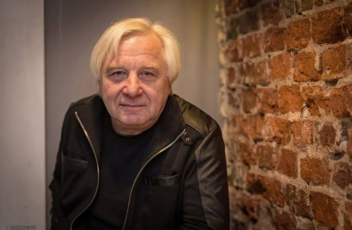
The cinematography of Pulp Fiction was a collaboration between Quentin Tarantino and cinematographer Andrzej Sekuła, whose approach was both raw and authentic. Sekuła’s work aligns closely with Tarantino’s vision, as it avoids glamorous visuals, opting instead for a grounded style that mirrors the gritty world of the film’s characters. This synergy between director and cinematographer allowed for a unique visual experience that prioritizes storytelling over stylized aesthetics, embracing unpolished, organic textures. Sekuła’s choices create an immersive, chaotic world where every camera angle, light source, and lens serves to reflect the unpredictable nature of the story.
Inspiration for the Cinematography of Pulp Fiction
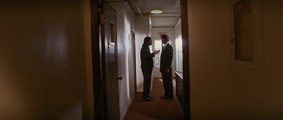
Sekula and Tarantino took cues from an array of cinematic influences—film noir, crime genres, and postmodern references. These references infuse Pulp Fiction with a strikingly eclectic style, where high art and pop culture blend seamlessly. The film’s visual style often nods to French New Wave, particularly Jean-Luc Godard, as well as to classic noir and pulp magazine aesthetics. This merging of genres provides a layered viewing experience, where noir lighting, bold colors, and pop culture references coexist in a deliberately stylized landscape. The cinematography here goes beyond mere homage; it makes Pulp Fiction a love letter to cinema itself, constantly referencing and reinterpreting iconic styles from cinematic history.
Camera Movements Used in Pulp Fiction
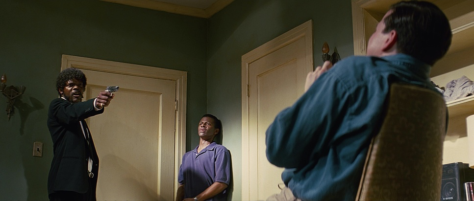
Sekuła’s camera movements are fluid yet controlled, capturing a sense of immediacy without overpowering the story. One of the most notable techniques is the use of tracking shots, like the tense sequence following Butch through his apartment, where the continuous motion builds suspense. Slow zoom-ins appear throughout the film, providing a voyeuristic feel to scenes that demand a heightened sense of discomfort or intimacy. In contrast, handheld shots inject a rough, almost documentary-like realism that intensifies the film’s gritty texture. These varied approaches make the camera a silent participant, adding to the raw, visceral quality of each scene and drawing viewers directly into the action.
Compositions in Pulp Fiction
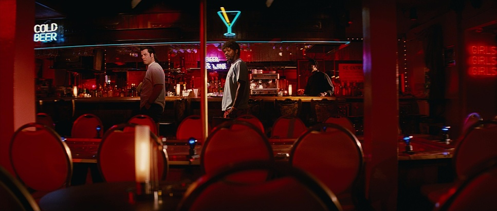
Sekula’s compositions are meticulously designed to underscore the tension and dynamic relationships between characters. In the iconic restaurant scene with Vincent and Mia, the framing reflects their complex connection—their bodies angled apart but eyes locked, conveying both distance and intrigue. By using tight framing in intimate, confined spaces like Butch’s apartment, the film amplifies the claustrophobia and isolation of the characters, allowing audiences to feel the same heightened tension the characters are experiencing. This tight framing contrasts with the use of wide shots during moments of violence, which brings a stark, unsettling realism to these scenes and adds an element of unpredictability that keeps viewers on edge.
Lighting Style of Pulp Fiction
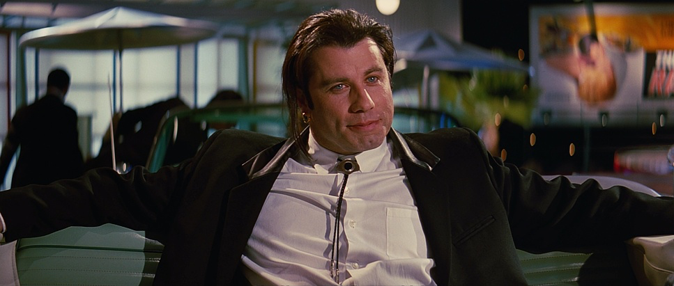
Sekula’s lighting is often hard and high-contrast, intensifying the raw, atmospheric tone of Pulp Fiction. Practical lighting adds a sense of realism, but there are also scenes where lighting is exaggerated to emphasize mood over accuracy. For example, the diner scene’s harsh lighting amplifies the anxiety of Pumpkin and Honey Bunny, while creating intense shadows that draw viewers’ attention to specific facial features. In other sequences, like the one where Jules and Vincent confront their victims, intense contrast and sharp shadows lend a menacing, dramatic effect. The film’s lighting is flexible, adapting from scene to scene to suit the emotional needs of each moment, sometimes stepping away from realism to evoke a stylized, almost theatrical intensity.
Lensing and Blocking in Pulp Fiction
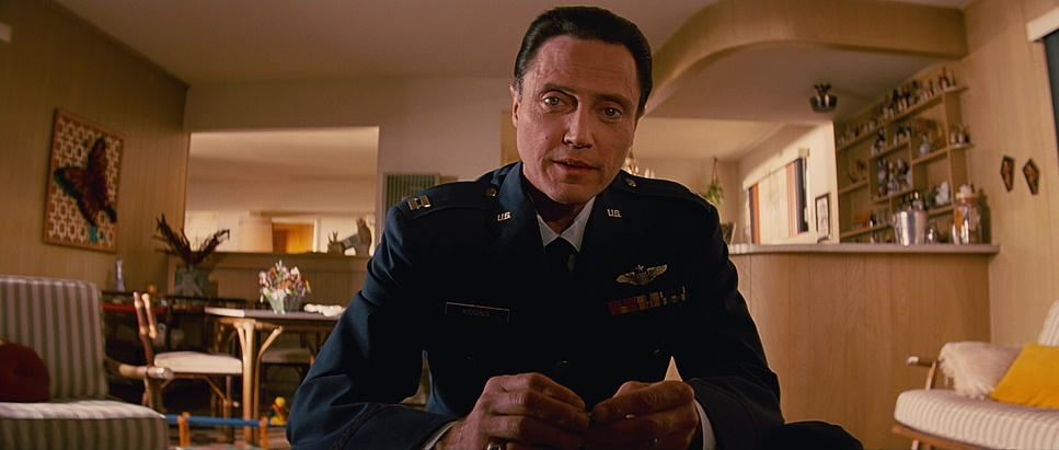
Wide-angle lenses and intentional blocking create an intimate yet immersive viewing experience. Sekula’s lensing emphasizes the physicality of the characters, bringing the viewer up close to their expressions and body language. For instance, wide lenses exaggerate close-up shots, making the viewer feel almost uncomfortably close to the action. Blocking is equally significant, as Tarantino’s direction often places characters at different levels or depths within the frame to signify power dynamics. In the diner scene, the blocking subtly conveys Pumpkin and Honey Bunny’s partnership while highlighting their individual personalities. Meanwhile, during Jules and Vincent’s interrogation scenes, the duo’s imposing positioning asserts their authority. These choices reinforce each character’s narrative importance and deepen our understanding of their interpersonal dynamics.
Color of Pulp Fiction
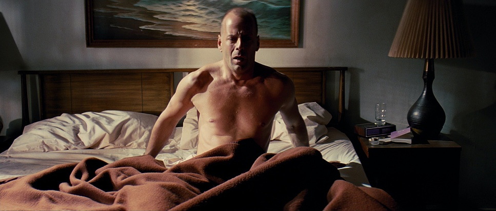
The color palette of Pulp Fiction is deliberately bold and eclectic, echoing the chaotic nature of its narrative. Rich, saturated reds, blues, and yellows punctuate the film, lending a comic-book aesthetic that captures the “pulp” essence. This diverse color scheme reflects the fragmented, multi-layered storylines, with each hue reinforcing the film’s postmodern tone. Tarantino’s use of color is both symbolic and functional—the iconic glow of the briefcase, for instance, serves as a mysterious focal point, paying homage to classic noir. The vibrant tones of Jack Rabbit Slim’s, with its neon pop-art feel, contrast with the earthy, subdued tones in Butch’s scenes, creating a vivid and memorable visual landscape that is unique to Pulp Fiction.
Technical Aspects: Camera, Lenses, etc.
Pulp Fiction
35mm Film • Anamorphic 2.35:1 • Panavision
| Genre | Crime, Thriller, Anthology, Dark Comedy, Comedy, Gangster, Heist |
| Director | Quentin Tarantino |
| Cinematographer | Andrzej Sekula |
| Production Designer | David Wasco |
| Costume Designer | Betsy Heimann |
| Editor | Sally Menke |
| Colorist | Mike Stanwick |
| Time Period | 1990s |
| Color | Cool, Saturated, Blue |
| Aspect Ratio | 2.35 – Anamorphic |
| Format | Film – 35mm |
| Lighting | High contrast, Backlight |
| Lighting Type | Artificial light, Mixed light, Fluorescent |
| Story Location | California > Los Angeles |
| Filming Location | California > Los Angeles |
| Camera | Arriflex 35 IIIc, Panavision Gold / G2, Panavision Lightweight |
| Lens | Panavision C series, Panavision E series |
| Film Stock / Resolution | Eastman EXR 50D 5245 |
The technical choices in Pulp Fiction reinforce its gritty aesthetic. Sekula used the ARRIFLEX 35mm camera paired with Zeiss lenses, known for their sharpness and ability to capture detail. Shooting on 35mm film gave Pulp Fiction a grainy, textured look that digital formats lack, grounding the film’s visual style in the pulp genre’s roughness. The lens choices—often wide-angle—enhanced close-up shots by making the viewer feel almost uncomfortably close to the characters. The grain, combined with Sekula’s blocking and lighting, highlights both the beauty and harshness of each scene, echoing the volatile, fragmented energy of the film’s narrative structure.
Conclusion
The cinematography of Pulp Fiction stands as a masterclass in visual storytelling, combining eclectic influences with a distinctly modern style. Sekula and Tarantino have crafted a visual narrative that not only tells a story but also serves as a commentary on the art of cinema itself. Each element—camera movement, composition, lighting, lensing, and color—contributes to a complex, multi-dimensional viewing experience. Sekula’s choices go beyond merely enhancing the story; they elevate it, turning Pulp Fiction into an unforgettable cinematic experience that challenges conventions and leaves a lasting visual imprint. Through its visual style, Pulp Fiction has earned its place as a cultural landmark and a touchstone of postmodern filmmaking.
- Also Read: CINEMATOGRAPHY ANALYSIS OF CITY LIGHTS (IN DEPTH)
- Also Read: CINEMATOGRAPHY ANALYSIS OF ORDET (IN DEPTH)
Browse Our Cinematography Analysis Glossary
Explore directors, cinematographers, cameras, lenses, lighting styles, genres, and the visual techniques that shape iconic films.
Explore Glossary →