As a passionate filmmaker and full-time colorist, I’ve always been fascinated by the intricate relationship between storytelling and visual aesthetics. My work revolves around understanding the subtleties of cinematography, particularly how light, color, and composition influence the emotional impact of a scene. When I watched Poor Things, directed by Yorgos Lanthimos and shot by Robbie Ryan, I was captivated by its bold and surreal visual language. This film exemplifies the kind of cinematic artistry that inspires me, and I’m thrilled to delve into its cinematography in this analysis.
Cinematography Analysis Of Poor Things
About the Cinematographer
Robbie Ryan, a name synonymous with inventive and emotive cinematography, helmed the visual storytelling of Poor Things. Ryan’s past work, including The Favourite and Marriage Story, highlights his ability to balance intimacy with grandeur, creating visuals that resonate on a deeply emotional level. His approach to Poor Things is no different—it’s a blend of whimsy and realism that perfectly complements the film’s surreal narrative.
What I find particularly remarkable about Ryan’s style is his willingness to experiment. He embraces imperfections, plays with unconventional tools, and uses lenses that challenge traditional norms—all to serve the story. Collaborating with Lanthimos, who is known for his avant-garde sensibilities, Ryan crafted a world that feels like a living, breathing storybook. The synergy between director and cinematographer is evident in every frame, making the film a visual masterpiece.
Inspiration for the Cinematography of Poor Things
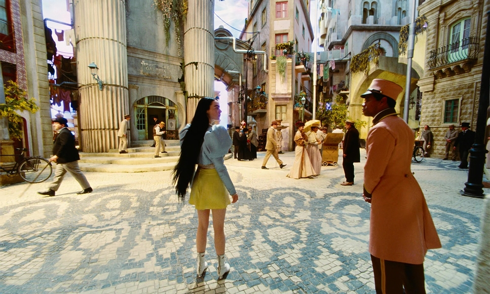
The visual style of Poor Things draws inspiration from a myriad of sources, blending elements from art, literature, and cinema. As someone who spends a great deal of time analyzing cinematic visuals, I couldn’t help but notice how Ryan and Lanthimos channeled influences from Victorian literature, early 20th-century sci-fi, and Gothic horror. The tonal parallels to Metropolis (1927) and Frankenstein (1931) are unmistakable, lending the film a timeless, dreamlike quality.
Moreover, the aesthetic nods to artists like Degas, Dali, and Magritte give the film an otherworldly charm. As I watched, I was struck by how these inspirations weren’t just visual flourishes—they were deeply integrated into the narrative. The color palettes, the distorted proportions, and the interplay of light and shadow all reflect Bella Baxter’s evolving journey, making the cinematography an essential part of the storytelling.
Camera Movements Used in Poor Things
The camera movements in Poor Things were nothing short of a revelation. Ryan employed a dynamic approach, using techniques that are often considered unconventional in modern filmmaking. Frequent use of zooms stood out as a defining feature. The Zeiss Master Zoom lens allowed for seamless transitions between wide and tight shots, mirroring Bella’s shifting perspectives. The choice to use wide-angle lenses, including the extreme 4mm Optex lens, added a vignette effect that felt like peering into an alternate reality.
One of the most memorable aspects of the camera work was its versatility. While most of the film utilized fluid and deliberate movements, the few handheld shots—like those in the chaotic hotel fight scene—brought a visceral energy that heightened the drama. This balance between precision and chaos created an immersive visual rhythm that kept me engaged throughout.
Compositions in Poor Things
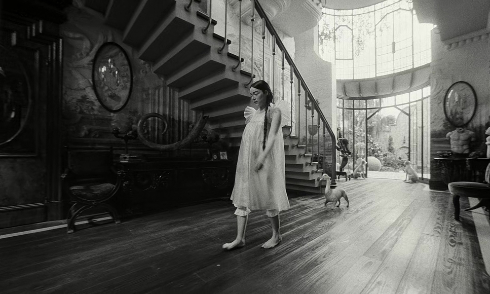
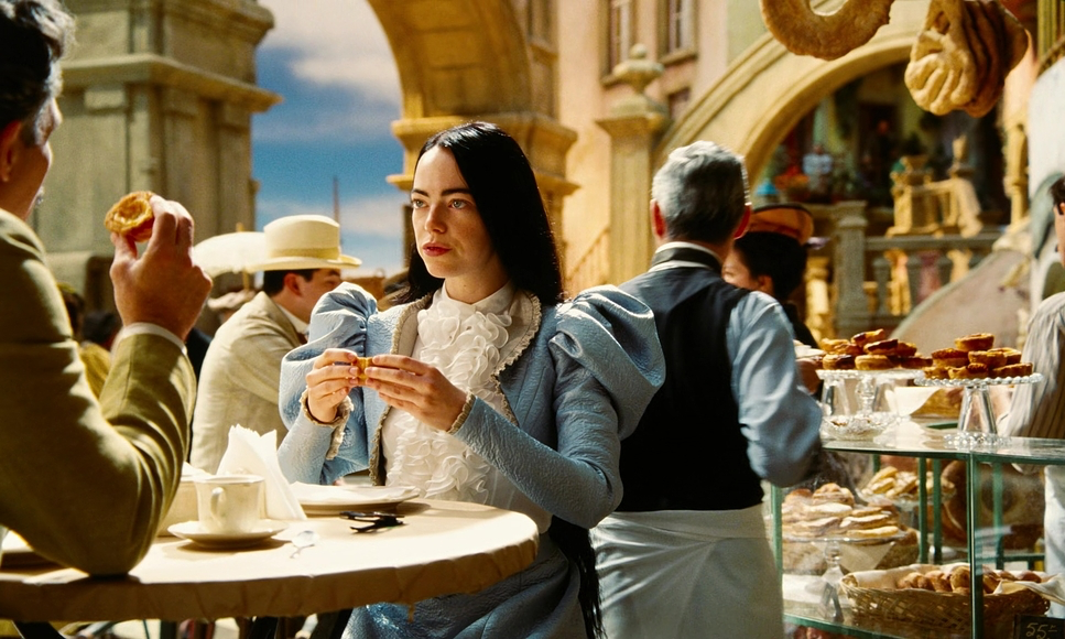
As a colorist, I have a keen appreciation for compositions, and Poor Things is a masterclass in this regard. The wide-angle shots, often framed with symmetrical precision, created a sense of exaggerated reality that mirrored Bella’s unique worldview. The extreme close-ups, captured with portrait lenses like the Lomography Petzval, added an intimacy that brought me closer to the characters’ emotional cores.
What fascinated me most was the interplay between scale and perspective. The sets, built to full scale, gave the camera freedom to roam, resulting in expansive frames that felt immersive yet surreal. The compositions often juxtaposed the characters against their environment, emphasizing themes of isolation and discovery. It’s a testament to Ryan’s meticulous craftsmanship that every frame feels intentional, almost painterly in its execution.
Lighting Style of Poor Things
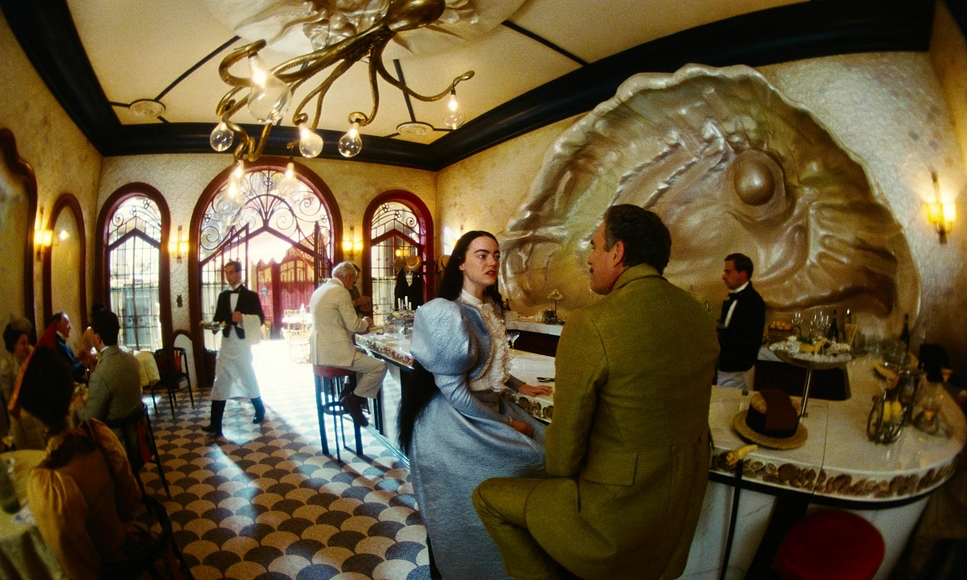
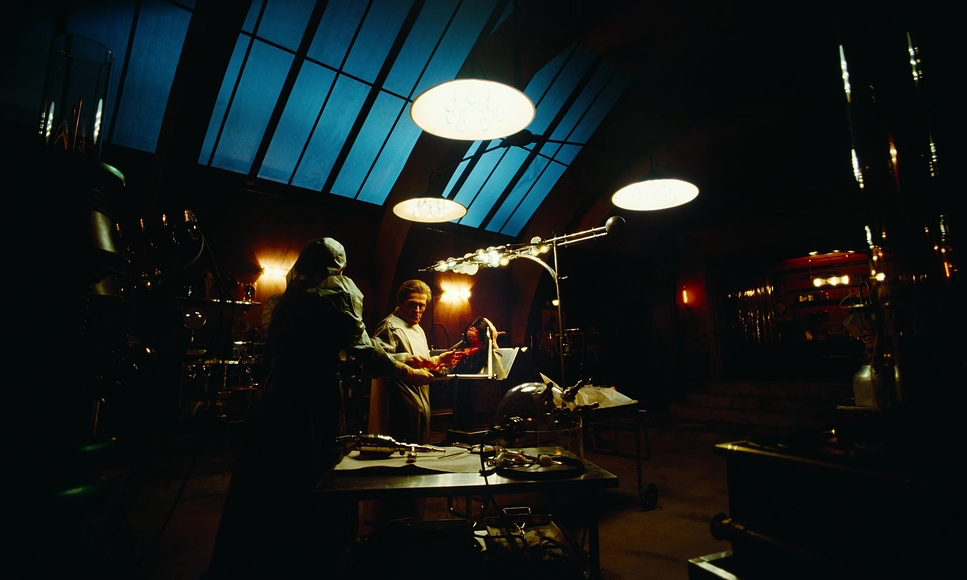
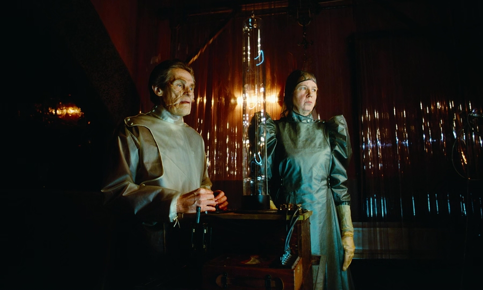
Lighting is often where the magic of cinematography truly comes alive, and Poor Things exemplifies this beautifully. The film strikes a delicate balance between naturalism and theatricality. Practical lights and natural sources were frequently used, creating a grounded ambiance that made the whimsical world feel tangible. For the more dramatic scenes, such as the black-and-white sequences, high-contrast lighting evoked the aesthetics of classic noir cinema.
I was particularly drawn to the lighting in the Lisbon scenes. The dreamy, candy-colored palette was achieved using Dino lights and Aerie Max 18Ks, creating an atmosphere that was both magical and grounded. The subtle “happy accidents” in lighting, like the green tint from a stained-glass skylight, added an organic quality that enhanced the film’s visual unpredictability.
Lensing and Blocking in Poor Things
Ryan’s choice of lenses played a pivotal role in defining the film’s distinctive aesthetic. Testing over 50 lenses before production began, he settled on a combination that included Lomography Petzval lenses for portraits and ultra-wide lenses like the 4mm Optex for dramatic vignettes. This careful selection of lenses accentuated Bella’s perspective, making her world feel expansive yet intimate.
Blocking, too, was handled with precision. The 360-degree lighting setups allowed the camera to move freely, creating dynamic compositions without compromising the naturalistic lighting. I was particularly impressed by how the blocking mirrored Bella’s journey—her movements within the frame often reflected her growth from innocence to independence.
Color Grading of Poor Things
Color grading is where my expertise lies, and the work done on Poor Things left me in awe. The film’s color palette was rich and varied, reflecting the narrative’s emotional shifts. The use of Kodak Vision 3 500T 5219 film stock delivered vibrant colors, while the Lisbon scenes, shot on Kodak Ektachrome 100D, brought a dreamy, saturated quality that felt otherworldly.
The black-and-white sequences, shot on Eastman 5222, were a stark contrast, exuding a gritty texture that grounded the more surreal moments. The grading emphasized these shifts beautifully, with cooler tones underscoring tension and warmer hues celebrating Bella’s moments of freedom and discovery. The seamless integration of these color choices made the film a visual feast, blending story and style effortlessly.
Technical Aspects of Poor Things
| Genre | Comedy, Psychological Horror, Romance, Satire, Science Fiction, Horror, Fantasy, Magical Realism |
| Director | Yorgos Lanthimos |
| Cinematographer | Robbie Ryan |
| Production Designer | James Price, Shona Heath |
| Costume Designer | Holly Waddington |
| Editor | Yorgos Mavropsaridis |
| Colorist | Greg Fisher |
| Time Period | 1800s |
| Color | Cool, Desaturated, Blue |
| Aspect Ratio | 1.66 – Spherical |
| Format | Film – 35mm |
| Lighting | Soft light, Low contrast |
| Lighting Type | Daylight |
| VFX | LED Background |
| Story Location | England > London |
| Filming Location | Budapest > Origo Film Studios |
| Camera | Arricam LT |
| Lens | Zeiss Ultra Prime |
From a technical standpoint, Poor Things is a marvel. Shot primarily on 35mm film with Arri ST and Arri Cam LT cameras, the film also employed a vintage VistaVision camera for Bella’s reanimation scene. This choice added a unique texture, with a serendipitous frame rate error enhancing the sequence’s otherworldly feel.
The sets, built on sound stages in Hungary, were extended digitally to create the illusion of infinite worlds. For the cruise ship scenes, an LED virtual production volume allowed for realistic lighting integration with CGI extensions. This blend of classic and modern techniques is a testament to the filmmakers’ ingenuity and attention to detail.
Final Thoughts
As a filmmaker and colorist, Poor Things resonates with me on multiple levels. Robbie Ryan’s cinematography is a testament to the power of visual storytelling. His mastery of lenses, lighting, and composition, paired with Yorgos Lanthimos’ daring vision, creates a film that challenges conventions while celebrating the artistry of cinema.
What I find most inspiring is how the film embraces imperfections and experimental techniques, resulting in a unique visual language that feels timeless yet profoundly relevant. Poor Things isn’t just a movie—it’s a work of art, and one that reminds me why I fell in love with filmmaking in the first place.
- Also Read: CINEMATOGRAPHY ANALYSIS OF PAN’S LABYRINTH (IN DEPTH)
- Also Read: CINEMATOGRAPHY ANALYSIS OF OPPENHEIMER (IN DEPTH)
Browse Our Cinematography Analysis Glossary
Explore directors, cinematographers, cameras, lenses, lighting styles, genres, and the visual techniques that shape iconic films.
Explore Glossary →