I am Salik Waquas, a passionate filmmaker and full-time colorist dedicated to the art of storytelling through visual language. As the founder of Color Culture, I explore the nuances of cinematography and its role in crafting emotionally resonant narratives. My fascination lies in the power of visual storytelling to convey emotions that dialogue often cannot. Lost in Translation by Sofia Coppola is one such masterpiece that inspires me both as a filmmaker and a colorist, with its profound use of light, composition, and color to delve into themes of connection and alienation.
Cinematography Analysis Of Lost in Translation (In Depth)
About the Cinematographer
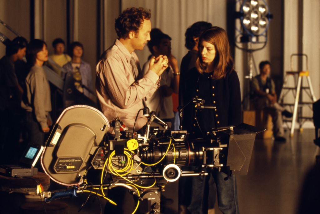
The visionary behind the cinematography of Lost in Translation, Lance Acord, masterfully shaped the film’s visual language to evoke its melancholic yet hopeful tone. Acord, celebrated for his work on films like Being John Malkovich and Adaptation, has a talent for complementing narratives with understated visuals that speak volumes.
In Lost in Translation, Acord’s collaboration with Sofia Coppola resulted in a deeply emotive aesthetic. Together, they used naturalistic techniques and minimalist storytelling to explore themes of disconnection, cultural displacement, and fleeting connections. His ability to use Tokyo as both a setting and a character underscores his brilliance in creating visuals that are as poetic as they are poignant.
Inspiration for the Cinematography of Lost in Translation
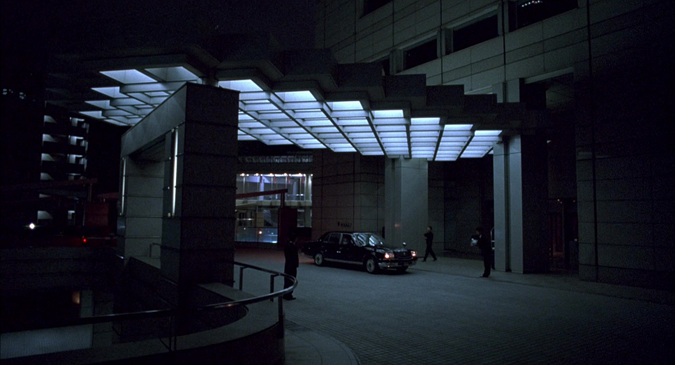
The film’s cinematography draws inspiration from Sofia Coppola’s personal experiences and artistic influences. During her visits to Japan, Coppola’s sense of isolation inspired her vision of Tokyo as an enigmatic backdrop to her characters’ inner journeys.
Acord’s visuals reflect this by juxtaposing Tokyo’s modern neon-lit chaos with its quieter, reflective corners. The works of Wong Kar-Wai, particularly In the Mood for Love, are apparent influences, as seen in the dreamy use of lighting and color. The compositions echo John Singer Sargent’s paintings, which capture intimacy and solitude in muted palettes.
This artistic blend creates a visual representation of Bob and Charlotte’s emotional disconnection and their unexpected connection, making the film as much a visual experience as an emotional one.
Camera Movements
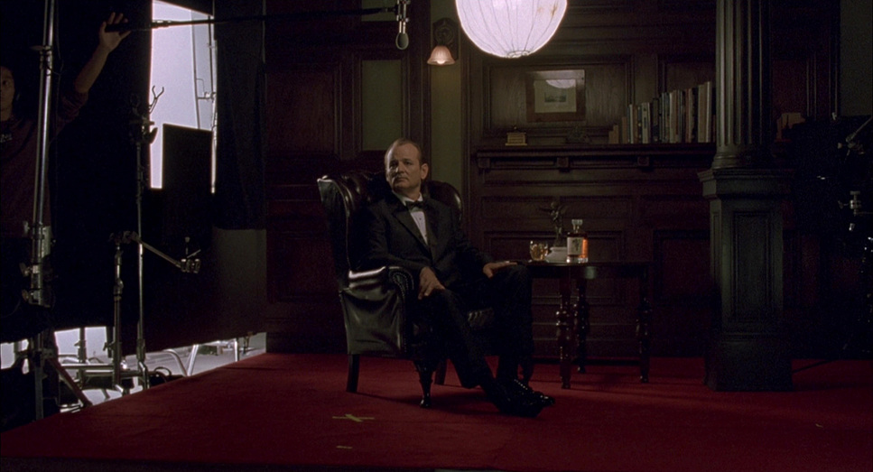
One of the hallmarks of Lost in Translation is its minimalist approach to camera movement. The camera lingers with intent, allowing the audience to immerse themselves in the characters’ world. Static shots dominate, creating a sense of stillness that mirrors the characters’ stagnation and introspection.
Subtle handheld movements occur during moments of spontaneity, such as Bob and Charlotte exploring Tokyo. These shots add intimacy, as if the viewer is a silent observer of their unfolding connection. The contrasts between dynamic handheld shots and static frames emphasize the duality of restlessness and isolation within the narrative.
This restrained technique serves the story impeccably, allowing the emotions to unfold organically.
Compositions
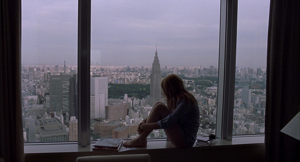
The compositions in Lost in Translation are deceptively simple yet layered with meaning. Lance Acord often uses negative space and off-center framing to underscore the characters’ feelings of alienation. Wide shots of Tokyo’s bustling streets dwarf Bob and Charlotte, highlighting their insignificance in the larger world.
One striking example is Charlotte sitting by a window, silhouetted against Tokyo’s vibrant cityscape. The shot captures her loneliness while juxtaposing it with the city’s chaos. Similarly, Bob’s isolation is emphasized in the iconic hotel room scene, where the vastness of the frame mirrors his emotional emptiness.
The framing evolves as the characters grow closer, with tighter shots emphasizing their connection. This shift is subtle yet powerful, demonstrating the art of visual storytelling.
Lighting Style
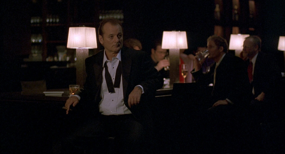
Lighting in Lost in Translation leans heavily on naturalism. Acord used available light—neon signs, street lamps, and hotel fixtures—to maintain authenticity. The result is a soft, diffused glow that complements the film’s introspective tone.
For nighttime scenes, the ambient light of Tokyo’s urban landscape becomes a character in itself, casting a moody atmosphere over the characters’ interactions. In contrast, the interiors of the Park Hyatt Hotel exude warmth through practical light sources like bedside lamps. This interplay of cool exteriors and warm interiors visually mirrors the characters’ emotional states.
One particularly striking scene is the karaoke bar, where vibrant neon colors punctuate the subdued palette, symbolizing a fleeting escape from emotional turmoil.
Lensing and Blocking
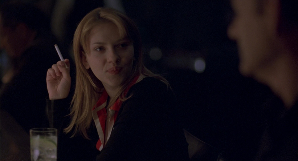
The choice of lenses and blocking in Lost in Translation adds depth to the narrative. Acord used Zeiss Super Speed lenses, known for their vintage aesthetic, to create soft, organic imagery. These lenses paired with dynamic framing allowed the cinematographer to shift seamlessly between wide vistas of Tokyo and intimate character moments.
Blocking was equally deliberate. Early in the film, Bob and Charlotte are often framed at opposite ends of the frame, emphasizing their emotional distance. As their bond strengthens, the blocking becomes more intimate, with shared spaces reflecting their growing closeness.
This visual evolution is subtle yet profoundly effective, mirroring the characters’ emotional arcs.
Color Grading
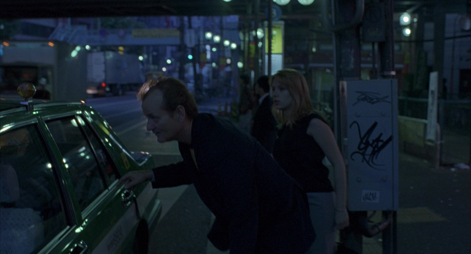
As a colorist, I find the grading in Lost in Translation particularly inspiring. The muted palette of blues and grays dominates, echoing the characters’ emotional detachment. Warmer tones make rare but significant appearances, representing moments of connection and vulnerability.
Tokyo’s vibrant nightlife introduces bursts of saturated colors—pink, red, and neon greens—which stand in stark contrast to the muted aesthetic. This dynamic use of color mirrors the chaos and beauty of the city, as well as the emotional highs and lows of Bob and Charlotte’s journey.
The pink wig Charlotte wears during the karaoke scene becomes an iconic motif, symbolizing a fleeting moment of self-expression and escape.
Technical Aspects
Lost in Translation (2003)
Technical Specifications
| Genre | Drama, Rom-Com, Adventure, Comedy, Romance, Melodrama, Travel |
| Director | Sofia Coppola |
| Cinematographer | Lance Acord |
| Production Designer | K.K. Barrett, Anne Ross |
| Costume Designer | Nancy Steiner |
| Editor | Sarah Flack |
| Colorist | Bob Fredrickson |
| Time Period | 2000s |
| Color | Cool, Saturated, Cyan, Blue |
| Aspect Ratio | 1.85 – Spherical |
| Format | Film – 35mm |
| Lighting | High contrast, Backlight |
| Lighting Type | Practical light, Mixed light |
| Story Location | Japan > Tokyo |
| Filming Location | Japan > Tokyo |
| Camera | Aaton 35-III, Arriflex 435, Moviecam Compact |
| Lens | Angenieux Optimo, Zeiss Super Speed |
| Film Stock / Resolution | 5260 Vision 2 500T, 5277/7277 Vision 320T |
Shot on 35mm film with Panavision and Moviecam cameras, Lost in Translation achieves a timeless aesthetic. The use of Kodak Vision film stocks allowed Acord to capture vibrant colors and low-light scenes with remarkable fidelity.
The decision to shoot without permits in Tokyo’s crowded streets added an organic, documentary-like feel to the film. This guerilla-style approach lent authenticity to the visuals, making the city’s energy palpable.
These technical choices demonstrate how simplicity and intentionality can elevate storytelling. The film’s grainy texture and imperfections add warmth and relatability, reinforcing its timeless appeal.
Conclusion
The cinematography of Lost in Translation is a masterclass in restraint and emotional storytelling. Lance Acord’s use of naturalistic lighting, minimalist compositions, and thoughtful lensing transforms the film into a visual poem. For me, as both a filmmaker and a colorist, this film is a reminder of the power of subtlety.
By using visuals to convey what the characters cannot express in words, Lost in Translation transcends traditional storytelling. It captures the universal human experience of loneliness and connection, leaving an indelible impression long after the credits roll.
- Also Read: CINEMATOGRAPHY ANALYSIS OF LITTLE WOMEN (IN DEPTH)
- Also Read: CINEMATOGRAPHY ANALYSIS OF LA LA LAND (IN DEPTH)
Browse Our Cinematography Analysis Glossary
Explore directors, cinematographers, cameras, lenses, lighting styles, genres, and the visual techniques that shape iconic films.
Explore Glossary →