As a filmmaker and full-time film colorist owning a post-production color grading suite, I’ve always been captivated by the art of visual storytelling. The way a film looks can profoundly influence how its story is perceived, and few modern films exemplify this better than “Knives Out.” Directed by Rian Johnson and masterfully shot by cinematographer Steve Yedlin, “Knives Out” is a visual feast that pays homage to classic whodunit mysteries while injecting a fresh, contemporary flair. In this article, I’ll delve into the cinematography of “Knives Out,” exploring how camera movement, composition, lighting, lensing, and color grading come together to enhance the film’s intricate narrative.
About the Cinematographer
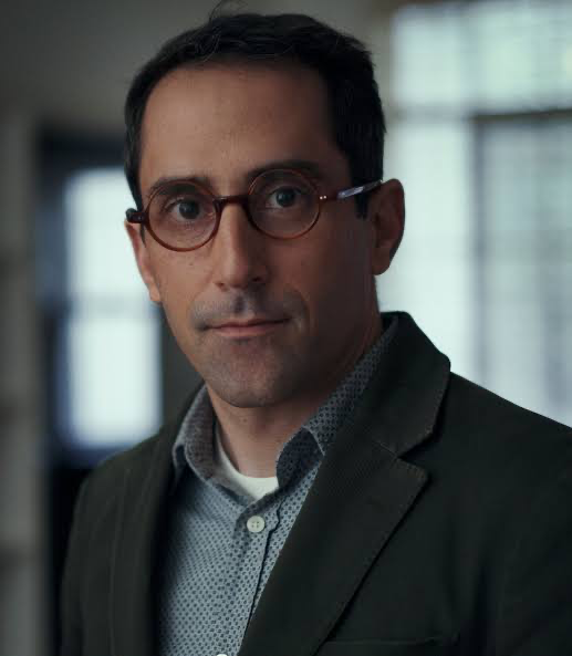
Steve Yedlin is a name that consistently stands out in the realm of cinematography. His collaboration with Rian Johnson has spanned multiple films, including “Brick,” “Looper,” and “Star Wars: The Last Jedi.” Yedlin is not just a cinematographer; he’s a true master of his craft who possesses a deep understanding of color science and the technical aspects of filmmaking. His ability to blend technical precision with creative vision makes him one of the most talented cinematographers working today. In “Knives Out,” Yedlin’s meticulous attention to detail and innovative techniques elevate the film to a masterclass in modern cinematography.
Inspiration for the Cinematography of “Knives Out”
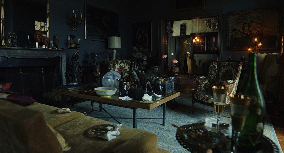
“Knives Out” is a modern take on the classic whodunit genre, drawing inspiration from Agatha Christie’s mysteries and classic noir films. Yedlin and Johnson aimed to create a timeless look that pays homage to traditional detective stories while incorporating contemporary cinematic techniques. One of their key inspirations was the filmmaking style of Robert Altman, known for weaving characters together within a space using fluid camera movements that combine dolly shots, zooms, and pans. This blend of old and new is evident in the film’s visual language, which feels both familiar and innovative.
Camera Movements Used in “Knives Out”
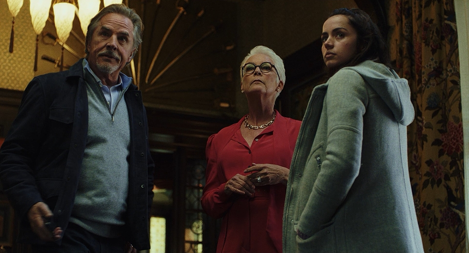
The camera movements in “Knives Out” are meticulously planned to enhance the storytelling and control the pacing and tension. One of the primary techniques employed is the dolly-in shot, particularly during scenes involving Detective Benoit Blanc, portrayed by Daniel Craig. As Blanc listens and learns, the camera slowly moves in, drawing the audience into his perspective and heightening the sense of investigation. This subtle movement puts us in the detective’s shoes, emphasizing the importance of each clue uncovered.
In scenes with other characters, such as Walt Thrombey gaining confidence while discussing the publishing company, the camera moves past the police officers to reflect his growing self-assurance. Conversely, when characters feel vulnerable or insecure, wider shots are used to make them appear smaller within the frame, highlighting their emotional state.
The film also utilizes fluid camera movements that blend dolly shots, zooms, and pans to weave characters together in a scene. This approach allows the audience to feel immersed in the environment and connected to the characters’ interactions, keeping the visual energy high and enhancing the ensemble feel of the cast.
Compositions in “Knives Out”
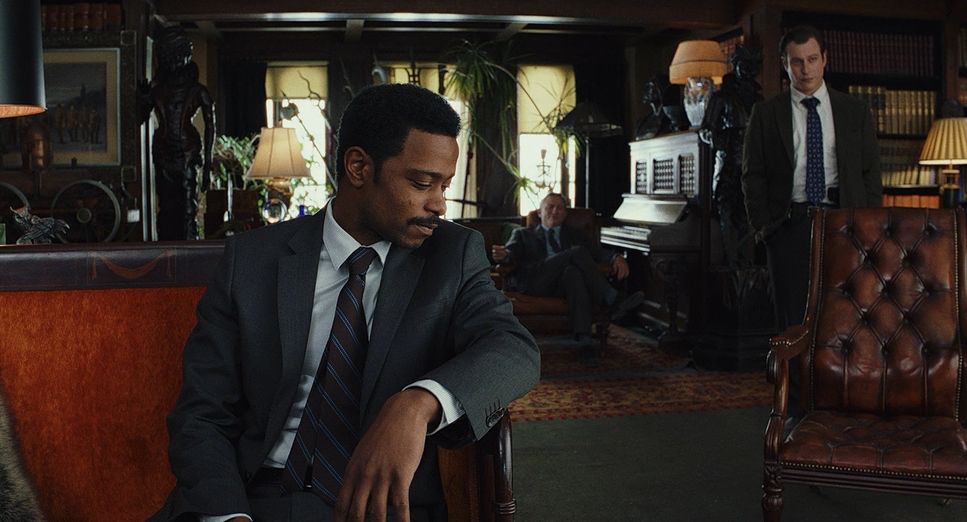
Composition plays a crucial role in conveying the film’s themes and character dynamics. Yedlin frequently uses framing to reflect the themes of deception and revelation. During the interview scenes, characters are often framed slightly off-center, and the camera angles are positioned to look up at them. This choice creates a subtle sense of power and authority, emphasizing that each character is a potential suspect with their own secrets.
When it comes to Ransom Drysdale, portrayed by Chris Evans, the compositions shift noticeably. Ransom is frequently centered in the frame, and the camera looks up at him more consistently than with other characters. This framing establishes his dominance and nonchalant attitude, setting him apart from the rest of the family.
One of the most striking compositional elements is the recurring motif of knives. Sharp objects are strategically placed throughout the film, particularly during key moments when fragments of the truth are revealed. The famous “circle of knives” in Harlan Thrombey’s study serves as a focal point, but the knife is only centered in the frame during three pivotal scenes: when Harlan mentions Ransom, when Blanc solves the mystery, and when Ransom attempts to harm Marta. This deliberate placement encourages the audience to associate the knives with the uncovering of truth, engaging viewers as active participants in the sleuthing process.
Lighting Style of “Knives Out”
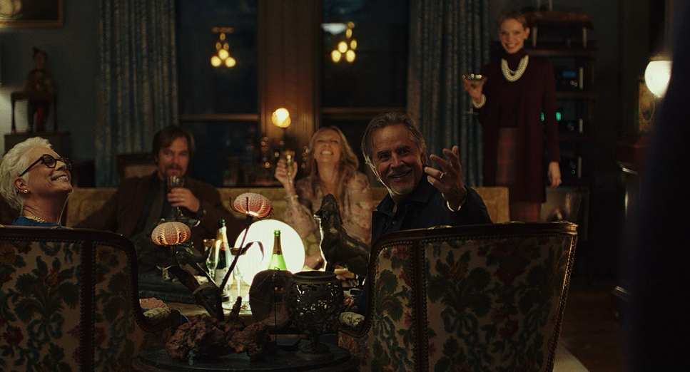
Lighting plays a pivotal role in establishing the film’s tone and atmosphere. Yedlin opts for a blend of naturalistic and stylized lighting, carefully designed to support the film’s mood and themes. During interior scenes, especially within the Thrombey mansion, warm tungsten lighting dominates, creating an inviting yet mysterious atmosphere. This warmth contrasts with the coldness of the family’s interactions, adding depth to the narrative.
Soft lighting is often used in interview scenes and casual conversations, lending a gentle, intimate feel that draws viewers into the characters’ personal spaces. In contrast, hard lighting is employed in scenes meant to feel more natural or when emphasizing tension, such as when characters are illuminated by sunlight or harsh indoor lights.
Yedlin utilized a combination of ARRI Skypanels and custom-built RGBWW lights to achieve precise color matching with practical fixtures on set. By using Pran foam sheets as diffusion, he ensured that the augmented lighting blended seamlessly with the environment, maintaining a consistent and natural look even as exterior lighting conditions changed.
One particularly innovative technique involved replicating window reflections in characters’ glasses, notably with Jamie Lee Curtis’s character, Linda. This added a layer of realism and visual interest, enhancing the authenticity of the scenes without drawing attention away from the narrative.
Lensing and Blocking of “Knives Out”

Yedlin’s choice of lenses and meticulous blocking contribute significantly to the film’s visual impact. He primarily used Panavision Primos and Zeiss Master Primes, known for their ability to maintain image quality even when opened wide. This allowed for shooting in lower light conditions without sacrificing sharpness or introducing unwanted artifacts.
The use of wide-angle lenses captures the opulence of the mansion and the ensemble cast within it. This choice allows for dynamic compositions where multiple characters can be in focus simultaneously, emphasizing their interconnected stories. The Panavision compact zooms (PCZ and PZWs) were also integral to the film’s visual style, providing flexibility in framing and enabling smooth transitions that support the story’s pacing.
Blocking in “Knives Out” is meticulously crafted to reflect character relationships and power dynamics. Characters are often positioned in ways that visually represent their emotional states and connections to one another. For example, during ensemble scenes, the spatial arrangements highlight tensions and alliances within the family, using physical distance and placement to convey underlying conflicts. The careful choreography of movement and positioning allows subtle shifts in control and influence to be communicated visually.
Color Grading of “Knives Out”
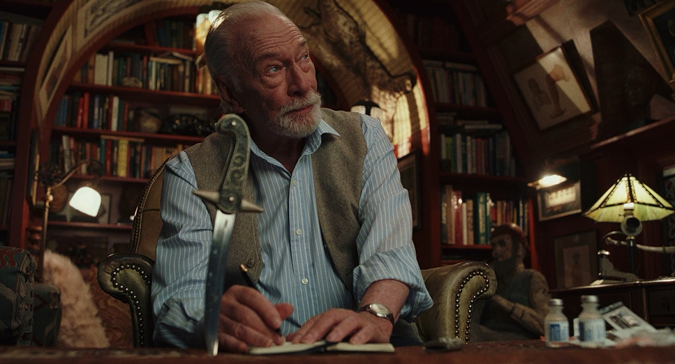
As a colorist, I was particularly drawn to the film’s authentic and timeless color grade. Steve Yedlin’s expertise in color science is evident in the subtle yet impactful grading choices. The color palette leans towards warm, earthy tones indoors, emphasizing the rich textures of the mansion’s interiors and the opulence of the Thrombey family’s world. This creates a sense of warmth and tradition, contrasting with the dark undertones of the story.
The use of color contrasts, such as cool blues during exterior night scenes, adds to the film’s moodiness. Skin tones are rendered naturally, and the controlled contrast ensures that details are preserved in both shadows and highlights. The grading enhances the inviting atmosphere of the setting while guiding the viewer’s emotional response.
Yedlin’s philosophy that emulating film stock doesn’t necessarily require shooting on film is showcased here. The digital footage from the ARRI Alexa Mini is graded to achieve a filmic look, with careful attention to color reproduction and dynamic range. The grading complements the film’s themes of hidden truths and family drama, maintaining a cinematic quality without resorting to overly stylized or trendy looks.
Technical Aspects of “Knives Out”
| Genre | Comedy, Crime, Drama, Mystery, Thriller, Murder Mystery, Detective |
| Director | Rian Johnson |
| Cinematographer | Steve Yedlin |
| Production Designer | David Crank |
| Costume Designer | Jenny Eagan |
| Editor | Bob Ducsay |
| Colorist | Aidan Stanford |
| Time Period | 2010s |
| Color | Cool, Cyan, Blue |
| Aspect Ratio | 1.85 – Super 35 |
| Format | Digital |
| Lighting | Soft light |
| Story Location | Boston > North Easton |
| Filming Location | Boston > North Easton |
| Camera | Panavision R-200, ARRI ALEXA Mini, ARRI ALEXA 65 |
| Lens | Panavision Primo Primes, Zeiss Master Primes, Panavision Compact – 19-90mm (PCZ) |
| Film Stock / Resolution | 5219/7219 Vision 3 500T, 2.8K / 2.8K ArriRaw, Arriraw 5.5K |
From a technical standpoint, “Knives Out” showcases how digital cinematography can rival traditional film. The decision to use the ARRI Alexa Mini was driven by its excellent color reliability, low noise, and high frame rate capabilities without needing to change the framing area. This choice proves that high-end results are achievable without the most expensive or largest cameras.
The combination of high-quality lenses and the Alexa Mini’s performance allowed for flexibility on set, especially in tight locations within the mansion. The camera’s size facilitated dynamic movements and complex setups without compromising image quality. This aligns with Yedlin’s reputation for leveraging technology to serve the story effectively.
Yedlin’s use of custom-built RGBWW lighting fixtures demonstrates innovation in achieving precise color control. Matching the fill lights to the changing exterior light ensured consistency throughout shooting, maintaining the natural look that was essential to the film’s aesthetic.
Moreover, the collaboration between the cinematography, production design, and direction resulted in a cohesive visual narrative. The attention to detail in every technical aspect—from lens selection to lighting, from camera movement to color grading—culminated in a film that is both visually engaging and thematically resonant.
Conclusion
In my opinion, “Knives Out” stands as a testament to the power of thoughtful cinematography in enhancing storytelling. Steve Yedlin’s work on the film seamlessly blends traditional and modern techniques, resulting in a visually compelling narrative that keeps audiences engaged from start to finish. From the deliberate camera movements to the nuanced lighting and color grading, every element is crafted with precision.
As a filmmaker and colorist, I find the film inspiring for its ability to balance a classic aesthetic with modern techniques, creating an experience that feels both fresh and timeless. “Knives Out” offers a wealth of inspiration and serves as a valuable study in the art of cinematography. It’s a film that not only tells a captivating story but does so in a way that celebrates the craft of filmmaking itself.
By analyzing the cinematography of “Knives Out,” we gain insight into how visual elements contribute to storytelling. Steve Yedlin’s innovative approaches and meticulous attention to detail exemplify the impact that skilled cinematography can have on a film. For filmmakers and enthusiasts alike, “Knives Out” is more than just a movie; it’s a masterclass in visual storytelling.
- Also Read: CINEMATOGRAPHY ANALYSIS OF CHINATOWN (IN DEPTH)
- Also Read: CINEMATOGRAPHY ANALYSIS OF BONNIE AND CLYDE (IN DEPTH)
Browse Our Cinematography Analysis Glossary
Explore directors, cinematographers, cameras, lenses, lighting styles, genres, and the visual techniques that shape iconic films.
Explore Glossary →