My name is Salik Waquas, and I’m a filmmaker and full-time film colorist. I own a post-production color grading suite, where I spend my days enhancing the visual storytelling of films and television projects. My passion for cinematography and color grading goes beyond just the technicalities—it’s about the art of translating emotions and narratives into compelling visuals. As someone who appreciates the nuances of both classic and contemporary visual styles, analyzing the cinematography of an iconic series like Friends feels like an exciting journey into how visuals contribute to storytelling in ways we often overlook.
Cinematography Analysis Of Friends
About the Cinematographer
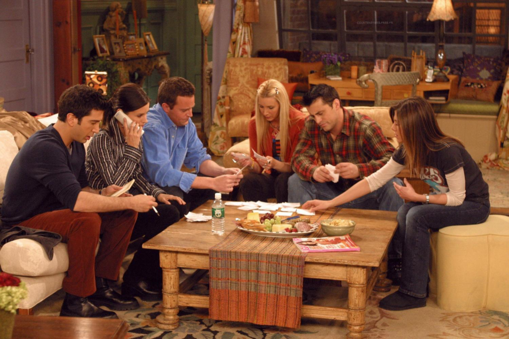
The timeless sitcom Friends, which entertained audiences from 1994 to 2004, benefited from the expertise of several cinematographers. Among them, George La Fountaine, Sr., and later Nick McLean, were pivotal in defining the show’s visual identity. While sitcoms often prioritize humor and dialogue over visual flair, the cinematographers of Friends managed to elevate its style within the constraints of a multi-camera setup. Collaborating with directors like James Burrows, they crafted a visual aesthetic that balanced functionality for live audiences with a polished, inviting look for viewers at home.
The challenge was clear: maintain visual consistency across a decade while ensuring the look stayed fresh and relevant. This required a meticulous approach to lighting, composition, and blocking. It’s fascinating how Friends managed to stand out visually while adhering to the practicalities of traditional sitcom production.
Inspiration for the Cinematography of Friends
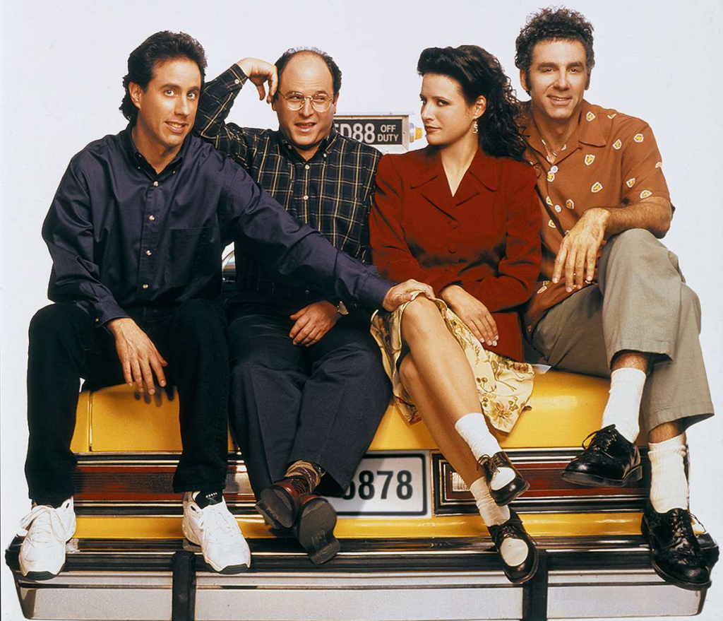
The visual style of Friends was heavily inspired by its predecessors in the golden age of sitcoms, such as Cheers and Seinfeld. These shows laid the foundation for creating a warm, intimate aesthetic that complemented both comedic and emotional narratives. However, Friends updated this formula to align with the youthful energy of the 1990s.
The creators and cinematographers embraced a style that drew from the dynamics of theater. With live audiences in mind, the visual language was designed to emphasize clarity and relatability. The lighting and set designs reflected urban life in New York City but through an optimistic lens, making the spaces feel lived-in and inviting. The show’s cinematography often reminds me of how theater productions ensure that every audience member, regardless of their seat, feels connected to the action on stage.
Camera Movements Used in Friends
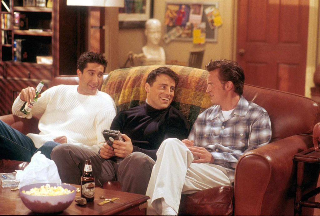
As a multi-camera sitcom, Friends predominantly relied on stationary cameras, a necessity for live-audience filming. The three-camera setup ensured every angle—wide, medium, and close-up—was captured simultaneously, allowing for seamless editing. This technique kept the focus on the characters’ interactions and comedic timing.
However, the cinematographers occasionally deviated from this static setup to heighten key moments. For instance, subtle dolly movements during emotionally charged scenes, like Ross’s passionate “we were on a break!” moment or Monica and Chandler’s proposal, added depth to the storytelling. Even small tracking shots during Ross’s “pivot” scene helped amplify the humor without distracting from the dialogue. These rare dynamic movements demonstrated how even within sitcom conventions, creative camera work can add impact to pivotal scenes.
Compositions in Friends
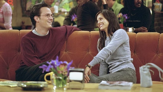
Composition in Friends was carefully designed to reflect the dynamics of its ensemble cast. In group scenes, the cinematographers often used balanced, symmetrical framing to emphasize unity and camaraderie. For example, gatherings in Monica’s apartment often featured characters positioned in triangular formations or arranged around the iconic orange couch in Central Perk. These choices ensured that no character dominated the frame, visually reinforcing the idea that each friend was equally important.
In more intimate moments, the compositions shifted to focus on individual characters or pairs. Tight framing and over-the-shoulder shots during emotional exchanges, such as Ross and Rachel’s arguments or Chandler and Monica’s heartfelt confessions, drew the audience’s attention to the emotional tension. This balance between wide group shots and close, personal angles kept the storytelling engaging while honoring the sitcom’s conversational flow.
Lighting Style of Friends
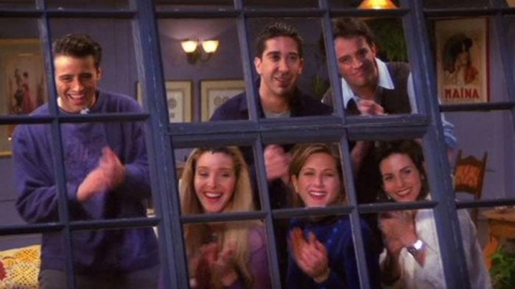
The lighting in Friends is one of its most defining visual elements. Traditional sitcoms often favor bright, even lighting, and Friends adhered to this approach while adding subtle variations to enhance mood and setting. The lighting in Monica’s apartment, for instance, was warm and inviting, reflecting the centrality of this space to the group’s lives.
Nighttime scenes, however, brought a cozier atmosphere with dimmer, warmer lighting, creating an intimate backdrop for reflective moments. Central Perk’s lighting leaned on practical fixtures like table lamps and neon signs, adding texture to its cozy, café-like ambiance. These subtle shifts in lighting style gave the show a visual depth that belied its seemingly simple aesthetic.
What I find particularly impressive is how the lighting remained consistent throughout the series’ ten-year run. This continuity not only ensured a cohesive visual identity but also reinforced the timeless quality of the show.
Lensing and Blocking in Friends
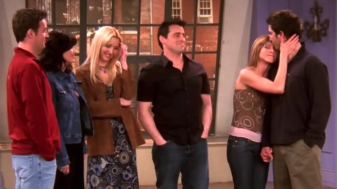
The lensing in Friends focused on medium focal lengths, striking a balance between intimacy and spaciousness. The cinematographers used lenses that allowed for clear, vibrant visuals without intruding too closely on the characters. Filming on 35mm film added richness to the visuals, a quality that contributes to the show’s enduring appeal even in the era of high-definition streaming.
Blocking was another critical component of Friends’ cinematography. With six main characters, it was essential to position them in ways that maintained visual balance while facilitating natural interactions. In group scenes, characters were often arranged in semi-circles or triangular formations, ensuring everyone remained visible and engaged in the conversation. This blocking technique was particularly effective in Central Perk, where the layout of the furniture encouraged dynamic interactions.
Color Palette of Friends

The color palette of Friends is as iconic as its characters. Monica’s apartment, with its purple walls and eclectic décor, became a visual signature of the show. The vibrant hues reflected the youthful, quirky personalities of the characters. In contrast, Chandler and Joey’s apartment had a more subdued palette, mirroring their laid-back, bachelor lifestyle.
Central Perk’s earthy tones—warm oranges, greens, and browns—provided a cozy backdrop for the group’s many conversations. What stands out to me is how the show used color not just for aesthetic appeal but to subtly reinforce its emotional beats. Brighter colors dominated scenes of levity and humor, while more muted tones appeared in moments of tension or sadness.
Technical Aspects of Friends
The technical execution of Friends exemplified the seamless integration of tradition and innovation. Filmed on 35mm film with Panavision cameras and lenses, the show achieved a cinematic quality that set it apart from its contemporaries. The multi-camera setup, tailored studio lighting grid, and meticulously designed sets allowed the cinematographers to capture the actors’ performances with clarity and precision.
The reliance on practical effects over digital enhancements reinforced the grounded tone of the series. Even the few instances of visual effects, such as flashbacks or dream sequences, were handled sparingly, ensuring they didn’t disrupt the show’s realism.
Conclusion
As a filmmaker and colorist, I deeply admire the cinematography of Friends for its ability to enhance the storytelling within the constraints of a traditional sitcom format. The show’s visual language, from its balanced compositions and inviting lighting to its dynamic blocking and vibrant color palette, contributed significantly to its status as a cultural phenomenon.
The cinematography of Friends teaches us that even in genres where visuals are often secondary to dialogue, thoughtful choices in lighting, composition, and technical execution can elevate the overall experience. For me, the enduring appeal of Friends lies not just in its humor or characters but in its ability to create a world that feels visually cohesive, emotionally resonant, and utterly timeless.
- Also Read: CINEMATOGRAPHY ANALYSIS OF HUNT FOR THE WILDERPEOPLE
- Also Read: CINEMATOGRAPHY ANALYSIS OF HUGO (IN DEPTH)
Browse Our Cinematography Analysis Glossary
Explore directors, cinematographers, cameras, lenses, lighting styles, genres, and the visual techniques that shape iconic films.
Explore Glossary →