I usually roll my eyes at reboots. Another Frankenstein? Really? But when you tell me Guillermo del Toro is holding the paddles, I’m already dragging my chair closer than necessary.
If you’re new here, I’m Salik—filmmaker, colorist, and someone who has spent far too much of his life debating whether teal is overused (it is, but don’t tell anyone). At Color Culture, we obsess over skin tone lines and luminance curves like they’re family heirlooms. Most people watch movies for the plot; I watch to see if the black levels are behaving. And Frankenstein isn’t just a horror movie—it’s a “Gothic monster romance” that feels lovingly handmade in an era that’s practically allergic to physical craftsmanship. It’s visually aggressive, deeply textured, and honestly, the sort of film that would make a colorist’s palms sweat—in a good way. So let’s pull the scopes out and dive in.
About the Cinematographer

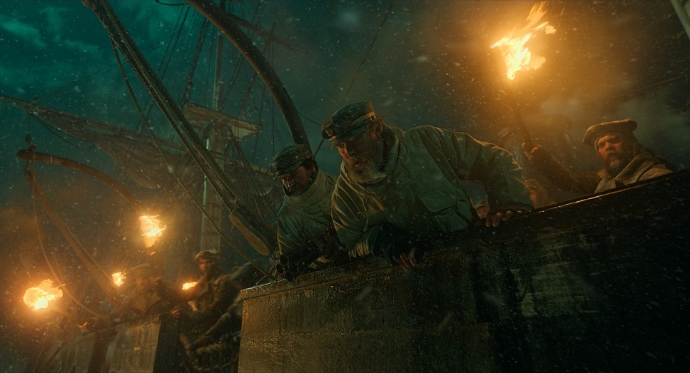
The man orchestrating the chaos is Dan Laustsen. He’s a del Toro regular, practically a co-author of the director’s visual language. If you’ve seen The Shape of Water or Nightmare Alley, you already know his flavor: obsessive contrast, beautiful shadows, and lighting choices that feel almost architectural.
What stands out here is how confident the raw capture feels. I’ve been in suites where the DI is basically asked to find the movie. This isn’t that. You can sense the baked-in intention. Laustsen balances the grimy, industrial lab textures with surprisingly romantic exteriors. It’s like he’s saying, “Yes, this is a monster movie, but don’t you dare call it ugly.”
Inspiration for the Cinematography
Del Toro doesn’t exactly hide his influences—he wears them like badges. You can see Bernie Wrightson’s gothic illustration style all over the framing. But this isn’t a cheap homage. The film isn’t going for jump-scare energy; it’s playing in the territory of tragedy and inherited wounds.
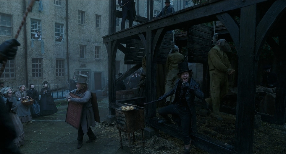
Visually, that translates into a palette closer to Crimson Peak’s moody elegance than modern horror’s grey sludge. And honestly, there’s something nostalgic about how physical the world feels—big sets, heavy props, light that actually touches things. No uncanny CGI fog, no plastic-looking backgrounds. It’s the kind of visual honesty we don’t get enough of anymore.
Camera Movements
In an age where directors wave the camera around like it’s on an energy drink, Frankenstein moves with intention. The shots are steady, almost meditative at times. You can practically hear the dolly grip’s footsteps.
This stability is part of the storytelling. The environments are rich and layered, and the camera gives them space to breathe. There are moments where it glides forward just enough to pull you into a character’s emotional orbit. And sometimes it simply sits back, letting the tragedy unfold without cutting every two seconds. It’s patient—something I wish more films remembered how to be.
Compositions
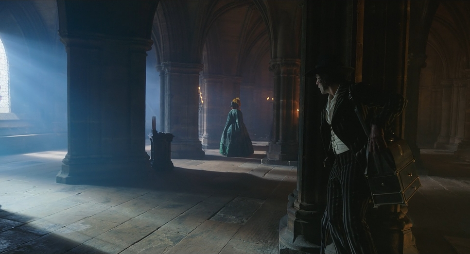
Freeze-frame almost anywhere, and you’ll find something gallery-worthy. Laustsen leans heavily on negative space and asymmetry—frames that feel just a little off-balance, like the story itself.
The frozen battlefield shot with the horse mid-gallop? Pure cinema. The weight of the animal against that stark backdrop creates this brutal L-shaped composition that hits harder than half the dialogue in modern dramas. And the wide shots—the truly wide ones—shrink the characters to dots swallowed by ice and sky. It’s gorgeous, but also quietly devastating.
Lighting Style
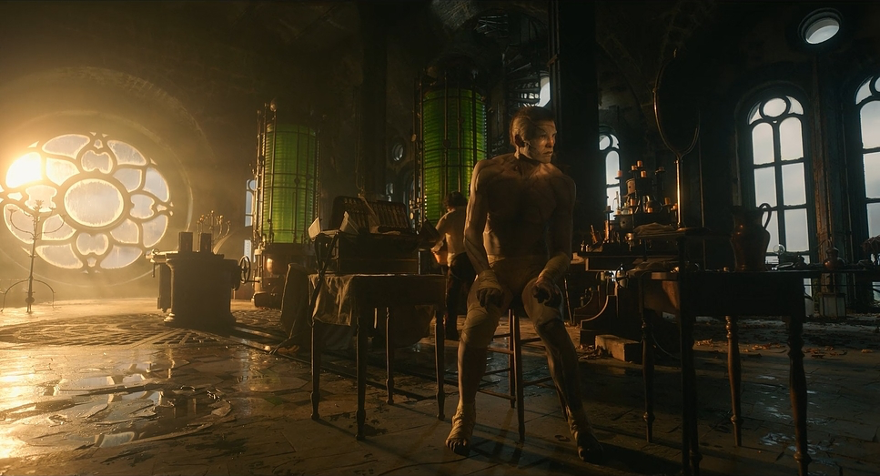
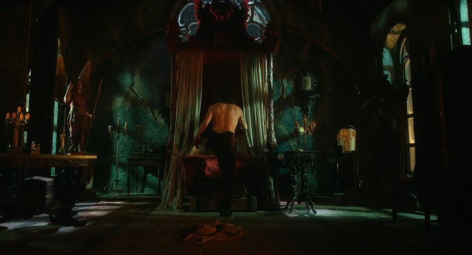
Laustsen works the dynamic range like he’s physically stretching it with his hands. The labs have that signature “industrial nightmare” look: punchy shafts of light, dust thick enough to grade as a separate character, blacks verging on crushed but never quite slipping.
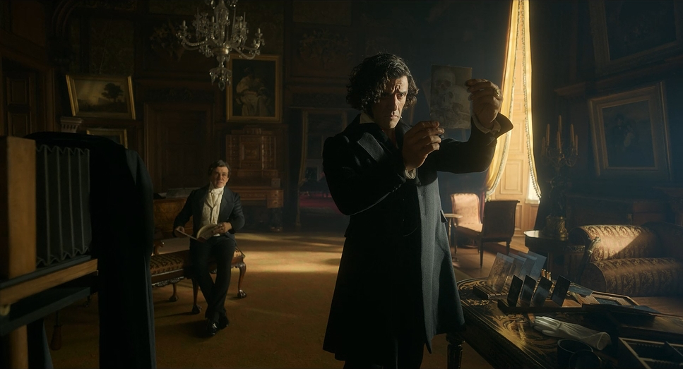
Then comes the sunlight. When the creature steps into it, the lighting flips—suddenly broad, high-key, almost generous. It’s not just a lighting change; it feels like the film finally takes a breath it’s been holding. As a colorist, you immediately see how carefully this was executed. Shadows stay heavy in the castle, but the daylight scenes bloom with life without going milky. It’s a dance.
Lensing and Blocking
Jacob Elordi is tall, sure, but here he looks like he could casually lift a cathedral. The trick isn’t just his boots—it’s the lensing.
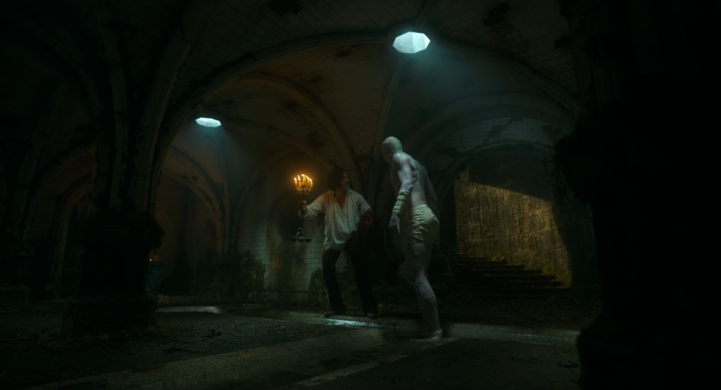
Laustsen seems to favor wider lenses pushed close to the subject, likely at low angles. This forces perspective, making Elordi loom like a myth more than a man. And the blocking supports that visual trickery—placing him closer to lens center, giving him dominance even in stillness. The makeup detail survives beautifully too, which tells me they didn’t drown everything in diffusion. They trusted the prosthetics, and honestly, they were right to.
Color Grading
Let’s talk about the grade—because this look isn’t accidental. This isn’t your standard “desaturate everything and call it horror” approach. The grade leans into the Gothic Romance aesthetic with commitment.
Deep reds anchor scenes with emotional weight, especially in the costume work. Against the colder cyan-driven castle interiors, those reds practically throb. It’s depth through color contrast, not just lighting. And the creature’s skin? That’s a puzzle. Patchwork flesh can go muddy fast if you’re not careful. Here, the hue separation is crisp—the complexion reads pallid but not chalky, textured but not dirty. They walked a very thin line and stuck the landing.
Technical Aspects
| Genre | Drama, Fantasy, Horror, Science-Fiction |
| Director | Guillermo del Toro |
| Cinematographer | Dan Laustsen |
| Production Designer | Tamara Deverell |
| Costume Designer | Kate Hawley |
| Editor | Evan Schiff |
| Colorist | Stefan Sonnenfeld |
| Time Period | 1800s |
| Color | Cool, Desaturated, Cyan, Blue |
| Aspect Ratio | 1.85 – Spherical |
| Format | Digital |
| Lighting | Soft light, Low contrast |
| Lighting Type | Daylight, Overcast |
| Story Location | Earth > North Pole |
| Filming Location | Toronto > Cinespace Studios |
| Camera | ARRI ALEXA 65 |
| Lens | Leitz Thalia Lenses |
What really excites me is the return to physical effects. Animatronics, prosthetics, real textures—it all changes how the camera and light behave. You can’t cheat reality the same way you can cheat CGI.
Light bounces off silicone differently. Shadows wrap differently. And honestly, the imperfections sell the emotion. The split narrative—Victor vs. the Creature—works because both worlds feel tactile. They have weight. They have dust. They have gravity. It’s filmmaking that trusts the audience’s eyes.
- Also Read: CINEMATOGRAPHY ANALYSIS OF THE BRUTALIST
- Also Read: CINEMATOGRAPHY ANALYSIS OF THE GREAT DICTATOR
Browse Our Cinematography Analysis Glossary
Explore directors, cinematographers, cameras, lenses, lighting styles, genres, and the visual techniques that shape iconic films.
Explore Glossary →