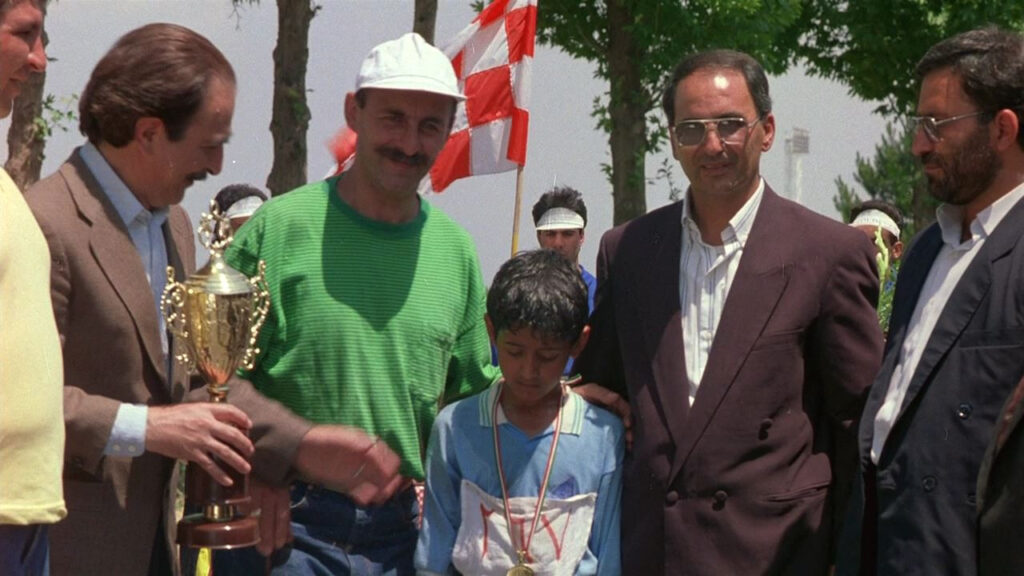
Children of Heaven (1997) was a hard reset. It’s a quiet Iranian masterpiece that doesn’t care about specs. It’s about two kids, Ali and Zara, and a pair of lost shoes. Analyzing the cinematography here isn’t about breaking down complex VFX or high-budget lighting; it’s about seeing how little you actually need to break a viewer’s heart.
About the Cinematographer
Parviz Malekzadeh shot this. In 90s Iranian cinema, realism wasn’t just an aesthetic choice; it was often a budgetary necessity. Malekzadeh didn’t try to impose a “look.” He just got out of the way. His work here is almost invisible, which is the highest compliment I can give. He understood that if the audience is noticing the lighting, he’s failed the story. There are no sweeping crane shots or ego-driven compositions just a raw, unvarnished documentation of Ali and Zara’s reality. It’s a reminder that sometimes the most powerful visual statement is simply presenting the truth without a filter.
Inspiration Behind the Cinematography

Director Majid Majidi works on a simple philosophy: the camera is the character. Here, the inspiration is clearly the height of a child. The camera rarely rises above waist level. We are forced to look up at the adults, shrinking us down to Ali’s perspective.
This isn’t “empathy” in a vague, academic sense; it’s a physical constraint. By keeping the lens low, the filmmakers force you to feel the weight of the children’s world. The environment towers over them. It’s a deliberate choice to strip away cinematic artifice. The visual texture feels immediate and lived-in, grounding us in their poverty without ever feeling like poverty porn. It’s just their life, seen from their eye line.
Camera Movements
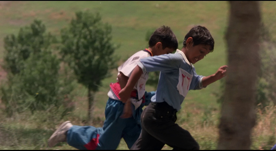
Movement here is utilitarian. It tracks. When the kids run, the camera runs usually handheld or on a rough dolly that transmits the vibration of the pavement. It keeps the energy high and the anxiety palpable.
Take the scene where Zara’s shoe falls into the drain. The camera tracks the floating shoe. Dead simple. No fancy jib arm, just a linear movement that screams helplessness. It uses the receding perspective of the gutter to visually communicate loss. These aren’t complex Steadicam sequences designed to show off the operator’s skill. They are humble movements. They feel like a breath, a pause, or a sudden burst of adrenaline, mirroring exactly what the kids are feeling.
Compositional Choices
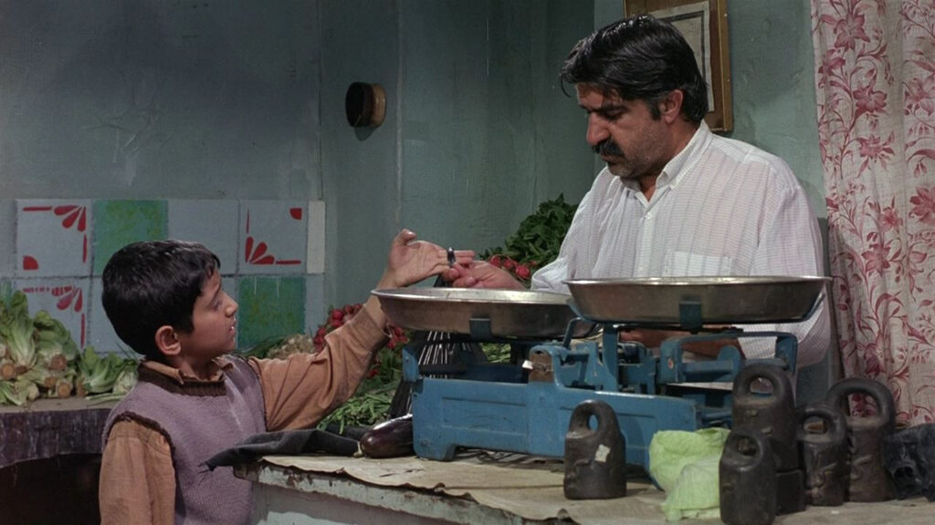
Framing in Children of Heaven is claustrophobic in the best way. Ali and Zara are often squeezed into the corners of the frame or dwarfed by negative space massive walls, crowded markets, and winding alleyways. It visually reinforces their lack of power in a world that ignores them.
I noticed a lot of “dirty” frames shooting through doorways, behind pillars, or using the geometry of the streets to isolate the characters. When Zara follows the girl wearing her lost shoes, the composition places her slightly behind, peeking from the edge. It feels voyeuristic. We aren’t just watching a movie; we’re conspiring with them. The framing is tight enough to catch the panic in their eyes, but wide enough to show the worn-out fabric of their clothes.
Lighting Style
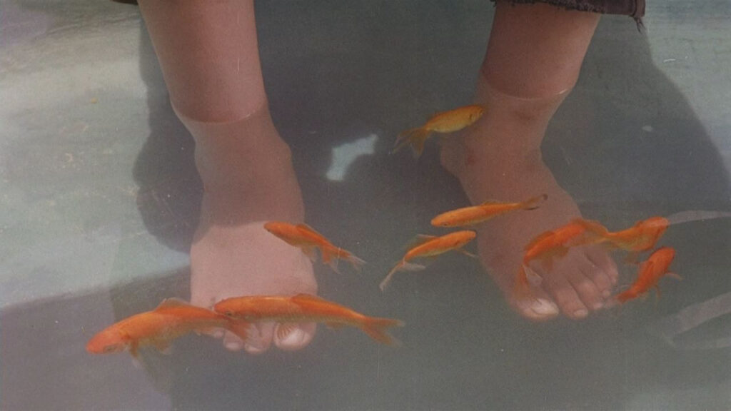
This is motivated lighting 101. No massive HMI setups outside just harsh, hard sunlight. You can see the deep, crunchy shadows on the streets. It’s high contrast, but it’s real. Indoors, it looks like they relied heavily on practicals and available window light. It’s dim. It falls off quickly.
As a colorist, I respect the decision to let the highlights blow out occasionally. The sky isn’t always perfectly retained with soft roll-off; sometimes it’s just hot. That’s what the midday sun looks like. The film embraces the dynamic range of the stock rather than fighting it. When Ali and Zara are scrubbing shoes by the pool, the sunlight hitting the bubbles creates specular highlights that clip in a way digital sensors still struggle to mimic naturally. It feels authentic because it isn’t perfectly balanced.
Lensing and Blocking
You can feel the prime lenses here. No lazy zoom creeps. It feels like they lived on a 35mm or 50mm for most of the film that standard field of view that mimics the human eye without distortion. It’s honest.
The use of wider lenses when filming at the child’s eye level makes the city feel massive, almost overwhelming. But the real genius is the blocking. Watch how the kids position themselves when they swap shoes. They are constantly physically obstructed by walls or corners, hiding their secret. It’s not just actors hitting marks; the blocking dictates the emotional stakes. Their physical proximity in the frame reinforces their bond they are almost always touching or leaning into each other, a united front against the world.
Color Grading Approach

From my grading suite, this film looks like a beautiful, unwashed print. It’s not “sepia” that’s an Instagram filter. This is the natural warmth of the film stock and the practical locations. The palette is starved of saturation, dominated by browns, beiges, and the dusty greys of Tehran streets.
Because the world is so desaturated, the few instances of color hit hard. Zara’s pink shoes, or the lush green of the rich family’s garden, pop significantly because the eye has been trained on earth tones for so long. Technically, the contrast shaping is gentle in the mid-tones but maintains that thick, photochemical density in the shadows that we try so hard to emulate with DCTLs today. The highlight roll-off is creamy, preserving detail without the harsh clip of digital video. It’s a lesson in restraint: don’t push the grade to look “cool,” just balance the density to feel true.
Technical Aspects & Tools
Released in ’97, this is undeniably 35mm. You can see the grain structure it’s alive. It’s likely a medium-speed stock, maybe a Kodak 500T for interiors given the texture, and a finer stock for exteriors. The forgiving latitude of film saved them here, handling the transition from dark interiors to bright exteriors without falling apart.
The camera package was likely a workhorse an Arri BL or similar. No gimbals, no drones. Just a tripod and a shoulder rig. And the sound design deserves a nod. It’s mono-focused and ambient. The scrape of shoes on concrete, the background chatter of the market it does more work than a heavy score ever could.
- Also read: MY FATHER AND MY SON (2005) – CINEMATOGRAPHY ANALYSIS
- Also read: THE MOUNTAIN II (2016) – CINEMATOGRAPHY ANALYSIS
Browse Our Cinematography Analysis Glossary
Explore directors, cinematographers, cameras, lenses, lighting styles, genres, and the visual techniques that shape iconic films.
Explore Glossary →