Clint Eastwood’s 2008 Changeling is one that really sticks with you, and honestly, a lot of that comes down to a visual strategy that is remarkably disciplined. It’s a harrowing story about a mother’s search for her son against the backdrop of a rotting, systemic corruption, and the visuals don’t just “show” the 1920s they make you feel the weight of them.
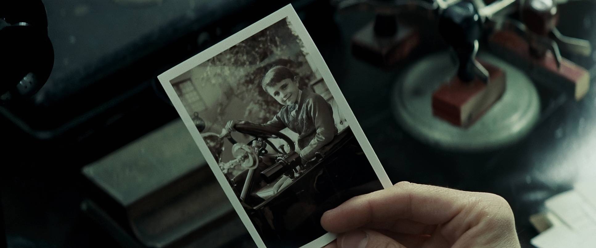
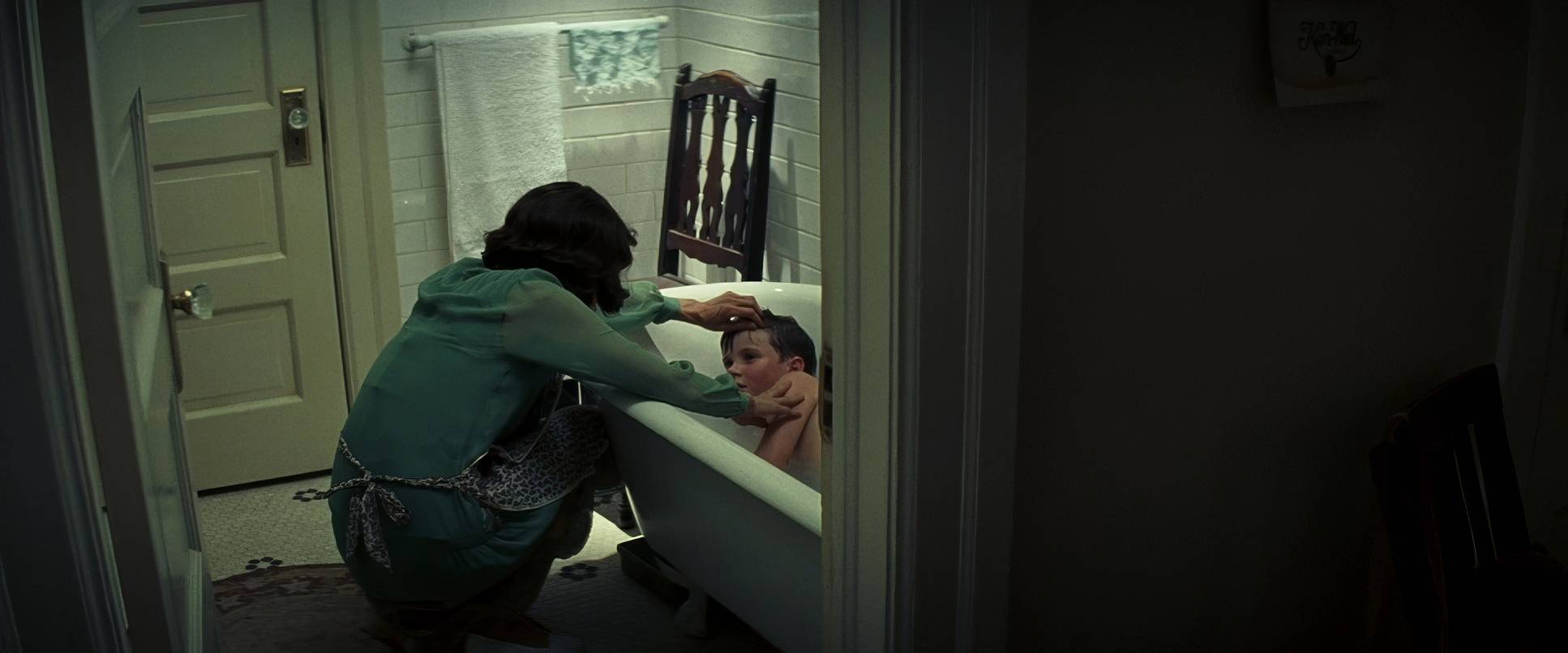
When I first sat down with Changeling, I wasn’t just watching the plot; I was watching the atmosphere. The story of Christine Collins and her battle with the LAPD in 1928 Los Angeles is heartbreakingly powerful, but what’s brilliant is how the film avoids the “shiny” nostalgia of most period pieces. I’ve heard people say this movie completely blew them away, and I get why. While Angelina Jolie’s Oscar-nominated performance is the anchor, it’s the way the camera perceives her the subtle shifts in density and the restrictive color palette that turns a historical drama into something visceral. My goal here is to look at how DP Tom Stern used a very specific toolkit to move us from initial hope into a suffocating institutional darkness.
About the Cinematographer

You can’t really analyze this look without talking about the shorthand between Clint Eastwood and Tom Stern. They are legendary for working fast often without storyboards relying on a “gut-instinct” workflow that I personally find fascinating. In an industry that often over-thinks every frame, Stern brings a raw, organic quality to his work.
His signature style usually leans toward a gritty, desaturated palette with heavy shadows. Some might call it stark, but for a colorist, it’s a masterclass in using “thickness” in the image. For Changeling, his approach feels like a natural extension of the late 1920s. He isn’t imposing a style; he’s stripping away the artifice to let the period’s inherent harshness bleed through. It’s lean, unsentimental cinematography that perfectly matches Eastwood’s directing style.
Inspiration Behind the Cinematography

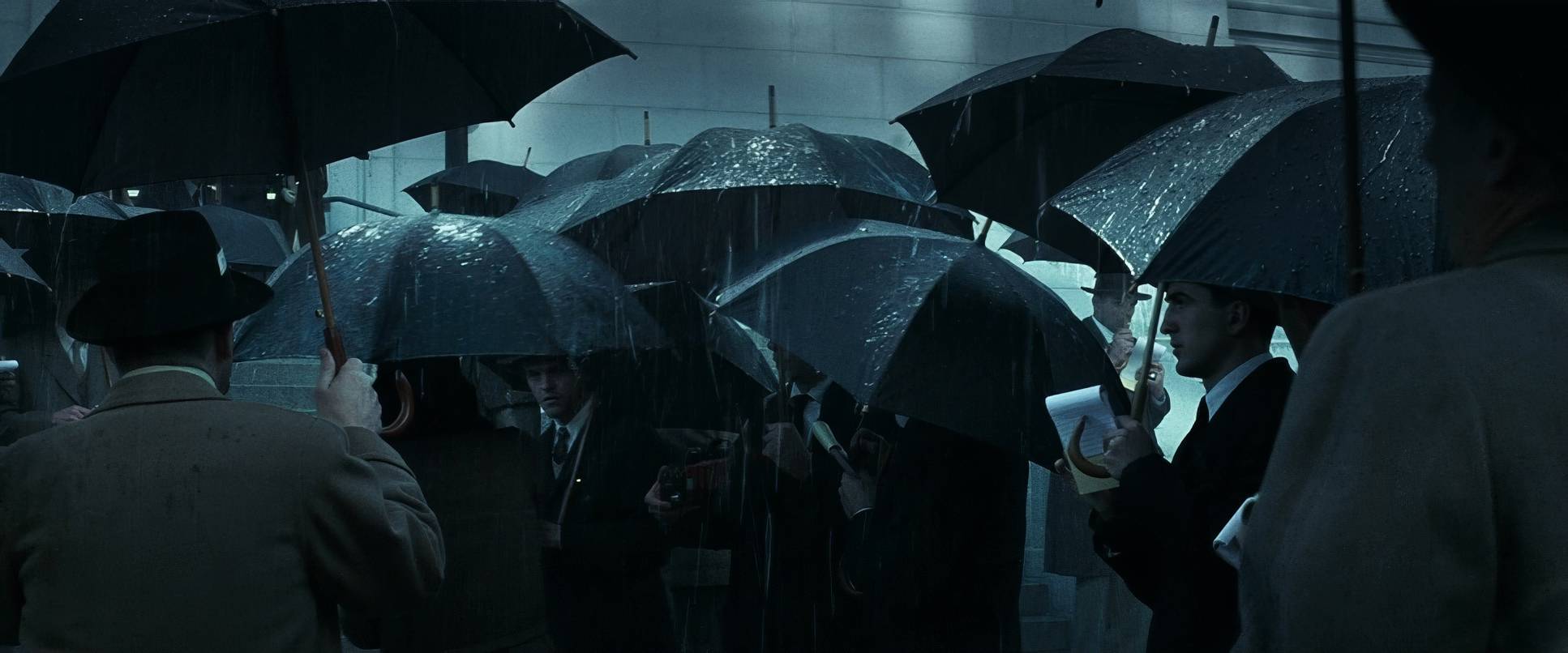
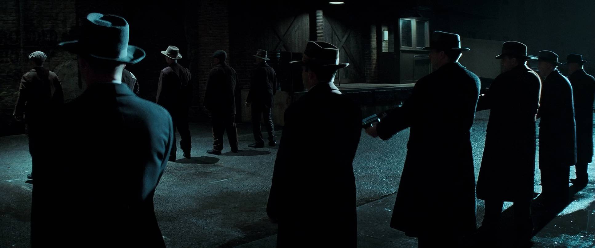
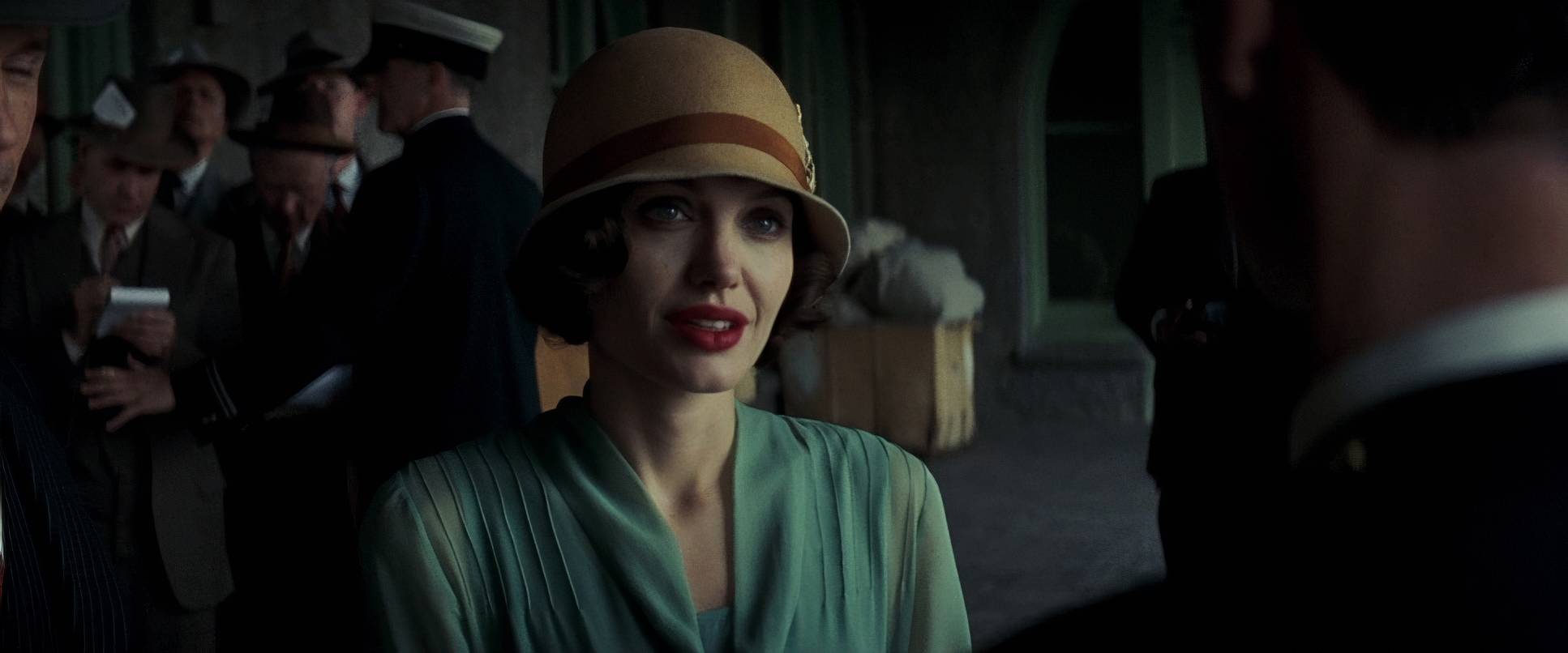
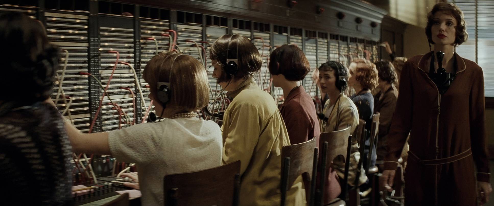
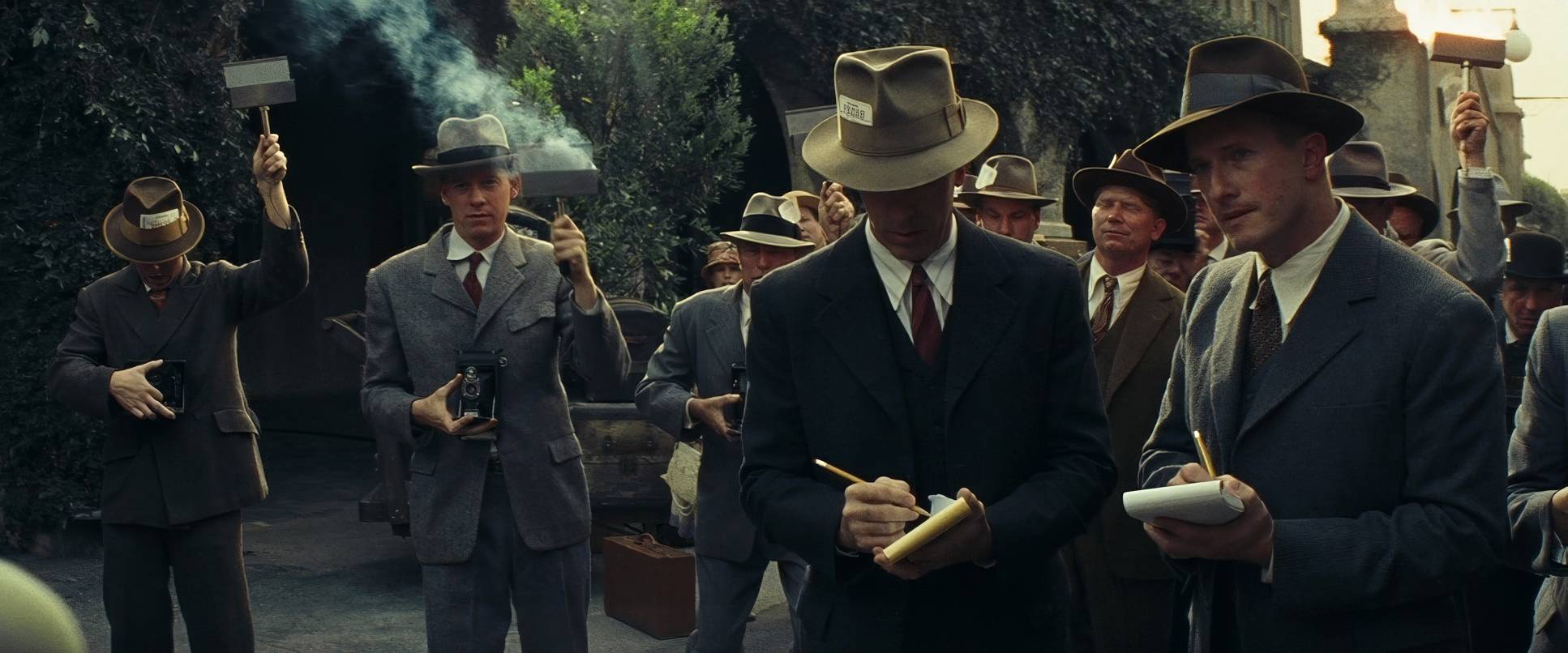
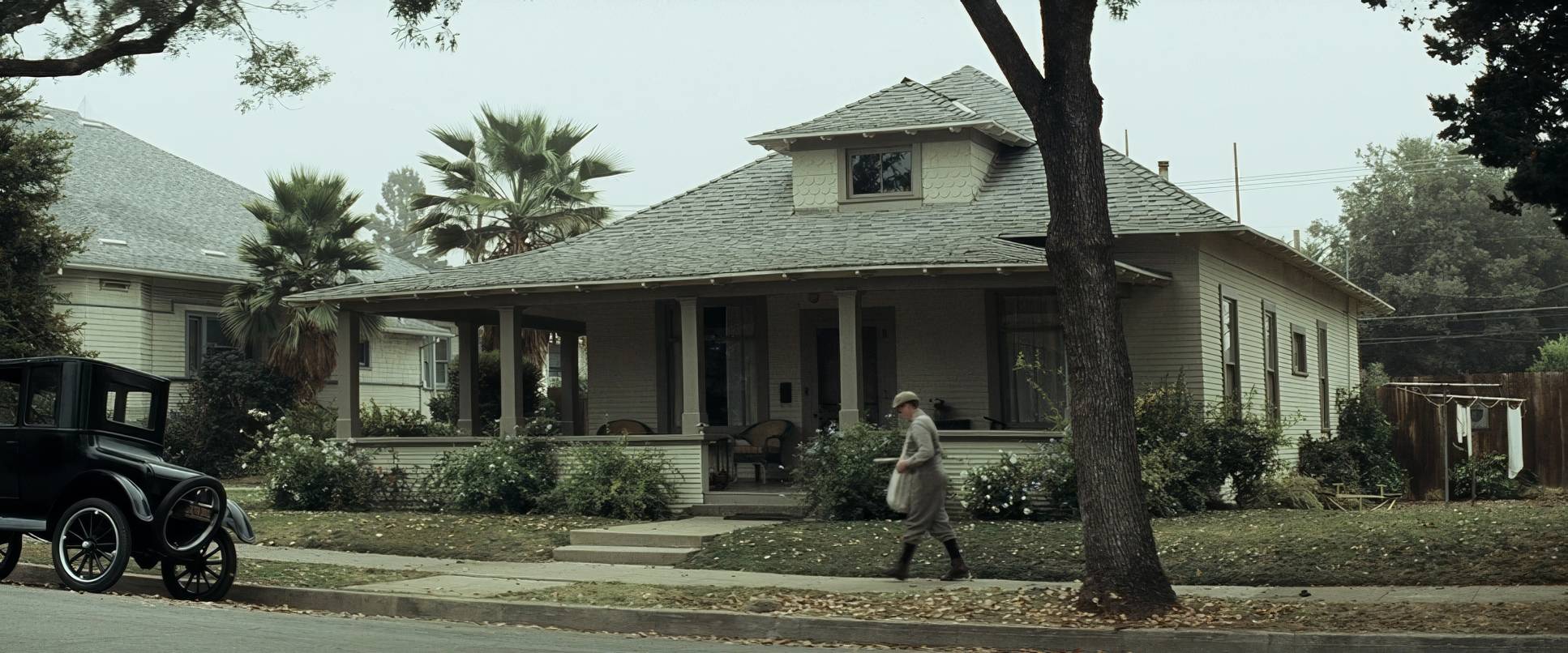
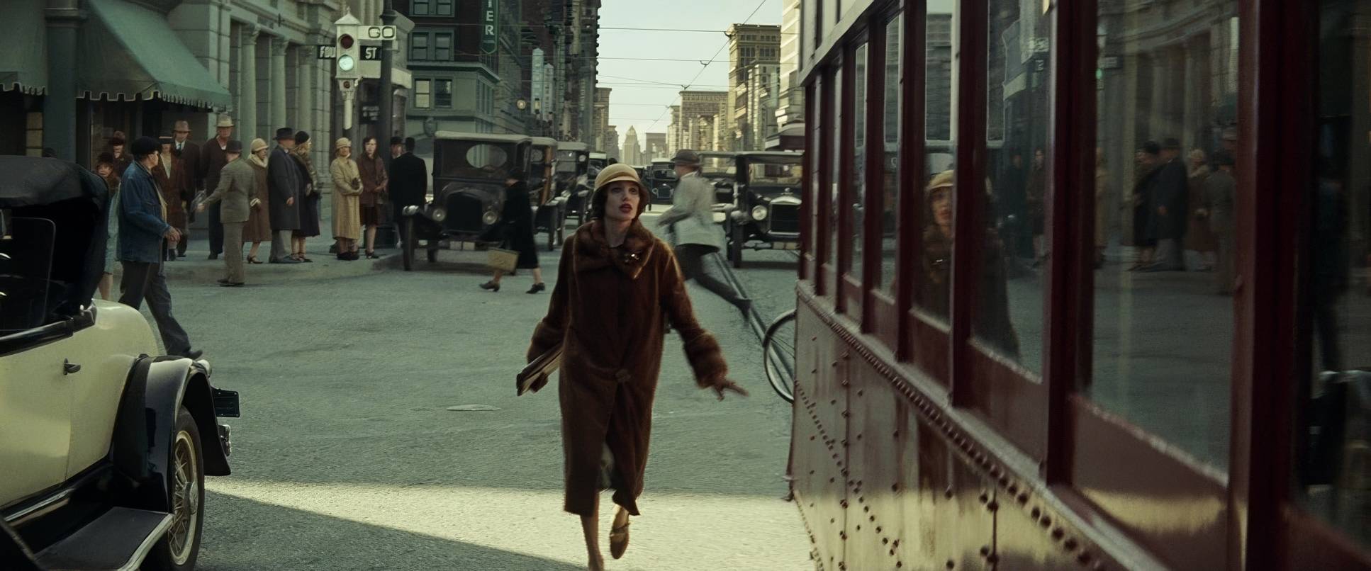
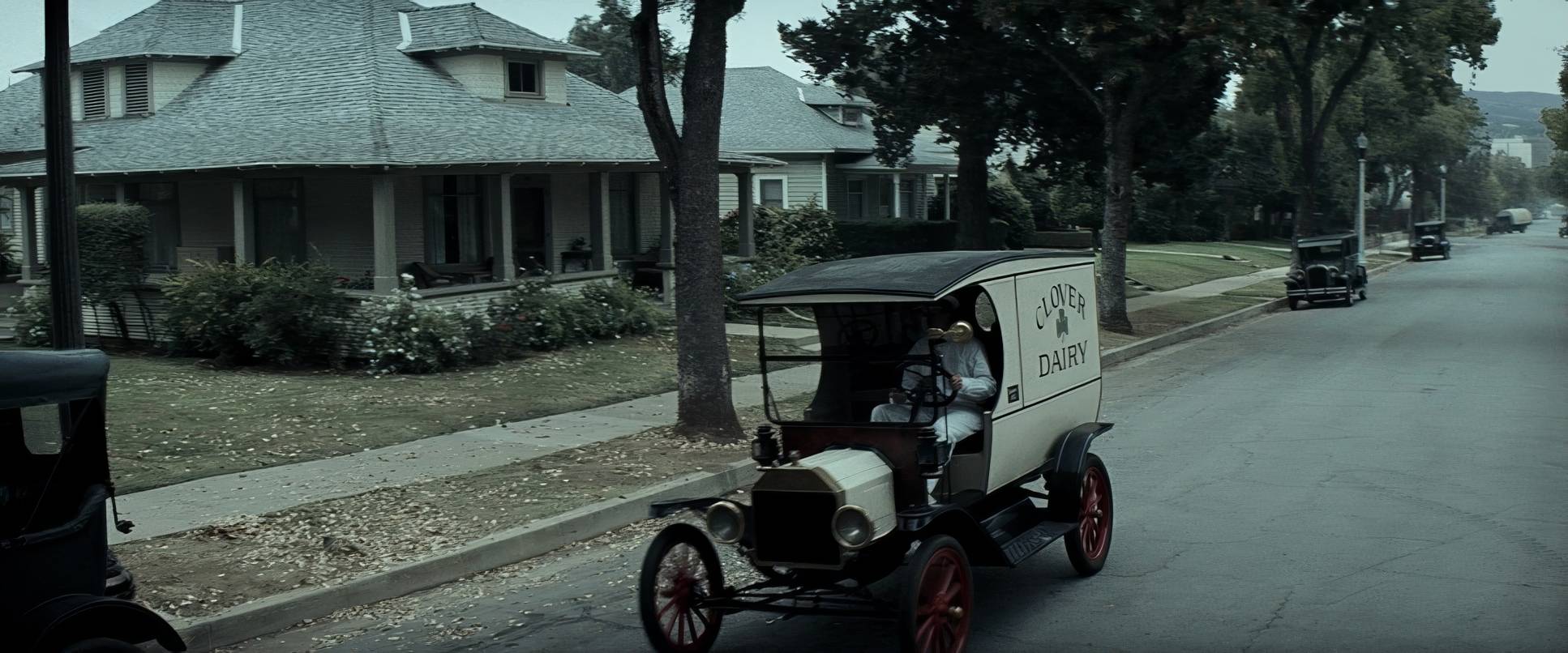
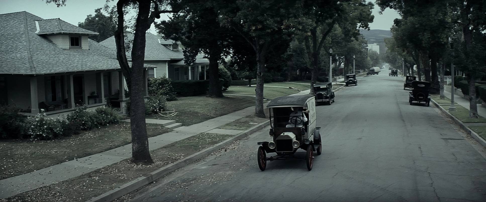
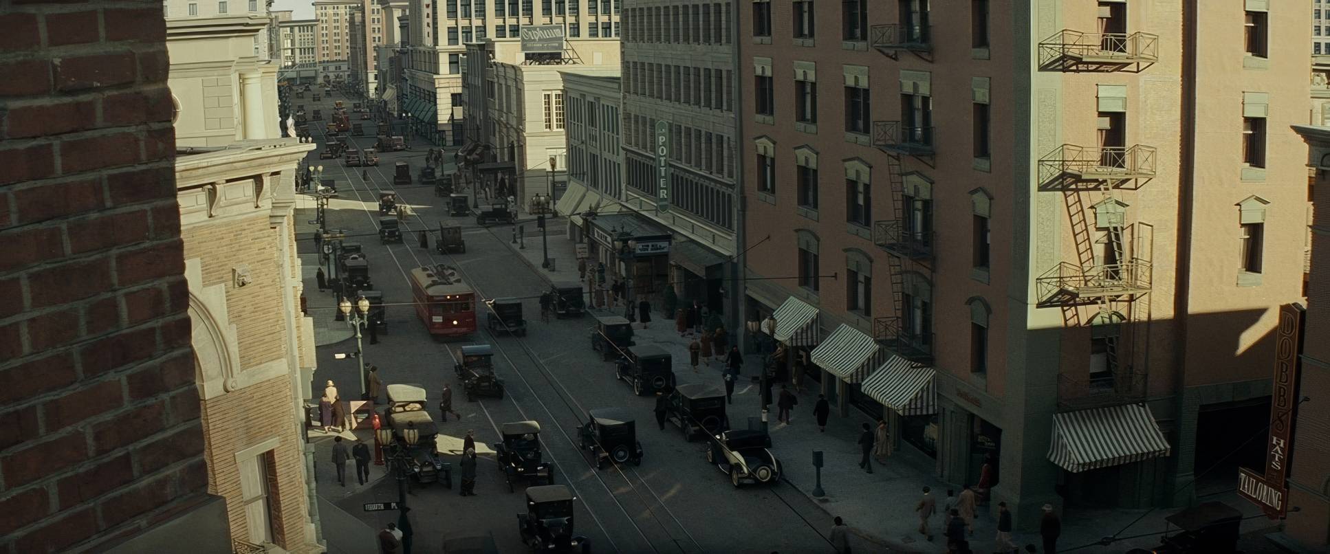
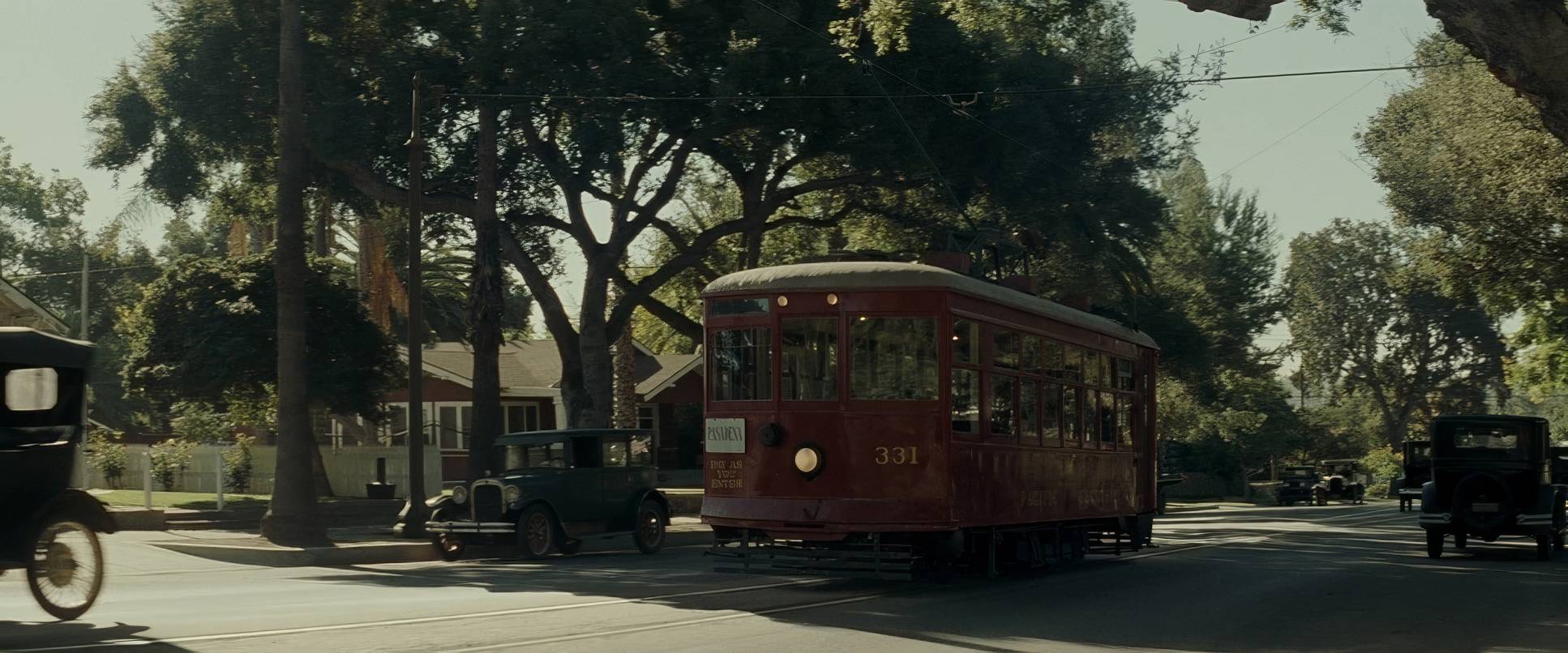
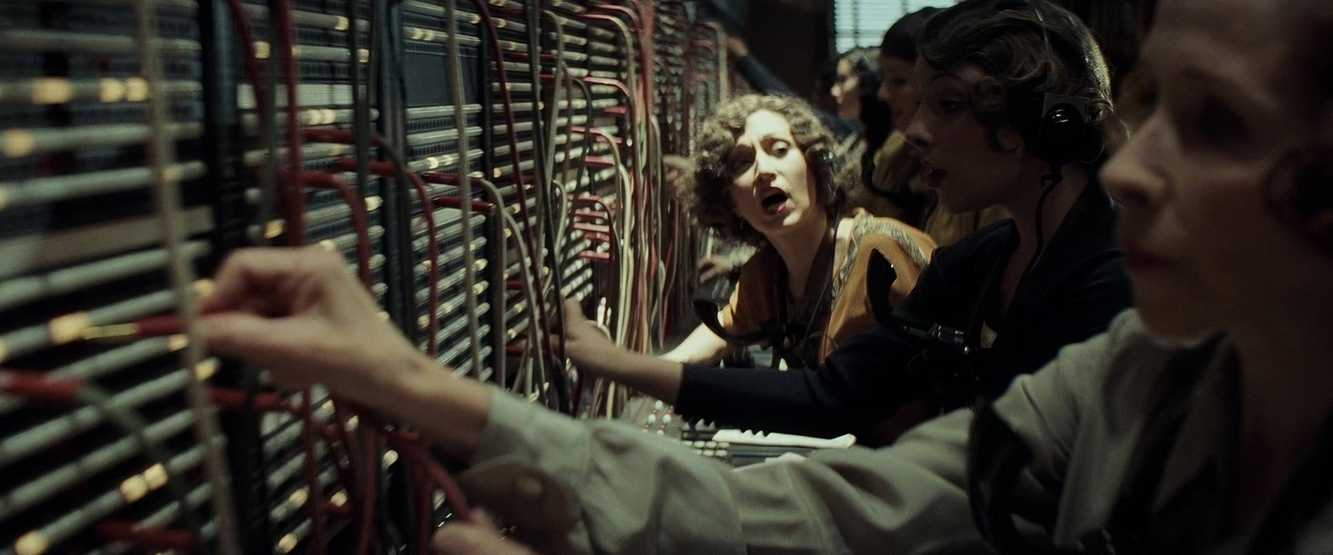
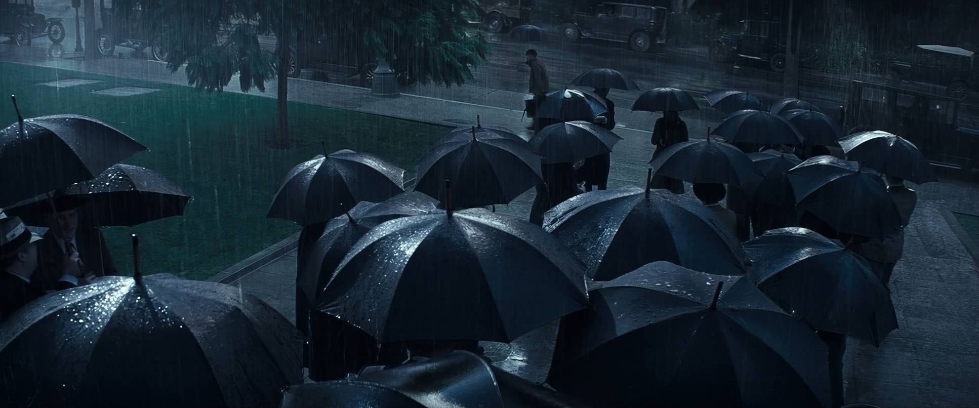
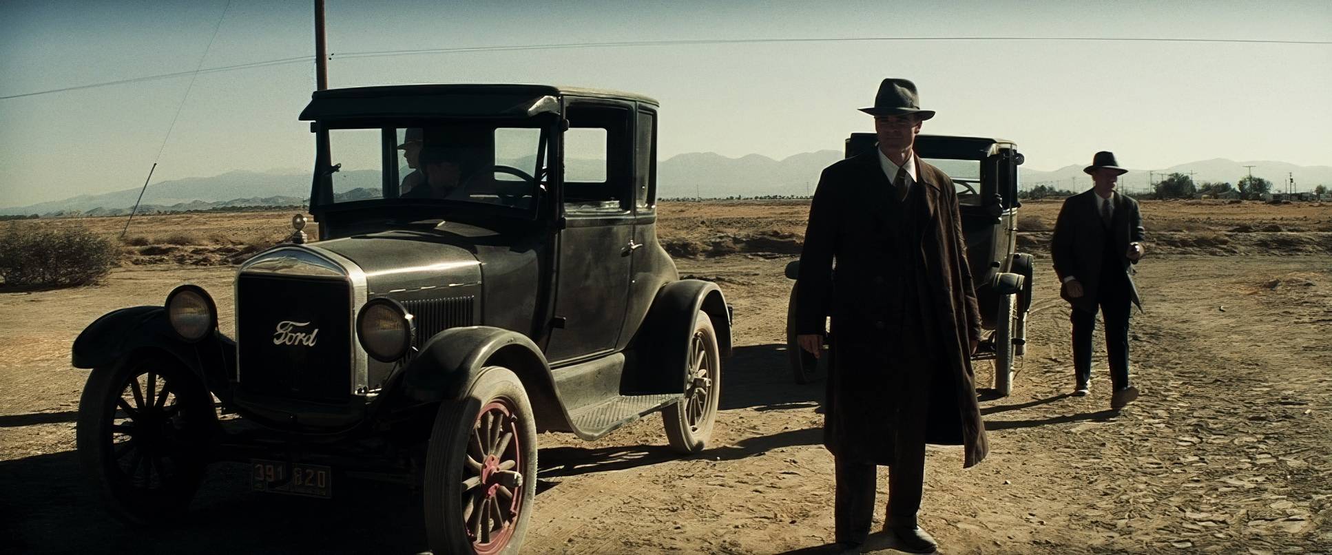
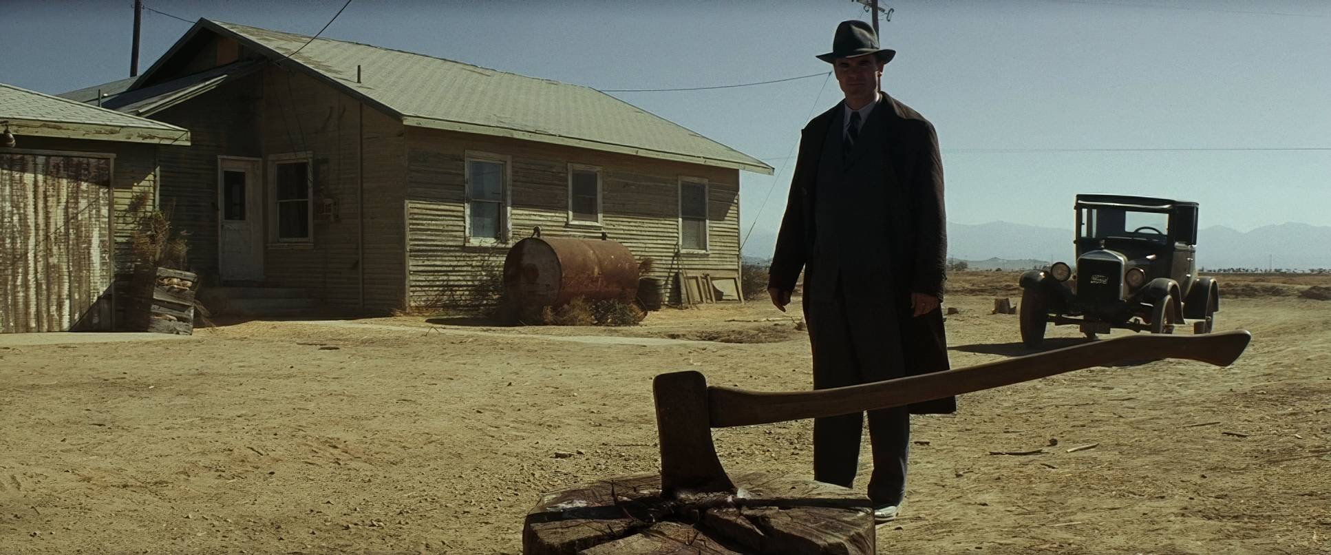
The primary inspiration here is clearly 1920s Los Angeles, but not the glamorous Hollywood version. This is the city of the rapid-growth era, simmering with corruption. I see massive echoes of Depression-era photography that unflinching, stark realism. There’s also a heavy dose of film noir, particularly in how light is used to suggest that the “competent” institutions of the city are actually hiding a deep moral rot.
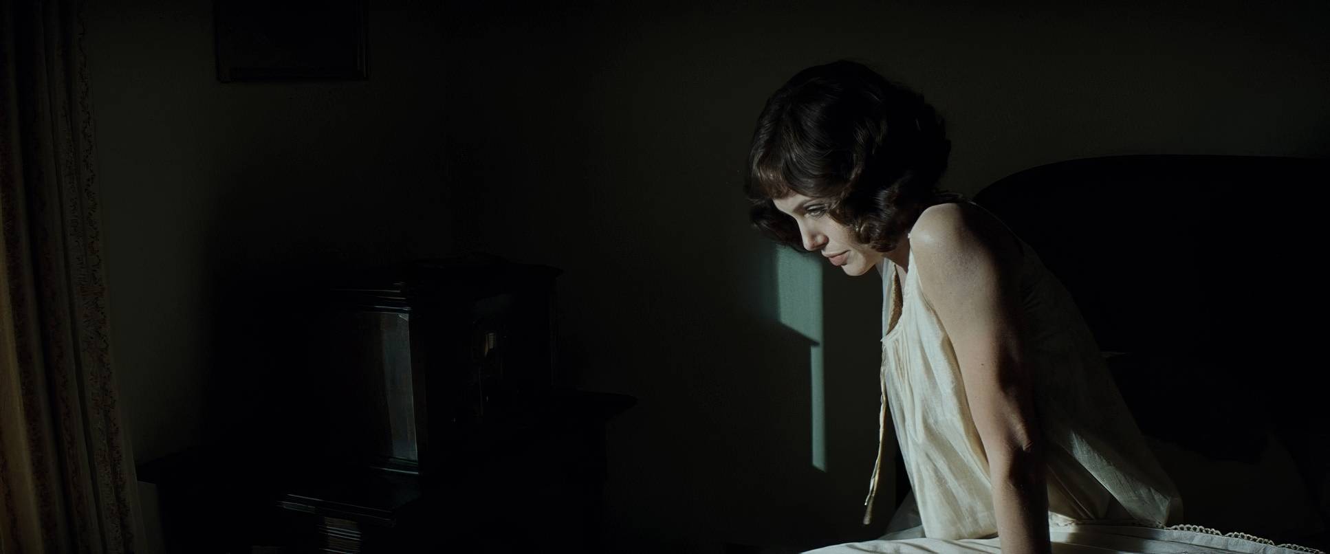
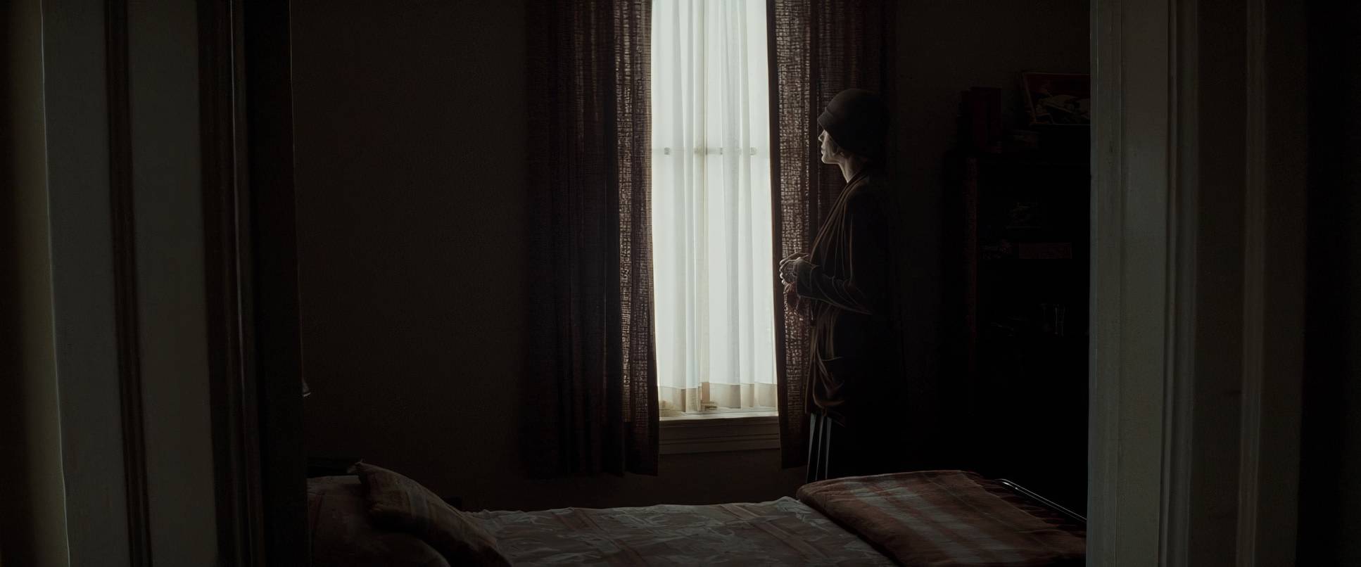
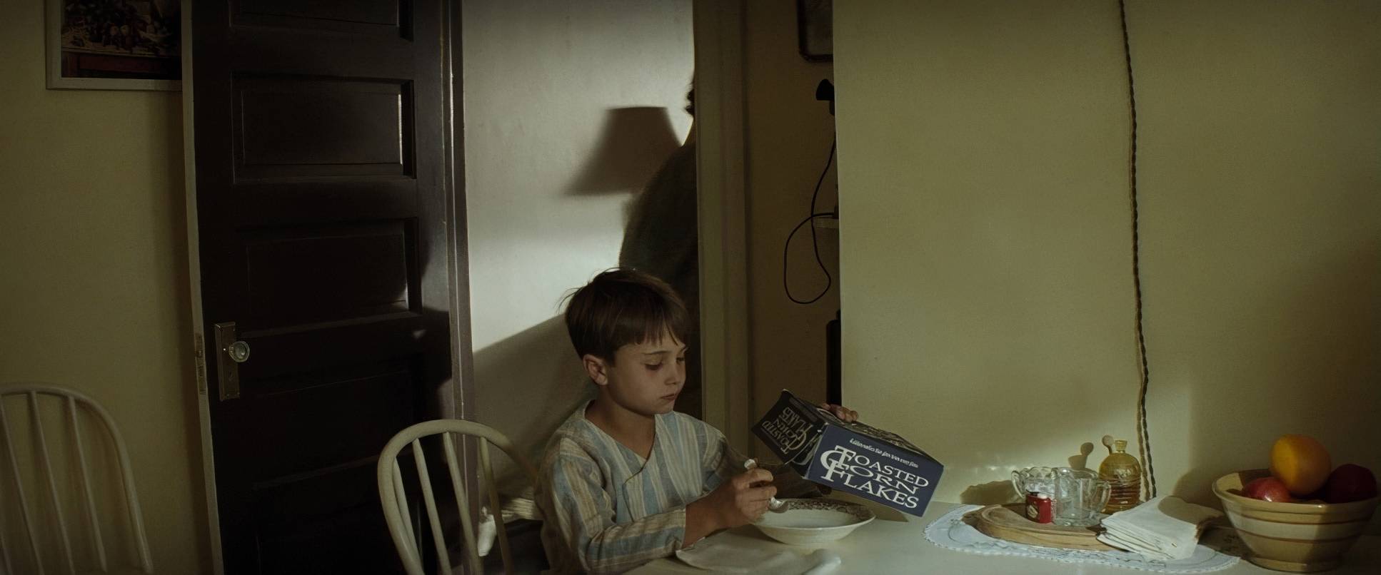
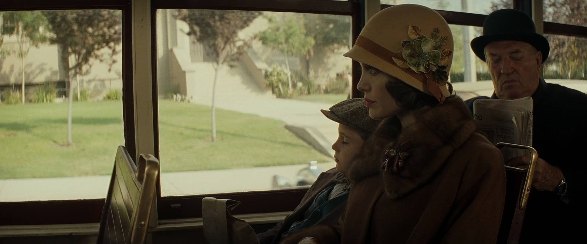
The overall feeling is that of a city under a cloud. Even in the “happier” early scenes with Christine and Walter, there’s a restraint. It isn’t “pretty.” It feels like stepping into a weathered, hand-tinted photograph where the textures of the walls and the weight of the coats tell as much of the story as the dialogue.
Camera Movements

Eastwood and Stern aren’t fans of flamboyant camera work, and I love the discipline of that. The camera in Changeling is a restrained observer. We aren’t getting dizzying Steadicam work or flashy crane shots; instead, we get purposeful stillness. This minimalism forces you to sit with Christine in her isolation.
When the camera does move, it’s never for the sake of movement. It’s a slow, deliberate push-in to punctuate a moment of horror, or a subtle dolly that makes Christine look small against the sterile, towering backdrops of the police station. It feels like a real-life event unfolding in real-time, mainly because the camera doesn’t try to “perform” for the audience.
Compositional Choices

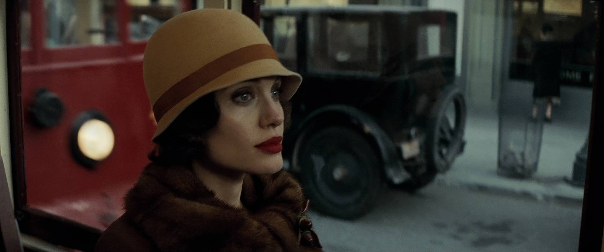
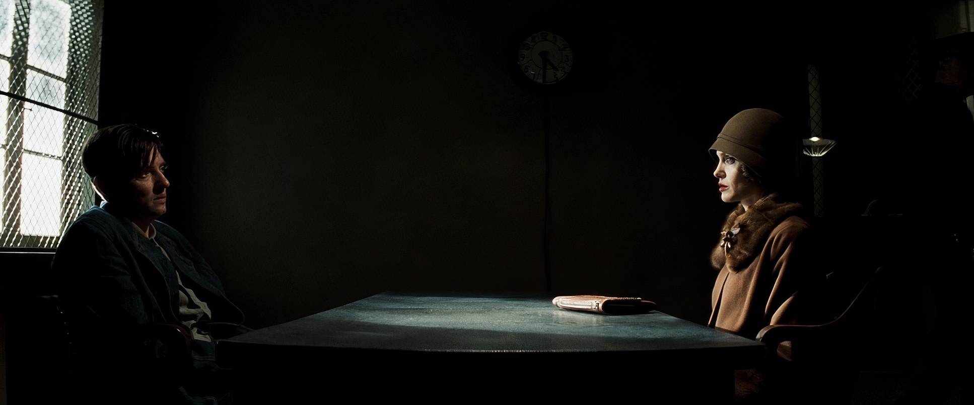
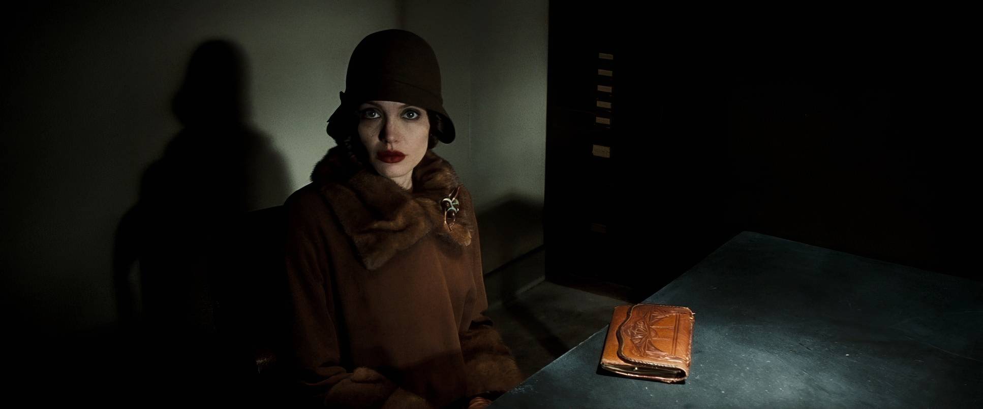
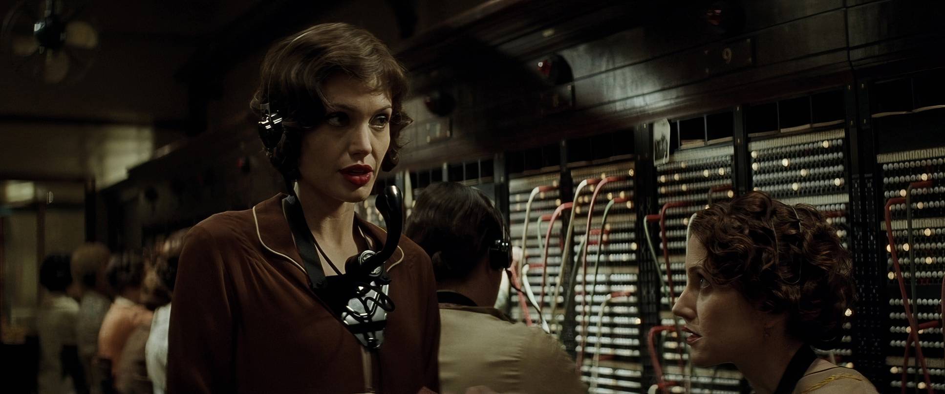
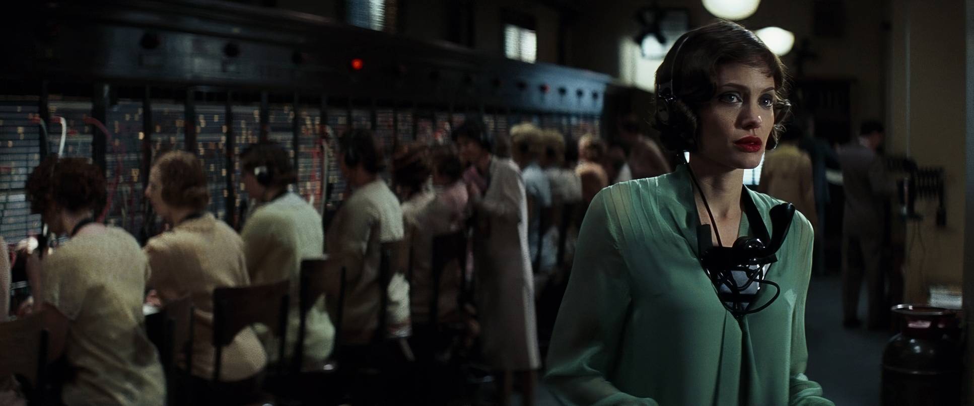
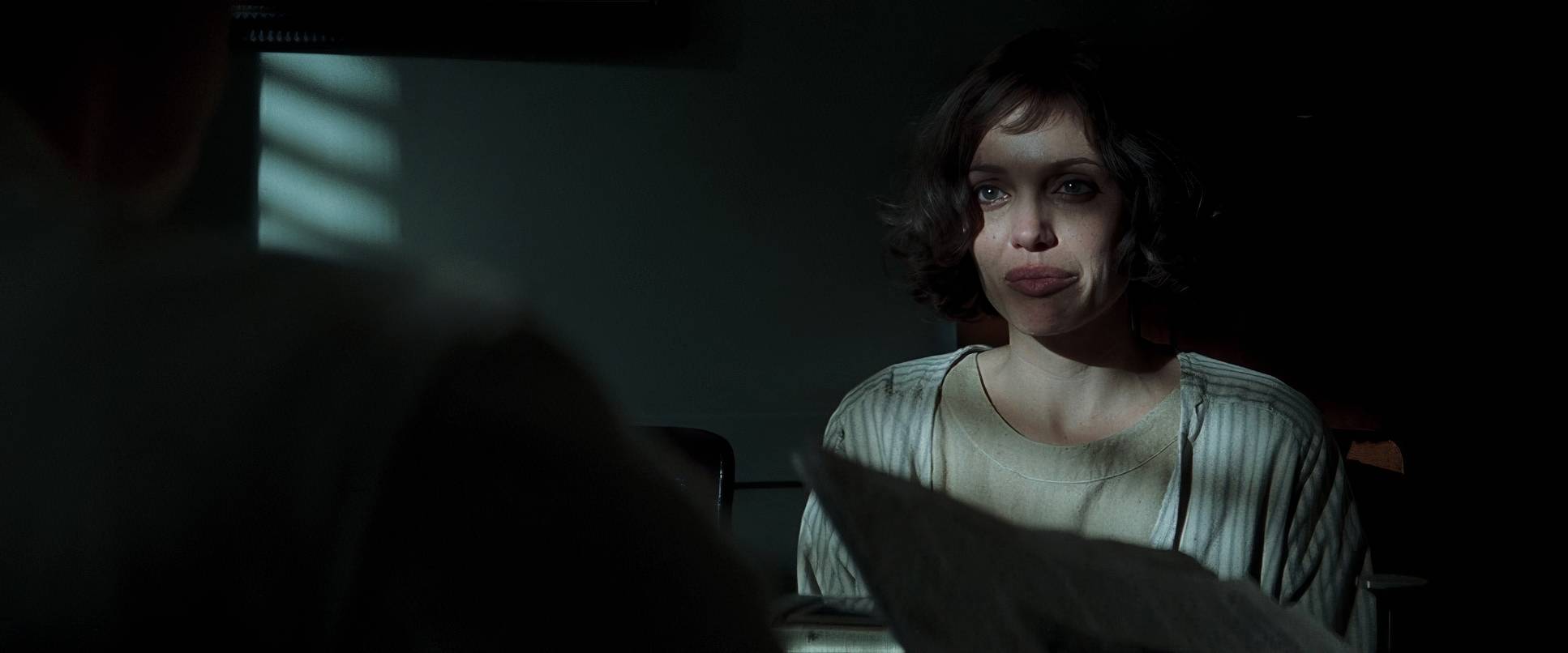
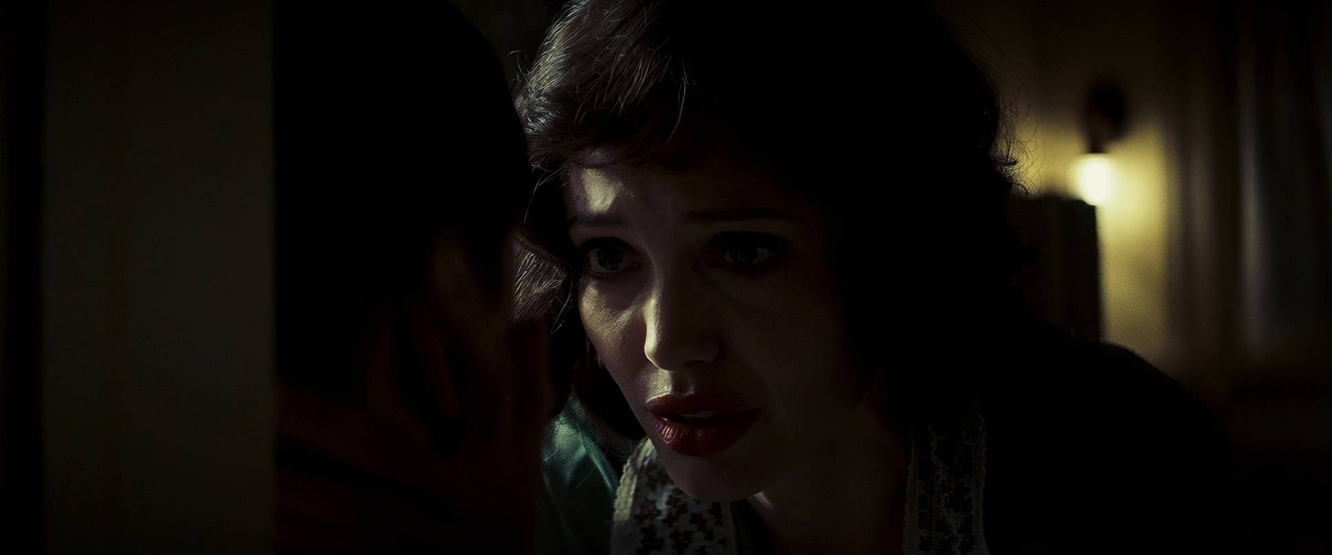
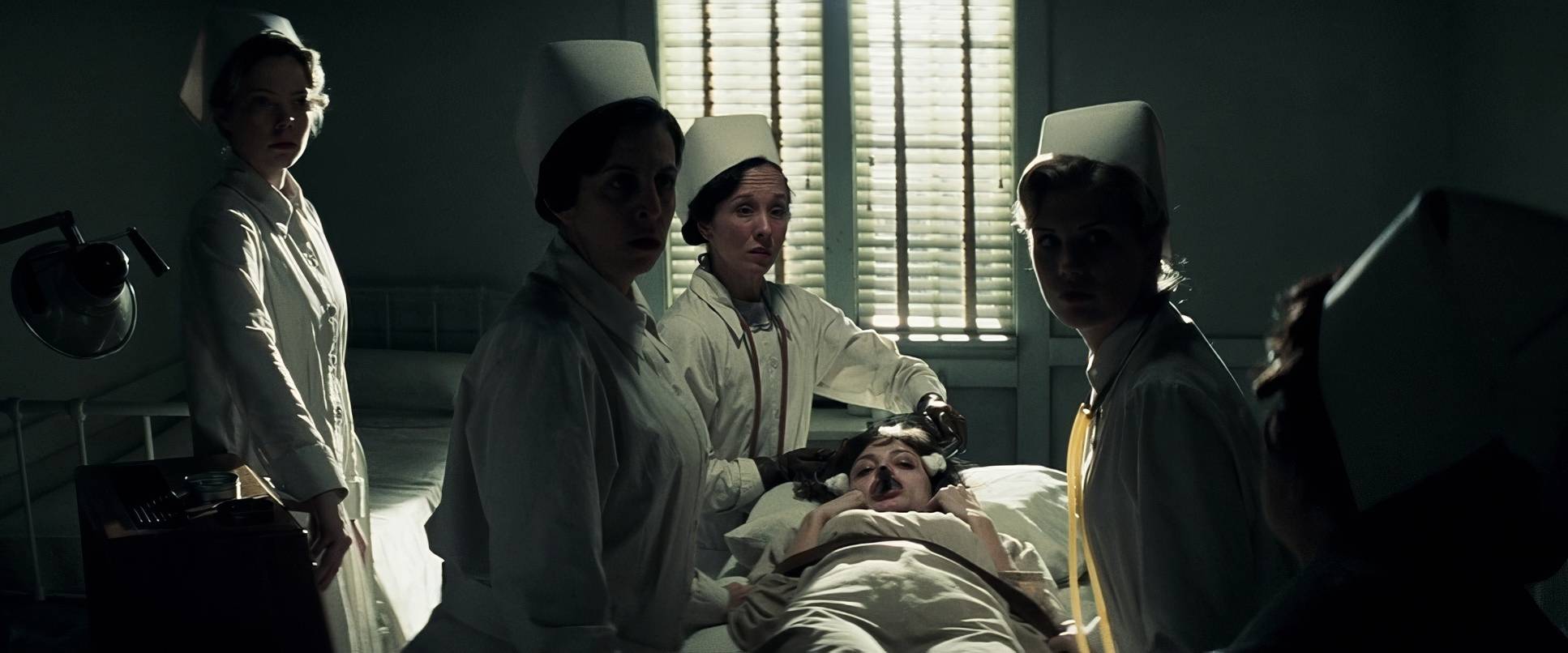
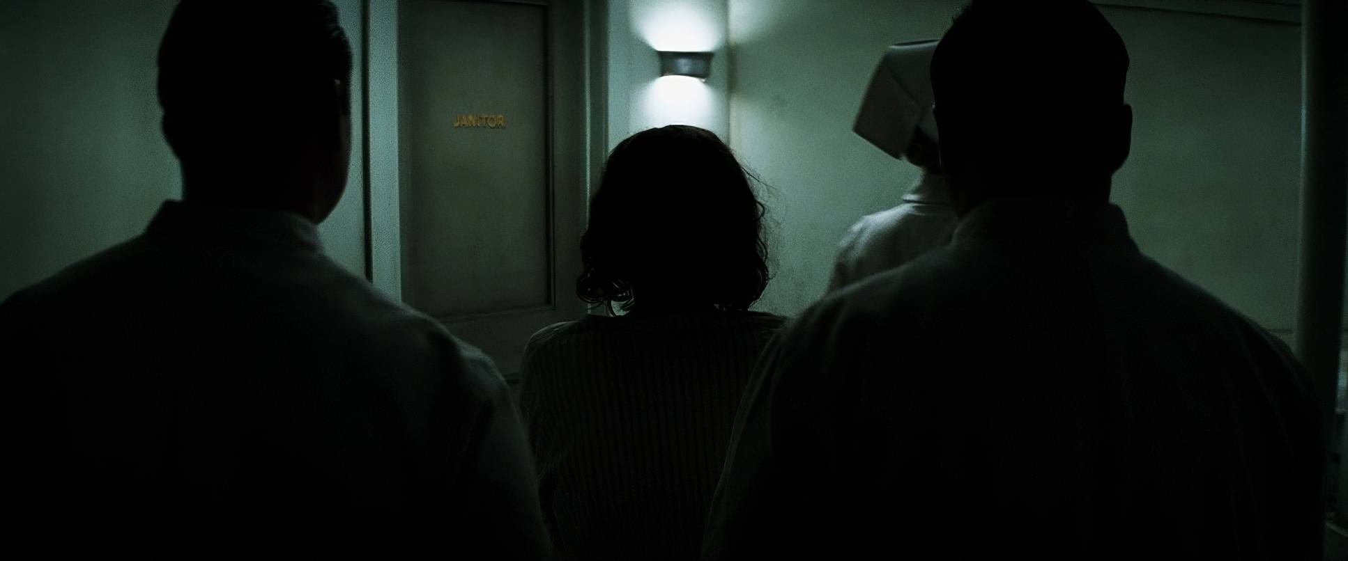
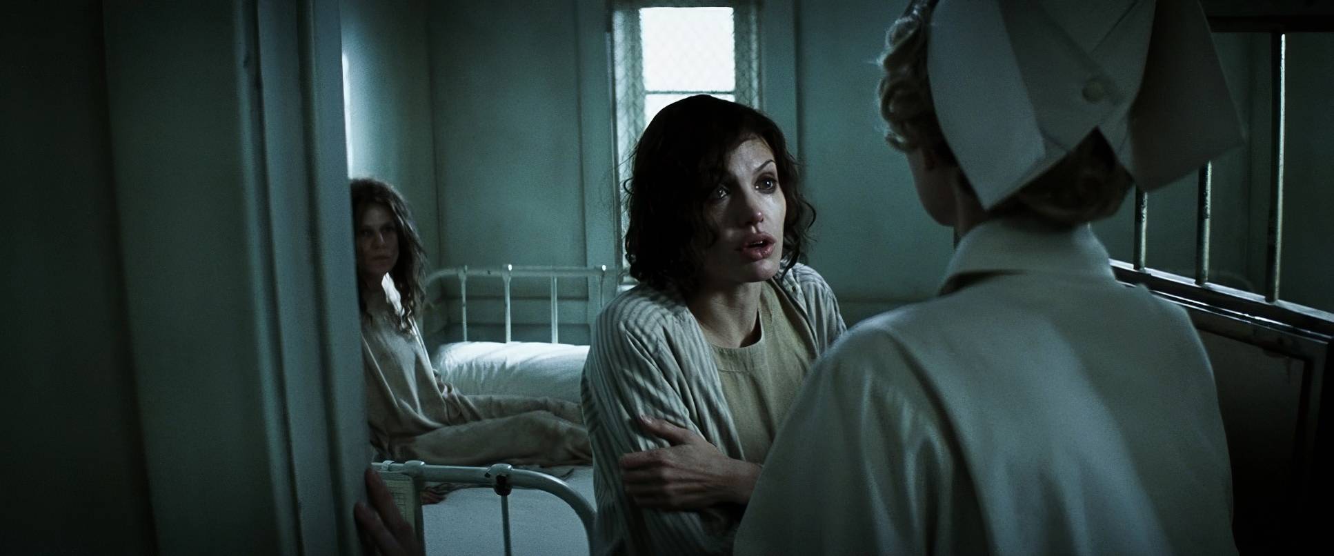
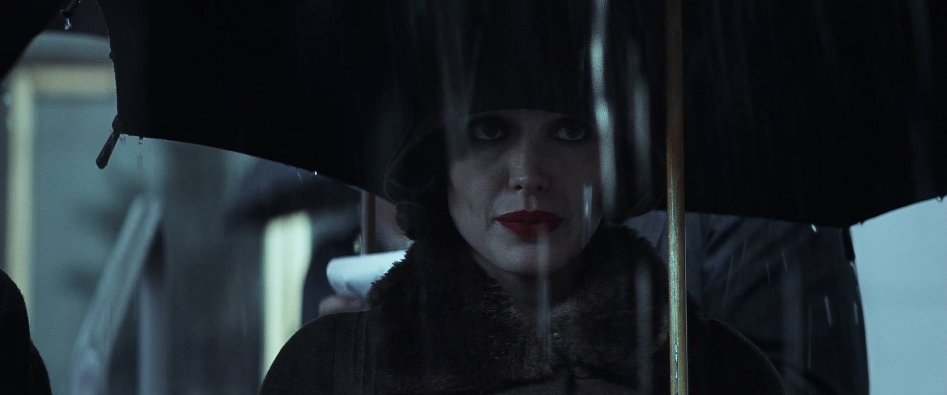
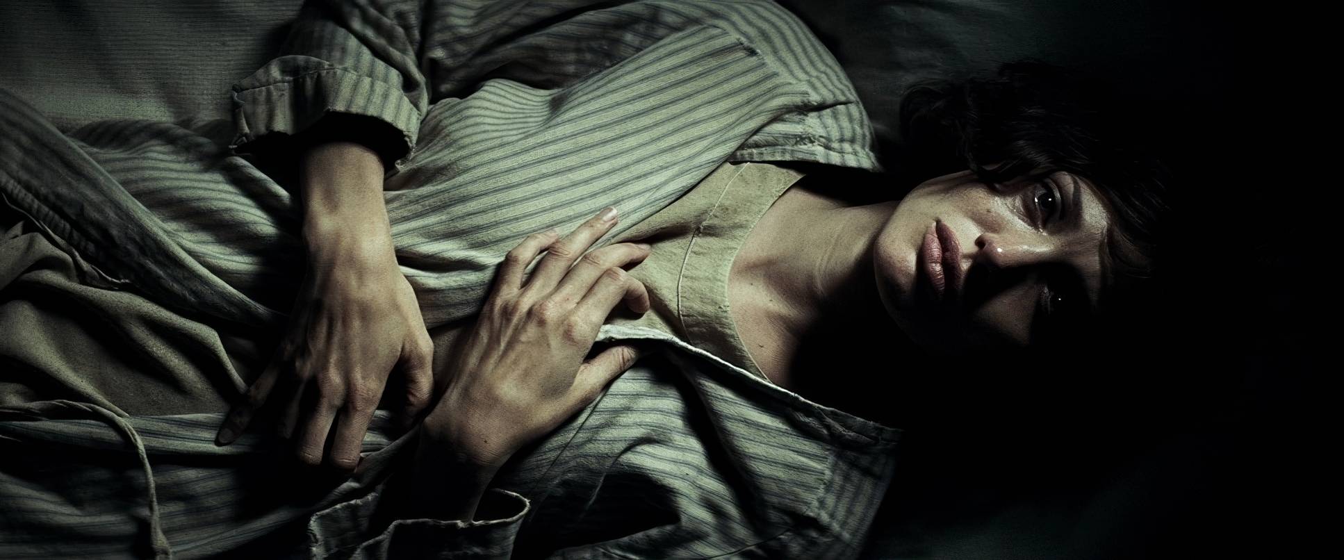
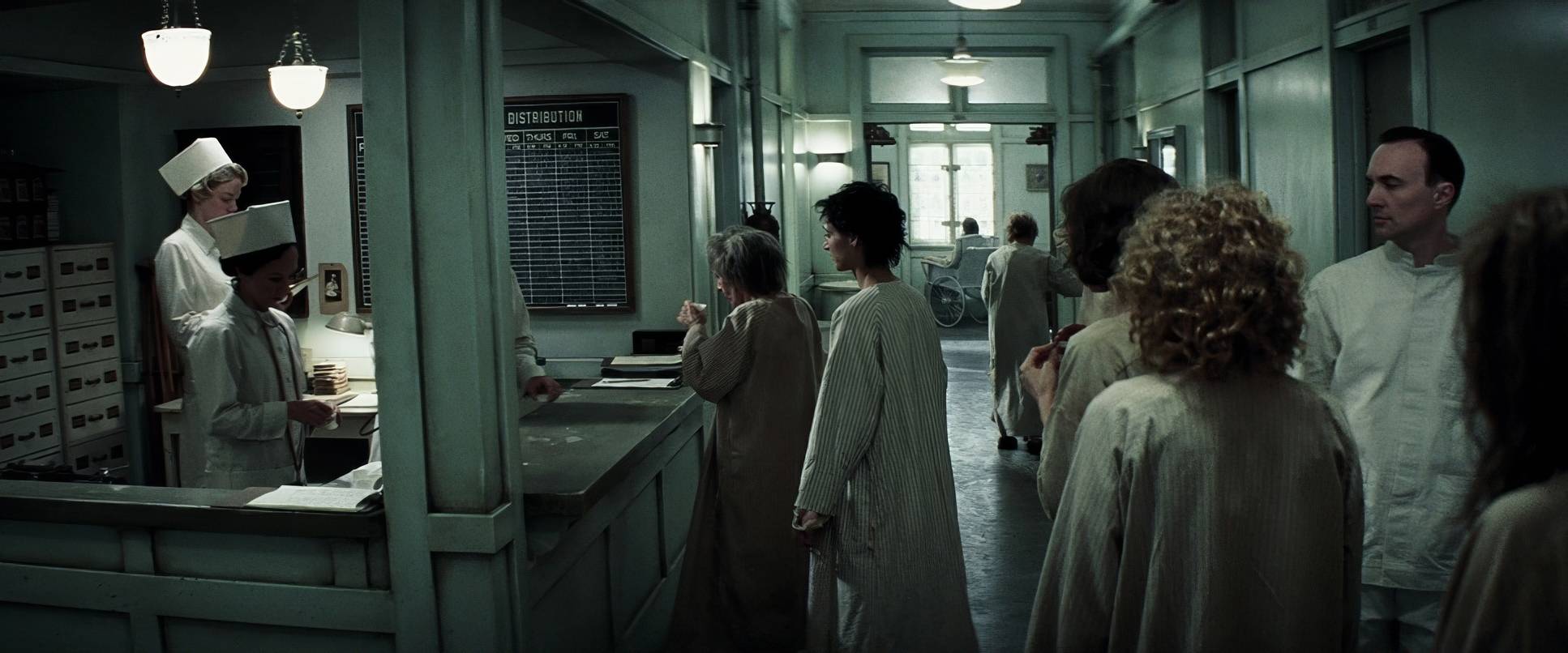
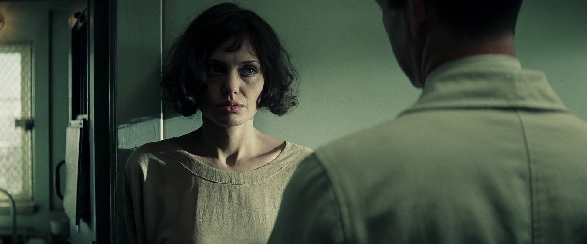
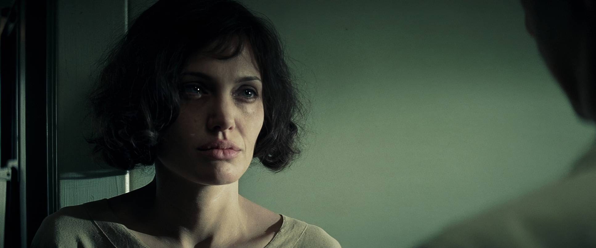
The framing here is all about power dynamics. Stern frequently frames Christine alone in the shot, often dwarfed by the imposing architecture of the psychiatric ward or the LAPD corridors. This use of negative space is a classic way to externalize her internal state she is quite literally being swallowed by the frame.
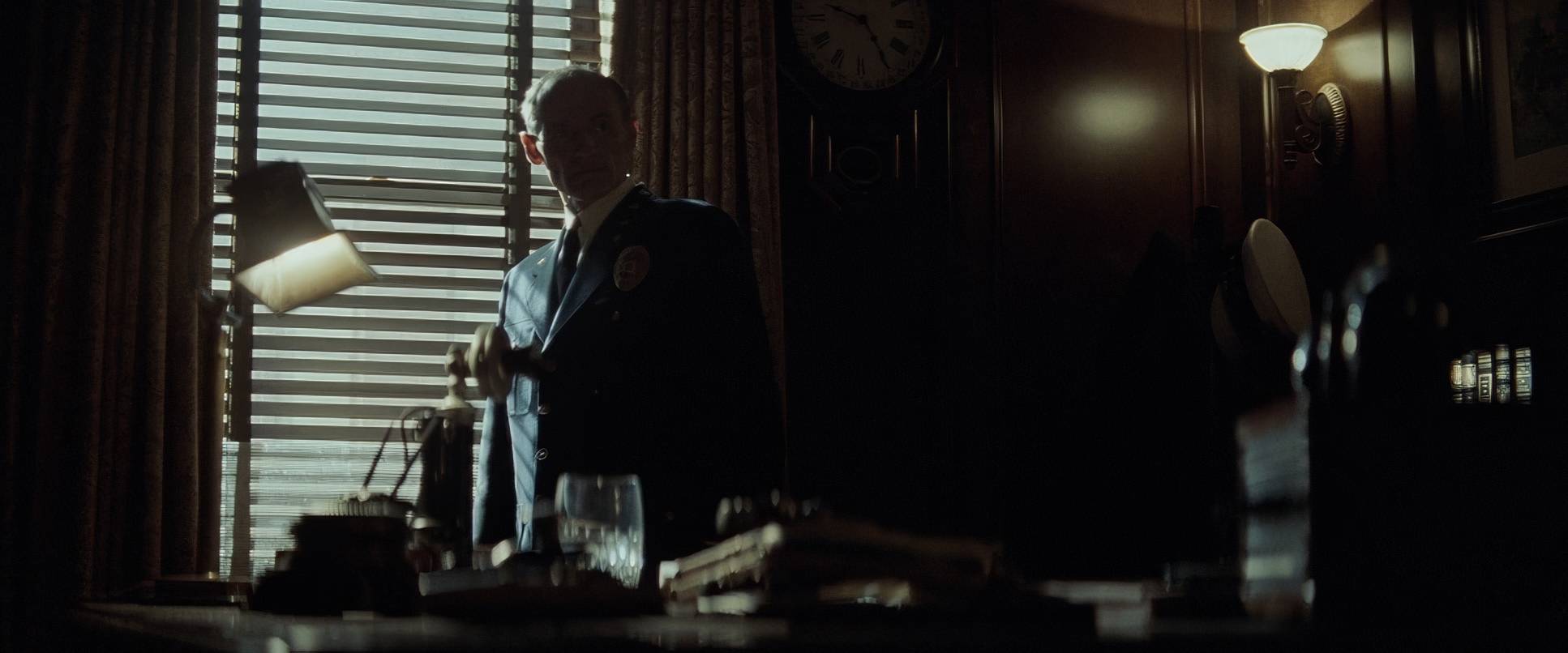
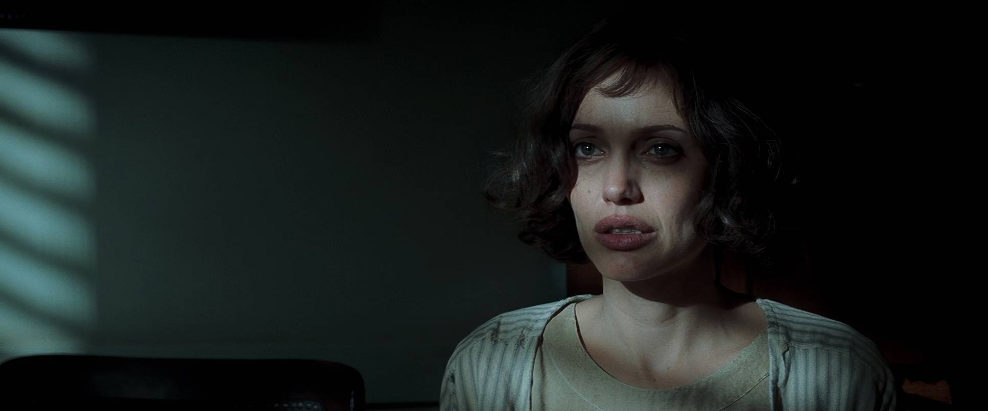
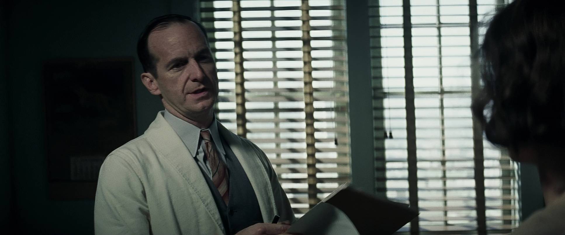
We also see some very specific height choices. Authority figures like Captain Jones are often shot from slightly low angles to make them feel dominant and unmovable. Christine, conversely, is often shot from neutral or slightly high angles when she’s being gaslit, subtly diminishing her presence. It’s never just about a balanced frame; it’s about illustrating a lopsided fight against an overwhelming force.
Lighting Style

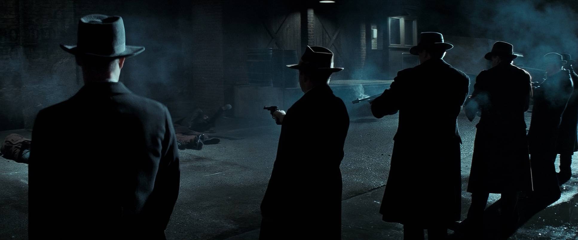
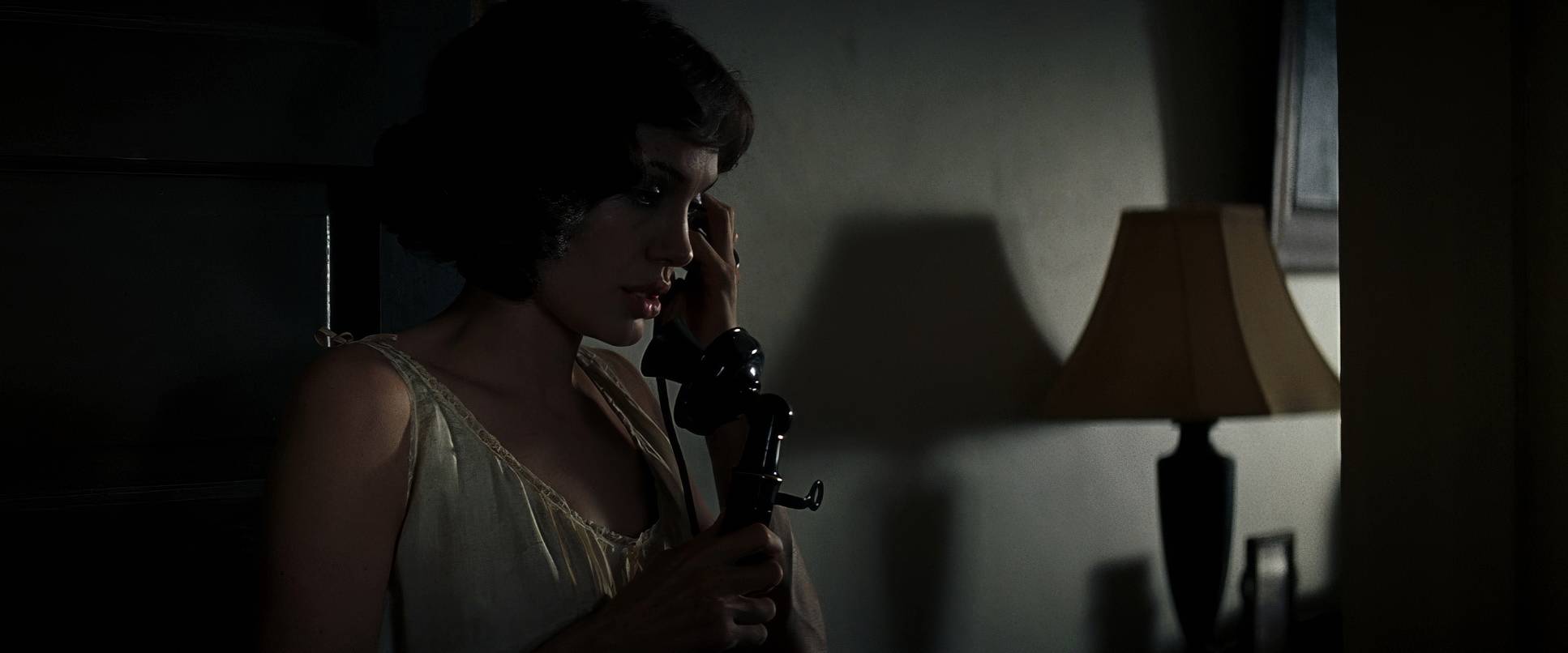
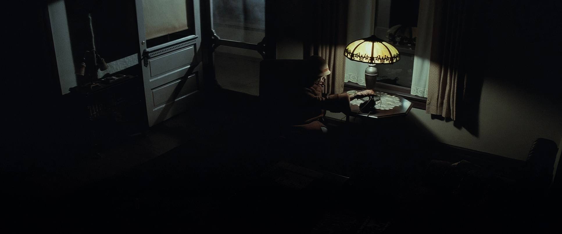
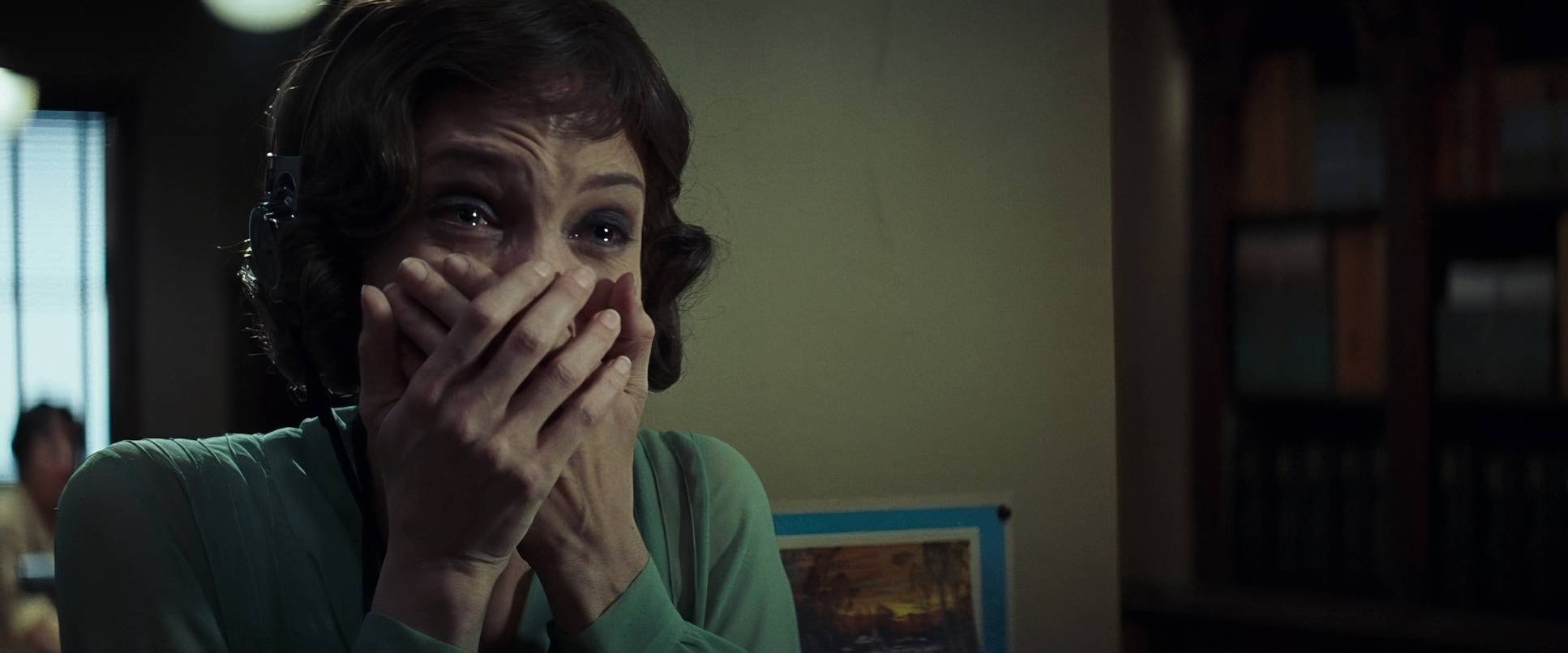
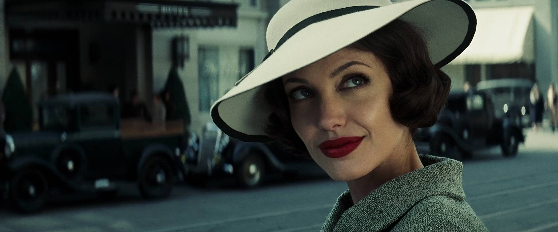
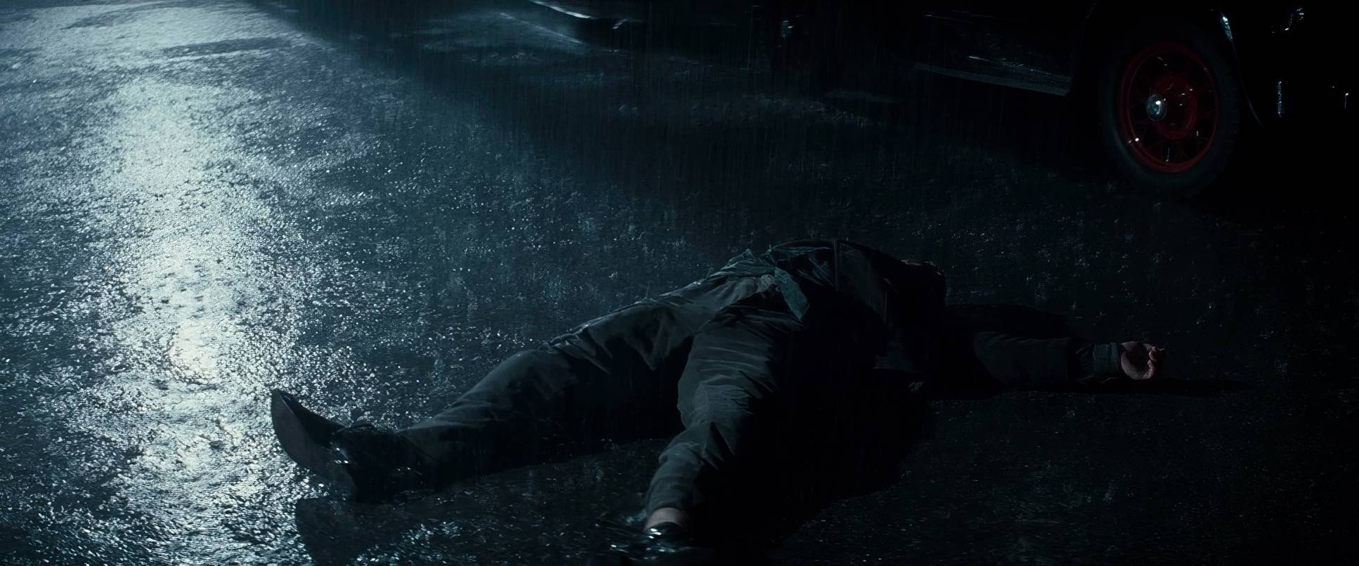
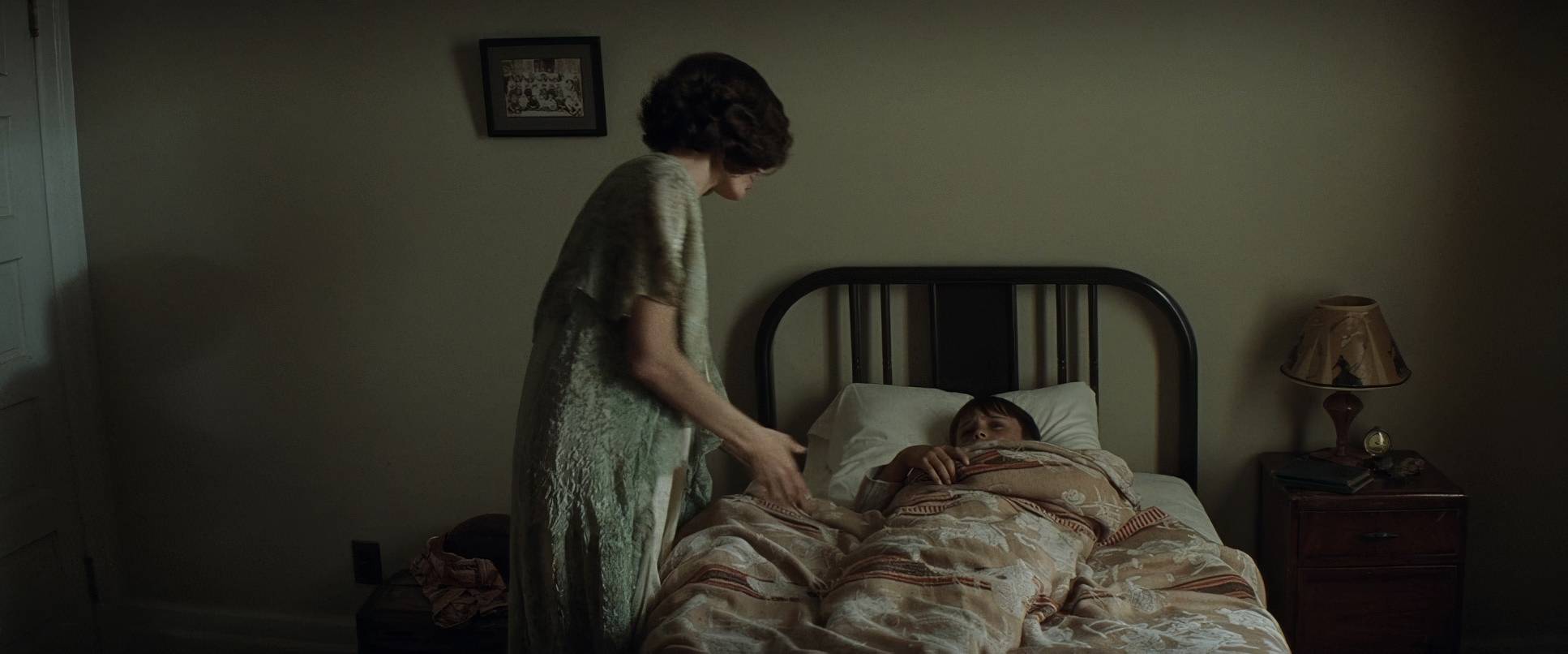
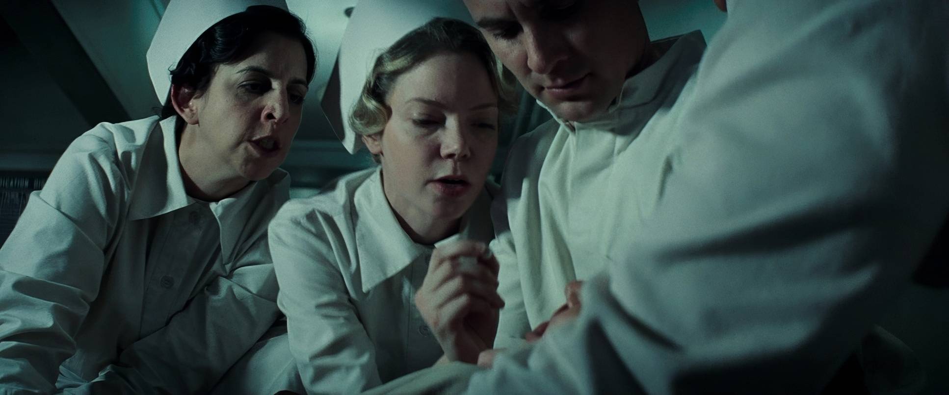
This is where the film gets technically interesting. While some might see “deep shadows,” the actual lighting strategy is a masterclass in soft light and low contrast. Most of the film feels like it was shot under an overcast sky or with large, soft sources, but the density in the shadows is what gives it that noir “kick.”
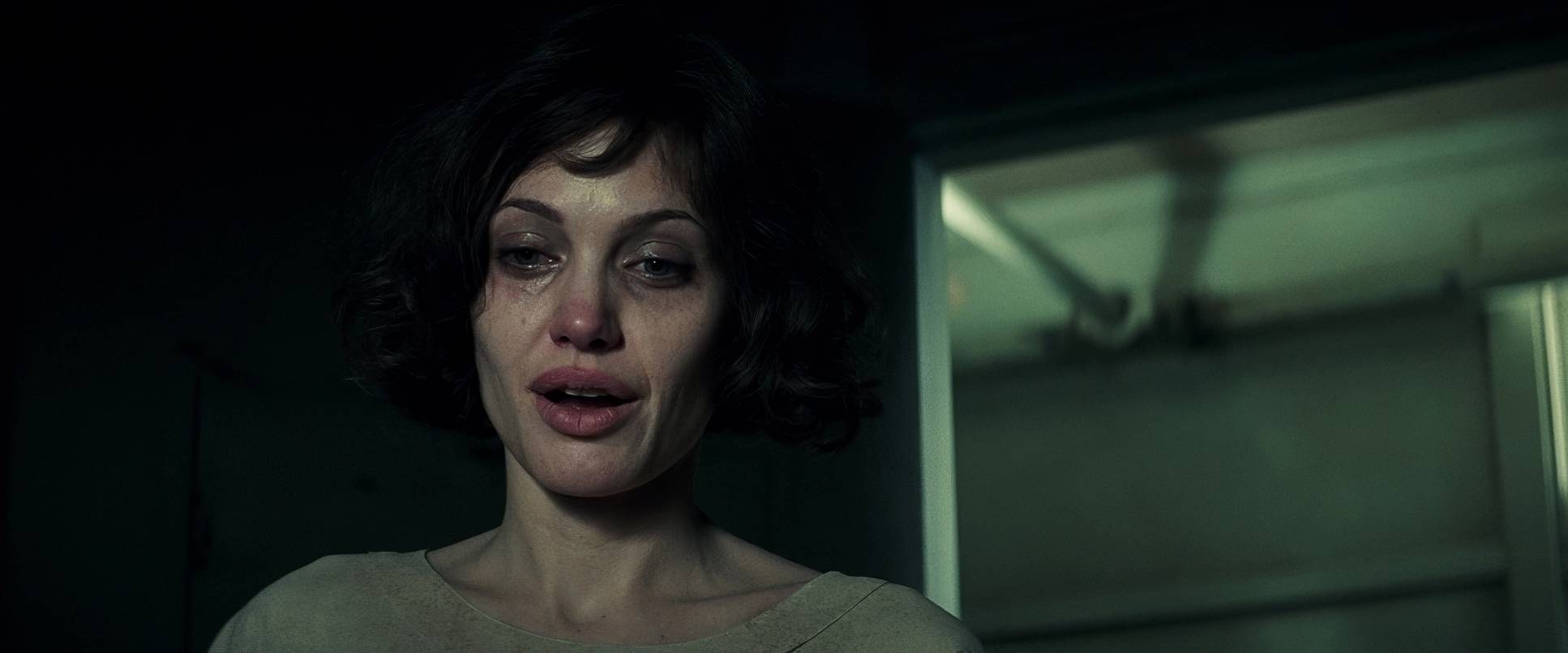
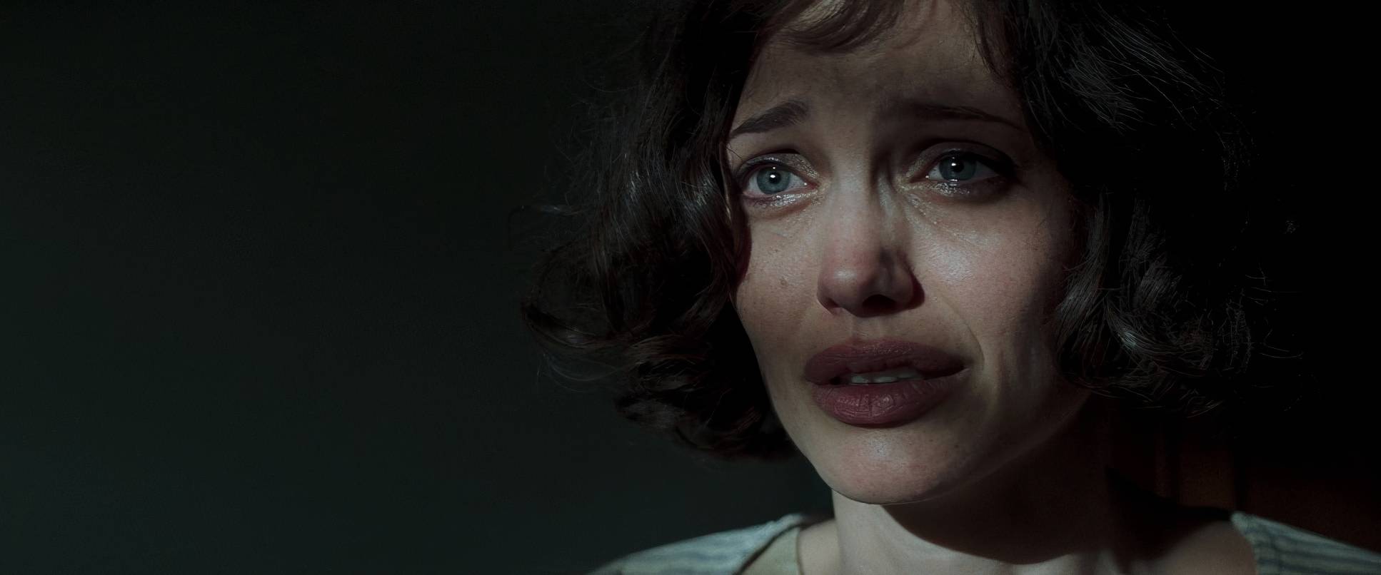
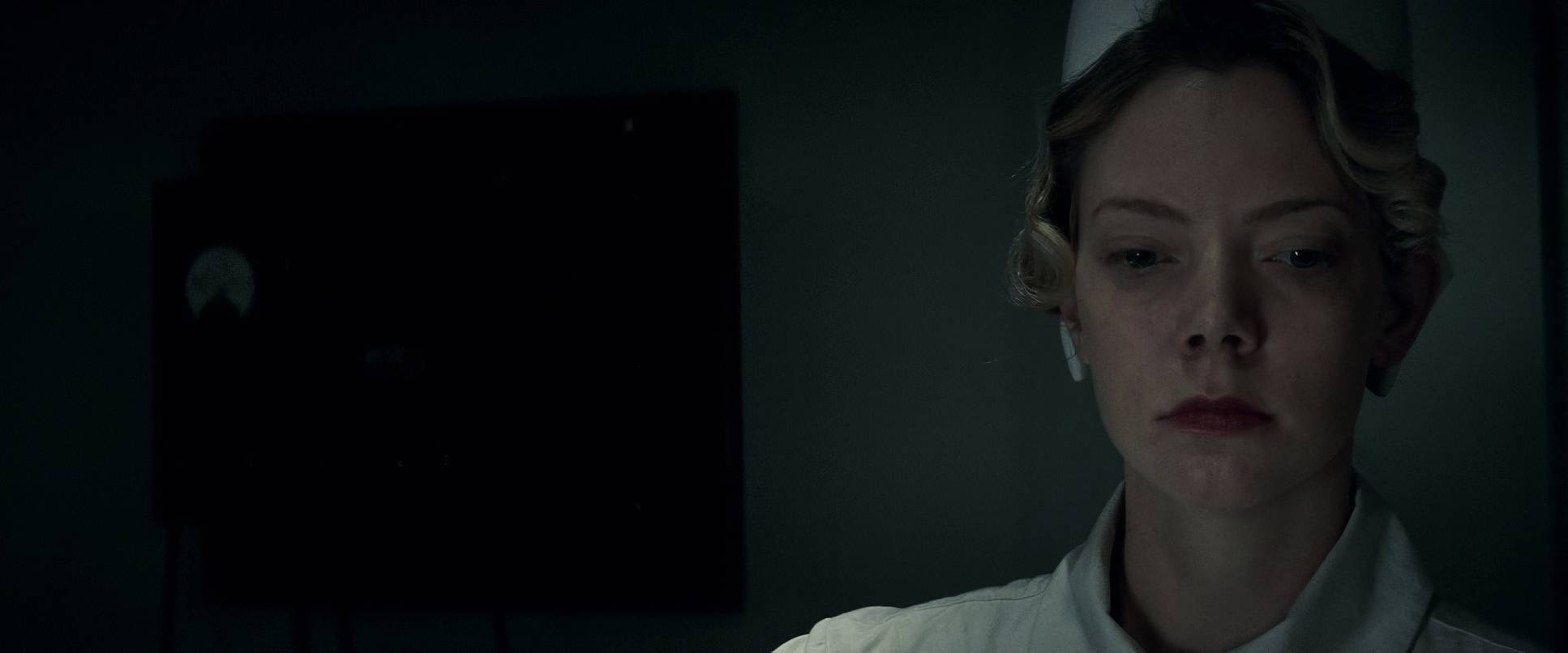
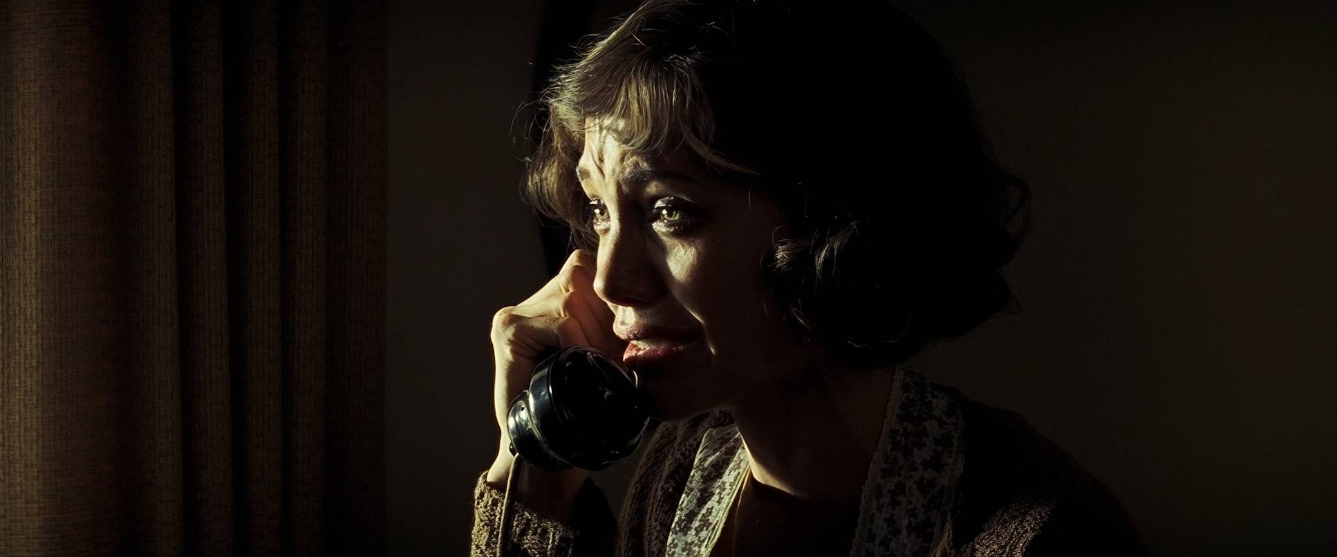
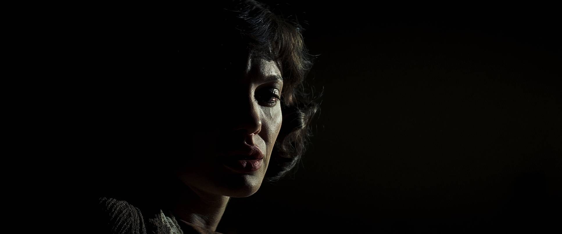
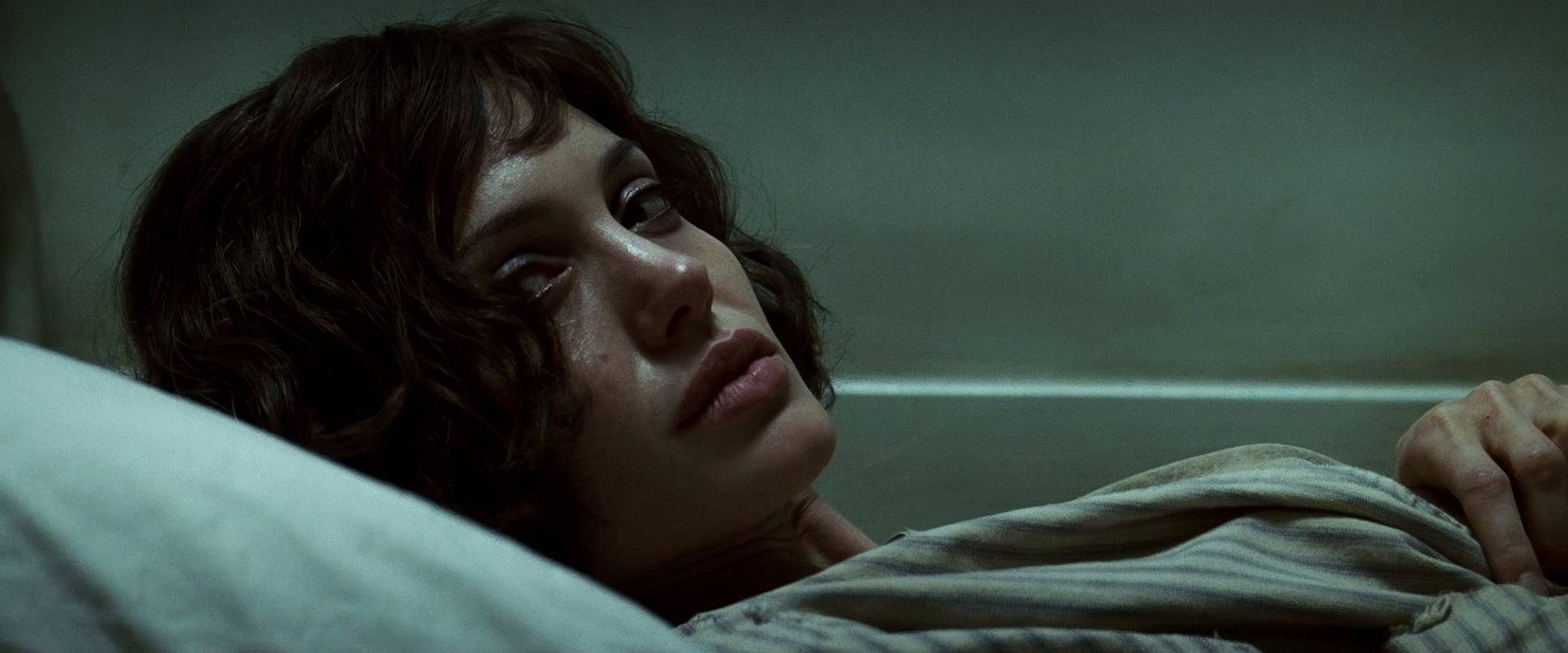
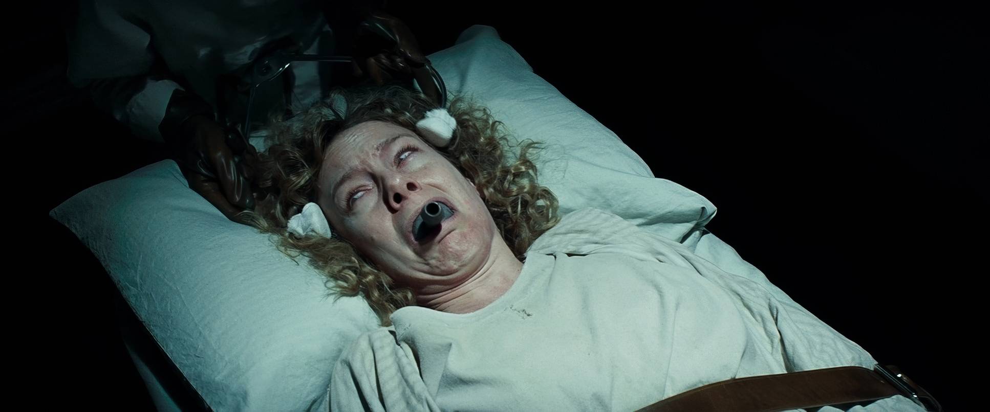
Stern uses motivated realism windows, desk lamps, or the ambient glow of a street but he sculpts it to create a heavy chiaroscuro effect. Faces are lit with a sculptural quality that emphasizes every line of worry or anger. In the psychiatric ward, the lighting has this sickly, institutional pallor. As a colorist, I love that he doesn’t rely on heavy gels to create mood; he just observes the “rawness” of the light and shapes the fall-off to make the environment feel cold and callous.
Lensing and Blocking

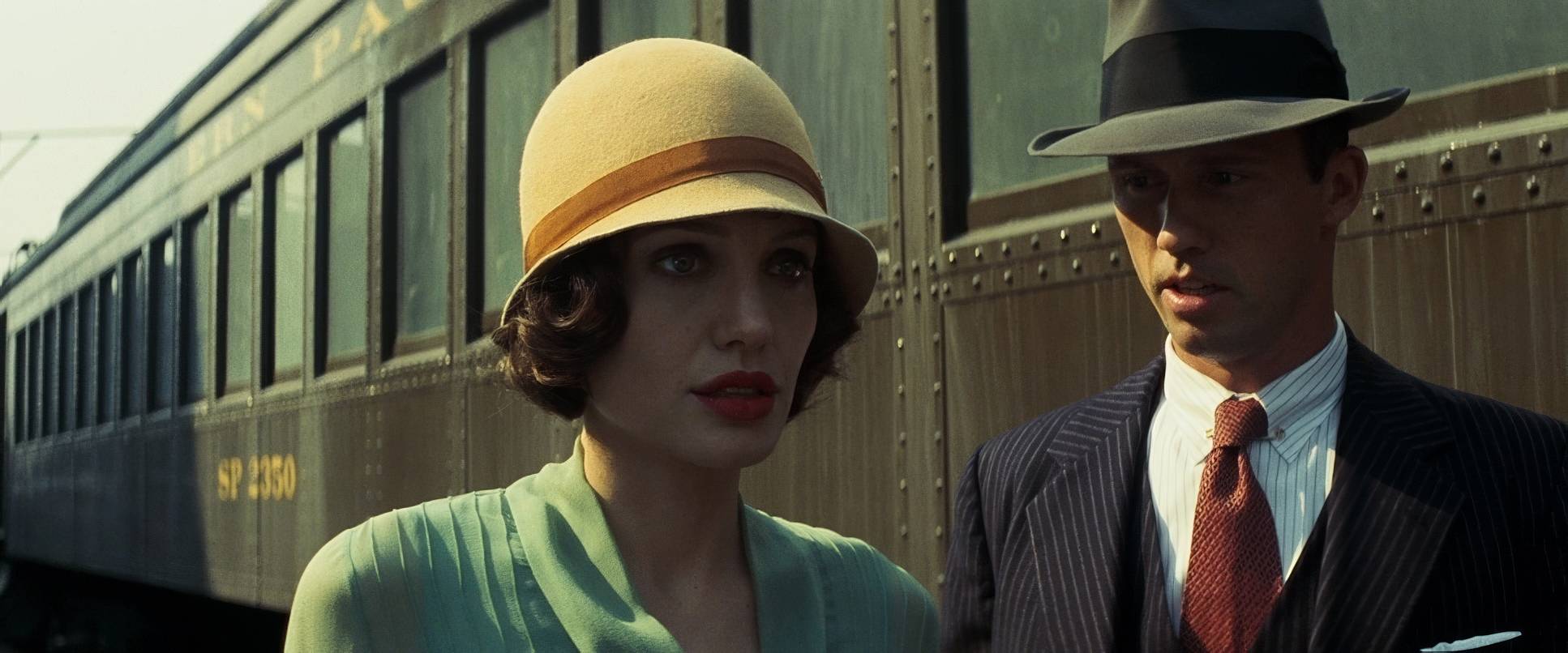
To get that authentic 1920s texture, they didn’t just use any glass. They shot on Panavision C-Series anamorphic lenses. This is a huge detail. These lenses are vintage, and they bring a specific “mushiness” to the edges and a beautiful, organic flare that you just can’t replicate with modern, sharp glass. It’s what gives the film that 2.39:1 anamorphic wide-screen look while still feeling grounded and old-world.
The blocking is equally precise. Think about the scenes with Captain Jones a character you grow to hate with a burning passion. The way he towers over Christine or the unnatural distance placed between them creates a visual “chasm.” It’s a choreographed dance of dominance. It’s not “awkward” blocking; it’s a chillingly clear manifestation of the power imbalance.
Color Grading Approach

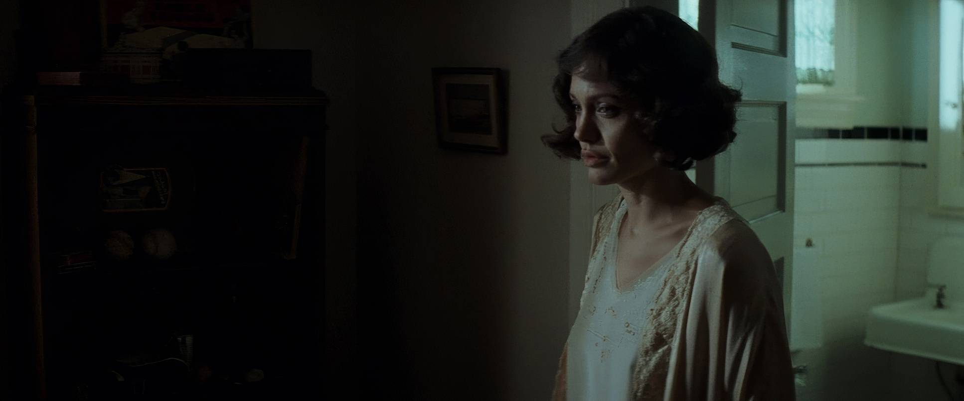
Now we’re in my territory. Changeling was shot on 35mm film (Kodak Vision 500T 5279), and you can see that beautiful, organic grain throughout. The colorist, Jill Bogdanowicz, did a fantastic job of leaning into a muted, desaturated palette lots of dusty browns, ochres, and somber blues.
From a grading perspective, the film has a “thick” look. The highlights have that soft, photochemical roll-off that makes digital look cheap by comparison. We aren’t seeing “crushed” blacks here; we’re seeing rich, deep shadow detail that holds the “rot” of the city. There’s a beautiful cyan lean in many of the exteriors that adds to the “cool,” detached feeling of the world. Even the grain itself acts as a character, giving the image a density that feels like a forgotten memory. My job often involves chasing this exact balance making a look feel like an “era” rather than just a “filter.”
Technical Aspects & Tools
| Genre | Crime, Drama, Mystery, Courtroom Drama, History, Documentary, Thriller, Serial Killer, Docudrama, True Crime |
| Director | Clint Eastwood |
| Cinematographer | Tom Stern |
| Production Designer | James J. Murakami |
| Costume Designer | Deborah Hopper |
| Editor | Joel Cox, Gary D. Roach |
| Colorist | Jill Bogdanowicz |
| Time Period | 1920s |
| Color | Cool, Desaturated, Cyan |
| Aspect Ratio | 2.39 – Anamorphic |
| Format | Film – 35mm |
| Lighting | Soft light, Low contrast |
| Lighting Type | Daylight, Overcast |
| Story Location | California > Los Angeles |
| Filming Location | California > Los Angeles |
| Camera | Panavision Millennium / Millenium XL / XL2, Panavision Panaflex, Panavision Panaflex Platinum |
| Lens | Panavision C series |
| Film Stock / Resolution | 5279/7279 Vision 500T |
Shooting on 35mm in 2008 was a deliberate choice by Eastwood to maintain that latitude and texture. Using the Panavision Millennium and XL2 systems combined with that C-Series glass meant they were capturing a lot of information with a very specific, “imperfect” aesthetic.
The lighting rigs were likely designed to disappear HMI bounces through windows for that overcast daylight and practical incandescent bulbs for the interiors. It’s the ultimate technical paradox: using high-end cinema tools to make the technology vanish, leaving only the raw, believable past on screen.
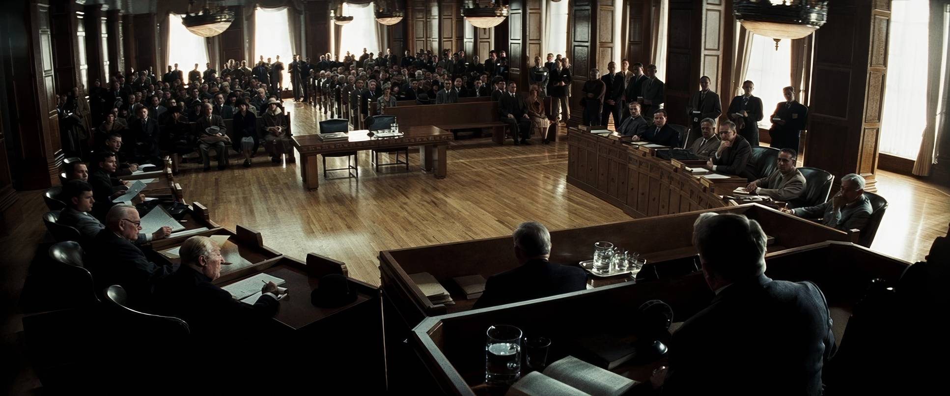
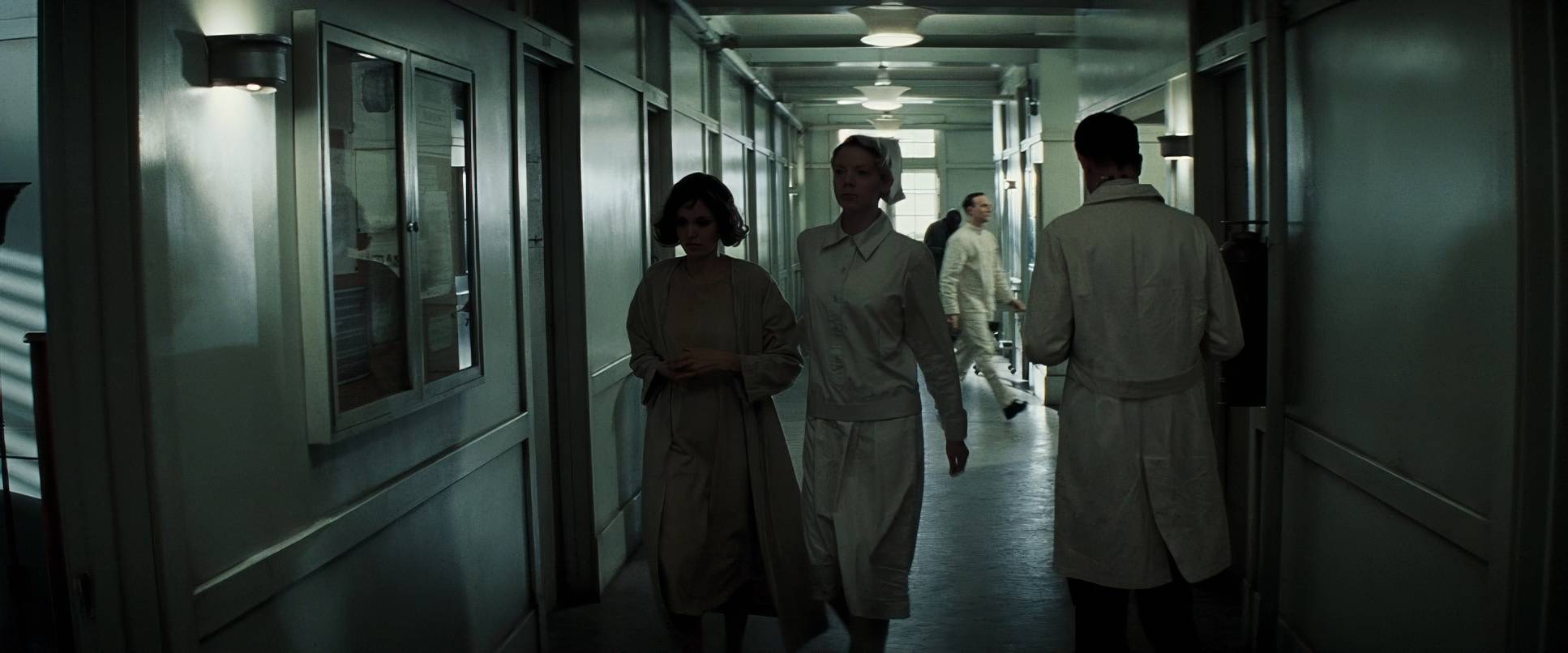
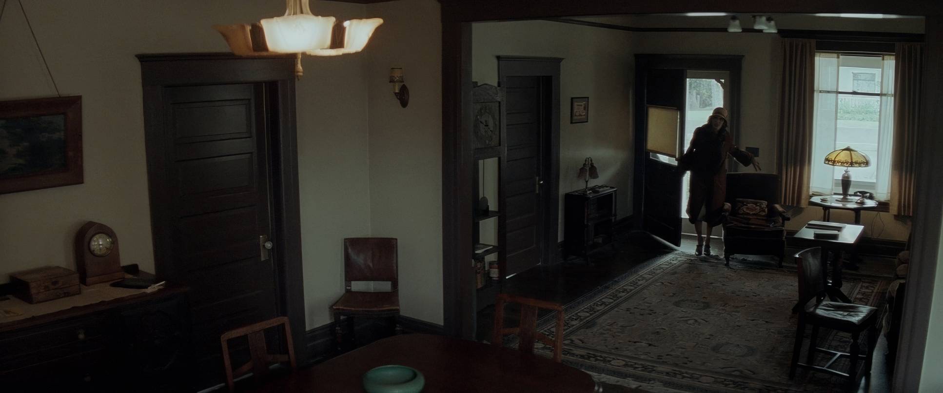
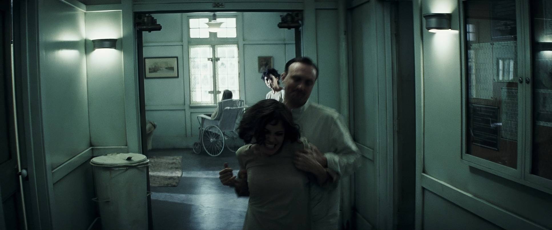
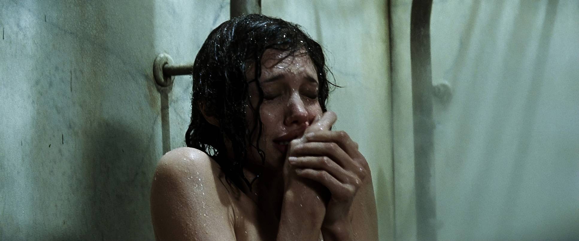
Changeling (2008) Film Stills
A curated reference archive of cinematography stills from CHANGELING (2008). Study the lighting, color grading, and composition.


- Also read: PRIMAL FEAR (1996) – CINEMATOGRAPHY ANALYSIS
- Also read: AIRPLANE! (1980) – CINEMATOGRAPHY ANALYSIS
Browse Our Cinematography Analysis Glossary
Explore directors, cinematographers, cameras, lenses, lighting styles, genres, and the visual techniques that shape iconic films.
Explore Glossary →