Robert Zemeckis and his team took a massive risk here: no dialogue for nearly an hour, no supporting cast, and a complete rejection of a traditional score for the island sequences. When you strip all that away, the cinematography isn’t just “capturing” the story it is the story. For anyone running a blog like Color Culture, this film is the ultimate case study in how the image alone can carry the weight of a man’s soul.
About the Cinematographer
Don Burgess, ASC, is the hand behind the lens here, and his partnership with Zemeckis is legendary. They’ve done everything from Forrest Gump to Contact, but Cast Away feels like their most disciplined work. What I love about Burgess is that he doesn’t let his ego get in the way of the frame. He has this incredible ability to blend high-end technical precision with a raw, almost documentary-like feel. He doesn’t over-stylize. Instead, he acts as a silent observer, letting the environment speak for itself. In this film, he isn’t just shooting Tom Hanks; he’s shooting the indifference of nature.
Inspiration Behind the Cinematography
The visual soul of this film is built on two things: isolation and absolute authenticity. Zemeckis and Burgess didn’t want the audience to just watch Chuck Noland; they wanted us to be trapped with him. This is why the lack of music is so genius. Without a score to tell us how to feel, the pressure on the visuals becomes immense.
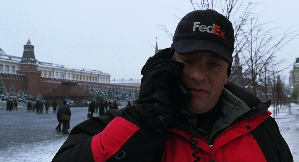
The goal was a “grounded” aesthetic. It’s not about flashy “movie” lighting; it’s about the brutal reality of survival. You see it immediately in the contrast between Chuck’s life in the 90s the fast-paced, clock-watching chaos of the FedEx warehouse in Moscow and the timeless, boundless silence of the South Pacific. The cinematography marks that shift instantly. The island becomes both a prison and a blank canvas, and the camera treats it with a mix of awe and terror.
Camera Movements
There is a remarkable restraint to the camera work on the island. While most blockbusters rely on constant movement to keep the audience engaged, Burgess often just lets the camera sit there. We get these long, stationary takes that force us to endure the passage of time alongside Chuck.
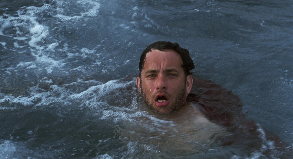
Compare that to the plane crash which is frantic, handheld, and completely disorienting and the shift is jarring. Once he hits the beach, the pans become slow and deliberate. If the camera moves, it’s usually because Chuck moves. We follow his gaze as he surveys the horizon or push in slightly to catch the panic in his eyes. This lack of “camera ego” creates a sense of truth. You don’t feel like you’re watching a movie; you feel like you’re witnessing a man grapple with existence.
Compositional Choices
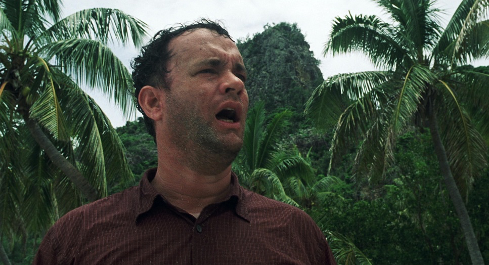
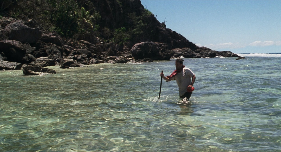
Compositionally, this film is about scale. Burgess uses wide shots to make Tom Hanks look like an ant against the backdrop of the ocean. It’s a powerful use of negative space. We see Chuck drift onto an island that looks like a playground from a distance, but the wide frames reveal it as a cage.
Then, the movie flips to extreme intimacy. We get these tight, visceral close-ups Chuck’s bloody hands, the struggle to strike a spark, and of course, the “face” of Wilson. These shots pull us into his immediate pain. Even the final shot at the crossroads in Texas is a compositional echo of the island. That four-way intersection is heavy with symbolism, but it works because it mirrors the vastness of the sea he just escaped. He’s at the center of the frame, but he’s still tiny compared to the horizon.
Lensing and Blocking
The lensing choices here are subtle but smart. In the Moscow sequences, the focal lengths feel standard, capturing the bustle of his corporate life. On the island, the lenses often go wider to emphasize the distance between Chuck and safety.
When the camera finally moves in close especially during the “conversations” with Wilson Burgess often uses slightly longer lenses to compress the background. It shuts out the rest of the world and focuses entirely on Chuck’s desperate need for connection. The blocking is equally impressive. Since Hanks is alone, the camera becomes his scene partner. He moves within the frame in a way that shows his evolution starting as a man overwhelmed by the terrain and eventually becoming a man who has mastered it.
Lighting Style
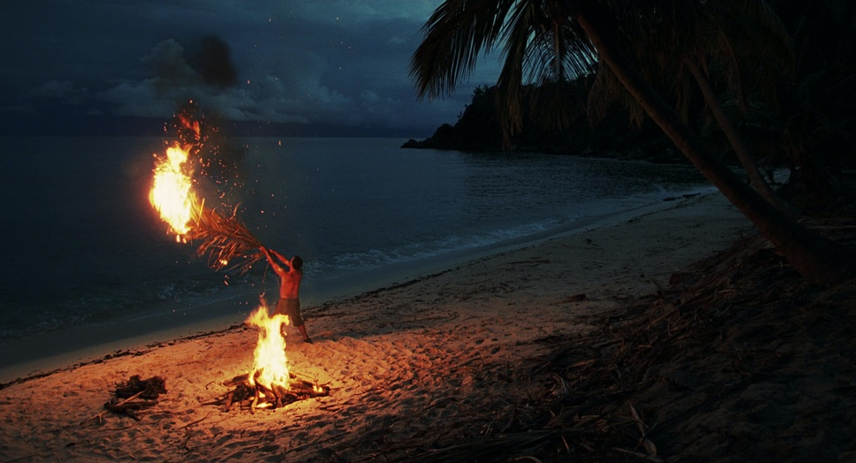
On the island, the sun is the only lighting director that matters. The style is almost entirely “motivated,” meaning it looks like it’s coming from natural sources. We see the harsh, vertical light of midday that creates those deep, oppressive shadows. It looks hot. It looks exhausting.
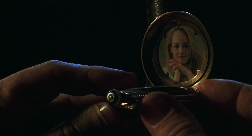
The night scenes in the cave are where the lighting gets really dramatic. It’s all sourced from tiny fires or soft ambient moonlight. You get these deep pockets of darkness that remind you just how lonely that island is. I love the visual honesty here Burgess wasn’t afraid to let the highlights blow out or the shadows go completely black. It replicates how the human eye actually sees in those conditions. It isn’t “perfect” Hollywood lighting, and that’s exactly why it works.
Color Grading Approach
As a colorist, this is where I really geek out. The grade in Cast Away is an emotional map.
The opening in Russia has a very specific “90s corporate” feel cool, slightly desaturated, and controlled. It feels sterile, like a world governed by clocks. Once we hit the island, the palette explodes, but not in a “vacation brochure” way. The blues of the Pacific are vibrant, but the highlights have a sun-bleached, desaturated roll-off that makes the heat feel tactile.
I look at the way the skin tones change there’s a nuanced desaturation that creeps in as Chuck wears down. It’s not a heavy-handed filter; it’s a slow draining of vitality. In my own work, I’m always looking for that “print-film” sensibility where the highlights push toward clipping in a natural, organic way. Cast Away nails this. The hue separation between the lush jungle greens and the searing blues of the water creates a depth that makes the island feel like a living, breathing character. When he returns to the world, the color doesn’t just go back to “normal.” There’s a lingering warmth a sign that he’s carrying the island’s perspective with him.
Technical Aspects & Tools
Cast Away (2000) — Technical Specifications
| Genre | Adventure, Drama, Survival, Nature |
| Director | Robert Zemeckis |
| Cinematographer | Don Burgess, ASC |
| Production Designer | Rick Carter |
| Costume Designer | Joanna Johnston |
| Editor | Arthur Schmidt |
| Colorist | Jeff Chaves |
| Time Period | 1990s |
| Aspect Ratio | 1.85 – Spherical |
| Format | Film – 35mm |
| Lighting Type | Daylight / Soft Light |
| Story Location | Russia > Moscow |
| Camera | Panavision Platinum, Gold / G2, Panaflex |
| Lens | Panavision Primo Primes |
| Film Stock | Eastman EXR 50D 5245, 5246/7246 Vision 250D, 5279/7279 Vision 500T, 5248/7248 EXR 100T |
Technically, this film is a beautiful example of 35mm stock specifically Eastman EXR and Vision stocks (50D, 250D, and 500T). Shooting on film in the year 2000 gave this movie a grain structure and dynamic range that digital just couldn’t touch back then.
Burgess used Panavision Platinum and Gold cameras with Primo Primes, which are known for their clarity and beautiful rendering of skin tones. Choosing to shoot on location in Fiji instead of a soundstage was a logistical nightmare, I’m sure, but you can’t fake that light. The technical team kept things lean on the island to stay mobile, and that efficiency shows in the final product. Every frame feels intentional, not over-produced.
- Also read: THE HATEFUL EIGHT (2015) – CINEMATOGRAPHY ANALYSIS
- Also read: FERRIS BUELLER’S DAY OFF (1986) – CINEMATOGRAPHY ANALYSIS
Browse Our Cinematography Analysis Glossary
Explore directors, cinematographers, cameras, lenses, lighting styles, genres, and the visual techniques that shape iconic films.
Explore Glossary →