When this movie hit, it introduced a completely different visual language. We got a physical agent, one who bleeds, sweats, and makes mistakes. The filmmaking stripped away the bombast and replaced it with a raw energy that prioritized physics over fantasy. It engages with craft, intuition, and the emotional logic of visual storytelling, and that is exactly what I want to break down.
About the Cinematographer
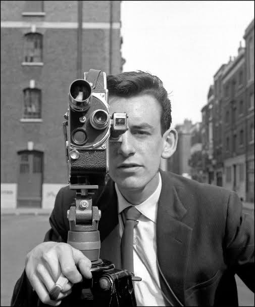
The Director of Photography was Phil Méheux, BSC. What’s interesting is that Méheux had already shot a Bond film GoldenEye which was stylish, slick, and very traditional. But for Casino Royale, he completely dismantled his own previous approach. Méheux isn’t known for flashy, ego-driven cinematography; he is a discipline-first DP who serves the narrative.
His experience meant he understood the “rules” of a Bond film well enough to know exactly how to break them. This wasn’t about inventing new technology; it was about restraint. He moved from the glamour lighting of the 90s to a starker, source-driven method that suited Daniel Craig’s brutal interpretation of the character. It’s a lesson for all of us filmmakers: sometimes the best stylistic choice is to stop trying to make everything look “pretty” and start making it look “true.”
Inspiration Behind the Cinematography
The visual departure here was intentional a conscious break from the fantastical elements that had crept into the franchise. The inspiration feels heavily rooted in the shift toward gritty realism seen in early 2000s cinema. The opening sequence, shot in high-contrast black and white (Kodak 5222 Double-X), isn’t just a stylistic flourish; it’s a nod to film noir. It tells us immediately that this is a crime thriller, not a gadget movie.
There is also undeniable DNA from the Bourne series in the action design. The handheld work, the fast cutting, and the emphasis on practical stunts over CGI lend a sense of immediacy. The film wanted to strip away the invincibility. When Bond fights, it’s messy. The camera shakes not because it’s a “style,” but because the operator is reacting to the chaos. This approach informs every visual decision showing us the sweat and the impact rather than an effortless ballet of violence.
Camera Movements
The camera movement in Casino Royale is a crucial part of its grounded aesthetic. The elegant, sweeping crane shots of previous eras were largely replaced by a reactive, agile camera. Look at the Madagascar parkour chase: the camera is often handheld, jogging alongside Bond. It creates a visceral participation. We aren’t just observing the stunt; we feel the hard landings. The camera struggles to keep up with the bomb-maker’s agility, while staying firmly anchored on Bond’s relentless, bullish drive.
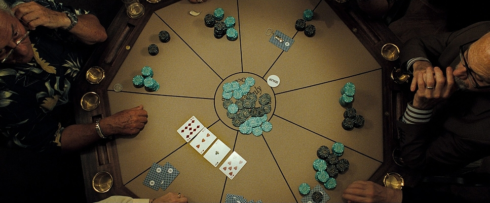
However, Méheux knows when to lock it down. In the poker scenes, the camera becomes composed, using subtle, creeping push-ins to ratchet up the tension. The movement is always motivated. In the stairwell fight, the camera tracks Bond’s physical exertion as he drags himself up the lift emphasizing the sheer weight of the moment. Whether it’s the chaos of a chase or the quiet warfare of a poker table, the camera reflects the internal state of the character.
Compositional Choices
Compositionally, the film uses framing to underscore Bond’s isolation. From the outset, the black and white sequence uses wide, brutalist framing to make the subjects feel small against the architecture. Bond is often framed in tight, aggressive close-ups, showcasing a determination that borders on coldness.
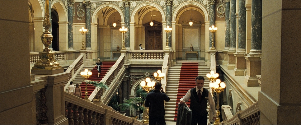
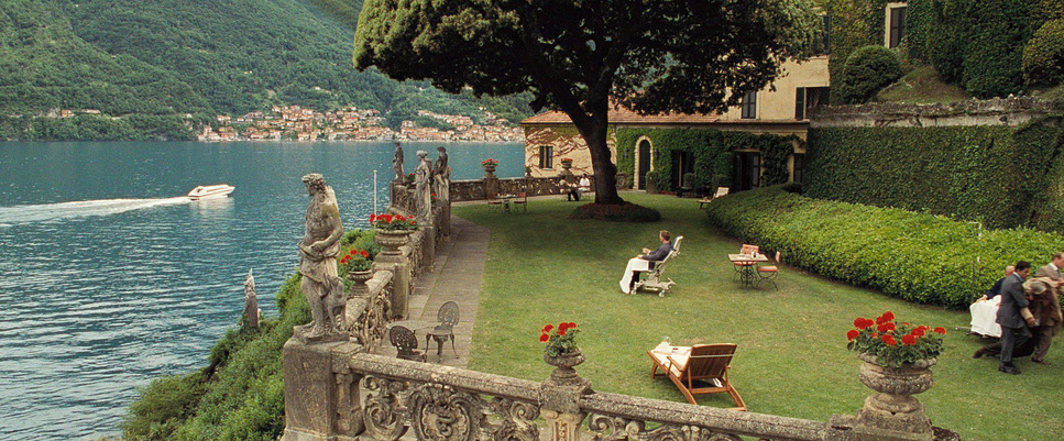
Throughout the film, wide shots are employed to convey scale and Bond’s occasional insignificance the sprawling construction site, the massive airport tarmac, or the crumbling grandeur of Venice. These compositions often use deep focus and leading lines to isolate Bond’s figure.
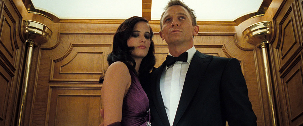
Then, there’s the use of tight framing in moments of danger. At the poker table, the framing becomes claustrophobic choking close-ups on eyes, hands, and chips. The torture scene is a prime example of unflinching composition, framing Bond’s suffering head-on with nowhere for the audience to look away. Even in elegant settings, the framing often places Bond slightly off-center or uses negative space to suggest that he is never truly safe.
Lighting Style
The lighting style shifts from the “studio glam” of the past to a naturalistic, motivated approach. We rarely see a light source that doesn’t feel justified by the environment.
In the early scenes like the bathroom fight the lighting is harsh, ugly, and likely driven by fluorescent practicals (or corrected to look that way). It gives the image a sickly, raw texture. As the film progresses to the Ocean Club or the Casino, the lighting becomes warmer and richer, but it remains motivated. Méheux uses practicals chandeliers, table lamps, sconces to do the heavy lifting.
Crucially, the film isn’t afraid of darkness. In modern HDR grading, there is a tendency to lift shadows to show off detail. Casino Royale embraces the crush. The shadows under the poker tables or in the sinking house in Venice are deep and heavy. This “chiaroscuro” effect adds weight to the image, creating a sense of underlying tension even in the most luxurious environments.
Lensing and Blocking
For a film of this scale, the choice of lenses was vital. Méheux largely utilized Cooke S4s and Angenieux Optimo zooms. For the action, he leaned on wider focal lengths (likely 28mm or 35mm on Super 35). This keeps the environment in play; when Bond slams a truck or jumps a barrier, the wide angle exaggerates the speed and proximity, making the danger feel immediate.
Blocking is equally deliberate. Daniel Craig’s Bond is a “calm powerhouse,” and the blocking reflects that. In the Body Worlds exhibit, the knife fight is confined and intimate, forcing the actors to interact with the physical obstacles in a tight space. Conversely, the casino scenes rely on the geometry of power where characters sit at the table relative to Le Chiffre tells a story of hierarchy. Longer lenses (50mm, 85mm) are reserved for these psychological moments, compressing the background and isolating the actors’ micro-expressions.
Color Grading Approach

Now, this is my turf. Casino Royale is a fascinating case study in photochemical emulation during the early days of the Digital Intermediate (DI). The overall palette is defined by density. Unlike the “orange and teal” look that saturated blockbusters later in the decade, this film relies on a subtractive color model that feels like traditional print film.
The film was shot on Kodak Vision2 stocks (5218 and 5229), which have a specific grain structure and contrast curve. The grade honors this. The blacks are dense and velvety not crushed to a flat zero, but sitting heavily in the toe of the curve. The highlights roll off gently; you don’t see the harsh digital clipping common in modern action films.
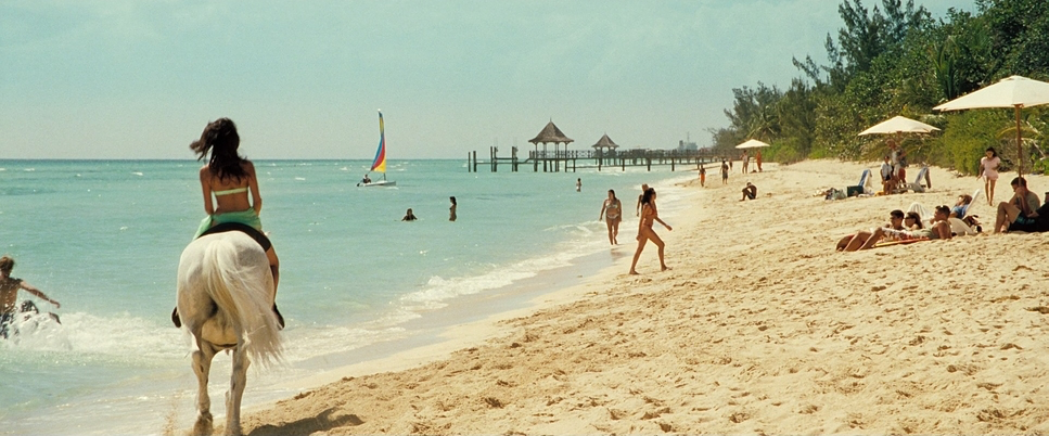
The color separation is subtle. Skin tones are kept natural and dense, retaining the reddish/pink hues of blood under the skin rather than pushing them toward a digital orange. The environments, however, are pushed to create mood. The flashbacks utilize a “bleach bypass” look high contrast, low saturation to evoke grit. The Bahamas sequences are warm but slightly desaturated, avoiding the “postcard” look. The final act in Venice shifts toward cooler, steelier blues, mirroring the tragedy of Vesper’s betrayal. It’s a sophisticated grade that prioritizes tonal separation over massive hue shifts.
Technical Aspects & Tools
Casino Royale – Technical Specifications
| Genre | Action, Adventure, Thriller, Crime, Political, Spy |
|---|---|
| Director | Martin Campbell |
| Cinematographer | Phil Meheux |
| Production Designer | Peter Lamont |
| Costume Designer | Lindy Hemming |
| Editor | Stuart Baird |
| Colorist | Adam Glasman |
| Time Period | 2010s |
| Color | Warm |
| Aspect Ratio | 2.39 – Spherical, Super 35 |
| Format | Film – 35mm |
| Lighting | Soft light |
| Lighting Type | Artificial light, Tungsten |
| Story Location | Europe > Montenegro |
| Filming Location | Como > Lake Como |
| Camera | Arricam LT, Arricam ST, Arriflex 235, Arriflex 435 |
| Lens | Angenieux Optimo, Cooke S4/ i |
| Film Stock / Resolution | 5222/7222 Kodak Double X, 5274/7274 Vision 200T, 5279/7279 Vision 500T |
In 2006, the industry was on the cusp of the digital revolution, but Casino Royale stayed true to 35mm film. This choice provides the organic texture and latitude that anchors the film’s “reality.” The grain is present, adding a tactile quality to the image that digital sensors often struggle to replicate without heavy post-processing.
The camera package centered on the Arricam ST and LT bodies, paired with the aforementioned Cooke S4/i prime lenses. The decision to shoot Super 35 (spherical) rather than Anamorphic was likely practical; spherical lenses are faster (allowing for more natural light) and offer more vertical headroom, which is essential for capturing the verticality of parkour stunts without distortion.
The DI workflow allowed the colorist (Adam Glasman) to refine the look, matching the different film stocks (the grainy 500T used for interiors vs. the finer 50D or 200T for exteriors) into a cohesive visual arc.
- Also read: BLADE RUNNER 2049 (2017) – CINEMATOGRAPHY ANALYSIS
- Also read: SIN CITY (2005) – CINEMATOGRAPHY ANALYSIS
Browse Our Cinematography Analysis Glossary
Explore directors, cinematographers, cameras, lenses, lighting styles, genres, and the visual techniques that shape iconic films.
Explore Glossary →