Matt Ross’s Captain Fantastic (2016) It’s a story about living authentically and the terrifying beauty of raising children outside the grid. For someone who spends their days balancing the cold math of a sensor with the warmth of an artistic vision, this film is a masterclass in how intentionality should look.
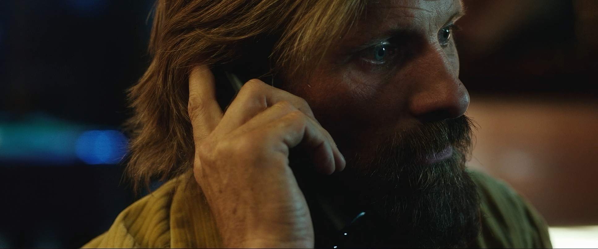
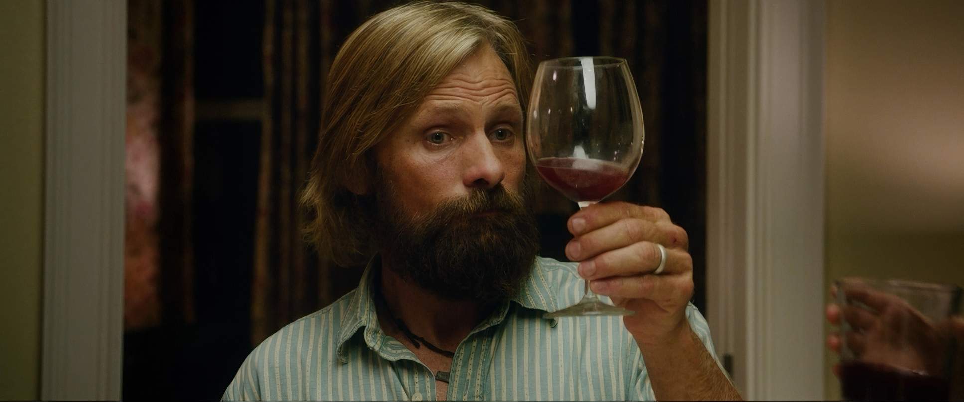
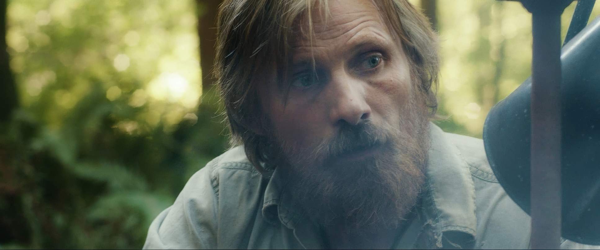
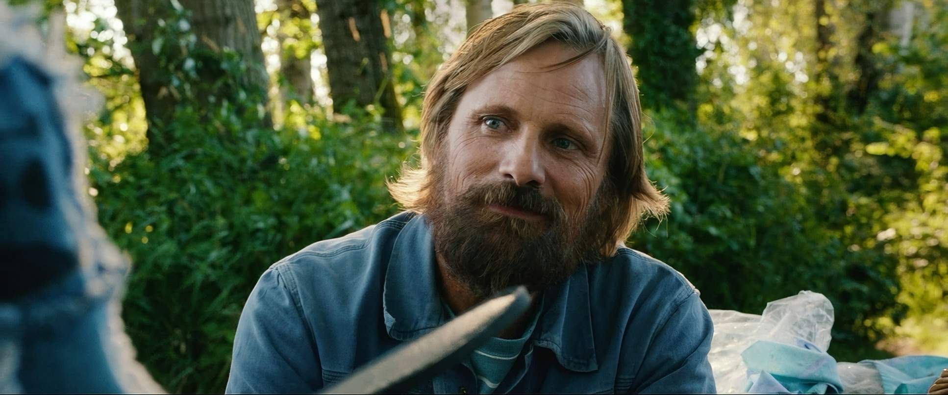
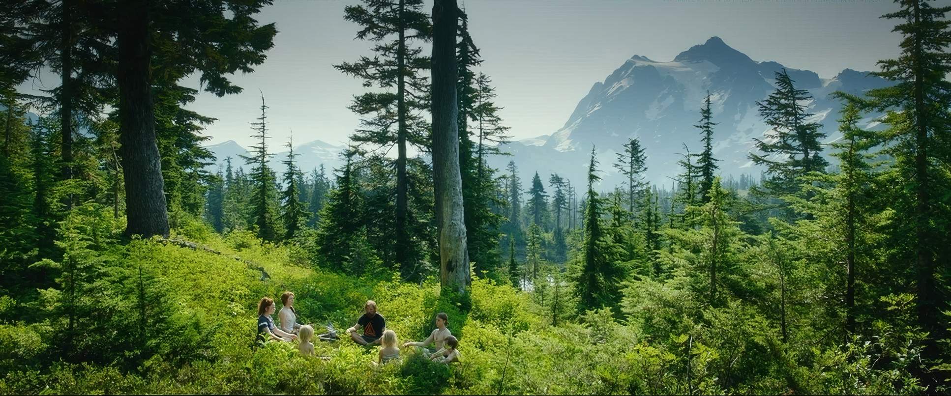
The story follows Ben Cash (Viggo Mortensen) and his six kids in the rugged wilderness of the Pacific Northwest. It’s a world of survival skills and Chomsky debates that slams hard against the “real world” after a family tragedy. The visual storytelling here isn’t just “pretty” it’s a calculated argument. It’s a vibrant, sometimes gut-wrenching journey that proves that when the visual craft is this strong, you don’t need a single line of dialogue to explain the stakes.
Inspiration Behind the Cinematography

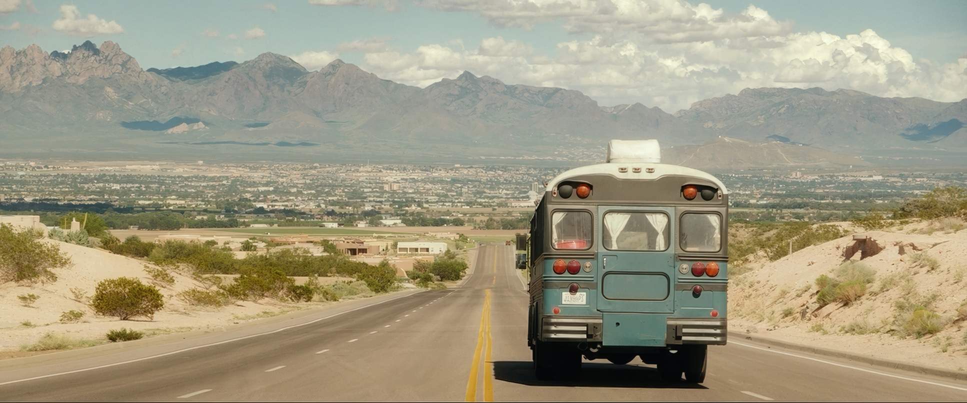
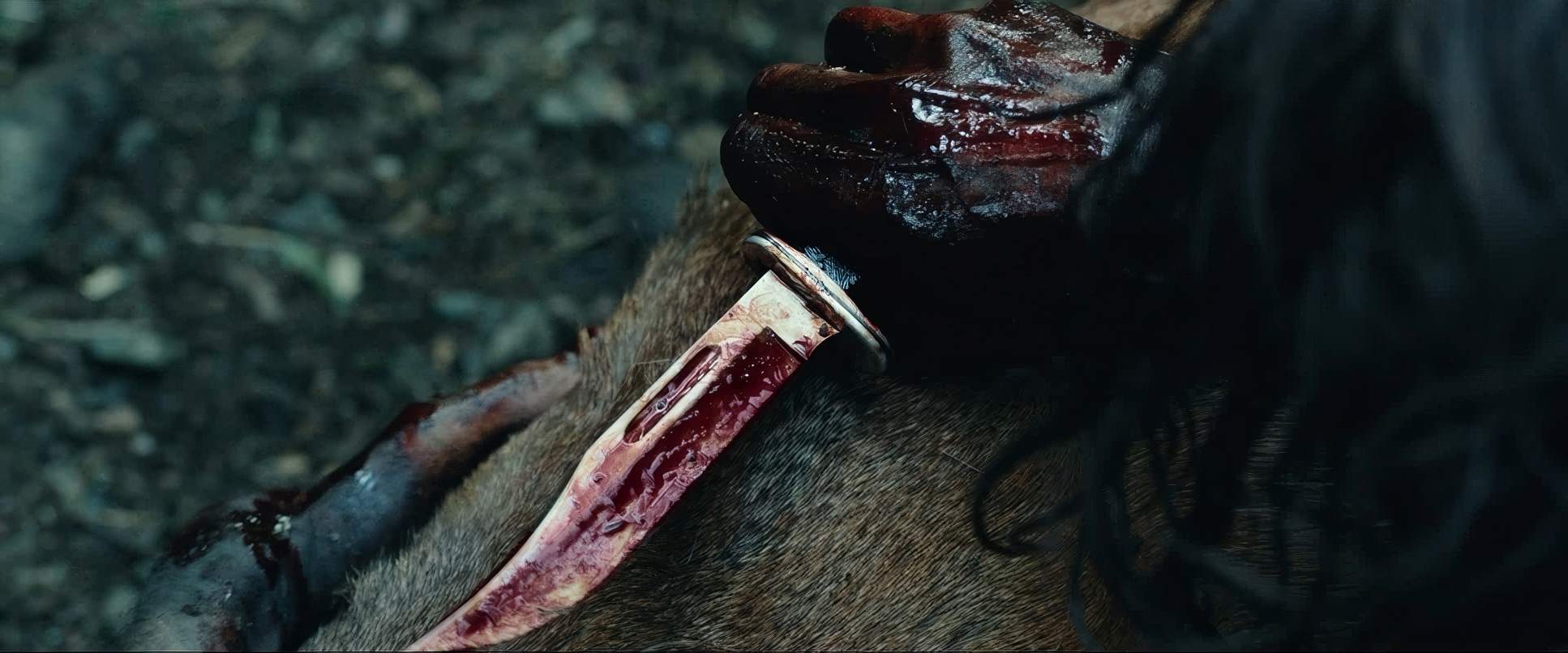
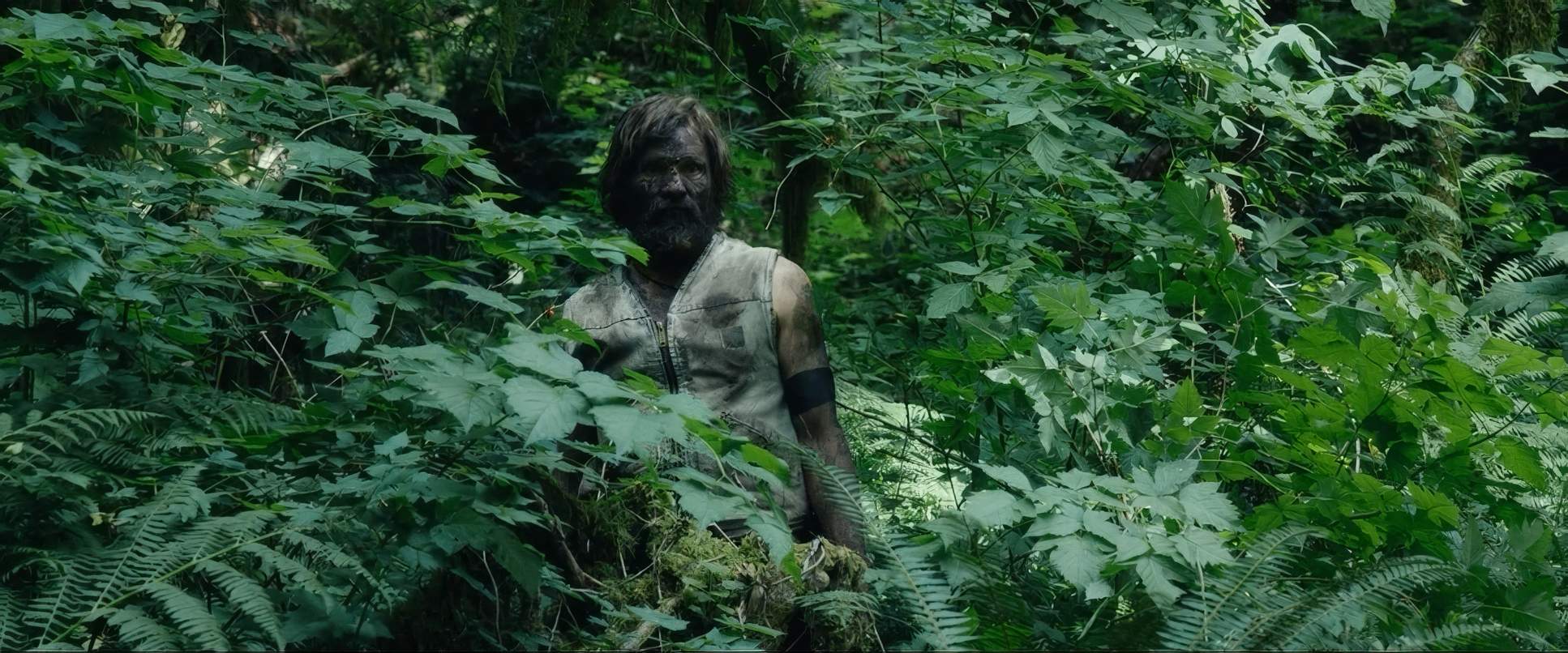
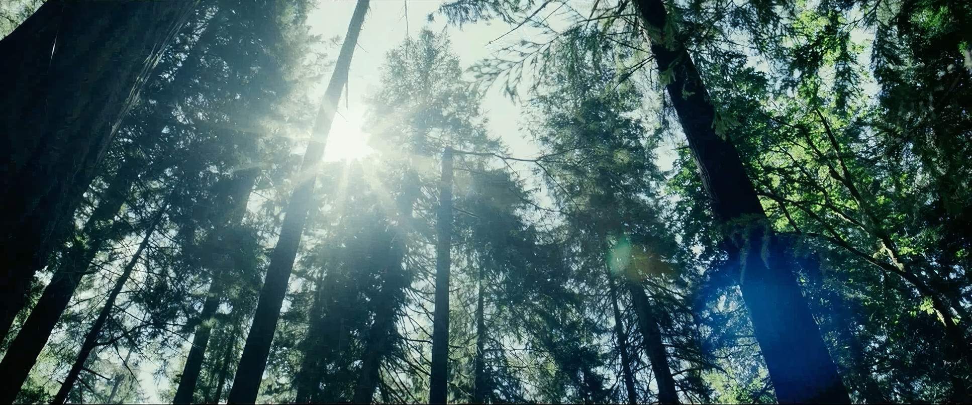
You can feel that Matt Ross grew up in communes himself. There’s a specific “lived-in” grit to the Cash family’s world that you just can’t fake. The inspiration here clearly wasn’t to make a “nature documentary,” but to capture the sensationof off-grid life the humidity of the forest and the dust on the bus.
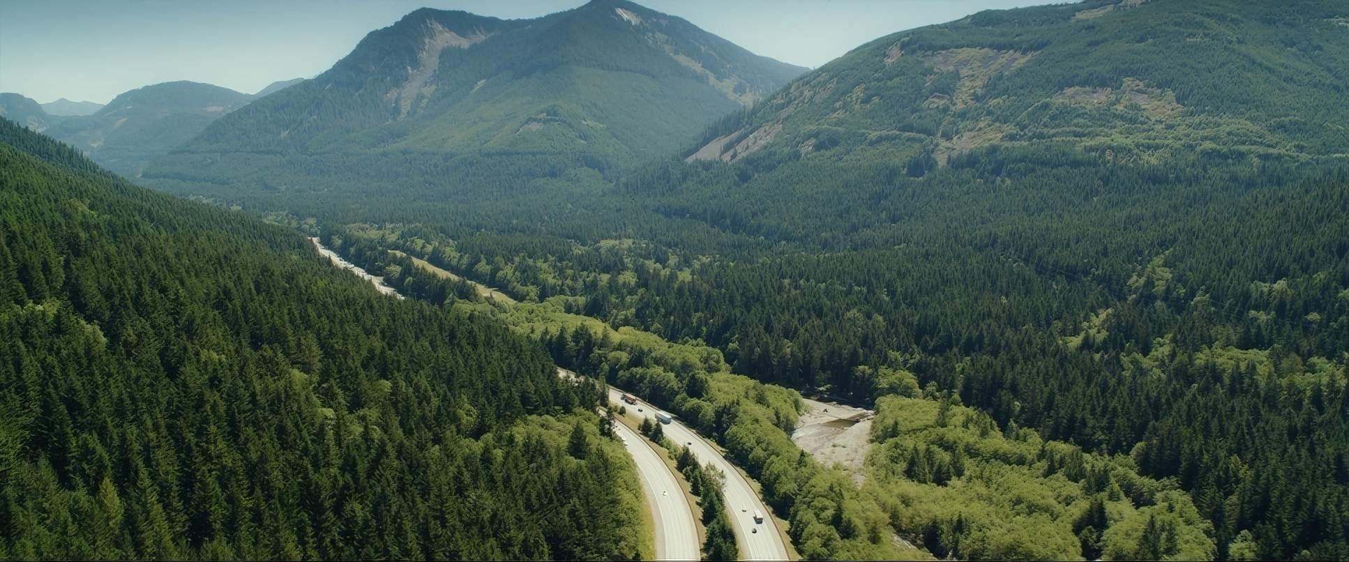
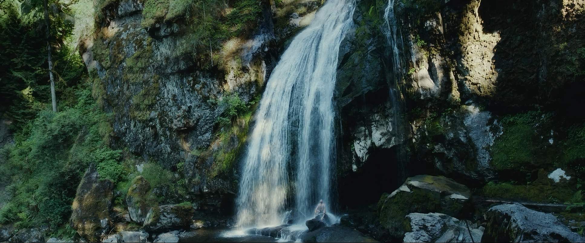
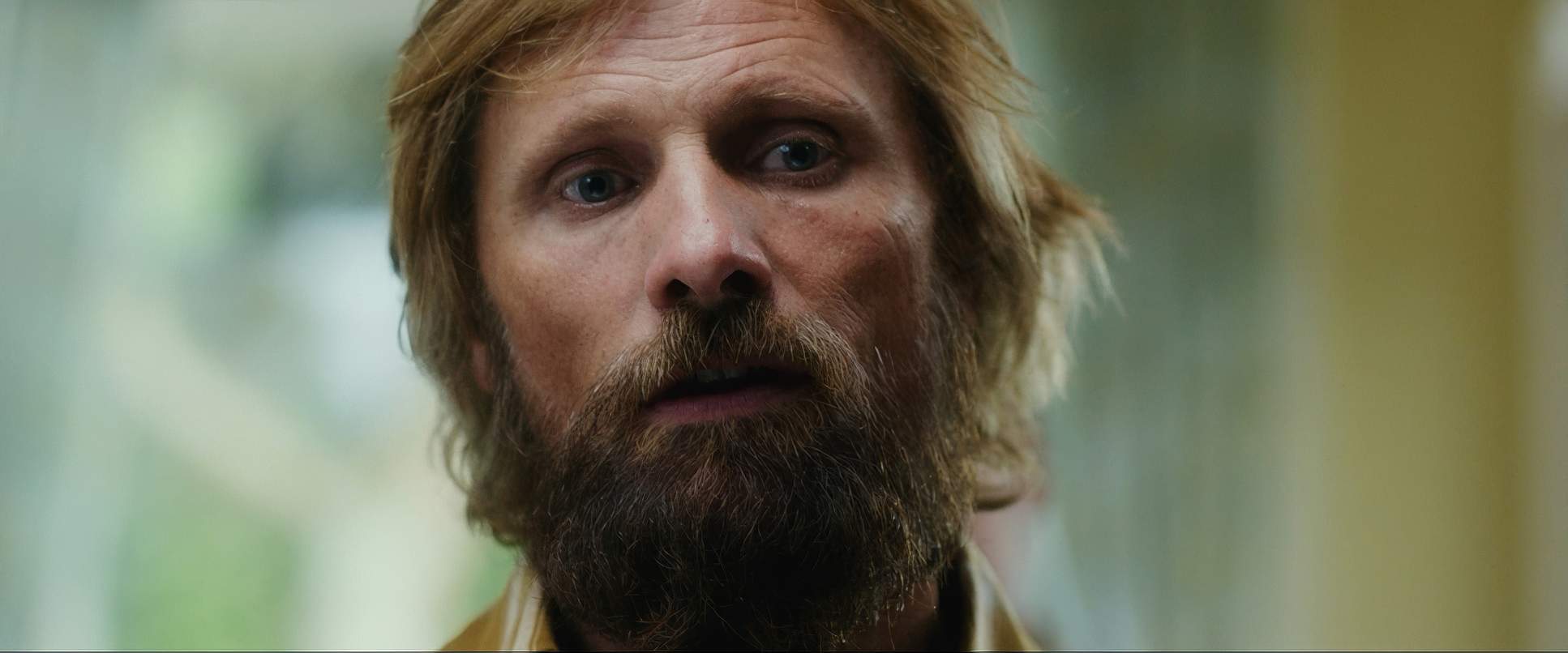
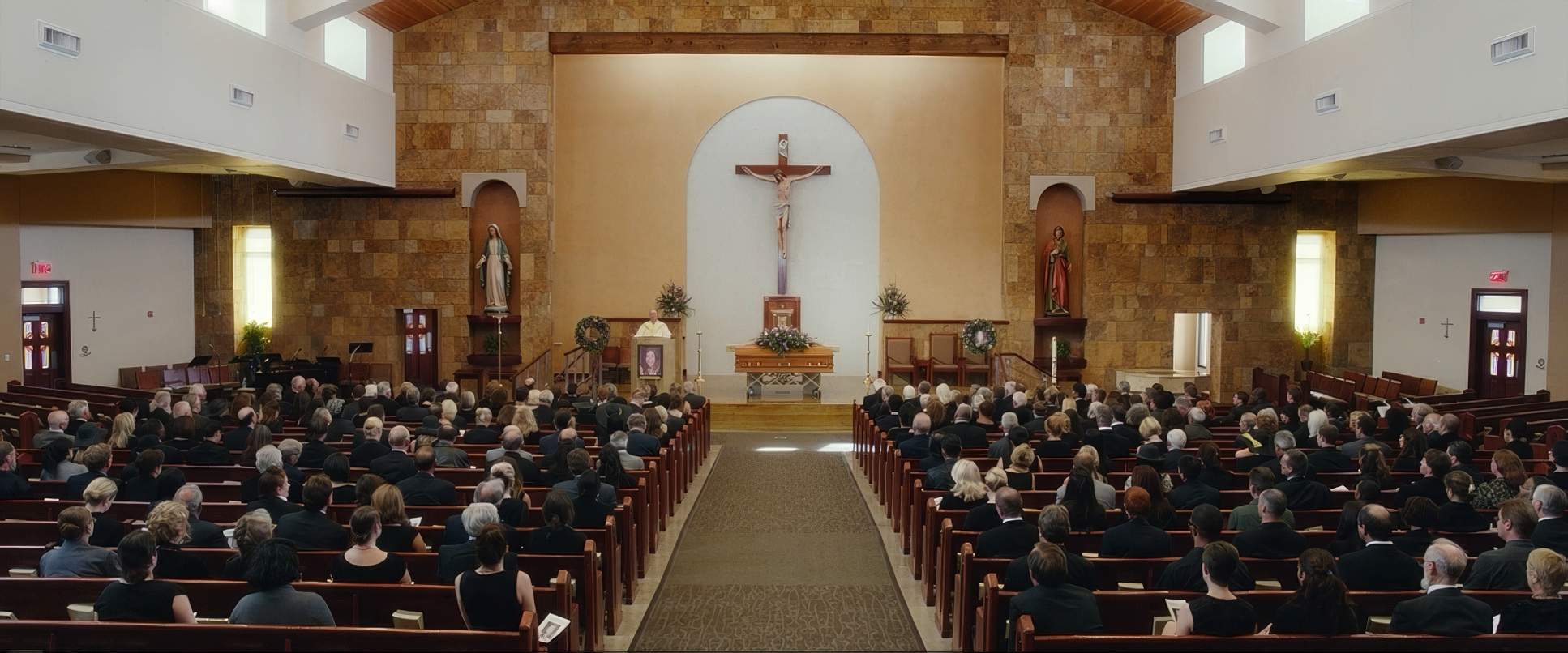
The cinematography is the primary driver for the film’s central question: Is Ben a brilliant educator or a dangerous zealot? The visual contrast between the lush, wild freedom of Washington and the muted, sterile conformity of the suburbs allows both sides of that argument to breathe. The forest feels like a sanctuary of wonder, while the modern world is rendered with an unsettling, almost comedic foreignness. It’s a visual language that refuses to give the audience an easy answer.
About the Cinematographer

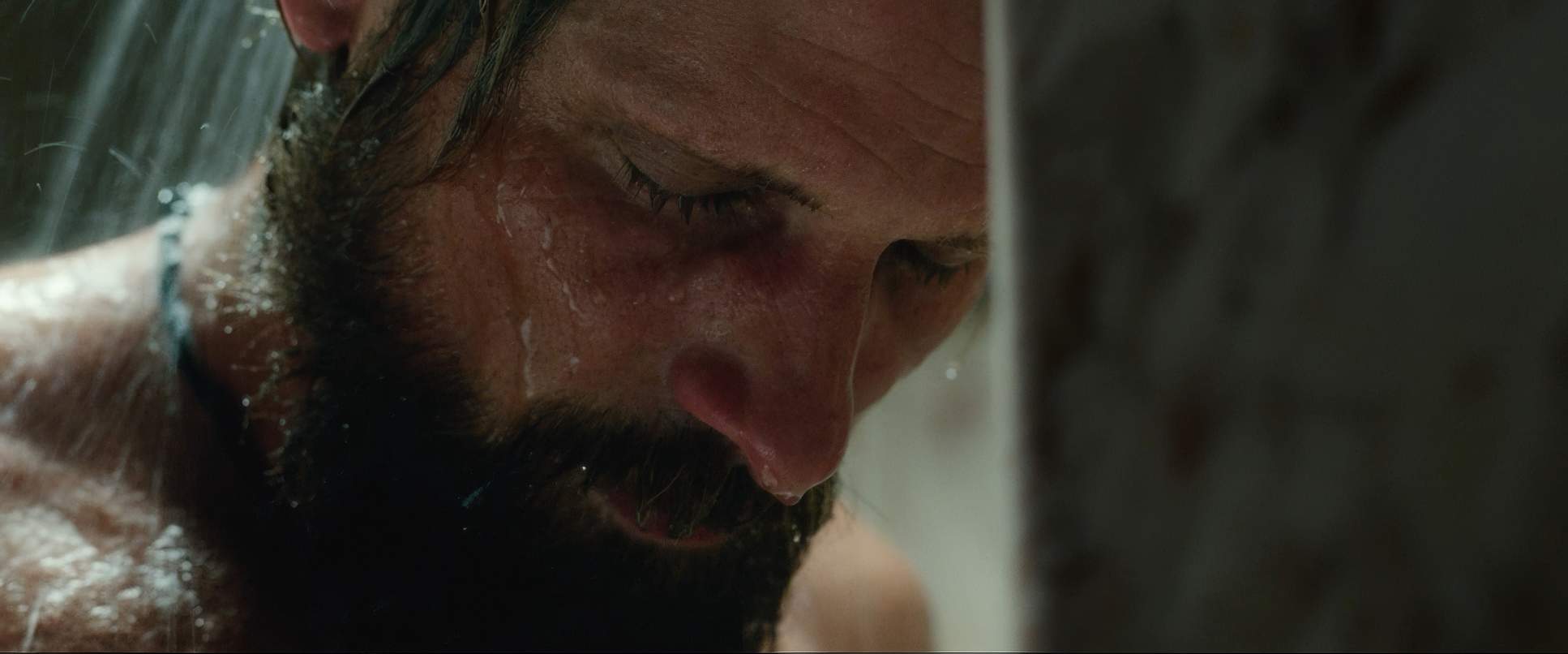
To capture this, Ross tapped French cinematographer Stéphane Fontaine. I’ve been a fan of his for a while his work on A Prophet and Rust and Bone has this incredible way of being raw and documentary-like while still feeling deeply poetic. Fontaine doesn’t “intrude” on a scene; he observes it.
In Captain Fantastic, he brings that same commitment to naturalism. His visual signature is this fluid, responsive camera that stays tight enough to catch a micro-expression but wide enough to remind you exactly where these characters stand in their environment. It’s a delicate dance, moving from the chaotic textures of the deep woods to the flat, clinical lines of a suburban diner without losing the movie’s soul.
Lensing and Blocking

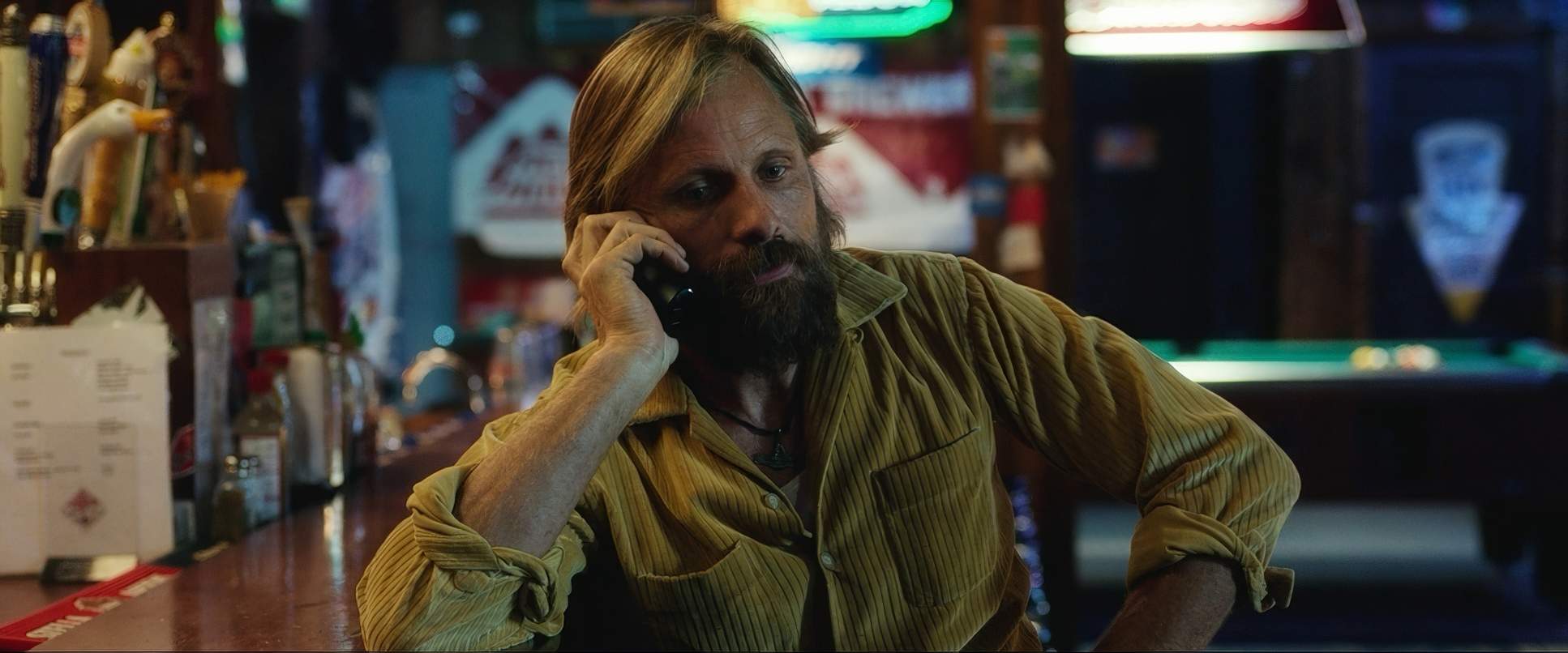
Technically, Fontaine’s choice of glass is where the “character” of the image starts. Shooting on the ARRI Alexa Classic, they opted for Leica Summilux-C and Summicron-C lenses. As a colorist, I love Leica glass because it has a very specific, creamy roll-off and a naturalism that doesn’t feel “clinical” like some modern optics. Using spherical lenses rather than anamorphic was the right call it keeps the aesthetic grounded in reality rather than turning it into a “movie-movie.”
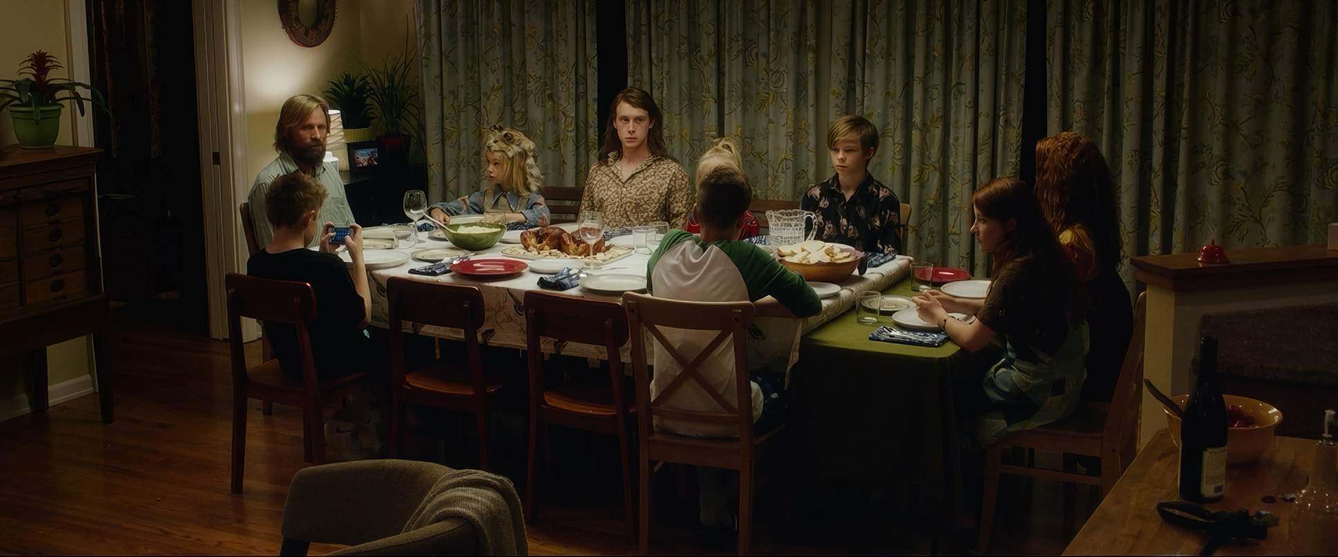
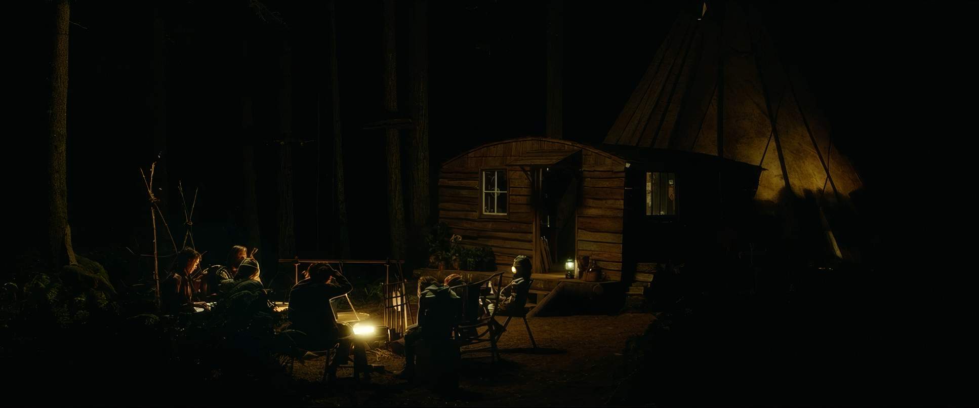
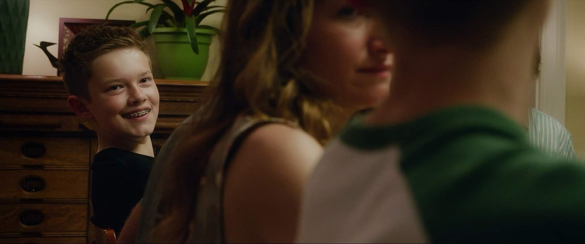
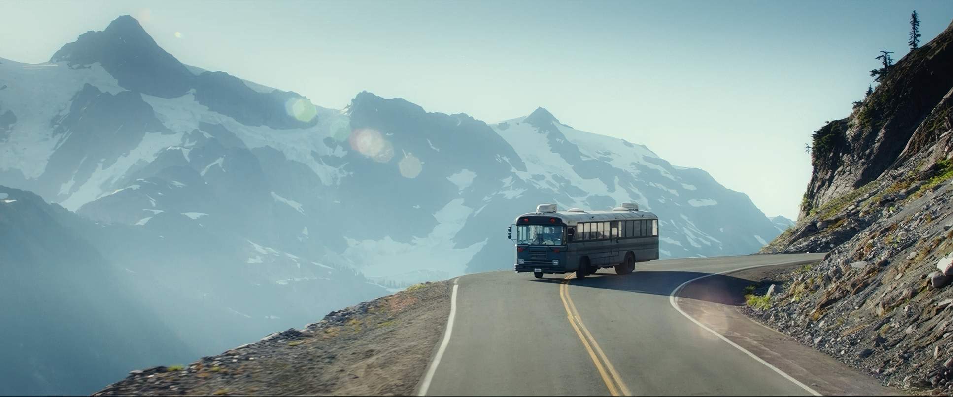
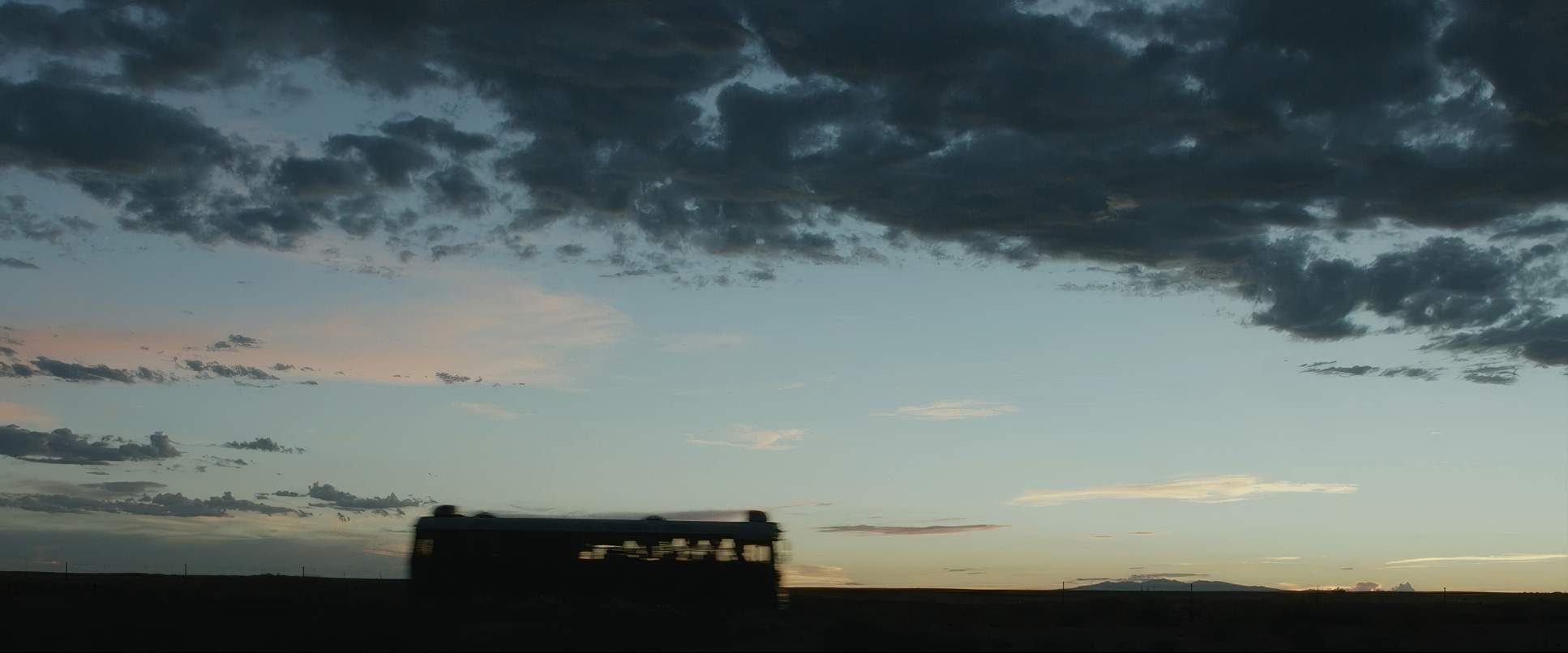
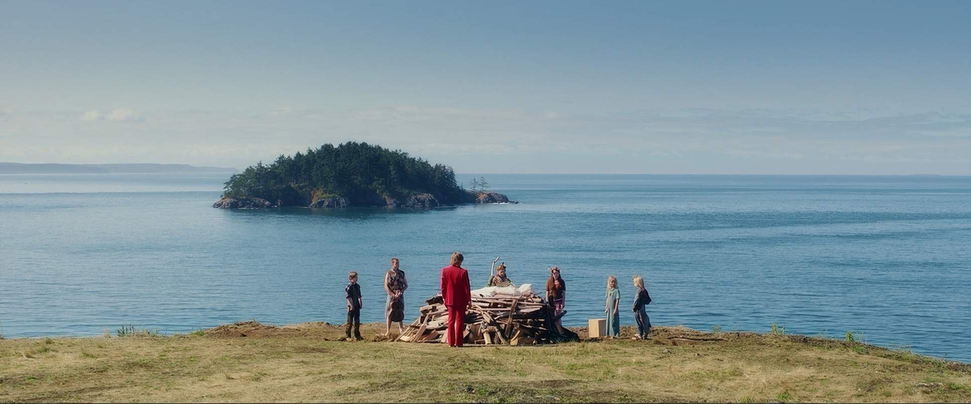
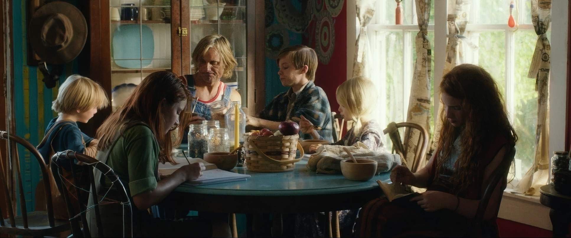
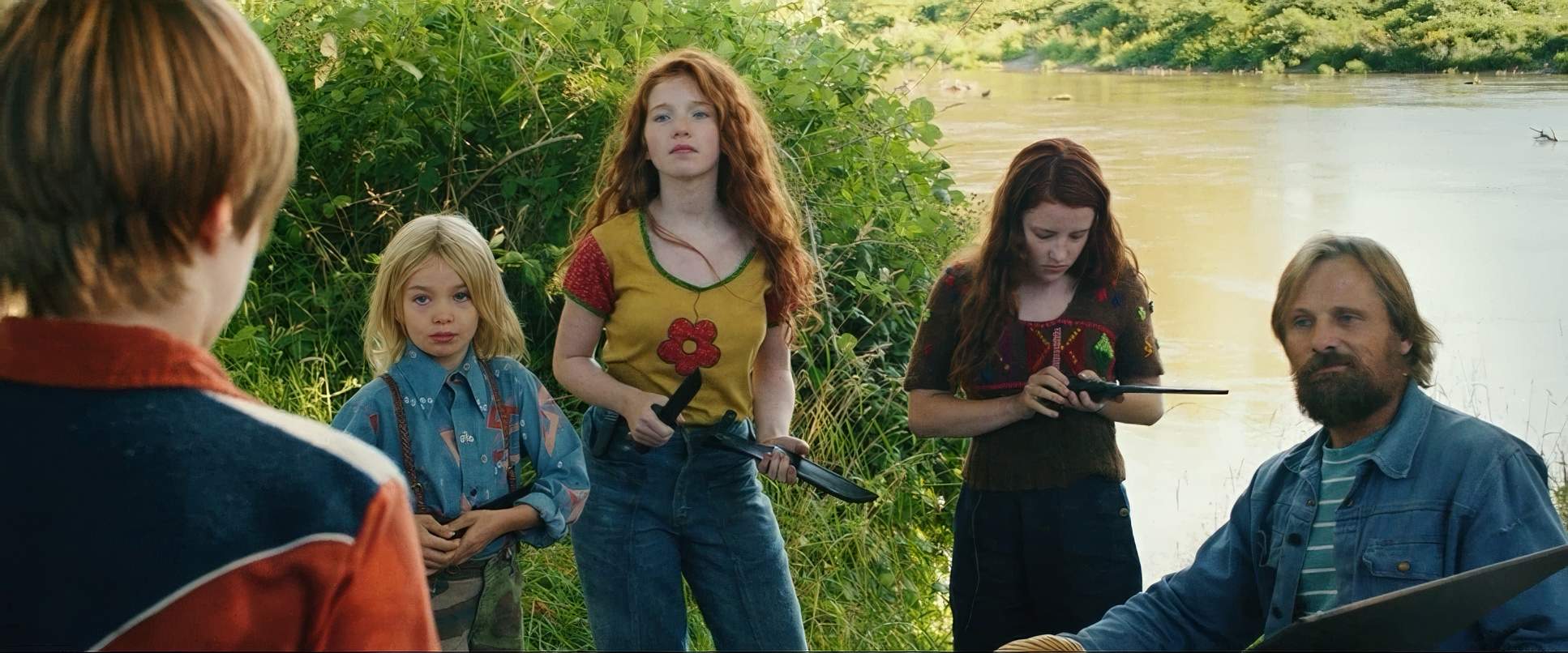
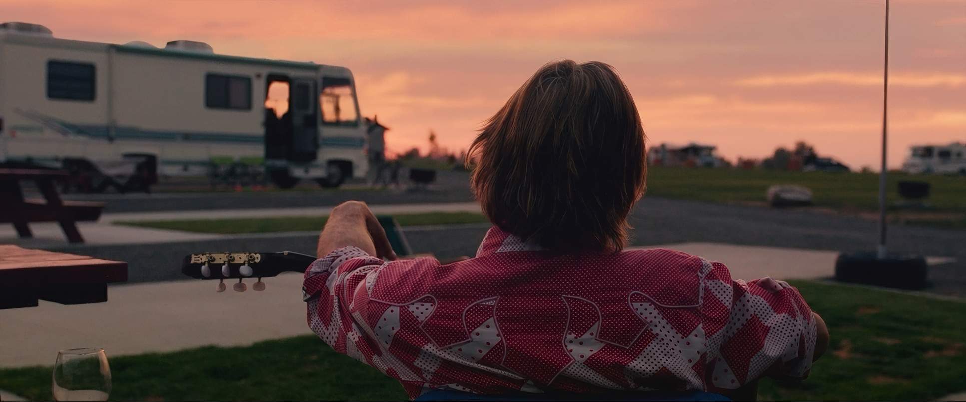
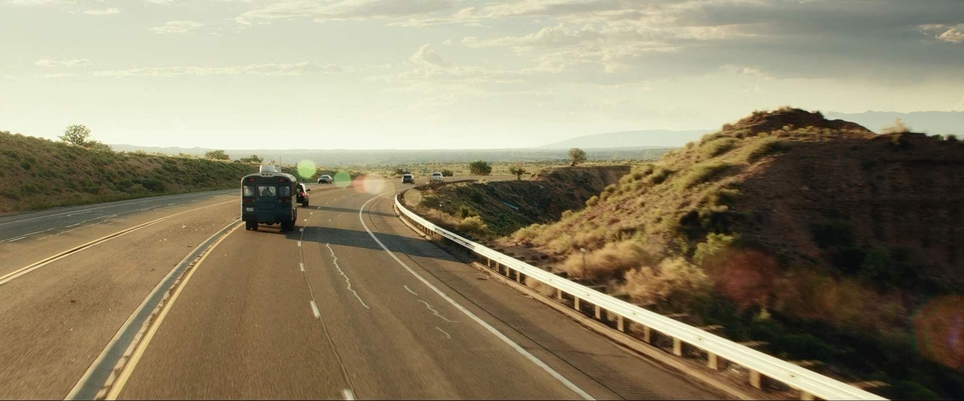
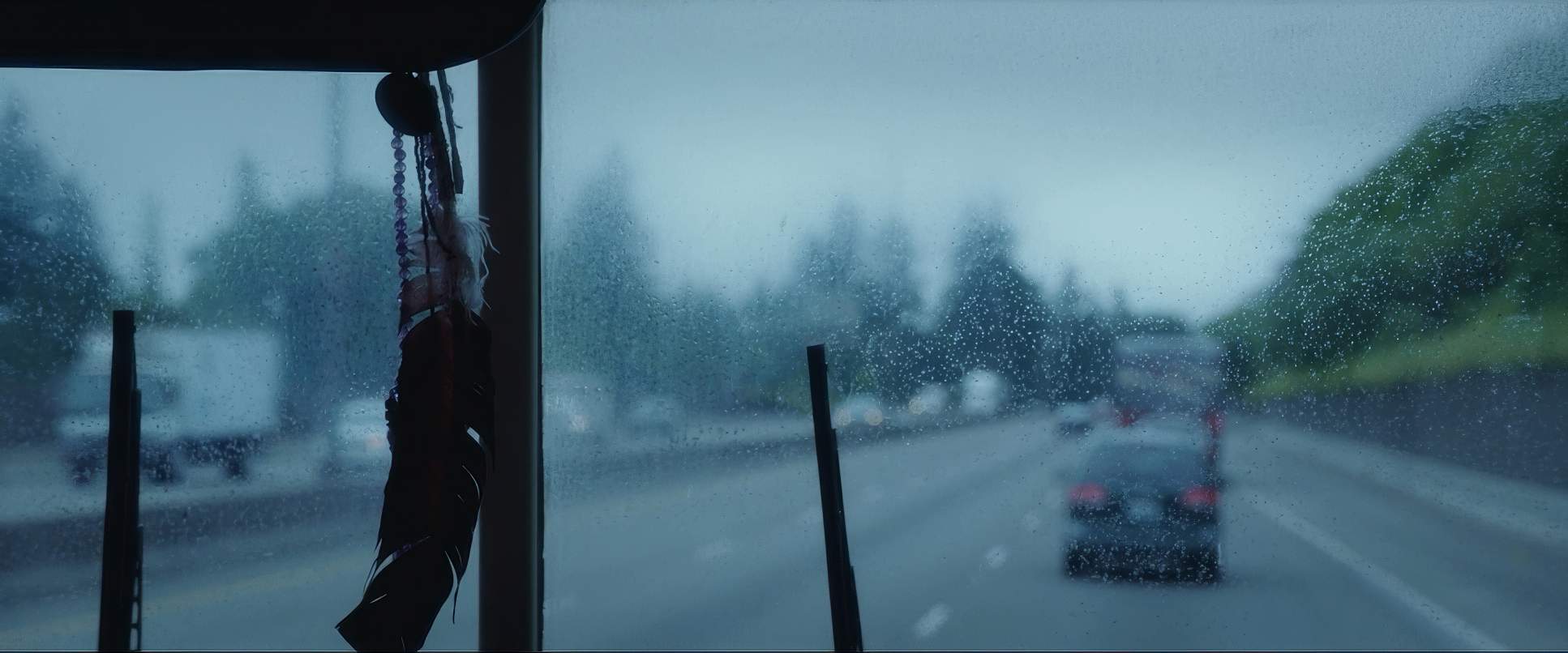
The 2.39:1 aspect ratio gives the Pacific Northwest the scope it deserves, but the blocking is what really sells the family dynamic. When they’re in the forest or on their bus, they are blocked as a single, tight-knit unit often physically overlapping. The bus itself acts as a mobile sanctuary. But once they hit civilization, the blocking fractures. They spread out, looking uncoordinated and visually overwhelmed by the sensory input of the “normal” world. It’s a brilliant way to show their internal displacement through physical positioning.
Camera Movements

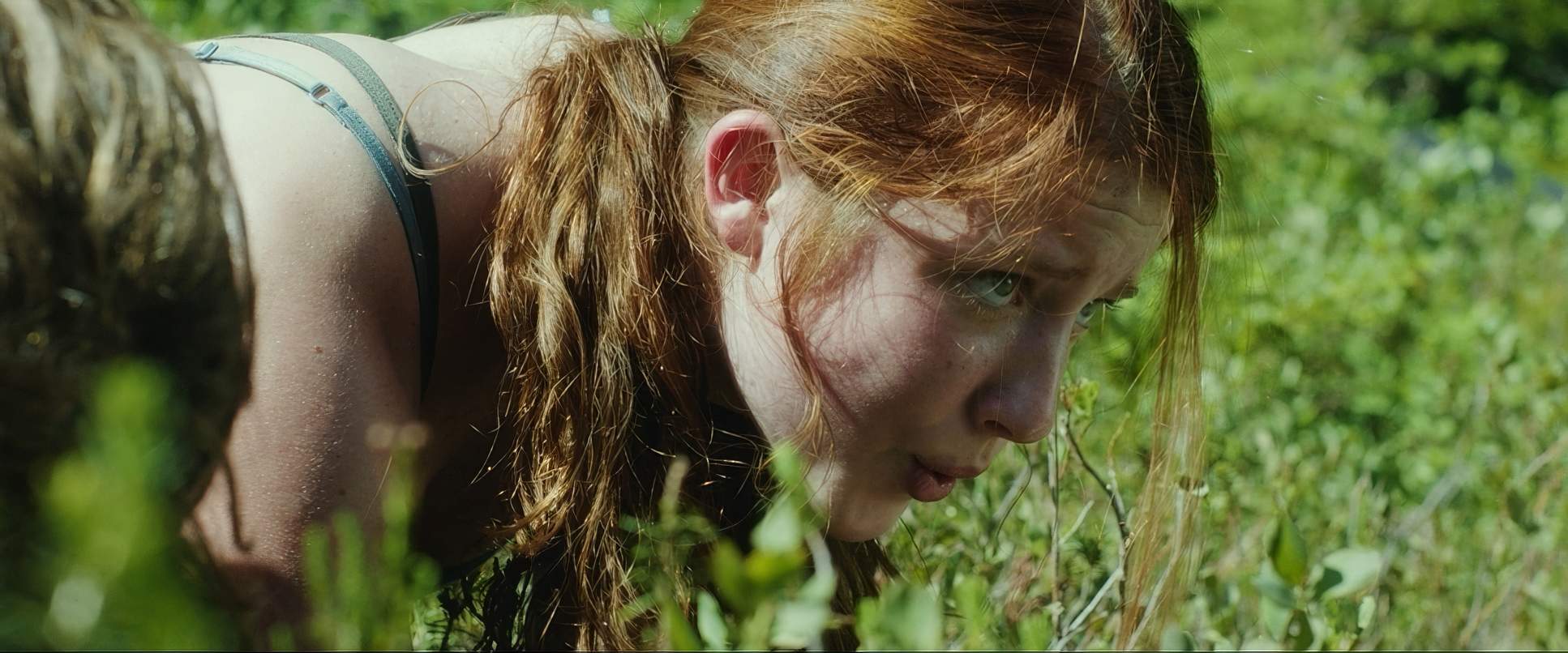
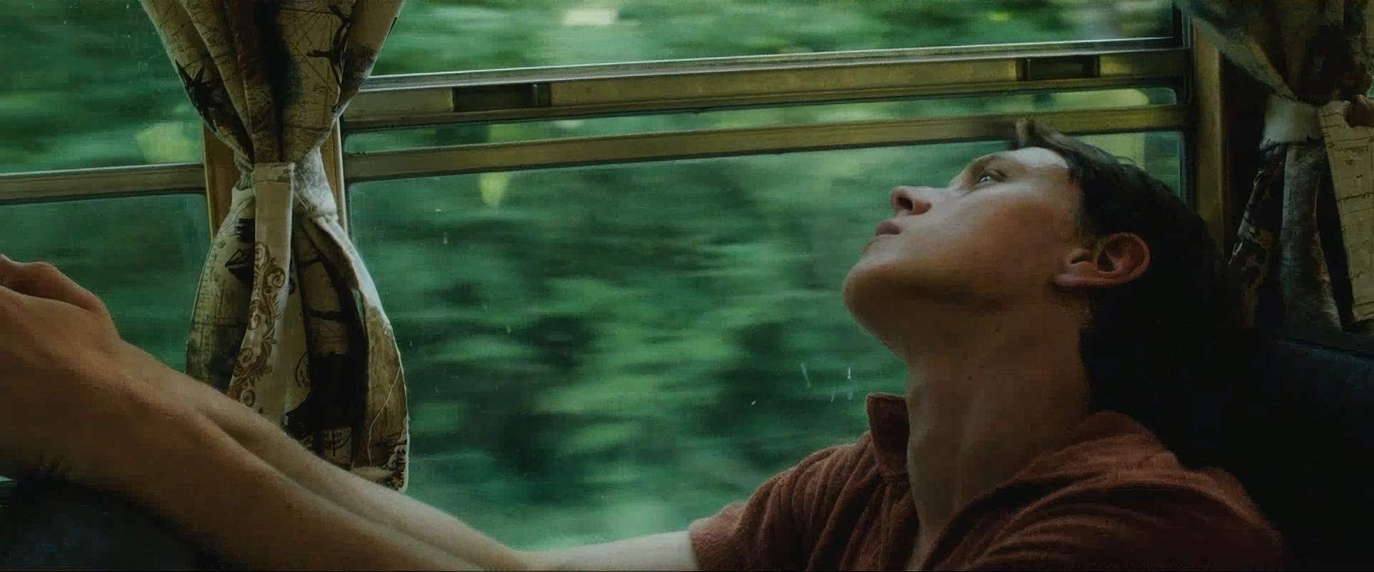
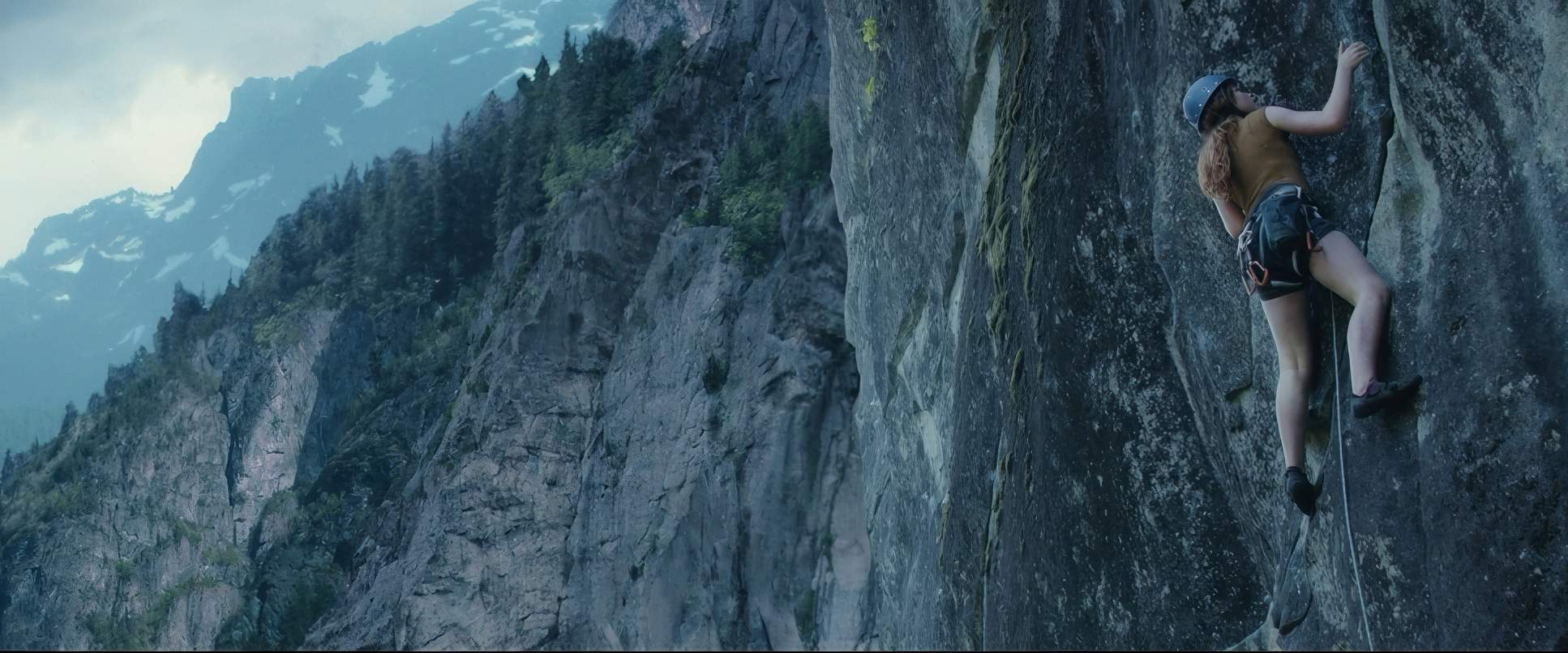
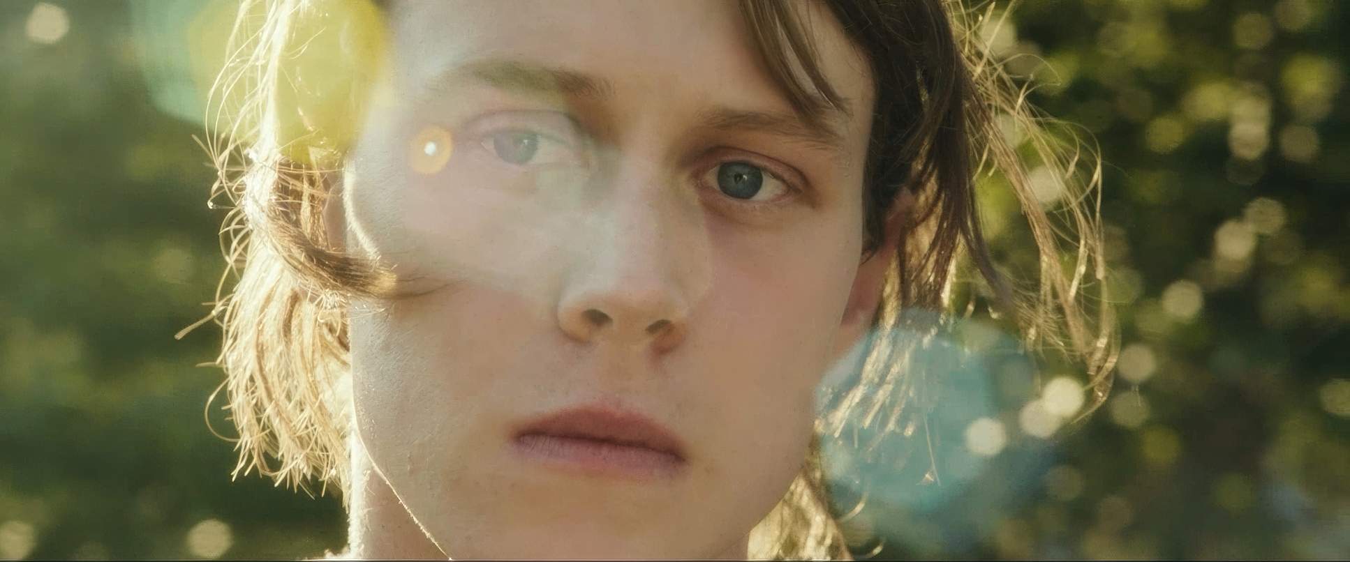
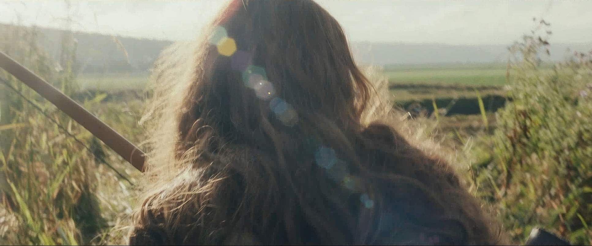
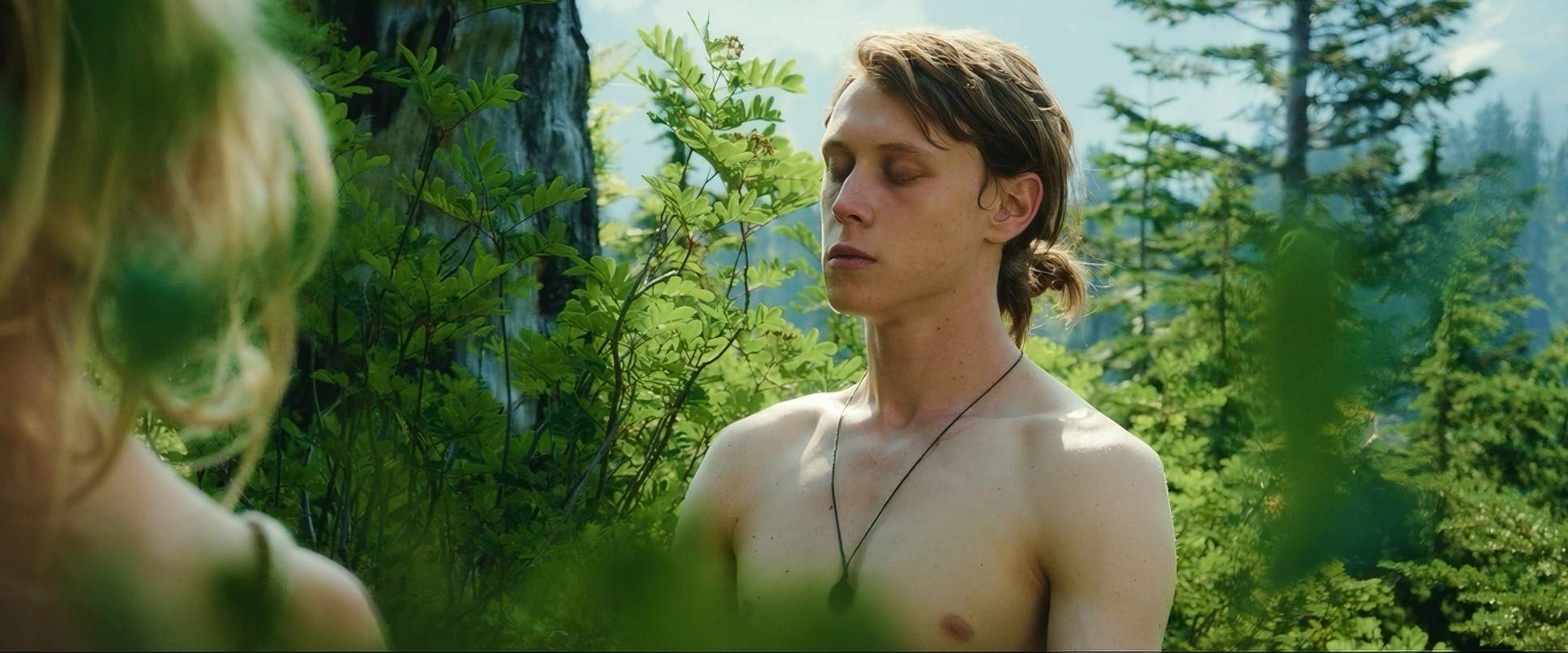
Fontaine’s camera movement is incredibly disciplined. In the forest, we get this steady, yet organic handheld energy. It’s not “shaky cam” for the sake of it; it’s a camera that floats with them as they hunt and climb. It feels primal and harmonious. We feel their self-sufficiency because the camera moves with the same confidence they do.
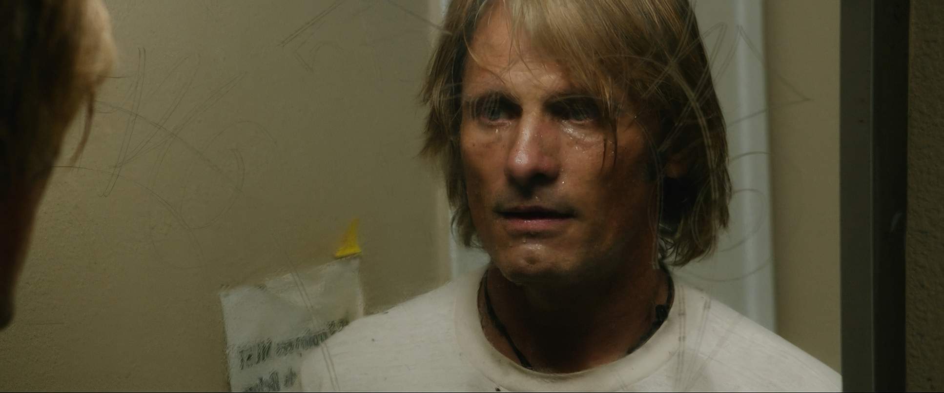
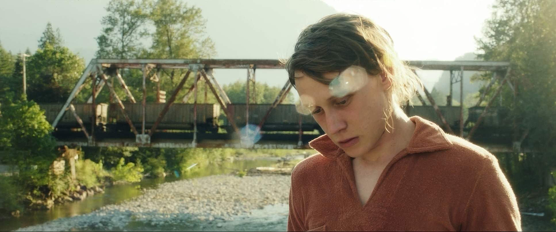
The shift happens when they venture into civilization. The rhythm changes. Those fluid, unbroken lines start to feel a bit more jarring or contained. The frames get tighter, and the tracking shots feel more deliberate, almost like the camera is “trapping” them within societal structures. As a filmmaker, I feel that shift in my bones it’s a masterful use of visual grammar to signal that the family’s freedom is being squeezed.
Compositional Choices

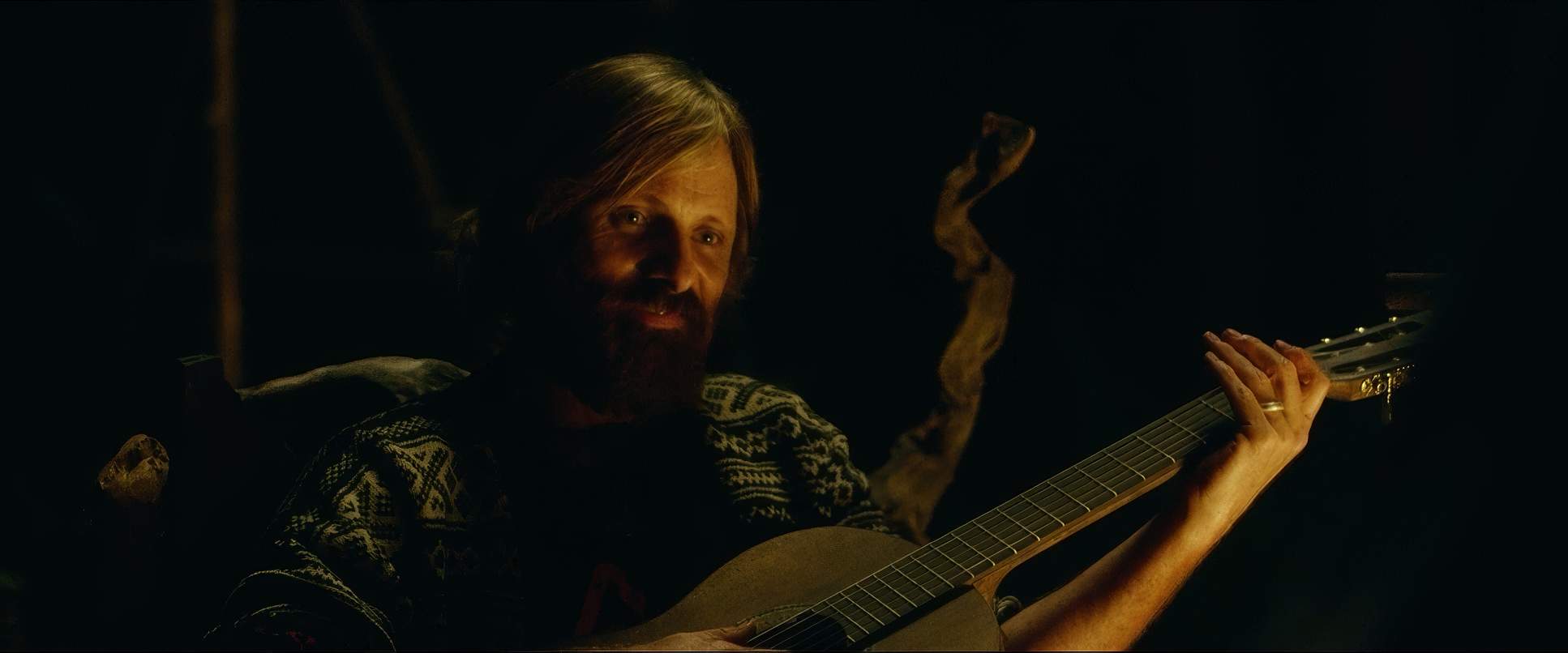
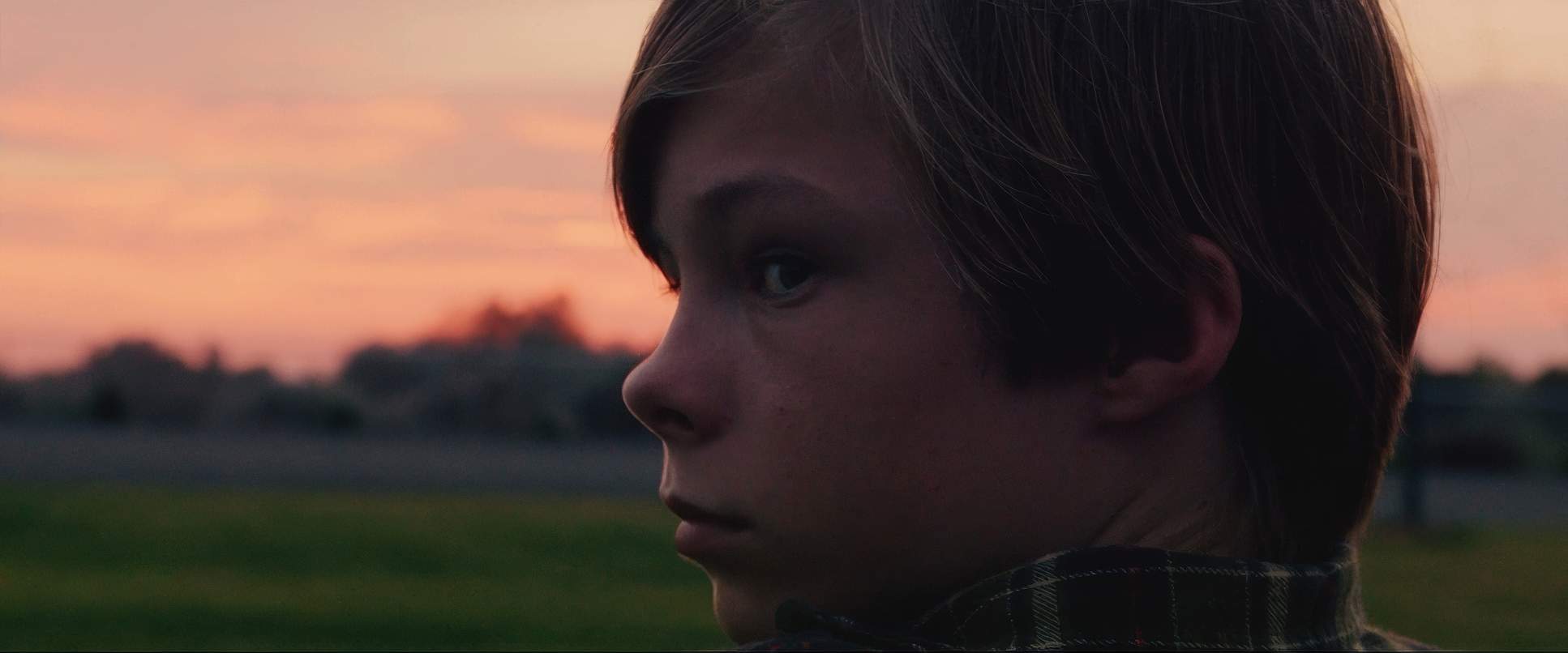
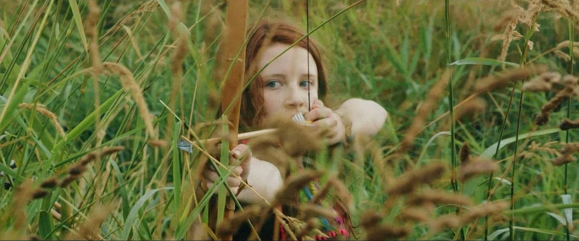
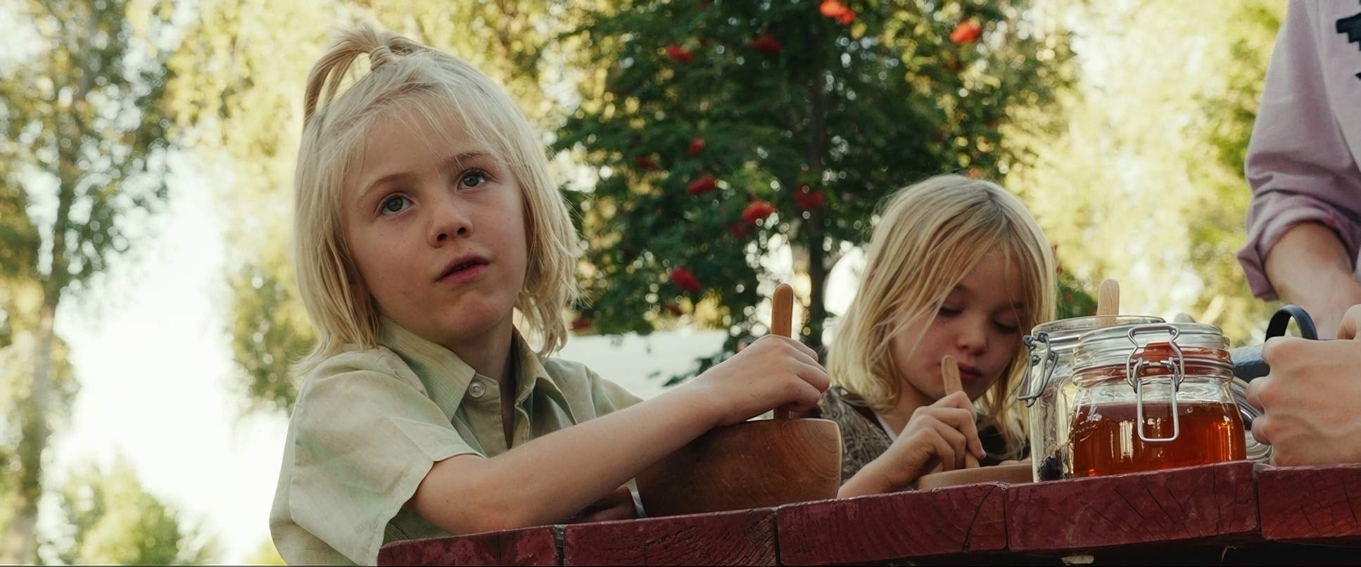
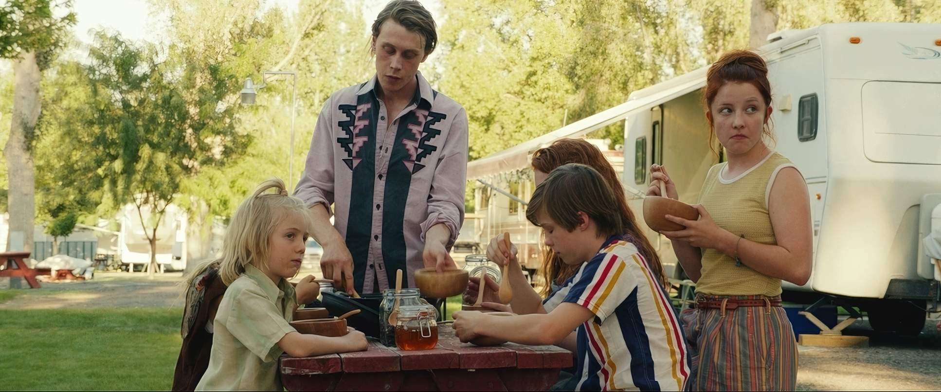
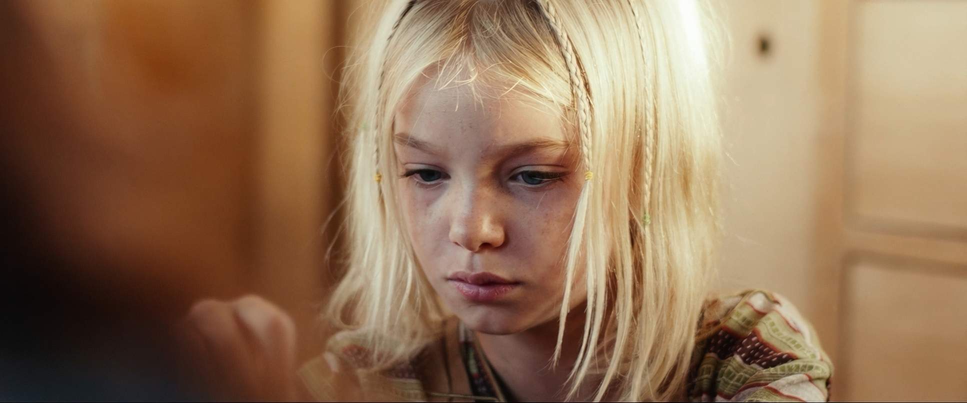
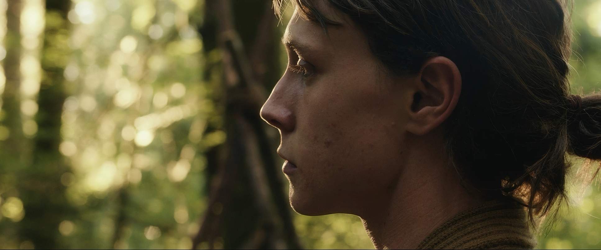
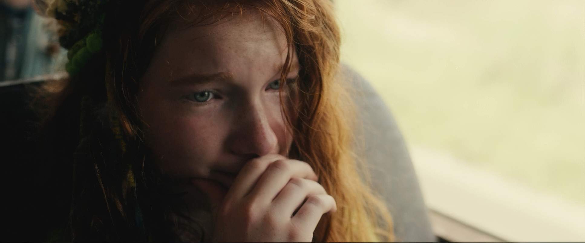
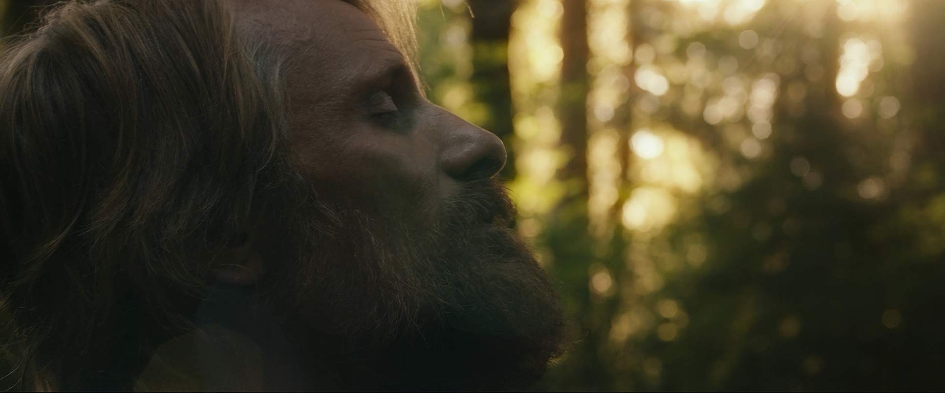
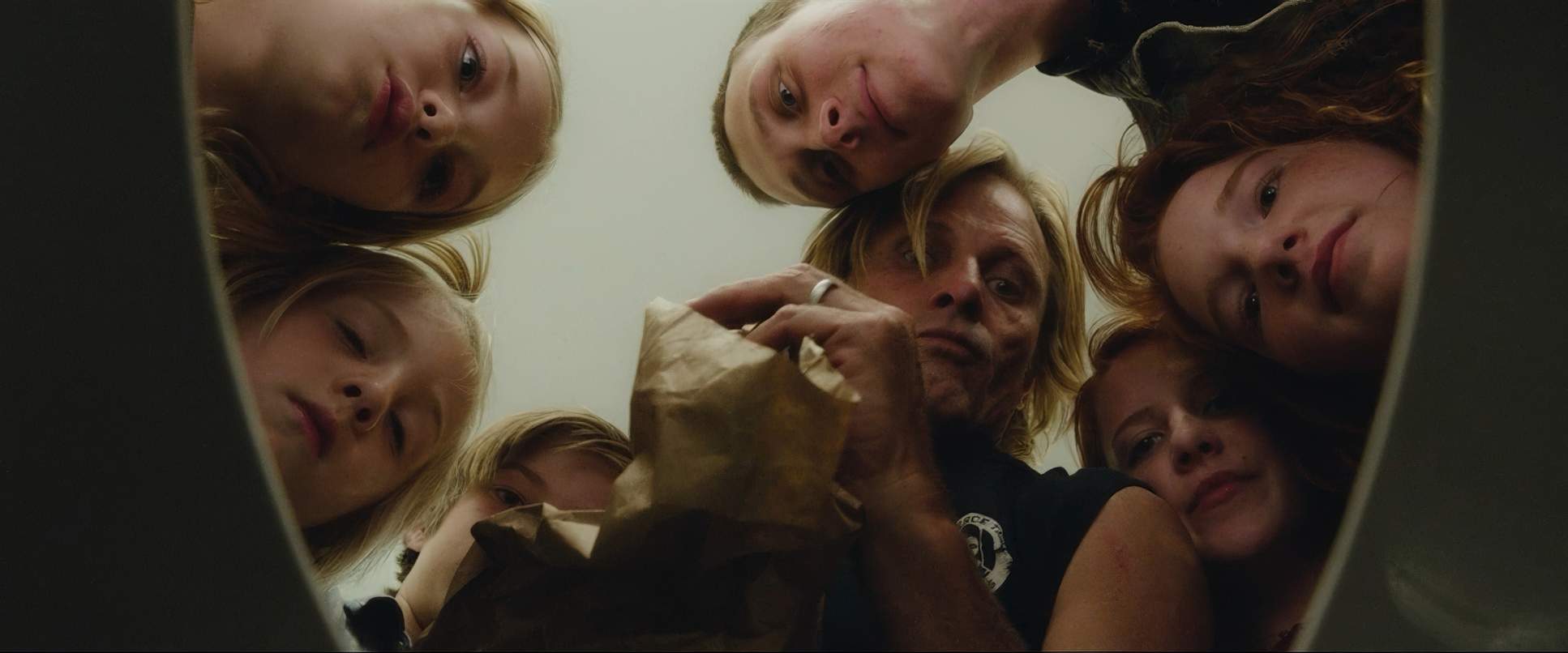
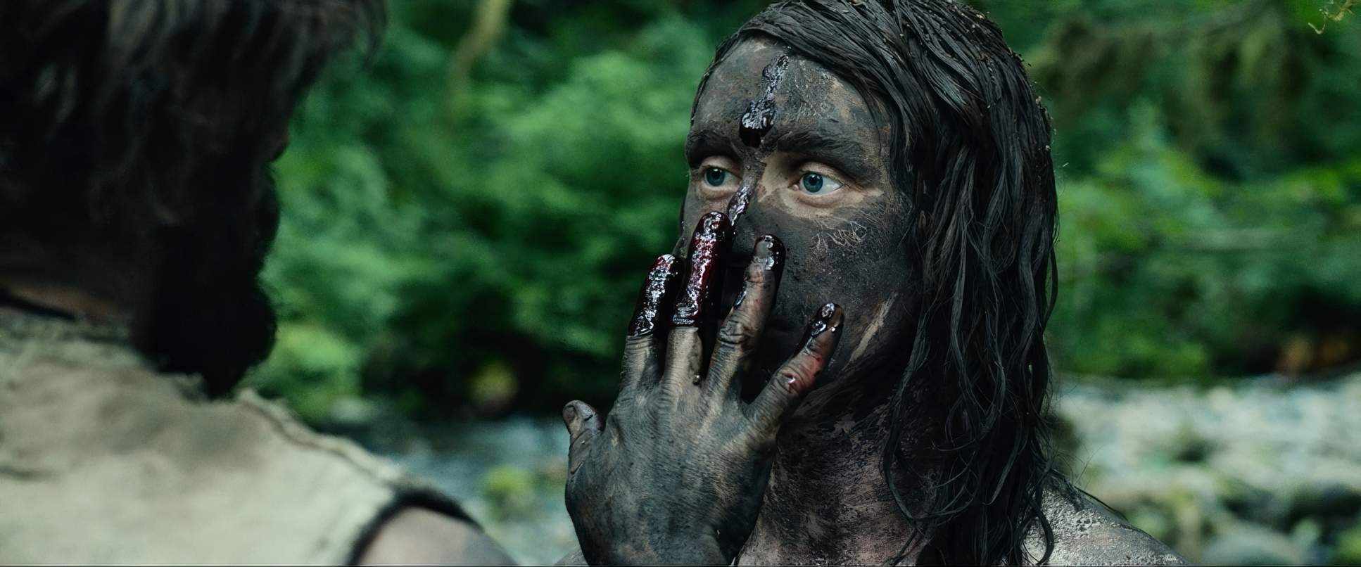
The compositions here are a study in scale. In the woods, Fontaine uses wide shots to dwarf the family against towering trees, emphasizing their isolation. But look at the campfire scenes: the compositions are tight, warm, and circular. It reinforces that “tribe” mentality and their shared intellectual life.
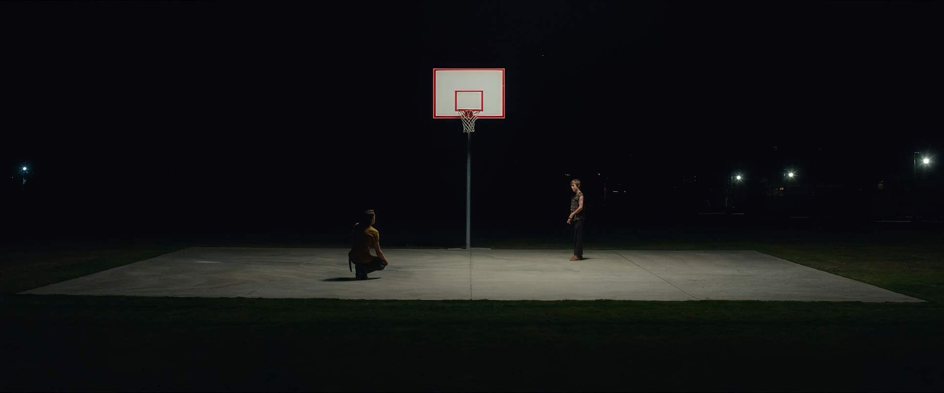
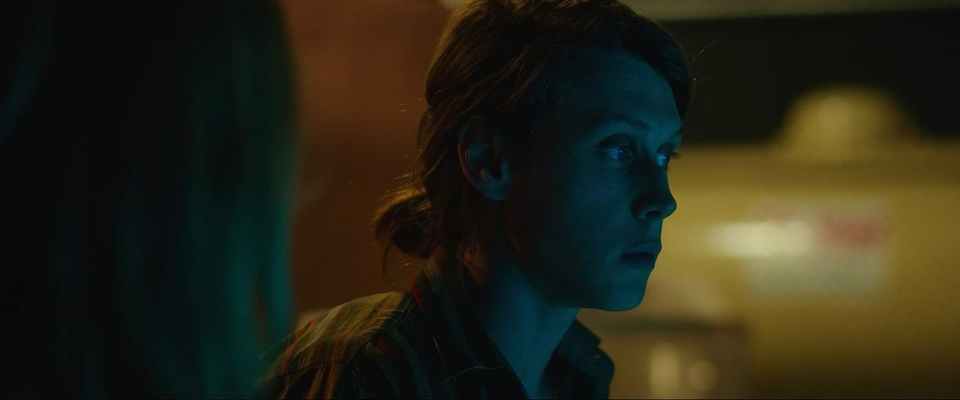
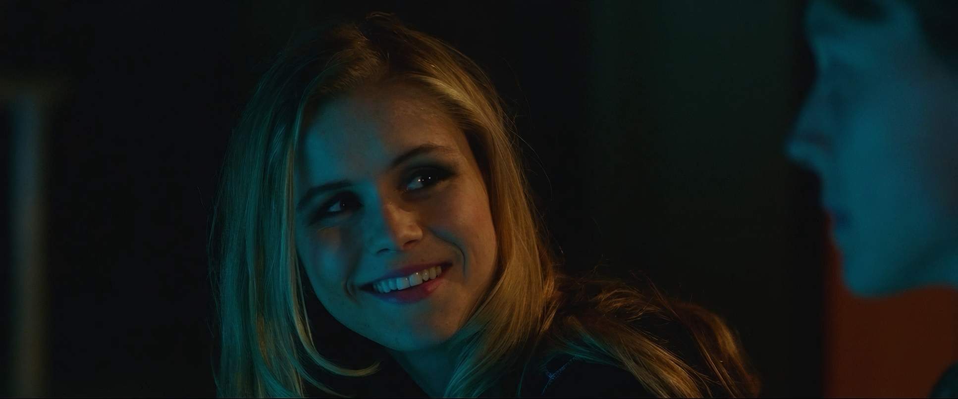
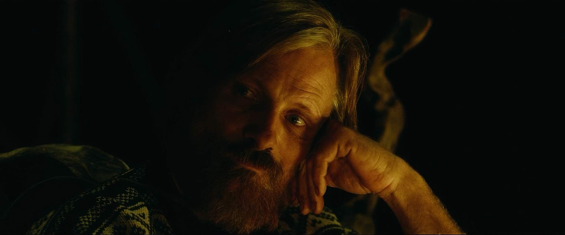
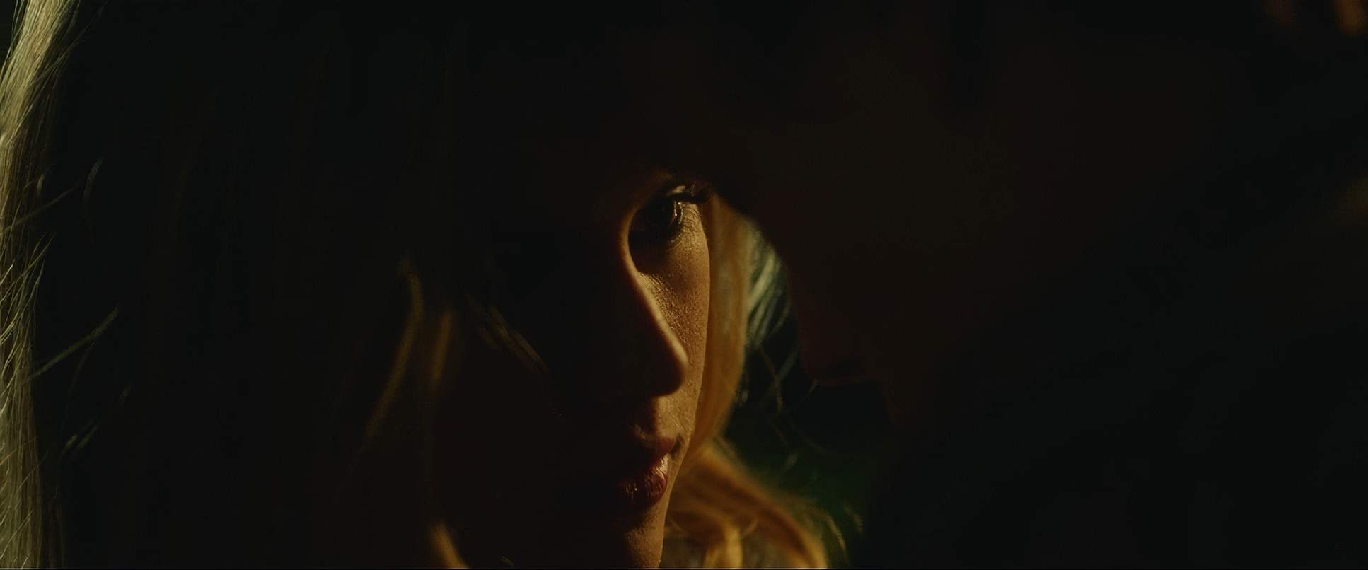
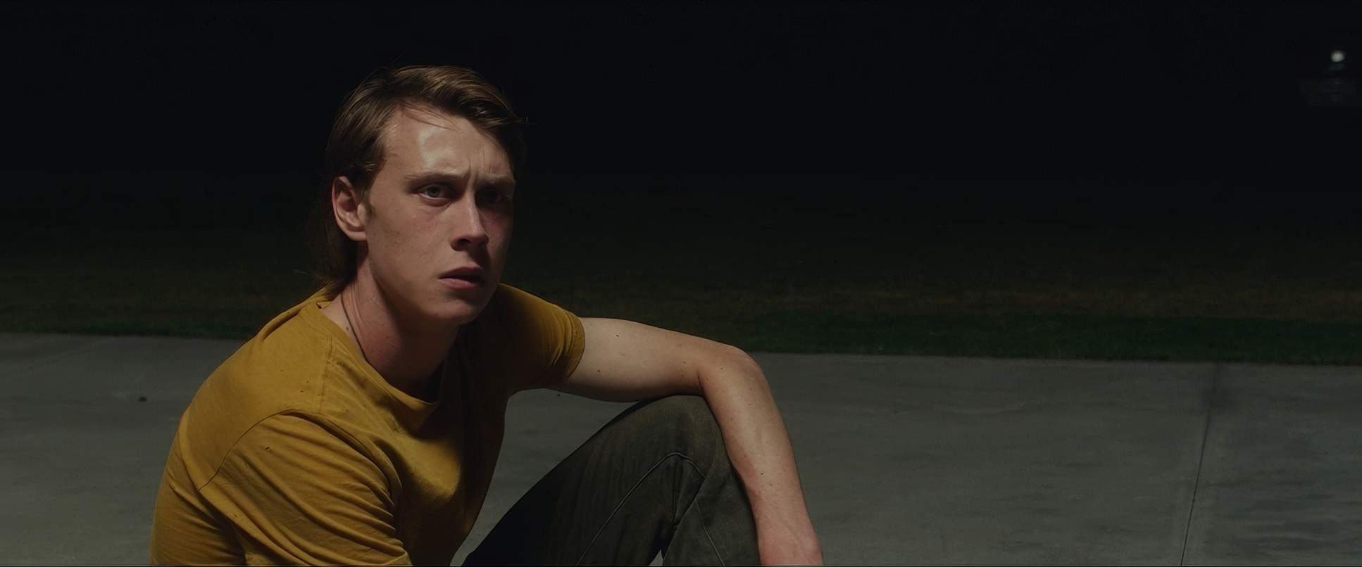
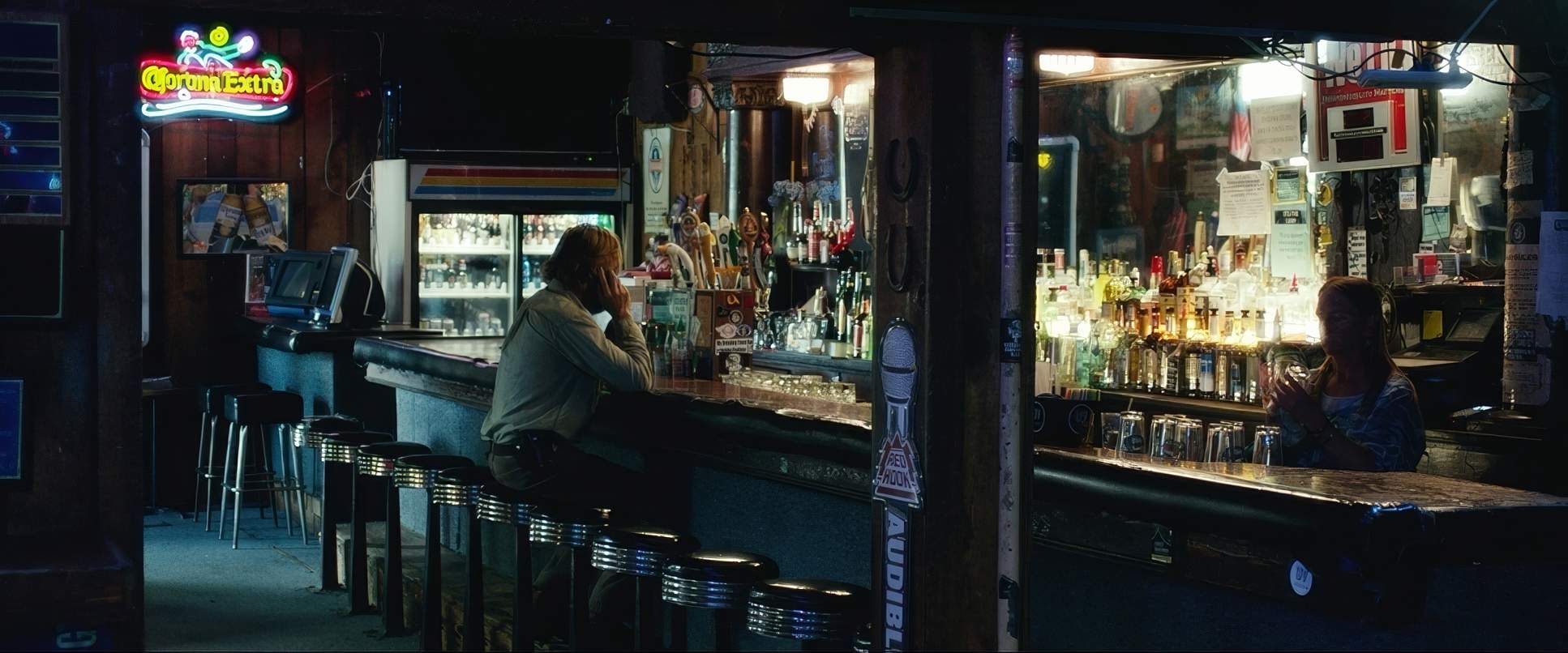
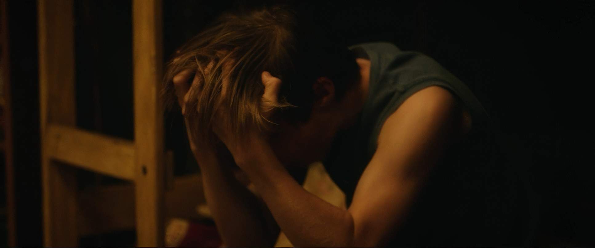
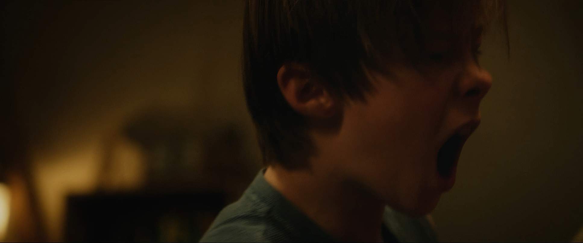
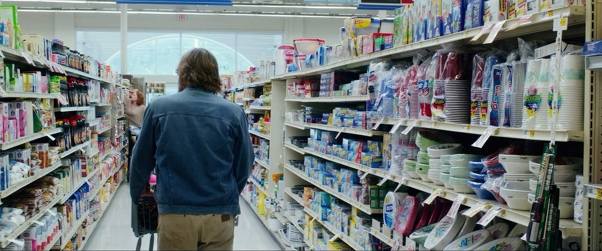
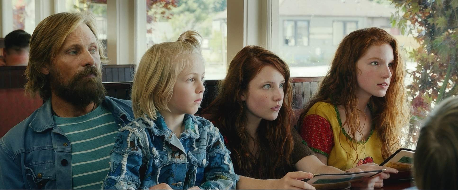
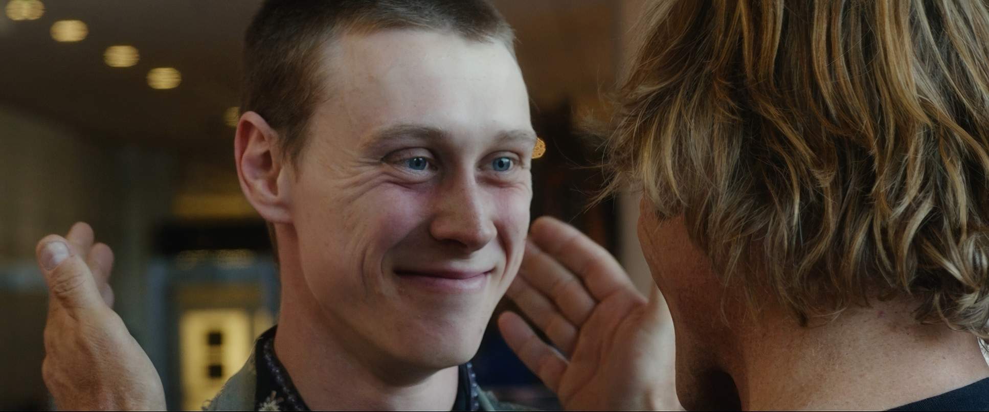
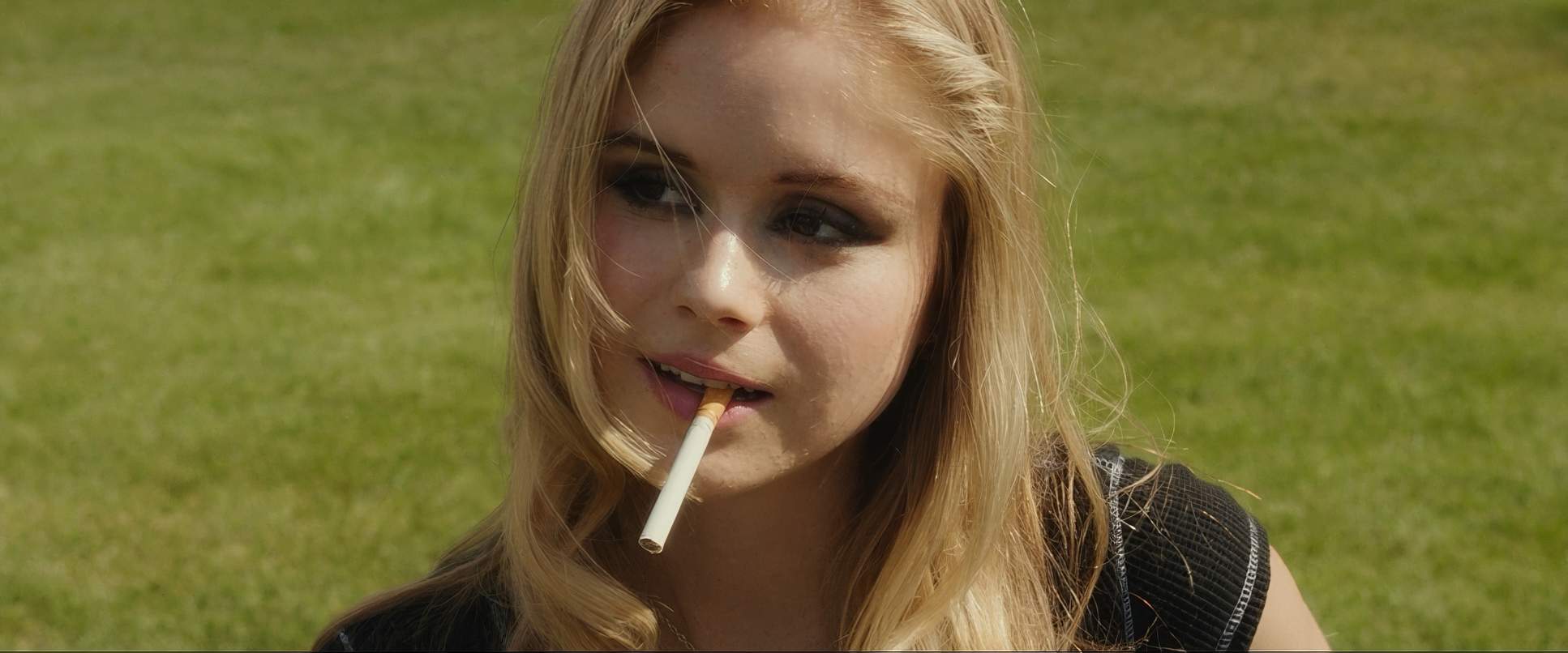
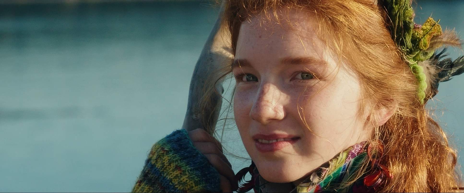
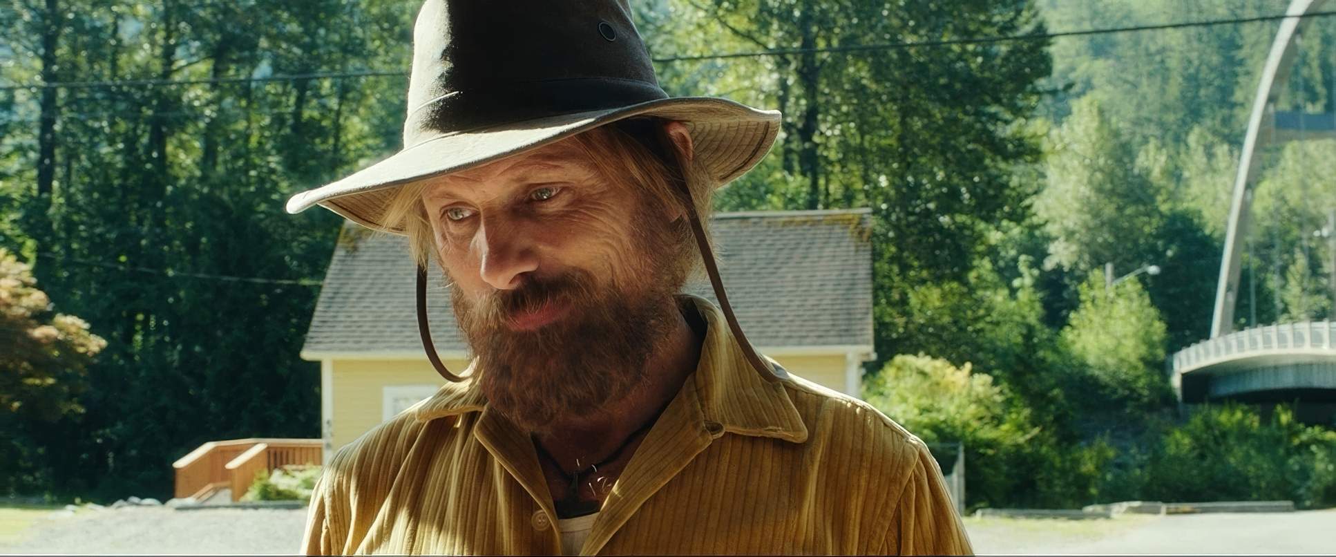
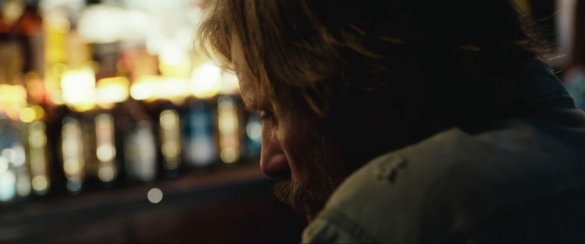
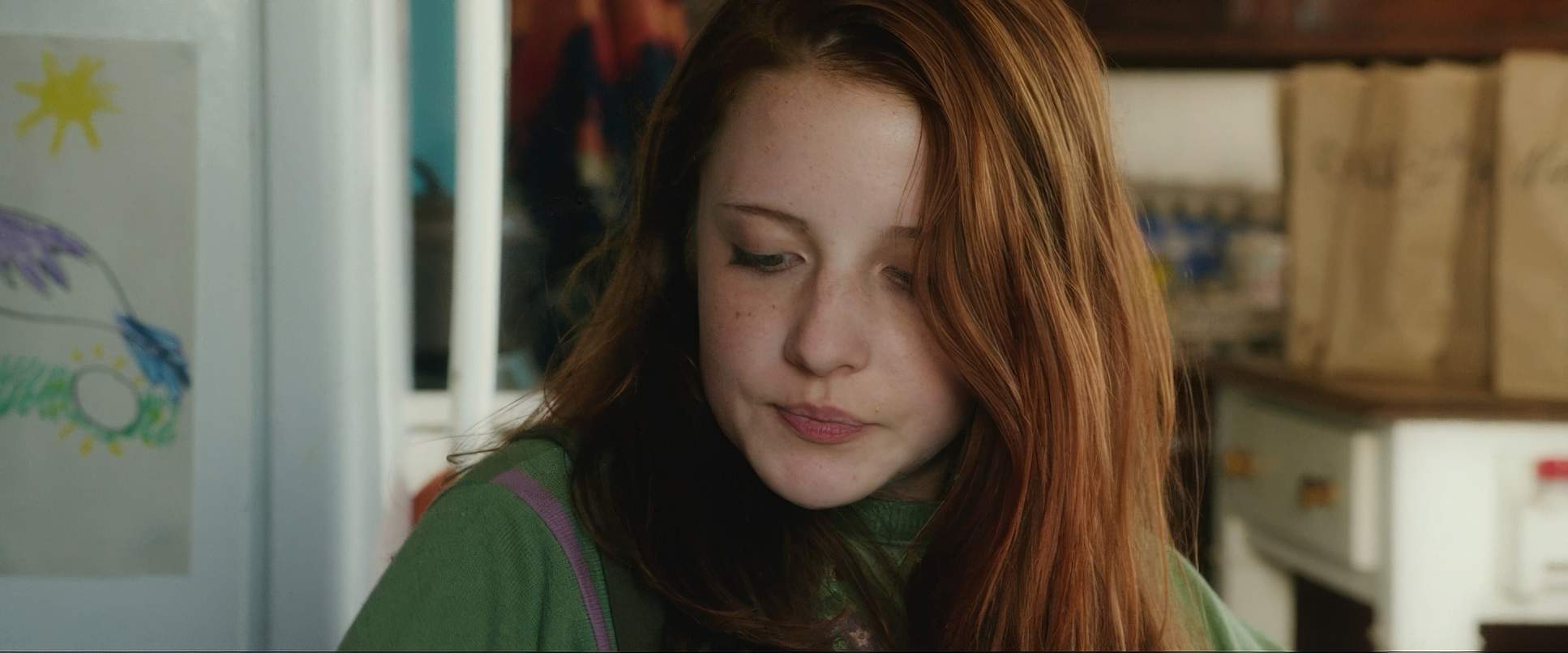
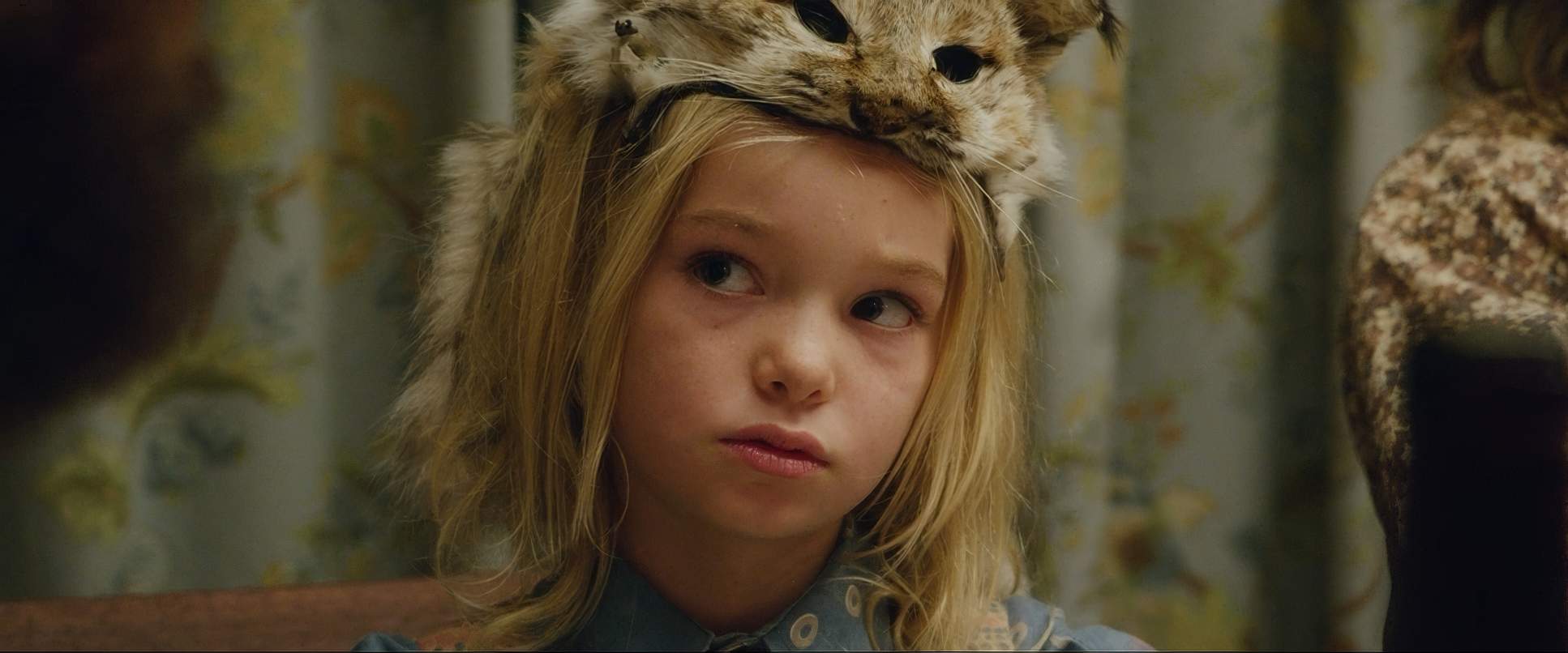
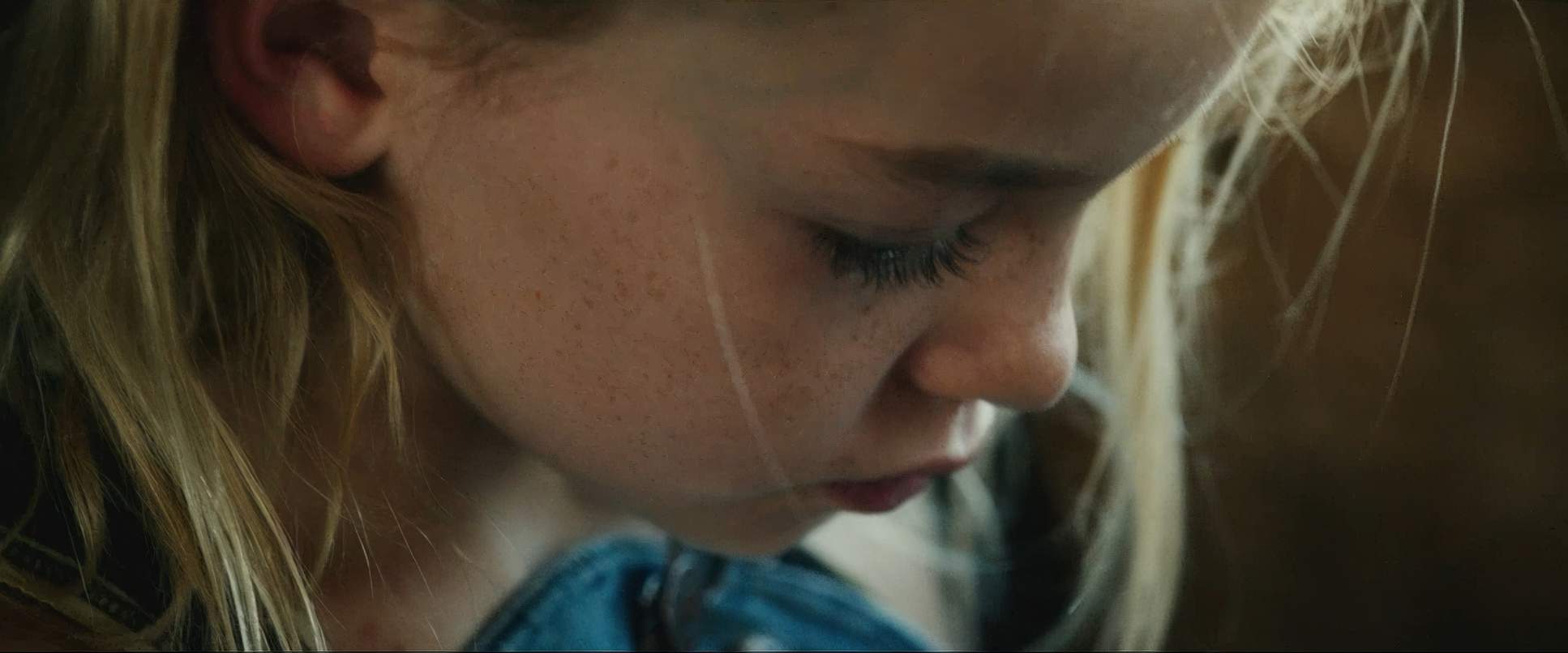
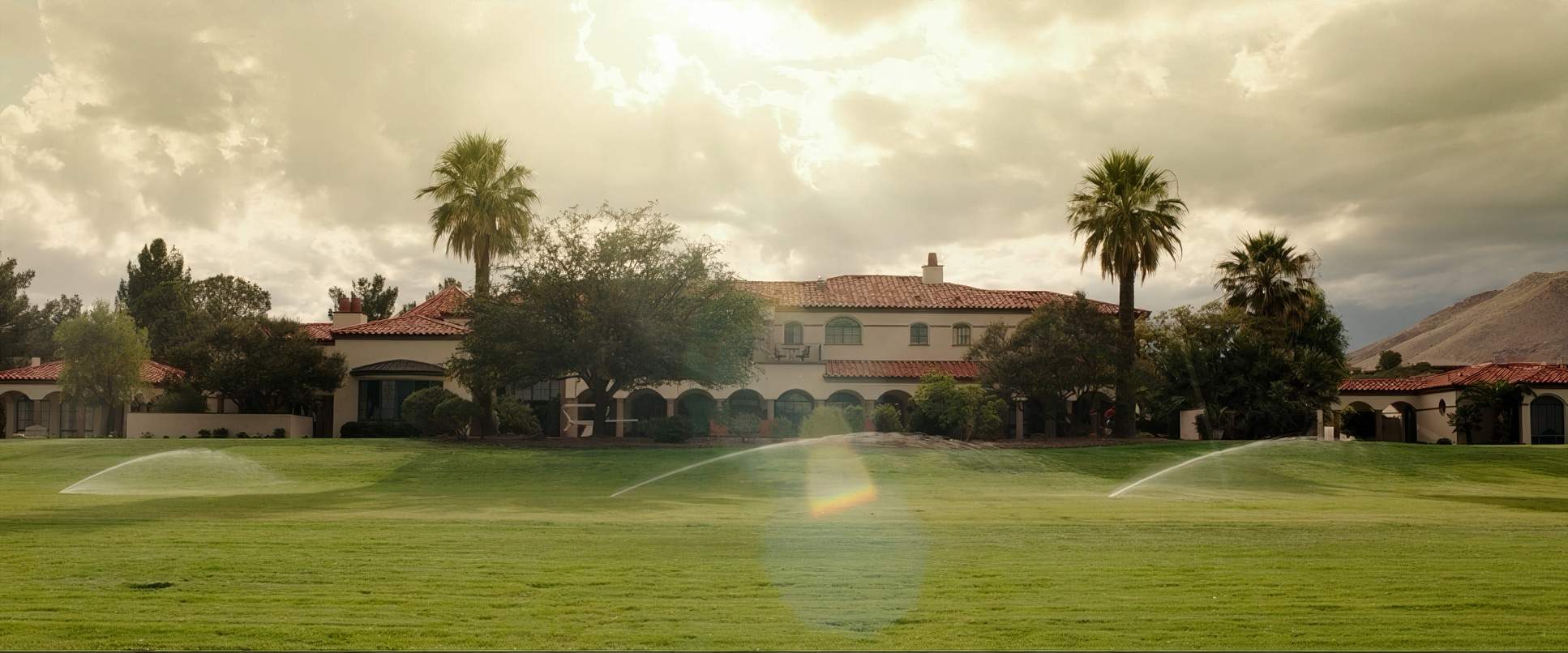
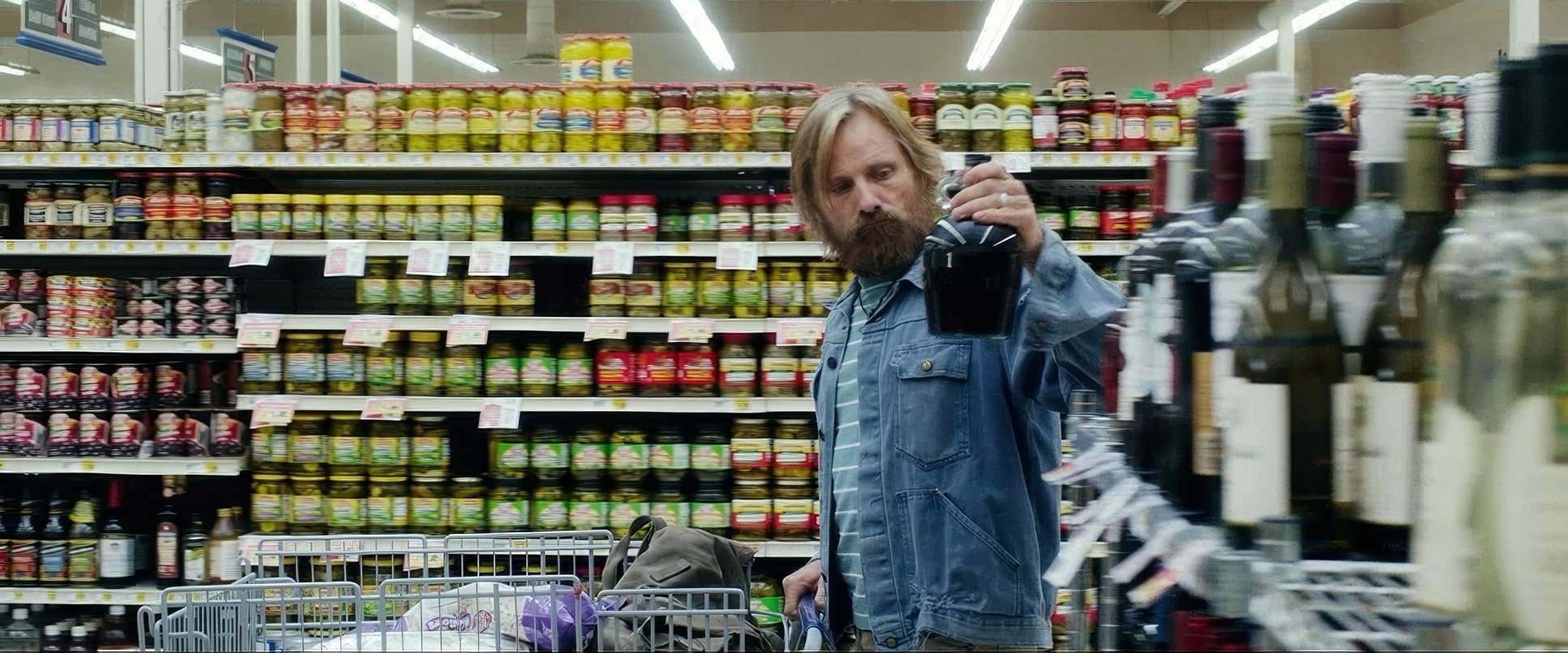
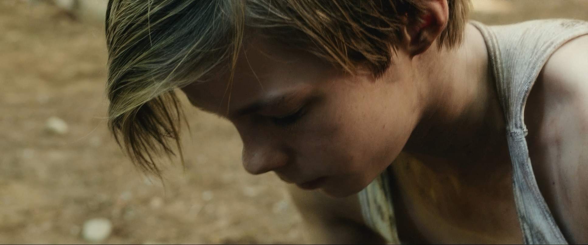
Contrast that with the “outside world.” Suddenly, the family is framed by doorways, windows, and the restrictive geometry of suburban architecture. We see a lot of “clean singles” and “left-heavy” compositions that make the negative space feel less like “nature” and more like “emptiness.” The close-ups on the children are particularly impactful here; they capture that raw confusion as they grapple with things like processed food and social norms for the first time.
Lighting Style

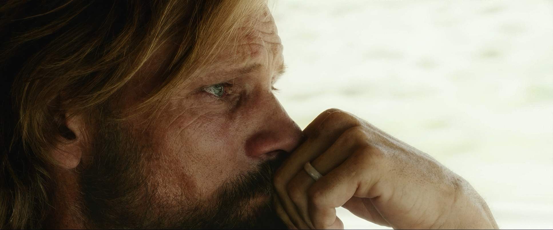
The lighting is predominantly naturalistic, which is Fontaine’s bread and butter. In the forest, it’s all about harnessing available light sunlight dappling through the canopy and motivated practicals like campfires. From a technical side, these scenes demand massive dynamic range. You’re dealing with deep, textured shadows and bright sky highlights, and the Alexa’s sensor handles that roll-off beautifully.
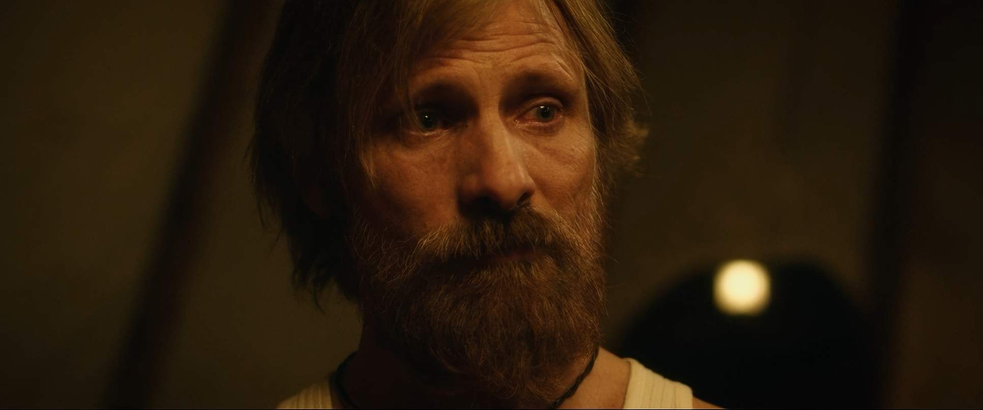
When they move indoors to the “outside world,” the light gets flatter and more artificial. Think fluorescent supermarket tubes and stagnant ambient lamps in a suburban home. It’s not “ugly” lighting, but it’s controlled and “dead” compared to the wild, untamed light of their home. It’s a subtle shift that supports the clashing philosophies of the film without hitting the audience over the head with a hammer.
Color Grading Approach

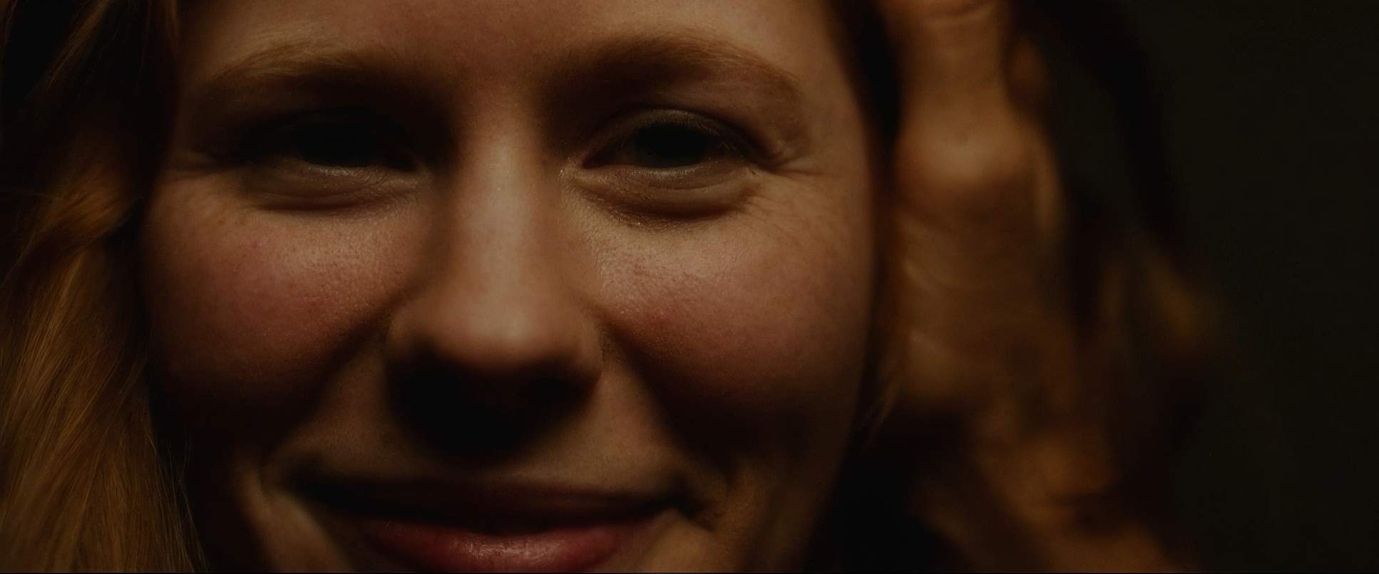
This is my favorite part. The grade, handled by Leandro Marini and Lee Hultman, is a lesson in restraint. In the forest, the palette is lush heavy on the greens and earthy browns but there is incredible hue separation. The greens feel distinct and alive, not like a muddy wash. The skin tones have a healthy, sun-kissed “Washington glow” that suggests vitality.
As a colorist, I appreciate how they didn’t just slap a “teal and orange” LUT on this. It feels like a print-film sensibility. When they travel, the grade shifts. The greens lose their saturation, the browns get duller, and the color temperature nudges cooler in urban spaces. They used contrast shaping perfectly flatter, less dramatic contrast in the suburbs to mirror the perceived “flatness” of modern life. It’s an intelligent, nuanced arc that pulls the viewer from the wild heart of the family’s ideals into the muted complexity of the “real world.”
Technical Aspects & Tools
Captain Fantastic
ARRI ALEXA Classic / Plus • Leica Summilux-C • 2.39:1
| Genre | Adventure, Comedy, Drama |
| Director | Matt Ross |
| Cinematographer | Stéphane Fontaine |
| Production Designer | Russell Barnes |
| Costume Designer | Courtney Hoffman |
| Editor | Joseph Krings |
| Colorist | Leandro Marini, Lee Hultman |
| Time Period | 2010s |
| Color | Cool, Green, White |
| Aspect Ratio | 2.39 – Super 35 |
| Format | Digital |
| Lighting | Top light |
| Lighting Type | Daylight, Overcast |
| Story Location | United States > Washington |
| Filming Location | Washington > Whatcom County |
| Camera | ARRI ALEXA Classic / plus |
| Lens | Leica Summilux-C, Leica Summicron-C |
| Film Stock / Resolution | HD / 1080p |
Looking at the technical specs, the choice to shoot Super 35 on the Alexa Classic was clearly about texture and latitude. Even at 1080p or 2K resolutions, the organic noise floor of that sensor provides a “film-like” density that fits the subject matter perfectly. Having that high-dynamic-range “raw” image from the set was paramount for Marini and Hultman to execute those intricate tonal sculpts in post.
The use of top lighting and daylight/overcast exteriors in Whatcom County, Washington, gives the film its authentic, damp atmosphere. Every technical choice from the Leica Summilux glass to the specific exposure strategy for those deep forest shadows was designed to preserve latitude. It’s the perfect marriage of thoughtful capture and meticulous post-production.
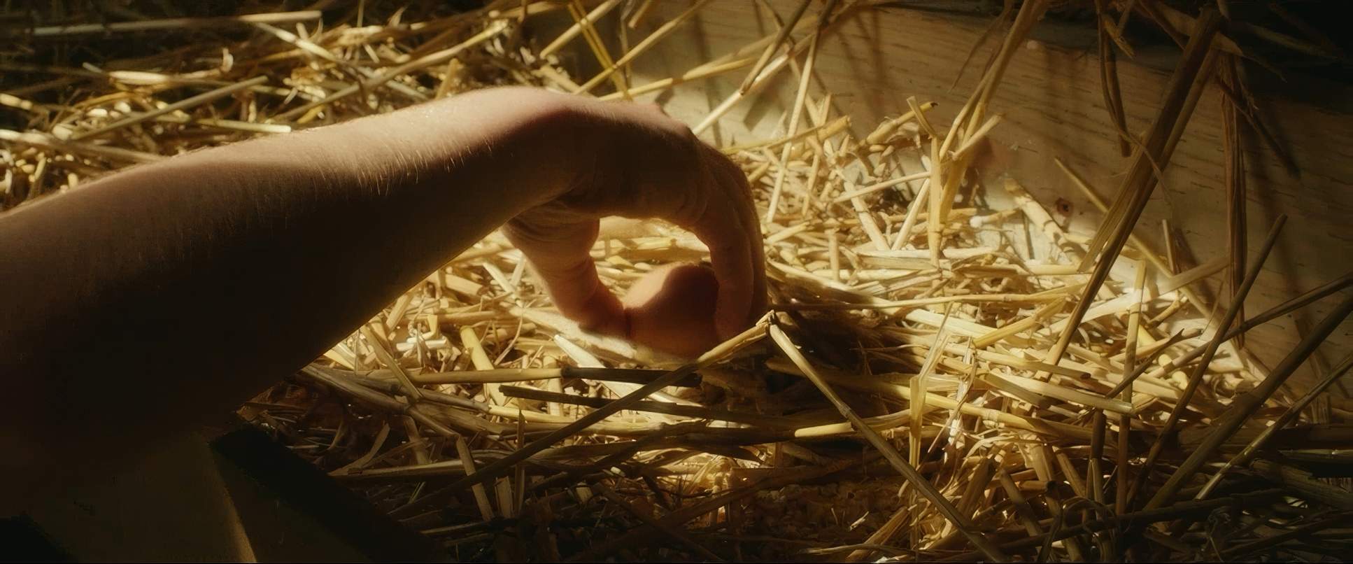
Captain Fantastic (2016) Film Stills
A curated reference archive of cinematography stills from CAPTAIN FANTASTIC (2016). Study the lighting, color grading, and composition.
- Also read: THE ARTIST (2011) – CINEMATOGRAPHY ANALYSIS
- Also read: MR. NOBODY (2009) – CINEMATOGRAPHY ANALYSIS
Browse Our Cinematography Analysis Glossary
Explore directors, cinematographers, cameras, lenses, lighting styles, genres, and the visual techniques that shape iconic films.
Explore Glossary →