I don’t just watch movies for the plot; I’m looking at the highlight roll-off, the texture of the shadows, and how the camera movement dictates the emotional pulse. Captain America: The Winter Soldier (2014) is a benchmark for me. It’s the film that fundamentally rewired the Marvel Cinematic Universe, proving a “superhero movie” could actually be a taut, grounded political thriller. It was a massive swing for Steve Rogers’ first modern-era solo outing, and honestly, the visual choices are the only reason it lands so well.
About the Cinematographer
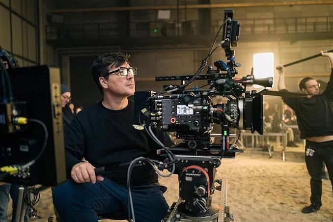
Trent Opaloch is the man behind the lens here, and his partnership with the Russo Brothers is one of the most effective in the MCU. What I love about Opaloch is his restraint. He’s not interested in the glossy, hyper-saturated “comic book” look that defined the early 2010s. He’s a realist. His work feels tactile and immediate. He leans into a naturalistic, almost documentary-style aesthetic that favors raw energy over pristine visuals. It’s not “pretty” in a traditional way, and that’s why it works. The beauty comes from its unvarnished authenticity it makes the stakes feel real because the world feels lived-in.
Technical Aspects & Tools
Captain America: The Winter Soldier (2014)
We don’t have to guess about the gear; the results are right there on the screen. Opaloch opted for the ARRI ALEXA 4:3, paired with Panavision C and E-Series Anamorphics, along with those specialized Bailey and ATZ zooms.
As a colorist, I can see why. That Alexa sensor provides a beautiful, organic base for tonal manipulation, and the Panavision glass adds that classic anamorphic character subtle distortion at the edges and a specific depth of field that pulls this away from “video” and firmly into “cinema.” Using a 2.39:1 aspect ratio was a deliberate choice to capture the wide, imposing scale of Washington D.C. while keeping the hand-to-hand combat feeling intimate and pressurized.
Inspiration Behind the Cinematography
The DNA of this film isn’t “superhero” it’s ’70s paranoia. The filmmakers were transparent about their love for Three Days of the Condor and All the President’s Men, and you can feel it in every frame. This required a total departure from the vibrant aesthetics of The Avengers. They needed a visual grammar that prioritized tension and a sense of tangible threat. The camera isn’t an omniscient observer here; it’s a breathless witness. It allows the audience to feel the weight of Cap’s predicament a man of integrity suddenly hunted by the very system he swore to protect.
Camera Movements

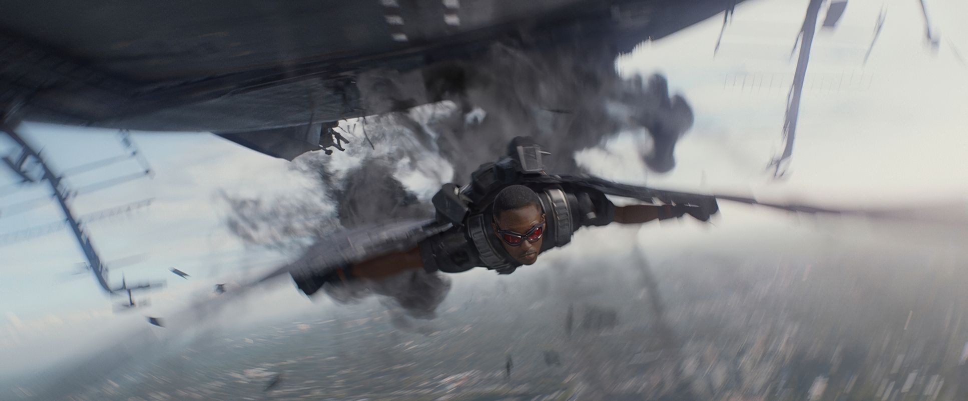
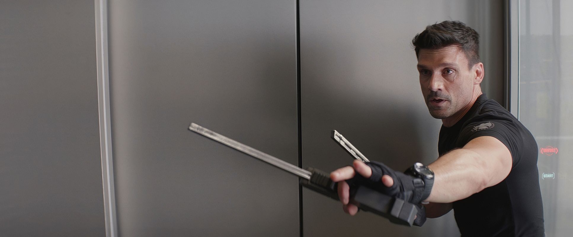
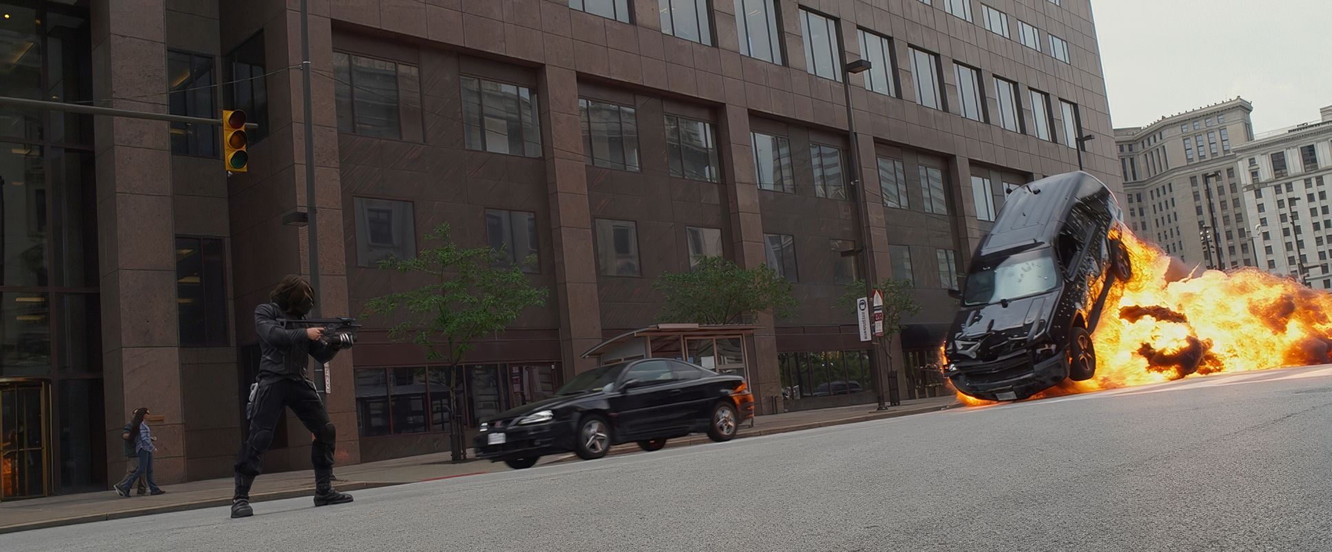
The camera movement in The Winter Soldier is a masterclass in disciplined chaos. It’s often handheld, but let’s be clear: this isn’t the lazy, disorienting “shaky cam” that makes you want to turn the movie off. It’s purposeful.
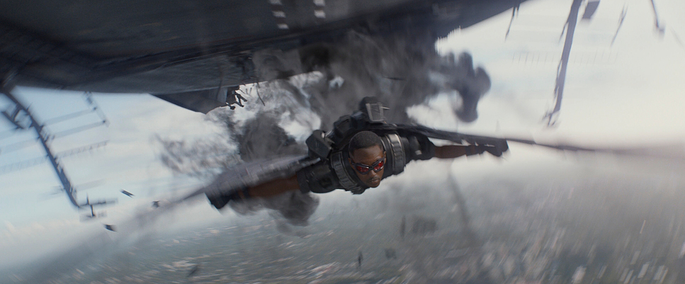
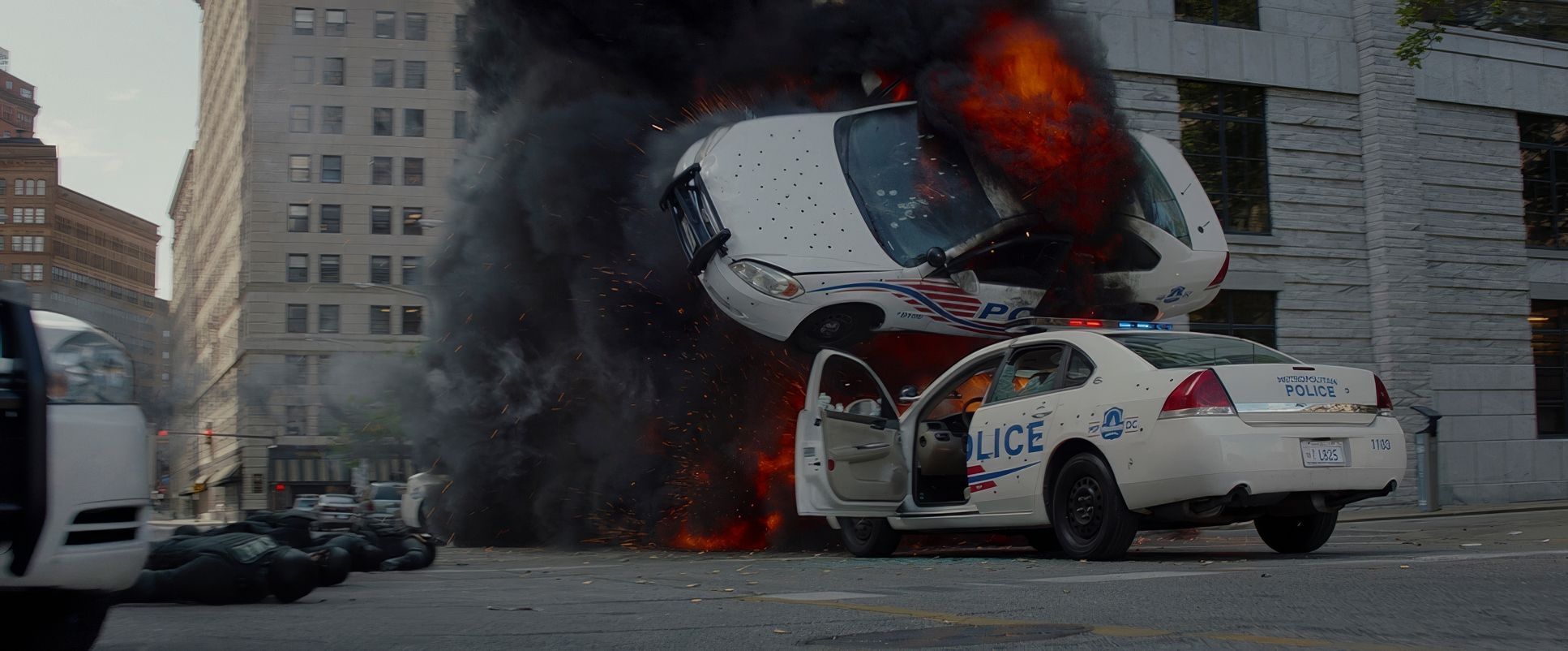
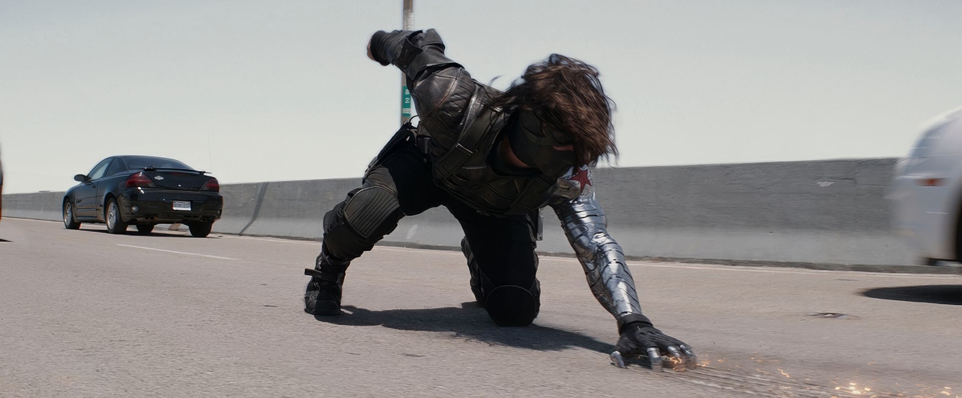
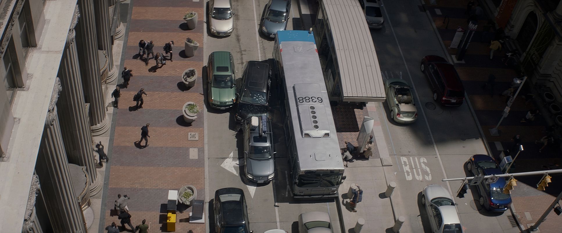
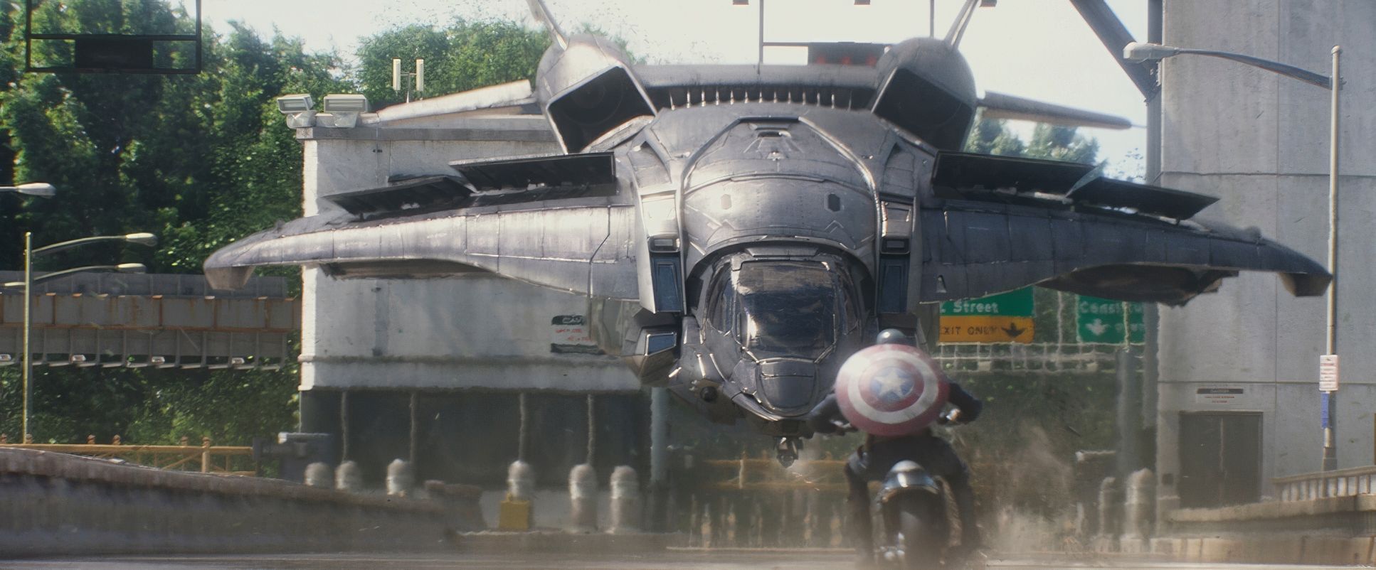
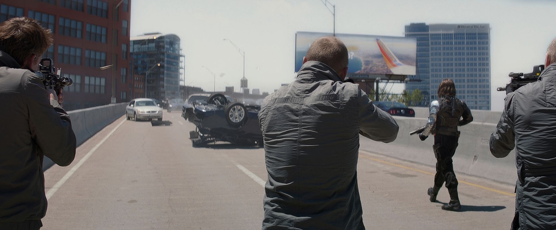
Think about the freeway ambush or the elevator fight. The camera doesn’t just watch the action. It breathes with it. It ducks and weaves, creating a visceral sense of presence. This creates a massive depth cue, making you feel like you’re standing in that three-dimensional space rather than watching a flat screen. Even in the dialogue scenes, there’s often a subtle, nearly imperceptible drift. It keeps you on edge. It reminds you that in this world, trust is a luxury no one can afford.
Lensing and Blocking

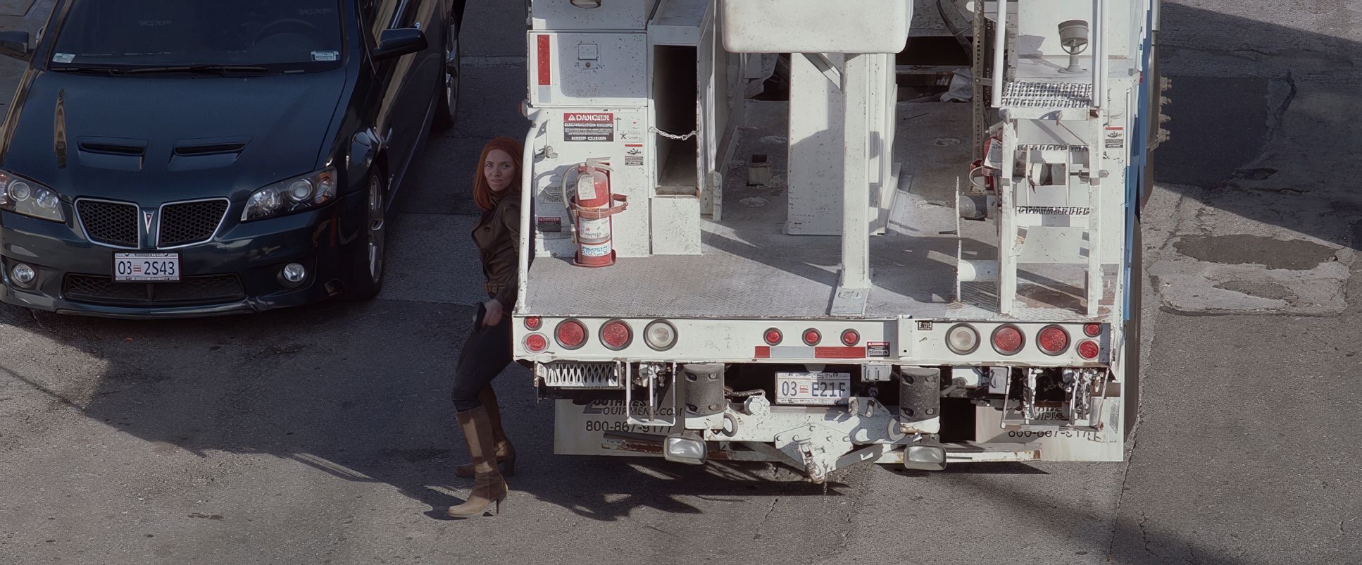
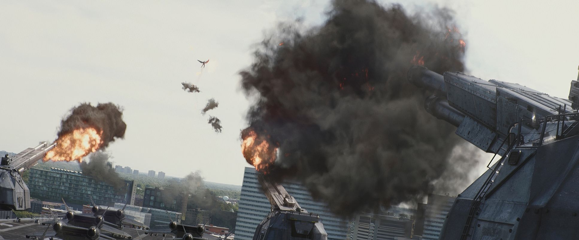
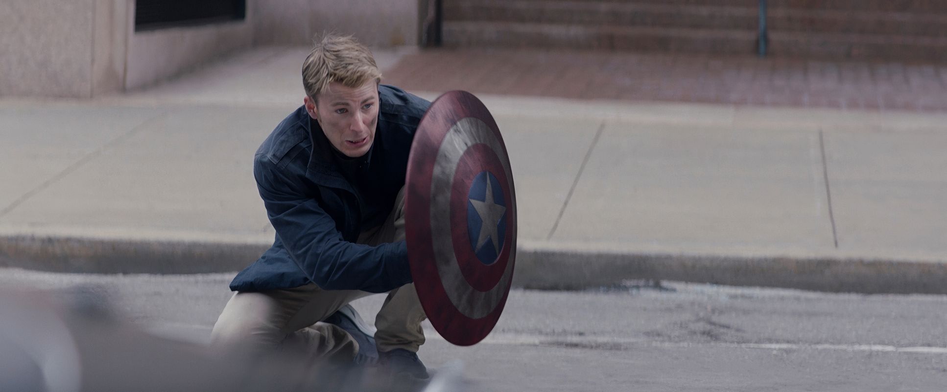
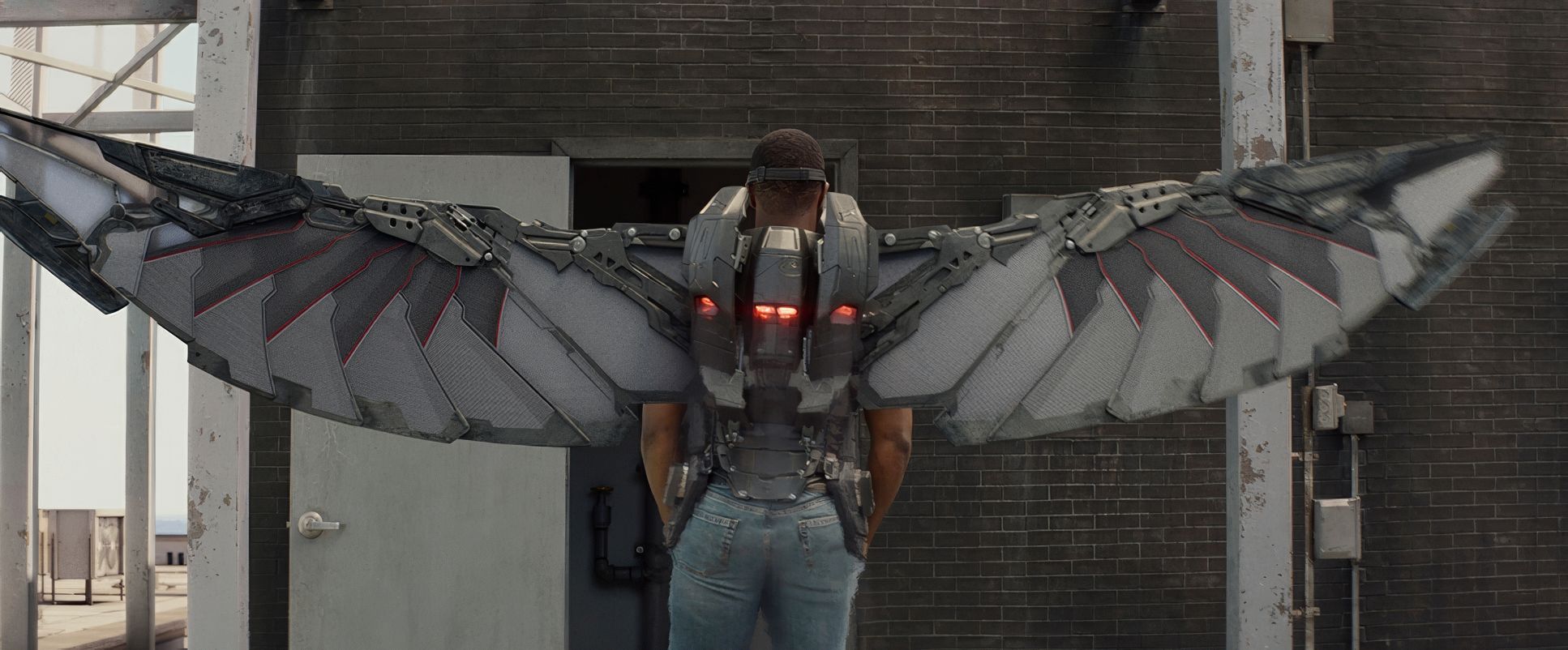
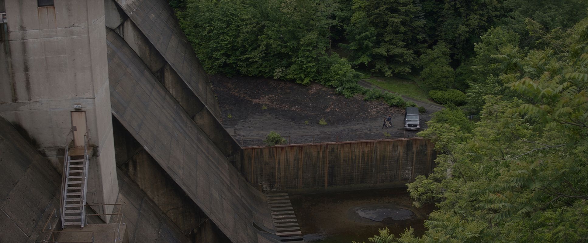
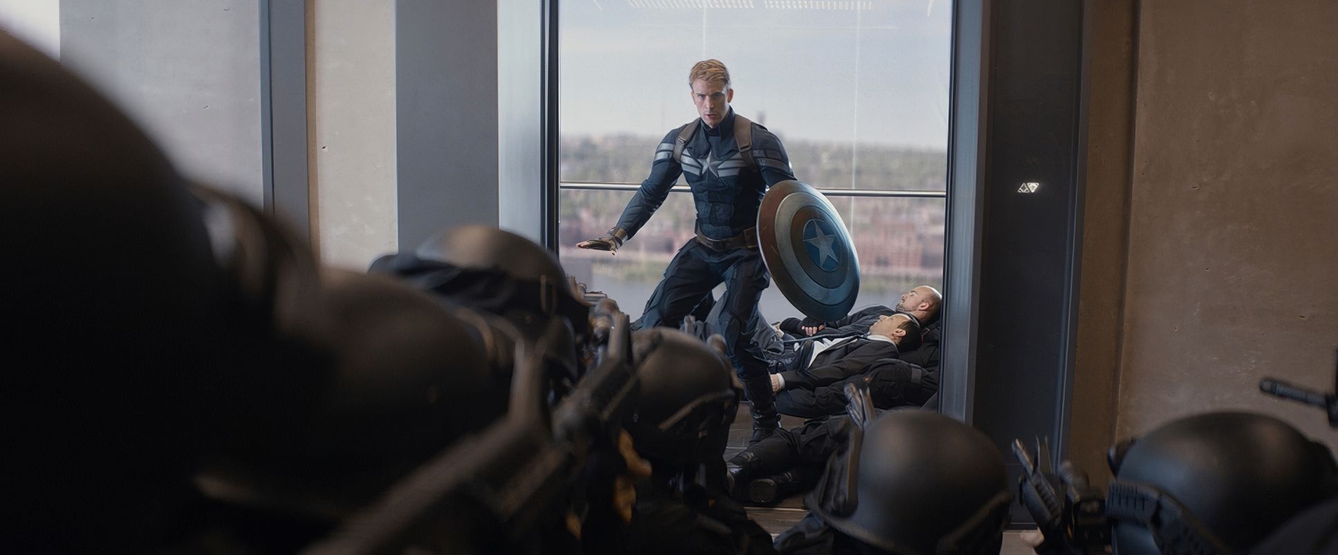
Opaloch and the Russos leaned heavily into wider lenses for the action, which I personally find much more impressive than the “close-up and cut” style of many modern blockbusters. By using medium-wide glass, they let us see the “hardcore” stunt work in its entirety.
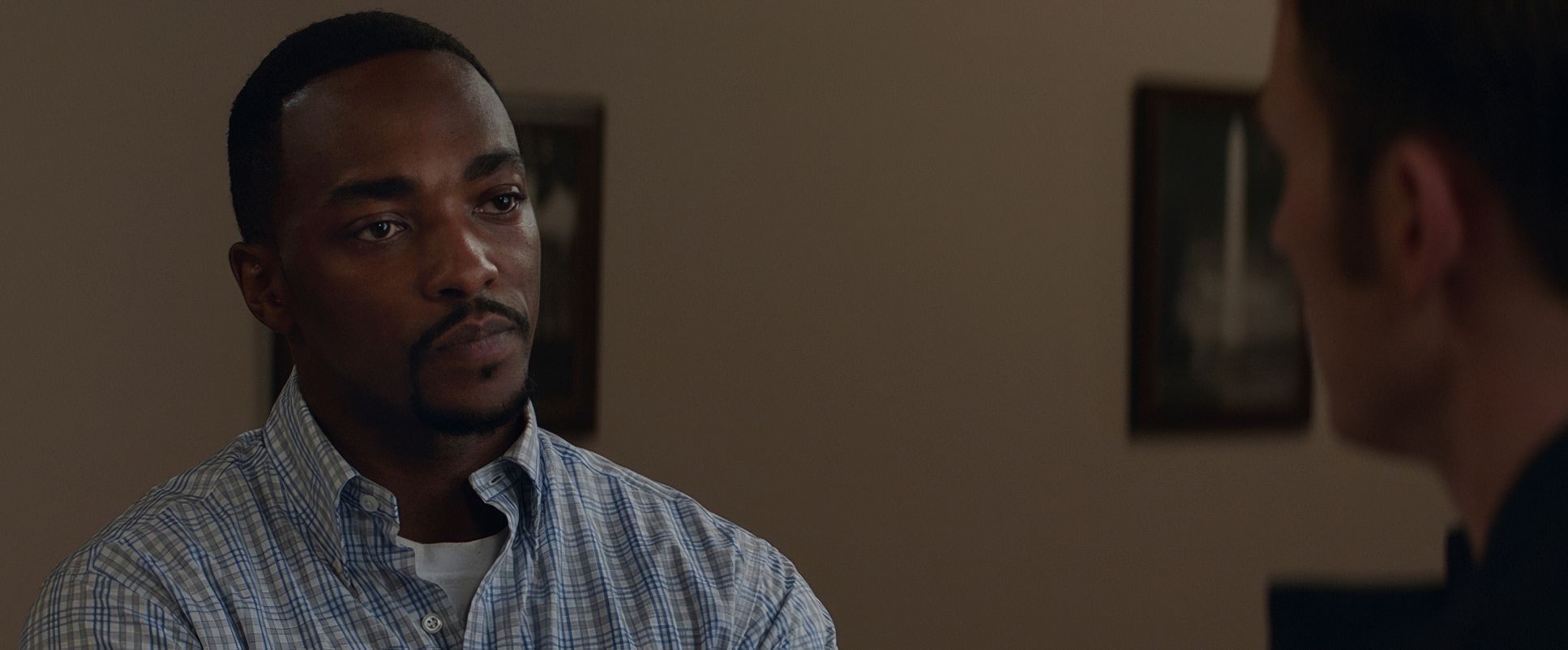
When you see Captain America: The Winter Soldier trading blows in a full frame, with their entire bodies and the environment visible, the impact is amplified. It feels like a real fight on a real street. In more intimate scenes, they’ll shift to a long lens to compress the space, drawing characters together to emphasize a confrontation or a shared secret. It’s a sophisticated use of lens behavior that enhances the “grounded” mandate the directors set out with.
Compositional Choices
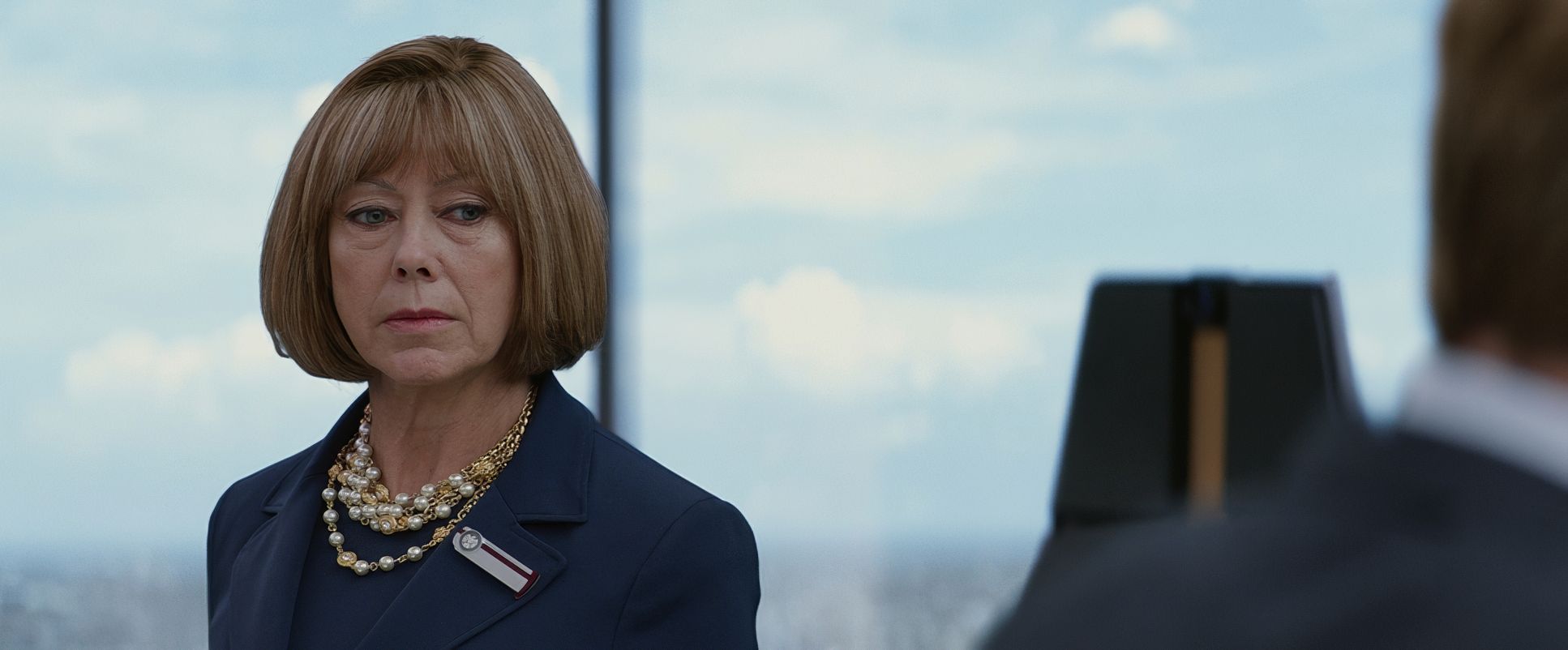
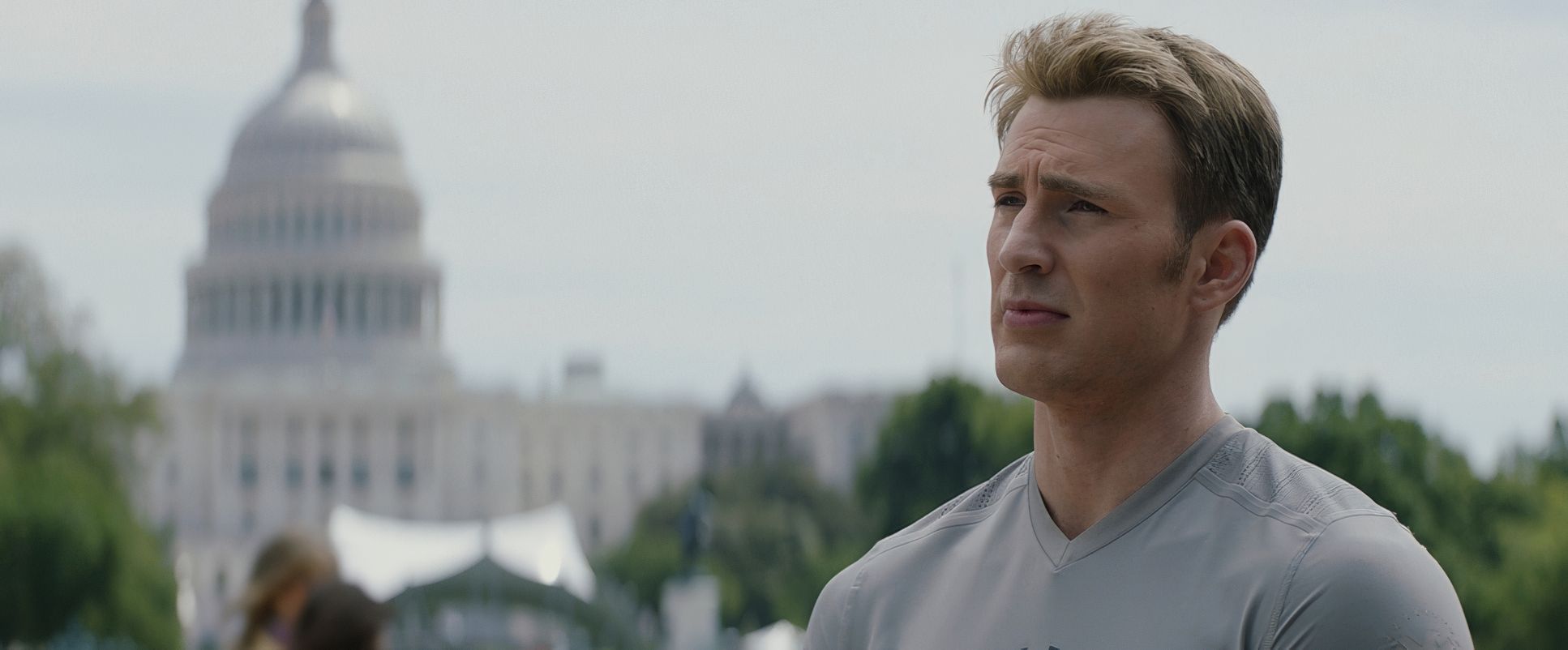
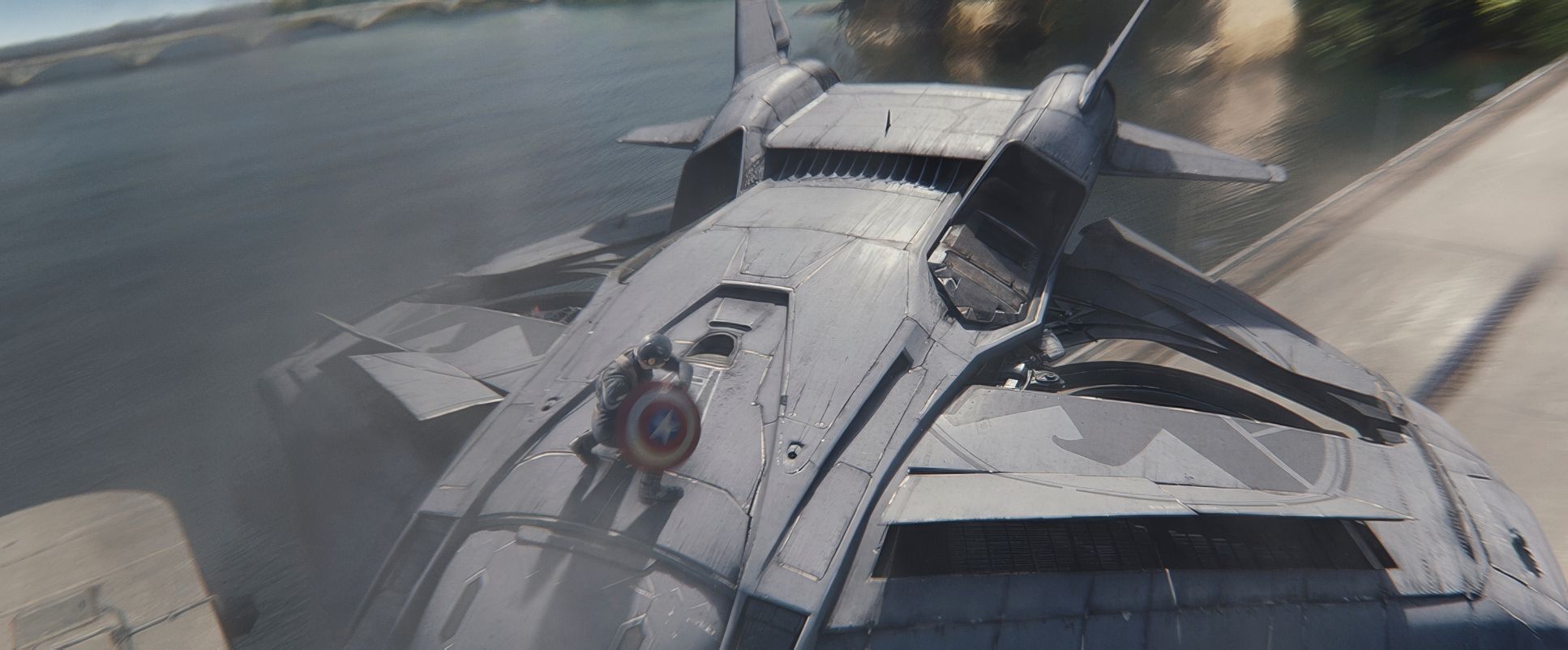
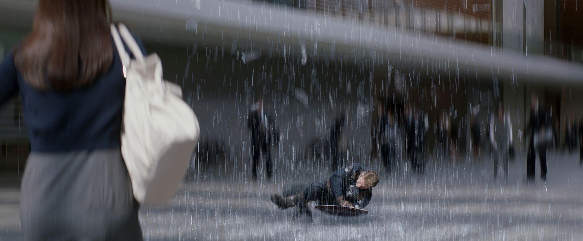
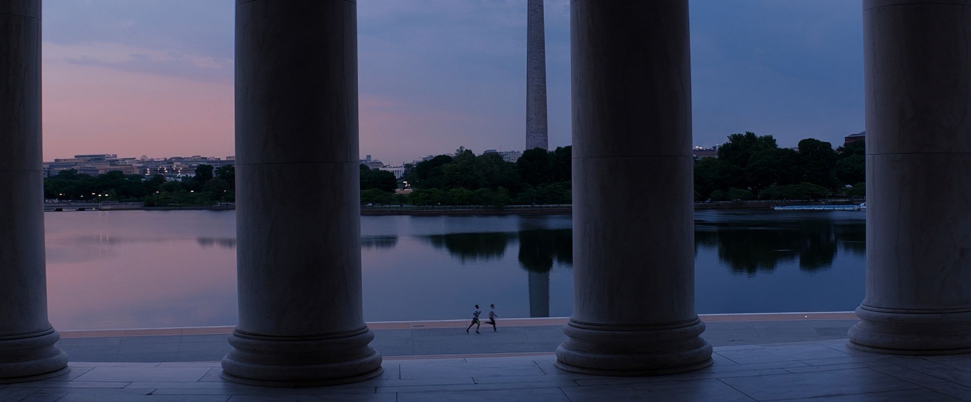
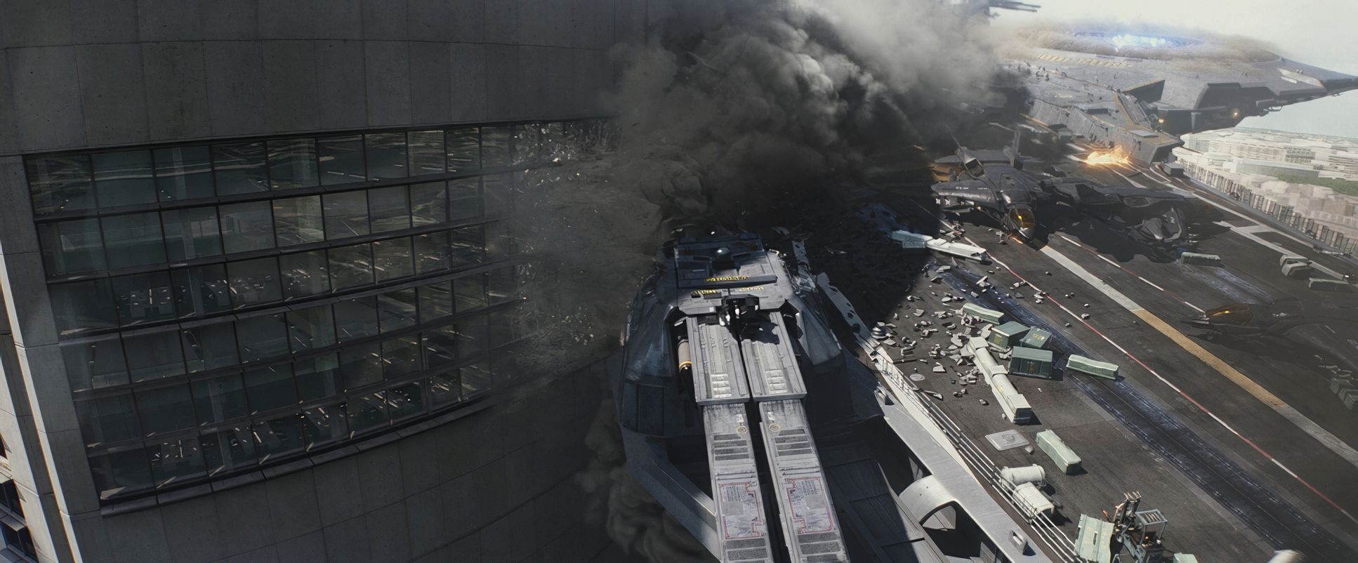
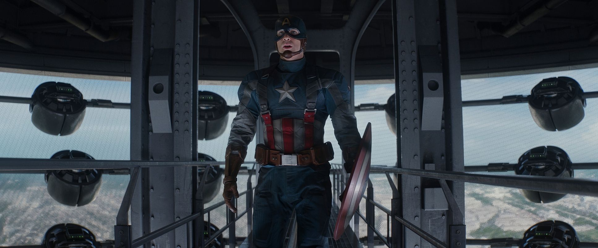
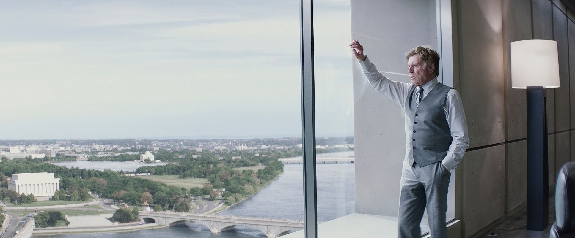
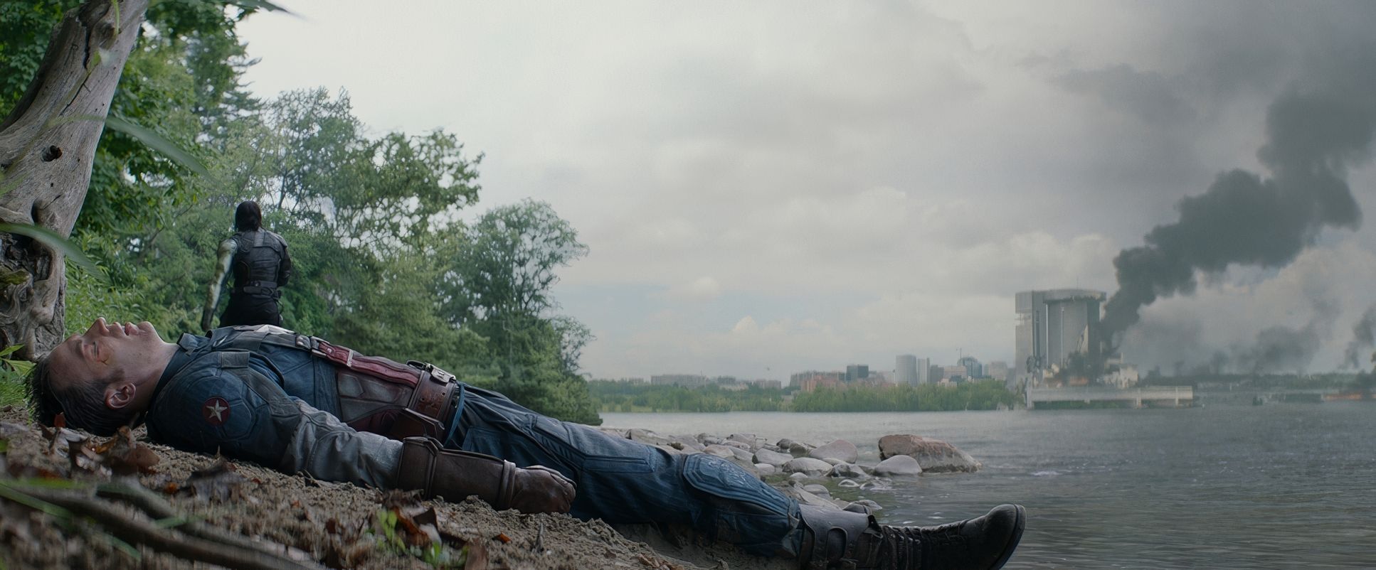
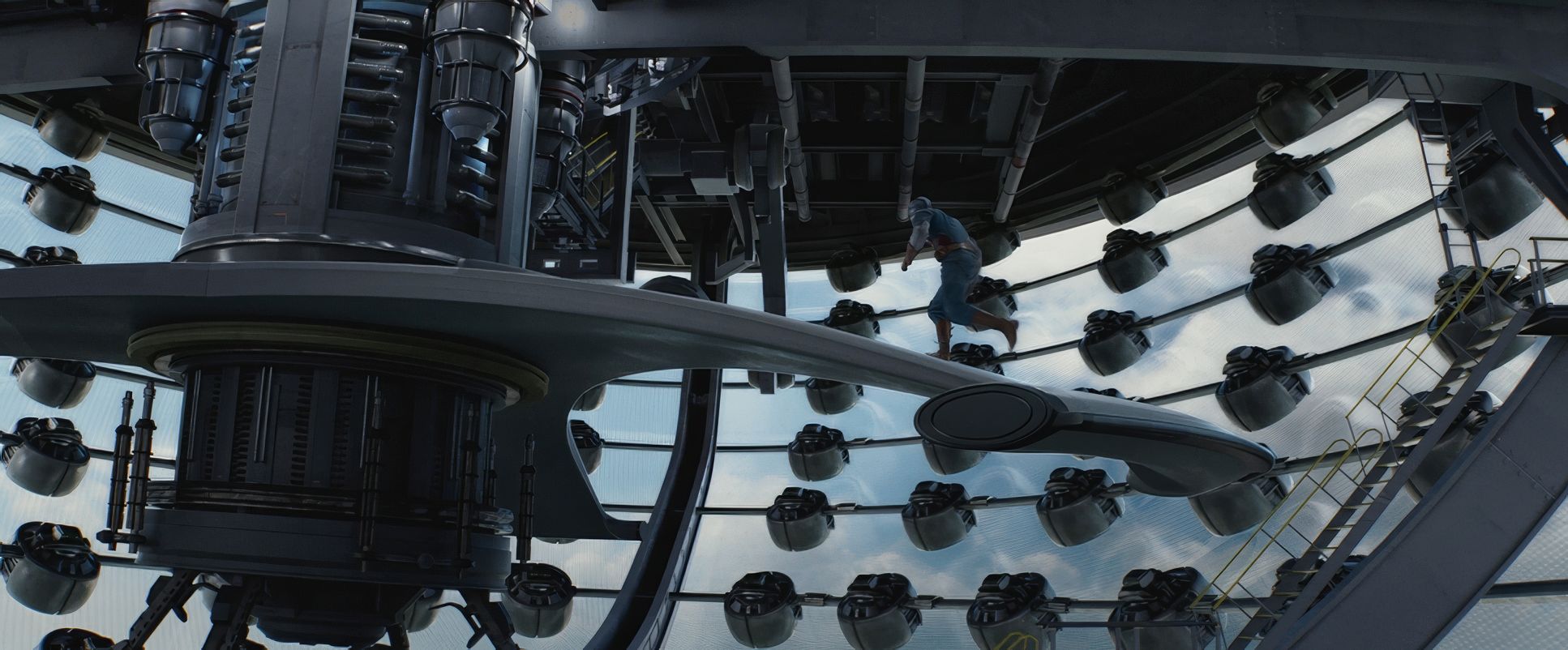
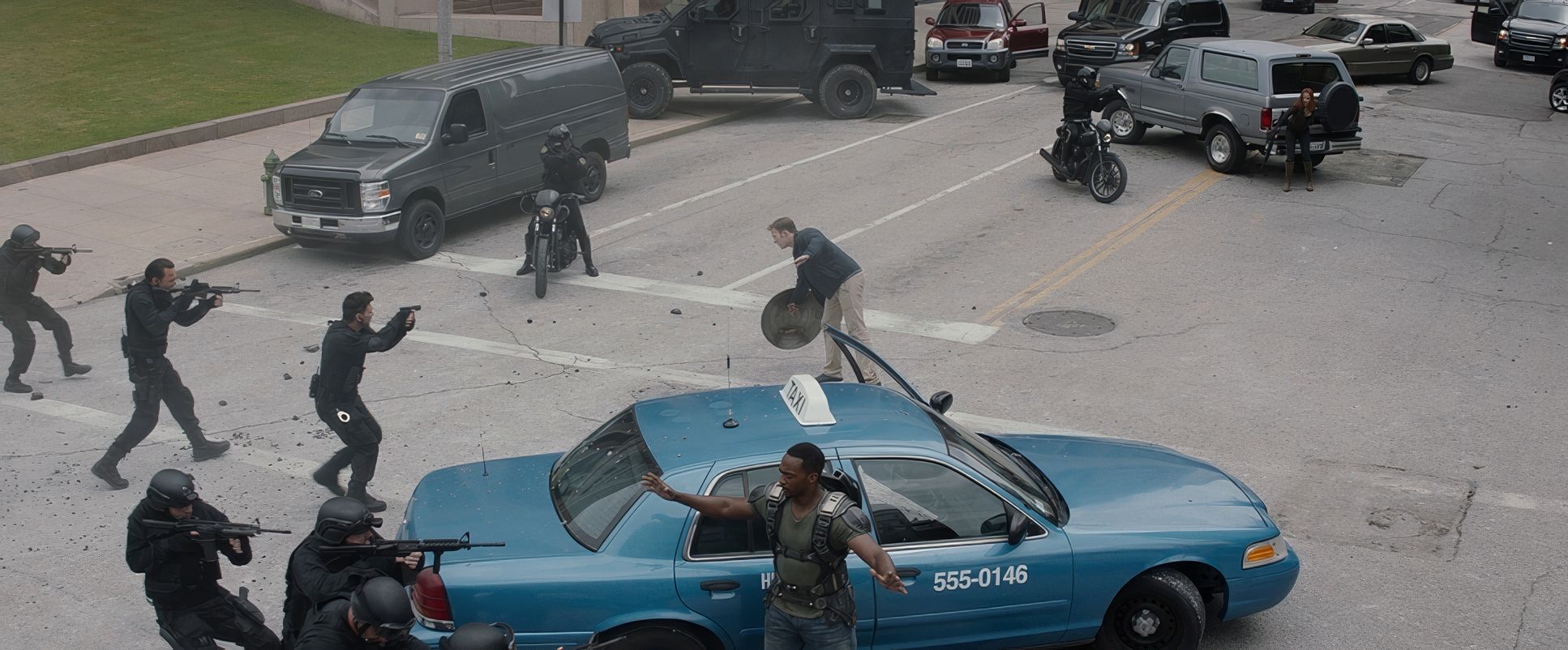
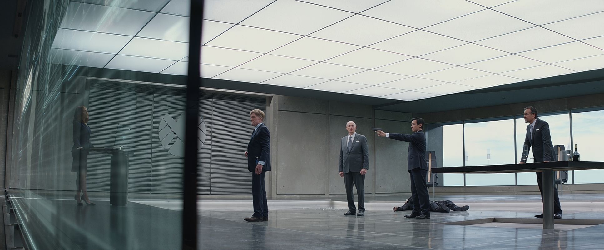
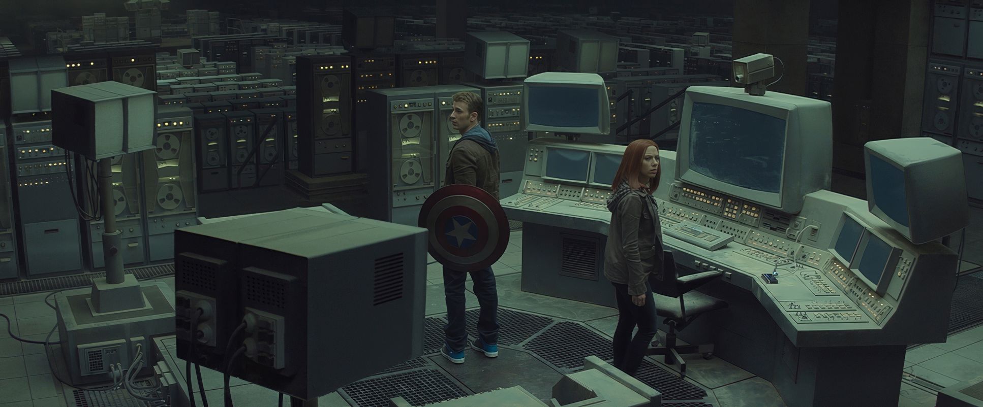
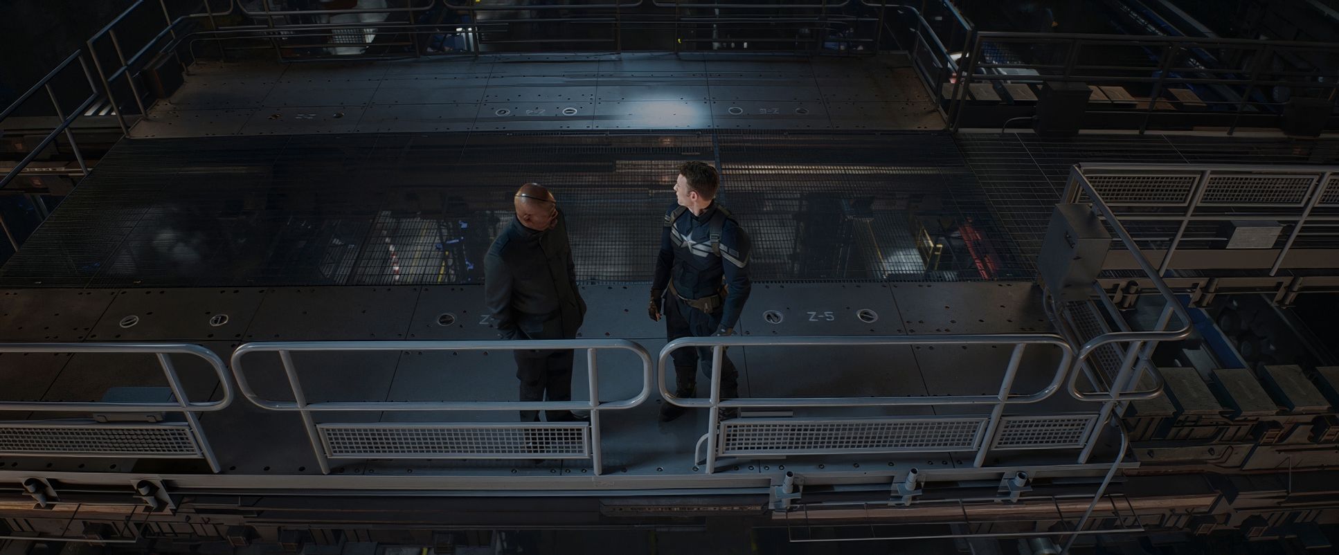
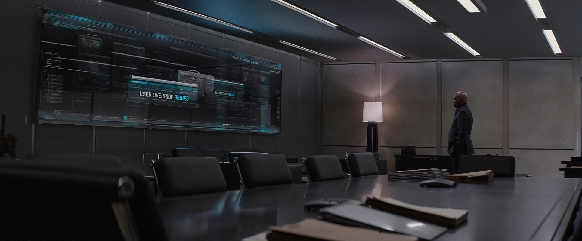
The composition here is often “right heavy” and utilizes the brutalist architecture of Washington D.C. to make the characters feel small or oppressed by the state. They use wide frames not just for scale, but to create a sense of isolation.
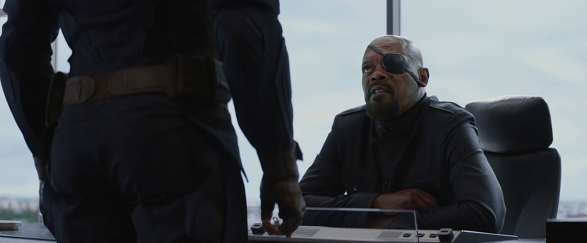
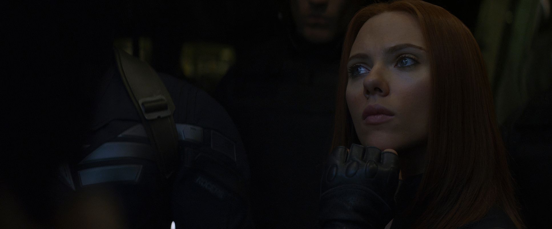
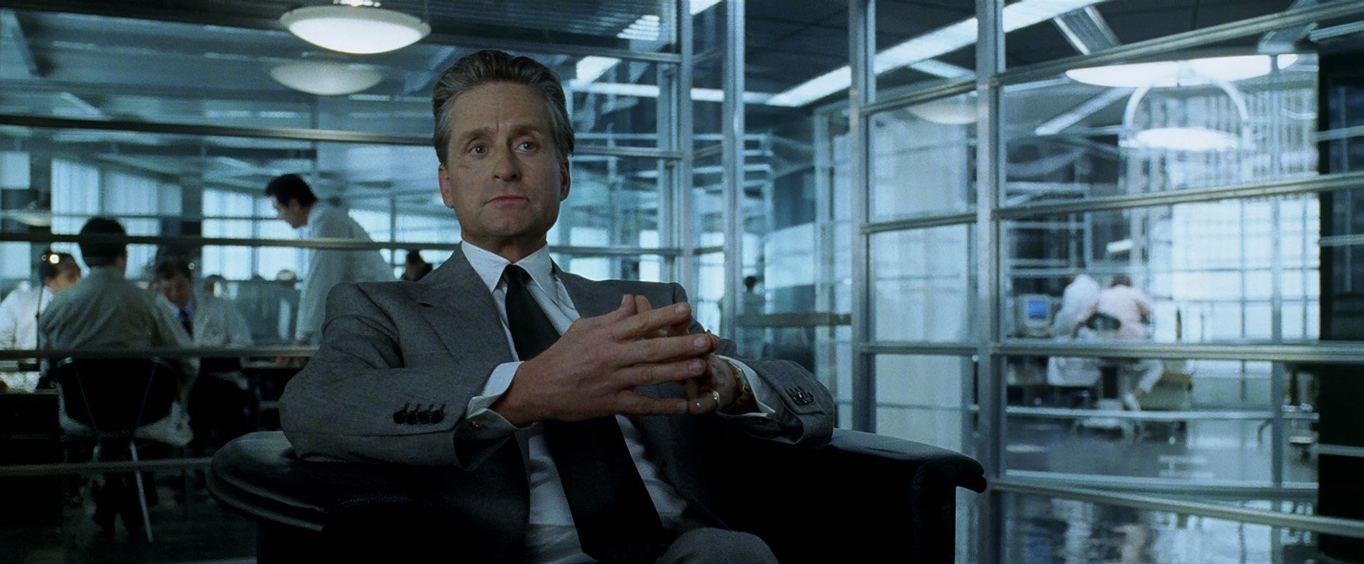
Look at the way they use negative space. When Black Widow or Cap are in those sterile S.H.I.E.L.D. corridors, the empty space around them feels like a threat. It visually articulates the theme of a compromised organization. They aren’t just taking “cool shots”; they are using geometry to tell us that Steve Rogers is alone.
Lighting Style
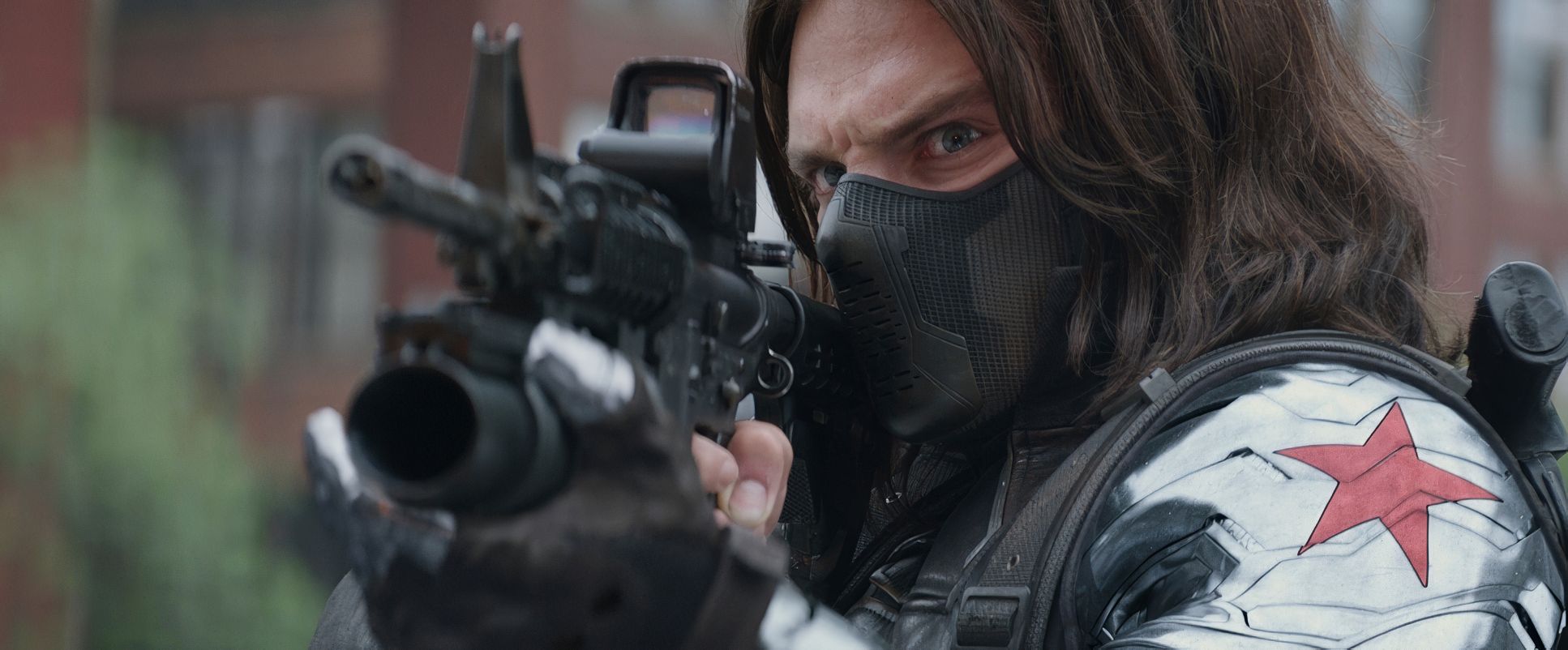
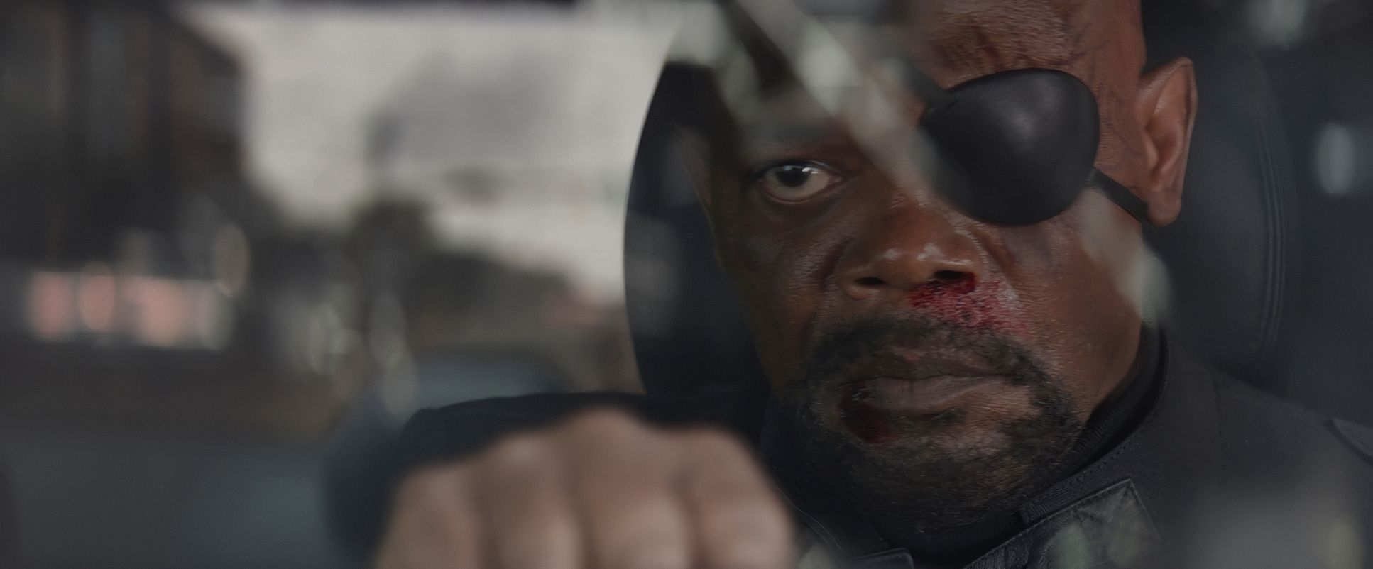
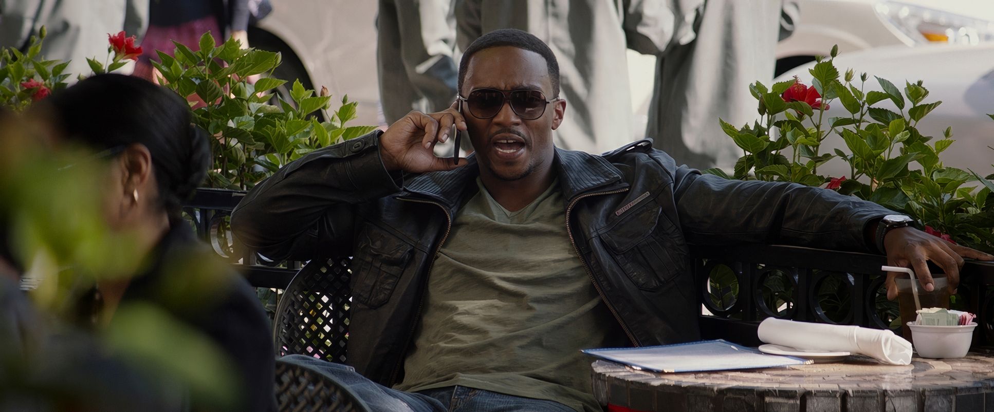
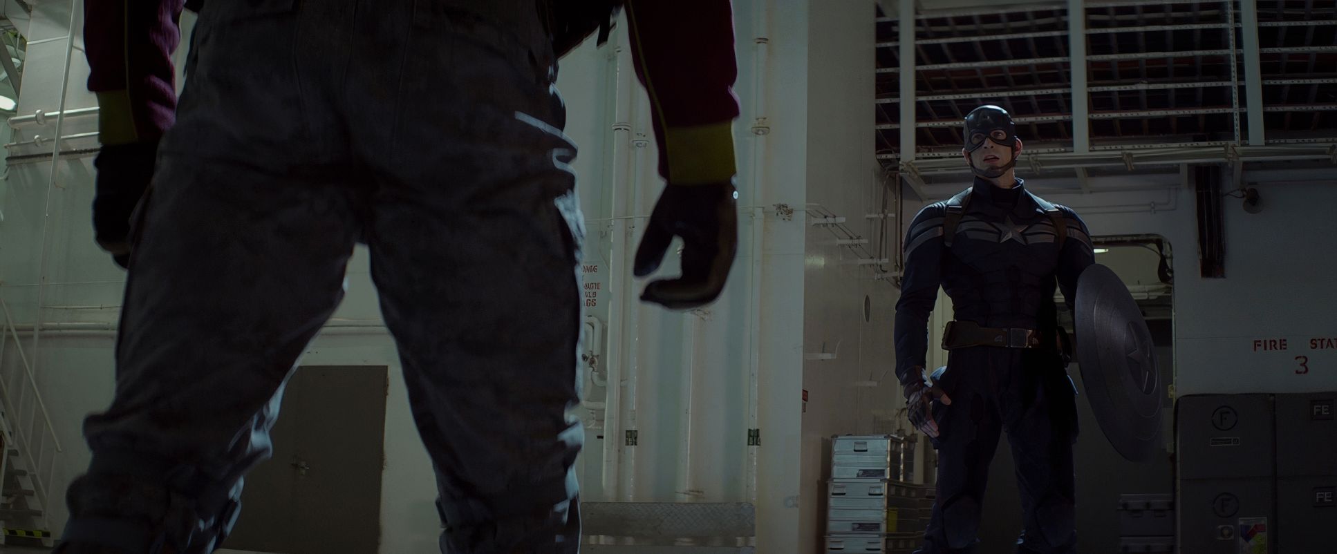
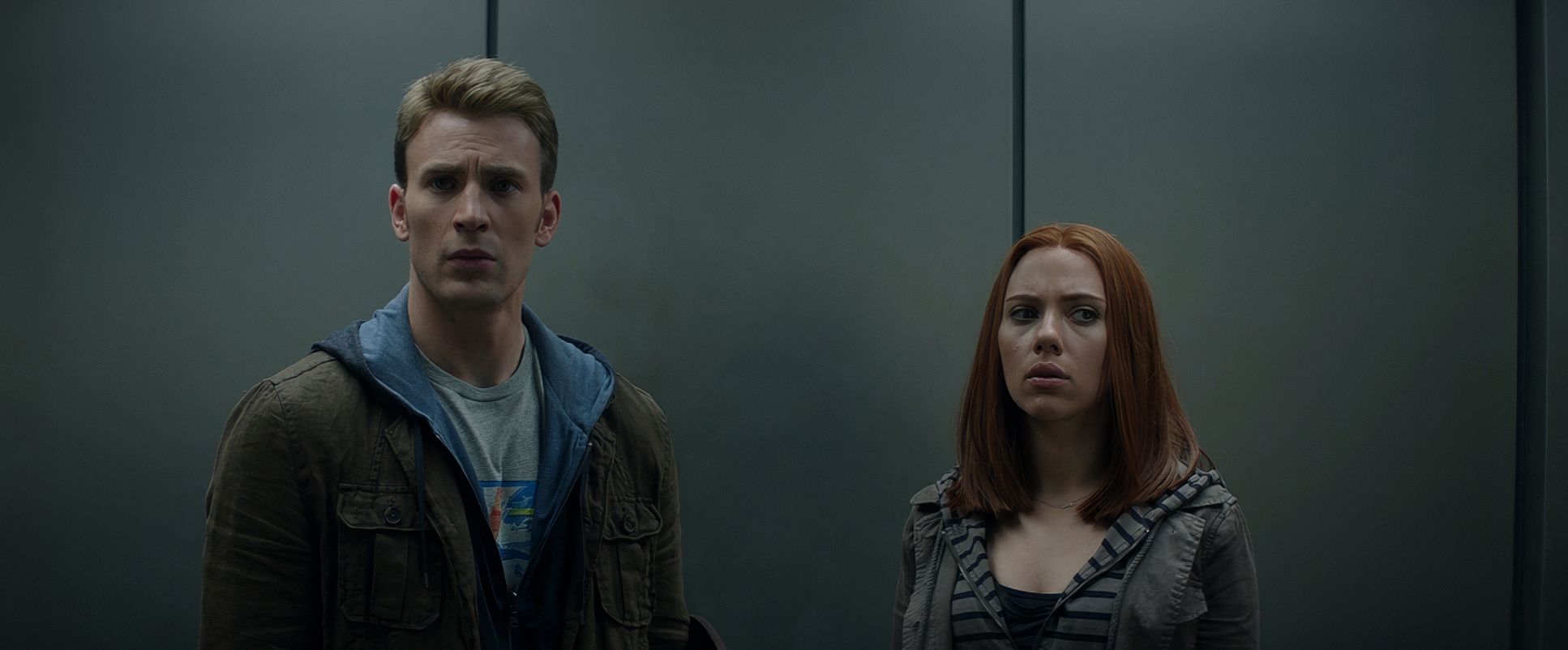
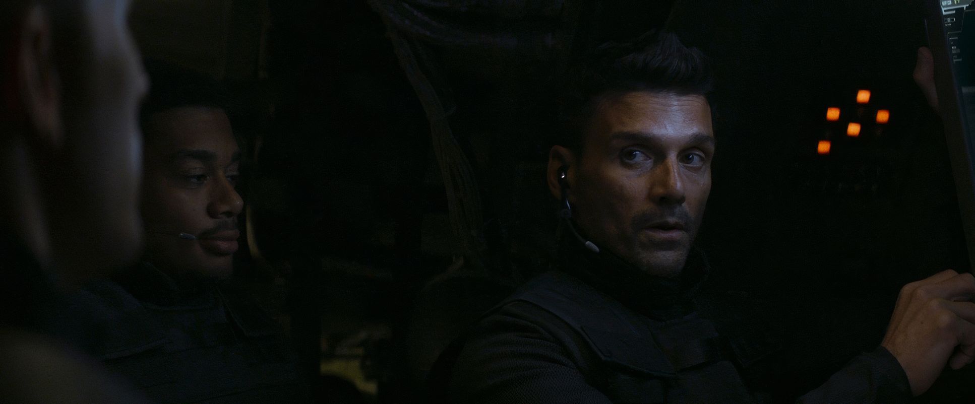
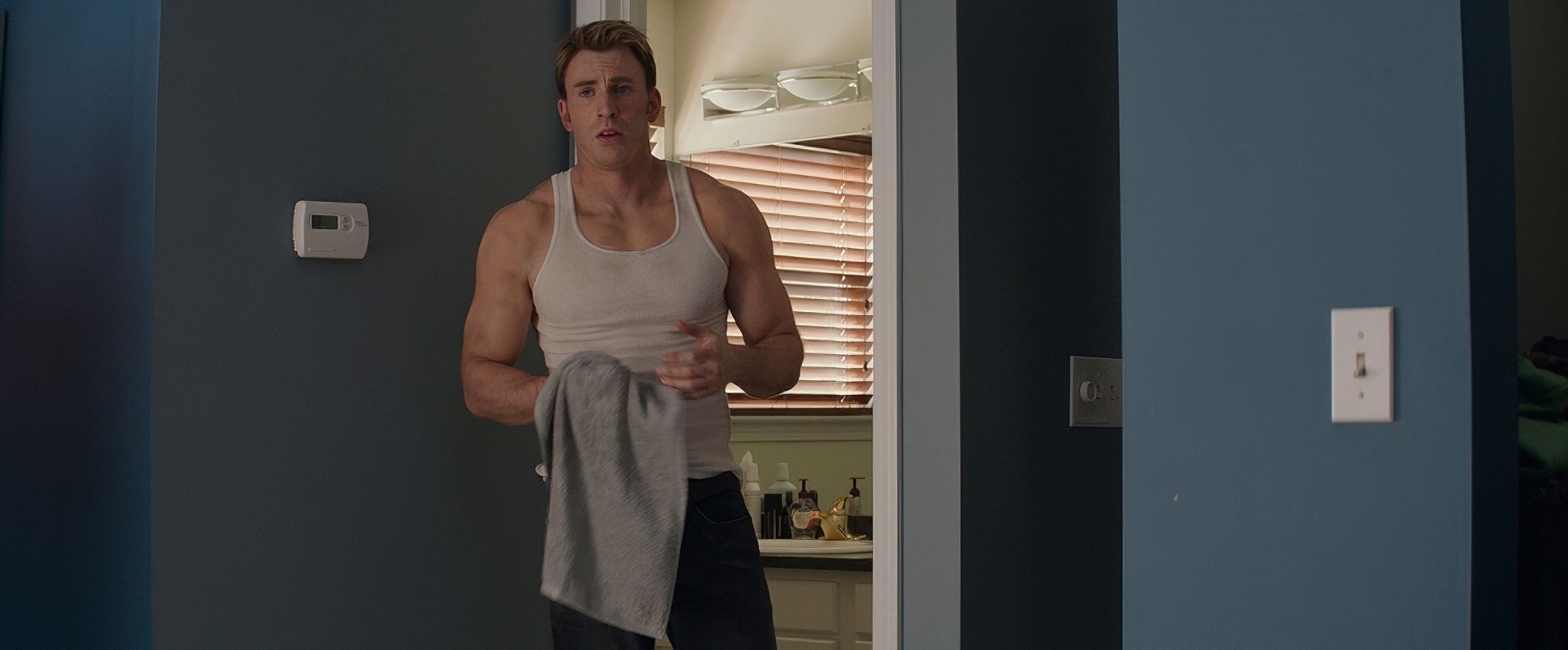
The lighting is motivated, naturalistic, and surprisingly moody for a Disney-backed film. You won’t find high-key, “pop” lighting here. Instead, Opaloch utilizes soft light and backlighting, often making it feel like the light is coming from the environment itself streetlights, office fluorescents, or the flat grey of a D.C. afternoon.
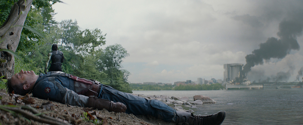
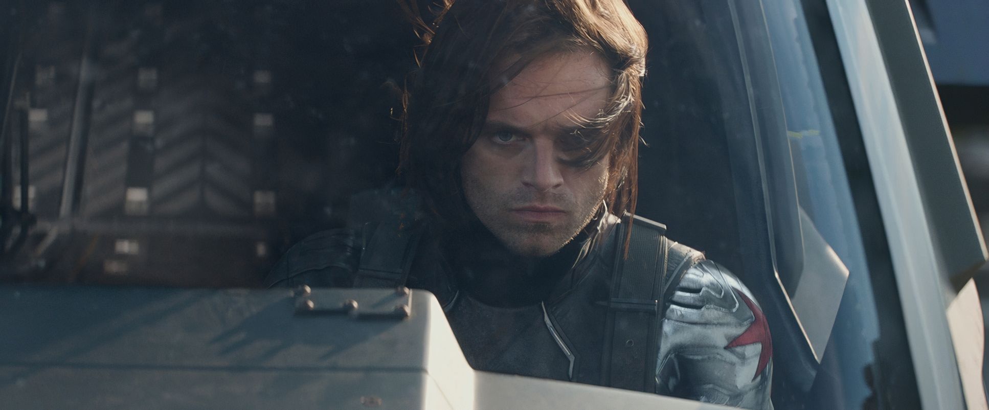
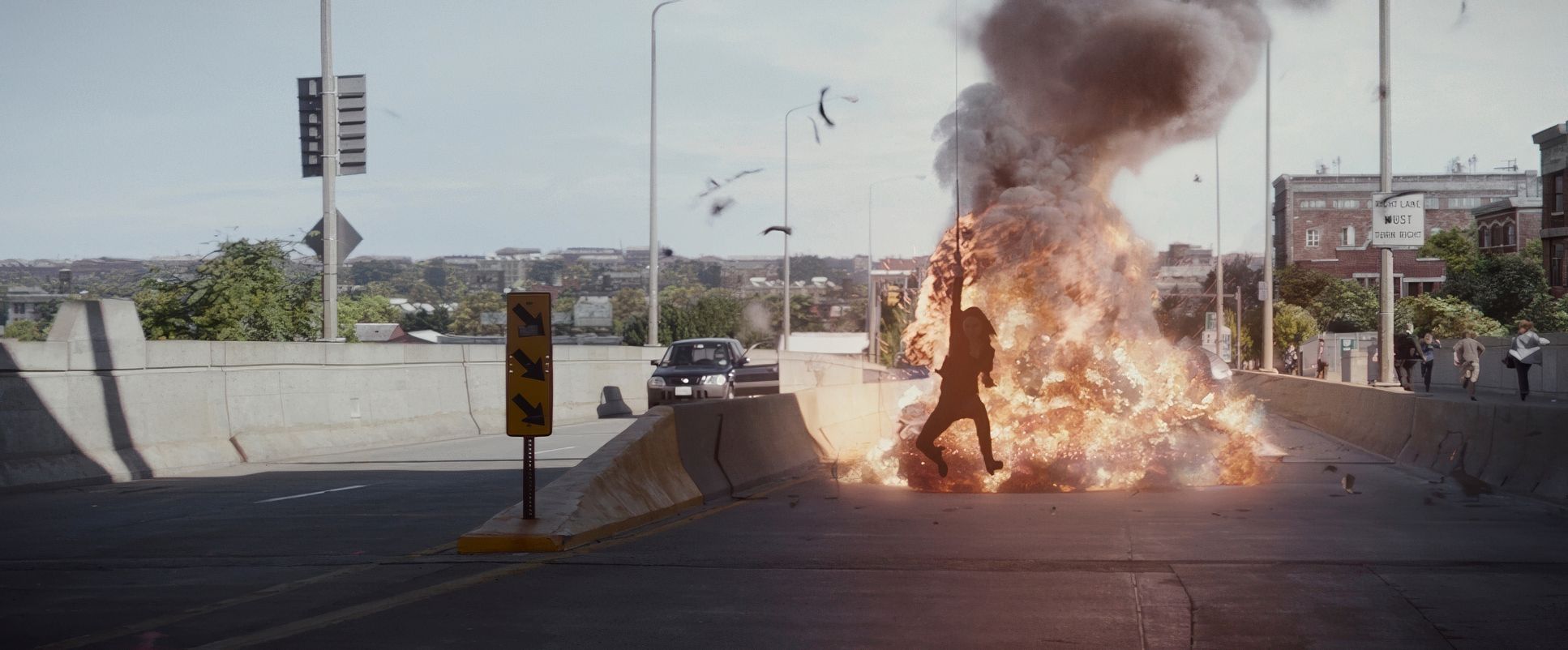
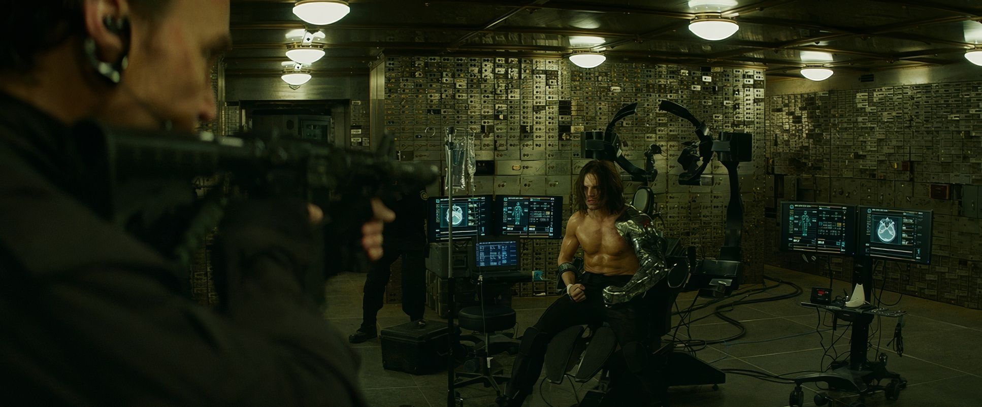
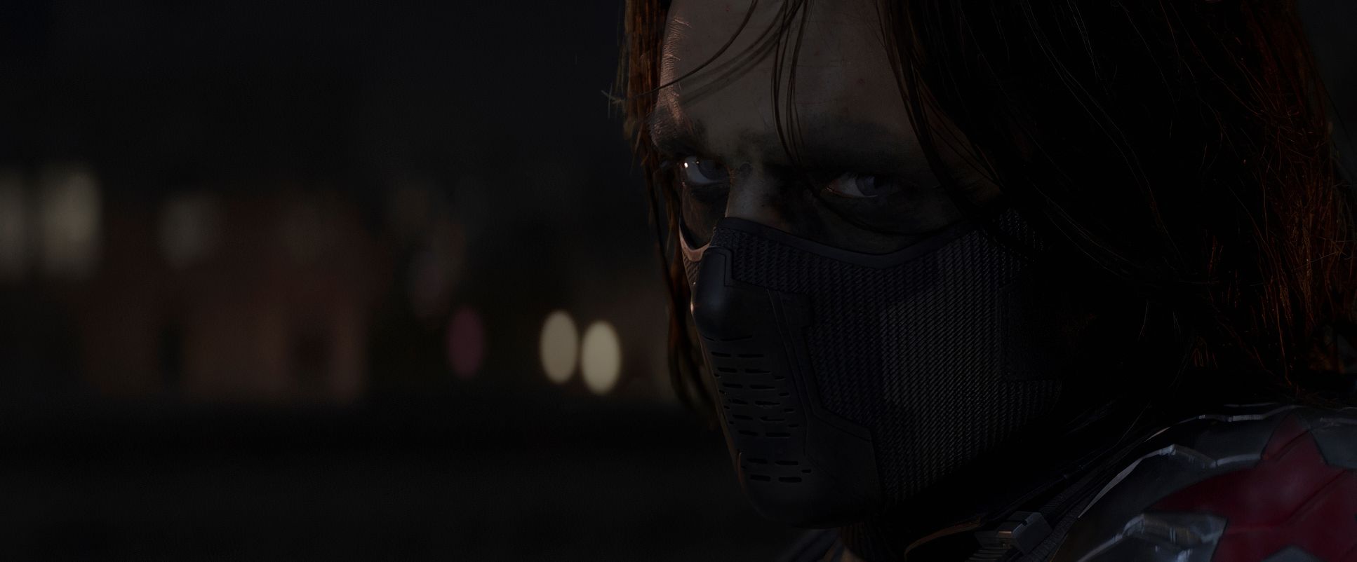
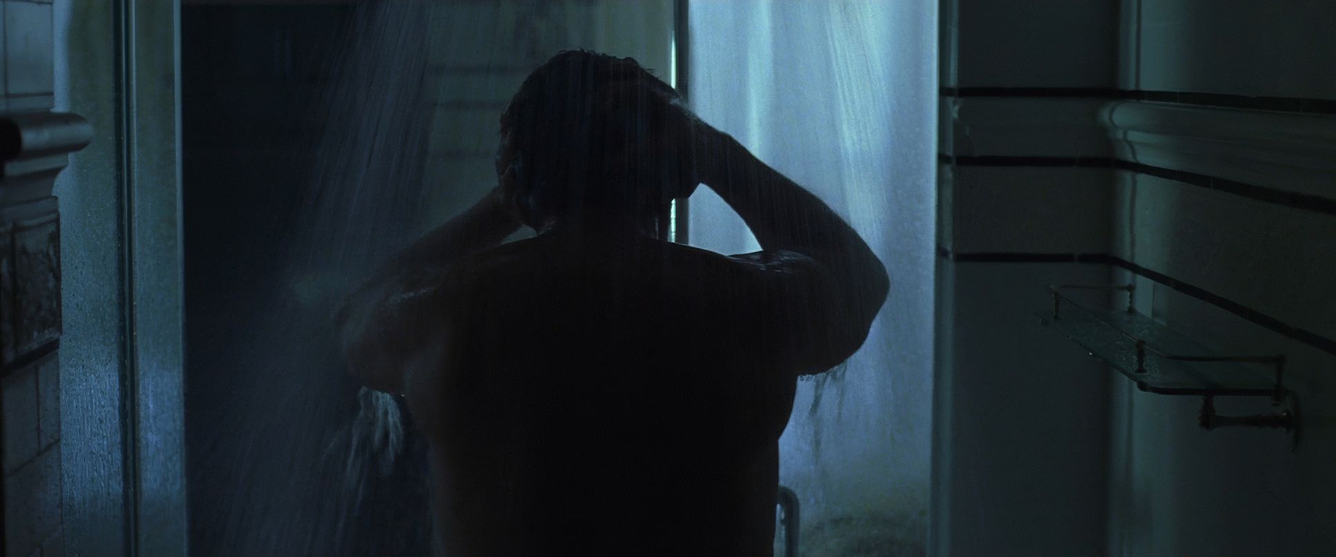
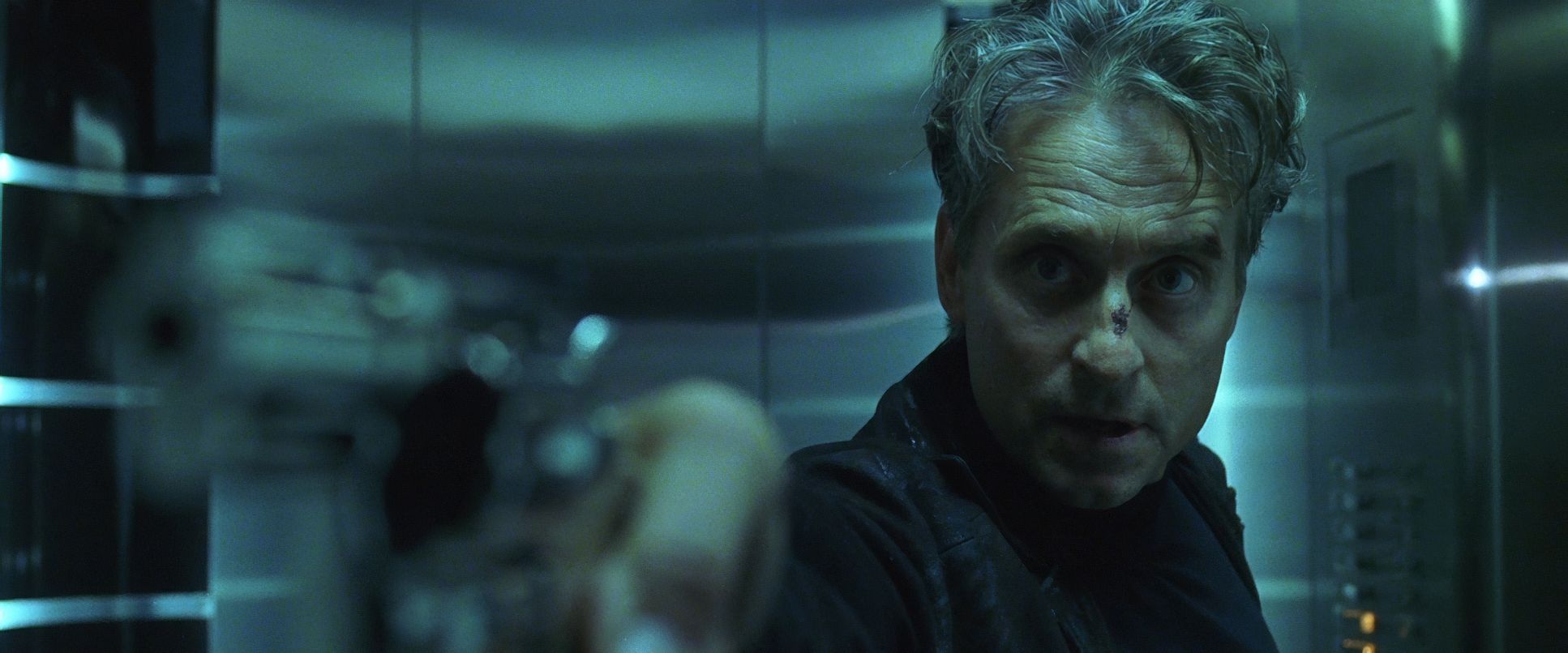
The night scenes are where it gets really interesting. They use a heavy chiaroscuro approach, creating deep shadows that conceal the Winter Soldier until the last possible second. Even in the bright daylight exteriors at the monuments, the light feels slightly muted. It reflects the morally ambiguous tone of the story. There’s a richness to the shadows, but as a colorist, I appreciate that they never “crushed” the blacks into nothingness; there’s always just enough detail to keep it feeling real.
Color Grading Approach
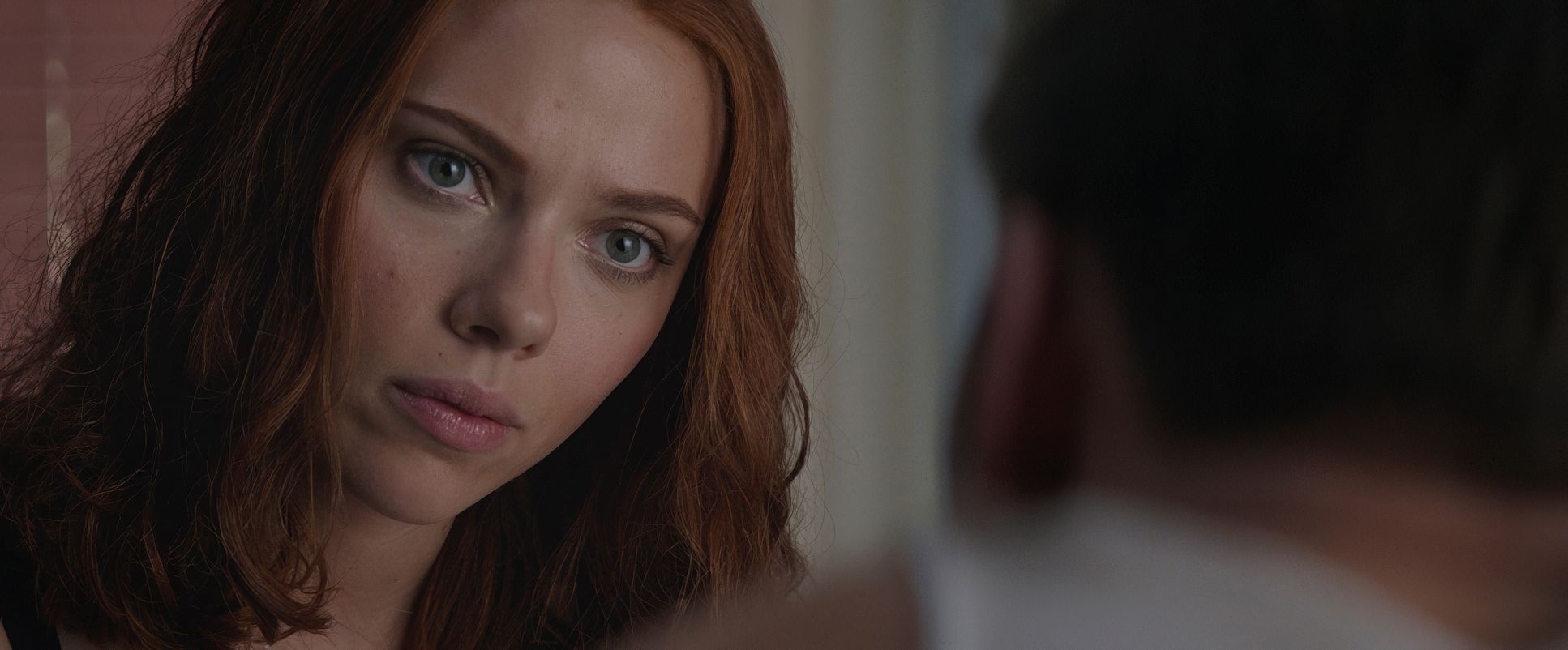
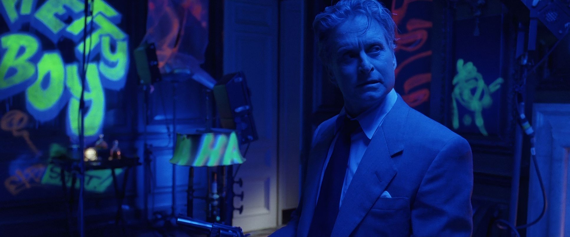
This is where Captain America: The Winter Soldier really speaks to me. As a colorist, I love the departure Steven J. Scott took here. The palette is desaturated, leaning into greens, whites, and steely blues. It’s a cooler, almost monochromatic look that fits the spy genre perfectly.
My daily work involves tonal sculpting, and The Winter Soldier is a perfect example of it. The contrast is robust but handled with a “film-print” sensibility. Look at the highlight roll-off in the skies it’s smooth and organic, not clipped and digital. They managed to keep the image from feeling flat despite the muted colors. You’ll see subtle hue separation, like the way the muted red of Cap’s suit sits against a cold, grey background, but it’s never loud. It’s about sculpting tones to enhance the mood, not popping colors to sell toys.
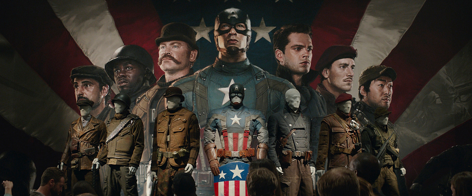
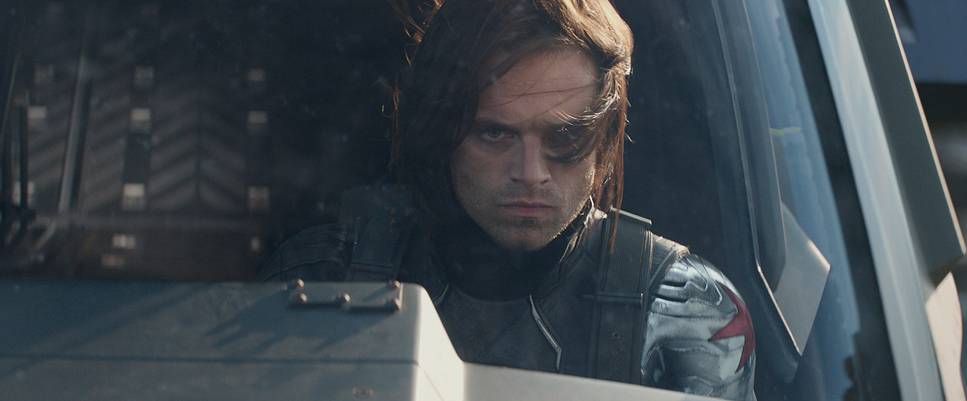
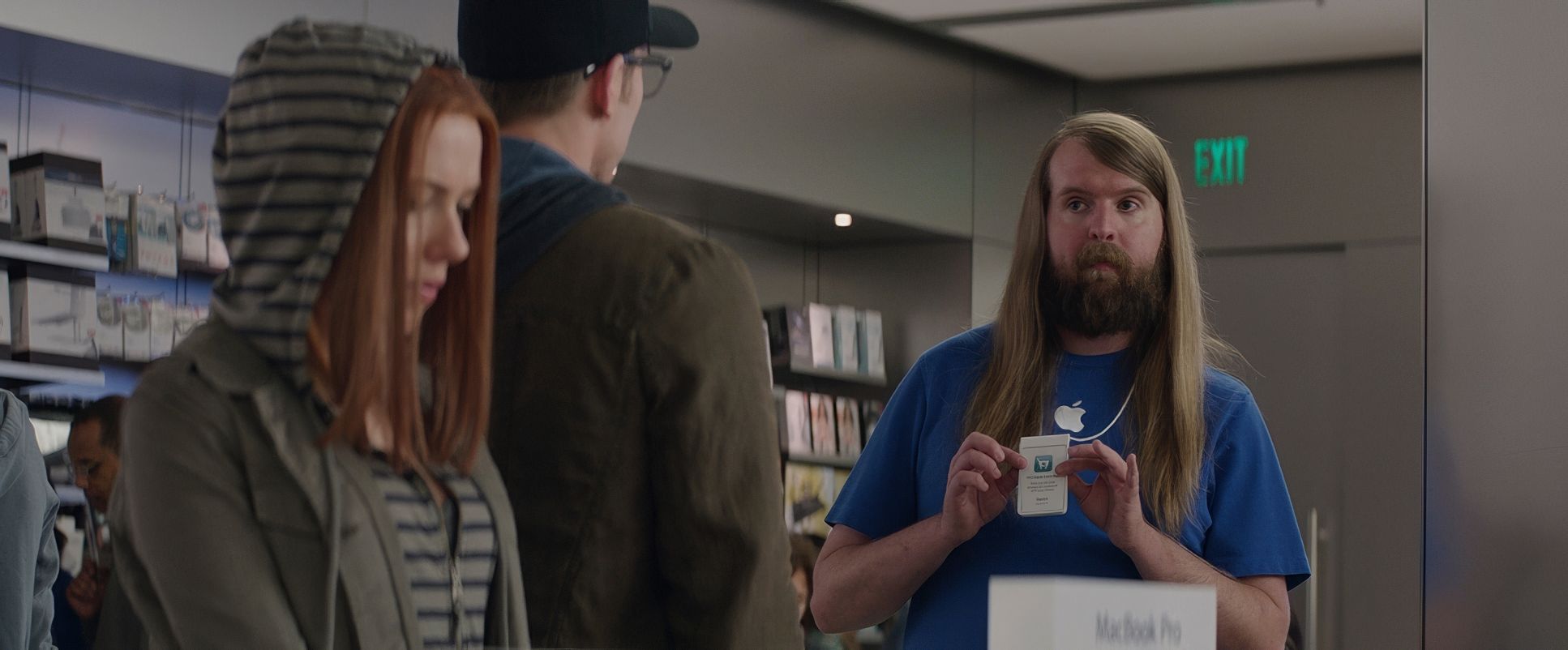
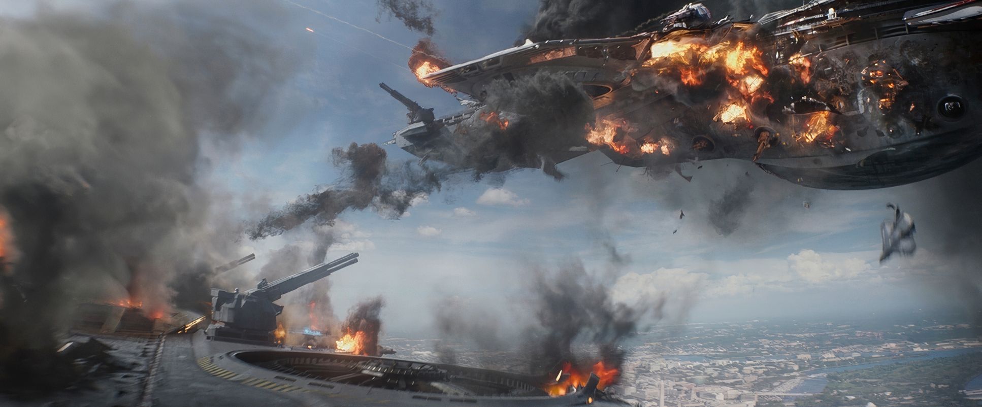
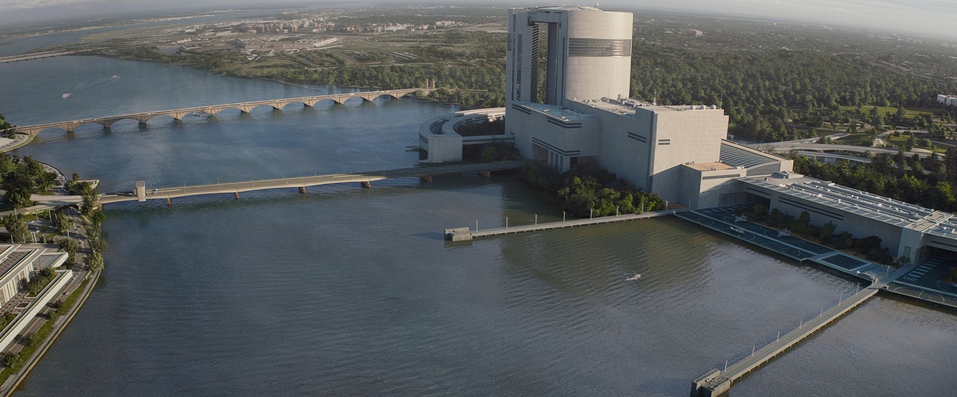
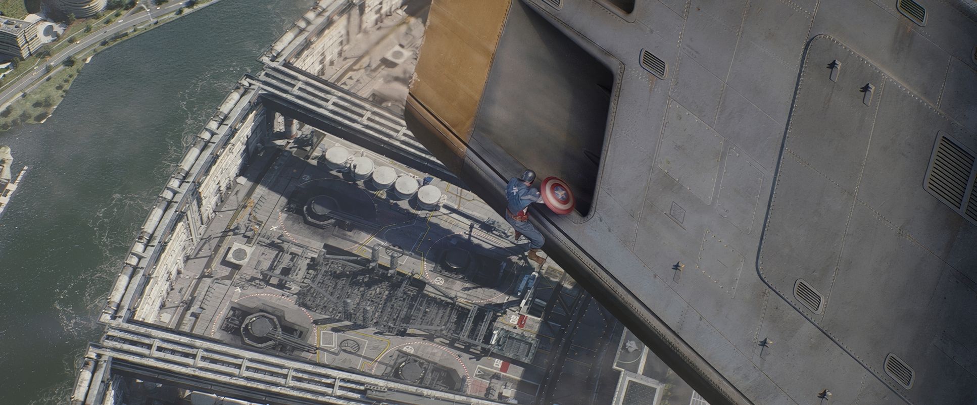
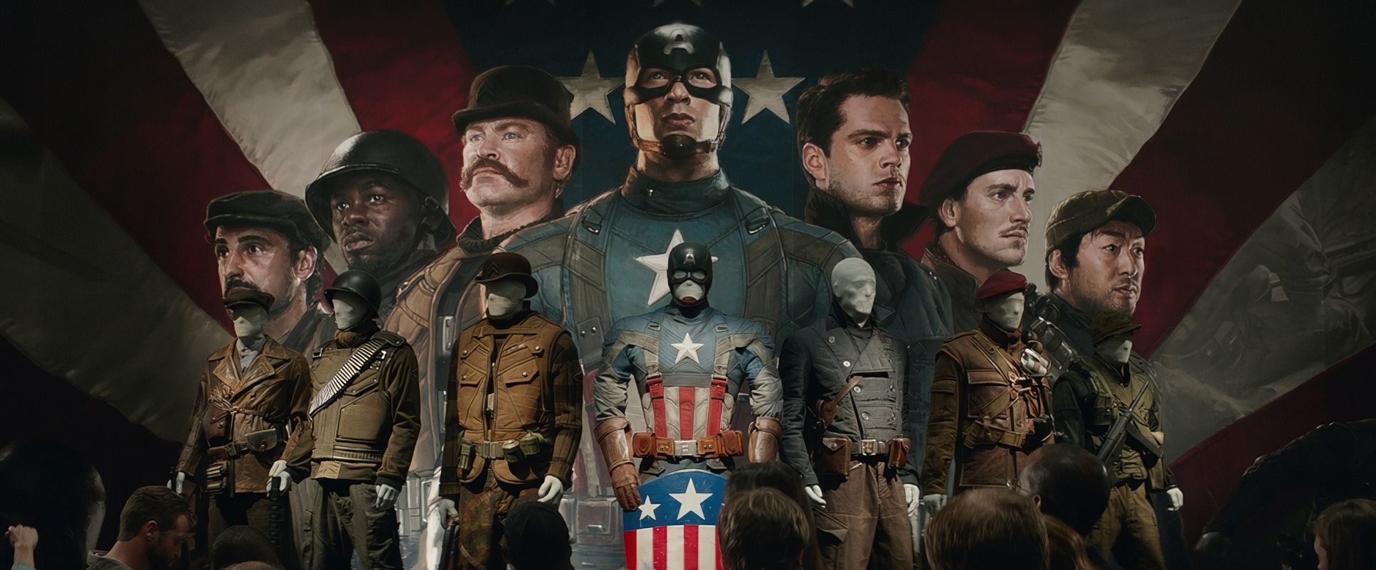
Captain America: The Winter Soldier (2014) Film Stills
A curated reference archive of cinematography stills from Captain America: The Winter Soldier (2014). Study the lighting, color grading, and composition.


- Also read: STAR WARS: EPISODE VII – THE FORCE AWAKENS (2015) – CINEMATOGRAPHY ANALYSIS
- Also read: HOOP DREAMS (1994) – CINEMATOGRAPHY ANALYSIS
Browse Our Cinematography Analysis Glossary
Explore directors, cinematographers, cameras, lenses, lighting styles, genres, and the visual techniques that shape iconic films.
Explore Glossary →