When I look at Richard Linklater’s Boyhood, I don’t just see a coming-of-age movie I see a twelve-year logistical anxiety attack. The concept alone is terrifying. Filming a story over a dozen years with the same actors isn’t just a scheduling nightmare; it’s a massive roll of the dice. When the film opens with young Mason watching Dragon Ball Z, it hits a specific nostalgic nerve (I definitely remember that era), but the filmmaker in me is thinking about something else entirely: How did they keep this looking like one movie? We aren’t just watching a character grow up; we are watching the medium of cinema change under his feet. The fact that it holds together visually is a miracle of discipline.
About the Cinematographer
One of the biggest misconceptions about Boyhood is that it had a single eye behind the lens the whole time. While Shane F. Kelly carried the torch across the finish line, the visual language was actually established by Lee Daniel in the early years.
For a cinematographer, taking over a project like this is tricky. You have to honor the visual foundation laid down years prior while adapting to the fact that you are physically losing your light or in this case, your film stock availability and lab processes over a decade. Kelly’s work here is an exercise in restraint. He had to be a chameleon. He wasn’t trying to put his own stamp on the look; he was trying to maintain a visual “control group” for Linklater’s twelve-year experiment. If the visual style had shifted drastically between year four and year five, the spell would have broken.
Inspiration Behind the Cinematography
Linklater has talked about wanting an “observational filmmaking style” that felt “almost like a documentary.” That’s a common director request, but executing it without it looking like boring B-roll is hard.
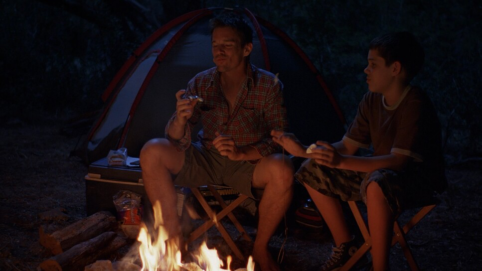
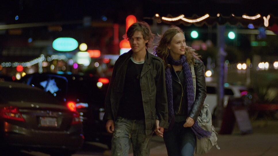
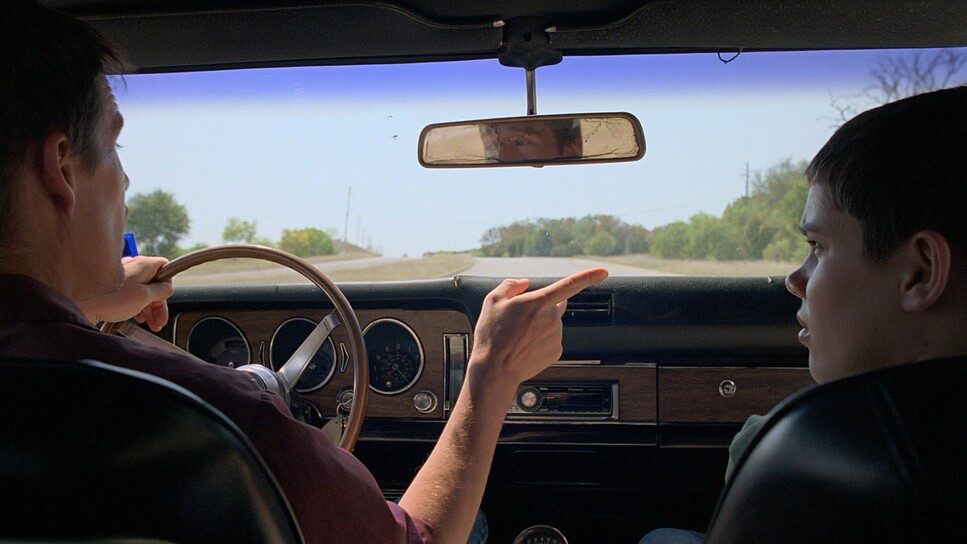
The visual strategy here prioritizes the mundane. It feels like a collection of short films stitched together by memory. The cinematography isn’t chasing the “money shot.” It’s quietly framing moments Mason looking out a car window, the family at a bowling alley and letting the frame breathe. It’s brave because it trusts the audience to stay engaged without constant visual stimulation. We see time pass through visual clues like iPods appearing, Obama campaign signs, and hairstyles changing, rather than through aggressive camera transitions. It’s a “fly on the wall” approach, but a fly that knows exactly where to sit for the best angle.
Camera Movements
Because the goal was realism, the camera movement in Boyhood is almost aggressively understated. There is a distinct lack of “look at me” directing. You don’t see crazy gimbal moves or steadicam oners designed to show off the budget.
Instead, the film relies on functional, motivated movement. If the camera pushes in, it’s usually barely perceptible, just enough to tighten the emotional space during a conversation. If it pans, it’s simply following a character across a room. This discipline is crucial for the edits. Since the film jumps years in a single cut, maintaining a calm, static visual baseline helps smooth over those massive temporal leaps. If the camera had been flying around in 2004 and locked off in 2008, the edits would have felt jarring. By keeping the movement language neutral, the time jumps feel like natural blinks rather than chapter breaks.
Compositional Choices
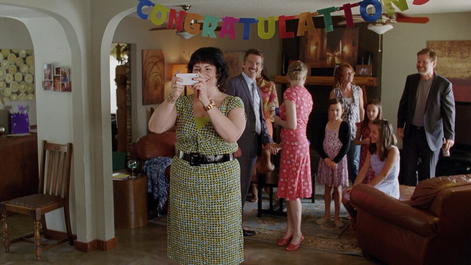
The framing often leans on depth cues to make the world feel lived-in. It’s not about perfect symmetry; it’s about perspective.
A great example of this is the scene with Bill (the alcoholic stepfather). As Mason and his stepbrother walk up to the house, we see their mother crying on the floor, but the view is fractured by the garage shutters. It’s a “frame within a frame” setup, but it doesn’t feel academic. It puts us right in the kids’ shoes confused, seeing only fragments of the adult drama, and helpless to intervene.
Later, the framing cuts off the top of Bill’s body, turning him into this headless, looming threat. It’s a smart use of negative space to generate tension without needing a horror-movie soundtrack. The camera positions us emotionally: when we are behind the mother, we are on her side. These choices are subtle, but they do the heavy lifting of subconscious storytelling.
Lighting Style
Lighting a film over twelve years is a consistency nightmare. The team clearly committed to a naturalistic, motivated lighting scheme. In the color grading world, we talk a lot about “memory colors” how people remember grass looking, or how sunlight feels. Boyhood nails the feeling of Texas heat.
The exteriors are harsh and bright, often utilizing that hard, high-contrast sunlight you get in the southwest. Interiors rely heavily on practicals lamps, overheads, window spill. They didn’t try to force a stylized look with heavy gels or unnatural rim lights. The challenge here would have been maintaining skin tone integrity. Film stocks respond to mixed lighting (like tungsten lamps fighting daylight windows) differently than modern digital sensors. Keeping the skin tones looking natural while the light quality shifted from location to location (and year to year) required a very light touch. It’s transparent lighting you don’t notice it, which means they did their job.
Lensing and Blocking
To maintain that consistent optical texture, the production relied on high-quality glass specifically Panavision Primo Primes and Zeiss Super Speeds. Prime lenses were the right call here. Zooms can breathe and change characteristics, but a good prime lens offers a reliable, solid image structure that helps unify footage shot a decade apart.
They generally sat in a “medium” focal range. We aren’t seeing extreme wide-angle distortion or super-telephoto compression that isolates characters completely. The depth of field is usually moderate characters are sharp, but you can still make out the environment behind them. It grounds the characters in reality.
The blocking mirrors this naturalism. Linklater stages the actors in ways that reveal power dynamics like the physical distance at the dinner table but it never feels like “blocking.” It feels like people just sat down. That “unforced” rhythm is actually the result of very precise rehearsal and staging.
Color Grading Approach
This is where my brain really starts to itch. Fact-check time: the colorist on this was Parke Gregg. He had the unenviable task of bringing twelve years of dailies into a single cohesive timeline.
The decision to shoot on 35mm film (using Panavision Millennium and Moviecam Compact cameras) was the saving grace here. If they had shot this digitally, starting on a DV camera in 2002 and ending on an Alexa in 2013, the texture difference would have been distracting. Film provided a consistent grain structure and color response baseline.
In the grade, the priority would have been density management. You want the blacks to have that rich film weight without crushing detail, and the highlights to roll off softly. It’s about matching the “toe and shoulder” of the film curve across different stock batches. Skin tones are critical Gregg had to ensure that Mason’s skin tone looked like the same person’s skin tone, whether he was 6 or 18, under fluorescent school lights or outdoor sun.
I also suspect they resisted the urge to apply modern grading trends. There’s no teal-and-orange push here. The grade feels honest to the period, respecting the natural colors of the locations. It’s a “print film” aesthetic warm, slightly soft, and organically textured.
Technical Aspects & Tools
Boyhood – Technical Specifications
| Genre | Drama, Satire, Coming-of-Age, Suburbia |
|---|---|
| Director | Richard Linklater |
| Cinematographer | Lee Daniel, Shane F. Kelly |
| Production Designer | Gay Studebaker, Rodney Becker |
| Costume Designer | Kari Perkins |
| Editor | Sandra Adair |
| Colorist | Parke Gregg |
| Time Period | 2000s |
| Color | Warm |
| Aspect Ratio | 1.78 – Spherical |
| Format | Film – 35mm |
| Lighting | Soft light, Low contrast |
| Lighting Type | Daylight |
| Story Location | United States of America > Texas |
| Filming Location | Terlingua > Big Bend Ranch State Park |
| Camera | Panavision Millennium / Millenium XL / XL2, Moviecam Compact |
| Lens | Panavision Primo Primes, Zeiss Super Speed |
| Film Stock / Resolution | 2.5K |
From a gear perspective, sticking to Panavision Millennium and Moviecam bodies was a stroke of genius for future-proofing. 35mm film is effectively “resolution independent” you can scan it at 2K, 4K, or 8K and it still holds up.
But the logistics… imagine the continuity bible for this production. Every prop, every costume, every set dressing detail had to be tracked. The crew had to be available for a few weeks every year for over a decade. That requires a level of production management that is almost unheard of. You have to store the negative safely for 12 years before you even finish the movie! The risk of physical film degradation, lost footage, or lab closures was real. The technical mastery here isn’t just about the cameras; it’s about the sheer organizational fortitude required to not lose the movie before it was finished.
- Also read: THE NIGHTMARE BEFORE CHRISTMAS (1993) – CINEMATOGRAPHY ANALYSIS
- Also read: MULHOLLAND DRIVE (2001) – CINEMATOGRAPHY ANALYSIS
Browse Our Cinematography Analysis Glossary
Explore directors, cinematographers, cameras, lenses, lighting styles, genres, and the visual techniques that shape iconic films.
Explore Glossary →