When Bohemian Rhapsody was released, the critical response was polarized. While audiences embraced the celebration of Queen’s music, many critics argued the narrative played it safe, smoothing over the complexities of Freddie Mercury’s life in favor of a “greatest hits” approach. But as a filmmaker and specifically from a colorist’s perspective I found myself less interested in the narrative debates and more focused on the visual execution. Regardless of the script’s depth, the film is a fascinating case study in how visual strategy can elevate a biopic, using specific technical choices to separate the legend from the man.
About the Cinematographer
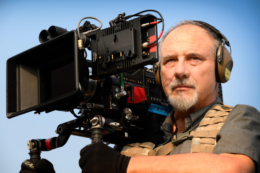
The visual architect behind Bohemian Rhapsody is Newton Thomas Sigel, ASC. Sigel is a veteran DP known for managing dynamic visuals that serve the story rather than distract from it, with a resume ranging from Drive to The Usual Suspects.
On this project, Sigel faced a specific challenge: reconciling two distinct visual worlds. He had to capture the bombastic, high-energy spectacle of Queen’s live performances while simultaneously grounding the intimate, often somber drama of Mercury’s personal life. His approach wasn’t just about making pretty pictures; it was about creating a visual language that could seamlessly transition between the operatic stage and the claustrophobic reality of fame.
Inspiration Behind the Cinematography
The primary visual inspiration was, inevitably, the archival footage of Queen itself. The film needed to transport the audience to Wembley Stadium and Live Aid with absolute fidelity. The production didn’t just want to mimic the look; they wanted to replicate the feeling of being in the crowd.
However, a conflicting current ran through the visual strategy. The script deals with the tension between the public “rock god” persona and Freddie’s internal isolation. Sigel mirrored this through a dichotomy in visual styles. The concert sequences are designed to be immersive and celebratory siding with the band’s preference for an anthem-filled experience. Conversely, the narrative scenes often lean into a “70s” period aesthetic that feels more restrained. The film attempts to reconcile the bombastic energy of the stage with the “loneliness and emptiness” of Freddie’s personal journey through contrasting visual textures.
Camera Movements
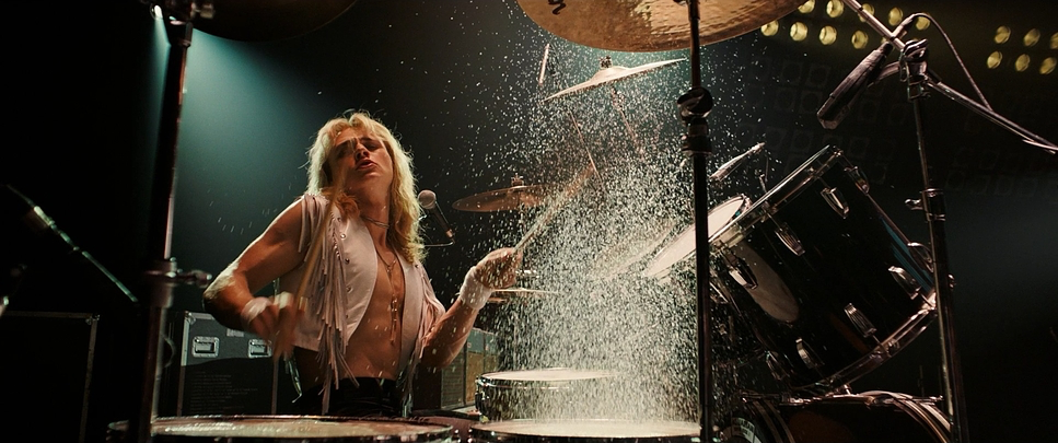
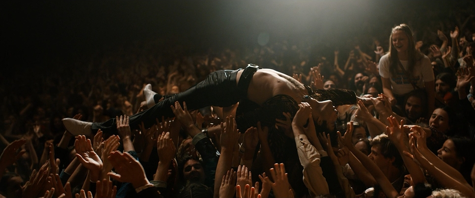
The camera movement in Bohemian Rhapsody is distinctively bifurcated. The concert sequences are defined by kinetic energy. The camera isn’t just observing; it is an active participant. Sigel utilized techno-cranes and wire cams to weave through the band members and plunge into the crowd, replicating the raw adrenaline of a live show. The movement creates a relentless forward momentum that mirrors the band’s meteoric rise.
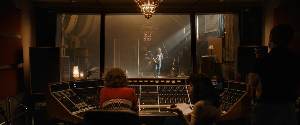
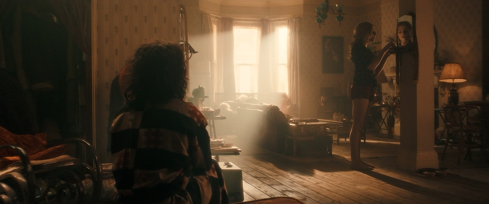
In sharp contrast, the movement off-stage is significantly more restrained. We see traditional static shots, subtle dolly pushes to emphasize emotional beats, and steady tracking shots. This stillness often feels claustrophobic, serving as a visual metaphor for Freddie’s entrapment within his own fame. The editor, John Ottman, cuts these scenes with a different rhythm than the concerts, allowing the camera to linger on the friction between characters rather than the spectacle.
Compositional Choices
Compositionally, the film adapts to its 2.39:1 aspect ratio to manage scale. During the concert scenes, wide shots are essential for conveying the magnitude of events like Live Aid, treating the crowd as a single, massive character. Sigel often employs low angles to elevate Freddie, reinforcing his larger-than-life status against the skyline or the stadium lights.
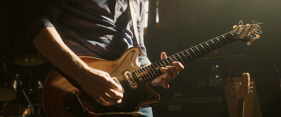
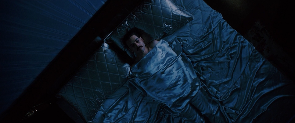
Off-stage, the framing tells a story of isolation. Freddie is frequently center-framed but isolated by depth of field or physical barriers doorways, windows, or negative space. Even when surrounded by his entourage or bandmates, the blocking and composition often place him on a different plane, highlighting his internal distance. The use of extreme close-ups (inserts) on details eyes, lips, instruments creates an intimacy that cuts through the wider period setting, forcing the audience to confront the human detail behind the icon.
Lighting Style
The lighting strategy is a tale of two worlds. On stage, the lighting is motivated by theatrical design: high-contrast, directional, and saturated. Spotlights carve out the performers, and backlighting creates the requisite halos of rock stardom. It is an operatic approach where the dynamic range is pushed to the limit to capture the brilliance of stage lights without losing facial detail.
Away from the stage, the lighting shifts to a softer, more naturalistic approach. Sigel utilized soft daylight and overcast sources for many of the London interior and exterior scenes. This diffuse lighting wraps around the actors, avoiding the harshness of the stage but also stripping away the glamour. It’s a grounded look that relies on practical sources lamps and windows to create a reality that feels lived-in rather than performed.
Lensing and Blocking
Rather than sticking to a single format, the production mixed cameras and lenses to texture the different timelines. For the bulk of the narrative scenes set in the 1970s and 80s, Sigel paired the ARRI ALEXA SXT with Cooke Panchro Classic lenses. The Cooke Panchros are vintage primes known for their “Cooke look”—a warmth and gentle rendering of skin tones that takes the digital edge off the Alexa sensor. This combination provided a period-appropriate softness without the need for heavy filtration.
However, for the climactic Live Aid sequence, the production switched to the ARRI ALEXA 65 with Hasselblad Prime 65 lenses. This large-format approach was critical for the finale. The massive sensor provided a depth and clarity that distinguished the concert from the rest of the film, making the stadium crowd feel vast while keeping Freddie the sharp, distinct center of gravity.
Blocking followed this technical shift. On stage, the choreography was precise, mimicking the exact movements of the real Queen performances. Off-stage, blocking was used to illustrate power dynamics often positioning Freddie at a distance from Mary or the band to physically represent his emotional drift.
Color Grading Approach
From a colorist’s perspective, the work done by Greg Fisher (the credited colorist) is essential to the film’s narrative clarity. The grade doesn’t just make the images look “nice”; it separates the timelines and emotional states.
For the concert scenes, the grade focuses on punch and vibrancy. We see enhanced saturation and aggressive contrast shaping to mimic the intensity of stage lighting. The skin tones are often warmer, reflecting the heat of the performance.
However, for the narrative sections specifically the London scenes Fisher opted for a cooler, desaturated palette. The data highlights a lean toward blue and cool tones in the shadows and midtones. This wasn’t just to sell the “rainy London” trope; the desaturation visually reinforces the “loneliness” mentioned by critics. By pulling back the vibrancy in Freddie’s private life, the grade subconsciously tells the audience that his world is greyer, colder, and less alive when he isn’t performing. It’s a smart use of color contrast to support the character arc.
Technical Aspects & Tools
Bohemian Rhapsody — Technical Specs
| Genre | Drama, Music, Musical, History, Biopic |
|---|---|
| Director | Bryan Singer |
| Cinematographer | Newton Thomas Sigel |
| Production Designer | Aaron Haye |
| Costume Designer | Julian Day |
| Editor | John Ottman |
| Colorist | Greg Fisher |
| Time Period | 1970s |
| Color | Cool, Desaturated, Blue |
| Aspect Ratio | 2.39 – Spherical |
| Format | Digital |
| Lighting | Soft light |
| Lighting Type | Daylight, Overcast |
| Story Location | England > London |
| Filming Location | United Kingdom > England |
| Camera | Arriflex BL, ARRI ALEXA SXT, ARRI ALEXA 65 |
| Lens | Cooke Panchro Classic, Hassalblad Prime 65 lenses |
| Film Stock / Resolution | ARRIRAW (6.5K) |
Achieving this look required a robust technical workflow. The decision to shoot ARRIRAW in 6.5K (for the Alexa 65 segments) meant the post-production team had massive latitude to push the image. This dynamic range was crucial for the concert scenes, allowing the colorist to retain detail in the blinding highlights of the spotlights while maintaining information in the deep shadows of the crowd.
The use of the Arriflex BL in specific sequences suggests a dedication to authentic grain structures for specific archival replications, blending seamlessly with the digital footage thanks to the texture of the Cooke lenses. The “camera on a wire” noted in reviews was indeed a specialized wire cam system, allowing for the multi-axis movements over the piano and through the stage gear that traditional cranes couldn’t achieve.
- Also read: TOY STORY 2 (1999) – CINEMATOGRAPHY ANALYSIS
- Also read: LIFE OF PI (2012) – CINEMATOGRAPHY ANALYSIS
Browse Our Cinematography Analysis Glossary
Explore directors, cinematographers, cameras, lenses, lighting styles, genres, and the visual techniques that shape iconic films.
Explore Glossary →