My name is Salik Waquas, and I am a professional colorist. I run a post-production color grading suite ‘Color Culture’, where I immerse myself in films of all genres, continuously learning from cinematic masters. Analyzing films from a technical and emotional perspective helps me refine my work, drawing inspiration from the storytelling elements that go beyond just visuals. I’ve worked extensively with DaVinci Resolve, and films like Birdman also know as the Unexpected Virtue of Ignorance have greatly influenced how I approach visual storytelling.
When it comes to groundbreaking cinematography, Emmanuel Lubezki’s Birdman has always stood out to me. The film’s illusion of being a single continuous take isn’t just a technical achievement; it profoundly enhances the narrative and character arcs. I admire how the visual choices align with the chaotic, fractured psyche of Riggan Thomson, making the film a unique piece of immersive storytelling. Here’s my breakdown of what makes Birdman‘s cinematography exceptional.
Birdman In Depth Cinematography Analysis
About the Cinematographer
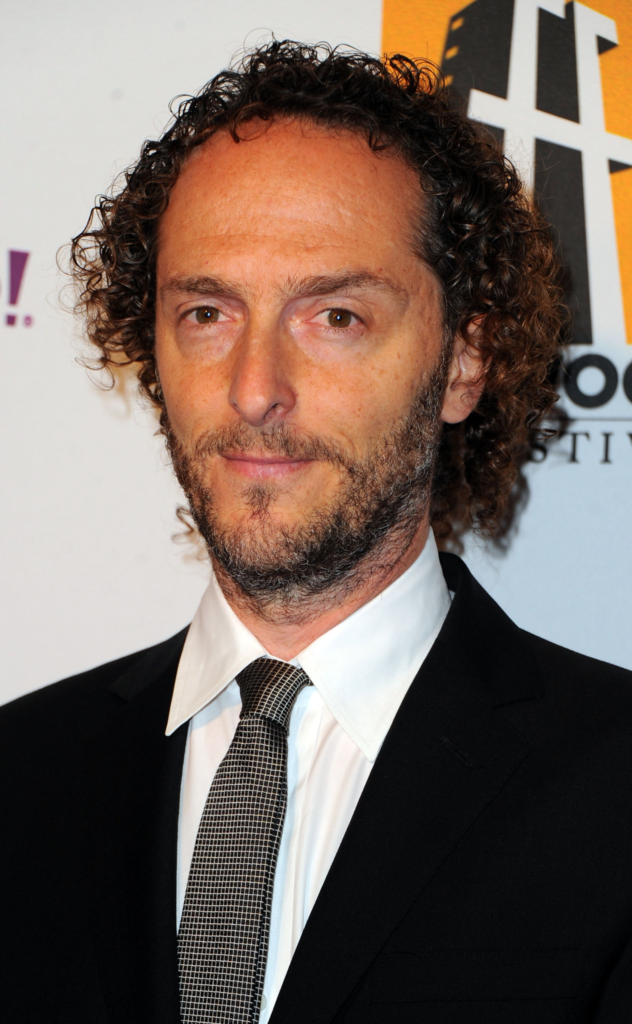
Emmanuel Lubezki, or “Chivo” as he’s fondly known, is a cinematographer renowned for his mastery over natural light, long takes, and immersive camera movements. Having worked on films like Gravity and Children of Men, Lubezki isn’t new to ambitious filmmaking. In Birdman, his collaboration with director Alejandro González Iñárritu pushed the boundaries of cinematography by crafting the illusion of a continuous one-shot film. This technical brilliance is accompanied by emotional depth, making Birdman a true masterclass in cinematography.
Inspiration for the Cinematography of Birdman
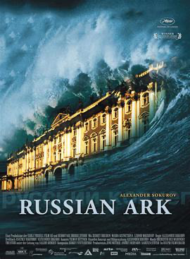
The inspiration for Birdman’s visual style lies in the experimental one-take approach, with films like Russian Ark and Victoria influencing the concept. However, instead of filming the entire movie in a single shot, the production used cleverly hidden cuts to stitch long takes together. This approach gave the narrative a seamless, real-time flow, aligning perfectly with Riggan’s mental state, as the audience feels trapped in his relentless struggle for relevance.
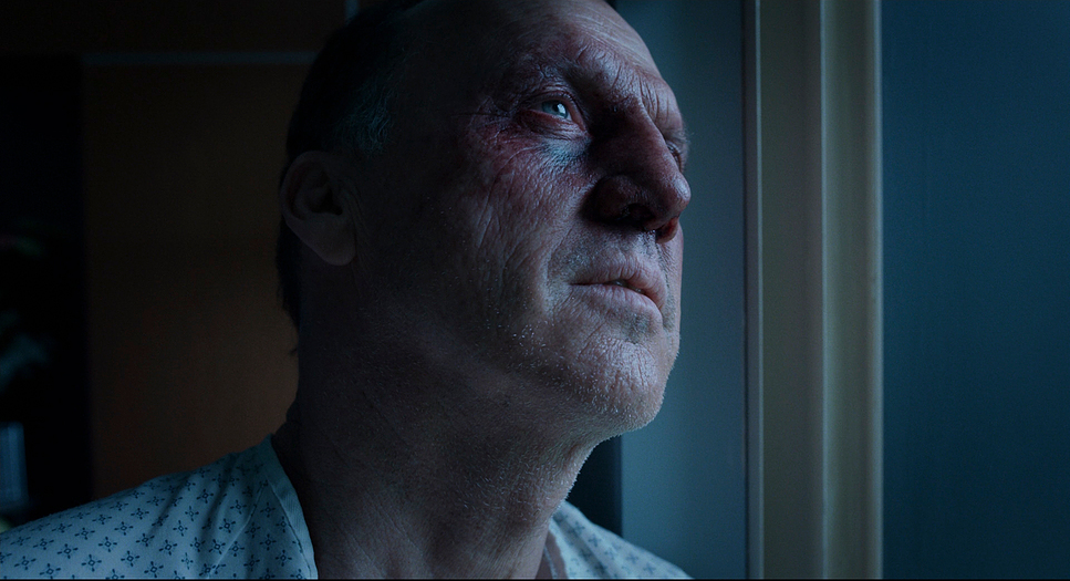
The beauty of this continuous movement lies in how it mirrors Riggan’s psychological entrapment. There is no respite from his insecurities and self-doubt, just as the film gives no break in its storytelling. I find this immersive quality fascinating—it makes us feel Riggan’s descent into chaos, heightening the emotional connection with his character.
Camera Movements Used in Birdman
One of the standout elements of Birdman is its dynamic camera movements. Lubezki uses both handheld and Steadicam shots to mirror the emotional fluctuations of the protagonist. During Riggan’s anxious moments, the handheld shots feel jittery and intrusive, intensifying the sense of instability. In contrast, calmer moments are accompanied by smoother Steadicam shots, offering fleeting tranquility.

This constant interplay between stability and chaos aligns with Riggan’s attempts to find control in his deteriorating world. In moments where he performs or rehearses, the Steadicam movements reflect a brief sense of mastery. But as soon as things unravel emotionally, the camera shifts to handheld, visually translating his inner turmoil. I love how Lubezki uses these movements to shape the emotional rhythms of the story, ensuring the cinematography becomes an emotional extension of the narrative.
Compositions in Birdman
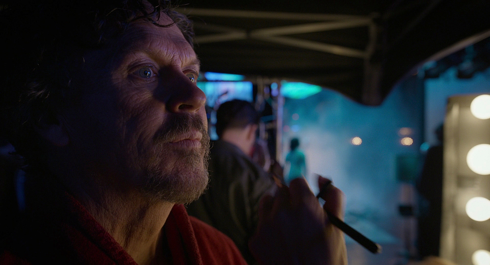
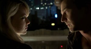
Lubezki’s compositions in Birdman are as deliberate as they are intimate. Tight close-ups frequently highlight the characters’ faces, capturing the rawness of their emotions and emphasizing their need for validation. Riggan, in particular, is often framed in claustrophobic compositions, reflecting his obsession with public perception and self-worth.
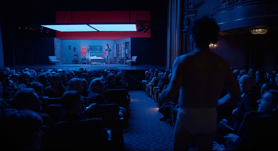
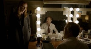
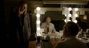
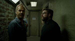
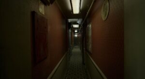
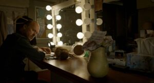
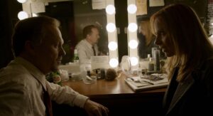
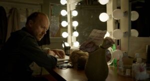
One element that stood out to me is the frequent use of reflective surfaces like mirrors and windows, symbolizing Riggan’s fractured identity. This visual motif adds layers to the narrative, conveying the duality between his inner life and his public persona. The use of long corridors and theater spaces creates a sense of endless pursuit, visually reinforcing the idea of Riggan chasing his fading relevance, which makes for a brilliant narrative and visual metaphor.
Lighting Style of Birdman
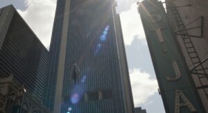
Lubezki’s lighting in Birdman straddles the line between realism and theatricality. Even in outdoor scenes, there’s a deliberate stage-like quality, blurring the lines between Riggan’s personal life and his performance-driven existence. This approach underscores the film’s theme: Riggan’s life is a never-ending act, and he cannot escape the performance, even outside the theater.
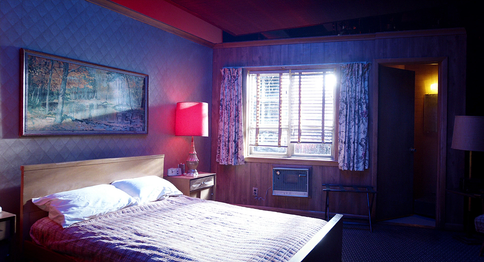
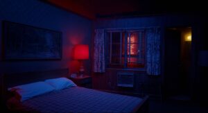
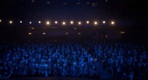
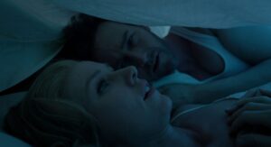
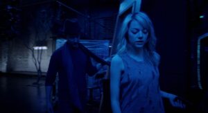
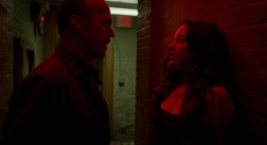
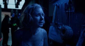
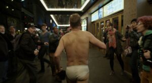
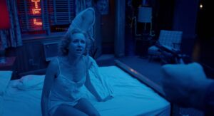
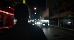
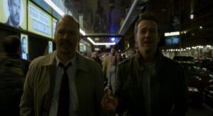
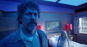
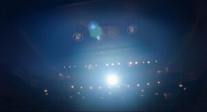
The lighting also shifts in tone to convey emotional transitions. Natural light, used in scenes like the one shot in Times Square, grounds the story in realism. In contrast, stage scenes employ stylized lighting, alternating between warm and cool tones. I especially appreciate how blues evoke melancholy, while reds convey tension and power, adding emotional depth to the scenes. The lighting not only illuminates the characters but also serves as a narrative tool, accentuating the film’s exploration of ego and identity.
Lensing and Blocking of Birdman

Lubezki opted for Arri Alexa M and Arri Alexa XT cameras with Zeiss Master Primes for Birdman. These lenses offer minimal distortion, even at wide angles, allowing for immersive visuals. The Alexa M’s compact design enabled the camera to navigate through tight spaces like corridors seamlessly, maintaining the illusion of the one-shot structure.
The precision required in blocking the actors to align with the camera’s movements is remarkable. Each scene feels like a choreographed dance between the camera and the performers, enhancing the sense of continuity. I find this approach particularly inspiring—it reminds me that great cinematography isn’t just about beautiful visuals but also about how the camera interacts with the narrative and the performances.
Color Grading of Birdman
As a colorist, I found Birdman‘s color palette fascinating. The grading is subtle yet effective, with smooth transitions that preserve the illusion of continuous movement. There’s a deliberate avoidance of harsh contrast, ensuring that no visual element stands out too starkly and disrupts the narrative flow.
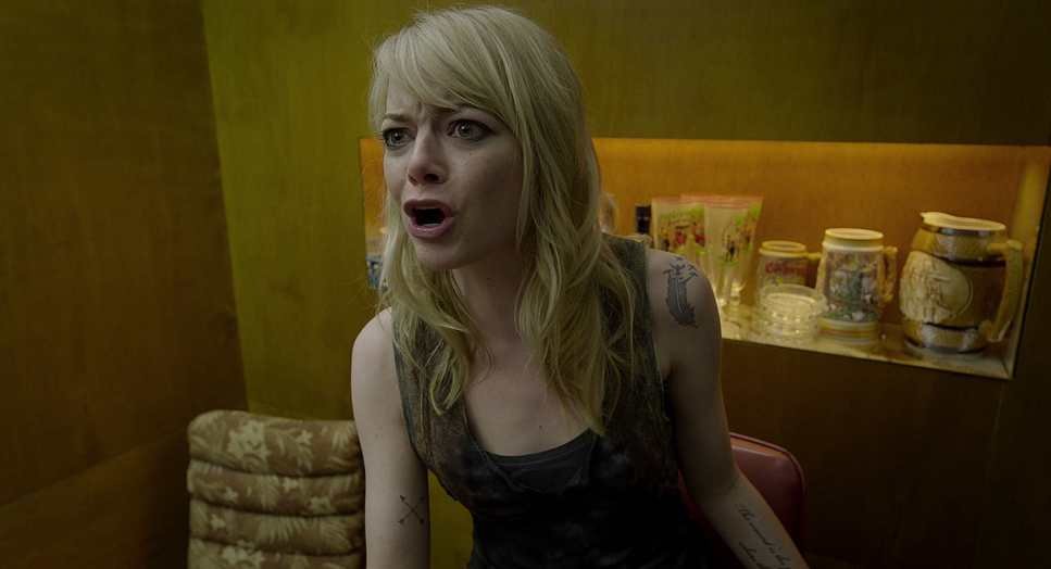
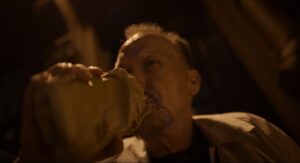
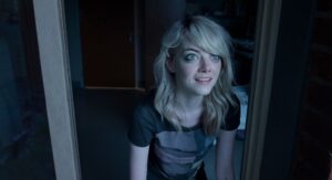
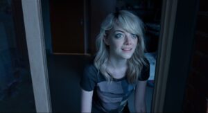
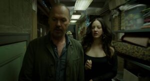
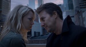
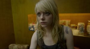
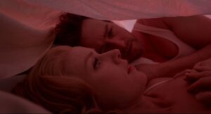
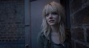
The film uses colors strategically to convey emotions. Yellow tones often highlight moments of danger or assertiveness, such as Emma Stone’s confrontational scenes. Meanwhile, deep blues and reds dominate the stage scenes, reinforcing themes of power, passion, and melancholy. I admire how seamlessly the production design, lighting, and color grading come together to create a unified visual language. This cohesive approach elevates the storytelling, making every frame feel intentional and emotionally resonant.
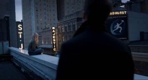
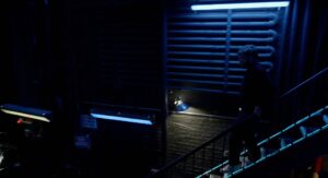
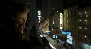
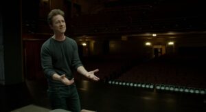
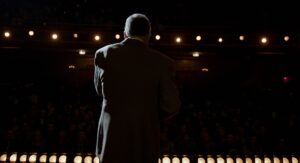
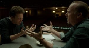
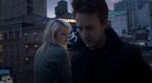
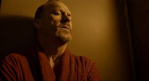
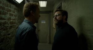
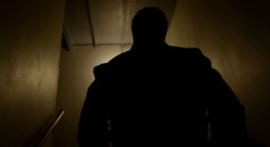
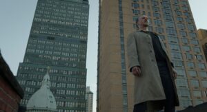
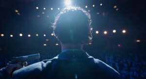
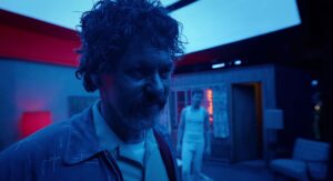
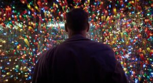
Birdman Film Stills
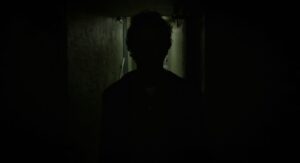
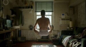
A curated reference archive of cinematography stills from Birdman. Study the lighting, color grading, and composition.
























Conclusion
For me, Birdman exemplifies the power of visual storytelling. It’s a reminder that cinematography is not just about capturing beautiful images but about conveying emotions and enhancing the narrative. As a colorist and filmmaker, this film has been an invaluable source of inspiration, teaching me that bold creative risks often yield extraordinary results. Birdman remains a testament to what’s possible when cinematography is used as both a technical and emotional storytelling tool.
- Also Read: CINEMATOGRAPHY ANALYSIS OF CHUNGKING EXPRESS (IN DEPTH)
- Also Read: CINEMATOGRAPHY ANALYSIS OF THE WOLF OF WALL STREET (IN-DEPTH)
Browse Our Cinematography Analysis Glossary
Explore directors, cinematographers, cameras, lenses, lighting styles, genres, and the visual techniques that shape iconic films.
Explore Glossary →