Tim Burton’s Big Fish (2003) is an anomaly in Burton’s career. When it came out, the lack of gothic spirals and pale, brooding anti-heroes confused people. Where was the macabre? Instead, we got a film bathed in Southern sunlight. But looking back, this restraint is exactly why the film works. It grounds the fantasy in a father-son story that feels profoundly real. It didn’t have the instant pop-culture impact of Edward Scissorhands, but visually, I’d argue it is one of the most mature and technically precise films Burton ever directed. A huge part of that success comes down to the choices made behind the lens.
About the Cinematographer
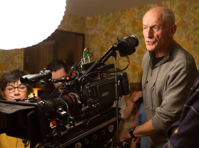
To pull this off, Burton didn’t hire a fantasy specialist; he hired Philippe Rousselot, AFC, ASC. If you know his work on A River Runs Through It or Interview with the Vampire, you know Rousselot is a master of “romantic realism.” He doesn’t just light a scene; he paints it.
Bringing Rousselot onto a Burton set was a brilliant move. Burton needed to prove he could pivot after Planet of the Apes, and he needed a DP who could handle the duality of the script. He needed someone who could make a giant walking through a town look believable, not just theatrical. Rousselot brought a painterly sensitivity that elevated the material. He treated the tall tales not as cartoons, but as cherished memories heightened, sure, but grounded in tangible, high-quality lighting.
Inspiration Behind the Cinematography
The visual strategy of Big Fish is built entirely on the friction between Edward Bloom’s “tall tales” and his son Will’s “boring reality.” It’s a classic conflict of aesthetics. Edward’s world is populated by werewolves and witches; Will’s world is sterile hospital rooms and dry conversations.
The filmmakers couldn’t just make the fantasy look “cool”; they had to visually differentiate the feeling of truth versus fiction. The inspiration seems to be the nature of storytelling itself how a memory glows brighter than the moment it actually happened. The goal was to create a visceral separation so that when the two worlds finally collide in the third act, the merge feels earned. It’s not just about pretty shots; it’s about using the camera to validate Edward’s worldview.
Camera Movements
You might expect a film about giants and circuses to be full of chaotic, whiz-bang camera moves, but I was struck by how deliberate the movement is here.
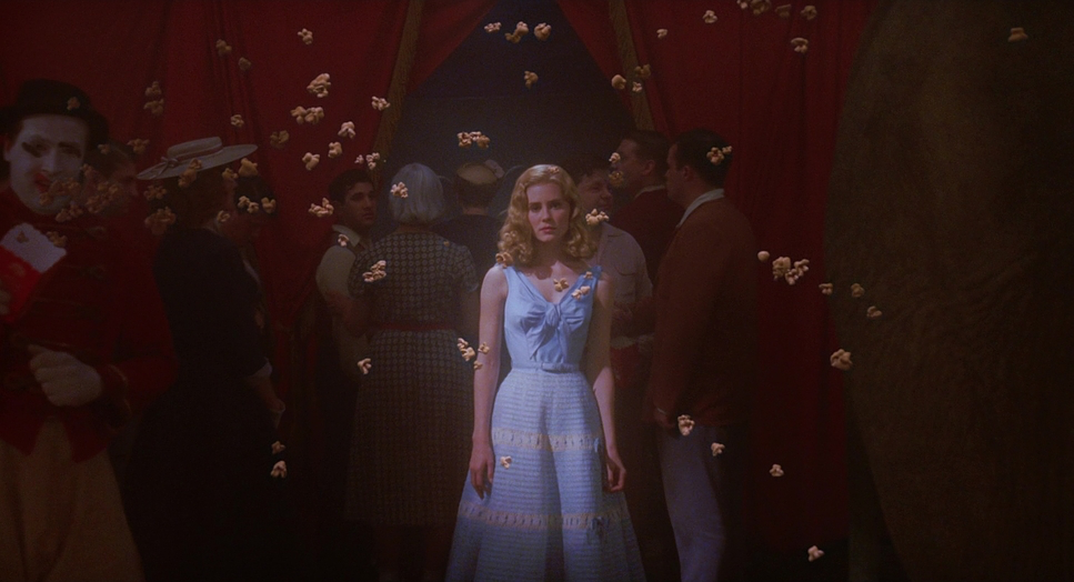
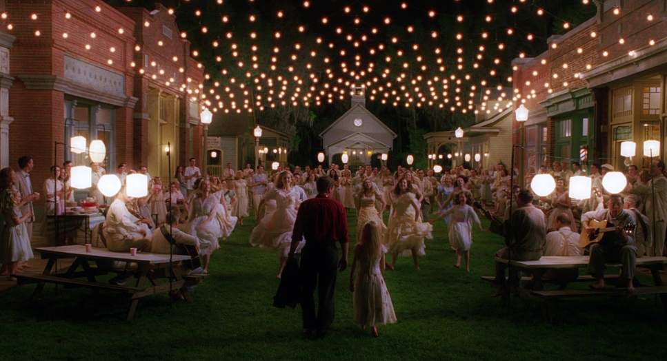
In the flashback sequences, the camera has a fluid grace. It tracks, dollies, and sweeps. Look at the shots establishing the town of Spectre or the tracking shots through the Calloway Circus the movement pulls you into the momentum of the story. It mimics the feeling of being swept up in a good lie.
Contrast that with the present-day hospital scenes. The camera stops breathing. It becomes static, observational, often locked off. There’s a specific stillness during the confrontations between Will and his father that underscores the emotional distance between them. This pacing shift allows the emotional beats to land without the distraction of a moving lens.
Compositional Choices
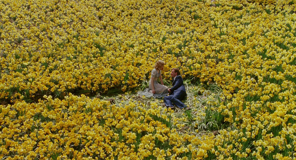
Rousselot’s framing tells us everything we need to know about the characters’ internal states. In the fantasy sequences, he favors the 1.85:1 aspect ratio to create diorama-like compositions. The shot of Edward in the daffodil field is the textbook example: extreme wide, right-heavy composition, with the character dwarfed by the vibrant set design yet anchoring the frame. It feels like an illustration from a storybook.
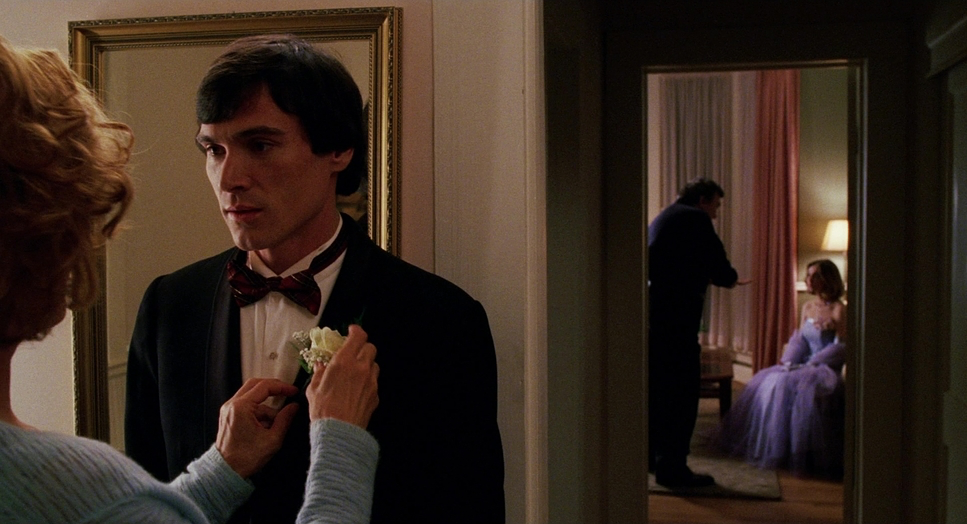
In the “real world,” the composition tightens. We get more clean singles and close-ups. The blocking often isolates Will, using negative space to suggest his alienation. Interestingly, older Edward is often blocked centrally, even in his sickbed he remains the protagonist of his own life until the very end. Will, meanwhile, often sits on the periphery, literally trying to find his place in his father’s frame.
Lighting Style
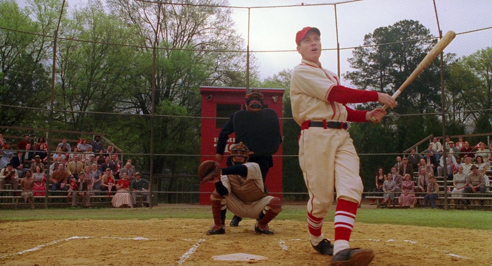
This is where the film’s technical precision really shines. The defining look of the flashbacks is that “hard light” mimicking a perpetual, golden afternoon sun. Rousselot utilizes high-key lighting setups, often backlighting Ewan McGregor to give him a literal halo. It’s motivated lighting the sun, practicals but it’s pushed about a stop brighter to feel like an idealized memory.
However, the “reality” scenes are where the cinematographer earns his paycheck. It’s easy to make a circus look good; it’s hard to make a dying man in a hospital room look cinematic. Rousselot shifts to a cooler, more subdued palette with lower contrast. Yet, he never lets the image fall apart. The shadow detail remains rich. Even in the dim hospital scenes, the lighting is stark but purposeful, reflecting Will’s desire for the “unvarnished truth” without making the film look like a TV drama.
Lensing and Blocking
We know from the technical specs that Rousselot favored Panavision cameras and lenses for this shoot, and you can feel that glass choice in the final image. Panavision lenses from this era often have a specific softness a “roundness” that takes the clinical edge off the image.
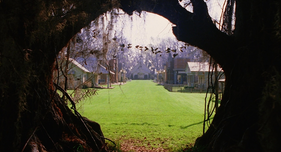
In the flashbacks, they lean into wider focal lengths. This isn’t just to show off the set; it’s to create a sense of scale. Characters like Carl the Giant need vertical headroom to feel imposing. But notice that they aren’t using distorted fish-eye lenses; they keep the geometry relatively grounded, which maintains that suspension of disbelief.
For the intimate moments, the focal length tightens. The telephoto compression in the emotional scenes brings the background closer to the subject, isolating them in the frame. It’s a subtle optical cue that forces us to focus on the performance rather than the world.
Color Grading Approach
As a colorist, this is the part I geek out on. Big Fish is a masterclass in hue separation.
For the fantasy sequences, the grade is pushed heavily into warmth and saturation. We aren’t just talking about cranking the saturation slider; this is specific density management. The reds in the circus uniforms and the greens in the forest are deep and lush, not neon. The highlight roll-off is creamy and golden, characteristic of the Kodak Vision2 500T (5218) stock they shot on. Digital cameras often struggle to hold detail in warm, clipped highlights, but here, the film stock handles that exposure beautifully.
In the present day, the grade shifts. It’s not black and white, but it’s definitely desaturated. The palette pivots to teals, sterile whites, and muted skin tones. It feels “thinner,” less punchy. This visual storytelling is crucial for the finale. When Will finally starts telling the story at the river, watch the grade. The saturation bleeds back in. The warmth returns. The color grading literally bridges the gap between father and son before the screen fades to black.
Technical Aspects & Tools
Big Fish (2003)
Technical Specifications
| Genre | Adventure, Drama, Fantasy, Magical Realism, Low Fantasy |
|---|---|
| Director | Tim Burton |
| Cinematographer | Philippe Rousselot |
| Production Designer | Dennis Gassner |
| Costume Designer | Colleen Atwood |
| Editor | Chris Lebenzon |
| Colorist | Steve Bowen |
| Time Period | 1940s |
| Color | Warm |
| Aspect Ratio | 1.85 – Spherical |
| Format | Film – 35mm |
| Lighting | Hard light |
| Lighting Type | Daylight, Sunny |
| Story Location | United States > Alabama |
| Filming Location | United States of America > Alabama |
| Camera | Panavision Cameras |
| Lens | Panavision Lenses |
| Film Stock / Resolution | 5218/7218 Vision 2 500T |
The texture of Big Fish is undeniable, and that comes down to the format: 35mm Film. specifically the Kodak Vision2 500T 5218 stock.
Shooting on 500T stock was a bold choice for a movie with so many day exteriors, but it explains the film’s unique texture. 500T is a high-speed stock with a visible, organic grain structure. That grain is vital here. It acts almost like a texture overlay, binding the CGI elements (like the big fish or the twins) with the live-action footage. If this had been shot on pristine digital, the visual effects might have stood out too sharply. The film grain blends everything into a cohesive, painterly image.
The 4K HDR remaster is a gift for us tech-heads because it widens the dynamic range, allowing those 500T blacks to sit deep without crushing, while the highlights in the daffodil field can really pop without clipping.
- Also read: IN BRUGES (2008) – CINEMATOGRAPHY ANALYSIS
- Also read: DALLAS BUYERS CLUB (2013) – CINEMATOGRAPHY ANALYSIS
Browse Our Cinematography Analysis Glossary
Explore directors, cinematographers, cameras, lenses, lighting styles, genres, and the visual techniques that shape iconic films.
Explore Glossary →