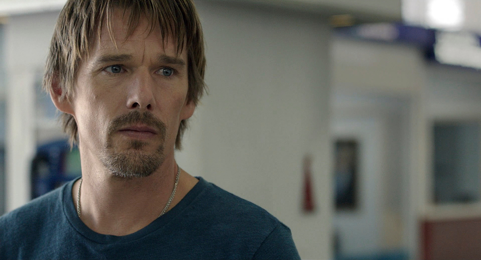
Before Midnight (2013) is a difficult watch, but for all the right reasons. By the time we get to this third installment, the “fairytale” luster of Vienna and the bittersweet amber of Paris have evaporated. What’s left is something starker, more honest, and technically much more demanding than it looks. It’s a film that gets under my skin because it uses the camera as a silent, unblinking witness to the messy reality of Jesse and Céline.
About the Cinematographer
There’s a common misconception that the legendary Yorgos Arvanitis lensed this, but the credit actually goes to Christos Voudouris. His work here is a study in restraint. In a film that lives or dies on ten-minute takes and relentless dialogue, the cinematography has to be invisible. Voudouris doesn’t use flashy movements or dramatic “movie” lighting to tell us how to feel. Instead, he creates a canvas of authenticity. It’s a logistical nightmare disguised as a simple stroll. As The Guardian noted, it’s easy to overlook the technical feat here because it never feels like “theater” it just feels like life.
Camera Movements
The camera in Before Midnight doesn’t just observe; it breathes with the actors. Because Linklater favors these massive, unbroken takes some stretching over ten minutes the camera has to be incredibly fluid. It acts like a third character, constantly recalibrating and drifting to follow the emotional ebb and flow.
We see this in the long walks through the Peloponnese. The camera leads them, then trails them, then circles back. It’s organic responsiveness. When the tension spikes, the frame might tighten just a fraction—a slow, almost imperceptible push-in. When they find a moment of levity, it eases back. The lack of “coverage” or frequent cuts forces us to sit with the discomfort. We can’t look away from the raw honesty, especially during that grueling third-act hotel scene.
Technical Aspects & Tools
Before Midnight
Technical Specifications & Production Data
| Genre | Drama, Romance |
| Director | Richard Linklater |
| Cinematographer | Christos Voudouris |
| Costume Designer | Vasileia Rozana |
| Editor | Sandra Adair |
| Colorist | Parke Gregg |
| Time Period | 2010s |
| Aspect Ratio | 1.85 – Spherical |
| Format | Digital |
| Lighting | Soft light |
| Lighting Type | Artificial light, Practical light, Fluorescent |
| Story Location | Europe > Greece |
| Filming Location | Kalamata > Kalamata International Airport |
| Camera | ARRI ALEXA Mini |
| Film Stock / Resolution | 3.2K / 3.2K ArriRaw |
Executing those long takes required a specific toolkit. They shot this on the ARRI ALEXA Mini in 3.2K ArriRaw, which was a brilliant choice for this specific environment. The Mini is small enough to be nimble for Steadicam work and handheld intimacy, yet it retains that legendary Alexa dynamic range.
In the bright, harsh Greek sun, you need a sensor that can handle highlight roll-off without making the sky look like a white sheet of paper. They used spherical lenses nothing too stylized or anamorphic to keep the image clean and undistorted. The goal wasn’t to show off the gear; it was to ensure the technical “feat” of the unbroken scene never distracted from the performance. It’s a perfect marriage of high-end digital tech and old-school blocking.
Lighting Style
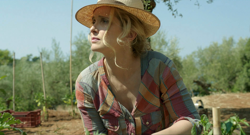
This is a masterclass in motivated naturalism. For the exteriors, Voudouris leans heavily on the Mediterranean sun, but look closer there’s subtle fill and diffusion everywhere to keep the faces legible without looking “lit.” It’s about making the light feel as honest as the conversation.
The real challenge, though, is the shift to interiors. Take the airport scene or the hotel room. Here, we’re dealing with practicals and even fluorescents. As a colorist, I know how tricky these “dirty” light sources can be, but here they serve the story. The natural, forgiving golden-hour glow of the afternoon eventually gives way to the stark, unforgiving electric light of the hotel room. It strips away the romantic veneer. The shadows are a bit harder, the fall-off is quicker, and it perfectly underscores the “dormant rage” that begins to surface between Jesse and Céline.
Compositional Choices
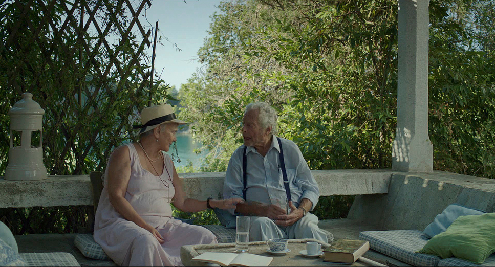
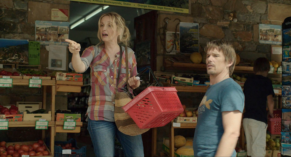
The two-shot is the heartbeat of this film, but Voudouris avoids monotony by playing with the Greek landscape. During their walks, the compositions are wide, placing the couple against the timelessness of rolling hills and ancient ruins. It positions their very modern anxieties against something eternal.
But notice how the framing shifts as the day goes on. Early on, the shots feel balanced Jesse and Céline share the frame equally, side-by-side. As the hotel argument escalates, the compositions become more fragmented. The frame starts to feel claustrophobic. One character might dominate the space while the other is tucked into a corner. It reflects that feeling of emotional suffocation that hits when a relationship starts to fray at the edges.
Inspiration Behind the Cinematography
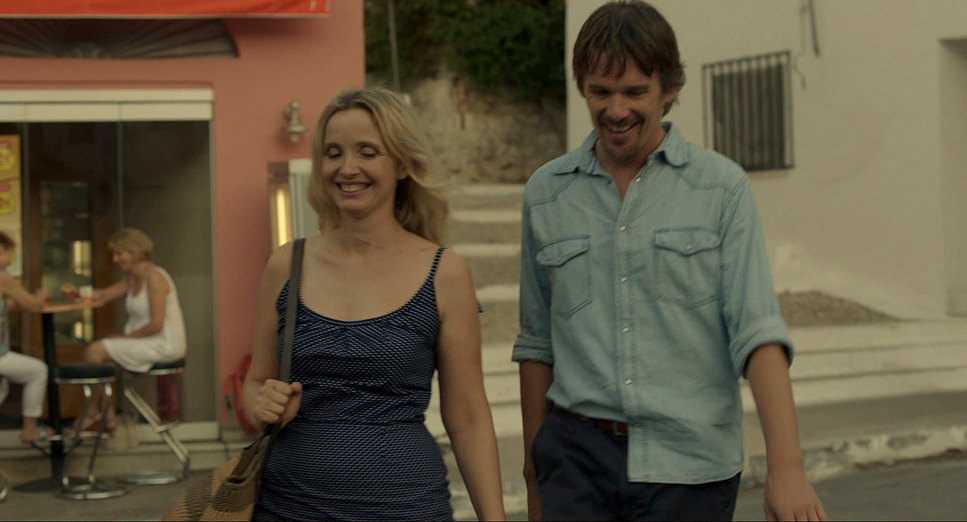
The core visual inspiration is the passage of time itself. Linklater wanted to depict the evolution of a relationship through raw, extended conversations. The Greek setting the Peloponnese provides a sun-drenched, ancient backdrop that contrasts beautifully with the modern anxieties of the couple. It’s an idyll, a reverie, but as Peter Bradshaw pointed out, “real life keeps kind of intruding.” The cinematography captures that candidness. It feels like we are hidden observers, watching the “natural rapport” of Ethan Hawke and Julie Delpy bloom and then, eventually, clash.
Lensing and Blocking
Lensing and blocking are what make those long takes work. They used medium focal lengths for a lot of the dialogue, which offers a perspective similar to the human eye. It doesn’t feel like a “movie” lens; it feels like standing three feet away from them.
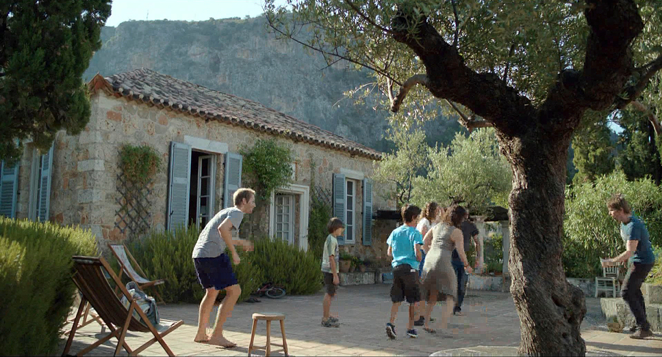
The blocking is where the real choreography happens. The characters aren’t just standing and talking; they’re interacting with the world. Céline stops to look at goats; Jesse gestures at the horizon. This constant, organic movement keeps the frame alive without needing a single cut. It requires an insane level of coordination between the actors and the camera crew to ensure that every beat of a ten-minute conversation remains visually engaging.
Color Grading Approach
This is where my obsession kicks in. The grade on Before Midnight, handled by Parke Gregg, is incredibly disciplined. It favors a natural, slightly desaturated look that avoids the “commercial” vibrancy of modern rom-coms. This reflects the theme: this is real life, not a fairytale.
As a colorist, I look at the contrast shaping. There’s a softness to the highlights that mimics a print-film sensibility. It’s not clinical or overly “digital.” The skin tones are rendered faithfully warm, but never oversaturated. The greens of the olive groves and the blues of the sea are muted, ensuring the faces remain the focal point.
I’d argue that in the final hotel scenes, the grade shifts. The shadows feel a bit cooler, the warmth is dialed back just a touch. It increases the perceived emotional distance. It’s a beautifully restrained approach that prioritizes authenticity over a “pretty” image. It’s messy, it shows flaws, and that’s exactly what the story needs.
- Also read: HERO (2002) – CINEMATOGRAPHY ANALYSIS
- Also read: WONDER (2017) – CINEMATOGRAPHY ANALYSIS
Browse Our Cinematography Analysis Glossary
Explore directors, cinematographers, cameras, lenses, lighting styles, genres, and the visual techniques that shape iconic films.
Explore Glossary →