Disney’s Beauty and the Beast (1991), It wasn’t just a nostalgia trip, I wanted to break down why this film works so well visually.There’s a quote from reviewer Chris Stuckmann about the film’s 3D re-release that stuck with me: watching it as an adult makes “all these little things keep snapping.” That’s exactly how I felt revisiting it last week. But this time, I wasn’t just watching the story; I was looking at the construction. Seeing it with “colorist eyes,” I was honestly shocked by the precision of the visual language. This isn’t just a great cartoon; it is a blueprint for visual communication that holds up against any live-action feature.
About the Cinematographer (or Rather, the Cinematographic Vision)
Talking about “cinematography” in animation is tricky. There isn’t one Director of Photography standing on set with a light meter. In Beauty and the Beast, the “cinematographic vision” was a massive, complex collaboration. Directors Gary Trousdale and Kirk Wise set the tone, but the execution fell to Art Director Brian McEntee, the layout artists who framed the shots, and the background painters who built the world.
Think of it less like a single photographer and more like an orchestra where the layout artists are the camera operators and the background painters are the gaffers. They were effectively the DPs of this animated world, making thousands of micro-decisions about composition and lighting to serve the narrative without a single physical light being rigged.
Inspiration Behind the Cinematography
The visual aesthetic here feels heavy in a good way. It’s rooted in a blend of classical European art and theatrical stage design. There’s a distinct Old World charm that mimics the romanticism of French Rococo paintings and the dramatic, high-contrast chiaroscuro of Baroque art. The Beast’s castle isn’t just a generic scary location; the architecture and the lighting give it a sense of decaying splendor that feels like a character in itself.
The animators famously studied historical art and used live-action reference footage for the characters. This grounding in reality gave the film a weight that elevated it beyond standard Saturday morning cartoons. They weren’t just animating; they were painting a moving canvas, borrowing the visual grammar of centuries of art history.
Camera Movements
For a film from 1991, Beauty and the Beast shows an astonishing control of “camera” movement. The key here is that the moves are never just for show; they always serve the story.
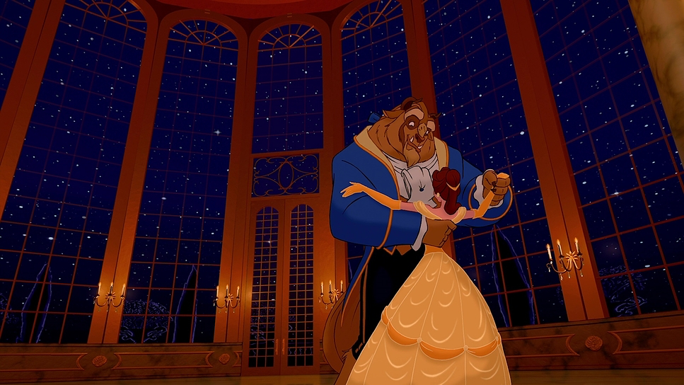
The obvious standout is the ballroom sequence during the title song. This scene is still a technical marvel. It starts with a medium shot, pushing in to establish intimacy, then pulls back, rising and arcing around the characters to reveal the scale of the ballroom. It’s a digital crane shot combined with a dolly that completely immerses you in the moment. This was achieved using Disney’s CAPS (Computer Animation Production System), allowing a multi-plane 3D camera move that would have been a nightmare to rig in live-action.
But look beyond the famous shots. Notice the smooth tracking shots following Belle through her town, establishing her isolation. Or the slow, subtle “push-ins” on characters’ faces during emotional beats. These movements act as depth cues, guiding our eyes and making the 2D world feel three-dimensional.
Compositional Choices
The framing in this film is a textbook example of classical composition. The layout artists were rigorous about guiding the viewer’s eye.
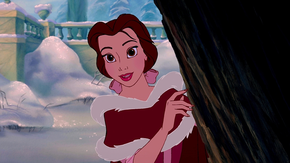
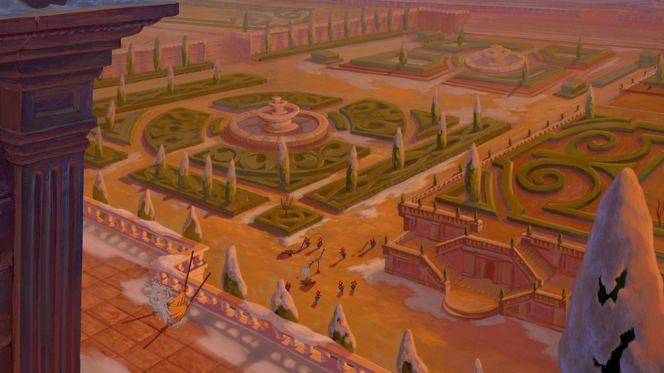
Characters are blocked within the frame to tell you exactly where they stand socially. Belle is frequently framed with negative space around her in the village, visually reinforcing that she doesn’t fit in. Gaston, on the other hand, often dominates the center of the frame, crowding out others to highlight his ego.
When Belle enters the castle, they use low-angle shots to make the architecture feel imposing and menacing. Conversely, they use high angles to diminish characters, like the initial shots of the Beast as a defeated, solitary figure. The filmmakers utilize the rule of thirds and leading lines aggressively your eye is always directed exactly where they want it, whether it’s towards the enchanted rose or a specific emotional reaction.
Lighting Style
The lighting is where the film really flexes its muscles. It creates a mood that is highly motivated and dramatic.
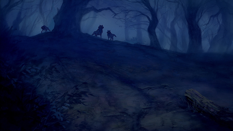
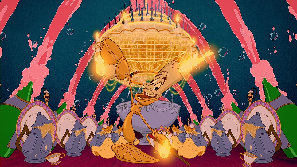
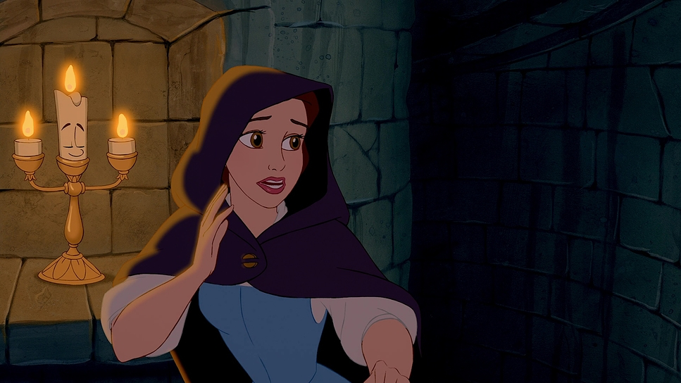
The Beast’s castle is initially dominated by cool, dim, low-key lighting. Moonlight filters through stained glass, casting long, hard shadows. Practical sources like firelight and the glow of the enchanted objects (specifically Lumiere) provide pockets of warm, flickering light. This contrast between the cold ambient light and the warm practicals creates incredible depth.
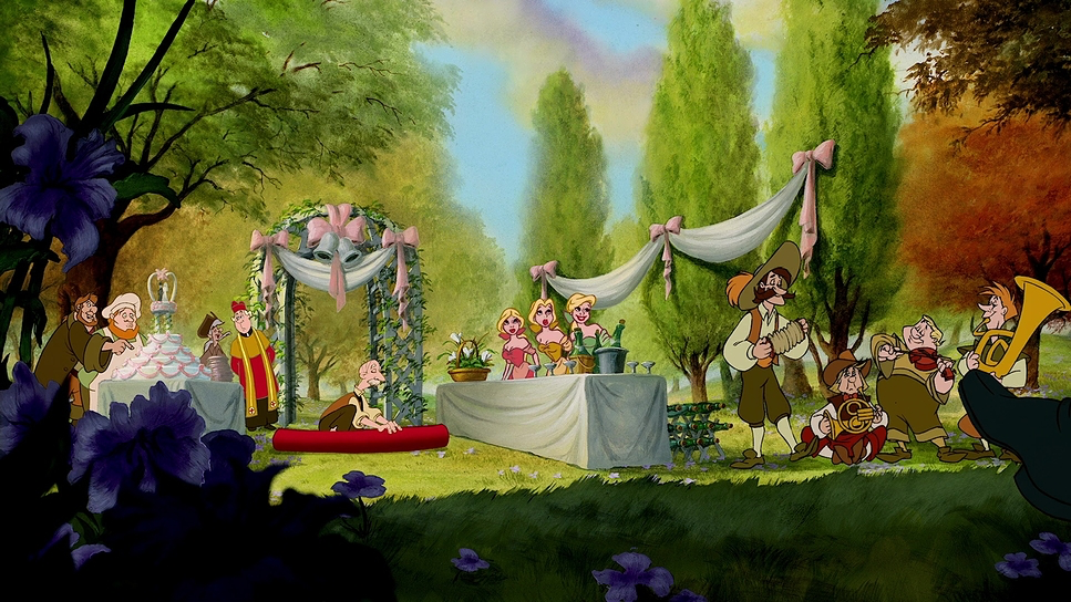
In contrast, Belle’s village is lit with a flat, bright, naturalistic light. It feels safe but boring. As the story progresses and the relationship softens, the lighting in the castle changes. The shadows lift, and warmer tones start to bleed into the background paintings. The enchanted rose acts as its own light source, a ticking clock illuminated by a soft, magical glow. The dynamic range from the crushed blacks of the castle’s West Wing to the ethereal highlights of the transformation scene is handled with a subtlety that rivals high-end live-action cinematography.
Lensing and Blocking
Even though there are no physical lenses in animation, the artists simulate lens mechanics to sell the realism. They use wide “focal lengths” to establish scale, using deep focus to show off the castle or the village square. These shots usually have multiple layers of foreground and midground to create parallax.
Then, they “cut” to tighter, telephoto-style framing for close-ups. In these moments, they simulate a shallow depth of field, blurring the background paintings to force your focus onto the character’s expression.
Blocking the staging of the characters is equally deliberate. In the early scenes, the enchanted objects crowd around Maurice, making him (and the audience) feel overwhelmed. Later, the blocking between Belle and the Beast maintains physical distance to show emotional distance, until they slowly move closer together, culminating in the intimate framing of the dance. It’s a sophisticated use of space.
Color Grading Approach
This is the stuff I geek out on. The “color grading” of Beauty and the Beast or rather, the palette selection is phenomenal.
The film relies on a strict color dichotomy: the cold, desaturated blues and cyans of the cursed castle versus the warm, earthy greens and browns of the village. This isn’t random; it immediately orients the audience emotionally. As Belle changes the Beast, the palette shifts. The ballroom scene is the payoff, bathed in a rich, amber-gold glow that signifies warmth and hope.
The tonal sculpting is what impresses me most. The shadows in the castle are deep and inky, but they don’t crush the detail there is just enough information in the blacks to keep it from looking flat. The highlights, especially on magical elements, have a beautiful roll-off. They don’t just clip to white; they diffuse softly, mimicking the halation you’d see on film stock.
I also appreciate the hue separation. Even in the monochromatic blue scenes of the castle, there are shifts from teal to indigo, giving the image texture. When Belle wears her yellow gown, that hue is isolated against the cool background, creating a color contrast that makes her pop immediately. The colors have a density and richness that reminds me of early 90s print film stock organic, not clinical.
Technical Aspects & Tools
Beauty and the Beast (1991) – Technical Specifications
| Genre | Family, Fairytale, Fantasy, Music, Musical, Romance, Magical Realism, Animation, Traditional Animation |
|---|---|
| Director | Gary Trousdale, Kirk Wise |
| Production Designer | Ed Ghertner, Brian McEntee |
| Editor | John Carnochan, Bill Wilner |
| Time Period | 1700s |
| Color | Warm, Saturated, Orange, Blue, Purple |
| Aspect Ratio | 1.78 |
| Format | Animation |
| Story Location | Europe > France |
| Camera | Bell and Howell 2709 |
Beauty and the Beast was a tech demo for CAPS (Computer Animation Production System). This system changed the game for animated cinematography.
Before CAPS, layers were painted on cels and photographed physically. Camera moves were restricted to pans and zooms. CAPS allowed for digital ink and paint and, crucially, the ability to composite hand-drawn characters into 3D computer-generated environments.
The ballroom sequence is the famous example, but the technology liberated the animators to think like cinematographers in every scene. They could execute complex tracking shots and multi-plane depth effects that gave the film a cinematic polish previously impossible in 2D animation. It allowed them to control lighting and depth cues with a precision that bridged the gap between animation and live-action.
- Also read: RAIN MAN (1988) – CINEMATOGRAPHY ANALYSIS
- Also read: ZOOTOPIA (2016) – CINEMATOGRAPHY ANALYSIS
Browse Our Cinematography Analysis Glossary
Explore directors, cinematographers, cameras, lenses, lighting styles, genres, and the visual techniques that shape iconic films.
Explore Glossary →