Usually, we look for technical perfection, but sometimes a film comes along that prioritizes texture over cleanliness. Christopher Nolan’s Batman Begins (2005) is exactly that. Before the “Nolanverse” became a massive brand, this film had to do the heavy lifting of erasing the neon-soaked memory of the Schumacher era. It didn’t just reboot a franchise; it fundamentally shifted the color palette of the blockbuster genre from “comic book pop” to “grounded reality.”
When I first heard the guy behind Memento was tackling Batman, I was skeptical. Could a cerebral indie director handle a massive IP? Turns out, that indie sensibility was exactly what the character needed. It gave us a psychological deep dive into Bruce Wayne, sure, but visually, it did something more important: it made Gotham feel like a place you could actually smell, touch, and fear.
About the Cinematographer

The visual architect here is Wally Pfister. If you know Pfister’s work, you know he isn’t interested in making things look “pretty” in the conventional sense. He wants them to look dense. His collaboration with Nolan is built on a shared disdain for the “digital look.” Even back in 2005, when digital intermediates were starting to take over, Pfister was fighting for the integrity of the negative.
His style is disciplined. He doesn’t over-light. In fact, he’s famous for underexposing, forcing the audience to peer into the shadows just like Batman does. He treats darkness not as an absence of light, but as a physical weight in the frame. This approach aligns perfectly with Nolan’s preference for practical effects. When you see the Tumbler smash through a wall, the lighting reacts realistically because it is real, not a CGI pass added six months later.
Inspiration Behind the Cinematography
The mandate was to “Nolanize” the character—essentially, taking the fantastical and dragging it down to street level. Visually, this meant stripping away the gothic expressionism of the Tim Burton era and replacing it with something that felt like Blade Runner meets Chicago.
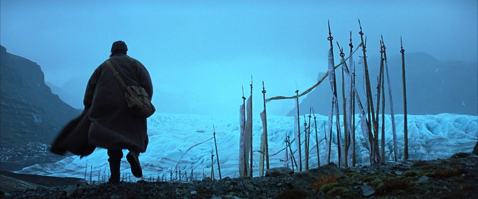
The inspiration clearly comes from urban decay. The atmosphere is choked with steam, sodium vapor, and rain. It feels lived-in. Pfister and Nolan moved away from stylized “movie sets” to a world where the fear toxin feels plausible. The cinematography leans heavily into this theme of fear. Shadows are used aggressively—often obscuring the main character completely. It’s a brave choice to hide your lead actor in the dark for half the movie, but it works because it sells the psychology of the Bat. The fear isn’t just in the script; it’s in the exposure values.
Camera Movements
Nolan and Pfister aren’t big on coverage. They don’t spray and pray. The camera movement in Batman Begins is deliberate, almost restrained, until it isn’t. In the drama scenes—Bruce with Alfred, or the flashbacks—the camera is locked off or on a slow, heavy dolly. It’s classical filmmaking.
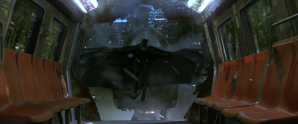
Then you get to the fight scenes, and the style shifts violently. This is a point of contention for some, but I’d argue the chaotic, tight editing and abrupt camera shifts are intentional. They mask the fact that Batman is more of a brawler than a martial artist in this suit, but they also mimic the criminals’ perspective: Where is he? He’s a phantom. The camera doesn’t track him smoothly because he’s not supposed to be tracked. Contrast this with the Tumbler sequences—low angles, hard mounts. You feel the suspension working. It’s heavy metal, not CG weightlessness.
Compositional Choices
Compositionally, this film is a study in isolation. Pfister loves deep staging. He’ll often dirty the frame with foreground elements—fences, rain, debris—to create a sense of claustrophobia. Gotham feels massive in the wides, but suffocating in the close-ups.
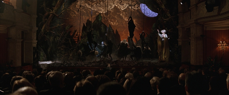
Batman is frequently framed with a “hero” low angle, silhouetting the cowl against a backlight. It’s simple, but it establishes his mythic status immediately. On the flip side, look at how Bruce is framed when he’s just a “rich kid.” He’s often small in the frame, swallowed by the architecture of Wayne Manor or the boardroom. It’s visual subtext: the man is small, but the symbol is huge. The villains get their own visual language, too. The Scarecrow sequences break the rules entirely—canted angles, disorienting focus pulls—visually manifesting the breakdown of sanity.
Lighting Style
This is where the film really separates itself. The lighting is motivated, primarily by practicals. We aren’t seeing perfectly rim-lit superheroes here. If Bruce is standing near a streetlamp, that’s his key light. If he steps away, he falls off into darkness.
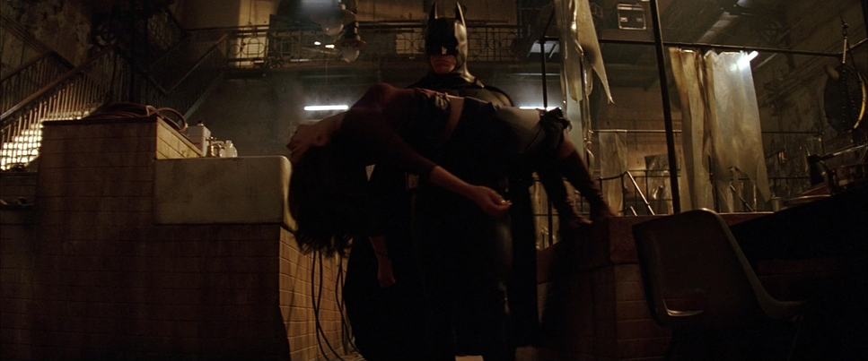
The strategy is low-key, but specifically, it’s about texture. The blacks are deep, but thanks to the film stock, they aren’t dead. There’s grain and noise in there. The lighting on the Batsuit relies on specular highlights to define the shape, rather than a fill light lifting the shadows. It creates that “creature” vibe.
Conversely, the fear toxin scenes are lit with jarring, artificial intensity—strobes, sick greens, and blown-out highlights. It cuts through the film’s usual gloom like a knife, jarring the viewer and simulating the panic attack of the toxin.
Lensing and Blocking
Contrary to popular belief that Nolan only shoots spherical for realism, Batman Begins was actually shot on Panavision C and E Series Anamorphic lenses. You can see it in the aspect ratio (2.39:1) and the way the background falls off. However, Pfister lights and frames it to avoid the “JJ Abrams” style anamorphic flares. He keeps it clean. The anamorphic squeeze gives Gotham that epic, sprawling width that spherical lenses just can’t match, making the city feel like a character itself.
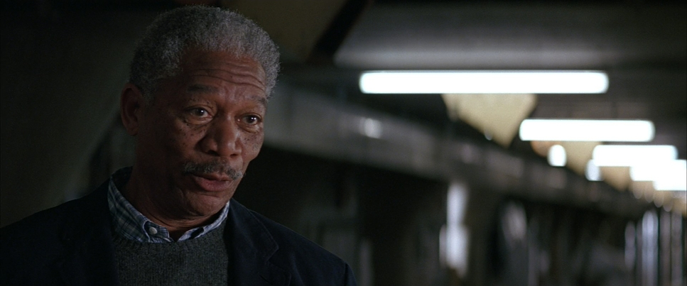
The blocking is theatrical but effective. Bruce acts as the anchor. Notice the spacing with Alfred—they are almost always close, sharing the same focal plane, emphasizing their intimacy. With Lucius Fox, there’s often a physical barrier or distance, a visual representation of their “plausible deniability” arrangement. And then there’s Batman: he is almost always blocked to be above his opponents, looking down, establishing dominance before a single punch is thrown.
Color Grading Approach
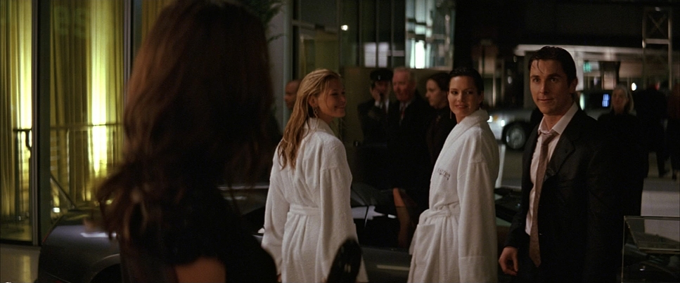
Stepping into my lane as a colorist: the grade on Batman Begins is fascinating because it predates the modern, clean “teal and orange” lut-fest. The palette is heavy on sodium vapor orange and dirty browns. It looks like a photochemical finish where the printer lights were pushed to warm up the lows and mids.
The “orange/brown” wash is critical. It makes Gotham feel sweltering and industrial. As a colorist, what I appreciate is that they didn’t crush the blacks into oblivion. They sit just above the floor, retaining that thick film density. The highlights have a creamy roll-off—classic celluloid behavior—rather than the harsh clipping you see in digital acquisition.
There is barely any true white in this film; everything is tinted by the environment. The only time the palette breaks is during the fear hallucinations, where we get those acidic greens and yellows. It’s a monochromatic approach that shouldn’t work for a blockbuster, but it grounds the movie in a specific, gritty reality. It feels like a 70s crime thriller, not a comic book movie.
Technical Aspects & Tools
Batman Begins
Technical Specifications| Genre | Action, Crime, Drama |
|---|---|
| Director | Christopher Nolan |
| Cinematographer | Wally Pfister |
| Production Designer | Nathan Crowley |
| Costume Designer | Lindy Hemming |
| Editor | Lee Smith |
| Colorist | John Ensby |
| Time Period | 2000s |
| Color | Saturated, Green, Blue |
| Aspect Ratio | 2.39 – Anamorphic |
| Format | Film – 35mm |
| Lighting | Soft light, Edge light |
| Lighting Type | Mixed light |
| Story Location | United States > Gotham City |
| Filming Location | Illinois > Chicago |
| Camera | Panavision Millennium / Millenium XL / XL2 |
| Lens | Panavision 40-80 (Bailey zoom – AWZ2), Panavision 70-200mm (ATZ), Panavision C series, Panavision E series |
Nolan and Pfister shot this on 35mm film (Kodak Vision2 500T 5218 mostly), using Panavision Millennium cameras. That 500T stock is crucial—it loves underexposure and has a grain structure that eats up digital noise reduction.
While they used anamorphic glass, they stayed away from the “sci-fi” look of the format. The visual effects were grounded in practical work—miniatures for the monorail, full-scale builds for the Tumbler. This meant the DI (Digital Intermediate) didn’t have to work overtime “fixing” the look. The look was baked in on set. The colorist’s job was largely balancing and refining that “burnt” aesthetic rather than inventing it from scratch. It’s a testament to the “garbage in, garbage out” rule: if you capture it right on the negative, the grade sings.
- Also Read: HARAKIRI (1962) – CINEMATOGRAPHY ANALYSIS
- Also Read: DAS BOOT (1981) – CINEMATOGRAPHY ANALYSIS
Browse Our Cinematography Analysis Glossary
Explore directors, cinematographers, cameras, lenses, lighting styles, genres, and the visual techniques that shape iconic films.
Explore Glossary →