When I first watched Barry Lyndon, I wasn’t just looking at a movie; I was looking at a series of 18th-century oil paintings that somehow learned to move. It’s a film that demands patience, but the payoff is a visual education in how texture, lighting, and composition can carry a narrative. As a colorist, I return to this film constantly not just for inspiration, but to study how visual choices can underscore a theme. European audiences hailed it as art immediately, while Americans struggled with the pacing, but make no mistake: this is a technical marvel where vision and engineering aligned perfectly.
About the Cinematographer
The brain trust responsible for executing Kubrick’s impossible demands was John Alcott. Alcott had already proven his mettle as a lighting cameraman on 2001 and DP on A Clockwork Orange, but Barry Lyndon is arguably his magnum opus.
Alcott wasn’t just a “lighter”; he was a technical problem solver. He understood that Kubrick didn’t want “movie lighting” he wanted the raw authenticity of the period. This wasn’t a shoot where you could just set up a key light and call it a day. It was an eight-and-a-half-month exercise in exposure management. Alcott had to adapt to English weather in real-time, often changing stops mid-take to match lighting continuity. Kubrick famously refused to block scenes until the actors were in costume and the natural light was ready, requiring a cinematographer who could think on his feet and execute with mathematical precision.
Inspiration Behind the Cinematography
The visual DNA of Barry Lyndon comes directly from the canvas. Kubrick and Alcott obsessively studied the Dutch Masters, along with Watteau and Gainsborough. They weren’t just looking for “vibes”; they were analyzing the direction of natural light and the fall-off found in those paintings.
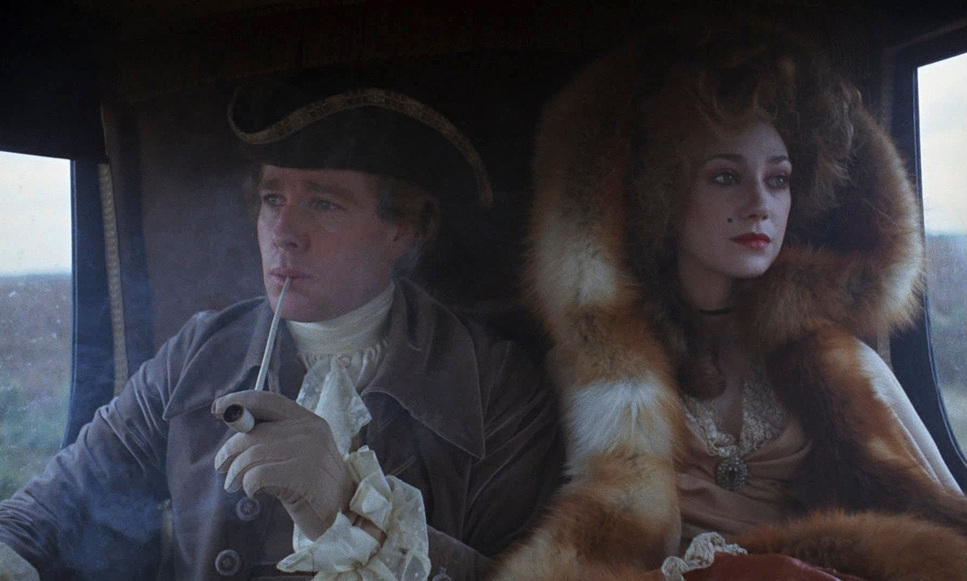
The goal was to create a moving tableau. Characters exist within grand, painterly frames that feel trapped in time. This creates a specific duality: the image has a beautiful, dreamy quality, yet it strives for absolute realism. This visual contradiction perfectly mirrors the film’s critique of the aristocracy a world that looks dignified and pristine on the surface but is internally rotting with “fraud and quiet hate.” The powdery makeup and stiff costumes make the characters look like ghosts haunting a beautiful landscape. As a viewer, you are seduced by the beauty, but the lighting and framing keep you emotionally distant, preventing you from ever fully romanticizing Barry’s toxic world.
Camera Movements
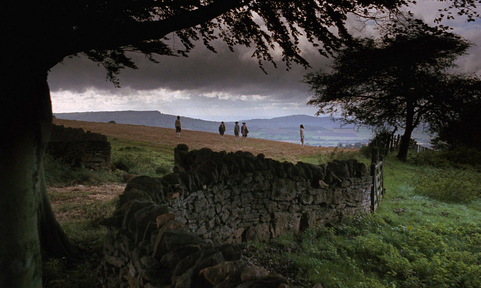
Barry Lyndon is famous for what the camera doesn’t do. You won’t find shaky handheld work here. The dominant move is the slow zoom out. Unlike a dolly shot, which moves the audience through a space (creating parallax), a zoom flattens the image.
Kubrick used an Angenieux 10-to-1 zoom lens paired with a custom “joystick” motor to execute these creeping pulls. The effect is psychological. It distances the viewer. It creates a “God’s eye view,” reducing Barry from the center of the universe to just a small, insignificant speck in a massive landscape. It visualizes the film’s core question: Do we shape our environment, or does it shape us?
However, the film isn’t entirely static. The battle sequences break this rule with dynamic tracking shots. The introduction to Barry’s first battle was filmed with three cameras on an 800-foot track, starting with a 250mm tight shot. This jarring switch from the clinical, slow zooms to immersive tracking creates a visceral contrast, reminding us that the violence under the surface is very real.
Compositional Choices
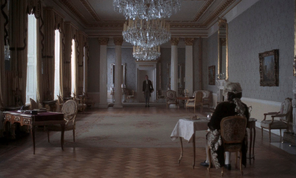
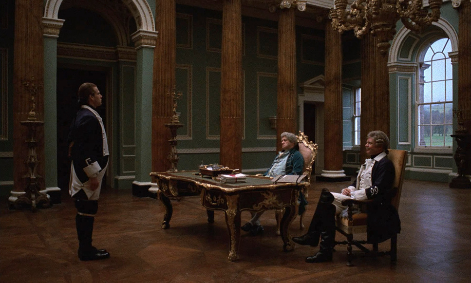
Every frame in this movie is composed with the rigidity of a portrait. Kubrick treated the aspect ratio like a canvas, often locking the camera off and forcing the actors to fit into the geometry of the room.
The wide shots are particularly telling. Barry is frequently framed small within the massive architecture of Castle Hackton or the rolling Irish hills. These are classic depth cues used for narrative weight the environment dominates the character. There is a specific shot where Barry and his son are seated beneath a gigantic painting; they look like temporary guests in a house that doesn’t care about them. They are “frozen in time,” just a blip on the timeline.
This symmetry can feel claustrophobic. It suggests a predetermined fate. No matter how hard Barry tries to climb the social ladder, the rigid composition of the frame like the rigid social hierarchy traps him. The beauty is a cage.
Lighting Style
This is where the film changed the game. Kubrick and Alcott committed to motivated lighting in its most extreme form.
For day exteriors, they used only available natural light. They were at the mercy of the clouds. Alcott famously rode the aperture on his ARRIFLEX 35BL during takes, opening up to T1.2 as clouds rolled in and closing down as the sun broke through, just to maintain a consistent exposure.
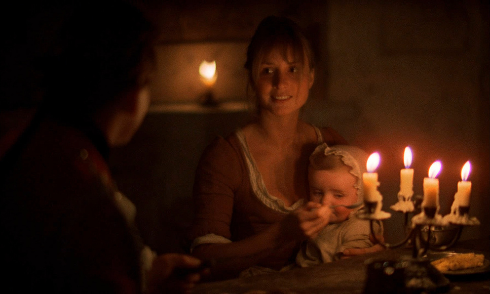
Interiors were even trickier. While they sometimes used “mini-brutes” diffused through tracing paper outside windows to extend the day, the night scenes are the stuff of legend. Kubrick wanted the scenes lit entirely by candlelight. To achieve this, they needed glass faster than anything in Hollywood. They sourced the famous Zeiss f/0.7 50mm lens, originally designed for NASA to photograph the dark side of the moon. This lens, paired with setups of up to 70 multi-wick candles and metal reflectors (to save the ceilings from heat), created a warm, amber fall-off that artificial light simply cannot replicate. It captures the world exactly as it would have looked in the 1700s dark, intimate, and flickering.
Lensing and Blocking
While the Zeiss f/0.7 gets all the glory, the “daylight” look of the film relied heavily on other glass, specifically Cooke Panchros and Canon K35s, which offered a vintage sharpness that modern lenses often lack.
The Zeiss f/0.7, however, came with a nightmare: almost zero depth of field. At f/0.7, the focus plane is razor-thin maybe an inch or two deep. This dictated the blocking. Actors couldn’t just walk around; they had to hit marks with surgical precision. Doug Milson, the focus puller, had to use a closed-circuit video camera mounted at 90 degrees with a grid overlay just to keep the actors sharp.
For the wider shots in candlelight, they couldn’t just swap lenses (because no other lens was fast enough). Instead, they mounted a projection lens adapter onto the front of the 50mm to widen it out to roughly 36.5mm. It was a constant battle of physics vs. art. The use of zooms over dollies also contributed to the “flattening” effect, compressing the background and making the characters feel like they were stuck in a 2D painting.
Color Grading Approach
Now, speaking my language. Looking at Barry Lyndon from a colorist’s perspective is fascinating because it defies the modern obsession with “clean” images.
The film was shot on Eastman Kodak 5254 (exteriors) and 5247 (interiors). Here is where the technical approach gets interesting. To get enough exposure for those candlelit scenes, Alcott pushed the development of the film one stop. Usually, pushing film increases contrast and grit something you might not want for a “soft” period piece. However, the resulting look feels remarkably similar to flashing (a technique where you pre-expose film to lower contrast). Because the lighting ratios were so low (flat candlelight), the “push” didn’t result in a harsh, crunchy image; instead, it gave the film a unique texture milky shadows with a distinct grain structure that feels alive.
If I were grading a project to look like Barry Lyndon today, I wouldn’t just slap a “Vintage” LUT on it.
- Highlight Roll-off: I’d focus heavily on the roll-off. The candles in the film never clip into a harsh digital white; they bloom. I’d use halation tools to mimic that bleed of the highlights into the mid-tones.
- Contrast Shaping: I would lift the toe of the curve. The blacks in Barry Lyndon are rarely crushed; they are dense but detailed.
- Hue Separation: The palette is restrained. The skin tones are natural, slightly ruddy (accurate to the makeup and cold weather), and the greens of the landscape are deep and earthy, not vibrant pop-greens.
The key is to emulate that print-film density. We want the image to feel thick, not thin and digital.
Technical Aspects & Tools
| Barry Lyndon: Technical Specifications | |
|---|---|
| Genre | Drama, Romance, War |
| Director | Stanley Kubrick |
| Cinematographer | John Alcott |
| Production Designer | Ken Adam |
| Costume Designer | Ulla-Britt Söderlund, Milena Canonero |
| Editor | Tony Lawson |
| Time Period | 1700s |
| Color | Warm, Blue |
| Aspect Ratio | 1.66 |
| Format | Film – 35mm – Flashing |
| Lighting | Soft light, Side light |
| Lighting Type | Daylight |
| Story Location | England > Castle Hackton |
| Filming Location | Salisbury > Wilton House |
| Camera | Arriflex BL, Mitchell BNC |
| Lens | Cooke Panchro Classic, Canon K35 m2, Century Angenieux 23-460mm |
The gear list for Barry Lyndon reads like a custom engineering project.
- Cameras: The ARRIFLEX 35BL was the workhorse for sound sync and exteriors. For the special candlelight scenes, Ed DiGiulio modified a non-reflex Mitchell BNC to accept the massive rear element of the Zeiss lens.
- Lenses: The Zeiss f/0.7 50mm (Planar) is the star, but the Angenieux 10-to-1 zoom (often used with the Cooke Panchros and Canon K35s for other focal lengths) did the heavy lifting for the storytelling.
- Focus System: A custom closed-circuit video assist system was pioneered here, purely because the optical viewfinder was too dark to see focus at f/0.7 levels.
Alcott’s decision to push the film across the board even for scenes that didn’t strictly need the speed was brilliant. It ensured the grain structure matched between the bright day scenes and the dark night scenes, creating a cohesive visual tapestry.
- Also read: IN THE NAME OF THE FATHER (1993) – CINEMATOGRAPHY ANALYSIS
- Also read: LA HAINE (1995) – CINEMATOGRAPHY ANALYSIS
Browse Our Cinematography Analysis Glossary
Explore directors, cinematographers, cameras, lenses, lighting styles, genres, and the visual techniques that shape iconic films.
Explore Glossary →