Released in 1989, just as Tim Burton’s Batman was redefining the “blockbuster” aesthetic, Part II was an incredibly bold swing. It wasn’t just a sequel; it was a high-wire act of world-building that revisited a cherished past while inventing a future that, at the time, felt miraculous. Robert Zemeckis and Bob Gale truly went for it, and the cinematography was right there with them, defining a visual lexicon for temporal displacement.
About the Cinematographer: Dean Cundey’s Triple Threat
While some production notes focus on the directors, for us, this is a Dean Cundey film. His fingerprints are all over the frame. The visual language established in the first film that bright, optimistic, yet grounded “Amblin” glow was something Cundey had already perfected. But for Part II, his challenge was exponential. He wasn’t just replicating an aesthetic; he was creating a 2015 future, warping it into a 1985 dystopian nightmare, and then re-visiting 1955 through a fresh lens.
Zemeckis has famously admitted he actually dreaded the “future” segments because he didn’t like the guesswork of predicting what lies ahead. As a result, Cundey’s role wasn’t just execution; it was about making those scenes visually believable to a skeptical director. He translated Zemeckis’s request for an aesthetic akin to “IKEA and NASA partnering for a fall collection” into something concrete. Cundey had to walk a tightrope: making the future feel fresh without getting bogged down in literalism, all while maintaining the series’ DNA of fun and adventure.
Inspiration Behind the Cinematography
The core inspiration for Part II stemmed directly from a narrative ambition: show two wildly different visions of 2015 and then re-contextualize 1955. Zemeckis and Gale leaned into pipe dreams and “scientists’ predictions,” prioritizing a “funny while possibly inaccurate” future over strict realism. This approach liberated the visuals.
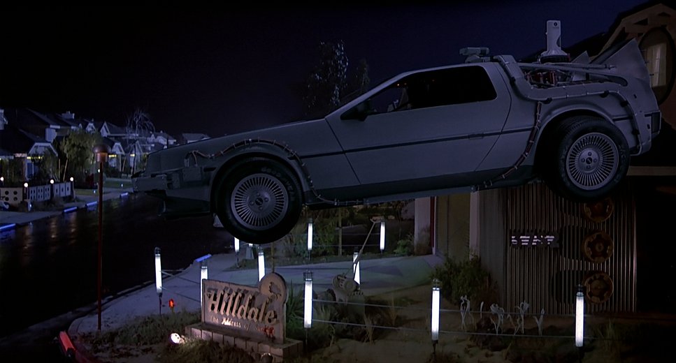
The “ideal future” where climate change is still science fiction is depicted as bright, tidy, and brimming with optimism. Visually, that translates into clean lines, vibrant saturation, and a sense of open possibility. This optimistic palette then needed a brutal counterpoint: the “dystopian hellscape” of the alternate 1985. Here, the inspiration shifts to something grittier and oppressive a direct visual manifestation of a corrupted timeline. The contrast isn’t just in the script; it’s baked into every frame, using visual shorthand to signal moral decay versus hopeful progress.
Technical Aspects & Tools: The ILM Revolution
Back to the Future Part II: Technical Specifications
| Genre | Action, Adventure, Comedy, Family |
| Director | Robert Zemeckis |
| Cinematographer | Dean Cundey |
| Production Designer | Rick Carter |
| Costume Designer | Joanna Johnston |
| Editor | Harry Keramidas, Arthur Schmidt |
| Colorist | Dale Grahn |
| Time Period | Future |
| Color | Green |
| Aspect Ratio | 1.85 – Spherical, Vista Vision |
| Format | Film – 35mm |
| Lighting | Soft light |
| Lighting Type | Daylight, Overcast |
| Story Location | California > Hill Valley |
| Filming Location | United States > California |
| Camera | Panavision Gold / G2 |
| Lens | Panavision Primo Primes |
| Film Stock / Resolution | 4K |
Back to the Future Part II was a landmark technical achievement. With a $40 million budget and a back-to-back shooting schedule with Part III (lasting 11 months), the scale was massive. The absolute stars of the show were Industrial Light & Magic (ILM) and the VistaGlide motion control system.
This film marked ILM’s “maiden voyage” into digital compositing, which was revolutionary. Before this, compositing was primarily optical, meaning film negatives were physically re-photographed together, usually resulting in “generation loss” (a loss of sharpness and color depth). Digital compositing gave them unprecedented control over the flying cars and the “multi-Marty” scenes. While the effects might look “dated” by today’s 4K standards, the sheer wonder they evoked in 1989 was a pivot point for the entire industry.
Camera Movements and the VistaGlide
From a technical standpoint, the camera movements here are a masterclass in precision. The standout is the use of the VistaGlide motion control camera system. This wasn’t just a fancy tool; it was the first portable motion control system, which allowed the team to take these complex shots out of the studio and onto the “real” streets of the Hill Valley backlot.
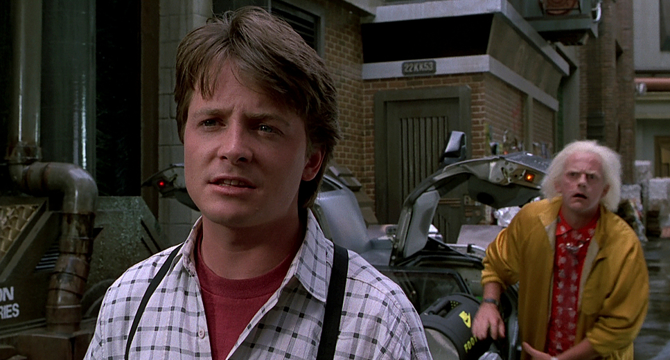
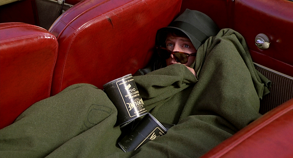
For me, as a colorist, the VistaGlide is fascinating because it enabled the seamless layering of Michael J. Fox playing Marty Sr., Marty Jr., and Marlene in a single shot. The system allowed for repeatable camera moves dolly, pan, and tilt that were identical frame-by-frame across multiple takes. This technical grounding is vital; it ensures that when we composite those plates, the lighting and perspective line up perfectly. It turns the camera into a silent, omniscient observer executing a clinical, dance-like precision.
Lensing and Blocking
Cundey shot this on 35mm film using Panavision Gold and G2 cameras paired with Panavision Primo Primes. The choice of glass is evident in the image quality. We see a heavy use of wider lenses to capture the scope of the 2015 Town Square, giving the audience a sense of immersion among the flying vehicles and architectural innovations.
Conversely, tighter lenses are saved for the emotional stakes, pulling us into Marty’s desperation. The blocking for the scenes featuring multiple versions of Fox is a marvel of pre-digital discipline. Actors had to hit incredibly precise marks while interacting with empty space, knowing exactly where their “other self” would be added later. It’s a dance between technical rigidity and fluid storytelling.
Compositional Choices: Order vs. Chaos
The composition in Part II is deeply tied to the timeline. For the “Ideal 2015,” the frames are clean, open, and ordered. Wide shots establish the futuristic environment without feeling cluttered, using depth cues layering flying cars over pedestrian walkways to create a believable world.
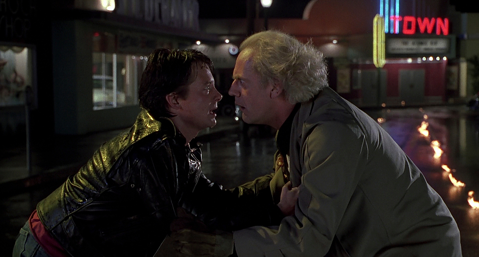
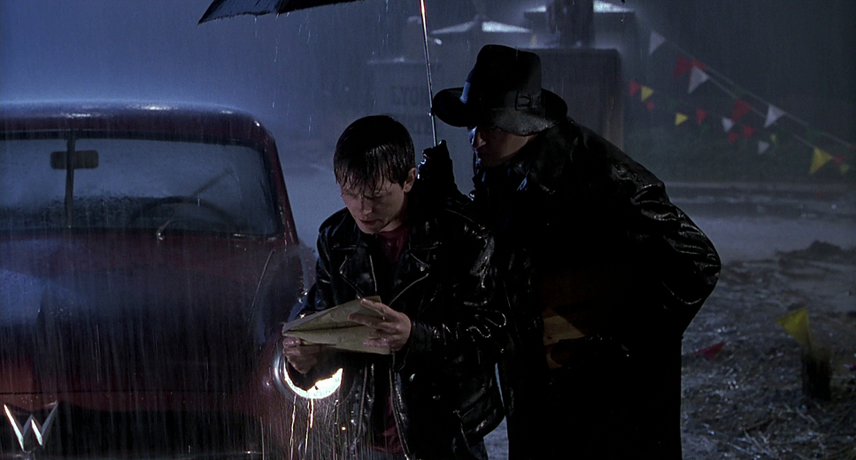
In contrast, the alternate 1985 is claustrophobic and fragmented. This is Biff’s Hill Valley: gaudy, violent, and messy. Shots are tighter, filled with bars, graffiti, and debris. Even the framing of George McFly (played here by Jeffrey Weisman) was a compositional solution to a casting problem deliberately obscured or framed at odd angles to hide the fact that it wasn’t Crispin Glover. It’s a great example of how a DP and director use the frame to solve production hurdles.
Lighting Style: The Narrative Tool
Lighting is where Cundey really sells the emotional stakes. For 2015, the lighting is high-key and soft. There’s an even glow that suggests prosperity; it’s an inviting, aspirational aestheticalmost like a high-end commercial. Natural light feels abundant, even when augmented by artificial sources.
Switching to the “hellscape” of 1985, the lighting undergoes a total transformation. We see low-key, high-contrast illumination. Shadows are deeper and motivated by “dirty” or flickering practical sources. As a colorist, I can see how foundational this lighting is the mood is set before the film even reaches the lab. The shadows in Biff’s casino aren’t just dark; they feel heavy.
Color Grading Approach: The Colorist’s Turf
Now we’re on my home turf. Back to the Future Part II is a fascinating study in print-film sensibilities. Working with colorist Dale Grahn, the look was largely “baked in” photochemically. Unlike today’s digital intermediate (DI) workflows, they couldn’t just “power window” a specific hue in post.
For the optimistic 2015, the intent was a clean, vibrant, and slightly cool palette. I see a lot of blue-grays in the vehicles and crisp whites in the architecture. Hue separation was paramount here to keep the vibrant signs from becoming a muddy mess. In my suite, I’d be looking for a neutral contrast curve and a controlled highlight roll-off to preserve those bright futuristic surfaces.
For the alternate 1985, the tonal sculpting gets aggressive. This is where I’d be pushing a grittier, warmer, and desaturated palette. We’re talking about “crushing” the blacks to create oppressive shadows and shifting the color temperature toward ambers and sickly greens to evoke decay. When I’m working on a project with shifts this dramatic, I’m not just correcting; I’m interpreting. Seeing how this film achieved such distinct looks with the limited tools of 1989 is a constant inspiration for my work at Color Culture.
- Also read: SHAUN OF THE DEAD (2004) – CINEMATOGRAPHY ANALYSIS
- Also read: NIGHTCRAWLER (2014) – CINEMATOGRAPHY ANALYSIS
Browse Our Cinematography Analysis Glossary
Explore directors, cinematographers, cameras, lenses, lighting styles, genres, and the visual techniques that shape iconic films.
Explore Glossary →