Let’s be real for a second: people love to dunk on Avatar. We’ve all heard the “Pocahontas in space” jokes or called it a glorified tech demo. But as a filmmaker and colorist who spends my life staring at waveforms and stressing over color spaces, I have to give credit where it’s due. When you strip away the narrative debates, what James Cameron achieved visually wasn’t just a step forward; it was a complete rewrite of the rulebook. I wanted to revisit this film not to talk about the plot, but to break down the sheer technical audacity of its construction the tools, the grading, and how they managed to make blue aliens feel physically real.
About the Cinematographer
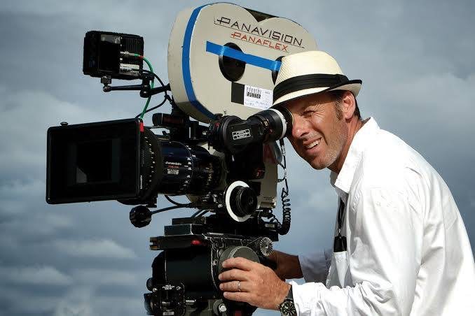
When discussing the look of Avatar, you have to acknowledge the unique dynamic between James Cameron and his DP, Mauro Fiore ASC. Cameron is a technical obsesssive who effectively co-DPs his movies, but Fiore’s role was critical in grounding the madness. He wasn’t just lighting a set; he was lighting a volume to match a virtual world that didn’t exist yet. Fiore brought a naturalistic, almost gritty sensibility to the live-action plates that prevented the movie from looking like a video game. He had to match the lighting on Sam Worthington in a studio in New Zealand to a virtual jungle environment that would be rendered months later. It’s a thankless, technical high-wire act, and Fiore’s ability to keep the lighting consistent between the “real” world and the “simulated” world is why the film holds up.
Inspiration Behind the Cinematography
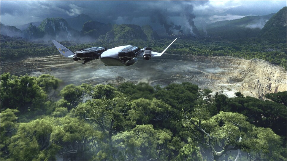
The visual philosophy here is built entirely on contrast. You have the sterile, metallic brutalism of the RDA base clashing against the organic bioluminescence of Pandora. Cameron and the art department leaned heavily into aquatic references if you look closely, the forest feels more like a coral reef than a jungle.
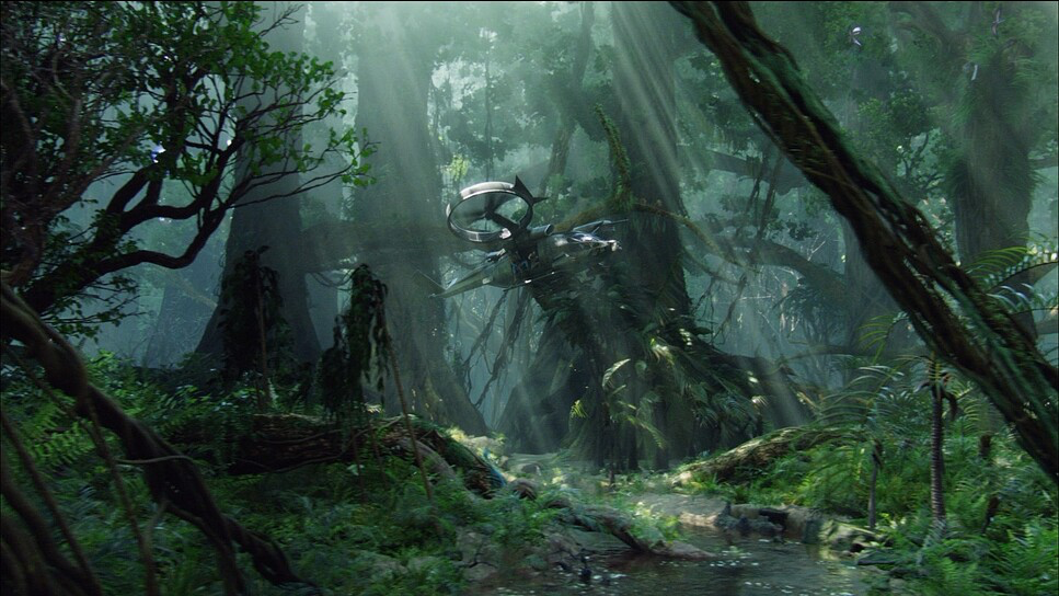
From a lighting and color perspective, the inspiration seems to be “hyper-reality.” It’s not just capturing nature; it’s capturing the feeling of nature on steroids. The RDA scenes are monochromatic, desaturated, and cold full of greys and harsh cyans. Pandora, by comparison, utilizes the full gamut. The decision to make the night scenes glow with bioluminescence wasn’t just a “cool factor” choice; it solved a major lighting problem: how do you light a night exterior in a jungle without it becoming a muddy mess? You turn the plants into practical lights.
Camera Movements
What usually breaks the immersion in CGI-heavy films is the “floating camera” that weightless feeling where the camera moves too perfectly because it doesn’t physically exist. In Avatar, even the virtual camera moves have weight.
When we are with Jake in his human form, the camera is grounded, often using steady dolly moves or static framing to emphasize the rigidity of the human military. But once he links to the Avatar, the language changes. We get these sweeping, vertical crane shots that emphasize the height of the trees. The “Simulcam” technology allowed Cameron to operate a virtual camera by hand, which is why the flight sequences especially the Toruk Makto scene feel energetic and handheld rather than robotic. The camera reacts to the action rather than just predicting it.
Compositional Choices
Cameron shot this in a 1.78 aspect ratio (filling the IMAX screen), which fundamentally changes how you compose a frame. You aren’t hiding things with widescreen letterboxing; you are overwhelming the viewer with vertical information.
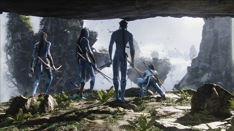
A lot of the composition relies on scale. There are constant reminders of how small the humans are compared to the Navi, and how small the Navi are compared to the Hometree. I noticed a lot of low-angle framing on the environment to make the audience feel dwarfed. Conversely, when we are in the RDA base, the framing becomes claustrophobic and cluttered with machinery. It’s a subtle cue: the humans are trapping themselves, while the Navi are framed with open, negative space, suggesting freedom.
Lighting Style
This is where the film gets technically fascinating. The movie relies heavily on soft, top-down light sources mimicking moonlight or sunlight filtering through a canopy.
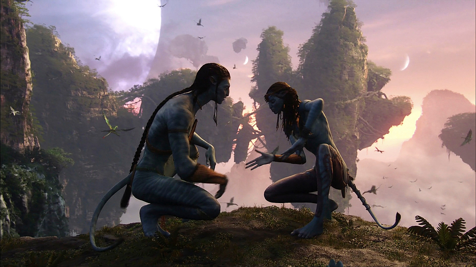
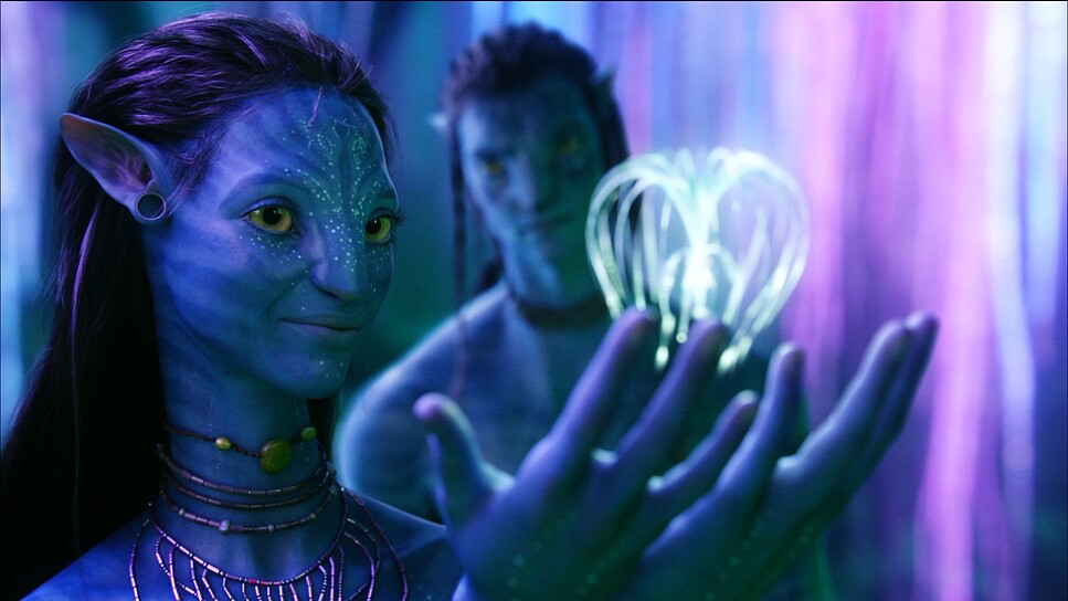
In the live-action scenes, Fiore used massive softboxes to create a wrap-around light that matched the eventual CGI environment. But the real magic is in the night scenes. They treated the bioluminescence as true “motivated” lighting. If a plant glows pink next to Neytiri, you see that pink light wrap around her face. This interaction is what sells the illusion. If the characters were just lit by a generic “moonlight,” they would look like stickers pasted onto a background. Instead, the environment lights the characters. The dynamic range is also managed carefully; deep, crushed blacks in the shadows allow the neon colors of the plants to pop without clipping the highlights.
Lensing and Blocking
We have to talk about the hardware. The live-action components were shot on the Sony CineAlta F23. This is an older 2/3-inch sensor camera, which has a deeper depth of field than the Super 35mm or Large Format cameras we use today. This was actually an advantage for Avatar, as 3D requires a bit more depth of field to be comfortable to watch.
They used Fujinon lenses, keeping the look sharp but clean. In terms of blocking, notice how the Navi are always moving vertically climbing, jumping, looking up. The humans are blocked horizontally driving, walking in formation, sitting in cockpits. This visual blocking reinforces the narrative: humans conquer the land (horizontal), while the Navi are one with the ecosystem (vertical).
Color Grading Approach
As a colorist, this is the part that stresses me out just thinking about it. The grade was handled by Skip Kimball, and the challenge he faced was massive: crosstalk.
You have blue characters (the Navi) in a predominantly green environment. In a standard Rec.709 color space, separating those two hues cleanly without making the image look muddy is a nightmare. Kimball and the VFX team managed to create a clean separation where the blue skin tones pop distinctively against the foliage.
The grade has a very “print film” quality to it. Despite being digital, the highlight roll-off is incredibly soft. Look at the explosions or the glowing woodsprites they don’t fizzle out into digital white noise; they roll off gently. They also weren’t afraid of saturation. In modern cinema, we often desaturate to make things look “serious,” but Avatar pushes the saturation into the psychedelic range while keeping the skin tones (even the blue ones) feeling organic rather than plastic.
Technical Aspects & Tools
Avatar (2009) — Technical Specifications
| Genre | Action, Adventure, Fantasy, Science Fiction, Space, Technology, Nature |
|---|---|
| Director | James Cameron |
| Cinematographer | Mauro Fiore |
| Production Designer | Rick Carter, Robert Stromberg |
| Costume Designer | John Harding, Mayes C. Rubeo, Deborah Lynn Scott |
| Editor | James Cameron, John Refoua, Stephen E. Rivkin |
| Colorist | Skip Kimball |
| Time Period | Future |
| Color | Cool, Saturated, Blue |
| Aspect Ratio | 1.78 – Anamorphic |
| Format | Digital |
| Lighting | Soft light, Top light |
| Lighting Type | Moonlight, Artificial light |
| Story Location | Pandora > The Tree of Voices |
| Filming Location | New Zealand > Wellington |
| Camera | Sony CineAlta F23 |
| Lens | Fujinon Lenses |
| Film Stock / Resolution | 2K |
The real star of the show wasn’t an actor; it was the Fusion Camera System and the Simulcam. Cameron didn’t just want to film actors in pajamas against a green screen and hope the VFX artists made it look good later.
The Simulcam allowed him to look through a monitor and see the CGI characters and environment live while he was shooting. If he wanted to move the camera two inches to the left to get a better angle on a tree that didn’t physically exist, he could. This bridged the gap between production and post-production. It allowed the cinematography to be reactive and organic. For me, this is the turning point in digital filmmaking the moment where the computer stopped being just a post-processing tool and became a production tool.
- Also read: BARAKA (1992) – CINEMATOGRAPHY ANALYSIS
- Also read: THE COVE (2009) – CINEMATOGRAPHY ANALYSIS
Browse Our Cinematography Analysis Glossary
Explore directors, cinematographers, cameras, lenses, lighting styles, genres, and the visual techniques that shape iconic films.
Explore Glossary →