Let’s talk about Autumn Sonata. Ingmar Bergman’s 1978 masterpiece is exactly that. It’s a raw, unflinching look at a mother-daughter relationship, steeped in decades of resentment. It feels less like a movie and more like a forensic excavation of the human ego. For me, that’s where the visual craft really starts to matter.
It’s often said that Bergman returned to his “bread and butter” here intimate psychological dramas in confined spaces. But while the writing is legendary, it’s the look of the film that sells the suffocation. This isn’t a movie that screams for attention with flashy camera work; it’s a masterclass in quiet, observant cinematography that makes every strained smile feel like a punch in the face.
About the Cinematographer
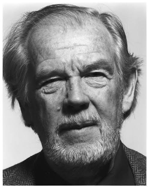
You can’t discuss Autumn Sonata without acknowledging the titan behind the lens: Sven Nykvist. If you’ve spent any time studying cinema, Nykvist and Bergman are inseparable. Their partnership defined a certain aesthetic naturalistic, stark, but deeply humane.
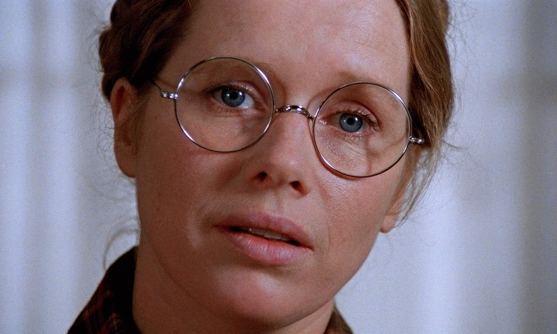
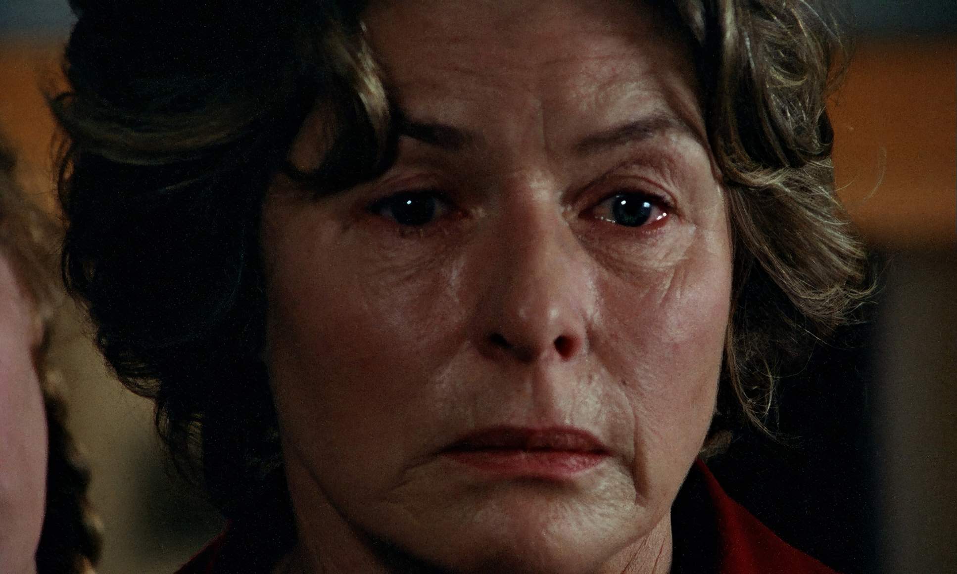
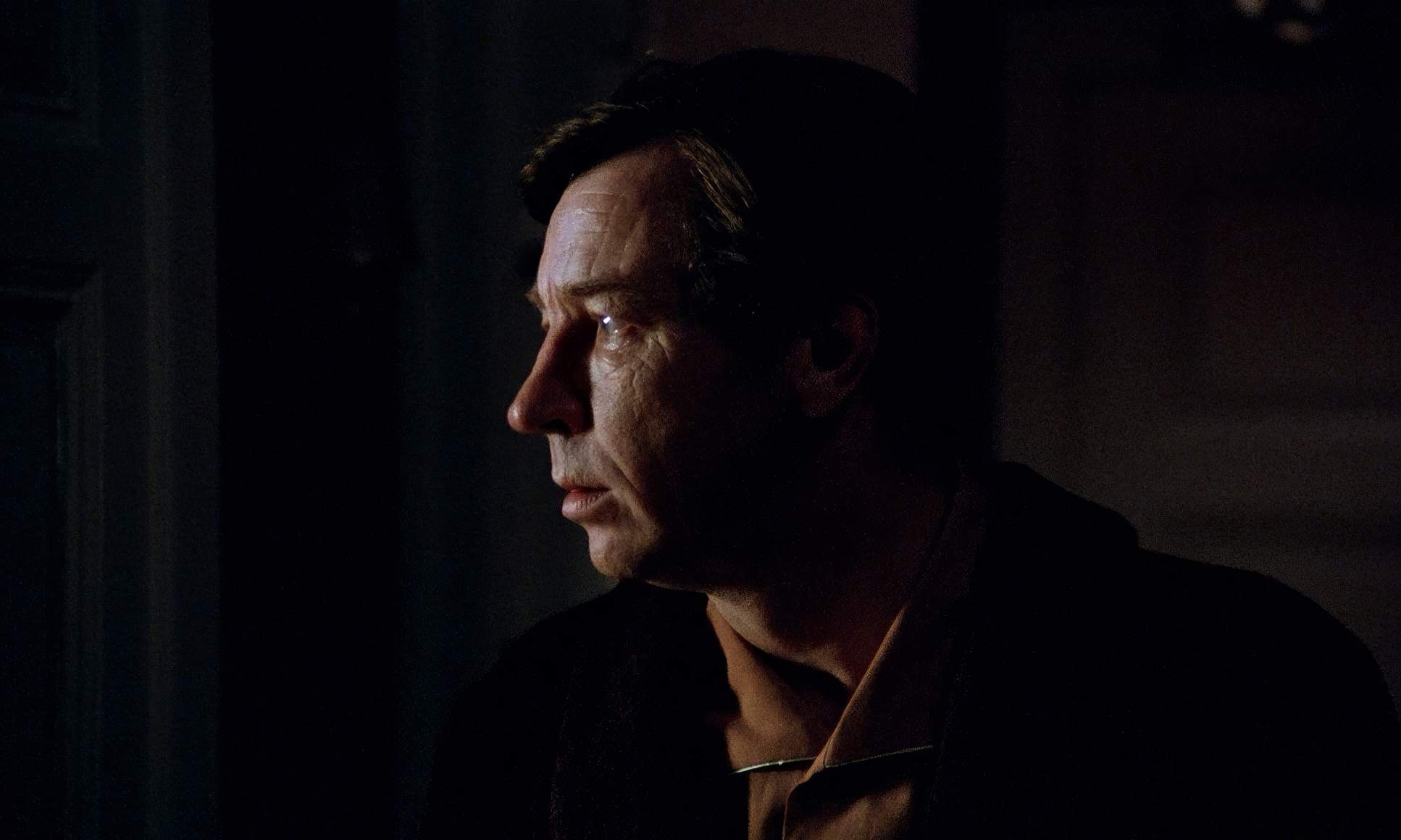
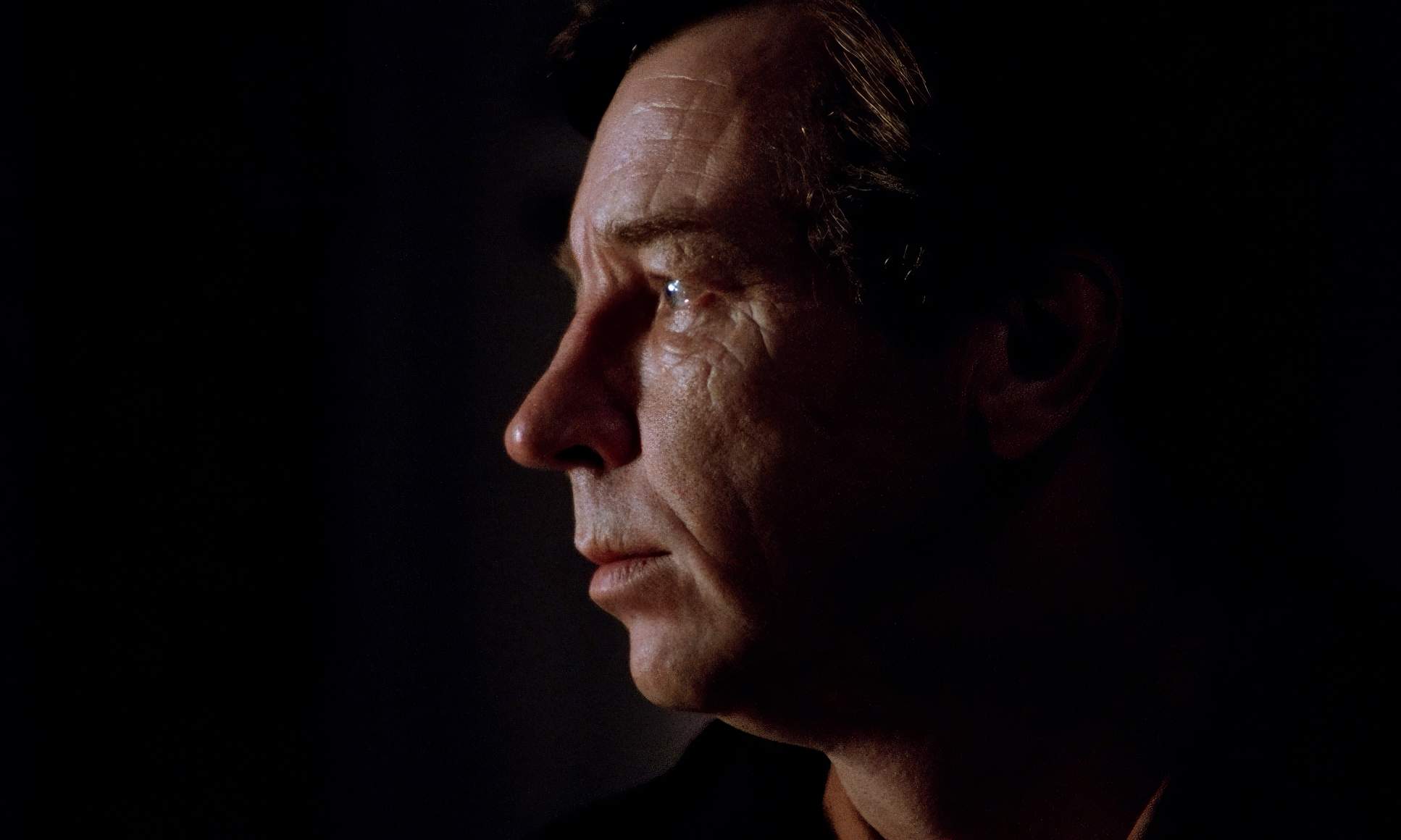
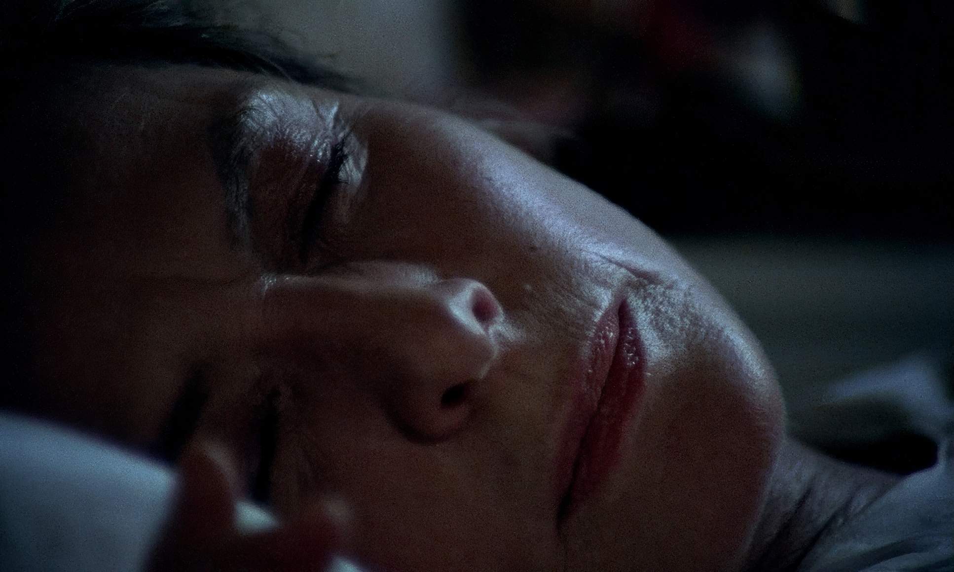
Nykvist had this uncanny ability to find the light (or build it) in a way that felt utterly organic. He stripped away the “movie-ness” to find the truth in an actor’s face. He wasn’t interested in flourishes. His camera was a quiet observer, often completely still. He worked with available light or enhanced it minimally, seeking that balance between realism and expressive artistry. He was the master of the close-up, making you feel like you were peering directly into a character’s soul a quality Bergman leaned on heavily.
Inspiration Behind the Cinematography
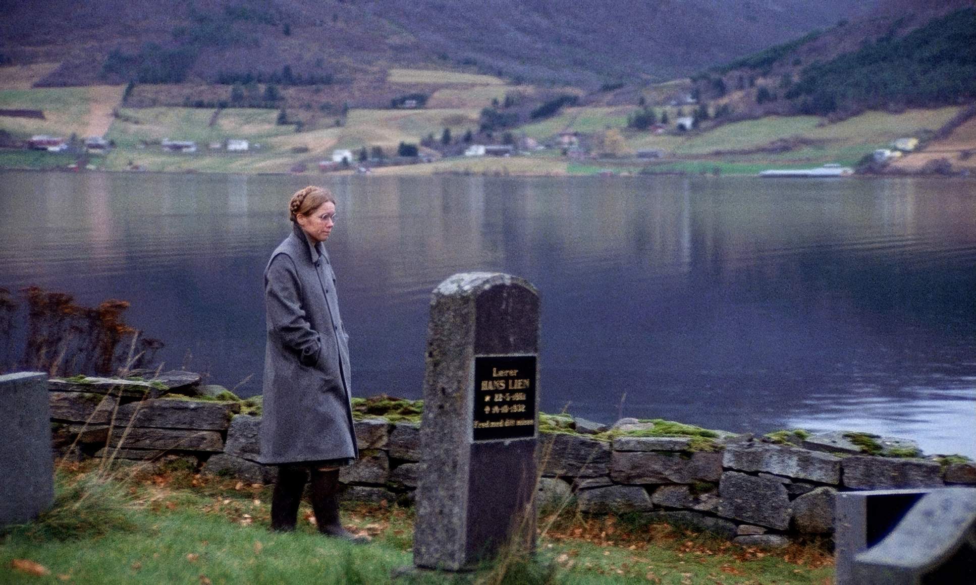
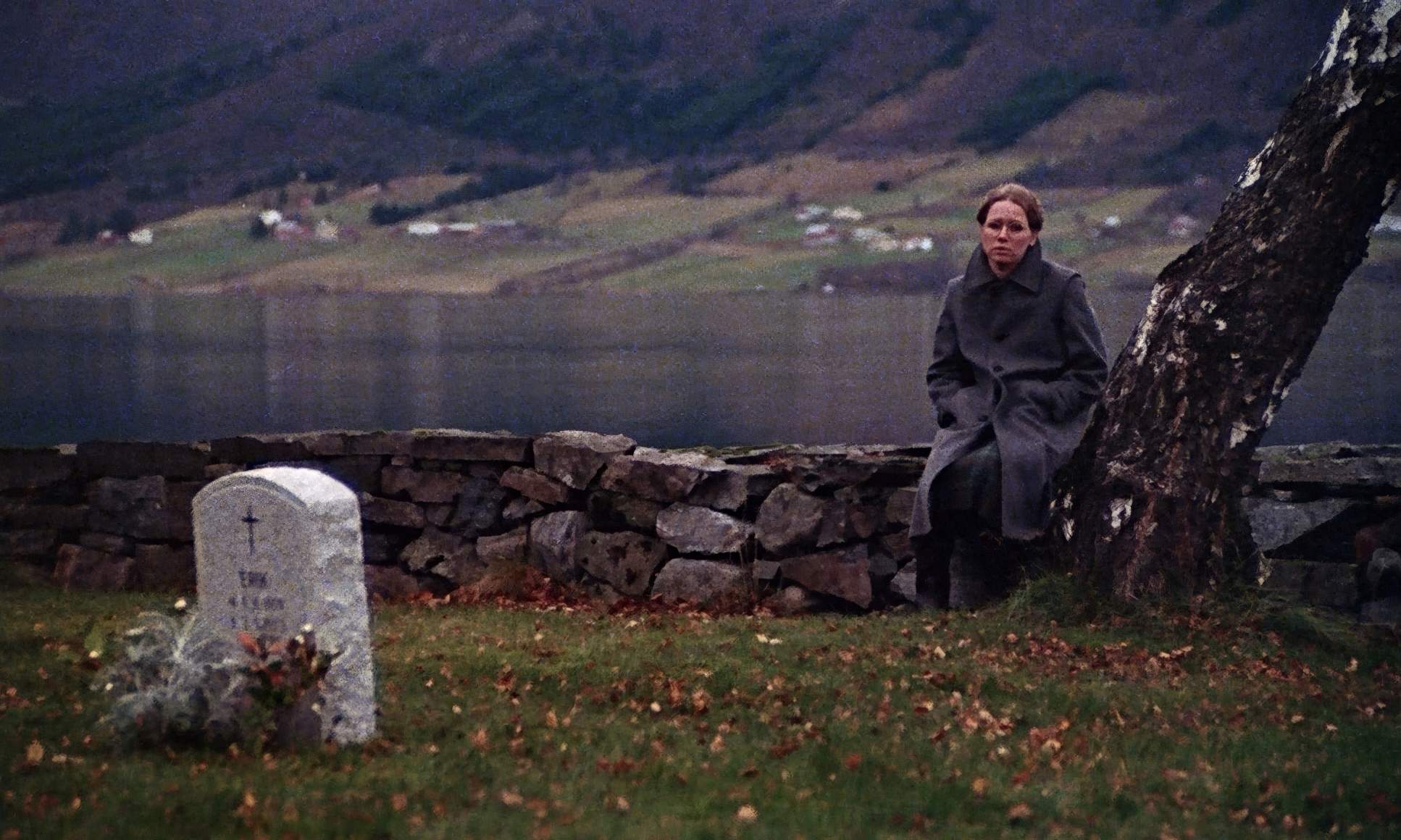
The core inspiration is right there in the title: Autumn. Bergman usually preferred the vibrancy of spring or summer, but choosing autumn here was a deliberate, heavy-handed move. It’s a season of transition things coming to fruition, but also declining into winter.
The cinematography embraces this metaphor. It’s not just about “looking brown.” It’s about the mood: a melancholy, introspective tone. The visual strategy supports the narrative of two women reaping what they’ve sown a harvest that “isn’t going to be enjoyed at all.” Nykvist’s lighting and the eventual color palette work together to hit that sweet spot between warmth and a literal encroaching chill.
Lighting Style
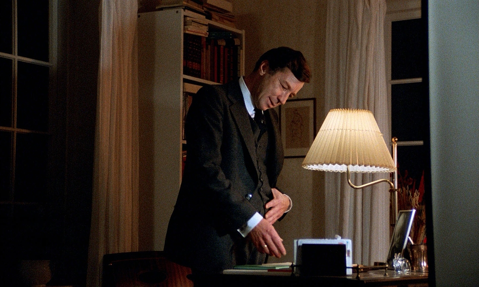
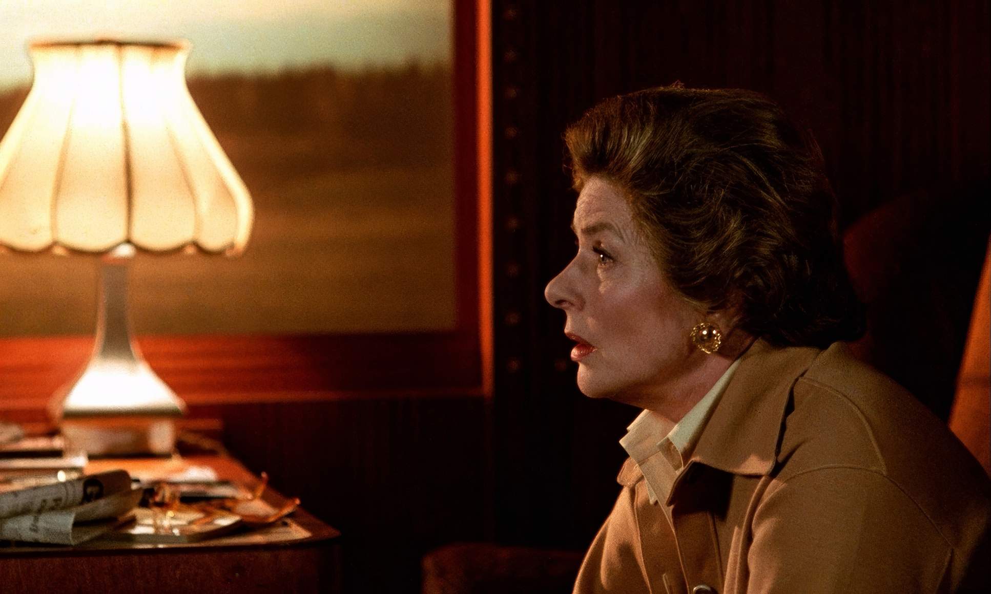
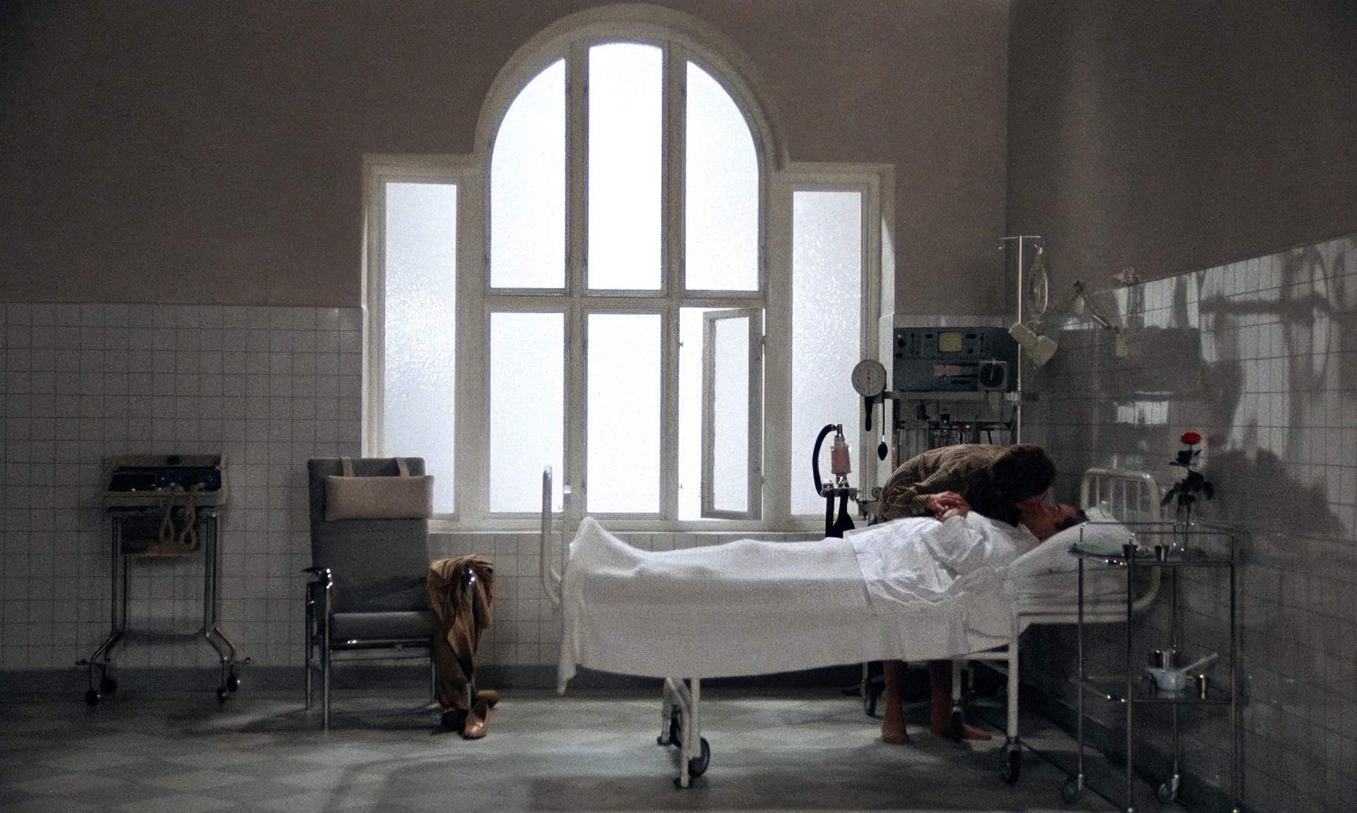
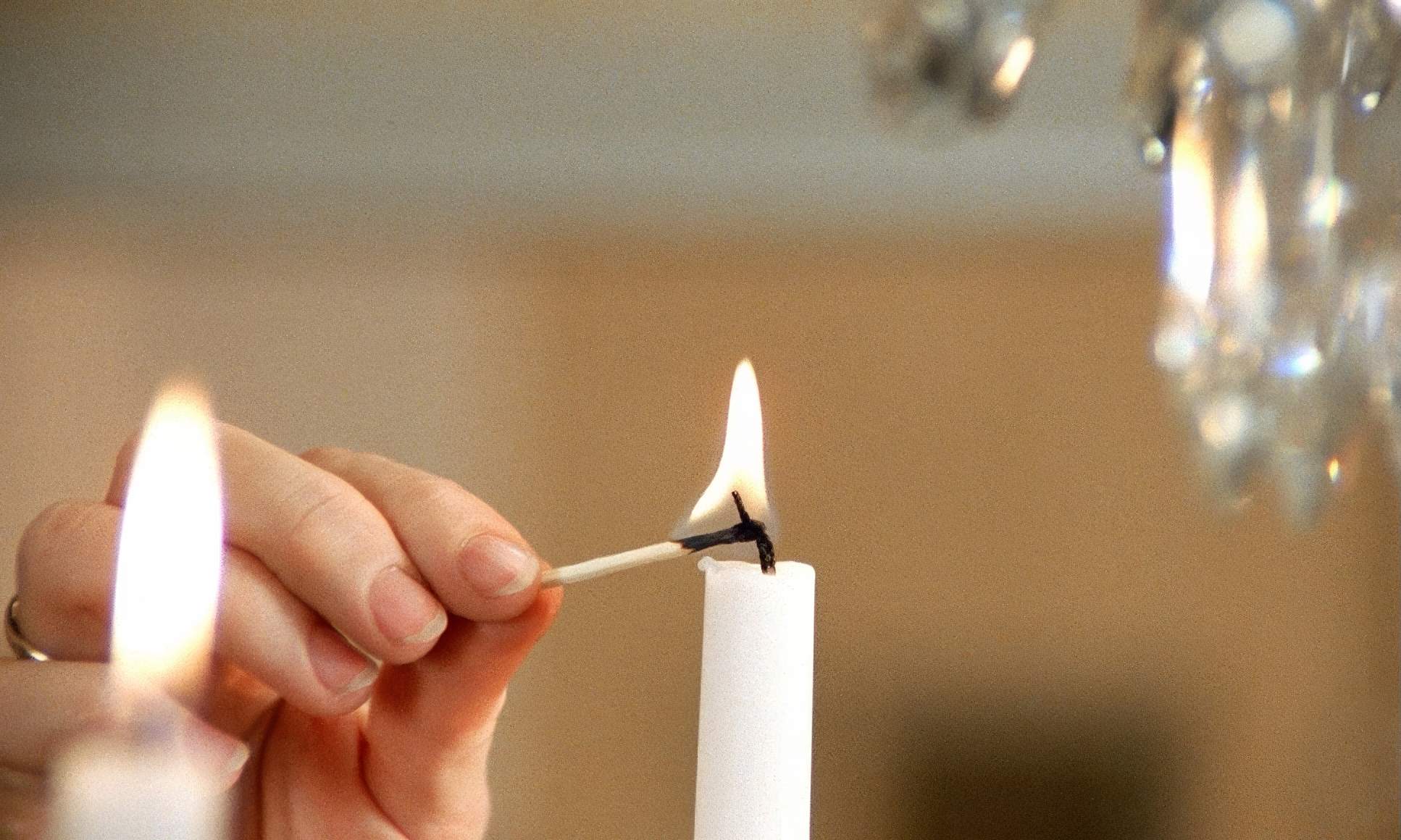
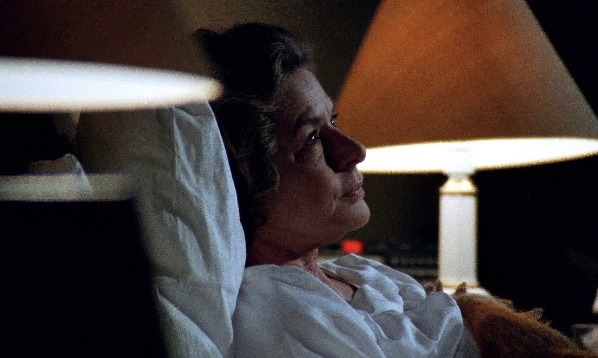
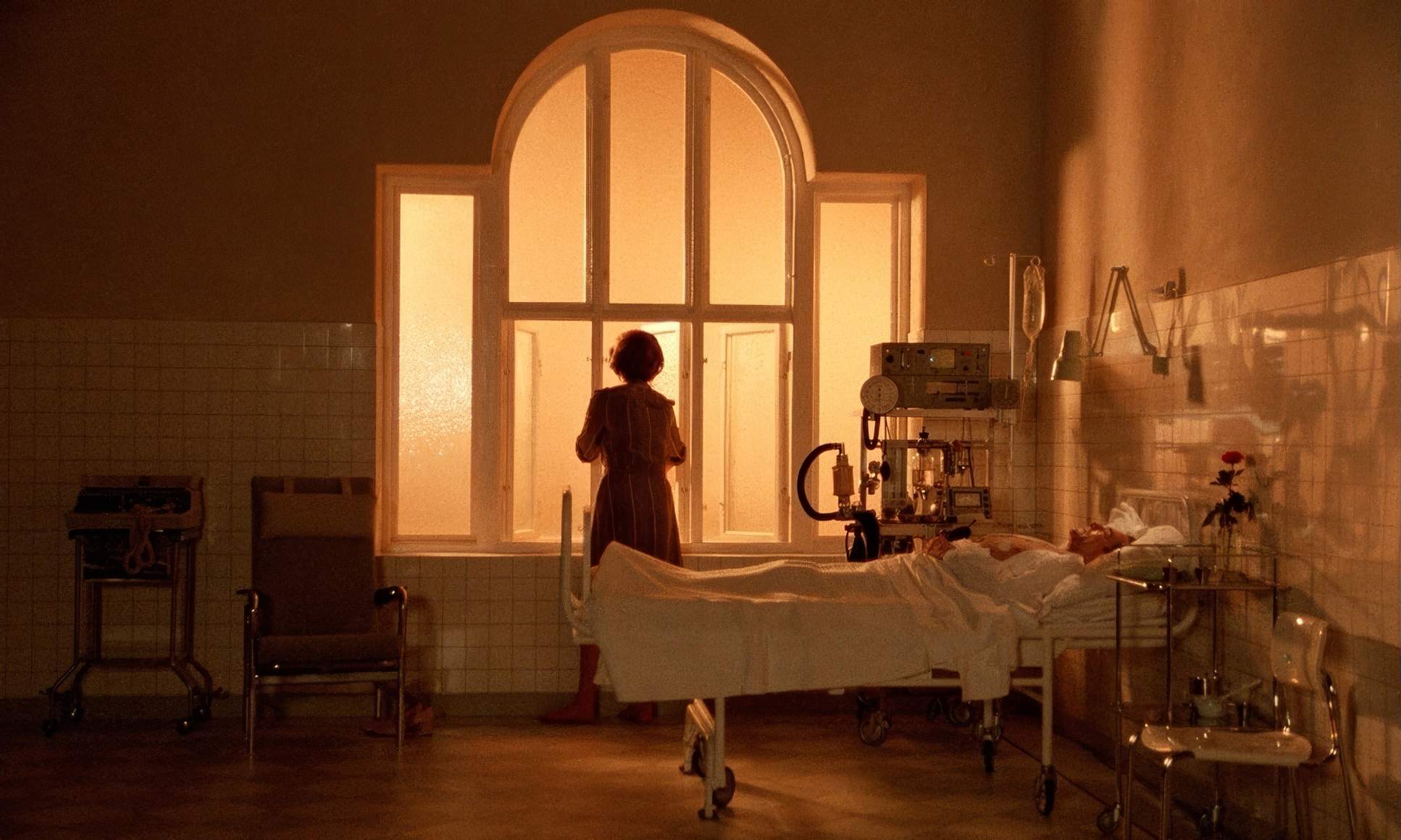
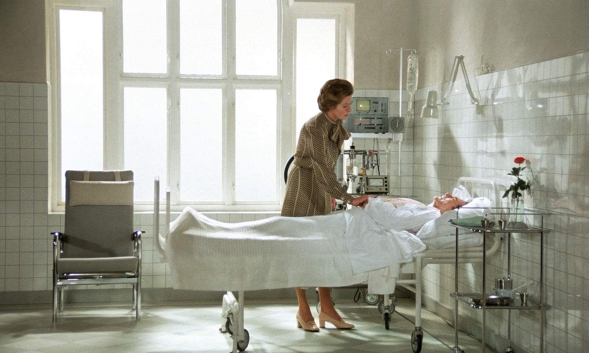
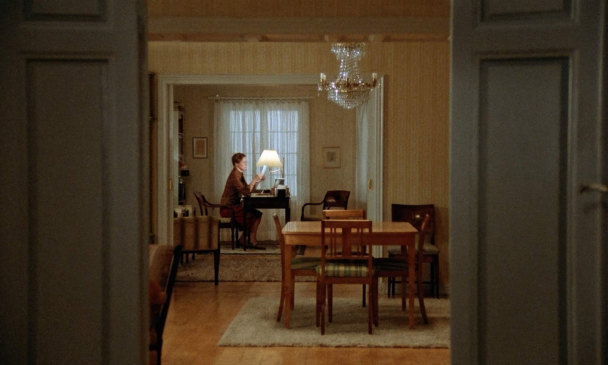
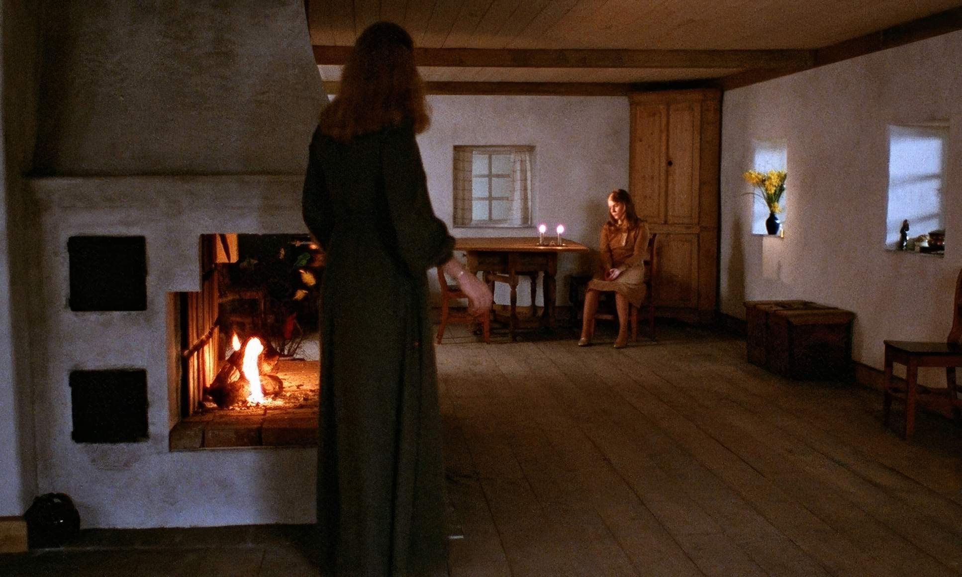
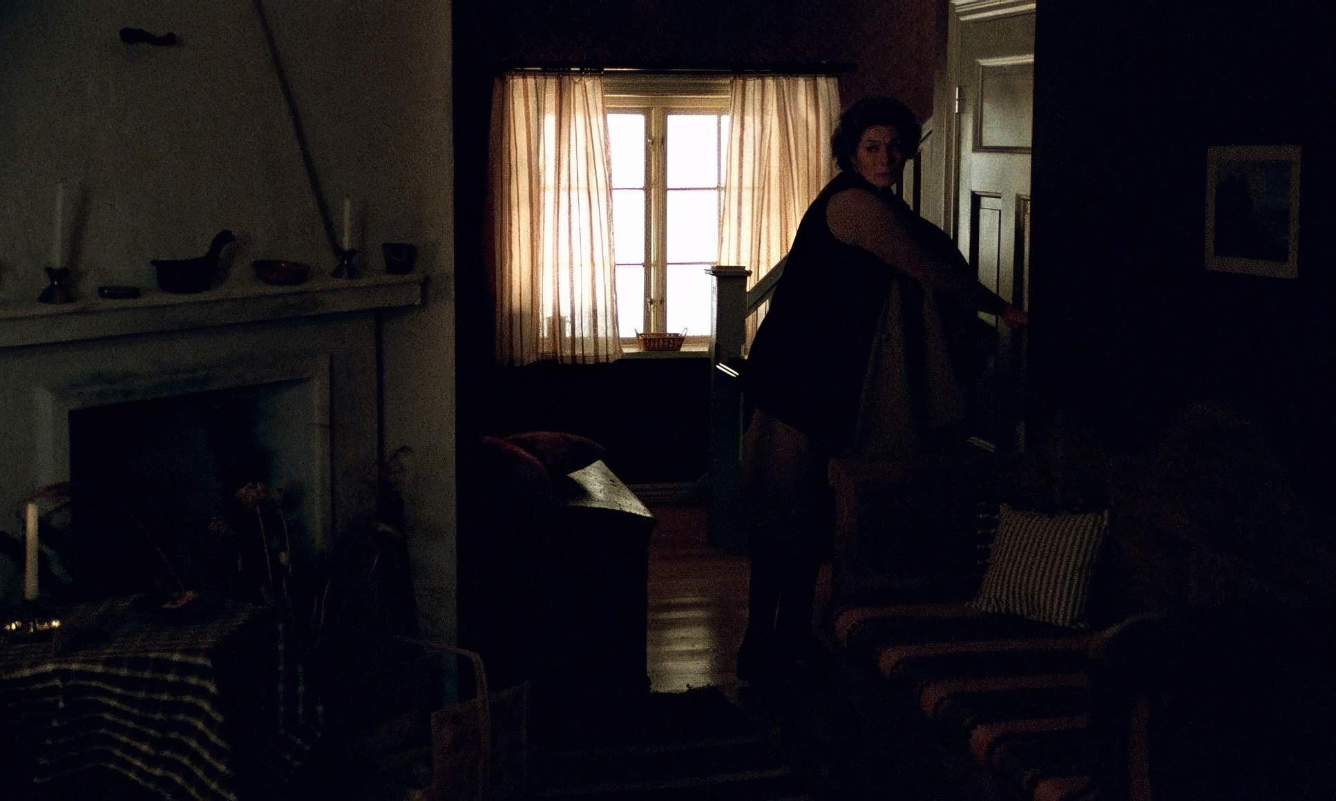
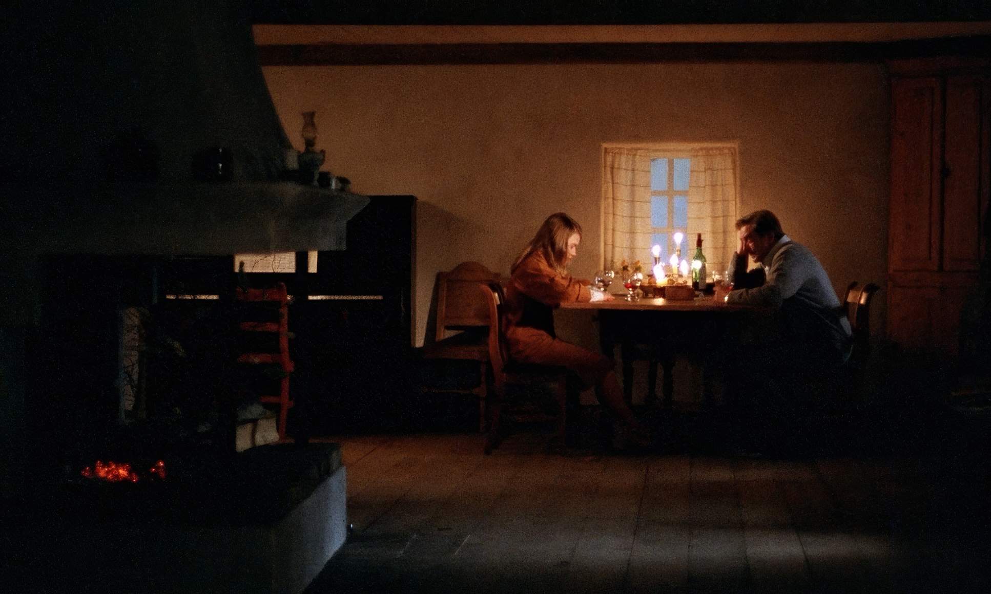
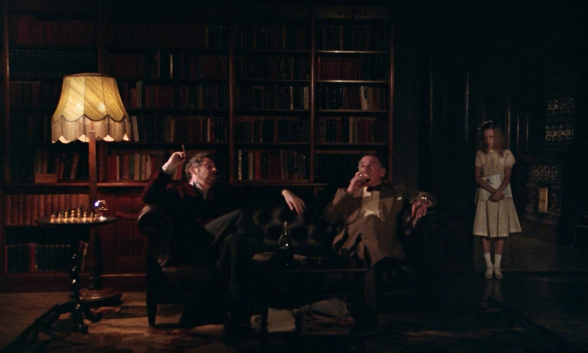
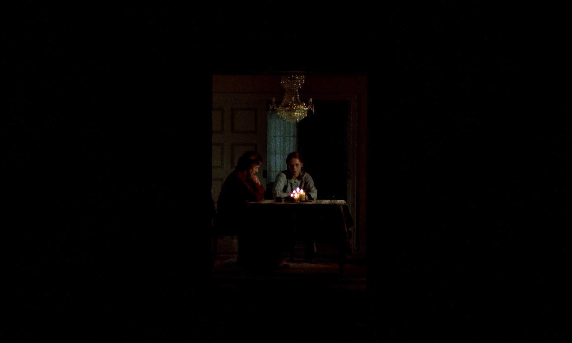
Nykvist’s lighting is the heartbeat of this film. His approach was all about prioritizing “motivated” light sources that feel like they belong in the room, like windows, lamps, or fireplaces. This grounds the drama in a tangible reality.
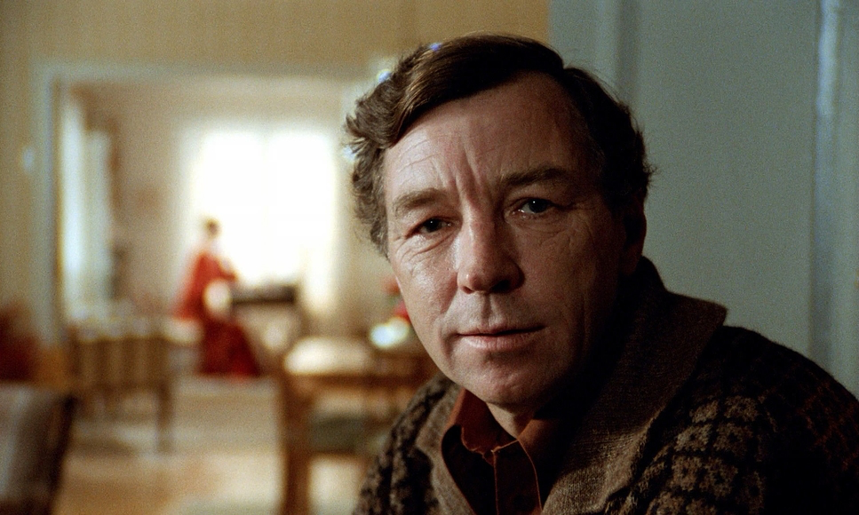
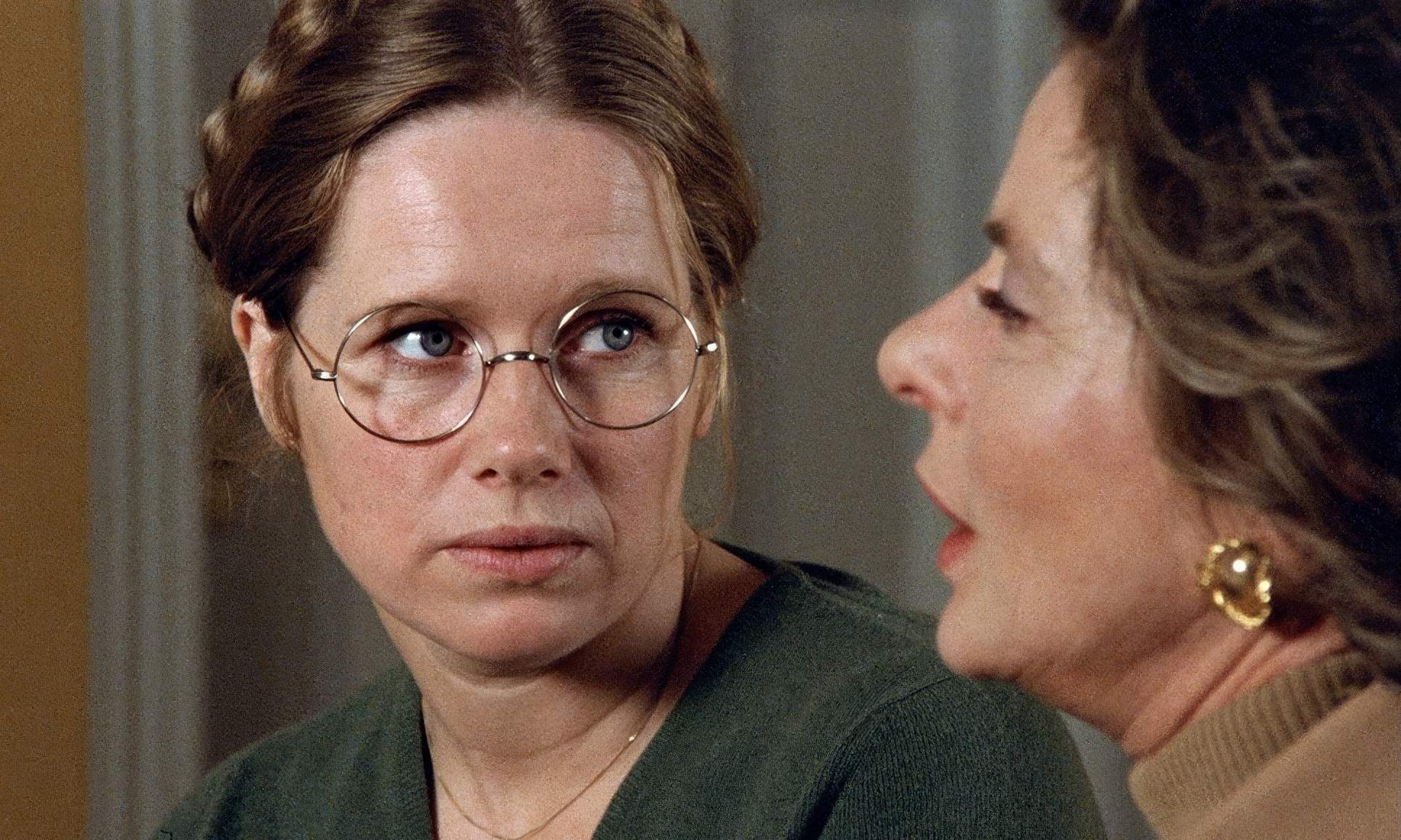
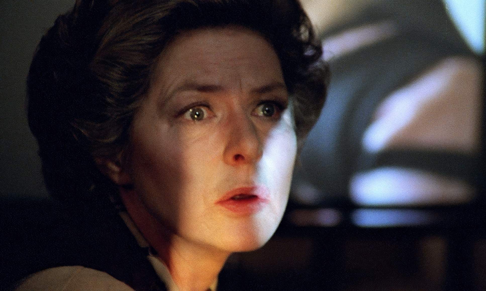
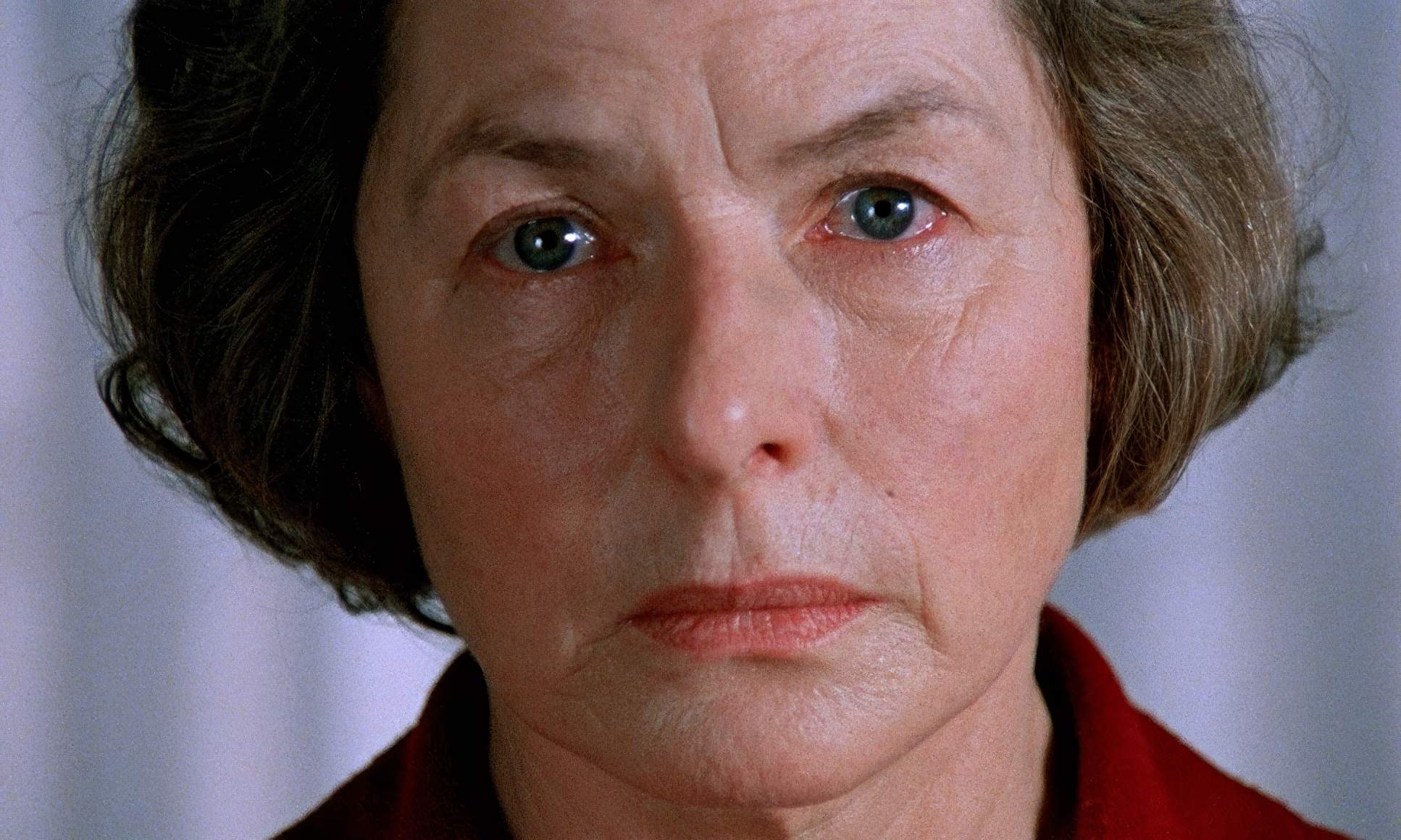
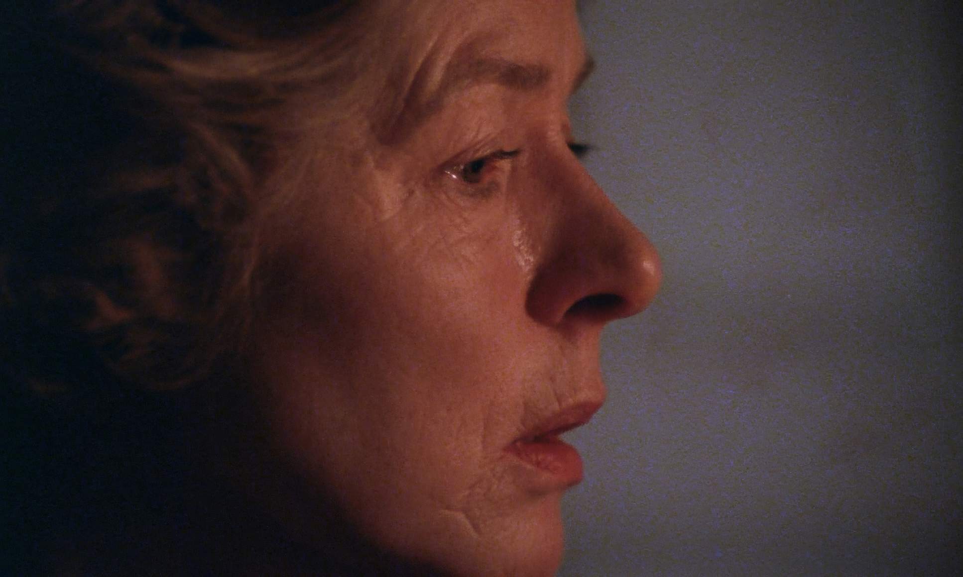
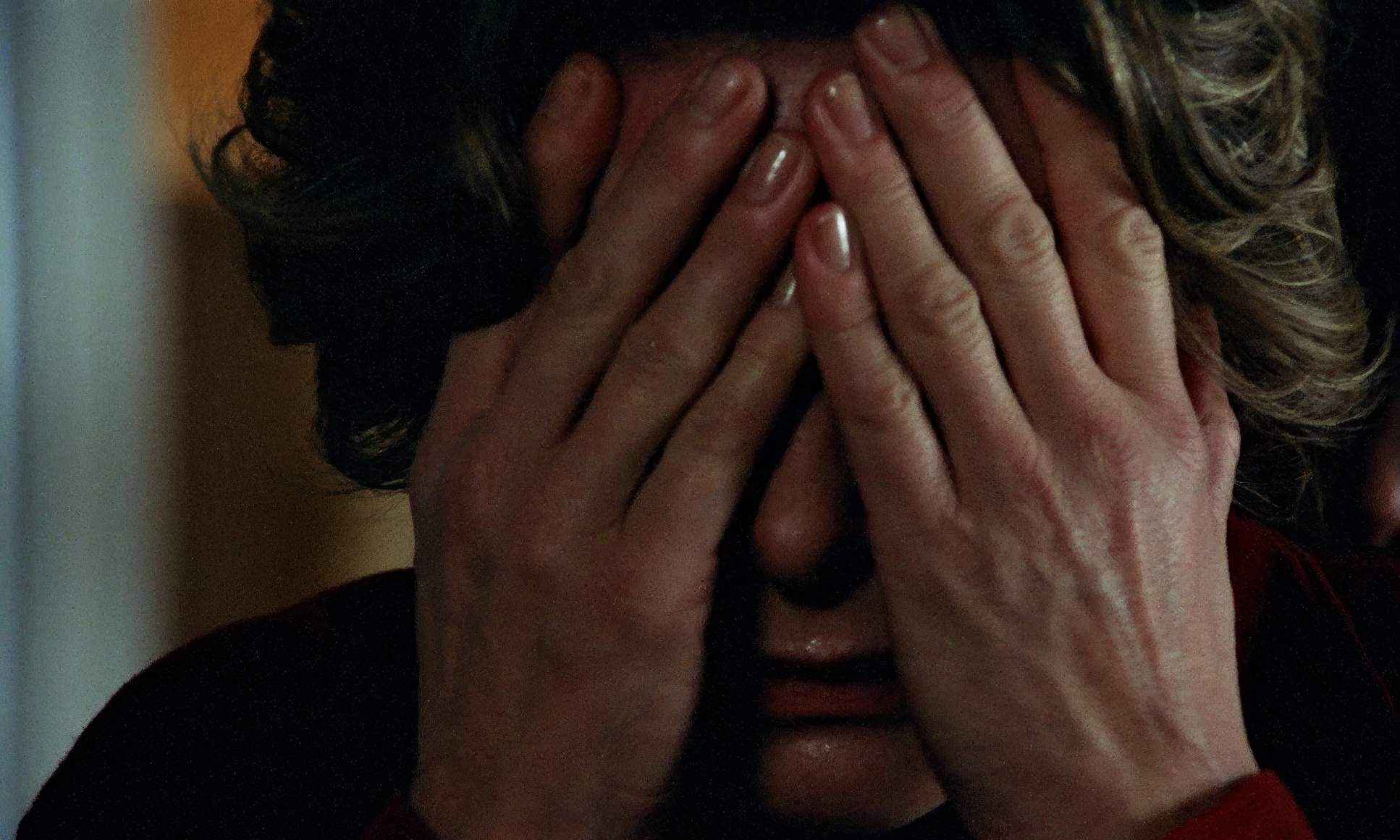
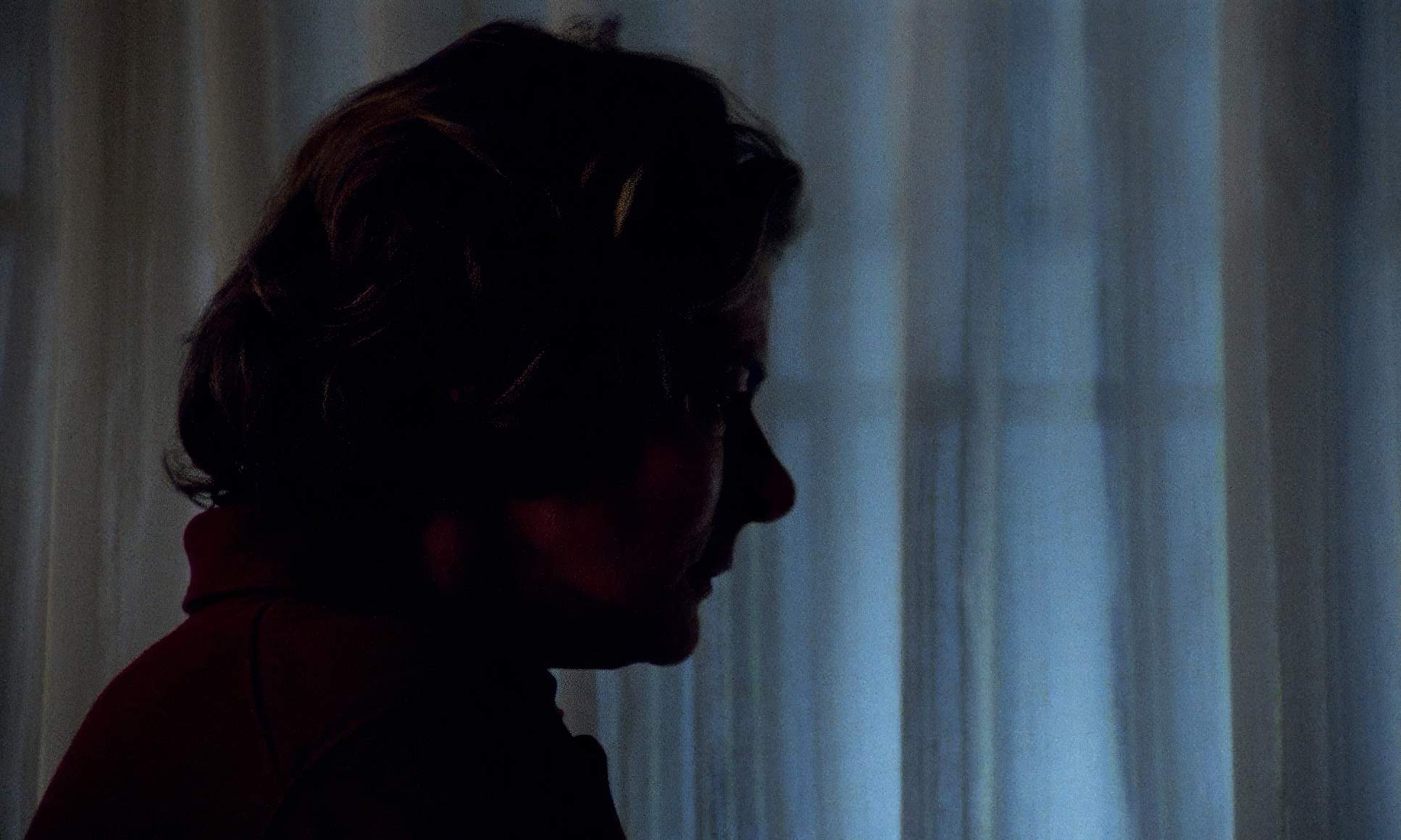
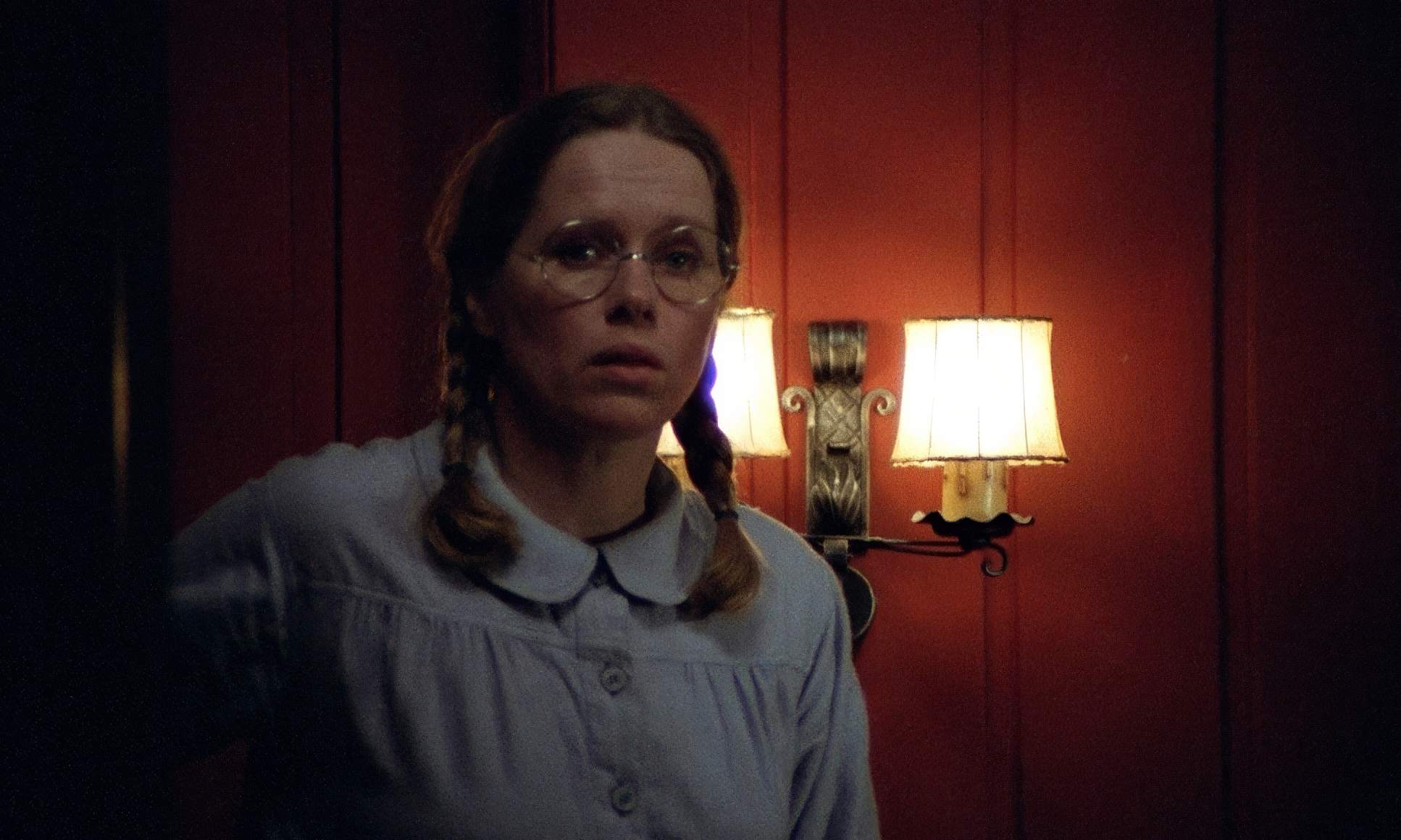
As you watch, notice how the quality of light shifts. It might start as a soft, inviting glow, but as the confrontation escalates, it becomes harsher and more analytical. Nykvist used light to create a sort of emotional chiaroscuro. He’d illuminate one side of a face while leaving the other in shadow, perfectly mirroring how these characters guard their truths. It’s a style that makes us feel like we’re witnessing unguarded moments captured by chance, rather than a staged production.
Compositional Choices
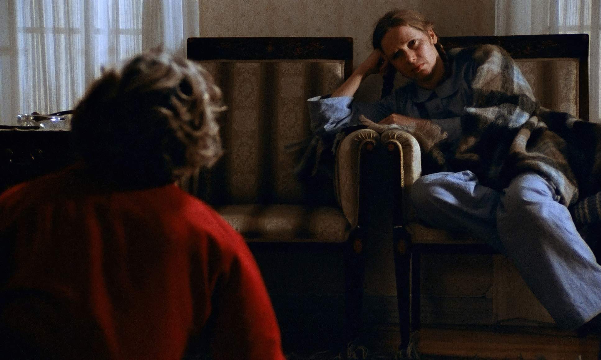
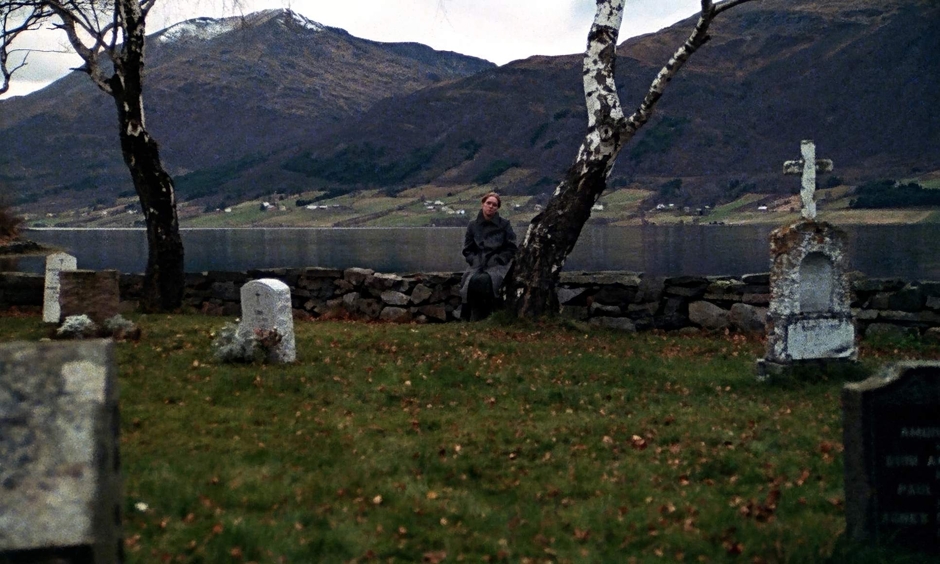
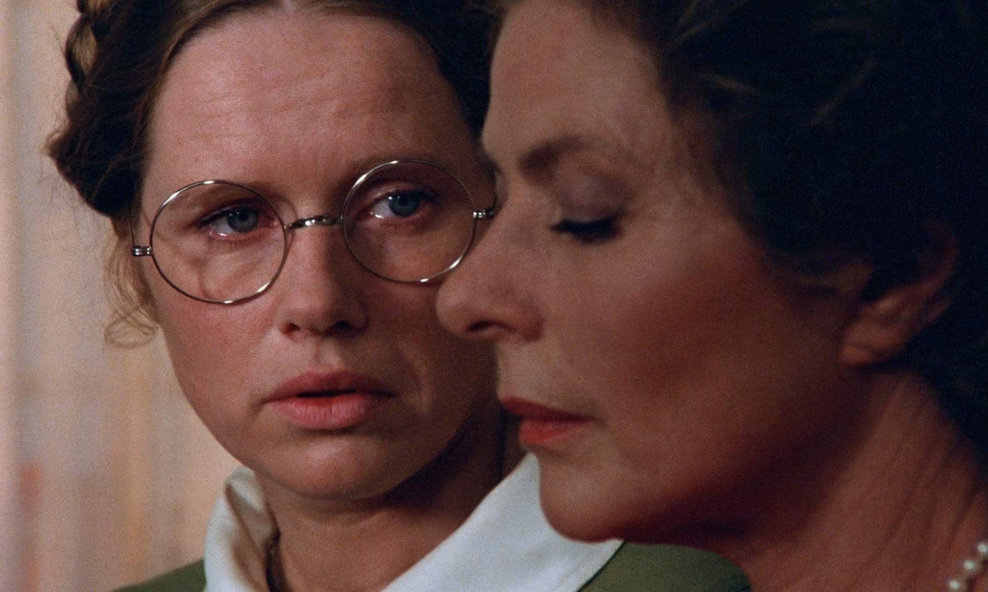
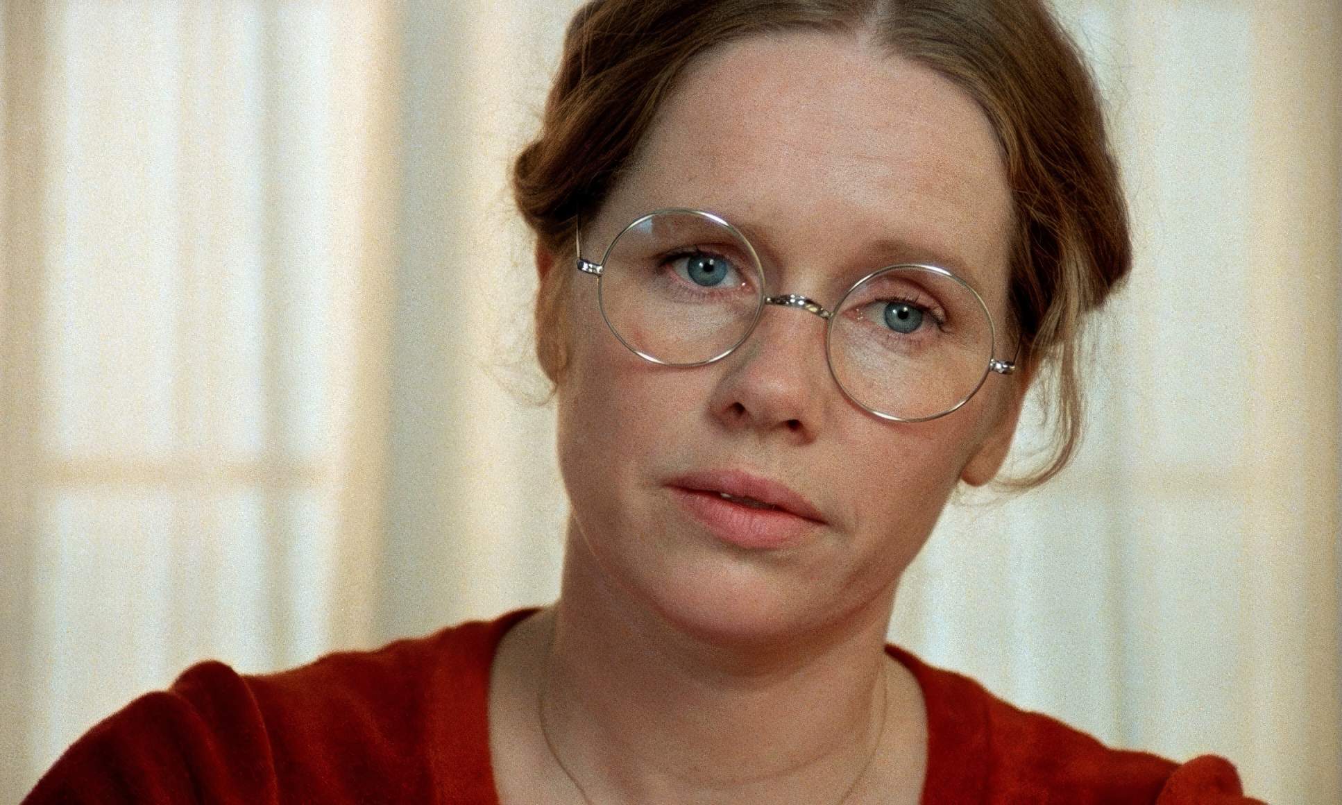
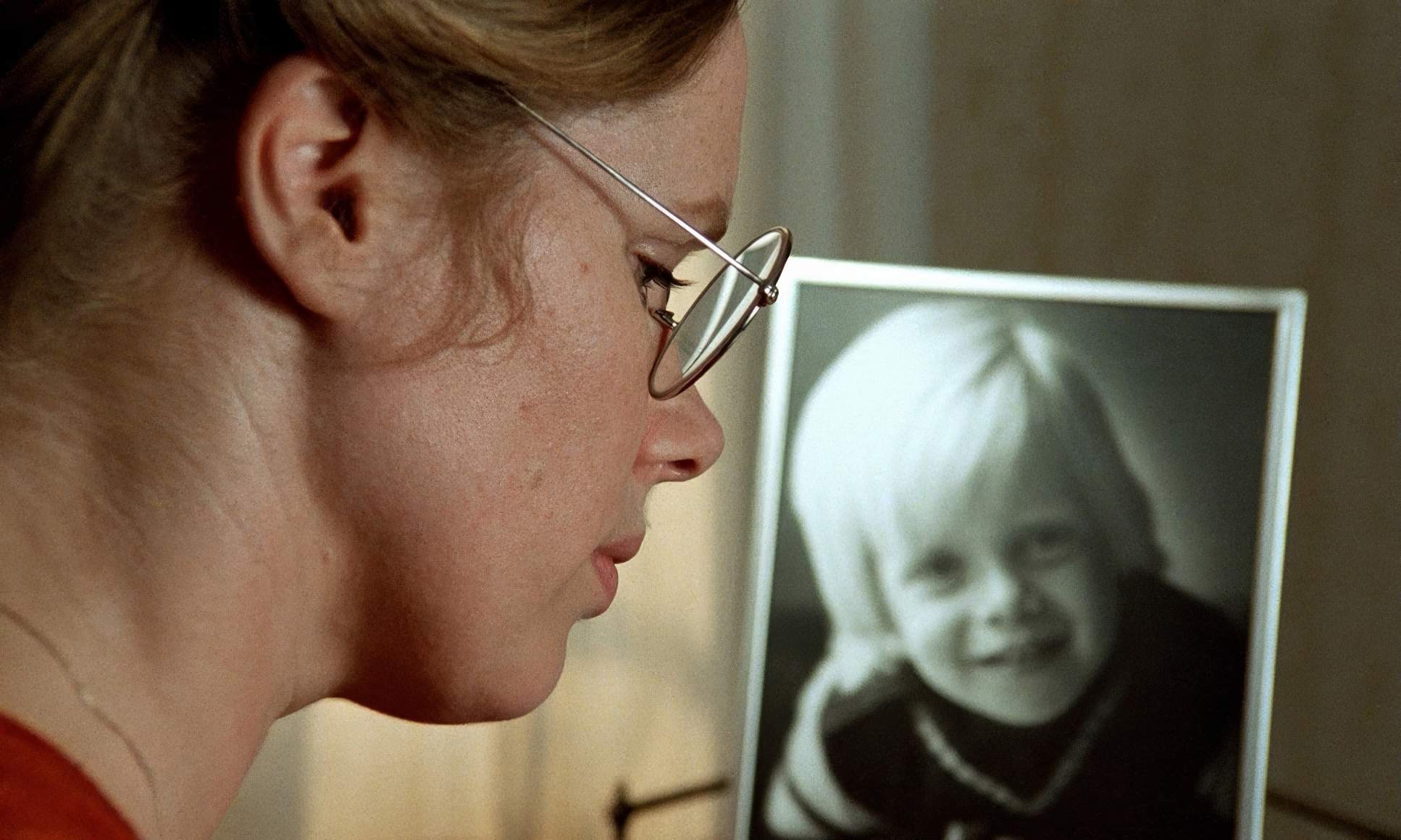
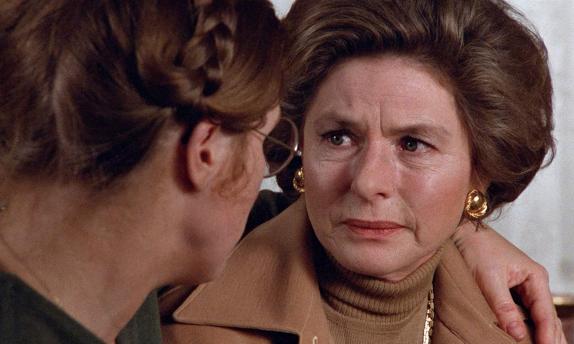
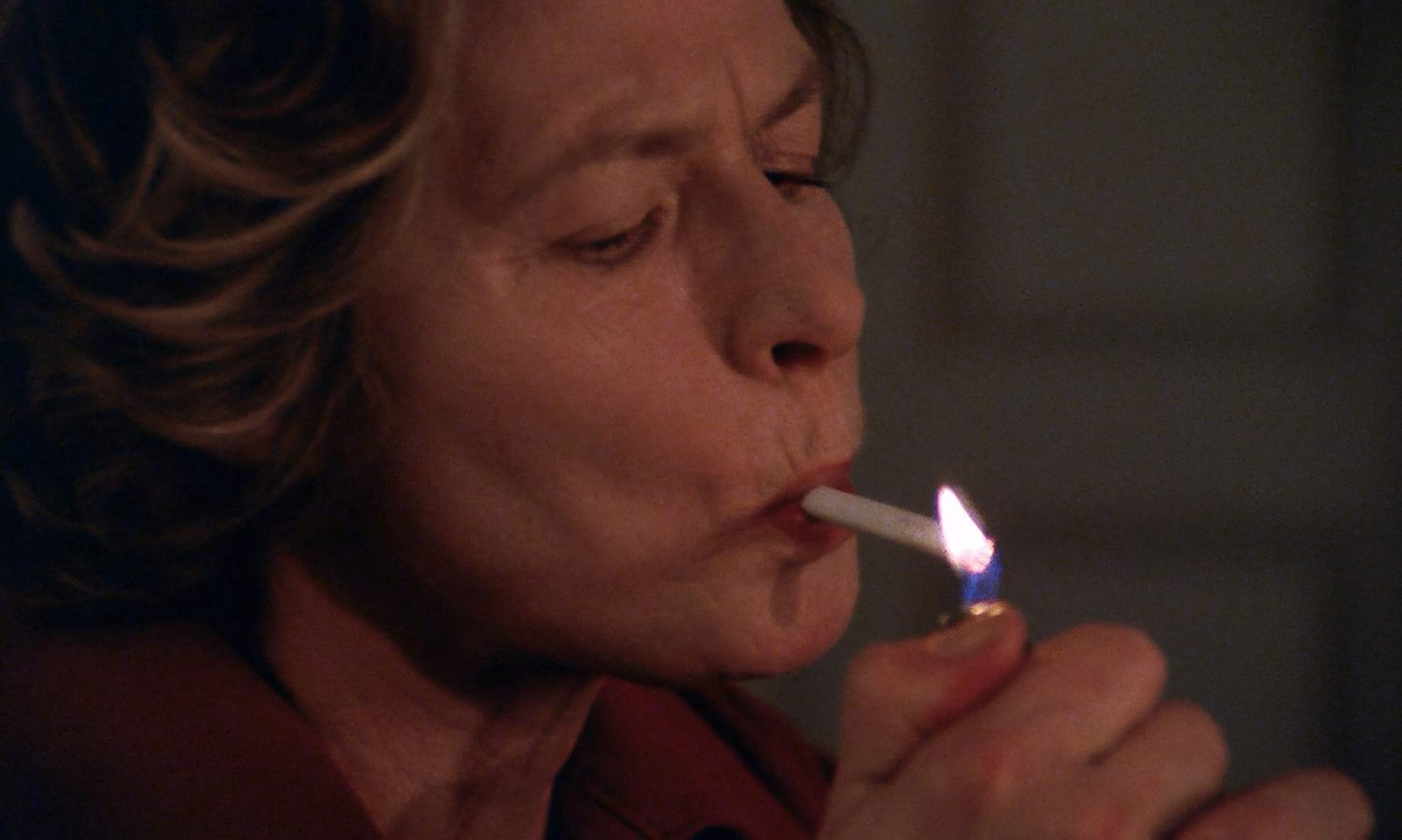
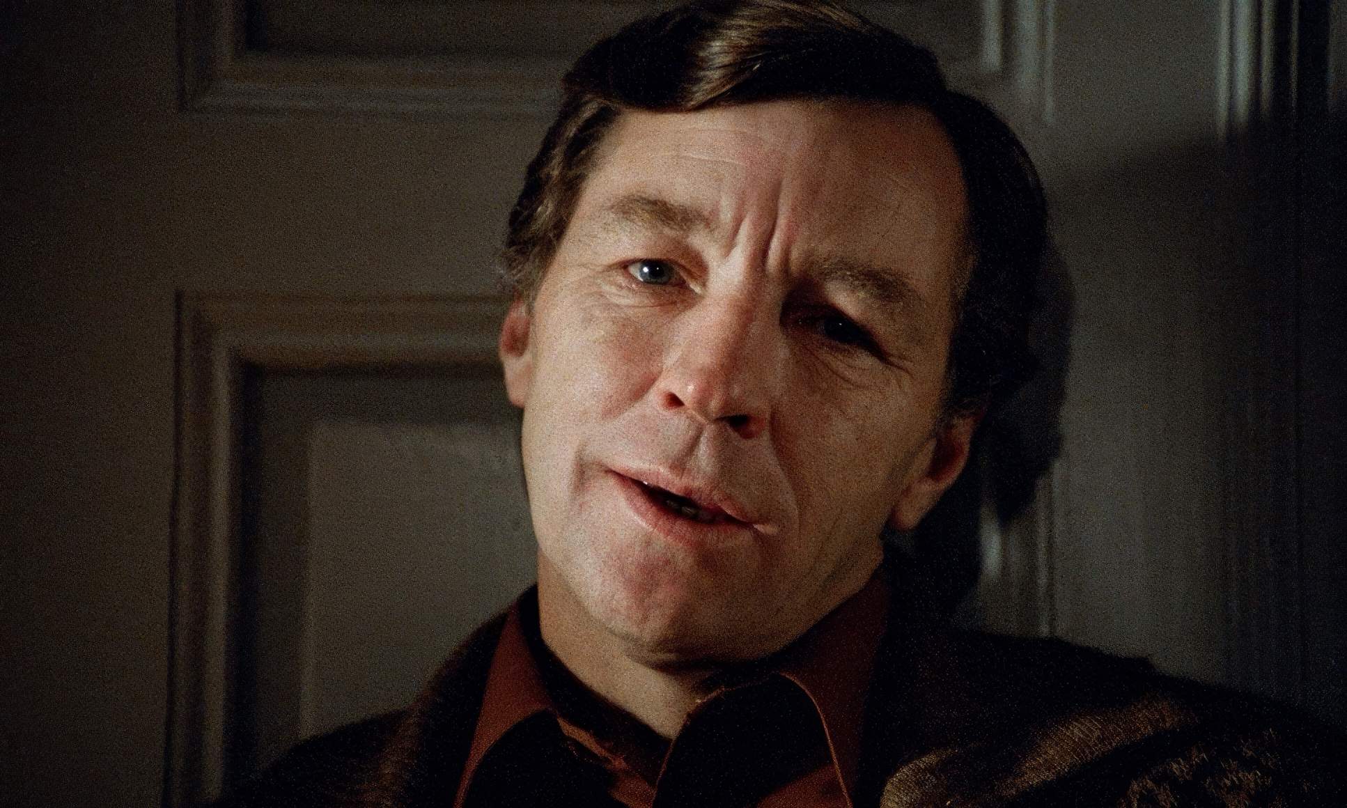
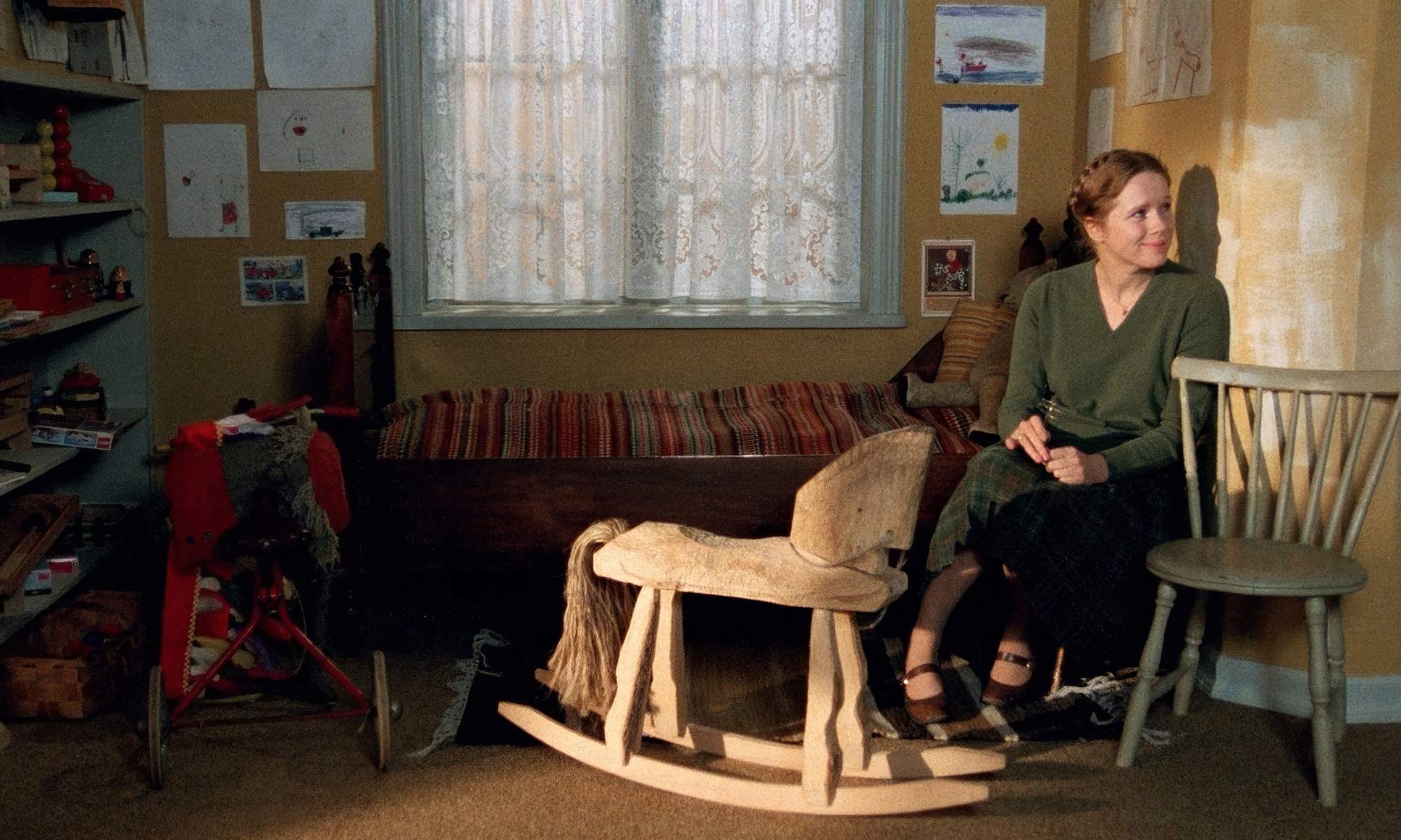
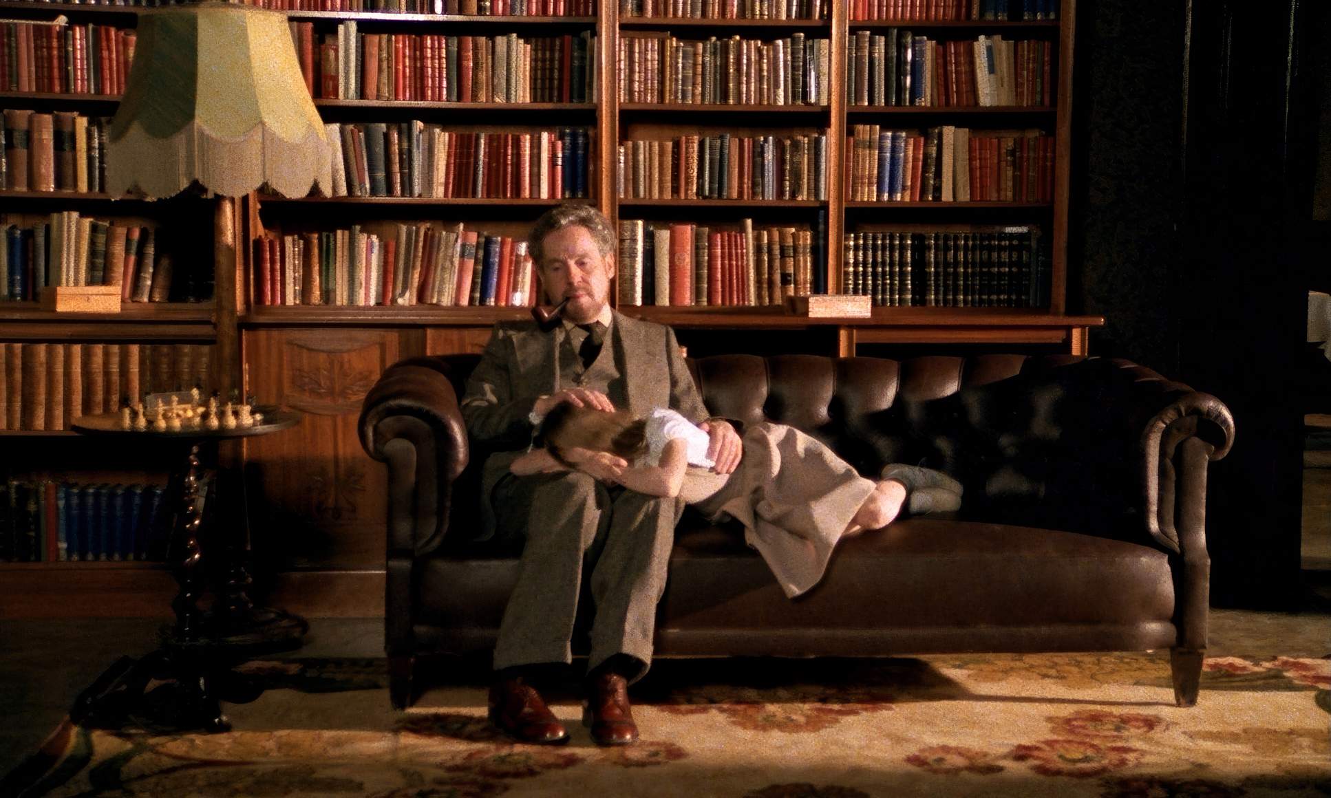
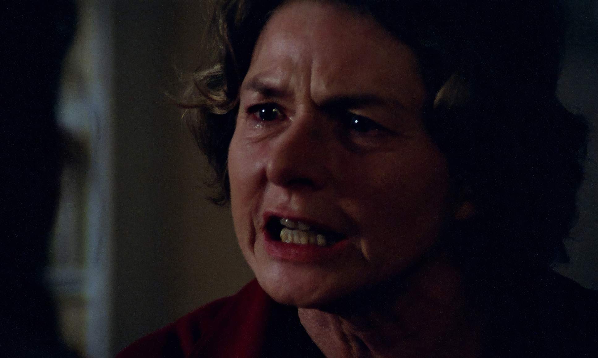
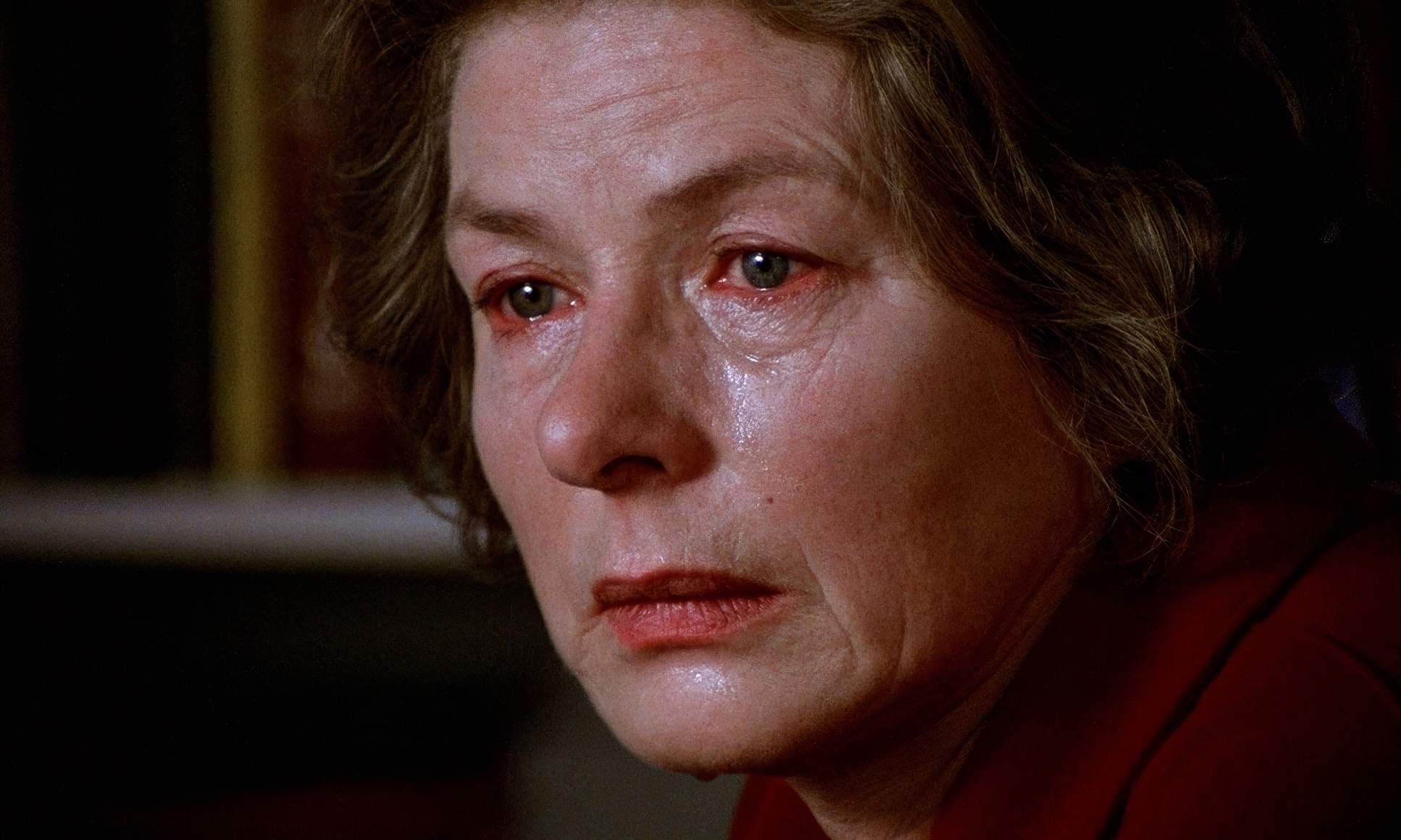
Composition here is a lesson in controlled intimacy. Nykvist and Bergman were “students of the human face.” Ingrid Bergman herself called these close-ups “brutal,” and she was right. They stripped away the makeup and the vanity, exposing every line and pore.
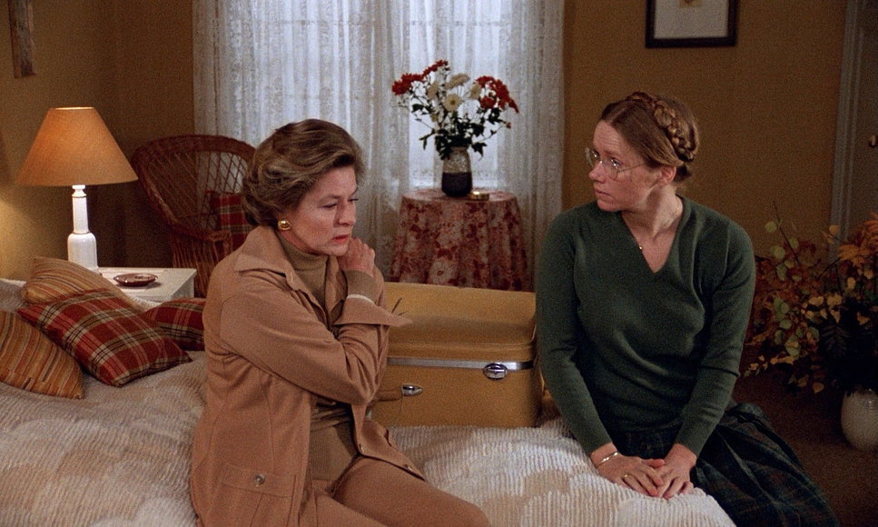
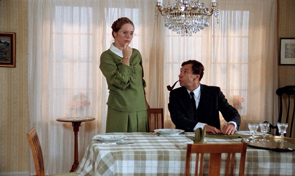
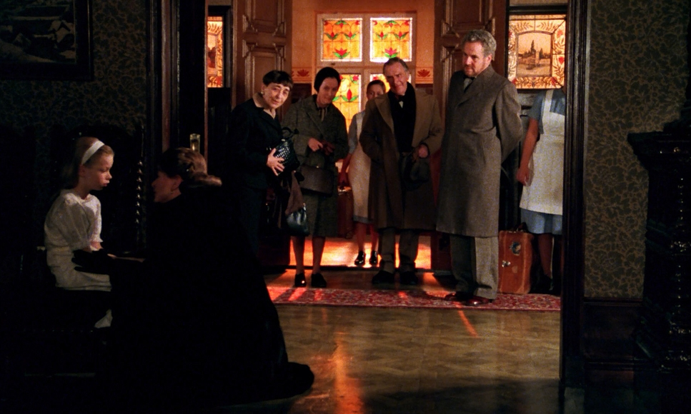
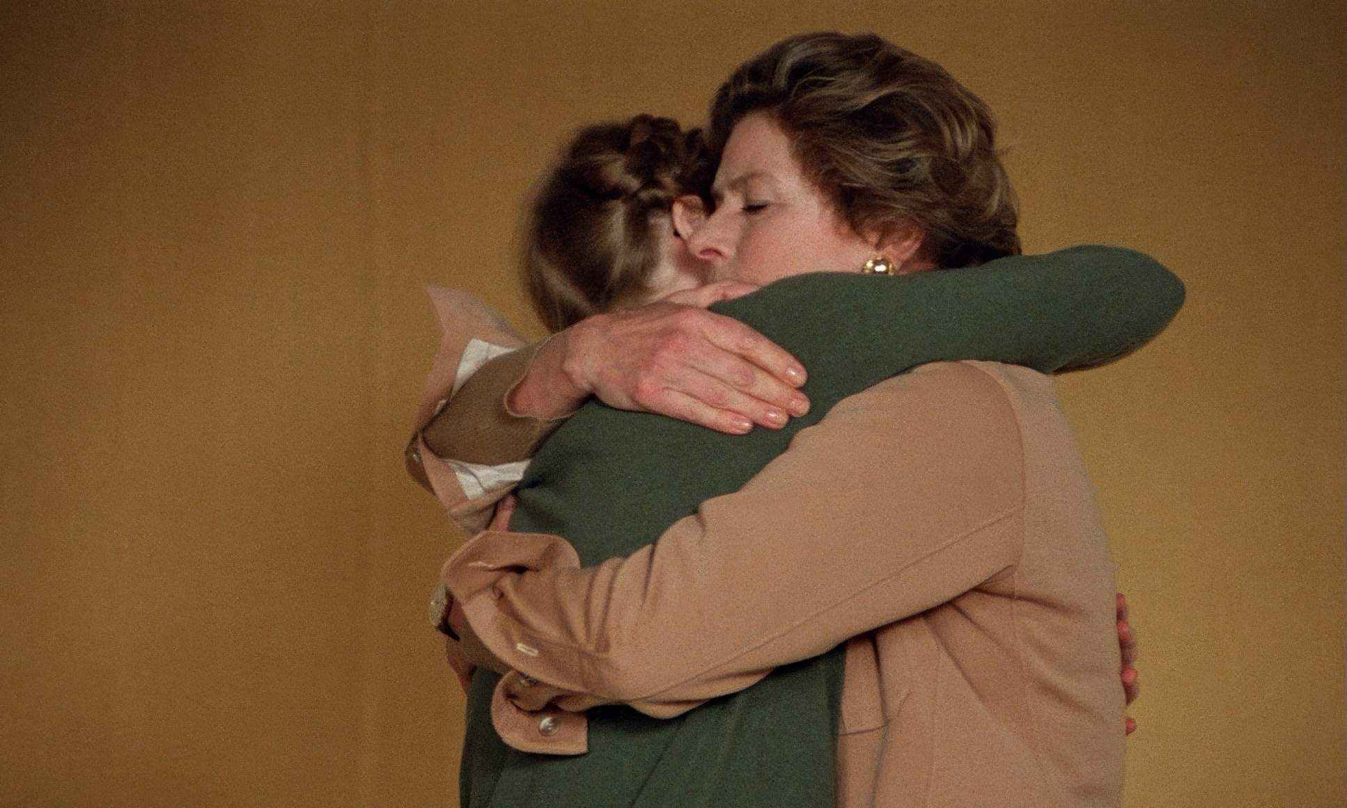
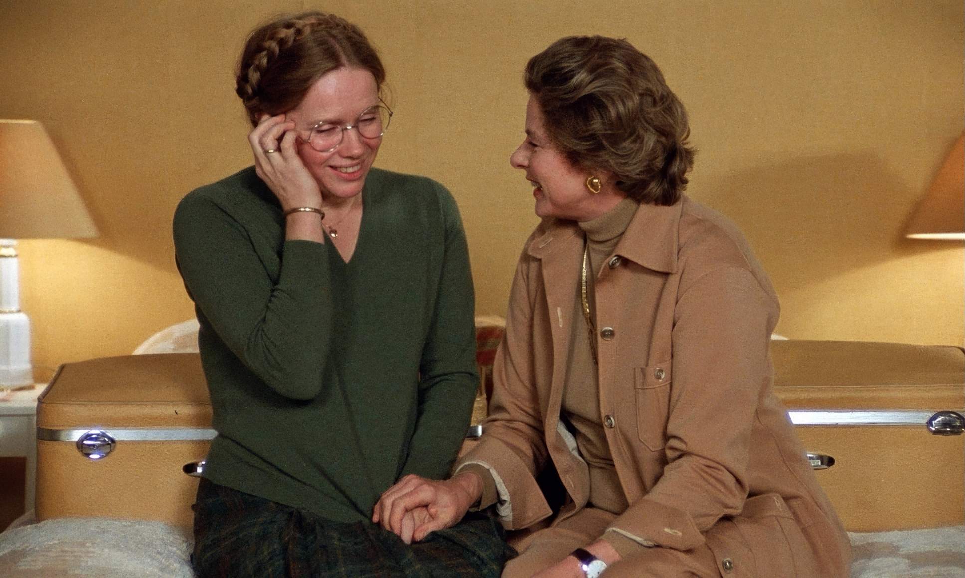
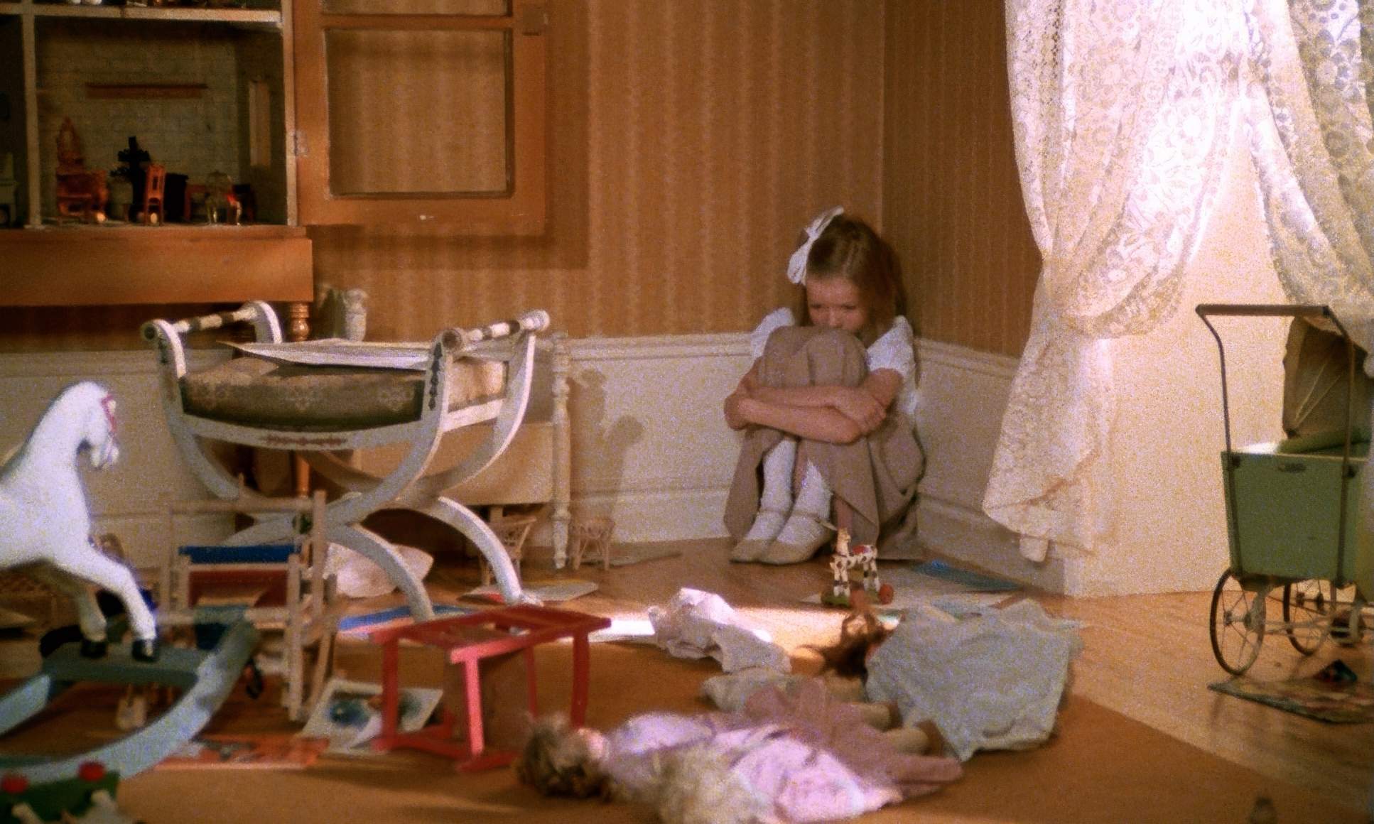
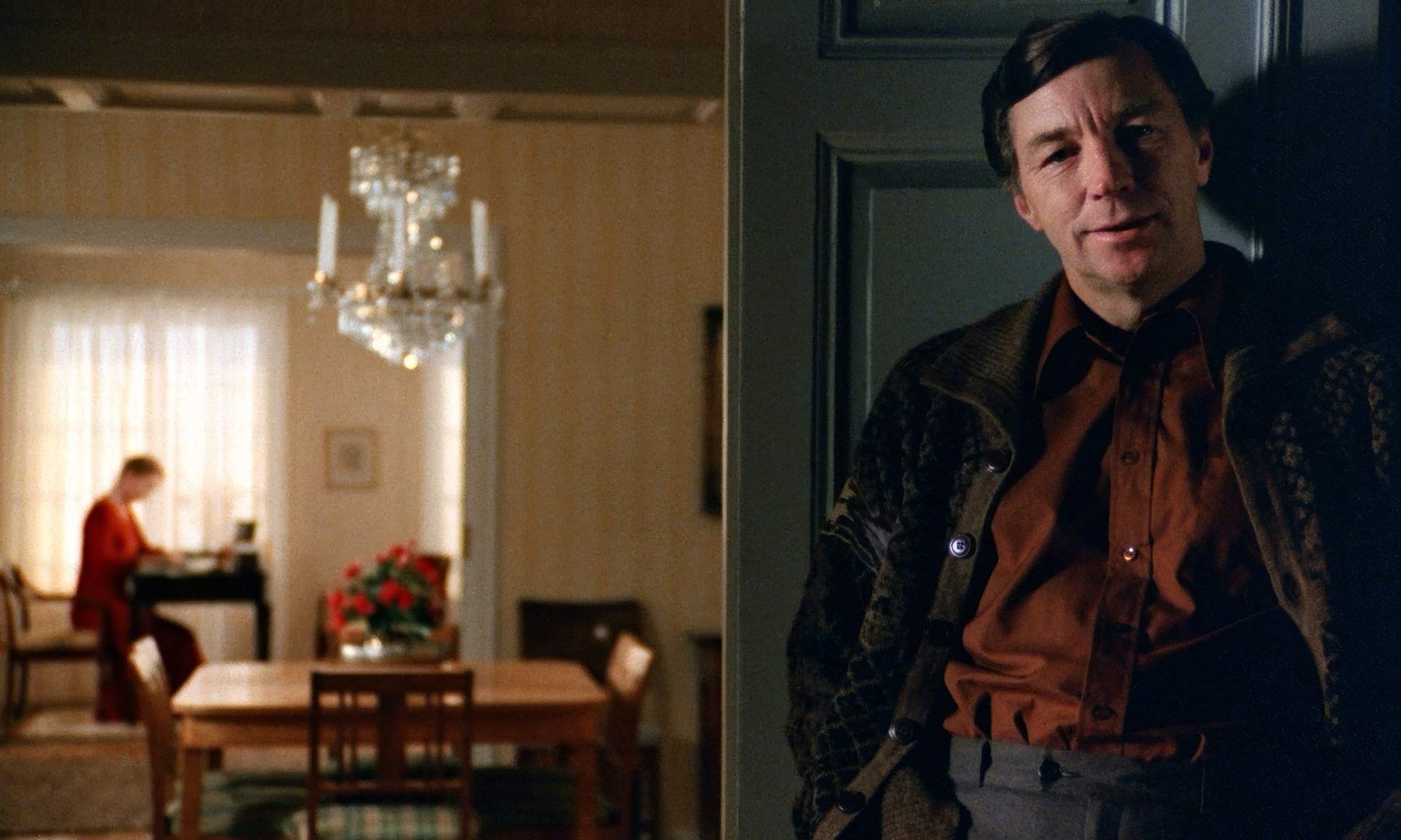
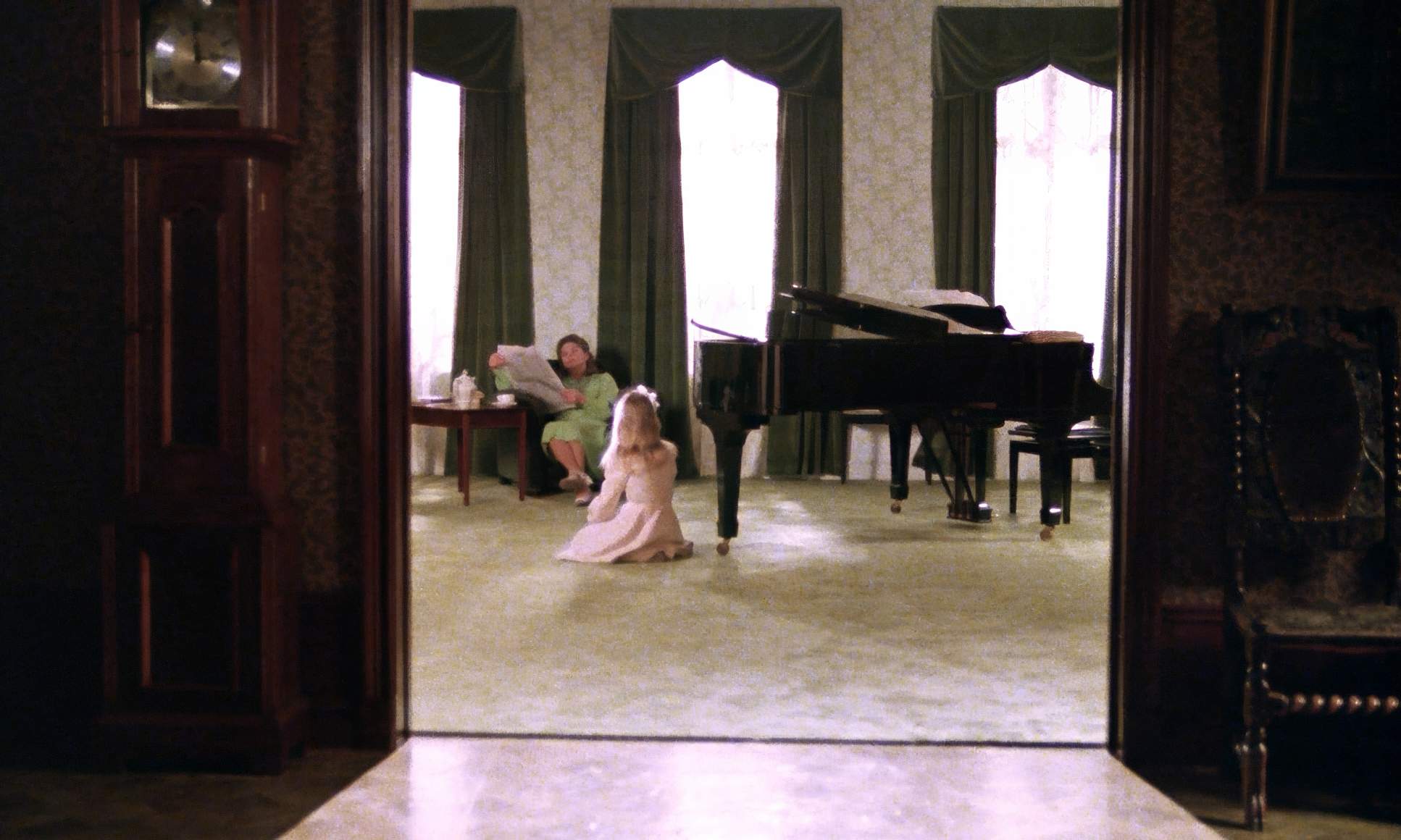
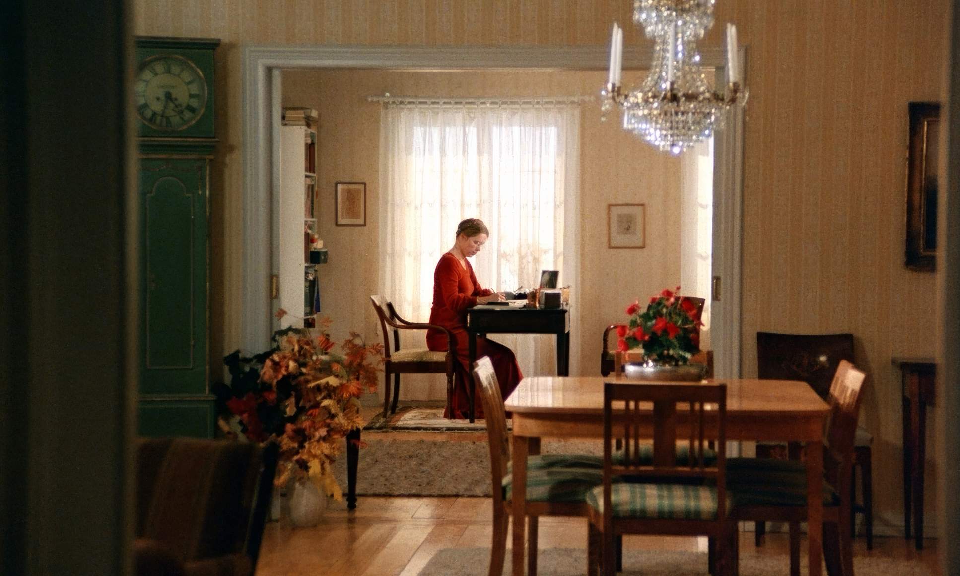
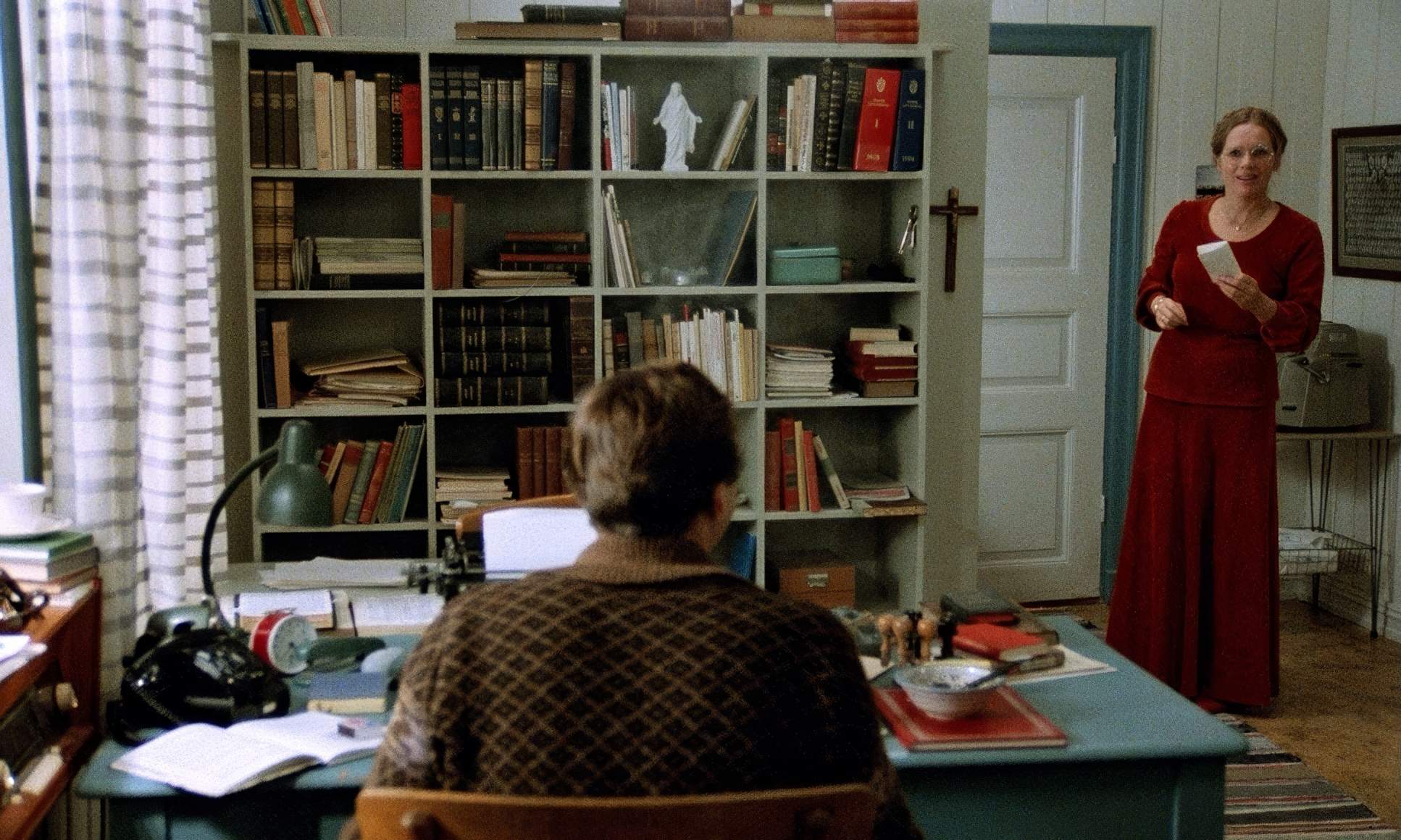
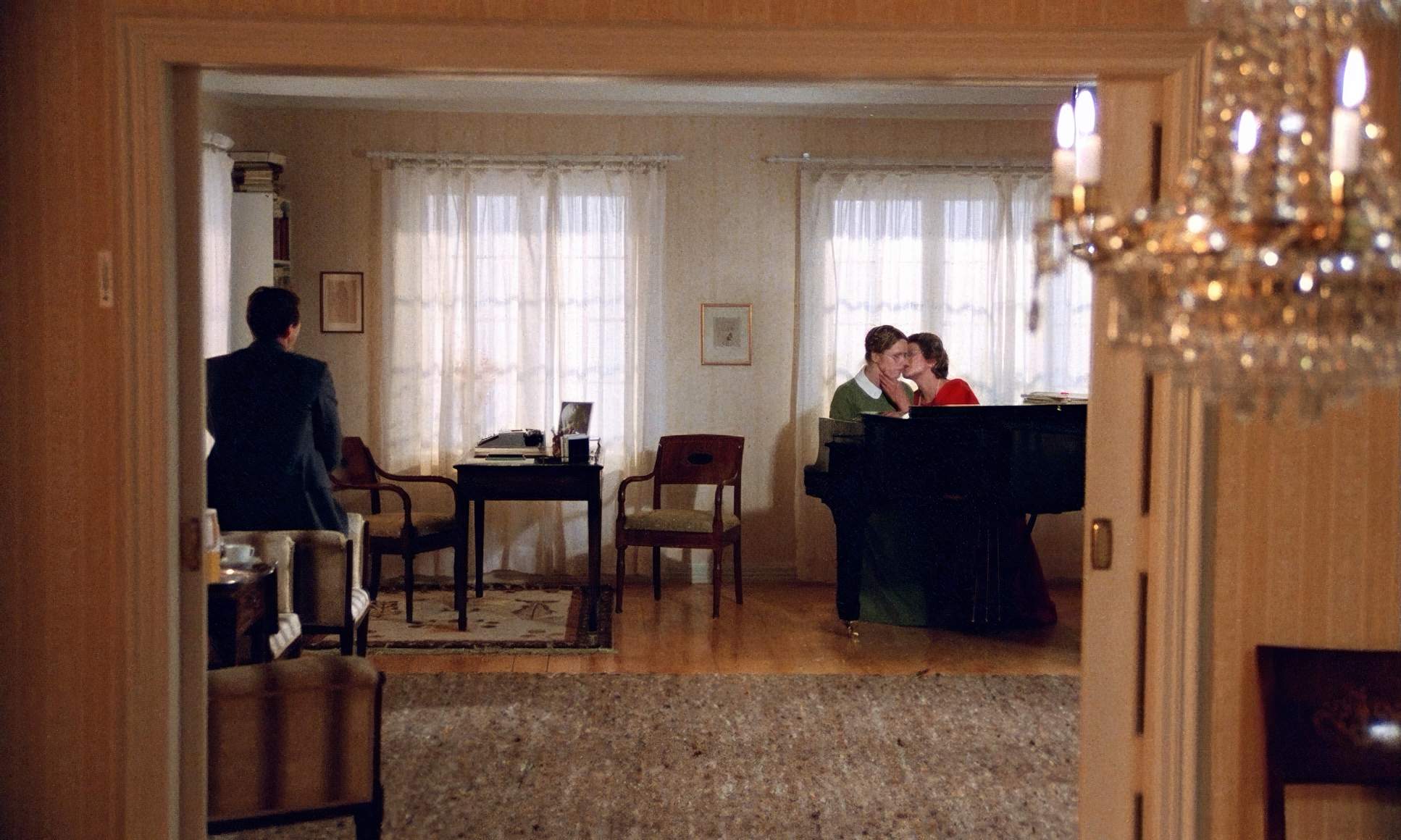
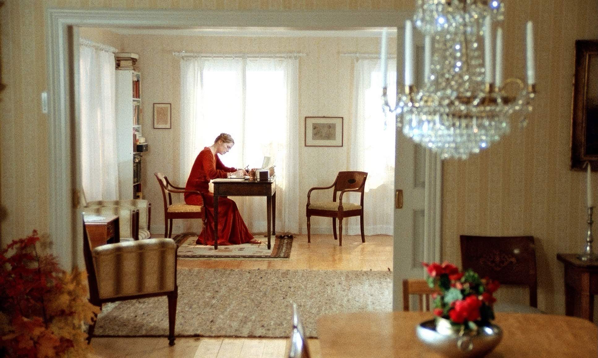
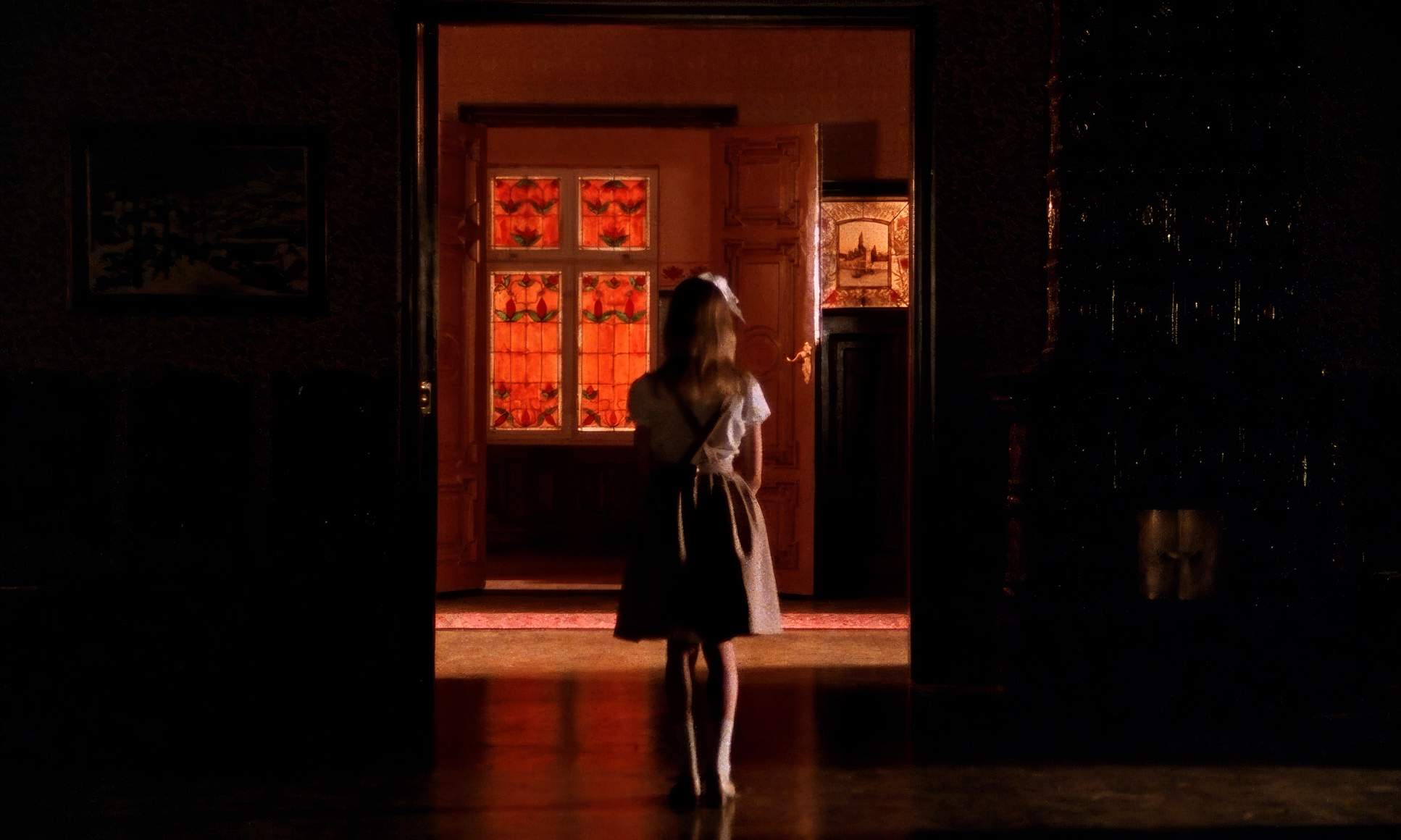
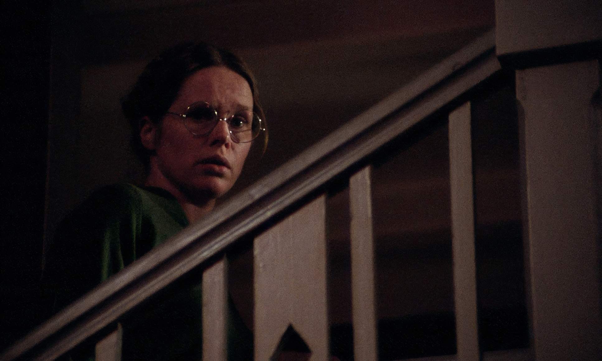
Even in close quarters, the wider shots emphasize the emotional distance. Eva and Charlotte might be in the same room, but the way they are framed suggests a massive chasm between them. Doors and windows are used as barriers or “frames within frames.” For instance, the pastor is often shown as a removed observer, framing his wife from a distance. That negative space around the characters feels heavy it’s laden with all the words they aren’t saying.
Camera Movements
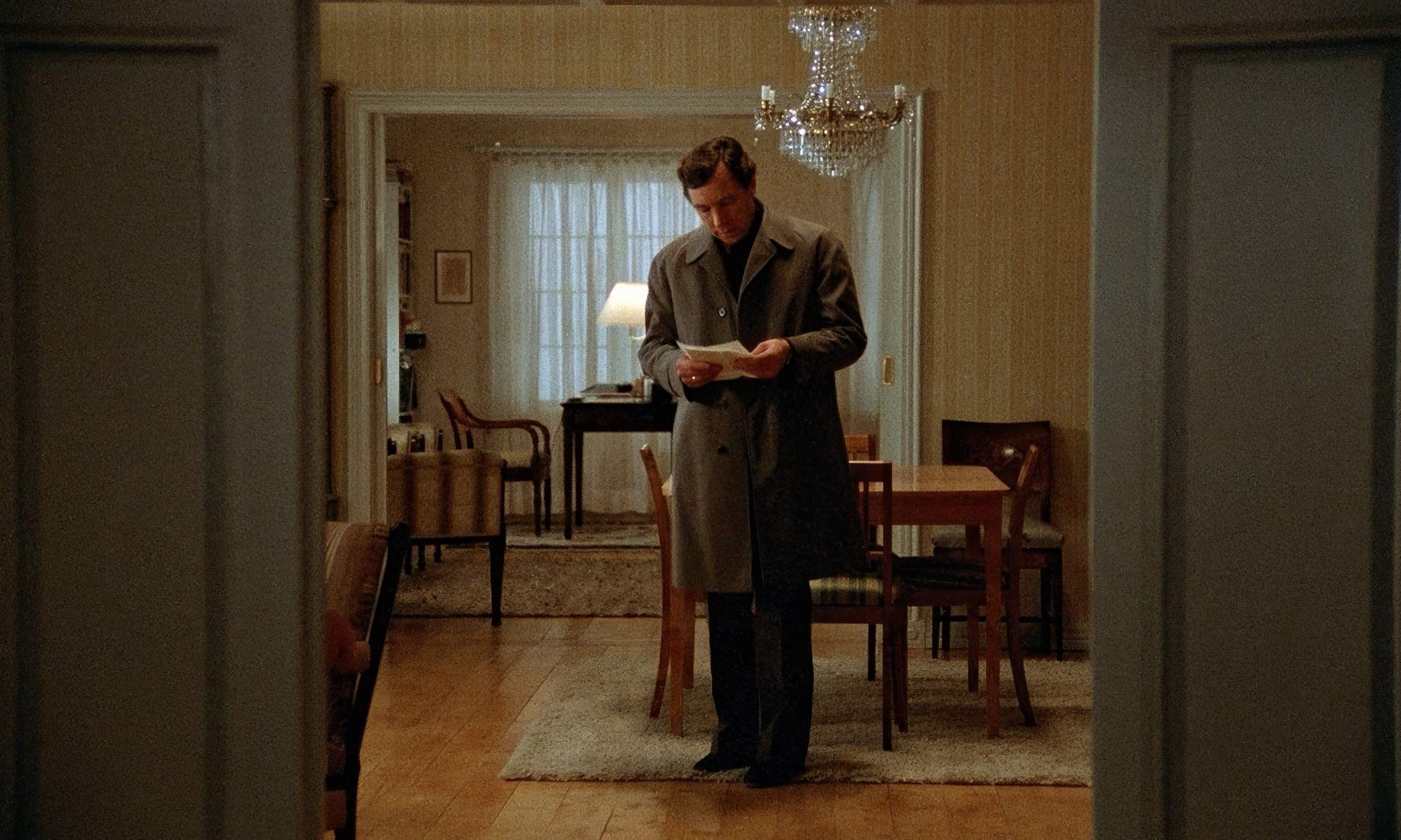
There are no grand, sweeping moves here. The camera is predominantly static, locking us into the psychological battlefield. This isn’t a film about exploring a house; it’s about exploring an internal landscape.
When the camera does move, it’s almost imperceptible. A slow push-in might tighten the screw on a character’s vulnerability. A subtle pan might shift the focus to a character who is “eavesdropping,” which is a recurring theme. These aren’t “cool” shots; they are functional. The stillness puts the pressure entirely on the actors. It’s a testament to the trust Bergman had in his cast and Nykvist’s ability to catch every nuance of a micro-expression.
Lensing and Blocking

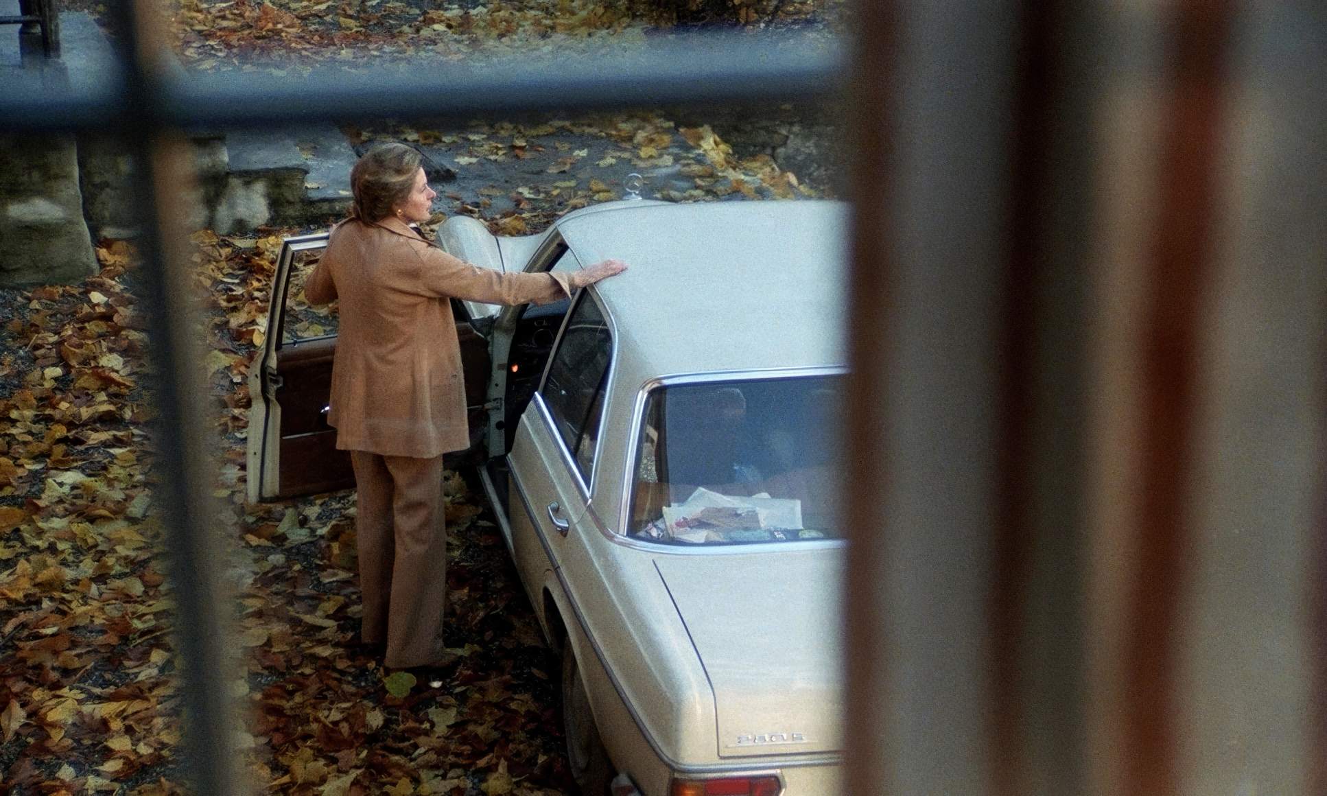
The film favors prime lenses likely in the 35mm to 50mm range for those interiors. This gives a natural field of view that avoids distortion while keeping the parsonage feeling appropriately oppressive.
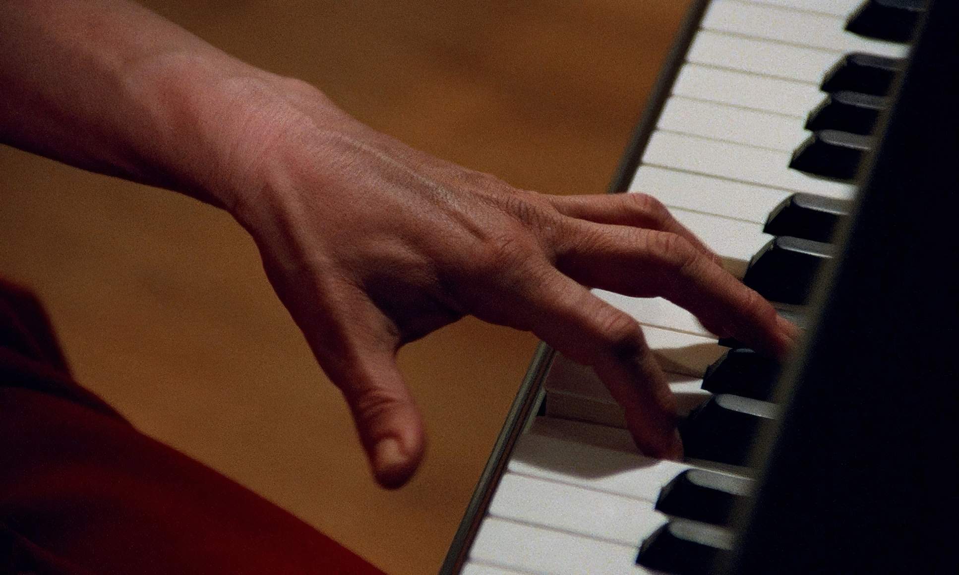
Blocking is where the power dynamics are won and lost. In the famous piano scene, the physical arrangement says everything. Liv Ullmann’s Eva is hunched and tentative at the keys, while Ingrid Bergman’s Charlotte stands over her with effortless mastery. The camera just follows these subtle shifts in height and proximity. The long, intense dialogues rely on this precise blocking to keep the emotional flow moving without needing to cut away, eventually landing on those penetrating close-ups that define the film.
Color Grading Approach
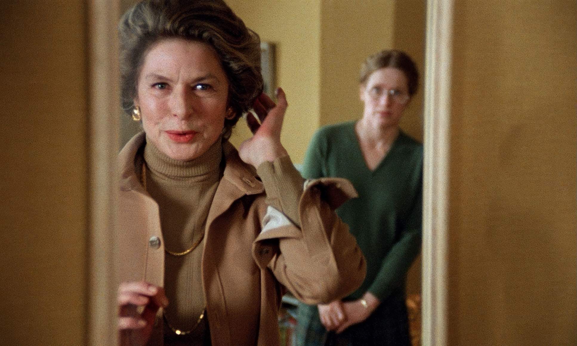
This is where my colorist brain really gets to work. The palette is a tight “autumnal” scheme: browns, off-whites, and deep reds.
Since this was 1978, we’re talking about a photochemical process, not a DaVinci Resolve session. But the intent is clear. If I were grading this today, I’d be looking at the mid-tone density to keep those earth tones feeling rich but not muddy. The off-whites are crucial they give the parsonage a lived-in, aged feel that adds to the melancholy.
Then you have the reds. They mostly appear in Charlotte’s outfits. It’s a strategic splash in a desaturated world. As a colorist, I’d ensure those reds are hue-separated just enough to “pop” without looking garish. They represent Charlotte’s ego, her passion, and her danger a stark contrast to the repressed, cooler hues surrounding her daughter, Eva. The highlight roll-off (that soft, painterly quality you get from film) prevents the image from ever feeling clinical, which is vital when you’re spending so much time inches away from an actor’s face.
Technical Aspects & Tools
Autumn Sonata (1978) — Technical Specifications
| Genre | Drama, Melodrama |
| Director | Ingmar Bergman |
| Cinematographer | Sven Nykvist |
| Production Designer | Anna Asp |
| Costume Designer | Inger Pehrsson |
| Editor | Sylvia Ingemarsson |
| Time Period | 1970s |
| Color Palette | Warm, Saturated, Orange, White |
| Aspect Ratio | 1.66 – Spherical |
| Format | Film – 35mm |
| Lighting | Backlight |
| Lighting Type | Daylight, Artificial light |
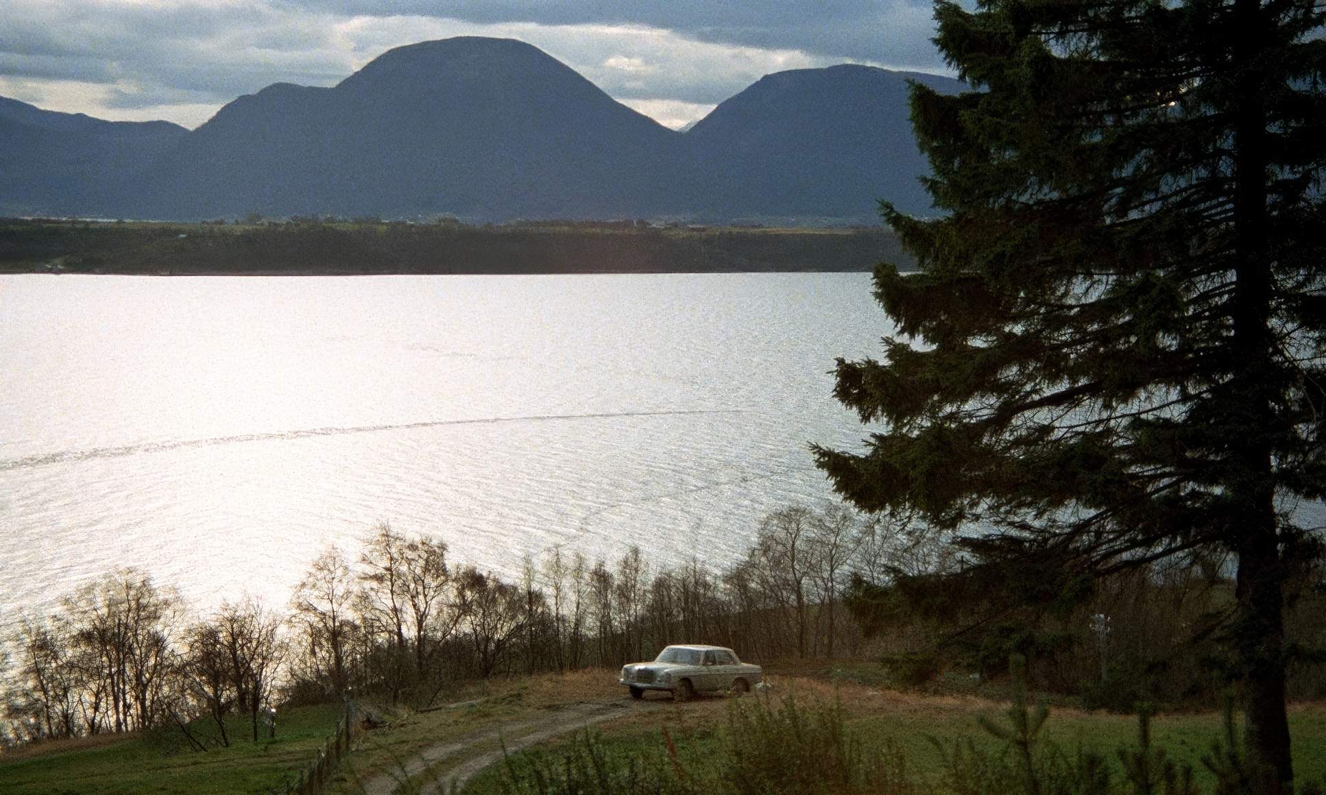
| Story Location | Europe > Norway |
| Filming Location | Europe > Norway |
| Camera | Arriflex 35 BL4 |
Autumn Sonata was shot on 35mm film (1.66 aspect ratio) in Norway, where Bergman was living at the time. While many assume the Arriflex 35 BL4 was used, that model didn’t actually hit the market until the mid-80s. Nykvist likely used the Arriflex 35 BL1 or BL2, which were the workhorses of the late 70s. These cameras were quiet enough for the intimate, dialogue-heavy scenes Bergman required.
He likely used Eastmancolor Negative Film 5247, a stock known for beautiful grain and natural color. The lenses were probably Zeiss primes sharp, but with that organic “soul” that modern glass often lacks. Nykvist’s genius wasn’t in the gear; it was in his exposure. He knew exactly how to push the latitude of the film to capture low-light interiors without losing the “human” texture of the image.
Autumn Sonata (1978) Film Stills
A curated reference archive of cinematography stills from Autumn Sonata (1978). Study the lighting, color grading, and composition.


- Also read: ACE IN THE HOLE (1951) – CINEMATOGRAPHY ANALYSIS
- Also read: THE RED SHOES (1948) – CINEMATOGRAPHY ANALYSIS
Browse Our Cinematography Analysis Glossary
Explore directors, cinematographers, cameras, lenses, lighting styles, genres, and the visual techniques that shape iconic films.
Explore Glossary →