A film comes along that makes me put the technicalities aside and just feel the weight of the image. Michael Haneke’s Amour (2012) is that film. On the surface, it’s deceptively simple, but under the guidance of the legendary Darius Khondji, its cinematography is a brutal masterclass in profound minimalism.
This isn’t a film you “enjoy” in the popcorn-munching sense; it’s one you survive. Mark Kermode described it as “harrowing but very well put together… but I don’t mean any of those things in a sentimental way.” He’s spot on. It won the Palme d’Or and the Oscar for Best Foreign Language Film not by being pretty, but by being unflinching. My goal here is to get under the skin of its visual design and understand how Khondji’s choices make this story feel so terrifyingly real.
About the Cinematographer
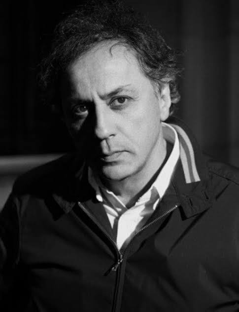
Darius Khondji ASC, AFC, is a bit of a chameleon. If you look at his filmography, it’s a total gear-shift: from the oppressive, rain-slicked grit of Se7en to the golden, romantic glow of Midnight in Paris. He isn’t a DP with a “signature look” that he forces onto every project; he’s a storyteller who happens to use a light meter.
Amour represents a fascinating, almost ascetic turn in his career. After years of highly stylized work, he embraced a stark, documentary-like realism for Haneke. It’s proof that true artistry isn’t always about making things look “beautiful” in a traditional sense. Sometimes, the bravest thing a DP can do is disappear entirely, letting the emotional core of the film breathe without the distraction of “hero shots” or flamboyant camera moves.
Inspiration Behind the Cinematography
Haneke’s directorial philosophy can be summed up in three words: “not looking away.” The film doesn’t start with a soft-focus romantic memory; it starts with the police breaking into an apartment to find a corpse. That brutal honesty is the DNA of the cinematography.
The visual inspiration here isn’t an art movement; it’s the authentic human experience of decline. We’re talking about aging, devotion, and the quiet, messy indignities of sickness. Haneke wanted to present these realities without a hint of sentimentality. The “minimalist approach” isn’t just a stylistic choice; it’s a way of creating a voyeuristic window. The apartment itself slowly morphs from a cultured home into a cage, and eventually, a tomb. Khondji’s job was to document that decay with unblinking clarity.
Camera Movements
If you’re a fan of sweeping Steadicam shots or kinetic action, you’re going to be frustrated. Amour is defined by its lack of movement. The camera is stoic an impassive witness to a private tragedy.
This static approach forces us into a position of passive observation. We aren’t being “guided” through the drama; we’re forced to sit there and deal with it. It perfectly mirrors the helplessness Georges feels as he cares for Anne. Some viewers including one reviewer I came across admitted to being “bored shitless” by the long, unmoving takes. But that’s the point. Real life doesn’t cut away when things get uncomfortable. When the camera does finally move a tiny pan or a slow push it feels like a massive emotional event. It’s the visual equivalent of a whisper in a dead-silent room.
Compositional Choices
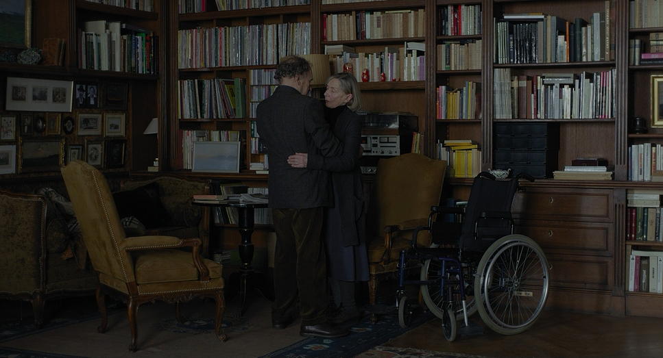
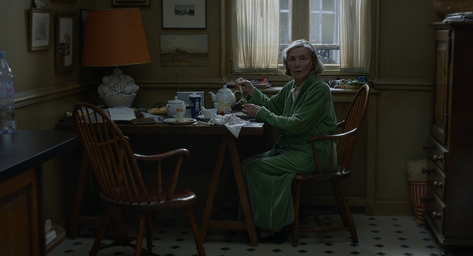
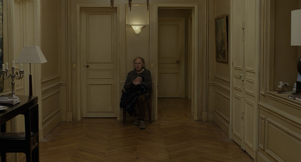
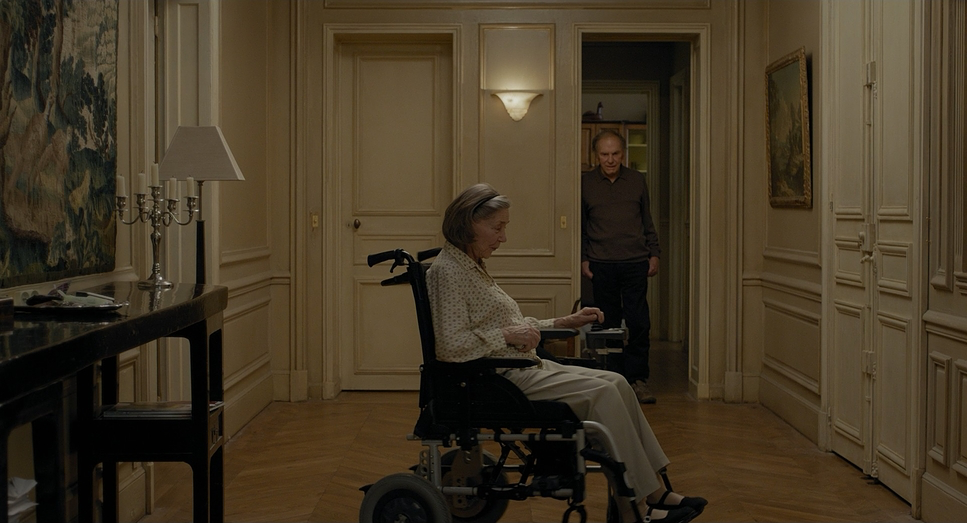
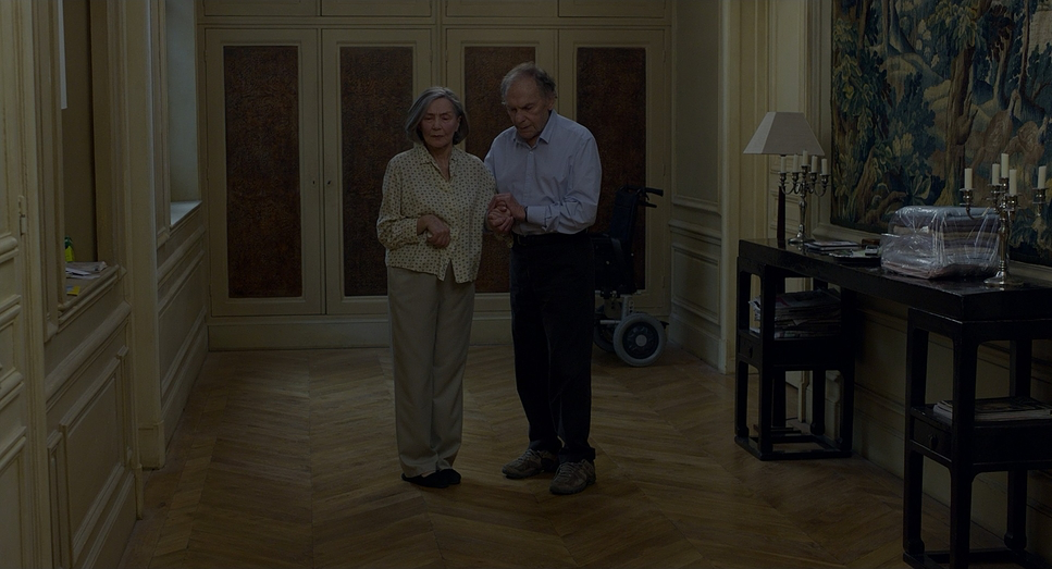
Khondji frames the apartment in 1.85:1, and he uses every inch of that space to emphasize confinement. Most scenes are wide or medium-wide static frames with a deep depth of field. This is a bold move. By keeping everything in focus, Haneke isn’t telling you where to look. He’s inviting you to scan the frame, to notice the dusty books, the piano, and the medicinal clutter that begins to take over.
The apartment becomes a “third major character.” Characters are often framed through doorways or down long hallways, dwarfed by the architecture. As Anne’s condition worsens, the compositions feel heavier and more unbalanced. Negative space isn’t “empty” here; it’s a silent witness. Every line and every carefully placed piece of furniture contributes to a narrative of a world that is shrinking down to the size of a single bed.
Lighting Style
As a colorist, this is where I get really nerdy. The lighting in Amour is a masterclass in motivated realism. Khondji throws out the “movie lighting” playbook and uses practicals windows, lamps, ceiling fixtures to do the heavy lifting.
The light has a soft, diffused quality, mostly spilling in from large windows during the day. It avoids those harsh, dramatic “film noir” shadows because Haneke wants everything clear and unambiguous. There is an “un-lit” look here that is incredibly hard to pull off. It takes immense control to make a scene look like “just a room at 2 PM” without it looking flat or amateur. As the film progresses and the emotional weight gets heavier, you might notice the apartment feels slightly dimmer, the shadows a bit longer. It’s subtle never “theatrical” but it perfectly tracks the encroaching darkness of Anne’s illness.
Lensing and Blocking
For lenses, Khondji stayed in the “standard” lane likely sticking to Cooke S4/i or S5/i primes in the 35mm to 50mm range. Why? Because these lenses don’t lie. They don’t have the distortion of a wide-angle or the artificial compression of a telephoto. They provide a “human eye” perspective that grounds the film in reality.
The blocking is where the “stillness” gets its energy. Even though the camera doesn’t move, the characters do. Georges’ frantic maneuvering around Anne’s wheelchair creates a visual metaphor for their shifting roles. The depth cues are precise; characters move from the background to the foreground, keeping the space three-dimensional even when the frame is frozen. It’s a rigorous discipline trusting that the movement of a human body is more interesting than the movement of a camera.
Color Grading Approach
Here’s the part where I have to confess: I was almost fooled. Watching Amour, you’d swear it was shot on 35mm film because of its organic texture. But it was actually shot digitally on the Arri Alexa. As a colorist, I find that fascinating. The grade, handled by Didier Le Fouest, is a testament to the power of transparency.
From my perspective, the goal here wasn’t to “create a look” but to honor the Alexa’s incredible latitude while chasing a filmic soul. The palette is naturalistic and slightly desaturated, yet it keeps an underlying warmth. You don’t see crushed blacks or clipped, “digital-looking” highlights here. Instead, there’s a gentle, film-like curve.
I’ve been in sessions where the temptation is to “fix” a quiet scene by cranking the contrast or pushing some stylized blues into the shadows. Amour is a reminder to resist that urge. The skin tones are rendered with painful accuracy. It’s tonal sculpting at its most invisible the grade doesn’t scream for attention, it just lets the heartbreak happen.
Technical Aspects & Tools
Amour (2012) — Arri Alexa XT • Cooke S5/i & S4/i
| Genre | Drama, Romance |
| Director | Michael Haneke |
| Cinematographer | Darius Khondji |
| Production Designer | Jean-Vincent Puzos |
| Costume Designer | Catherine Leterrier |
| Editor | Nadine Muse, Monika Willi |
| Colorist | Didier Le Fouest |
| Time Period | 2010s |
| Color | Warm, Desaturated |
| Aspect Ratio | 1.85 – Super 35 |
| Format | Digital |
| Lighting | Hard light, Top light |
| Lighting Type | Artificial light |
| Story Location | France > Paris |
| Camera | ARRI ALEXA XT / XTplus |
| Lens | Cooke S5i, Cooke S4/i |
| Film Stock / Resolution | 2.8K / 2.8K ArriRaw |
While the film feels like a relic of the celluloid era, the technical backbone was cutting-edge for 2012. Using the Arri Alexa XT/XTplus allowed Haneke and Khondji to shoot in 2.8K ArriRaw, giving them the dynamic range needed to handle those soft, natural window lights without blowing out the highlights.
The choice of Cooke S5/i and S4/i lenses was critical. Cookes are famous for the “Cooke Look” a certain warmth and “roundness” in the image that feels less clinical than other digital-era glass. This helped bridge the gap between the digital sensor and the filmic aesthetic Haneke craves. In the DI (Digital Intermediate) phase, they weren’t trying to make it look “high-def”; they were likely respecting the natural “grain” and color response of a print-film sensibility. The result is a technical setup that serves a singular purpose: making the artifice of the camera disappear.
- Also read: NOTORIOUS (1946) – CINEMATOGRAPHY ANALYSIS
- Also read: PATTON (1970) – CINEMATOGRAPHY ANALYSIS
Browse Our Cinematography Analysis Glossary
Explore directors, cinematographers, cameras, lenses, lighting styles, genres, and the visual techniques that shape iconic films.
Explore Glossary →