Salik here from Color Culture. Today I want to break down a film that is often cited as a benchmark for visual storytelling: American History X (1998). As a colorist and filmmaker, I spend a lot of time analyzing how light, texture, and grading influence emotion, and this film is a masterclass in using visual grammar to drive a narrative. It doesn’t just rely on dialogue to tell its story; it uses the camera to force you into the uncomfortable headspace of its characters.
This isn’t just a movie about hate and redemption; it is a case study on how technical choices—framing, exposure, and color separation—can amplify a theme. Let’s look at the mechanics behind the visual genius of American History X.
From the opening credits, American History X establishes that it is going to be visually aggressive. Directed by Tony Kaye, the film treats the camera as an active participant rather than a passive observer. It is rare to see a drama that relies so heavily on its visual aesthetic to carry the weight of the plot.
For me, the success of this film lies in its refusal to be visually safe. It swings wildly between hyper-stylized sequences and gritty realism. It uses the visual spectrum to delineate time and mental states, creating a separation that helps the audience navigate Derek Vinyard’s fractured timeline. It’s a film where the style is the substance, articulating the complex interplay of memory and prejudice in a way that dialogue alone never could.
About the Cinematographer: Tony Kaye’s Audacious Vision
Tony Kaye is an interesting case study because he served as both the director and the cinematographer (DP) for much of the film. This is relatively rare in Hollywood production, but it explains the singular, uncompromised nature of the imagery. Kaye came from a background in high-end commercials and music videos, and he brought that discipline—specifically the ability to create striking, singular images—into a feature format.
Because he was operating the camera himself for key sequences, there is a raw, immediate connection between the direction and the image. He wasn’t relaying instructions to a DP; he was framing the shots as they happened. This approach gives the film its “punk rock” sensibility. It feels spontaneous and reactive, especially in the violent flashbacks, breaking conventional rules of coverage to maintain high energy.
Inspiration for the Cinematography: A Duality of Tone
The most obvious visual hook in the film is the split between black and white (past) and color (present). However, looking closer, this isn’t just a stylistic quirk; it is the foundational logic of the film.
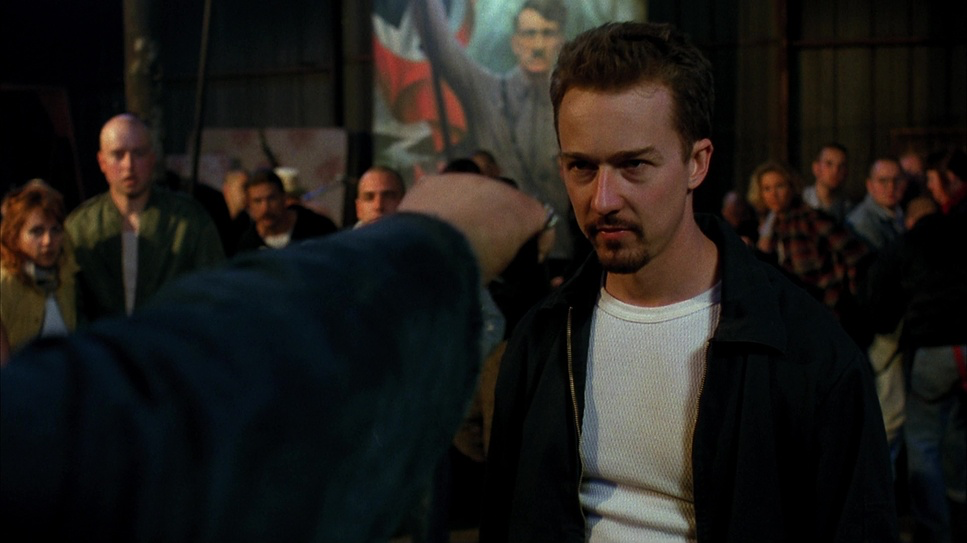
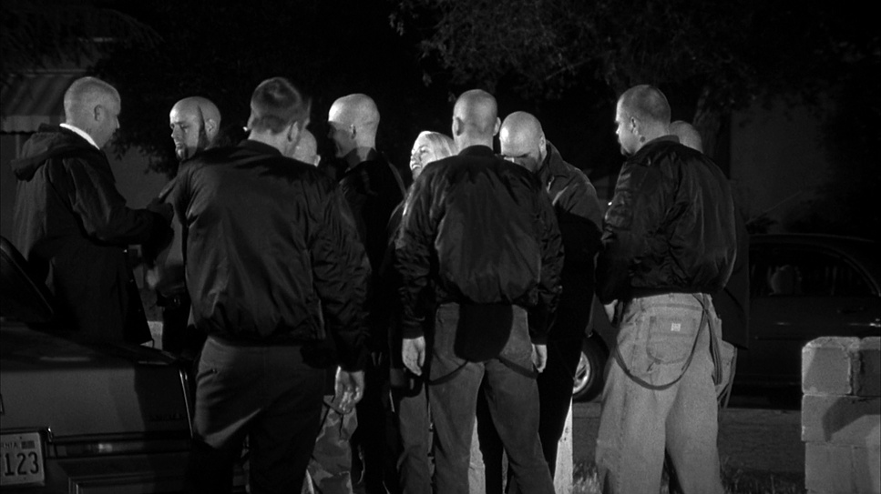
The black and white sequences represent Derek’s memory and his ideology at the time: binary, high-contrast, and absolute. There is no “grey area” in his hate, and the photography reflects that. It mimics the look of classic photojournalism or even propaganda footage—heroic, stark, and idealised.
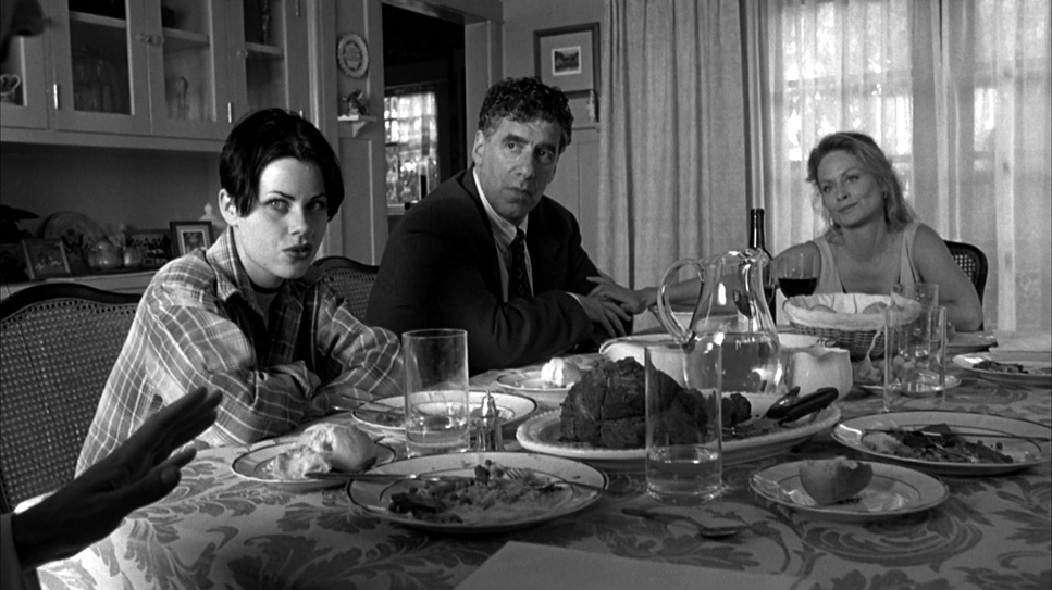
In contrast, the present-day color sequences are stripped of that “mythic” quality. They feel tired and heavy. The inspiration here seems to be realism—showing the mundane, gritty reality of the consequences of his actions. By visually separating these two worlds, Kaye forces the viewer to feel the difference between the seductive power of Derek’s past rhetoric and the depressing reality of his present life.
Camera Movements: A Dance of Deliberation and Chaos
The camera work shifts gears constantly to mirror the psychological state of the scene.
In the black and white flashbacks, the camera is aggressive. We see a lot of handheld operation, particularly during the basketball game and the raid. The camera crowds the actors, invading their personal space. It shakes and reacts to the violence, making the viewer feel like a bystander in the middle of a riot. The “curb stomp” sequence is shot with a chillingly steady hand, but the proximity makes it nearly unwatchable.
In the present-day color sequences, the camera settles down. It becomes more observational. We see more static shots, slow pans, and tracking shots that feel lethargic rather than energetic. This lack of movement reflects Derek’s exhaustion and his caution as he tries to navigate life post-prison. The contrast between the shaky, kinetic past and the static, heavy present subliminally tells us that the “rush” of the lifestyle is gone.
Compositions: Frames of Isolation and Confrontation
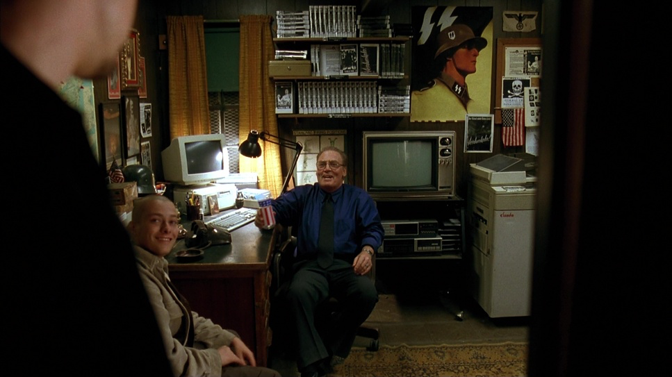
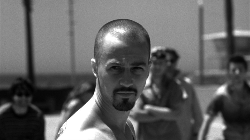
Composition is used effectively to establish power dynamics. In the flashbacks, Derek is frequently framed in low-angle “hero shots,” often centered perfectly in the frame. This symmetry gives him a sense of authority and dominance. He literally looms over the audience and the other characters.
Kaye also utilizes wide-angle lenses close to the subjects (I suspect 18mm or 24mm), which distorts facial features slightly and exaggerates perspective. This makes the characters feel larger than life and more threatening.
In the present day, the framing changes. Derek is often framed loosely, with more headroom or negative space, making him look smaller and more isolated within his environment. He is no longer the titan of the frame; he is just a man in a room, emphasizing his loss of status and power.
Lighting Style: The Stark Contrast of Light and Shadow
The lighting in the black and white sequences is classic chiaroscuro—high contrast with hard edges. Kaye uses hard light sources to create deep, crushed shadows and bright highlights. This isn’t soft, flattering beauty lighting; it’s architectural and harsh. It sculpts the muscles and the anger on the characters’ faces.
From a technical standpoint, lighting for black and white requires you to think about separation in terms of luminance rather than hue. You can’t rely on color contrast to separate a character from the background; you have to do it with rim lights and shadow fall-off.
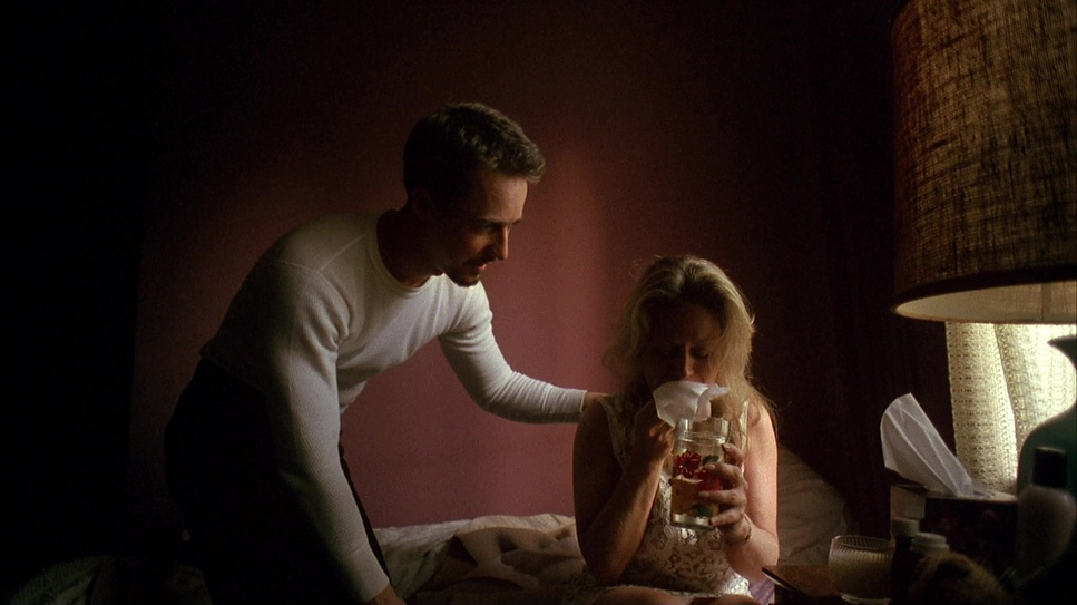
The color sequences, conversely, use flatter, more diffused lighting. The sun feels hot and oppressive, blowing out windows and casting a haze over the image. It lacks the dramatic “punch” of the flashbacks, reinforcing the idea that the present is mundane and unglamorous.
Lensing and Blocking: Space, Proximity, and Power
The lensing choices heavily influence how we perceive the characters’ relationships. The use of wide-angle lenses in the flashbacks does more than just capture the action; it creates a sense of distortion that mirrors Derek’s warped worldview. When a character screams into a wide lens from inches away, it feels aggressive and grotesque.
Blocking in the flashbacks is often pack-mentality—groups of skinheads moving as a single unit or Derek standing alone against a backdrop. In the present day, the blocking emphasizes distance. Characters stand across rooms from each other, struggling to bridge the gap. The lenses used here feel longer (perhaps 50mm or 85mm), which flattens the image and isolates characters in their own shallow depth of field, highlighting their emotional disconnection.
Color Grading: The Narrative Power of Hue and Tone
As a colorist, this is the aspect of the film I appreciate most. The “grade” here is doing heavy narrative lifting.
The black and white isn’t just desaturated video; it looks like a specific film stock simulation, likely aiming for something like Kodak Double-X. The blacks are crushed (pushed down to 0 IRE), and the highlights are often clipped, creating a high-contrast curve that feels gritty and metallic. In post-production, achieving this look usually involves using a channel mixer to dictate which colors (reds or skin tones) translate into specific shades of grey, ensuring the skin textures pop.
For the color sequences, the grade is intentionally unappealing. It’s not a vibrant Hollywood look. The saturation is dialed back, and the palette leans toward sickly greens, cyans, and warm, dusty oranges. It looks like “bleach bypass” or a print stock that has been left in the sun. This dirty, muted palette prevents the audience from feeling comfortable. It visually communicates that Derek’s world is toxic and decaying.
Technical Aspects: Crafting the Raw Aesthetic
AMERICAN HISTORY X (1998)
35mm Film • 1.78:1 Spherical • Panavision Panaflex| Genre | Crime, Drama, Political, Prison |
| Director | Tony Kaye |
| Cinematographer | Tony Kaye |
| Production Designer | Jon Gary Steele |
| Costume Designer | Doug Hall |
| Editor | Gerald B. Greenberg, Alan Heim |
| Time Period | 1990s |
| Color | Desaturated, Black and White |
| Aspect Ratio | 1.78 – Spherical |
| Format | Film – 35mm |
| Lighting | Hard light, High contrast, Side light |
| Lighting Type | Artificial light |
| Story Location | California > Los Angeles |
| Filming Location | California > Los Angeles |
| Camera | Panavision Panaflex |
| Lens | Panavision Lenses |
The film was shot on 35mm film, which provides a grain structure that digital cameras still struggle to emulate perfectly. That grain is crucial—it adds a subconscious layer of texture that makes the image feel “lived in” and abrasive.
The choice of film stocks would have been critical. The production likely used a fine-grain stock for the color sections to keep the realism sharp, while potentially pushing the processing on the black and white sections to enhance the grain and contrast. The combination of anamorphic lenses (implied by the flares and bokeh in certain scenes) and the physical texture of the 35mm negative creates an aesthetic that feels organic and raw, perfectly suiting a story that is so deeply human and flawed.
- Also read: LÉON: THE PROFESSIONAL (1994) – CINEMATOGRAPHY ANALYSIS
- Also read: THE PRESTIGE (2006) – CINEMATOGRAPHY ANALYSIS
Browse Our Cinematography Analysis Glossary
Explore directors, cinematographers, cameras, lenses, lighting styles, genres, and the visual techniques that shape iconic films.
Explore Glossary →