Hey everyone, Salik Waquas here from Color Culture. Today, I want to unpack the visual language of a film that—let’s be honest—has become complicated to talk about: Sam Mendes’ 1999 debut, American Beauty. Regardless of how you feel about the narrative or the controversy surrounding it today, as a filmmaker and colorist, I can’t ignore the craft. It’s a film that arrived right at the end of the 90s, capturing a specific kind of suburban rot that feels distinct from the grunge of the early decade.
While critics debate whether the symbolism is deep or just pretentious, the cinematography is undeniable. It’s a masterclass. It doesn’t just look “good”; it looks expensive, deliberate, and surgically precise. It proves that you don’t need explosions to make a visually arresting movie—you just need to know where to put the light.
About the Cinematographer
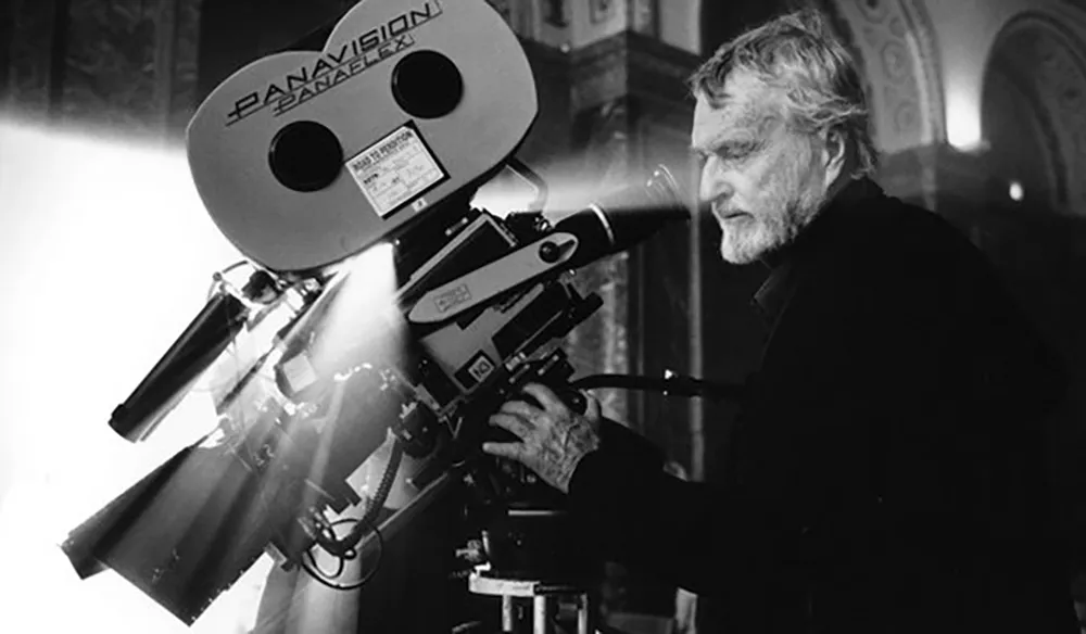
The man behind the lens was the late, legendary Conrad Hall. This wasn’t a rookie getting lucky; Hall was a veteran (think Butch Cassidy and the Sundance Kid and In Cold Blood) who knew exactly how to manipulate an image. He won the Oscar for this film, and frankly, he deserved it.
Hall wasn’t just lighting for exposure; he was lighting for subtext. His work here bridges the gap between the mundane (a boring dinner table) and the surreal (rose petals on the ceiling). He had this ability to take a “mistake”—like lens flare or a shadow falling “wrong”—and turn it into an emotional beat. He understood that a perfectly lit shot is boring if it doesn’t make you feel something.
Inspiration Behind the Cinematography
The late 90s were weird. You had Fight Club and The Matrix (also 1999) screaming about corporate disillusionment. American Beauty tackled the same thing but did it quietly. The visual inspiration seems to be the “facade.” It’s about the glossy, saturated surface of the American Dream and the absolute emptiness underneath it.
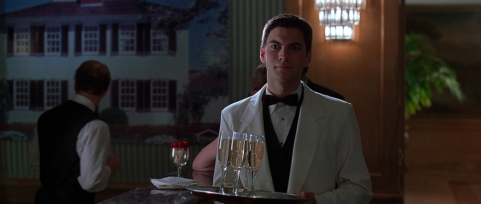
Visually, Hall and Mendes treat the suburbs like a prison. The inspiration feels rigid—almost like a stage play where the actors are trapped in their blocking. The film relies heavily on the color Red to break this sterility. Yes, the rose petals are obvious symbolism—maybe a bit on the nose—but from a color theory perspective, it works. It creates a violent contrast against the beige and gray of their lives. It’s Ricky Fitts’ camcorder footage that acts as the counter-point: grainy, handheld video finding beauty in a plastic bag versus the polished, tripod-locked stability of the main narrative.
Camera Movements
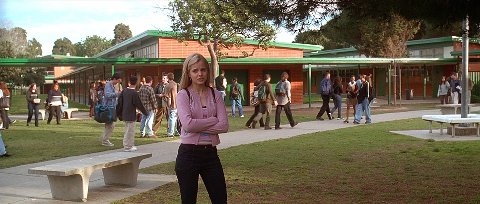
The camera in American Beauty is a creep. I don’t mean that negatively; I mean it’s voyeuristic. The movement is slow, smooth, and incredibly deliberate. We aren’t flying around on a Steadicam just for energy. We are tracking slowly on dollies, framing characters through windows, watching them when they think they’re alone.
Notice the “dead space.” When characters feel trapped, the camera doesn’t help them; it often pushes in slowly, increasing the claustrophobia. In wide shots, the camera is locked off, letting the characters look small against their perfectly manicured lawns. But when Lester enters his fantasy sequences, the rules break. The camera floats. It becomes sensual. Then, snap—back to reality, back to the tripod. The editing also creates a rhythm where we cut away from the person talking to focus on a reaction or an object, forcing the audience to read the room rather than just listen to the dialogue.
Compositional Choices
Hall’s composition is rigorous. He leans into the 2.35:1 aspect ratio (Super 35), using that width to isolate people. You’ll see a lot of “short-siding,” where a character looks toward the edge of the frame rather than into open space, subconsciously making them feel trapped.
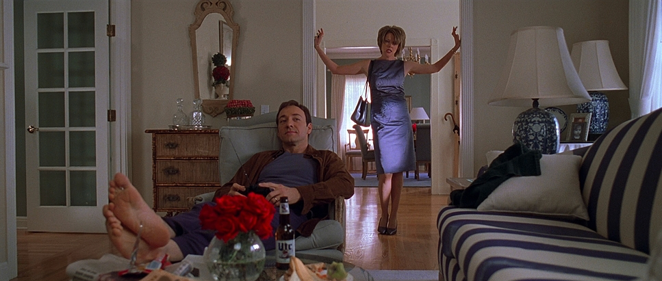
Look at the dinner scenes. The table is huge, and the framing emphasizes the distance between Lester, Carolyn, and Jane. They share a frame, but they are miles apart emotionally. Hall uses doorways and windows as frames-within-frames constantly. Carolyn is almost always framed by vertical lines—curtains, doorframes—imprisoning her in her own perfectionism.
Depth is huge here. Hall rarely shoots flat against a wall. He gives you deep backgrounds, often out of focus, suggesting a world going on behind the characters that they can’t quite access. It’s methodical.
Lighting Style
The lighting is where this film moves from “drama” to “art.” It’s a mix of soft, naturalistic daylight and heightened, theatrical hard light.
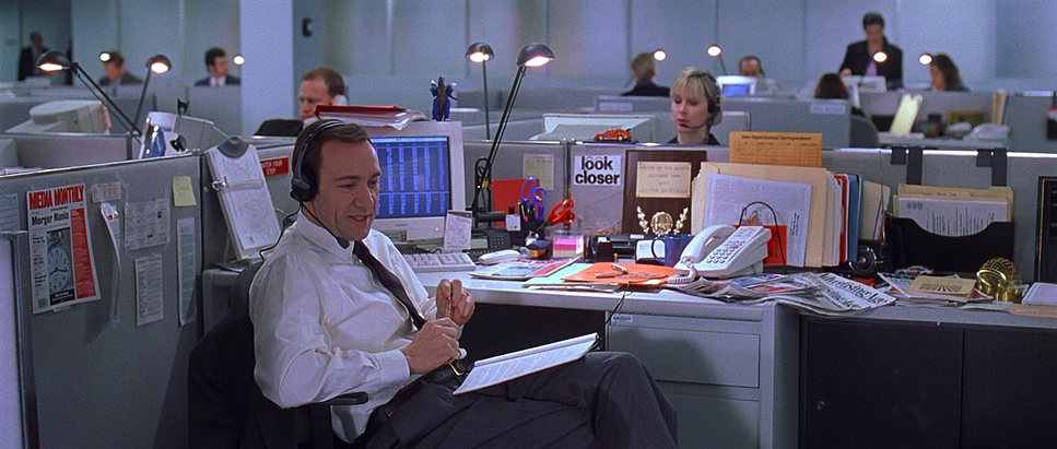
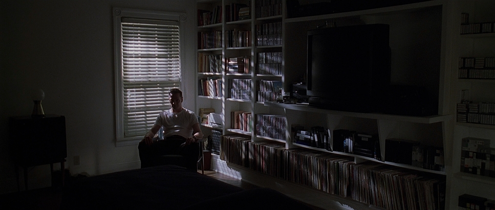
For the day exteriors, it’s harsh, high-contrast sunlight—nowhere to hide. Inside, Hall uses soft top-light to create a mundane, fluorescent feel for the office or the kitchen. But the magic happens in the shadows. Conrad Hall was the master of the “rich dark.” He doesn’t just crush the blacks; he fills them with information.
Take the bathtub scene. The water looks like ink. The skin tones are glowing, likely lit by a soft source with heavy diffusion to wrap around the face, while the background falls off into complete darkness. It’s motivated lighting (the “moonlight” or “candles”), but heightened to a point of fantasy. He also uses shadows to hide eyes. In many scenes, a character’s face will dip into shadow, telling us they are hiding their true intent. It’s subtle, but effective.
Lensing and Blocking
They shot this on Panavision glass—specifically Primo Primes and the 14.5-50mm Primo Macro Zoom. Hall stuck mostly to spherical lenses rather than anamorphic. Why? Because anamorphic adds flares and distortion that feel “movie-like.” Spherical lenses are cleaner, more honest. They render vertical lines straight (crucial for all those doorframes and windows).
He favored the wider end of the spectrum for the suburbia shots to exaggerate the space, but used longer focal lengths to compress the background when he wanted to isolate a character.
The blocking matches the lens choice. Characters are staged meticulously. In the beginning, Lester is often placed low in the frame or in the background. As he “wakes up,” his blocking changes—he takes center stage, he stands taller, he dominates the frame. It’s visual character development.
Color Grading Approach
As a colorist, this is the part I obsess over. Since this was 1999, we aren’t talking about digital power windows in Resolve; this was largely achieved photochemically with the help of a timer (Phil Hetos) and the film stock itself.
The palette is built on a cool, cyan-heavy shadow roll-off that contrasts with warmer skin tones. It’s that classic “film print” look—dense, rich blacks that aren’t flat, but have weight to them. The highlight roll-off on the 35mm stock is creamy; even when windows blow out, they don’t clip harshly like digital.
Then there’s the Hue Separation. The Red in this film is a character. In the grade, that red is isolated and pushed. It’s not just saturated; it has luminance. It glows. Against the desaturated, cool tones of the Burnham house, those red roses vibrate. It’s a specific “print emulation” aesthetic where the mid-tones have contrast but the colors don’t feel digital or plastic. They feel organic to the emulsion.
Technical Aspects & Tools
| American Beauty – Technical Specifications | |
|---|---|
| Genre | Drama, Suburbia, Satire, Melodrama |
| Director | Sam Mendes |
| Cinematographer | Conrad L. Hall |
| Production Designer | Naomi Shohan |
| Costume Designer | Julie Weiss |
| Editor | Christopher Greenbury, Tariq Anwar |
| Colorist | Phil Hetos |
| Time Period | 1990s |
| Color | Red, Blue |
| Aspect Ratio | 2.35 – 3 perf, Spherical, Super 35 |
| Format | Film – 35mm |
| Lighting | Soft light, Hard light, Top light, Side light |
| Lighting Type | Artificial light, Practical light, Mixed light, Fluorescent |
| Story Location | Illinois > Chicago |
| Filming Location | California > Sacramento |
| Camera | Panavision Panaflex, Panavision Platinum |
| Lens | Panavision Primo Macro 14.5-50mm, Panavision Primo Primes |
| Film Stock / Resolution | 5248/7248 EXR 100T, 5274/7274 Vision 200T, 5279/7279 Vision 500T |
Technical specs matter. American Beauty was shot on 35mm film (Super 35, 3-perf) using Panavision Panaflex cameras.
The stocks were key: likely Kodak Vision 200T (5274) for the day interiors/exteriors to keep the grain tight and the image sharp, and Vision 500T (5279) for the low-light and night scenes. 5279 was a workhorse stock in the 90s—it had grain, but it was beautiful grain. It allowed Hall to dig into those shadows without the image falling apart.
Hall didn’t just blast lights. He used nets behind the lens, flags, and silks to control the contrast ratio on set. The “look” wasn’t saved for post-production; it was baked into the negative. That’s the difference between a master and a novice.
- Also Read: CINEMA PARADISO (1988) – CINEMATOGRAPHY ANALYSIS
- Also Read: GRAVE OF THE FIREFLIES (1988) – CINEMATOGRAPHY ANALYSIS
Browse Our Cinematography Analysis Glossary
Explore directors, cinematographers, cameras, lenses, lighting styles, genres, and the visual techniques that shape iconic films.
Explore Glossary →