Every few months, I have to go back to Akira (1988) It’s not just a movie; it’s the reason many of us picked up a camera (or a stylus) in the first place. Watching the 4K Ultra HD remaster recently, I stopped watching the story which, let’s be honest, gets incredibly dense in the third act and started looking at the edges of the frame. That’s when you realize: this isn’t just “great animation.” This is a masterclass in cinematography that just happens to be drawn by hand.
About the Cinematic Visionary (Not Just a Cinematographer)
When people talk about Akira, they worship Katsuhiro Otomo, and rightfully so. He was the supervising director with complete creative control, translating his own massive manga to the screen. But we need to give credit where it’s due: Katsuji Misawa, the actual cinematographer.
In live-action, the DP lights the set. In 1988 cel animation, Misawa and the team were effectively “lighting” with ink and paint, calculating exposure for a 70mm blow-up in a time before digital intermediates existed. They weren’t just drawing pictures; they were simulating lens characteristics. With a budget of $10 million and 160,000 animation cels, they had the resources to treat every shot like a live-action setup. They made choices about framing and exposure that feel grounded, giving the film a weight that prevents it from feeling like a standard cartoon.
Inspiration Behind the Cinematography
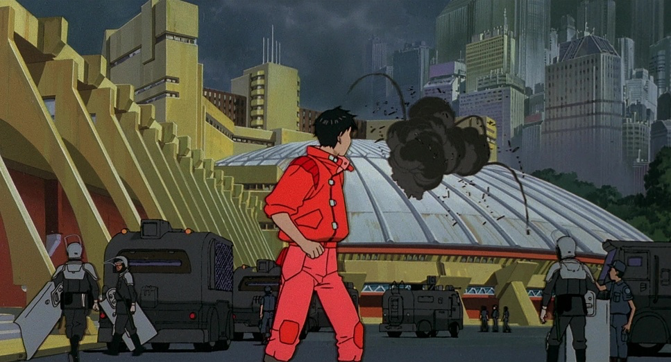
Akira is set in a Neo-Tokyo of 2019, built on the ashes of World War III. Visually, it feels like it shares DNA with Ridley Scott’s Blade Runner both deal with a dystopian future soaked in rain and neon. But Akira feels decidedly grimier.
The challenge here was condensing 2,000 pages of manga into two hours. This forced the visual team to use a kind of shorthand. They couldn’t rely on dialogue to explain the world; the environment had to do the heavy lifting. The destroyed “Old Tokyo” versus the sleek, rotting “Neo-Tokyo” isn’t just a background; it’s a character. The specific Japanese aesthetic of layering detail filling every corner of the 1.85:1 aspect ratio with debris, pipes, and wires creates a claustrophobia that explains the characters’ angst better than any monologue could.
Camera Movements: A Fluid Dance of Chaos and Control
The thing that always floors me about Akira is the parallax. In traditional animation, moving the “camera” usually means sliding a background layer. In Akira, the perspective actually shifts.
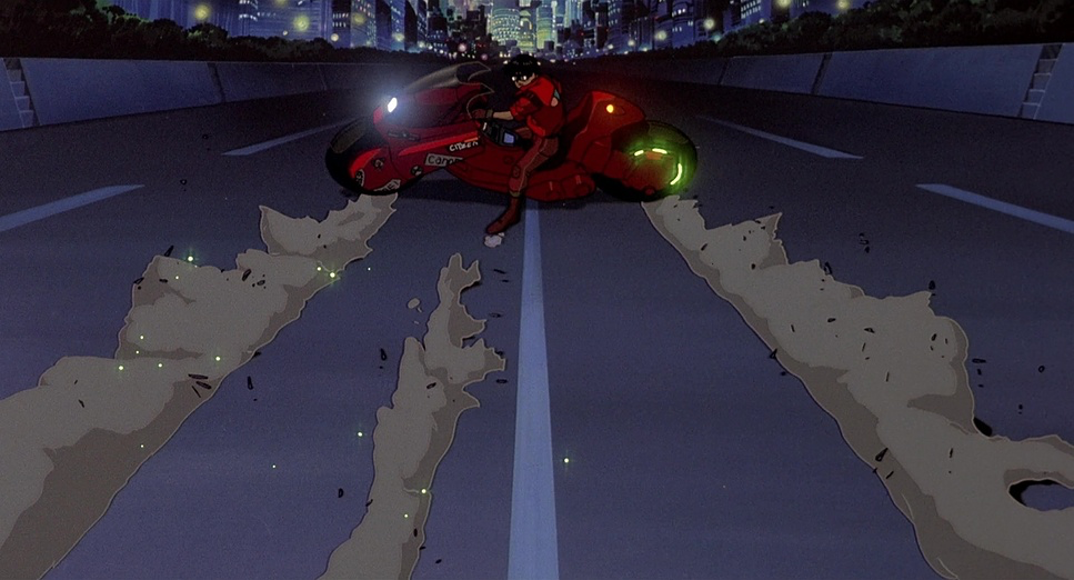
Look at the opening motorbike chase. When Kaneda’s bike drifts, the “camera” doesn’t just pan; it leans. It drops low, practically scraping the asphalt to exaggerate the speed. This mimics the behavior of a chase car or a mounted camera rig. Later, during Tetsuo’s descent into madness, the camera work stops being smooth and starts to feel “handheld.” They intentionally animated shake and jitter to mimic a cameraman struggling to keep a subject in frame. It’s a subtle touch, but it subconsciously triggers that feeling of a documentary or a newsreel, making the psychic horror feel unsettlingly real.
Compositional Choices: Layers of Meaning in Every Frame
If modern minimalism is the trend, Akira is the antidote. The composition style is pure maximalism.
Otomo and Misawa use wide shots to crush the characters. When you see the towering skyscrapers or the complex freeway systems, the characters are often tiny specs in the frame. It highlights the central theme: individual powerlessness against the machine of society. They use leading lines constantly roads, cables, beams to draw your eye through the chaos to the focal point.
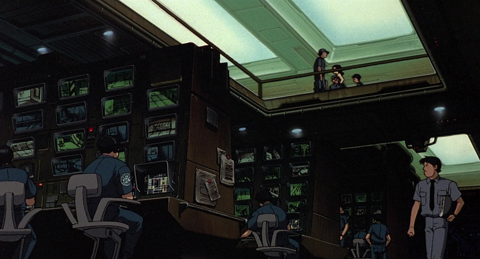
But what impresses me most is the depth blocking. They didn’t just animate the foreground. They animated the background crowds, the mid-ground traffic, and the foreground action simultaneously. It creates a volumetric feel. You get the sense that if the camera turned 180 degrees, there would be a whole world behind you, not just a blank page.
Lighting Style: Sculpting Neo-Tokyo’s Gritty Soul
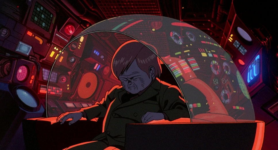
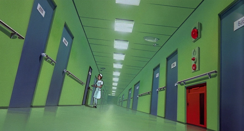
Most animated films of this era cheated on lighting. They used flat colors. Akira, however, is a night film. It lives in the dark.
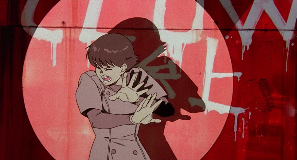
The lighting is motivated, meaning it always comes from a logical source neon signs, streetlamps, or the blinding headlights of the bikes. As a colorist, I love looking at how they handled the “spill.” When a bike tears through a tunnel, the light paints streaks across the wet pavement. They used rim lighting (that sliver of light outlining a character) to separate the bikes from the dark backgrounds, giving them a 3D, sculptural pop.
And when things explode? They don’t just flash white. They cast deep, hard shadows that move. The high-contrast ratio essentially Chiaroscuro adds a layer of drama that feels closer to a noir film than a Saturday morning cartoon.
Lensing and Blocking: Crafting Depth and Drama
Translating the concept of “lensing” to a drawing board is incredibly difficult, but Akira nails it. They simulate specific focal lengths to manipulate how we feel.
During the action sequences or psychic outbursts, the art mimics a wide-angle lens you can actually see the barrel distortion where straight lines start to curve at the edges of the frame. This exaggerates the scale of the destruction. Conversely, in the quiet, tense interrogation scenes, the space compresses, mimicking a telephoto lens that flattens the distance between characters.
The blocking (where characters stand) is also incredibly deliberate. Tetsuo is often placed lower in the frame or in the background during the first act, visually reinforcing his inferiority complex. As his power grows, he starts dominating the frame, literally taking up more space. It’s visual storytelling 101, executed perfectly.
Color Grading Approach: The Pulse of Red and the Neo-Tokyo Palette
This is where I really geek out. The palette of Akira isn’t just “cool colors” it’s a stress test for any display.
The film relies heavily on a specific, highly saturated Red. Kaneda’s bike, his jacket, the title card it’s a red that pushes right to the edge of the gamut. In the film days, keeping that red from bleeding or turning into a muddy brown on print was a nightmare. On the modern 4K HDR master, that red is luminous. It screams danger.
But beyond the red, the contrast shaping is brilliant. The blacks are crushed and dense, mimicking high-speed film stock, while the highlights have a soft rolloff. They don’t clip harshly into digital white; they bloom. The mix of cyan and green in the city lights against that deep, inky black creates a “print film” density that modern digital anime often lacks. They weren’t afraid of darkness. A lot of modern grading tries to lift the shadows so you see everything; Akiralets the shadows be scary.
Technical Aspects & Tools: Pushing Animation’s Boundaries
Akira (1988) — Technical Specifications
| Genre | Animation, Cyberpunk, Science Fiction, Traditional Animation, Satire, Technology, Political, Dystopian, Post-Apocalyptic, Body Horror, Anime |
|---|---|
| Director | Katsuhiro Otomo, Takashi Nakamura |
| Cinematographer | Katsuji Misawa |
| Production Designer | Kazuo Ebisawa, Yuji Ikehata, Koji Ono |
| Editor | Takeshi Seyama |
| Time Period | Future |
| Color | Mixed, Saturated, Blue, Magenta |
| Aspect Ratio | 1.85 – Spherical |
| Format | Animation |
| Story Location | … Japan > Tokyo |
There is a long-standing debate about whether Akira was shot on 70mm. Technically, it was likely a 70mm blow-up from a 35mm negative for the theatrical release, but the intention was always IMAX-level clarity. That’s why the detail holds up on a 4K TV today.
The other game-changer was the workflow. They recorded the dialogue first (prescoring). In Japan, the standard was to animate first and dub later. By recording first, the animators could match the lip-sync and body language to the voice actors’ actual breaths and pauses. It makes the performances feel human rather than mechanical. They also incorporated very early, primitive CGI for things like the pattern of the psychic indicator lights a rare instance of using computers not to save time, but to do something the human hand couldn’t calculate perfectly.
- Also read: BUTCH CASSIDY AND THE SUNDANCE KID (1969) – CINEMATOGRAPHY ANALYSIS
- Also read: IP MAN (2008) – CINEMATOGRAPHY ANALYSIS
Browse Our Cinematography Analysis Glossary
Explore directors, cinematographers, cameras, lenses, lighting styles, genres, and the visual techniques that shape iconic films.
Explore Glossary →