Richard Curtis’s About Time (2013) is exactly that. It isn’t trying to be a technical “masterpiece” in the traditional sense, but there is a specific genius in how it captures the humble and the intimate. I wanted to dive into this one not just as a cinephile, but from the perspective of Color Culture looking at how these visual choices create that “real yet dreamlike” warmth that makes this film such a perennial favorite.
About the Cinematographer
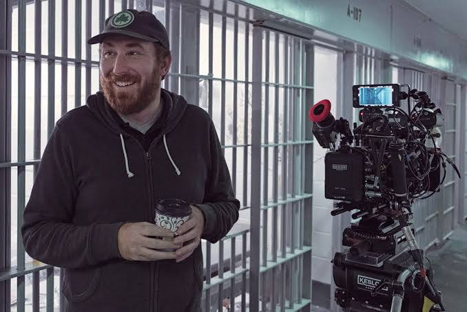
The look of About Time was crafted by John Guleserian. If you look at his resume things like Manchester by the Seaor Lady Bird you see a clear pattern: he’s a cinematographer who prioritizes the soul of a scene over visual fireworks. He has this incredible knack for naturalism.
In About Time, his collaboration with Richard Curtis is what makes the movie tick. Curtis loves sincerity; Guleserian gives that sincerity a visual home. It doesn’t feel like you’re watching a “set.” It feels like you’ve been invited into a family’s private life. It’s a masterclass in restraint, proving that you don’t need a 50-foot crane move to tell a powerful story.
Inspiration Behind the Cinematography
Richard Curtis was very vocal about wanting the film to feel like “sunshine and water.” He wasn’t looking for a spectacle; he was looking for an emotional connection. This is the “secret sauce” of the film’s DNA.
The inspiration seems to be the “perfect nexus of raw reality and unapproachable imagination.” For me, that translates to a visual strategy where the foundations are grounded in realism, but then subtly elevated to feel like a memory. It’s about making the mundane look beautiful. Tim’s journey is about reliving ordinary days to find the joy in them, and the cinematography acts as a gentle embrace of that philosophy. It’s an affirmation of life, plain and simple.
Lensing and Blocking
Technically, the film has a very specific texture because of the glass Guleserian chose. They shot on Hawk V-Lite 1.3x anamorphic lenses. As a colorist, I love these lenses because they give you that anamorphic character the subtle edge fall-off and organic flares without being “too much.” They soften the world just enough to make it feel inviting.
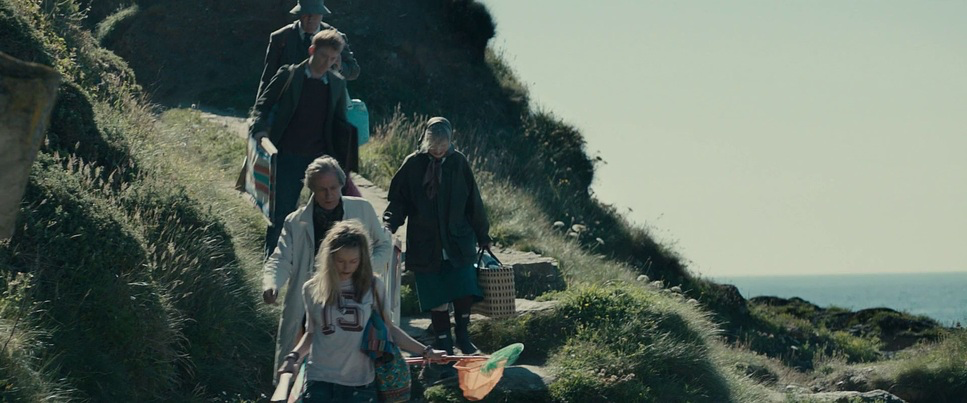
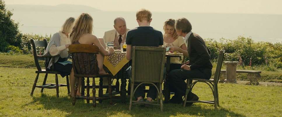
The blocking follows suit. It’s never fussy. In the family scenes, you’ll notice the characters are often clustered together, creating a visual sense of “kaleidscopic entanglement.” When Tim and Mary are together, the camera gets physically close. There’s a tangible intimacy in their proximity. It feels like real people interacting in a real space, which is why the “time travel” elements never feel jarring or out of place they are grounded by the human blocking.
Camera Movements
The camera in About Time is remarkably quiet. You aren’t going to see aggressive whip-pans or dizzying moves that pull you out of the moment. Instead, it’s primarily observational.
Dolly moves are used, but they’re almost invisible just a gentle glide to reveal a new beat in a conversation. Handheld work is kept on a tight leash, used only to add a documentary-like intimacy to family moments without ever becoming distracting. The pacing of the camera mirrors the story: it’s measured and deliberate. It gives the emotional beats room to breathe, reinforcing the film’s core message that “moments are all that matter.”
Compositional Choices
The compositions here are a lesson in “elegant simplicity.” Guleserian avoids over-stylizing, opting for frames that feel effortless.
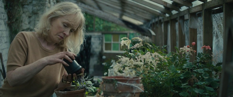
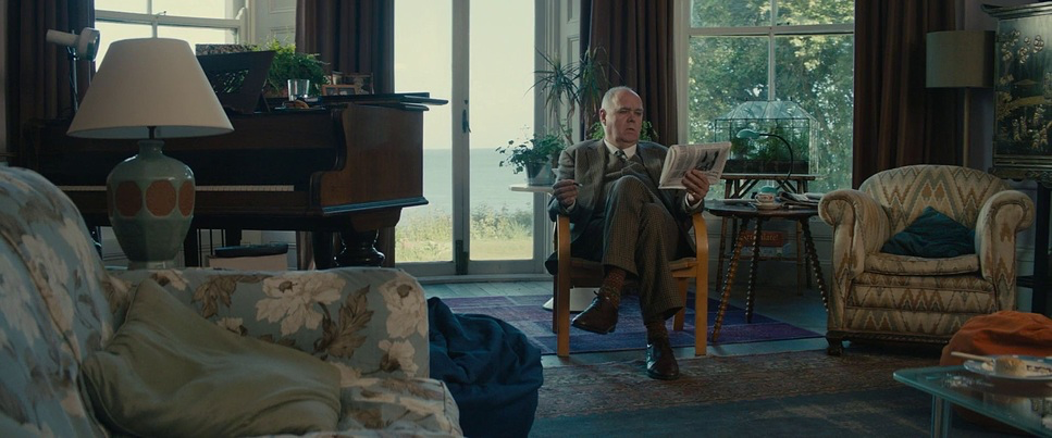
Medium shots and close-ups are the workhorses here, especially for Tim and Mary, to keep the focus on facial expressions and subtle gestures. Even the famous “tube montage” is incredibly honest simple, unadorned frames that capture the routine of love. There’s no flash, no melodrama. Even the climax a boy playing on a beach with his dad is just a straightforward, unpretentious shot. It proves that the most impactful frames are often the ones that simply get out of the way and let the humans shine.
Lighting Style
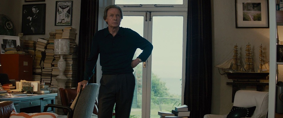
Now, this is where it gets interesting. The metadata for the film often lists “Hard light,” but as a viewer, it feelsincredibly soft. That’s the magic of Guleserian’s work here. He uses the hard Cornish sun but manages to keep the contrast low and the feeling airy.
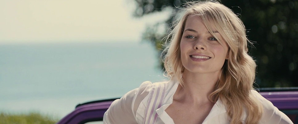
It’s predominantly a high-key approach, but it’s never sterile. It’s infused with a radiant warmth. Even the “rainy wedding” scene doesn’t feel gloomy; it has an ethereal quality that makes the downpour feel romantic. The use of golden hour is particularly effective, creating a nostalgic, idyllic beauty in the family home scenes. The highlights have a painterly quality a soft roll-off that embraces the characters rather than exposing them.
Color Grading Approach
This is my favorite part to dissect. If I were sitting at the panel for this film, my primary goal would be protecting those skin tones. Colorist Aurora Shannon did a beautiful job ensuring the characters look healthy and vibrant, with a subtle golden hue that suggests vitality.
The palette follows Curtis’s “red and blue” directive. You see it in Mary’s red dress and the deep, clean blues of the Cornish coast. My approach would be to push the saturation in the mid-tones while keeping the highlights soft and “angelic.” I’d aim for a print-film sensibility giving the colors a certain density and richness that feels like a classic film stock, even though it was shot digitally. It’s a grade that makes you want to live in that world. It isn’t saccharine or “fake” sweet; it’s intentionally warm, designed to evoke empathy and comfort.
Technical Aspects & Tools
About Time (2013)
ARRI Alexa M • Hawk V-Lite Anamorphic • 2.39:1
| Genre | Comedy, Drama, Magical Realism, Science Fiction, Time Travel, Music, Musical, Satire, Rom-Com, Holidays, Wedding |
| Director | Richard Curtis |
| Cinematographer | John Guleserian |
| Production Designer | John Paul Kelly |
| Costume Designer | Verity Hawkes |
| Editor | Mark Day |
| Colorist | Aurora Shannon |
| Time Period | 2010s |
| Aspect Ratio | 2.39 – Anamorphic |
| Format | Digital |
| Lighting | Hard light, Low contrast |
| Lighting Type | Daylight, Sunny |
| Story Location | England > Cornwall |
| Filming Location | England > Cornwall |
| Camera | ARRI ALEXA M |
| Lens | Hawk V-Lite 1.3x |
| Resolution | 2K |
For the gear nerds: About Time was shot on the ARRI Alexa M. Even back in 2013, the Alexa was the gold standard for skin tones and highlight roll-off. When you pair that sensor with the Hawk V-Lite 1.3x lenses, you get a 2.39:1 aspect ratio that feels cinematic but still deeply personal.
The 2K resolution might seem “low” by today’s 8K standards, but for a character-driven drama, it’s actually a blessing. It keeps the image from being hyper-sharp or clinical. The Digital Intermediate (DI) workflow was clearly used to sculpt that “lovely” aesthetic, allowing for the fine-tuning of those “sunshine and water” tones. It’s a perfect example of how technical tools, when used with restraint, can elevate a story into something profound.
- Also read: THE GENTLEMEN (2019) – CINEMATOGRAPHY ANALYSIS
- Also read: THE IRISHMAN (2019) – CINEMATOGRAPHY ANALYSIS
Browse Our Cinematography Analysis Glossary
Explore directors, cinematographers, cameras, lenses, lighting styles, genres, and the visual techniques that shape iconic films.
Explore Glossary →