let’s grab a coffee and actually get into A Streetcar Named Desire. It’s not just “classic cinema” it’s a masterclass in how you can weaponize a frame to mess with an audience’s head. This isn’t about pretty pictures; it’s about using black and white to build a world that feels as sweaty, claustrophobic, and crumbling as Blanche’s mental state.
About the Cinematographer
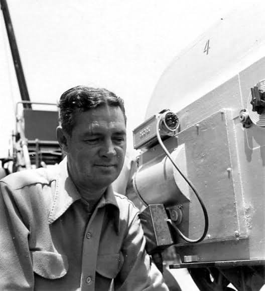
When you look at the visual DNA of Streetcar, you’re looking at the handiwork of Harry Stradling Sr. The guy was a legend. While most people focus on Elia Kazan’s direction or Marlon Brando’s “method” acting, us tech-heads know the real heavy lifting was done by Stradling. He had this incredible career that bridged the gap between old-school Hollywood glamor and the raw, gritty New Hollywood style. He didn’t just “light” a scene; he sculpted it. He knew exactly how to make a 35mm frame feel tactile like you can almost smell the New Orleans humidity long before we had digital grain overlays or HDR tools.
Color Grading Approach (or lack thereof, and its implications)

I want to jump straight into the “grade,” or at least how we’d view it today. As a colorist, I’m obsessed with how this film handles tonality. In a world without hue or saturation, your only tools are luminance and value separation. Stradling was doing “digital grading” in the lab decades before it was a thing.
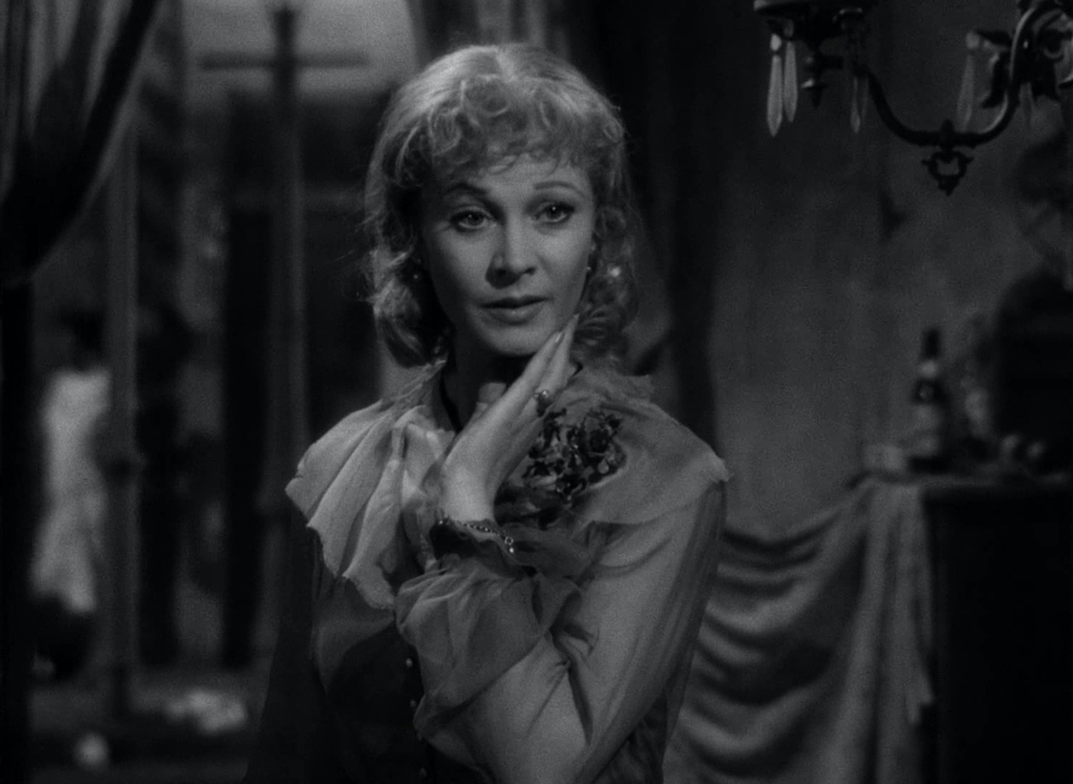
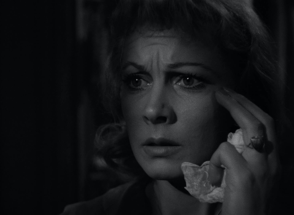
Look at the highlight roll-off in this film. In the scenes where Blanche is under her paper lantern, the lights don’t just “clip” to white; they bloom. It’s this soft, ethereal glow that masks her age and her past, exactly like she wants. Then you have the blacks deep, inky, and oppressive that represent Stanley’s world. We talk about “dynamic range” all the time now, but the way they pushed and pulled the film stock here to get that specific grayscale is more sophisticated than half the stuff I see on Netflix today. It’s proof that you don’t need a color wheels to create a “look.”
Lighting Style
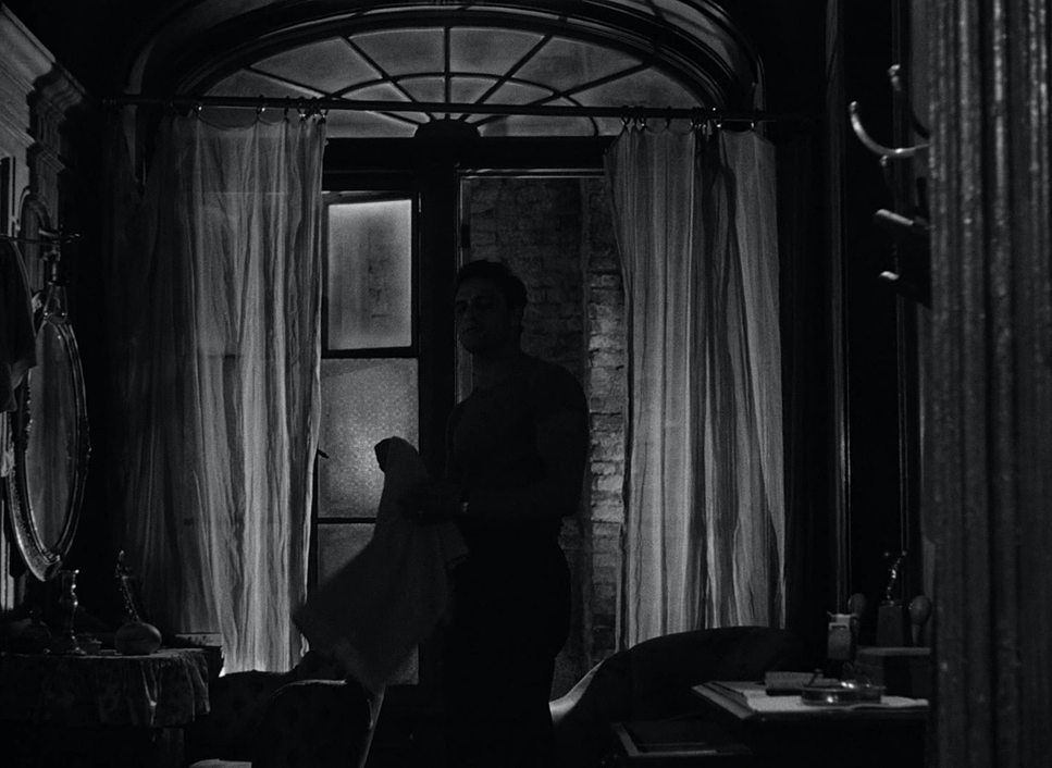
The lighting here is basically film noir’s aggressive cousin. It’s all about Chiaroscuro harsh shadows and high-contrast pockets of light. But it’s all motivated. You’ve got that iconic paper lantern over a bare bulb, which isn’t just a prop; it’s a lighting strategy.
Blanche says, “Soft people have got to shimmer and glow,” and Stradling took that literally. He uses heavy diffusion on her to create that “butterfly wing” texture. Meanwhile, he hits Stanley with hard, unforgiving top-light and side-light. It makes his skin look oily, his muscles look like granite, and it strips away any “glow.” It’s a visual battle between Blanche’s filtered illusions and Stanley’s brutal reality. When Stanley finally rips that lantern off the bulb, the lighting shift is like a physical punch.
Inspiration Behind the Cinematography
The “vibe” of this film is pure decay. The transcripts and the play both harp on this “shabby, dilapidated” apartment in Elysian Fields, and the cinematography leans into that 100%. This isn’t a set; it’s a pressure cooker.
You’ve got the clash of two different eras. You have Blanche in her pearls and traveling suit the “fading belle”—dropped into a New Orleans slum where Stanley is undressing in the middle of the room. The inspiration for the look comes from that friction. The camera captures the grime of the walls and the sweat on the brows to make sure the audience feels just as trapped as Stella and Blanche. It’s about externalizing the nervous breakdown that’s happening off-screen.
Camera Movements
The camera work in Streetcar is actually pretty restrained, which makes it more effective. It’s not showy for the sake of being showy. It feels restless. When Blanche is panicking, the camera is right there, feeling slightly “off,” mirroring her disorientation.
Think about the scene where Stanley bellows “Stella!” outside. The camera doesn’t need to do a 360-degree spin; it just holds on that raw, animalistic desperation. When Stanley “charges” Stella and we hear the hit off-screen, the camera’s stillness is what makes it haunting. It forces your imagination to do the work. The movement is always intentional following a shift in power or a sudden burst of violence rather than just “covering” the scene.
Compositional Choices
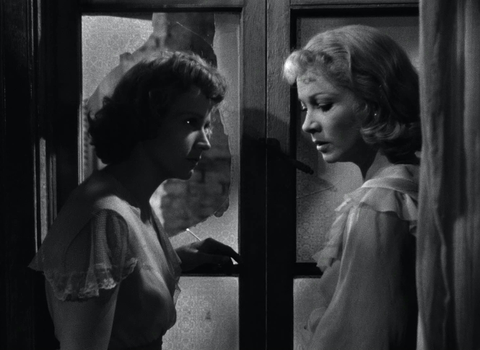
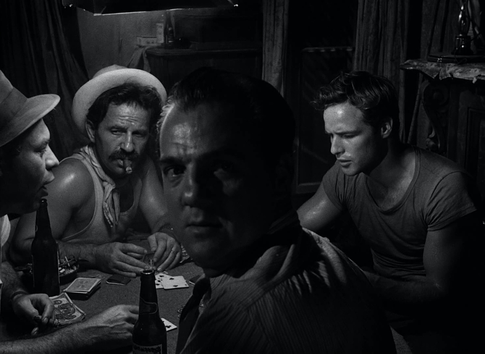
If you want to learn how to frame for psychological tension, study the Kowalski apartment. It’s a cage, plain and simple. Stradling and Kazan use the 1.37:1 aspect ratio to box Blanche in. There’s almost no “negative space” for her to breathe.
They use depth cues to show who’s winning. Usually, Stanley is composed to fill the frame he’s big, physical, and imposing. Blanche is often shoved into a corner or framed through doorways and bedposts, making her look like she’s already behind bars. It’s a predator-and-prey dynamic played out through blocking and framing. Even the outdoor shots in New Orleans feel dense and cluttered. There’s no escape for her, and the composition makes sure you know it.
Lensing and Blocking
Blocking in Streetcar is almost like a violent dance. The physical proximity is what makes it so uncomfortable. You’ve got Marlon Brando constantly invading people’s personal space, looming over them, being “as crass as they come.” The way he takes up space compared to how Vivien Leigh shrinks away tells the whole story before a single line is spoken.
On the tech side, they used the Mitchell BNC with medium glass for most of this. The wider lenses in those tight rooms slightly distort the space, which helps sell that “walls are closing in” feeling. And that staircase scene? The way Stanley sinks to his knees and Stella bends over him it’s choreographed perfectly. The lens just sits back and lets that raw, physical interplay happen.
Technical Aspects & Tools
A Streetcar Named Desire | 35mm • 1.37:1 • B&W
| Genre | Drama, Stage Adaptation, History, Melodrama |
| Director | Elia Kazan |
| Cinematographer | Harry Stradling Sr. |
| Production Designer | Richard Day, Bertram Tuttle |
| Costume Designer | Lucinda Ballard |
| Editor | David Weisbart |
| Time Period | 1940s |
| Color | Desaturated, Black and White |
| Aspect Ratio | 1.37 – Spherical |
| Format | Film – 35mm |
| Lighting | Hard light, Low contrast, Top light |
| Story Location | New Orleans, Louisiana |
| Filming Location | New Orleans, Louisiana |
| Camera | Mitchell BNC |
We have to remember this was 1951. They didn’t have Gimbal rigs or SmallHD monitors. They were lugging around massive 35mm Mitchell BNC cameras. Every shot required a massive setup with hot, incandescent lamps and heavy dollies.
Shooting on 35mm film stock back then meant you had to know exactly what you were doing with exposure there was no “checking the LUT” on a monitor. The “paper lantern” trick was a brilliant, low-tech way to get a specific look. It reminds me that even today, with all our fancy AI and digital tools, the best solutions are usually the simplest ones born out of necessity.
- Also read: TALK TO HER (2002) – CINEMATOGRAPHY ANALYSIS
- Also read: DANCER IN THE DARK (2000) – CINEMATOGRAPHY ANALYSIS
Browse Our Cinematography Analysis Glossary
Explore directors, cinematographers, cameras, lenses, lighting styles, genres, and the visual techniques that shape iconic films.
Explore Glossary →