There’s a specific kind of magic in the rattle of a projector or even just the opening frame of a restored 35mm print that pulls me back to Sergio Leone’s A Fistful of Dollars (1964). This film isn’t just a Western; it’s a masterclass in how to tell a story with nothing but a raw, uncompromising lens and a lot of guts. It essentially reset the compass for the entire genre.
What really hits me about Fistful is its sheer audacity. Leone dared to give us an anti-hero when everyone else was still wearing “white hats” and playing by the rules. But more than the plot, it’s the visual style that sticks—that weird, beautiful mix of epic scale and claustrophobic tension. It’s a film that demands you look closer, not just at the “Man with No Name” playing two gangs against each other, but at how that tension is literally baked into the grain of the film.
About the Cinematographer
When we talk about the look of this film, we have to talk about the hands that actually moved the lights. While Leone is the mastermind, the cinematography was a real collaborative grind, primarily by Massimo Dallamano (though he was credited as Jack Dalmas a common move in the Italian “pseudonym era”). Carlo Carlini also put in work. Dallamano wasn’t just some guy for hire; he was an innovator who eventually went on to direct.
Working with Leone meant Dallamano wasn’t just “getting the shot.” He was defining a new visual grammar. This wasn’t the clean, golden-hour American West. This was a sun-baked, gritty, and often disgusting landscape. I’ve always felt that the budget constraints actually helped them. They couldn’t afford “pretty,” so they went for “immediate.” They forged what I call a “primordial” form of filmmaking stripping everything down to the visceral essentials. It just goes to show: sometimes the best styles come from necessity, not a blank check.
Inspiration Behind the Cinematography
It’s no secret that A Fistful of Dollars is a riff on Kurosawa’s Yojimbo. But the influence goes way deeper than the “ronin-becomes-cowboy” plot. It’s in the visual philosophy. Kurosawa loved deep focus and wide lenses that let the action play out in a single, static frame. Leone and Dallamano took that and “Spaghetti-fied” it.
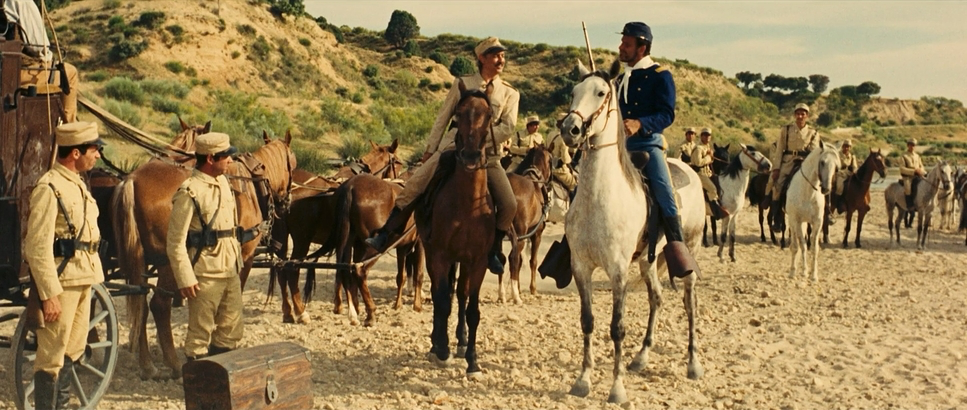
They took the barren landscapes of Spain, stood them in for Mexico, and created a town (San Miguel) that feels suffocatingly tense. The cinematography takes that bleakness and makes it beautiful in a stark, harsh way. It’s all about the juxtaposition: you have these massive, empty expanses, and then bam an extreme, almost grotesque close-up. It’s a world where the characters are just small dots in a moral wasteland, and the camera makes sure you feel that indifference.
Camera Movements

In Fistful, the camera doesn’t do a graceful ballet. It attacks. Leone and Dallamano used the zoom lens like a weapon. Nowadays, a lot of DPs shy away from the zoom, but here, it’s a surgical tool. They use it to punctuate a moment snapping from a wide shot of a dusty street directly into an extreme close-up of a character’s eyes.
It gives the action this “seat-of-your-pants” energy. Then you have the quick pans and tilts during the gunfights that feel almost like a documentary. It’s raw. The camera isn’t an invisible observer; it’s a participant. It’s active, it’s dynamic, and it works with the rapid-fire editing to make sure those reaction shots really land. It’s not about “elegant gliding”—it’s about high-stakes drama.
Compositional Choices
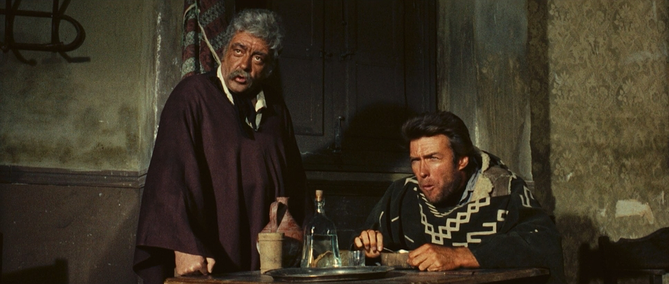
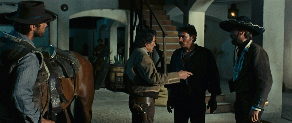
Composition here is a study in purposeful tension. The film is obsessed with the contrast between the vast and the minuscule. You’ll have an expansive wide shot that shows how lonely San Miguel really is, with a figure looking tiny against the landscape.
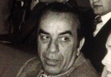
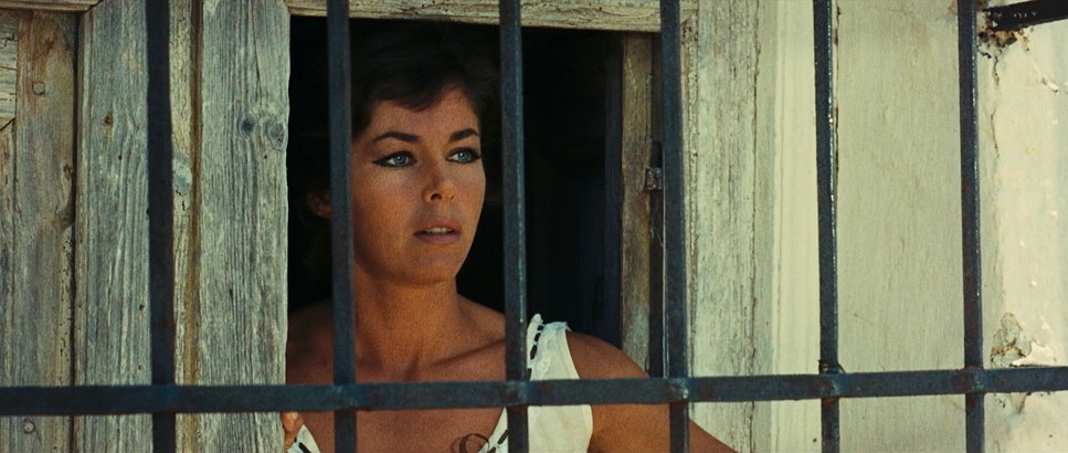
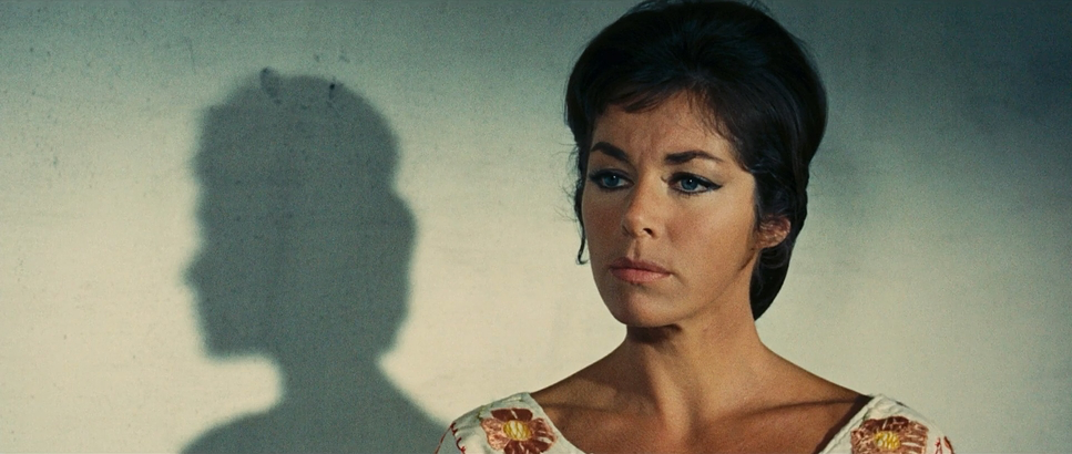
Then, Leone hits you with his signature: the extreme close-up (ECU). I’ve heard it said that “the eyes are the most important thing in this story,” and as a colorist, I couldn’t agree more. These ECUs are narrative devices. We’re forced to read the cunning, fear, or resolve in a single flicker of a gaze. When Marisol looks at Joe, you feel that scowl. It creates this psychological intensity where every twitch of a lip holds a “mere scrap of information” that could mean life or death. The low angles on the holsters and the eye-level staring contests? Iconic.
Lighting Style
The lighting in this film is as unforgiving as the desert. Since they were filming under the brutal Spanish sun, they leaned into high contrast as a core look. This isn’t soft, “beauty” lighting. It’s sharp, defined, and full of deep, impenetrable shadows.
The sun is simply there. It carves out the textures of the dusty clothes and the weathered faces. Indoors, they went for a chiaroscuro vibe pockets of light from oil lamps or windows. For me, the most impressive part is the dynamic range. Shooting on 35mm, Dallamano was able to keep the highlights from “clipping” (that nasty digital white-out) while keeping the blacks rich and weighty. It amplifies that “gritty tone” where every shadow feels like a threat and every highlight feels like a piercing glare.
Lensing and Blocking
This is where things get really interesting from a technical standpoint. Leone loved using wide-angle lenses for tight close-ups. Usually, you’d use a long (telephoto) lens to make a portrait look “flattering,” but Leone wanted the opposite.
By using a wide lens up close, he gets this slight, impactful distortion that brings you right into the character’s personal space. It feels raw and unfiltered. In my own work, I’m always debating that line the “beauty” of a long lens versus the visceral “honesty” of a wider one. Leone balanced it perfectly.
The blocking is just as calculated. Look at the standoffs: the characters are placed in these strong, symmetrical spots that highlight their isolation. Joe (Eastwood) is often framed alone or observing from a high vantage point. It reinforces the fact that he’s the outsider looking in, deconstructing these gangs like a chess player.
Color Grading Approach
Now, we didn’t have digital suites in 1964, but as a colorist, I can see exactly what the “intended grade” was. The gritty tone is built on a specific print-film sensibility.
If I were grading this today, my goal would be to honor that organic highlight roll-off that soft way the sun-drenched skies fade away. The palette is intentionally desaturated: browns, ochres, and dusty greens. As a colorist, I’d be sculpting the tonal values to keep those shadows mysterious. I’d pull the dusty yellows away from the earthy tones just enough to make the skin tones feel sun-baked and warm against a cold, desolate background. There’s a beauty in that almost monochromatic feel; it’s grounded, impactful, and timeless.
Technical Aspects & Tools
| Genre | Action, Western, Outlaw, Spaghetti Western, Epic |
| Director | Sergio Leone |
| Cinematography | Federico G. Larraya, Massimo Dallamano |
| Production Design | Carlo Simi |
| Costume Design | Carlo Simi |
| Editor | Roberto Cinquini, Alfonso Santacana |
| Time Period | 1800s |
| Color Palette | Warm |
| Aspect Ratio | 2.35 – Anamorphic |
| Format | Film – 35mm (Techniscope) |
| Lighting | Hard light, High contrast |
| Lighting Type | Sunny / Direct |
| Story Location | Mexico > San Miguel |
| Filming Location | Spain > Madrid |
| Camera | Arri 2c (IIc), Arriflex 35 IIC |
The tech behind Fistful is fascinating because it was all about “hacking” the budget. They used Techniscope, a 2-perf 35mm process. Basically, they halved the film consumption to save money, but it gave the image a wider, 2.35:1 aspect ratio with a grittier texture because the negative was smaller.
They were likely using Arriflex 35 IIC (Arri 2C) cameras robust, “workhorse” machines. In the hands of someone like Dallamano, these tools were more than enough. This blend of technical ingenuity (Techniscope) and artistic vision shows that you don’t need the most expensive kit to make a masterpiece; you just need to know how to make the technology serve the story.
- Also read: TRUE ROMANCE (1993) – CINEMATOGRAPHY ANALYSIS
- Also read: WALK THE LINE (2005) – CINEMATOGRAPHY ANALYSIS
Browse Our Cinematography Analysis Glossary
Explore directors, cinematographers, cameras, lenses, lighting styles, genres, and the visual techniques that shape iconic films.
Explore Glossary →