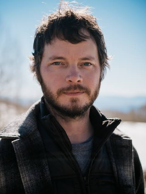
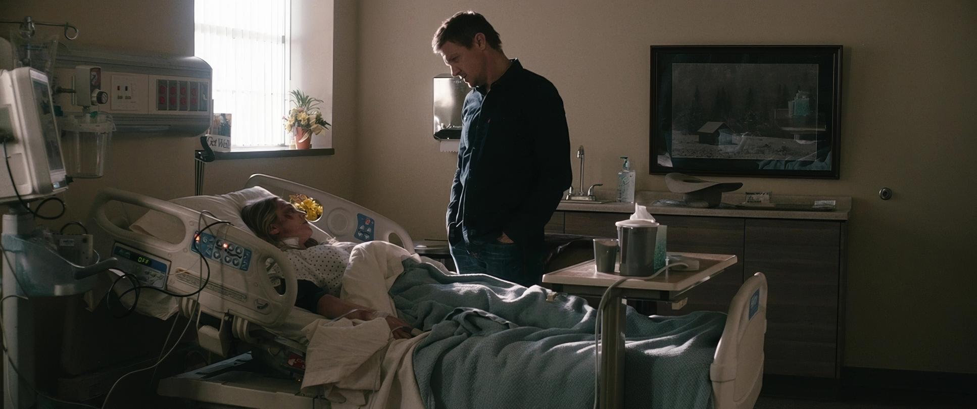
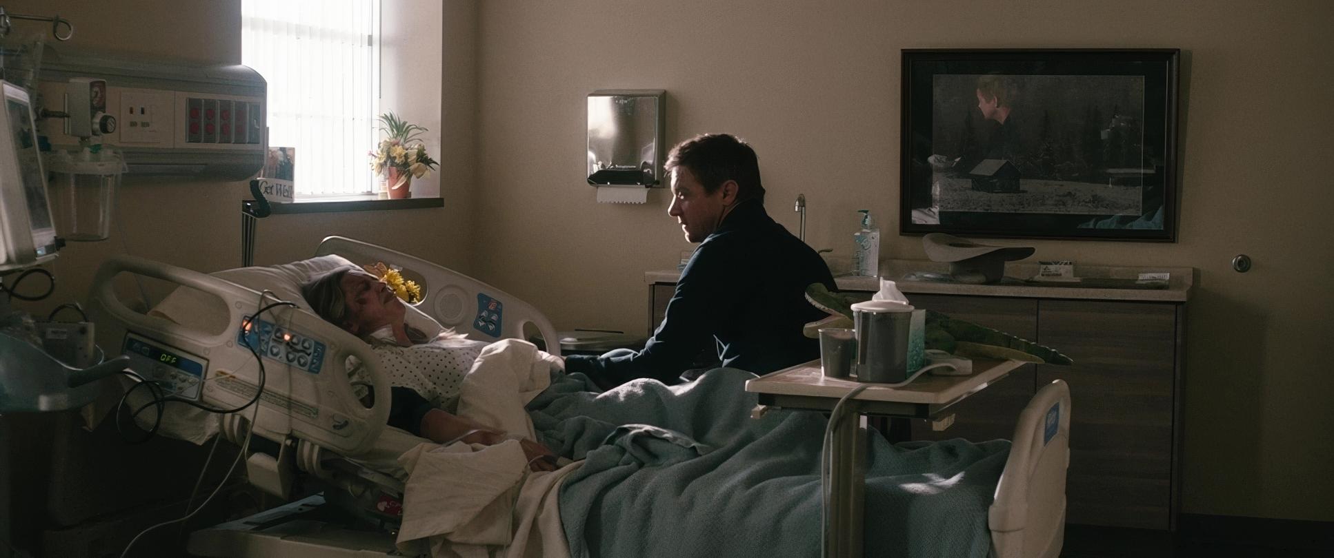
Taylor Sheridan’s Wind River (2017) is one of those films that just lodges itself in your brain and refuses to let go. It’s a masterclass in atmospheric storytelling, where the environment isn’t just a backdrop but a relentless force a character as compelling and unforgiving as any human in the narrative. The story of Jeremy Renner’s Cory Lambert and Elizabeth Olsen’s Jane Banner is brutal and poignant. But what truly elevates it for me is the sheer power of its visual language. It’s the kind of film that makes you feel the biting cold in your bones.
That, my friends, is where the cinematography truly shines.
Inspiration Behind the Cinematography

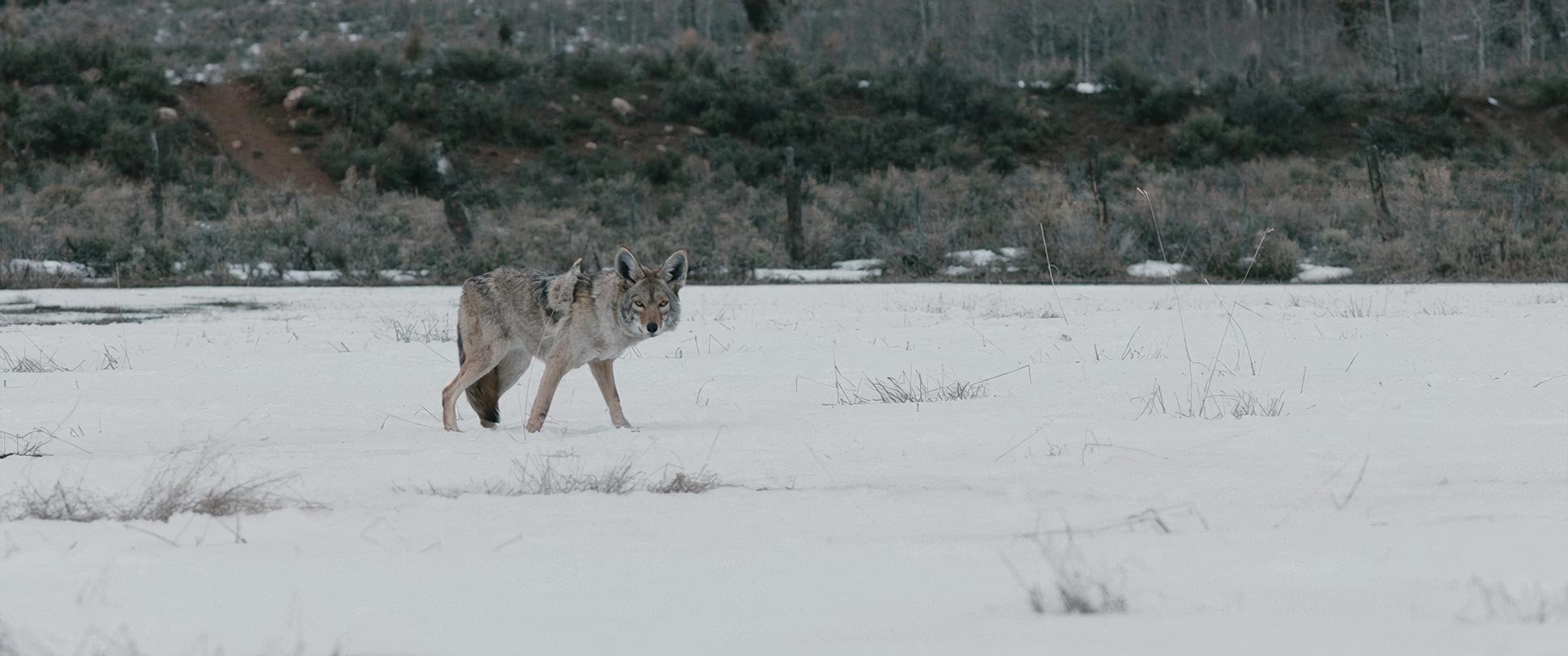
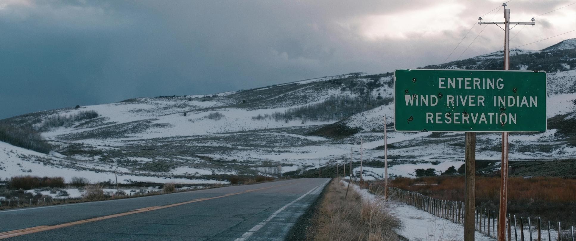
When I look at Wind River, the overriding inspiration feels deeply rooted in the concept of a “hostile wilderness.” The film’s aesthetic isn’t just about pretty pictures of snow; it’s about conveying a pervasive sense of danger and entrapment. As one reviewer aptly put it, the location “infects everyone in it.” This isn’t a world where nature offers solace; it’s a world where nature actively conspires against its inhabitants.
The cinematography draws heavily from the American Western tradition, but it subverts the myth. Instead of glorifying the frontier, it emphasizes its brutality. I sense a clear intent to marry the emotional landscape of the characters their grief, anger, and resilience with the physical landscape. It’s a visual manifestation of how a place can dictate your worldview and keep you restricted to nothing more than basic survival. In this film, the cinematography is the loudest voice.
About the Cinematographer
The visual architect behind this stark beauty is Ben Richardson. If you’ve spent any time studying modern indie cinema, his name should ring a bell. He’s known for a raw, naturalistic style, often collaborating with directors who prioritize emotional authenticity over flashy visuals. Richardson has a knack for making landscapes feel lived-in and dangerous look at his work on Beasts of the Southern Wild for proof.
For Wind River, his collaboration with Sheridan felt utterly synergistic. Sheridan’s scripts are deeply rooted in place, demanding a visual counterpart that can translate geographic and cultural texture onto the screen. Richardson, with his keen eye for natural light, was the perfect fit to bring the inherent menace of the Wyoming wilderness to life. He understands that a quiet shot of a snow-covered peak can speak volumes about isolation.
Technical Aspects & Tools
| Genre | Crime, Drama, Mystery, Thriller, Murder Mystery, Contemporary Western, Western, Political, Epic, Detective, Neo-Noir |
| Director | Taylor Sheridan |
| Cinematographer | Ben Richardson |
| Production Designer | Neil Spisak |
| Costume Designer | Kari Perkins |
| Editor | Gary D. Roach |
| Colorist | Mitch Paulson |
| Time Period | 2010s |
| Color | Desaturated |
| Aspect Ratio | 2.39 – Spherical |
| Format | Digital |
| Lighting | Soft light, Low contrast |
| Lighting Type | Daylight, Overcast |
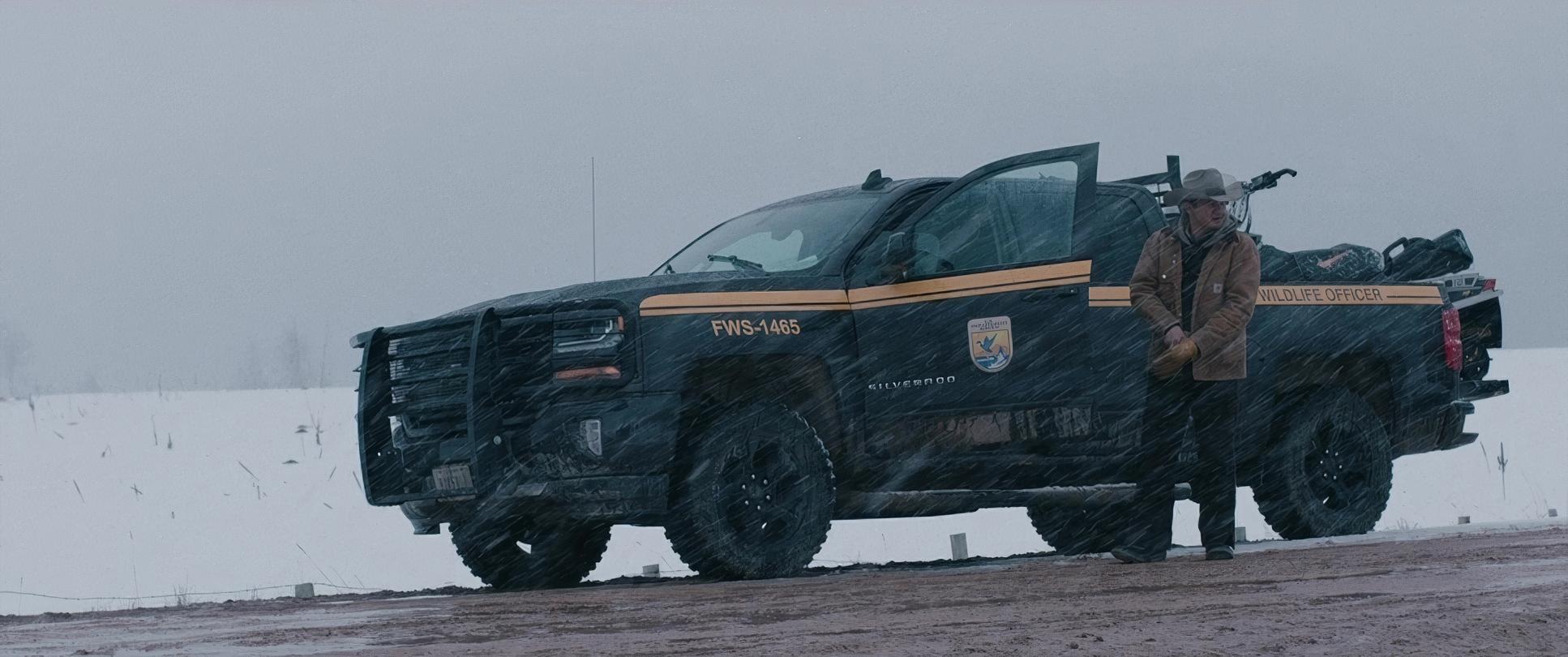
| Story Location | United States > Wyoming > Wind River Indian Reservation |
| Filming Location | United States > Utah |
| Camera | ARRI ALEXA XT / XTplus |
| Lens | Zeiss Standard Primes, Angenieux Optimo Zooms |
| Film Stock / Resolution | 2.8K / 2.8K ArriRaw |
To capture that frigid reality, Richardson opted for the ARRI ALEXA XT, shooting in 2.8K ArriRaw. As a colorist, I can tell you: that choice was critical. When you’re dealing with blindingly white snow and deep, dark shadows in the same frame, you need every bit of that Alexa dynamic range to prevent the highlights from clipping into a digital mess.
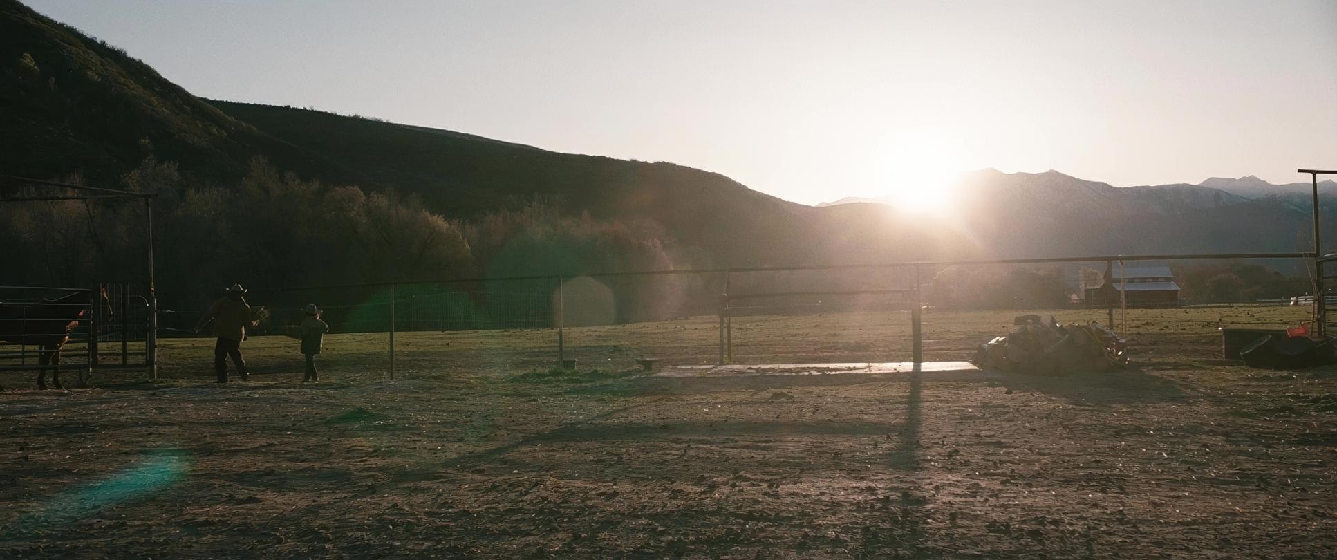
He paired the sensor with Zeiss Standard Primes and Angenieux Optimo Zooms. The Zeiss glass is legendary for being sharp without feeling “clinical” it retains a texture that feels human. Choosing the 2.39:1 aspect ratio was the final touch, emphasizing the expansive horizontal lines of the landscape and making the environment feel even more imposing. It’s a classic cinematic choice, but here, it serves to swallow the characters whole.
Lensing and Blocking
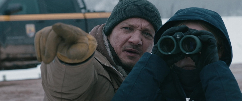
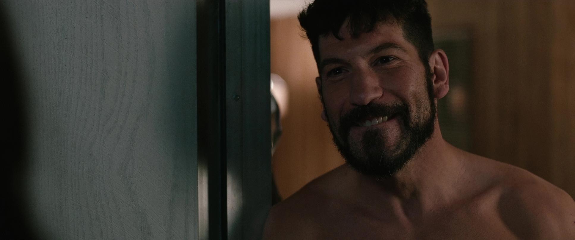
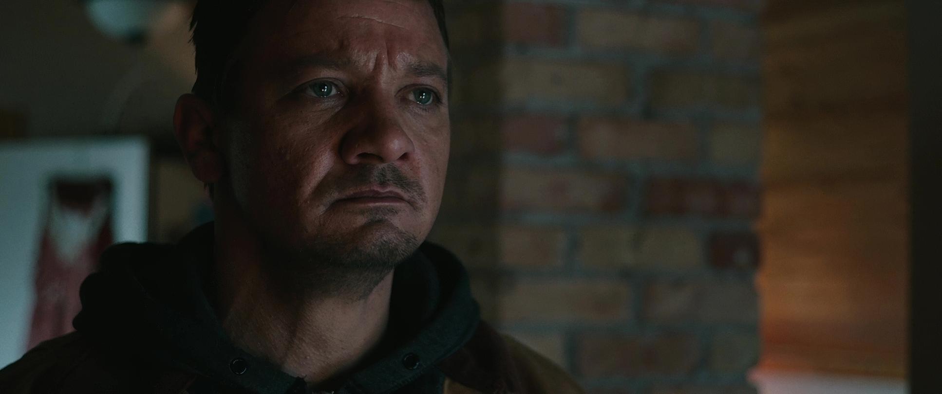
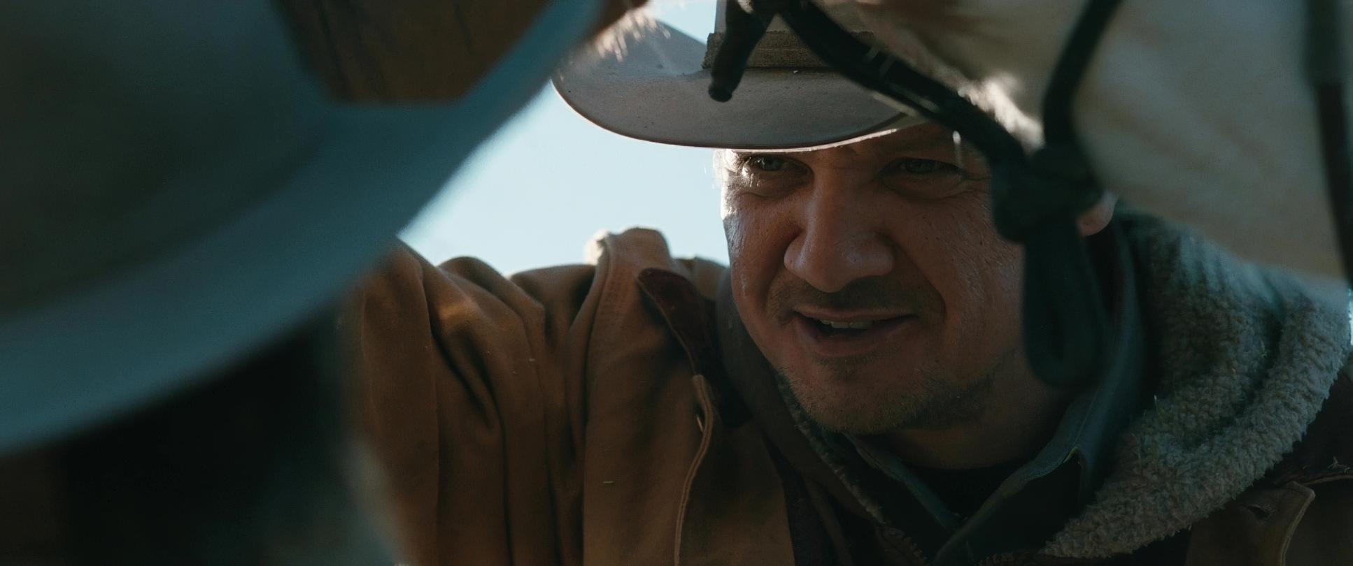
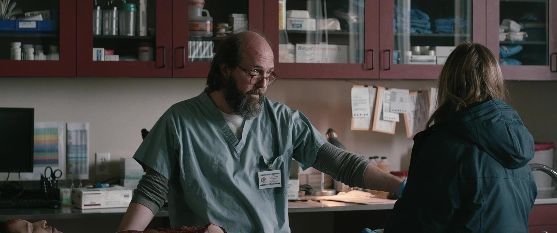
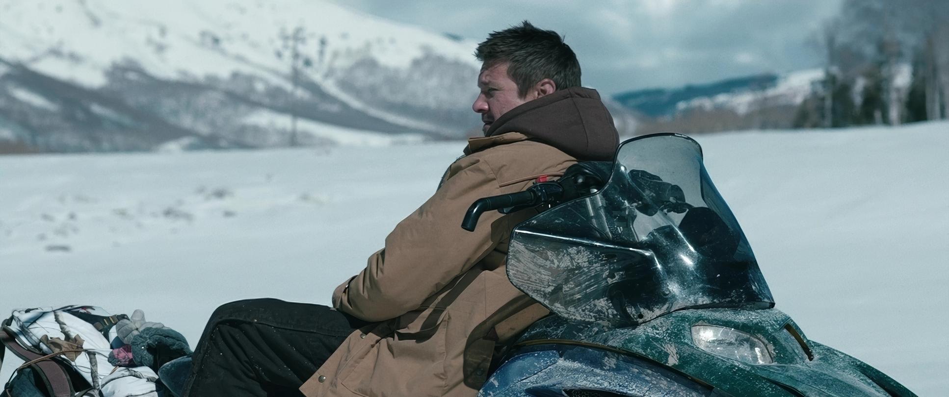
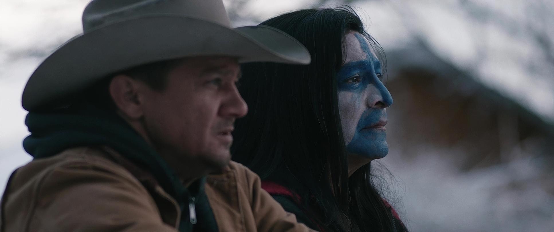
Richardson’s lensing choices are a study in versatility. While he uses those wide-angle primes to capture the scale of the environment, he isn’t afraid to jump to medium-to-long focal lengths for the intimate moments. These longer lenses compress the background, forcing us to focus on the nuanced performances of Jeremy Renner and Gil Birmingham.
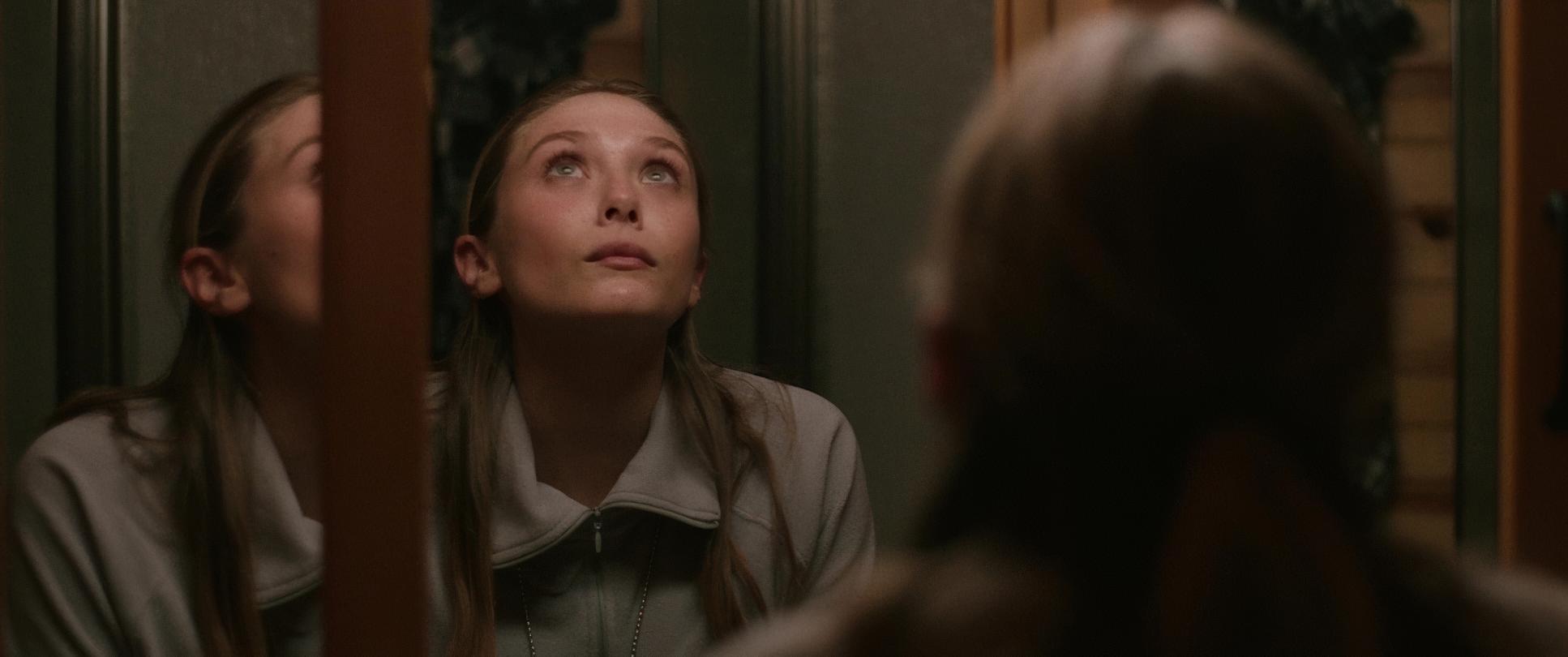
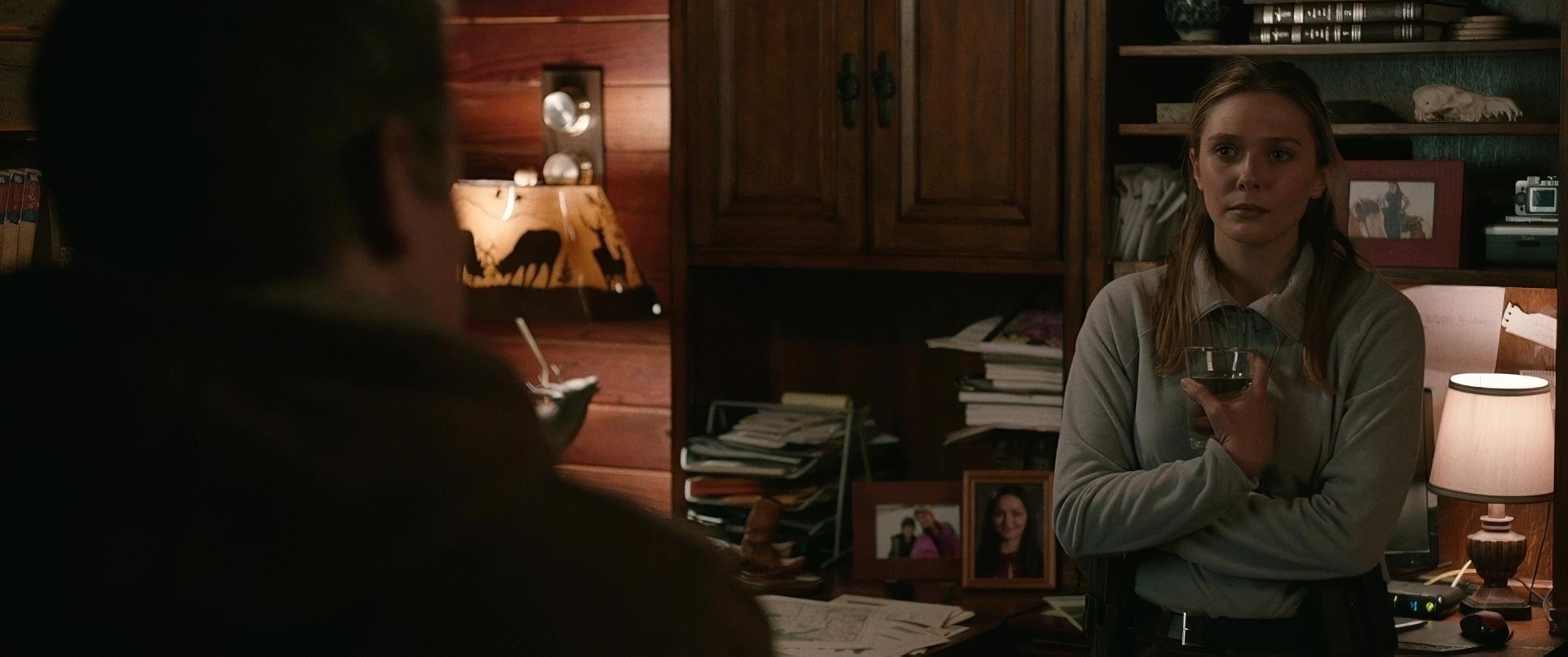
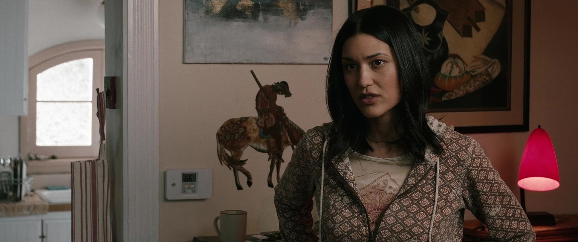
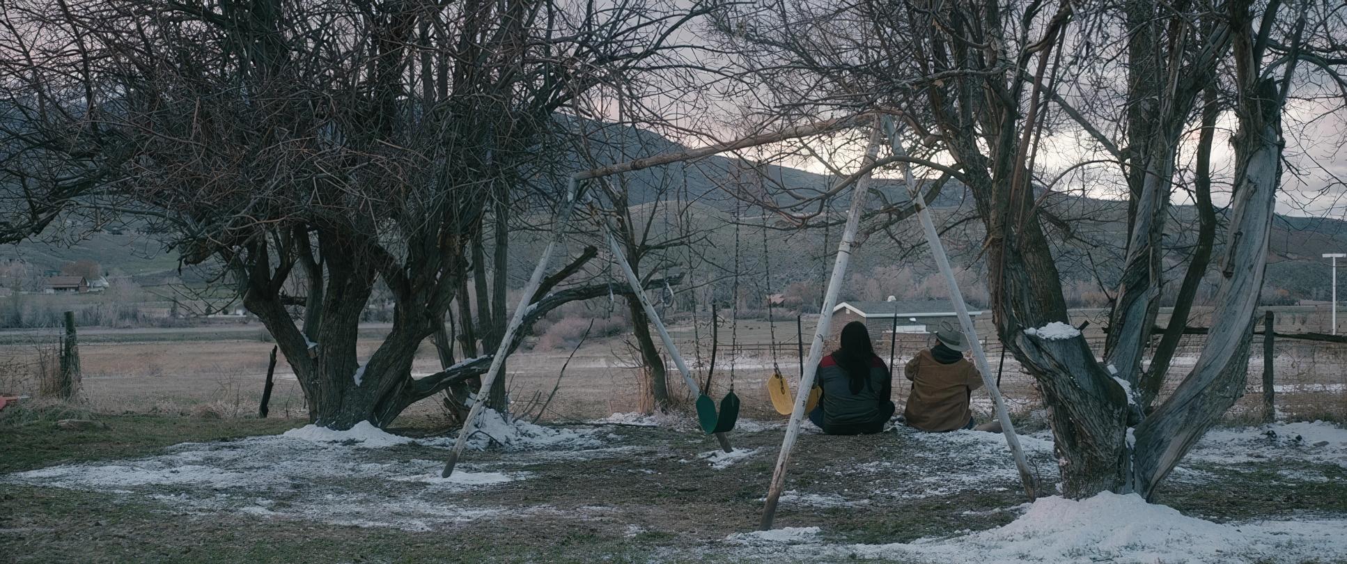
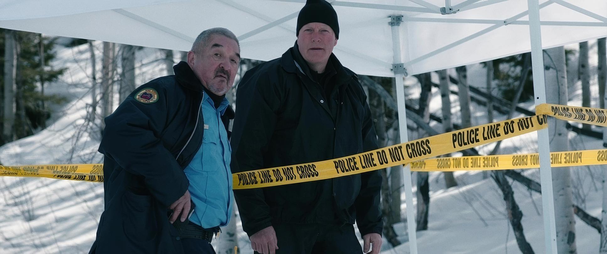
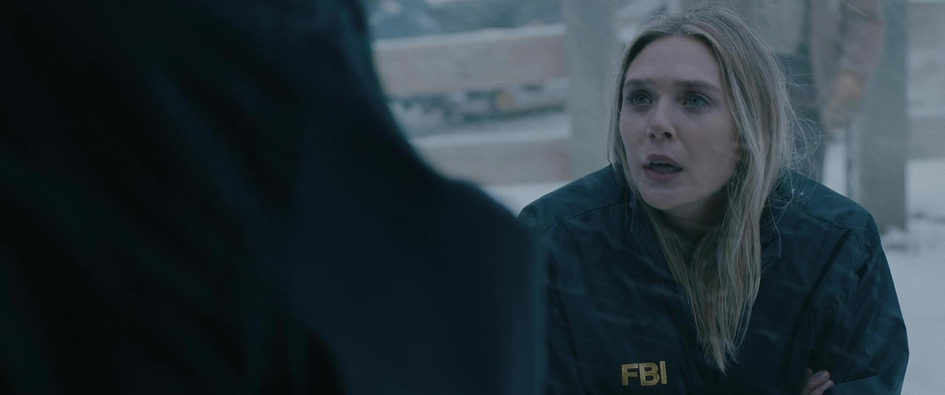
In terms of blocking, the film excels at using the landscape as a natural stage. Characters are often positioned with literal and metaphorical distance between them, reflecting their emotional guardedness. Jane Banner, as the “fish out of water,” is frequently isolated in the frame. Cory, on the other hand, moves with a fluidity that suggests a deep connection to the land. When characters finally do come together, the blocking brings them into a tighter, more intimate space. It’s not just about getting everyone in the shot; it’s about using that physical relationship to tell an unspoken emotional story.
Camera Movements

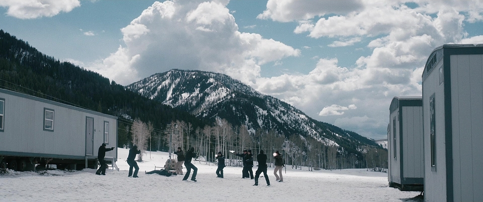
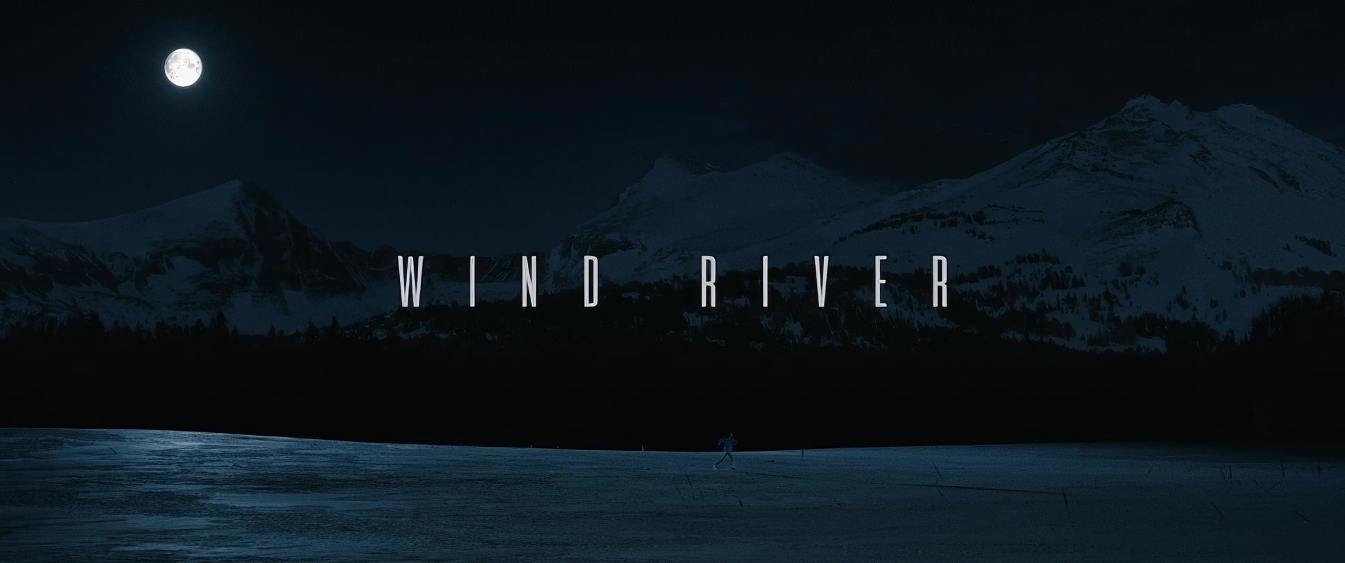
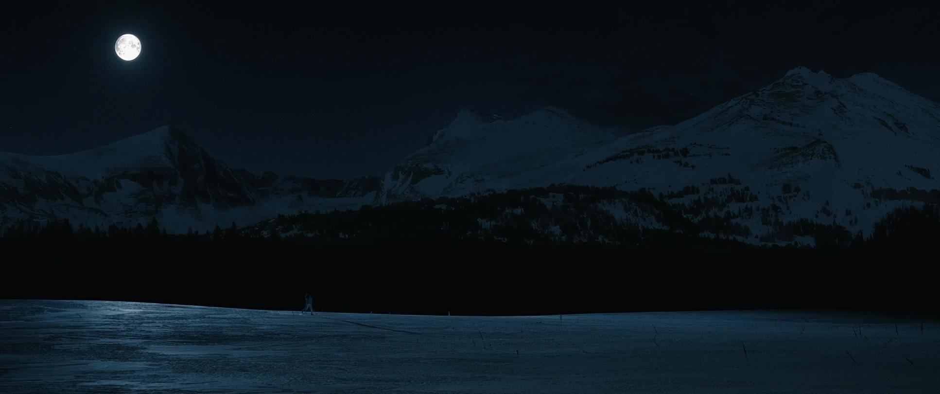
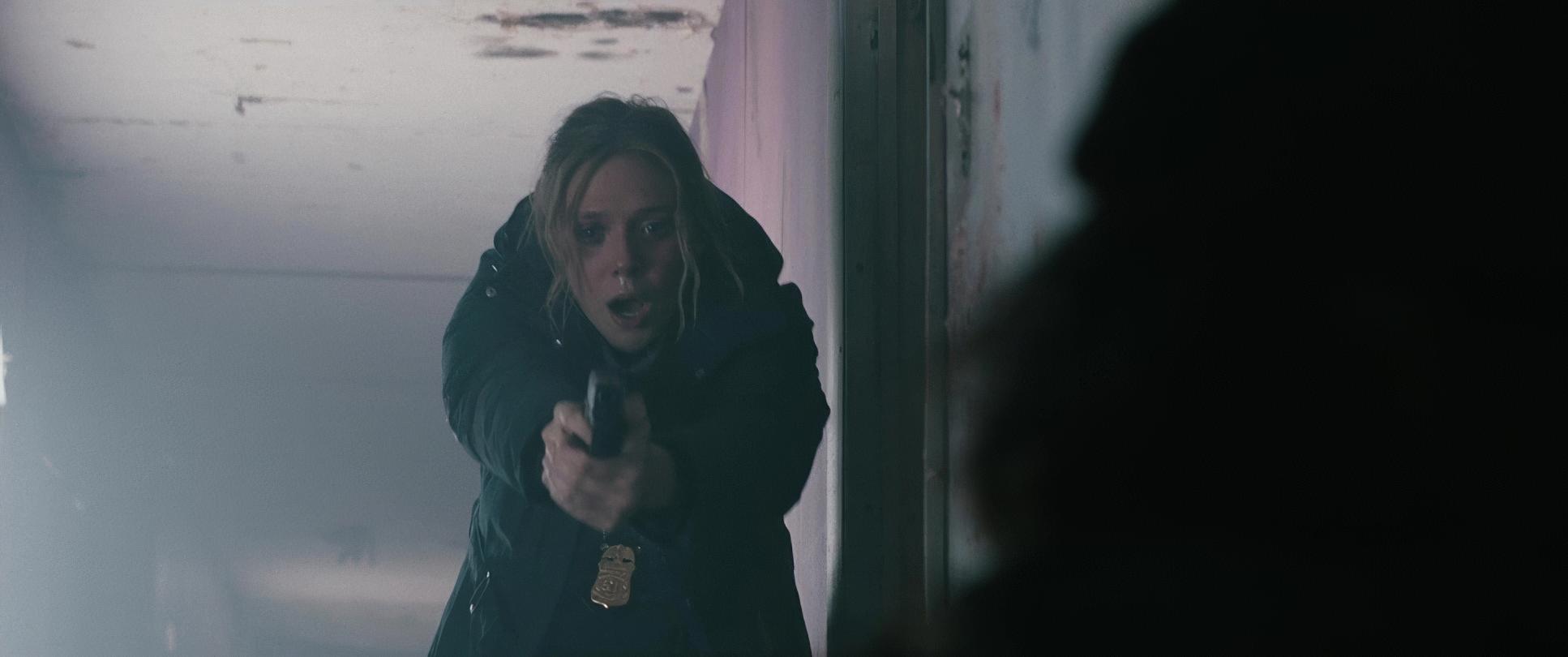
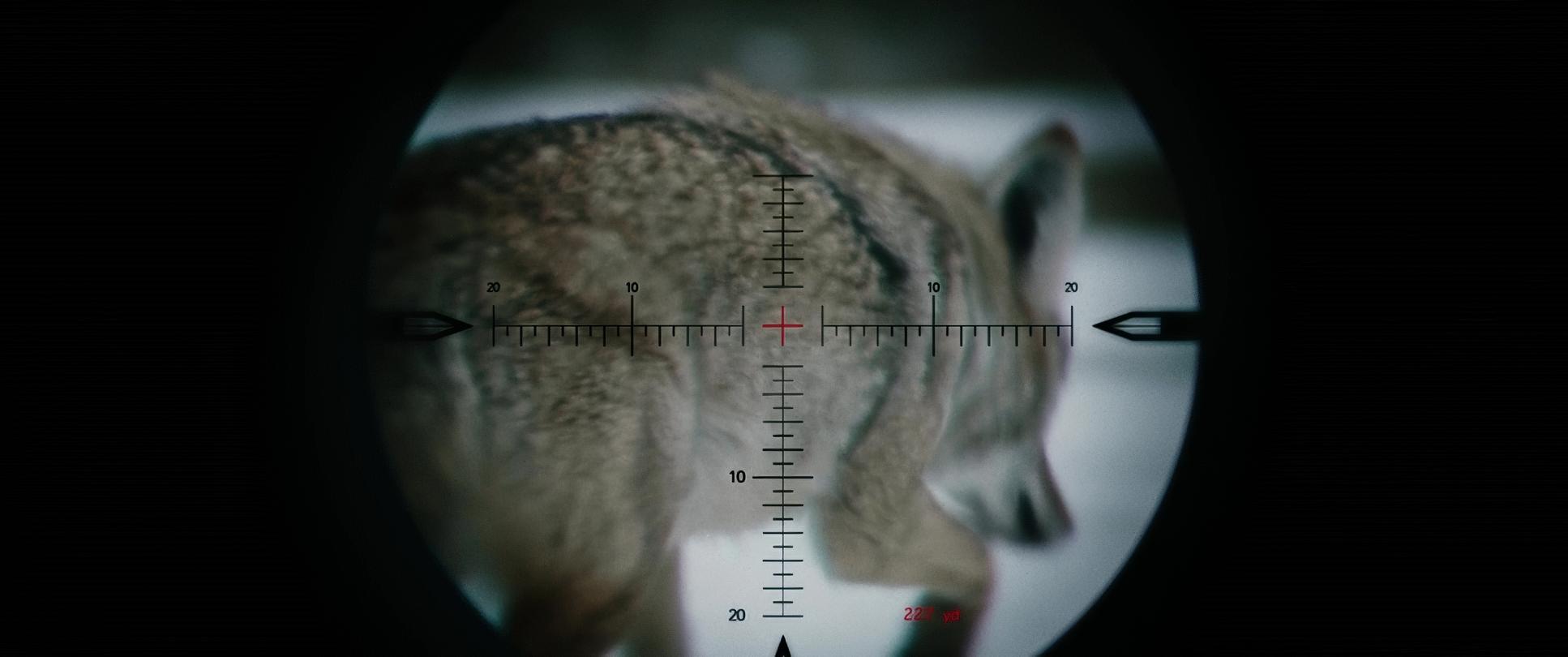
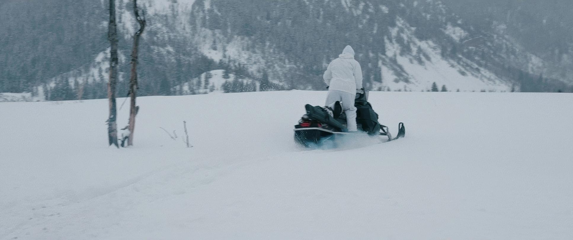
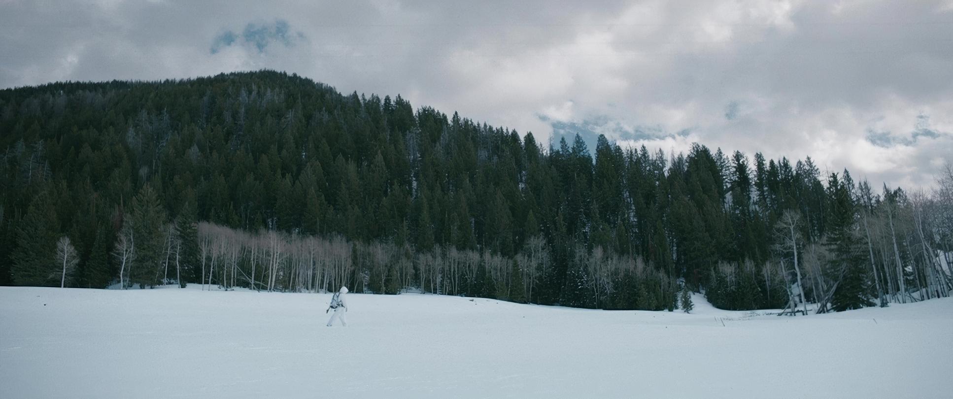
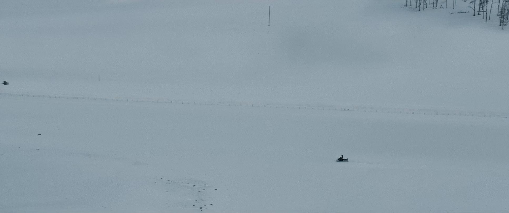
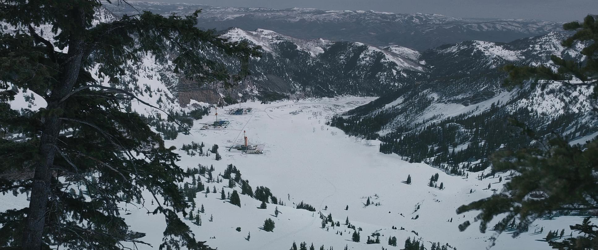
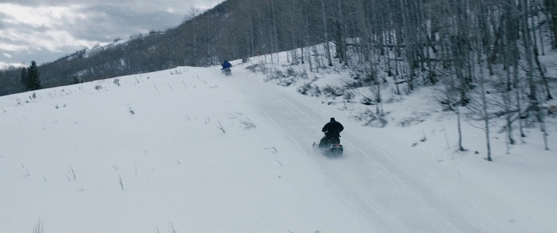
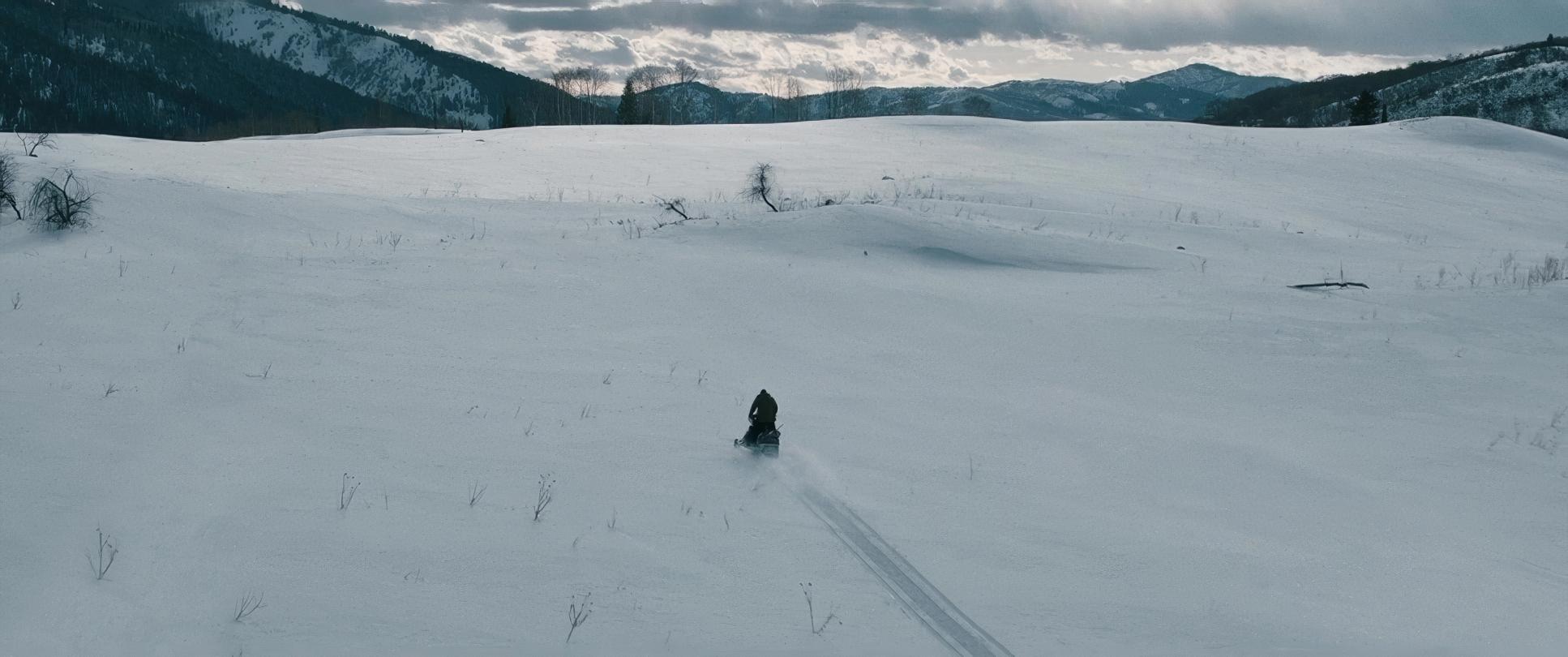
The camera movements here are subtle, deliberate, and deeply effective. You won’t find many flashy, attention-grabbing moves. Instead, Richardson employs an observational approach, often using a static frame or a slow push into a wide shot. This technique amplifies the feeling of insignificance; it makes the characters appear small against towering mountains.
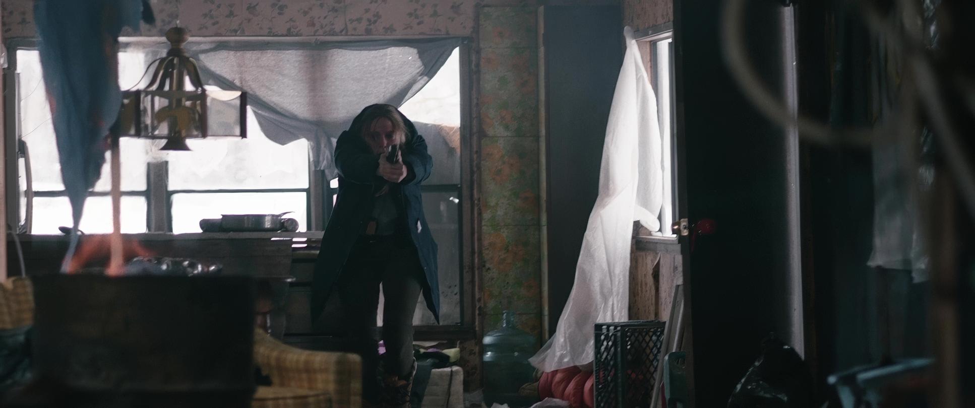
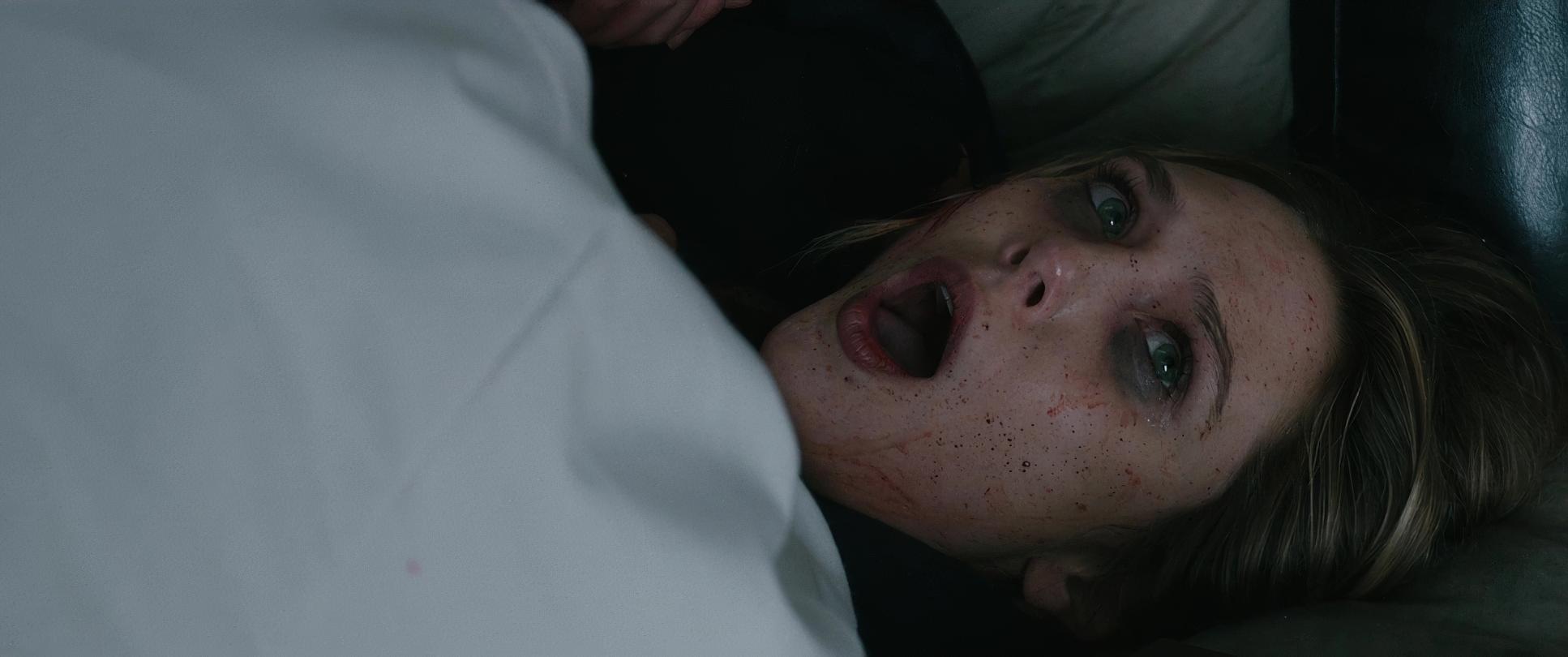
However, when tension mounts specifically during that climactic shootout the camera shifts. Richardson deploys a more agile, handheld approach. This isn’t “shaky-cam” for chaos’ sake; it’s controlled, kinetic energy that plunges you into the visceral intensity of the moment. It makes those violent bursts hit harder because the film isn’t an “action movie.” It looks like people are dying. The camera becomes an urgent witness.
Compositional Choices

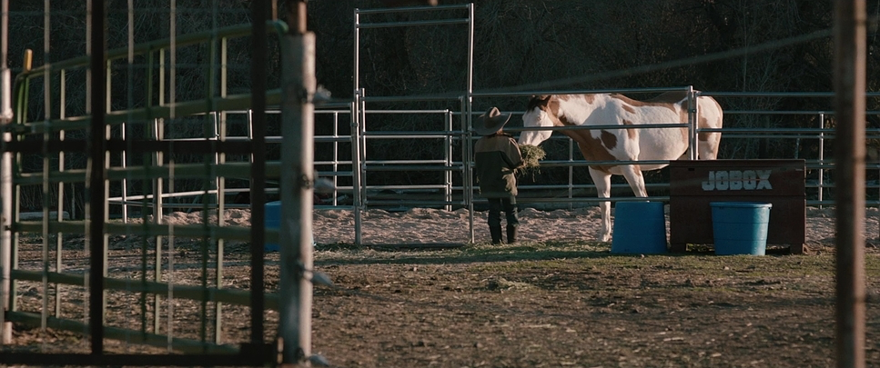
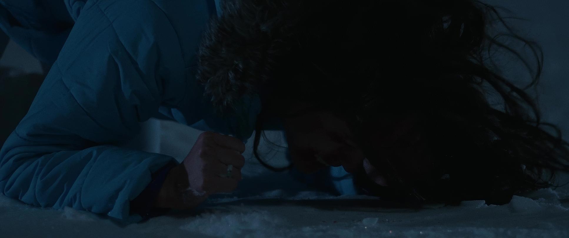
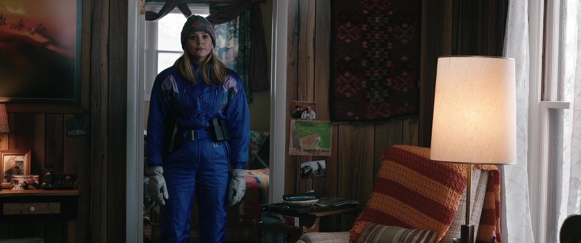
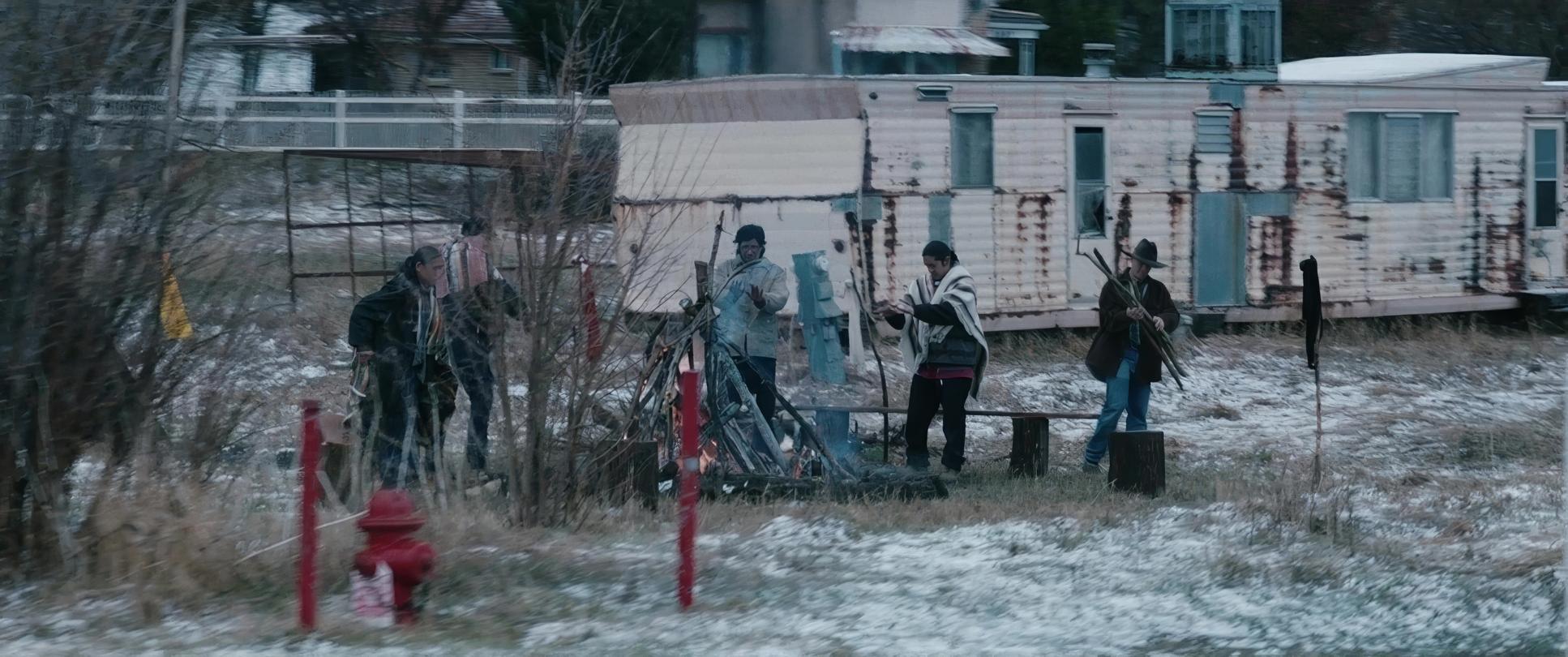
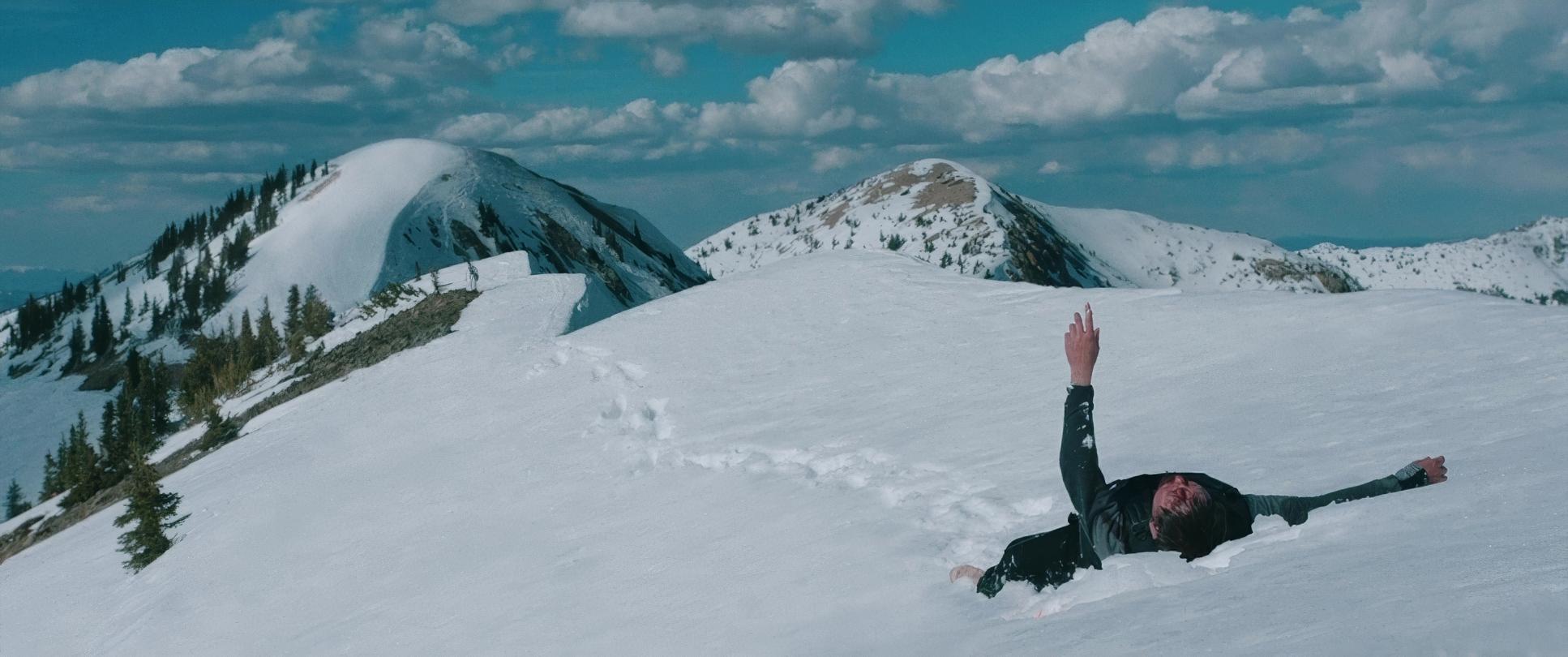
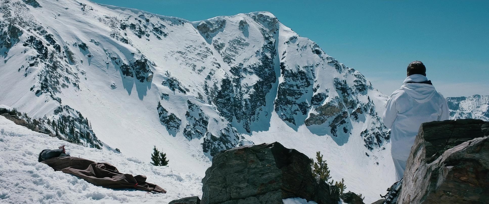
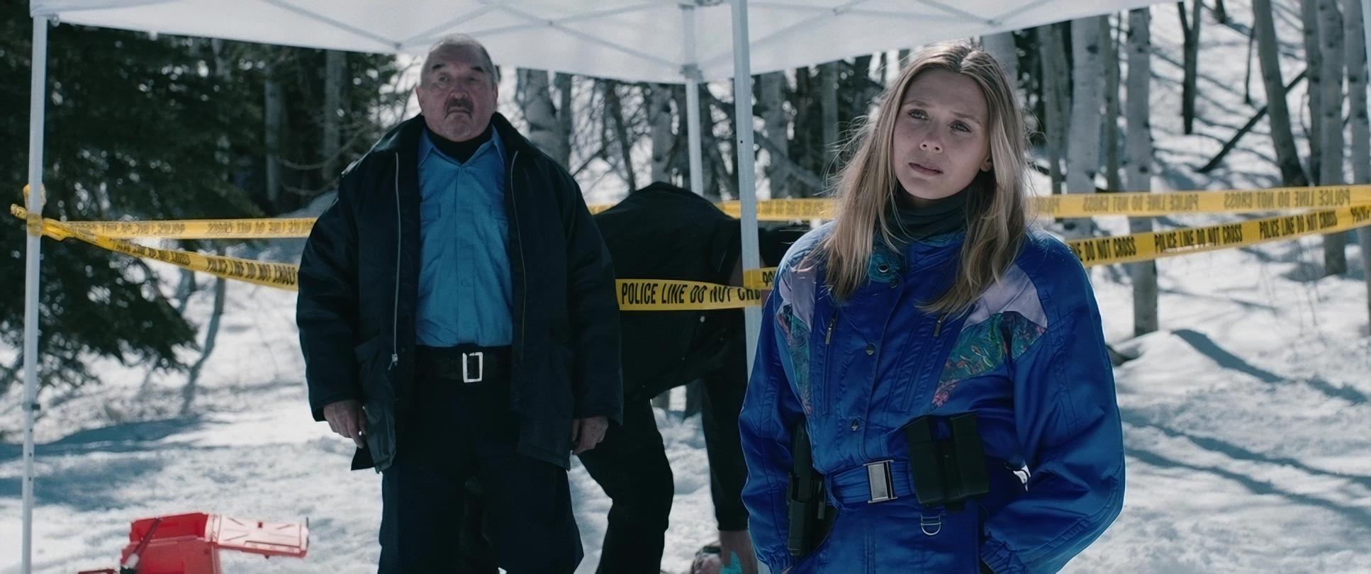
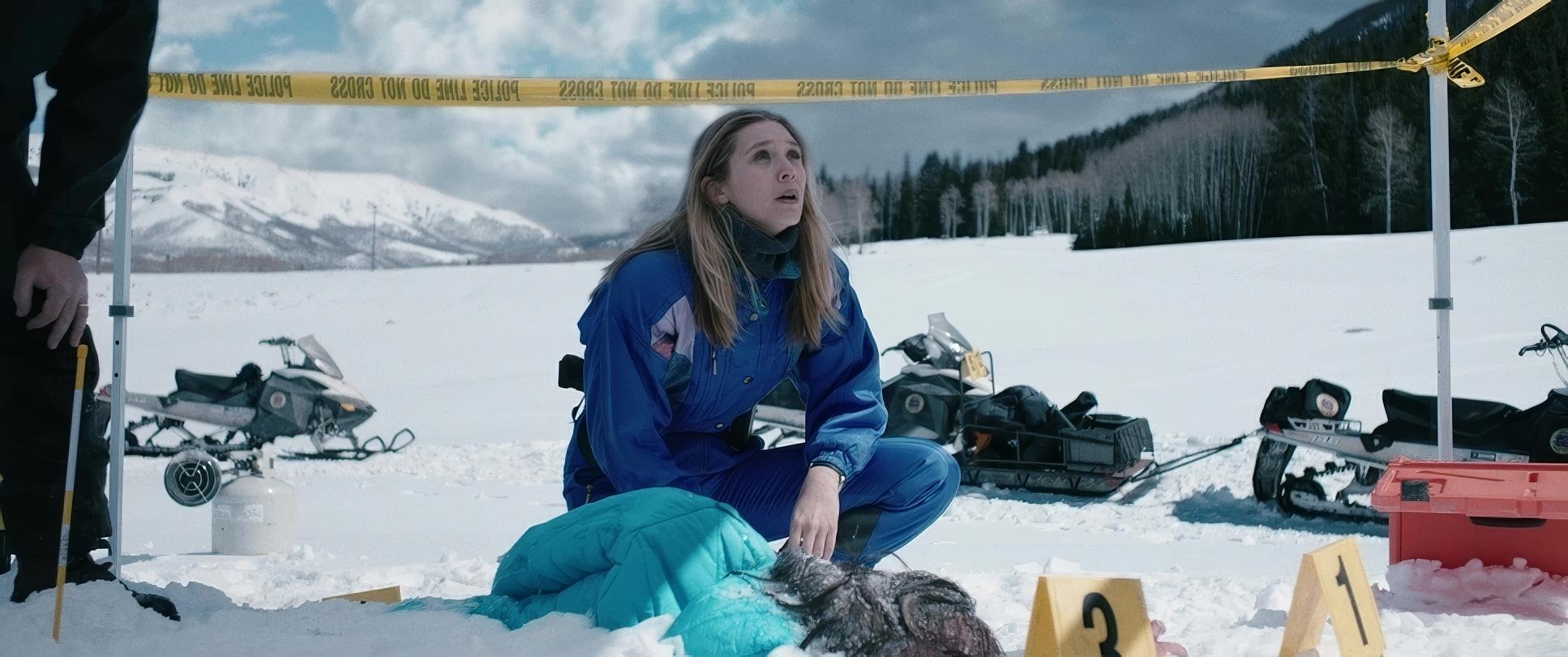
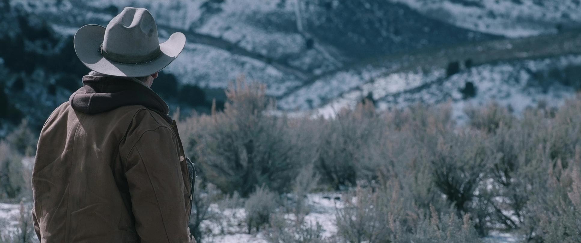
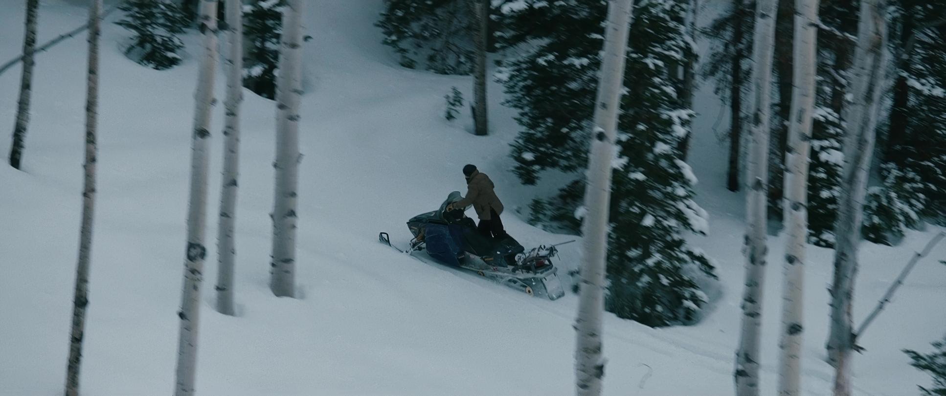
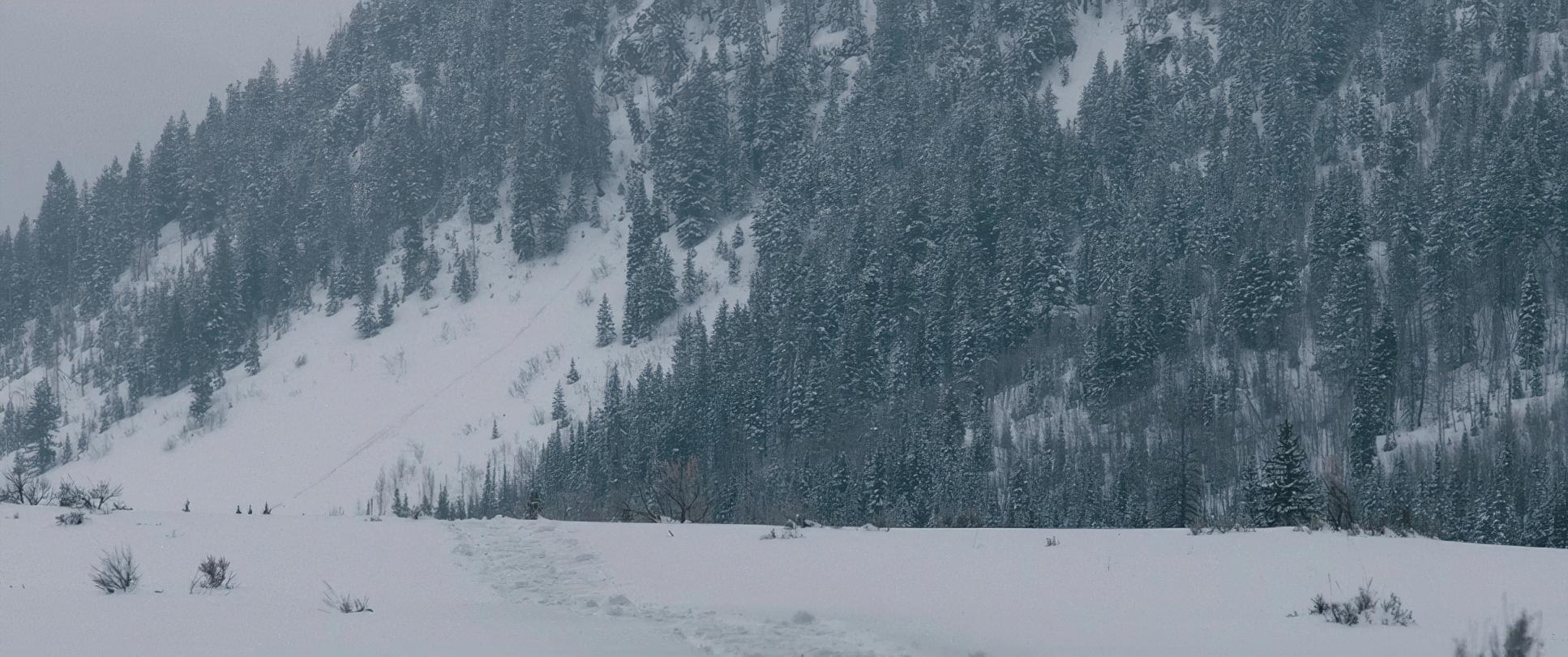
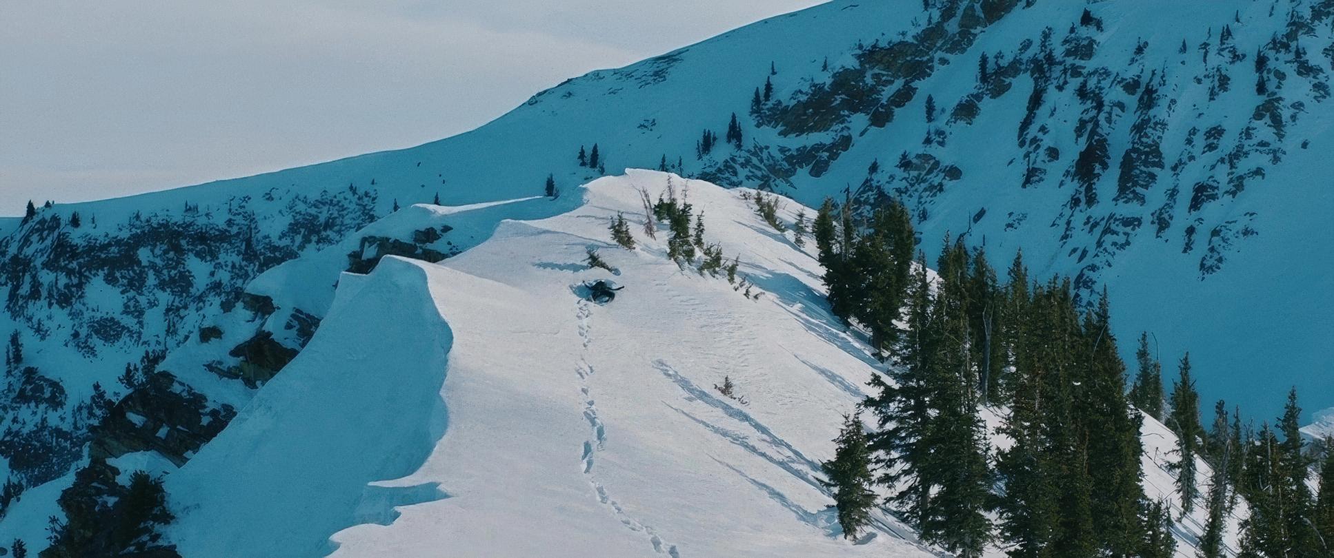
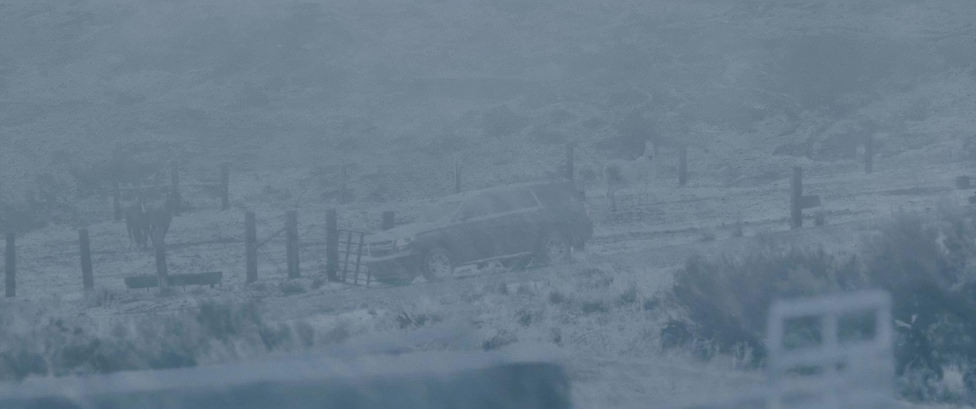
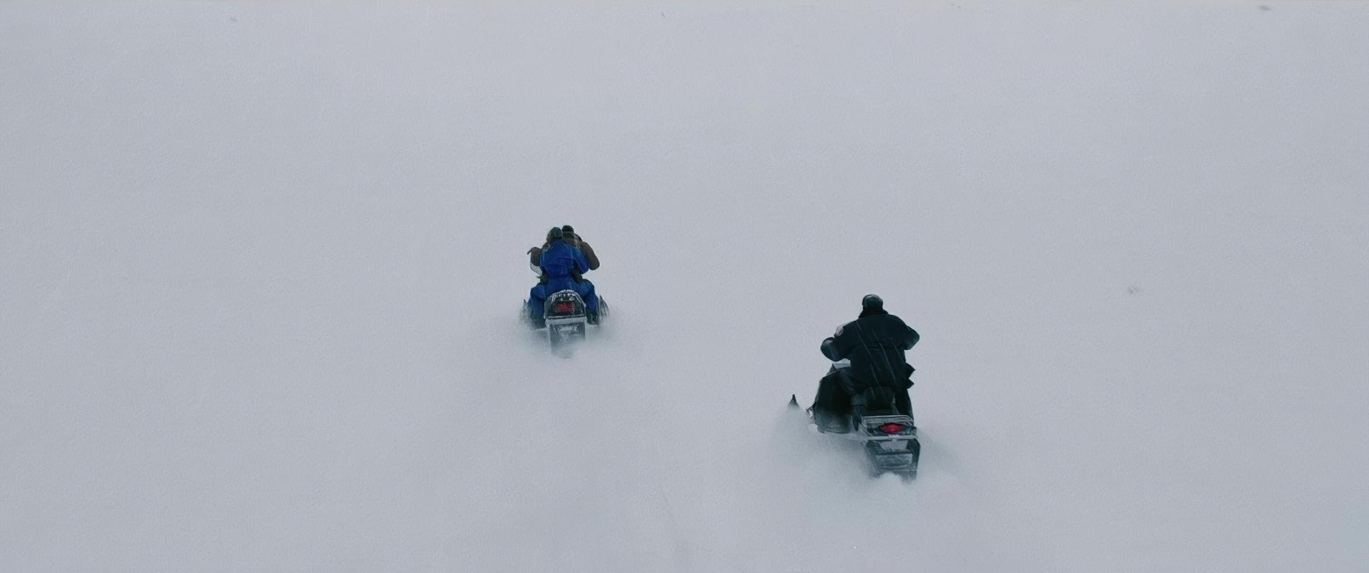
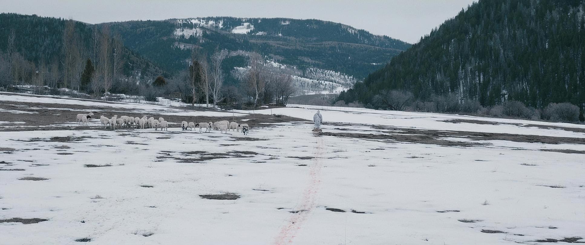
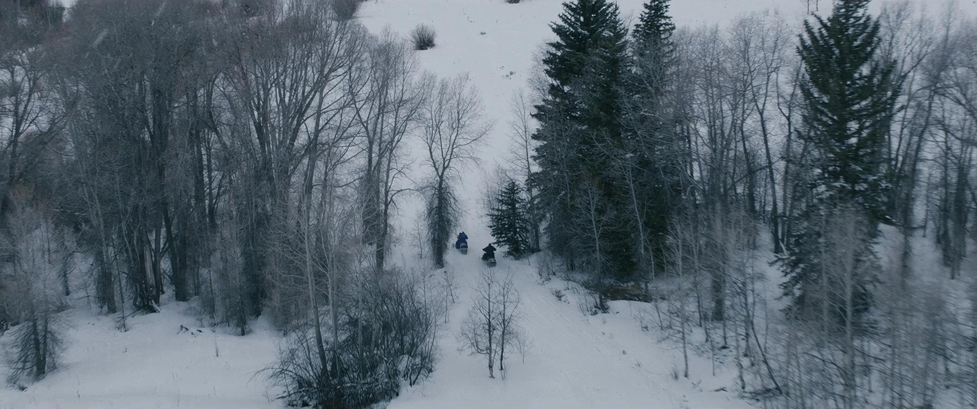
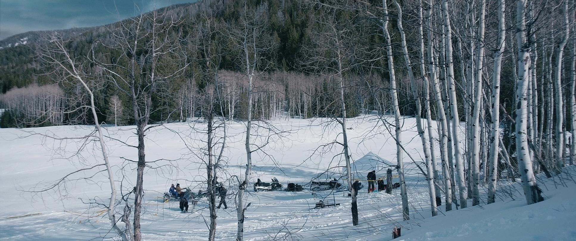
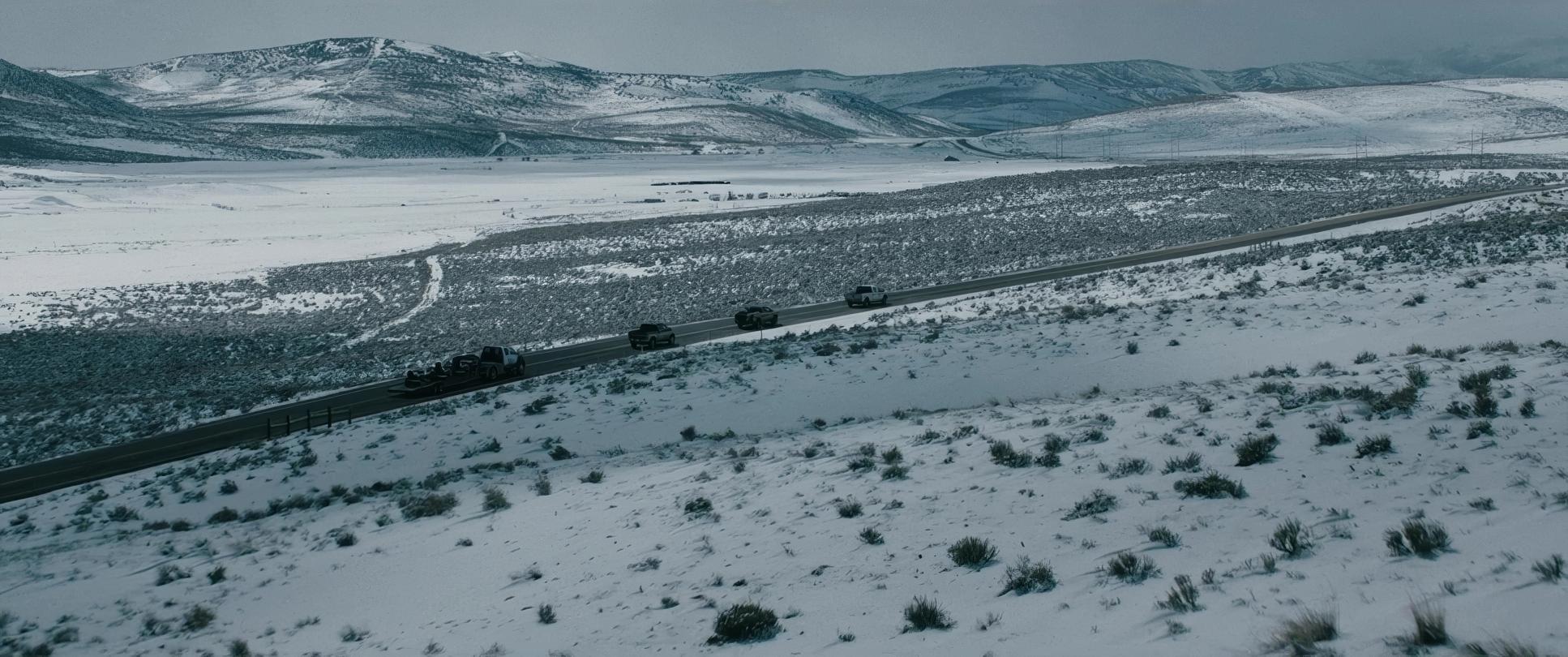
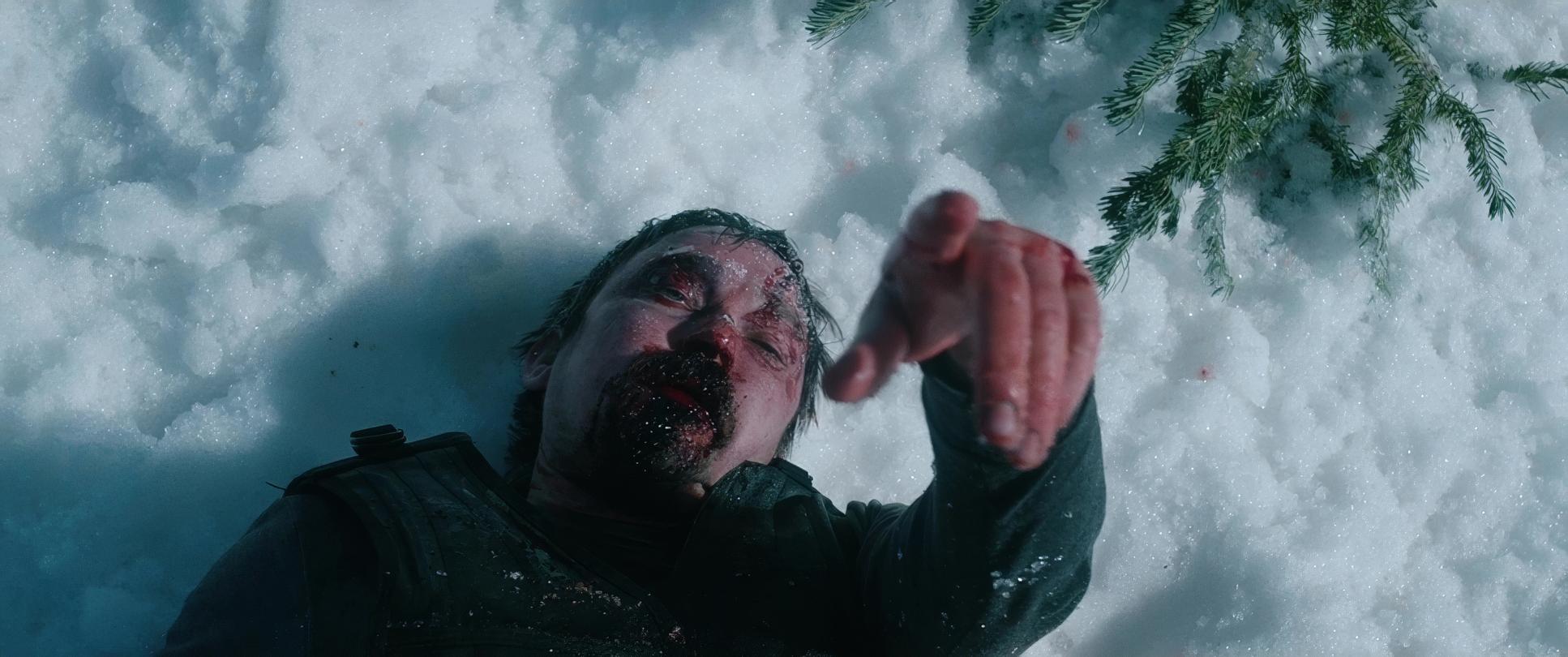
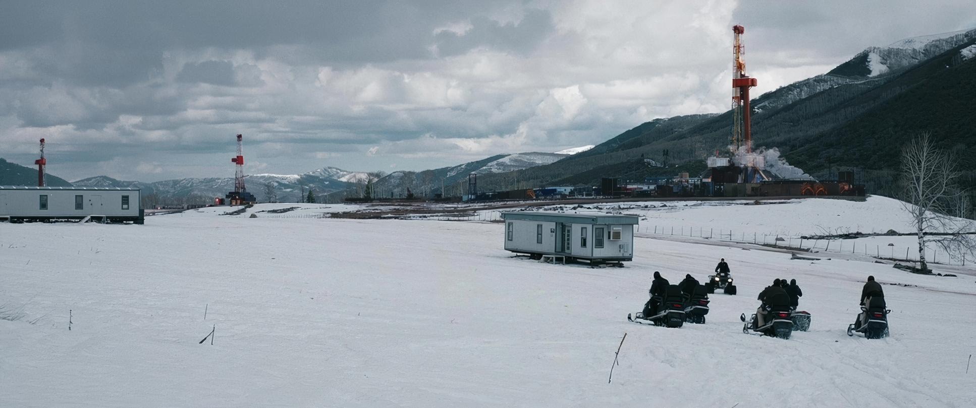
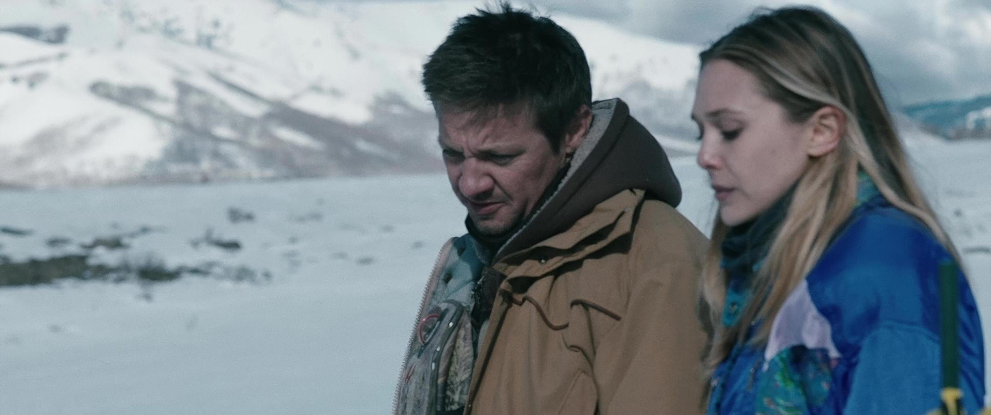
Compositionally, Wind River frequently uses wide, expansive frames that dwarf the human figures. This consistently positions characters within vast, “negative” spaces. We see Cory and Jane as tiny specks traversing endless white plains, underscoring how far they are from any sense of civilization.
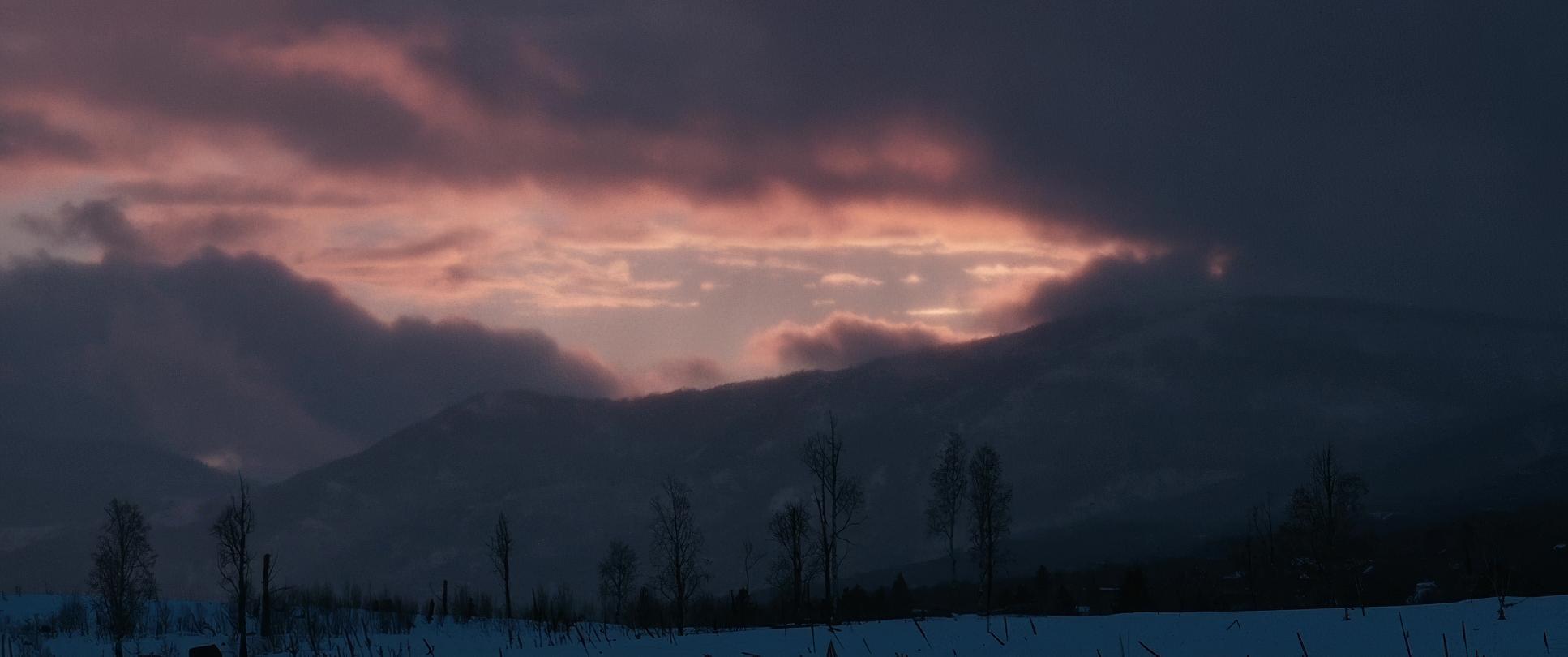
There’s also a recurring motif of framing characters through natural elements bare trees or snowdrifts. This adds visual texture, but it also creates a sense of being hemmed in or even hunted by the landscape. When characters are closer, Richardson often uses slightly lower angles, making the harsh sky loom larger, almost pressing down on them. The sheer emptiness becomes a powerful tool. It’s a constant visual reminder of the suffocating feeling of being “squashed” into a place that doesn’t want you there.
Lighting Style
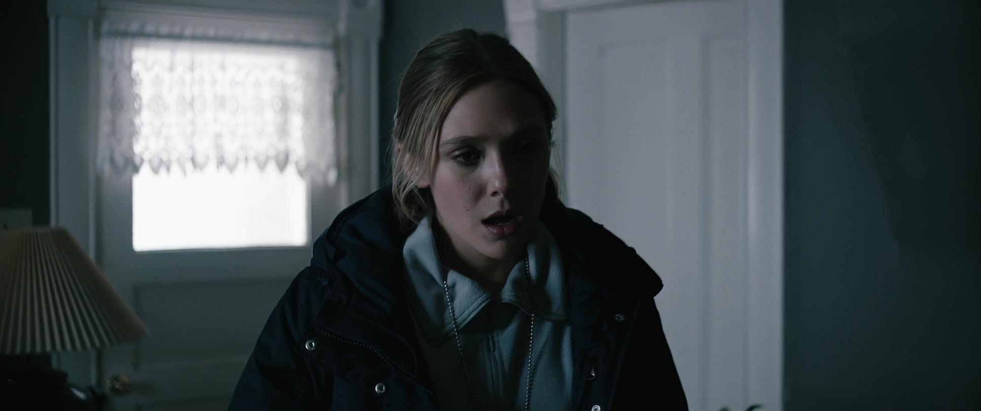
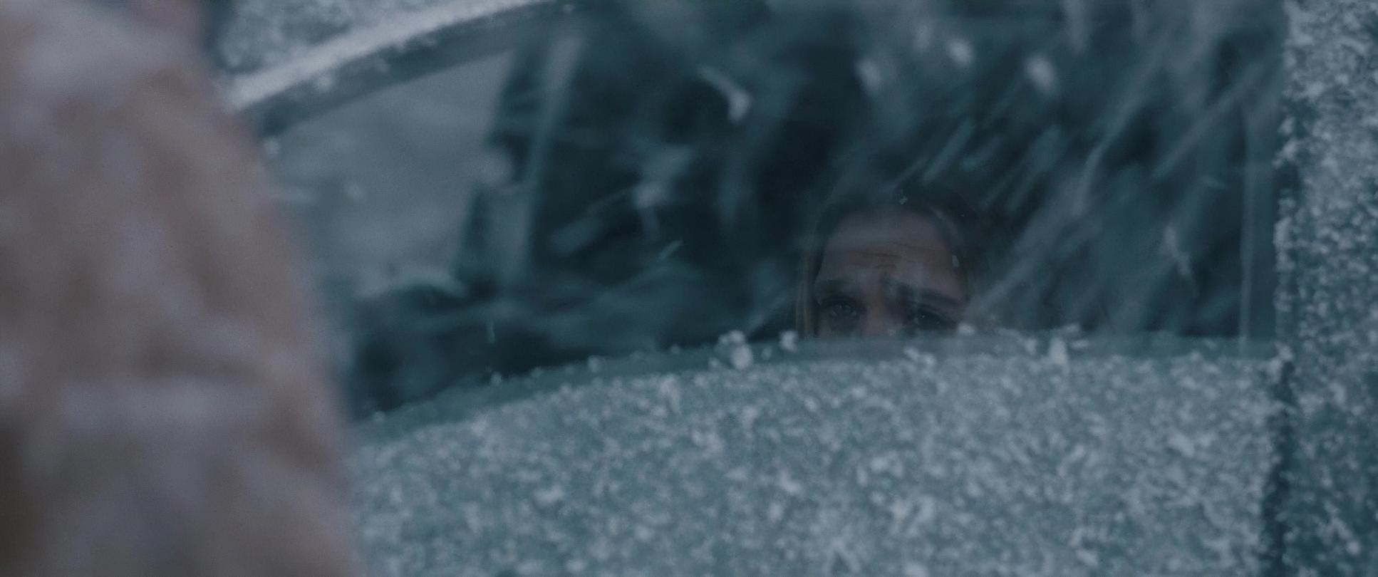
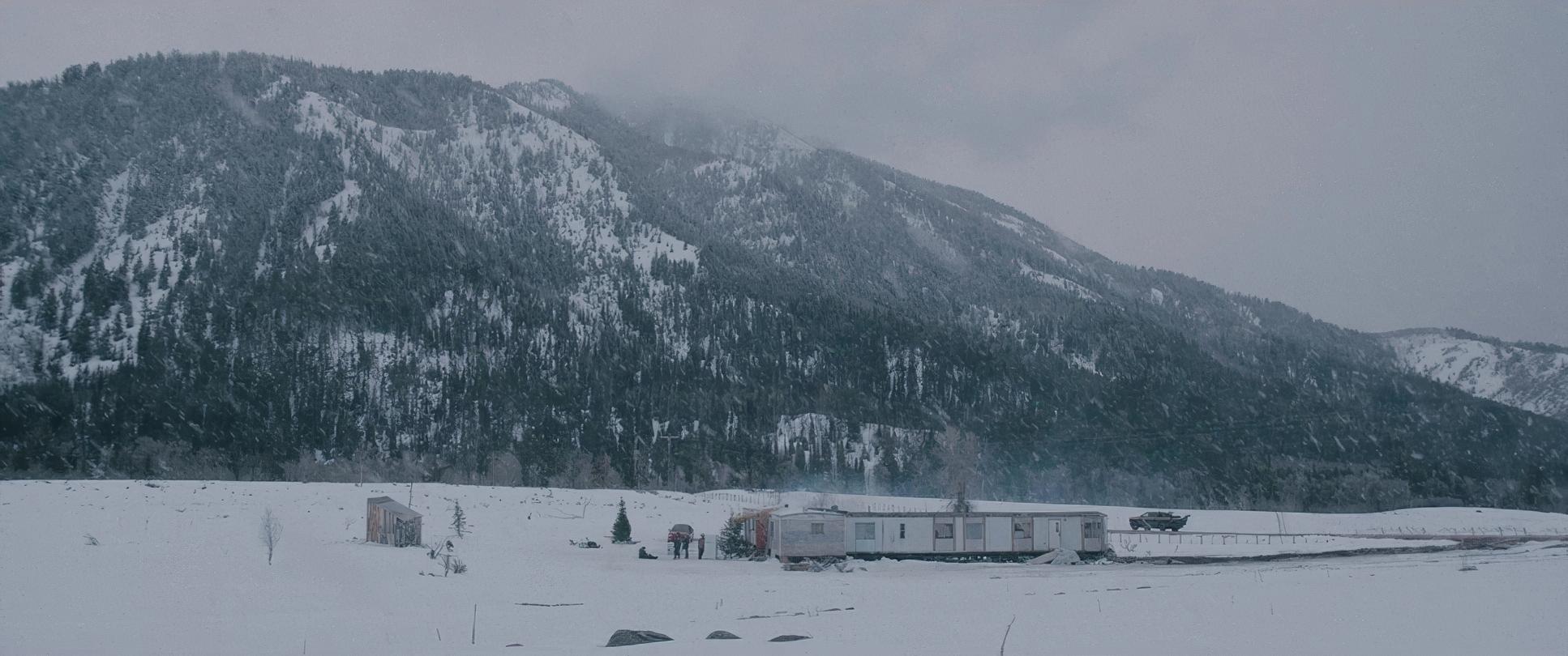
The lighting is a masterclass in motivated naturalism. Given the setting, the sun is often low or diffused by heavy cloud cover. Richardson relied predominantly on available daylight and overcast skies, augmenting it minimally to maintain that raw authenticity. The light isn’t “beautiful” in a conventional sense; it’s functional and unforgiving.
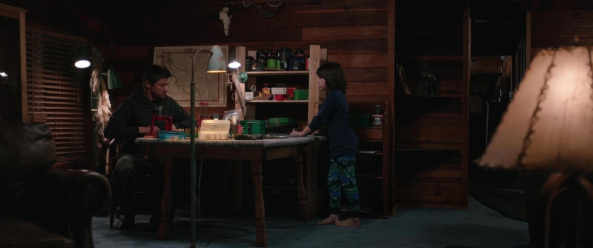
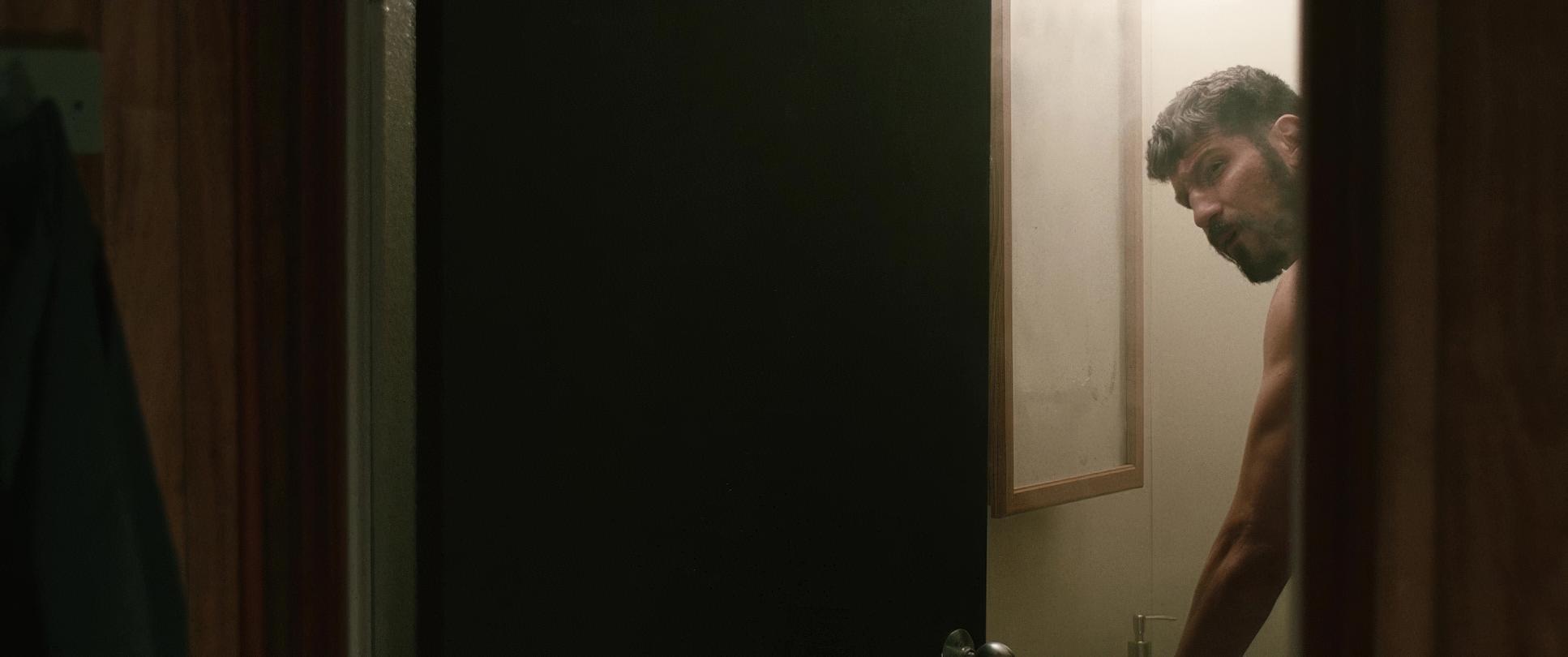
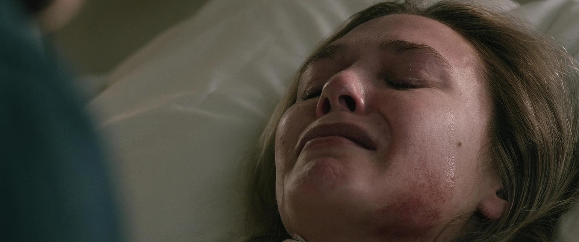
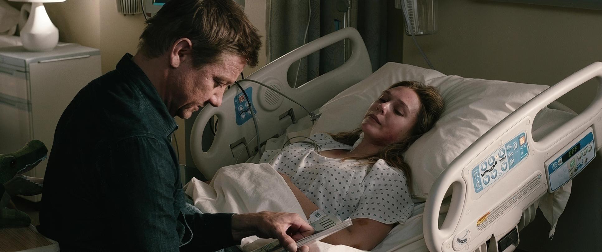
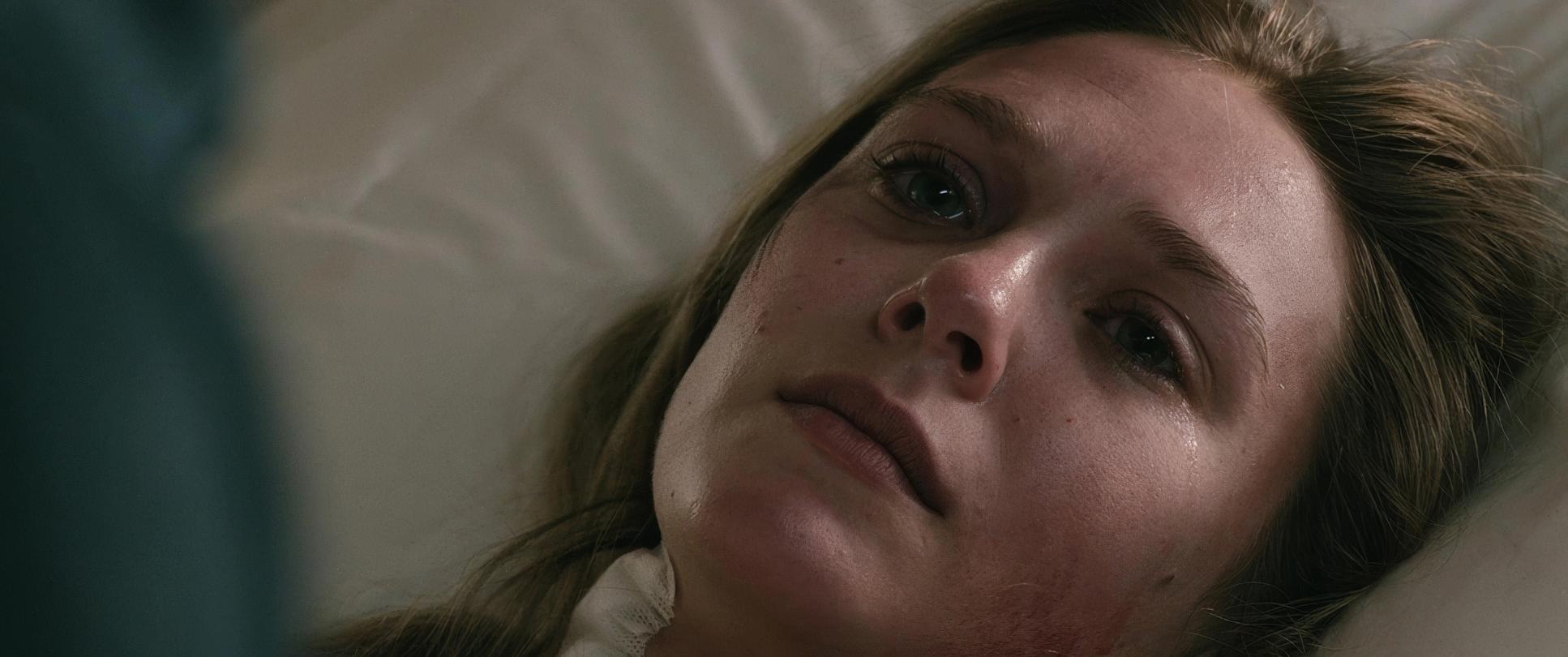
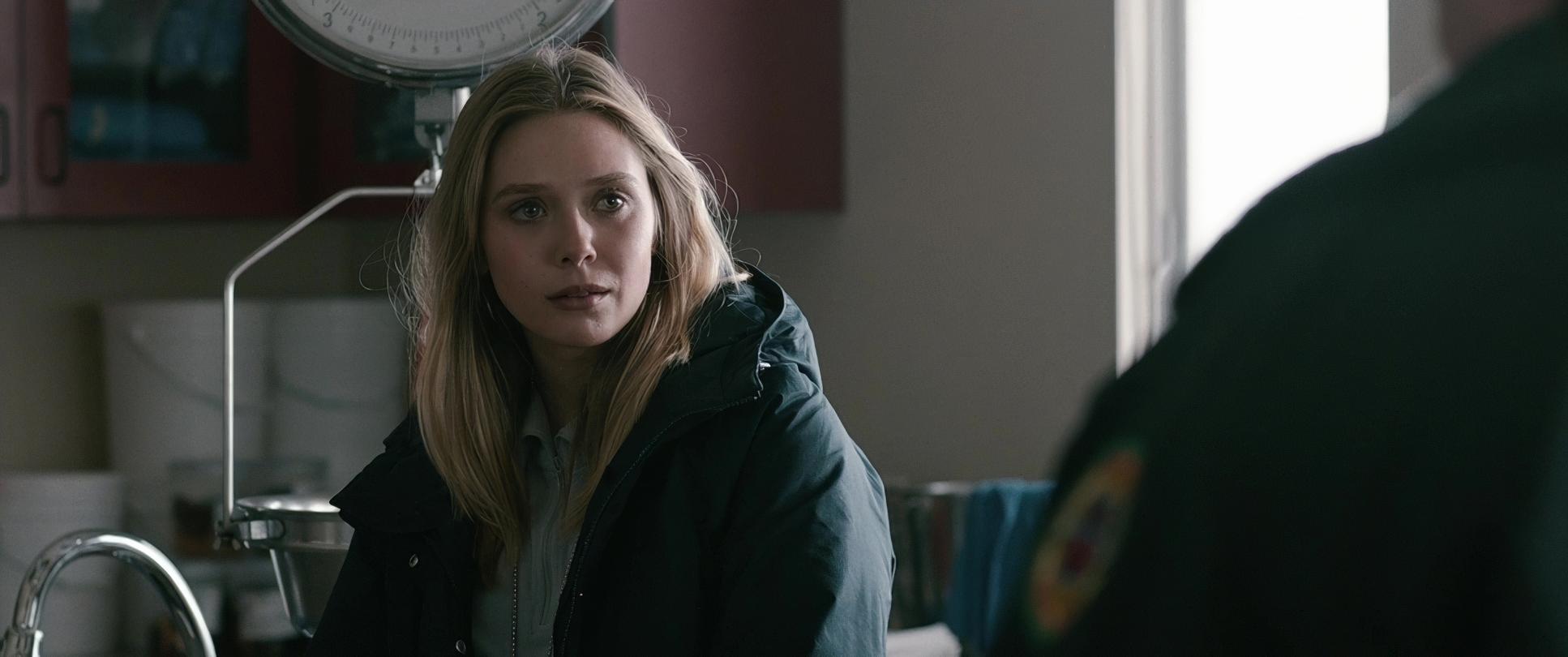
Indoors, practical lights and low-key illumination dominate, creating tiny pockets of warmth. Think about the scenes in the trailer homes the pools of incandescent light barely push back the encroaching darkness. This contrast is everything. It visually represents the struggle for safety in a world that offers none. Even when the sun is out, it feels cold a harsh light that offers no comfort.
Color Grading Approach
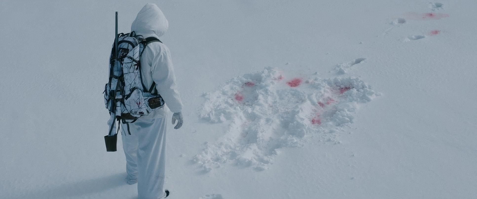
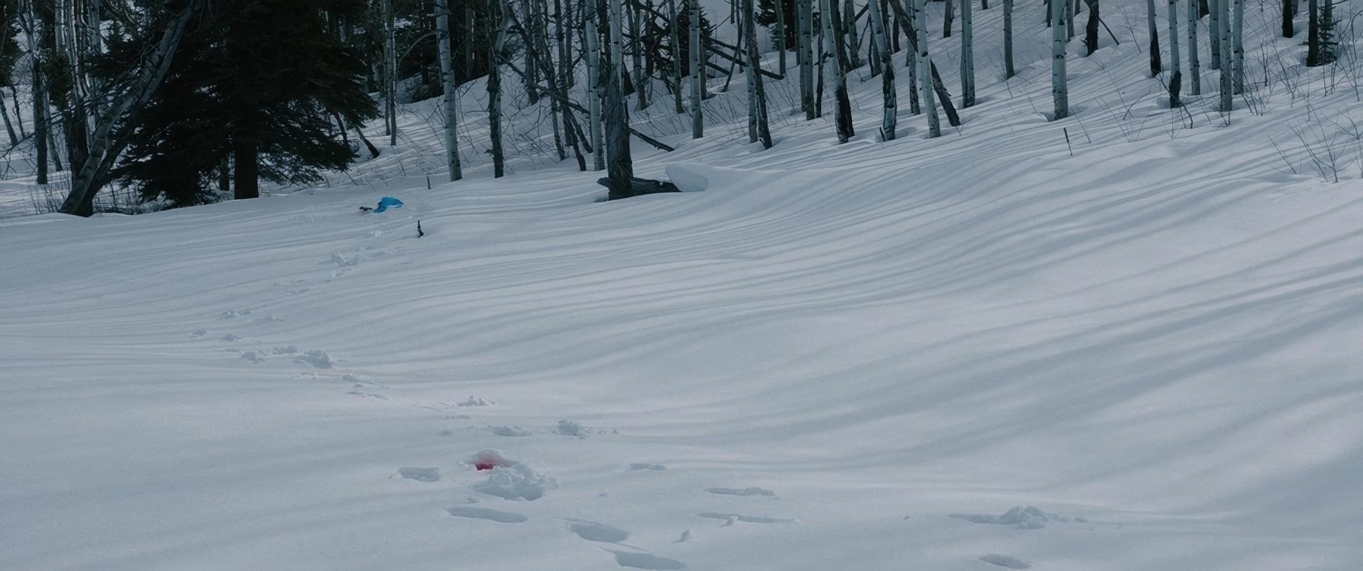
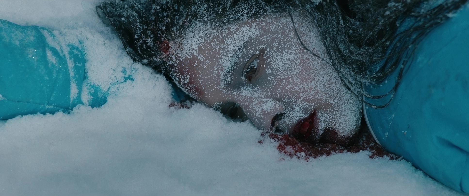
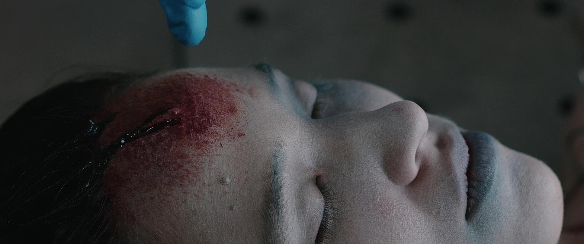
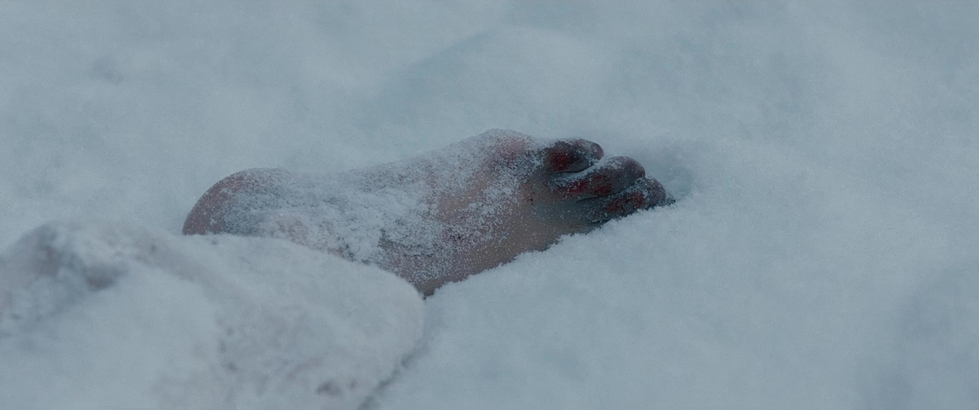
Now, this is my favorite part. The grade on Wind River, handled by Mitch Paulson, is nothing short of masterful. The overall palette is dominated by cool, desaturated tones blues, grays, and muted whites. There’s a deliberate suppression of warm hues, which makes the occasional splash of red (like blood on the snow) incredibly impactful.
As a colorist, I’m particularly obsessed with the highlight roll-off and shadow management here. We see deep blacks that ground the image, but they never feel “crushed” or muddy. There’s a subtle application of what feels like print-film sensibilities perhaps a hint of a magenta shift in the shadows that gives the image a gritty, timeless feel. The skin tones are kept neutral but lean slightly cool, reinforcing the idea of characters constantly battling the elements. This tonal sculpting ensures that while the world feels bleak, it never feels dull. Every choice in the grade reinforces the emotional logic of the story.
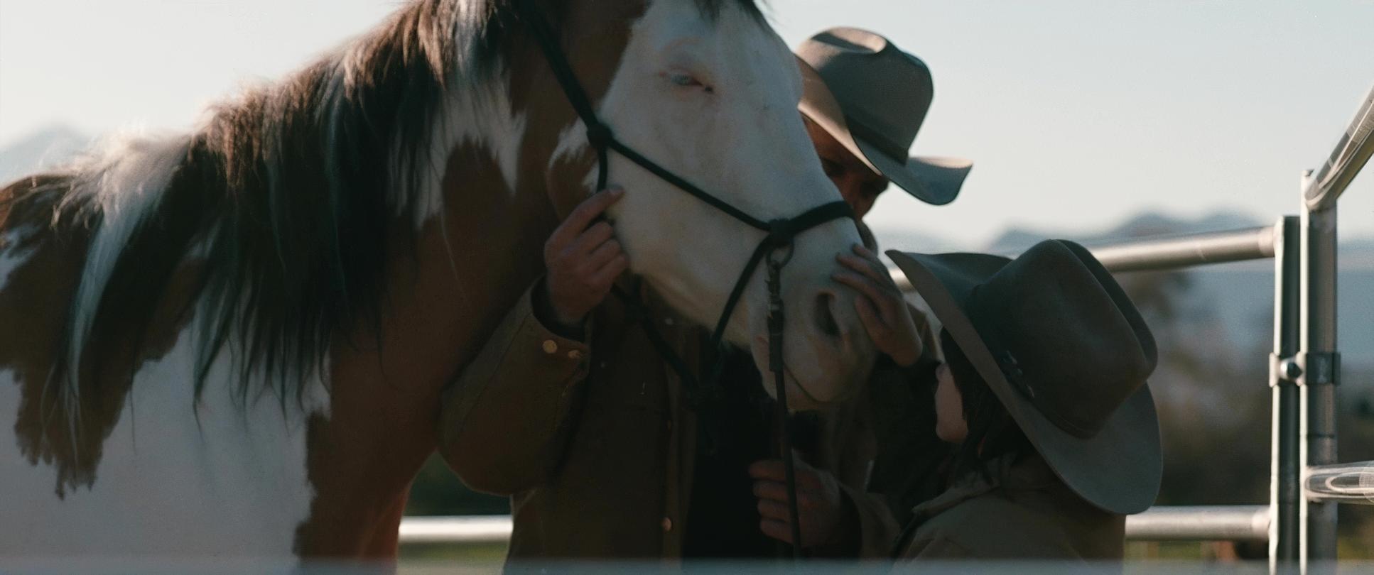
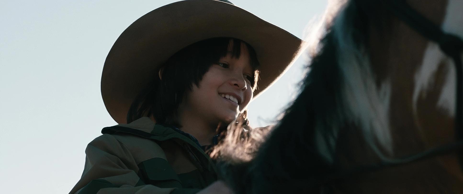
WIND RIVER (2017) Film Stills
A curated reference archive of cinematography stills from About WIND RIVER (2017). Study the lighting, color grading, and composition.
- Also read: A FEW GOOD MEN (1992) – CINEMATOGRAPHY ANALYSIS
- Also read: THE GOONIES (1985) – CINEMATOGRAPHY ANALYSIS
Browse Our Cinematography Analysis Glossary
Explore directors, cinematographers, cameras, lenses, lighting styles, genres, and the visual techniques that shape iconic films.
Explore Glossary →