A Few Good Men. When I sit down with a film like Rob Reiner’s 1992 courtroom classic, I’m looking past the iconic “You can’t handle the truth!” memes. I’m looking at how the visual language often deceptively quiet works its magic to amplify Sorkin’s rapid-fire dialogue.
It’s easy to get swept up in the heavyweights Cruise and Nicholson sparring on screen. But the real magic? It’s in how the cinematography subtly sculpts the environment and defines power dynamics without ever screaming for attention. It’s a masterclass in controlled storytelling. It proves that sometimes, the most effective camera work is the kind you don’t overtly notice, but you feel deep in your gut.
About the Cinematographer

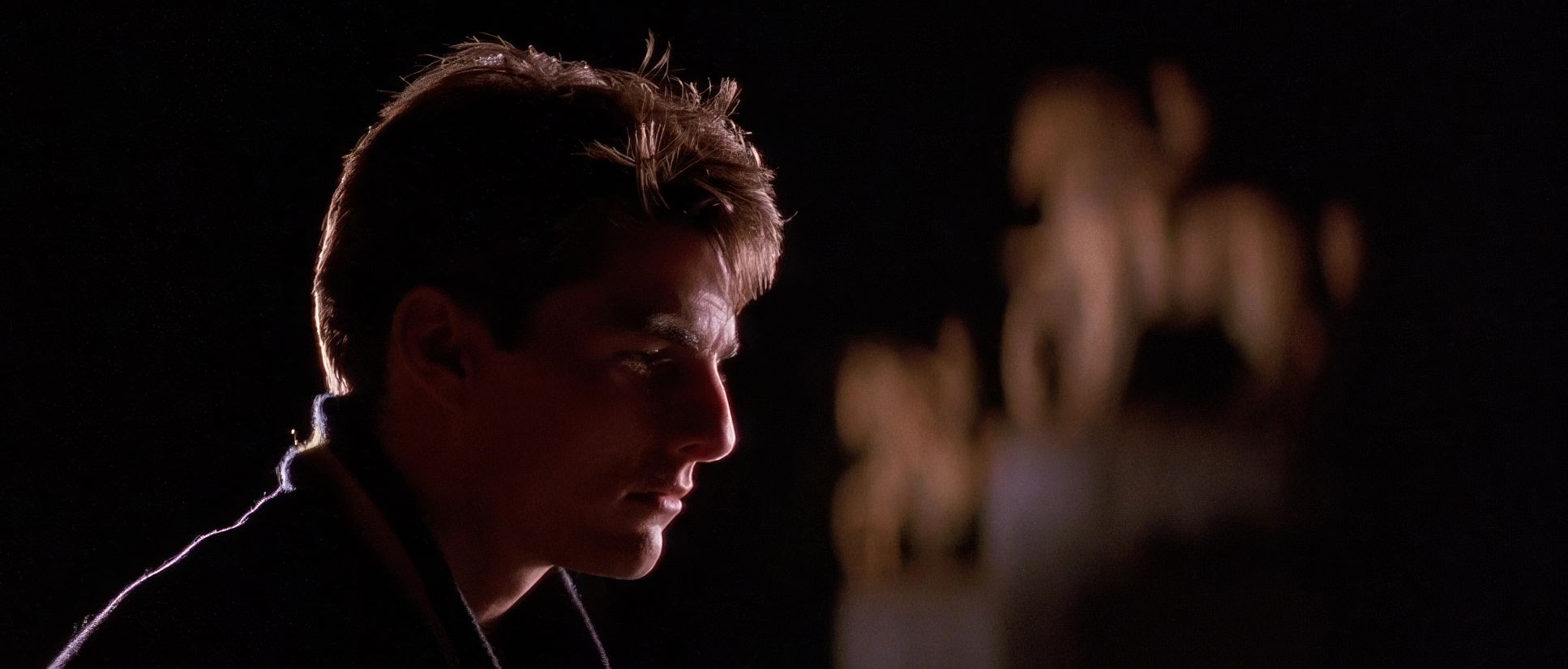
The man behind the lens here was Robert Richardson, ASC. Now, if you’re a cinematography nerd like me, that name carries weight. Richardson is the guy behind the searing looks of Platoon, Casino, and JFK. He’s famous for his signature “hot” top-light that glowing, almost angelic halation on the hair and shoulders of his subjects.
For A Few Good Men, Richardson reigned in his more avant-garde tendencies to fit Reiner’s traditionalist vision. This was Reiner in his prime, coming off The Princess Bride and When Harry Met Sally. He needed a visual foundation that was rock-solid but flexible enough to let the actors own the frame. Richardson delivered exactly that: precision, naturalism, and a believable, immersive world where high-stakes drama could breathe.
Inspiration Behind the Cinematography

When I look at the DNA of this film, I see the ghost of Golden Age Hollywood courtroom dramas, but filtered through a gritty, 90s anamorphic lens. The goal wasn’t to reinvent the wheel; it was to perfect its rotation. The film had to feel grounded in military protocol and legal gravitas, yet have a pulse that quickened as the walls closed in on Kaffee.
The primary inspiration was clearly the script itself the relentless build-up and the clash of ideologies between Kaffee and Jessup. The visual strategy was simple: create an environment that facilitates verbal duels. That means clean, uncluttered frames and lighting that defines the mood without becoming a distraction. There’s a utilitarian beauty to the military settings and a formal rigidity to the courtroom that naturally lends itself to a disciplined visual approach. It’s about ensuring every line of dialogue lands with maximum impact.
Camera Movements

Some might call the camera work here “basic,” but in my studio, we call it “motivated.” This isn’t a film that needs frenetic handheld or dizzying crane shots. Every move is designed to underscore a narrative shift.
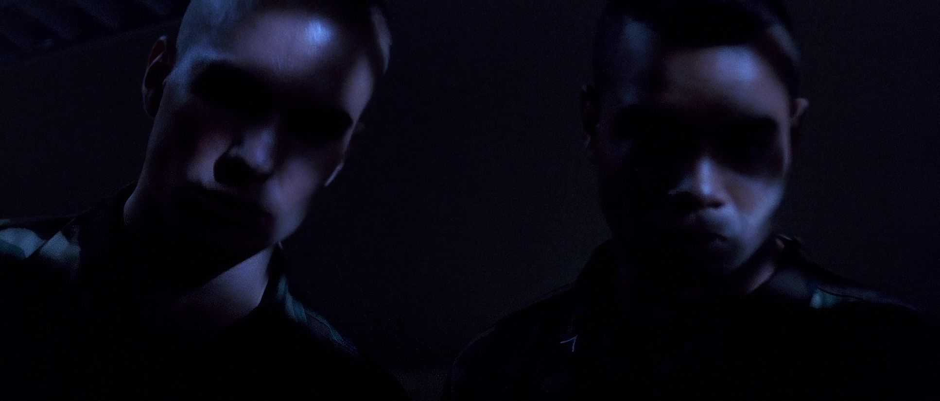
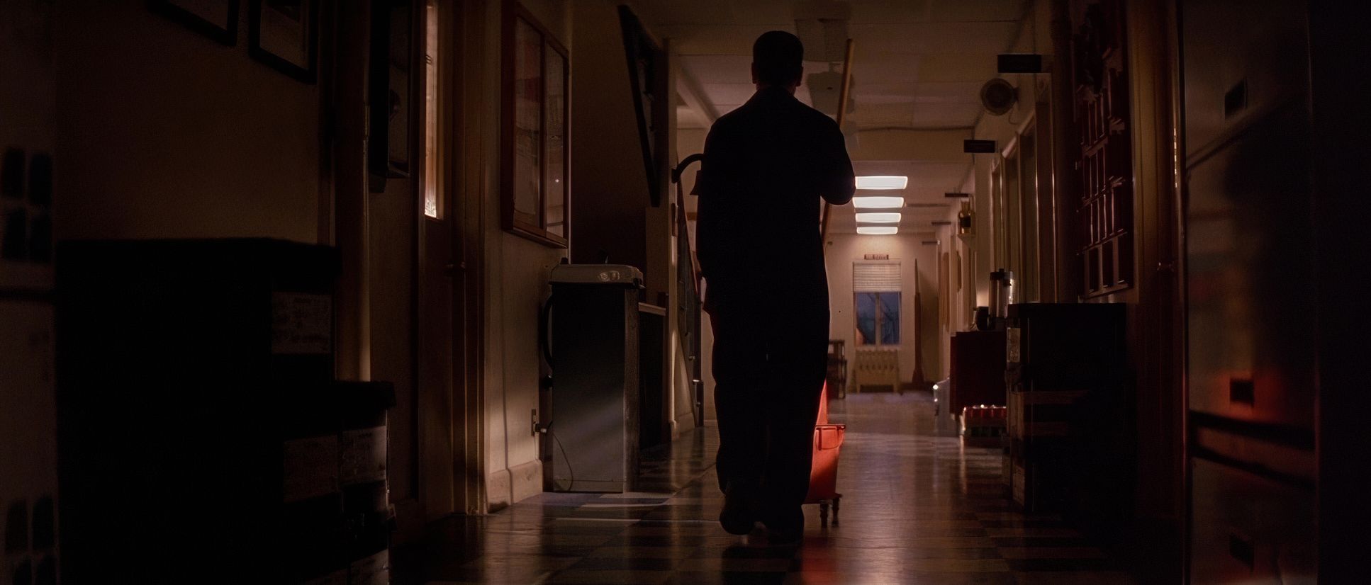
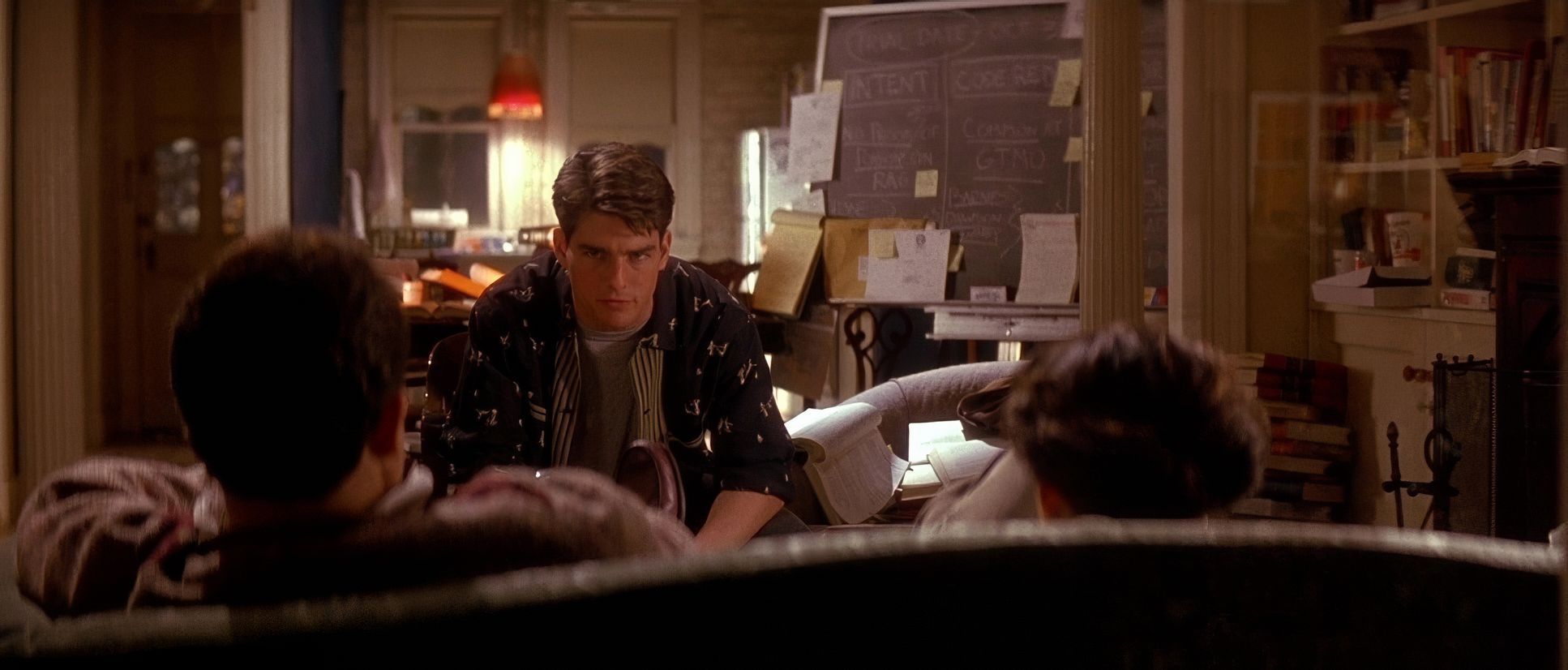
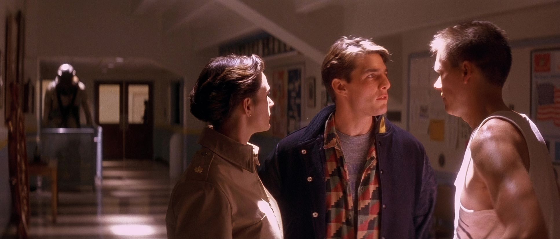
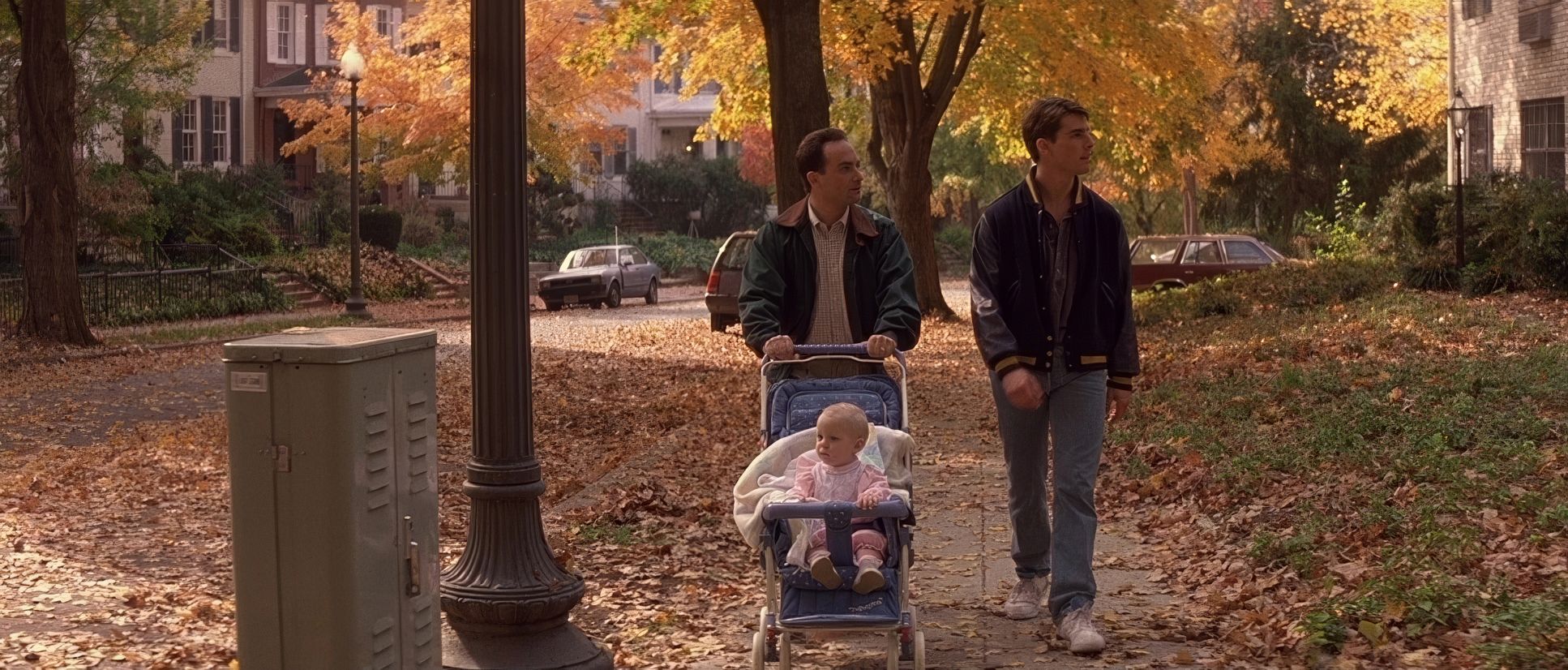
In the early acts, the camera tracks with Kaffee as he glides through the base, reflecting his initial, somewhat aloof confidence. But once we hit the courtroom, the movements become restrained almost claustrophobic. We see purposeful dollies and pans that act as a visual noose. As the pressure builds, the camera creeps in almost imperceptibly on a character’s face. It isolates them. It magnifies the sweat on the brow. When Kaffee finally challenges Jessup, the camera glides from a wider two-shot into a tight focus on Jessup’s agitation. We’re not just watching the pressure; we’re leaning into it.
Compositional Choices

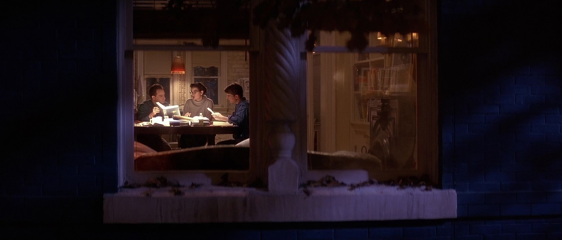
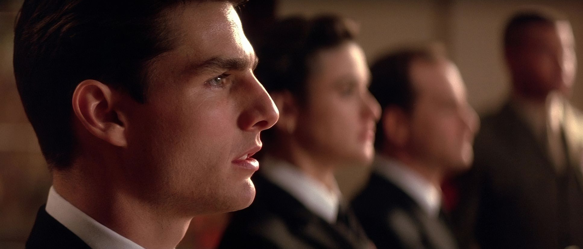
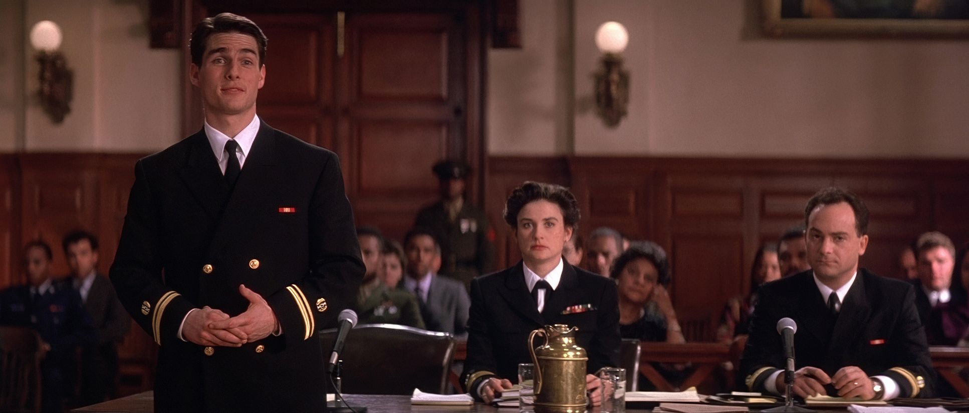
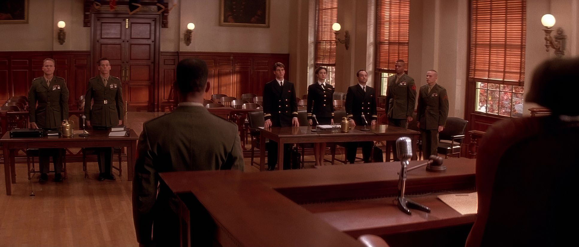
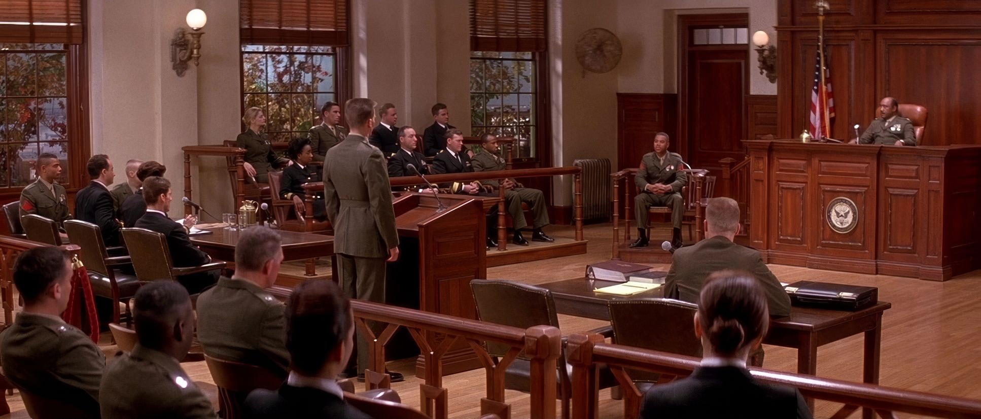
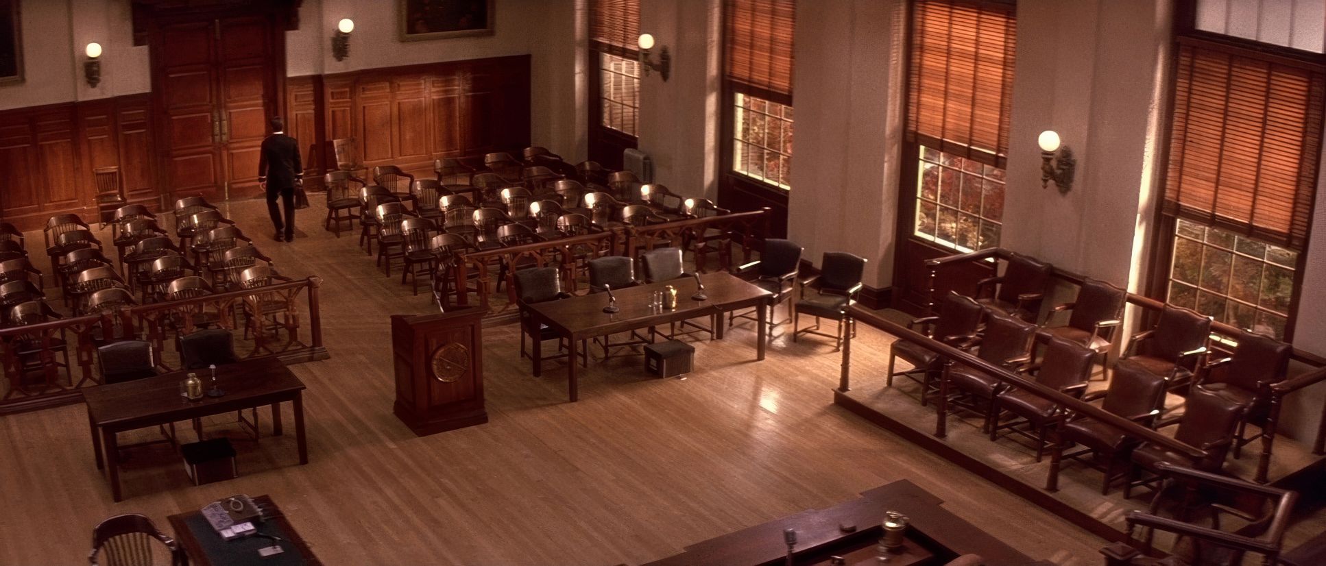
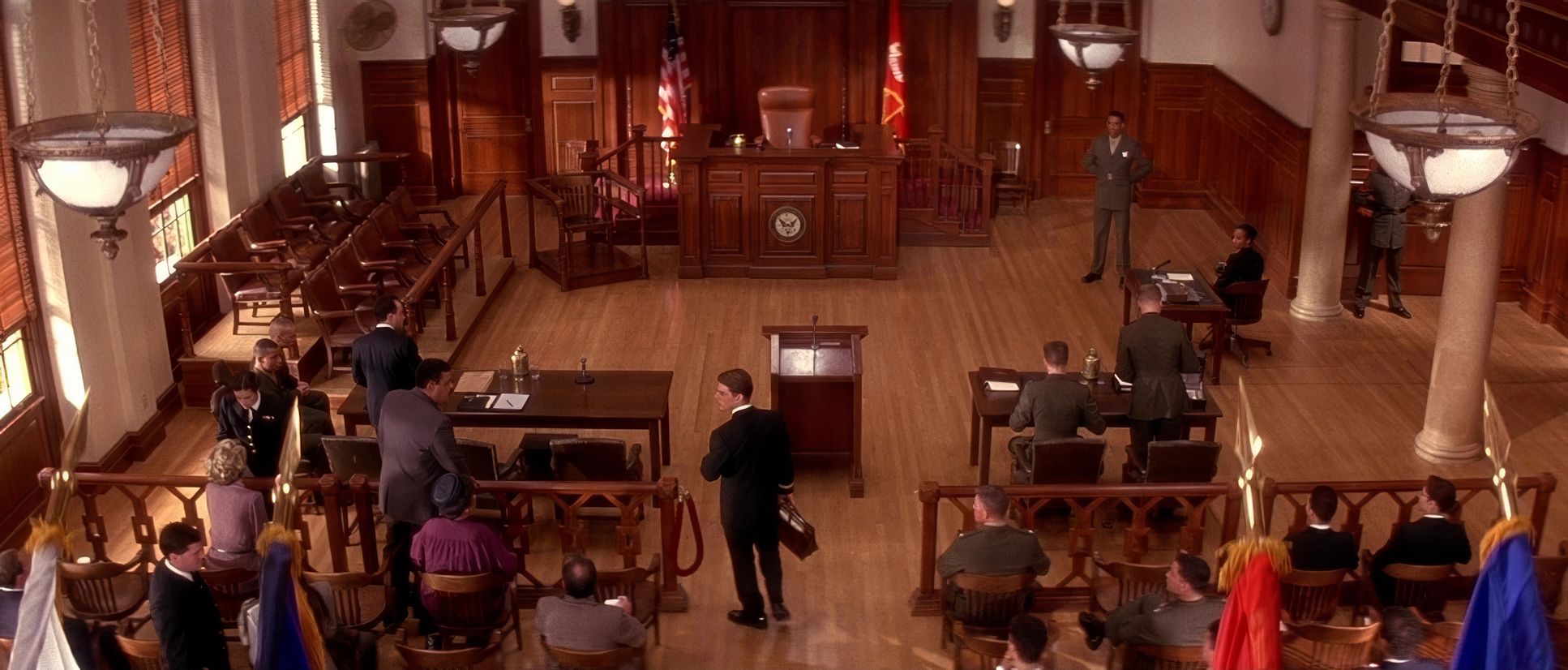
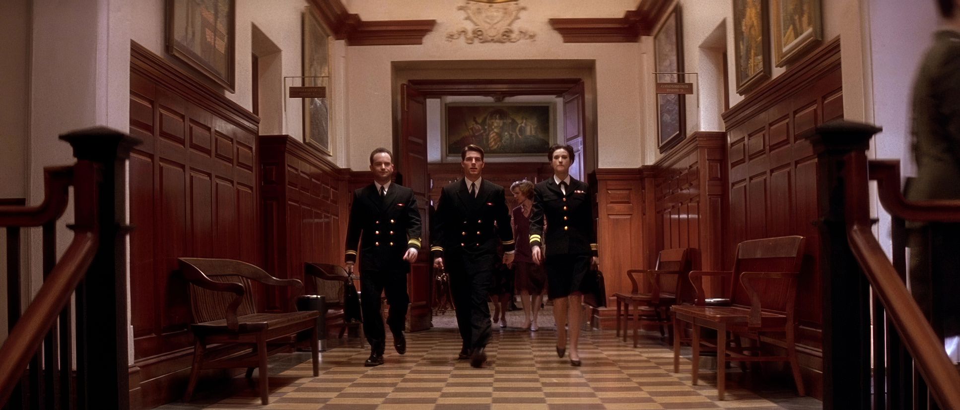
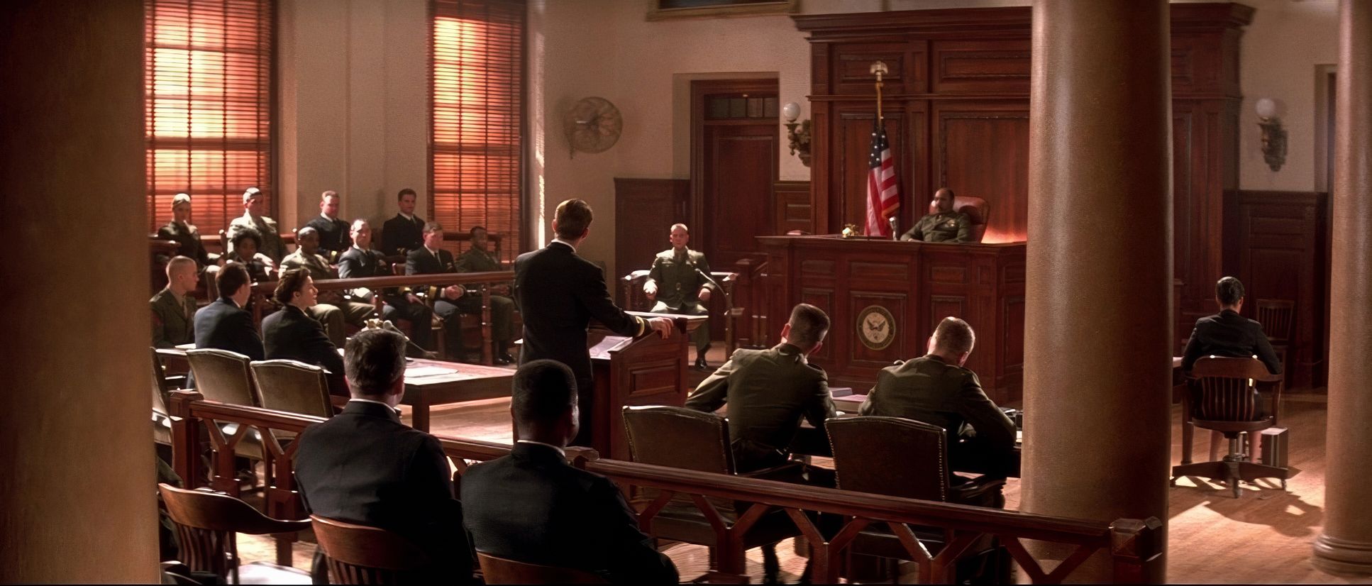
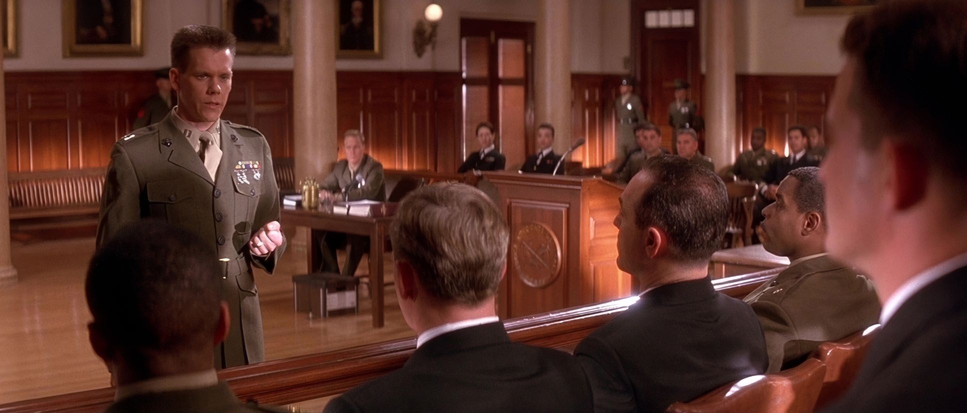
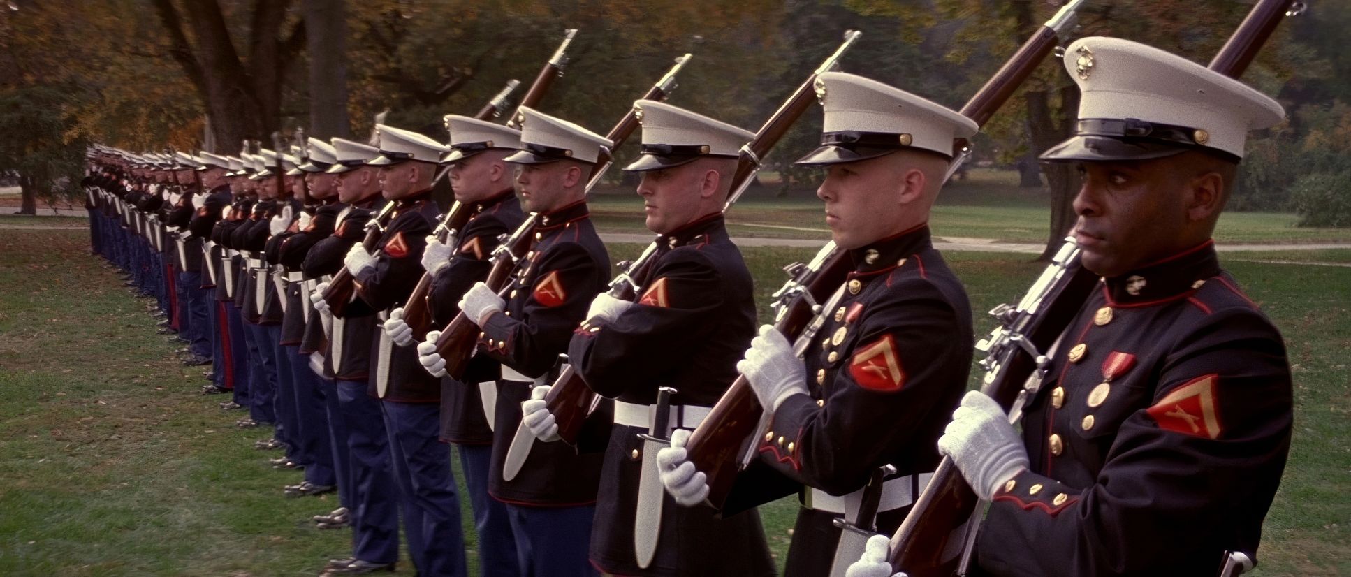
Composition in A Few Good Men is a masterclass in leveraging the 2.35:1 anamorphic frame to convey power. Despite its theatrical roots, the film never feels “stagey.” Richardson uses the wide frame to establish a strict hierarchy the judge elevated, the defense and prosecution tables strategically opposed.
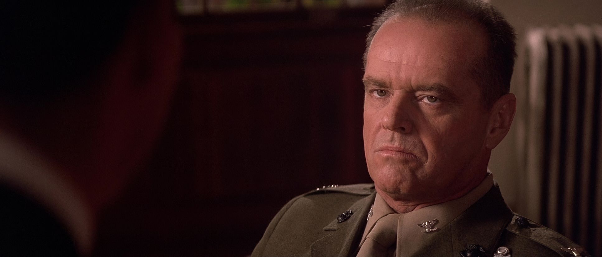
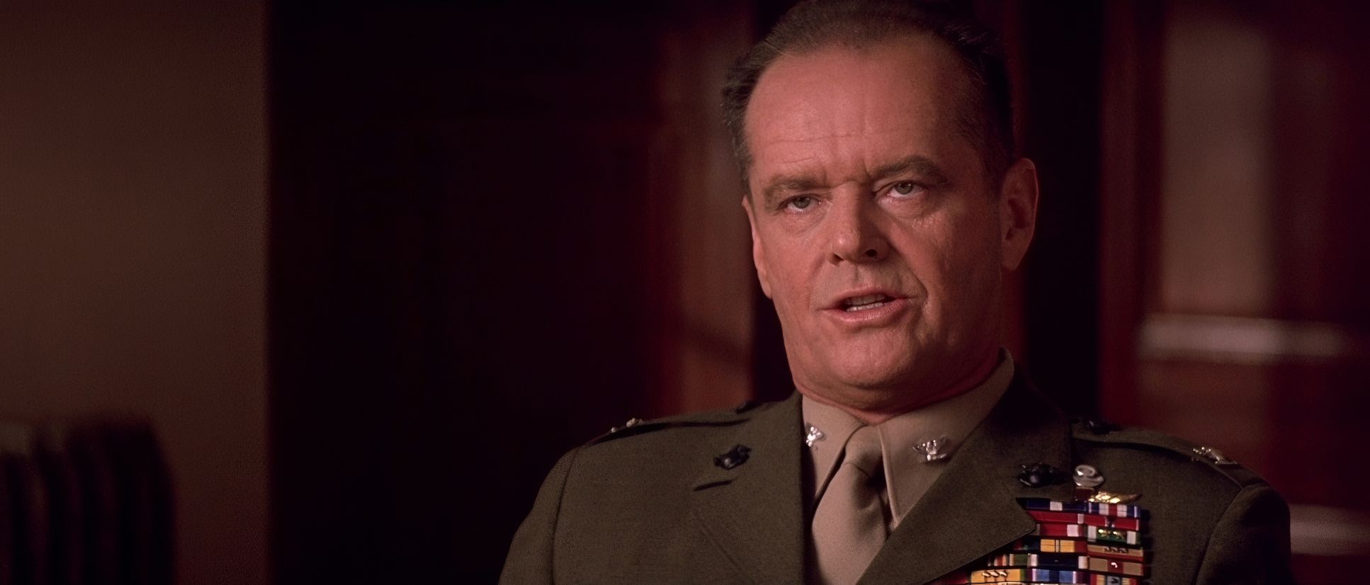
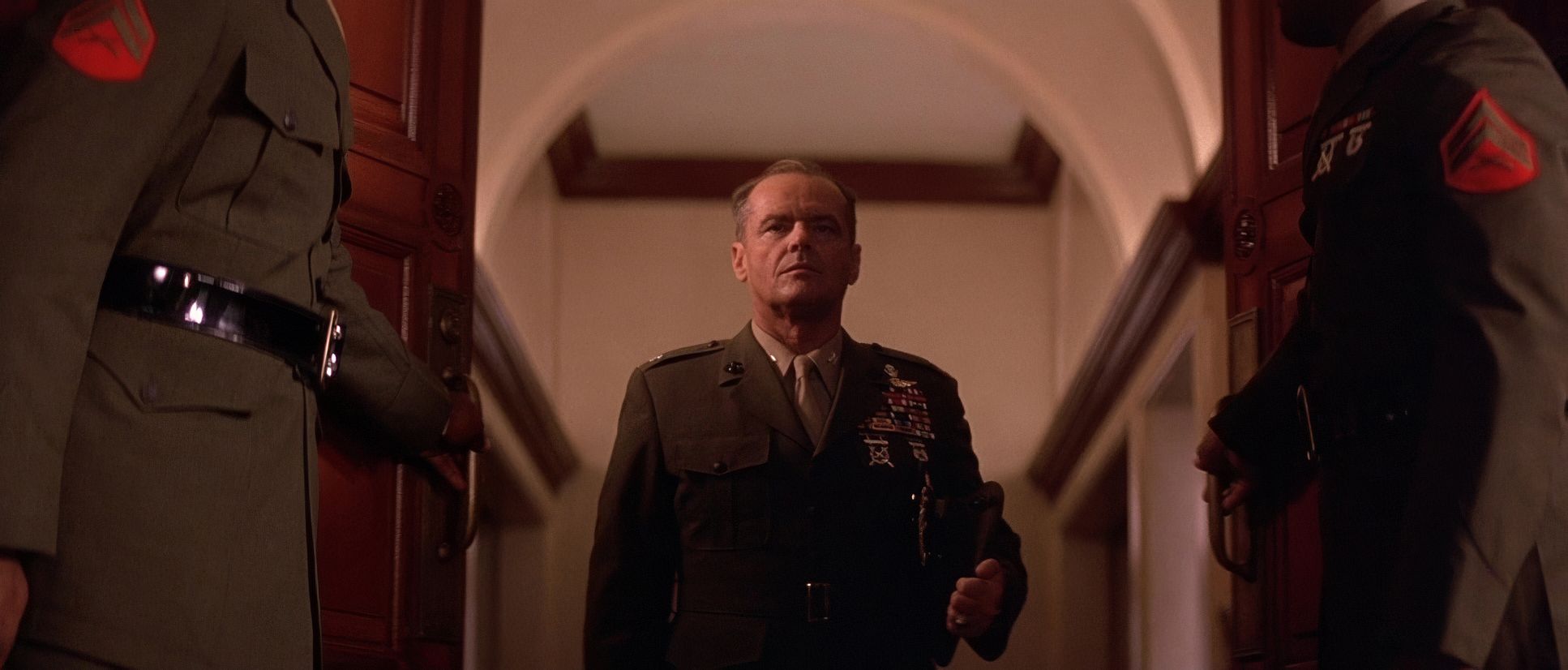
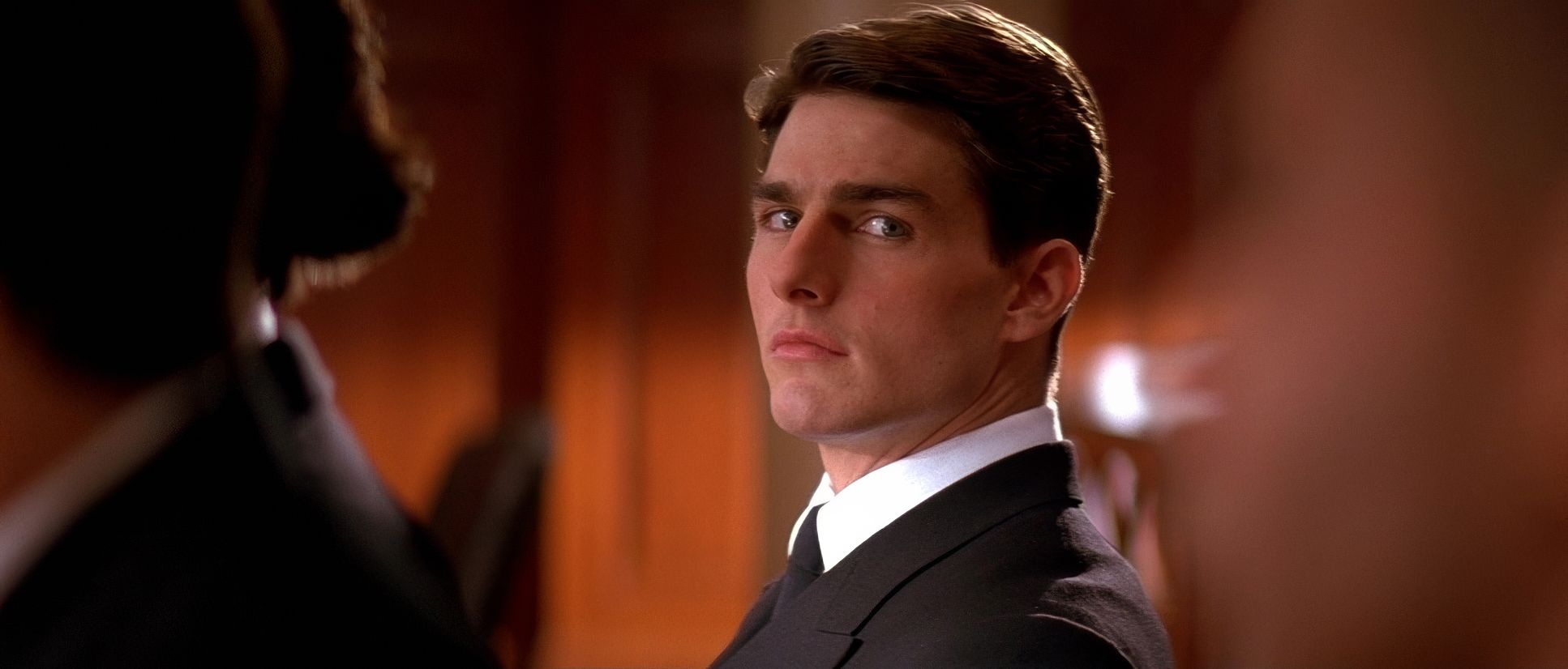
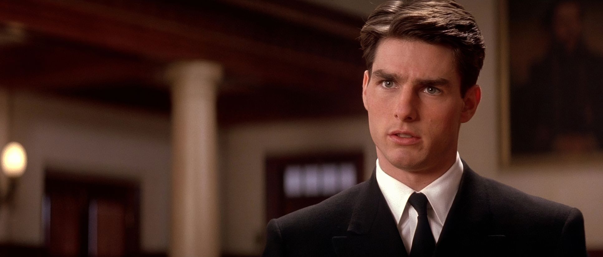
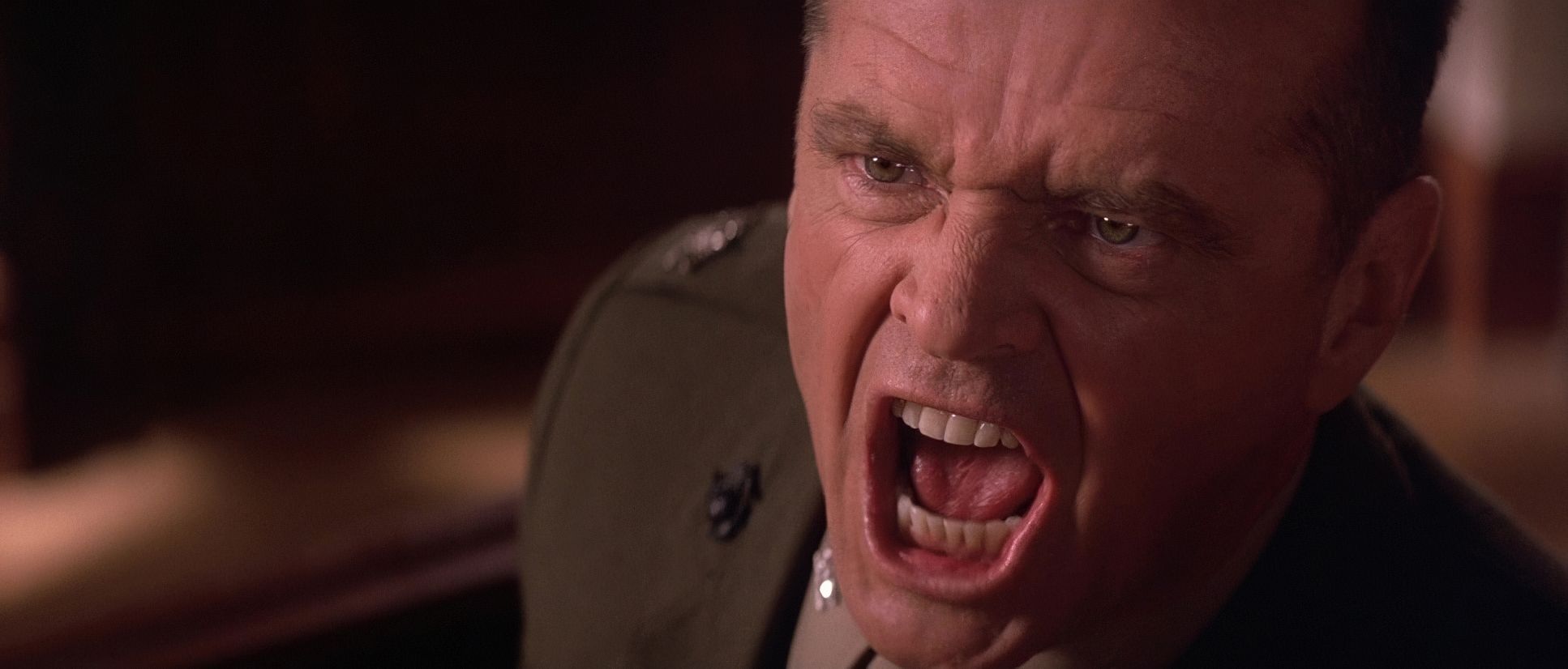
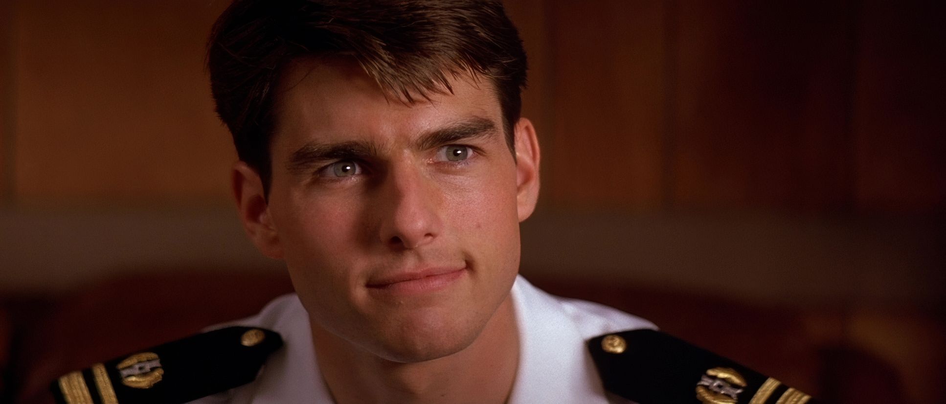
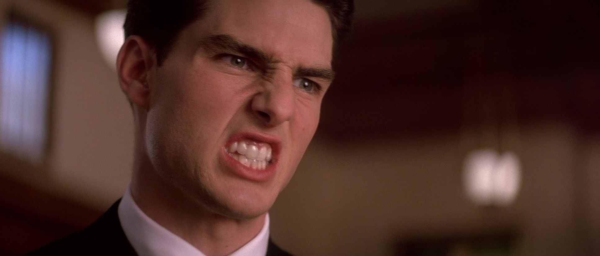
The framing of Kaffee and Jessup is intensely deliberate. Early on, Kaffee is often framed with significant negative space, suggesting he’s a small man in a big system. As he finds his footing, the compositions tighten. Then you have Jessup. Richardson often frames him from a slightly lower angle to emphasize his imposing authority. During the climax, the frame becomes a vice. Rapid cuts between tight close-ups Kaffee’s intensity vs. Jessup’s hubris leave no escape. It’s direct, unambiguous framing designed to maximize the impact of the performances.
Lensing and Blocking

This is where the film’s “inside baseball” gets interesting. They shot this on Panavision E-Series anamorphic lenses. As a colorist, I love anamorphic for the way the focus falls off at the edges and the subtle “squeeze” it gives the image. It adds a cinematic weight that spherical lenses just can’t match.
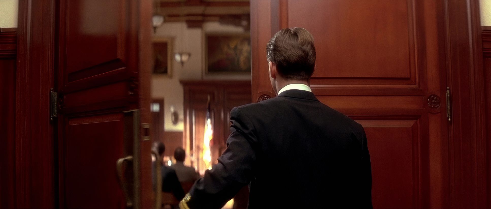
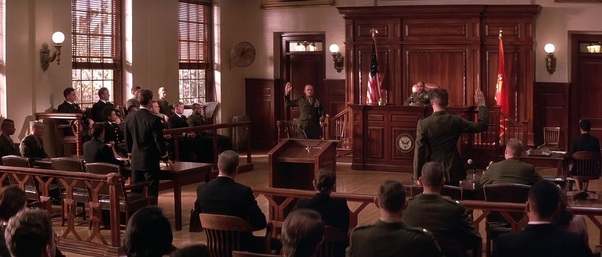
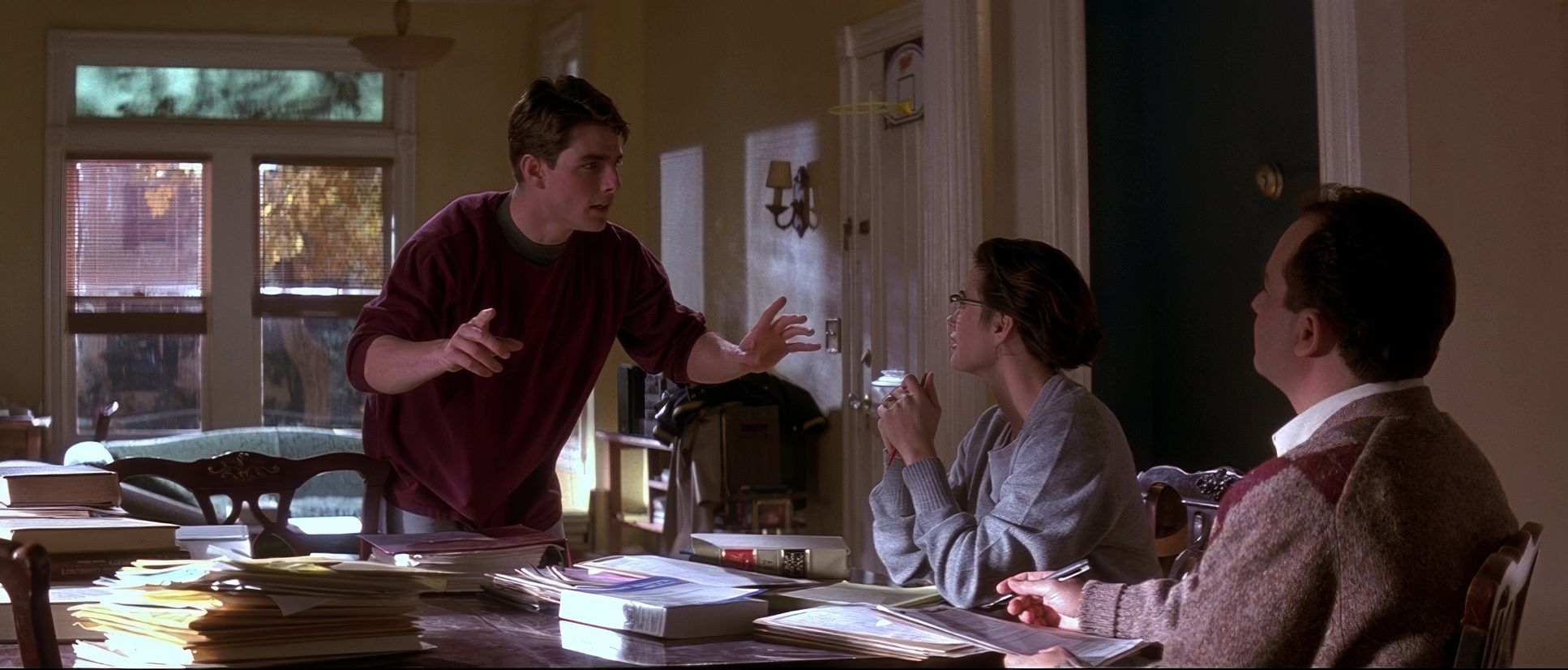
The blocking is where Reiner’s stage-play origins shine. Characters are meticulously positioned to create dynamic relationships. Take the final confrontation: Jessup is in the witness box, Kaffee is at the podium. That physical distance creates a literal “no-man’s-land” of tension. As the heat rises, the characters don’t even need to move much; the way they occupy the foreground or retreat into the shadows of the box tells the story. It’s blocking as silent dialogue.
Lighting Style

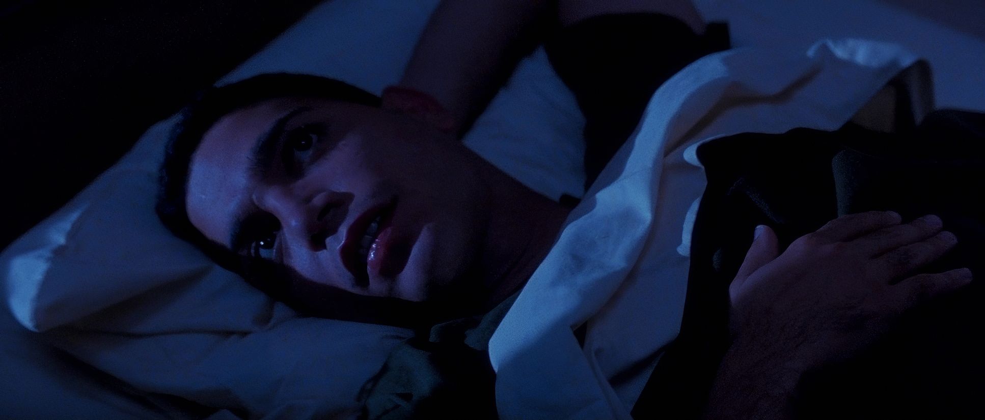
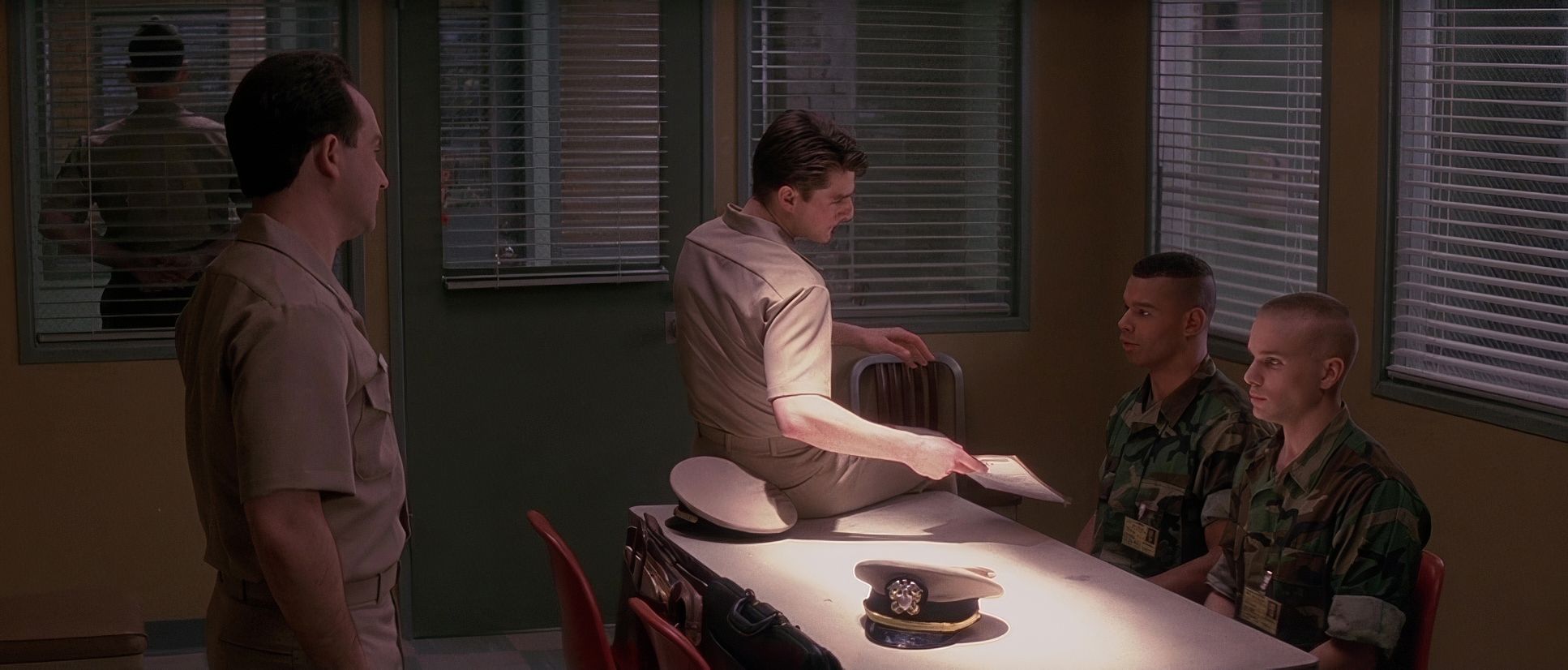
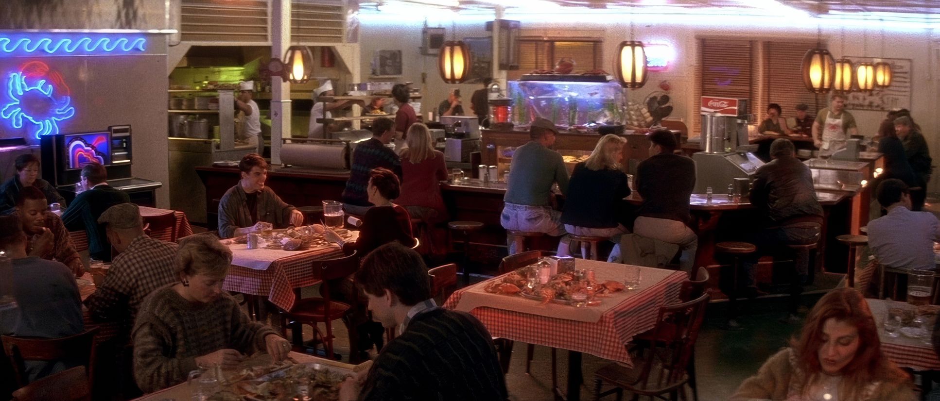
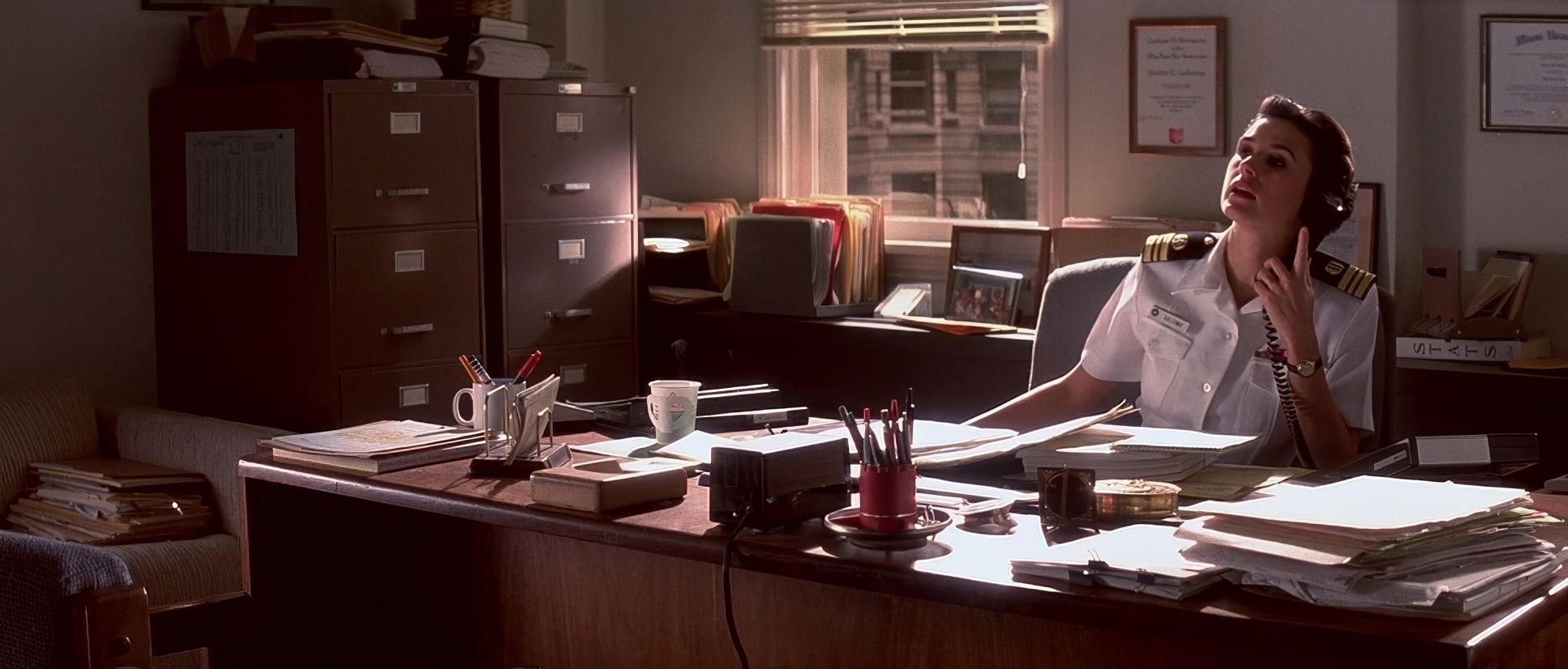
Now we’re talking. The lighting here is predominantly motivated and naturalistic, but with that unmistakable Richardson touch. In the offices, we see a blend of practicals and soft, diffused window light. But look closely at the courtroom scenes.
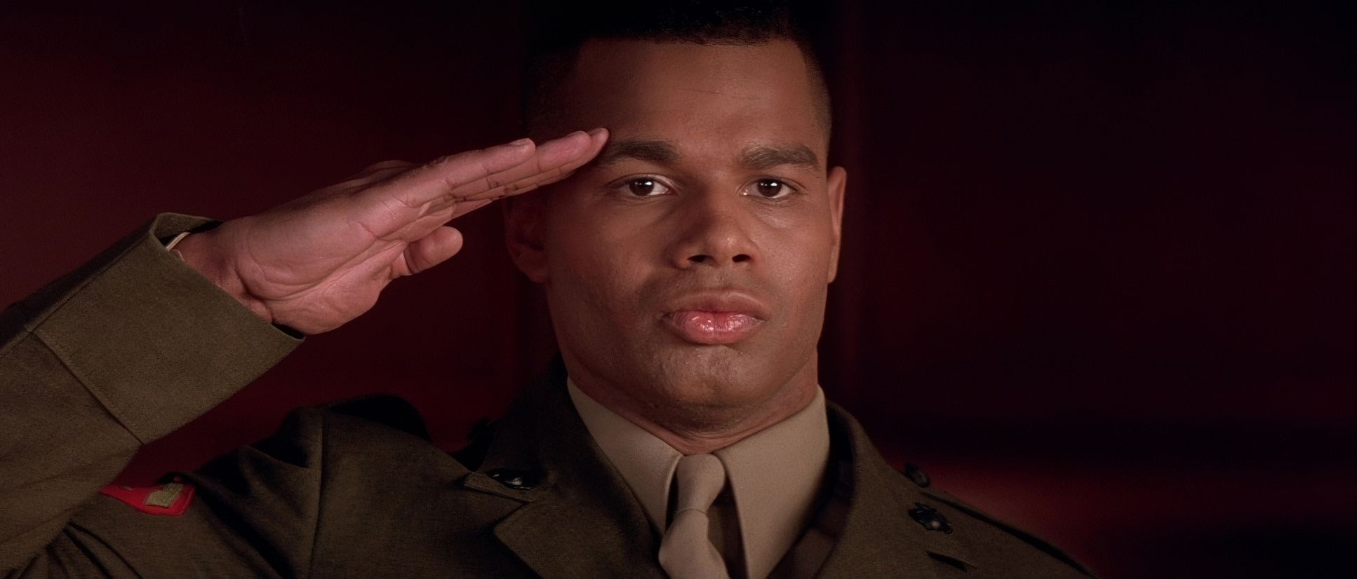
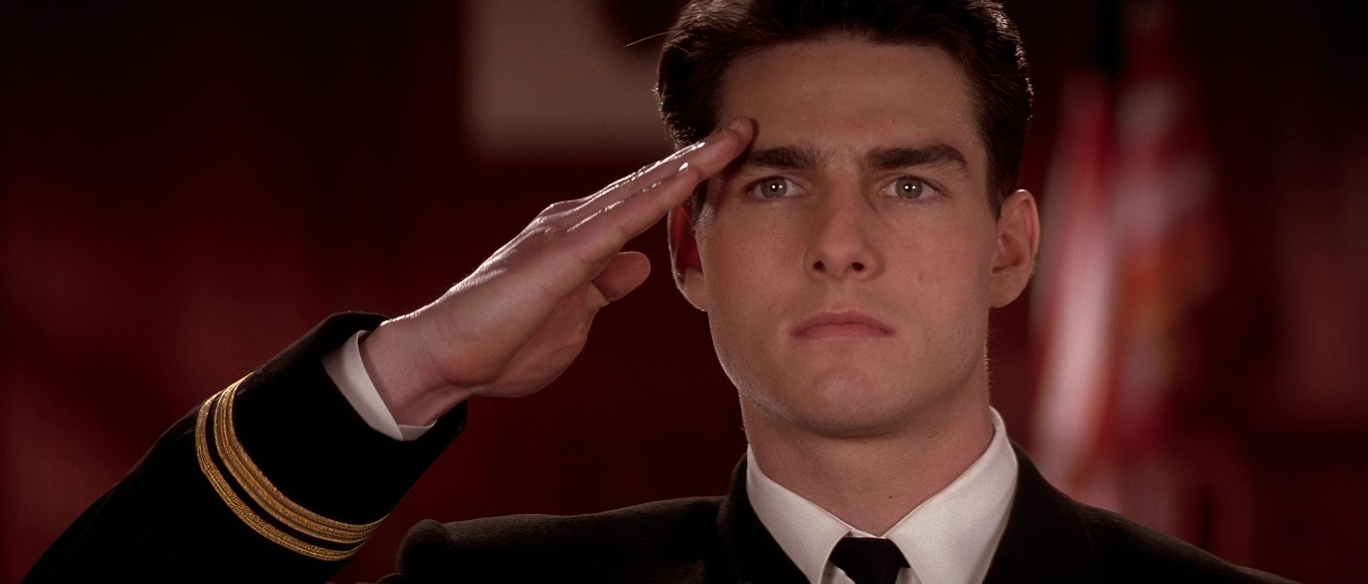
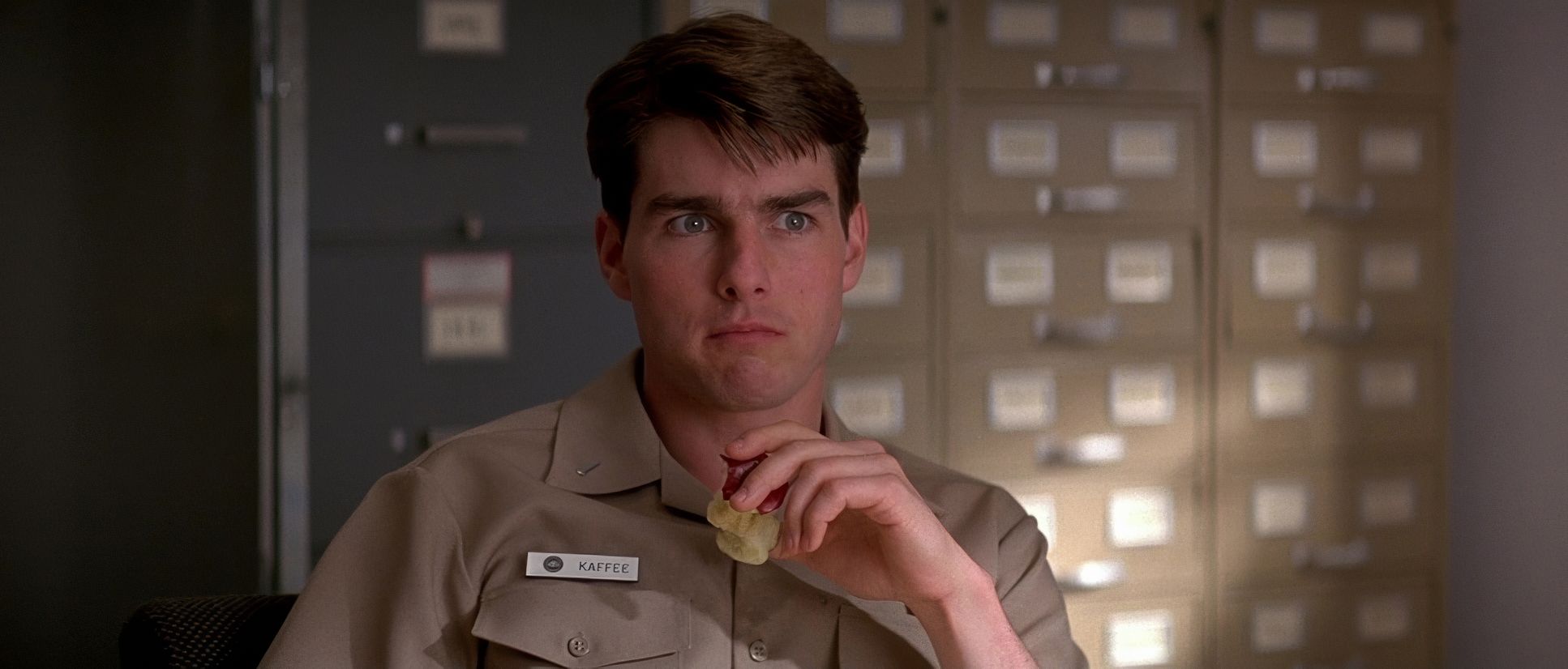
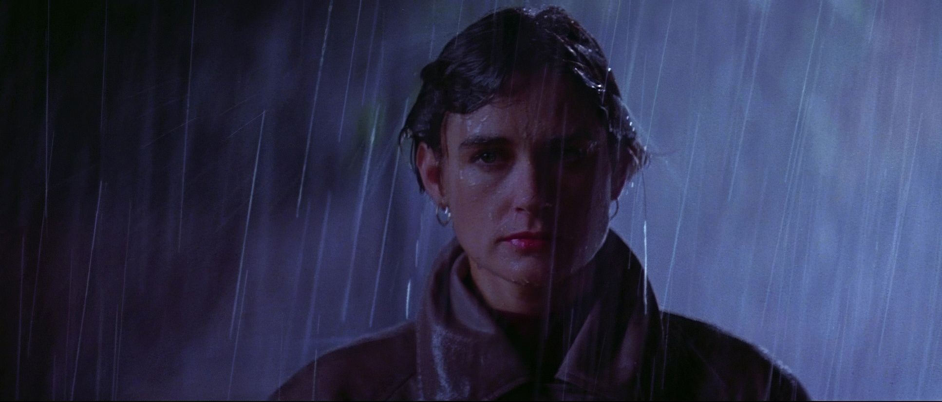
You’ll notice those “hot” highlights Richardson is known for strong top-light that separates the actors from the mahogany backgrounds. It gives the image a punchy, high-contrast feel without losing the institutional “fluorescent” vibe of a military court. It isn’t about moody shadows; it’s about clarity and presence. The highlight roll-off on the film stock prevents these “hot” spots from feeling digital or harsh; instead, they feel organic and commanding. It’s a pragmatic style executed with an artisan’s touch for emotional resonance.
Color Grading Approach

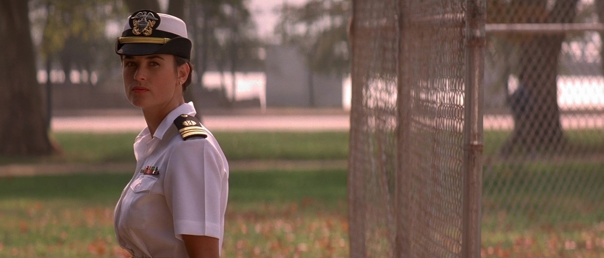
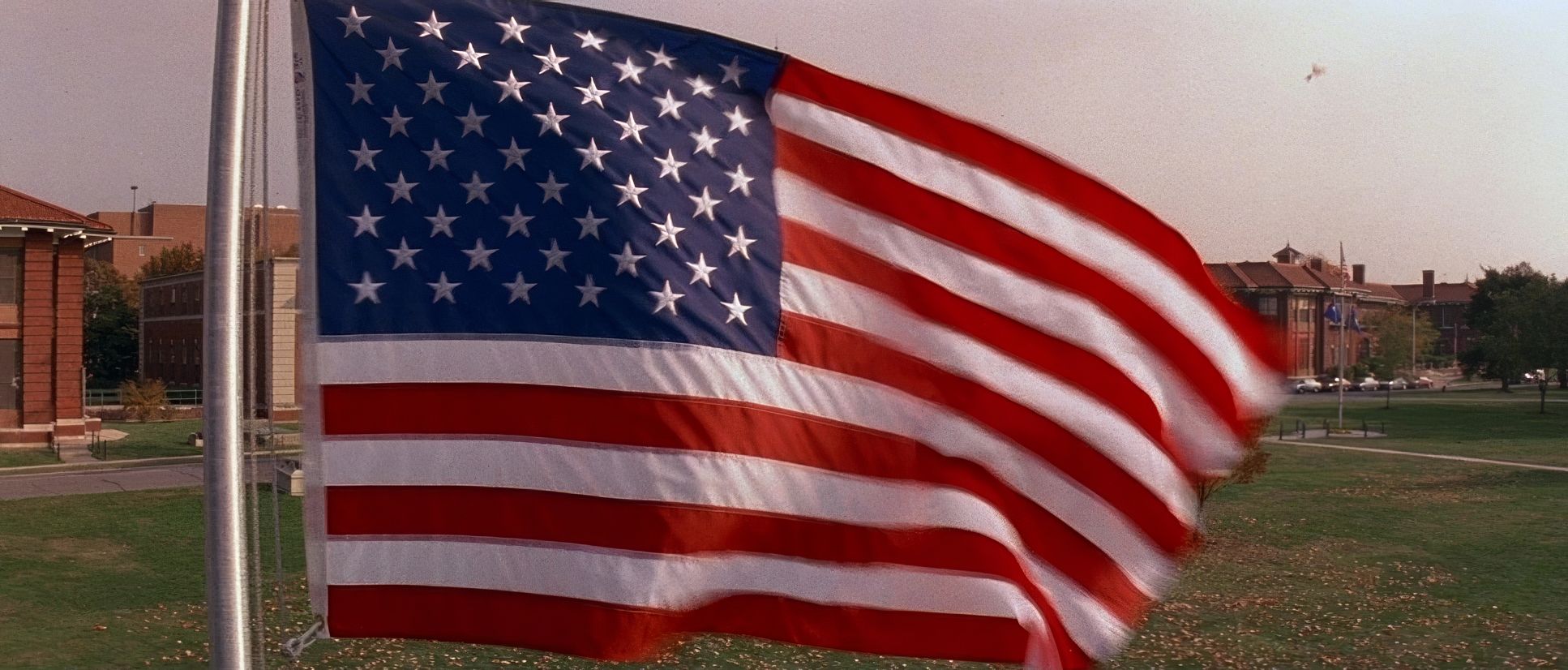
If I were grading A Few Good Men today, I’d be protecting that beautiful 90s print-film aesthetic. The original look embraces a clean, neutral-to-cool palette. The military blues, the grays of the uniforms, and the muted greens of the base create a desaturated world that underscores the gravity of the law.
As a colorist, I’d focus on the density of the blacks in those naval uniforms making sure they have weight without “crushing.” I’d lean into the skin tones, ensuring they remain warm and human against the cooler, institutional backgrounds. This creates a subtle color separation that guides the eye. I’d also preserve that characteristic filmic texture; the way the highlights roll off into the whites is something you just don’t get with modern sensors. It’s about letting the story’s emotional core define the image, rather than imposing a heavy “look.”
Technical Aspects & Tools
A Few Good Men | 35mm Anamorphic • 2.35:1
| Genre | Courtroom Drama, Drama, Stage Adaptation, Military, War, Legal |
| Director | Rob Reiner |
| Cinematographer | Robert Richardson |
| Production Designer | J. Michael Riva |
| Costume Designer | Gloria Gresham |
| Editor | Robert Leighton, Steven Nevius |
| Time Period | 1990s |
| Color | Warm, Saturated |
| Aspect Ratio | 2.35 – Anamorphic |
| Format | Film – 35mm |
| Lighting | Soft light |
| Lighting Type | Daylight, Sunny |
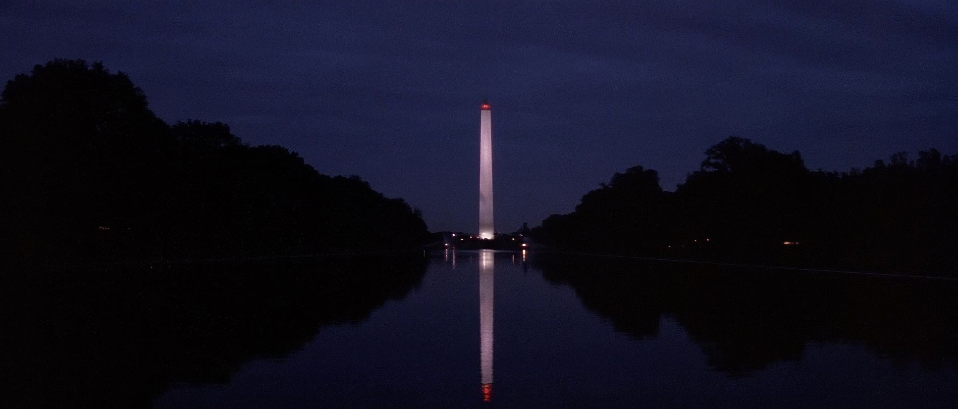
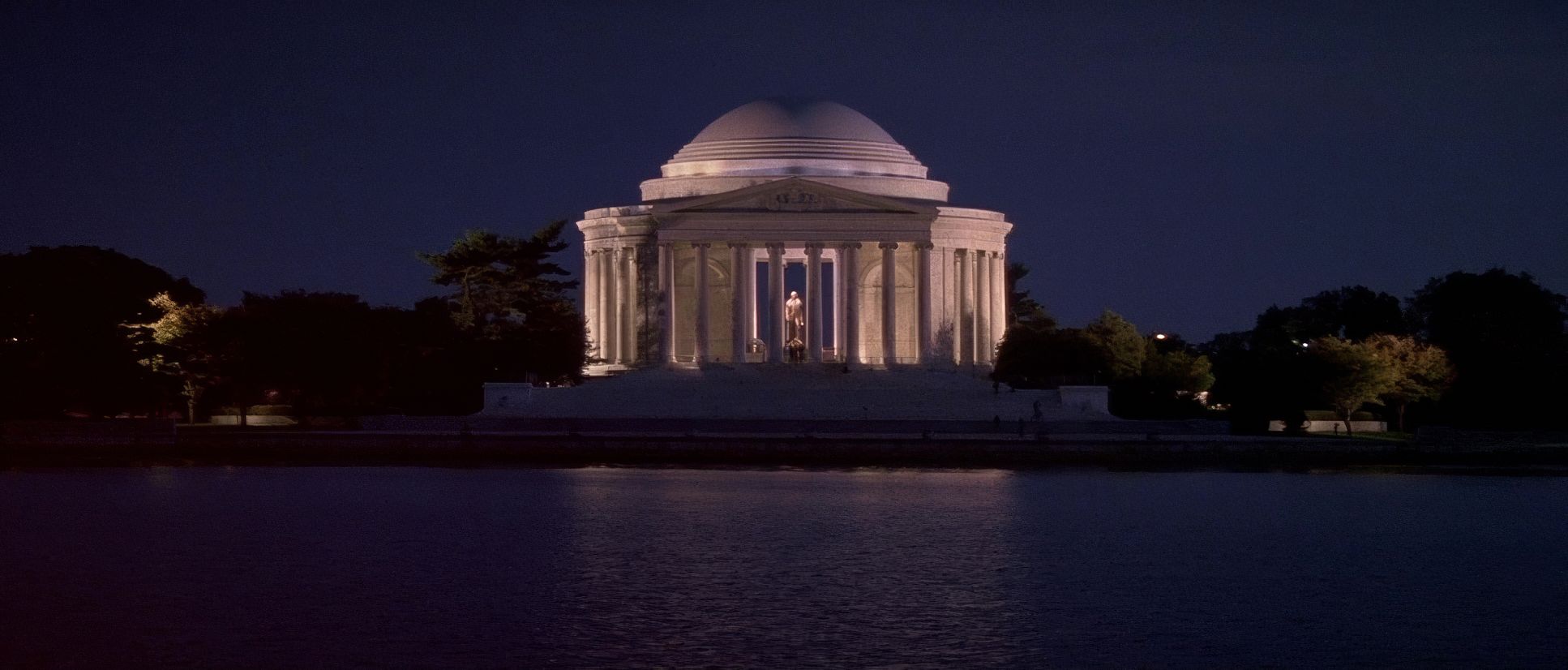
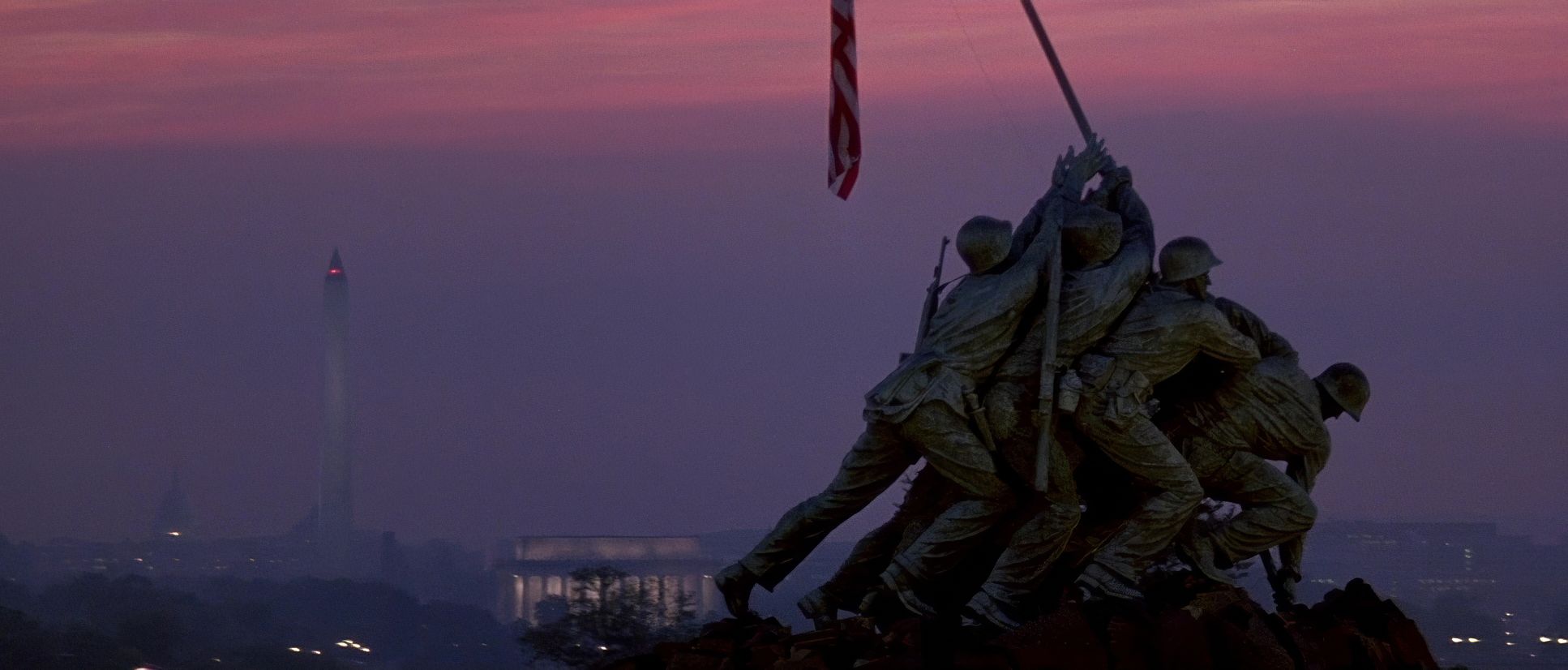
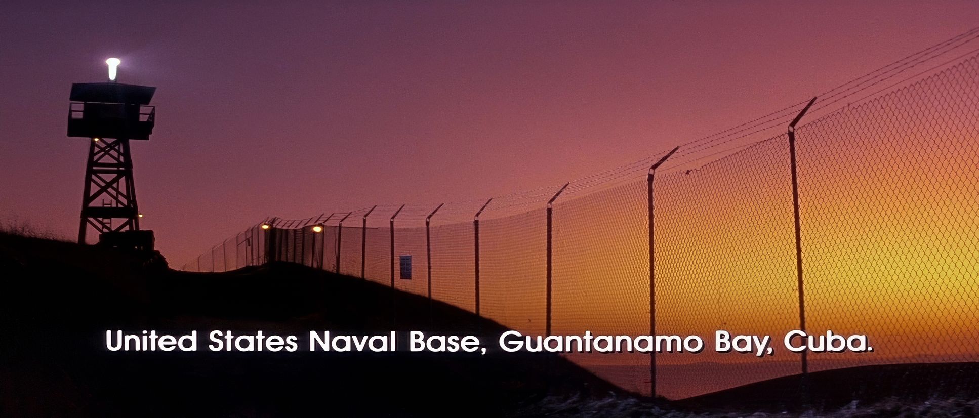
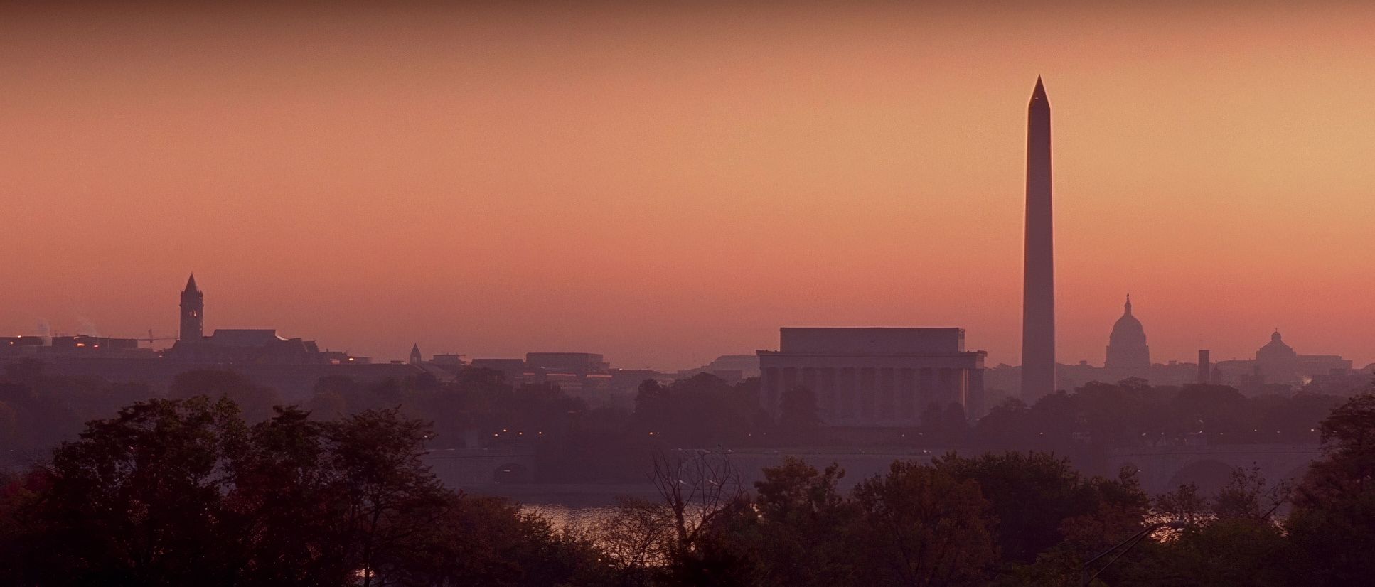
| Story Location | United States of America > Washington D.C |
| Filming Location | North America > United States of America |
| Camera | Panavision Panaflex |
| Lens | Panavision E series |
Shot in 1992, this was a 35mm production, likely using Kodak Vision stock. The choice of film dictated the grain structure and that incredible dynamic range. When I look at the shadows in the interrogation scenes, I see the latitude of the Kodak stock there’s detail even in the dark corners.
They used Panavision Panaflex cameras with the aforementioned E-Series anamorphic glass. Remember, post-production in ’92 was a photochemical process. There was no “Undo” button like I have in Resolve. The look was achieved largely in-camera and in the lab. This required a level of discipline and planning that we sometimes lose in the digital age. Every frame you see was a deliberate, baked-in decision made by Richardson and Reiner on the day.
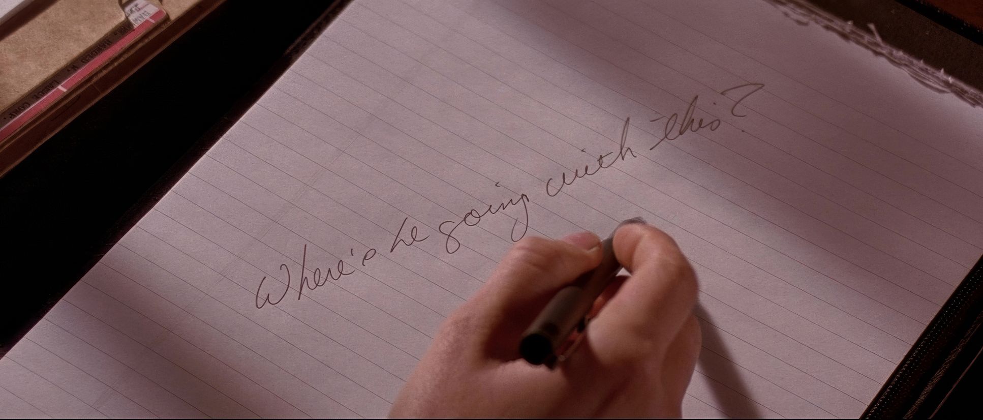
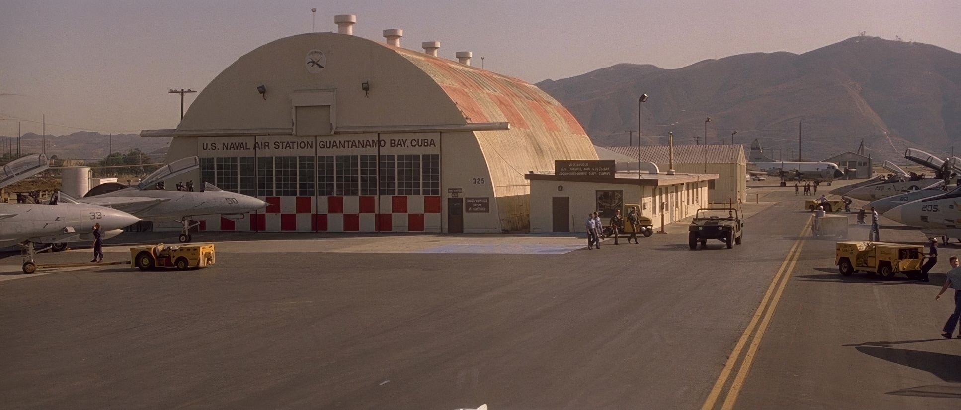
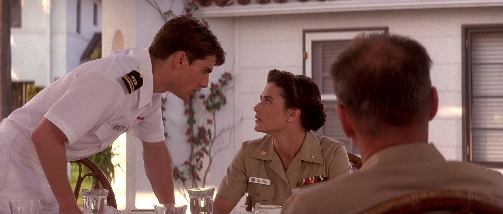
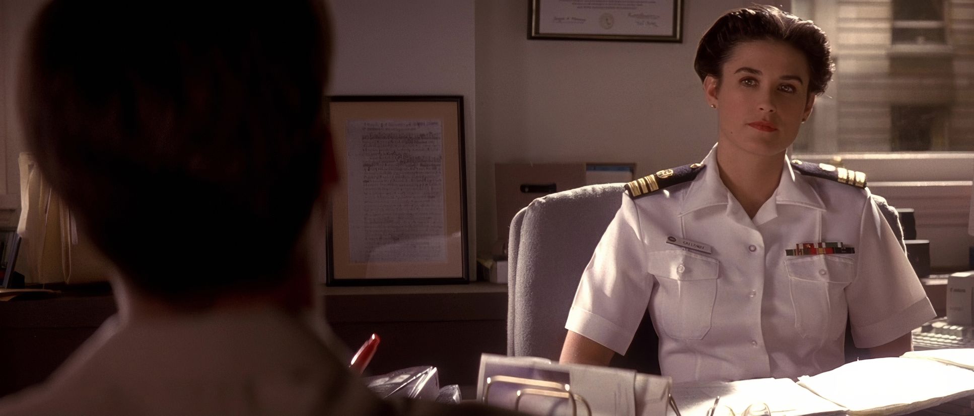
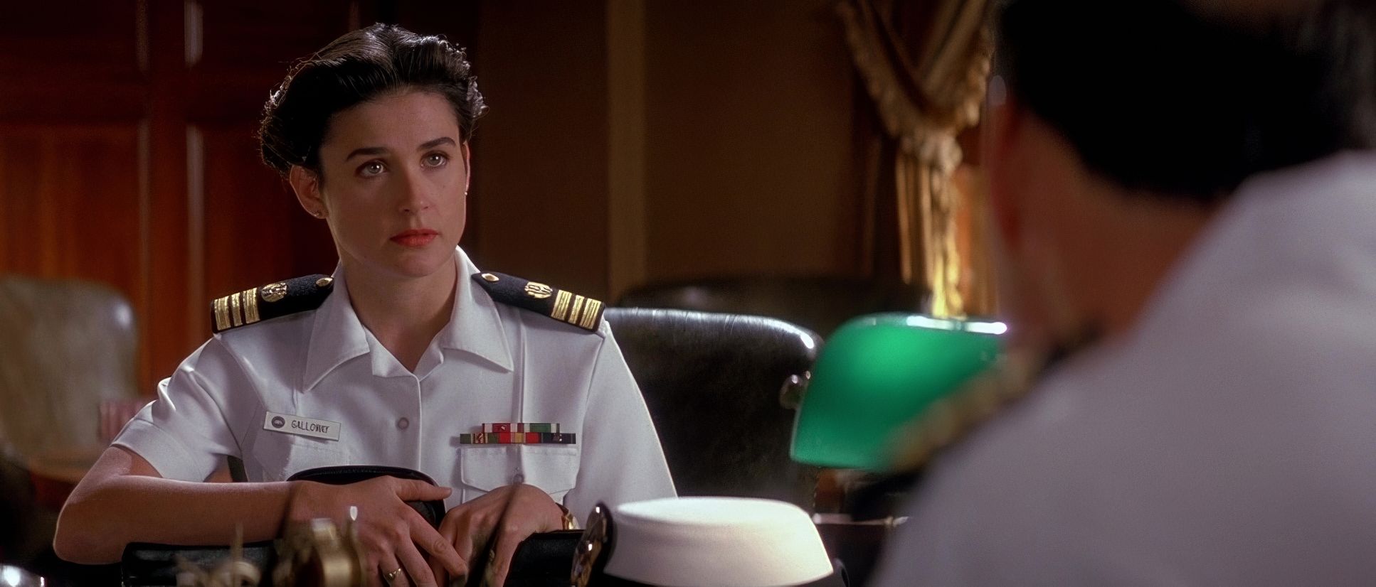
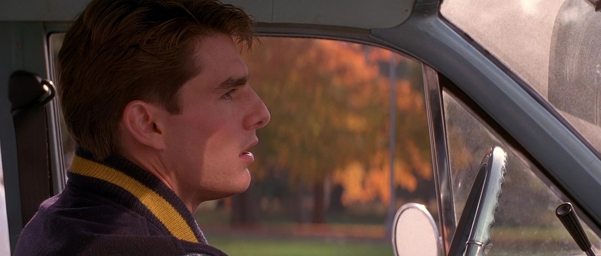
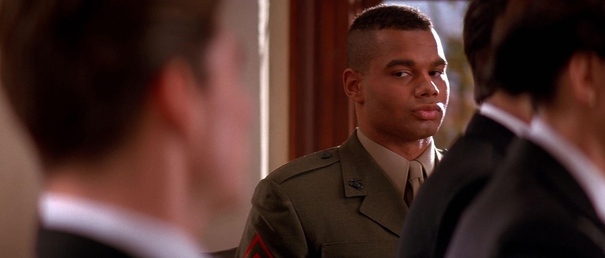
A Few Good Men (1992) Film Stills
A curated reference archive of cinematography stills from A Few Good Men (1992). Study the lighting, color grading, and composition.


- Also read: THE GOONIES (1985) – CINEMATOGRAPHY ANALYSIS
- Also read: F1: THE MOVIE (2025) – CINEMATOGRAPHY ANALYSIS
Browse Our Cinematography Analysis Glossary
Explore directors, cinematographers, cameras, lenses, lighting styles, genres, and the visual techniques that shape iconic films.
Explore Glossary →