A Charlie Brown Christmas (1965), I’m not just looking for nostalgia. I’m looking at the “imperfections.”On paper, this special shouldn’t work. It’s often called “cheap” or “rudimentary,” and yeah, by the standards of a high-budget Disney feature, the technical execution is thin. But as a filmmaker, I see something else: an object lesson in how constraints breed soul. Its visual grammar doesn’t just support the story; it is the story.
Color Grading Approach
Let’s talk about the color because, honestly, if an original 35mm print of this landed on my grading desk today, I’d be ecstatic. The special carries those heavy, mid-60s “print-film sensibilities” that we spend hours trying to replicate digitally today.
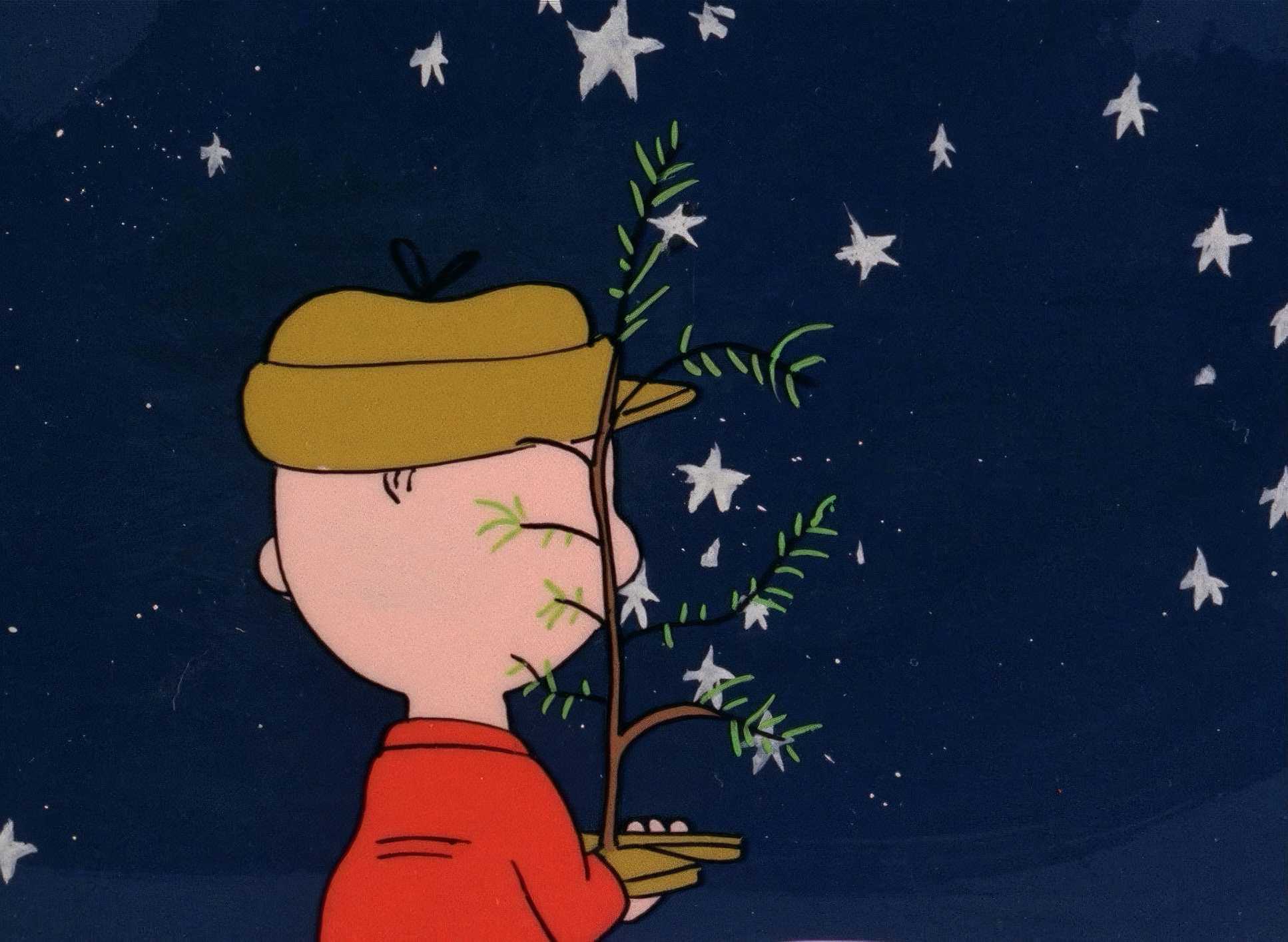
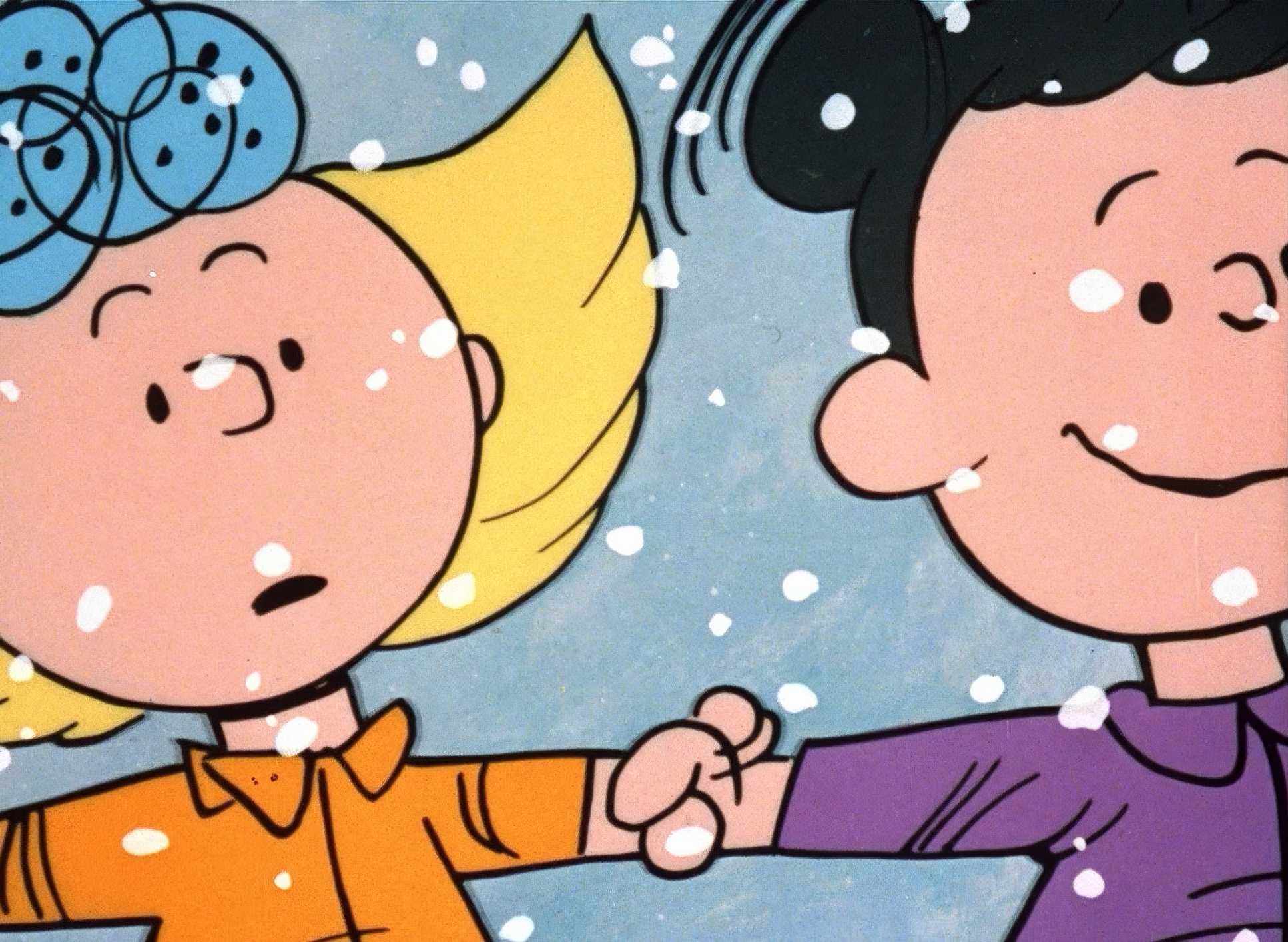
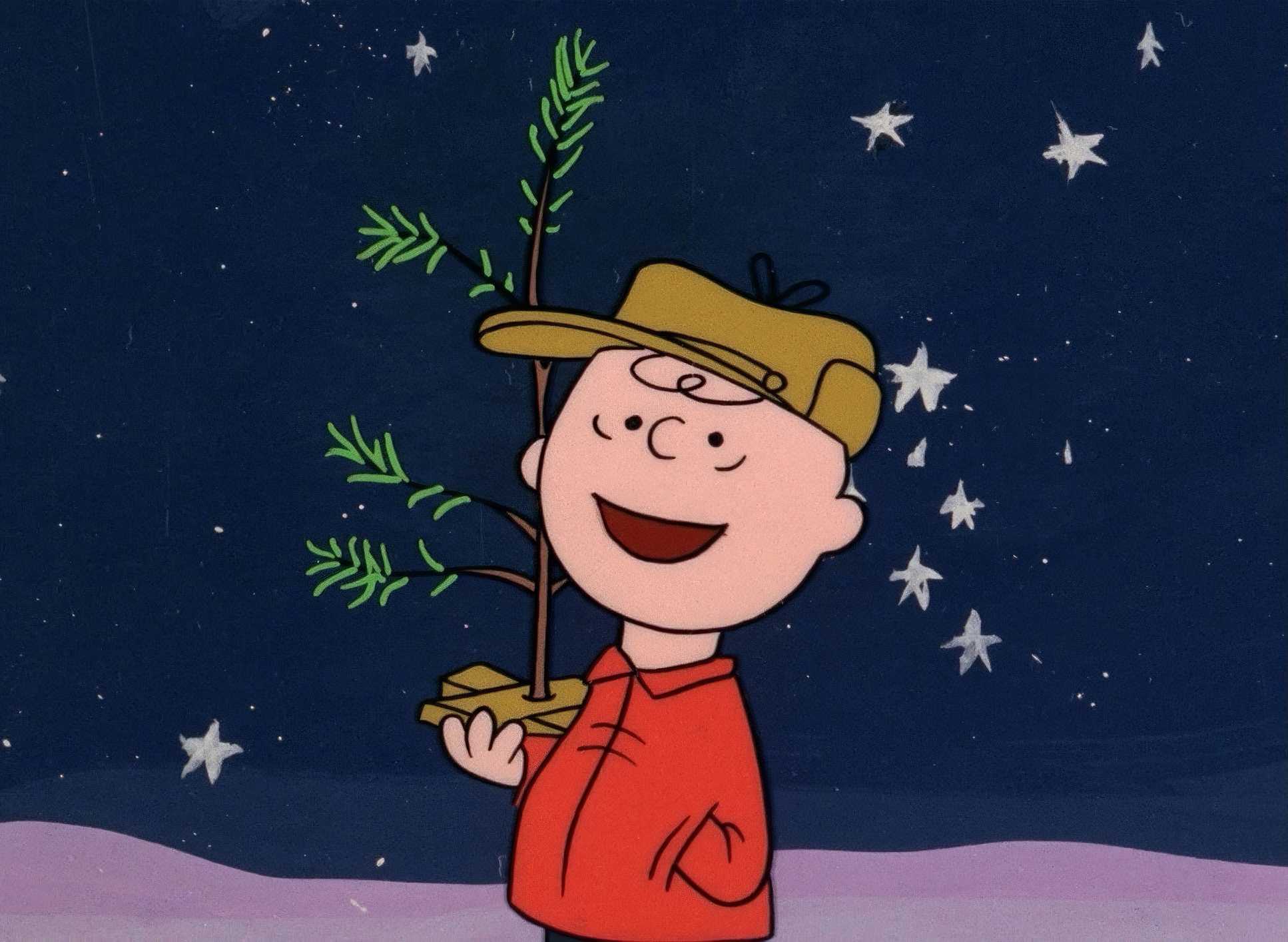
If I were grading this in DaVinci Resolve, I wouldn’t touch the “clean” look. I’d lean into the nostalgic, warm bias in the mid-tones to support that Vince Guaraldi jazz score. I’d build a custom Film Print Emulation (FPE) that respects the original dyes of the era. You have to be careful with the saturation Charlie Brown’s yellow shirt and Lucy’s blue dress need to “pop,” but if they’re too clean, they lose that hand-painted charm.
I’d also focus on the highlight roll-off. I want the whites of the snow and Snoopy’s fur to have that gentle, organic bloom you only get with film stock, rather than a harsh digital clip. The goal isn’t to make it look “new”; it’s to make it look like the best possible version of 1965.
About the Cinematographer
In live-action, we usually have one person to blame or praise for the look. In 1965 television animation, the “cinematographer” was really a collective brain trust. You had Bill Melendez directing, but the real visual architect was Ed Levitt, the layout artist.
Levitt was essentially the DP. He was the one deciding how to translate Charles Schulz’s minimalist line art into a cinematic frame. He wasn’t just drawing; he was designing shots. Along with Dean Spille, they had to figure out how to take a static comic strip and give it “depth” on a shoestring budget. They created a visual coherence that feels intentional, not just economical. It’s a collective vision that proves you don’t need a massive crew to create an iconic aesthetic.
Compositional Choices
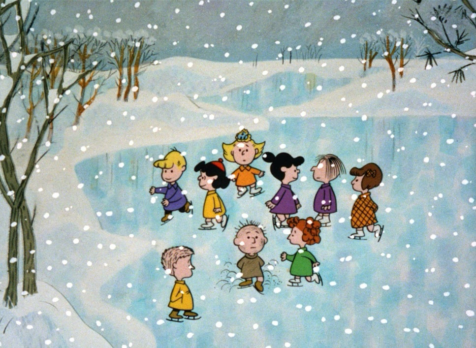
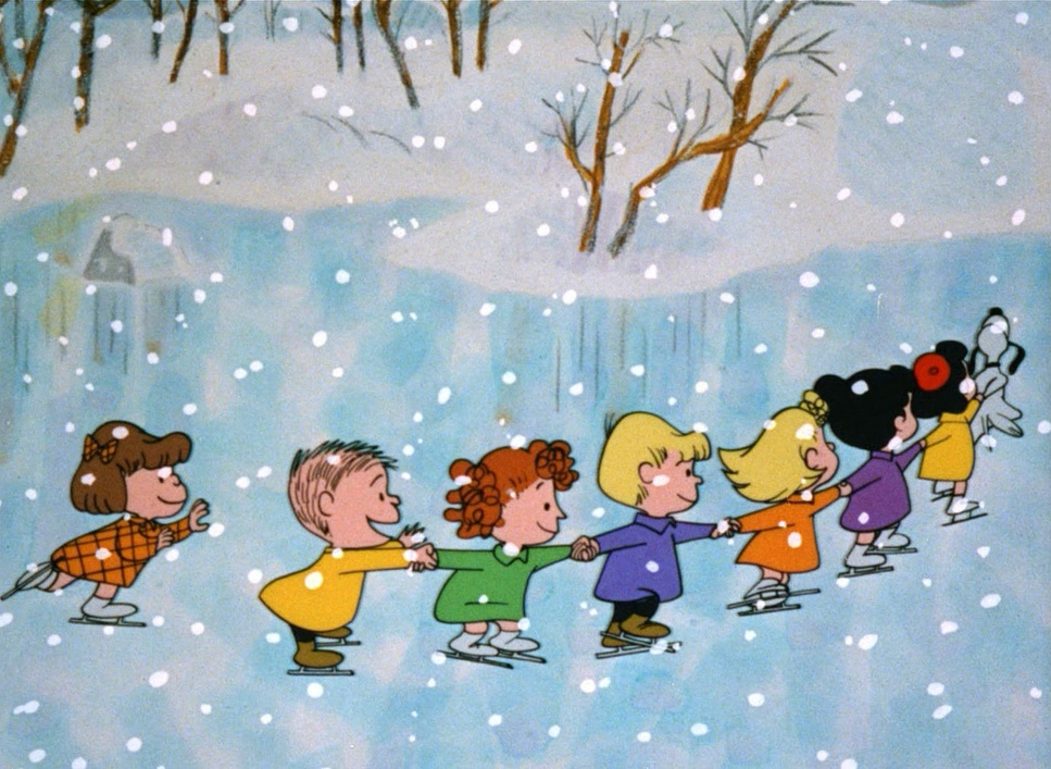
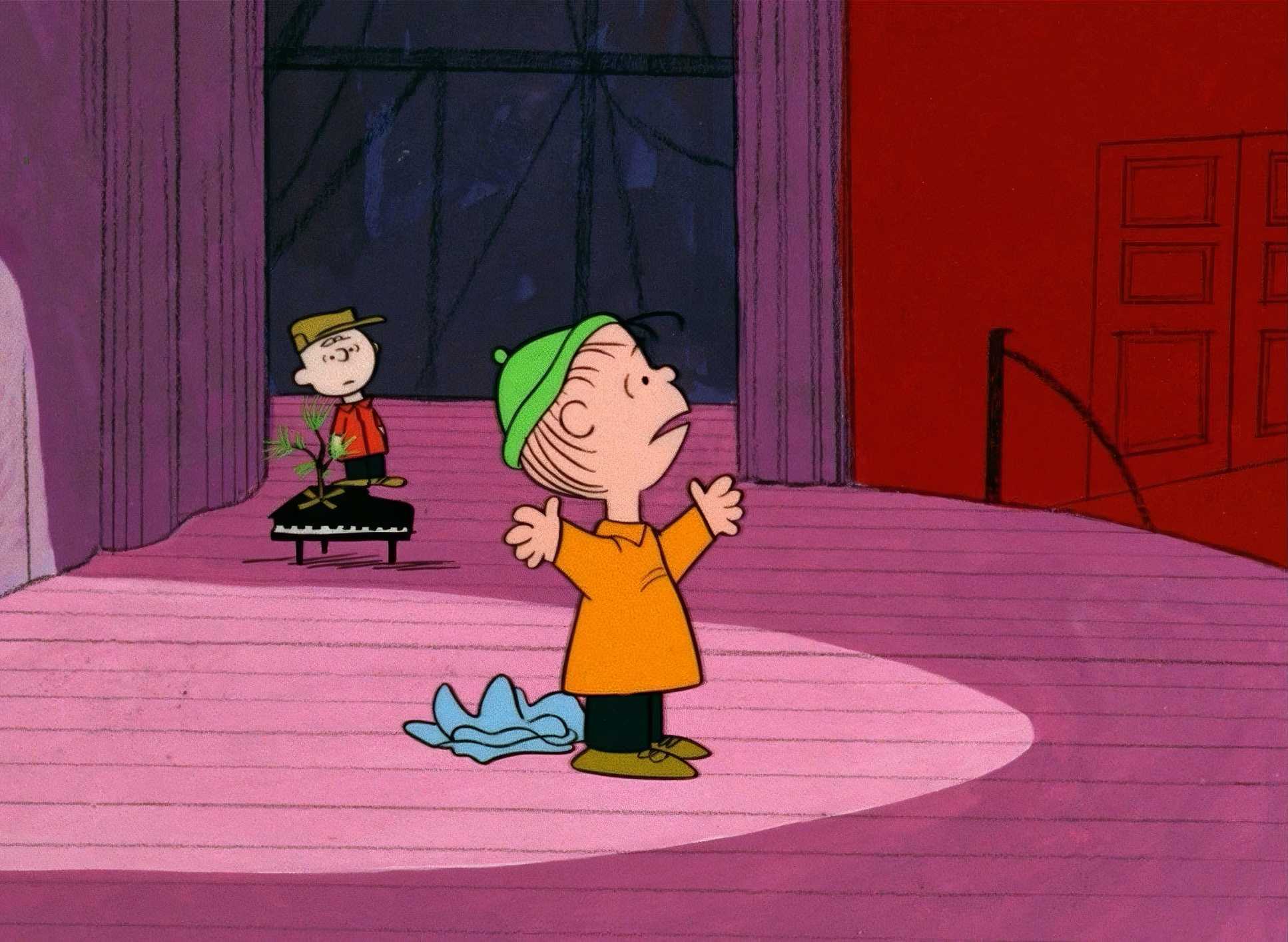
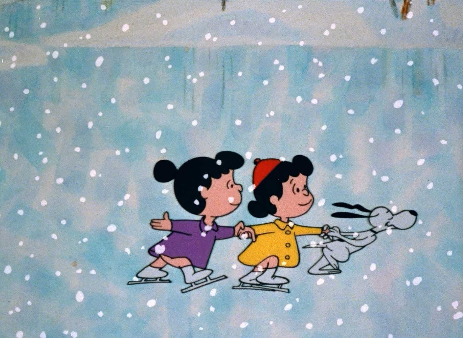
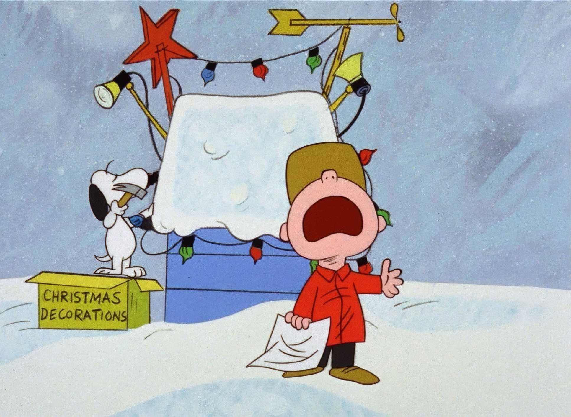
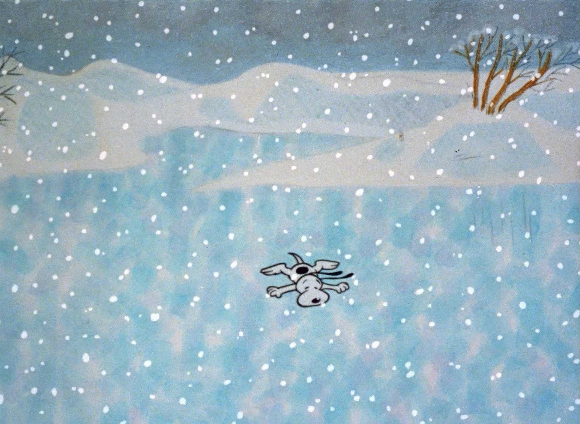
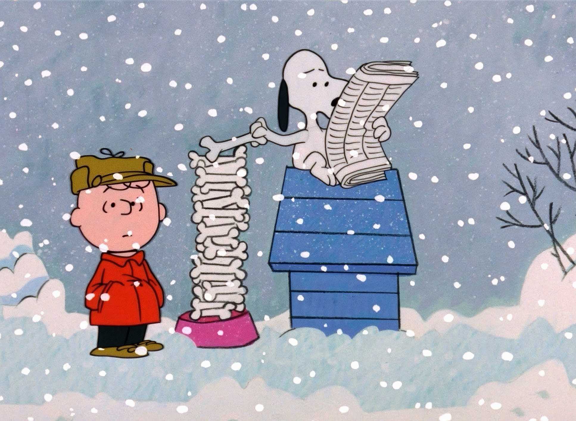
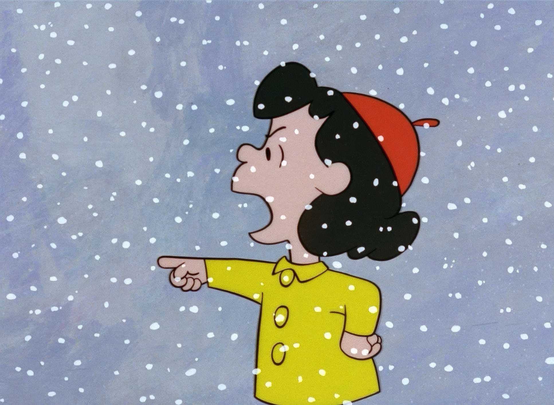
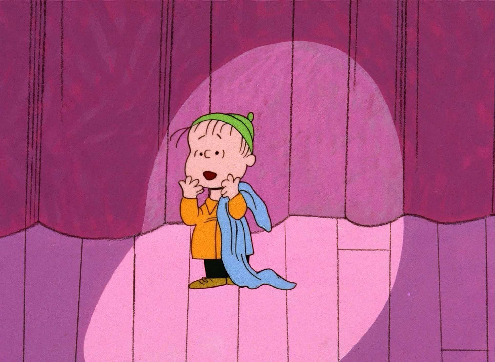
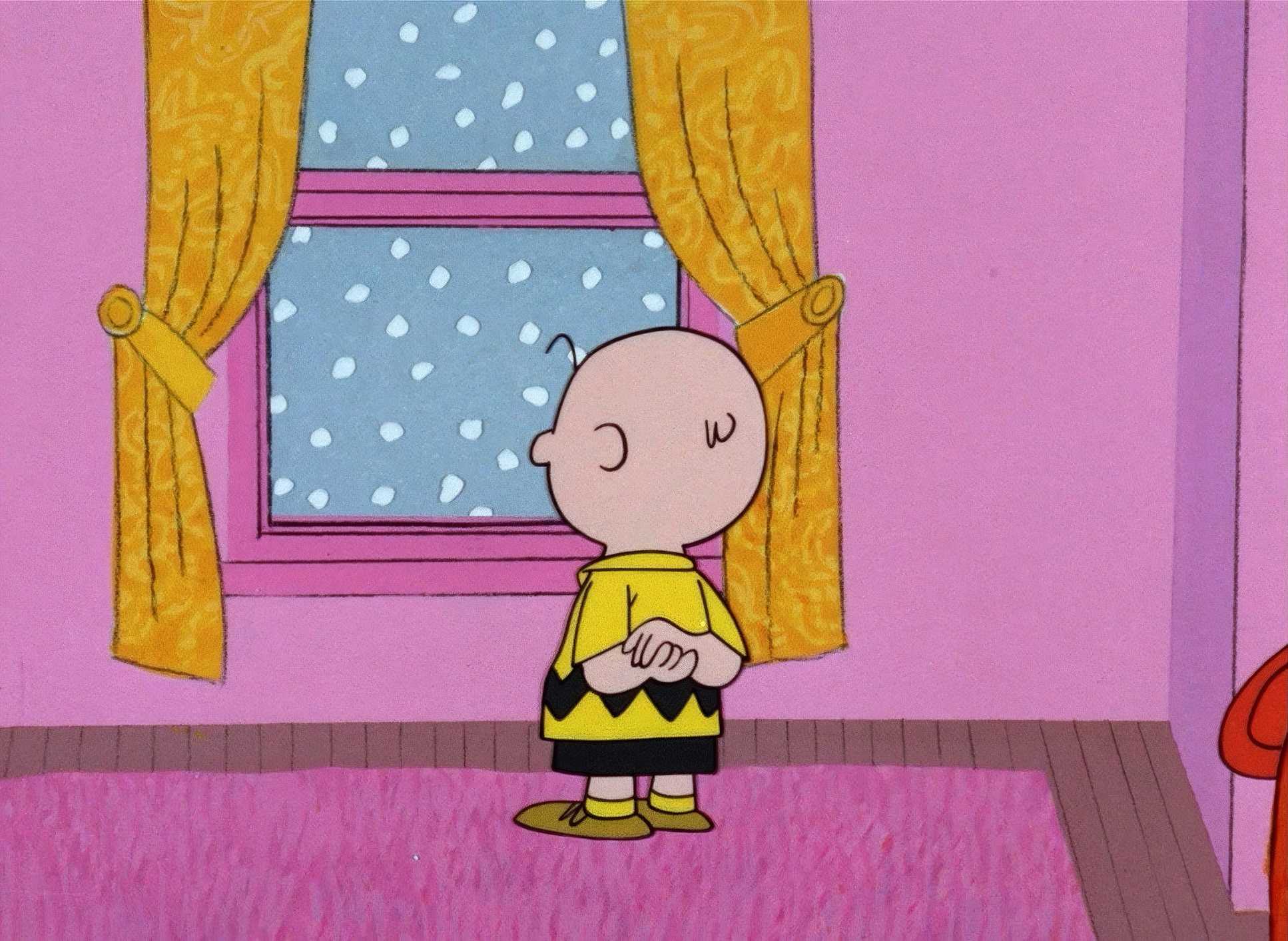
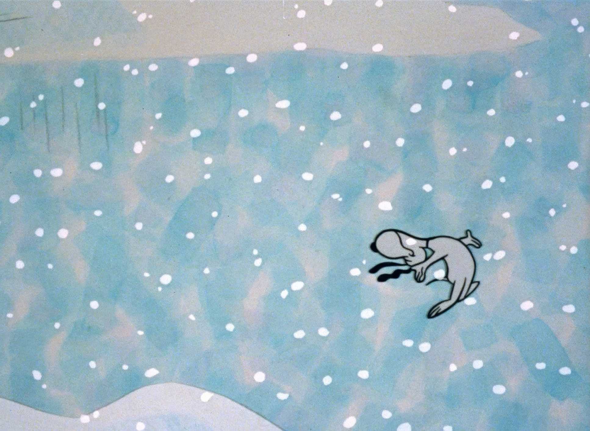
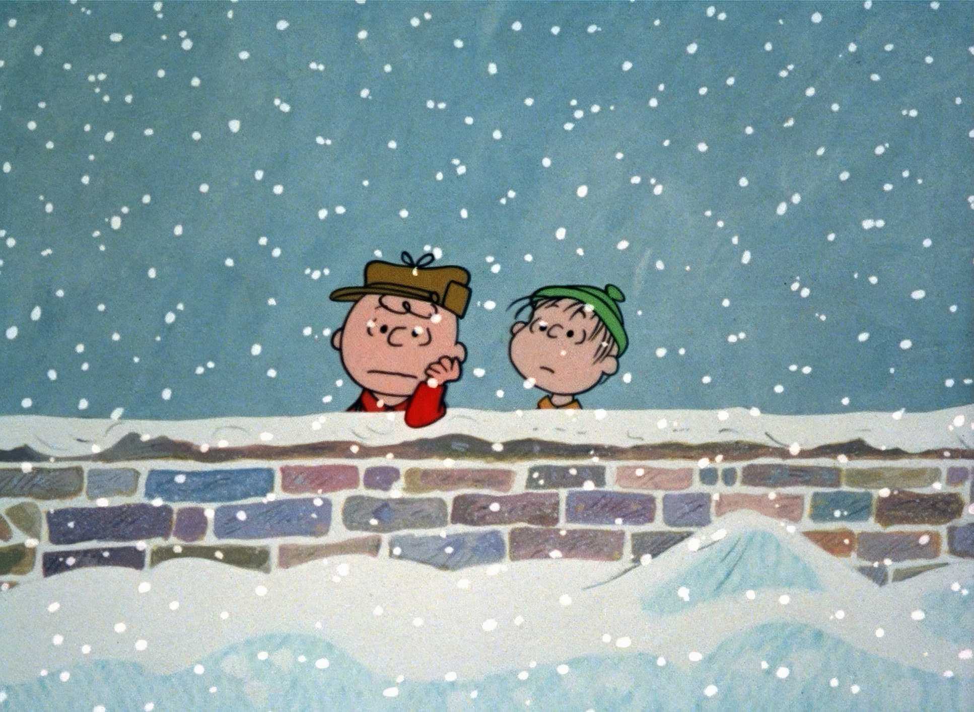
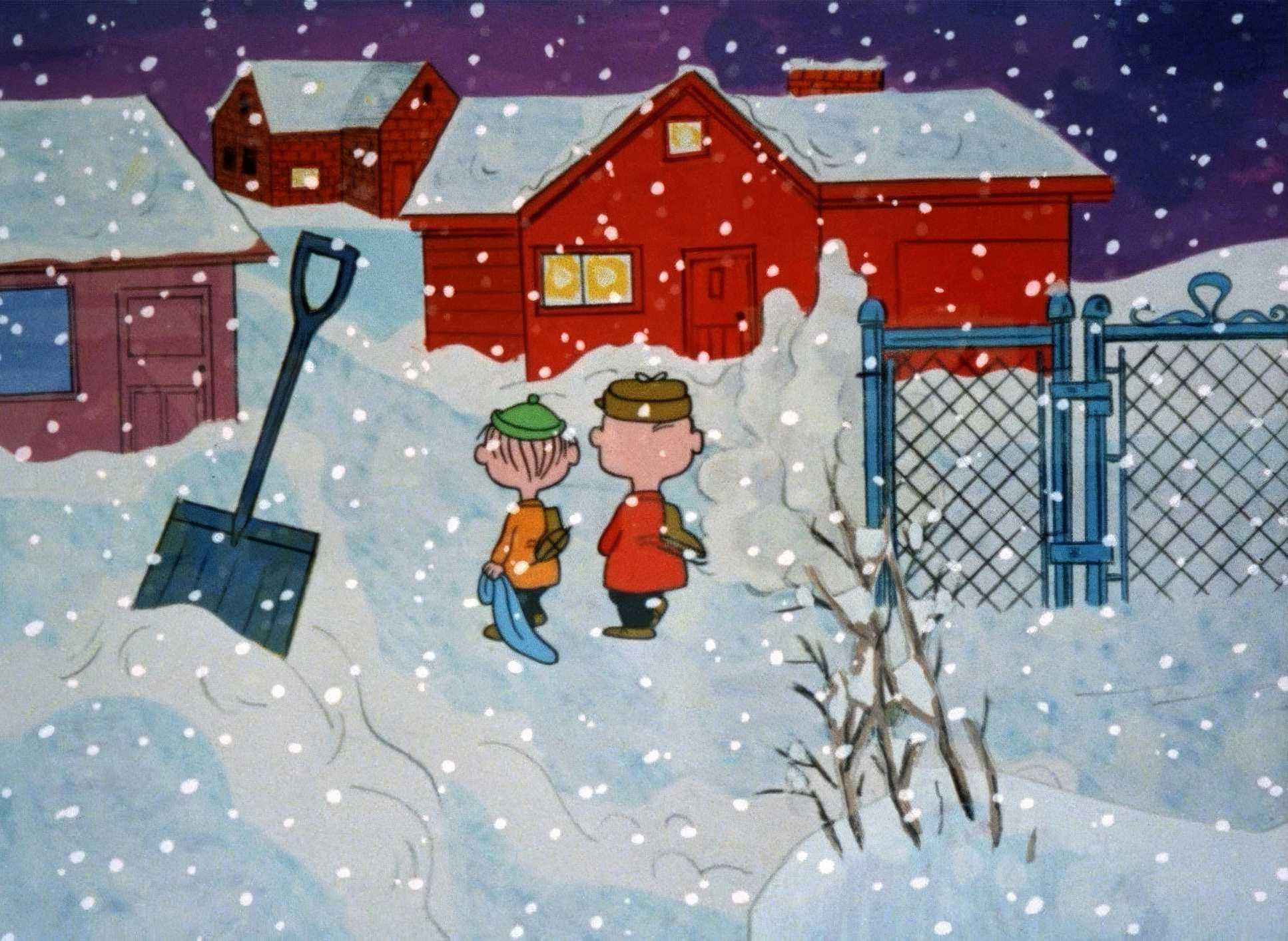
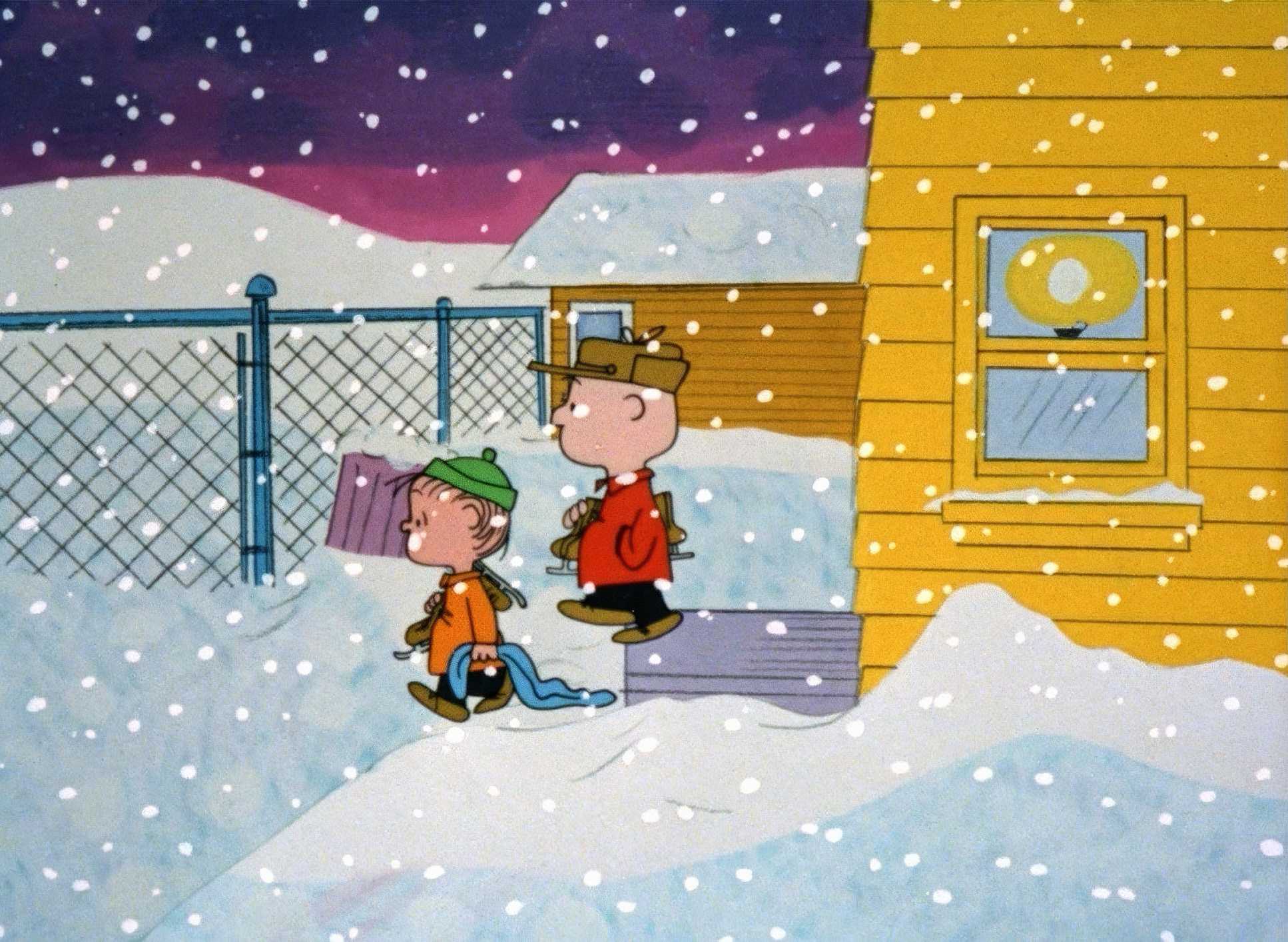
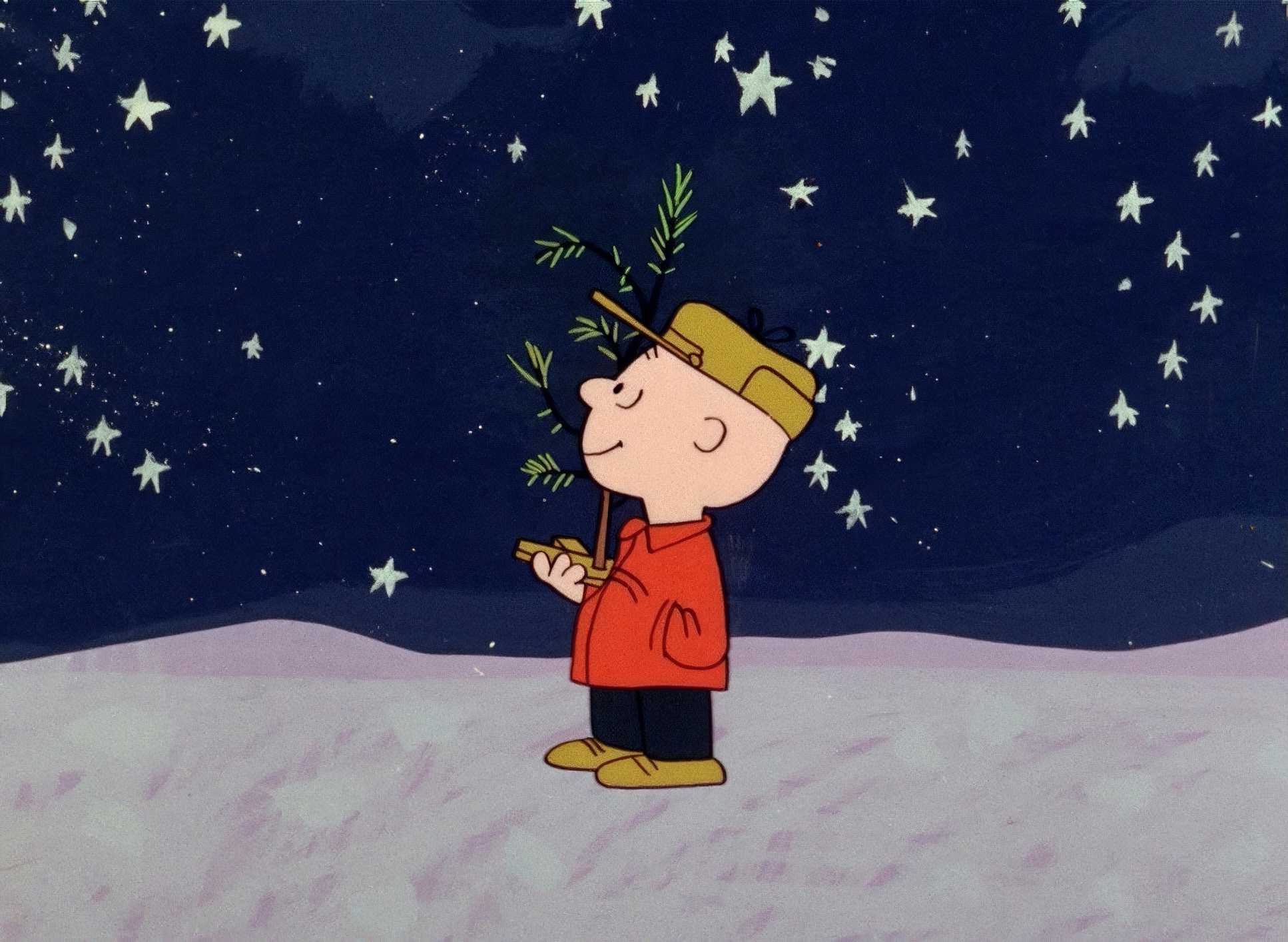
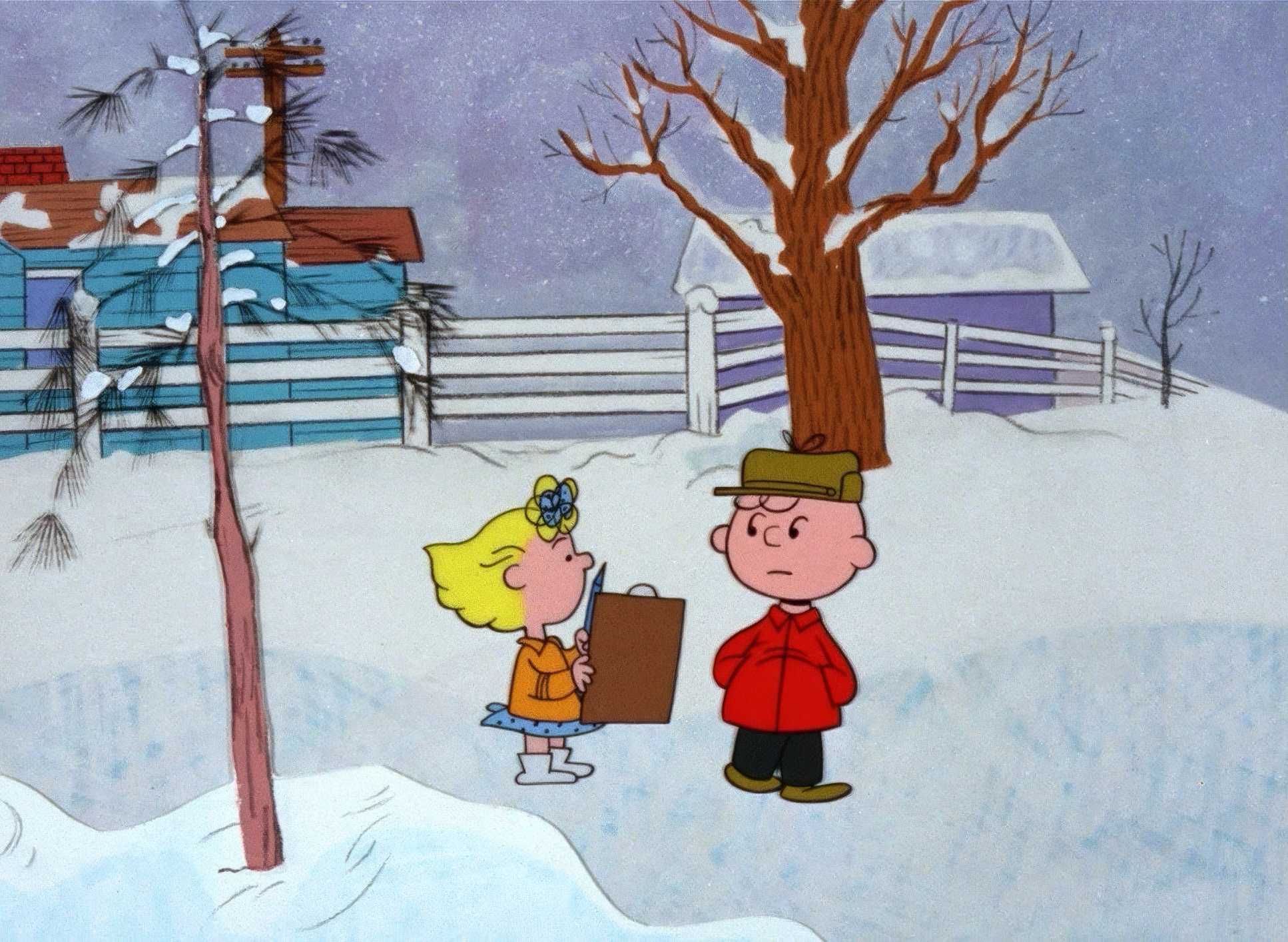
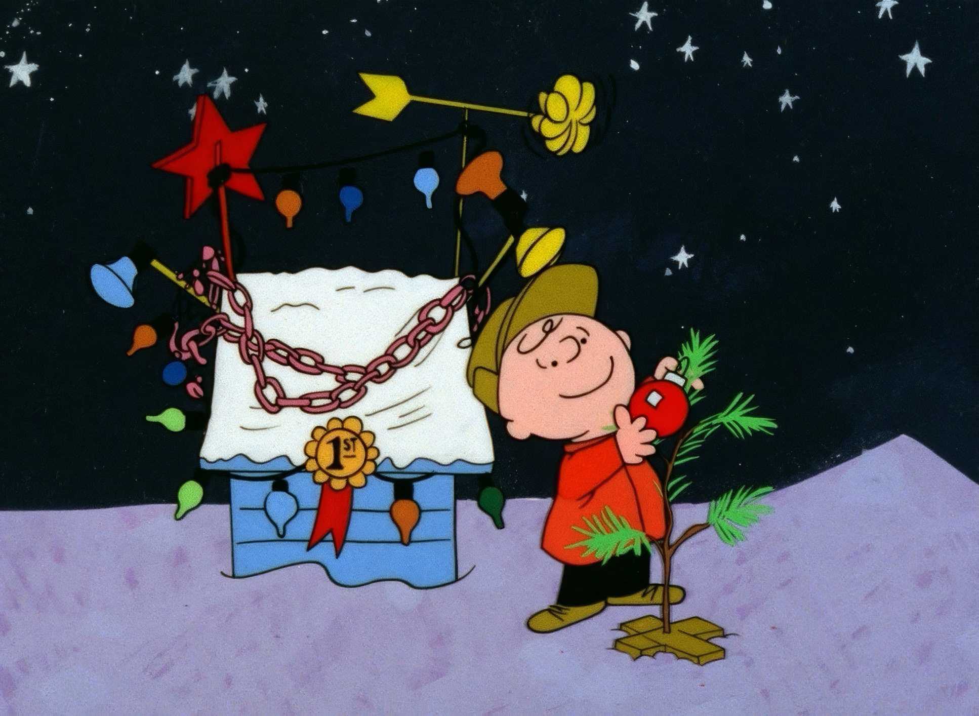
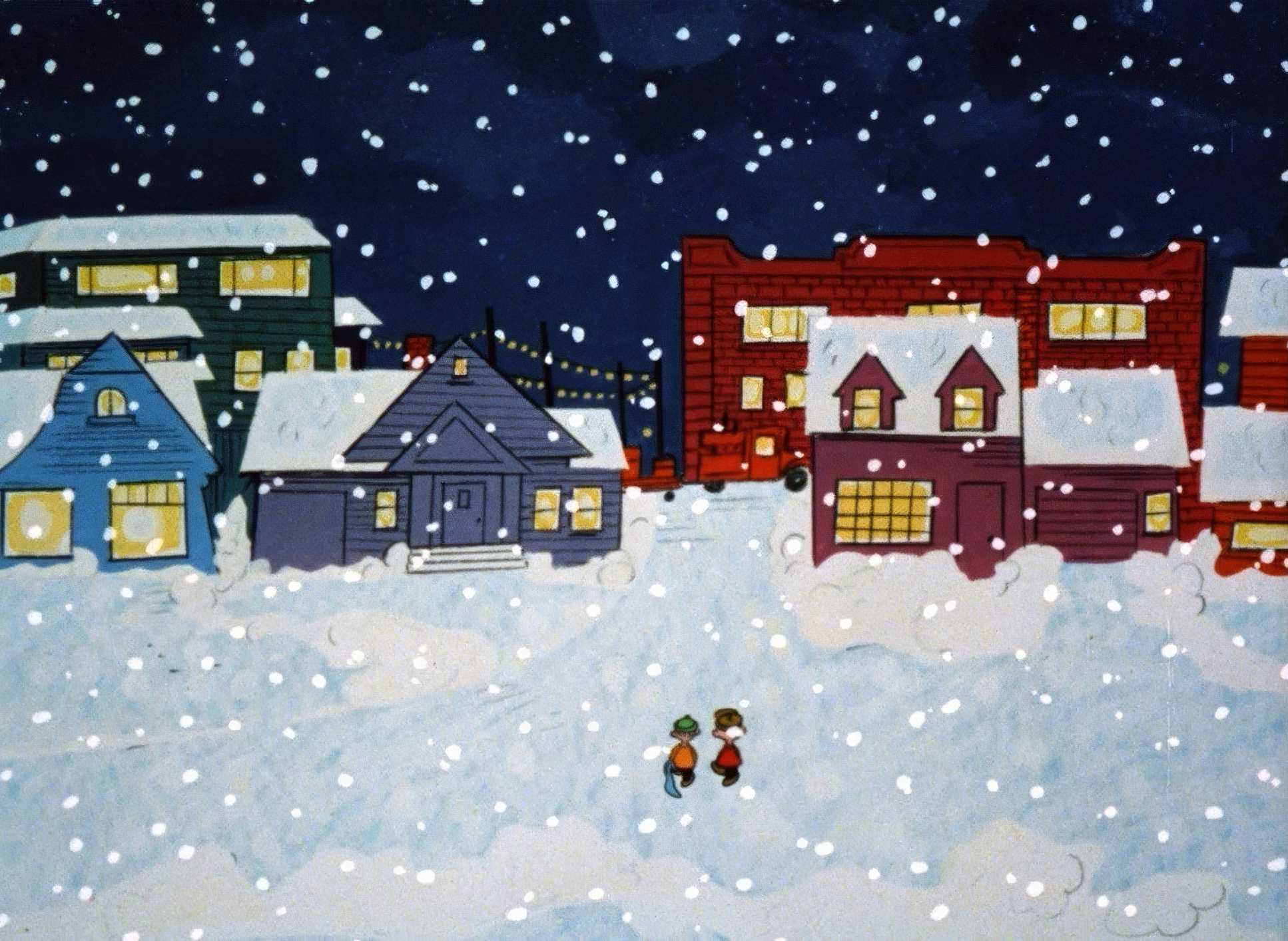
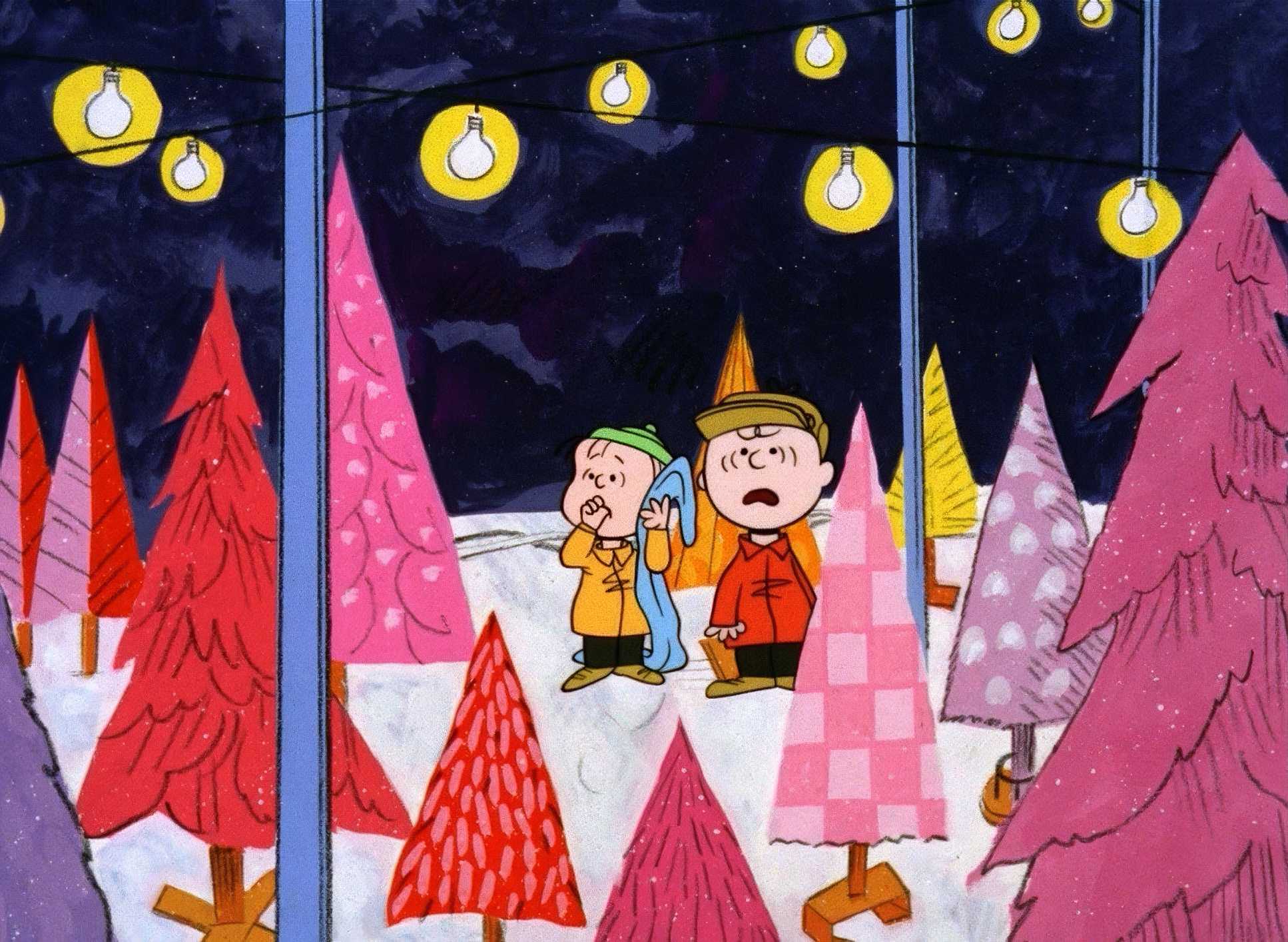
This is where the film really hits me. The use of negative space is, frankly, gutsy for a kids’ special. Levitt frequently frames Charlie Brown as this tiny, isolated figure against a massive, sparse winter landscape.
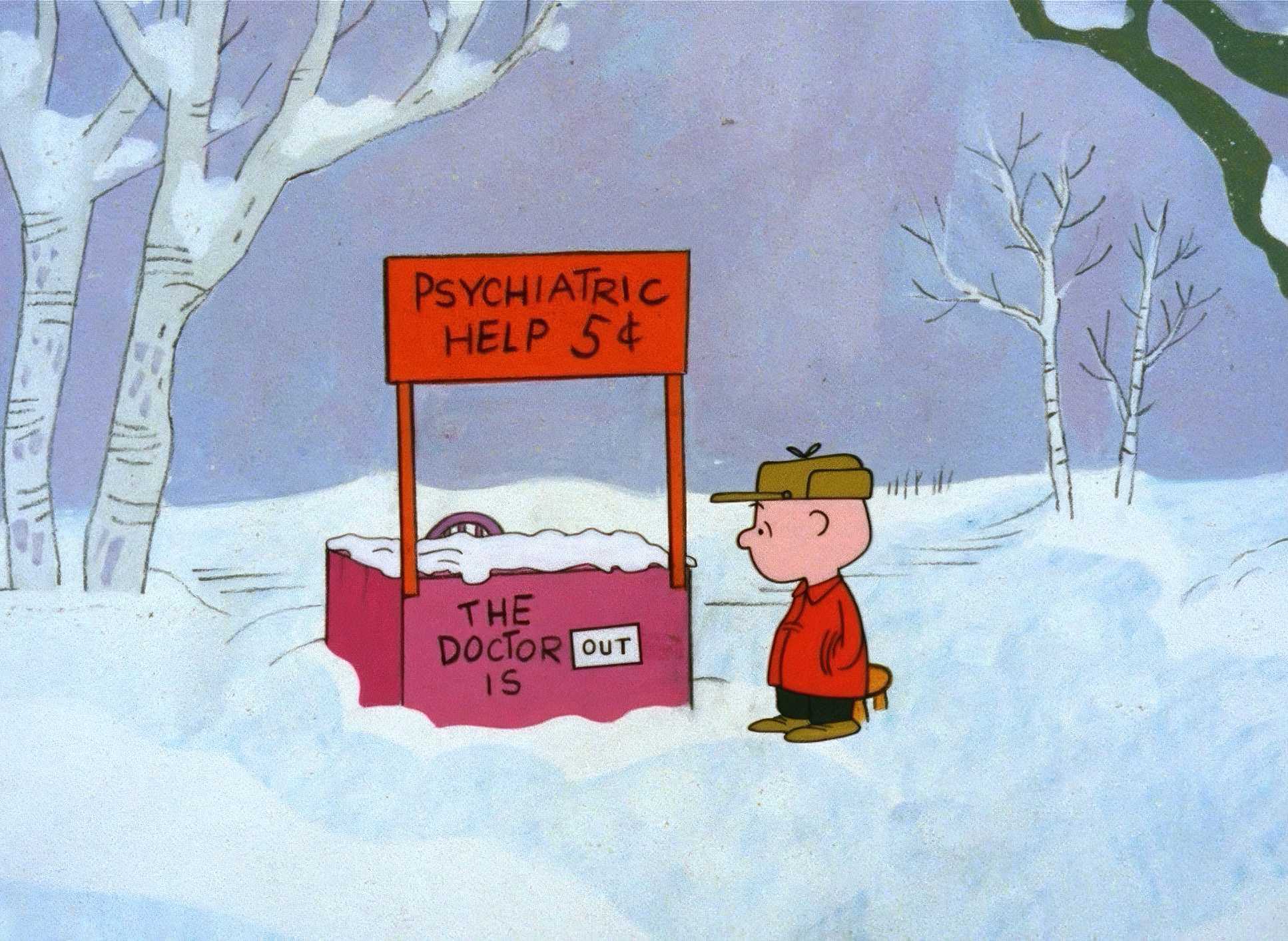
Think about the ice rink or the empty stage. These aren’t just “simple backgrounds” to save money (though they certainly did); they serve to externalize Charlie Brown’s internal state. He feels small, so the compositions make him look small. It’s masterful environmental storytelling. Most modern animation is terrified of an empty frame, but here, the emptiness is the point. The compositions are often slightly off-center and “askew,” perfectly mirroring the awkwardness of being a kid who doesn’t quite fit in.
Inspiration Behind the Cinematography

The DNA of this film is, obviously, Schulz’s Peanuts strip. But the inspiration goes deeper than just copying drawings. It’s about capturing the “confusion” and “existential dread” of childhood.
The animators resisted the urge to dazzle the audience. There are no grand musical numbers or “look-at-me” animation flexes. Instead, they opted for an aesthetic of understatement. It’s a visual approach that forces you to look closer. By keeping the visuals “mellow and calm,” they created a space for the audience to actually feel the weight of the message. It’s a quiet, empathetic observer.
Camera Movements
The camera barely moves. Honestly, it’s a study in restraint. In any other production, you might call it “stiff,” but here, the stillness feels like a choice. The camera acts as a static observer, mimicking the panels of a comic book.
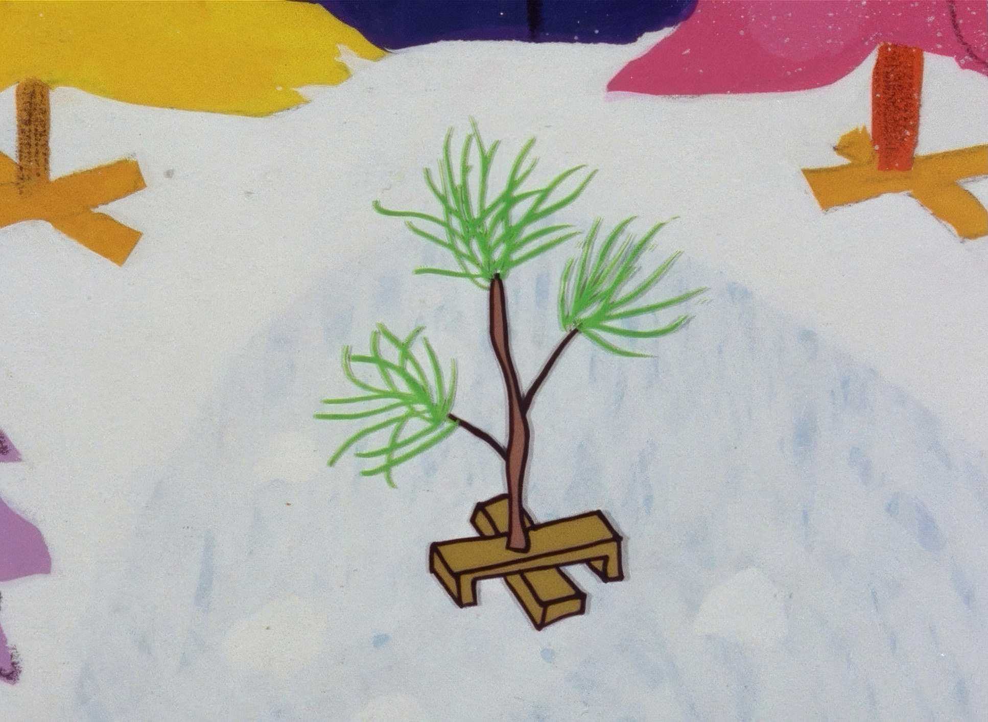
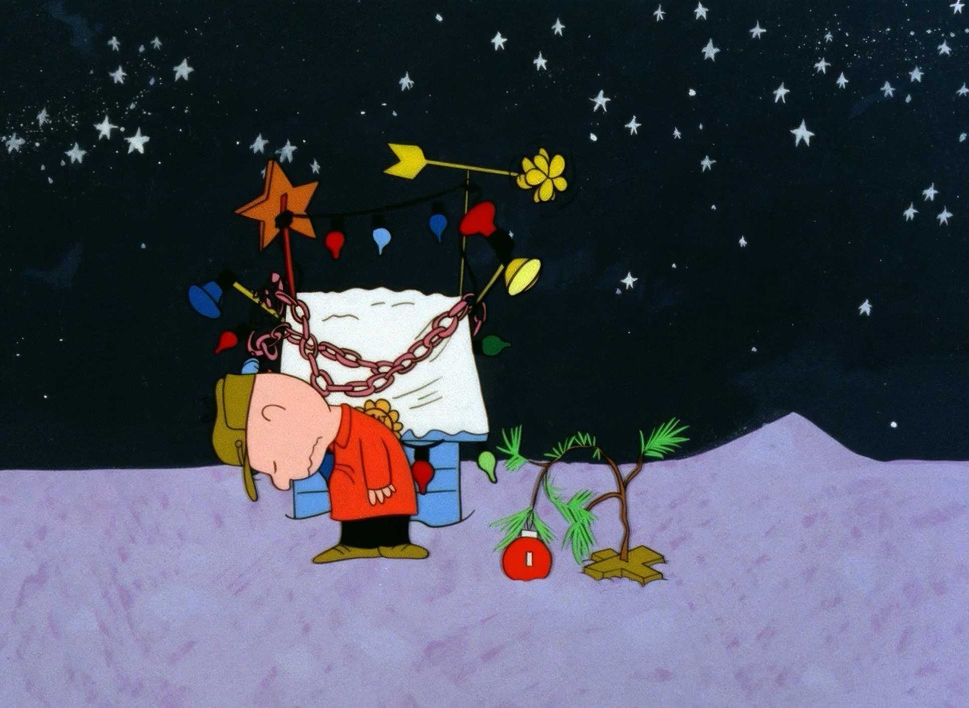
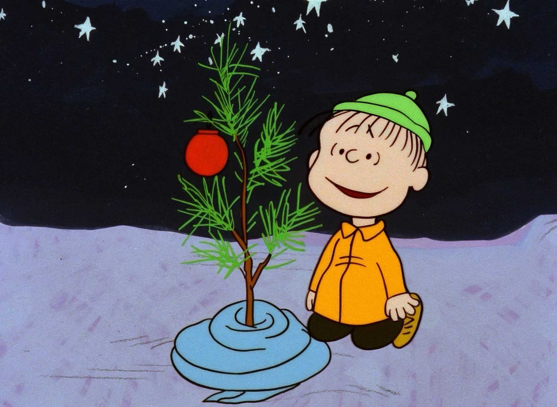
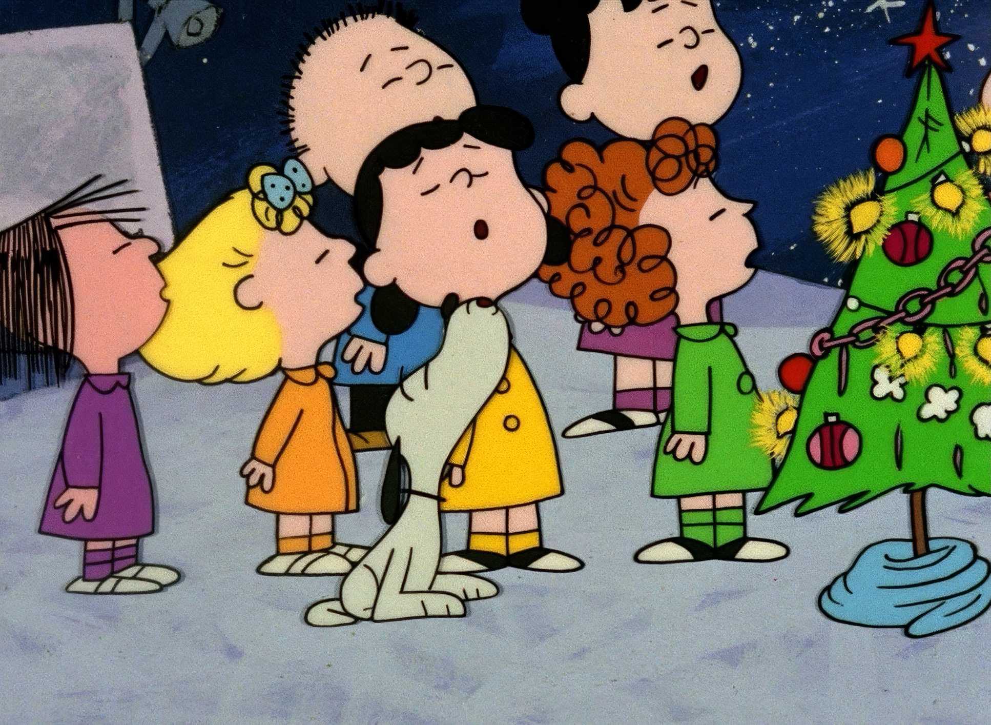
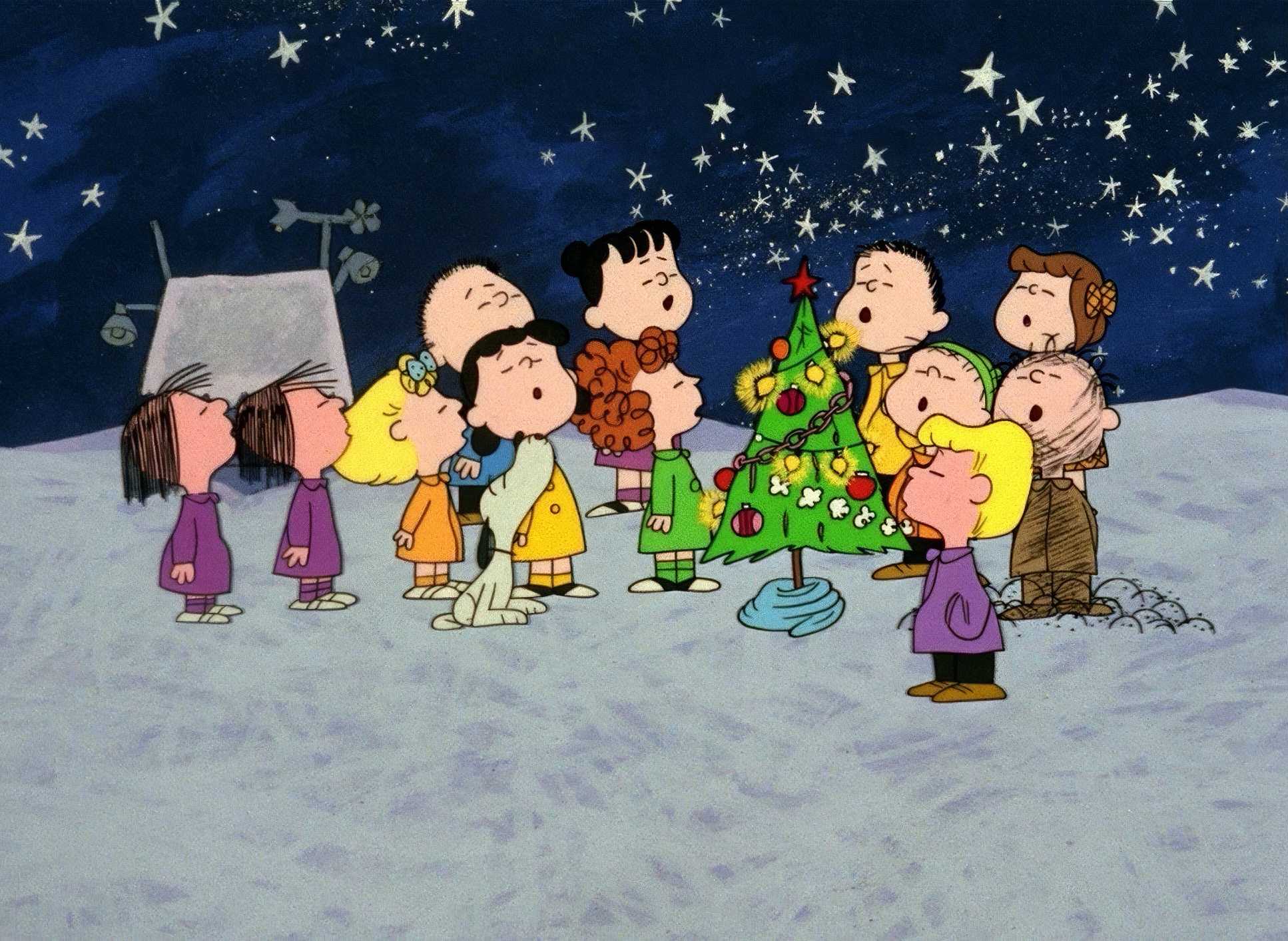
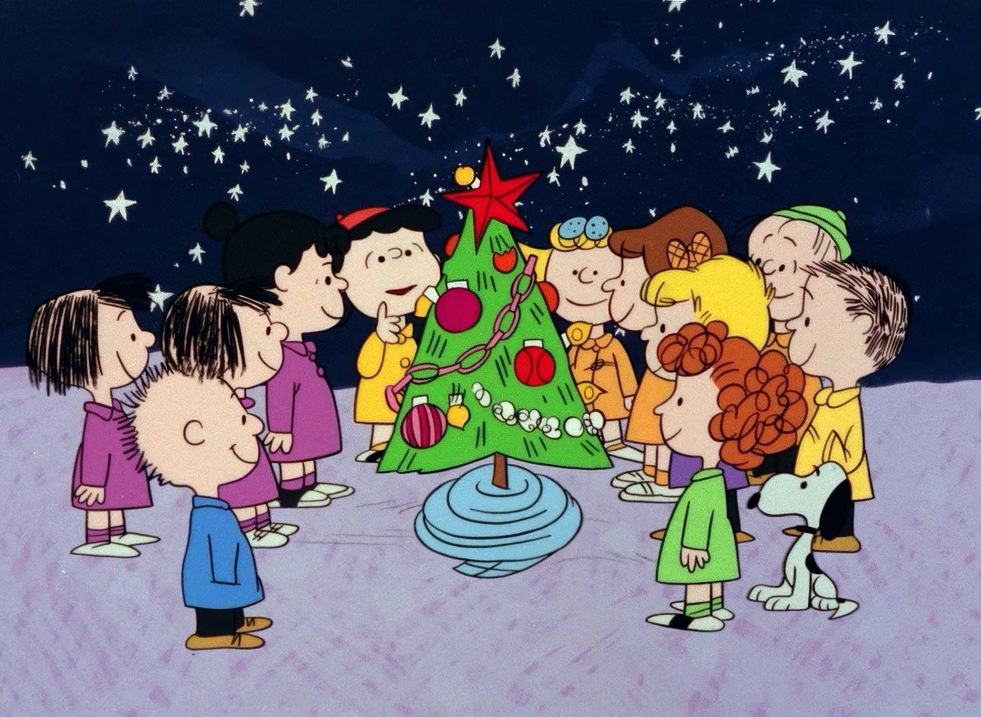
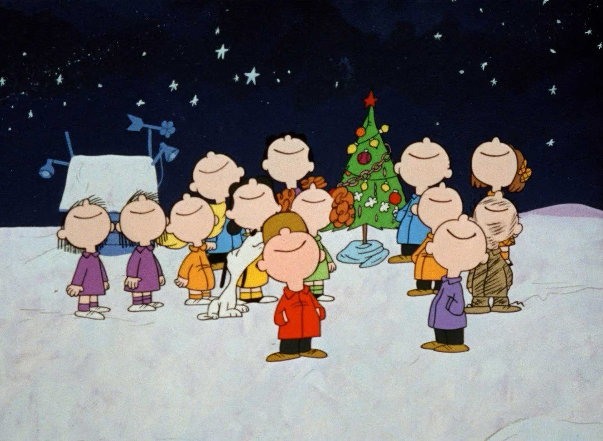
When the frame does move, it’s functional a gentle pan to follow a gaze or a slow tilt toward that pathetic little tree. Look at Linus’s big speech. The frame is dead still. No dramatic push-ins, no racking focus. Just the weight of the words and a simple backdrop. This lack of overt “camera work” allows the emotional nuances to breathe. It’s a reminder of how much you can achieve by simply doing less.
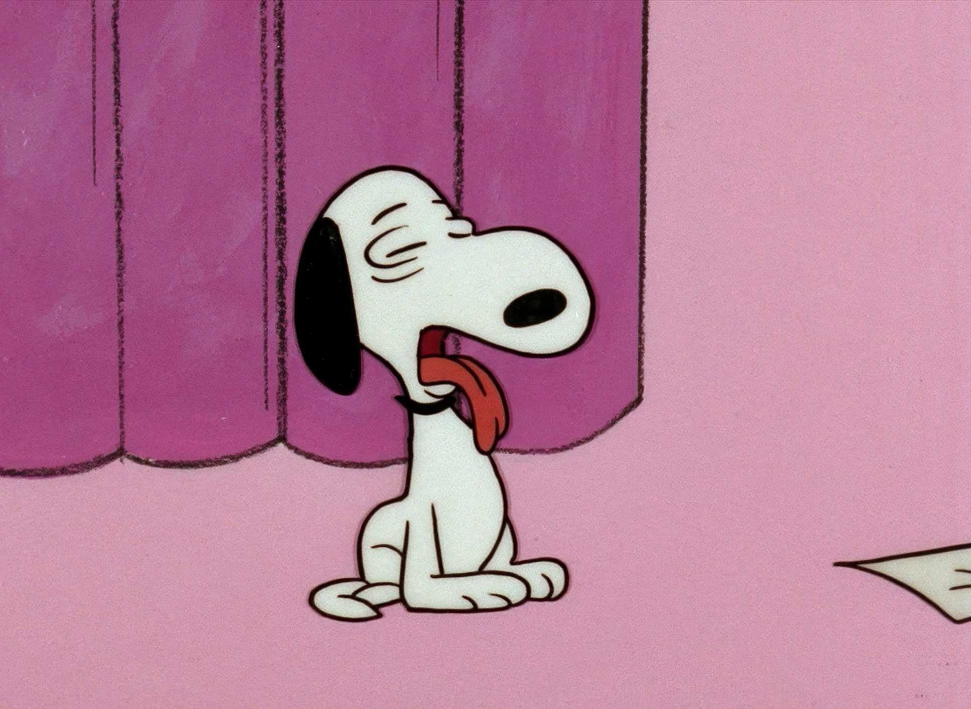
Lighting Style

In 2D animation, lighting is really an exercise in tonal suggestion. The style here is soft, diffused, and “low key but warm.” You won’t find any harsh shadows or dramatic noir lighting here.
Instead, we get the suggestion of an overcast winter sky or the ambient glow of a rehearsal hall. It’s subtle. When Linus recites the nativity story, there’s a slight “cueing” of the lights a focused glow that draws you in without being overly theatrical. It preserves the innocence of the world while still giving the heavy moments the gravitas they deserve. As a colorist, I love that “warm but lonely” balance.
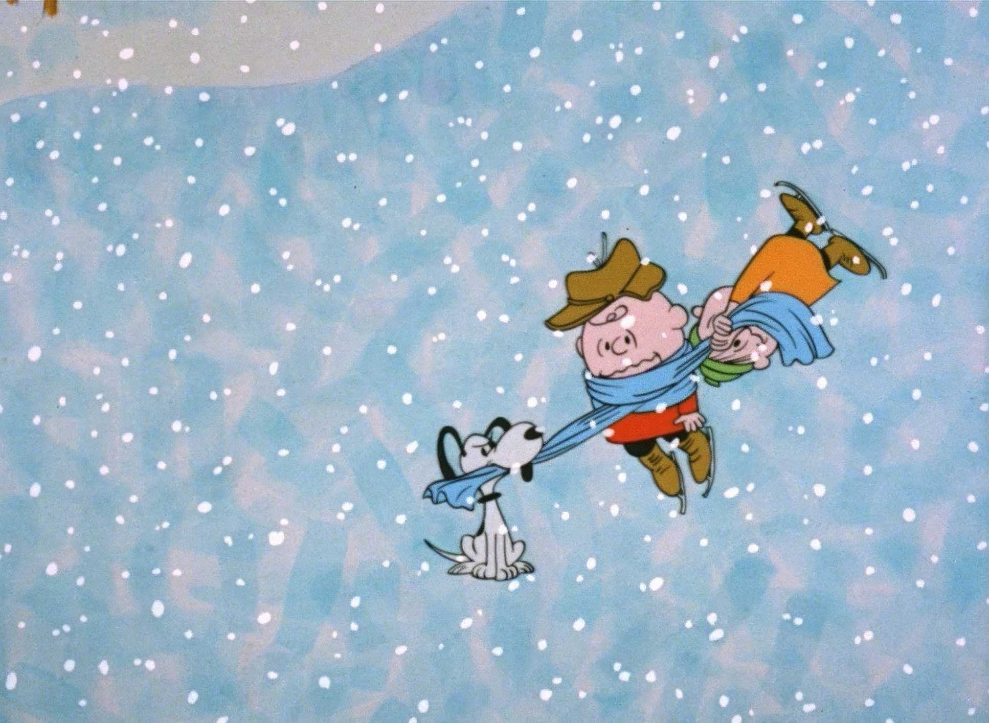
Lensing and Blocking

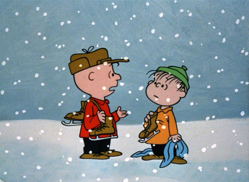
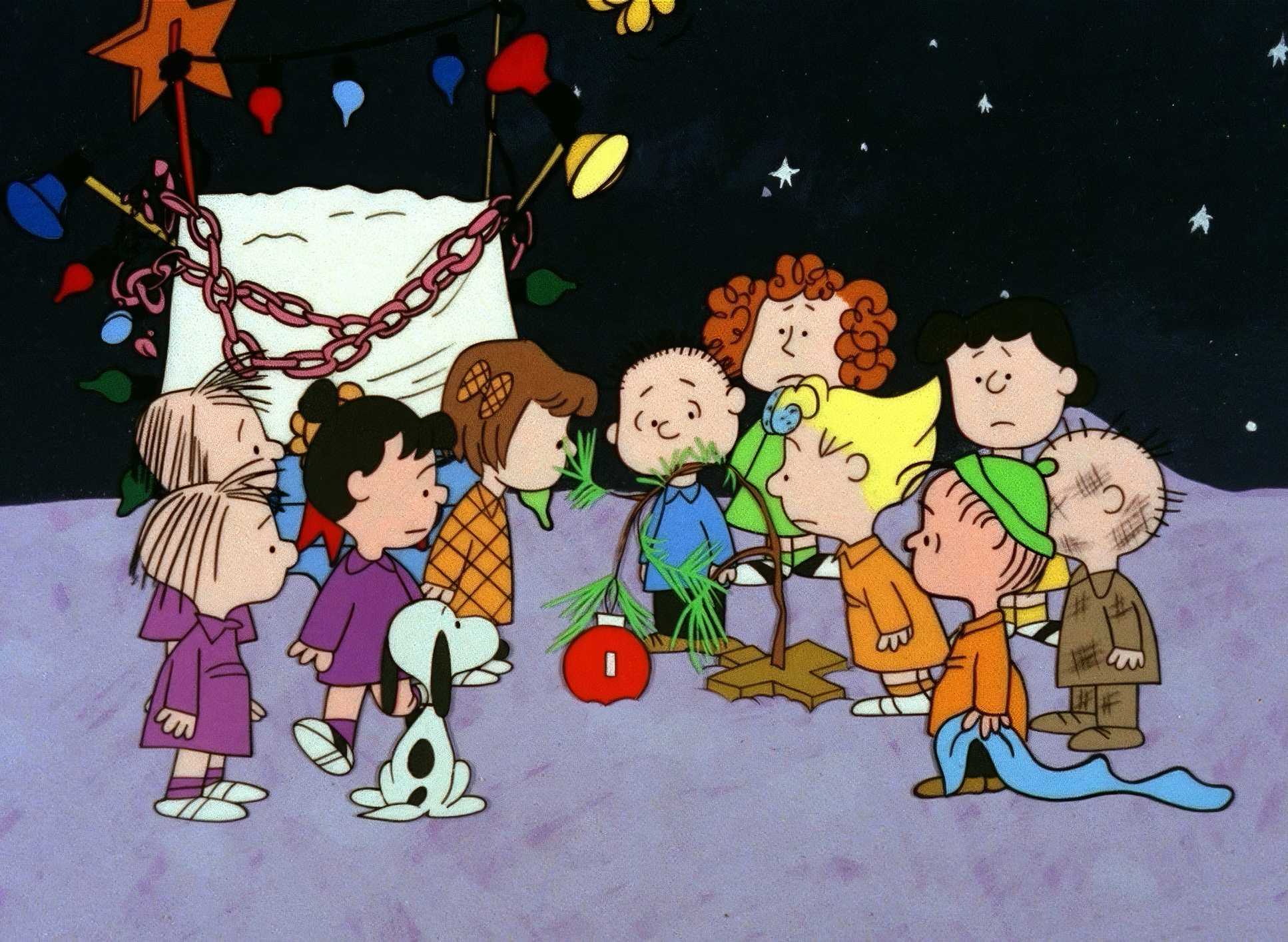
We don’t pick physical lenses for animation, but the “field of view” here feels like a consistent 35mm or 50mm “normal” lens. It’s a grounded, child’s-eye perspective. No extreme wide-angle distortion, no long-lens compression. It stays intimate.
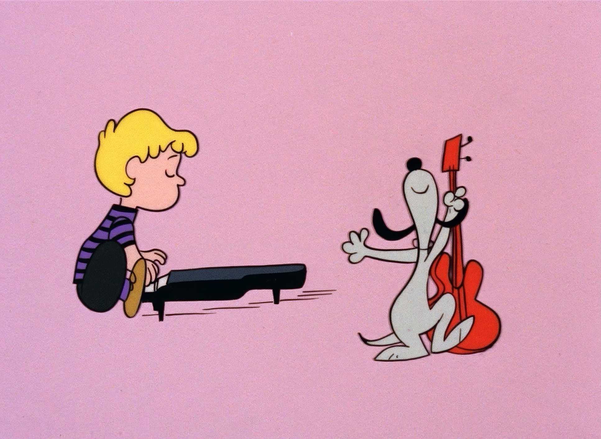
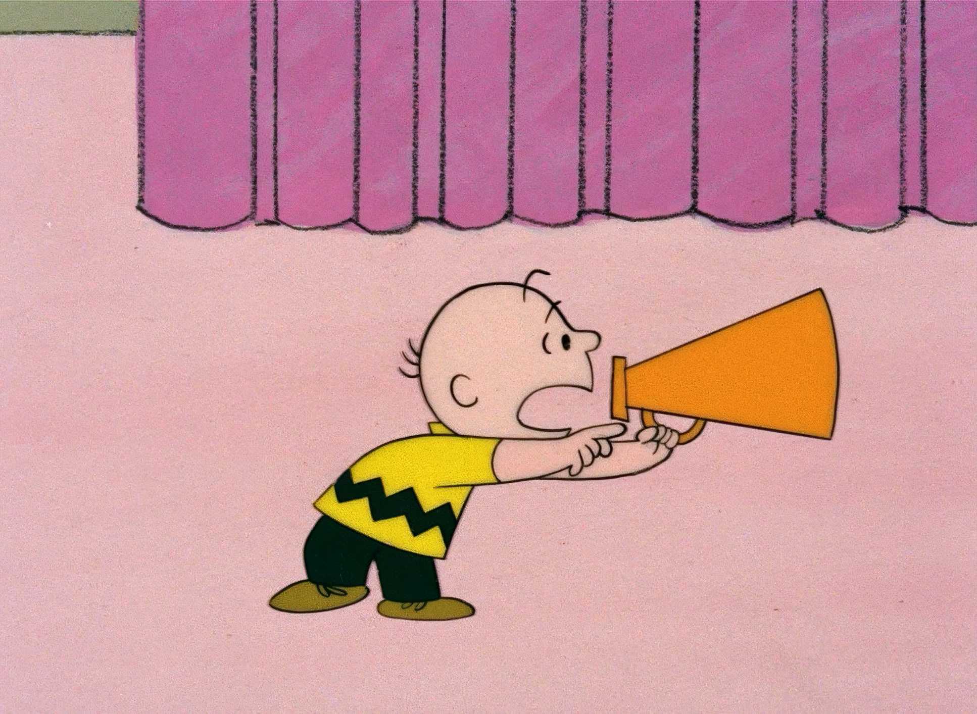
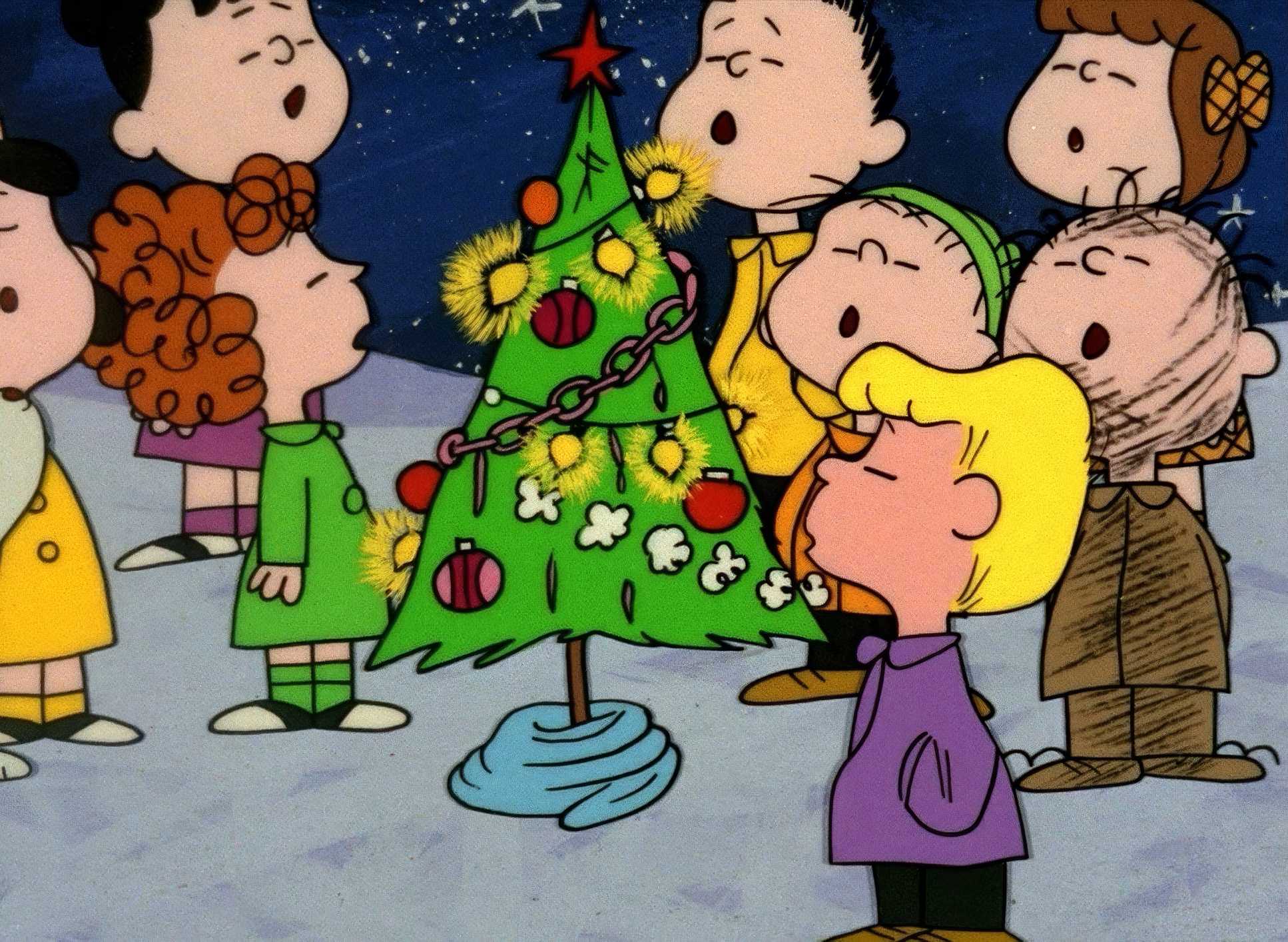
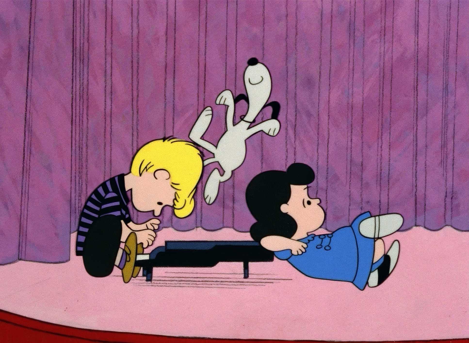
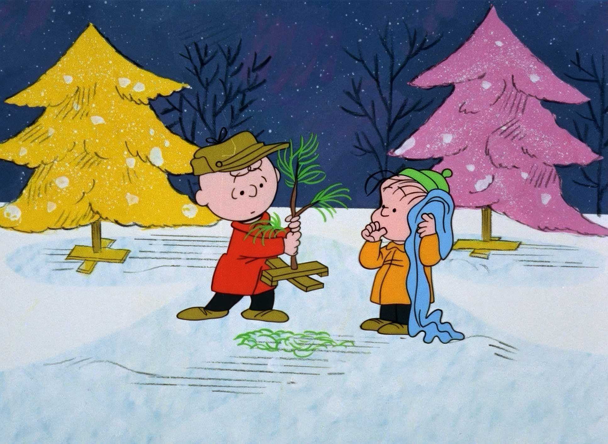
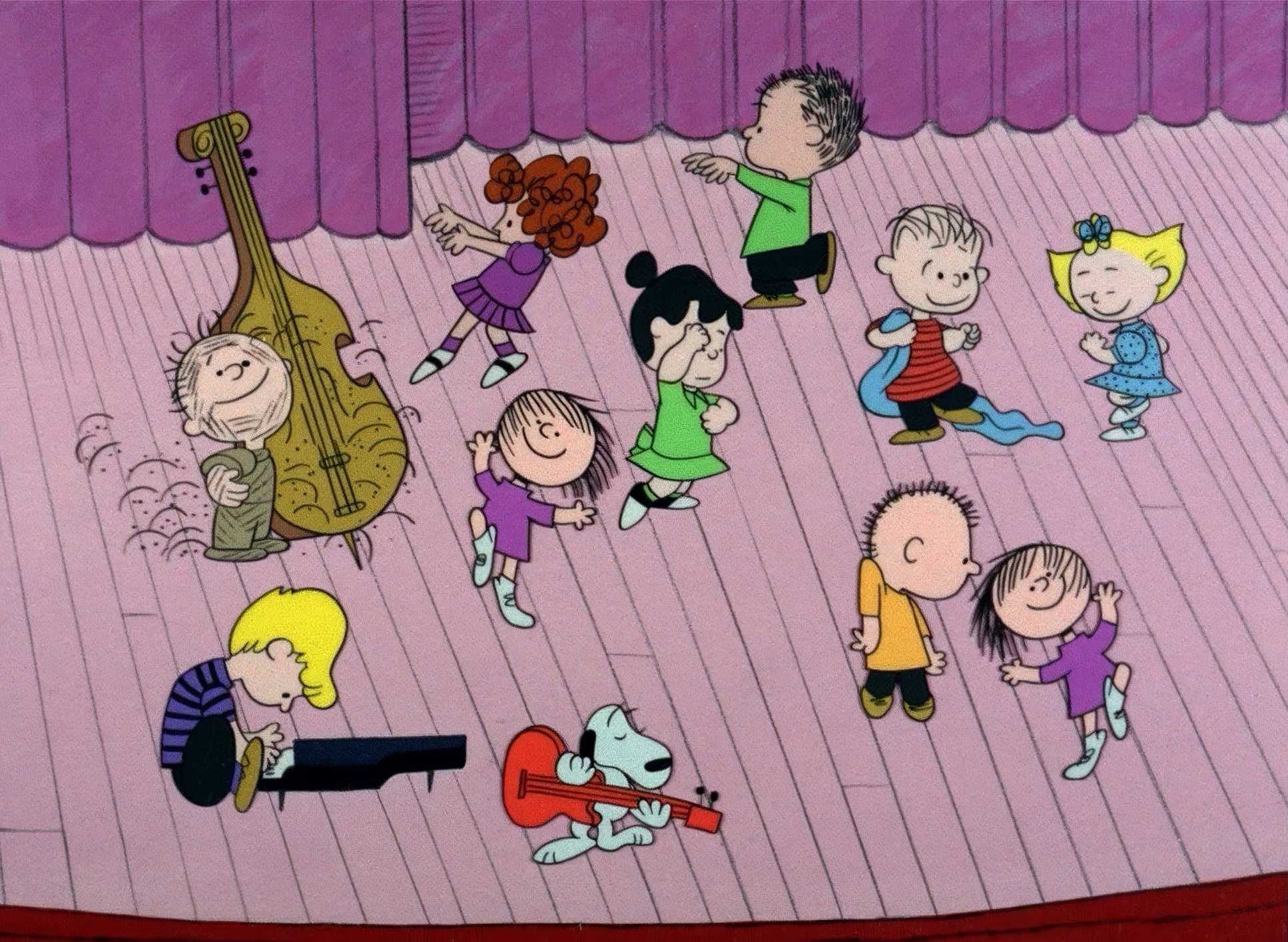
But the blocking? That’s where the real craft is. Charlie Brown is almost always physically separated from the “herd.” Even when he’s directing the pageant, he’s an island. The chaotic, anarchic dancing of the other kids is a perfect visual counterpoint to his need for control. And Linus, standing alone on that stage with his blanket? That’s precision blocking. It elevates a simple scene into something that feels like high theater.
Technical Aspects & Tools
A Charlie Brown Christmas (1965) — Technical Specifications
| Genre | Animation, Comedy, Family, Traditional Animation |
| Director | Bill Melendez |
| Editor | Robert T. Gillis |
| Time Period | 1960s |
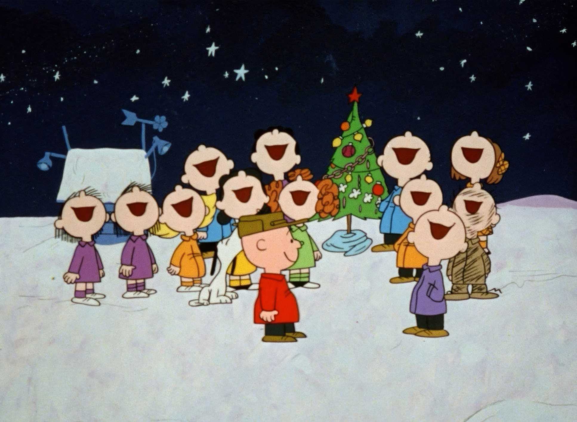
| Color | Cool, Saturated, Red, Blue, Purple, Magenta |
| Aspect Ratio | 1.37 |
| Original Aspect Ratio | 1.33 |
| Format | Animation |
We have to remember: this was 1965. Every frame was hand-inked and painted on cels. The “choppy” feel people talk about was a result of a tight budget and fewer frames per second, but that manual process is exactly what gives it that “hand-crafted” thumbprint.
The tools were physical paint, film stock, and a multiplane camera. When we watch it today, we’re seeing a digital scan, but as a professional, I’m always looking for the “gate weave” and the grain. It’s the soul of the medium. Even the “wooden” voice acting from actual kids adds to the authenticity. It’s not “slick,” and that’s why we’re still talking about it 60 years later.
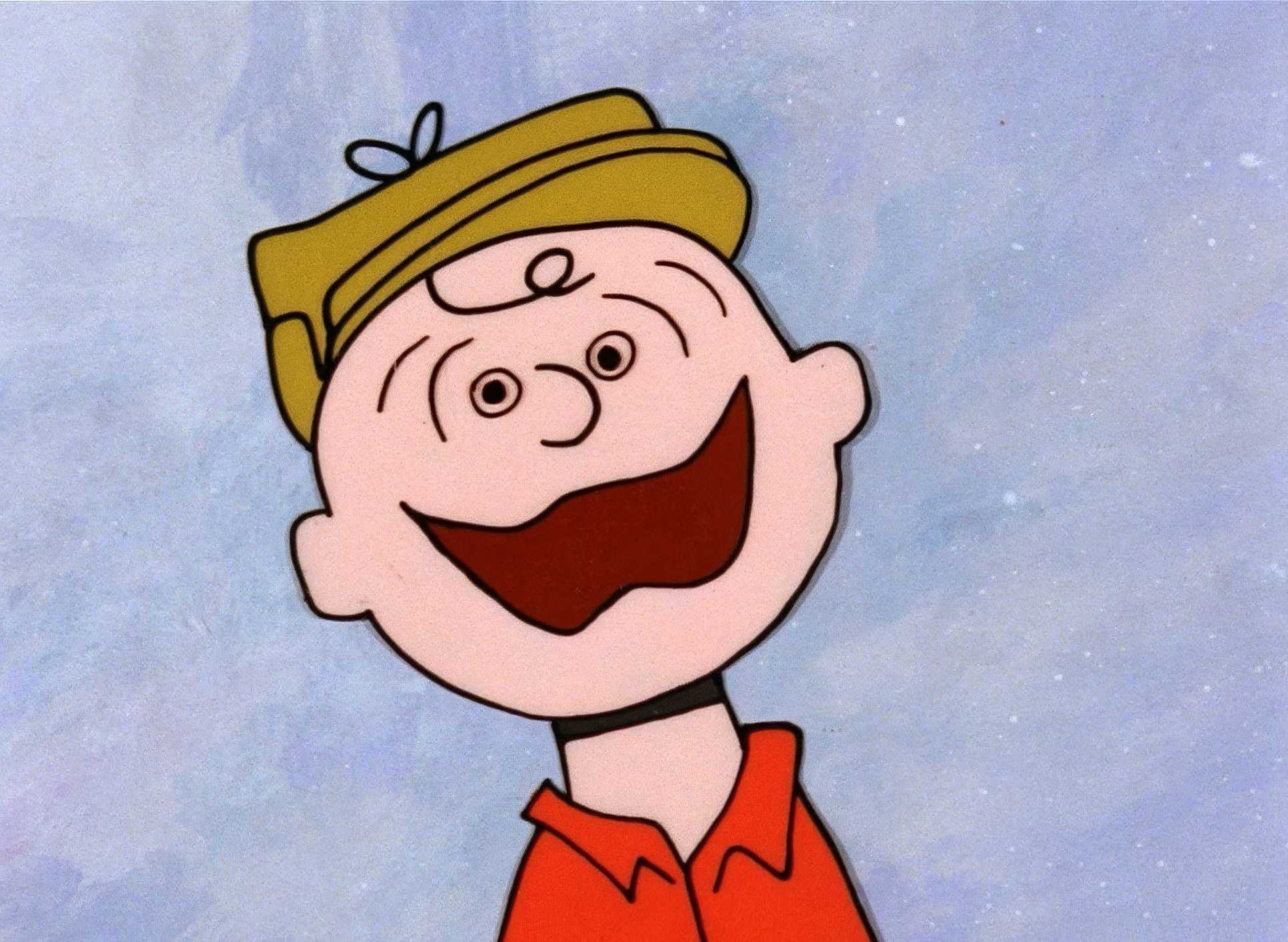
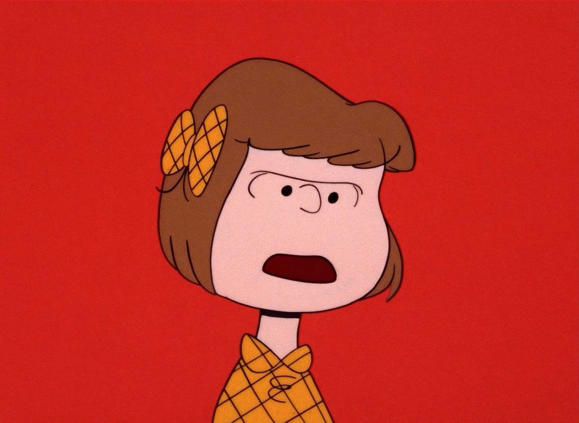
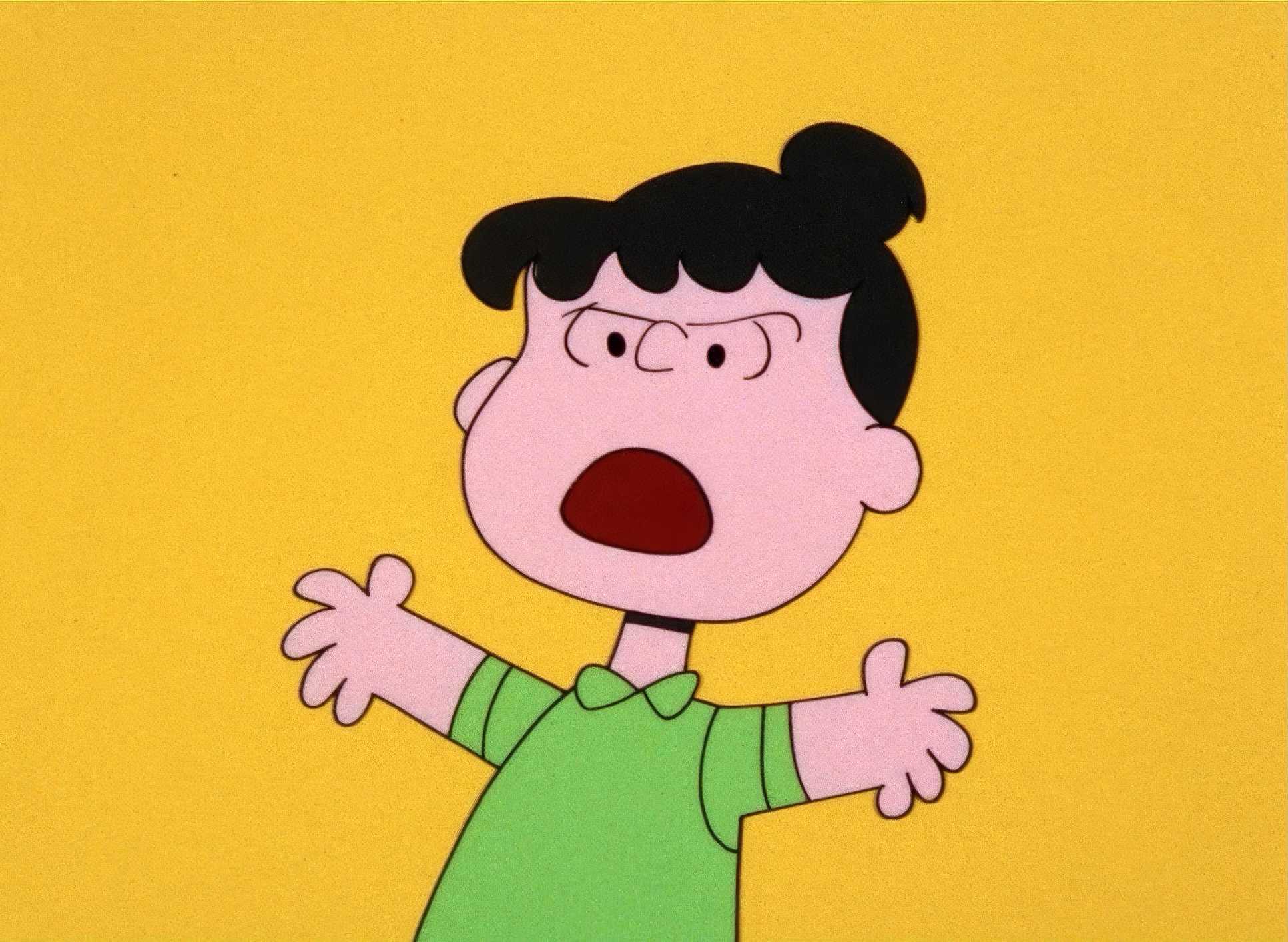
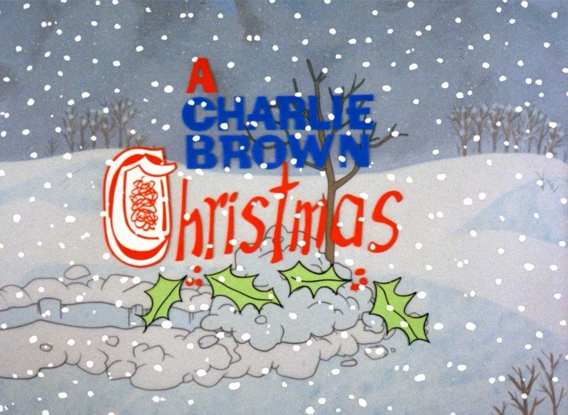
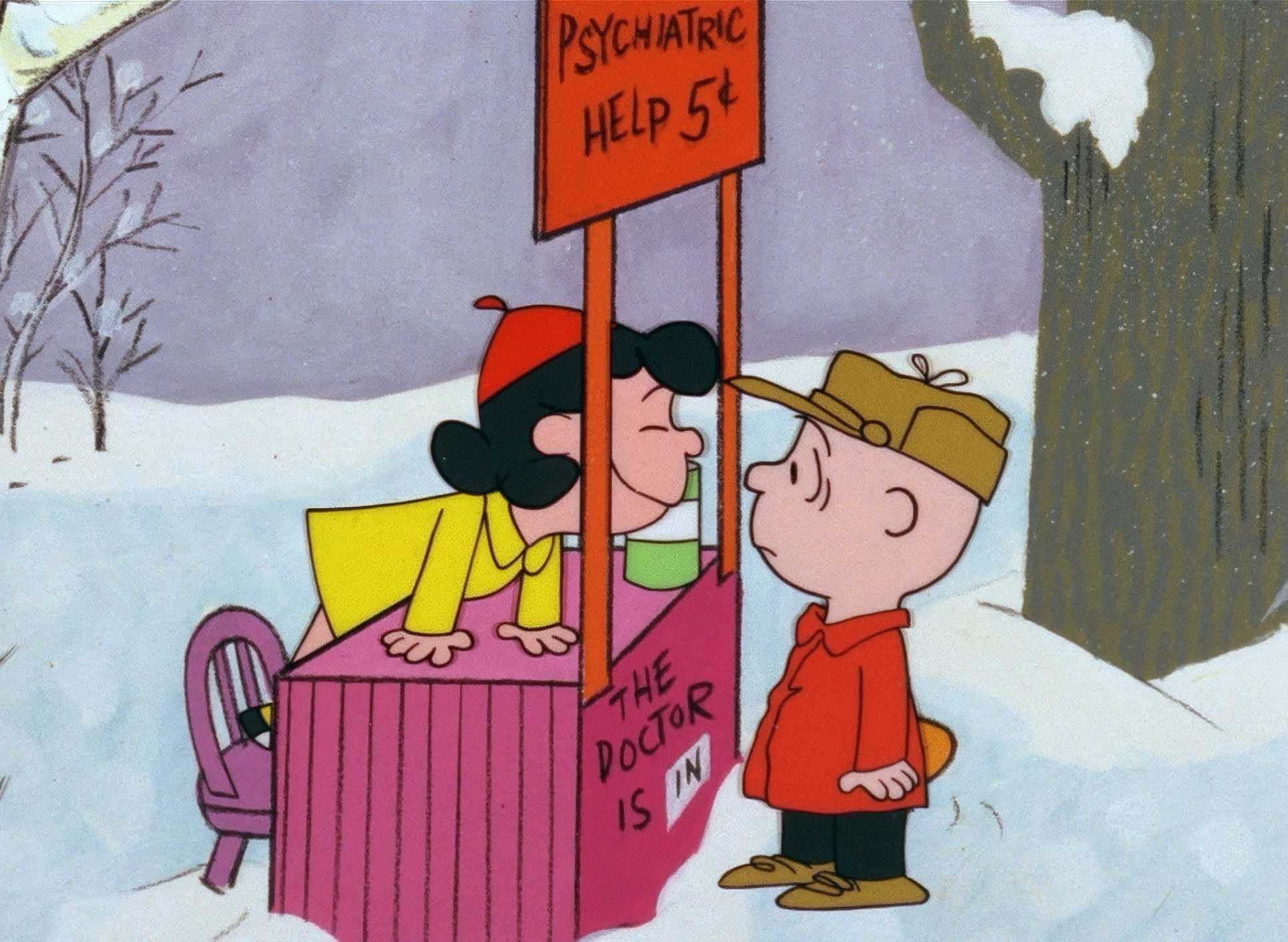
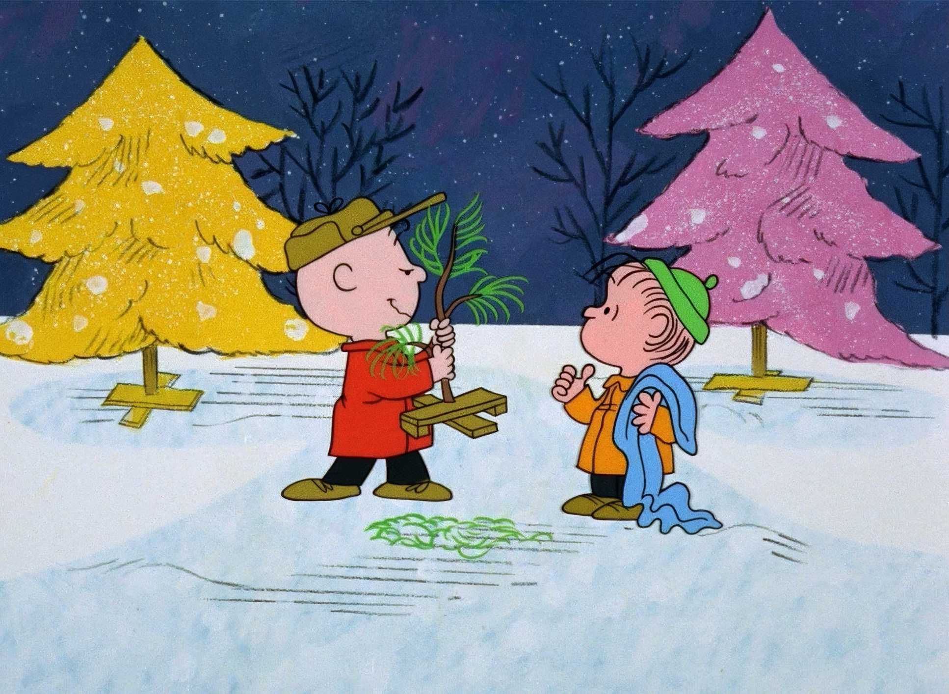
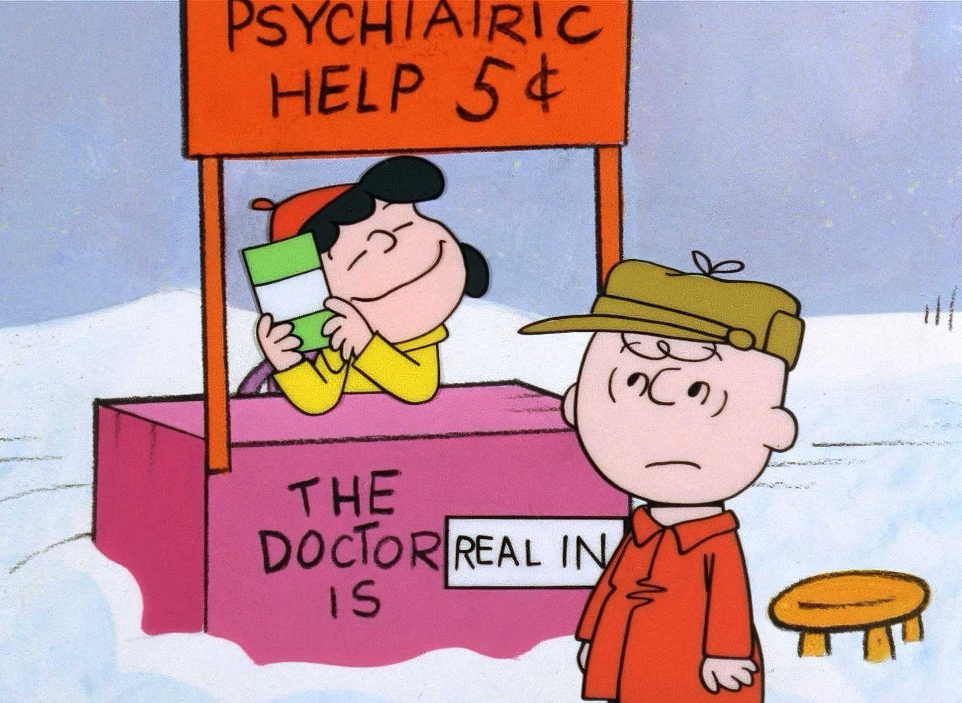
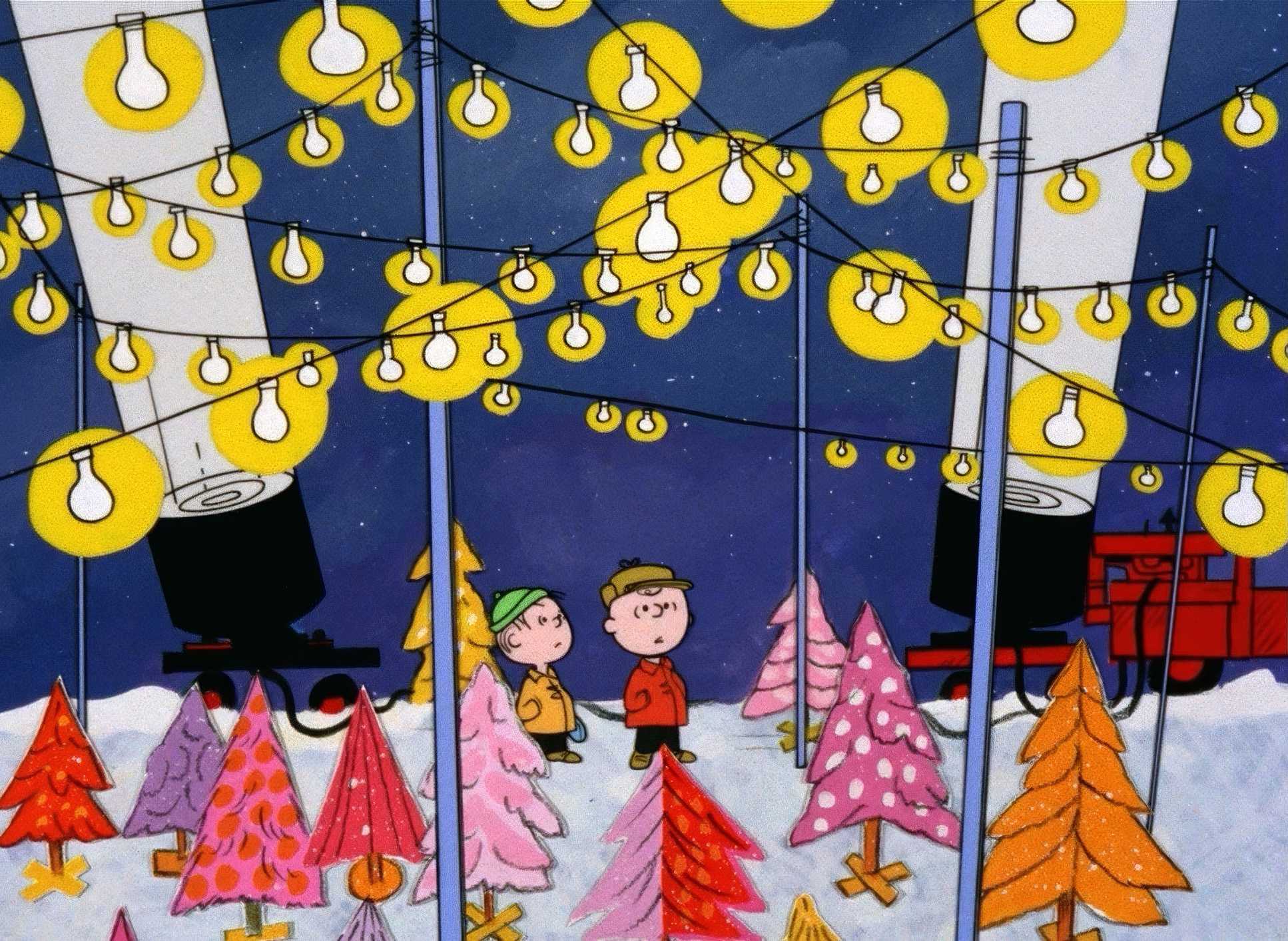
A Charlie Brown Christmas Film Stills
A curated reference archive of cinematography stills from A Charlie Brown Christmas (1965). Study the lighting, color grading, and composition.


- Also read: MIRACLE IN CELL NO. 7 (2019) – CINEMATOGRAPHY ANALYSIS
- Also read: SHERLOCK JR. (1924) – CINEMATOGRAPHY ANALYSIS
Browse Our Cinematography Analysis Glossary
Explore directors, cinematographers, cameras, lenses, lighting styles, genres, and the visual techniques that shape iconic films.
Explore Glossary →