Big Hero 6 (2014) is anything but simple. Every frame is a series of deliberate choices. We’re talking about virtual cinematography and lighting pipelines that are built from the ground up to hit specific emotional beats. It’s a masterfully executed blend of cultural influences that creates a visual identity I’m still thinking about years later.
The moment the Disney castle fades and that retro Mickey logo pops up, followed by the first wide look at San Fransokyo, you can tell the team was aiming for something high-concept. This was Disney’s first real swing at a Marvel property, and while it’s a loose adaptation, it feels entirely its own. For me, the magic is in how they married the high-octane superhero aesthetic with some really heavy themes like grief and loss. The city isn’t just a background it’s a character. It’s this living, breathing mashup of San Francisco and Tokyo that grounds the whole story in a world that feels both futuristic and lived-in.
About the Cinematographer

In animation, “cinematography” is a team sport. You’ve got Rob Dressel (DP of Layout) handling the “camera” and Adolph Lusinsky (DP of Lighting) shaping the image, all working under directors Don Hall and Chris Williams. Unlike my world in live-action where we’re dealing with physical sensors and glass, these guys are building virtual cameras from scratch. They’re “lensing” shots in a digital space, deciding on focal lengths and camera paths without the limitations of gravity or a budget for Steadicam ops.
I love this approach because it gives the filmmakers a level of control that’s frankly a bit enviable. They aren’t fighting the sun or a dying battery; their only real ceiling is the rendering power at their disposal. But that freedom is a double-edged sword it requires a deep mastery of traditional film principles to keep it from looking “floaty” or fake. The teams here had to figure out how to make Baymax’s soft, vinyl skin feel tactile and how to make Hiro’s workspace feel claustrophobic yet inviting. They’re essentially orchestrating a digital ballet to guide your eye exactly where they want it.
Inspiration Behind the Cinematography
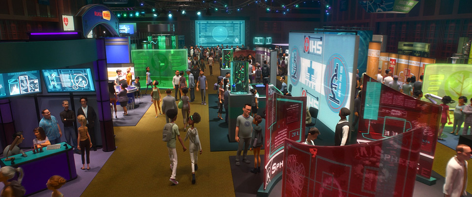
The core DNA of Big Hero 6 look is obviously the hybrid city itself. It’s a stroke of genius. You see the Golden Gate Bridge or Alcatraz, but they’re layered with this hyper-modern, neon-drenched Japanese infrastructure. You’ve got traditional Edo-period rooftops sitting right next to magnetic levitation lines and massive holographic billboards. It’s a beautiful contrast the old world meeting the relentless push of tech.
Beyond the architecture, the film clearly tips its hat to the MCU and Pixar’s The Incredibles. You can see the Iron Maninfluence in the “tech-forward” design of the suits, especially the way Baymax’s armor looks like high-end industrial design rather than just “superhero spandex.” The action sequences have that Avengers scale, but the film keeps it grounded in the “feeling of ingenuity.” It’s about the joy of building things. Even the villain’s microbots have this terrifyingly fluid, organic movement that feels like a modern art installation gone wrong.
Camera Movements
The virtual camera in Big Hero 6 is incredibly athletic. In the action scenes, the camera becomes a participant we’re seeing tracking shots that weave through traffic with the kind of fluidity you’d expect from a high-end drone or a Russian Arm. There’s a car chase in the first act that feels like it was ripped straight out of a Fast and Furious movie, with the camera dipping low to the asphalt to sell the speed and the stakes.
But as a filmmaker, I’m actually more impressed by the quiet stuff. When Hiro is struggling with the loss of his brother, the camera settles down. We get these slow, deliberate push-ins that emphasize his isolation. They even used a “side-scrolling” one-take shot for Baymax’s karate training that felt like a nod to old-school gaming, which was a clever way to show his progression. Sure, the flying sequences through the city are clearly designed to show off the IMAX 3D depth, but they’re breathtaking nonetheless. They use those wide, sweeping arcs to make you feel the sheer scale of San Fransokyo.
Compositional Choices
The layout team made some really strong calls regarding deep staging. Because San Fransokyo is so vertical and dense, the wide shots are packed with layers blimps in the background, bustling trains in the mid-ground, and our characters in the foreground. It makes the world feel massive and slightly overwhelming for a kid like Hiro.
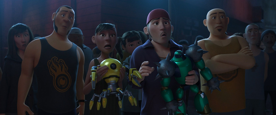
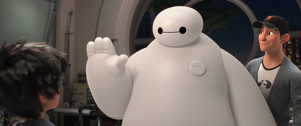
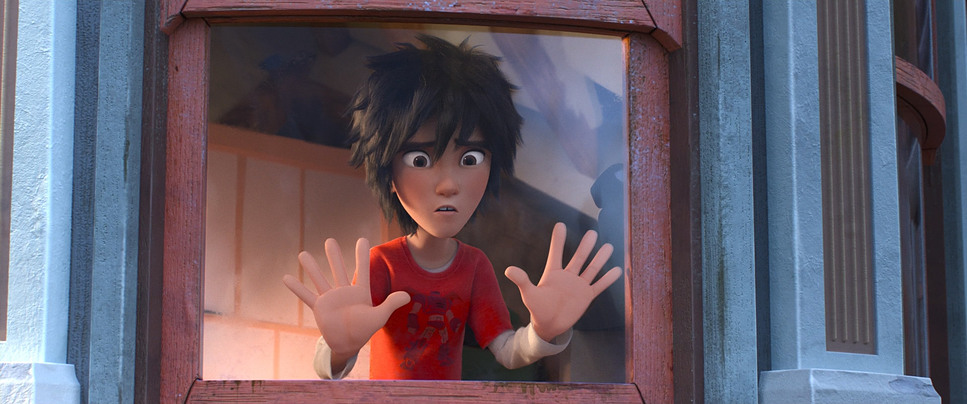
On the flip side, the close-ups are where the emotional heavy lifting happens. Baymax’s design is so simple just two dots and a line so the framing has to be perfect to convey what he’s “thinking.” By keeping him centered and using a lot of negative space around him, they lean into his “lovable marshmallow” vibe. I also noticed how they blocked the team as they formed up; each character has a specific “lane” and movement style that reflects their personality, which really helps when things get chaotic in the final act.
Lighting Style
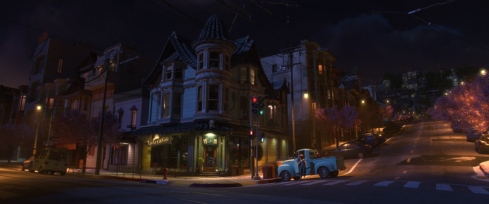
Now we’re getting into my territory. The lighting in this film is a masterclass in “source-based” illumination. San Fransokyo is essentially a giant light box. It’s glowing with neon, LEDs, and holographic projections. As a colorist, I’m looking at how those colors the cherry blossom pinks and the cool cyan blues interact with the environment. It’s a very warm, inviting look that makes the city feel safe, which makes the shift to the darker scenes even more effective.
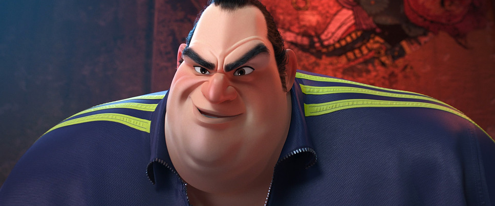
When the mood shifts, the lighting gets aggressive. The villain is usually shrouded in heavy shadows with high-contrast, “hard” lighting that makes his Kabuki mask look menacing. I was particularly struck by the “filmic” quality of the highlights here. In a lot of CG films from that era, the highlights can feel “clippy” or digital, but here they have a soft roll-off that feels more like 35mm film. They even used volumetric lighting that “god ray” effect—to give the city and the portal sequence a sense of atmosphere and physical weight.
Lensing and Blocking
In the digital world, “lensing” is all about focal length. Big Hero 6 uses wide-angle virtual glass to make the city feel infinite. When Hiro is standing on top of a skyscraper, those wide lenses distort the edges just enough to make the height feel dizzying. It pulls you into the frame in a way that a flatter lens just wouldn’t.
But when things get intimate, they clearly “swap” to longer, telephoto-style lenses. This compresses the background and forces your eye right onto the characters’ expressions. It’s particularly effective in the scenes between Hiro and Baymax in the garage. The blocking is equally sharp when Baymax is first introduced, he’s blocked to look clumsy and non-threatening, often filling the frame with his soft, round shape. Once he gets the armor, his posture changes, his movements sharpen, and the “camera” starts treating him like a heavy-hitter.
Color Grading Approach
This is where I really nerd out. The color grade on Big Hero 6 is vibrant, but it’s incredibly disciplined. We aren’t just seeing “rainbows for the sake of rainbows.” The team used Eliot Milbourn for the color, and you can see a real “tonal sculpting” at work. Each member of the team has a signature hue Go Go’s magenta, Wasabi’s green, Honey Lemon’s yellow which is a classic comic book trick, but it’s handled with a lot of subtlety in the actual grade.
As a colorist, I’m looking at the density of the blacks and the saturation in the shadows. They managed to keep the image looking “thick” and rich without losing detail. The “portal” sequence at the end is probably the highlight for me it’s a psychedelic explosion of teals, purples, and magentas that feels totally otherworldly. They pushed the gamut as far as it would go there, and it looks stunning. It’s a great example of using color to tell a story; we go from the warm, nostalgic oranges of Aunt Cass’s cafe to the cold, clinical blues of the lab, and finally to the hyper-saturated climax.
Technical Aspects & Tools
To get this look, Disney used their Hyperion rendering engine, which was a huge deal at the time. It allowed them to handle “global illumination” in a way that previous tech couldn’t, meaning light would bounce off surfaces naturally. That’s why the neon glow in the city looks so integrated and not just like a “glow effect” slapped on in post.
They also clearly spent a lot of time on the physics of Baymax’s “soft robotics” body. The way he deforms when he’s squeezed or how his vinyl skin reacts to light is technically very difficult to pull off. They even emulated real-world camera artifacts like rack focusing and subtle lens flares to give the digital image a bit of “soul.” It’s that intersection of high-end math and traditional art that makes the film look so “expensive.”
- Also read: LITTLE MISS SUNSHINE (2006) – CINEMATOGRAPHY ANALYSIS
- Also read: THE CURIOUS CASE OF BENJAMIN BUTTON (2008) – CINEMATOGRAPHY ANALYSIS
Browse Our Cinematography Analysis Glossary
Explore directors, cinematographers, cameras, lenses, lighting styles, genres, and the visual techniques that shape iconic films.
Explore Glossary →