Little Miss Sunshine (2006) is a reminder that the best cinematography isn’t always about beauty. It’s about honesty.It’s easy to get distracted by the high-contrast, hyper-stylized look of modern streaming shows. But this film? It’s a lesson in what happens when you stop trying to “dazzle” the audience and just tell the truth. It’s a comfort film for many, but for those of us behind the camera, it’s a masterclass in visual restraint and choosing the right tools for the emotional job. Let’s break down why this 2006 gem still holds up as a benchmark for indie storytelling.
About the Cinematographer
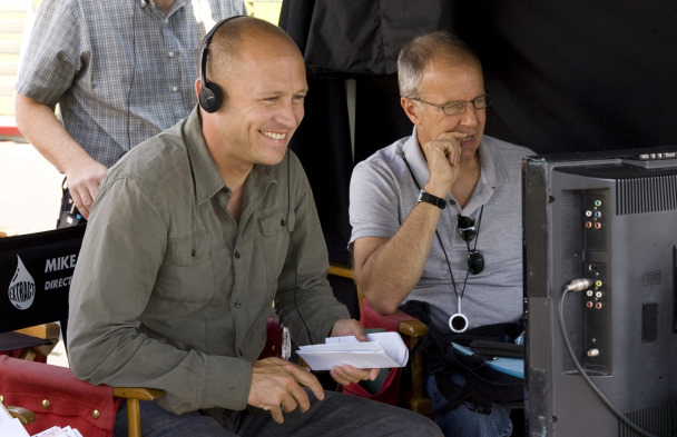
The look of Little Miss Sunshine was crafted by Tim Suhrstedt, ASC. If you look at his filmography which includes everything from Office Space to Bill & Ted’s Excellent Adventure you’ll see a DP who is incredibly versatile but never ego-driven. He doesn’t have a “signature” that he forces onto a film; instead, he adapts his eye to the narrative.
Working with directors Jonathan Dayton and Valerie Faris, Suhrstedt brought a sensibility that felt less like a “Hollywood production” and more like an intimate family documentary. He understood that this wasn’t a story about grand landscapes, even though it’s a road movie. It was a story about faces. His work here is powerful because it’s invisible. He creates an environment where the camera simply observes, allowing the chaotic energy of the Hoover family to dictate the frame rather than forcing them into “pretty” setups.
Technical Aspects & Tools
The “soul” of this film’s look comes from the choice of 35mm film. Suhrstedt utilized Panavision Platinum and Goldcameras, paired with Panavision Primo Primes and Zooms. In an era where digital was starting to make noise, sticking with 35mm specifically Kodak Vision2 500T (5218) and 200T (5274) was the right call.
The film stock provides a natural grain structure and a tactile quality that digital sensors still struggle to emulate perfectly. That 500T stock, in particular, gives the shadows a richness and the highlights a soft, organic roll-off that makes the desert heat feel palpable. Using Panavision glass also contributed to that classic anamorphic feel, providing a cinematic texture to a story that is, on the surface, very “small” and domestic.
Compositional Choices
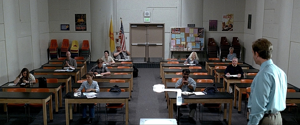
One of the most brilliant ironies of the film is the use of the 2.39:1 Anamorphic aspect ratio. Usually, wide formats are reserved for sweeping westerns or sci-fi epics. Here, Suhrstedt uses that width to emphasize isolation.
In the dinner scene or the cramped interior of the van, the wide frame allows us to see the “bubbles” each character lives in. Even when they are physically inches apart, the composition pushes them to the edges, creating “Left-heavy” or “Center-heavy” frames that highlight their emotional distance. We see Olive in the foreground, often framed by the toxic “winner/loser” ideology of her father in the background. It’s a clever use of depth cues to show how the characters are trapped by their own perspectives.
Inspiration Behind the Cinematography
The visual philosophy here is what I’d call “deliberate modesty.” The team intentionally avoided the “manufactured gloss” you’d see in a typical Hollywood comedy. They wanted an “aesthetically humble sincerity” to counter the fake, plastic world of the beauty pageants they were satirizing.
The cinematography embraces the messiness of life. Instead of pristine sets, we get lived-in textures and a documentary-style approach to fiction. This grounds the film in a relatable reality. It tells the audience, visually, that it’s okay to be flawed. The camera isn’t there to judge the Hoovers for their broken van or their broken dreams; it’s there to witness their journey back to each other.
Lighting Style
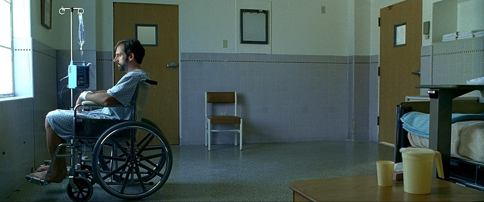
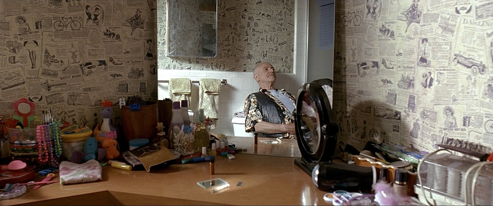
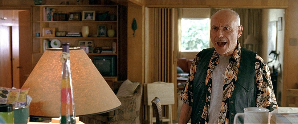
As a colorist, I love the “hard light” approach Suhrstedt took for the exterior scenes. It’s unabashedly naturalistic. When they’re in the Arizona sun, it looks like Arizona. It’s bright, it’s a bit harsh, and it feels real. He largely uses motivated lighting, meaning every light source feels like it belongs in the room a window, a desk lamp, or the overhead sun.
In the interior house scenes, the light is often soft and mundane, never calling attention to itself. This “daylight-sunny” vibe keeps the focus on the performances. There are no dramatic “Rembrandt lighting” setups here to signal a mood; the mood comes from the raw, unvarnished exposure of the characters’ vulnerabilities.
Camera Movements
The movement in Little Miss Sunshine is deceptively simple. You won’t find any “look-at-me” crane shots. Instead, the camera feels like a passenger in that yellow van. When the family is arguing, the camera is often handheld, bobbing gently with the movement of the vehicle. This creates a claustrophobic tension that makes the audience feel the heat and the frustration.
When they’re outside pushing the van, the camera pulls back into more objective, wider shots. I used to think this was just for realism, but it’s more nuanced. The camera’s momentum mirrors the family’s. When they are stuck, the camera is static and observational. When they finally get that van moving by any means necessary—the camera finds a rhythmic forward push. It’s an understated visual metaphor for their progress as a unit.
Lensing and Blocking
The Panavision Primo Primes were essential here. They are known for being sharp and clean but with a characteristic Panavision “creaminess” in the out-of-focus areas. Suhrstedt often used medium lenses to keep us close to the characters without distorting their features, which is vital for a character-driven drama.
The blocking is where the film really asserts itself. Think about the arrangement in the van: Olive, the heart of the family, is often central, flanked by the cynical Frank and the silent Dwayne. The blocking forces these clashing personalities into an intimate huddle. This reaches its peak at the pageant. While the other contestants are blocked with rigid, robotic perfection, the Hoovers eventually huddle together on stage in a chaotic, supportive mess. Their “Super Freak” dance is a total rejection of the “correct” blocking of the pageant world.
Color Grading Approach
Looking at this through a modern grading lens, the look is rooted in that Kodak Vision2 color science. It’s a naturalistic, slightly desaturated palette that avoids “pop” in favor of “presence.”
The hue separation is subtle but intentional. Skin tones are the anchor they look authentic and “un-retouched,” which is crucial for the film’s gritty realism. While the overall grade is neutral, the bright yellow of the van and Olive’s swimsuit act as the “glimmer of hope” in an otherwise muted world.
From a technical standpoint, the highlight roll-off in the desert scenes is beautiful. It feels like a “pushed print” look rich shadows that aren’t quite “crushed,” and highlights that retain detail even in the bright Arizona sun. It’s a grade that doesn’t scream for attention but provides a consistent, filmic texture that supports the emotional beats of the story.
- Also read: THE CURIOUS CASE OF BENJAMIN BUTTON (2008) – CINEMATOGRAPHY ANALYSIS
- Also read: ROGUE ONE: A STAR WARS STORY (2016) – CINEMATOGRAPHY ANALYSIS
Browse Our Cinematography Analysis Glossary
Explore directors, cinematographers, cameras, lenses, lighting styles, genres, and the visual techniques that shape iconic films.
Explore Glossary →