Rogue One: A Star Wars Story (2016), I’m not just watching a sci-fi flick. I’m looking at a masterclass in visual intent. Gareth Edwards and his team made a “Star Wars” movie that didn’t feel like a Star Wars movie, and that’s exactly why it works. It’s visceral, grounded, and dare I say essential.
About the Cinematographer

The look of Rogue One started with Greig Fraser. If you follow cinematography, you know Fraser’s name carries a certain weight. He’s the guy who brought a gritty, lived-in naturalism to Zero Dark Thirty and Lion.
Fraser’s reunion with Gareth Edwards (after Killing Them Softly) was a stroke of genius. He has this uncanny ability to take something monumental like a Godzilla-sized monster or a Death Star and frame it from a human perspective. He puts us in the trenches, not the cockpit of a clean X-Wing. It’s authentic, textured, and feels “true” in a way few blockbusters do.
Inspiration Behind the Cinematography
The mandate for Rogue One was clear: make it a war movie first, and a space fantasy second. I love that the team didn’t look at Jedi temples for inspiration; they looked at Apocalypse Now and Full Metal Jacket.
This is the “dirty futuristic” world George Lucas hinted at in 1977, but pushed to its absolute limit. It’s a world of moral gray areas where being a Rebel doesn’t automatically make you a “good guy.” Every visual choice, from the grime on the uniforms to the smoke-filled air, was designed to make this feel like a historical document of a conflict we thought we already knew.
Technical Aspects & Tools
Rogue One: A Star Wars Story (2016) — Technical Specs
| Genre | Action, Drama, Science Fiction, War, Space, History, Science-Fiction |
| Director | Gareth Edwards |
| Cinematographer | Greig Fraser |
| Production Designer | Doug Chiang, Neil Lamont |
| Costume Designer | David Crossman, Glyn Dillon |
| Editor | Jabez Olssen, John Gilroy, Colin Goudie |
| Colorist | Mitch Paulson |
| Time Period | Future |
| Color | Cool, Desaturated, White |
| Aspect Ratio | 2.39 – Anamorphic |
| Format | Digital |
| Lighting | Soft light, Top light |
| Lighting Type | Daylight, Overcast |
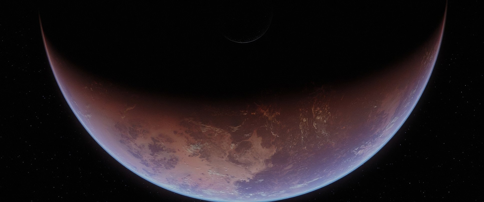
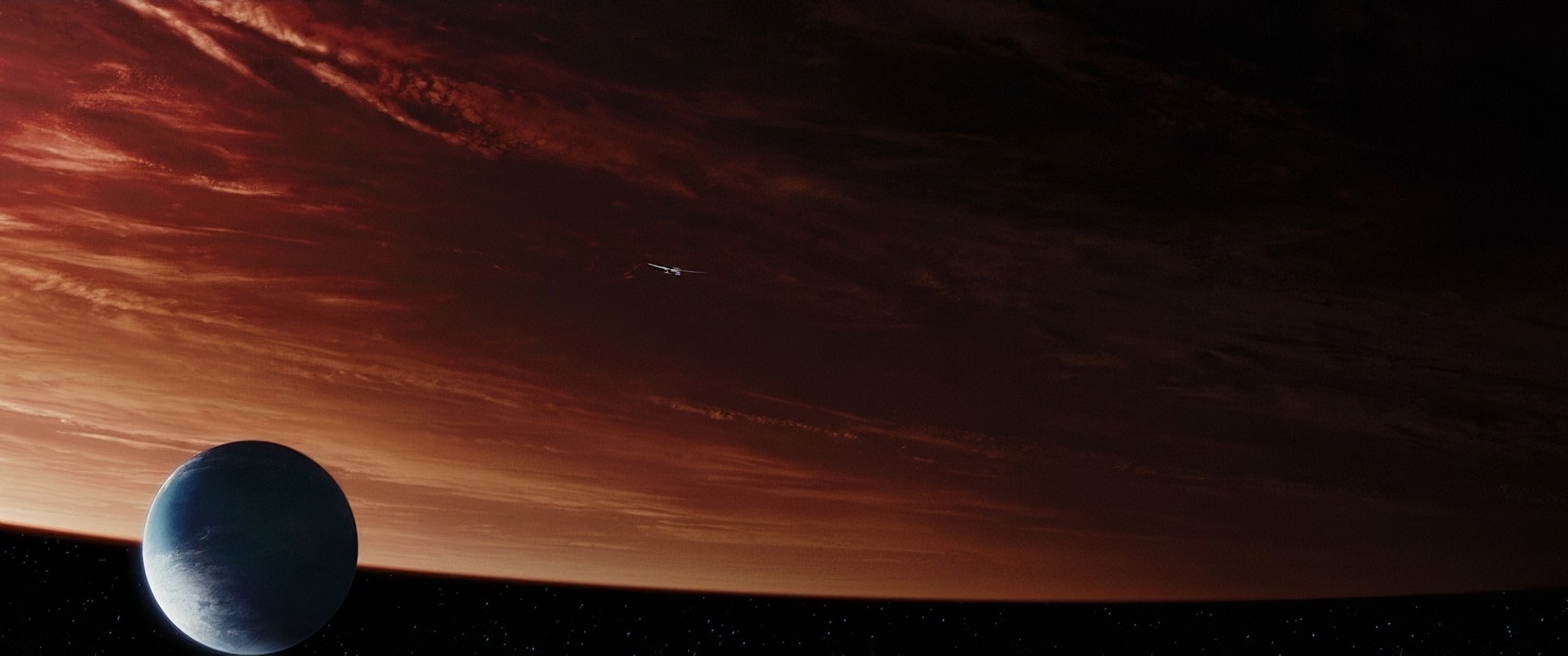
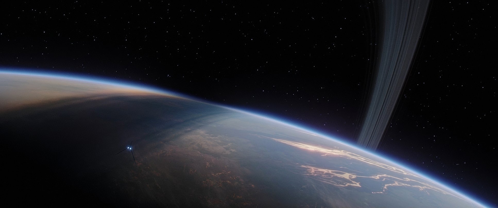
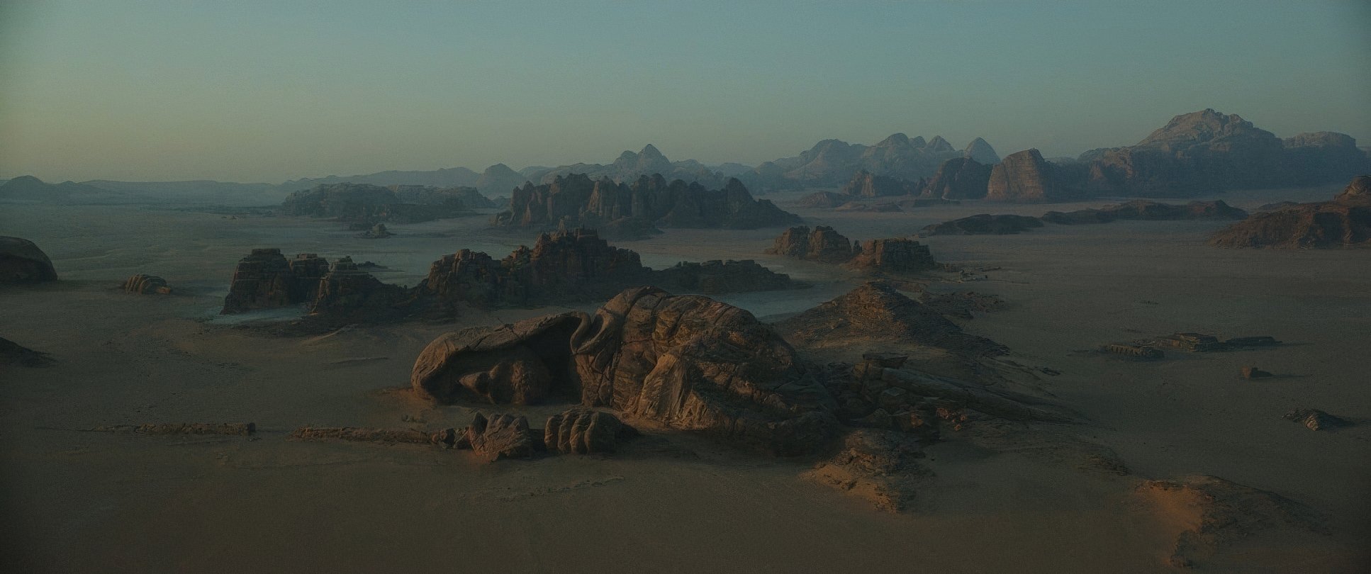
| Story Location | … Lah’mu |
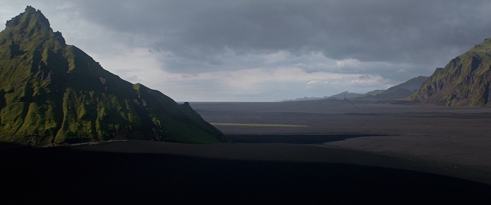
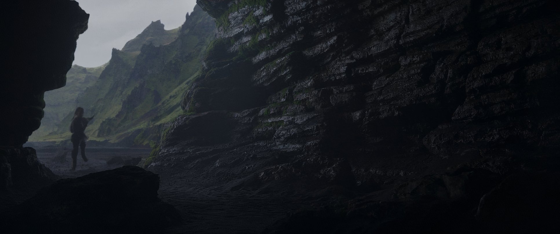
| Filming Location | … Iceland > Reynisfjara |
| Camera | ARRI ALEXA 65 |
| Lens | Panavision APO Panatar, Vantage Hawk 65 (1.3 anamorphic) |
| Film Stock / Resolution | 4K, ARRIRAW (6.5K) |
Let’s talk shop. To get this look, they went big literally. They shot on the ARRI Alexa 65. As a colorist, I can tell you the dynamic range and resolution (6.5K ARRIRAW) coming off that sensor is a dream. It gives the image a depth that 35mm sometimes struggles to match in a digital workflow.
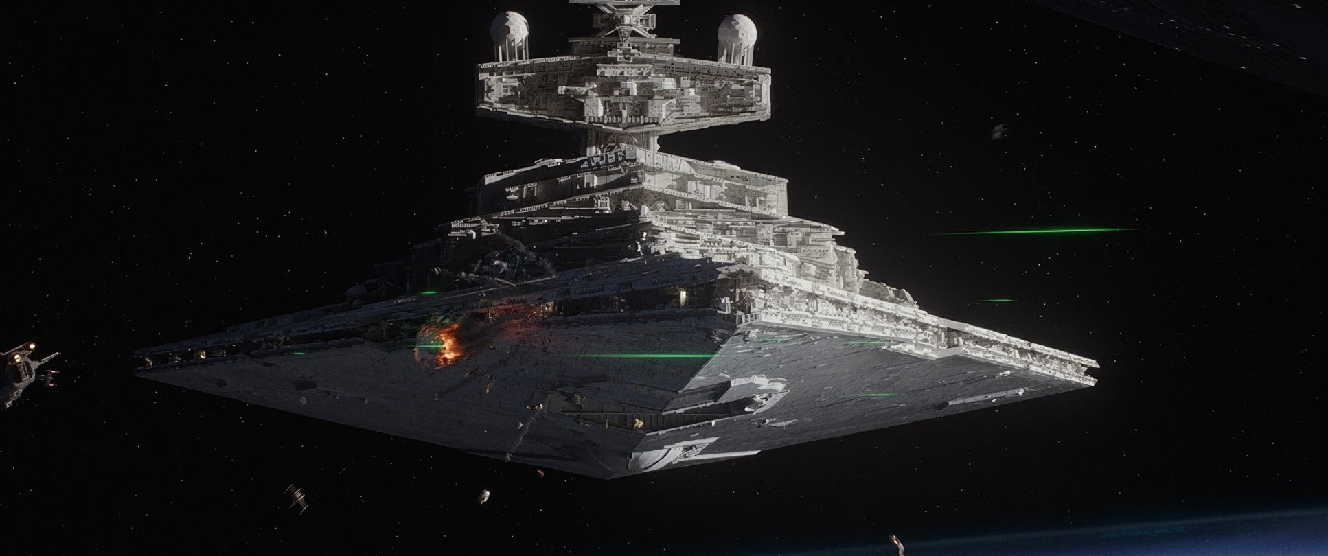
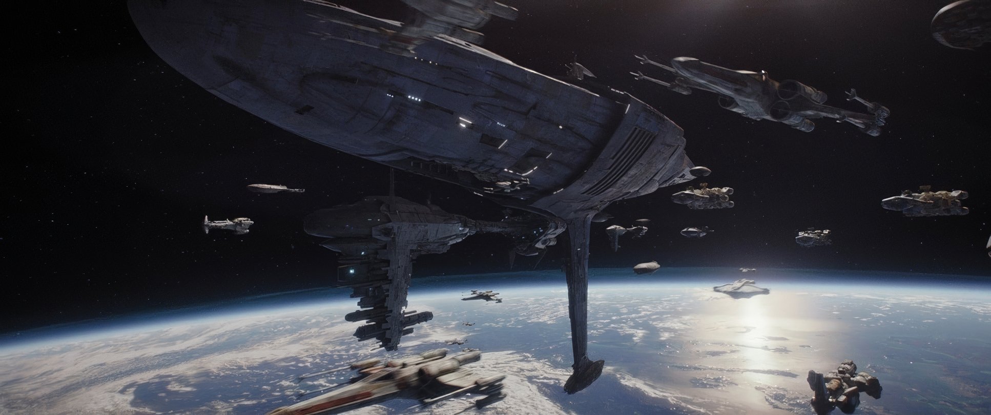
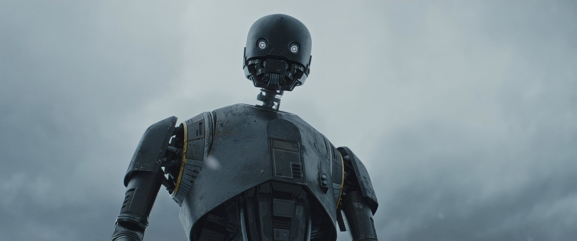
The VFX integration is another level. Usually, I can spot a CGI element a mile away, but here, the AT-ATs and Star Destroyers feel heavy. They have mass. Even the “ballsy” decision to digitally bring back Peter Cushing as Tarkin and a young Carrie Fisher though it hit the “uncanny valley” for some showed a level of technical ambition that’s rare. It’s all about the alchemy of matching digital faces to Fraser’s very specific lighting and grain structure.
Lensing and Blocking
Fraser’s lens choice is where the “personality” of the film lives. Using Panavision APO Panatars and Vantage Hawk 65 glass gave the movie a unique signature. These lenses allow for a wide field of view without that distracting ultra-wide distortion.
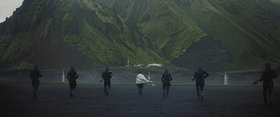
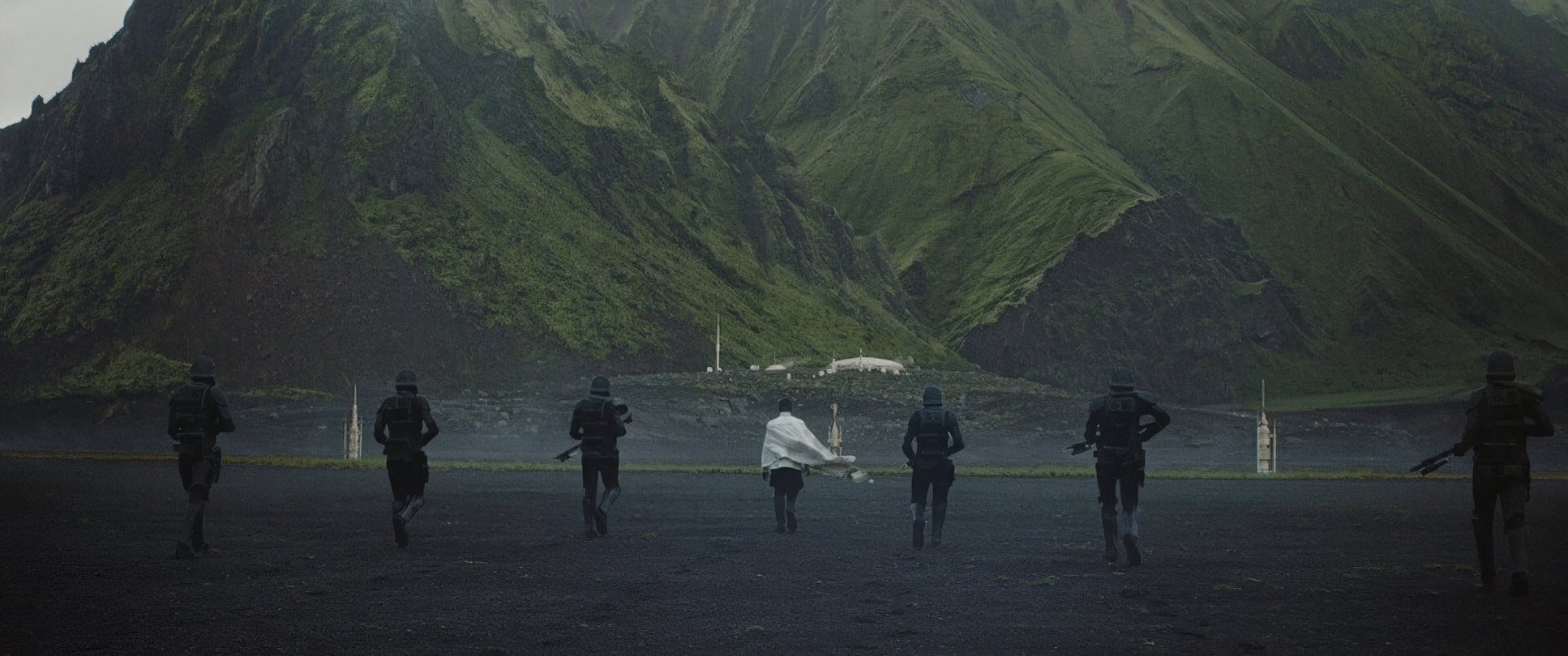
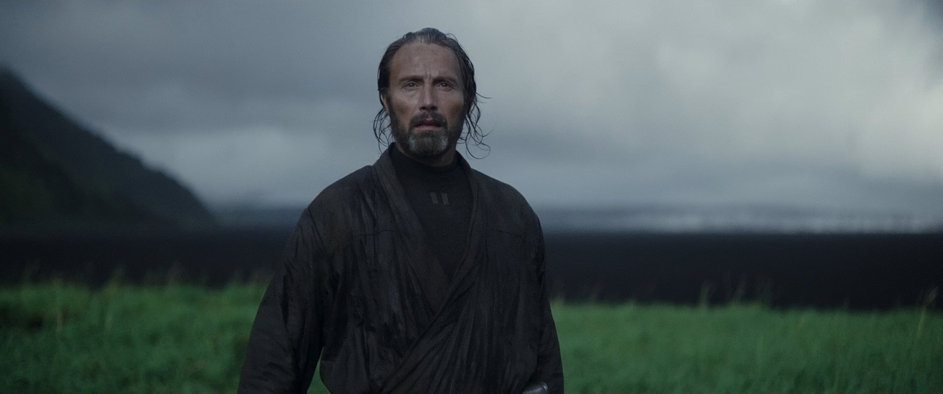
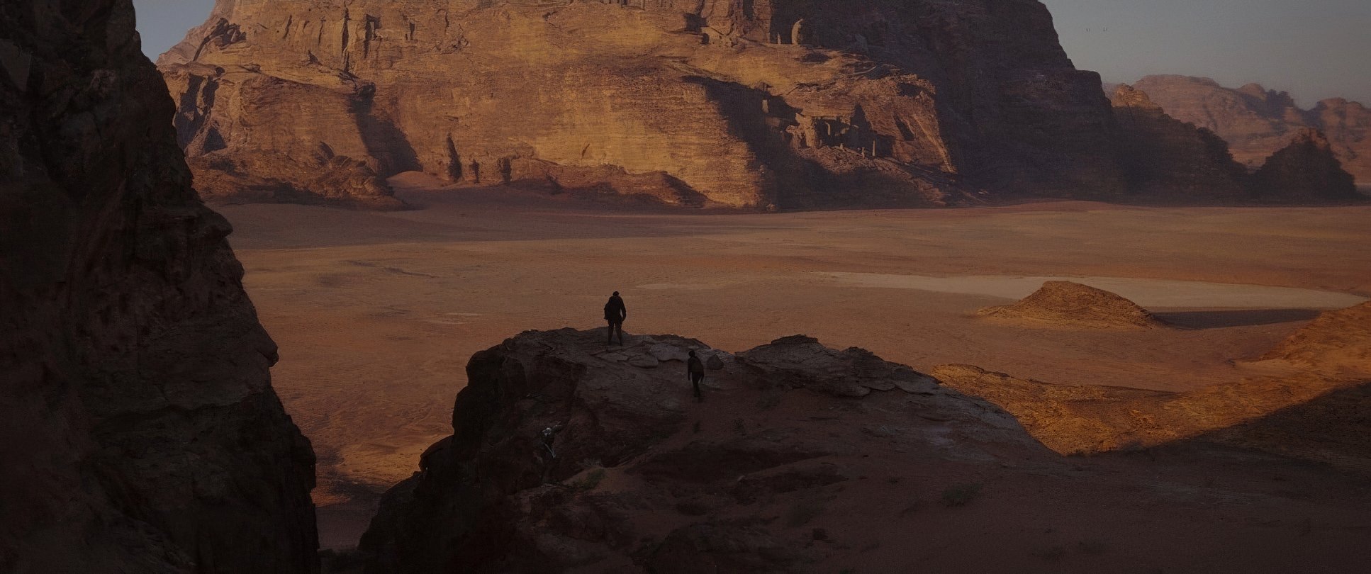
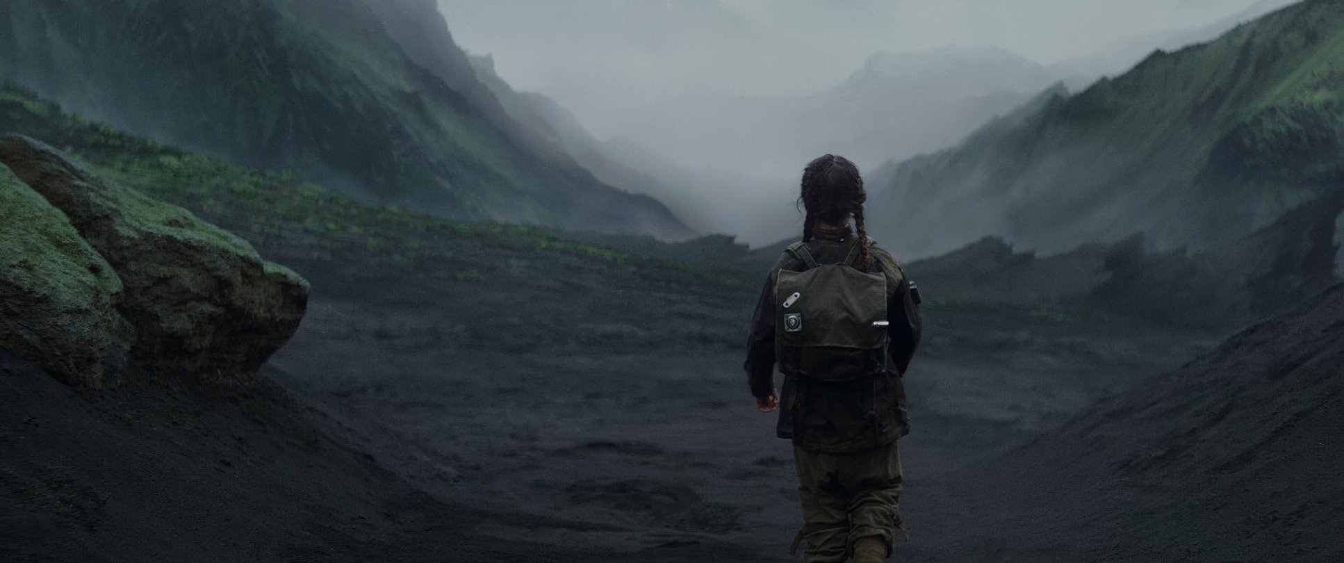
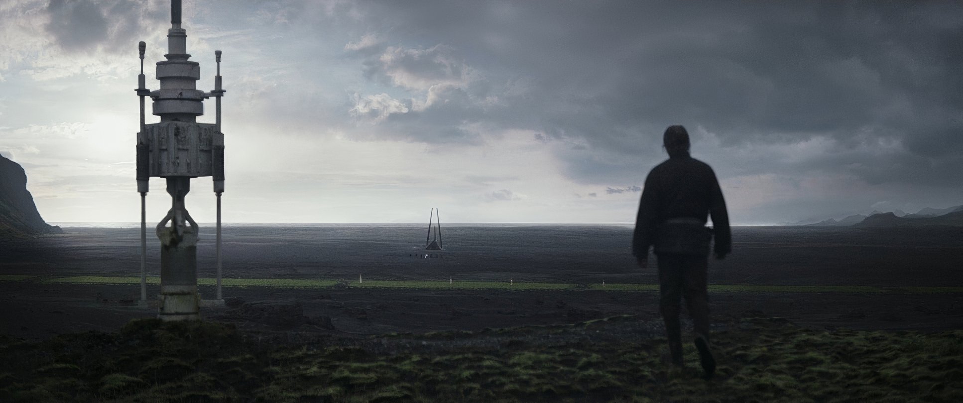
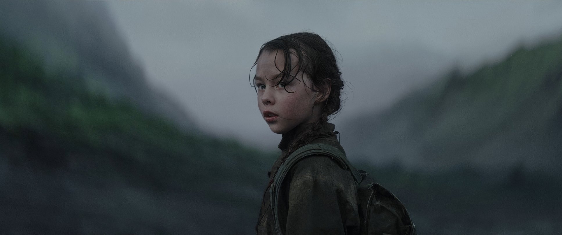
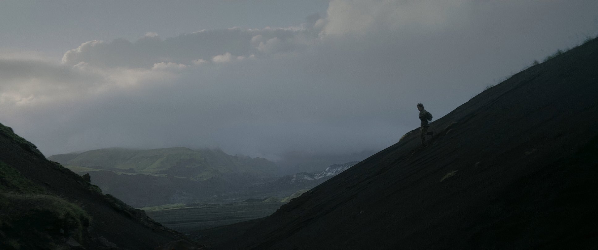
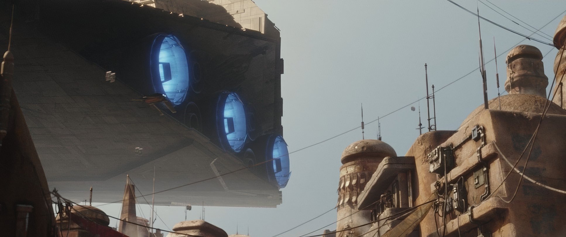
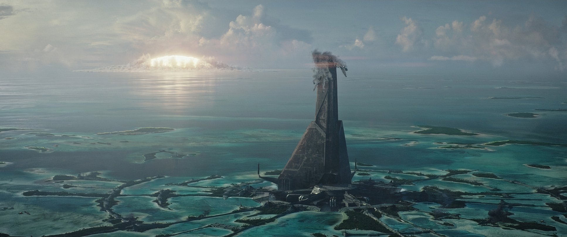
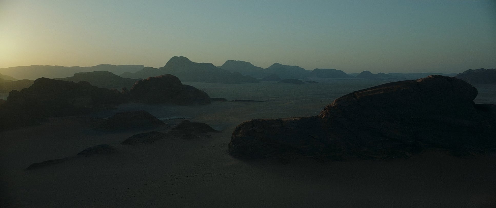
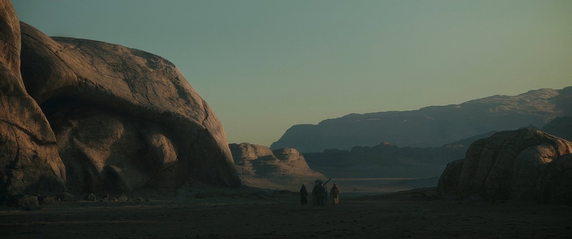
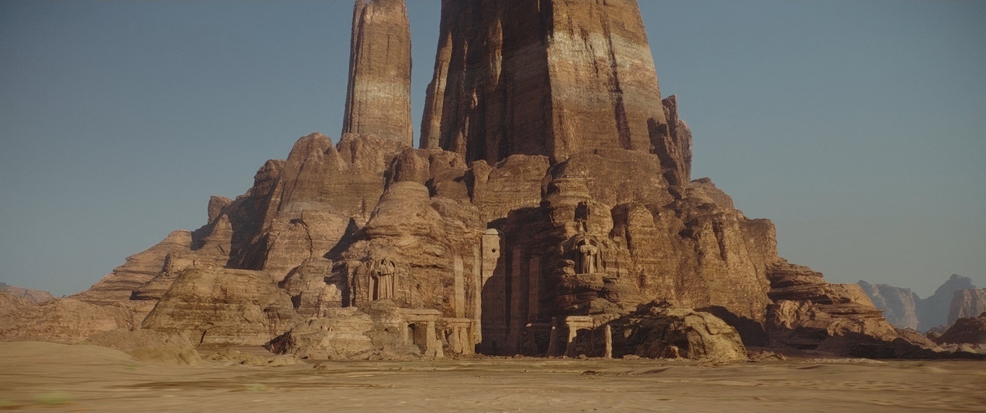
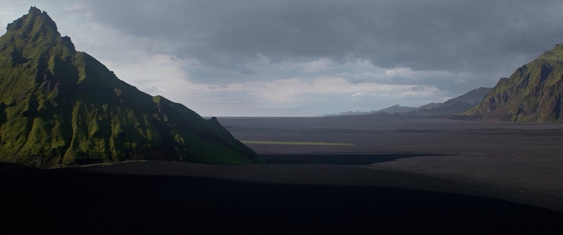
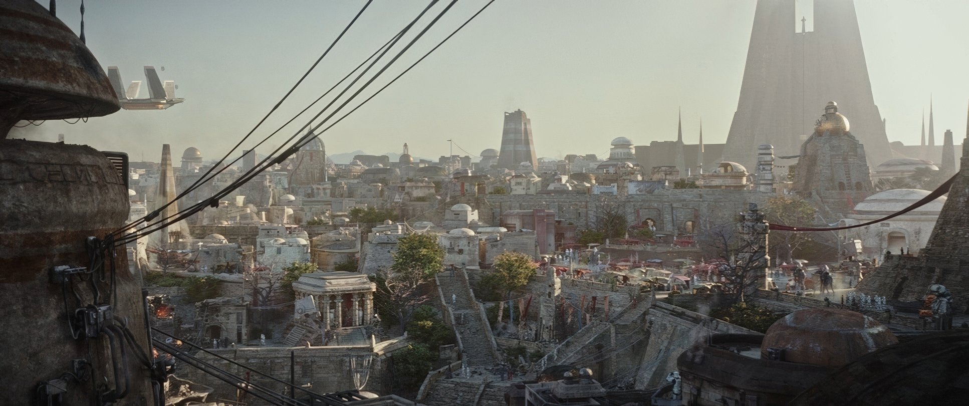
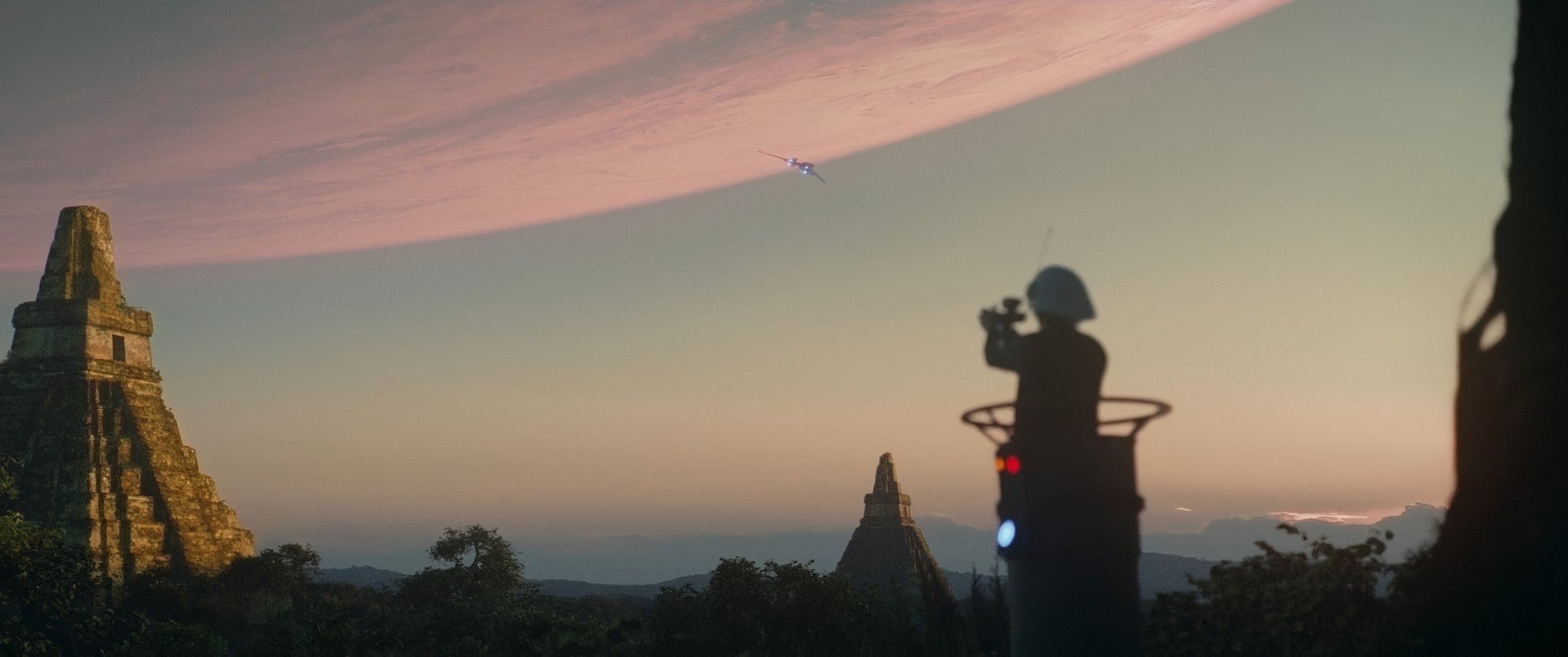
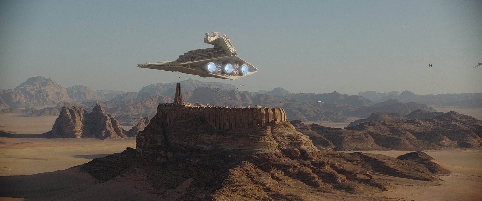
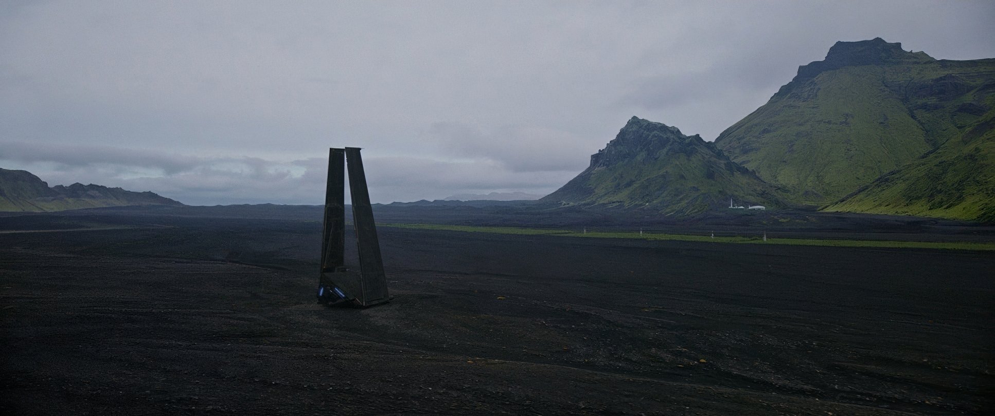
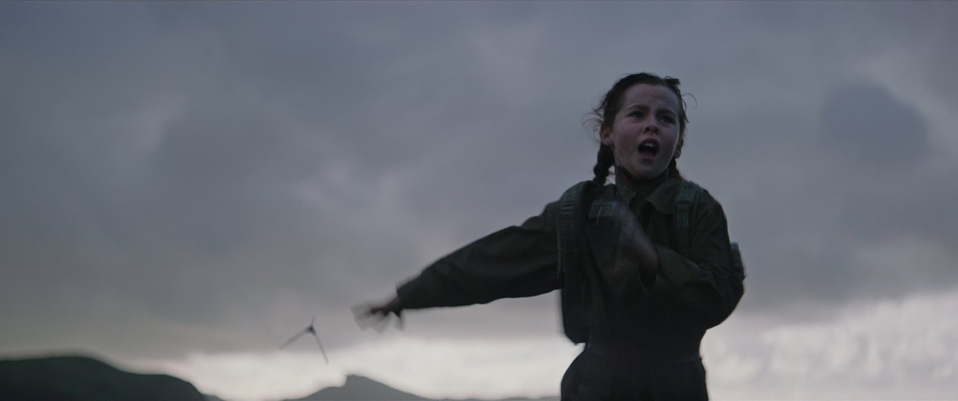
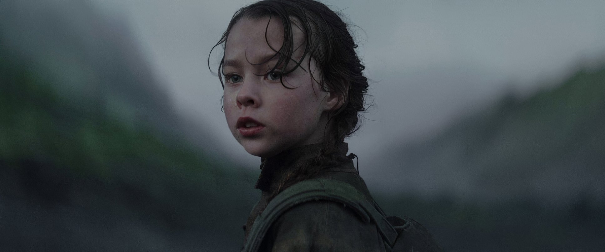
The blocking is just as deliberate. Think about how Krennic is often framed isolated, dwarfed by the brutalist architecture of the Empire. Then compare that to the opening shots on Lah’mu (filmed in the haunting black sands of Reynisfjara, Iceland). The characters feel small against the landscape. It’s a “David vs. Goliath” story told through spatial relationships, not just dialogue.
Lighting Style
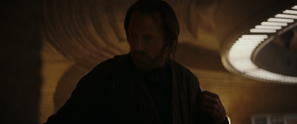
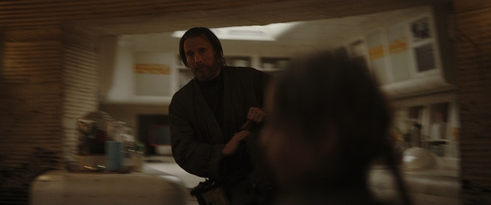
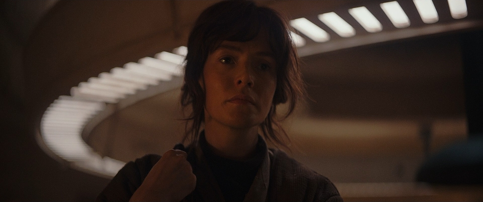
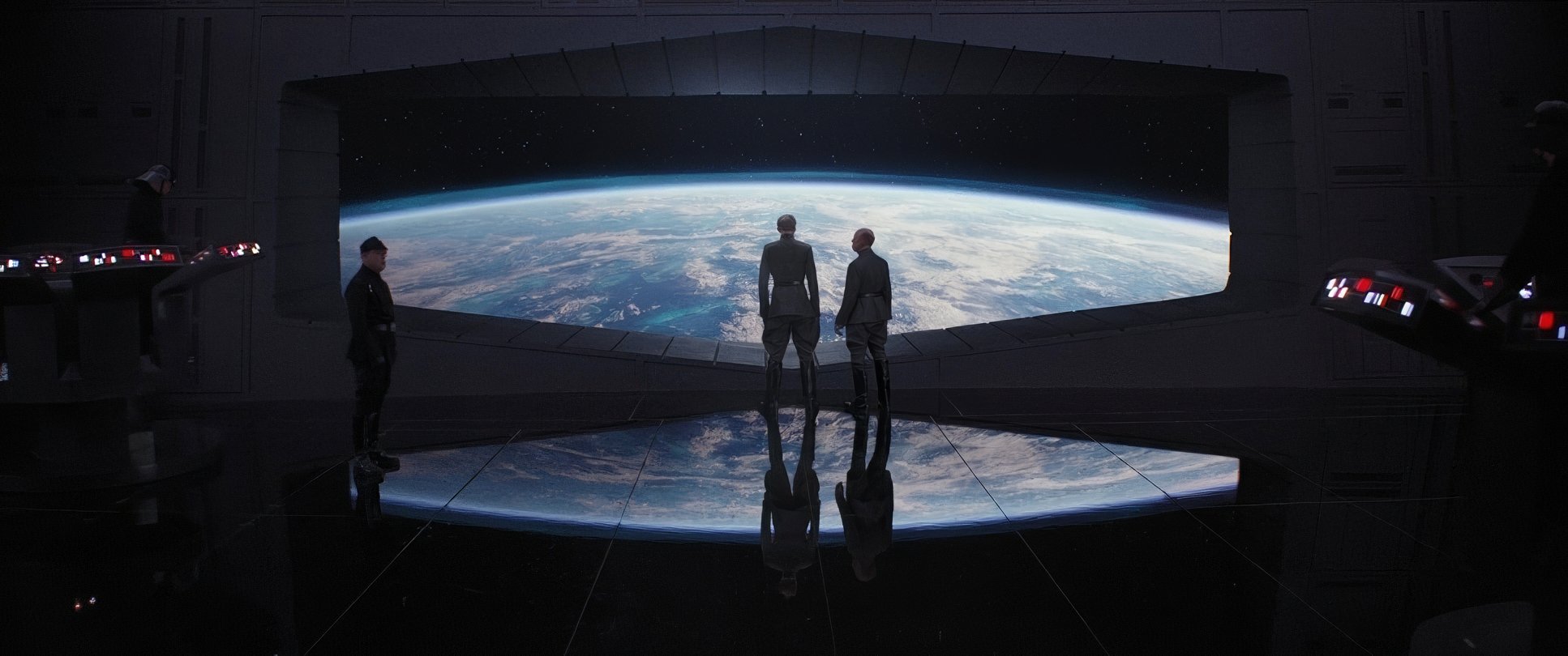
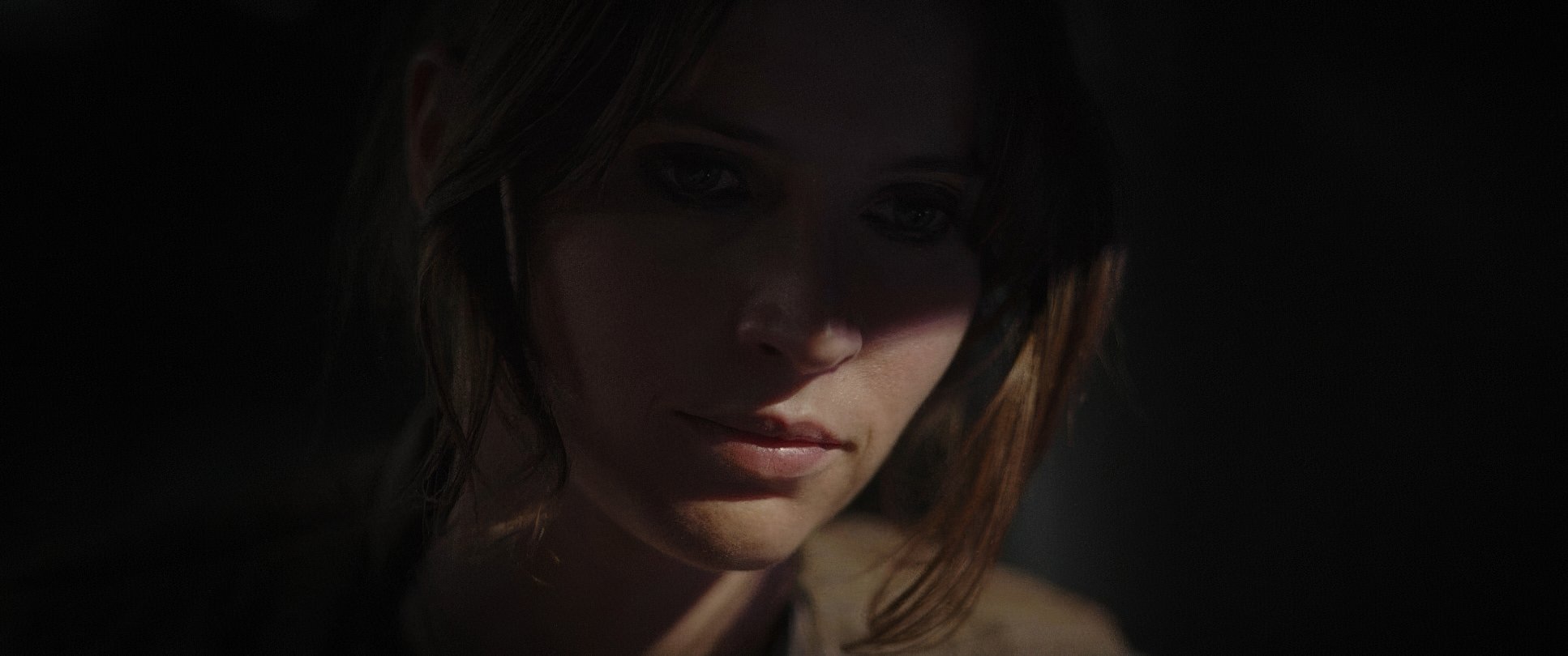
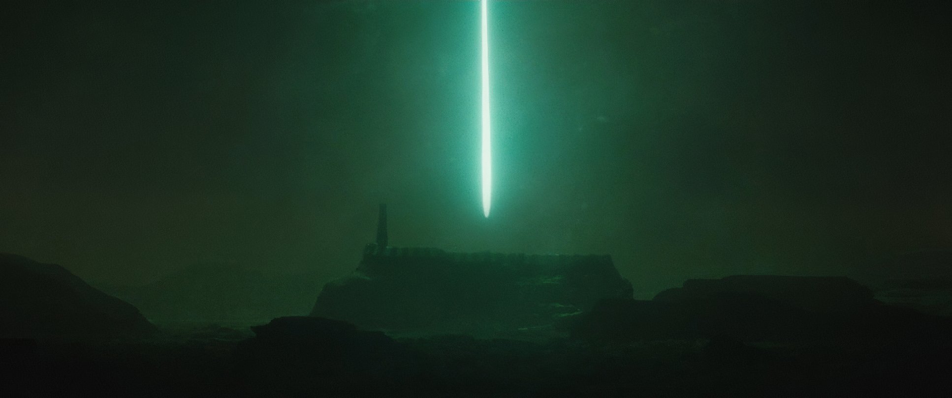
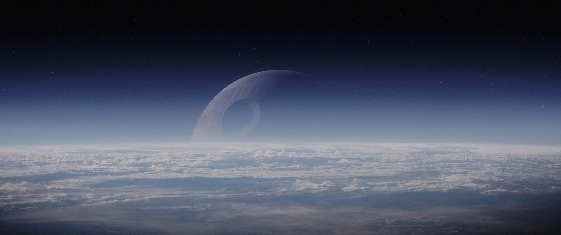
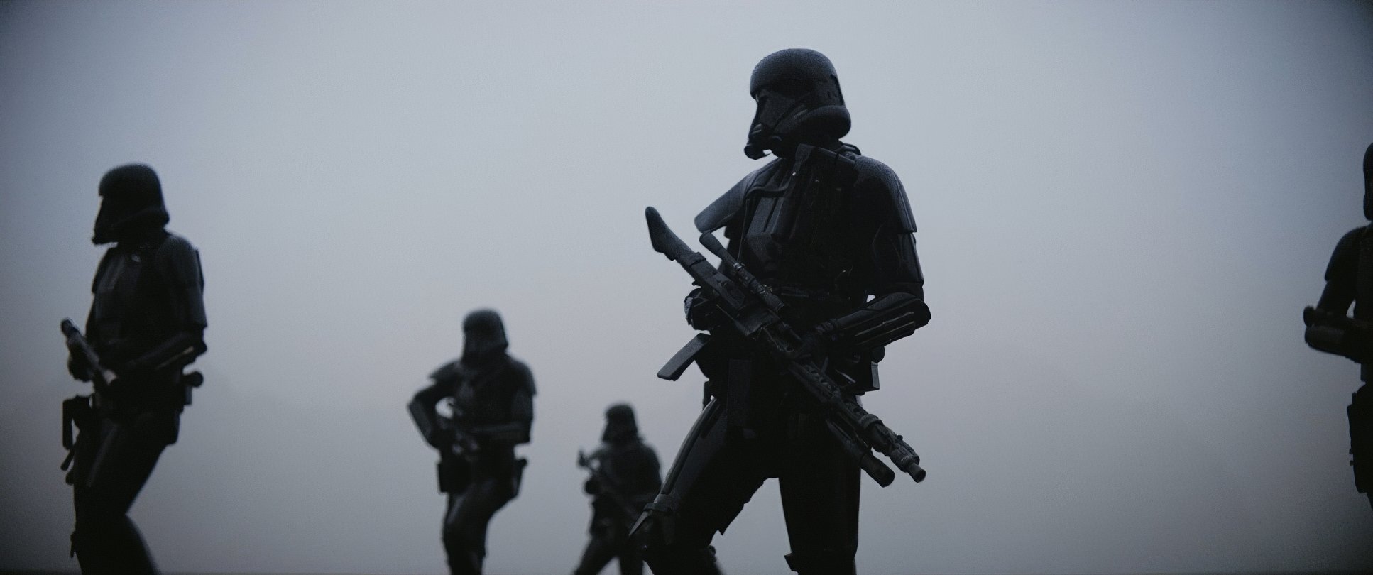
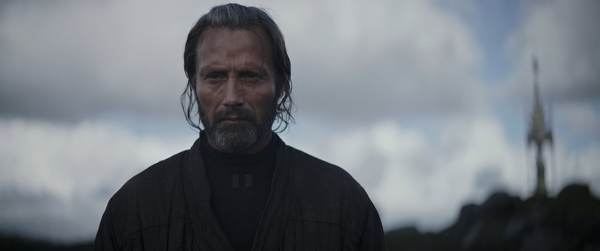
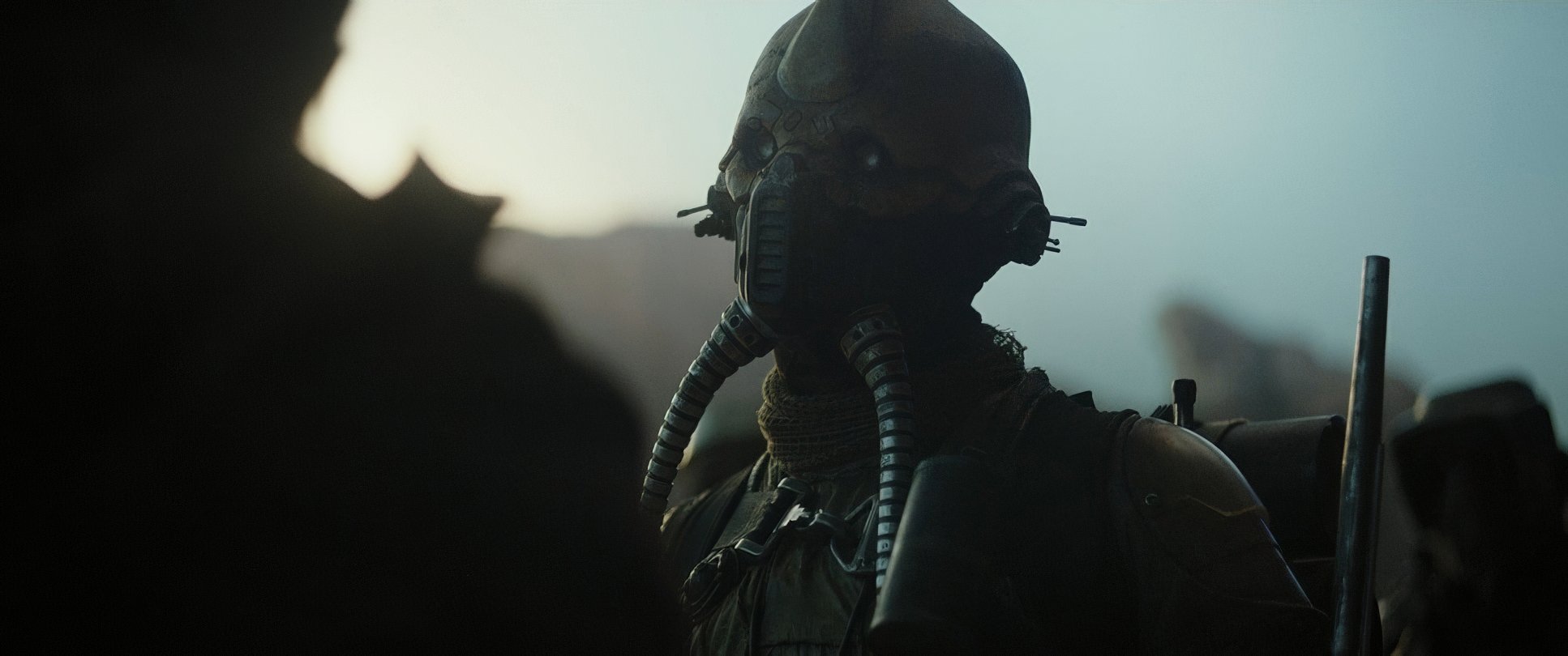
This is where Fraser really shines. He ditched the theatrical, high-key lighting of the prequels for “motivated realism.” If a scene is lit by a harsh sun or a utilitarian Imperial lamp, that’s where the light comes from. Period.
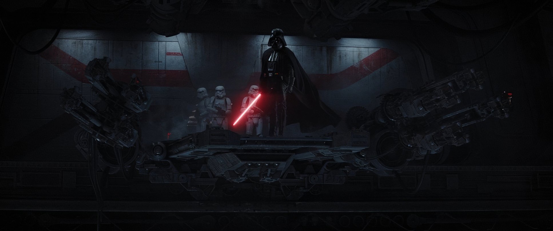
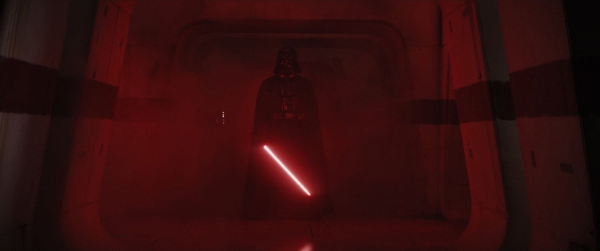
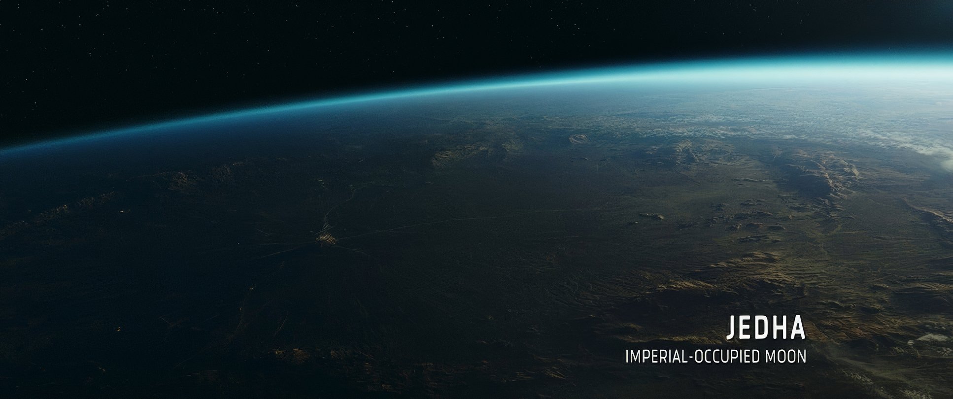
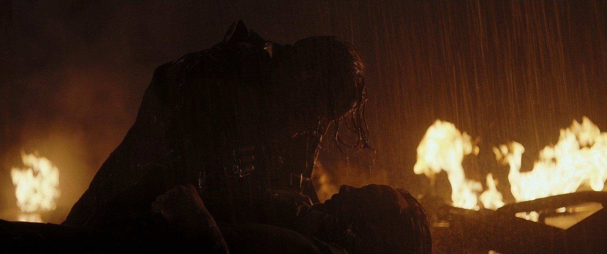
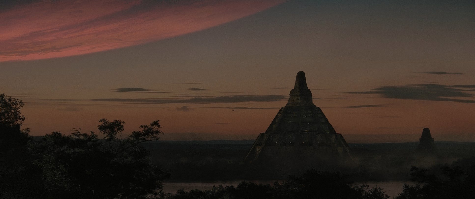
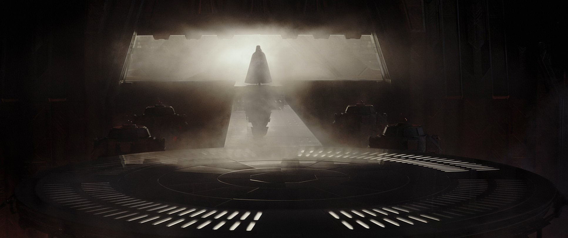
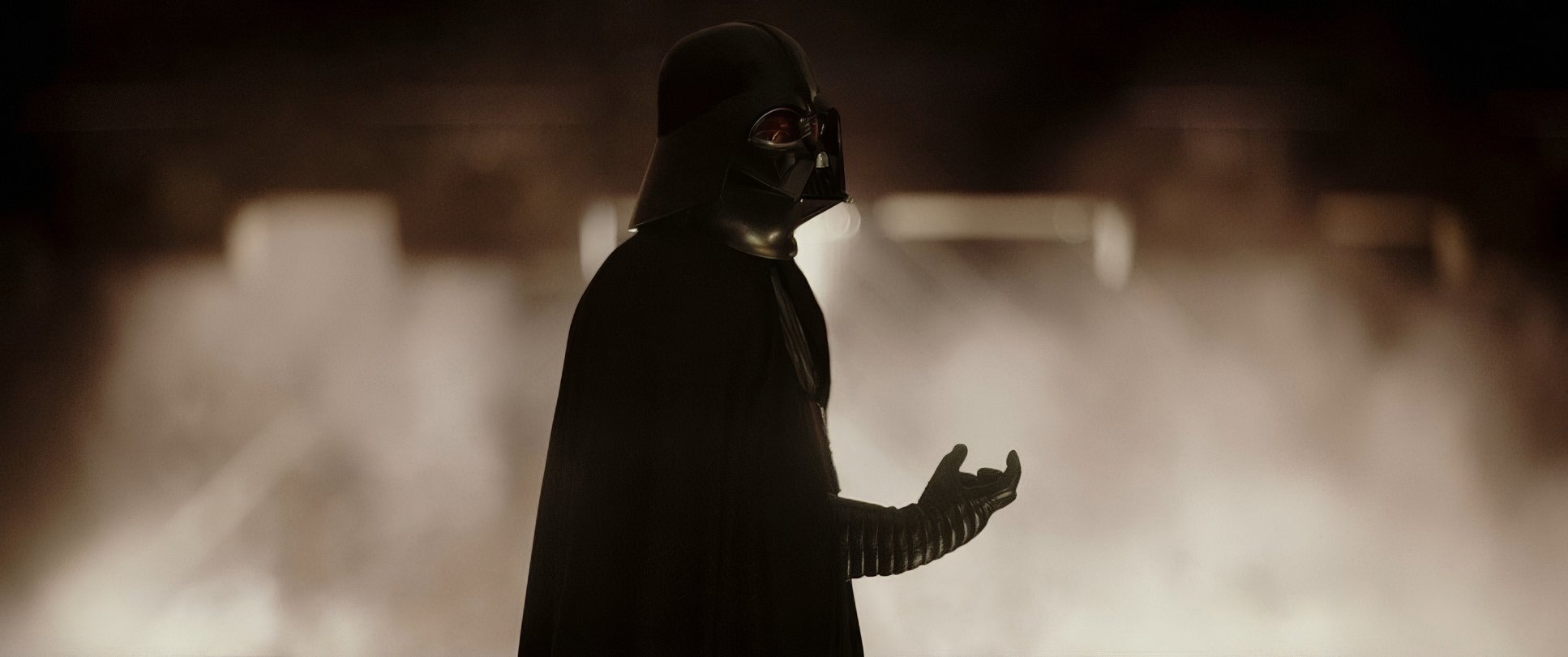
The shadows here aren’t just dark spots; they’re active characters. Look at the Darth Vader sequence at the end. That silhouette against the emergency red lighting? That’s 30 seconds of pure visual storytelling. It’s motivated, terrifying, and makes Vader feel like a mythological monster. Inside the Imperial facilities, the light is cool and clinical, while planets like Jedha feel sun-baked and dusty. It’s all about creating a sense of “place” through light.
Camera Movements
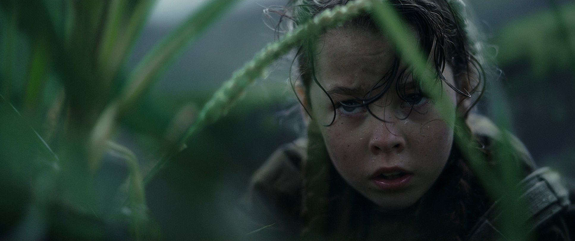
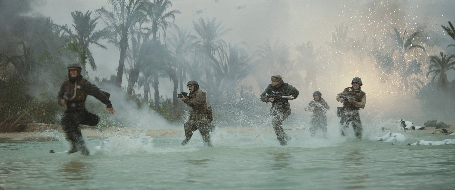
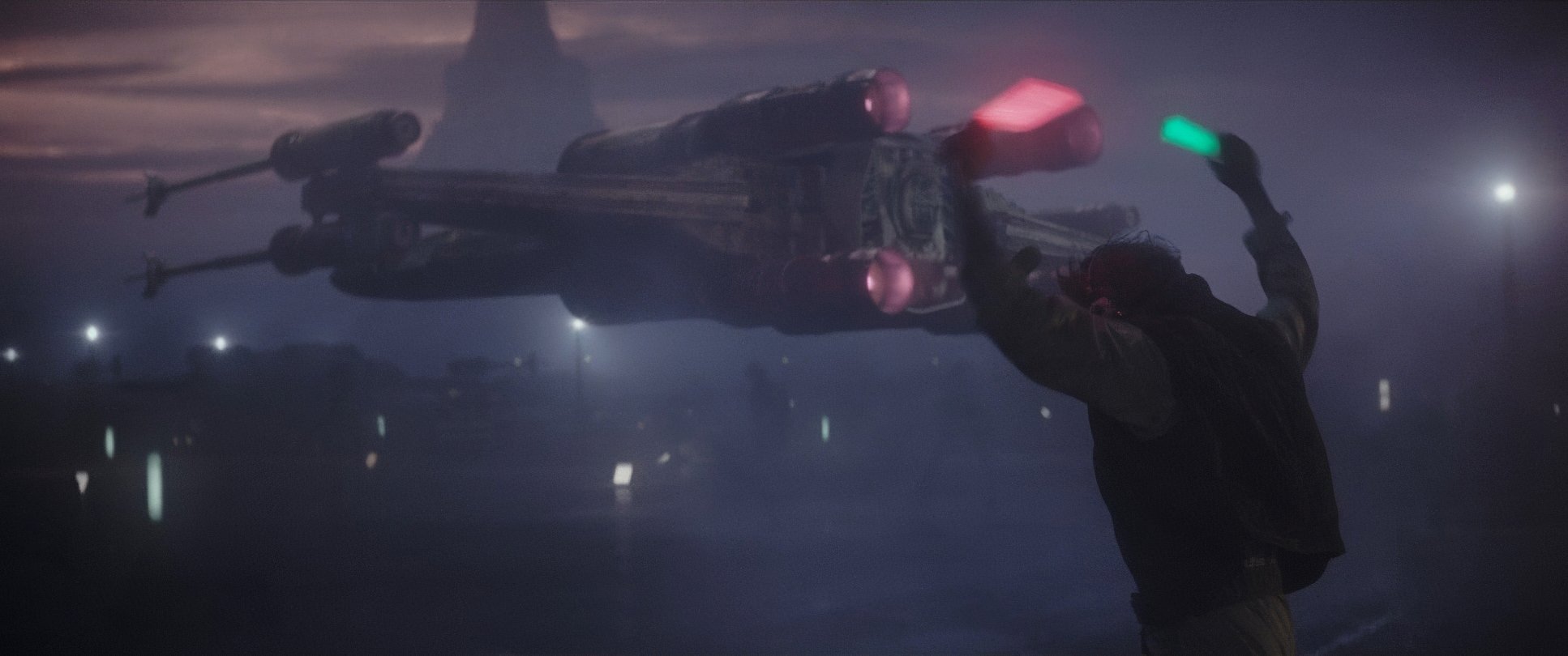
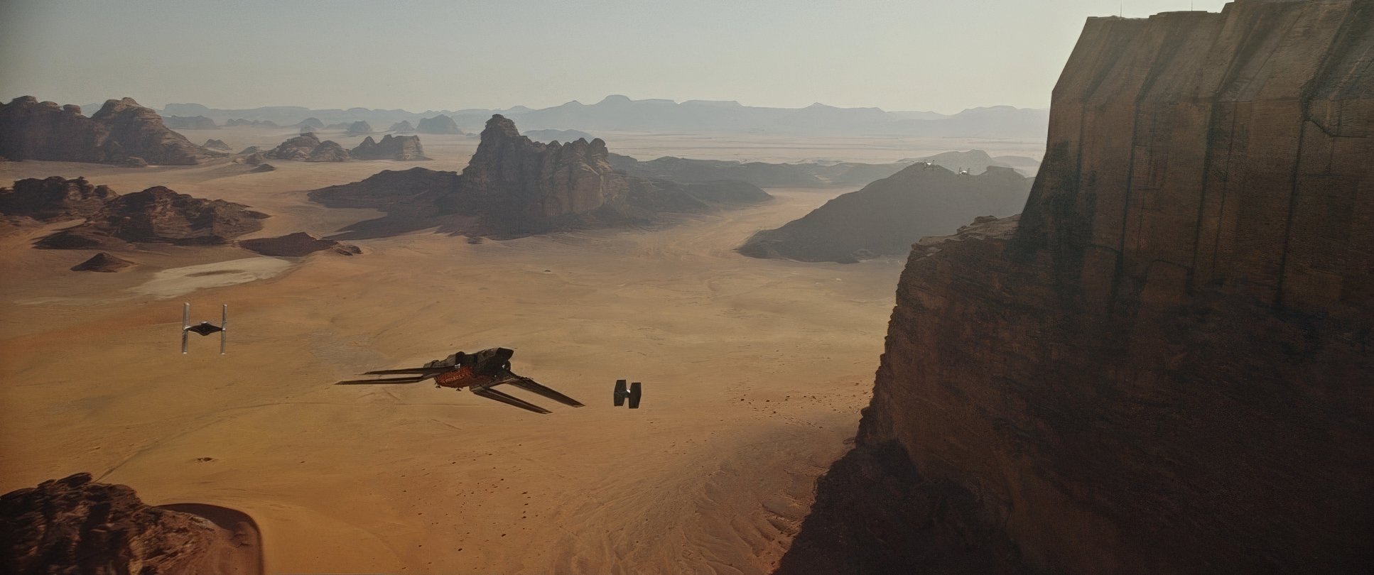
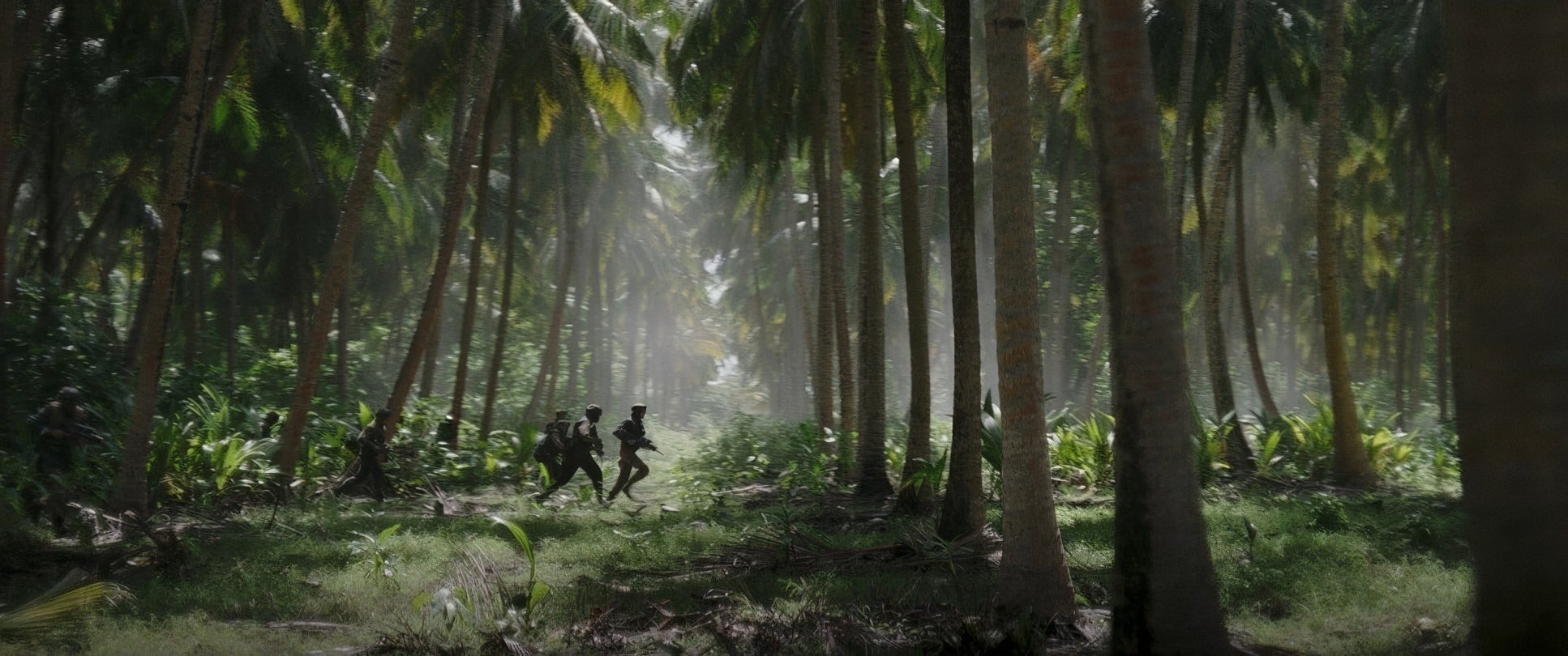
In Rogue One, the camera is a participant, not just a spectator. Edwards and Fraser used a lot of handheld work during the combat scenes. It isn’t “shaky-cam” for the sake of being trendy; it’s about making you feel like you’re ducking for cover with Jyn Erso.
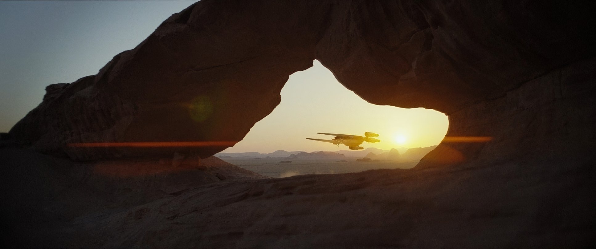
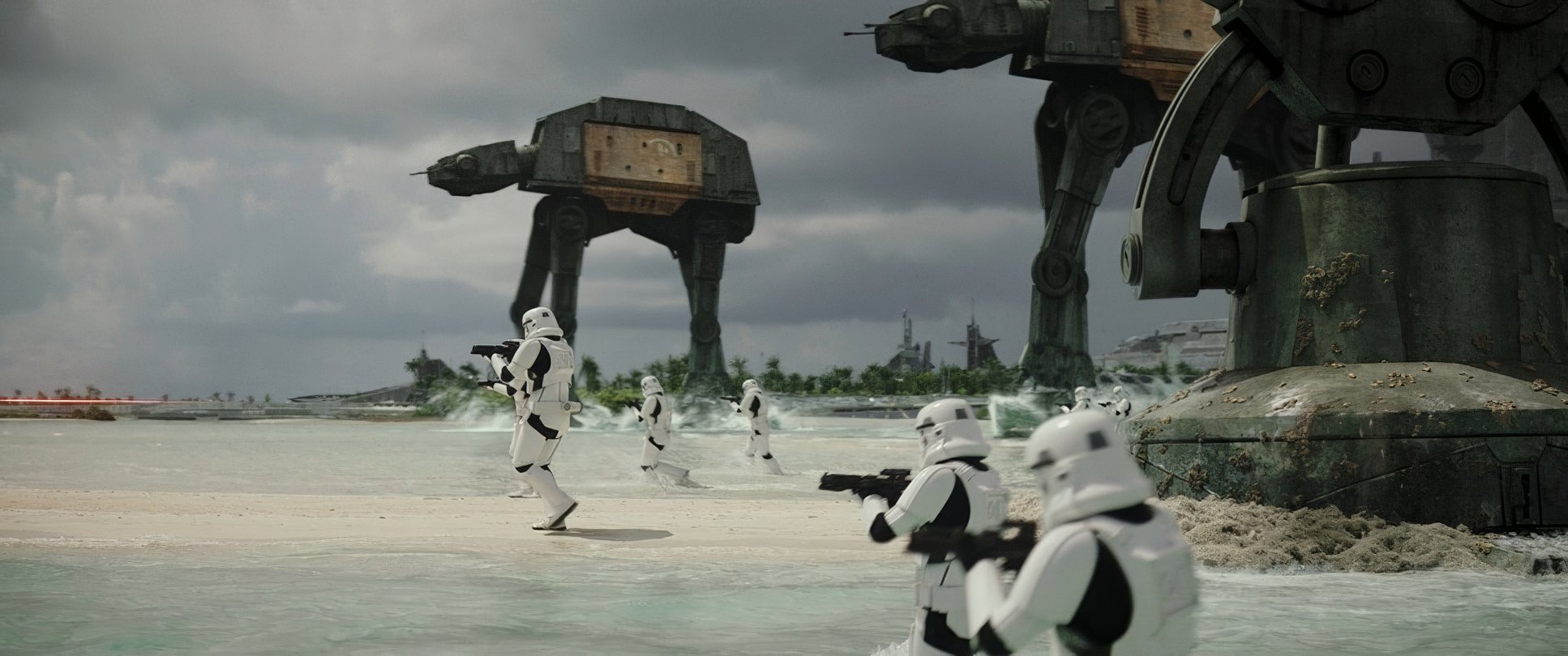
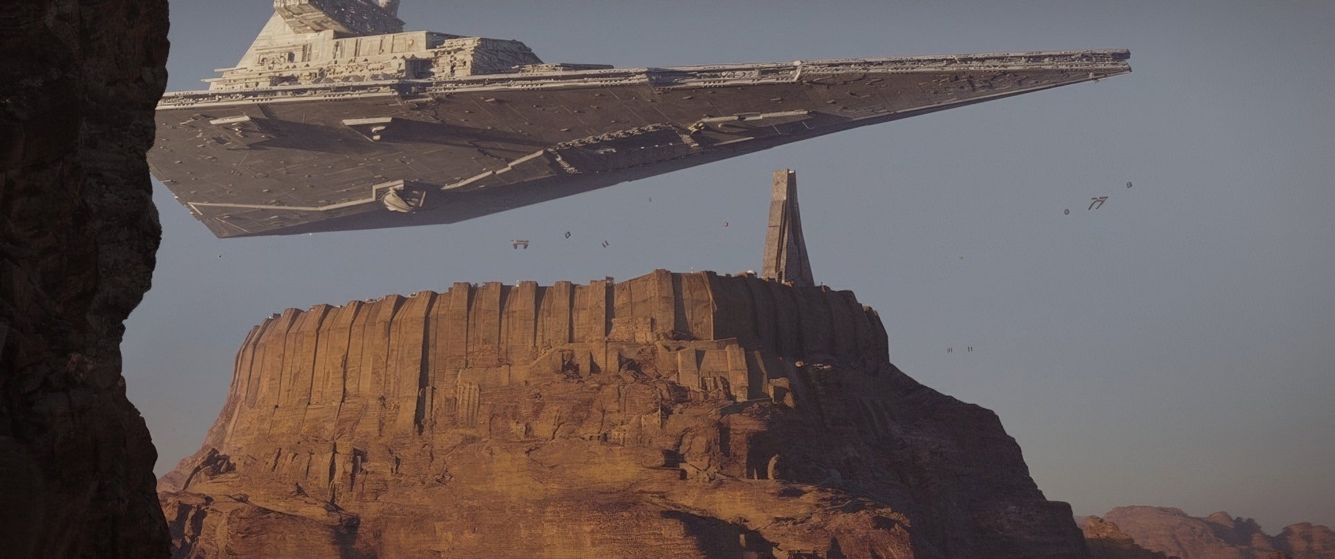
But they knew when to pull back. When they want to show the scale of the Empire, the camera becomes rock-steady, using sweeping crane shots or low-angle “look-ups” at those towering AT-ATs. It’s a trick Edwards perfected in Godzilla keeping the perspective at ground level so the audience feels the true weight of the threat.
Compositional Choices
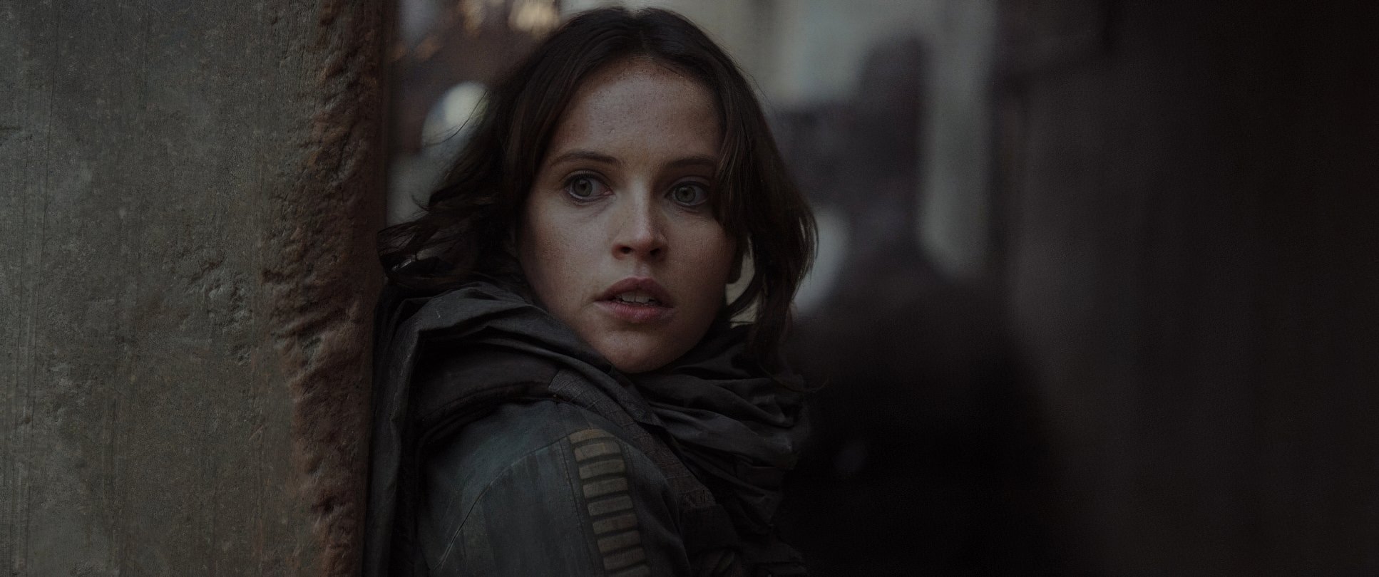
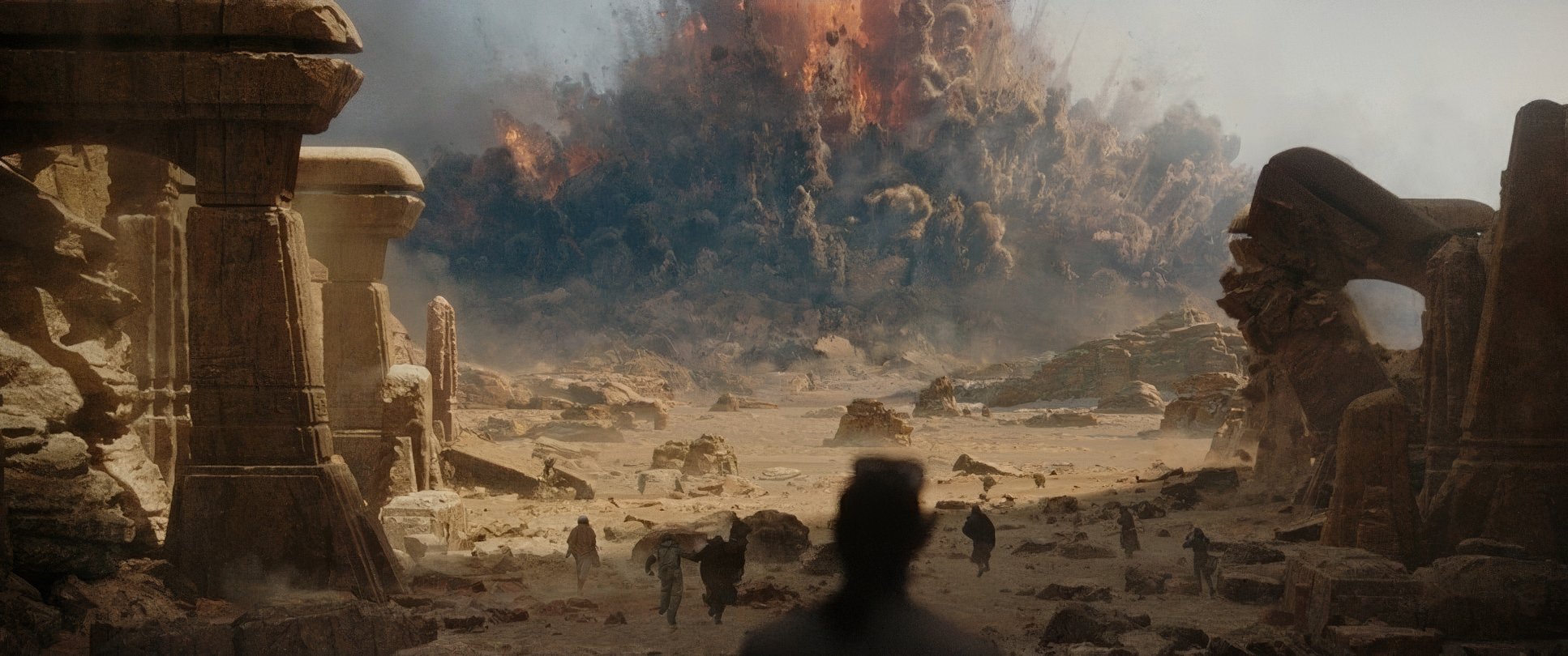
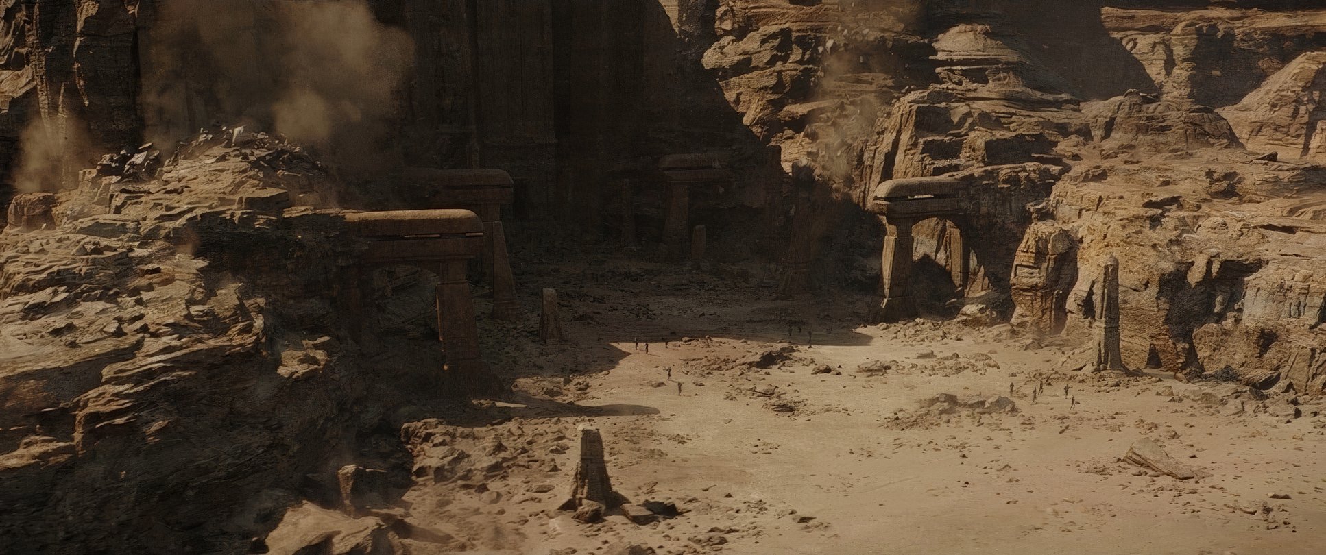
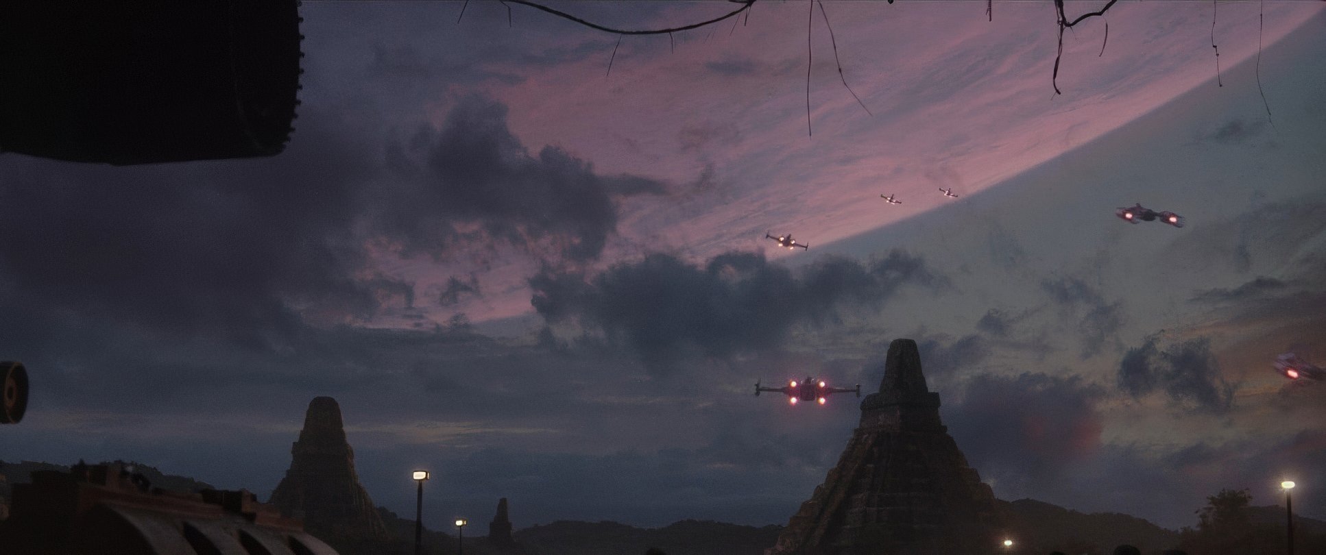
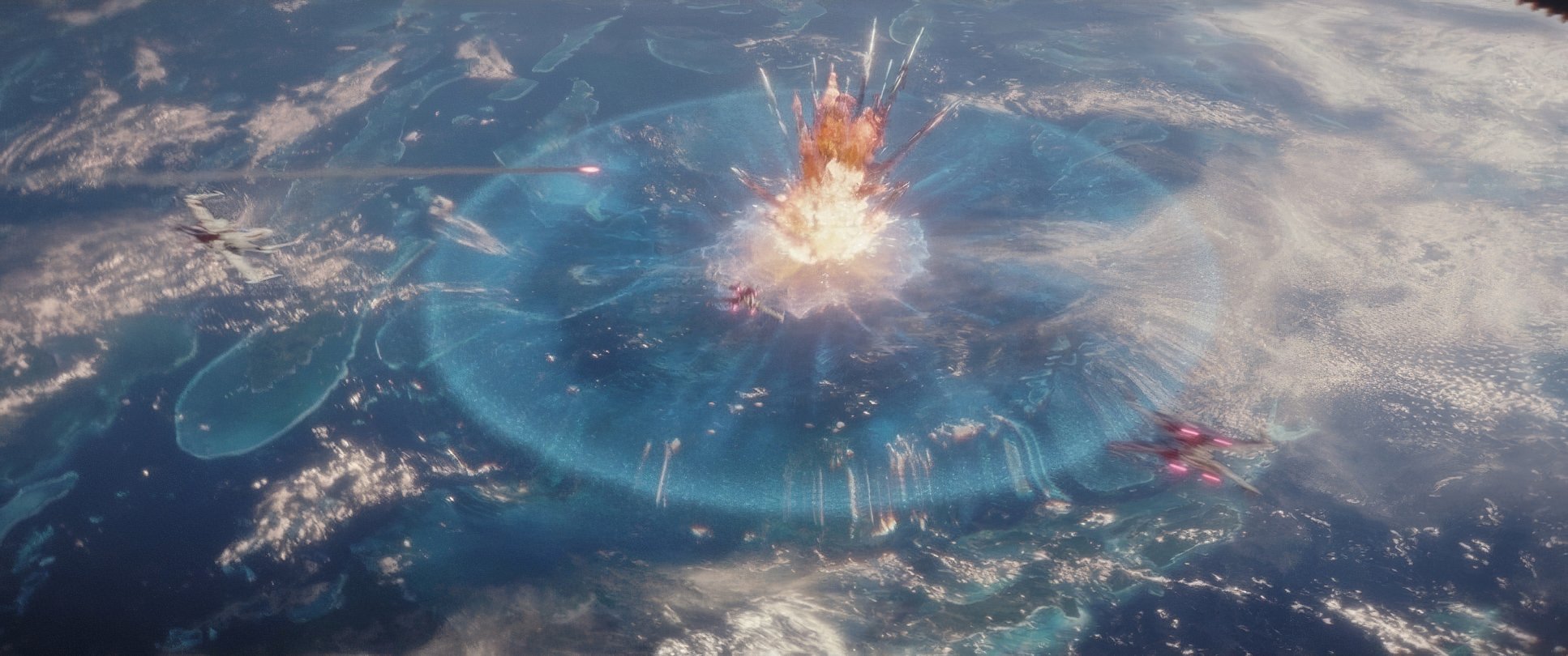
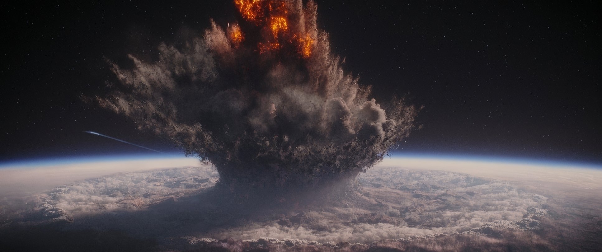
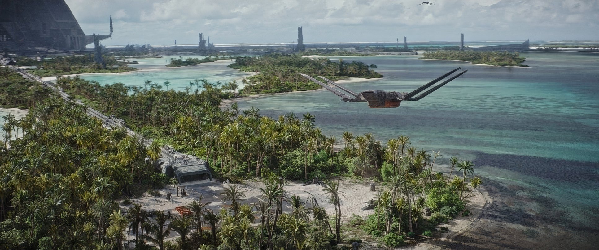
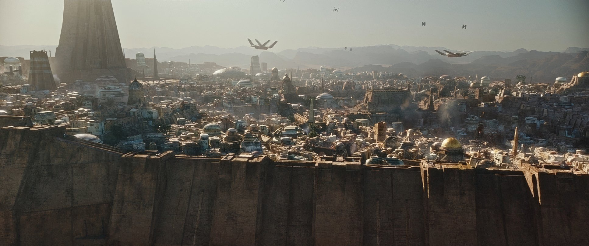
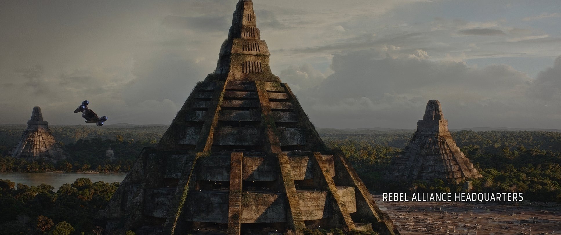
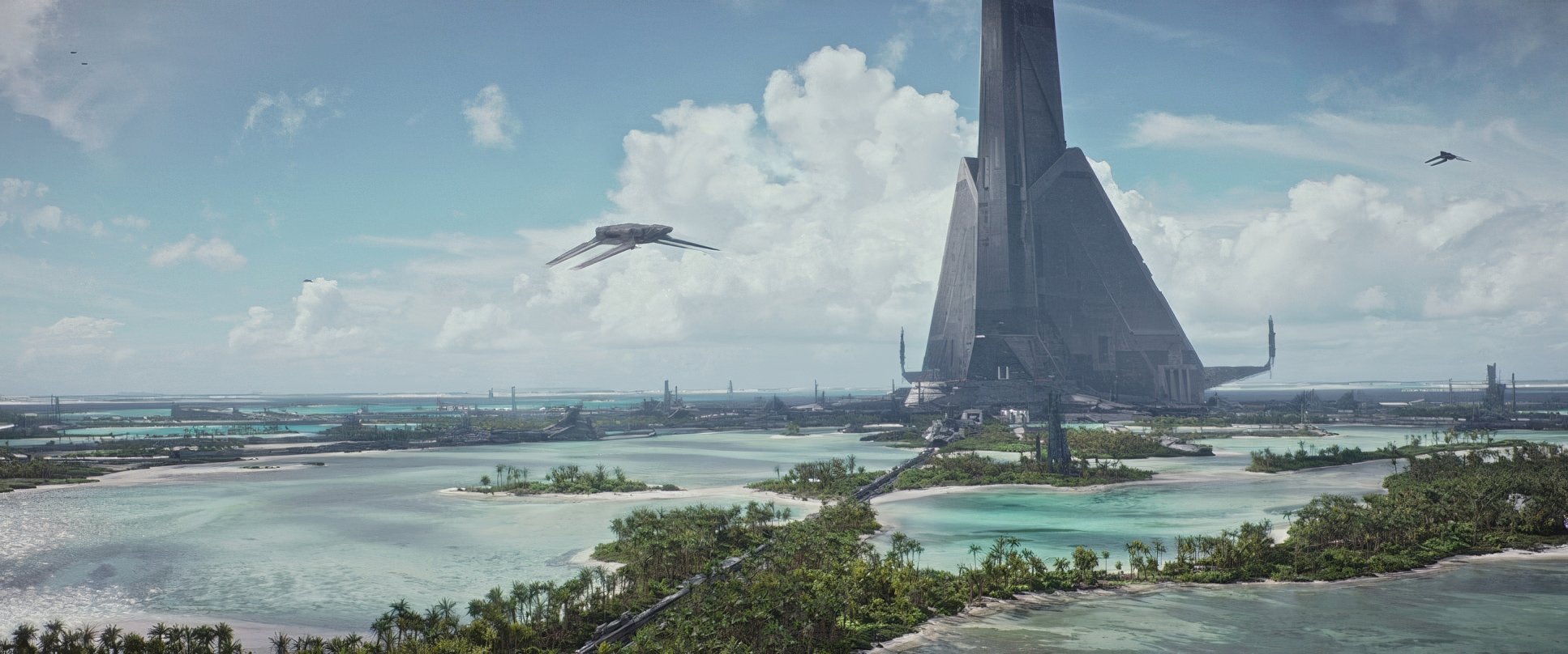
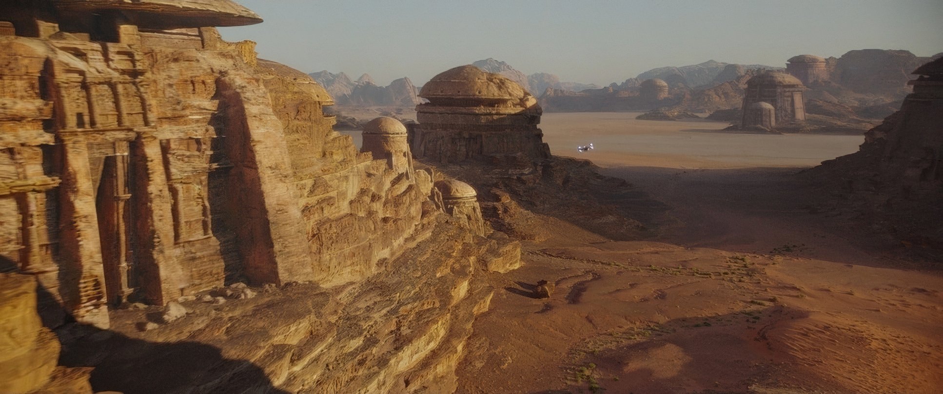
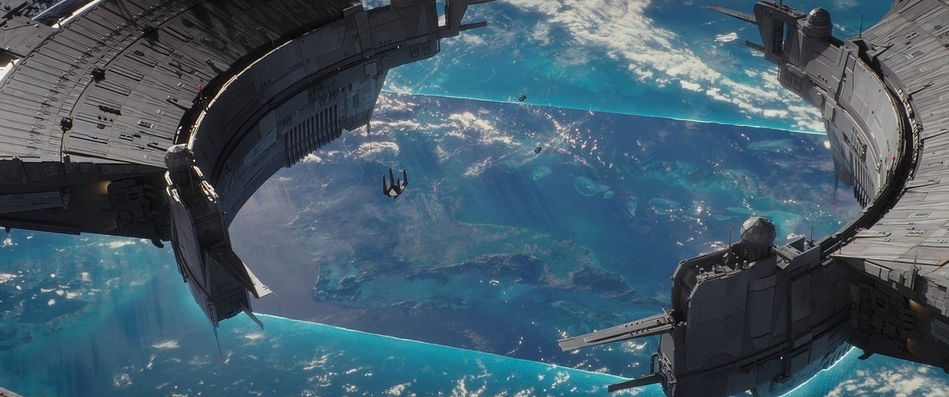
The compositions in this film are obsessed with scale. Fraser uses wide, sprawling frames to show just how vulnerable the Rebels are. On Scarif, the frames are often “right-heavy” or layered with foreground debris, making the action feel cluttered and chaotic exactly how a beach landing in a war should feel.
Even the simple “clean single” shots of characters have a weight to them. The framing tells you the stakes. You don’t need a monologue about how powerful the Empire is when you have a composition that physically dwarfs our heroes in every single frame.
Color Grading Approach

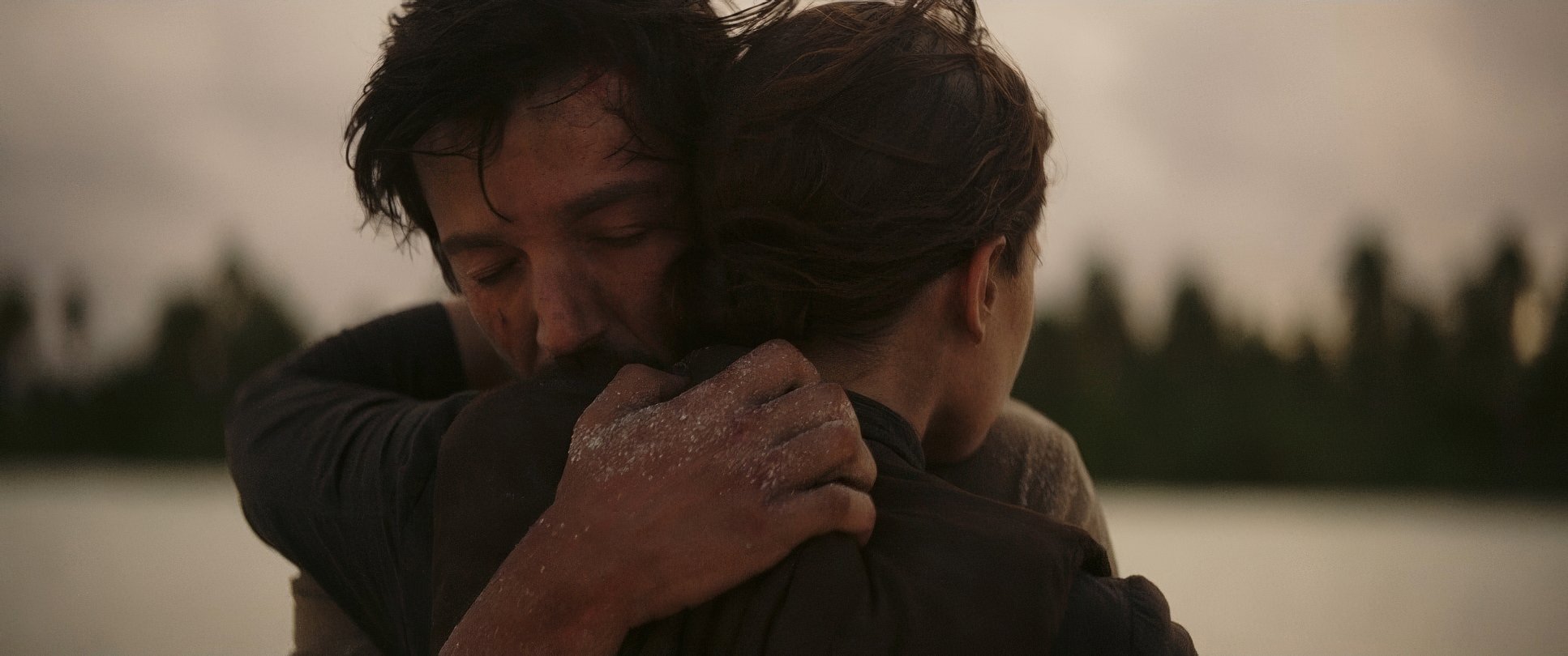
This is my favorite part. Mitch Paulson, the colorist, did a phenomenal job here. The “color grading is perfect” comments you hear from fans aren’t an exaggeration. They moved away from the primary-color saturation of the old films and embraced a desaturated, military palette.
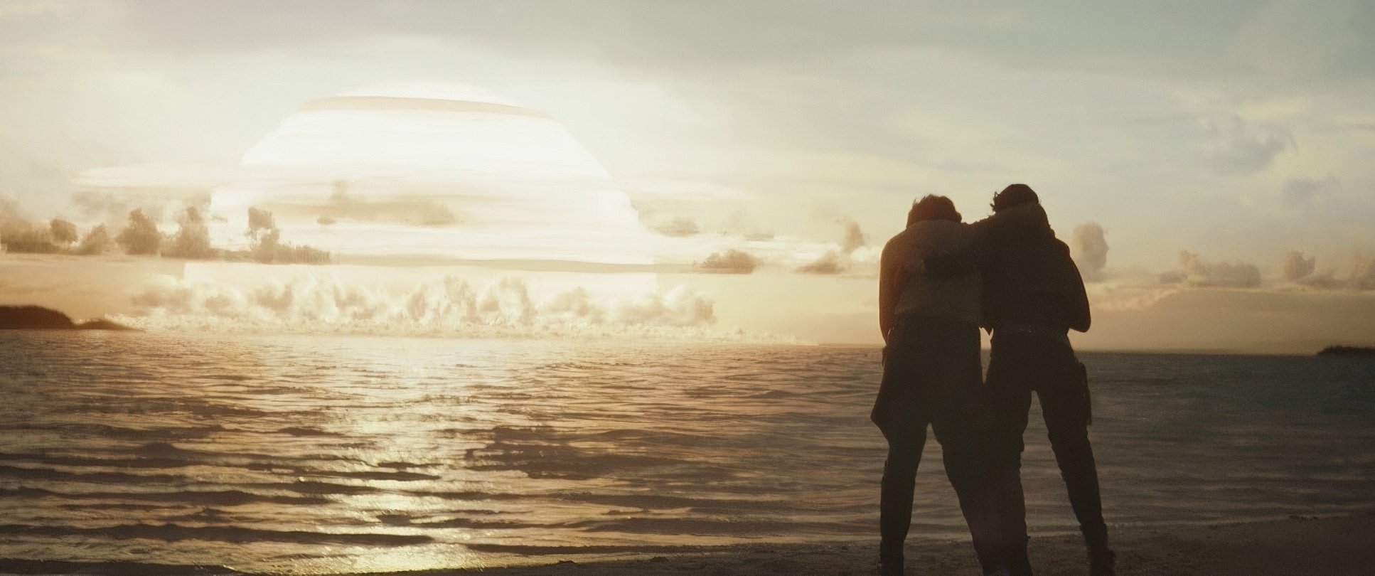
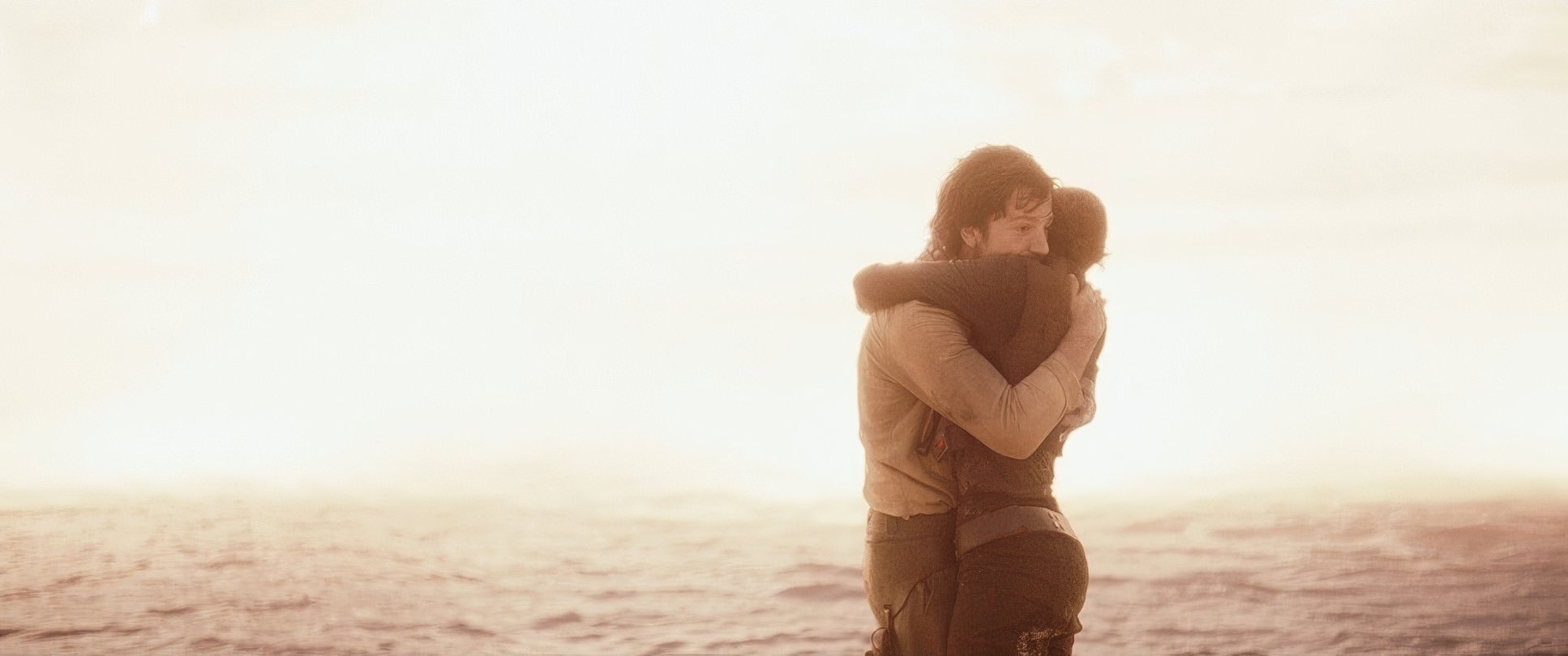
The contrast is robust. We’re talking deep, inky blacks that give the image gravity. But look at the highlight roll-off it’s incredibly smooth, mimicking the way film print handles light. Even on a tropical planet like Scarif, the colors feel melancholic. The blues and greens of the Rebel uniforms are subtly separated from the clinical grays of the Empire. It’s “tonal sculpting” at its finest.
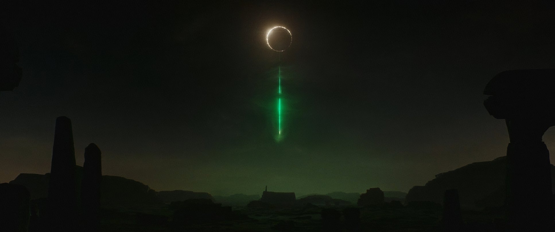
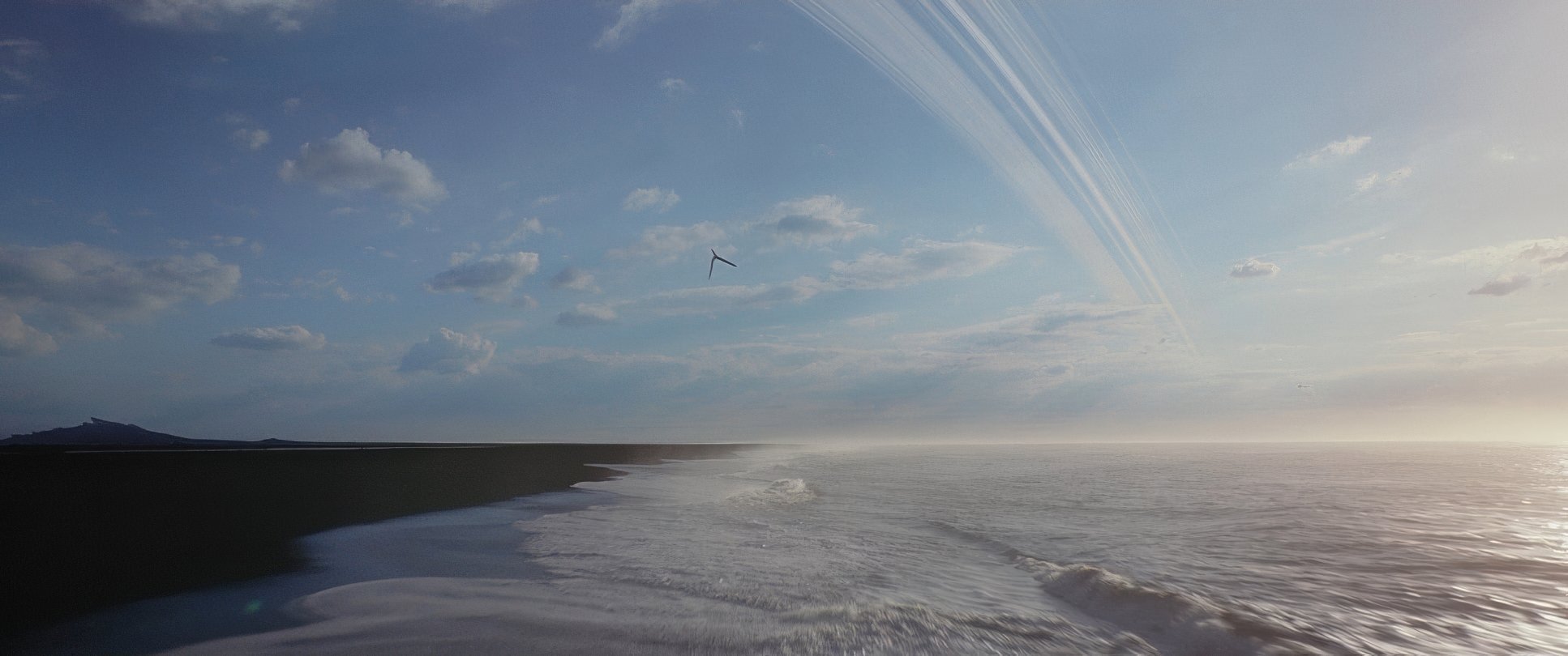
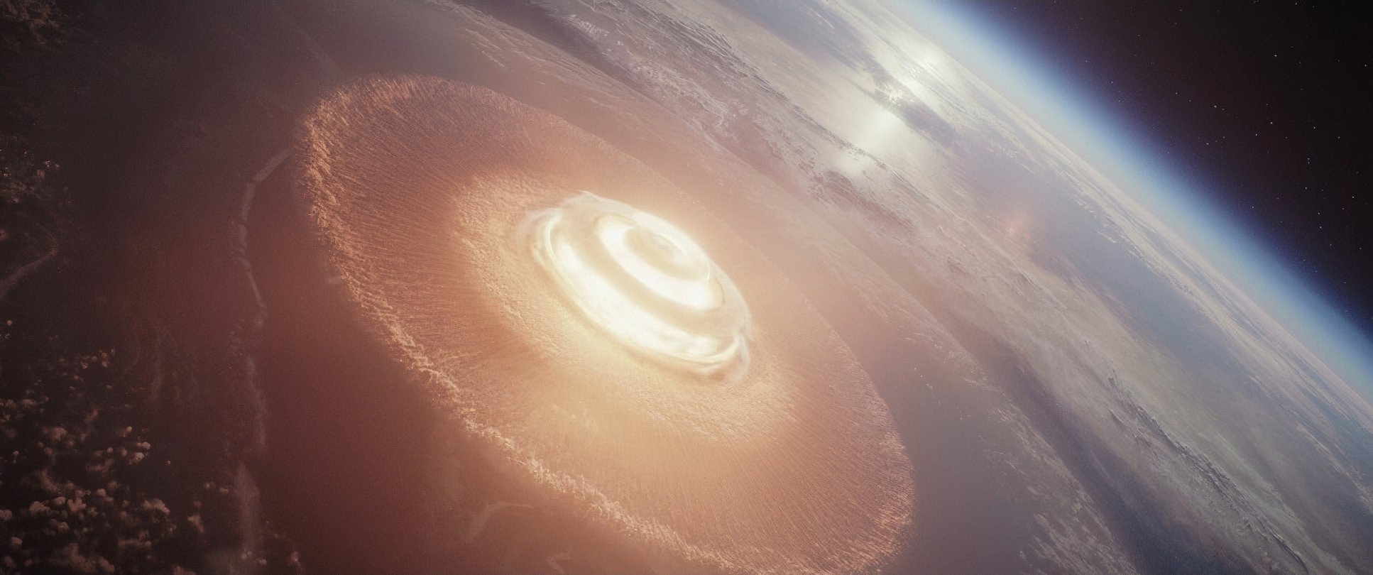
Rogue One: A Star Wars Story Film Stills
A curated reference archive of cinematography stills from Rogue One: A Star Wars Story (2016). Study the lighting, color grading, and composition.
- Also read: THE HOBBIT: THE DESOLATION OF SMAUG (2013) – CINEMATOGRAPHY ANALYSIS
- Also read: DRIVE (2011) – CINEMATOGRAPHY ANALYSIS
Browse Our Cinematography Analysis Glossary
Explore directors, cinematographers, cameras, lenses, lighting styles, genres, and the visual techniques that shape iconic films.
Explore Glossary →