When I sat down to re-examine The Hobbit: The Desolation of Smaug (2013), I wasn’t just looking for a nostalgia trip, I wanted to see how this middle chapter balanced the massive technical weight of 2013-era VFX with the tactile, grounded look we all loved in the original trilogy.
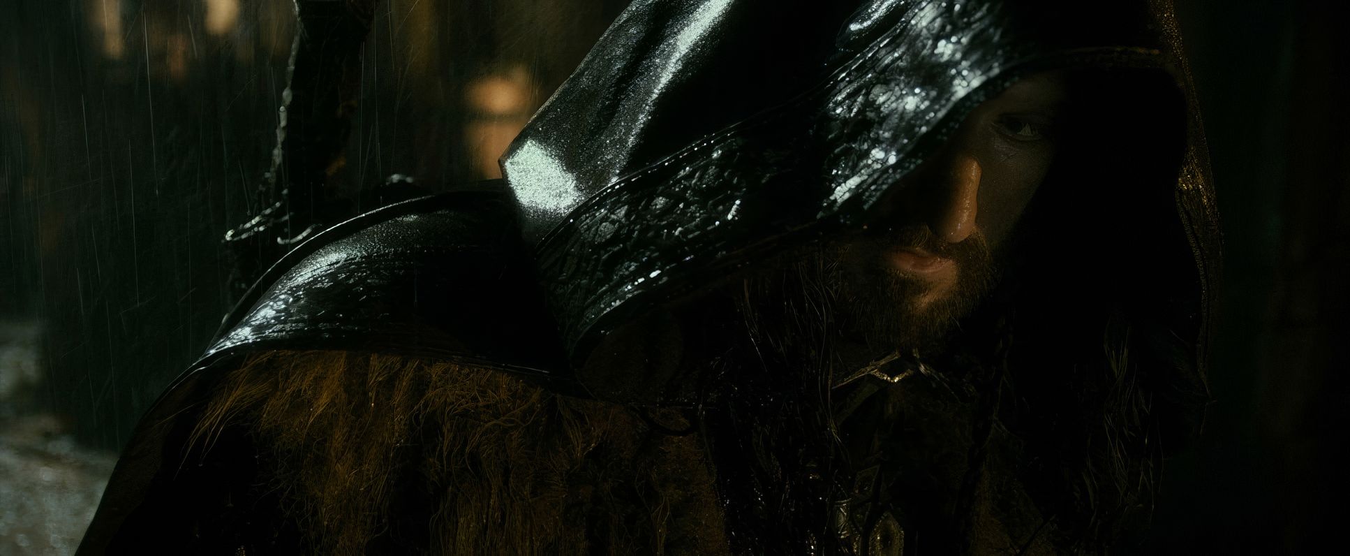
The Hobbit: The Desolation of Smaug actually kicks off with a great example of this: the Bree sequence. It’s a rainy, “future-set” flashback (in the timeline of the film’s opening) that feels incredibly lived-in. We’re at a stage-built “Prancing Pony,” shot with hard side-lighting and a saturated, yellow-heavy palette. It’s a stark, moody intro that sets the stage for a journey that is significantly more “in the thick of it” than An Unexpected Journey.
About the Cinematographer: The Legend of Andrew Lesnie
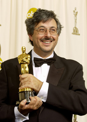
You can’t talk about the visual soul of Middle-earth without talking about the late, great Andrew Lesnie, ASC, ACS. He’s the guy who defined the “look” of Tolkien for an entire generation. For Smaug, Lesnie had the unenviable task of evolving a world he’d already spent a decade building.
Lesnie was a master of natural light, but this film pushed him into darker, more menacing territory. His challenge was a total tightrope walk: he had to maintain that authentic, “dirt-under-the-fingernails” feel of the original films while the production was leaning harder than ever into massive digital environments. It’s his eye for scale and intimacy that keeps the film from feeling like a total CG cartoon.
Inspiration Behind the Cinematography
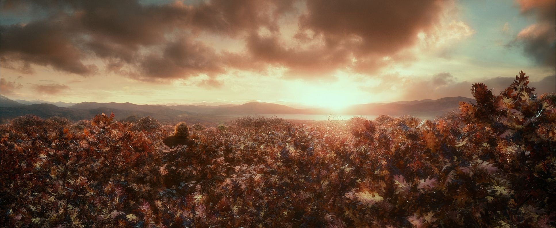
The visual DNA of this film shifts as the company moves away from the pastoral greens of the Shire. Lesnie and Peter Jackson clearly looked toward classical landscape painting and even specific architectural history to give each new locale a distinct “flavor.”
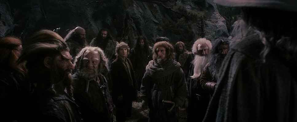
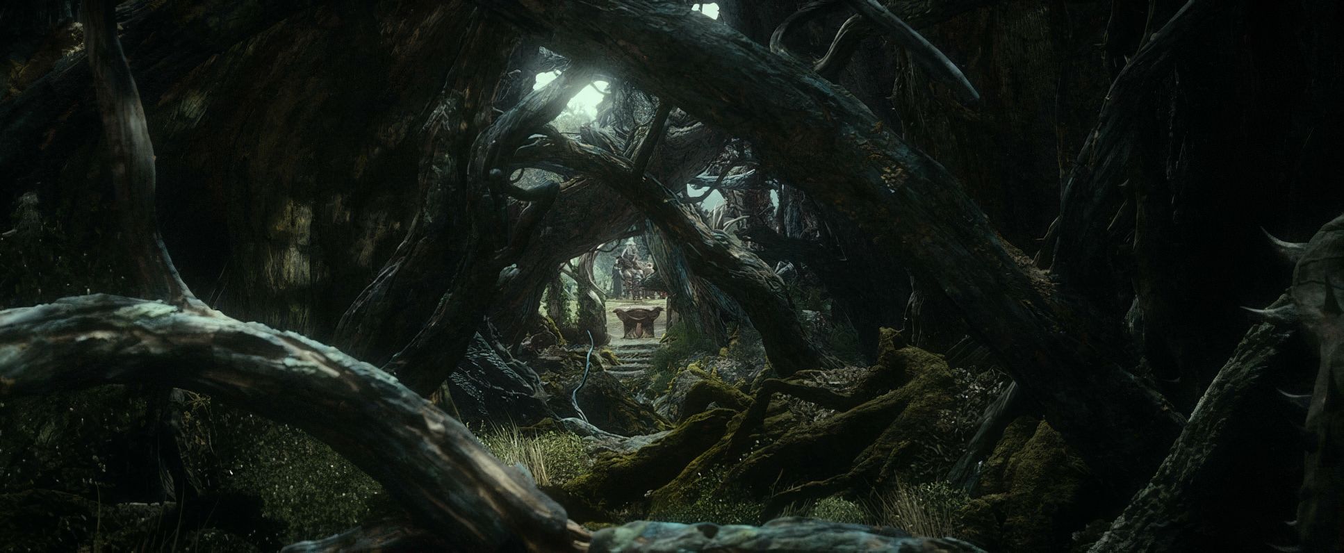
Take Mirkwood it’s pure claustrophobic dread. Then you have the ancient, cold elegance of Thranduil’s kingdom, followed by the “lived-in” decay of Lake Town. By the time we hit the Lonely Mountain, the inspiration shifts toward awe and terror. The goal was to make the visuals reinforce the narrative’s darkening tone. One critic called this film “the thick of it,” and the cinematography absolutely backs that up. It’s no longer an introduction; it’s a survival story.
Camera Movements: Kineticism vs. The “GoPro” Effect
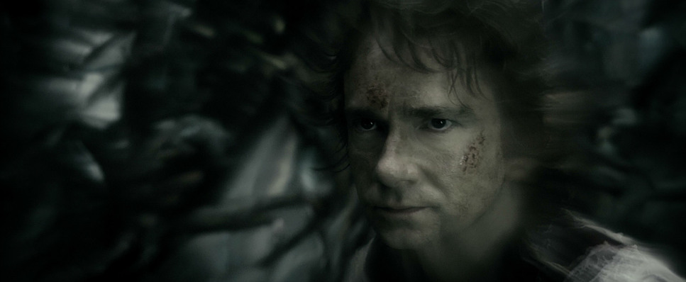
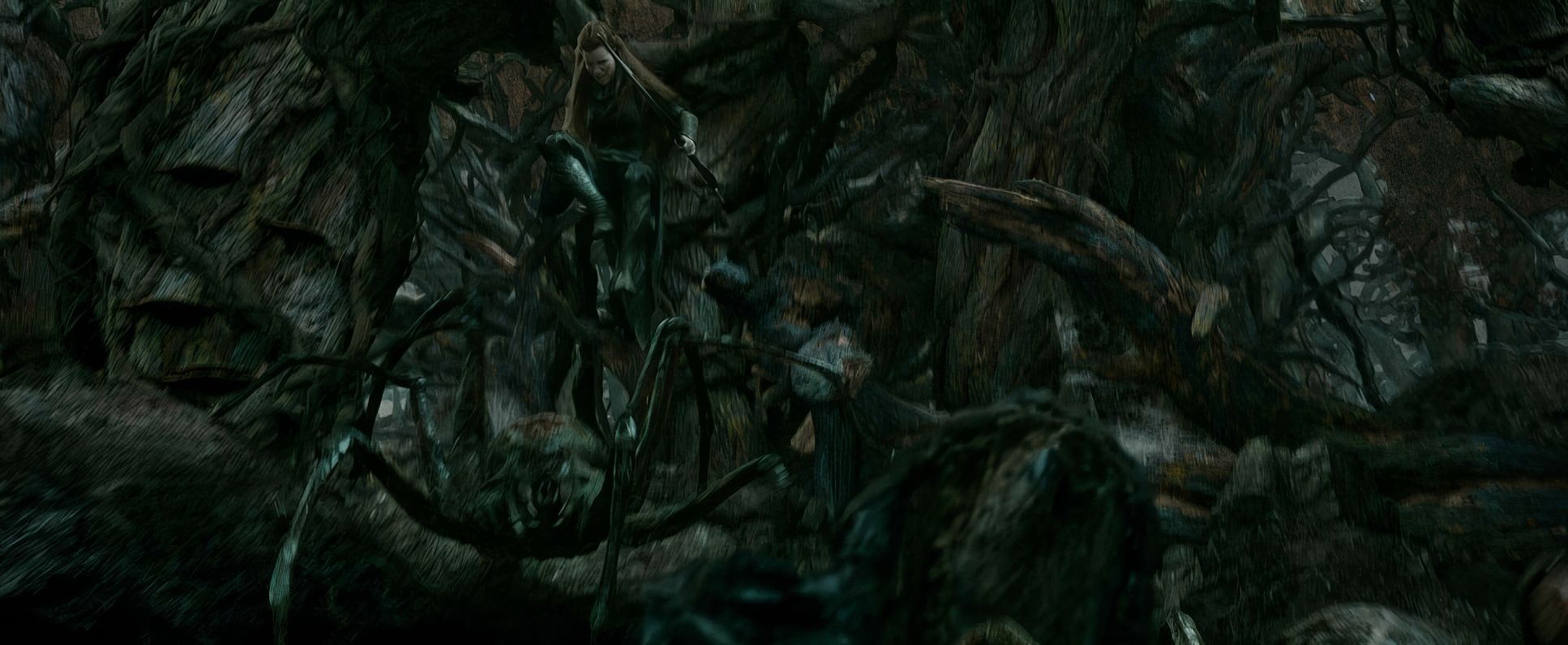
The camera work in Smaug is a precise tool, but it’s also where some of the most controversial choices happen. In the chaos of the Mirkwood spider attack, Lesnie uses dynamic Steadicam and handheld work to make Bilbo’s struggle feel immediate and visceral. It works. You feel the “dark influence” of the ring through that frantic movement.
Then we get to the barrel escape. On one hand, it’s an incredible feat of kinetic filmmaking fast, fun, and relentless. But and this is a big “but” for me the decision to use POV angles with a distinct GoPro-style aesthetic is jarring. While they wanted raw immersion, those shots feel like a sudden departure from the “cinema” language established in the rest of the film. It pulls you out for a second, feeling more like a theme park ride than a high-fantasy epic. It’s a bold choice, but as a purist, it’s a bit of a head-scratcher.
Compositional Choices: The Scale of a Hobbit
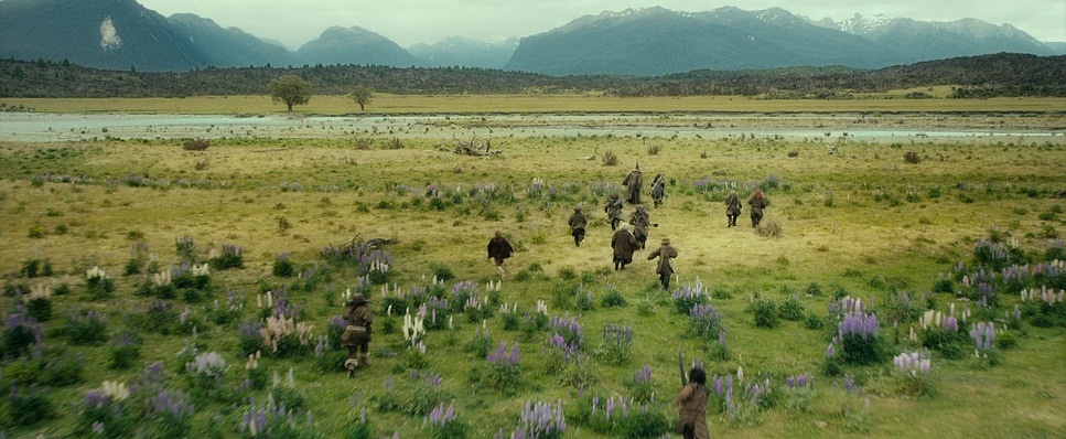
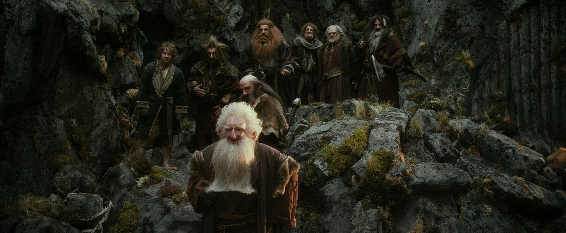
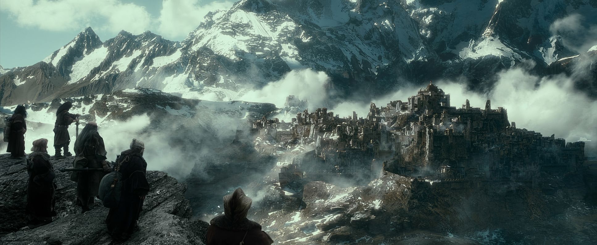
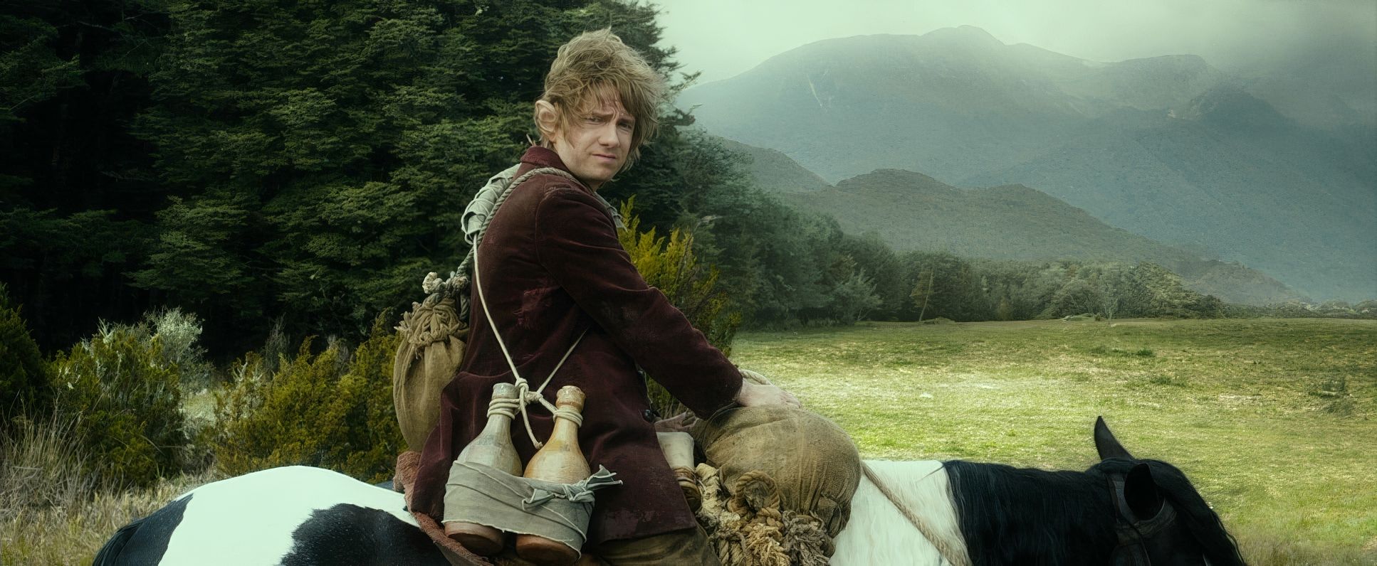
Lesnie’s use of the 2.39:1 widescreen ratio is a masterclass in framing scale. He constantly plays the “smallness” of the dwarves and Bilbo against the “immensity” of Middle-earth.
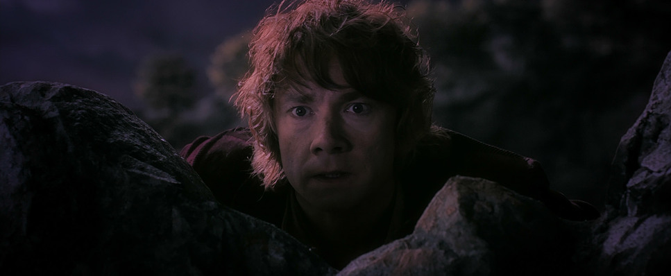
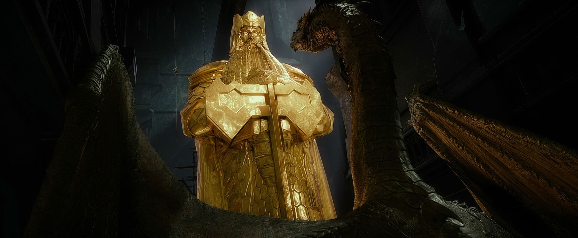
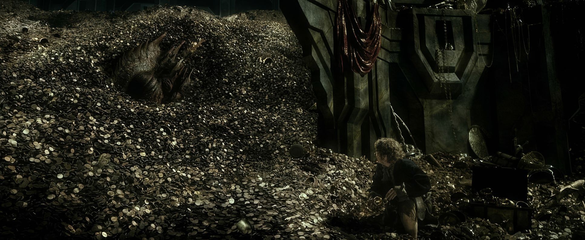
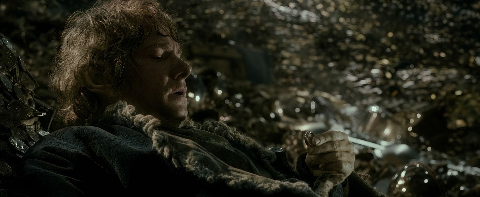
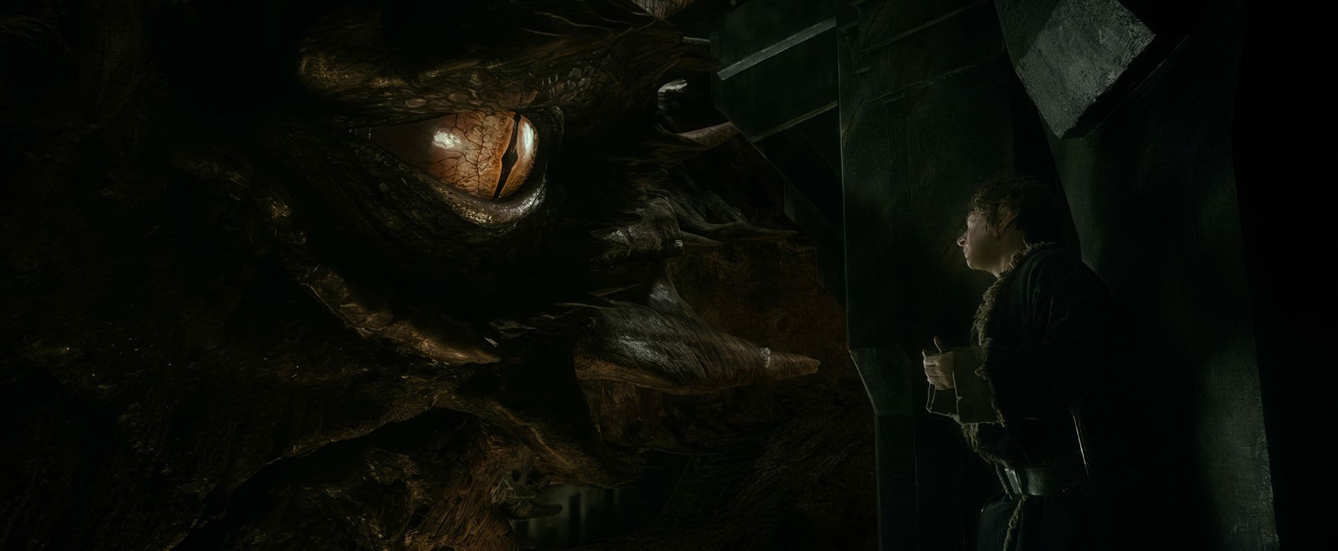
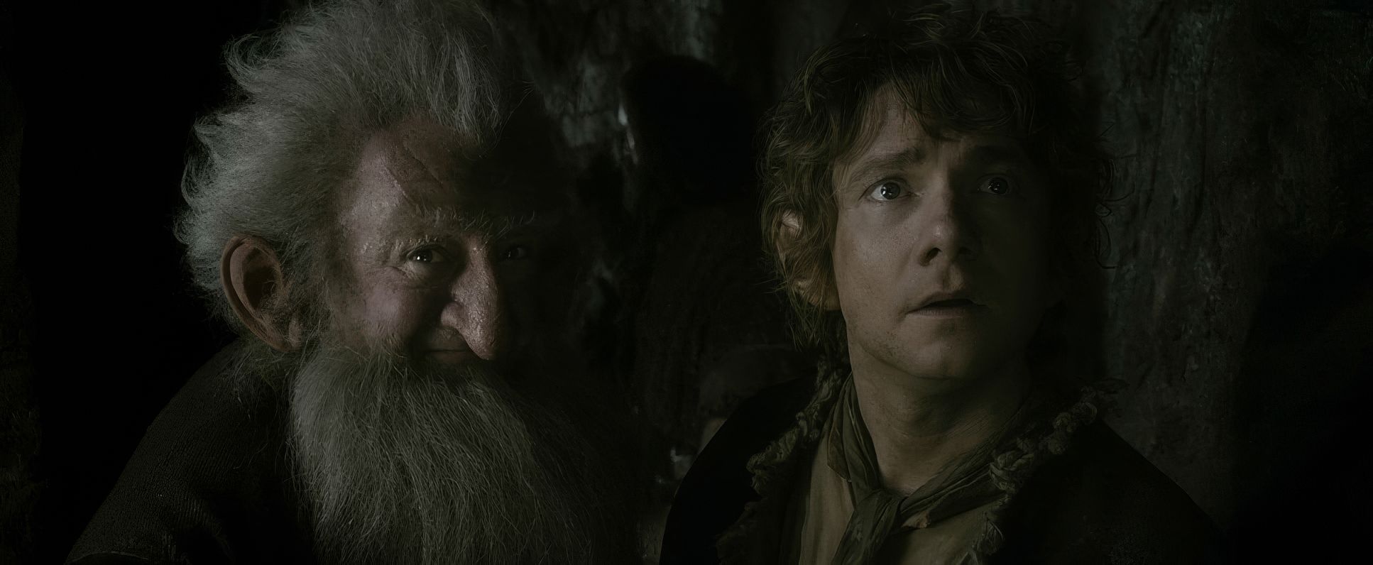
I’m particularly impressed by his use of negative space. When Bilbo first enters Smaug’s lair, he is absolutely swallowed by the frame. The atmospheric perspective the haze and layers of gold creates a sense of depth that makes the task of finding the Arkenstone feel genuinely impossible. The composition isn’t just “pretty”; it’s doing the heavy lifting for the story’s stakes.
Lighting Style: Motivating the Fantasy

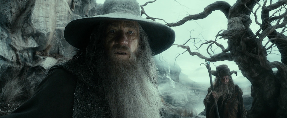
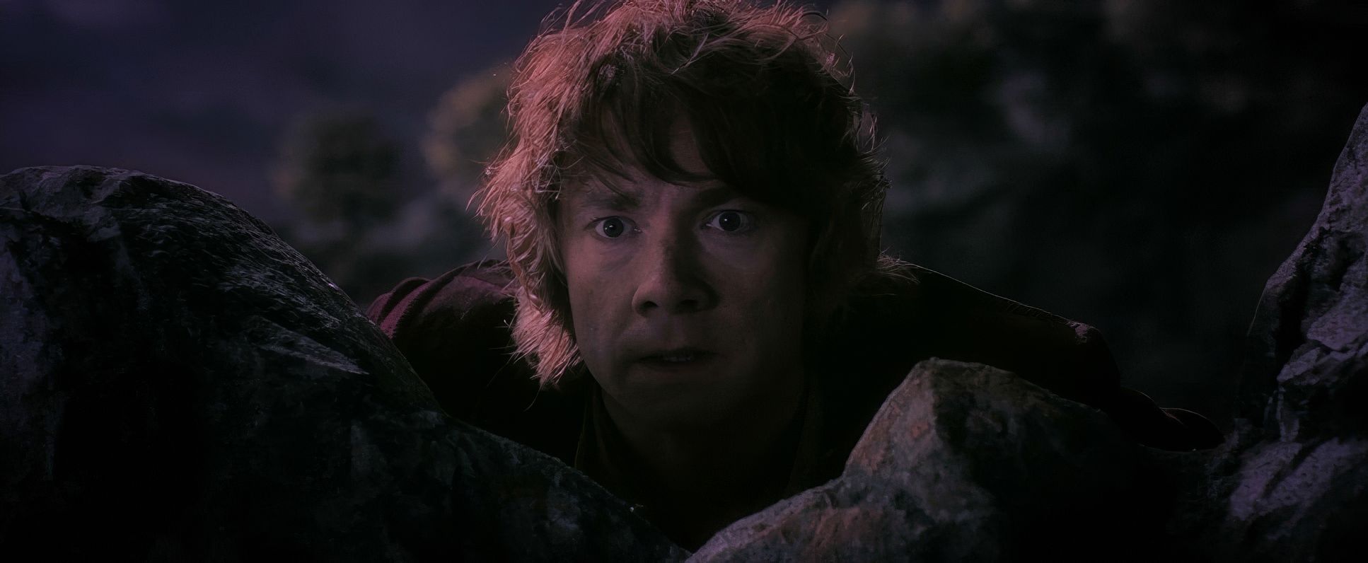
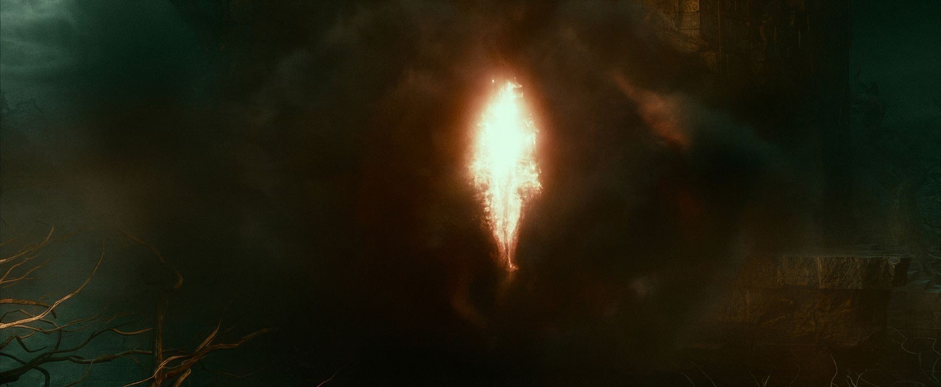
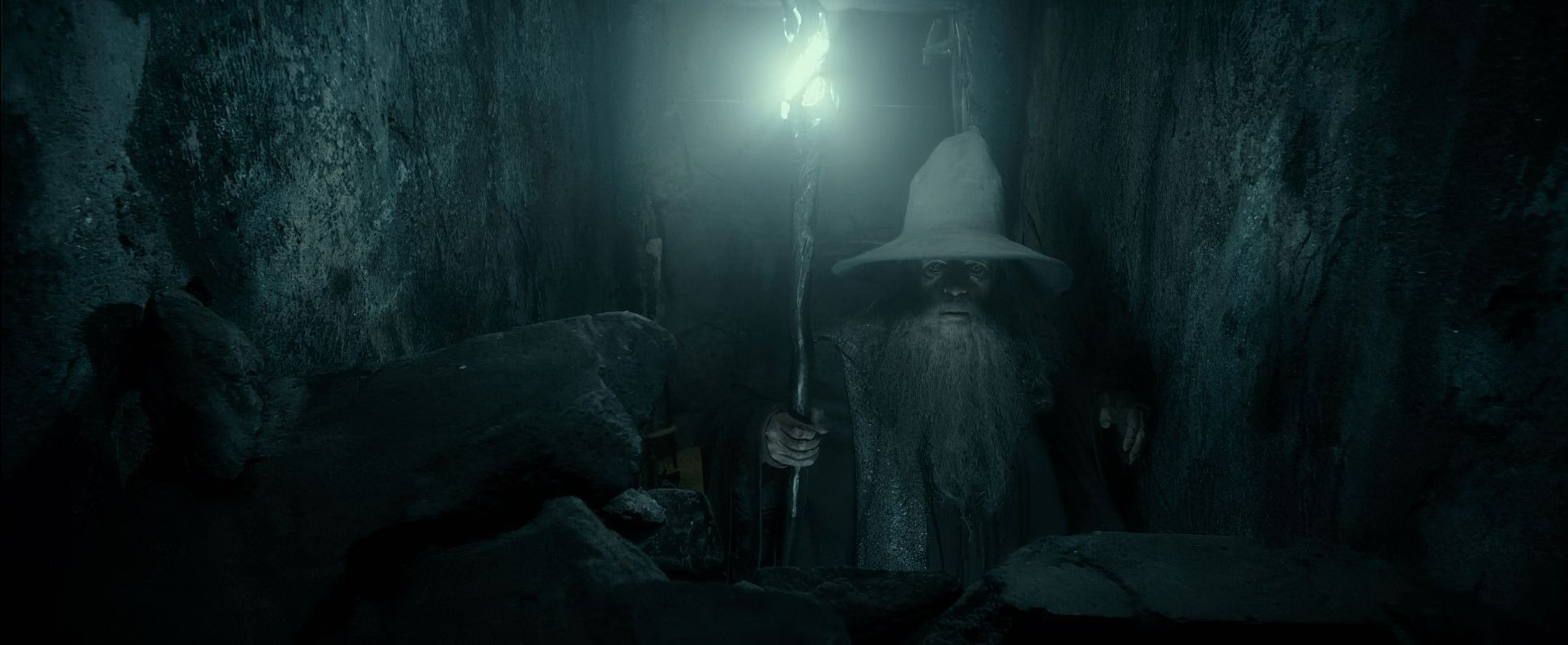
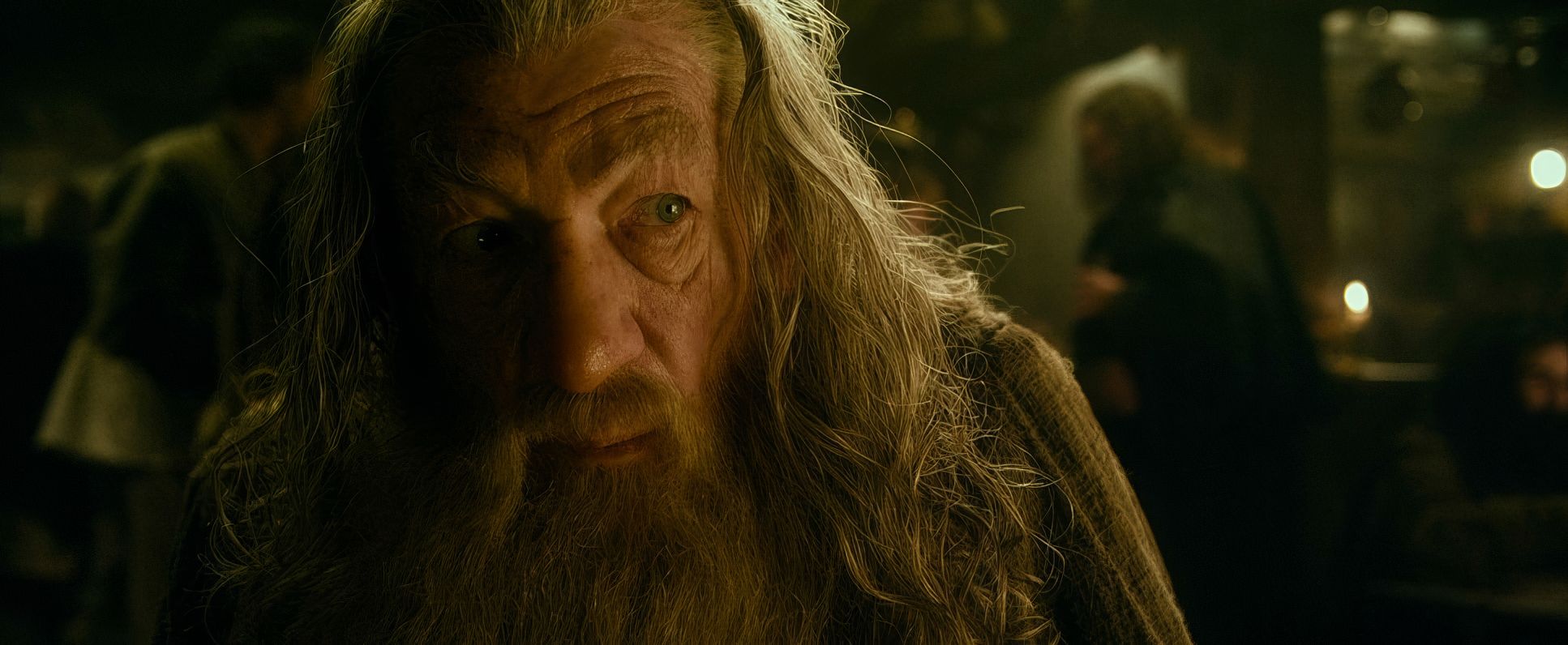
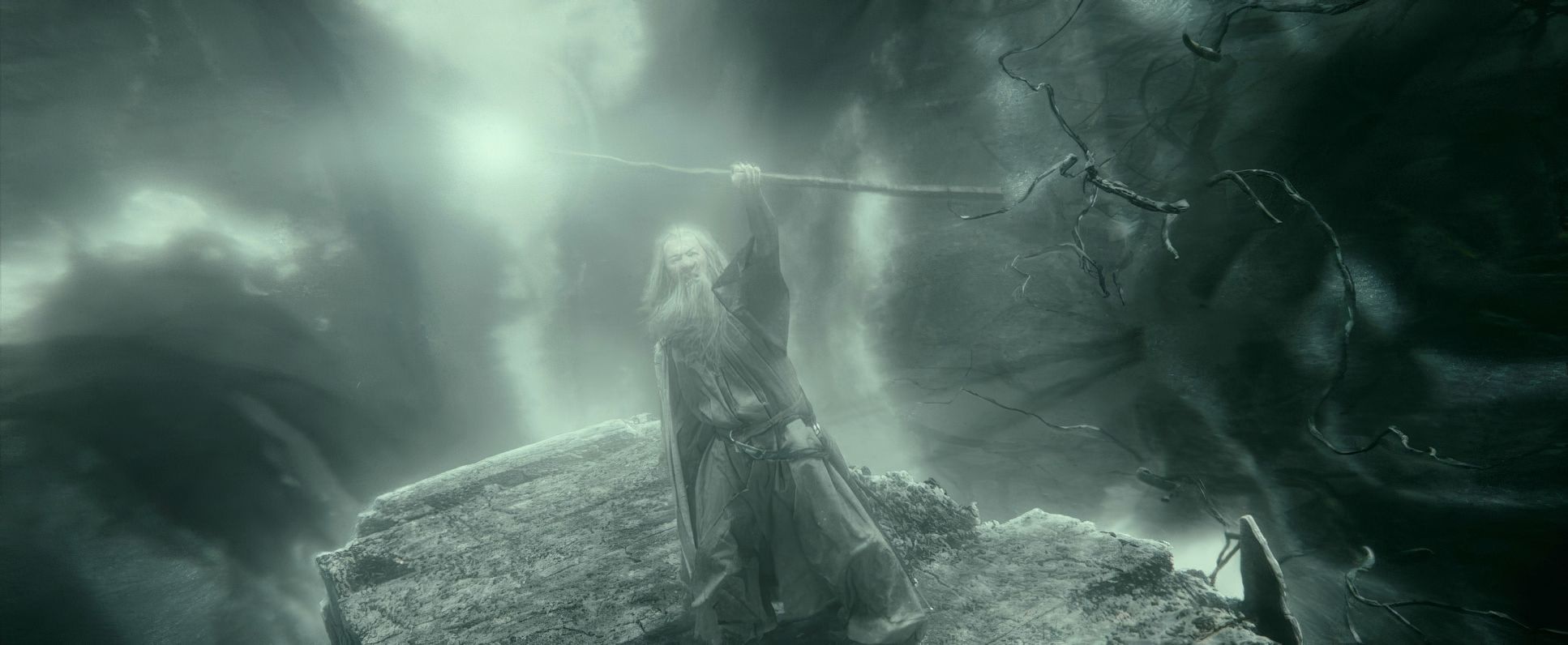
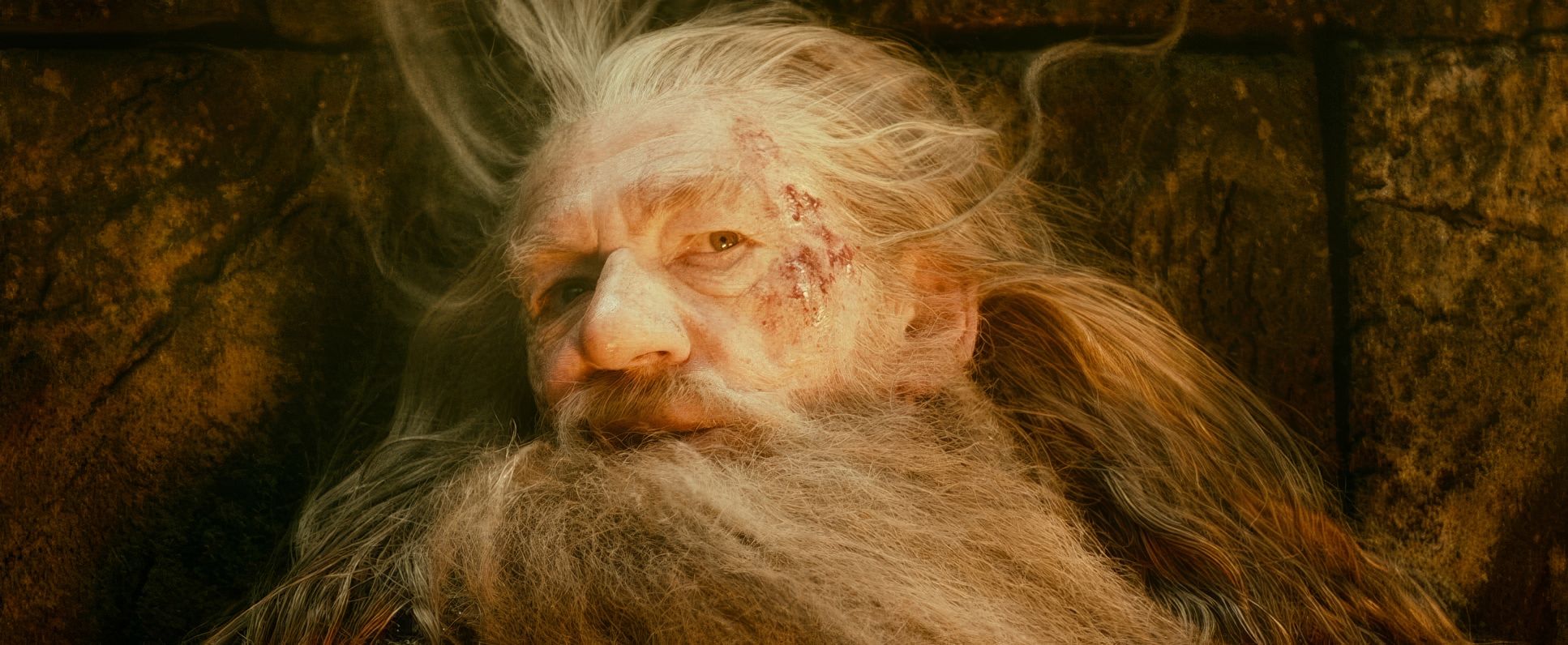
As a pro, I’m always looking at the light sources. Lesnie was a “naturalistic” shooter at heart. In Mirkwood, the lighting is dappled and fractured, perfectly conveying that “lost” feeling. When Gandalf goes to the tombs, the lighting shifts to a low-key, high-menace style with harsh, directional sources that hint at the return of Sauron.
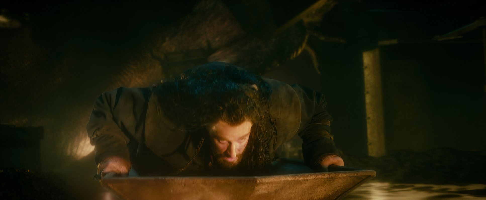
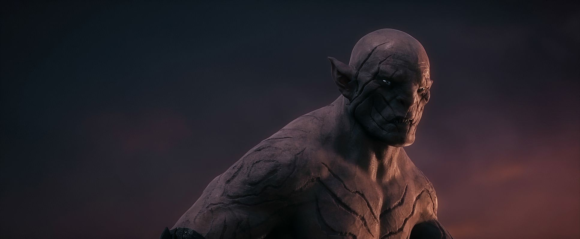
The real challenge, though, was Smaug’s lair. How do you light mountains of gold? Lesnie used the ambient glow of the gold itself and the “hellish” inferno of Smaug’s breath to sculpt the space. The molten gold sequence is a standout for me it’s extreme, motivated lighting where the environment itself becomes the light source, shifting in color and intensity as the gold flows.
Lensing and Blocking: Choosing the Glass
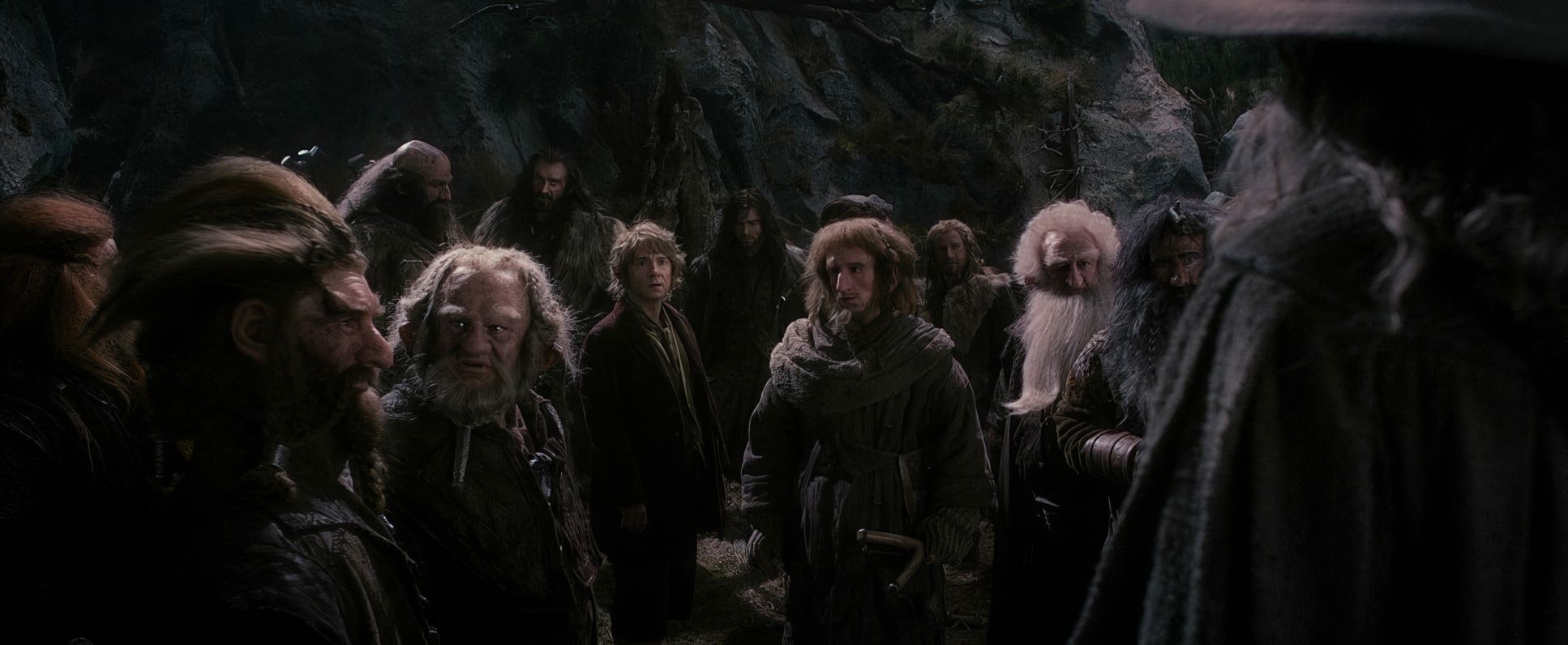
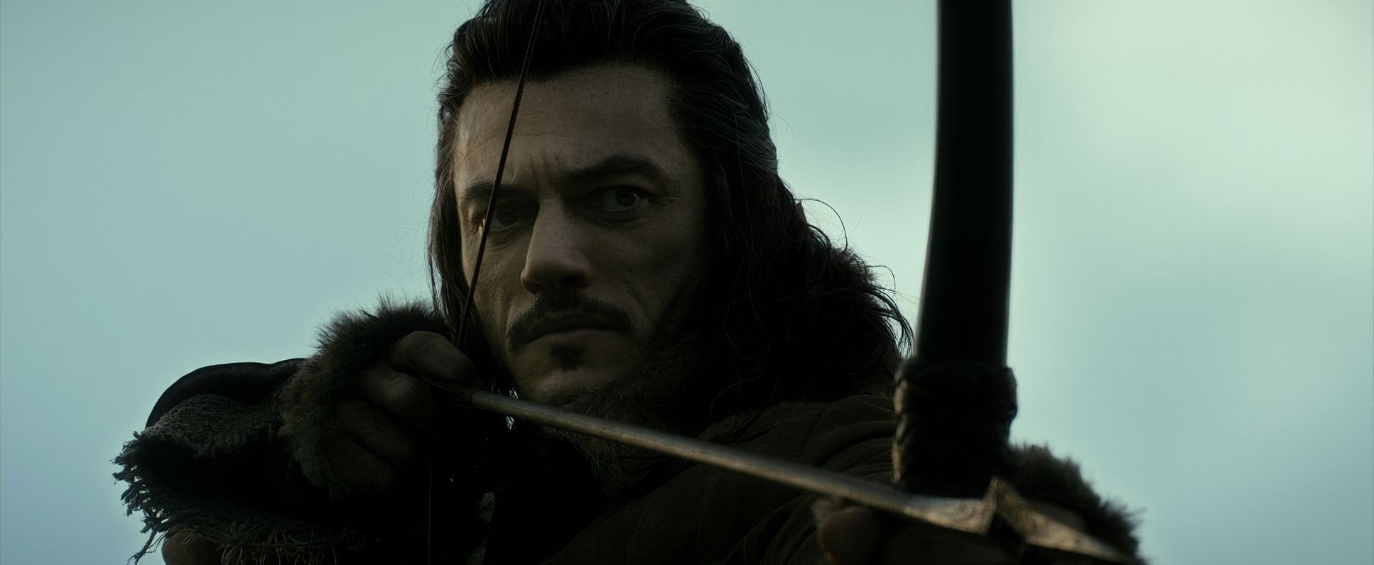
Let’s talk glass. Lens choice is what defines our emotional proximity to the characters. Wide-angle lenses are the workhorses here for the big establishing shots, making the characters look like tiny specks against the mountains.
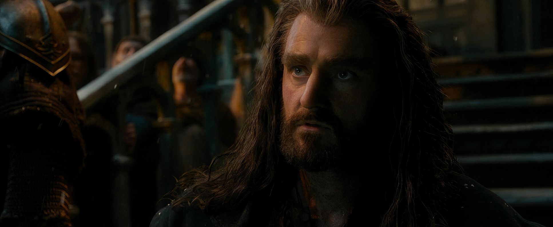
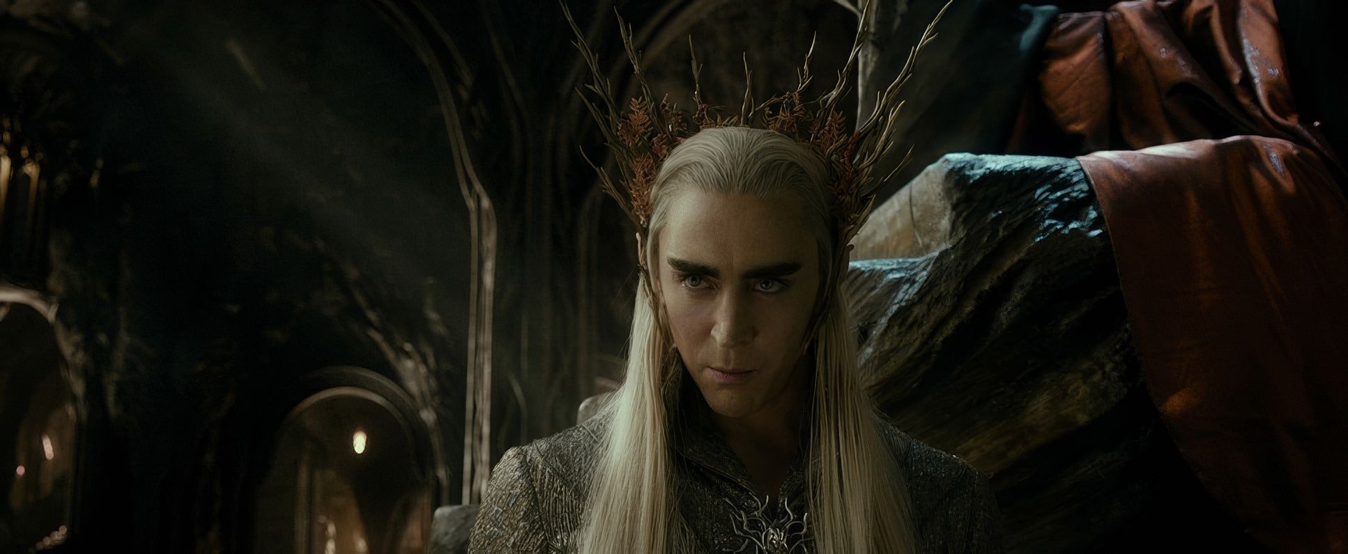
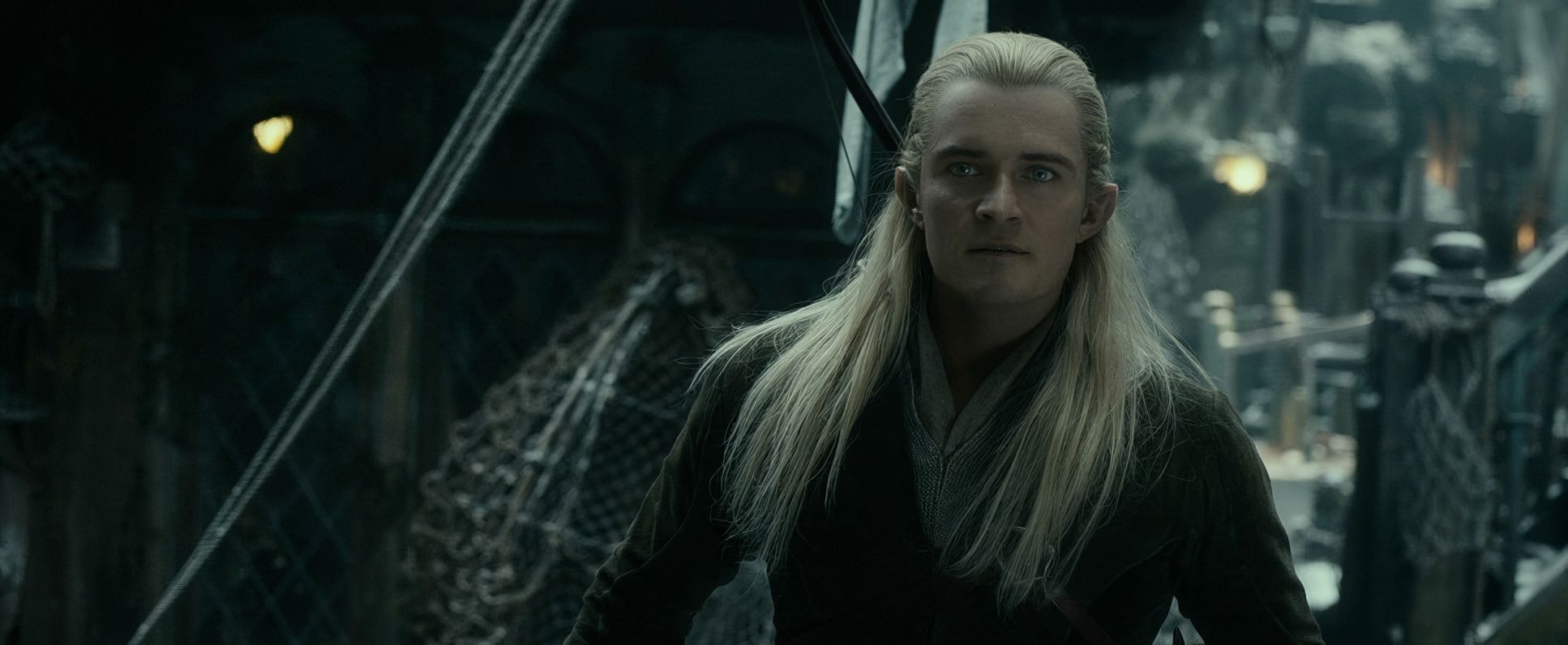
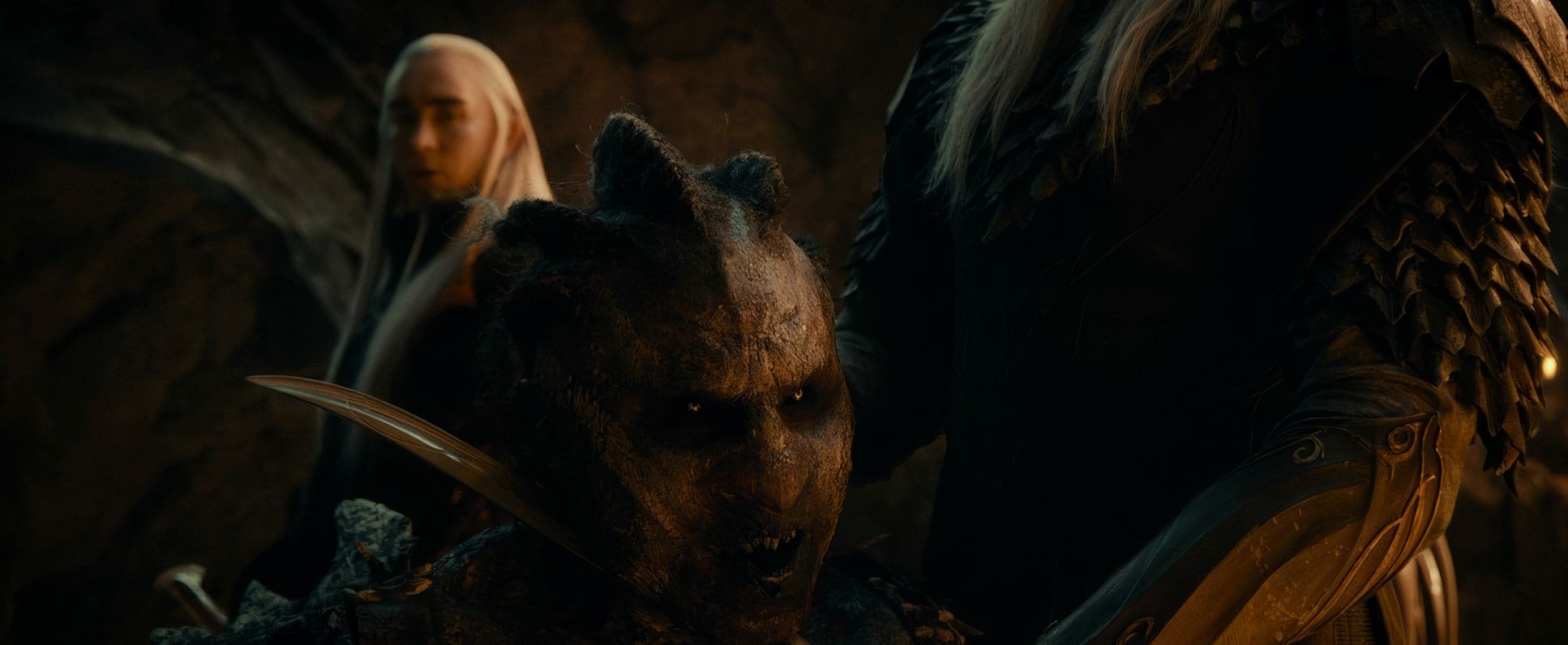
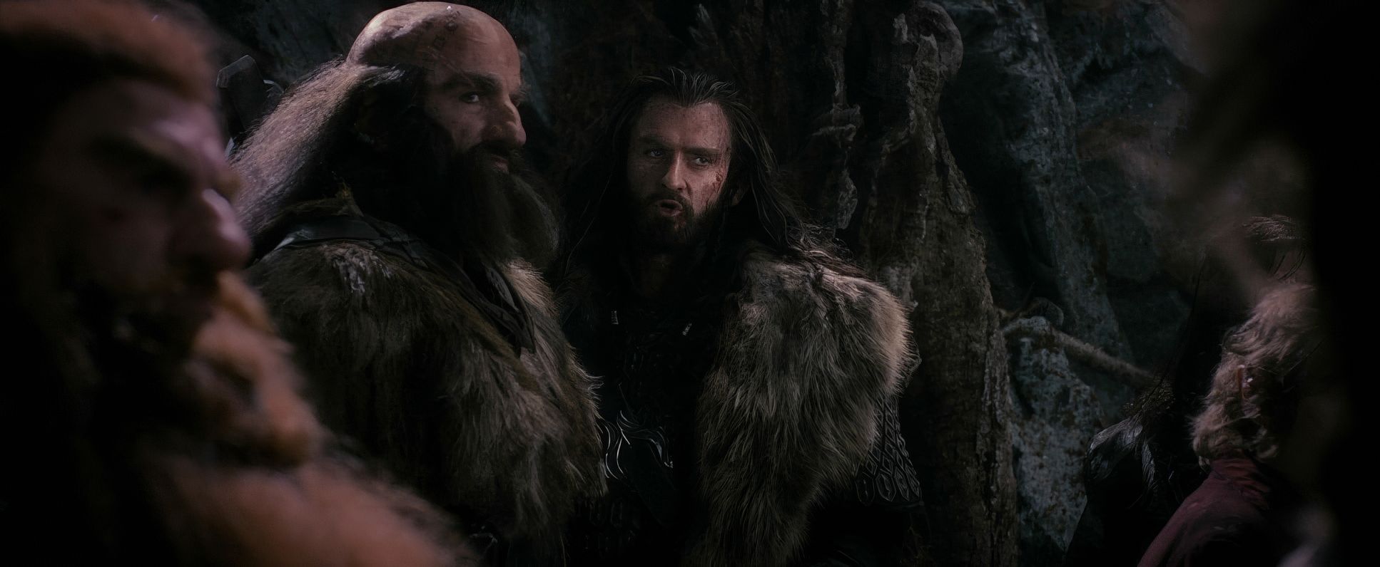
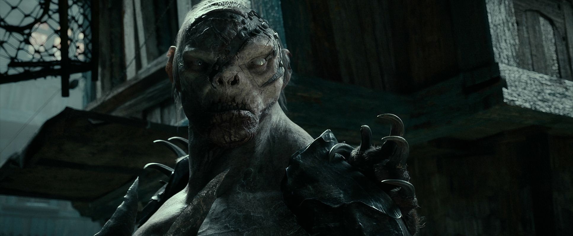
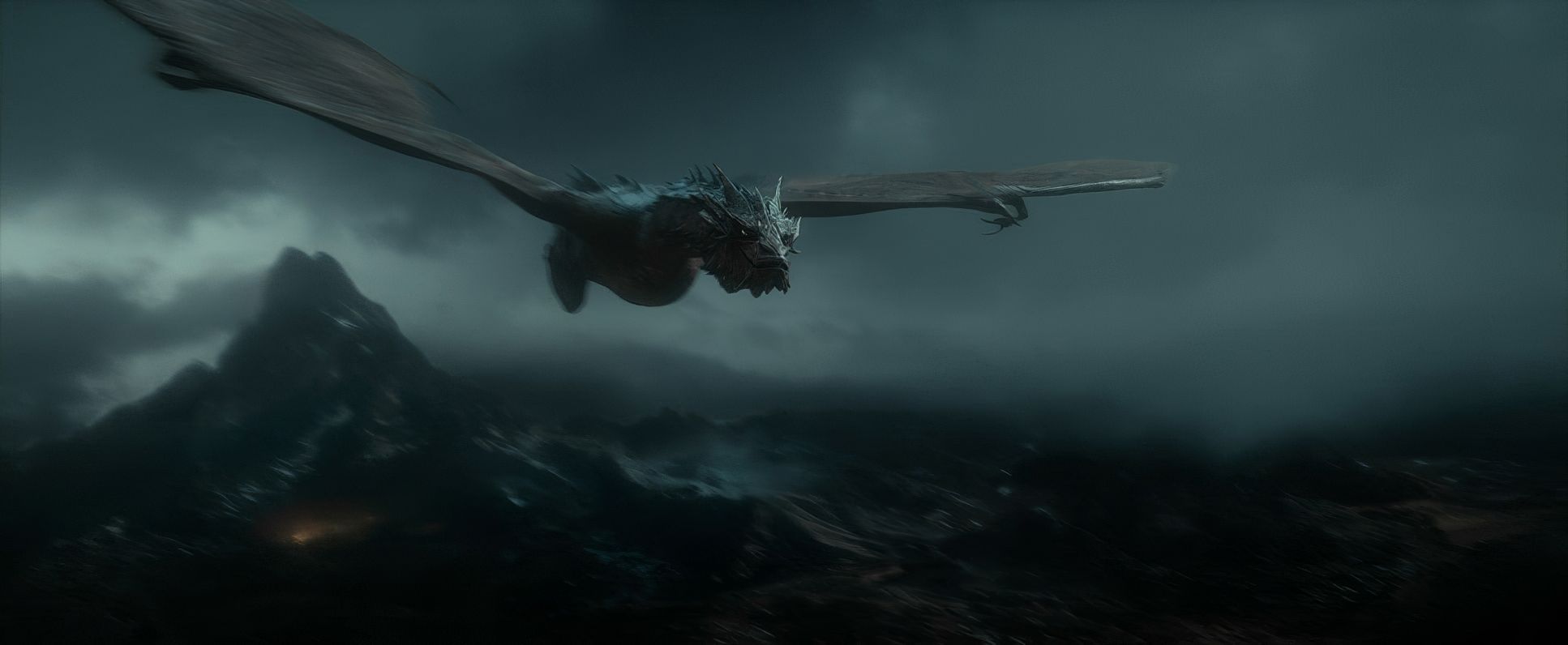
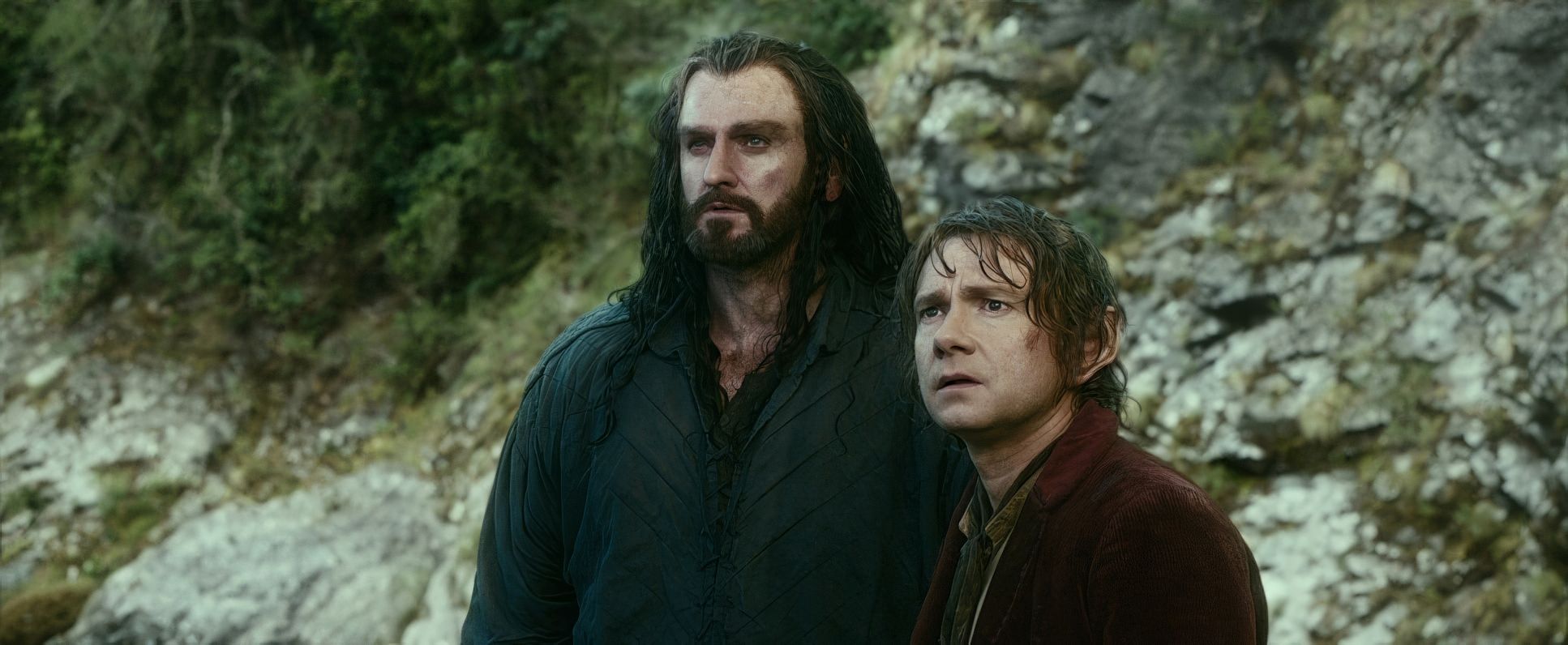
But for the “acting” moments like Thorin’s confrontation with Thranduil Lesnie switches to longer telephoto lenses. This compresses the background and forces us into a claustrophobic, intense close-up. The blocking follows suit; characters like Legolas are positioned with “balletic” precision during action scenes to maximize the impact of every stunt, while Smaug’s blocking is all about dominance. He fills the frame, looming over Bilbo to establish immediate power.
Color Grading: Tonal Sculpting and the “CG Problem”
This is my home turf. The grade in Smaug is significantly richer and more aggressive than An Unexpected Journey. We see a lot of hue separation to define the locations. Mirkwood is all desaturated, “sickly” greens and grays, while the Orc scenes lean into bruised purples and crushed blacks.
The biggest challenge for a colorist on a project like this is “unifying” the CGI. Raw digital assets can look “cartoon-y” and overly sharp. You can see the grading team worked overtime on tonal sculpting and highlight roll-off to give the digital Smaug a “film-print” sensibility. They used subtle diffusion in the highlights and tried to keep the shadows from feeling “dead.” It’s a massive effort to make a 100% digital dragon feel like he’s actually sitting in a room with a real Hobbit.
Technical Aspects & My “Hill to Die On”
The Hobbit: The Desolation of Smaug
We have to address the elephant in the room: 48fps High Frame Rate (HFR). While the RED Epic captured beautiful 5K resolution, the HFR decision is where I think the “cinematic” feel took a hit.
The hyper-clarity of 48fps is a double-edged sword. It strips away the “dream-like” quality of 24fps and makes the CGI look artificial. When you can see every single detail without motion blur, the digital effects have nowhere to hide. It makes the sets look like sets and the CGI look like software. Even with a world-class grade, fighting against the “soap opera effect” of HFR is a losing battle in my opinion.
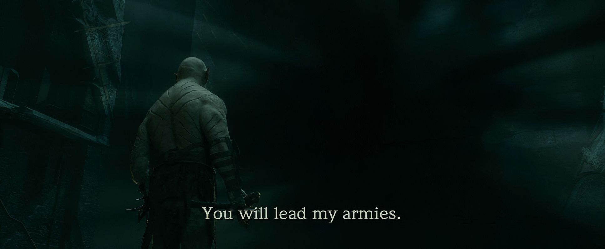
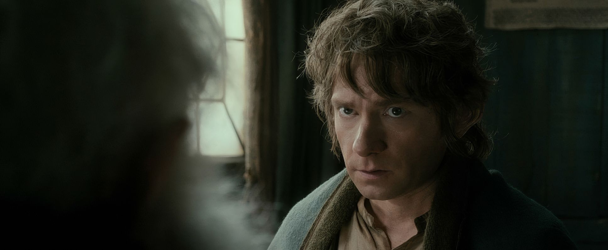
The Hobbit: The Desolation of Smaug (2013) Film Stills
A curated reference archive of cinematography stills from The Hobbit: The Desolation of Smaug (2013). Study the lighting, color grading, and composition.


- Also read: DRIVE (2011) – CINEMATOGRAPHY ANALYSIS
- Also read: SKYFALL (2012) – CINEMATOGRAPHY ANALYSIS
Browse Our Cinematography Analysis Glossary
Explore directors, cinematographers, cameras, lenses, lighting styles, genres, and the visual techniques that shape iconic films.
Explore Glossary →