Nicolas Winding Refn’s Drive back in 2011, it wasn’t just a movie; it was a visceral experience that burrowed its way into my cinematic soul. As a filmmaker and full-time colorist, I often find myself dissecting films, not just for their narratives, but for the sheer craft in their visual execution.
Drive isn’t just a film that demands analysis; it’s one that rewards it. It’s funny looking back at the marketing they sold a high-octane action flick, but Refn gave us a melancholic, almost meditative character study wrapped in a neon-soaked package. That dissonance is exactly why we’re still talking about it over a decade later. The visual language doesn’t just support the story; it is the story.
About the Cinematographer
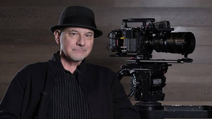
The man behind this look is Newton Thomas Sigel, ASC. You might know him from the gritty realism of The Usual Suspects or the huge scale of the X-Men films, but with Drive, he did something entirely different. He stepped into a space that felt both familiar and innovative. What I love about Sigel’s work here is his restraint. He’s not afraid to let the darkness breathe or use color as a raw emotional tool. He and Refn crafted a visual signature that feels like a fever dream one where the stillness of the frame carries as much weight as a car chase.
Inspiration Behind the Cinematography

Refn doesn’t hide his homework. He and Sigel drew heavily from 70s and 80s neo-noir. You can see the DNA of Jean-Pierre Melville’s Le Samouraï in the Driver’s stoic, professional silence. There’s also that heavy sense of urban alienation we saw in Scorsese’s Taxi Driver.
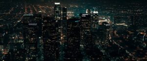
The cityscapes of Los Angeles, especially at night, owe a lot to Michael Mann’s Heat or Friedkin’s To Live and Die in L.A. LA isn’t just a backdrop here; it’s a character that’s glittering and seductive, yet totally unforgiving. The 80s synth-wave soundtrack wasn’t just a vibe choice it dictated the neon palette and high-contrast visuals, creating a “heightened reality” that feels both cool and deeply emotional.
Camera Movements
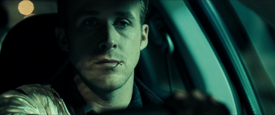
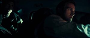
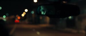
The camera work in Drive is an exercise in being incredibly deliberate. Take that opening getaway sequence: the camera almost never leaves the car. It’s a profound choice that keeps us trapped in the Driver’s perspective. We’re not watching a chase; we’re experiencing his meticulous control and his unwavering gaze. It creates this claustrophobic suspense that a wide, “Michael Bay-style” shot just couldn’t achieve.
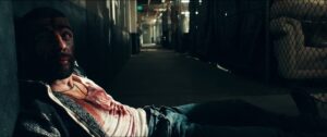
Outside the car, the camera often keeps a respectful distance, especially when the Driver is watching Irene and Benicio. It visually spells out his longing he’s close enough to see them, but framed in a way that suggests he’s miles away from a “normal” life. Then, when the violence hits, the camera shifts. It becomes an observing entity, sometimes staying dead still while something brutal happens, which makes the impact feel ten times worse because the visual tranquility is so abruptly broken.
Lighting Style
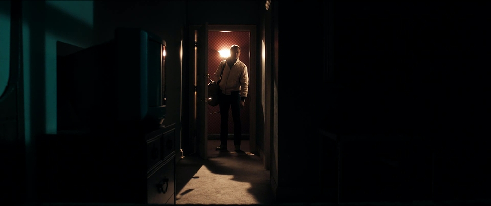
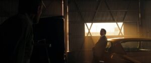
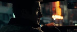
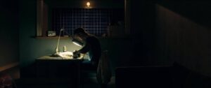
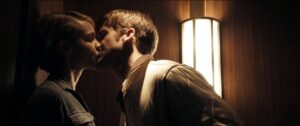
This is where the film really finds its soul. The lighting isn’t always “natural,” and I love that. It’s motivated by emotion rather than just the streetlights of LA. Sigel uses these unmotivated bursts of pink, blue, and gold as an emotional barometer.
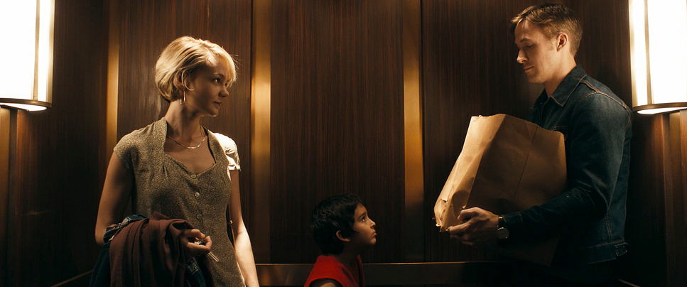
Think about the elevator scene. You’ve got this shifting, intense light from the elevator car itself, mixed with those ambient reds and blues. It turns a confined space into a hellish tableau. Even in the daytime, the contrast is pushed hard. Harsh sunlight carves out the actors’ faces against blown-out backgrounds or drops the interiors into deep, moody shadows. It’s all about sculpting the frame to make every flicker of emotion on Ryan Gosling’s face carry more weight.
Compositional Choices
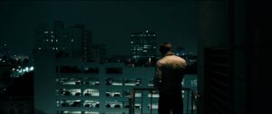
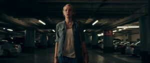
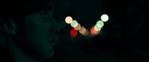
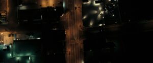
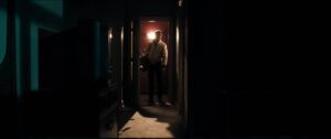
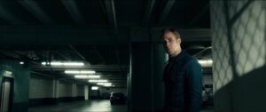
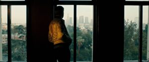
There’s a stark intentionality to how Sigel frames LA. He uses these wide shots to make the characters look tiny against the indifferent metropolis. But then he’ll cut to an extreme close-up of the Driver, and suddenly the world feels suffocatingly personal.
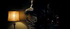
I’m particularly struck by the use of negative space. Often, the Driver is pushed to the edge of the frame or isolated by architectural lines. It makes him look like an afterthought in his own environment, reinforcing that “uncanny valley” feeling where everything looks familiar but feels just a little off. Even without dialogue, the composition tells you everything you need to know about his internal isolation.
Lensing and Blocking
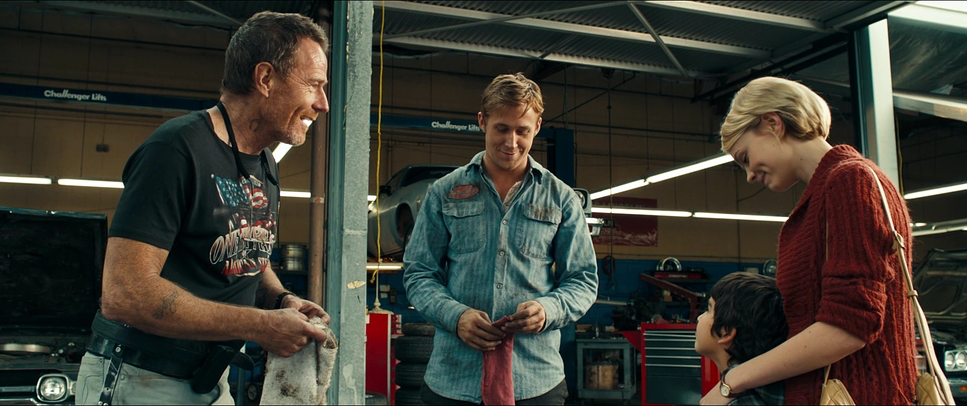
Looking at the technical data, they used Zeiss Master Primes lenses known for being incredibly sharp and clean. While the film features some beautiful wide-angle work to capture the scope of the city, I’ve noticed how they use blocking to create intimacy. Even when they’re on a wider lens, the camera is often positioned in a way that feels voyeuristic, like we’re peaking through a doorway or over a shoulder.
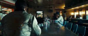
The blocking itself is spare. Characters often stand on separate planes within the frame, which creates this nagging sense of emotional distance. The Driver is usually blocked to observe rather than participate. He’s the outsider, and the way he’s positioned in the room often near an exit or in the shadows makes that physical. It’s not about complex choreography; it’s about positioning that speaks volumes.
Color Grading Approach
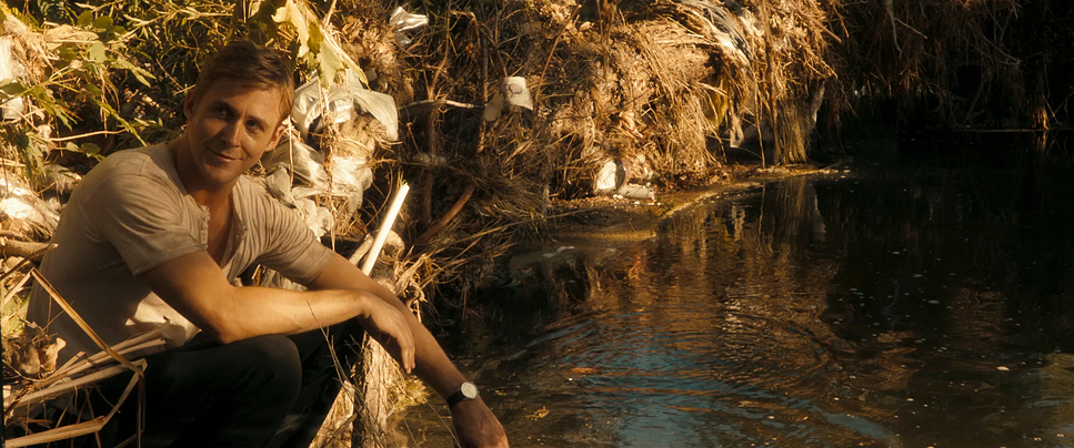
Now we’re in my playground. The grade on Drive, handled by the legendary Tom Poole, is iconic for a reason. This isn’t just a “teal and orange” look; it’s a meticulously sculpted palette. You have that 80s synth-wave aesthetic those neon pinks and purples vibrating against the warm, golden glow of the LA night.
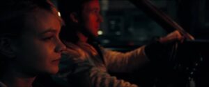
As a colorist, I’m obsessed with the contrast shaping here. Poole pushed the blacks deep, but they have this “thick,” filmic quality where you lose detail in the shadows in a way that feels intentional, not like a technical error. The highlight roll-off is incredibly smooth, giving the digital Alexa footage a “print-film” sensibility. Notice how skin tones stay relatively grounded even when the background is drenched in crazy neon. It’s a masterclass in hue separation. When the Driver is with Irene, the grade leans into a subtle warmth, a brief moment of peace. But as things go south, the blues get colder and the reds get more aggressive. The color is the audience’s roadmap through his mental state.
Technical Aspects & Tools
Drive – 2K Digital
| Genre | Action, Crime, Drama, Thriller |
| Director | Nicolas Winding Refn |
| Cinematographer | Newton Thomas Sigel |
| Production Designer | Beth Mickle |
| Costume Designer | Erin Benach |
| Editor | Matthew Newman |
| Colorist | Tom Poole |
| Time Period | 2010s |
| Color | Mixed, Desaturated, Yellow |
| Aspect Ratio | 2.39 – Spherical |
| Format | Digital |
| Lighting | High contrast |
| Story Location | California > Los Angeles |
| Filming Location | California > Los Angeles |
| Camera | ARRI ALEXA Classic / plus |
| Lens | Zeiss Master Primes |
| Film Stock / Resolution | 2K |
Even though it’s the artistry that grabs you, the tools mattered here. Shooting on the ARRI Alexa Classic in 2K was a brilliant choice. Even back in 2011, the Alexa was the king of dynamic range, and it handled those tricky, low-light night exteriors in LA with a very organic feel.
Using spherical Zeiss Master Primes meant they got a clean, unblemished image, which gave them a “blank canvas” to push the colors and lighting in post-production. They didn’t rely on anamorphic flares or lens distortions to create a vibe; they built the vibe through lighting and the digital intermediate process. It’s a great reminder that you don’t need the “newest” 8K camera to create a timeless look you just need to know how to use the sensor’s latitude to serve the story.
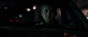
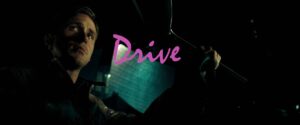
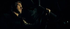
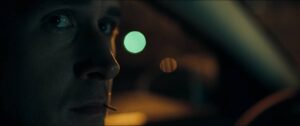
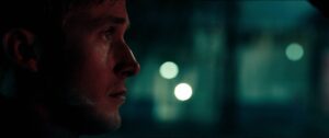
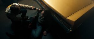
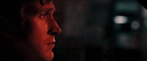
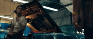
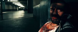
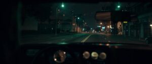
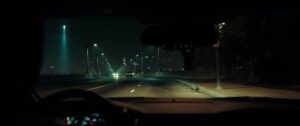
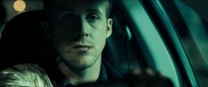
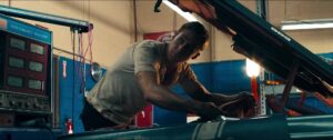
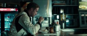
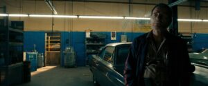
Drive (2011) Film Stills
A curated reference archive of cinematography stills from Drive (2011). Study the lighting, color grading, and composition.





































- Also read: SKYFALL (2012) – CINEMATOGRAPHY ANALYSIS
- Also read: THE SOCIAL NETWORK (2010) – CINEMATOGRAPHY ANALYSIS
Browse Our Cinematography Analysis Glossary
Explore directors, cinematographers, cameras, lenses, lighting styles, genres, and the visual techniques that shape iconic films.
Explore Glossary →