Skyfall (2012), I’m reminded that it isn’t just a James Bond movie, it’s a masterclass in visual storytelling. It was a pivot point for the franchise, trading the typical spy-flick gloss for a heavy, introspective gravitas that redefined what a blockbuster could look like. For me, analyzing this film is an excavation of craft looking at how a single lens choice or a specific tonal curve can elevate a narrative from a standard thriller to a cinematic event.
Inspiration Behind the Cinematography

The visual DNA of Skyfall was a deliberate, sharp turn from the Bond films that came before it. Director Sam Mendes didn’t want the usual theatrical sheen; he was chasing the “Dark Knight” ethos taking an iconic, almost mythological character and dropping them into a world that felt brutally realistic.
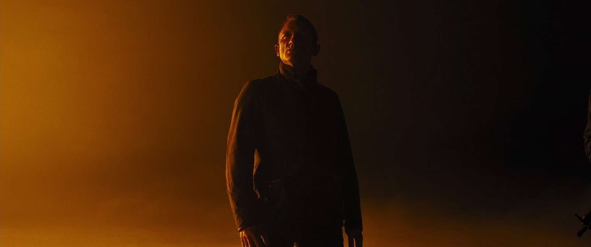
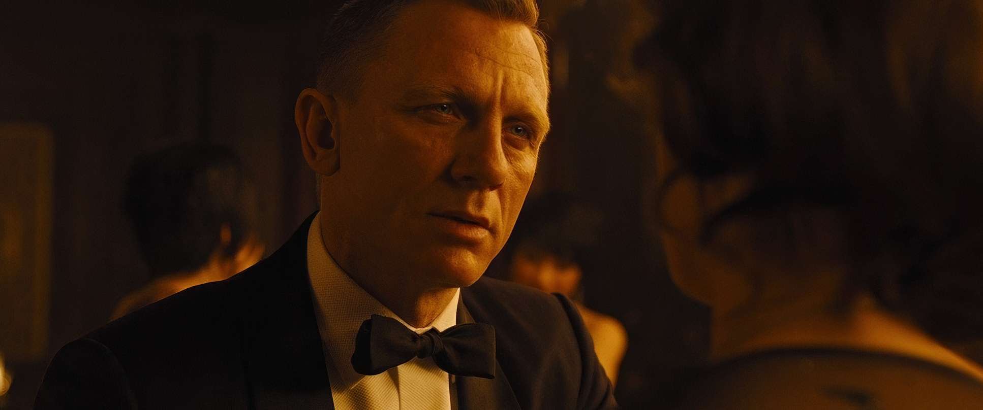
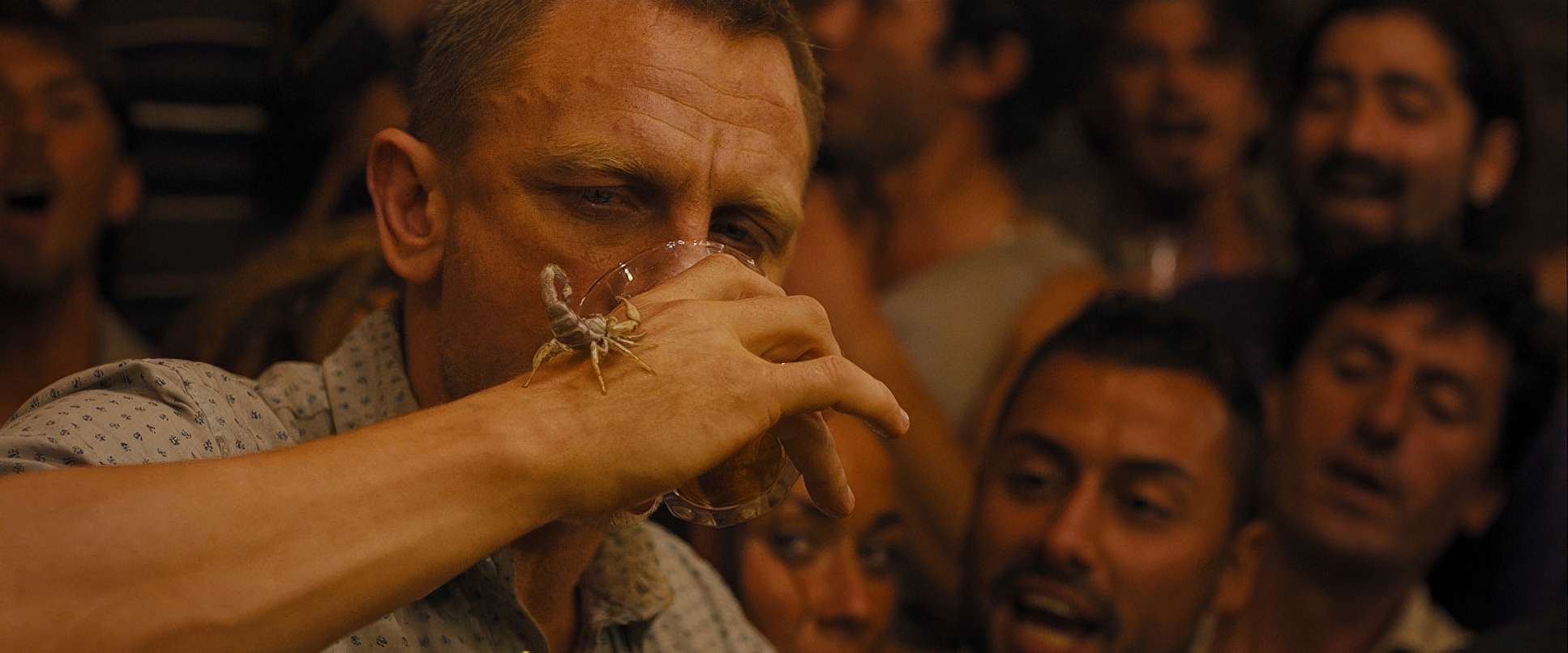
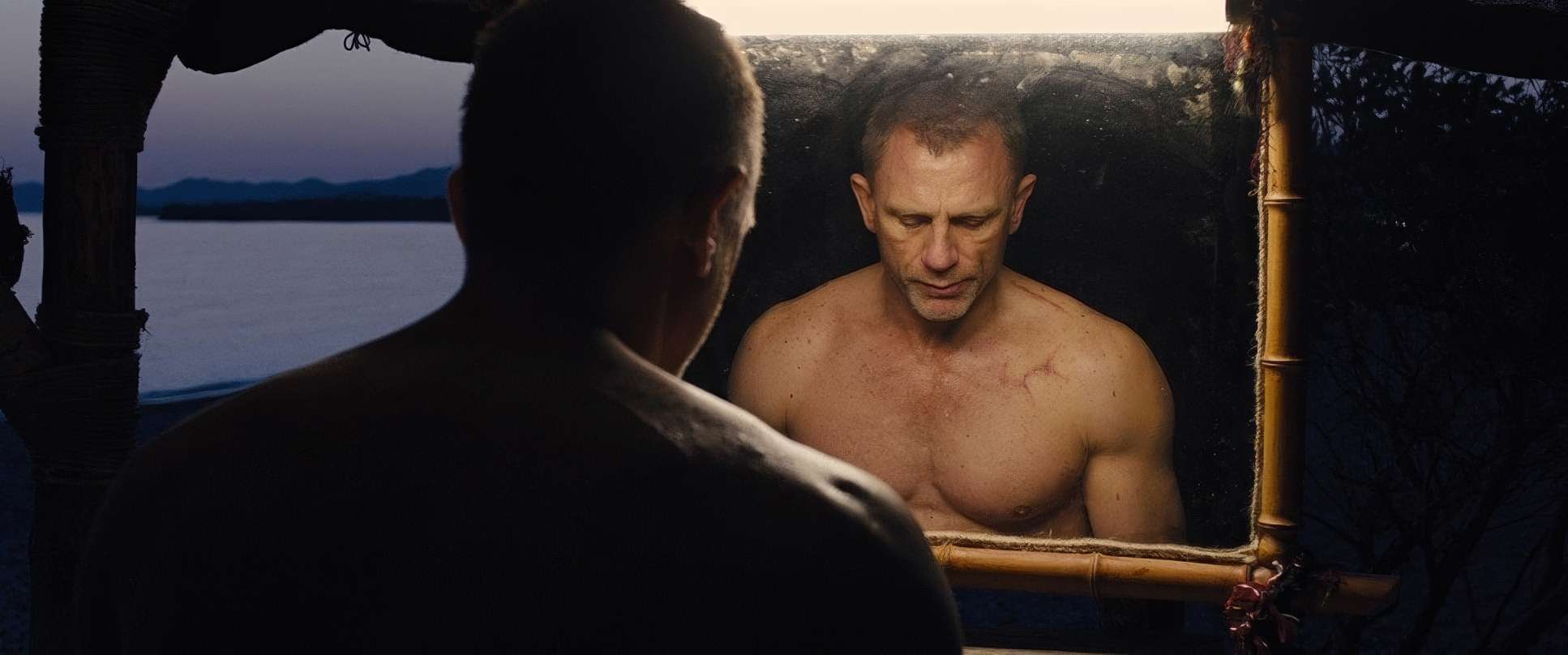
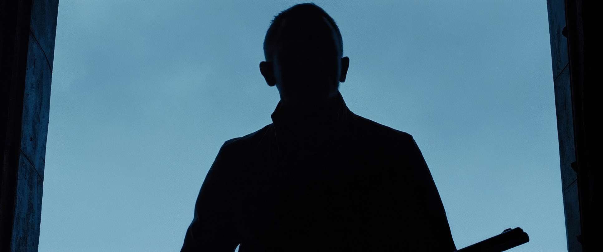
The goal was to create a “thicker,” more involved movie. This inspiration manifested in a palette that felt grounded and tactile. We moved away from the “cool spy” aesthetic and toward a darker, somber atmosphere that mirrored Bond’s own fractured psyche. He’s presented here as a “wounded assassin” who has fallen from grace, and the cinematography reflects that weariness. It isn’t about making Bond look effortlessly cool; it’s about capturing the grit and the shadows he inhabits.
About the Cinematographer: Roger Deakins
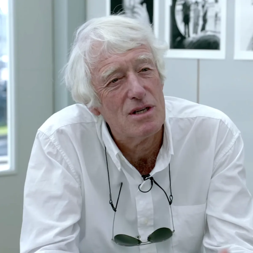
You can’t discuss the soul of Skyfall without talking about Roger Deakins. In our industry, the man is a living legend, but what I admire most is his deceptive simplicity. Whether it’s the stark, legendary frames of The Shawshank Redemption or the psychological textures of his work with Denis Villeneuve, Deakins has this rare ability to imbue a frame with immense emotion without ever over-complicating the tech.
When Mendes and Deakins teamed up, it was a stroke of genius. Mendes brought the auteur’s eye from his drama background, and Deakins brought a master craftsman’s precision to a scale he hadn’t fully explored before. They treated Skyfall with the same respect as a high-concept drama, proving that you don’t need to sacrifice subtle artistry for a “huge action movie.”
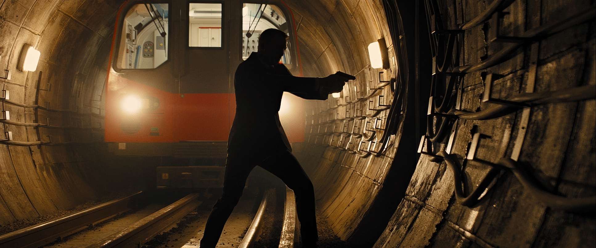
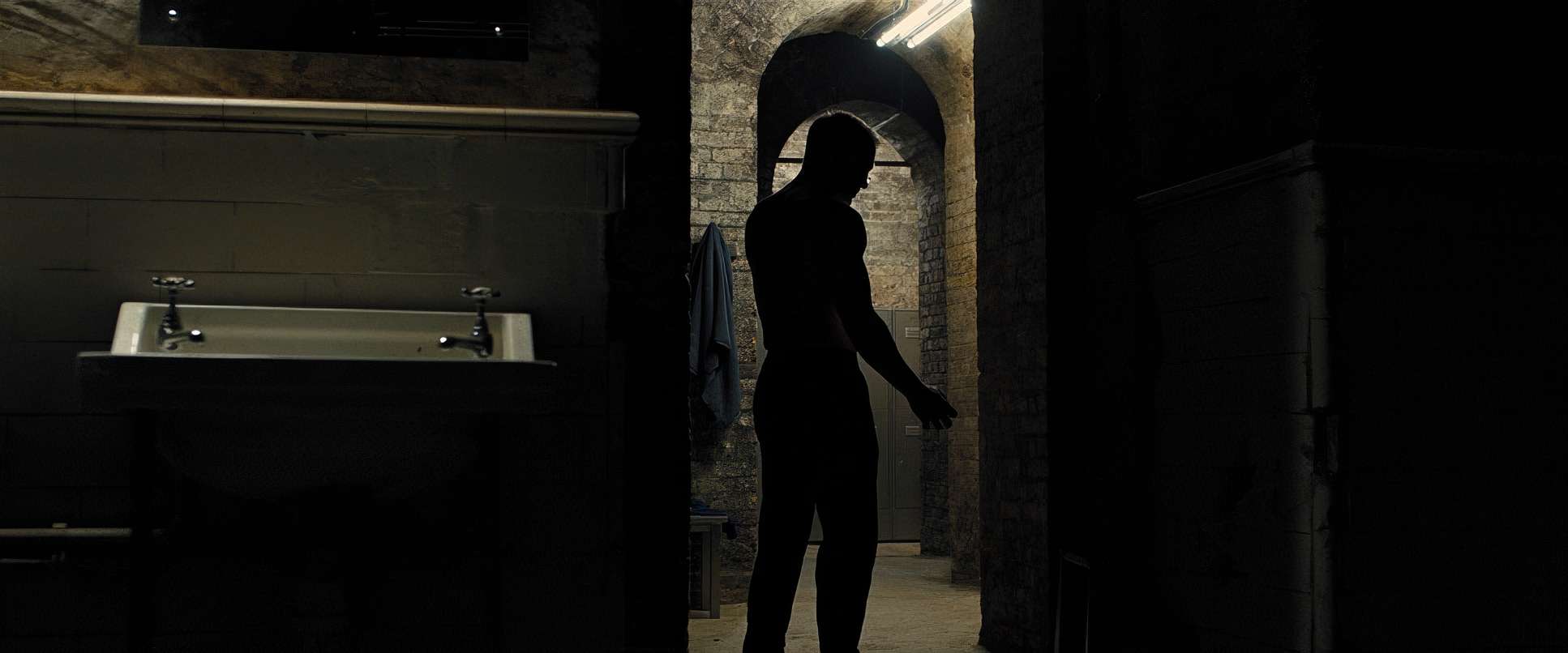
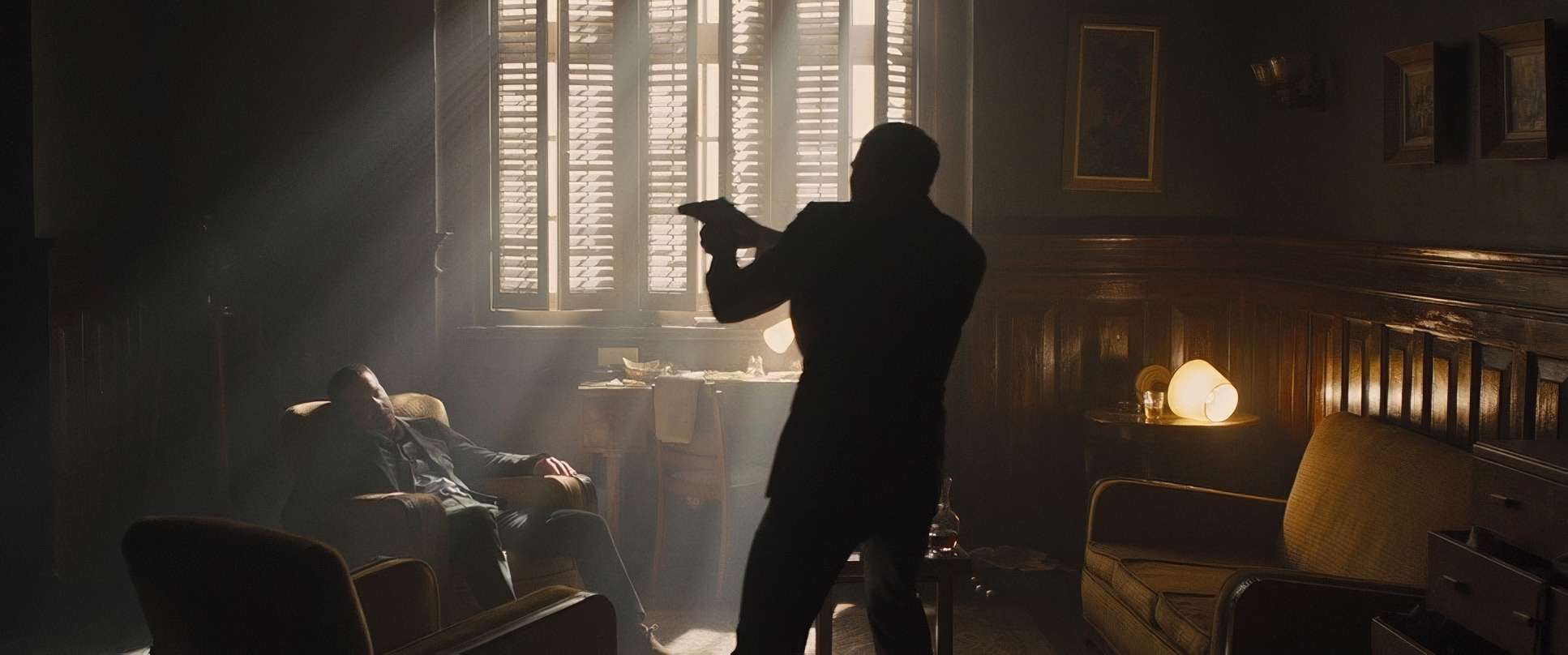
Lighting Style: Sculpting with Shadow
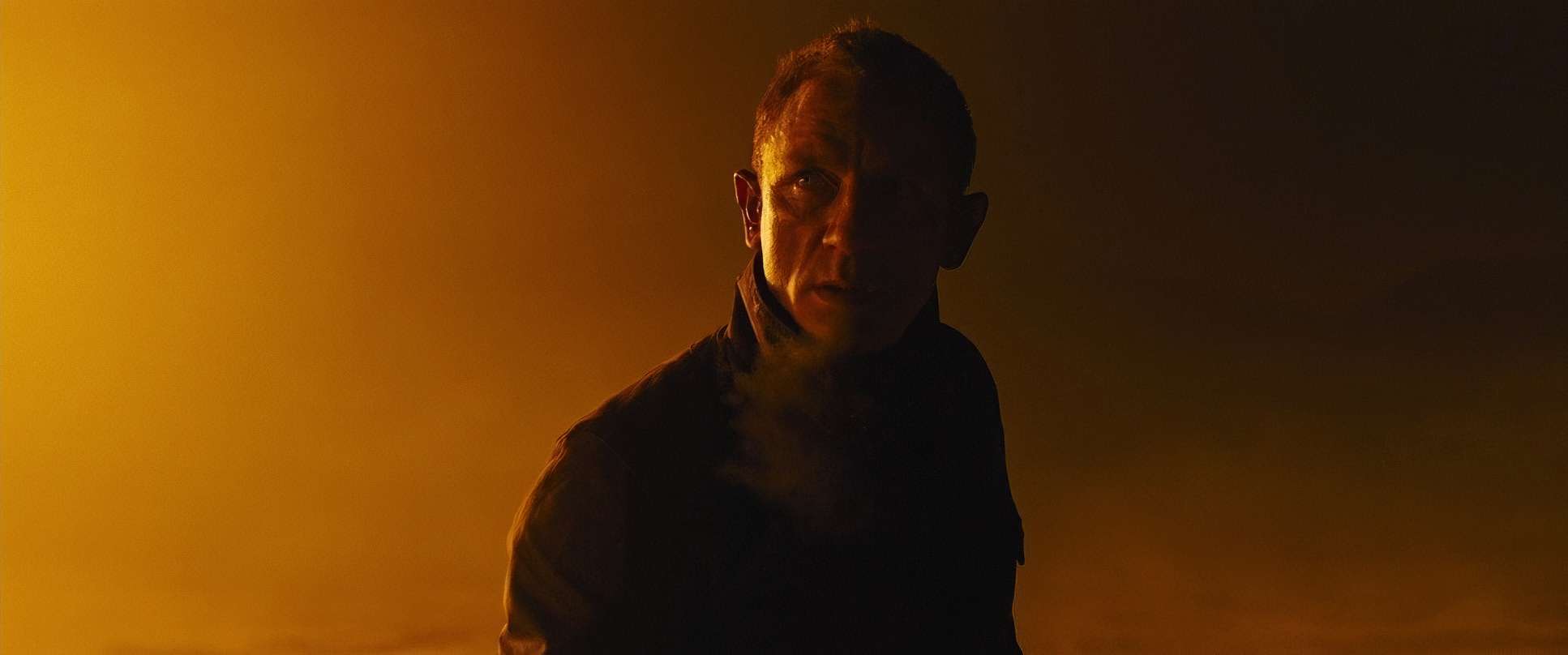
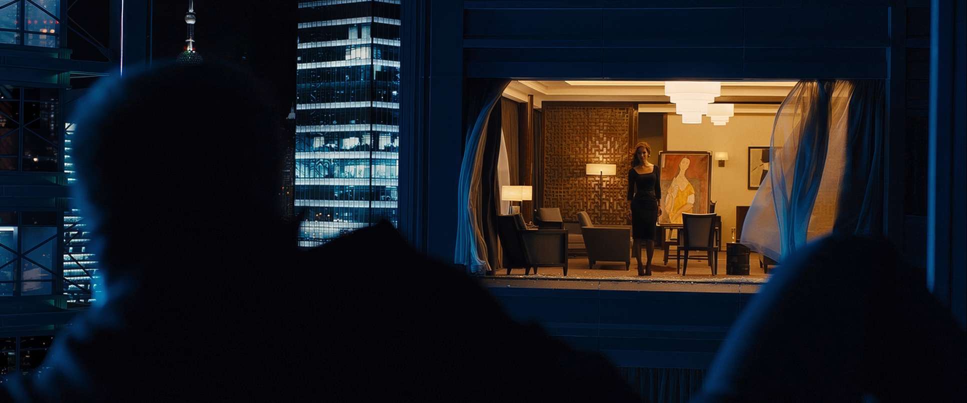
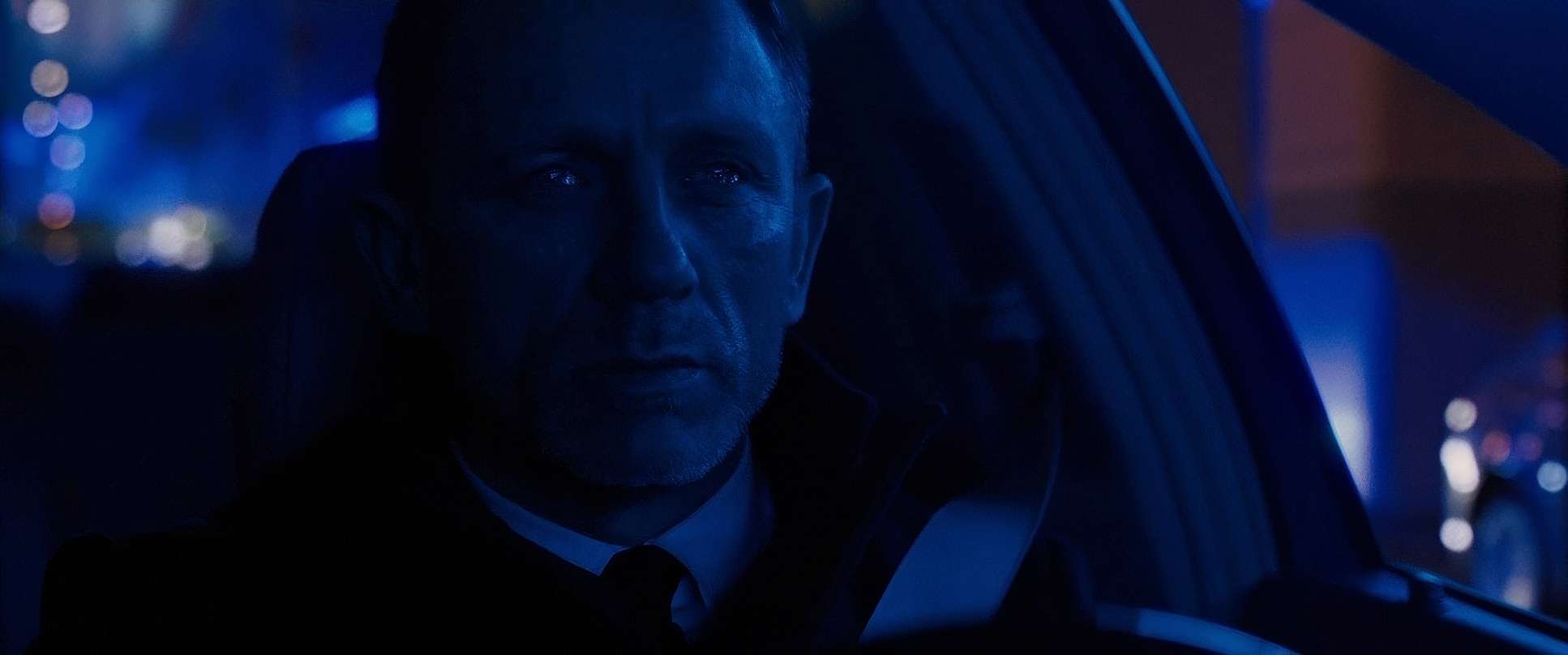
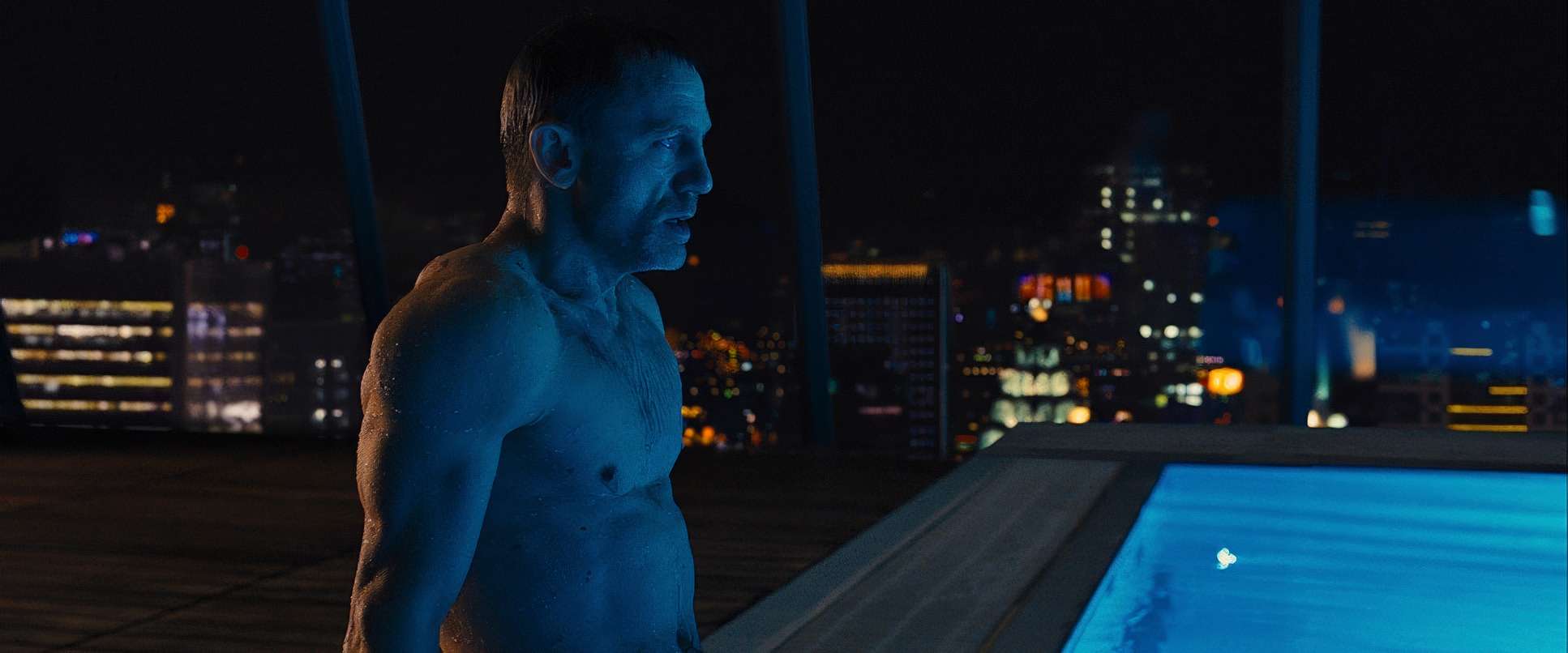
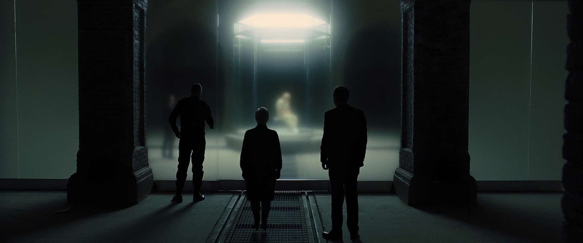
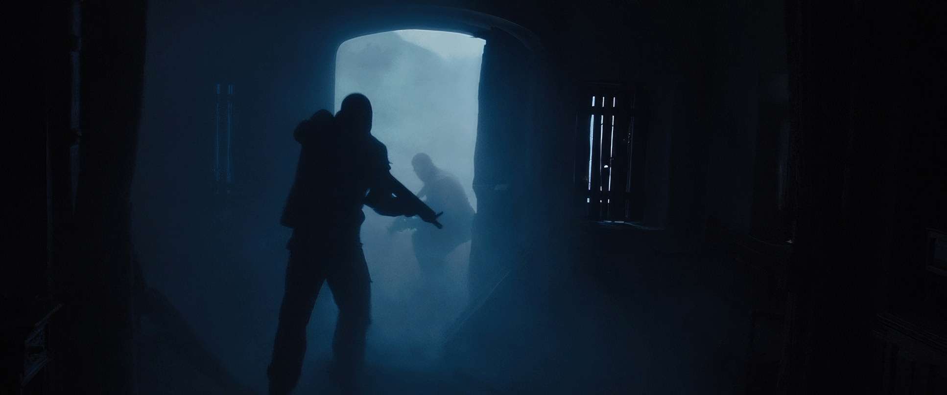
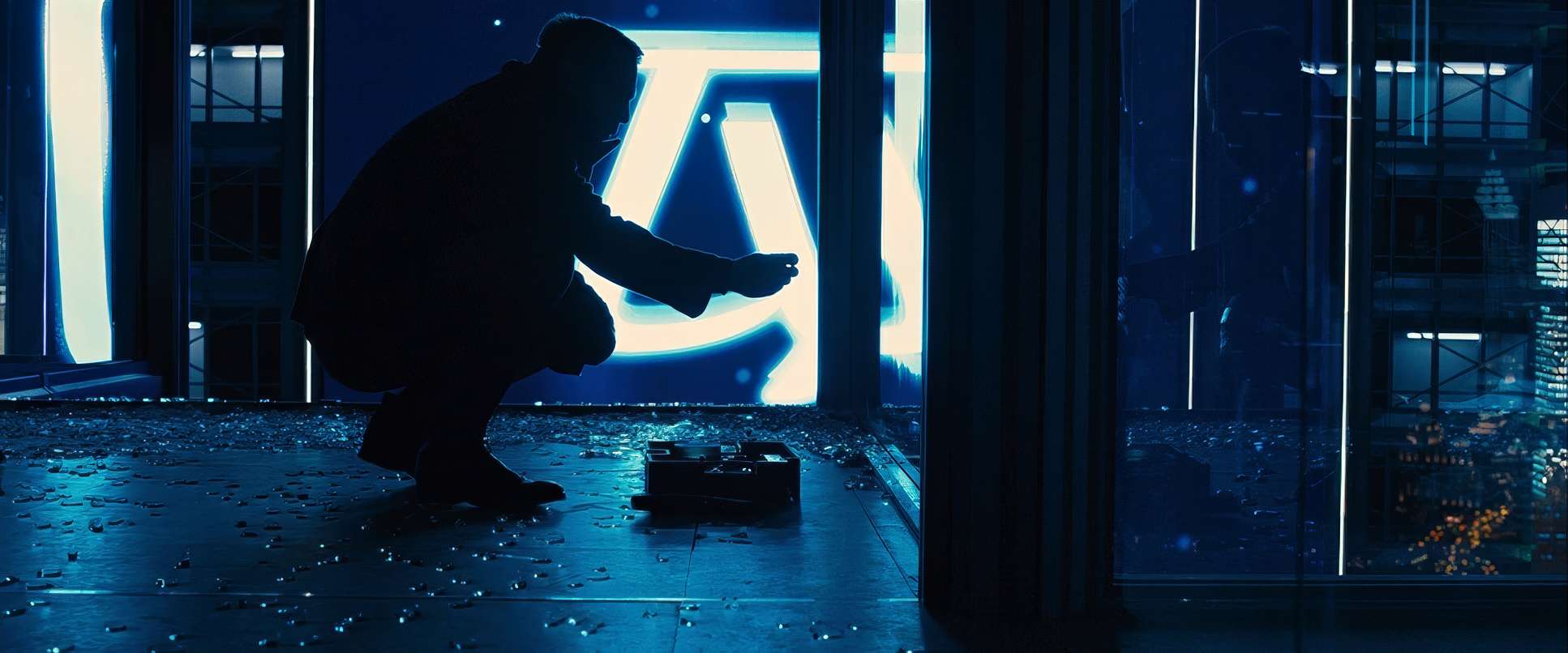
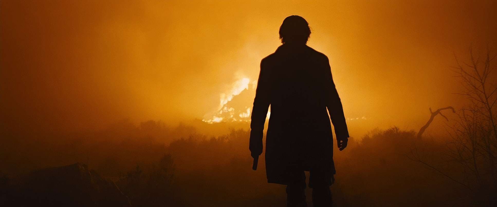
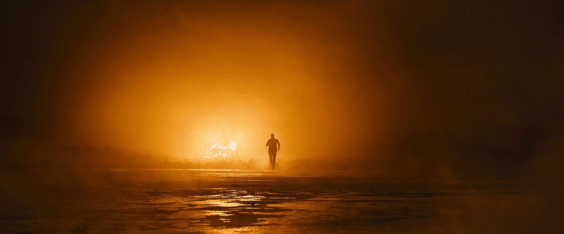
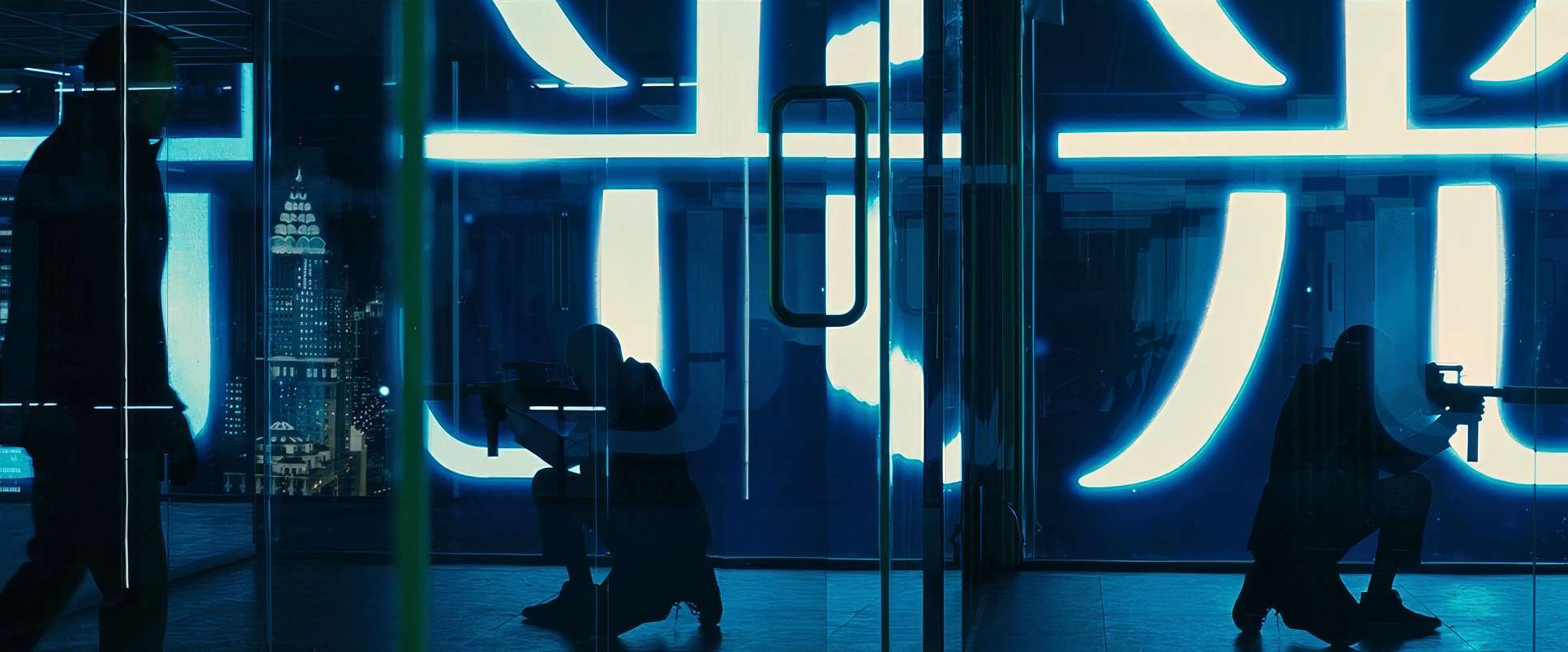
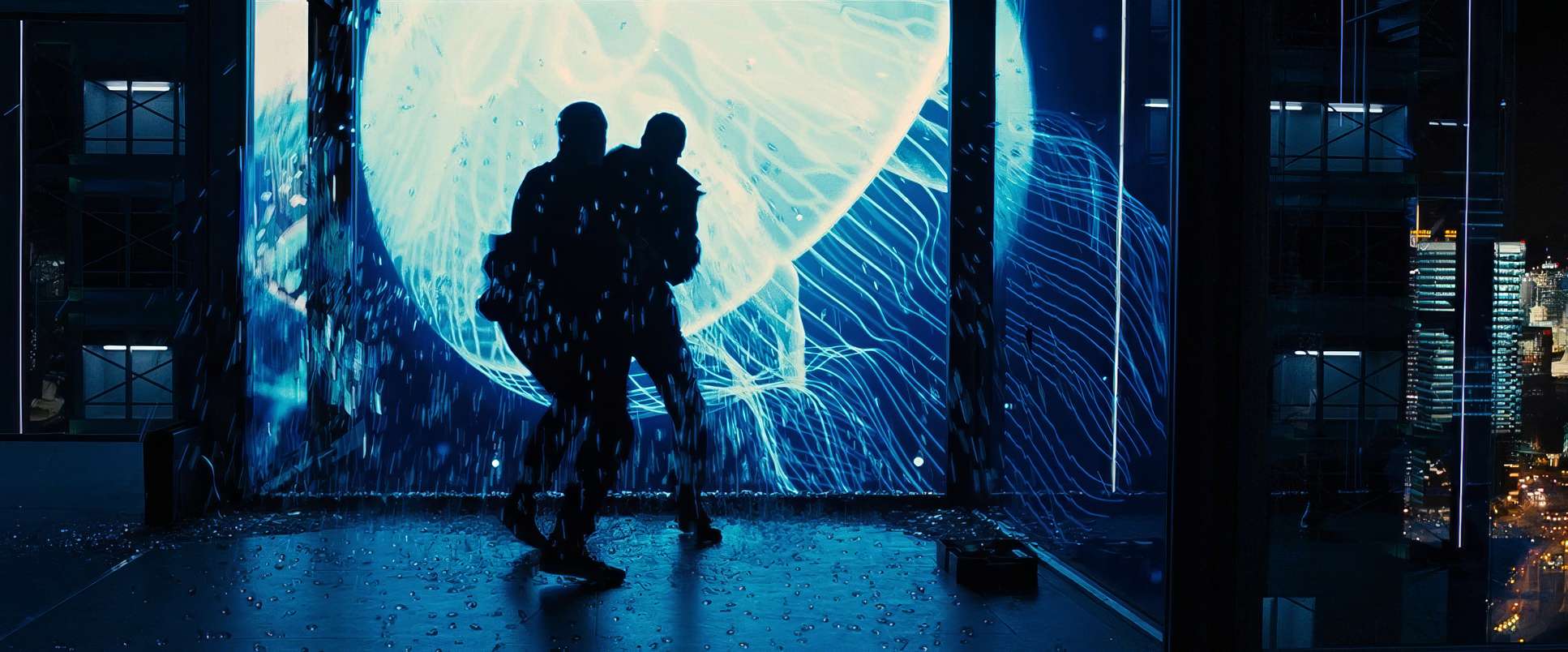
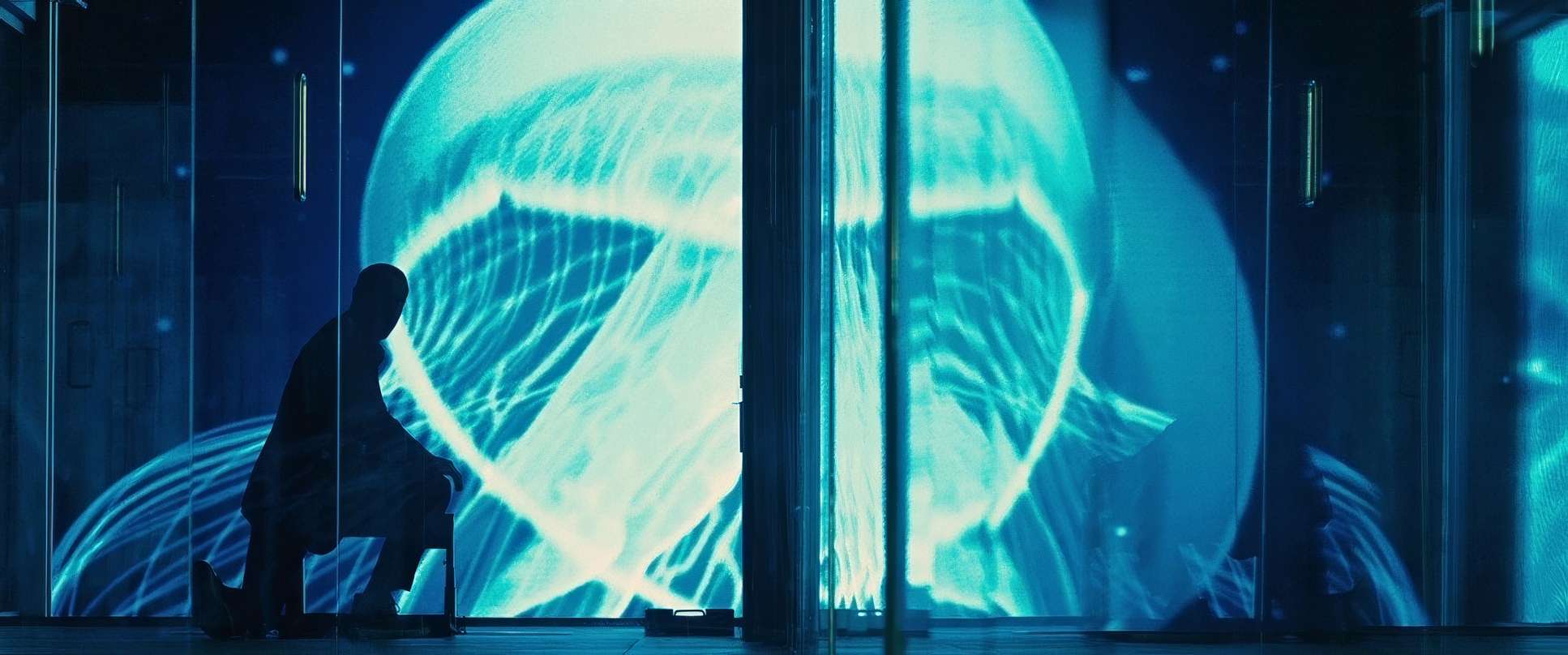
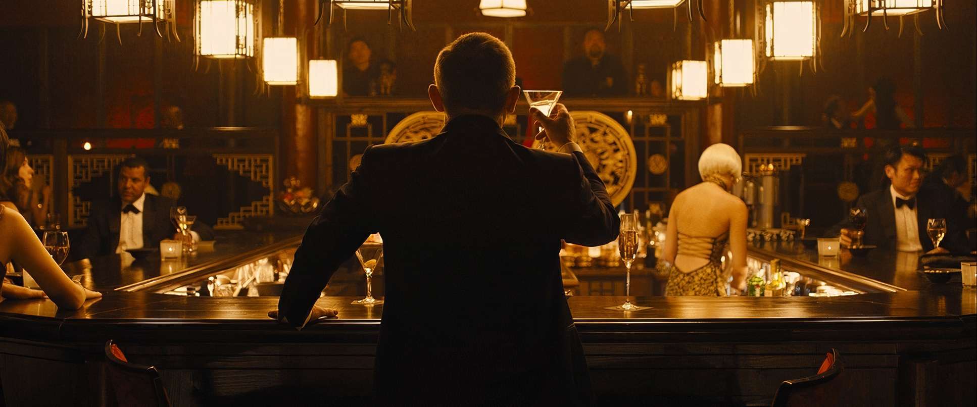
This is where Deakins’ genius becomes undeniable. His approach to motivated lighting in Skyfall is a case study for any DP. Take the Shanghai skyscraper sequence one of my favorite moments in modern cinema. The entire scene is driven by the pulsating, artificial blue glow of a digital billboard. It creates this otherworldly, abstract arena where silhouettes do the talking.
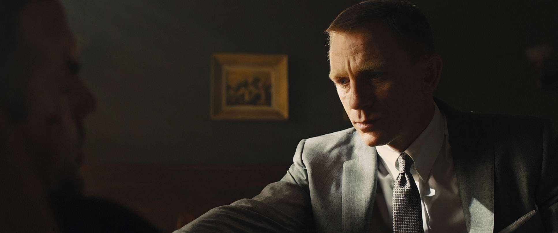
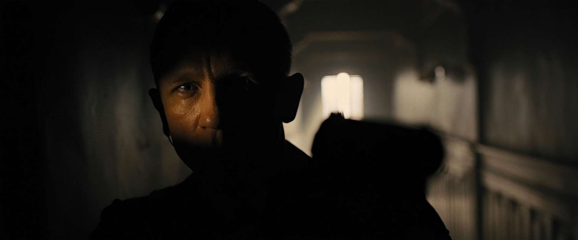
From a technical standpoint, his dynamic range decisions are impeccable. He allows shadows to fall into deep, inky blacks, yet they always retain just enough texture to feel substantial. The highlights roll off gently, avoiding that harsh “digital” clip that ruins so many modern action films. This “painterly” quality is what gives the film its weight; it’s light used not just to see the actors, but to sculpt the mood and define the danger of their world.
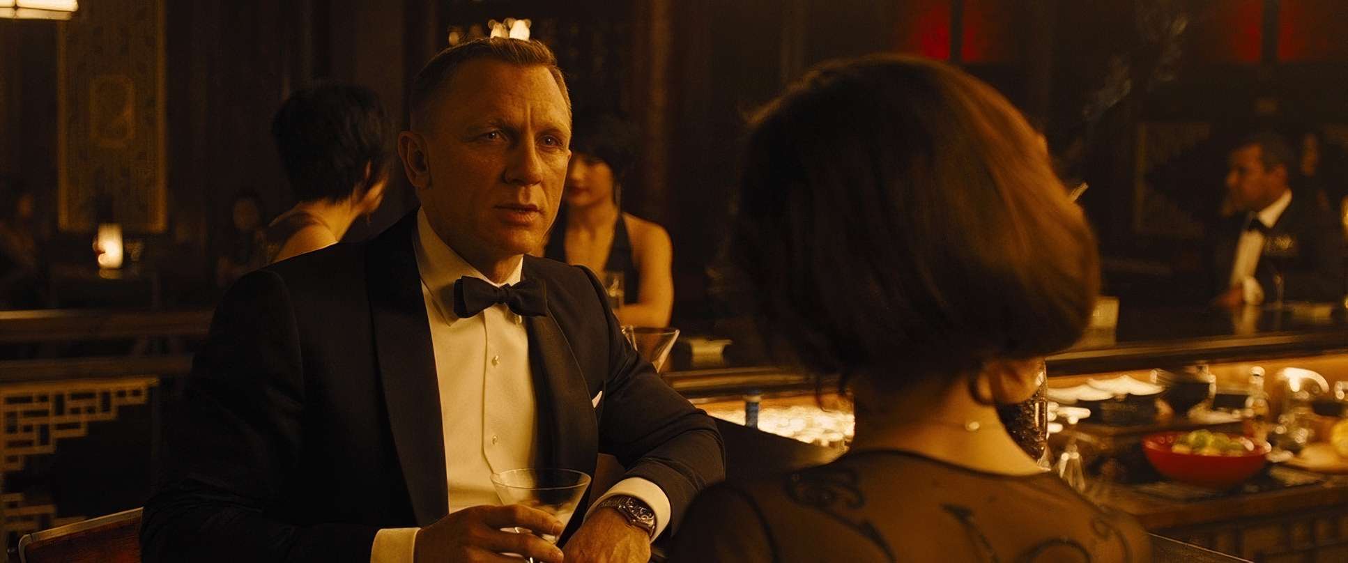
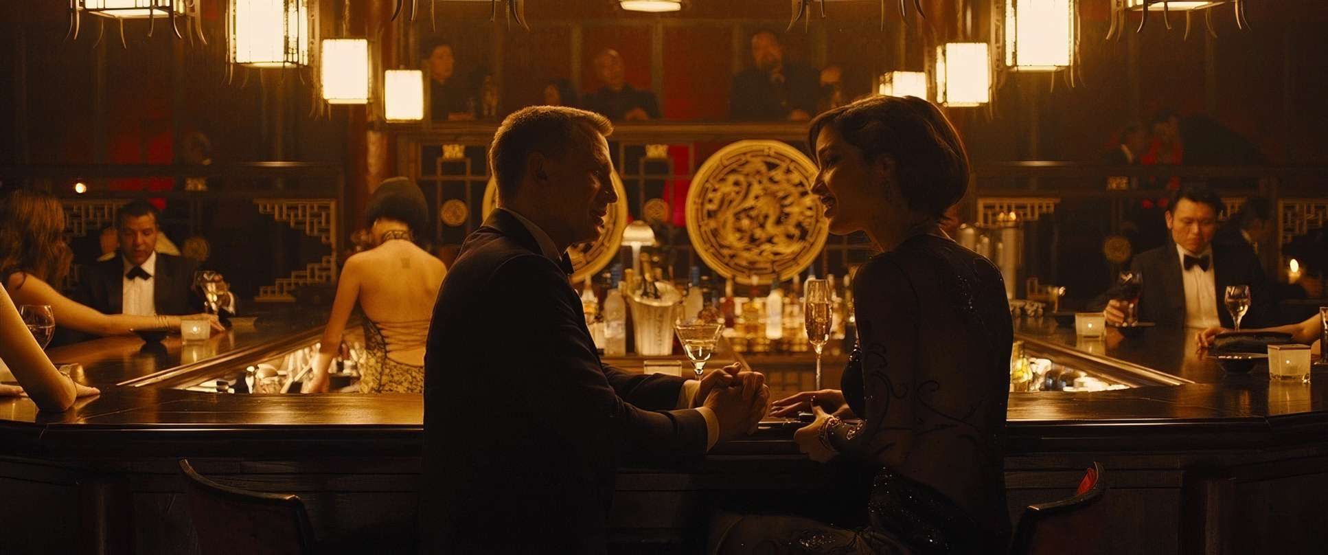
Color Grading Approach: The Tonal Soul
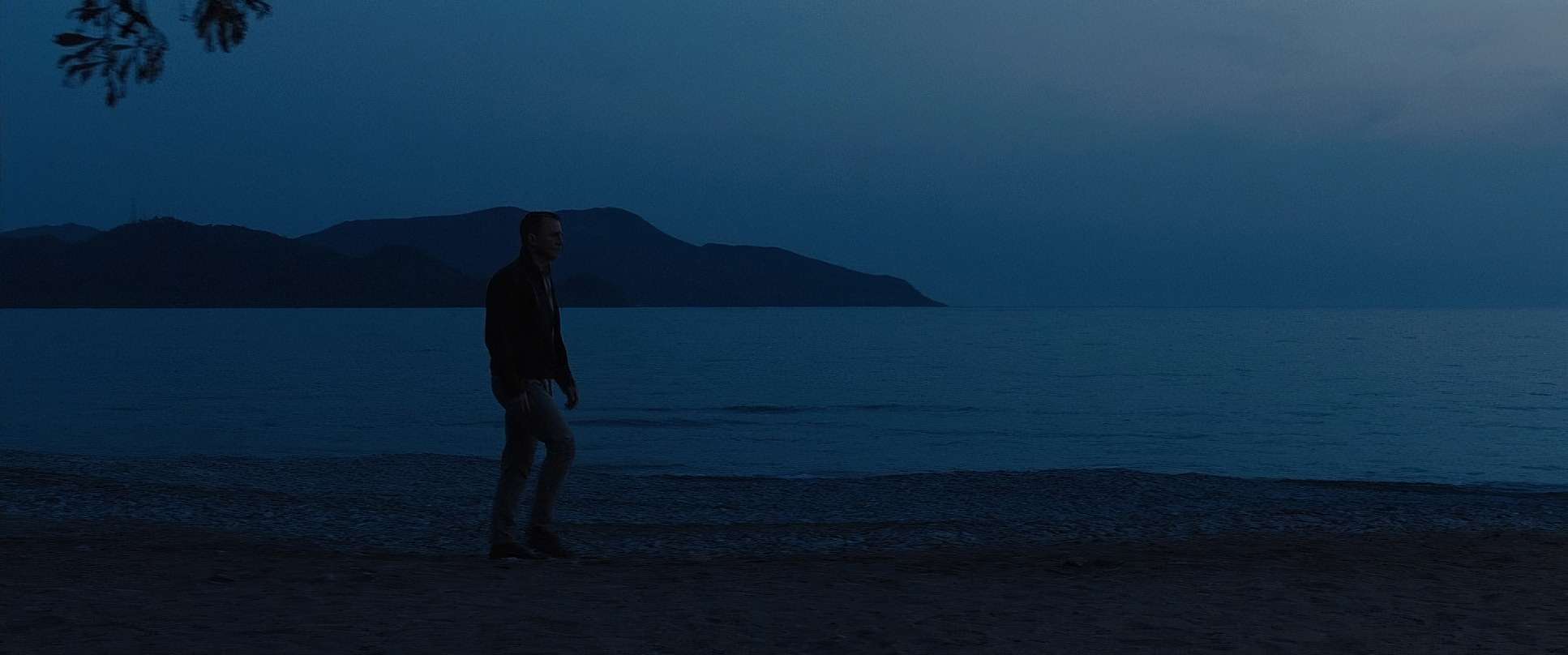
As a colorist, this is where I really nerd out. The grade on Skyfall (handled by Mitch Paulson) is the cornerstone of its aesthetic. The palette is a masterclass in restraint leaning into muted, desaturated cools that support the “thick” atmosphere Mendes wanted.
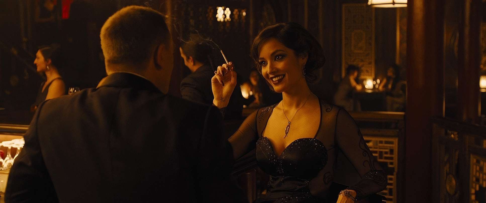
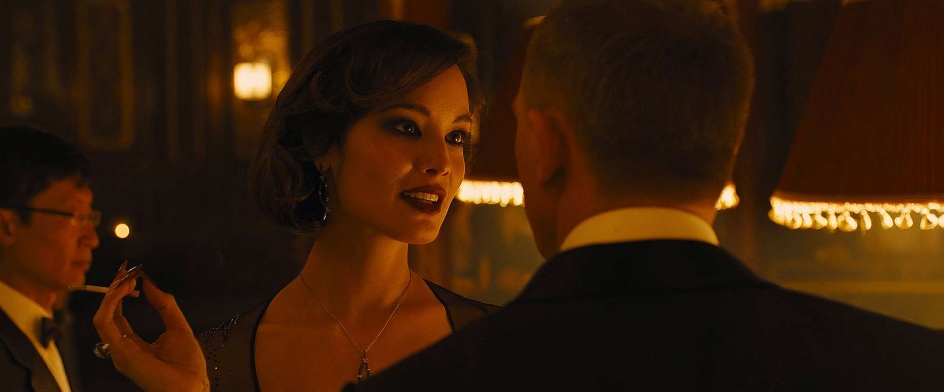
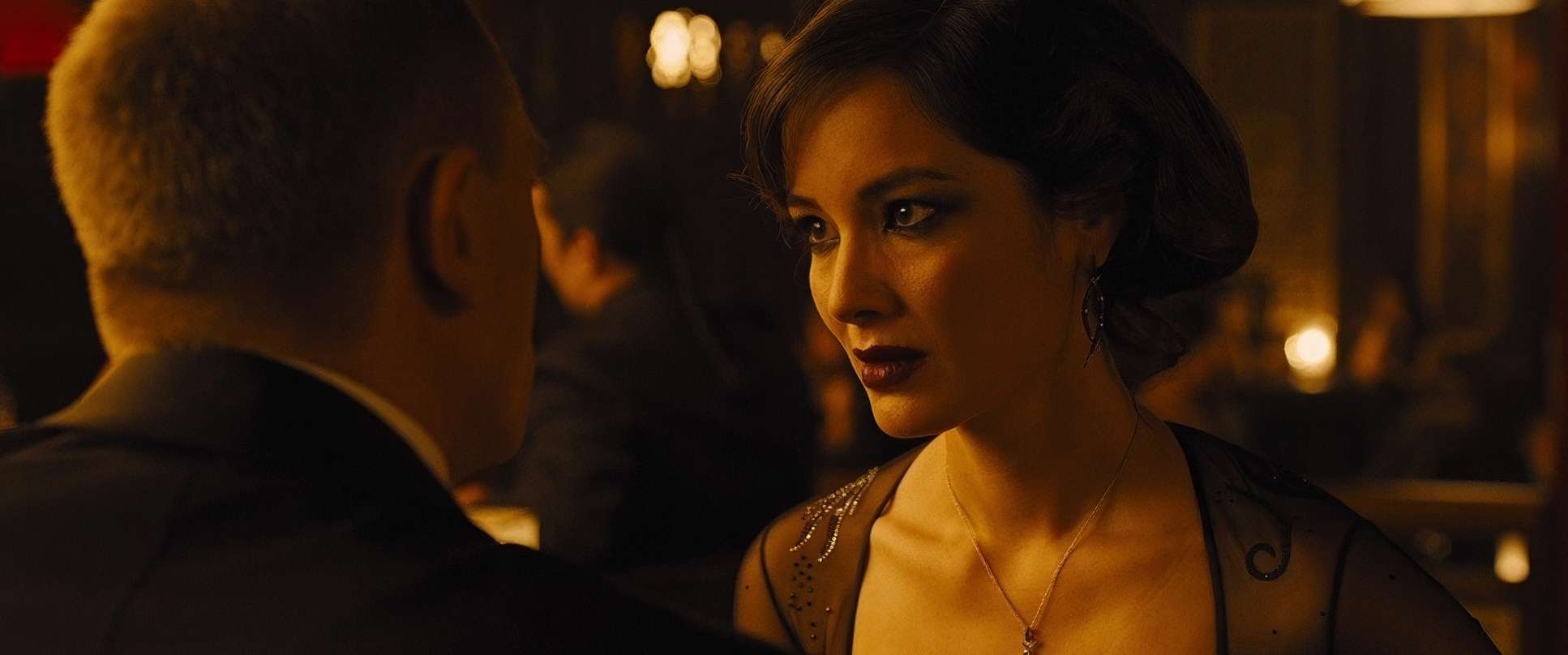
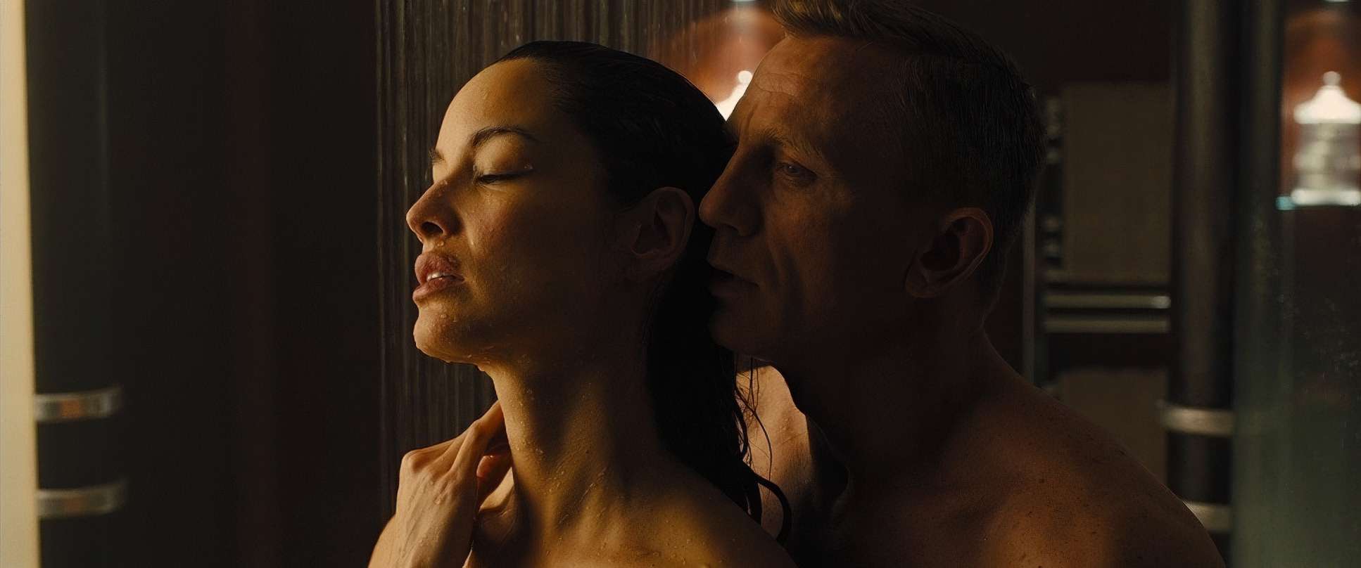
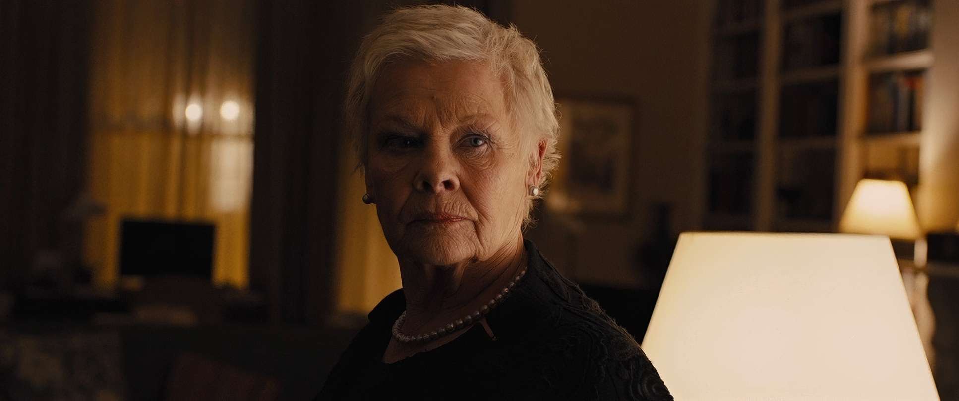
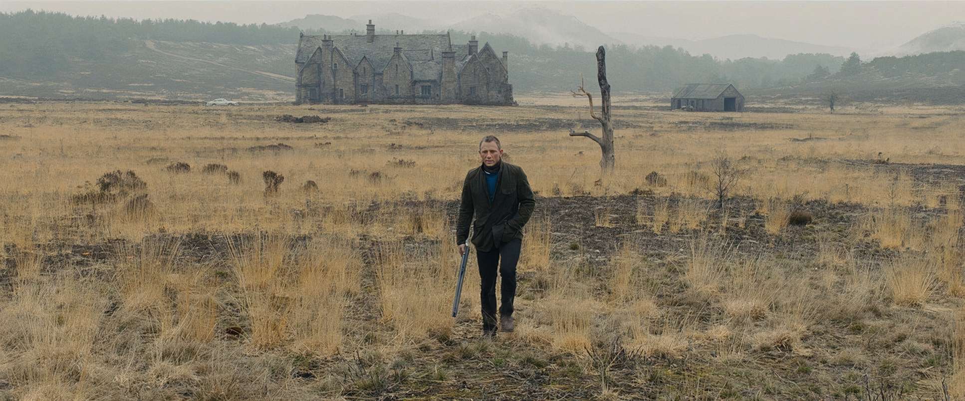
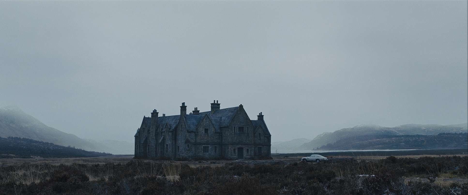
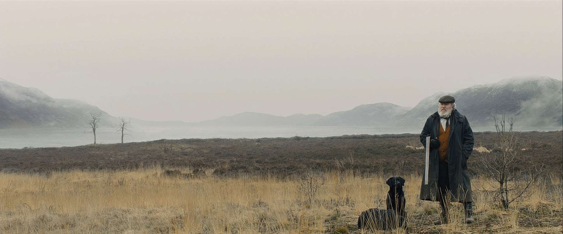
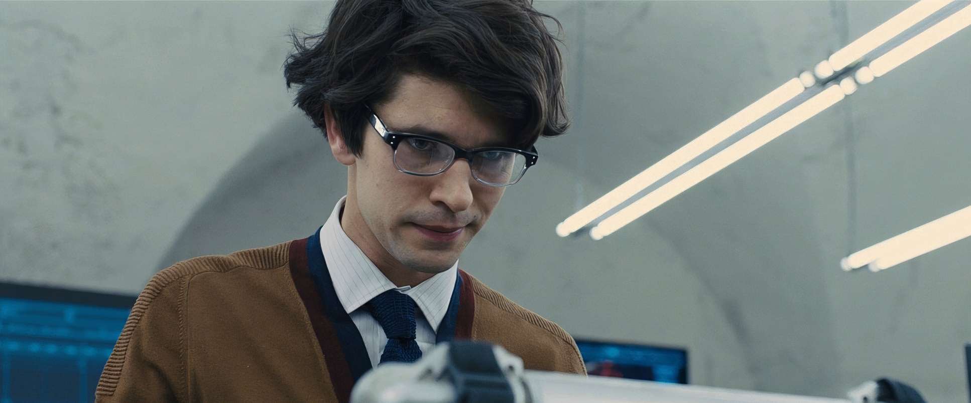
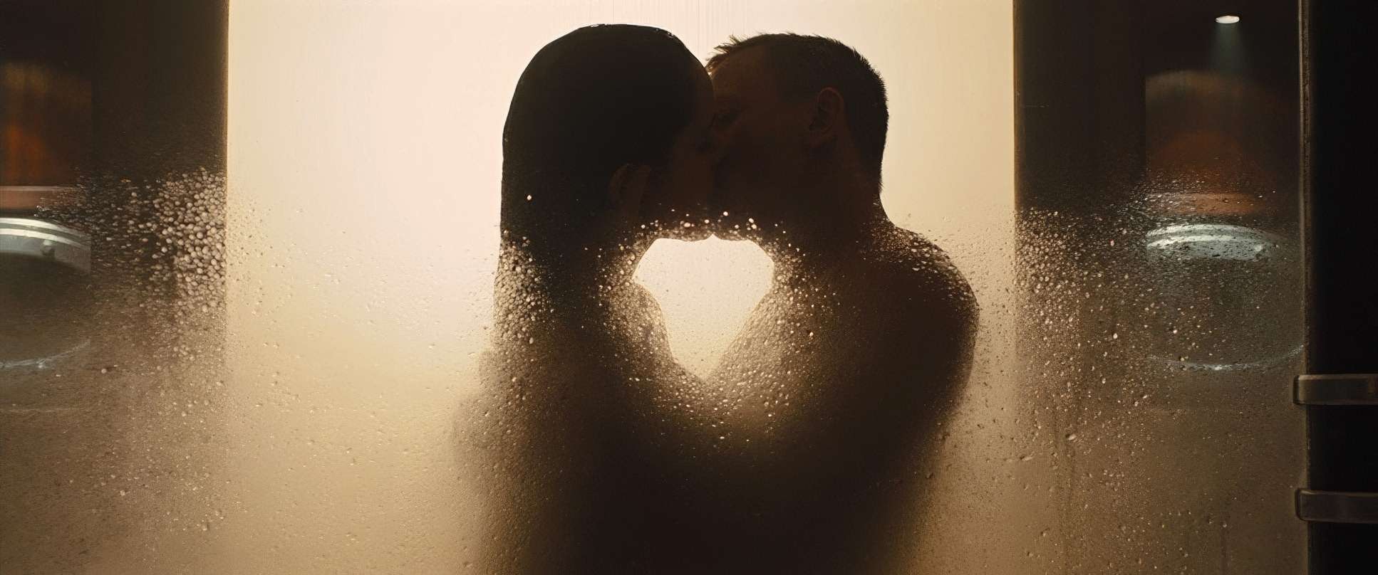
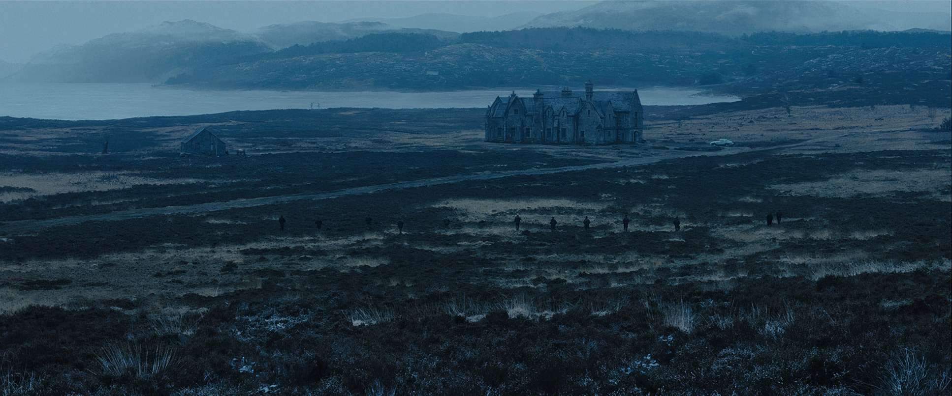
What fascinates me most is the hue separation. Even in a heavily stylized environment like the Scottish Highlands, the skin tones remain natural and warm. They provide a vital human anchor against the cold, melancholic greens and browns of the background. In my own studio, we often study the tonal sculpting here—the way the light transitions from mid-tones to shadows. The highlight roll-off mimics the behavior of print film beautifully, giving the digital Alexa footage a luxurious, celluloid sensibility. This isn’t just “grading for looks”; it’s grading for emotional logic.
Compositional Choices

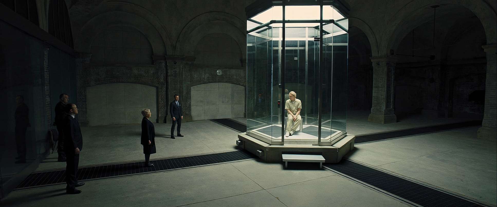
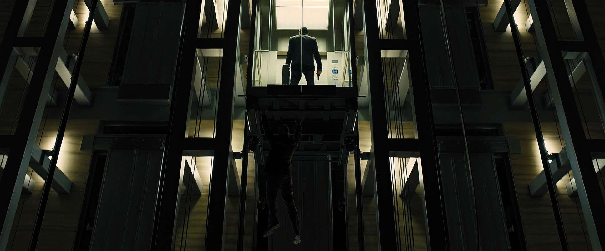
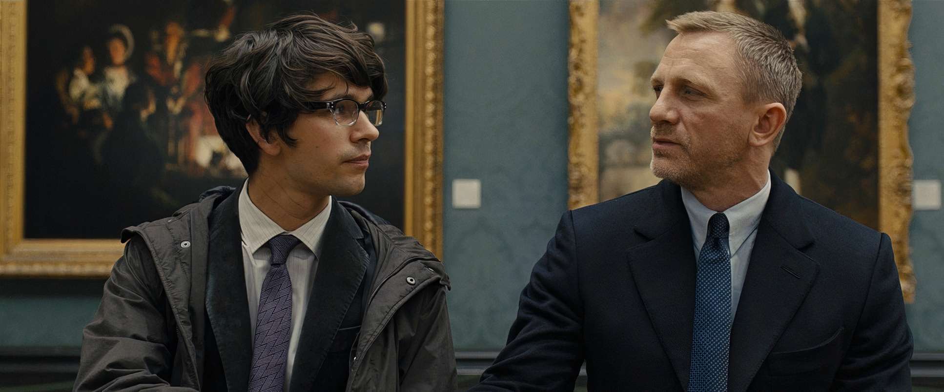
Deakins’ compositions are rigid, graphical, and incredibly powerful. He uses architecture to frame Bond in ways that emphasize isolation. Think of the Shanghai skyscraper again the rigid geometry of the glass panels framing characters as silhouettes against a vast, indifferent city.
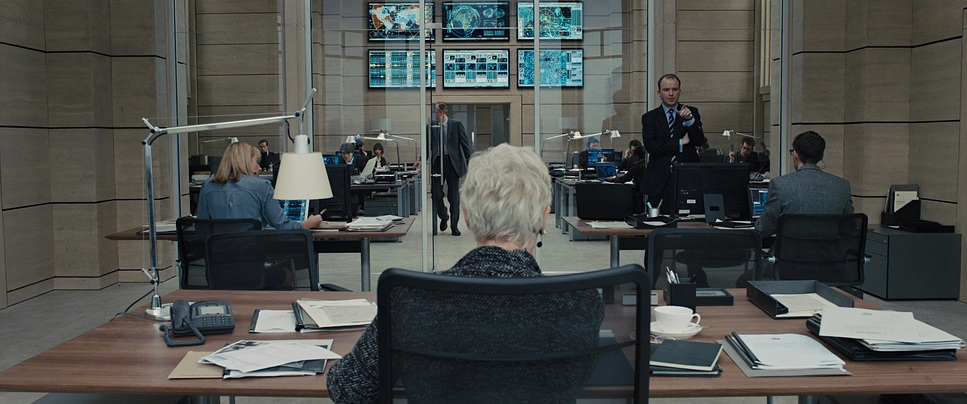
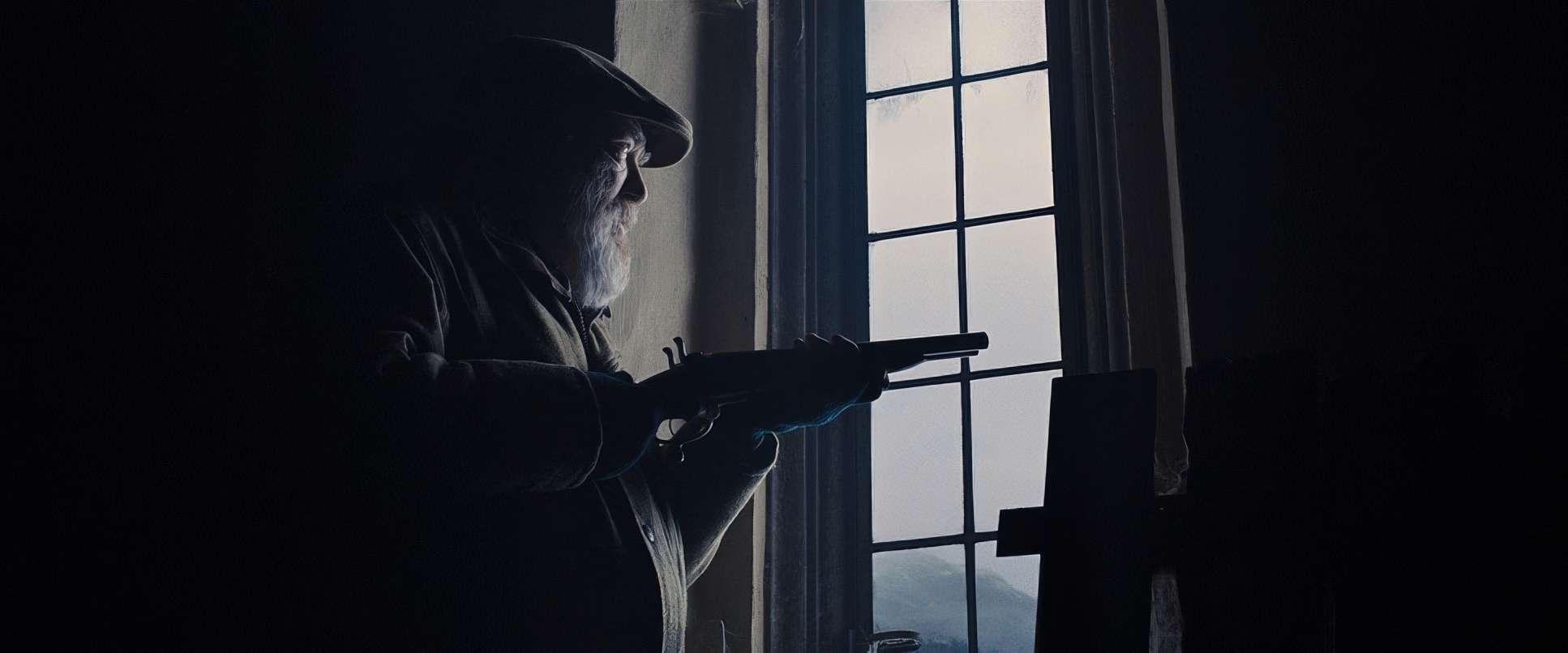
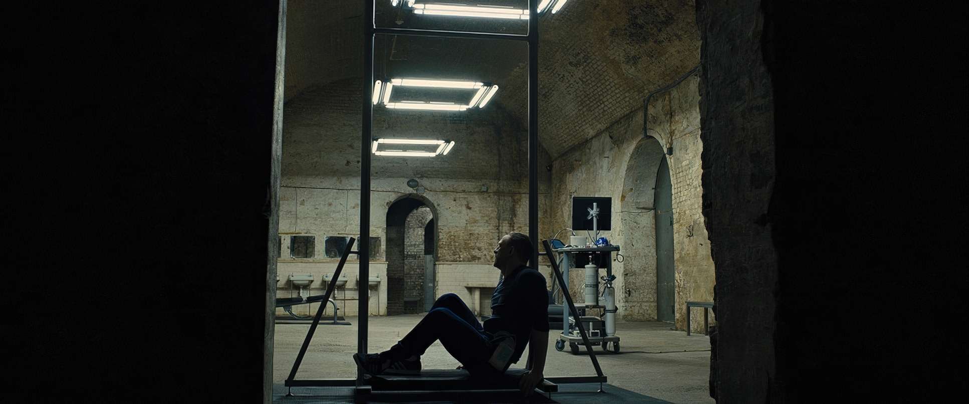
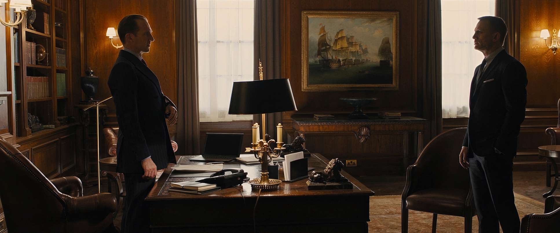
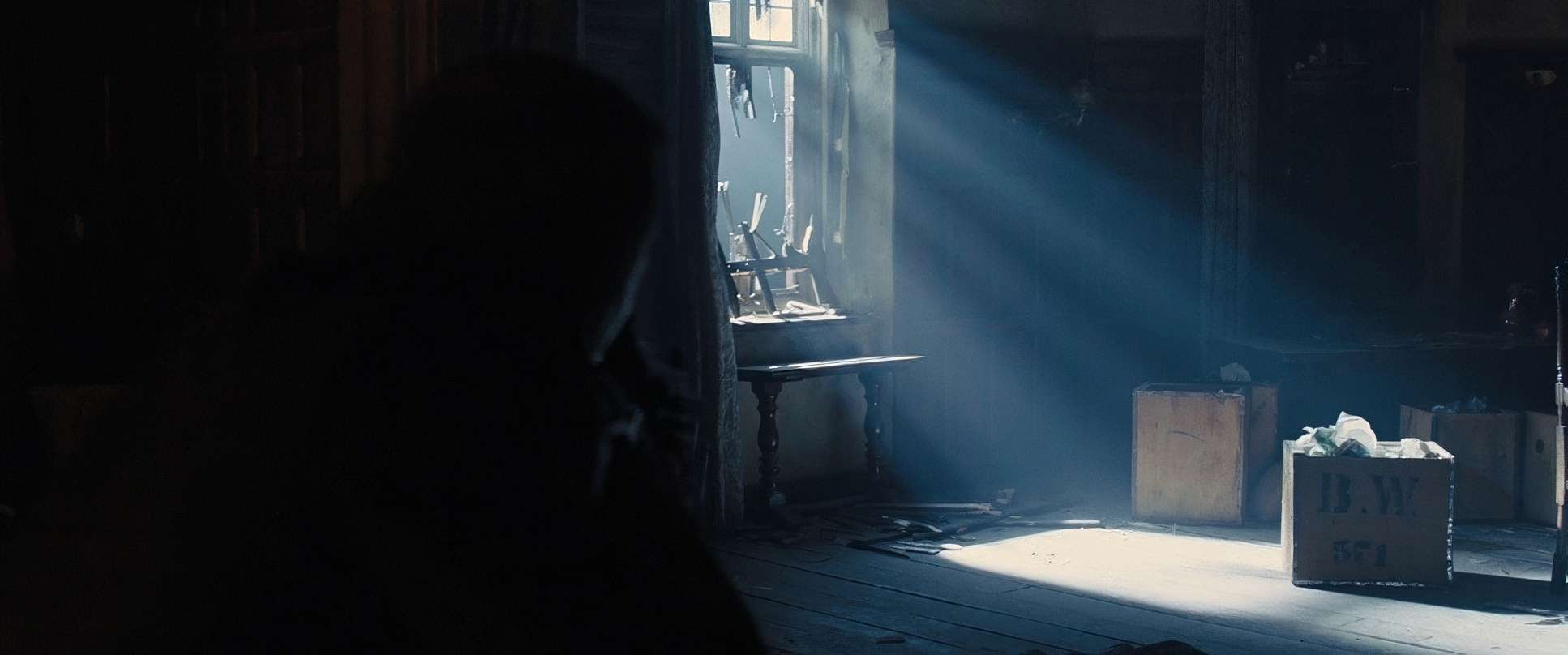
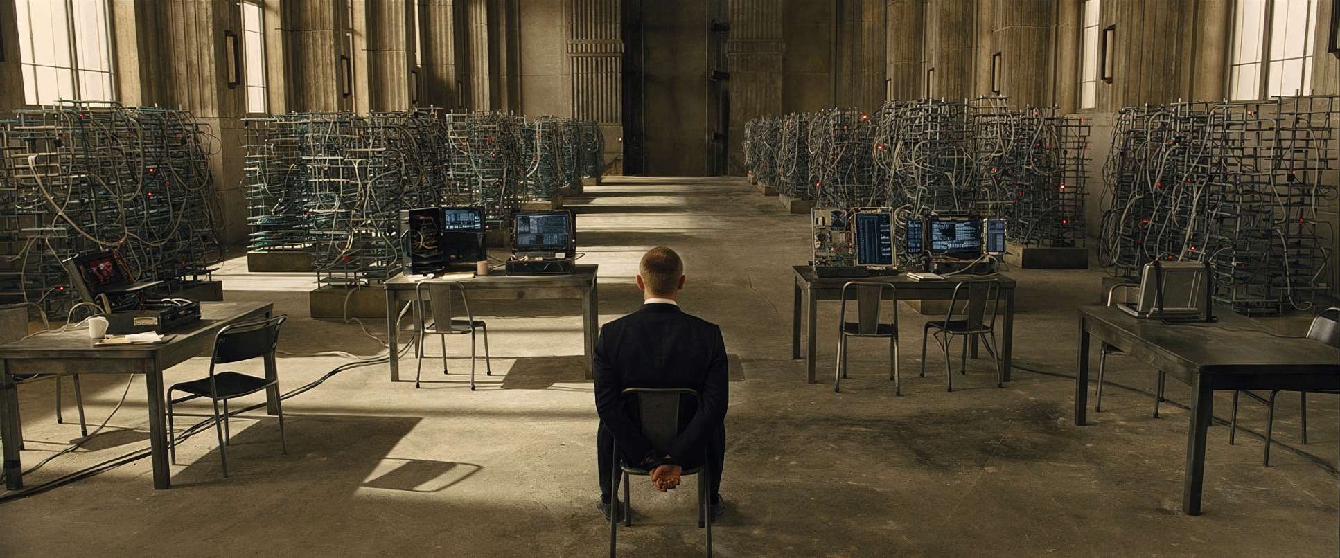
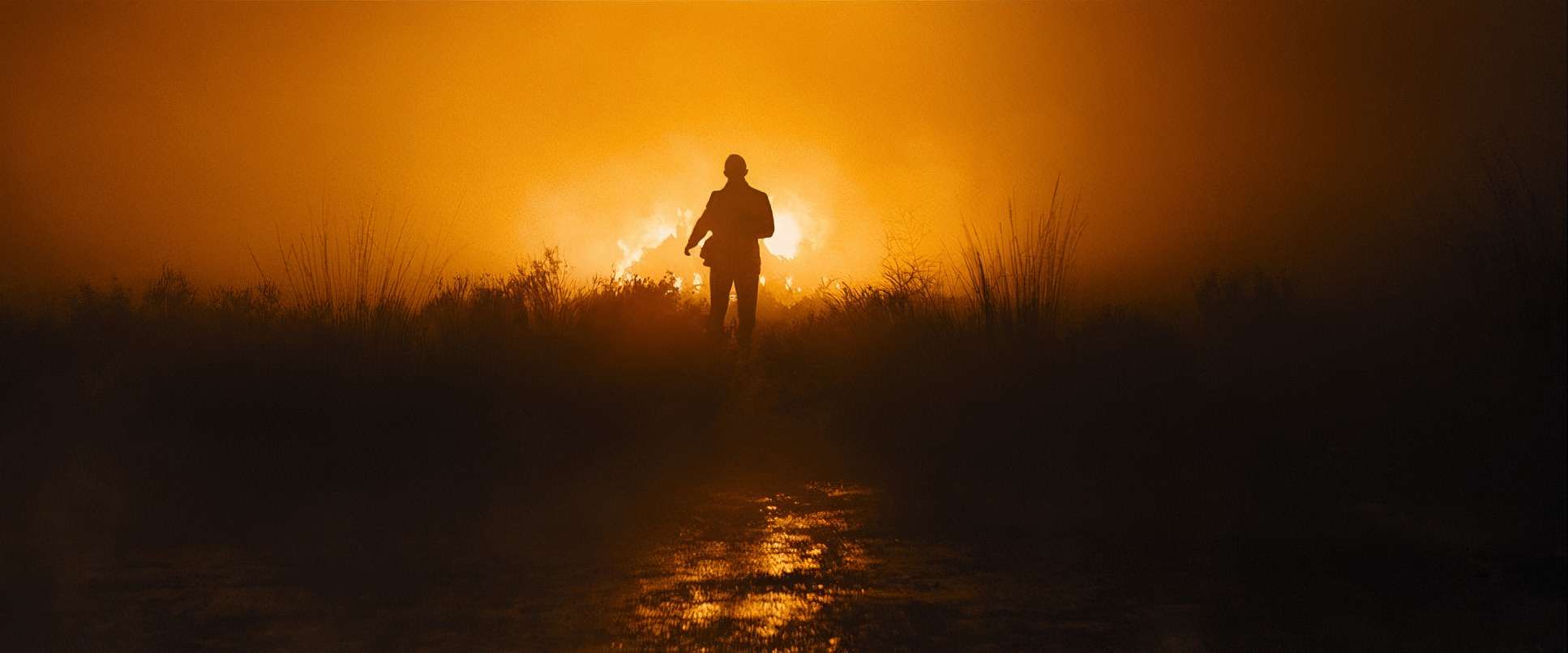
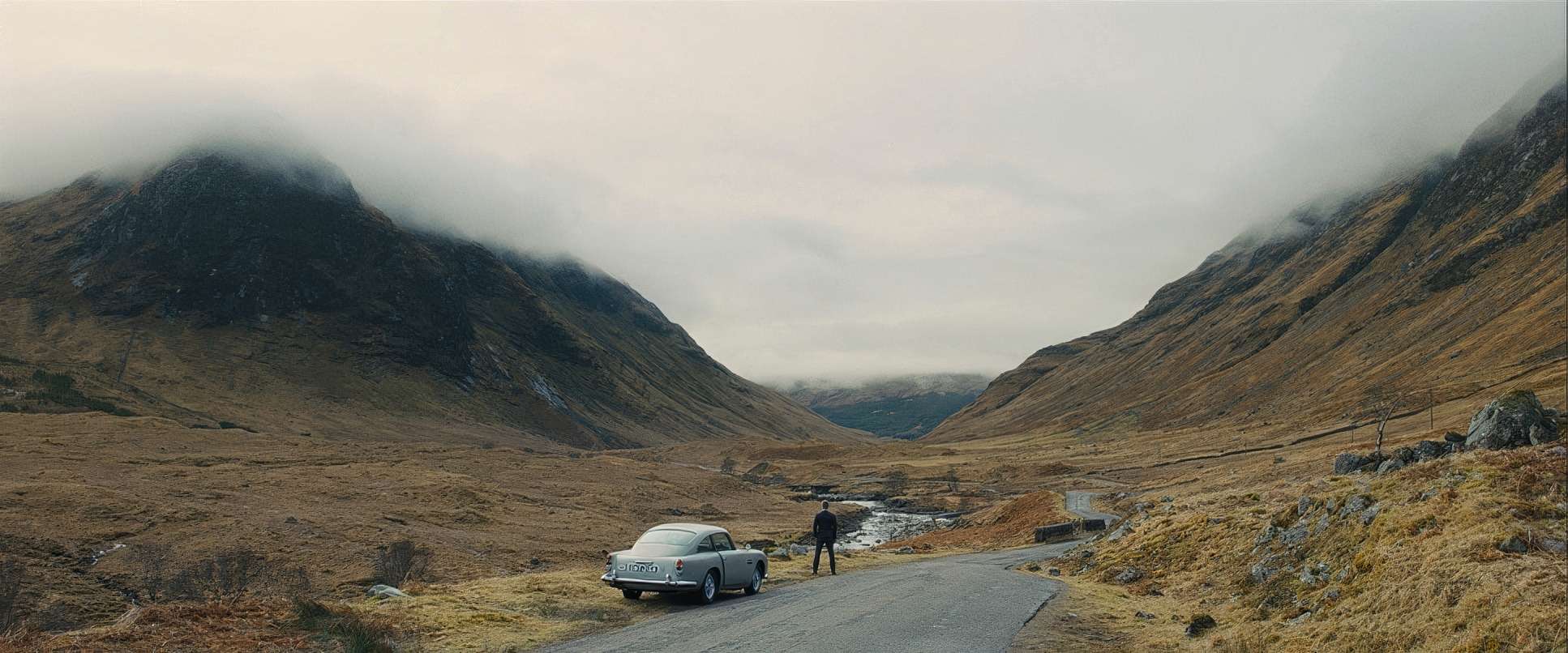
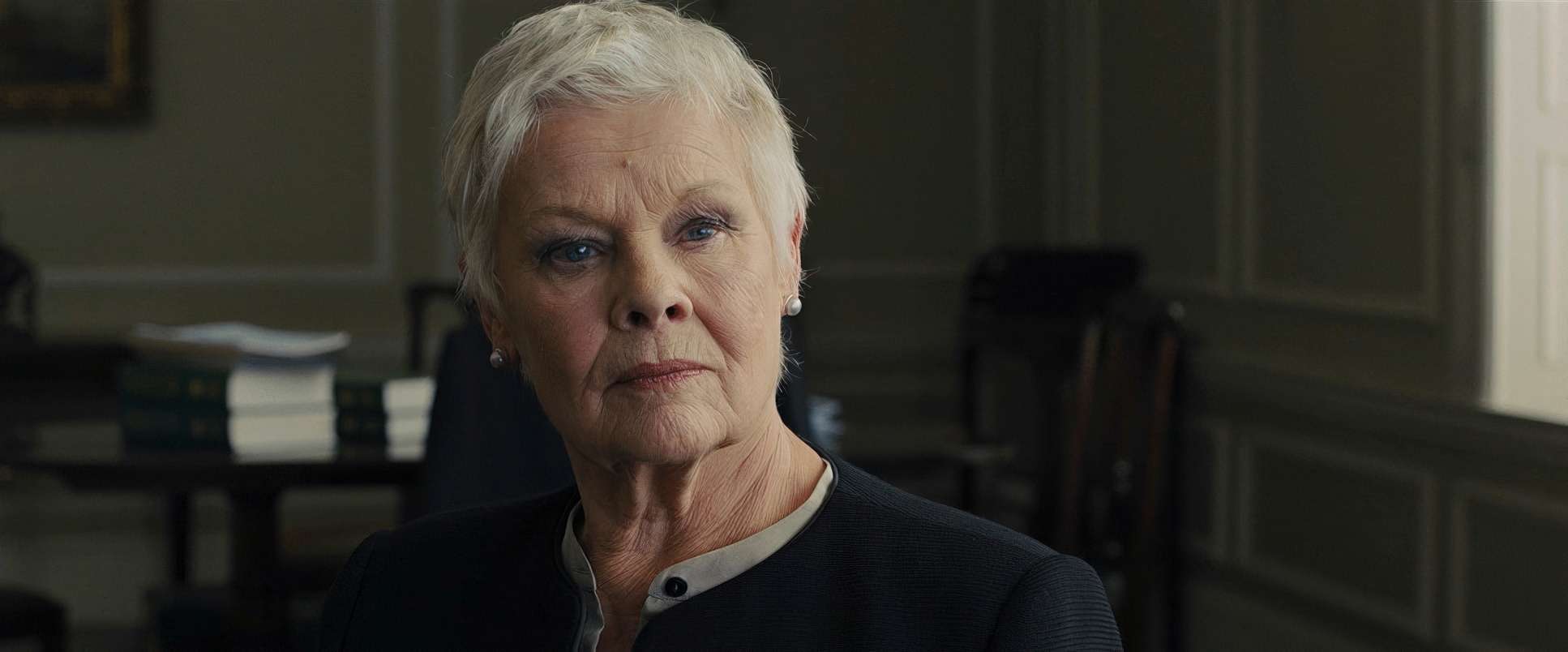
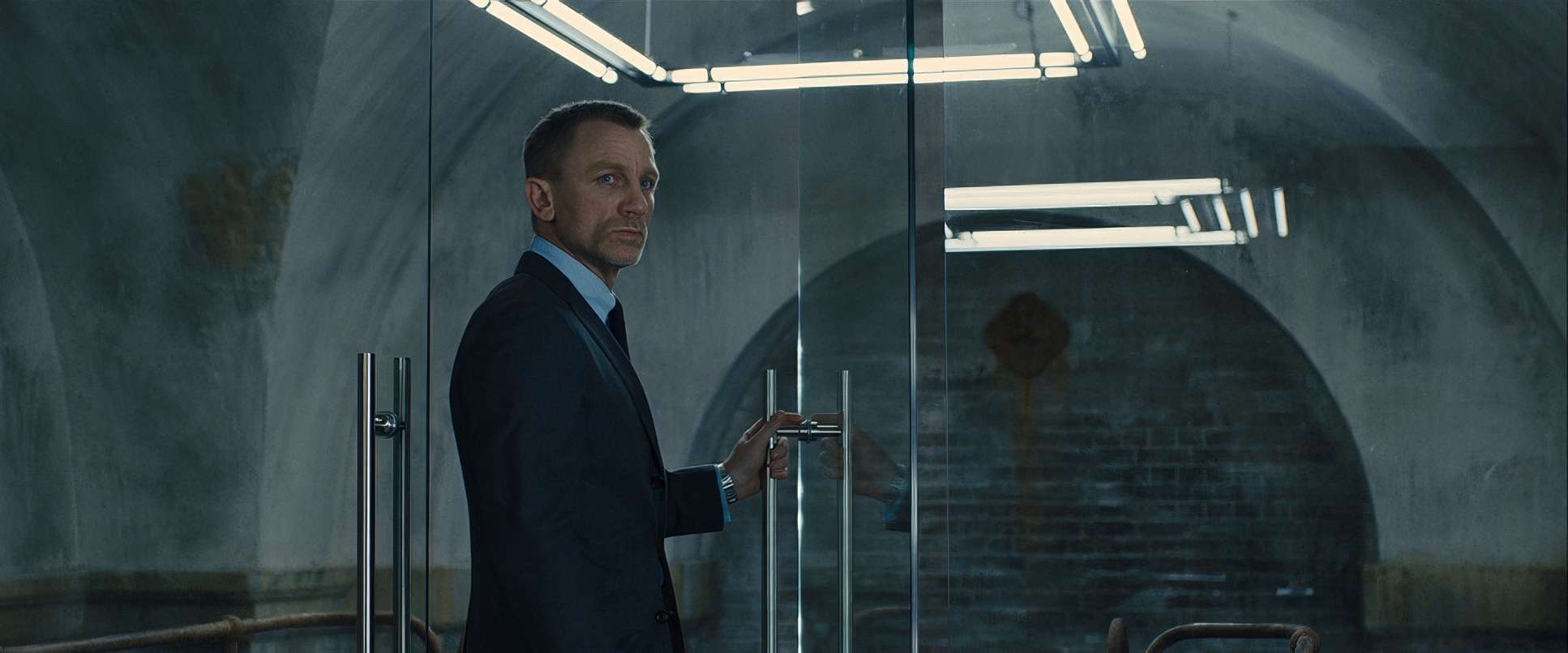
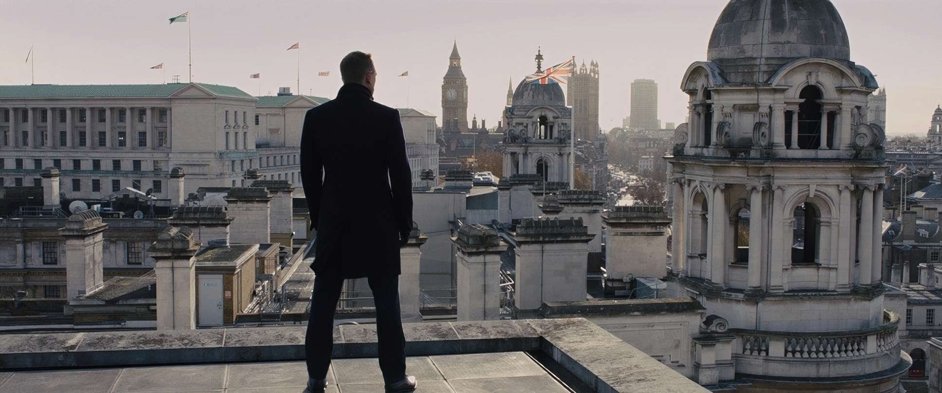
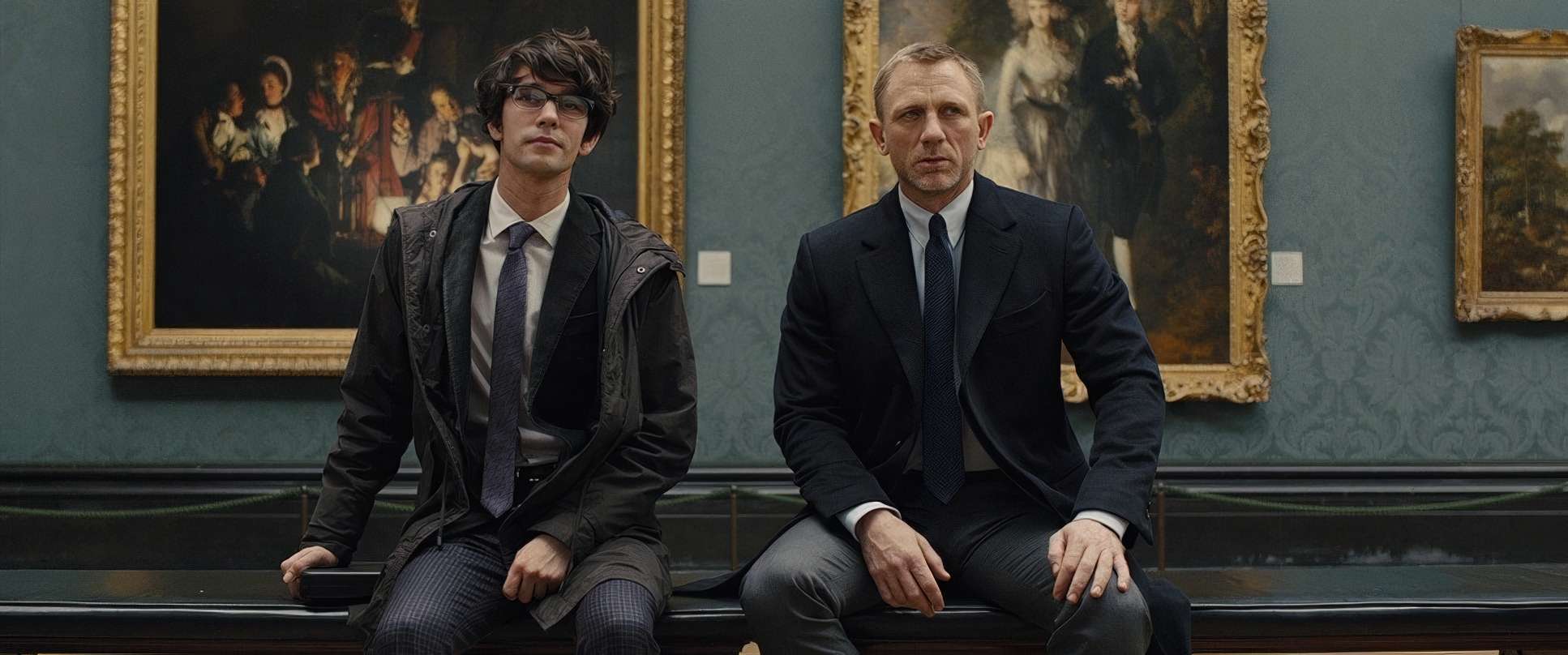
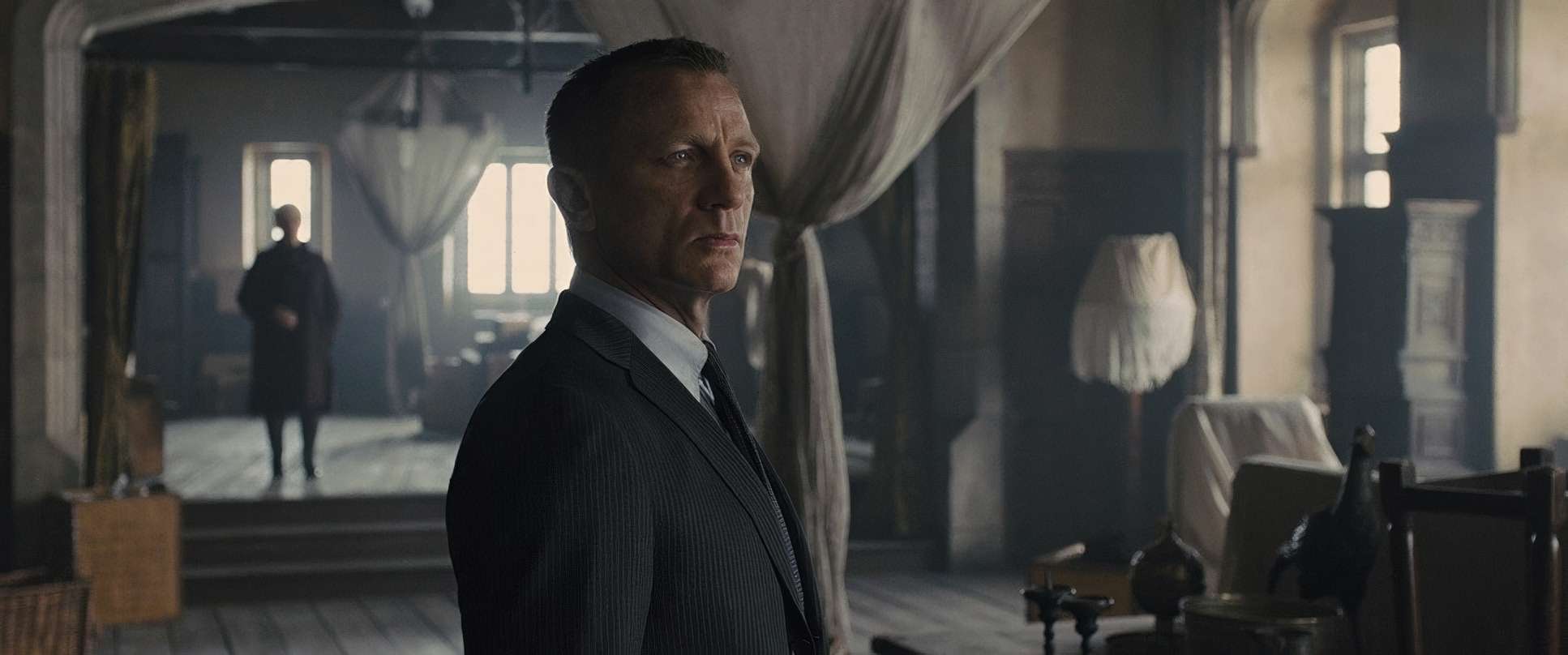
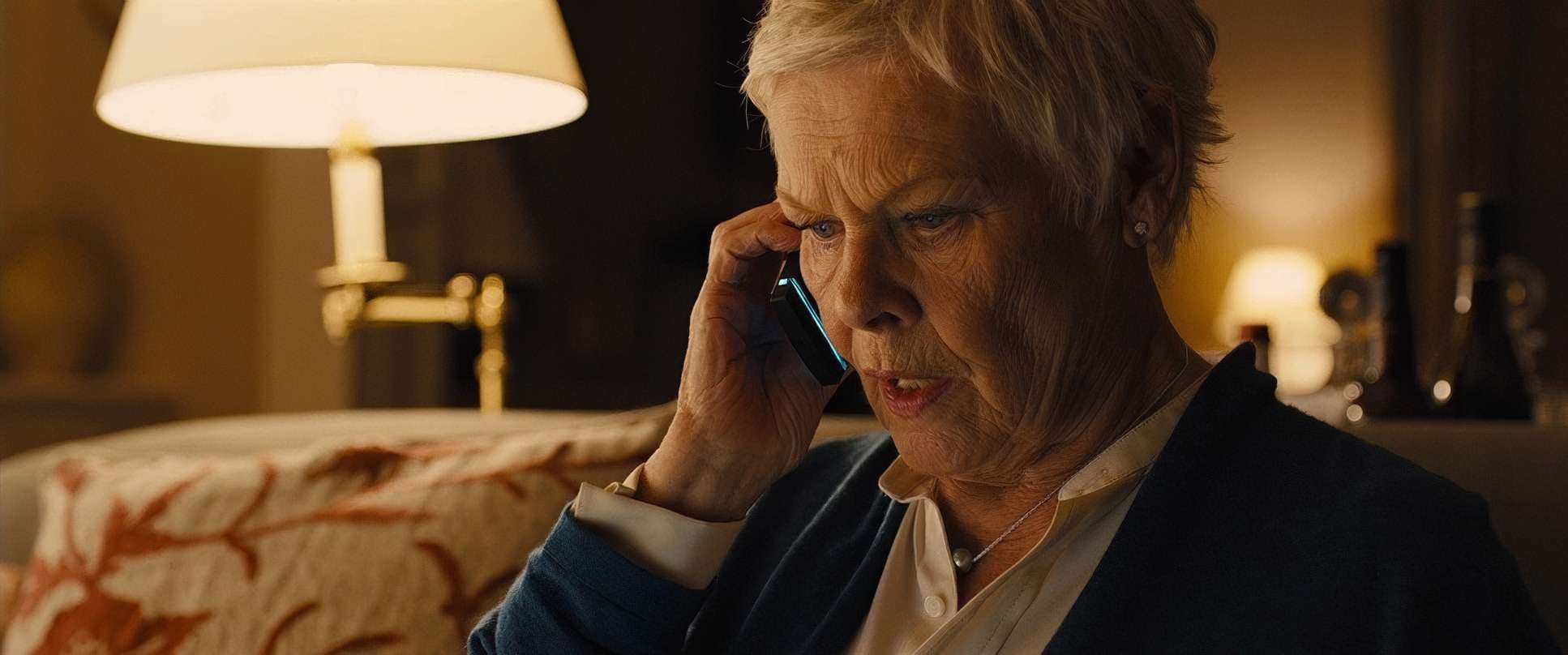
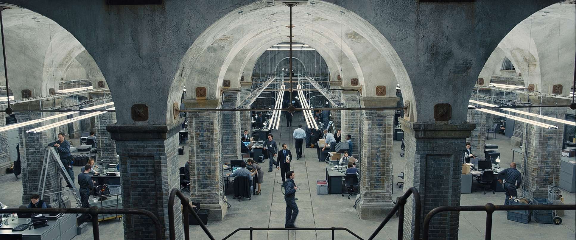
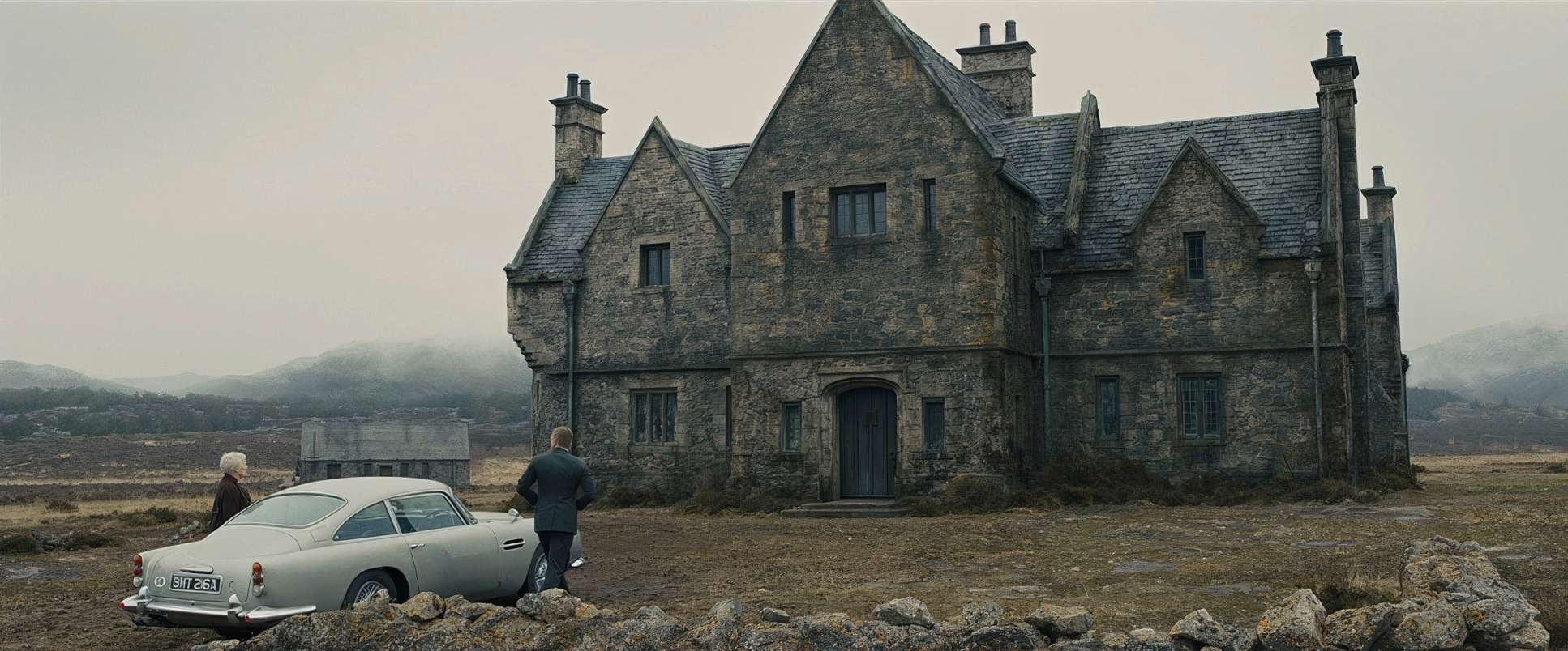
He’s a master of depth cues. He layers the foreground and background to guide your eye exactly where it needs to go, whether we’re in the claustrophobic underground bunkers of MI6 or the sprawling, ancient Skyfall Estate. Characters are positioned to highlight power dynamics; M is often framed by the imposing weight of her office, while Bond is frequently seen as a small, solitary figure against grand, oppressive landscapes.
Camera Movements: The Power of Restraint
In Skyfall, the camera is rarely ostentatious. It moves with a quiet, purposeful observation. During the Shanghai pursuit, the camera glides with a balletic grace, tracking horizontally with a precision that feels like an elegant dance.
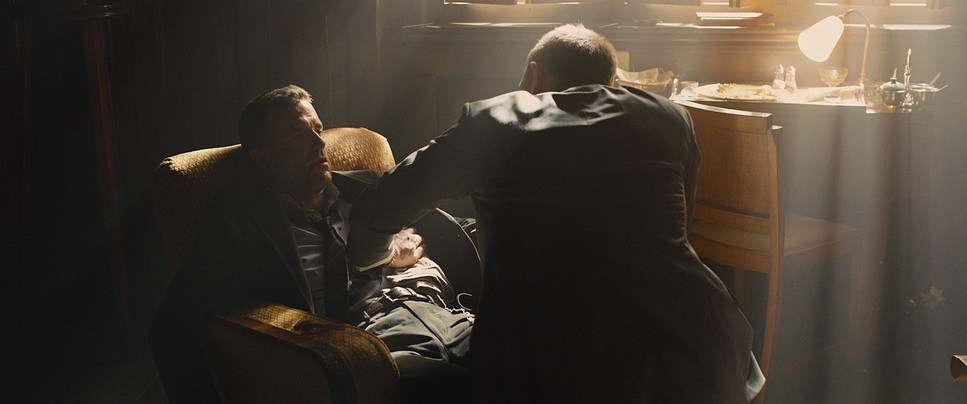
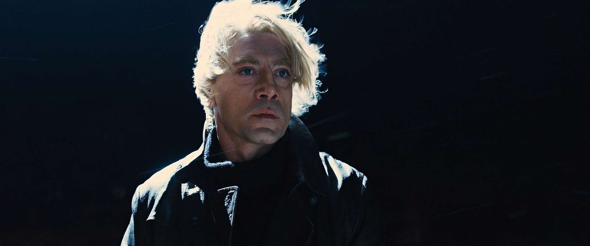
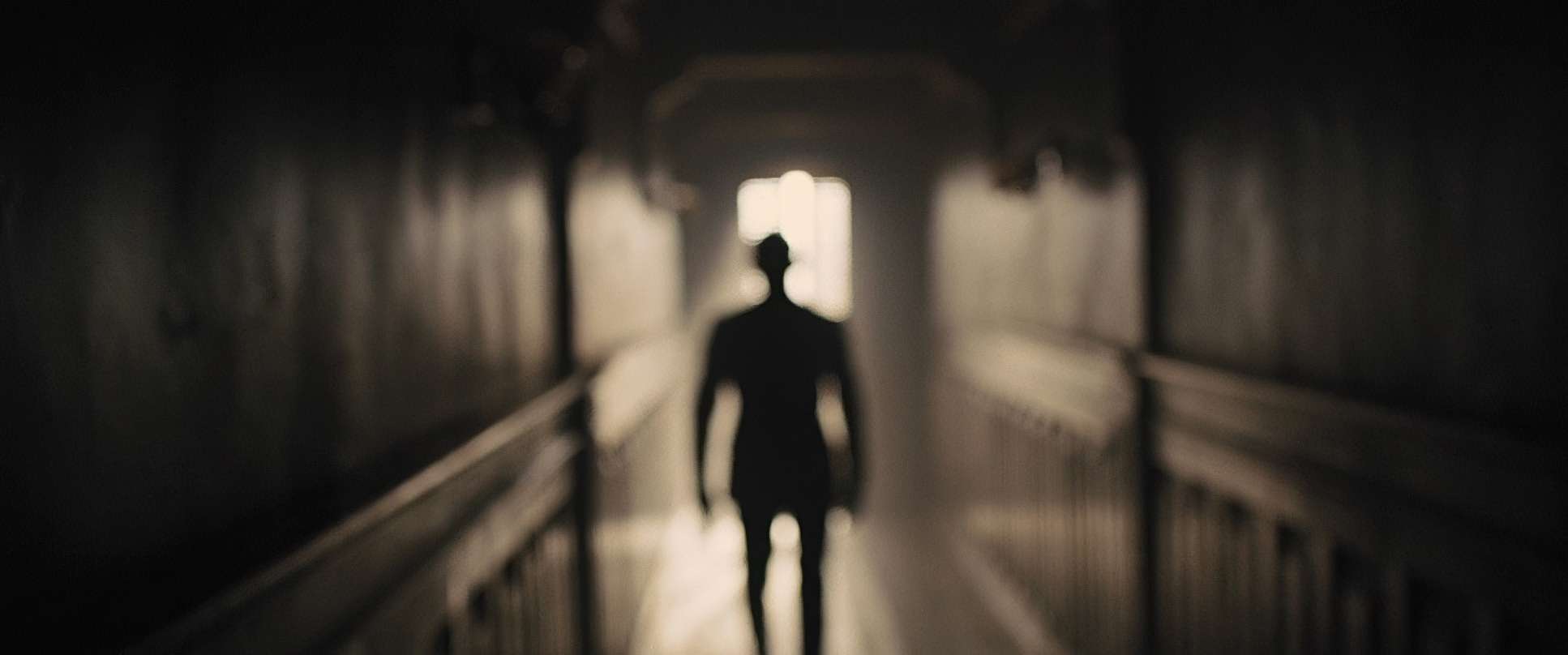
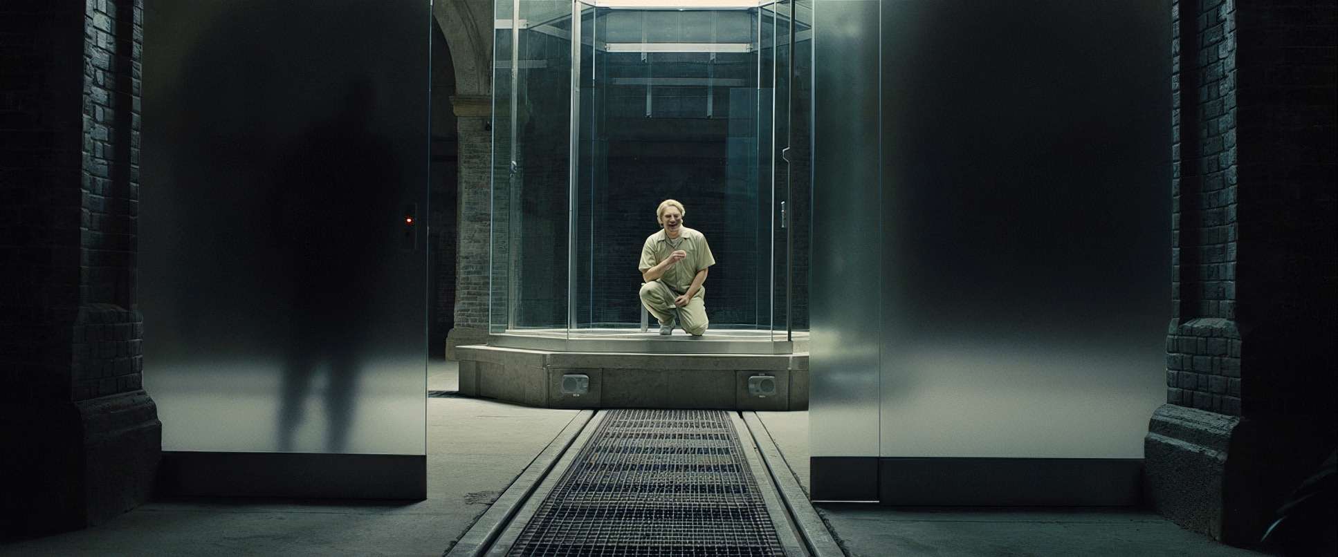
But sometimes, the most powerful move is no move at all. Javier Bardem’s introduction as Silva is the perfect example. It’s one long, static shot of him walking toward the camera, delivering a monologue. No cuts, no “stitching,” just an unblinking gaze. This lack of movement amplifies his unsettling confidence. It dares the audience to look away, but the stillness locks you into his madness. It’s a reminder that sometimes the most effective storytelling device is a tripod.
Lensing and Blocking
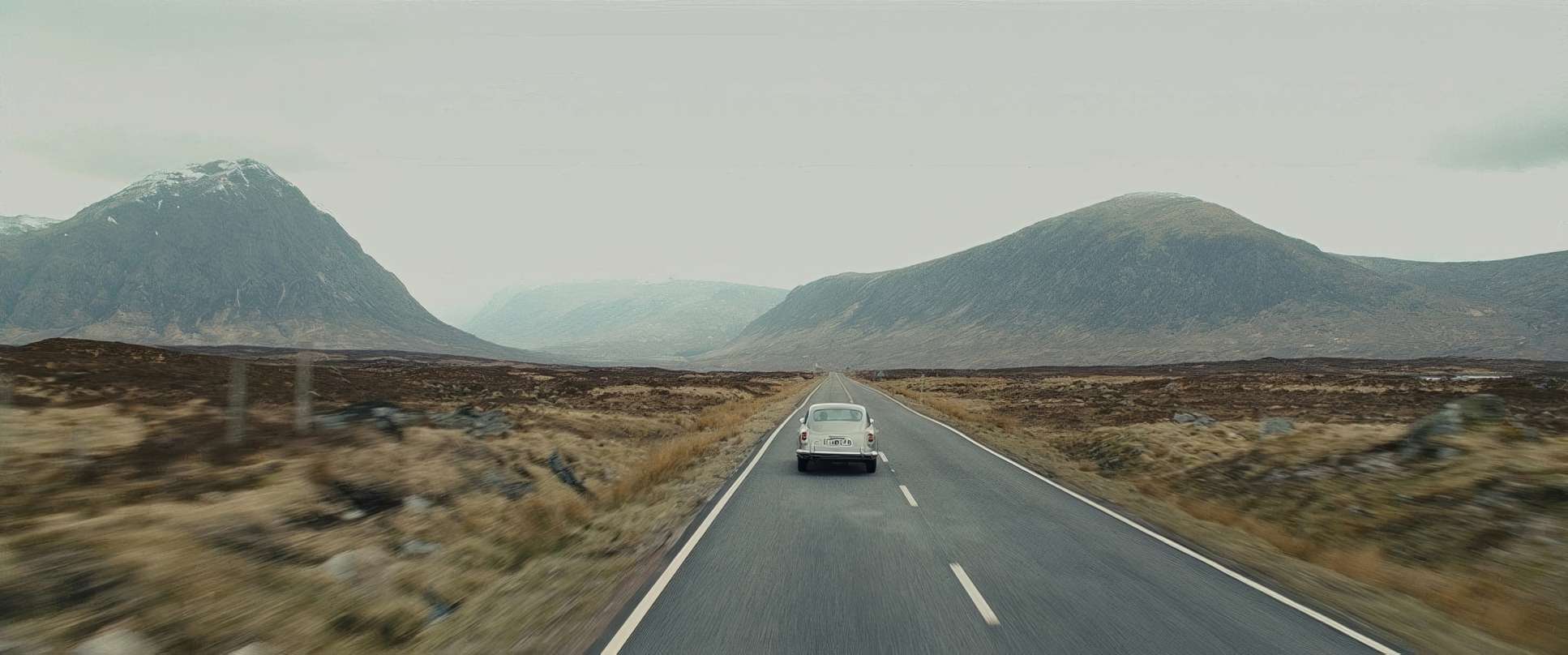
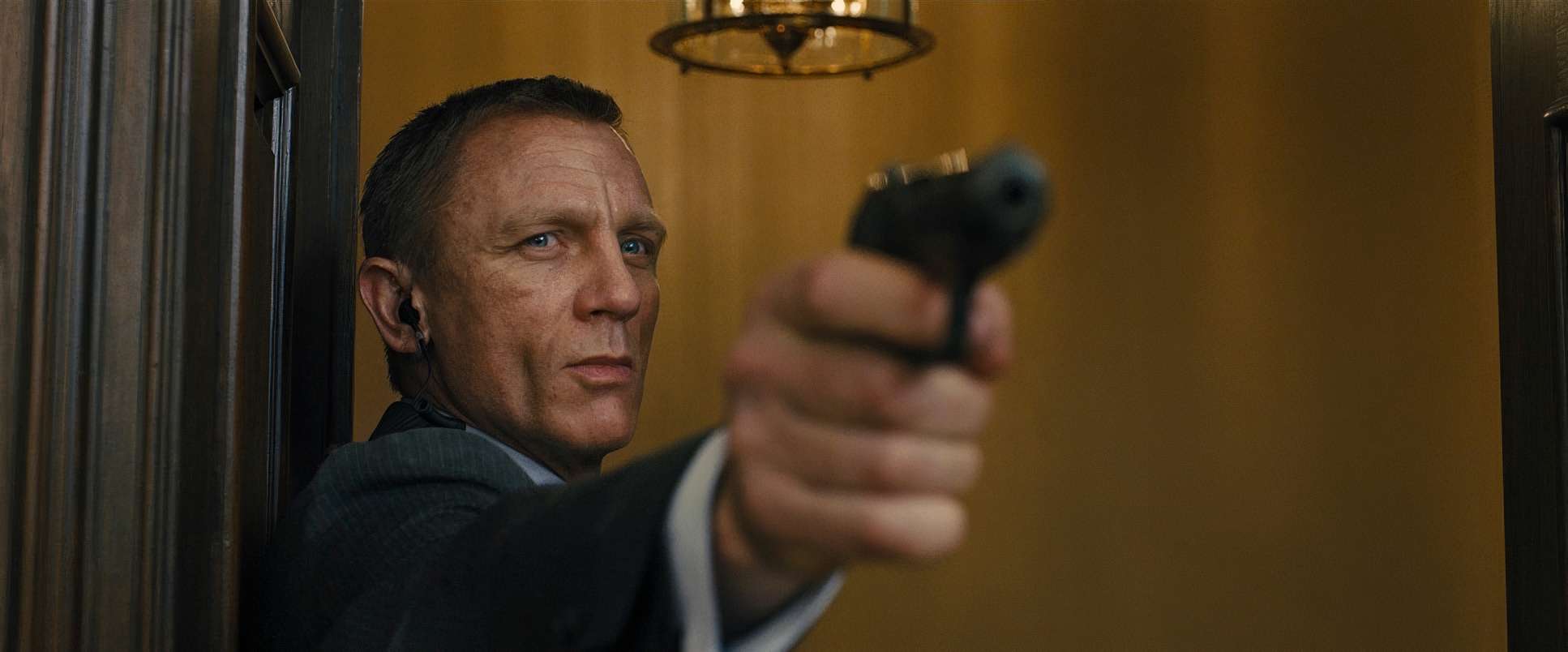
Deakins usually avoids extreme focal lengths that distort the world. He favors wider lenses that allow the environment to breathe, immersing the viewer in the space rather than isolating the subject with heavy telephoto compression. It’s a choice that favors clarity and depth over “fancy” optics.
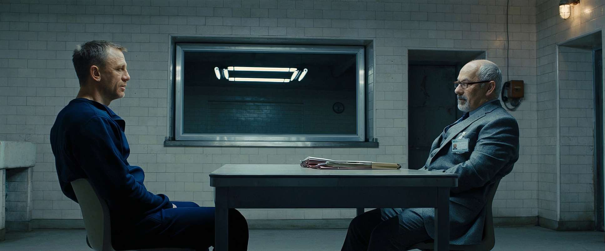
The blocking is equally intentional. The “mother-son” dynamic between Bond and M is told through their spatial relationship. Early on, the blocking suggests distance and subservience; as the film progresses and their bond deepens, the physical intimacy on screen shifts. Even Silva’s theatrical entrance into the interrogation room is a masterclass in blocking he commands the plane of depth, slowly moving from the background to the foreground to establish total dominance over the frame.
Technical Aspects & Tools
Skyfall (2012) — Technical Specifications
| Genre | Action, Adventure, Thriller, Political, Spy |
| Director | Sam Mendes |
| Cinematographer | Roger Deakins |
| Production Designer | Dennis Gassner |
| Costume Designer | Jany Temime |
| Editor | Stuart Baird |
| Colorist | Mitch Paulson |
| Time Period | 2010s |
| Aspect Ratio | 2.39 – Spherical |
| Format | Digital |
| Lighting | Hard light, Side light |
| Lighting Type | Artificial light |
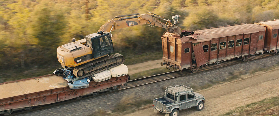
| Story Location | Asia > Turkey |
| Filming Location | Asia > Turkey |
| Camera | ARRI ALEXA 4:3 / plus, ARRI ALEXA Classic / plus, ARRI ALEXA M, RED Epic |
| Lens | Angenieux Optimo Zooms, Zeiss Master Primes |
| Film Stock / Resolution | 2.8K / 2.8K ArriRaw |
For the gear-heads, Skyfall was a landmark for the ARRI Alexa. At the time, it was the definitive proof that digital could finally match the dynamic range and filmic highlight roll-off of 35mm. Shooting on Zeiss Master Primes at a 2.8K resolution provided the perfect balance of sharpness and organic texture.
It’s also worth noting that this was the first Bond film partially formatted for IMAX. While it was shot in a 2.39:1 aspect ratio, expanding the frame for IMAX screens showed a commitment to scale. The synergy between high-end digital acquisition and Deakins’ visual artistry set the benchmark for what a modern blockbuster can be.
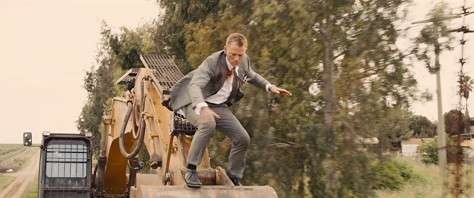
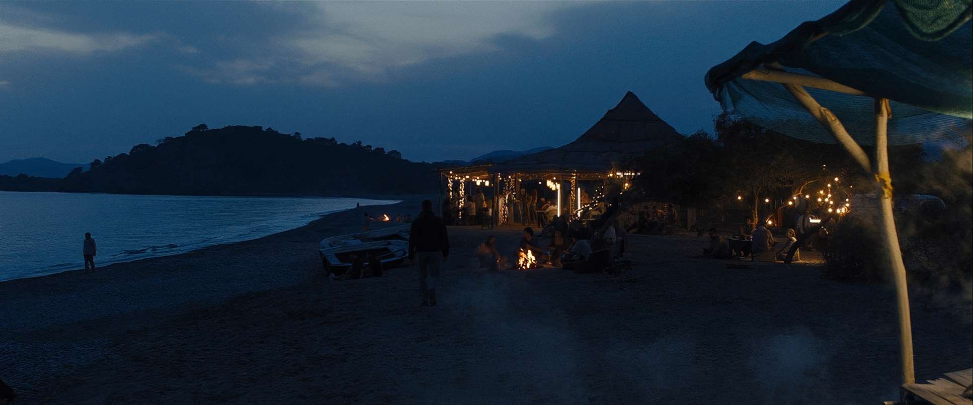
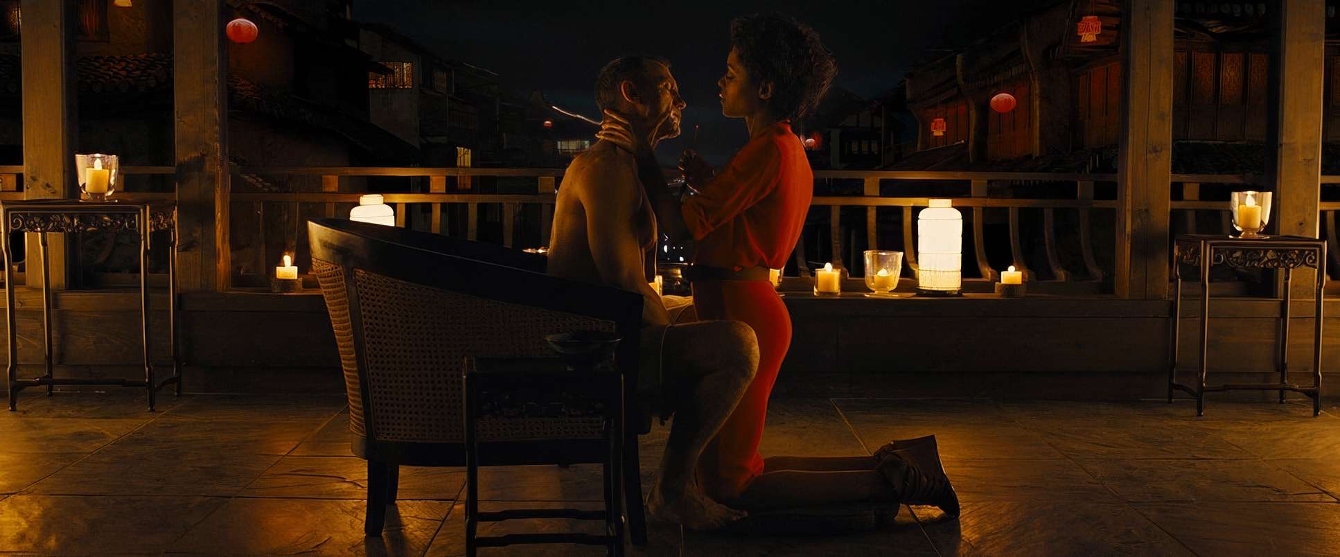
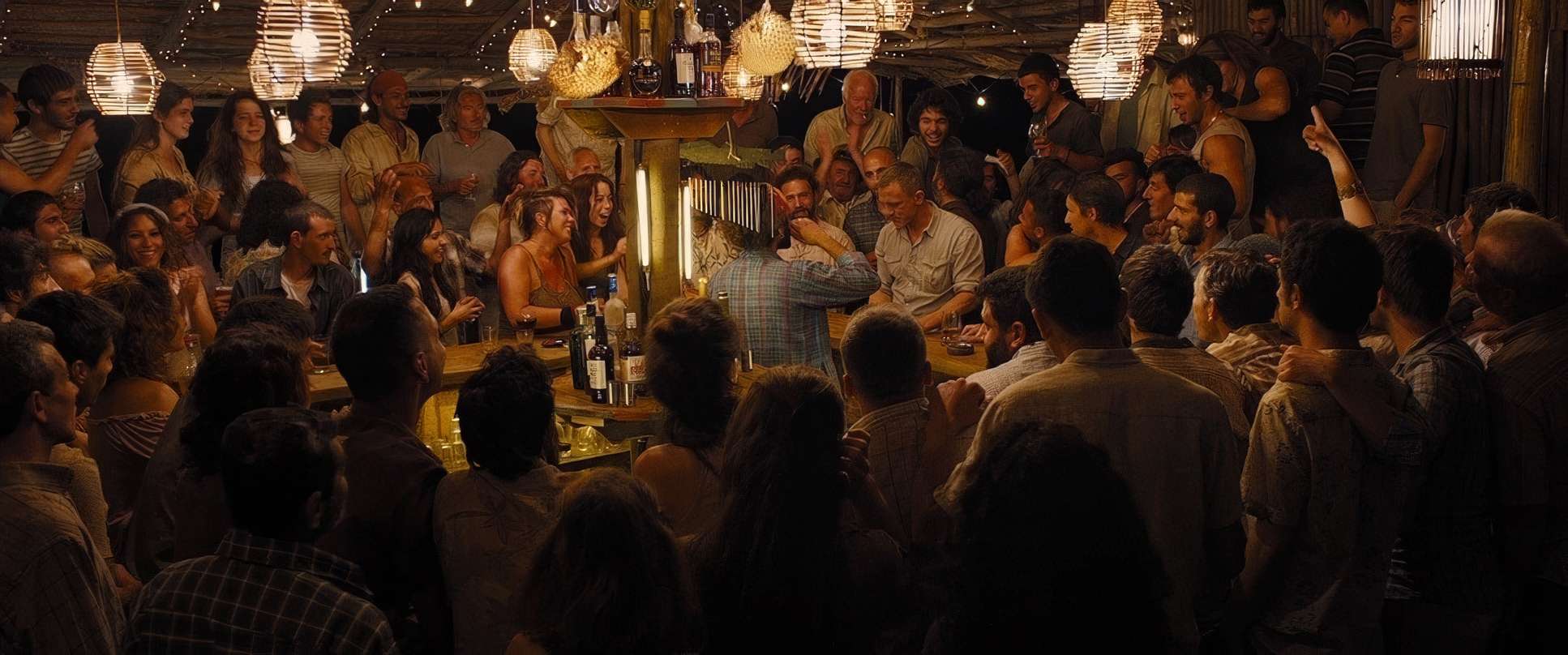
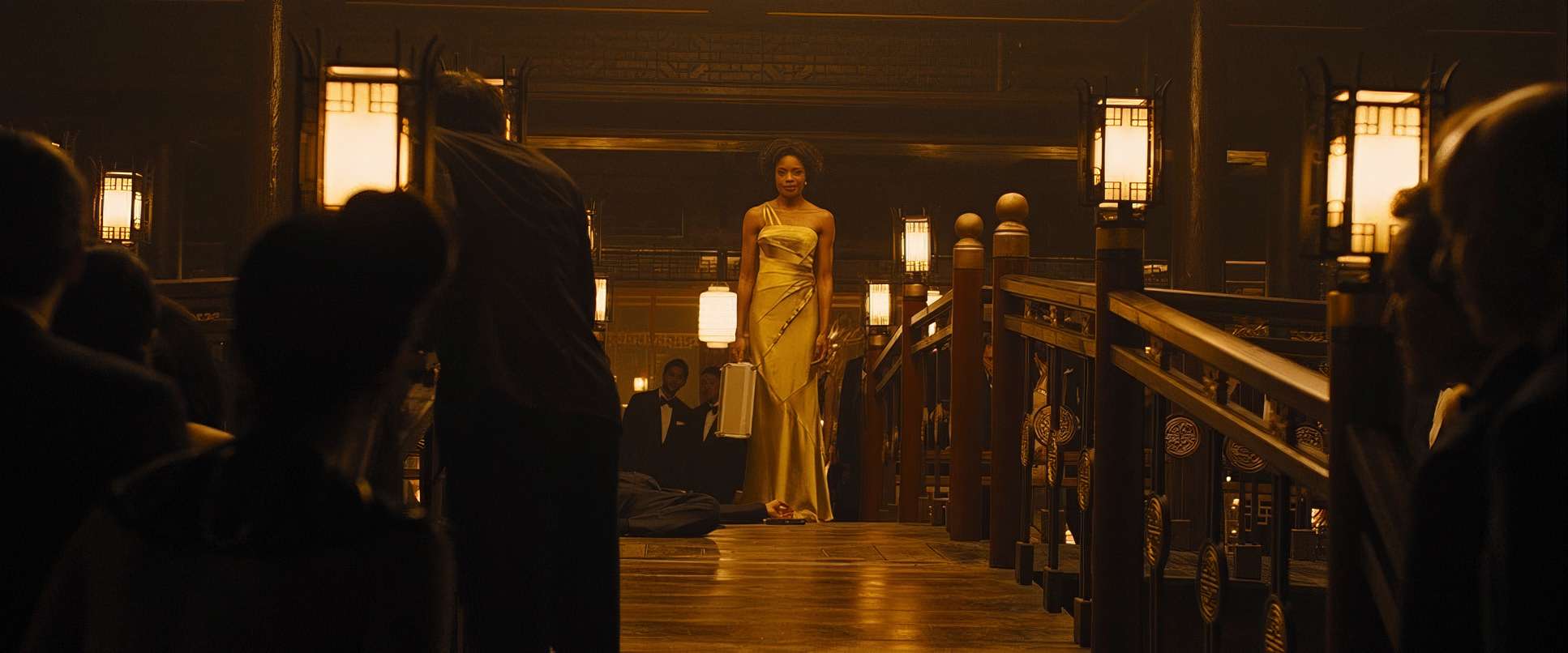
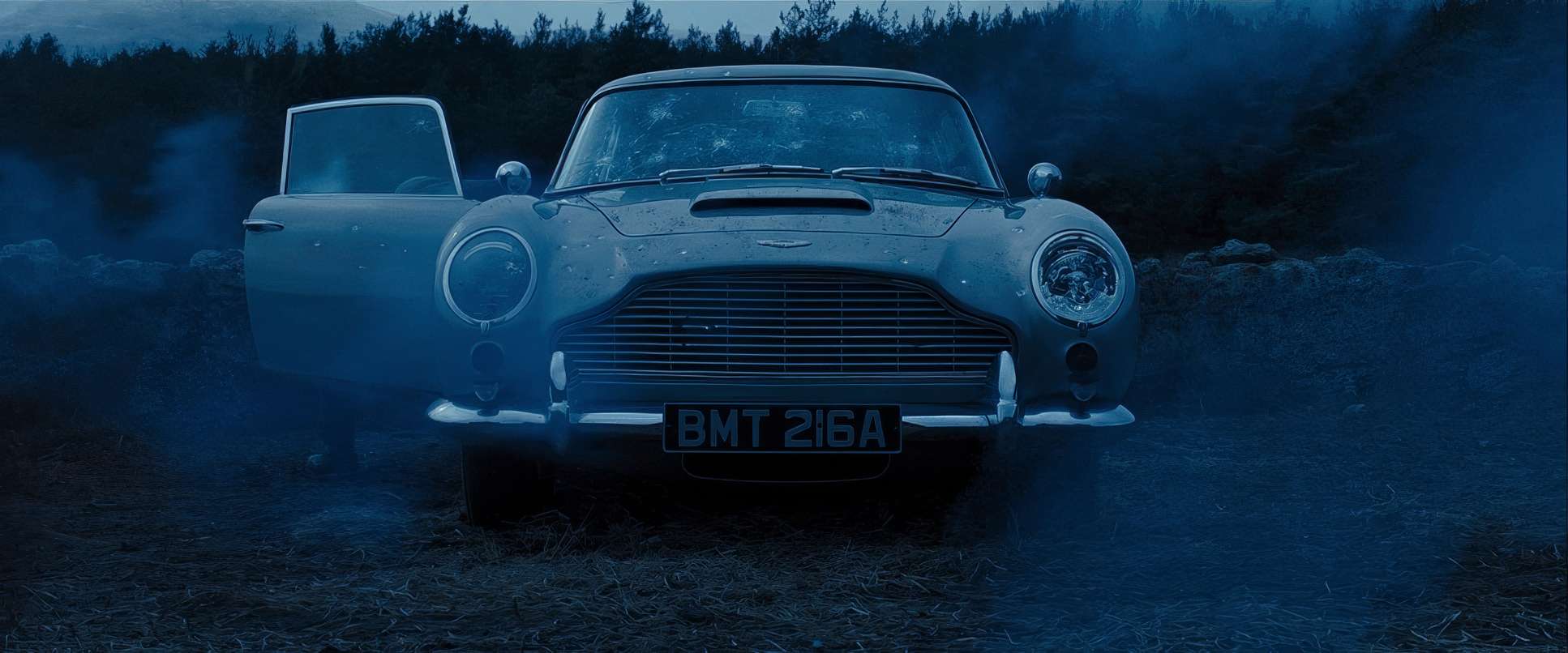
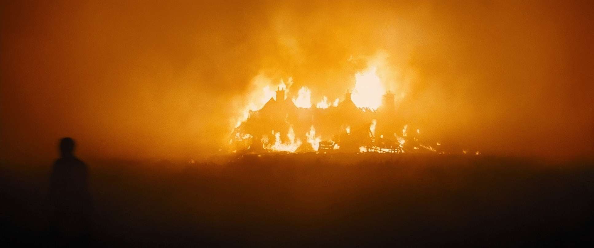
Skyfall (2012) Film Stills
A curated reference archive of cinematography stills from Skyfall (2012). Study the lighting, color grading, and composition.


- Also read: THE SOCIAL NETWORK (2010) – CINEMATOGRAPHY ANALYSIS
- Also read: THE BATMAN (2022) – CINEMATOGRAPHY ANALYSIS
Browse Our Cinematography Analysis Glossary
Explore directors, cinematographers, cameras, lenses, lighting styles, genres, and the visual techniques that shape iconic films.
Explore Glossary →