Captain America: Civil War (2016) is a fascinating case study. It’s not your typical “pretty” superhero movie. It’s gritty, it’s arguably a bit “grey,” and it’s incredibly intentional. The Russo Brothers weren’t looking for a comic book aesthetic here; they were looking for a political thriller aesthetic that just happened to have people in spandex.
About the Cinematographer
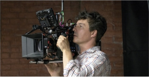
The man behind the lens was Trent Opaloch. If you look at his work across the Winter Soldier and into the Avengersfilms, you see a very specific evolution. Opaloch doesn’t shoot “clean.” He shoots for texture.
His partnership with the Russos works because they both seem to hate the idea of a “perfect” frame. They want the dirt. They want the heroes to look like they’ve been dragged through a parking lot. Opaloch’s sensibility leans toward a certain documentary-style realism that I really respect it’s about making these god-like figures feel like they’re actually standing in a real, physical space.
Inspiration Behind the Cinematography
Civil War had a massive job: it had to be an Avengers sequel while staying true to the ’70s spy thriller vibe of Winter Soldier.
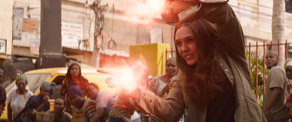
The opening sequence in Lagos tells you everything you need to know about the inspiration. It feels like a war zone. The camera is aggressive, the light is harsh, and the consequences are immediate. The goal wasn’t to make the heroes look “heroic” in the traditional sense; it was to show the mess they leave behind. This “realism-first” approach is what grounds the whole Sokovia Accords plotline. If the movie looked too polished or “poppy,” the weight of the collateral damage wouldn’t have landed. It needed to feel consequential.
Camera Movements
Let’s talk about the “shaky cam.” I know it’s a point of contention for some, but from where I’m sitting, it’s a deliberate narrative tool.
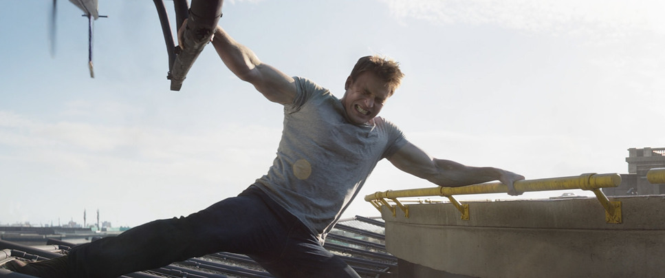
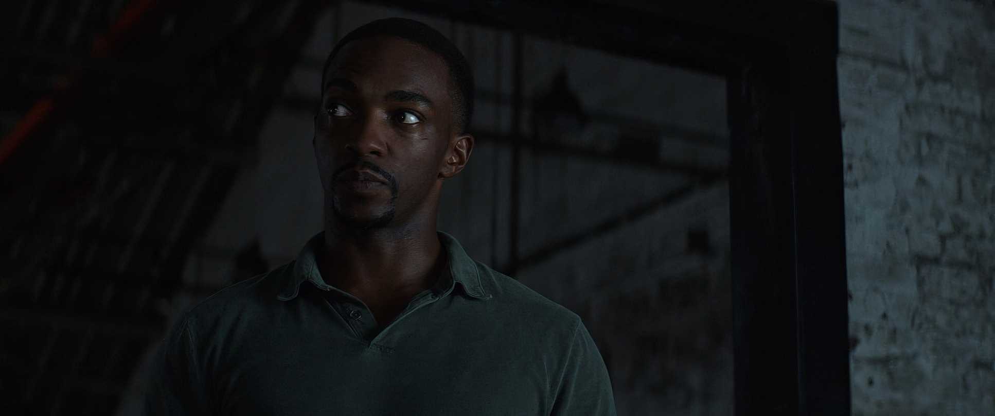
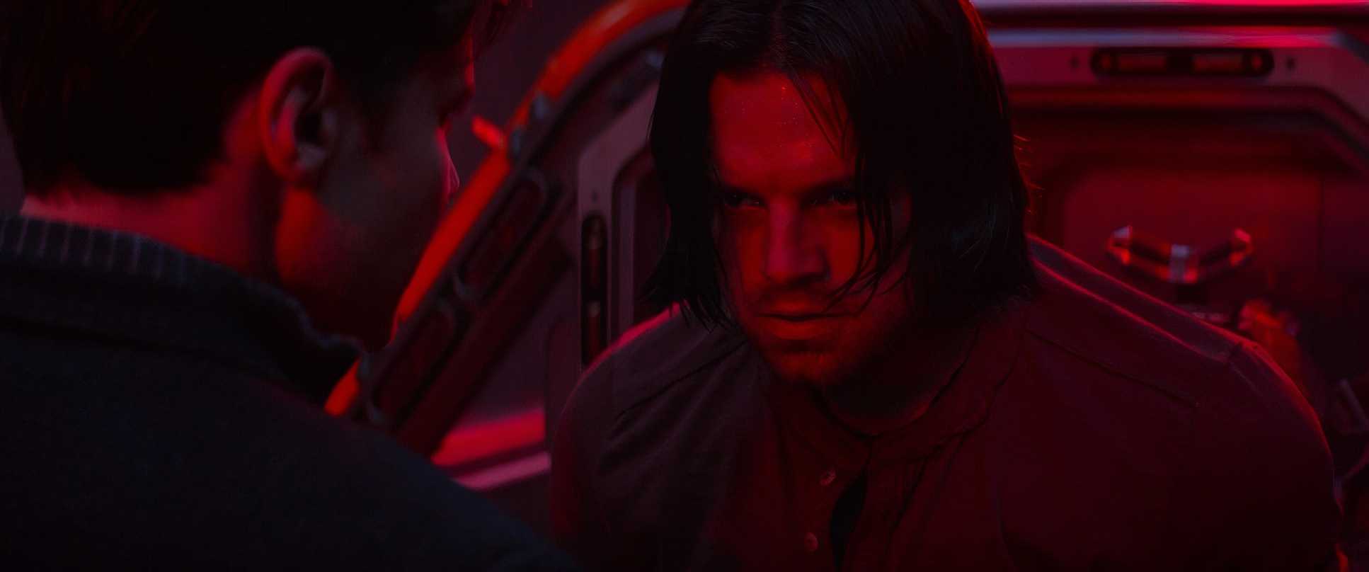
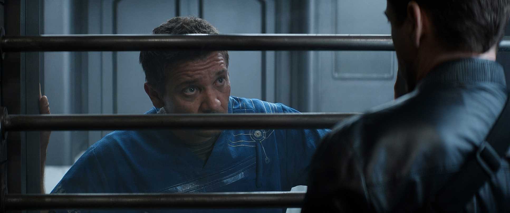
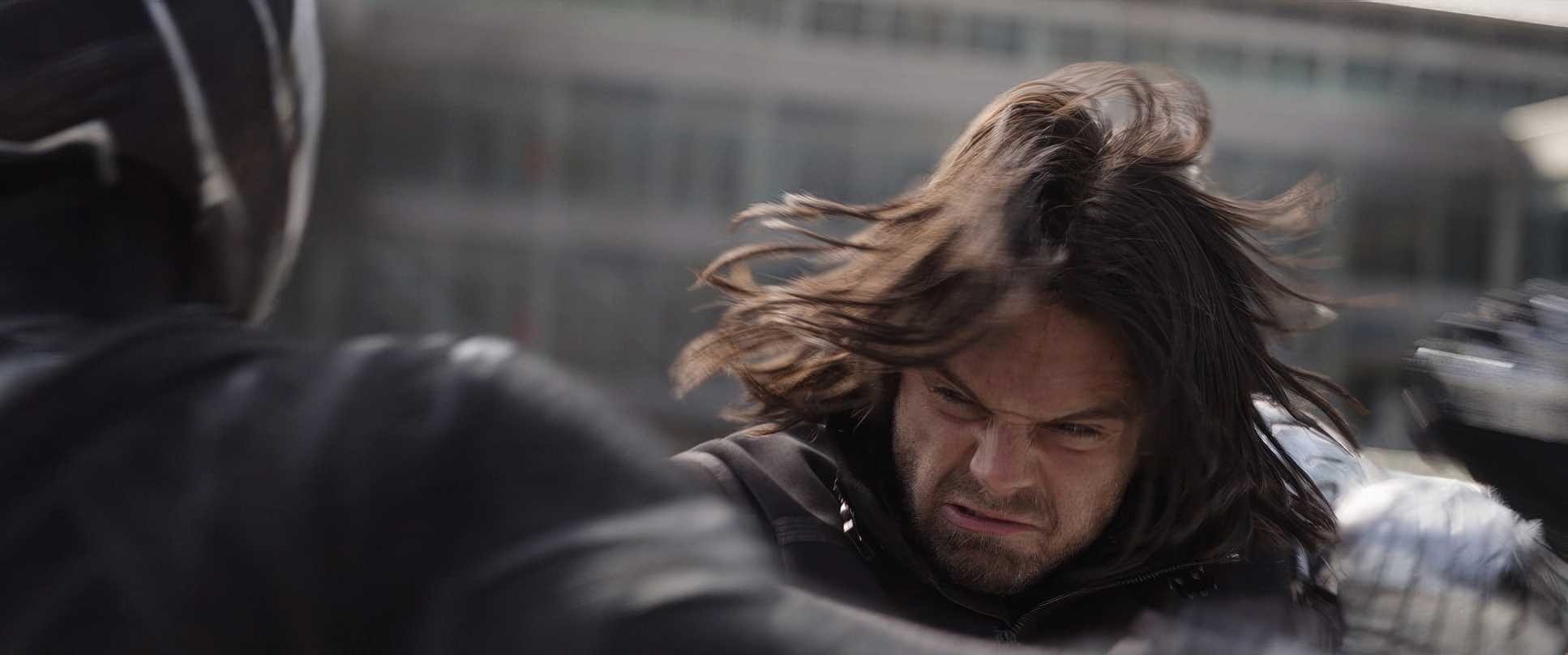
Take the Bucharest chase with Bucky, Steve, and Sam. The camera isn’t just observing; it’s scrambling to keep up. It’s handheld, it’s jostling, and it’s breathing with the characters. It adds a level of anxiety that you just can’t get with a perfectly stabilized Steadicam shot. When the camera drifts or reframes during a tense dialogue scene, it feels like a voyeuristic peek into a private argument. It bridges that gap between a “big Marvel movie” and an intimate character study.
Lensing and Blocking
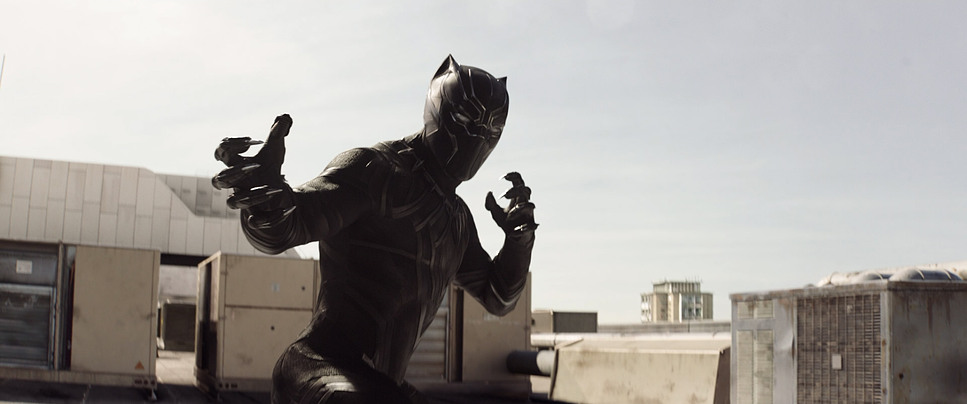
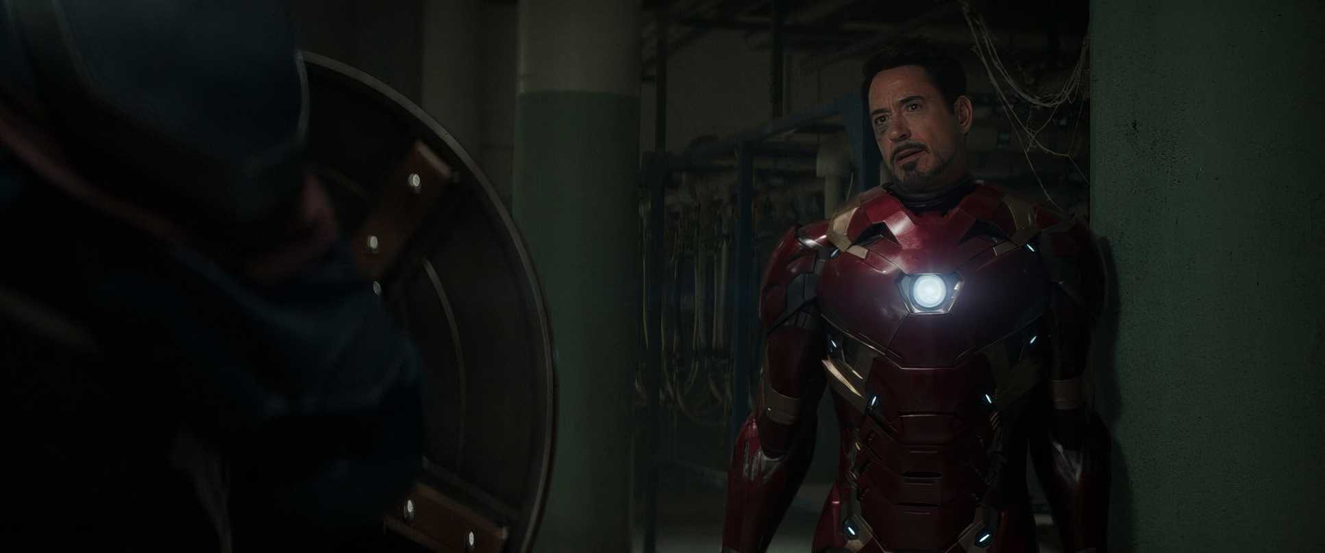
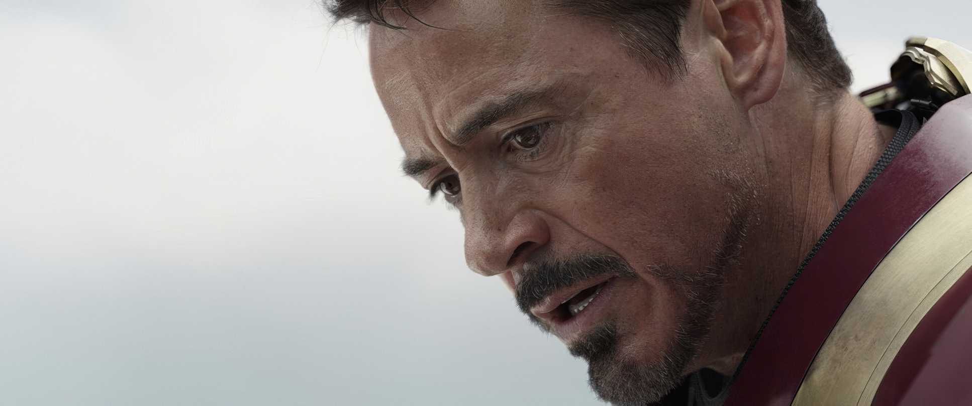
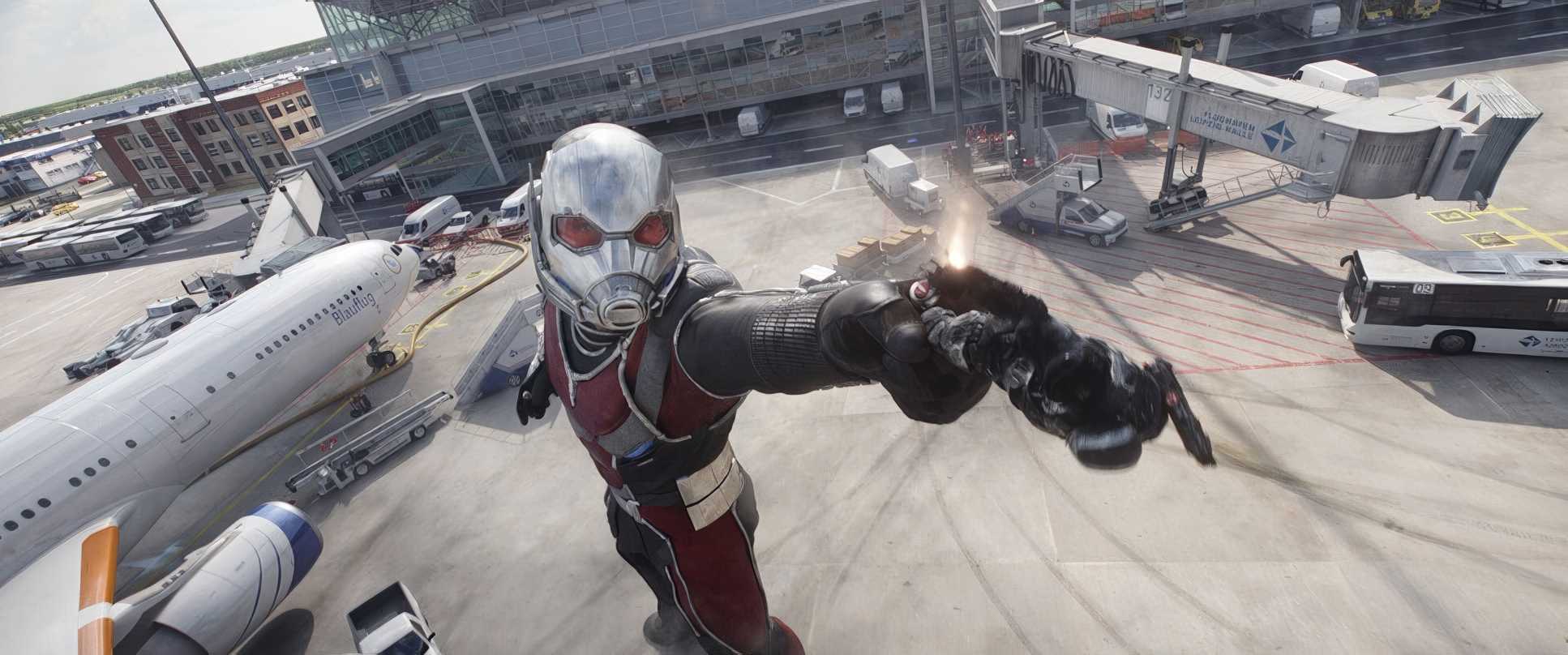
This is where things get technically interesting. For the massive airport battle, they brought out the ARRI ALEXA 65. As a colorist, I love the data that comes off that sensor. The resolution and the shallow depth of field allow you to maintain clarity even when you have twelve different heroes clashing in one frame.
The blocking is genius because it’s basically a game of “visual lines.” You always know who is on which side because of how they are physically arrayed against each other. The “royal rumble” moment isn’t just a mess of CGI; it’s deep staging at its best. You’ve got layers of action happening at different distances from the lens, making the whole environment feel three-dimensional.
Lighting Style
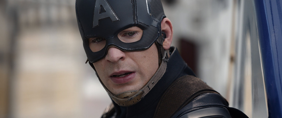
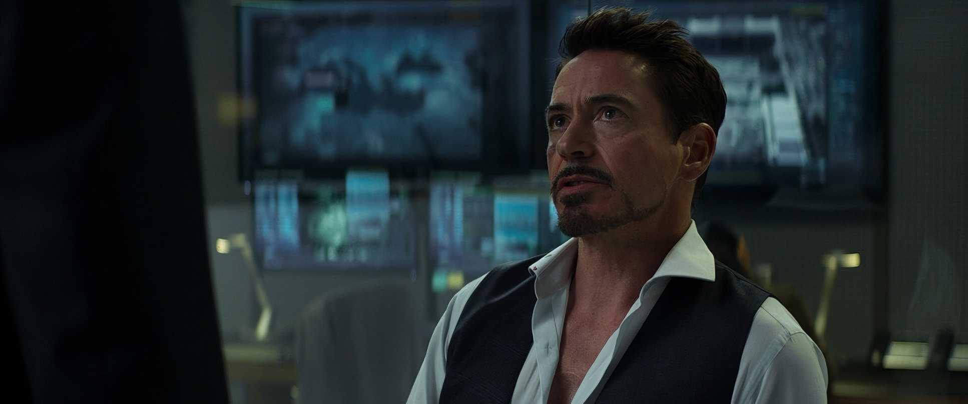
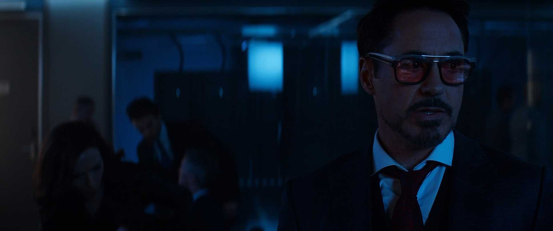
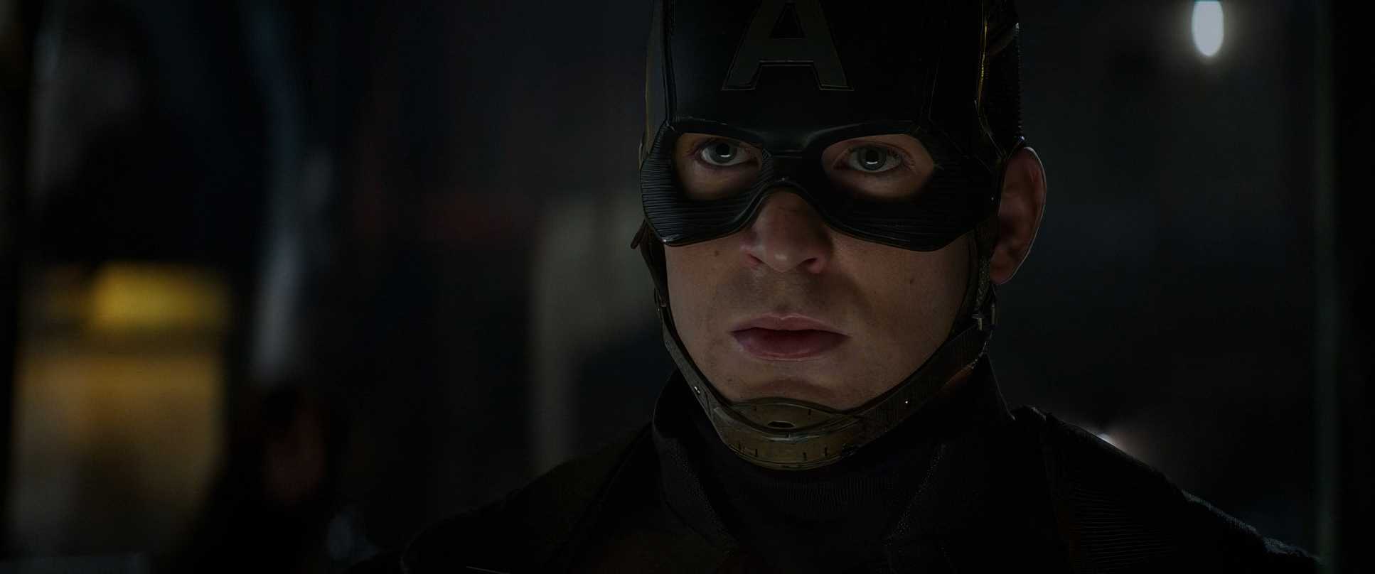
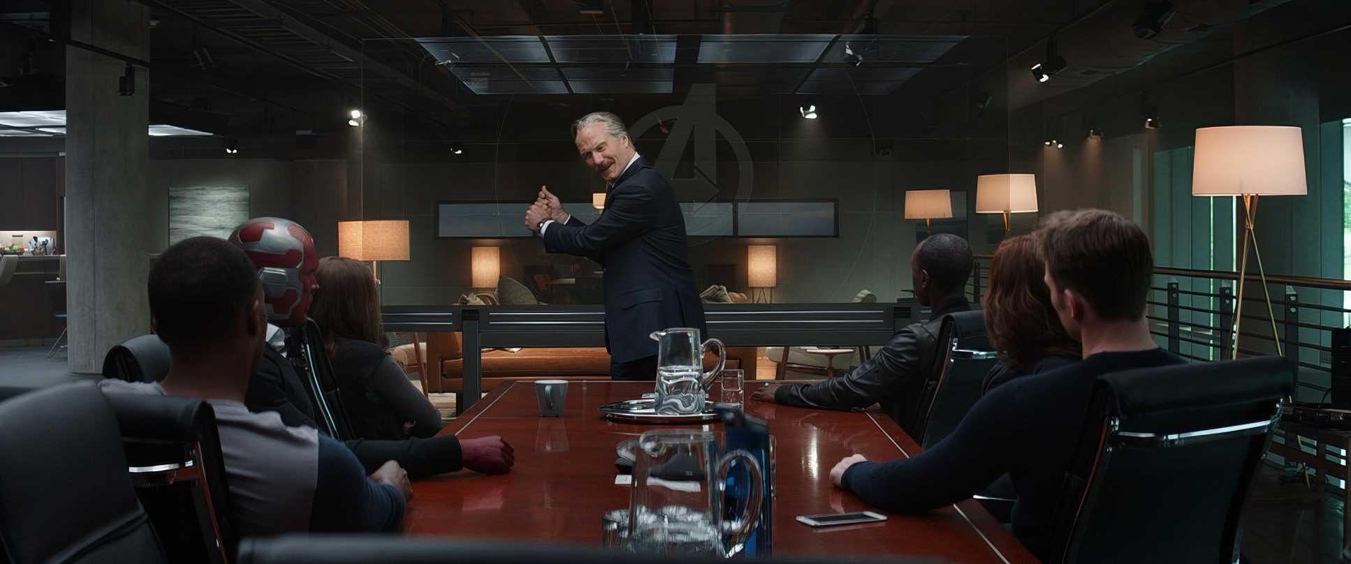
Opaloch leans heavily into motivated, naturalistic lighting. You don’t see those “beauty lights” on the actors’ faces here. Instead, you get the harsh, unforgiving African sun in Lagos or the clinical, oppressive overheads of the government buildings.
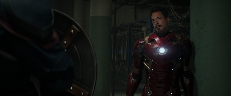
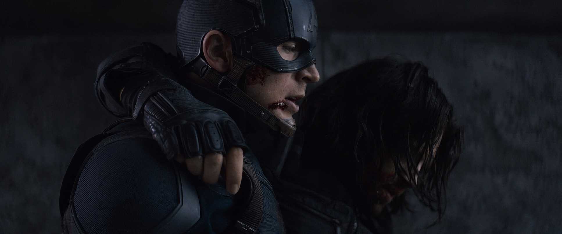
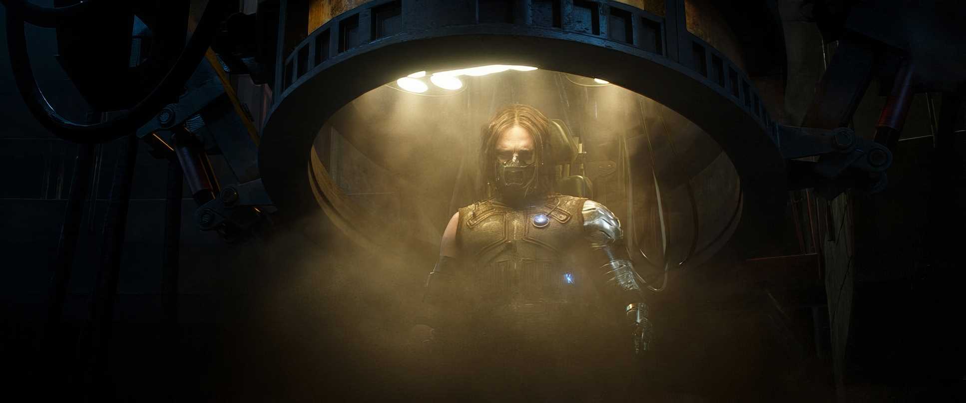
By the time we get to the Siberian bunker, the lighting becomes almost primal. It’s shadowy, cold, and dark. This is where the ALEXA XT’s dynamic range really shines. Even in those deep, underexposed corners of the bunker, there’s enough “clay” in the shadows for a colorist to pull out detail without the image falling apart into digital noise. It makes the final fight feel brutal and claustrophobic.
Color Grading Approach
Okay, let’s get into the “grey soup” controversy. A lot of people complained that Civil War looked washed out. But as a colorist, I see it as controlled desaturation.
- Tonal Sculpting: We aren’t looking at a flat image. The contrast is actually quite sophisticated. The highlights have a beautiful, film-like roll-off that avoids that “stinging” digital look.
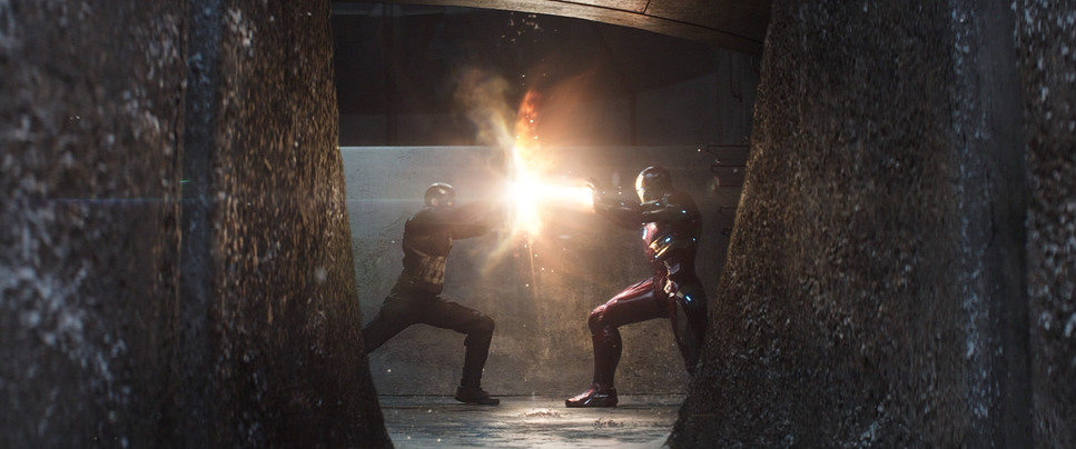
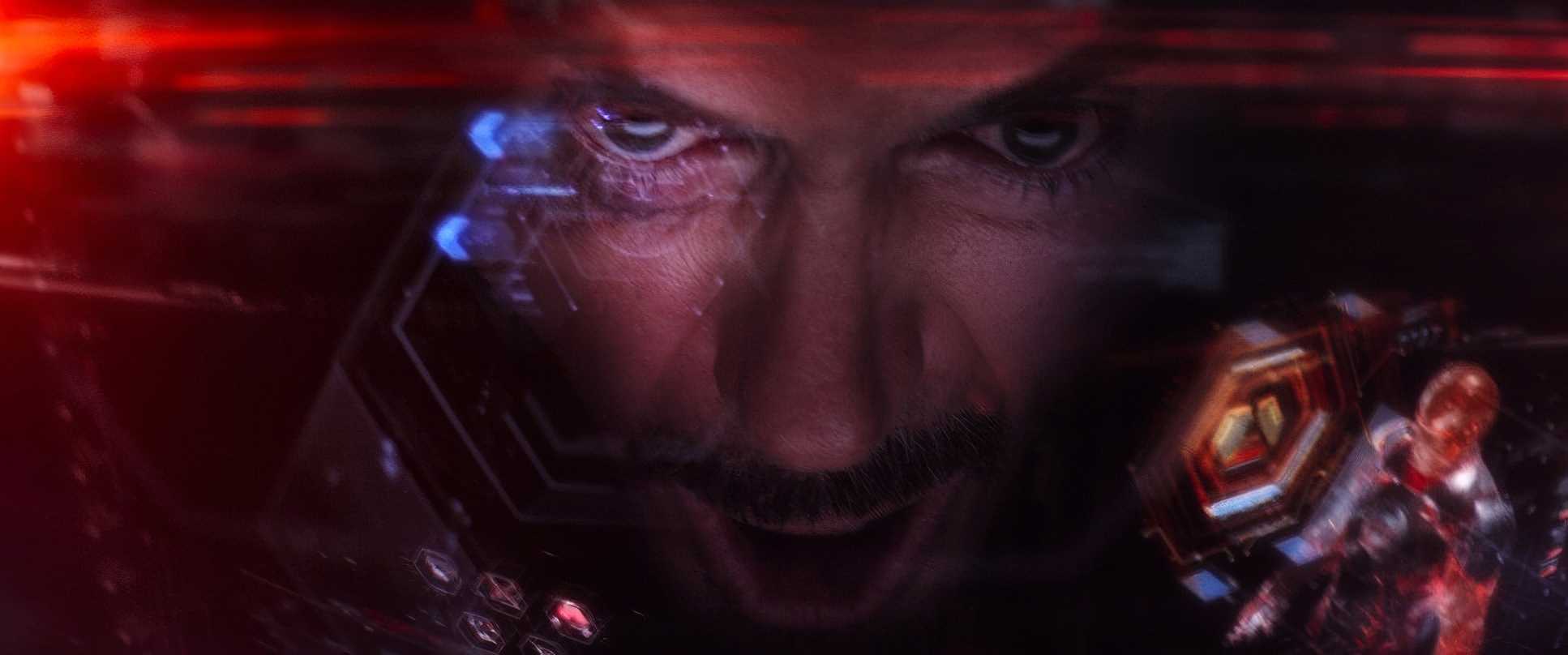
- Selective Hue Separation: Look closely at Cap’s blue or Iron Man’s red. They aren’t “loud,” but they are preserved. They pop just enough against the muted, desaturated backgrounds to keep the frame from becoming a total monochrome mess.
- The “Print” Look: There’s a definite lean toward cyan in the shadows, especially in the metallic interiors. It gives the film a steely, tactile weight. It’s not “pretty,” but it feels expensive and substantial, like a traditional photochemical process.
Compositional Choices
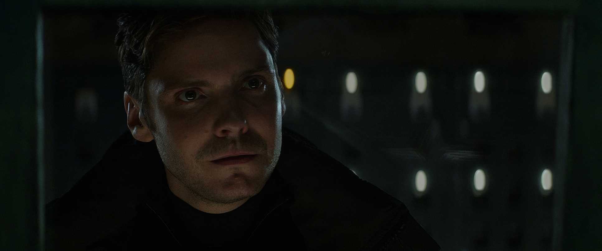
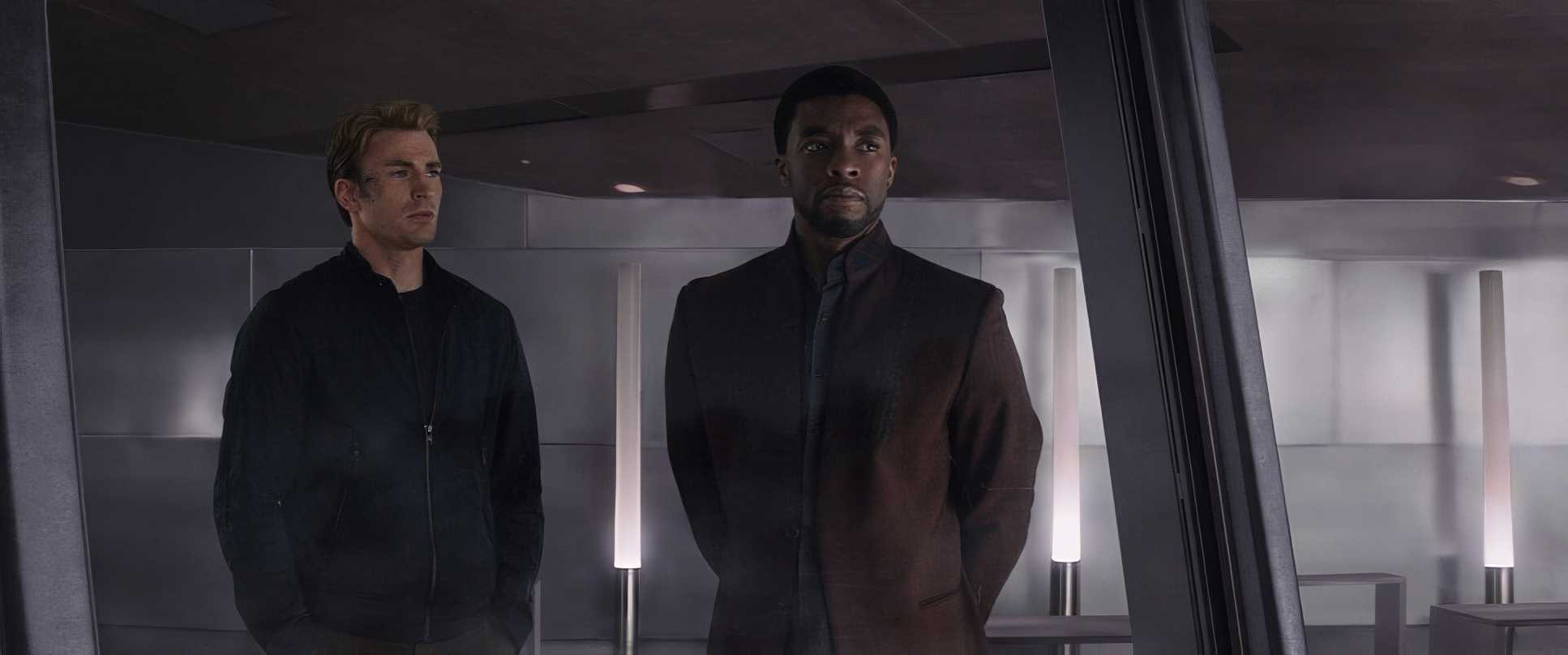
Opaloch uses the frame to tell you who’s winning the emotional war. In the airport scene, he uses wide compositions to show the scale of the fracture. But in Siberia, it’s all about isolation.
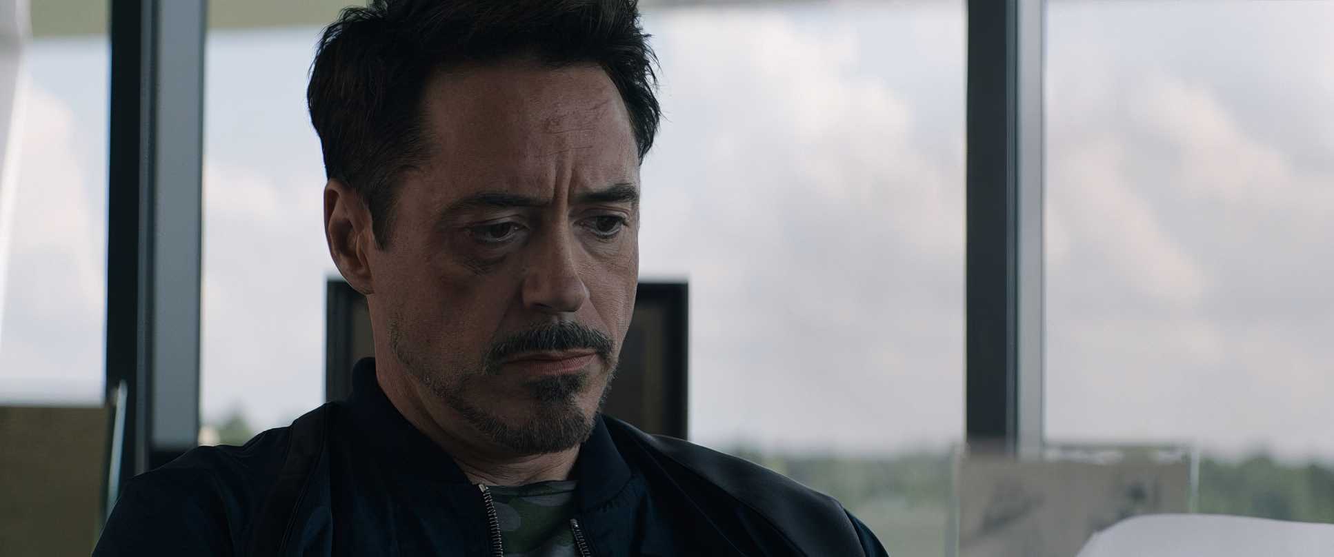
When Tony watches the footage of his parents, the framing is incredibly tight. He’s isolated in the frame, surrounded by negative space that emphasizes his betrayal. It’s a masterclass in using the arrangement of elements to externalize internal pain. You don’t need a line of dialogue to know Tony feels alone in that moment; the composition tells you everything.
Technical Aspects & Tools
Captain America: Civil War (2016)
Digital | 2.39:1 | ARRI Alexa 65 & XT
| Genre | Action, Adventure, Science Fiction |
| Director | Anthony Russo, Joe Russo |
| Cinematographer | Trent Opaloch |
| Production Designer | Owen Paterson |
| Costume Designer | Judianna Makovsky |
| Editor | Jeffrey Ford |
| Colorist | Steven J. Scott |
| Time Period | Future |
| Color | White |
| Aspect Ratio | 2.39 |
| Format | Digital |
| Lighting | Soft light |
| Lighting Type | Daylight, Overcast |
| Story Location | Saxony, Schkeuditz |
Technically, the choice of the ARRI ALEXA XT and ALEXA 65 was the backbone of this film’s look. For us in post-production, these cameras provide the ultimate latitude.
Having that much data in the highlights and shadows is what allows for the “gritty” grade without making the movie look “cheap.” The ALEXA 65, specifically, gives those grand exterior shots a level of fidelity that makes the CG-heavy airport battle feel like it was actually shot in-camera. It’s that high-fidelity capture that allows the stunts and the grade to blend seamlessly.
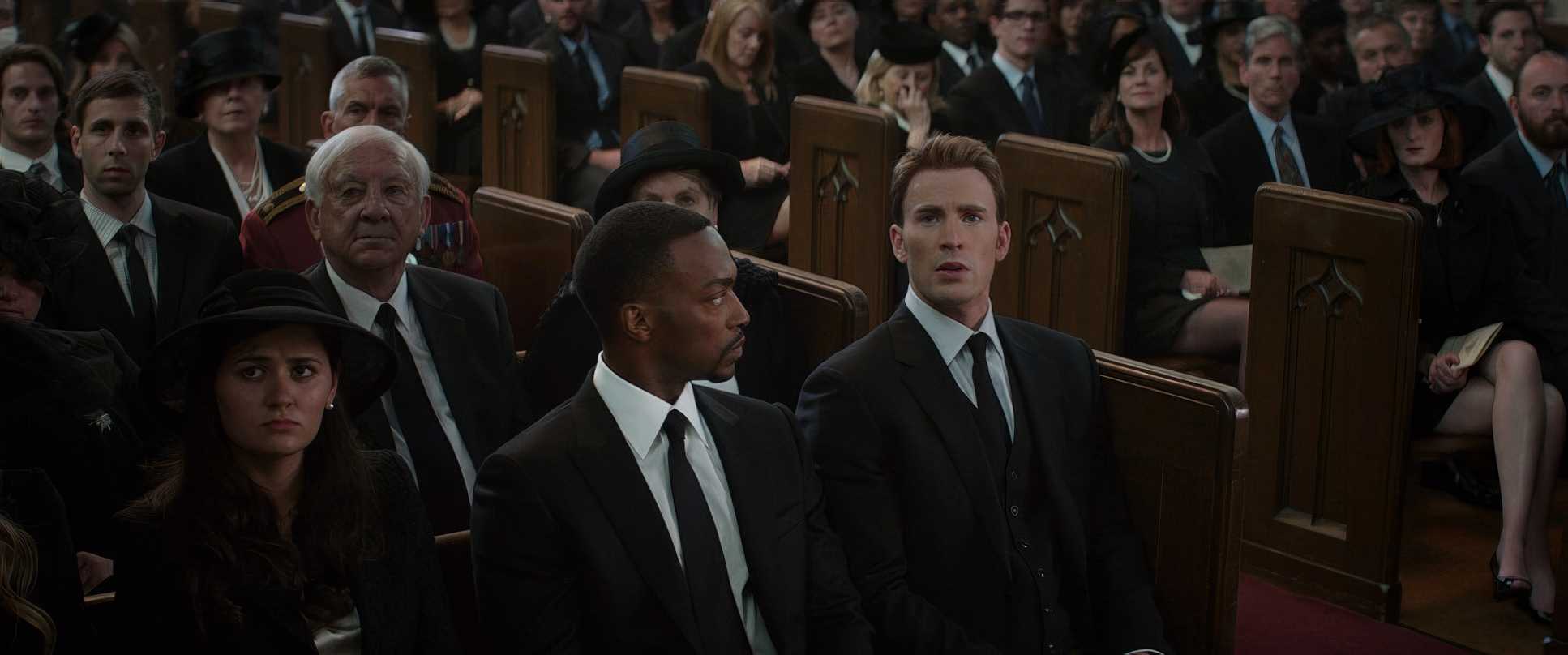
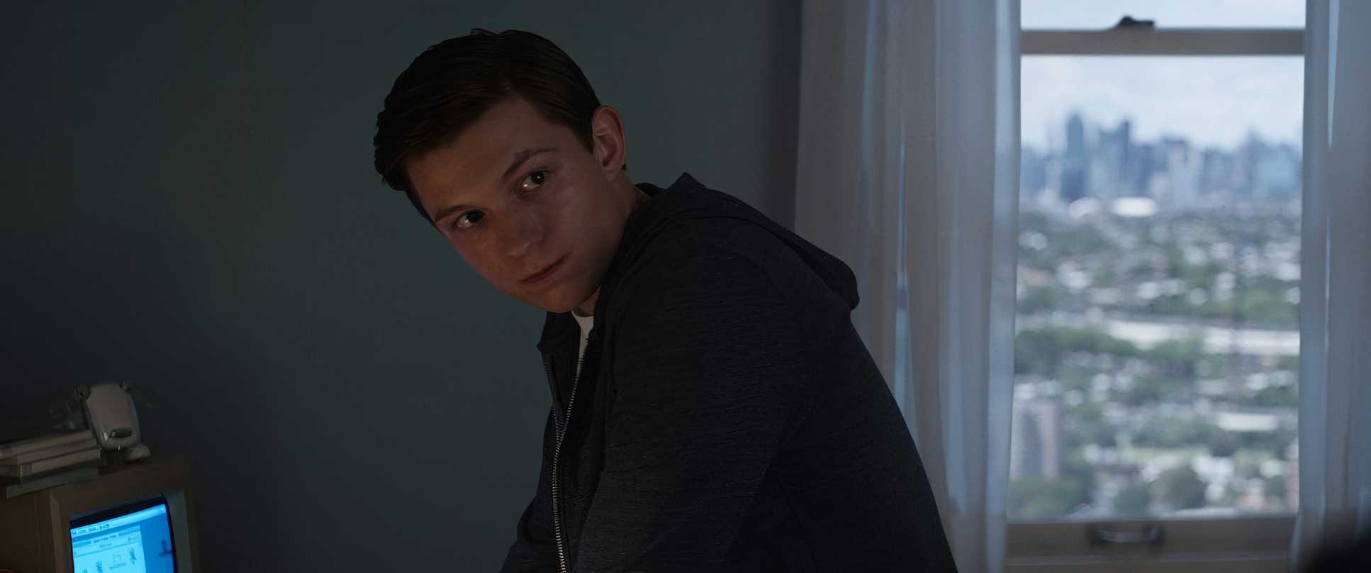
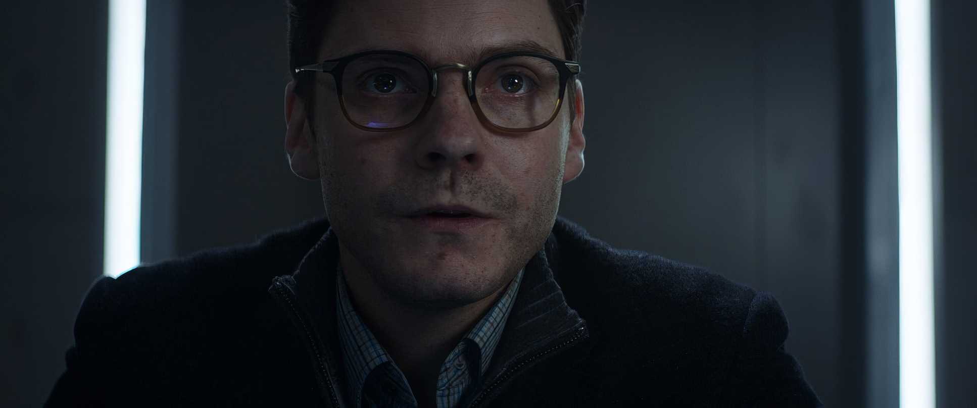
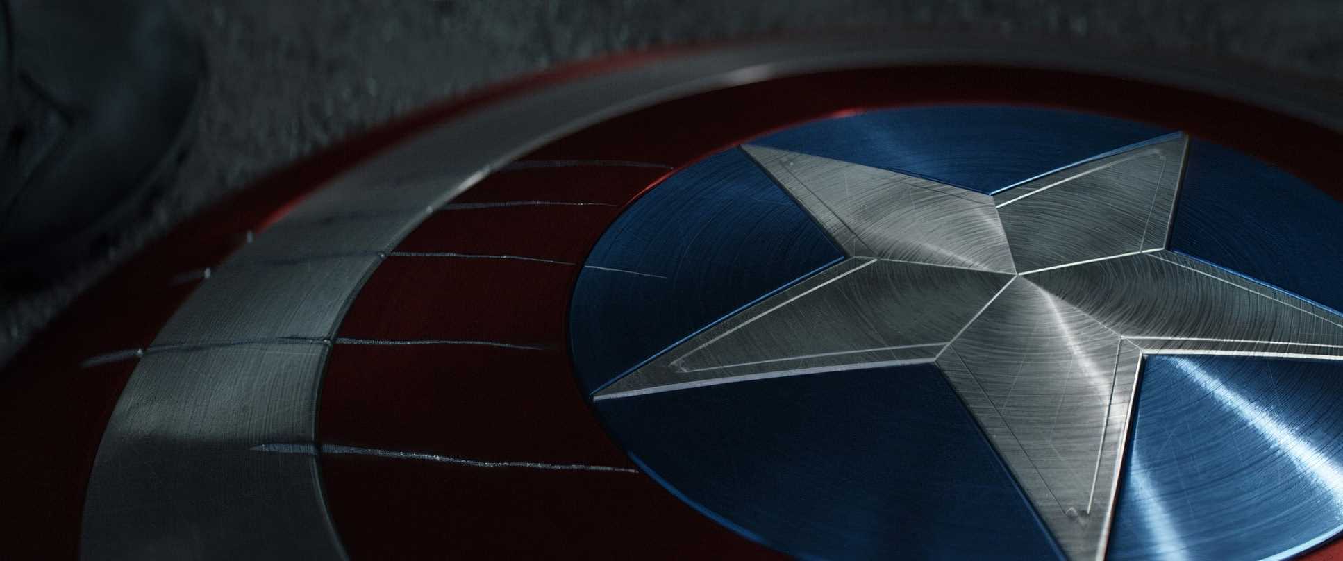
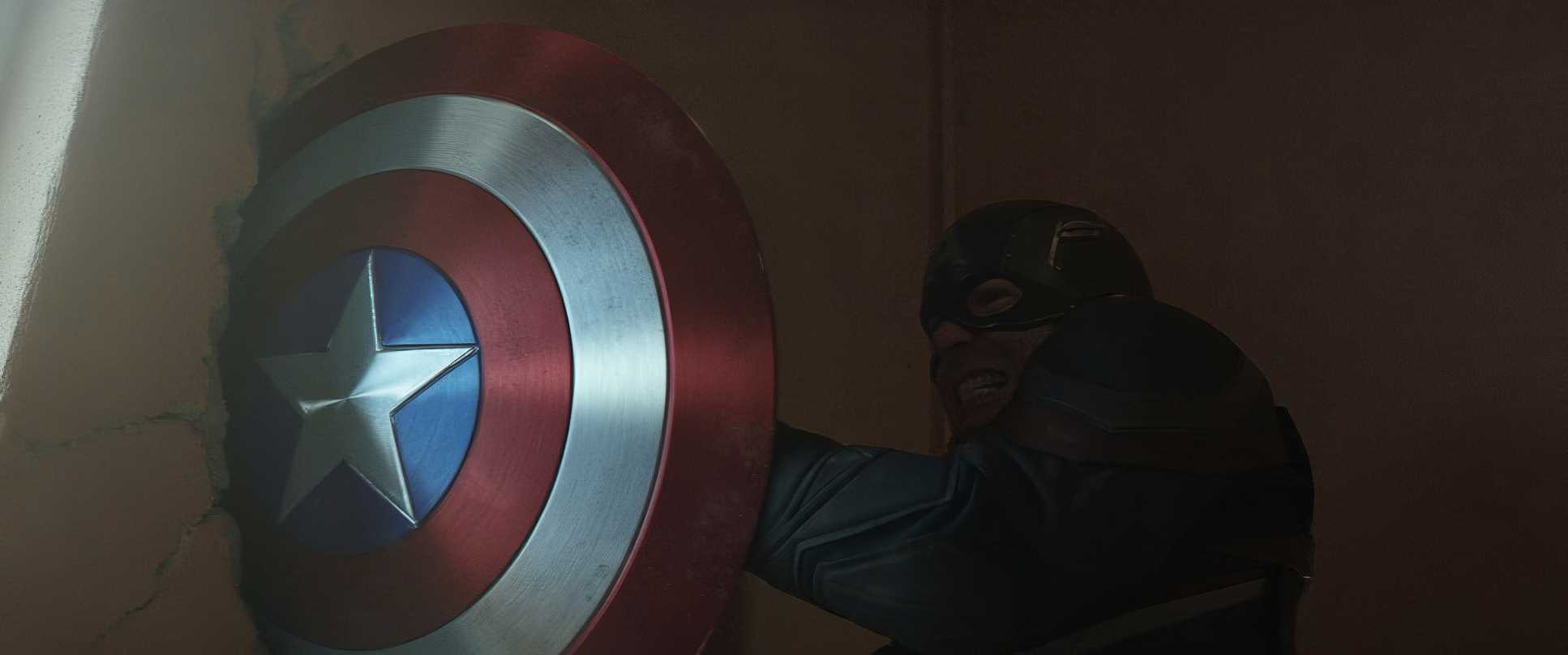
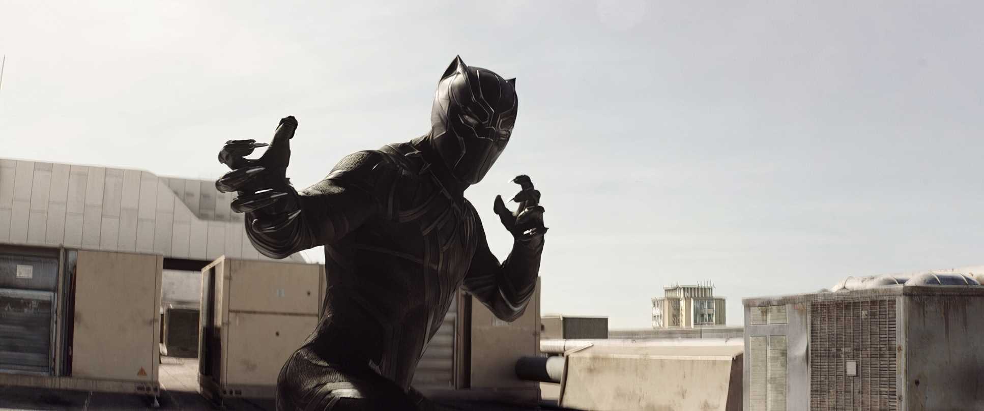
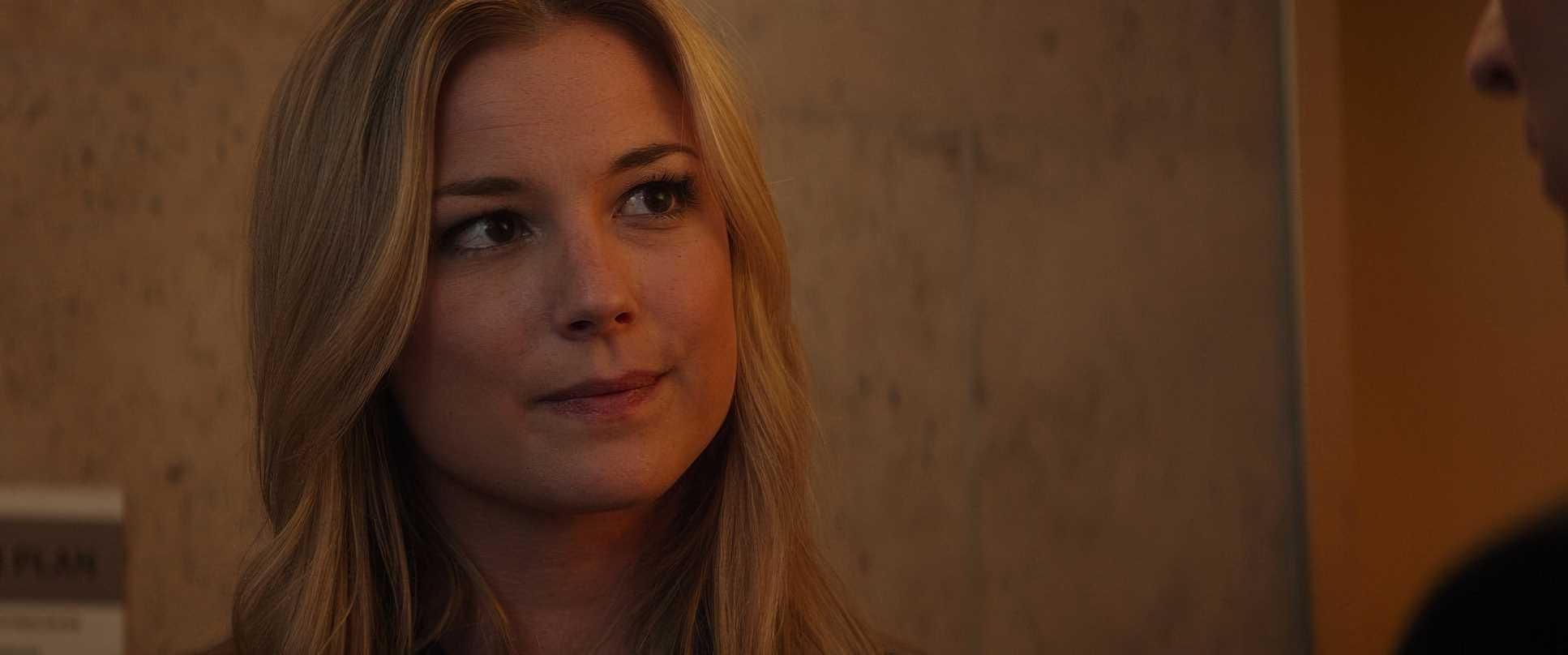
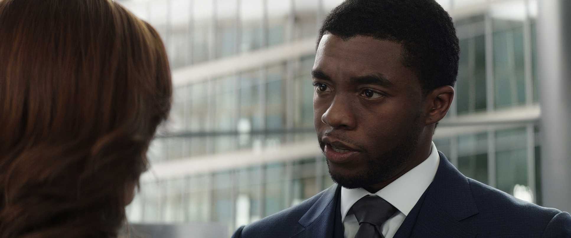
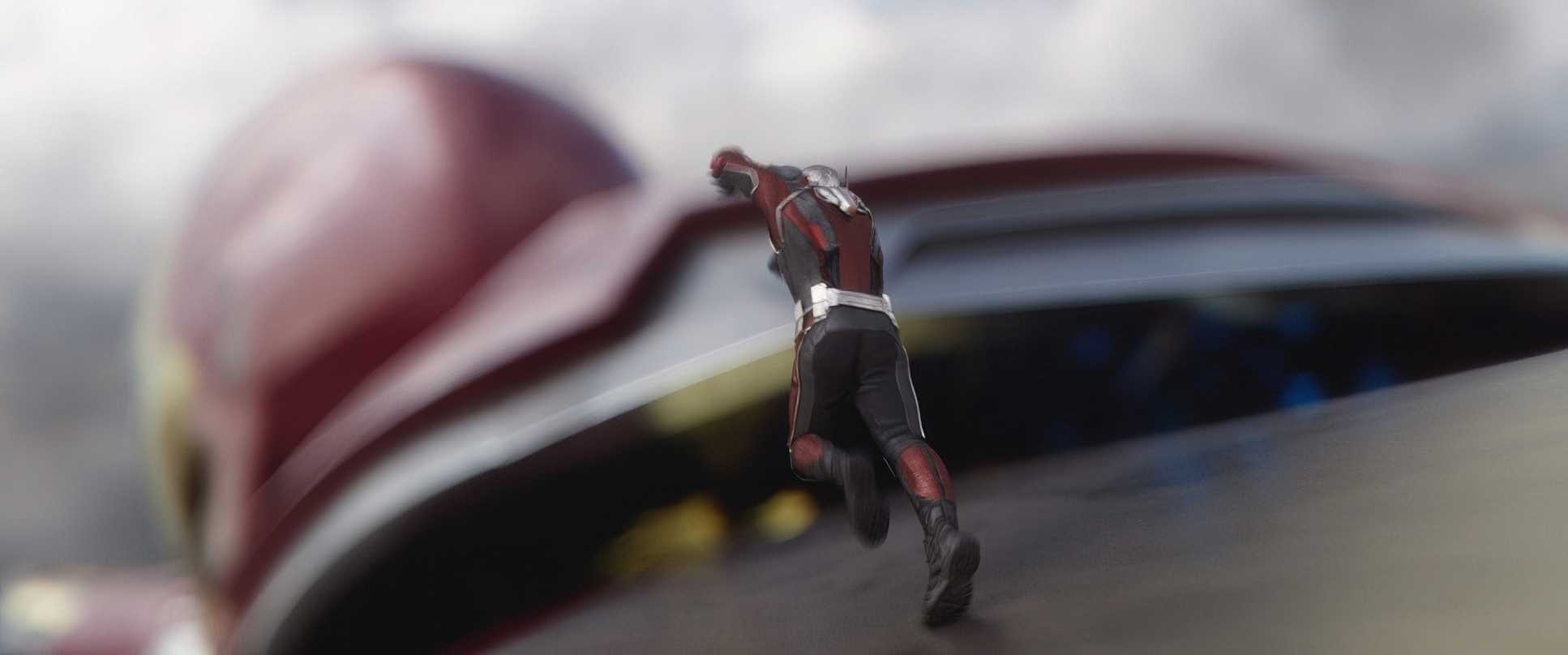
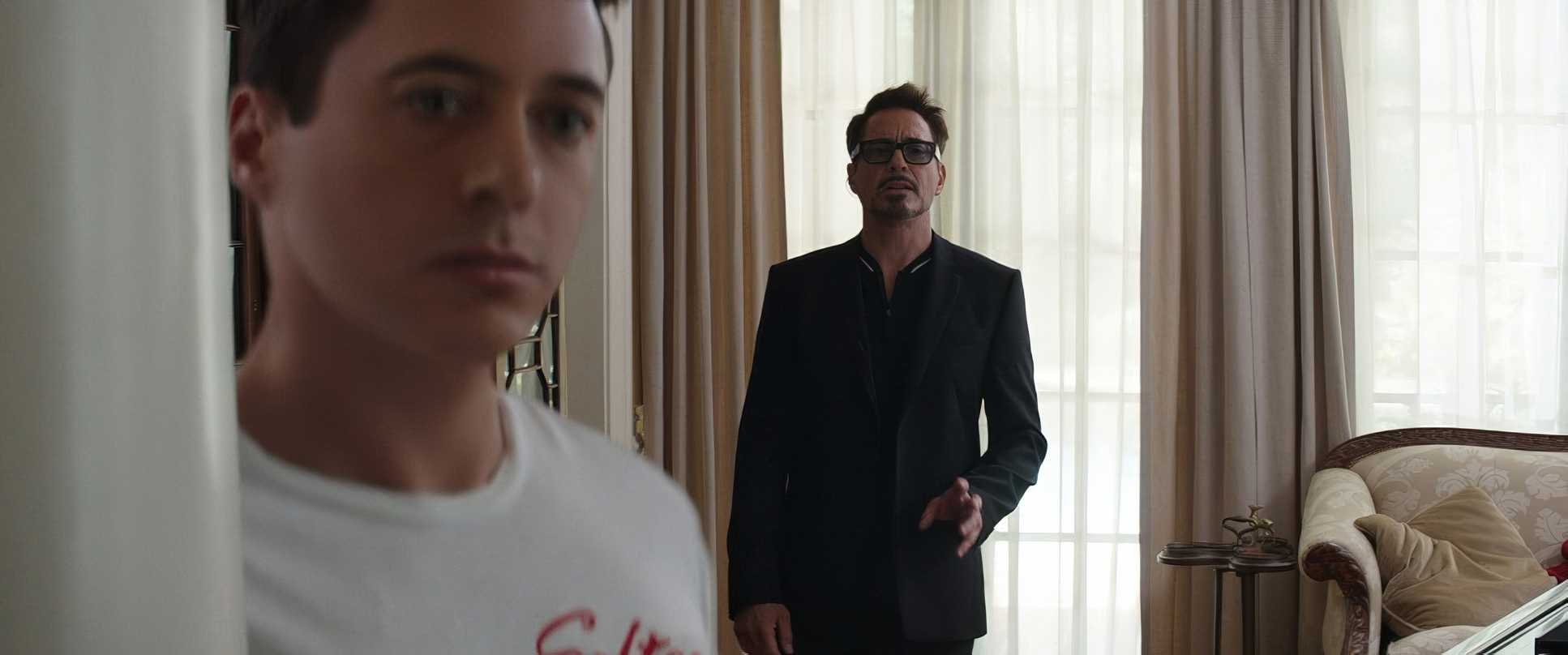
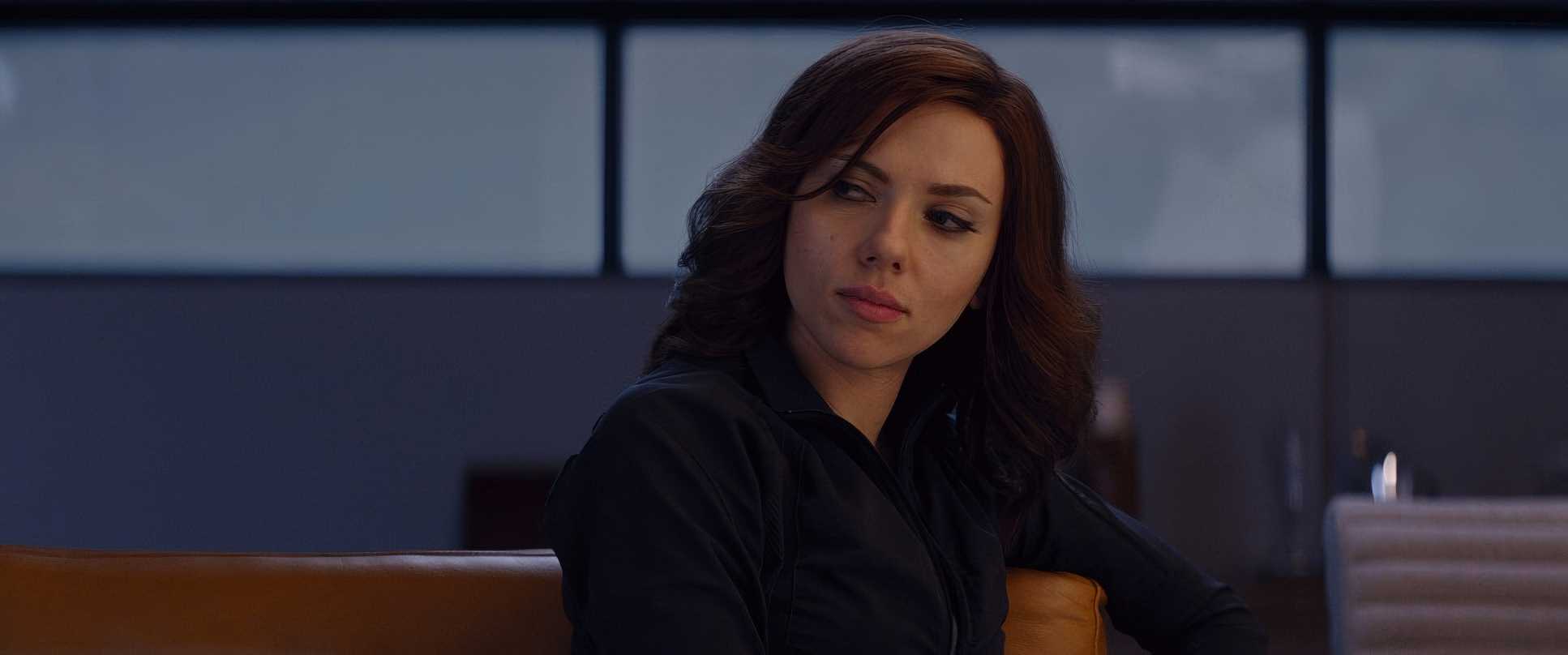
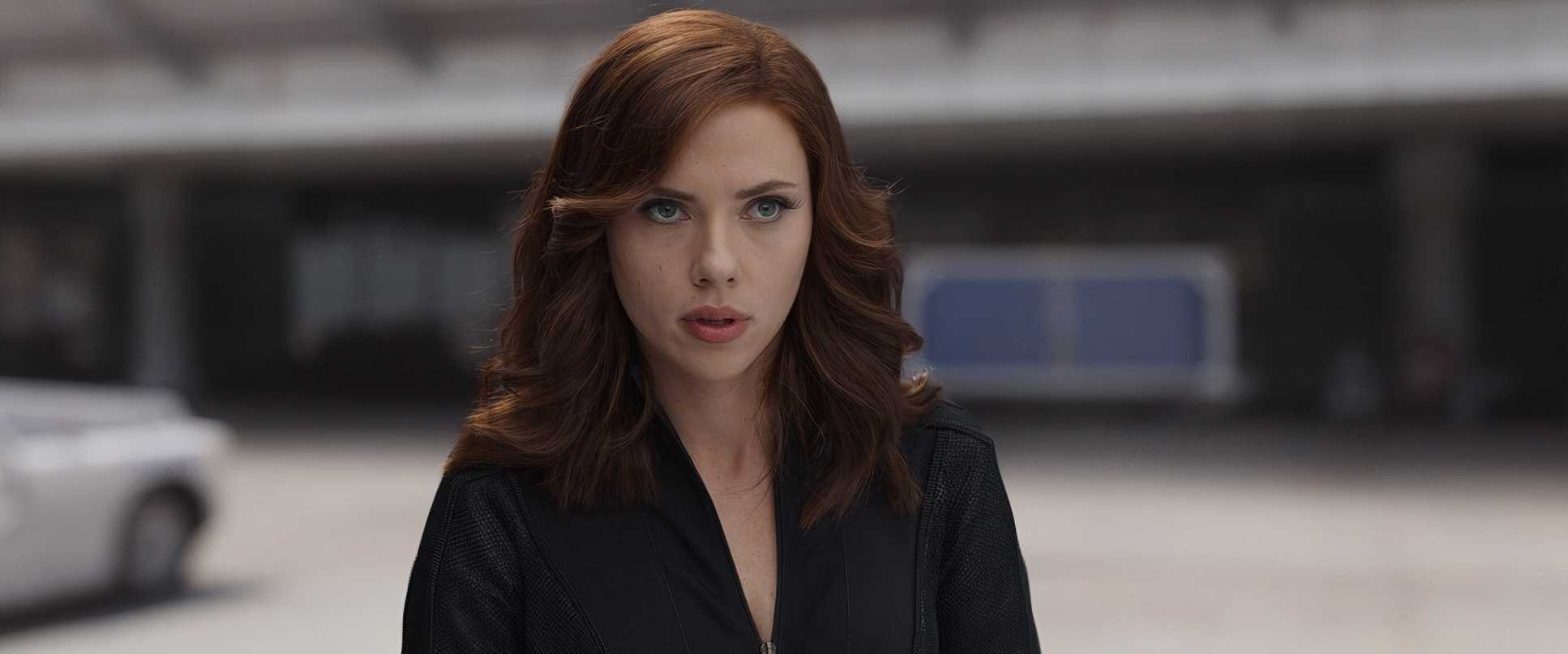
Captain America: Civil War (2016) Film Stills
A curated reference archive of cinematography stills from Captain America: Civil War (2016). Study the lighting, color grading, and composition.


- Also read: THE HOBBIT: AN UNEXPECTED JOURNEY (2012) – CINEMATOGRAPHY ANALYSIS
- Also read: 20 DAYS IN MARIUPOL (2023) – CINEMATOGRAPHY ANALYSIS
Browse Our Cinematography Analysis Glossary
Explore directors, cinematographers, cameras, lenses, lighting styles, genres, and the visual techniques that shape iconic films.
Explore Glossary →