The Hobbit: An Unexpected Journey (2012) had the impossible task of living up to The Lord of the Rings. It came out swinging with some incredibly bold and controversial technical gambits. While the pacing might have been a bit much (did we really need 40 minutes of dwarves doing dishes?), the sheer craft behind the image is a treasure trove for anyone who cares about cinematography.
About the Cinematographer
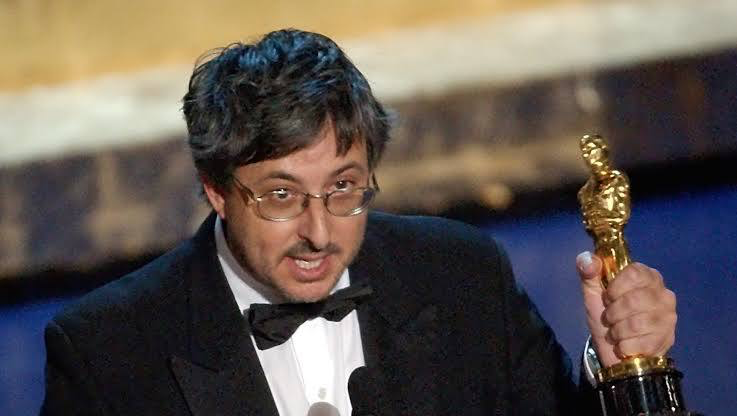
The man behind the glass was the late Andrew Lesnie, ASC, ACS. Lesnie was the visual architect of Middle-earth; he lensed the original trilogy and won an Oscar for it, and for good reason. He had this unique gift for making a massive fantasy epic feel grounded and tactile.
Coming into The Hobbit: An Unexpected Journey, Lesnie had to juggle the nostalgia of a world we already loved with Peter Jackson’s drive to push new tech. You can still see his signature “lyrical” touch here those breathtaking landscapes and intimate close-ups but you can also feel him wrestling with the shift to digital and high frame rates. He was a master of using light and shadow to tell the story, and even when the tech gets in the way, his skill as a craftsman shines through.
Inspiration Behind the Cinematography

The primary DNA for this film was obviously the book and the visual language established a decade prior. However, The Hobbit: An Unexpected Journey is a different beast than Lord of the Rings. It’s a lighter, more whimsical “children’s story” at its core, and you can see that reflected in the early frames.
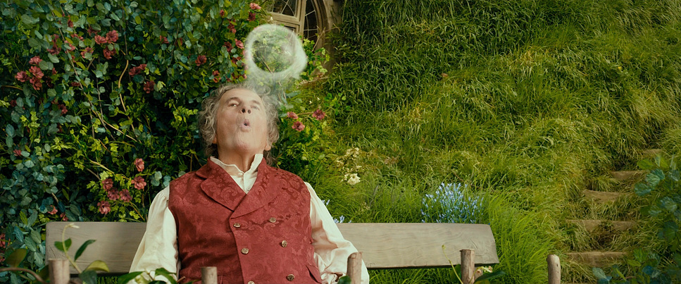
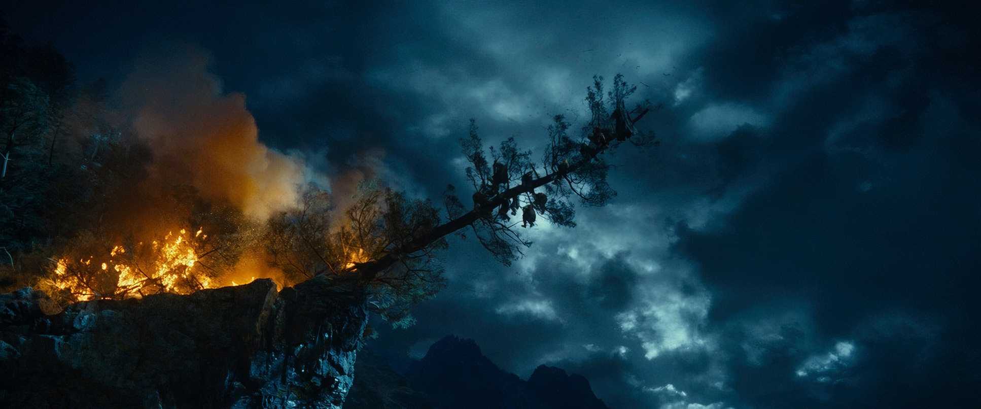
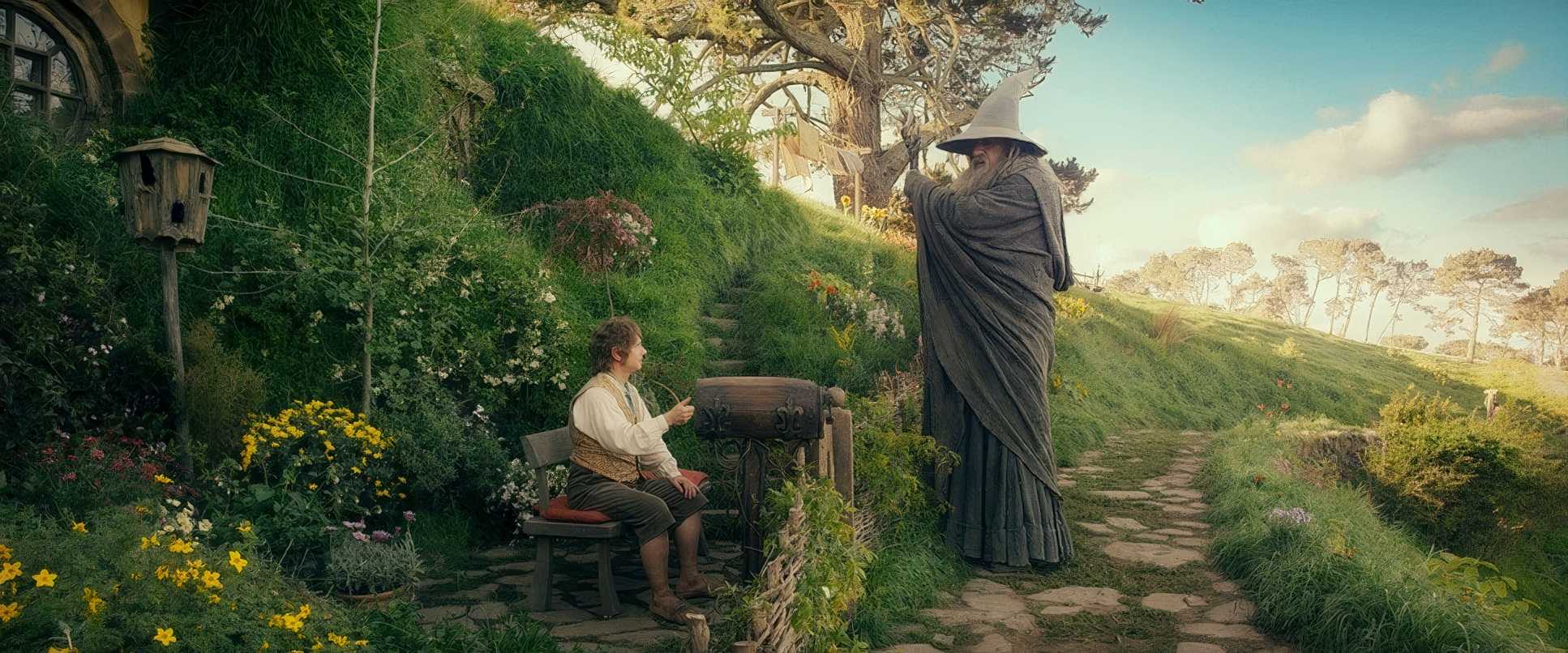
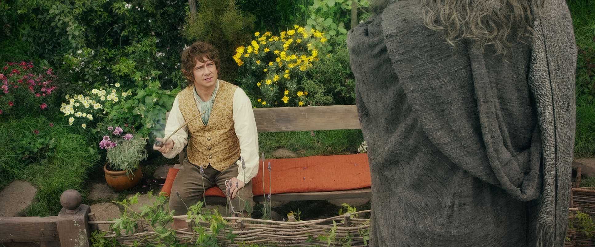
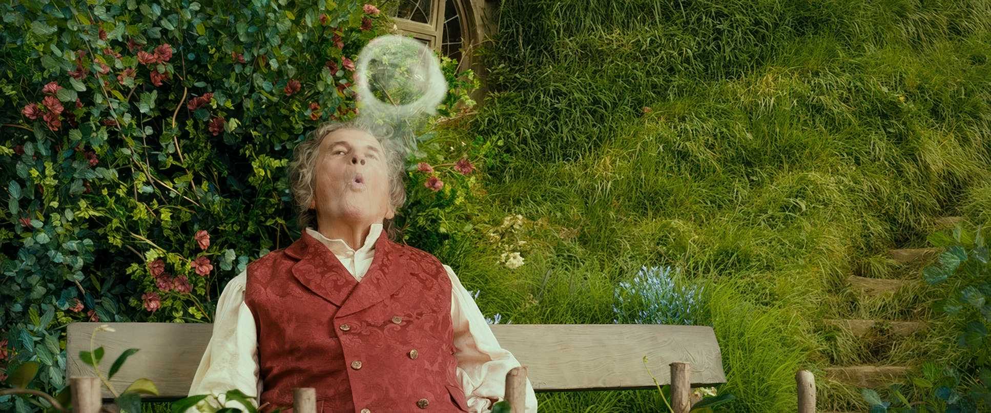
Jackson and Lesnie leaned into a more vibrant, adventurous palette. Where LotR was gritty and foreboding, The Hobbitstarts with an idyllic, almost nostalgic glow in the Shire. The goal was to show the “how” of Bilbo’s adventure with Gandalf and the dwarves, so the visuals start cozy and gradually mature. As the stakes rise and they hit the Misty Mountains, that “grand children’s story” feel slowly gives way to the epic, perilous shadows we recognize from the later films.
Camera Movements
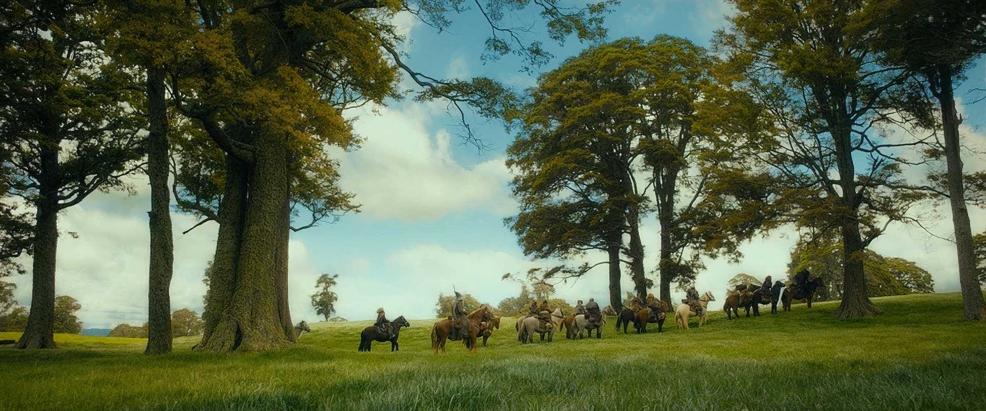
Lesnie’s camera work here is a study in scale. To make the 3D work (and to make the world feel huge), he used a lot of those signature sweeping crane shots and helicopter passes. These aren’t just “cool shots” they’re essential depth cues. They remind you exactly how small this company is compared to the vastness of Middle-earth.
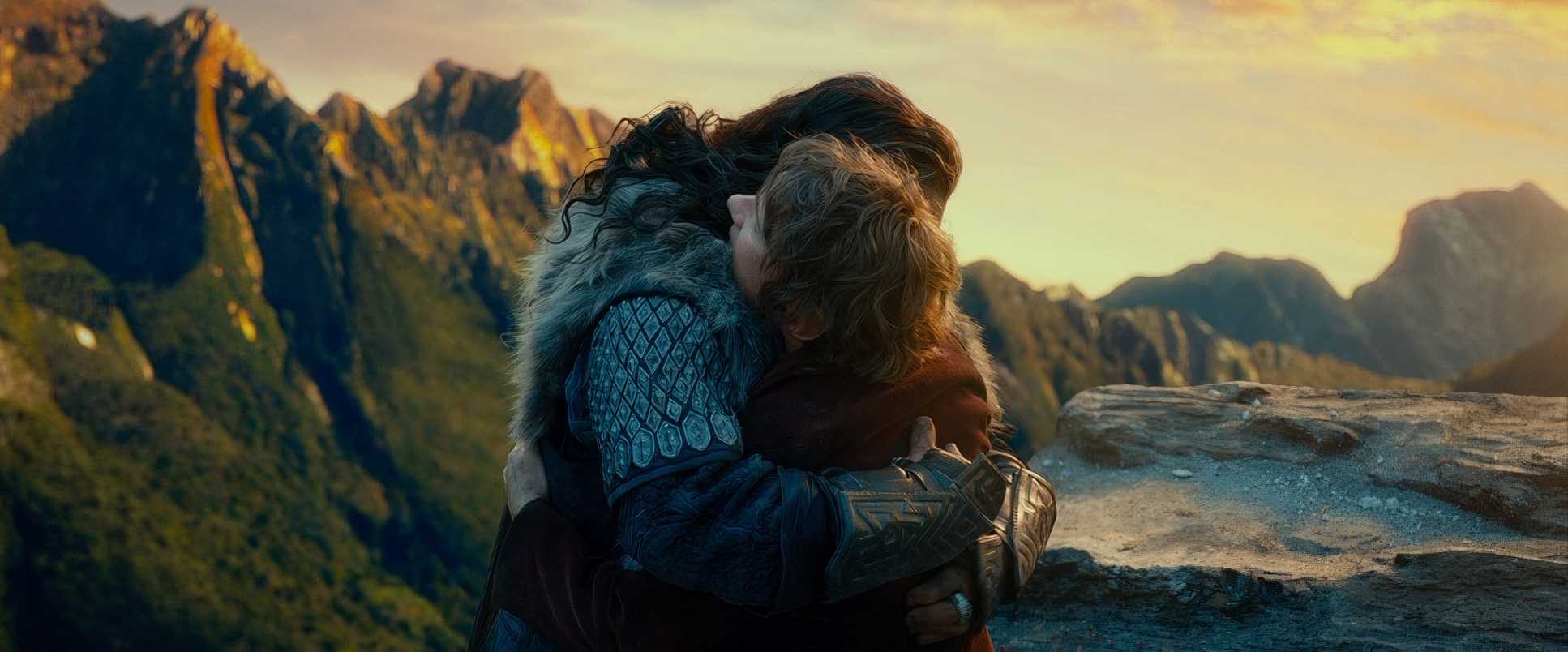
But it’s the intimate stuff that actually anchors the movie. We see a lot of subtle dolly moves and Steadicam work that stay glued to Bilbo’s perspective. When the dwarves invade his home, the camera moves with a frantic, bewildered rhythm that mirrors Bilbo’s blood pressure. Later, during the goblin escape, things go kinetic with handheld shots that plunge you into the chaos. It’s a smart balance; the camera isn’t just showing you the world, it’s reacting to it.
Compositional Choices
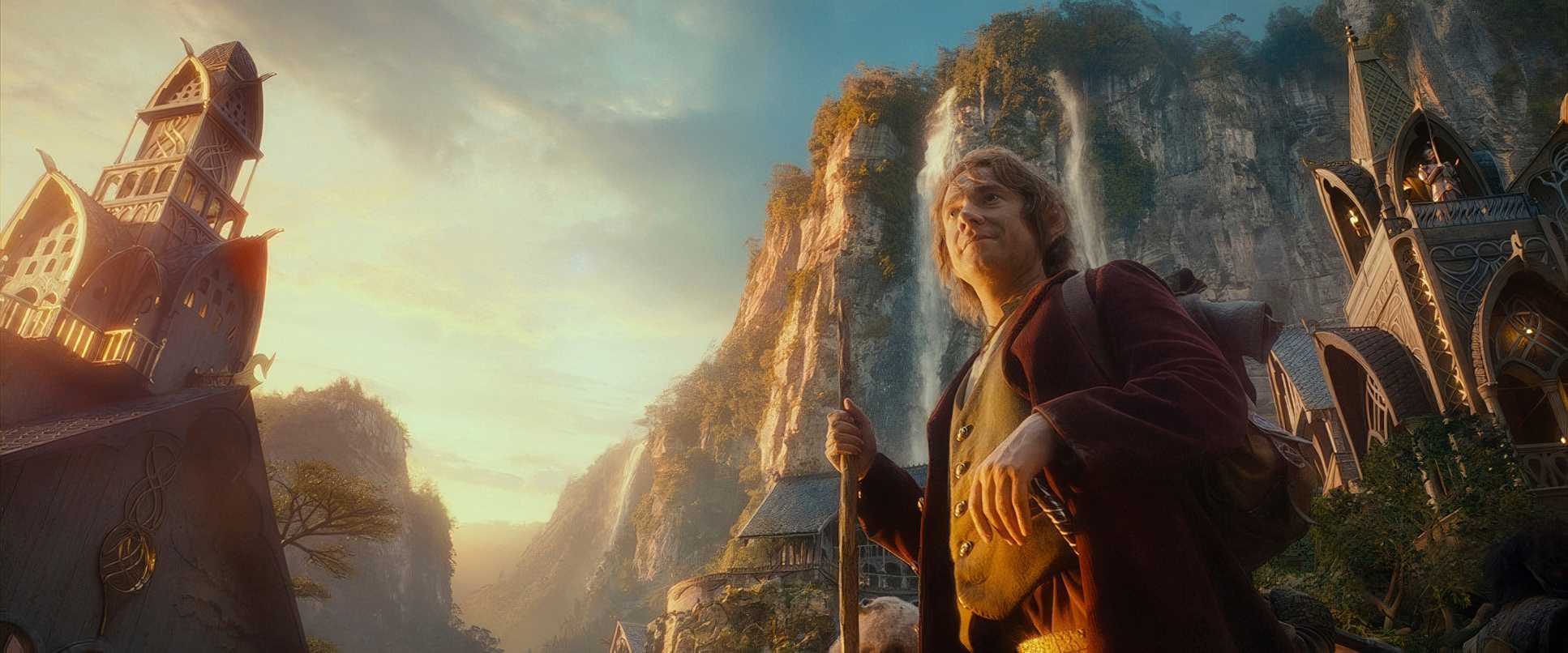
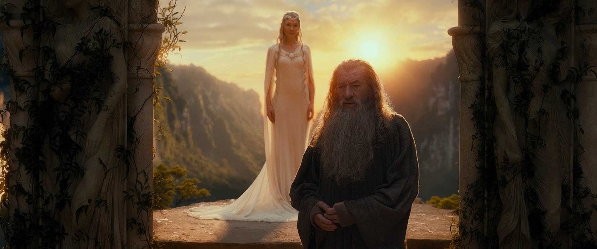
Lesnie stayed true to the classic “Middle-earth” look with his compositions. He used the rule of thirds religiously to guide the eye, especially in those massive wide shots where Bilbo or Gandalf look like tiny specs against the landscape.
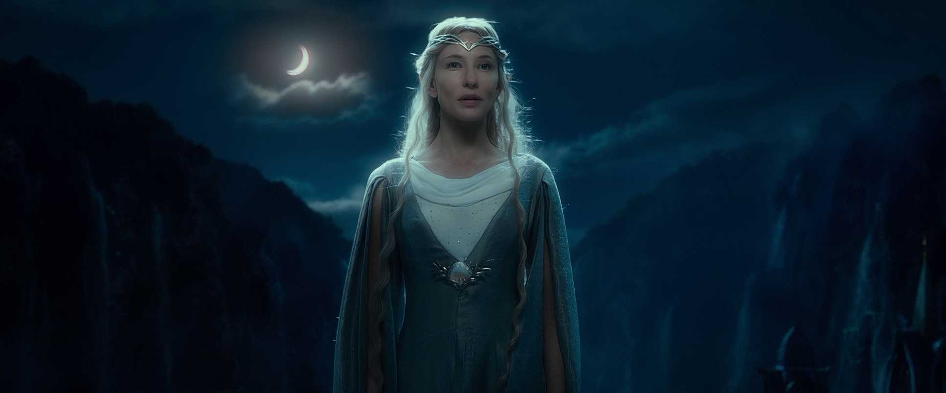
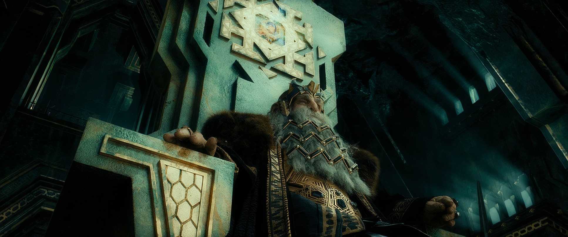
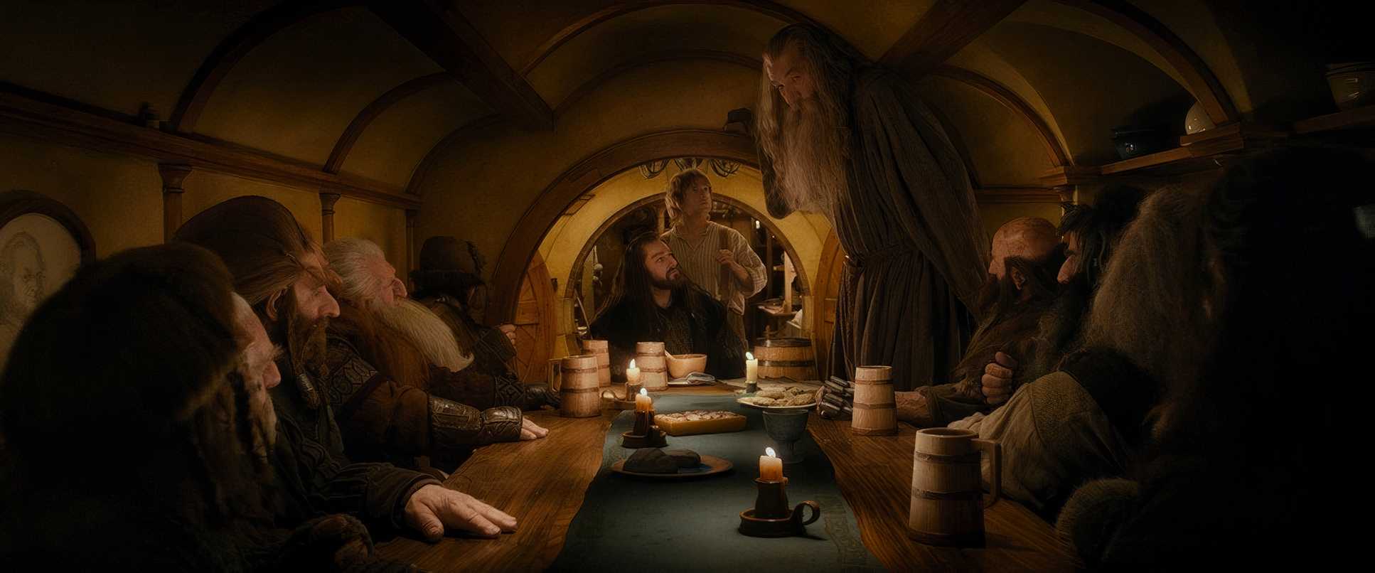
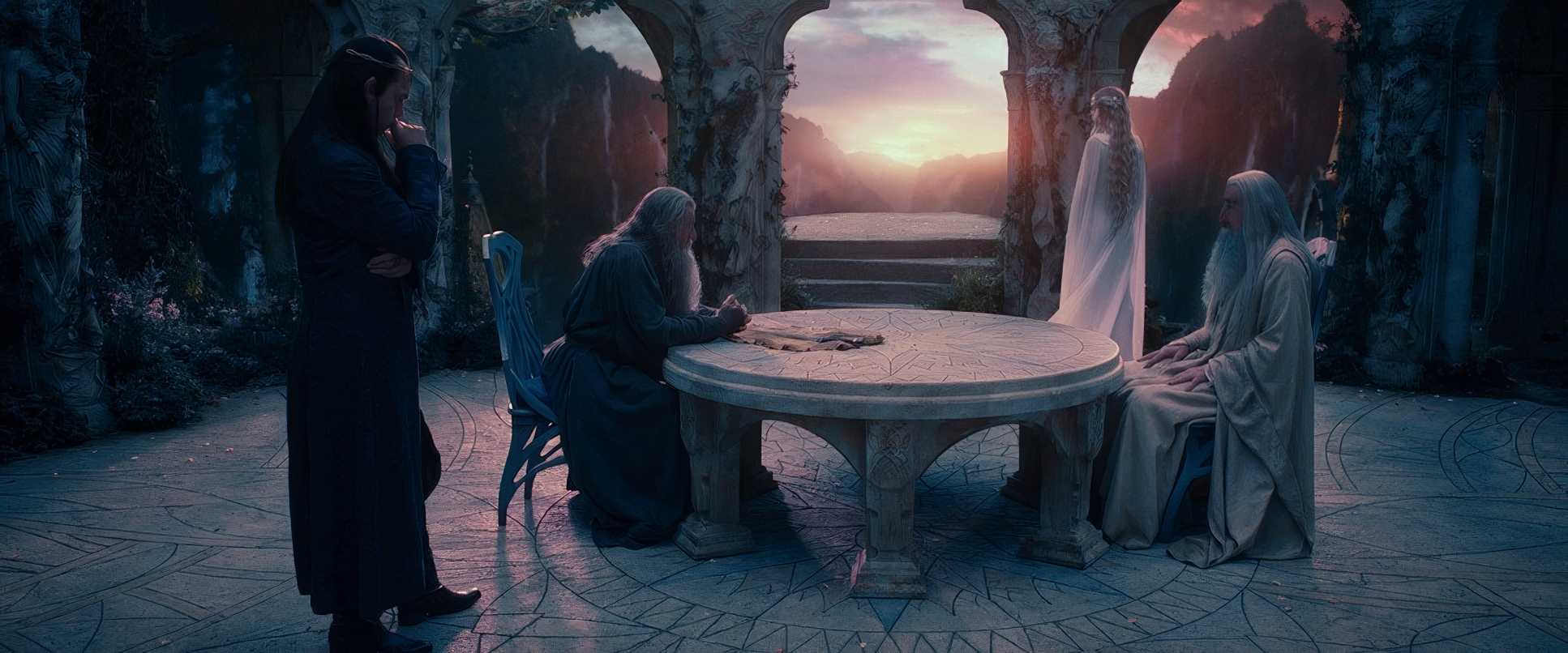
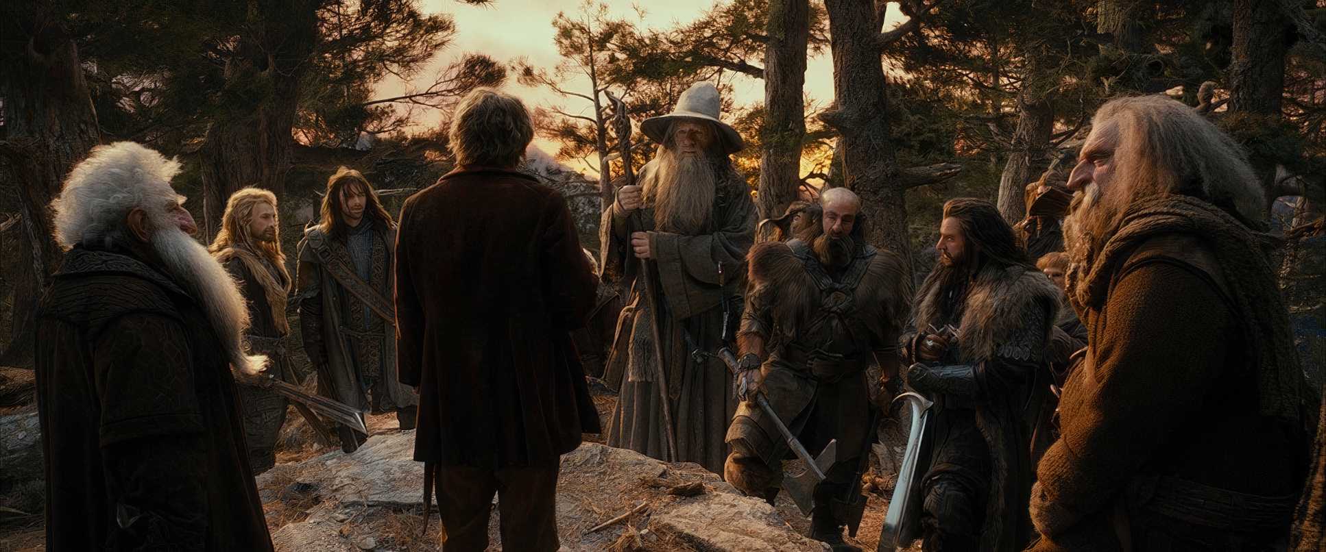
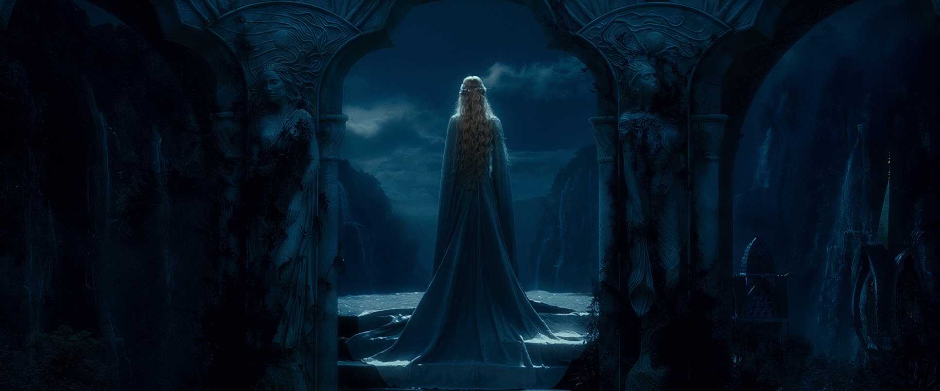
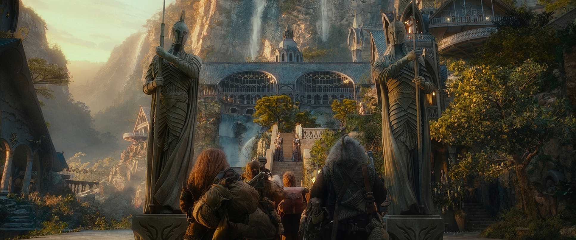
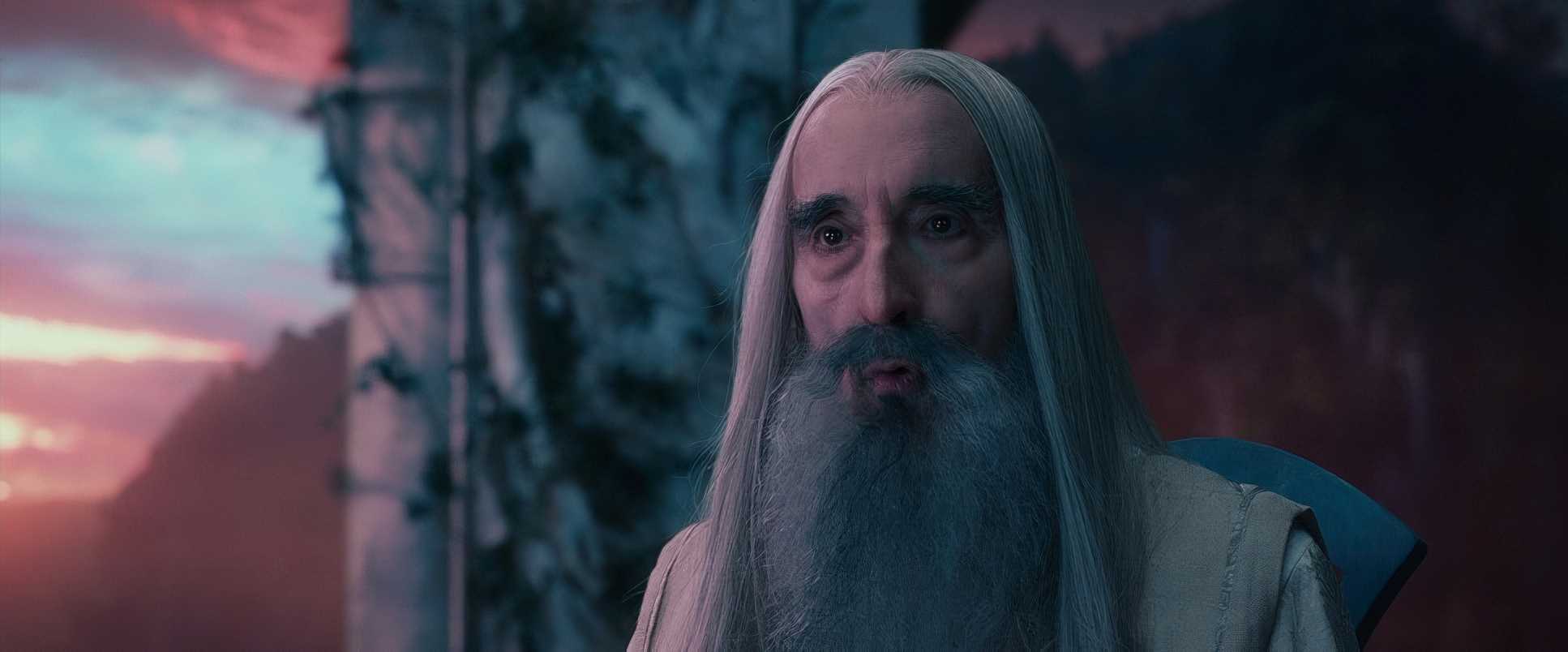
I’m a big fan of how he used negative space and deep staging here. By placing action in the extreme foreground and background, he created a sense of immense depth. Look at the White Council scene in Rivendell; the way characters are positioned within that Elvish architecture gives everyone visual weight. It’s not just about “pretty pictures” it’s about using the frame to tell us who holds the power in a room.
Lighting Style
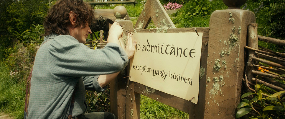
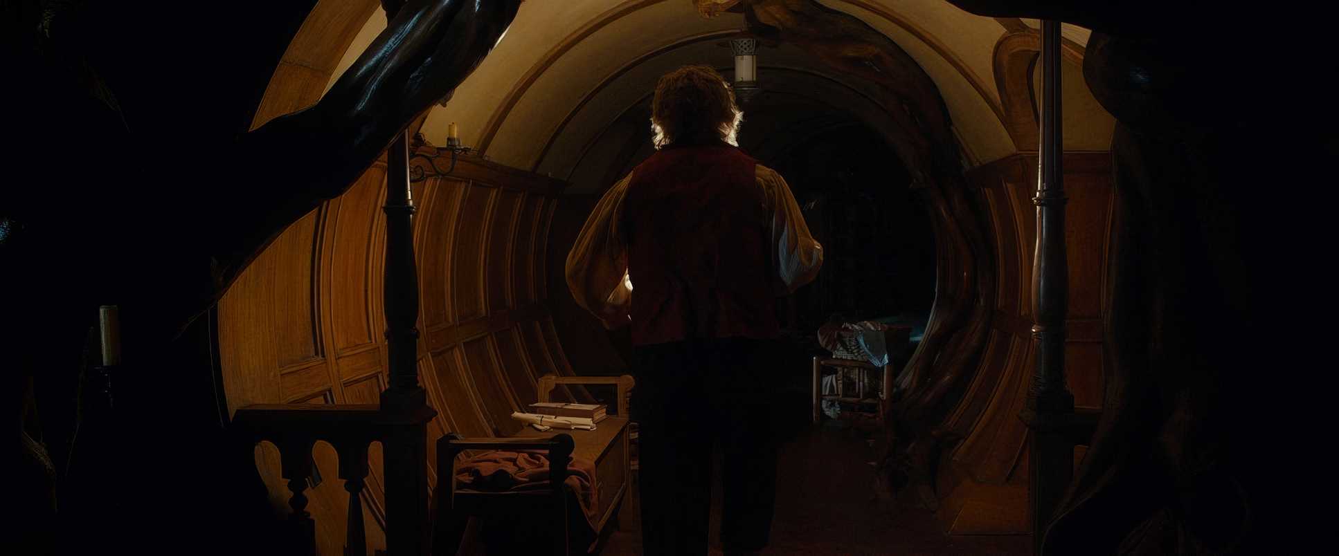
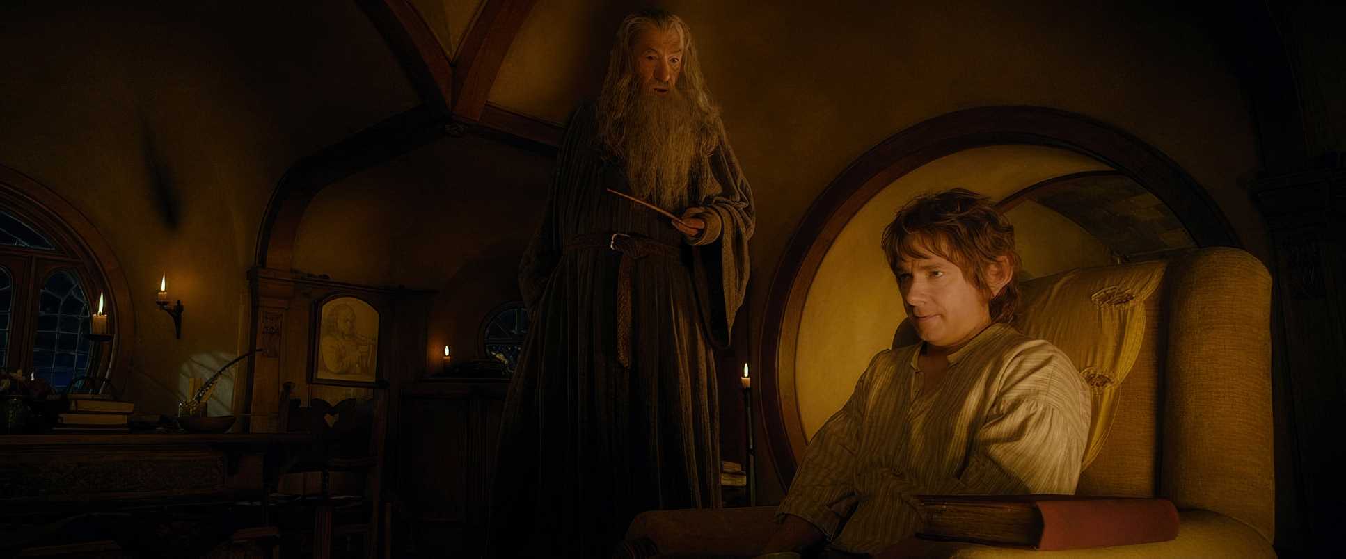
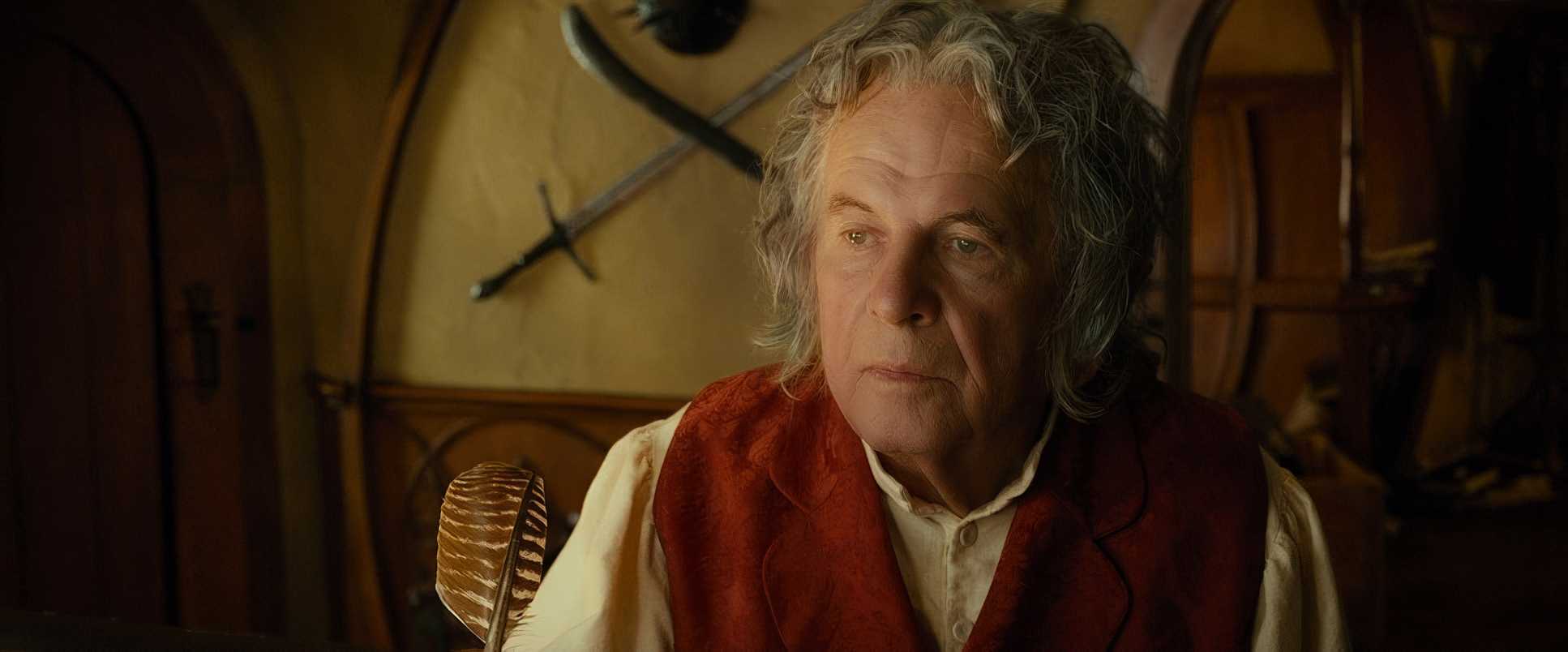
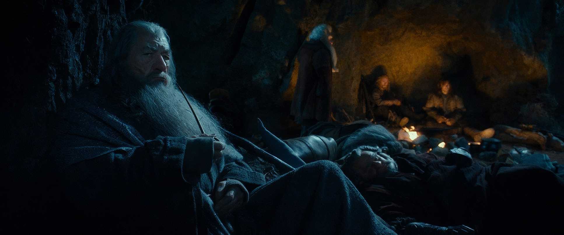
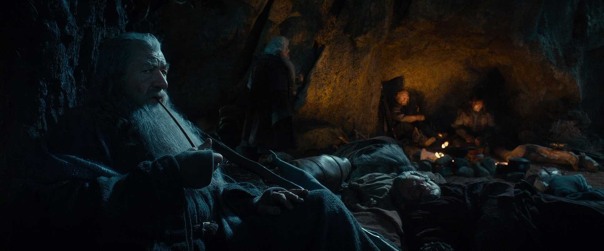
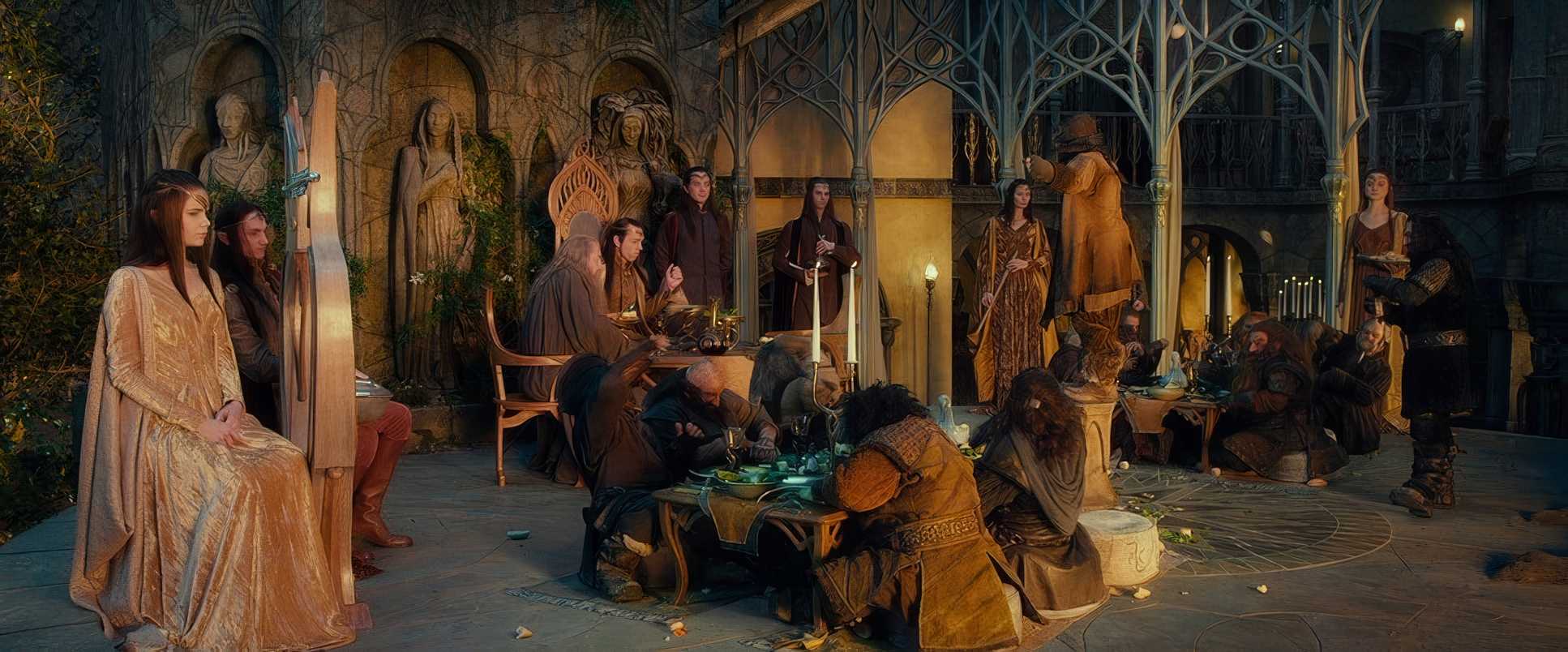
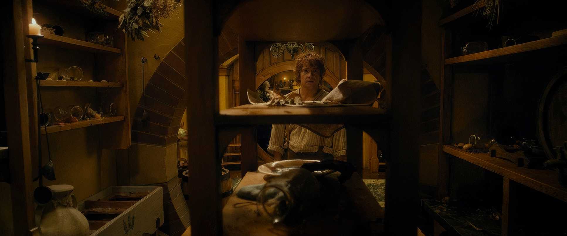
The lighting in The Hobbit: An Unexpected Journey is where things get interesting for me. In the Shire, it feels beautifully motivated sunlight through windows, warm firelight, dappled forest light. It feels lived-in and organic.
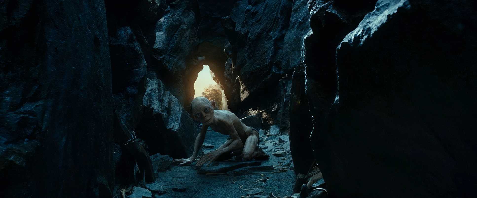
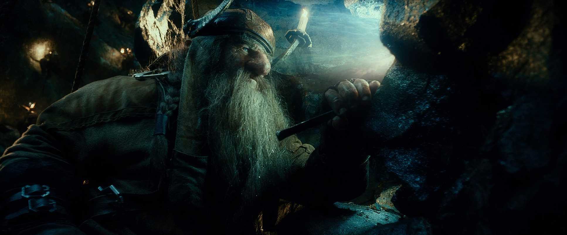
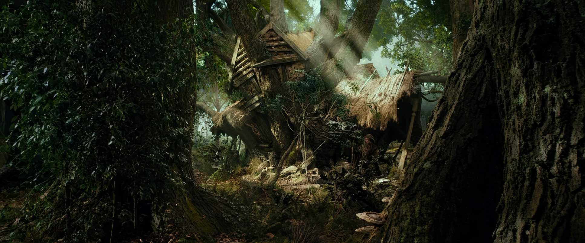
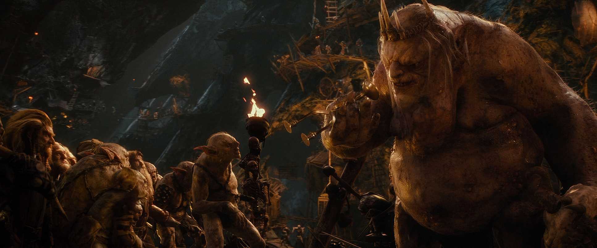
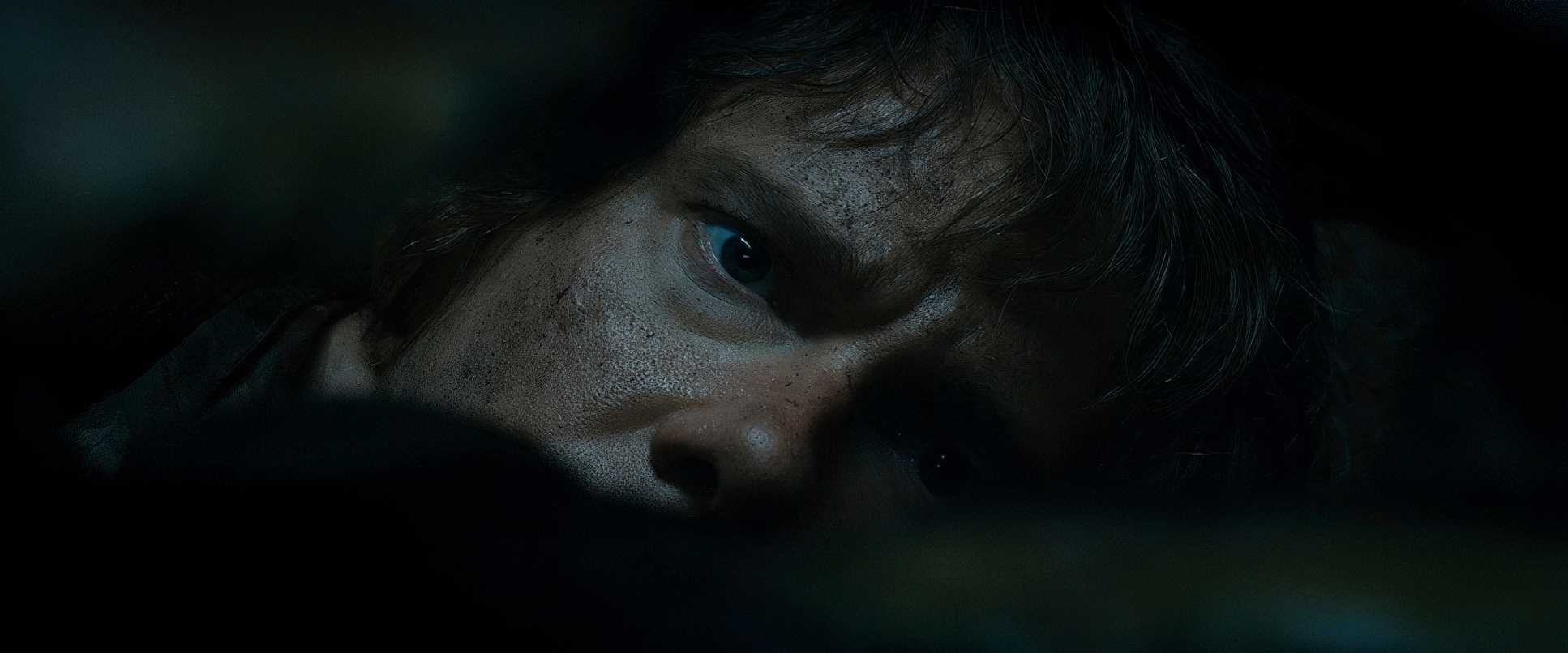
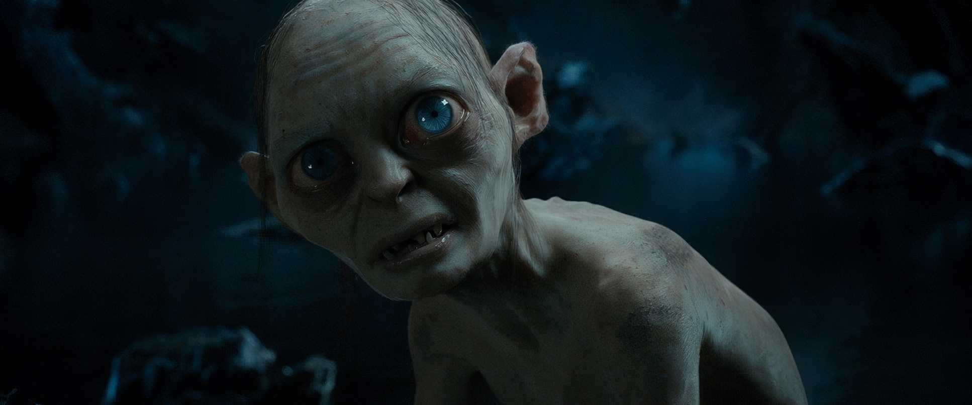
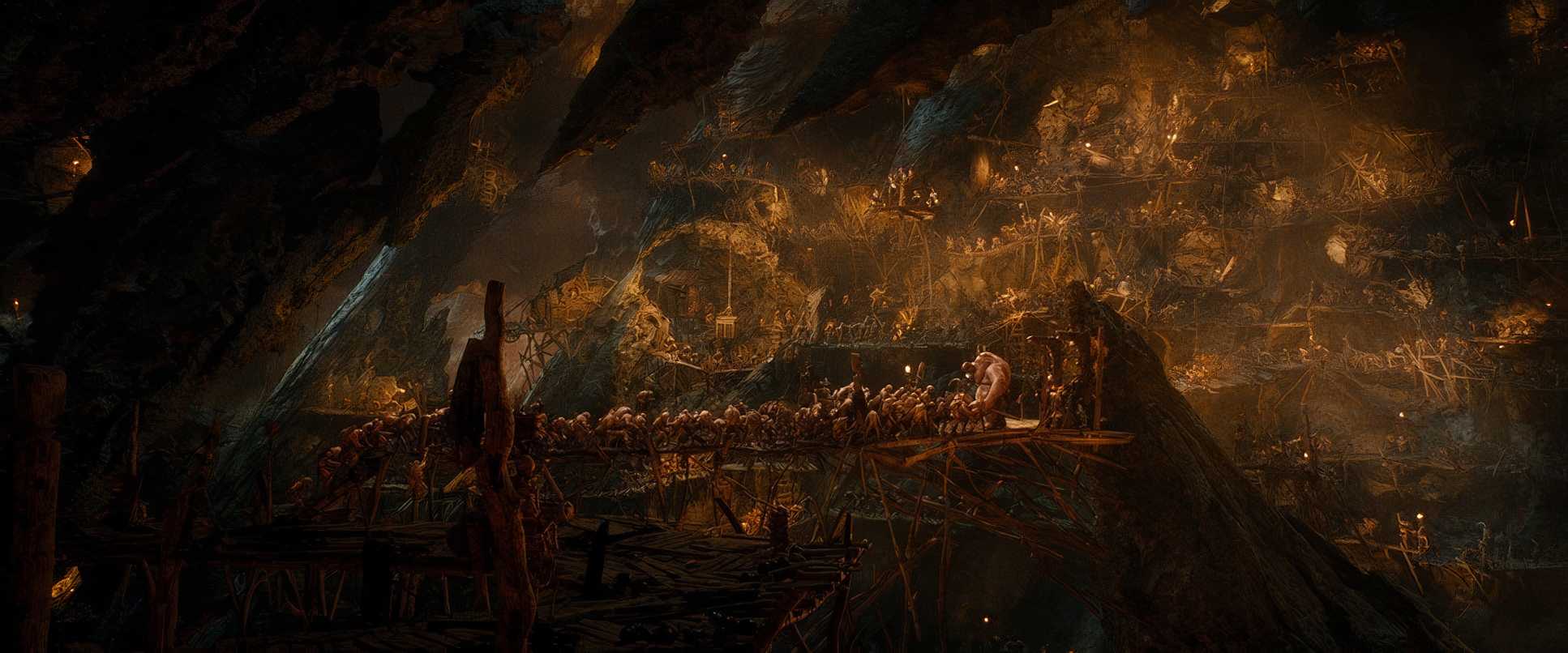
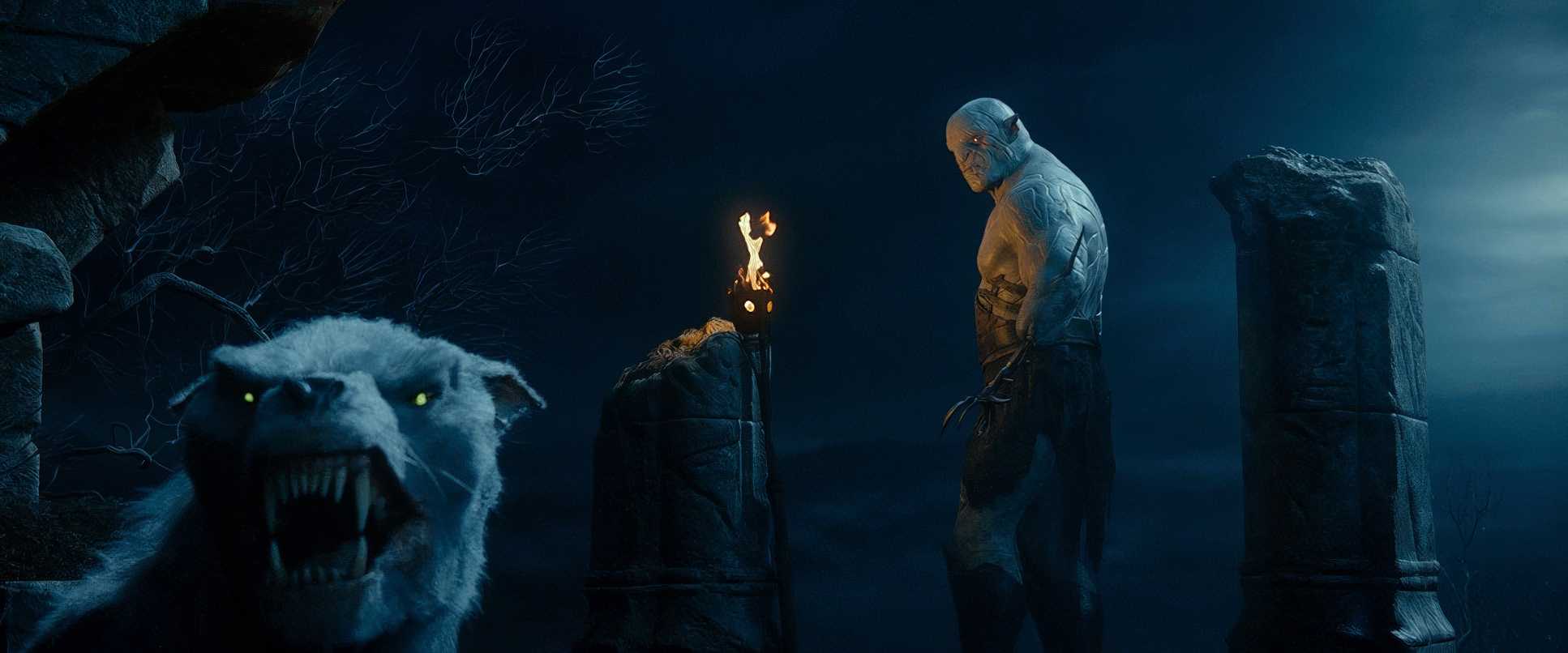
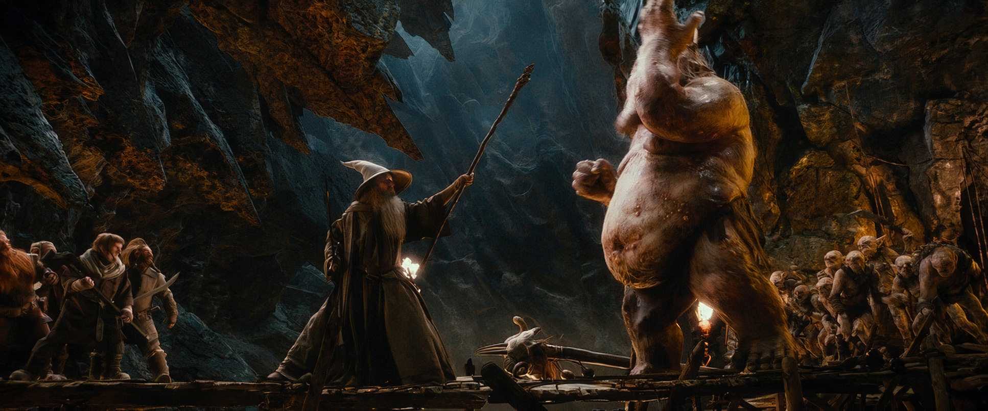
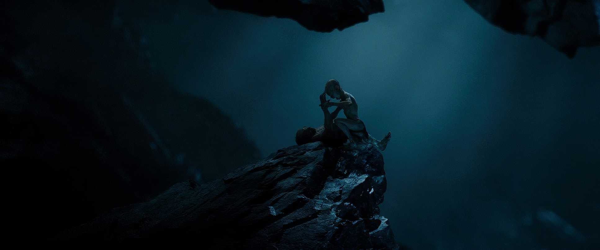
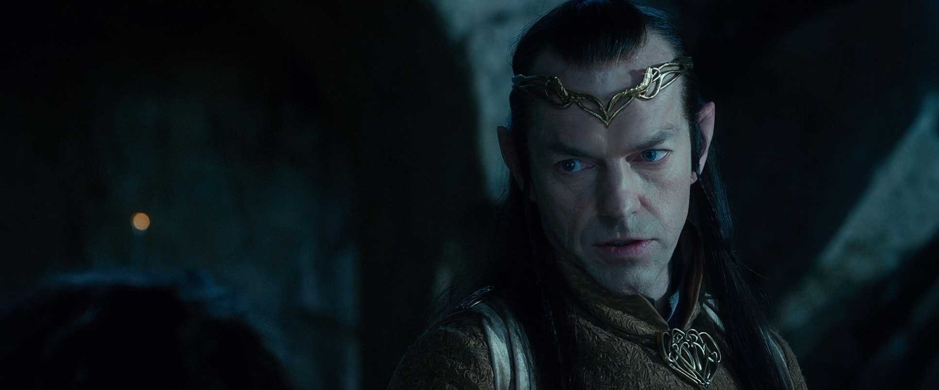
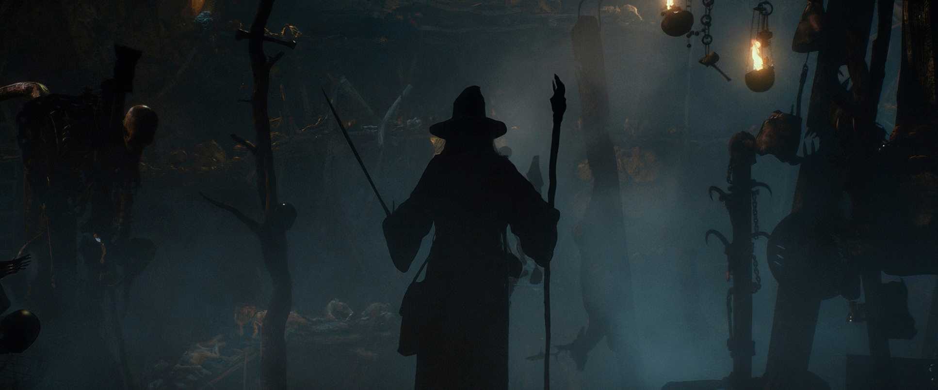
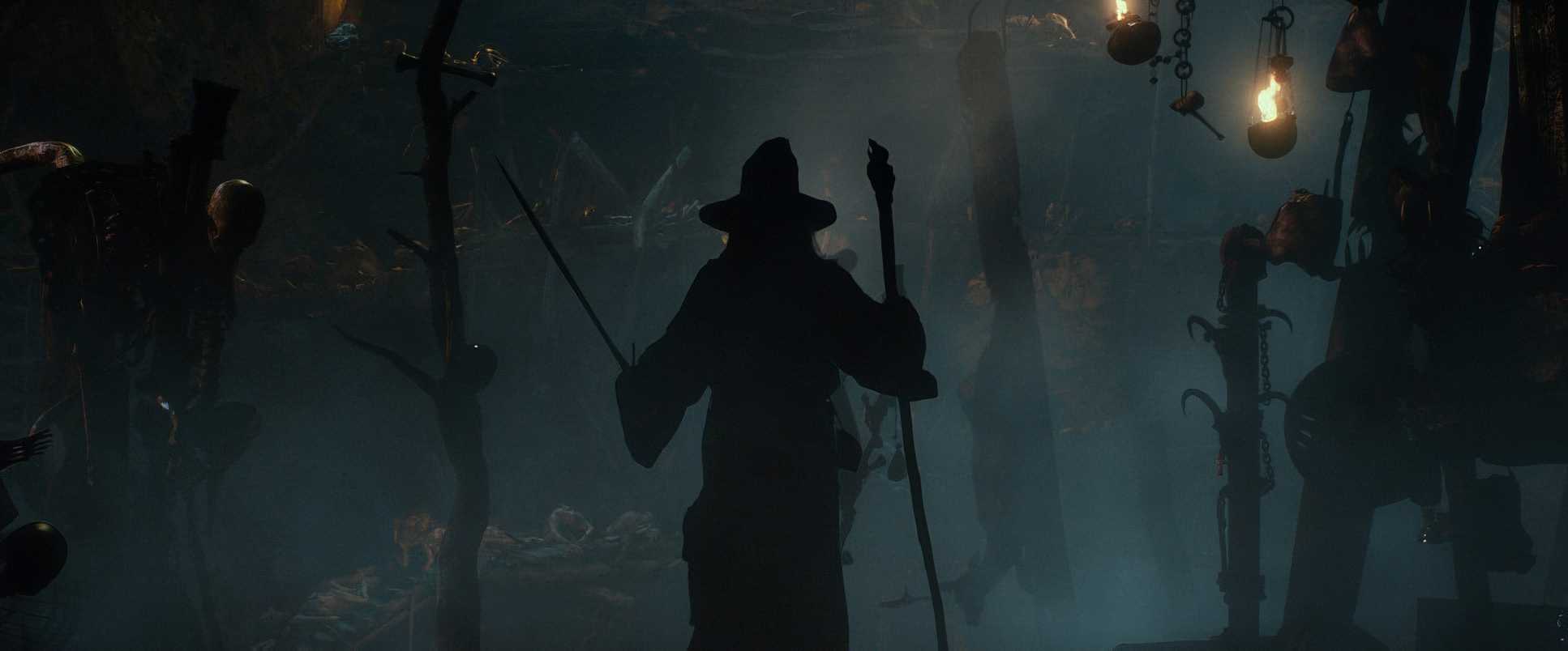
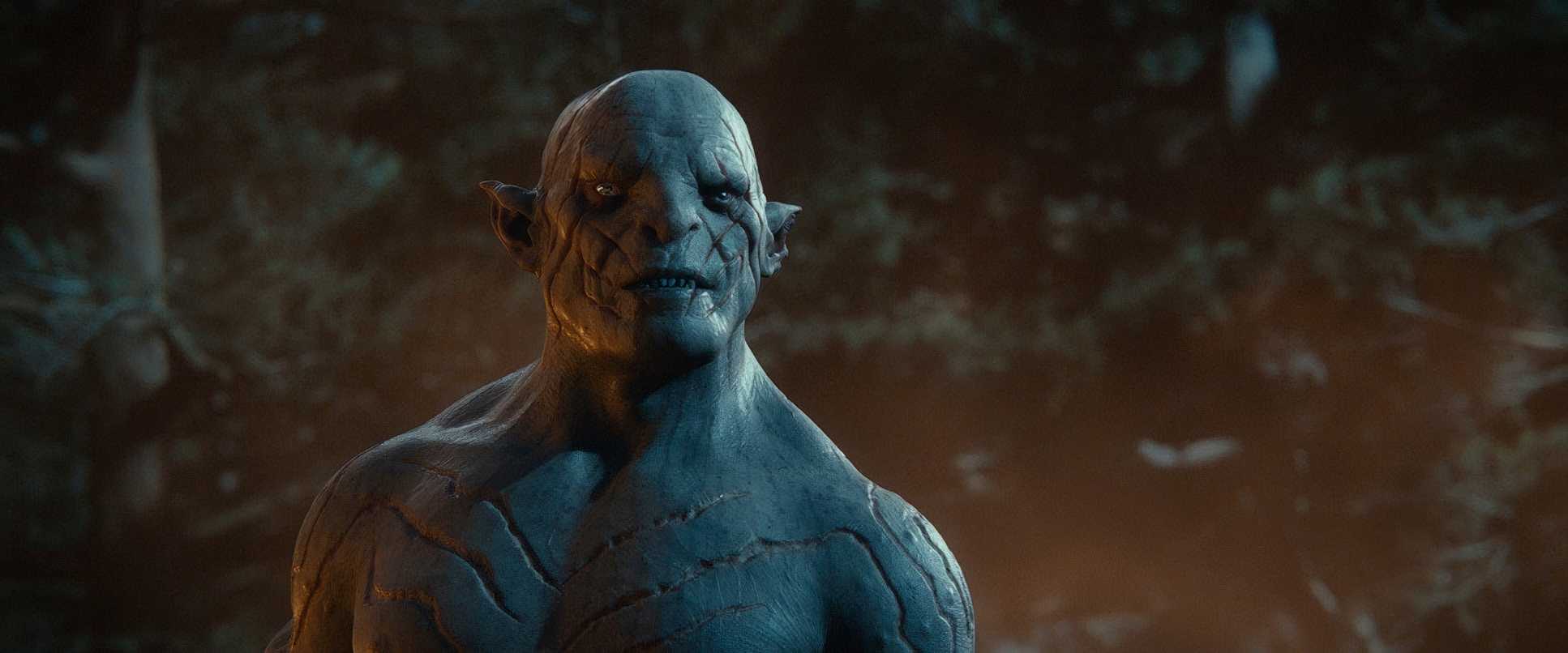
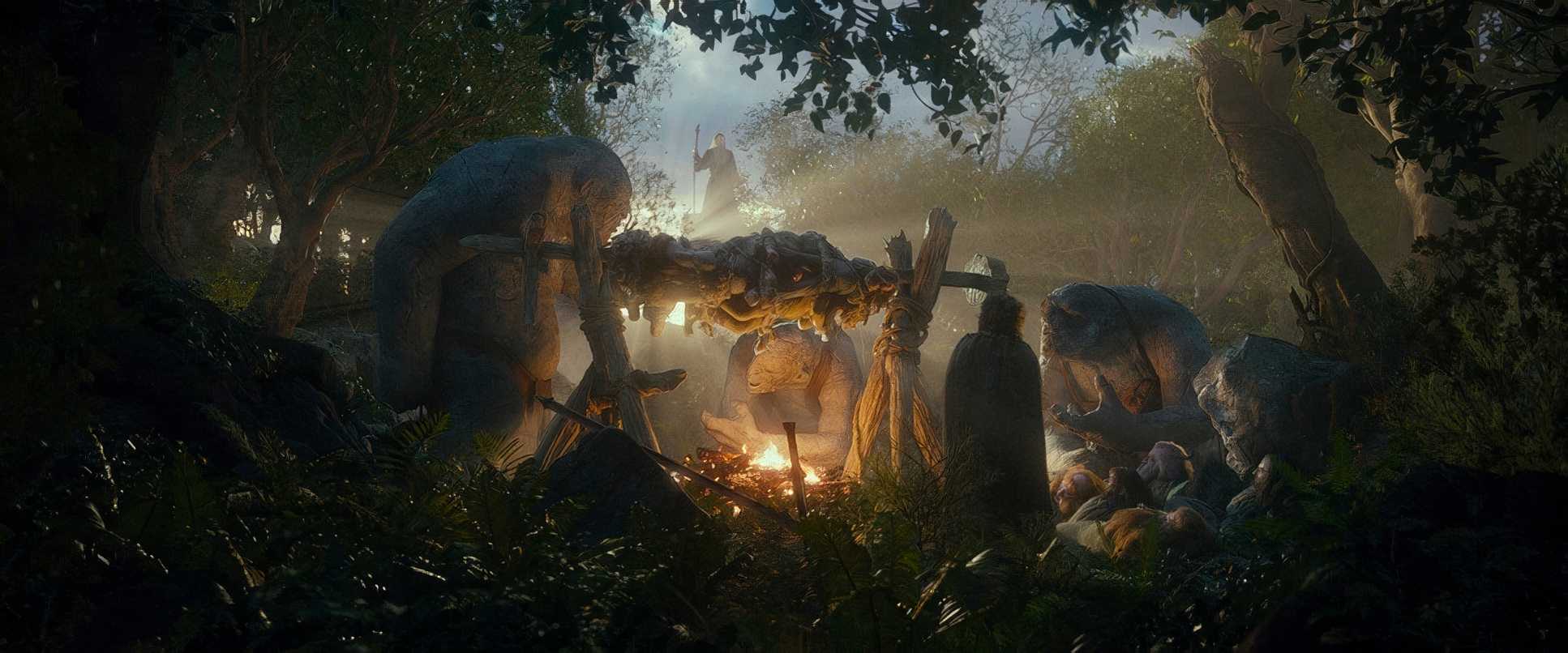
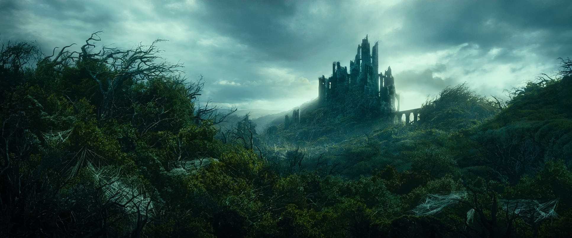
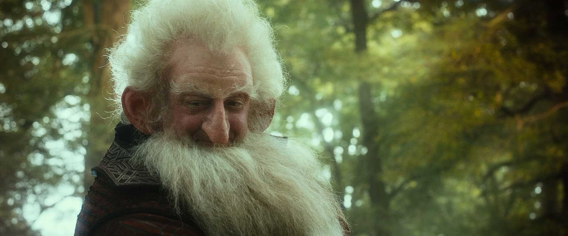
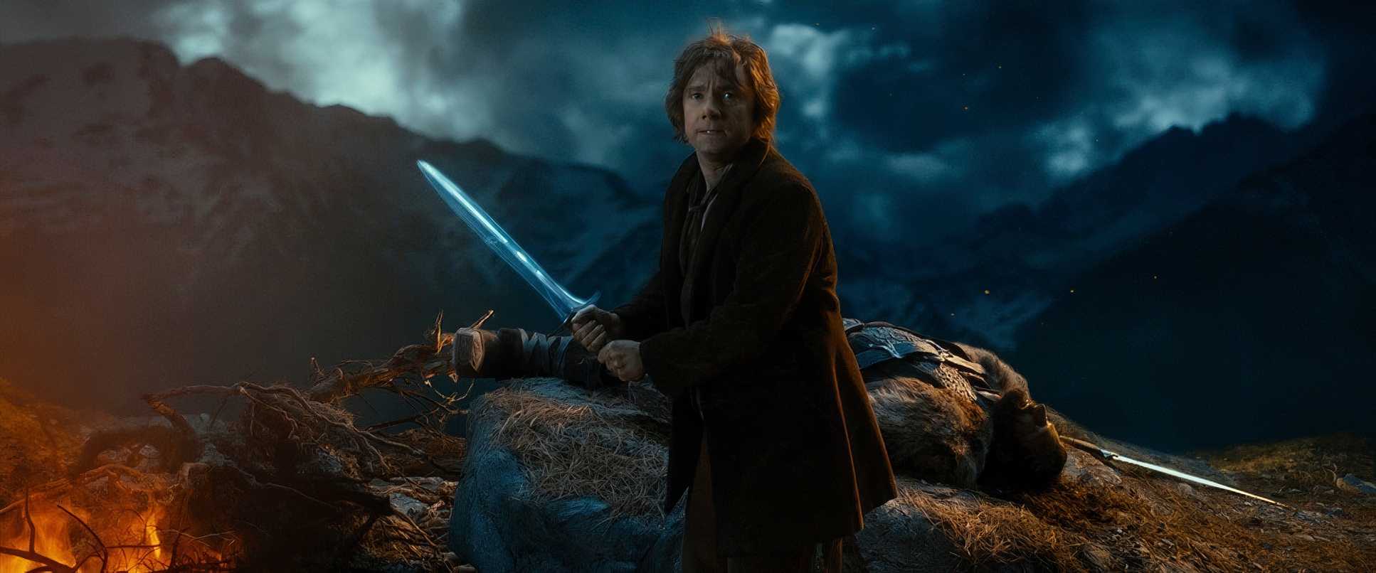
But once they hit the Misty Mountains or Goblin Town, the gloves come off. The lighting becomes theatrical and high-contrast. The “Riddles in the Dark” sequence with Gollum is a standout; it’s almost painterly, using stark highlights and deep, cavernous shadows to sculpt Gollum’s gnarled skin. Even Radagast the “mushroom eating hippie” with birch-dropping-covered hair is often hit with this ethereal, mystical glow. It’s a delicate dance between making a fantasy world feel “real” and making it look evocative.
Lensing and Blocking
Lesnie used a wide range of focal lengths to manipulate our emotions. Wide-angle lenses were the go-to for New Zealand’s landscapes, making the mountains look colossal and the characters look isolated.
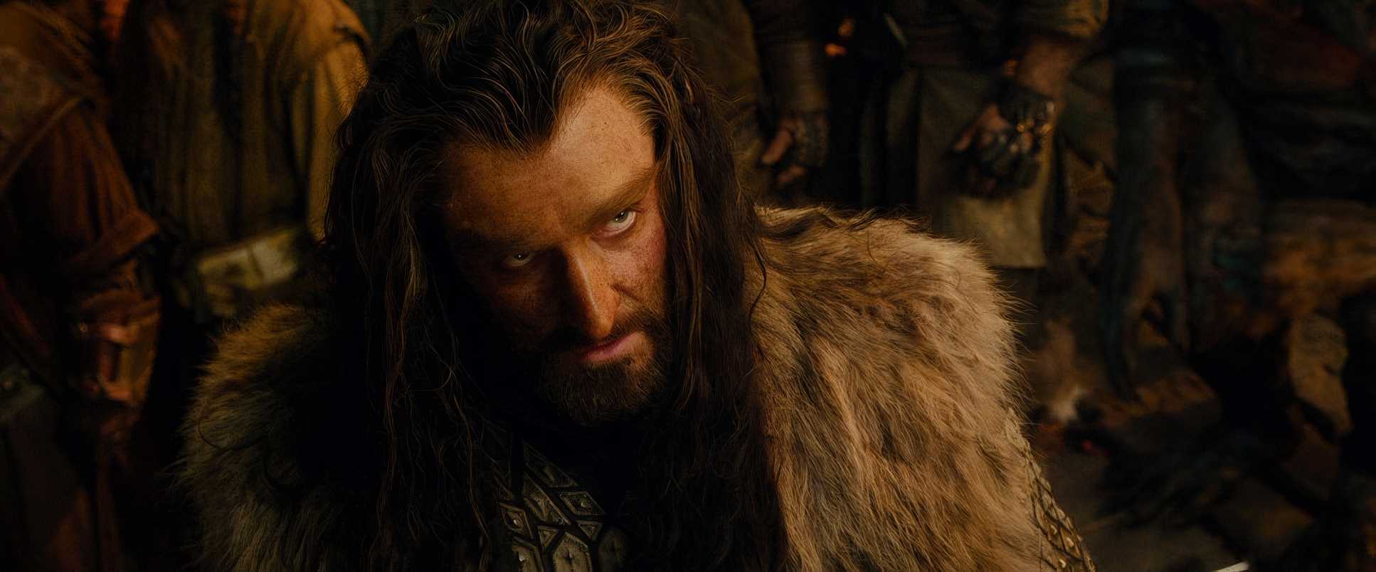
On the flip side, he leaned into medium and longer glass for the character beats. These lenses compress the background and let Martin Freeman’s performance really breathe. Martin Freeman absolutely owns it as Bilbo, and the lensing ensures his micro-expressions land with full impact.
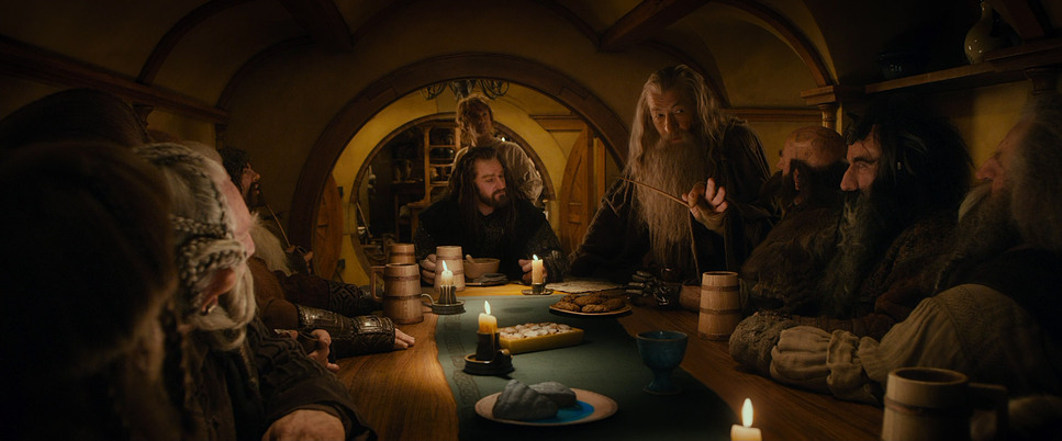
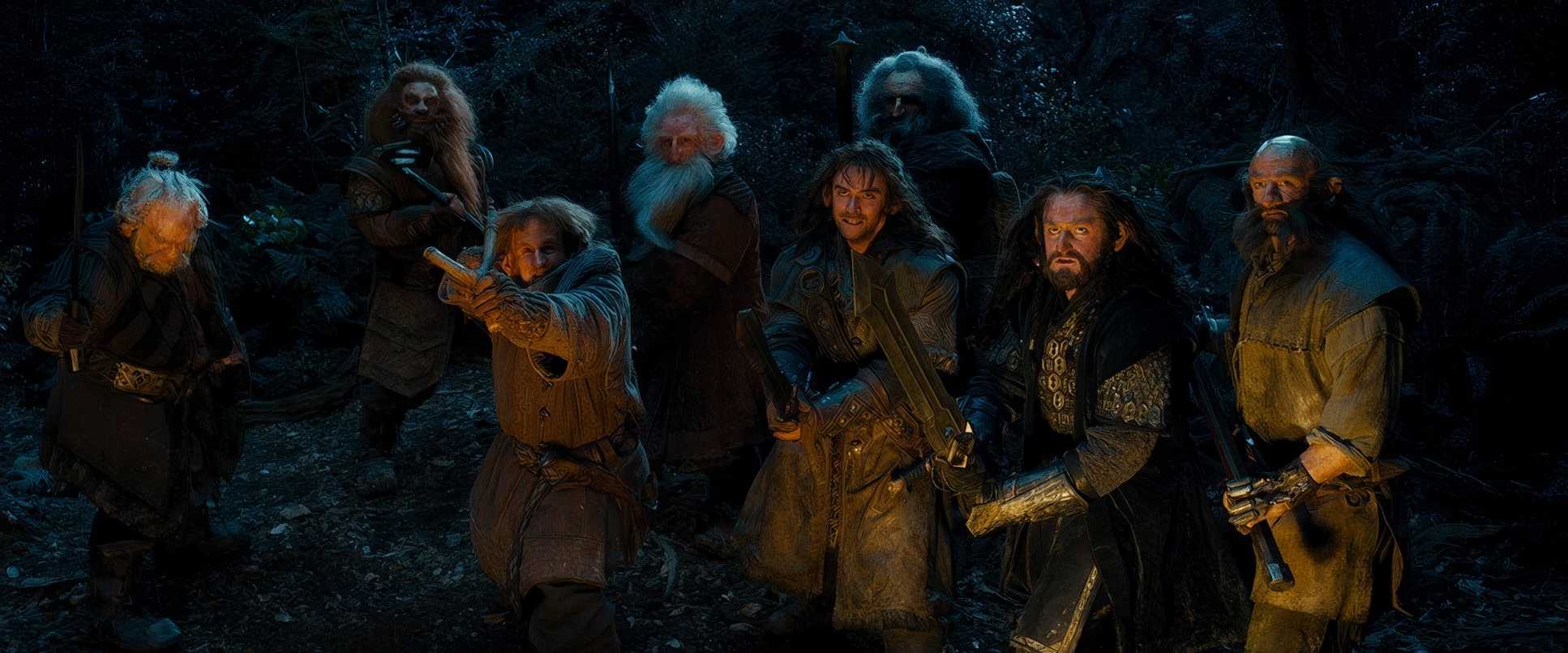
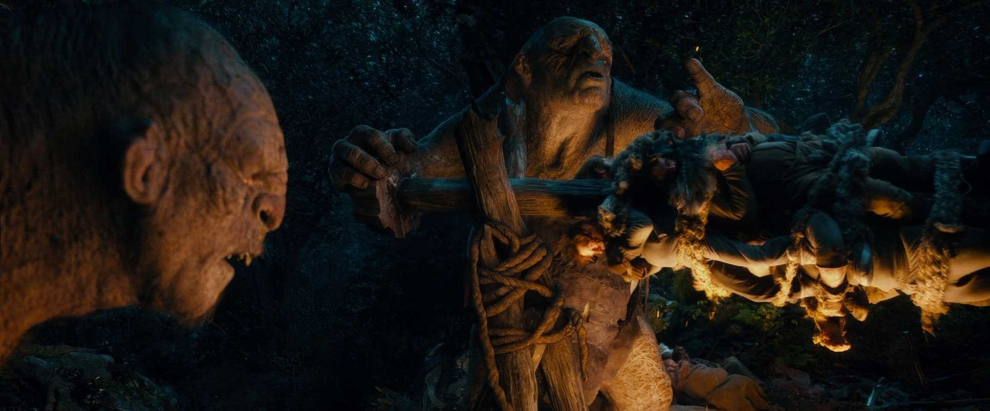
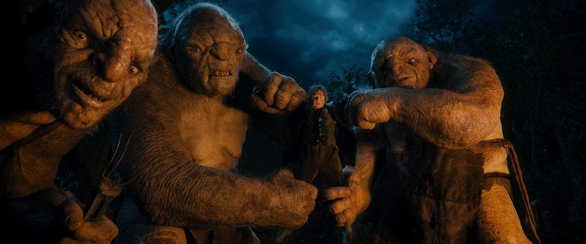
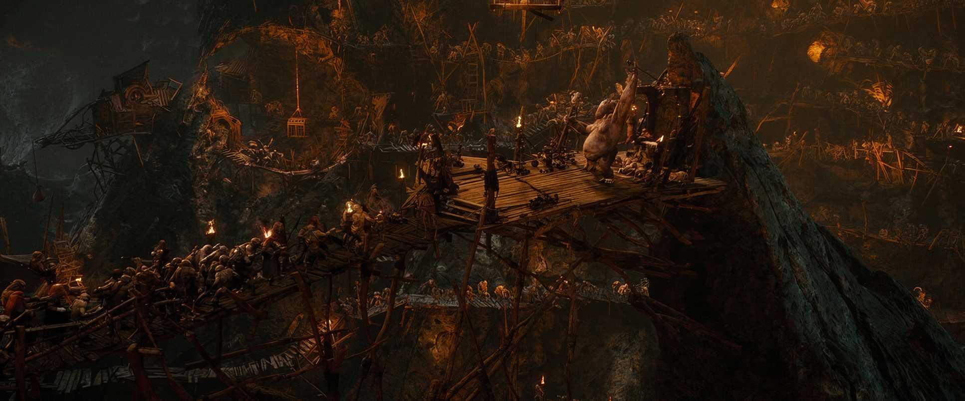
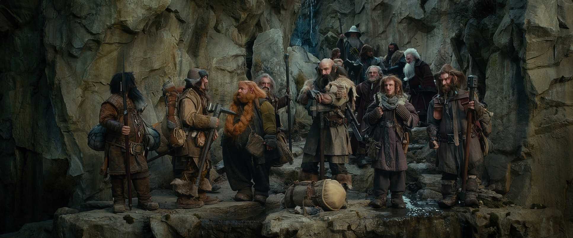
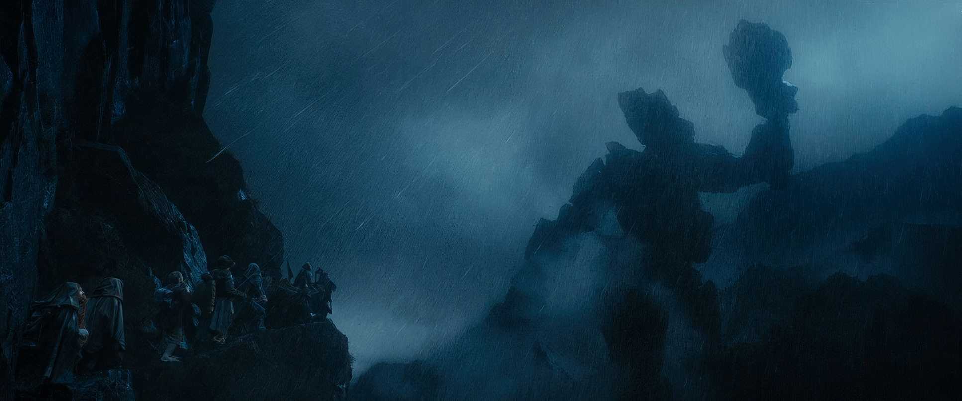
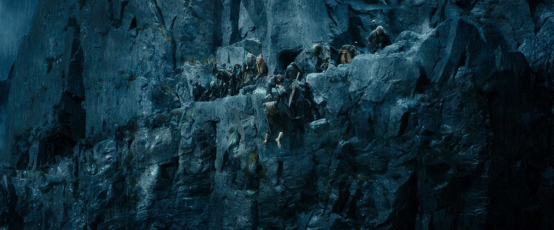
The blocking is equally calculated. Think about thirteen dwarves crammed into a tiny Hobbit-hole. Lesnie and Jackson orchestrated a kind of “controlled chaos,” keeping a clear visual hierarchy even when the frame is packed. When they face off against the Stone Giants, the dwarves are blocked to look like tiny specks caught in a titanic struggle, reinforcing just how out of their depth they really are.
Color Grading Approach
Now, let’s talk shop. This is where I really get to sink my teeth in. The Hobbit: An Unexpected Journey was a massive departure from the “print-film” look of Lord of the Rings. While the original trilogy had that earthy, tactile feel with beautiful highlight roll-off, The Hobbit embraced a cleaner, punchier digital aesthetic.
As a colorist, I can see the work of Peter Doyle here. The grade aims for a bright, modern look with aggressive hue separation. The Shire is a “cozy visual hug” all golden-hour tones and warm, inviting greens. But as they move into danger, the palette shifts. The “weird gangly hippie” Radagast brings vibrant, fairytale-like saturated greens and blues.
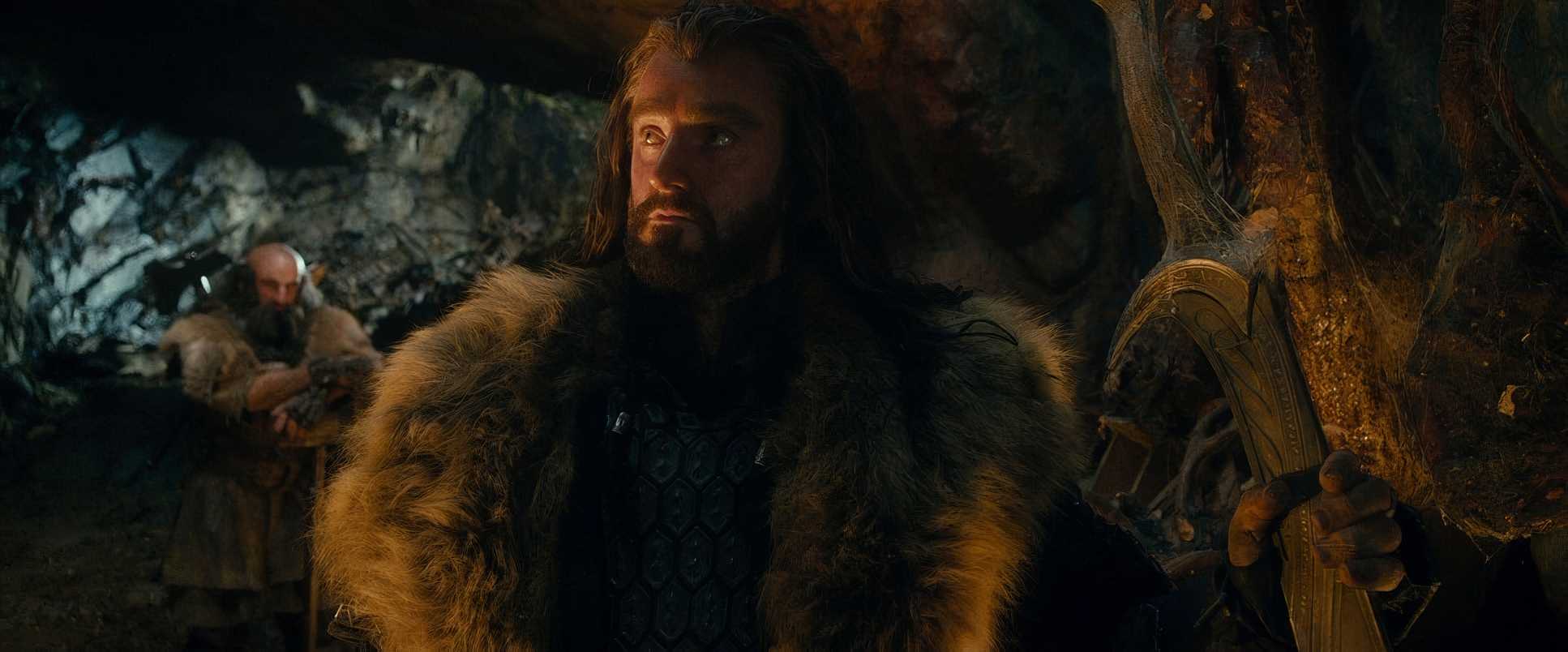
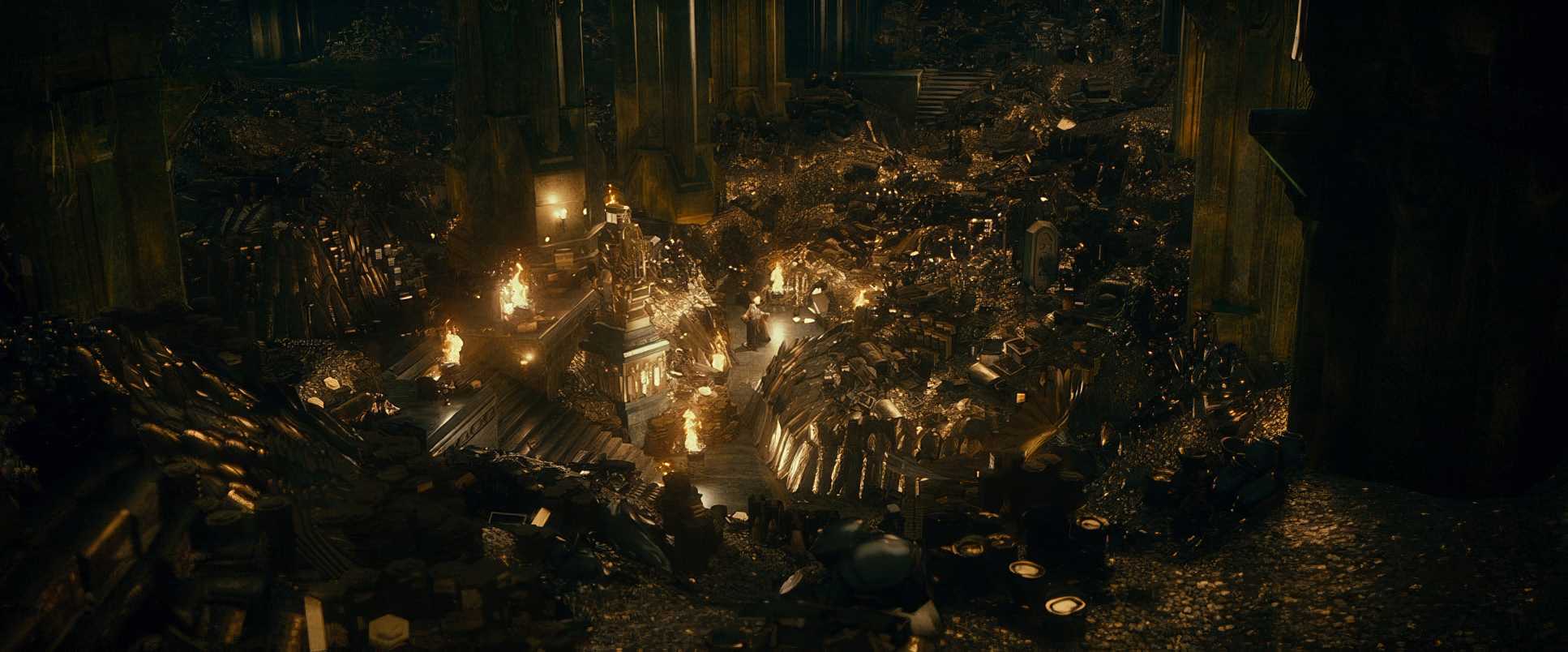
When they go underground, the tonal sculpting changes entirely. We get a desaturated, cooler palette inky, crushed blacks and sickly cyan-heavy greens to sell the claustrophobia. I noticed the highlight roll-off was handled with a lot of care to keep that “crystal clear” 5K resolution from the RED Epic sensors without looking too “plastic.” It’s a clean look that works for a fairytale, though it definitely lacks the grit of the original 35mm scans.
Technical Aspects & Tools
We have to talk about the elephant in the room: High Frame Rate (HFR). Shooting at 48 frames per second (twice the usual 24fps) was a massive gamble. To be honest? It freaks the brain out a bit. It’s “crystal clear,” but it often feels like the movie is playing in fast-forward. It takes away that magical filmic motion blur we’re used to and replaces it with a hyper-real, video-like quality.
They shot this on RED Epic cameras in 5K Redcode RAW, which gave them insane flexibility in post, but it also meant the “ton of CGI” had nowhere to hide. Because they could “still work on designs after shooting,” we got creatures like the Great Goblin and the Stone Giants entirely in digital. While the tech was a huge jump forward, for many viewers, it stripped away some of the grit. It’s a fascinating case study in whether “clearer” is actually “better” for cinema.
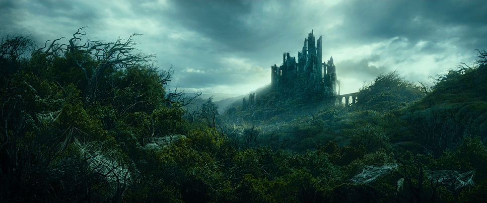
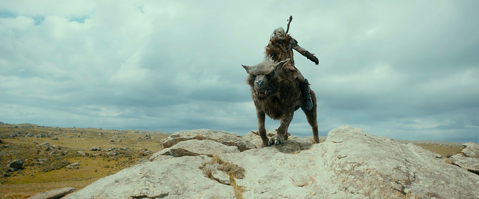
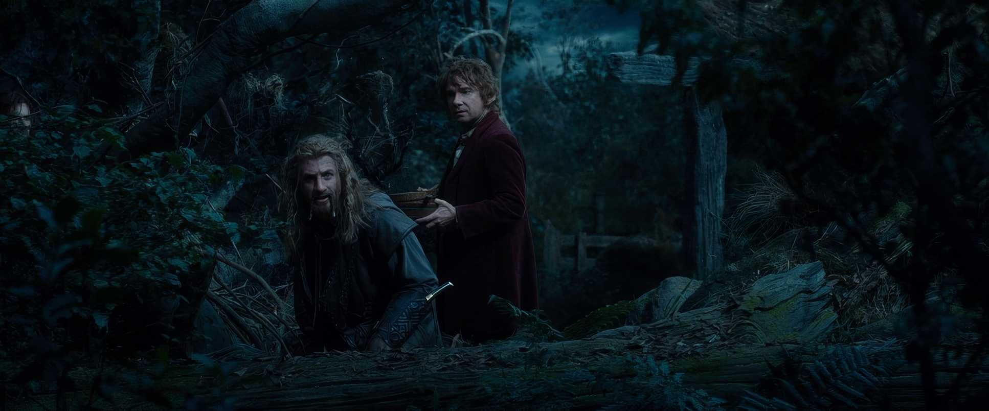
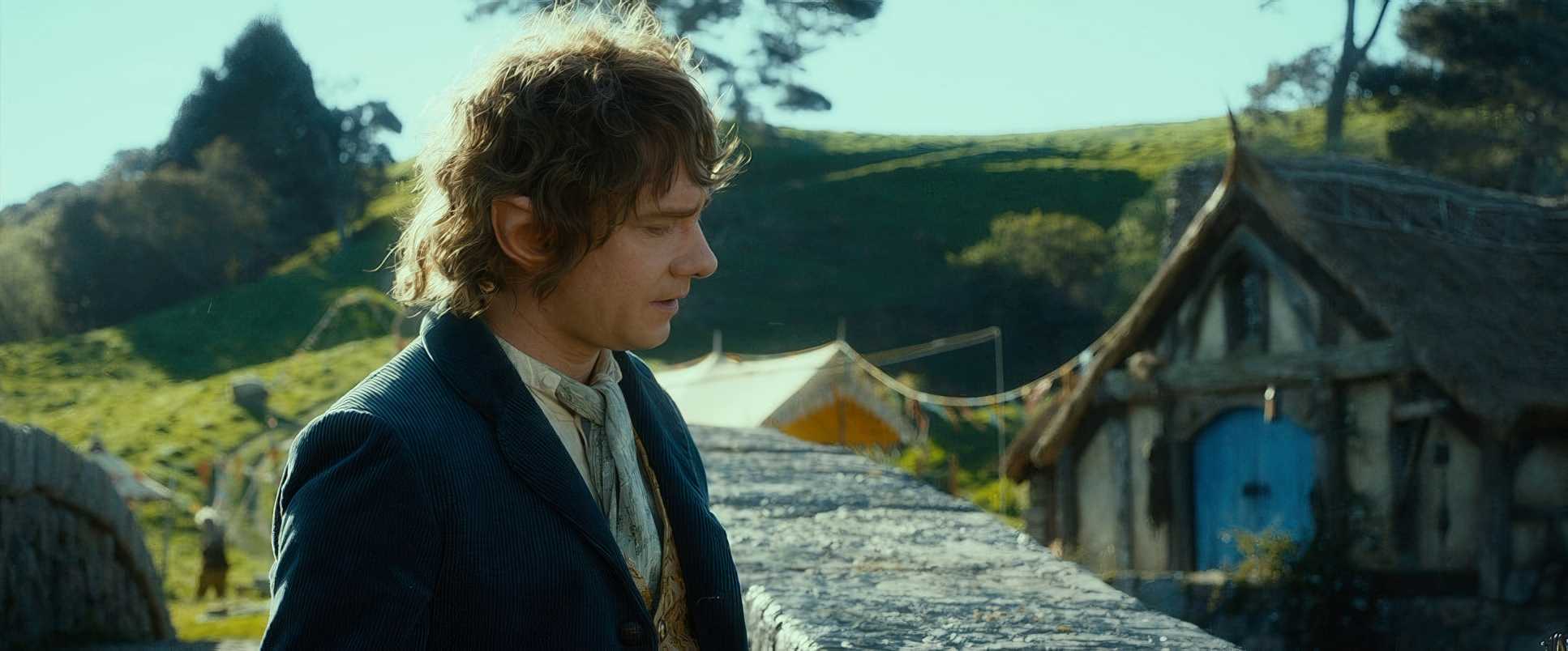
The Hobbit: An Unexpected Journey Film Stills
A curated reference archive of cinematography stills from The Hobbit: An Unexpected Journey (2012). Study the lighting, color grading, and composition.


- Also read: 20 DAYS IN MARIUPOL (2023) – CINEMATOGRAPHY ANALYSIS
- Also read: A CHARLIE BROWN CHRISTMAS (1965) – CINEMATOGRAPHY ANALYSIS
Browse Our Cinematography Analysis Glossary
Explore directors, cinematographers, cameras, lenses, lighting styles, genres, and the visual techniques that shape iconic films.
Explore Glossary →