Blackfish (2003) isn’t just a documentary to me; it’s a masterclass in using visual storytelling to dismantle a deeply ingrained illusion. It did so with a force that didn’t just change public perception it actually forced corporate policy to buckle.
When I first sat down with it, I wasn’t just watching the tragedy unfold; I was subconsciously dissecting the craft. I kept asking myself: How are they making me feel this way? How did they visually bridge the gap between “trainer error” and what one review called a “global nightmare”? It’s a testament to the power of committed filmmaking, and honestly, a huge chunk of that power lives in the cinematography. It’s an exposé, sure, but Peter Bradshaw from The Guardian was right on the money when he described the first forty-five minutes as being “as gripping as a thriller.” My job is to unpack how they actually achieved that visual grip.
About the Cinematographer
The lenswork here was primarily handled by Jonathan Ingalls, a guy who clearly knows his way around documentary and unscripted environments. What jumps out at me immediately is the sheer empathy he brings to the frame. You see it in the weathered faces of the former trainers and in the eyes of the orcas themselves.
Documentaries like this demand a very specific DNA in a DP someone who can handle a run-and-gun situation, adapt when things go sideways, and somehow maintain a consistent tone across a mountain of messy source material. You aren’t working with pristine sets or a lighting crew; half the time, you’re just trying to get the shot or capture a raw emotional beat without being intrusive. Ingalls navigated this with a kind of quiet precision. He didn’t lean on flashy moves or over-stylized “look at me” shots. Instead, he let the stark reality do the talking, orchestrating the visuals to build a cumulative emotional weight. It’s an incredibly tough balancing act when you’re mixing modern interviews with illicitly obtained footage and archival clips from the 80s that look like they were shot on a potato. (No offense to potatoes they’re elite in a gratin, just not for cinema-grade resolution.) The real magic was unifying that visual language so it all felt like one urgent, cohesive story.
Inspiration Behind the Cinematography
The cinematic “soul” of Blackfish feels rooted in a desire to deconstruct the shiny, romanticized image of marine parks. The goal was to expose what the Guardian review called a “viral conspiracy.” To do that, the visuals had to play a trick on us: they had to start by drawing us into that familiar, joyful SeaWorld aesthetic, only to systematically rip it apart.
A lot of the inspiration seems to come from the film’s central, heavy argument: that these “incredibly intelligent” animals are being driven to “borderline psychotic” behavior by their confinement. As a filmmaker, you have to ask: How do you show psychosis in a whale? You can’t make it a cartoon. You do it through stark comparisons using scale and the haunted reactions of the humans who were there. The cinematography had to visually argue that “we’ve driven them mad.” It’s less like a slasher flick and more like a slow-burn psychological thriller. We aren’t necessarily seeing overt, bloody cruelty as Whitney from EcoBeganGal points out, the closest it gets to that is the capture scenes. Instead, the “cruelty” is implied and systemic. It’s in the shadows and the tight framing.
The film also leans heavily into true-crime aesthetics, especially regarding Tilikum. That first 45 minutes is framed like a “portrait of a serial killer,” using the camera to build a sense of dread and foreshadowing. It required a visual language that felt urgent and unsettling, but always grounded in a reality you couldn’t look away from.
Camera Movements
The camera movements here are incredibly purposeful. They serve the film’s dual identity as both an exposé and a drama. For the interviews, the camera is mostly static or uses these very slow, deliberate pans. It gives the subjects’ words room to breathe. When a former trainer describes the capture “they had aircraft, they had spotters, speedboats, bombs” the fact that the frame is so calm and steady actually makes the brutality of the story feel ten times louder.
Then you have the footage of the whales. In those sequences, the camera feels much more restless, though it’s always controlled. You’ll see tracking shots following the repetitive, mind-numbing patterns of the orcas in their tanks, which really drives home how small their world is. When things get chaotic or historical, the handheld work kicks in. It adds this visceral, unpolished immediacy that makes you feel like you’re right there in the middle of the mess. It reminds me of that heartbreaking moment when a former capturer describes losing it and crying while separating a calf from its mothermthe raw, shaky nature of the footage at that point mirrors the emotional breakdown perfectly.
Compositional Choices
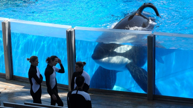
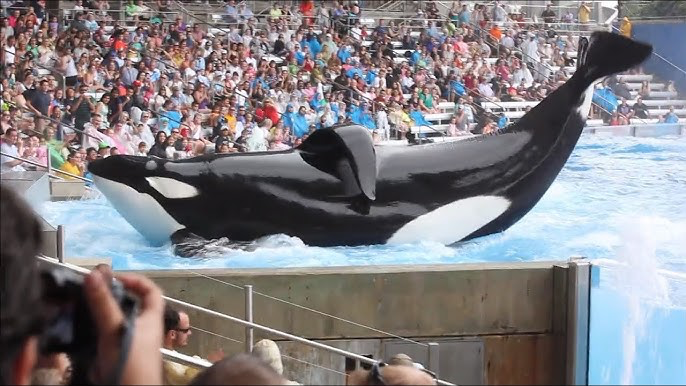
Composition in Blackfish is a masterclass in conveying scale and entrapment. The DPs frequently used wide shots of the tanks, often from high angles, to show just how massive these orcas are compared to their tiny concrete boxes. These aren’t “majestic” shots; they’re claustrophobic. They visually scream that “these animals are not happy.” You’re looking at a creature designed for the open ocean, compressed into a space that looks like a backyard pool.
Contrast is everything here. We’re shown grainy archival footage of orcas in the wild fluid, powerful, and free immediately followed by crisp, contemporary shots of them doing “tricks” in a sterile arena. The shift is jarring. In the wild, the frame is open; in captivity, the frame becomes tight and theatrical. That juxtaposition creates a depth cue for the “psychosis” mentioned in the reviews.
For the interviews, the compositions get much tighter. It’s all about the eyes and the body language. By stripping away distracting backgrounds, the filmmakers force you to connect with the trainers’ sincerity. It’s a subtle way to build empathy and authority without saying a word.
Lighting Style
The lighting is largely observational and naturalistic, which is exactly what you want for a compelling doc. It leans on “motivated” lighting meaning the light comes from the actual environment. There’s no “Hollywood” gloss here, which would have killed the film’s credibility.
In the interviews, they used soft, even illumination likely just available light or very minimal practicals. The goal wasn’t to make people look like movie stars; it was about clarity. I love how the light shapes the contours of their faces, catching the lingering sadness or flashes of anger in their expressions. It feels like a testimony, not a performance.
When we move into the marine parks, the lighting shifts to that harsh, unfiltered reality we all recognize. Think about that blazing sunlight hitting white concrete or the sickly, artificial glow of an indoor holding tank. It’s high-contrast and sometimes overexposed, especially in the capture scenes. That lack of polish underscores the film’s “one-sided” but powerful narrative. The message is clear: there’s no glamour here, only the truth.
Lensing and Blocking
Lensing choices in Blackfish were clearly driven by the need for intimacy and scale. For the interviews, they likely stuck to medium telephoto lenses something in the 50mm to 85mm range. This creates a comfortable distance while allowing for those close-ups that feel sincere rather than intrusive. The shallow depth of field helps pop the subject off the background, making sure you’re hanging on every word.
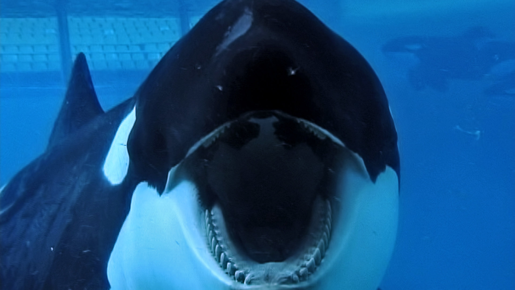
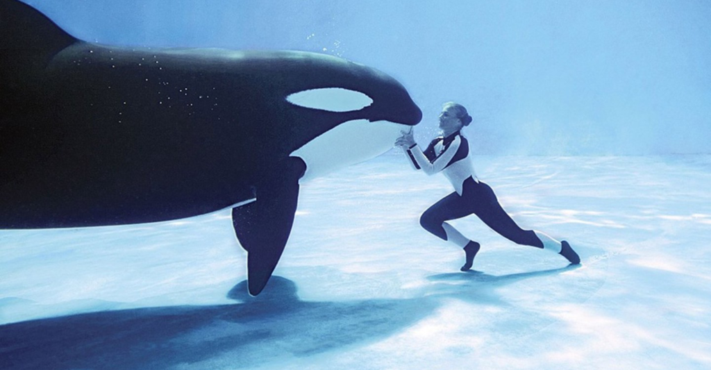
When it comes to the whales, the lensing gets more varied. They used wide-angle lenses to capture the “visual paradox” of an orca in a tank exaggerating the confinement. Imagine that massive animal framed entirely within a small concrete pool; the wide lens makes the walls look even closer. On the flip side, telephoto lenses were used to observe them from a distance, catching those repetitive, stress-induced behaviors without disturbing the animals.
The “blocking” of the whales is actually quite tragic. In the wild, their natural movement dictates the frame. In captivity, they are blocked by the geometry of the tanks. The cinematography exploits this constantly, framing the whales against hard lines and corners. When the film shows Tilikum being attacked by other whales, the angles make you feel the inescapable pressure of their forced proximity. You can practically feel the walls closing in.
Color Grading Approach
Now we’re in my playground! The color grade in Blackfish is masterful because it’s so quiet. It’s working overtime to unify a mess of different footage types and sculpt the emotional landscape. Given the tragedy of the subject, the palette leans toward a desaturated, slightly cool look. It’s not just an “aesthetic” choice; it’s a tool to convey the loss of vitality that happens in captivity.
As a colorist, I look at the contrast shaping here. They lifted the shadows just enough to keep detail in the darks while keeping the highlights from blowing out, which maintains that “grounded” feel. This is what helps a 20-year-old VHS tape sit next to a modern digital interview without looking like a total accident.
Hue separation is the other big player. You want the blues of the ocean to feel deep and natural, while making sure the skin tones of the trainers stay authentic. I noticed the grade often pushes the greens and cyans in the tank water toward a clinical, artificial tone. It subtly tells your brain, “This environment is wrong,” even while the bright, saccharine colors of the SeaWorld marketing footage pop with a kind of fake cheerfulness.
There’s also some beautiful tonal sculpting going on. Darks and heaviness surround the stories of cruelty, while a slightly brighter look accompanies the moments of reflection. The highlight roll-off is handled with a gentle, filmic touch, avoiding that “digital crunch” that can sometimes distract the viewer. The grade acts like a conductor, making sure every visual note reinforces the gut-wrenching argument of the film.
Technical Aspects & Tools
Shooting in the early 2010s, the filmmakers had to be scrappy. They likely relied on workhorses like the Canon C300or maybe a Sony F-series camera. These were the go-to’s for docs because they handled low light well and were easy to move with. I wouldn’t be surprised if they tucked a Canon 5D Mark II into a bag for the more clandestine shots it had a small footprint but still looked “cinematic.”
They needed portability, great ISO performance for those dim back areas of the parks, and enough dynamic range to handle the harsh sun reflecting off the water. But the real nightmare and the real triumph was the post-production. Blackfish is a patchwork of codecs, resolutions, and frame rates. My hat is off to the editors and colorists who managed to bridge those gaps.
While they likely cut the film in Avid or Premiere, the heavy lifting of the color management happened in a suite like DaVinci Resolve. That’s where you can use grain, curves, and noise reduction to make a grainy news clip from 1985 feel like it belongs in a 2013 feature film. It’s a reminder that the “perfect” camera is just the one that gets the shot; the real magic is how you weave those disparate pieces into a resonant whole.
- Also read: THE MAN WHO SHOT LIBERTY VALANCE (1962) – CINEMATOGRAPHY ANALYSIS
- Also read: MY OCTOPUS TEACHER (2020) – CINEMATOGRAPHY ANALYSIS
Browse Our Cinematography Analysis Glossary
Explore directors, cinematographers, cameras, lenses, lighting styles, genres, and the visual techniques that shape iconic films.
Explore Glossary →