When I sit down to rewatch All Quiet on the Western Front (1930), I’m not just watching a “classic.” I’m looking at the DNA of what I do. It’s a primal scream captured on silver halide, and frankly, it puts a lot of modern HDR war films to shame.
This isn’t just an “anti-war” movie; it’s a visual assault. Lewis Milestone’s adaptation of Remarque’s novel doesn’t ask you to pity the characters it shoves you into the mud with them. It forces you to deal with the sickening gap between the “glory” of the recruiters and the industrialized slaughter in the trenches. And it pulls this off with a visual vocabulary that was, quite honestly, decades ahead of its time.
About the Cinematographer
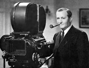
The man responsible for this look was Arthur Edeson. In the color grading suite, we talk about “versatility,” and Edeson was the definition of it. The guy shot Frankenstein, The Maltese Falcon, and Casablanca. But with All Quiet, he did something brave: he stopped trying to make things look “cinematic” in the traditional, theatrical sense.
Under Milestone’s direction, Edeson chased a raw, documentary-style truth. He wasn’t lighting for beauty; he was lighting for survival. While most films of that era were still stuck in a stage-play aesthetic, Edeson was out in the dirt, creating a visual tapestry that feels less like a movie and more like a memory you wish you didn’t have. It’s gritty, it’s unflinching, and it’s brilliant.
Inspiration Behind the Cinematography
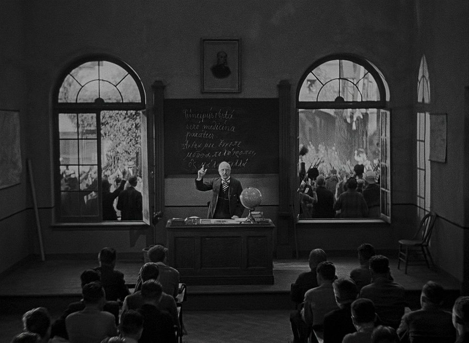
You have to remember the headspace of 1930. The scars of WWI weren’t history yet; they were open wounds. The post-war disillusionment was everywhere, especially in Germany. When they set out to adapt Remarque’s book, Milestone and Edeson knew they couldn’t use the usual “hero shots.”
Instead, they leaned into a philosophy of “unblinking witness.” They were visually translating phrases like “desolate bloodstream trenches.” This film is the direct antithesis of jingoistic stuff like The Green Berets. It exists to dismantle the “old lie” the idea that dying for your country is sweet or noble. Every frame is a rejection of that romanticism. As a colorist, I see this in the lack of “heroic” contrast; everything is balanced to show the cost, not the cause.
Camera Movements
For 1930, the camera movement here is actually kind of insane. Remember, they were dealing with massive, heavy gear, yet the camera feels incredibly active.
Those sweeping tracking shots across No Man’s Land? They aren’t just there to look cool. They emphasize the sheer scale of the meat grinder. You see bodies falling in waves, and the camera just keeps moving, indifferent to the individual. It’s disorienting and frantic exactly what combat actually feels like.
But it’s the quiet moves that get me. That slow, agonizing push-in on Paul’s face after he’s seen too much? That’s where the “psychological toll” lives. Or the way the camera feels trapped in the bunkers, barely moving, creating this claustrophobic tension that makes you want to look away. It’s a masterclass in using movement to dictate blood pressure.
Compositional Choices
Edeson’s eye for composition was basically a weapon used against the audience’s comfort. He constantly plays with the scale of the frame.
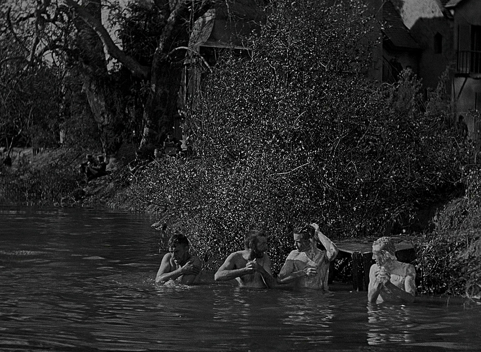
You’ve got these massive wide shots of ruined fields nothing but barbed wire and mud. He uses negative space here in a way that feels heavy. It’s not “empty” space; it’s space filled with the absence of the men who used to be there.
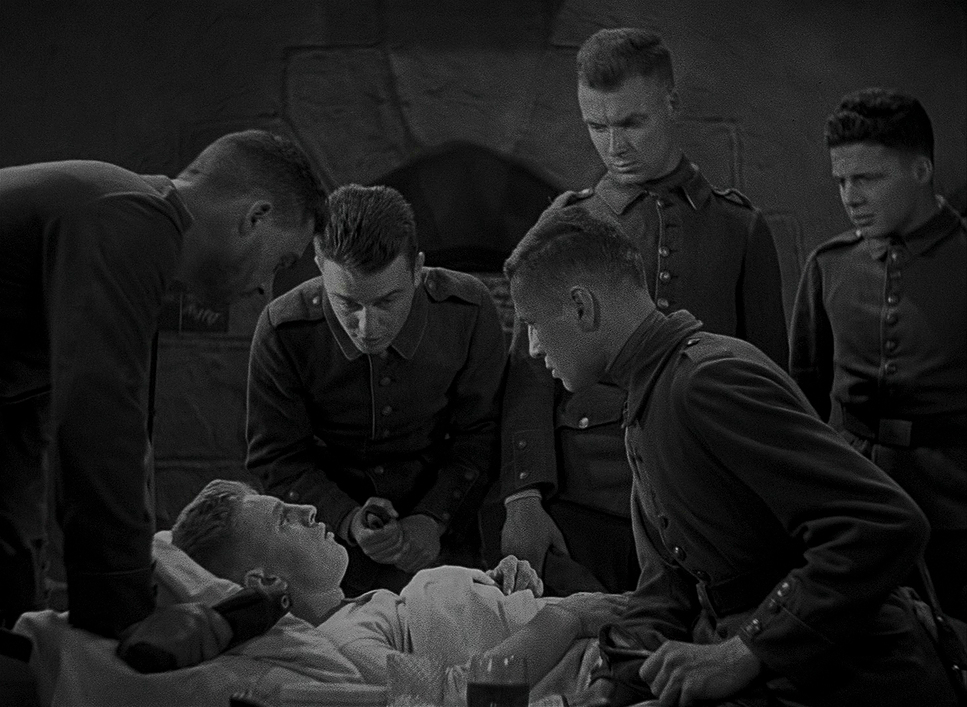
Then, he’ll pivot to a suffocatingly tight close-up in a trench. You can see the grime under the fingernails and the hollowed-out look in their eyes. He uses depth cues even without color to stack the chaos, layering foreground mud and background explosions so you never feel like there’s a “safe” place to look. The crater scene with the French soldier is the peak of this. It’s eye-level, intimate, and heartbreaking. It’s not a victor and a loser; it’s just two kids in a hole.
Lighting Style
In my world, lighting is color. When you don’t have a palette of hues, you have to sculpt with luminance. Edeson and Milestone understood that “pretty” light would have ruined this movie.
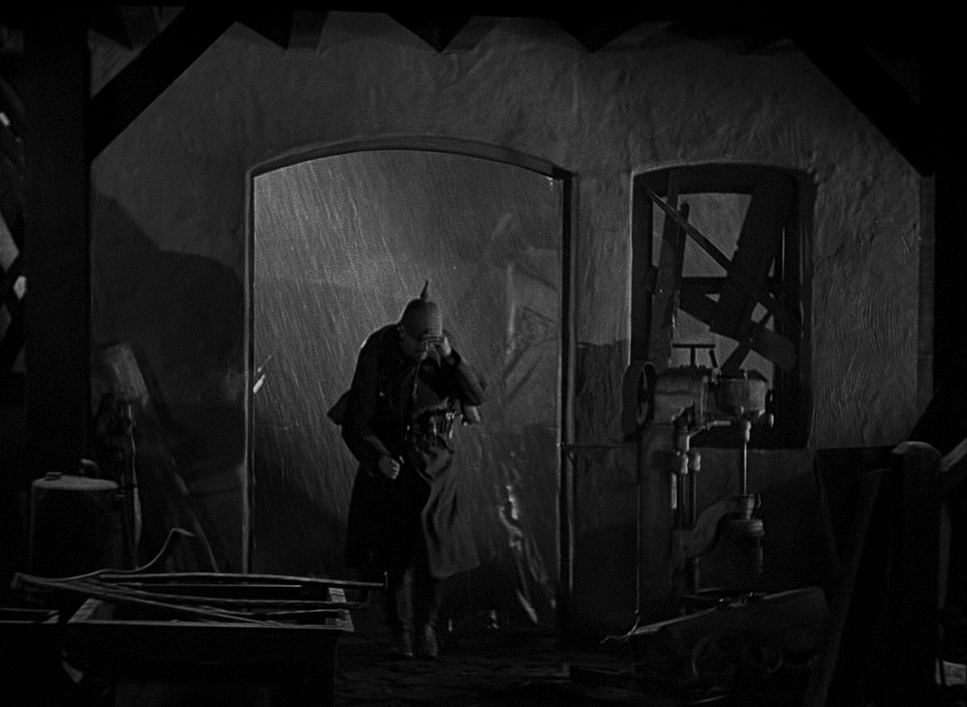
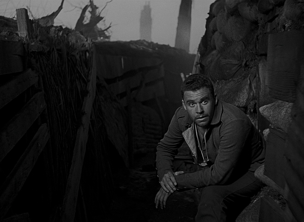
Most of the trench scenes use this harsh, flat daylight. It’s unforgiving. It makes the mud look wetter and the exhaustion look deeper. But then, for the night scenes, they go full chiaroscuro.
The flares are the star of the show here. They create these violent bursts of light that plunge everyone back into terrifying shadows a second later. From a grading perspective, the “tonal sculpting” here is incredible. The way the highlights roll off and the shadows hold just enough detail to show a terrified face that’s pure skill. They used the grit of the film stock to their advantage, making the whole world feel “barren and grey” without it feeling boring.
Lensing and Blocking
We have thousands of lens options today, but in 1930, they had to be very deliberate. They used wide glass to make the landscapes look desolate and make the soldiers look like ants. There’s a slight distortion at the edges of those wide lenses that, to me, perfectly mirrors how war warps reality.
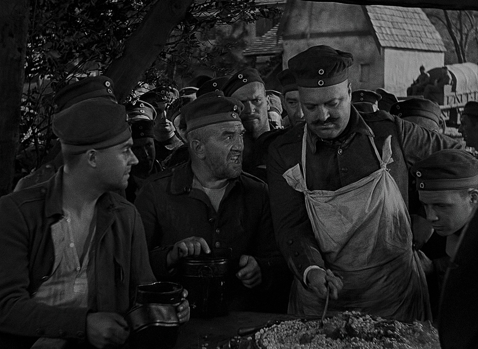
The blocking is where you see Milestone’s hand. In the battle scenes, it looks like pure chaos men stumbling, colliding, falling but it’s actually a choreographed nightmare.
In the bunkers, the blocking changes. The men are huddled so close they almost blend into one another. It’s not “heroic” posing; it’s the physical manifestation of trauma and camaraderie. When Paul is in that crater, the way he’s positioned next to the man he just killed is so uncomfortably close it makes your skin crawl. That’s how you tell a story without a single line of dialogue.
Color Grading Approach
Even though it’s a B&W film, as a colorist, I’m looking at the “dynamic range decisions” made on set. They didn’t have DaVinci Resolve, but they were doing “in-camera grading” through exposure and print processing.
The contrast is robust, almost aggressive. You’ve got these inky blacks and blown-out highlights from the artillery. It’s not subtle, and it shouldn’t be. If I were restoring this today, the biggest mistake would be trying to “clean it up.” You need that grain. The grain is the grit of the trenches.
The “hue separation” (how different colors like uniforms vs. mud turn into different shades of grey) is handled brilliantly. Edeson made sure the textures popped so that even in a world of grey, nothing felt flat. It’s a “gut-punch” aesthetic that relies on luminance to do the heavy lifting that color usually handles.
Technical Aspects & Tools
All Quiet on the Western Front (1930) | 35mm • 1.33:1 • B&W
| Genre | Drama, War |
| Director | Lewis Milestone |
| Cinematographer | Karl Freund, Arthur Edeson |
| Production Designer | Charles D. Hall, William R. Schmidt |
| Editor | Milton Carruth, Edgar Adams, Edward L. Cahn |
| Time Period | 1910s |
| Color | Desaturated, Black and White |
| Aspect Ratio | 1.37 |
| Original Aspect Ratio | 1.33 |
| Format | Film – 35mm |
| Lighting | Soft light |
| Lighting Type | Daylight |
| Story Location | Europe > Germany |
| Filming Location | California > Los Angeles |
| Film Stock / Resolution | Eastman 1218 |
You have to respect the hustle of the 1930 crew. They were lugging around Mitchell Standard cameras that weighed a ton. Once sound came in, they had to put these cameras in “blimps” essentially giant insulated boxes to keep the motor noise from ruining the audio. It made moving the camera a logistical nightmare, which makes those tracking shots even more of a miracle.
They were likely using the newer panchromatic film stocks, which actually saw the full spectrum of light. Before that, blue skies would just turn white and red would turn black. This new stock gave Edeson the ability to capture skin tones and textures with actual nuance. Every explosion you see was a real, choreographed blast. The mud was real. The exhaustion of the extras was probably real. It was visceral filmmaking because they didn’t have any other choice.
- Also read: TUMBBAD (2018) – CINEMATOGRAPHY ANALYSIS
- Also read: DIABOLIQUE (1955) – CINEMATOGRAPHY ANALYSIS
Browse Our Cinematography Analysis Glossary
Explore directors, cinematographers, cameras, lenses, lighting styles, genres, and the visual techniques that shape iconic films.
Explore Glossary →