The first time I sat down to watch The Straight Story (1999),I kept waiting for the “Lynch” of it all to kick in. I was looking for the jump scares, the red curtains, or the industrial humming. Instead, I got an old man on a John Deere, a lot of Iowa corn, and some of the most honest cinematography I’ve ever seen. They just captured it. It’s a total anomaly: a G-rated Disney movie about a guy driving five miles per hour to make peace with his brother. People call it “the least Lynchian movie ever,” and on the surface, they’re right. No nightmare fuel. No Eraserhead babies. But if you look at the restraint in the grade and the camera work, you realize it’s actually Lynch at his most confident. He didn’t need the surrealism to hold our attention.
About the Cinematographer
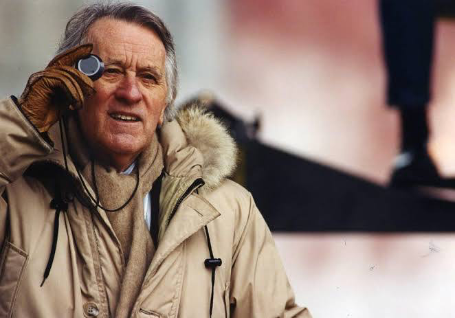
You can’t talk about this film without talking about the legend, Freddie Francis. The guy was a titan. He’d already done the heavy lifting on The Elephant Man and Dune for Lynch, but his CV is wild he won Oscars for Sons and Loversand Glory, yet he also spent years directing Hammer Horror films.
By the time he got to The Straight Story, he was in his late 80s, which is poetic if you think about it. He brought a “painterly” eye to the Midwest that only someone with that much mileage could have. He wasn’t trying to show off with flashy rigs or “look at me” lighting. He just stayed out of the way of Richard Farnsworth’s performance. It takes a massive amount of ego-stripping for a world-class DP to deliver something this transparent.
Inspiration Behind the Cinematography
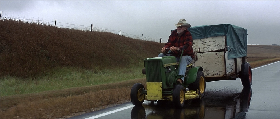
The visual DNA of this movie is built on one thing: Alvin’s internal clock. The pacing has been called “relentlessly monotonous,” which, to be honest, is a compliment. If you’re traveling 300 miles on a lawnmower, life is monotonous. The cinematography forces you to sit in that.
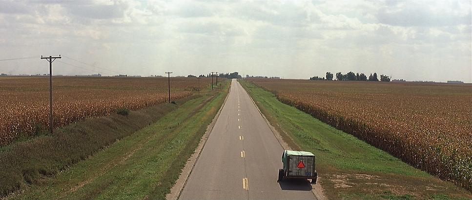
Lynch basically stripped his toolbox bare. No “flourishes” for the sake of it. The inspiration was the heartland itself. You see these massive wide compositions that make Alvin look like a speck of dust, which really hammers home his independence and his stubbornness. It’s the “straight” truth, literally and figuratively. Even that G-rating, which feels so weird for the guy who gave us Blue Velvet, serves the aesthetic. It’s a visual purity that matches the earnestness of the script.
Camera Movements
The camera here moves like a man with bad hips slowly, and only when necessary. You won’t find any shaky-cam or “kinetic” editing here. Most of the film is static, letting the wind in the corn do the moving.
When Francis does move the camera, it’s usually a slow dolly or a track that matches Alvin’s 3-mph crawl. There’s one specific sequence that kills me: the camera pans from Alvin up to the clouds, dissolves to show time passing, and pans back down… only for Alvin to have moved maybe ten feet. It’s a brilliant bit of visual humor, but it also reinforces the theme: the journey isn’t about the destination; it’s about the sheer, grueling accumulation of miles.
Compositional Choices
The framing is pure classical. Francis uses the 2.35:1 aspect ratio to show just how much “nothing” is surrounding this man. By keeping Alvin in the lower third of the frame against those massive Iowa horizons, the composition does the emotional heavy lifting. You feel his vulnerability before he even says a word.
I love the use of leading lines here the endless rows of crops and those straight-shot highways pulling your eye toward a vanishing point that feels a million miles away. And when we finally get close-ups? Man, the texture on Richard Farnsworth’s face is incredible. Francis used negative space to let the silence breathe. Those “empty” frames aren’t actually empty; they’re filled with Alvin’s memories and regrets.
Lighting Style
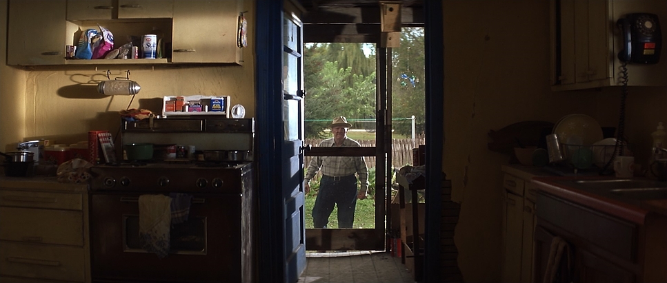
Now, looking at the lighting, it’s a masterclass in motivated naturalism. Most of the film is dominated by that hard, uncompromising Iowa sun. A lot of people try to soften everything out to make it look “cinematic,” but Francis leaned into the daylight. It feels weathered. It feels real.
We get these beautiful magic hour sequences where the long, orange shadows start to stretch out, and that’s where the melancholy hits. It’s not over-lit. The interiors feel like they’re lit by a single window or a lamp on a side table. There’s a humility to the light here that you just don’t see in modern digital features. It doesn’t look like a “set.” It looks like a life.
Lensing and Blocking
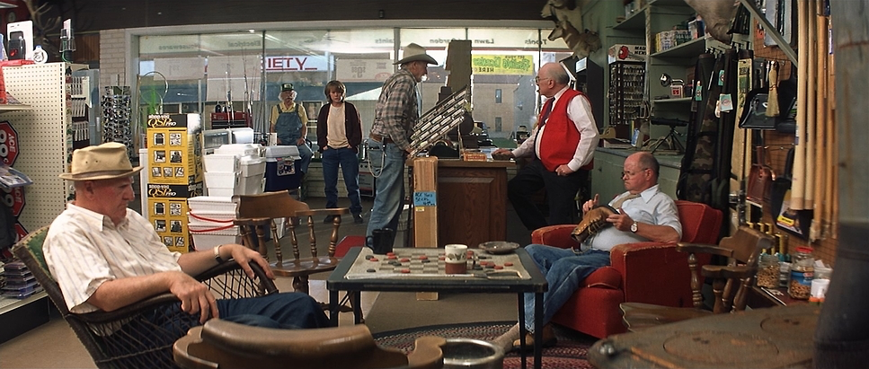
They shot this on Panavision glass specifically the C-Series anamorphics. Using wide lenses for those landscapes was the right call; it kept the depth of field deep enough to see the world Alvin was moving through. When they do go long for the intimate moments, it’s subtle. They aren’t blowing out the background into a blurry mess; they’re just gently separating him from the world for a second so we can hear him think.
The blocking is just as direct. Alvin is usually centered, reflecting his single-mindedness. I’m a fan of how they handled the deer antlers on his trailer, too. They’re always framed to look like a memento mori a constant reminder of mortality hitching a ride behind him. The camera doesn’t hunt for the action; it just waits for the actors to walk into the frame.
Color Grading Approach
As a colorist, this is where I get nerdy. The grade on The Straight Story is all about “staying in the pocket.” It’s a naturalistic, slightly desaturated palette that feels like a faded photograph from the 90s.
We’re seeing a lot of warm, golden tones that “Orange” vibe noted in the tech specs but it’s handled with such a gentle touch. The highlight roll-off is gorgeous; you can tell this was 35mm stock because the sun feels thick and tactile, not clipped like digital. I look at the hue separation between the greens of the grass and the yellows of the harvest, and it’s just perfect. You could try to give this the modern “Teal and Orange” blockbuster look, but it would ruin the movie. The “invisible” grade is the hardest one to pull off, and they nailed it.
Technical Aspects & Tools
The Straight Story
Technical Specifications & Metadata
| Genre | Drama, Road Trip |
| Director | David Lynch |
| Cinematographer | Freddie Francis |
| Production Designer | Jack Fisk |
| Costume Designer | Patricia Norris |
| Editor | Mary Sweeney |
| Colorist | Mato Der Avanessian |
| Time Period | 1990s |
| Color | Warm, Orange |
| Aspect Ratio | 2.35 – Anamorphic, Super 35 |
| Format | Film – 35mm |
| Lighting | Hard light |
| Lighting Type | Daylight, Sunny |
| Story Location | Iowa > Laurens |
| Filming Location | United States of America > Iowa |
| Camera | Panavision Gold / G2 |
| Lens | Panavision C series |
| Film Stock / Resolution | 5274/7274 Vision 200T, 5279/7279 Vision 500T |
Shooting on 35mm was essential for that organic grain and the way the film handles the sky. They used Kodak Vision stocks (the 200T and 500T), which explains that rich, filmic texture. Using the Panavision Gold/G2 camera package gave them that rock-solid, classic look.
Choosing film in 1999 wasn’t just about tradition; it was about the latitude. They needed to hold detail in those bright Midwestern skies while still seeing the shadows in Alvin’s porch. You get a textural “softness” in the highlights that digital sensors are still trying to replicate twenty-five years later. It’s a tactile film. You can almost smell the exhaust from the mower.
- Also read: THE GRAPES OF WRATH (1940) – CINEMATOGRAPHY ANALYSIS
- Also read: THE DIVING BELL AND THE BUTTERFLY (2007) – CINEMATOGRAPHY ANALYSIS
Browse Our Cinematography Analysis Glossary
Explore directors, cinematographers, cameras, lenses, lighting styles, genres, and the visual techniques that shape iconic films.
Explore Glossary →