I often find myself digging back into the foundational texts of cinema not just for the history, but for the sheer guts of the visual craft. John Ford’s “The Grapes of Wrath” (1940) is one of those films that serves as a reality check for anyone in post-production. It isn’t just a “classic”; it’s a masterclass in how purposeful cinematography can bake a story so deep into a viewer’s psyche that it starts to feel like a personal memory.
Ford’s direction, paired with Gregg Toland’s lensing, creates a brutal, honest drama about the Joad family’s collapse during the Great Depression. It hits with a level of realism that I’m constantly chasing in my own work. While the film softens Steinbeck’s ending, it keeps the soul of the book intact through an unflinching visual language. It’s the kind of film that sticks to your ribs long after the credits roll.
About the Cinematographer
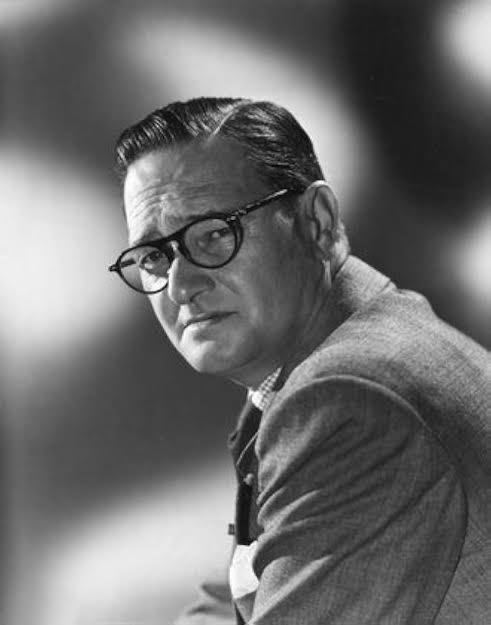
You can’t talk about the look of this film without talking about Gregg Toland. He wasn’t just a guy behind a camera; he was a visual philosopher who figured out how to use light and shadow to carve out raw emotion. By the time he hit the set of “The Grapes of Wrath,” Toland was already a technical heavyweight, but he brought an almost surgical precision to Ford’s vision.
He’s most famous for his pioneering use of deep focus, but it’s important to realize this wasn’t just a technical flex. It was a choice to stop “protecting” the viewer. By keeping everything sharp, he forces you to live in the Joads’ world, presenting the bleakness of the Dust Bowl with a haunting, tactile beauty.
Inspiration Behind the Cinematography
The aesthetic here wasn’t born from abstract art school musings; it was ripped straight from the dirt of the American Dust Bowl. Darryl F. Zanuck actually sent undercover investigators into migrant camps before production began to verify that Steinbeck hadn’t exaggerated the squalor. If anything, they found the reality was even worse.
That commitment to the “ugly truth” defined the approach for Ford and Toland. They leaned into a stark realism that makes the world feel unvarnished and unforgiving. The production relied heavily on research photos, crafting a visual language that felt lived-in and completely stripped of Hollywood glamour. Ford even famously banned makeup and perfume from the set. He wanted the sweat and the grit to be real, reminding us that the most powerful visual choices are the ones that don’t try to hide the pain.
Camera Movements
Analyzing the movement in “The Grapes of Wrath,” what strikes me most is the restraint. There’s a thoughtful economy of motion here that grounds the film. This isn’t a story for flashy Steadicam work or rapid-fire cutting; it’s a slow pilgrimage. The camera moves with the same weariness as the Joads themselves.
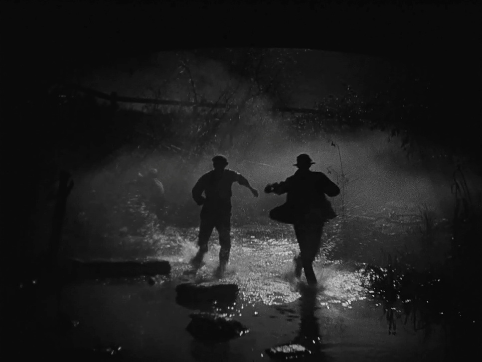
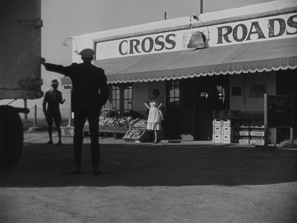
For the most part, the camera acts as a patient, empathetic observer. We see these steady, purposeful tracking shots following the Joads as they trudge along dusty roads, their overloaded jalopy becoming a character in itself. The lack of frantic motion mirrors their grind for survival. When the camera does pan, it’s usually to reveal the vast, indifferent landscape that makes the family look tiny. Every push and pull feels motivated by the narrative, contributing to that “documentary” feel without ever calling attention to the gear.
Compositional Choices
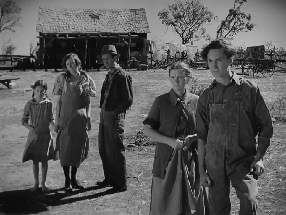
This is where Toland really shines. Using the frame as a canvas, his signature deep focus serves as the bedrock of the entire film. It allows him to pack an incredible amount of information into a single shot without losing clarity.
First, it hammers home the collective nature of their struggle. The Joads aren’t isolated; they’re part of a suffering community. By keeping family members in the foreground and other migrants in the background all in sharp focus, Toland reinforces the idea of a shared burden. Second, it uses “depth cues” to create a tangible sense of space. Whether it’s the empty Oklahoma plains or the cramped California camps, the spatial honesty makes the environment feel viscerally real.
He also plays with angles to manipulate power dynamics. Low-angle shots make the Joads look vulnerable against a massive sky, while high angles reduce them to specks in the dirt. Even the negative space like when Tom Joad returns to his abandoned farm speaks louder than the dialogue ever could.
Lighting Style
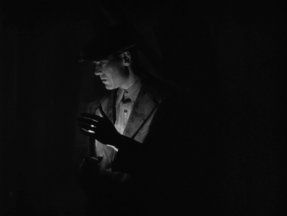
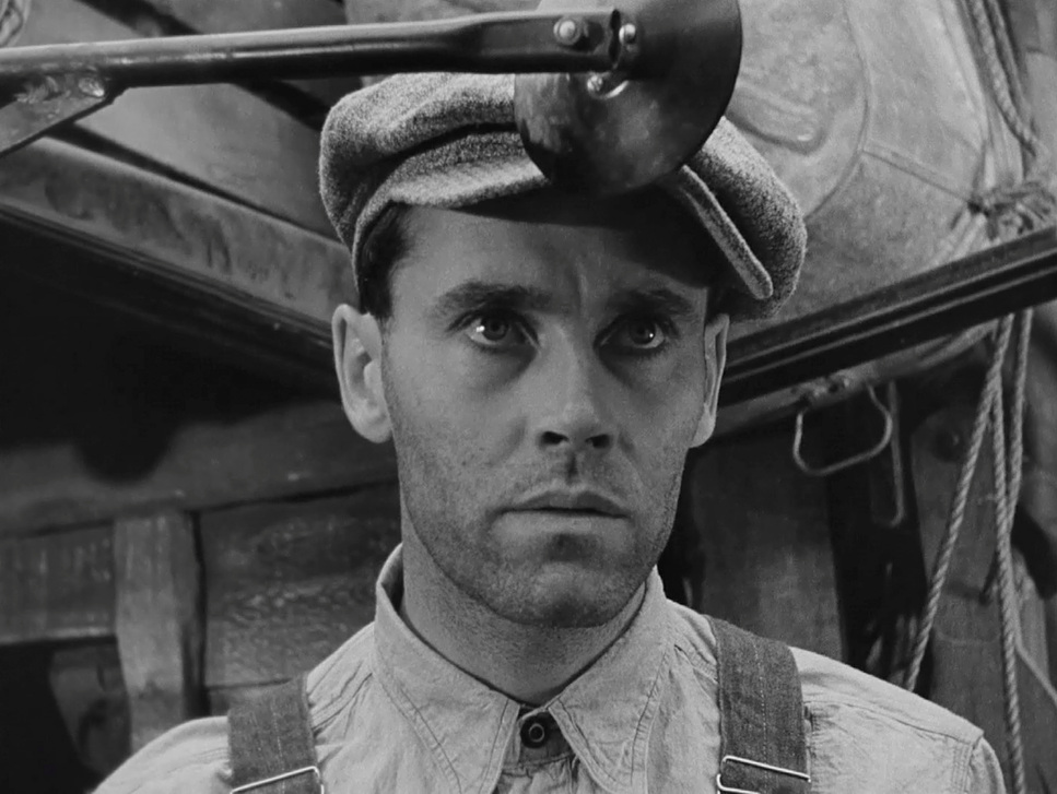
The lighting is where I get really excited as a colorist. In black and white, light is your color palette. Toland’s “low lighting” isn’t just a mood; it’s a strategy. He used high contrast ratios to sculpt faces, creating a chiaroscuro effect that feels both gritty and beautiful.
From a technical standpoint, the highlights are perfectly controlled you see them catching the worn textures of clothes or the glint in an actor’s eye while the shadows are deep and rich. But here’s the key: the shadows never truly “crush.” They retain just enough detail to keep the image from feeling like a black blob. This tonal sculpting gives the darkness a narrative purpose it represents the unknown and the weight of their existence. Most of the light feels “motivated,” appearing to come from campfires or lanterns, which keeps that documentary-like immersion intact.
Lensing and Blocking
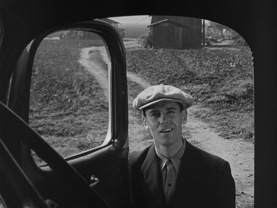
Lensing and blocking are inseparable here. To get that massive depth of field, Toland mostly relied on wide-angle lenses stopped down to small apertures (high f-stops). This wasn’t a choice made in a vacuum; it dictated exactly how Ford had to stage the actors.
The blocking is layered. You’ll have Ma Joad in a tight foreground, other family members in the mid-ground, and someone else glimpsed through a tent flap in the distance. Each layer holds weight because they are all connected spatially. However, when we move into those “clean single” close-ups, you can feel the shift to a longer lens to isolate the emotion on a face like Henry Fonda’s. It’s a sophisticated interplay between the lens’s distortion and the precise positioning of the cast, proving that the tech and the talent were working in total sync.
Color Grading Approach (for a B&W film)
If I were sitting at the grading panel with this footage today, my job wouldn’t be to “fix” it, but to protect that incredible “print-film” sensibility. In B&W grading, we’re sculpting luminance separation rather than hue separation.
My priority would be maintaining that roll-off in the highlights ensuring the whites of the sky or a lantern flame feel bright and hopeful without looking clipped or digital. I’d also be looking to preserve the texture in those deep shadows that Toland worked so hard to capture. I’d use subtle shifts in contrast to guide the viewer’s eye: maybe a slightly softer tonal curve for the rare moments of family tenderness, and a harsher, more aggressive contrast for the scenes of injustice. The goal is to make the original intent sing on modern displays without losing the grit that makes it authentic.
Technical Aspects & Tools
The Grapes of Wrath (1940) | Technical Specifications
| Genre | Drama, Political, History |
| Director | John Ford |
| Cinematographer | Gregg Toland |
| Production Designer | Richard Day, Mark-Lee Kirk |
| Costume Designer | Gwen Wakeling |
| Editor | Robert L. Simpson |
| Time Period | 1940s |
| Color | Desaturated, Black and White |
| Aspect Ratio | 1.33 – Spherical |
| Format | Film – 35mm |
| Lighting | Hard light, Underlight |
| Lighting Type | Artificial light, Tungsten |
| Story Location | United States > California |
| Filming Location | United States > California |
| Camera | Mitchell BNC |
The tech of 1940 was primitive by today’s standards, but they used it with terrifying precision. To get that deep focus, Toland was likely pushing his panchromatic film stock to its limits, sometimes over-developing it to gain speed and contrast.
He used the Mitchell BNC a tank of a camera to get those rock-solid tracking shots. The lighting required massive arc lamps and Tungsten units, often diffused heavily to look like “natural” light. It’s ironic that it took so much heavy equipment to make a scene look “simple” and “unlit.” Even the second unit work was authentic; they went to the actual states Oklahoma, Arizona, Texas and hired real migrants as extras. Every technical decision, down to Ford banning makeup, was about stripping away the “Hollywood” and finding the truth.
- Also read: THE DIVING BELL AND THE BUTTERFLY (2007) – CINEMATOGRAPHY ANALYSIS
- Also read: PERFECT BLUE (1997) – CINEMATOGRAPHY ANALYSIS
Browse Our Cinematography Analysis Glossary
Explore directors, cinematographers, cameras, lenses, lighting styles, genres, and the visual techniques that shape iconic films.
Explore Glossary →