Elite Squad (2007) is the one that constantly resurfaces when I’m talking shop with other DPs and editors. It just hits different. It’s raw, it’s ugly, and it’s visually uncompromising a total reminder that cinematography can do so much more than just look “pretty.”
The buzz around this film, especially in Brazil, is still massive. I’ve had people asking me to break this down for ages, and after sitting through it again, I get it. This isn’t a “sit back and relax” kind of movie. It drags you into the Rio favelas, shoves you into the back of a B.O.P.E. armored car, and forces you to stare at the moral decay of a system that’s basically eating itself. When Captain Nascimento talks about “snuffing out” criminals for the Pope’s visit, the camera doesn’t look away. It refuses to prettify the abyss.
What really gets me as a colorist is how much conviction the film has in its aesthetic. It’s not trying to be a sleek, glossy Hollywood export. It’s gritty, muddy, and often physically uncomfortable to watch. That’s its superpower. Let’s look at how they actually pulled it off.
About the Cinematographer

Lula Carvalho is the visual architect behind this nightmare. If you know his work, you know he’s not interested in “polished.” He’s the kind of DP who understands that sometimes the most honest image is the messiest one.
He’s got a massive track record with director José Padilha they did the sequel, Elite Squad 2, and later moved on to Narcos for Netflix. You can feel that shared shorthand in every frame. Carvalho’s style is all about kinetic energy: aggressive handheld work, motivated light, and a total willingness to let the “imperfections” of a location stay in the shot. He doesn’t meticulously curate every pixel; he lets the real world seep into the lens.
Inspiration Behind the Cinematography
The look of Elite Squad isn’t just a “style” it’s a philosophy. The goal here was to show the police, the favelas, and the corruption in a way that felt like a documentary, not a drama. It’s an unvarnished refusal to romanticize poverty or turn violence into a spectacle.
The visual language is pure cinéma vérité. When we see the police moving bodies between territories just to mess with the crime stats, or small business owners paying off the cops, the camera makes you feel the “grubby banality” of it all. You’re a fly on the wall in a room you probably shouldn’t be in. Using real locations the actual slums lends a tangibility and griminess that you just cannot fake on a studio backlot.
Camera Movements
If there’s one thing that screams “authentic” here, it’s the movement. It’s predominantly handheld, but it’s not that “fake” shaky cam you see in bad action movies. It’s an energetic, purposeful jolt.
The camera is basically another character in the squad. It breathes with the officers as they climb those narrow alleys and ducks when the bullets start flying. You aren’t watching a motorcycle chase; you’re on the bike with Matias and Neto. During the raid sequences, the quick pans and tilts feel like a live news report from a war zone. It turns every confrontation into a high-stakes, breathless encounter. It’s the visual equivalent of a racing heartbeat.
Compositional Choices
The framing here isn’t about beauty; it’s about claustrophobia. The shots are often tight, trapping the characters (and us) in these narrow, suffocating favela corridors. There’s no room to breathe.
You’ll see characters dwarfed by the sheer scale of the slums, highlighting how small they are against a massive, broken system. One of the best examples of deep staging is early on, where Neto uses a telephoto lens from a vantage point to keep an eye on his fellow officers. You see the immediate action and the hidden observer at the same time, layering the tension. It’s messy, it’s organic, and it perfectly blurs the lines between “good” and “bad.”
Lighting Style
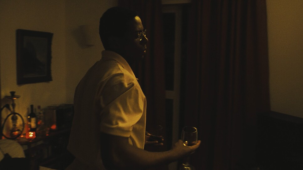
This is where the film gets really gutsy. It’s an anti-glamour approach. They lean heavily into a darker, muddier look that perfectly matches the subject matter.
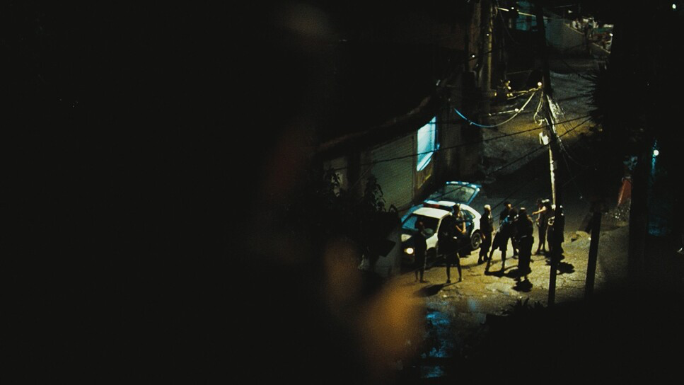
Interiors in the favelas feel underlit, usually relying on harsh practicals bare bulbs or flickering tubes that leave huge portions of the frame in deep, swallowed shadows. It feels dangerous. Then you go outside into the exterior night scenes, and it’s all about high contrast. We’re talking hard, artificial top-lighting that creates a cyan and blue wash over the Rio streets. It’s cold, saturated, and incredibly harsh. There’s no “magic hour” glow here. Highlights are allowed to blow out, and blacks are crushed into nothing. It’s the lighting equivalent of a punch to the gut.
Lensing and Blocking
The lens choices are super specific. They use wider focal lengths for the close-quarters combat to make you feel like you’re physically taking up space in the room. Then, they’ll flip to a telephoto lens for the surveillance moments like the group shots of the police team from a distance to create that sense of isolation and “watching eyes.”
The blocking is just as dynamic. It rarely feels choreographed. Characters move chaotically, and the camera follows from behind, like it’s trying to keep up with real people in real time. This creates these powerful depth cues where a B.O.P.E. officer might be sharp in the foreground while the rest of the world recedes into a soft, dangerous blur. It guides your eye without being “preachy” about where to look.
Color Grading Approach
Putting my colorist hat back on: this grade is a masterclass in intentional imperfection. While the overall vibe is “muddy and dark,” the technical reality is a heavy lean into contrast and specific saturation.
The palette is largely desaturated to emphasize the grit, but then you get these aggressive pushes in the night scenes. We see those deep cyan and blue tones in the shadows that make the city feel cold and predatory. The blacks are crushed not because they missed the exposure, but to create dread. The highlights run hot, rejecting that “perfectly balanced” digital look. It mimics the raw nature of 35mm film pushed to its absolute limit. It’s tactile. You feel like the grime on the screen could rub off on your hands.
Technical Aspects & Tools
Elite Squad (2007) | 35mm • 1.78:1 • Spherical
| Genre | Action, Crime, Drama, Gangster, Thriller, Police |
| Director | José Padilha |
| Cinematographer | Lula Carvalho |
| Production Designer | Tulé Peak |
| Costume Designer | Cláudia Kopke |
| Editor | Daniel Rezende |
| Time Period | 1990s |
| Color | Cool, Saturated, Cyan, Blue |
| Aspect Ratio | 1.78 – Spherical |
| Format | Film – 35mm |
| Lighting | Hard light, High contrast, Top light |
| Lighting Type | Artificial light |
| Story Location | Rio de Janeiro, Brazil |
| Filming Location | Rio de Janeiro, Brazil |
| Camera | Panavision Cameras |
| Lens | Panavision Lenses |
Shooting on 35mm (likely Super 35) was the best decision they could have made. It gives the film an organic, photochemical texture that digital still struggles to nail. The film grain adds a layer of “lived-in” realism that makes the world feel imperfect.
They used Panavision cameras and lenses and I’d bet they weren’t using the cleanest, newest glass available. The subtle distortions and light fall-off feel like they’re coming from older, more “characterful” optics. The lighting kit was clearly minimal; they used HMIs and Tungsten units to augment the night exteriors, but they always kept it looking naturally motivated. The final look was dialed in through a Digital Intermediate (DI), which is how they got those specific, aggressive contrast shapes and that “muddy” but high-impact saturation.
- Also read: IT HAPPENED ONE NIGHT (1934) – CINEMATOGRAPHY ANALYSIS
- Also read: DO THE RIGHT THING (1989) – CINEMATOGRAPHY ANALYSIS
Browse Our Cinematography Analysis Glossary
Explore directors, cinematographers, cameras, lenses, lighting styles, genres, and the visual techniques that shape iconic films.
Explore Glossary →