Bowling for Columbine (2002) when you look at a Michael Moore film, you realize pretty quickly that “pretty” isn’t the point. Moore doesn’t do delicate visual poetry; he uses the camera like a blunt-force tool for investigative journalism. It’s raw, it’s confrontational, and it has this dark, sarcastic humor that usually matters way more than a “clean” image.
In my suite, I’m usually finessing shadows or coaxing out hues to make a scene feel expensive. But to really appreciate what’s happening here, you have to look at the cinematographer’s intent. Bowling for Columbine is a masterclass in how doc cinematography can be totally transparent one minute and then deeply manipulative the next and I mean that as a compliment. It’s about how images influence perception, which is why I still find it fascinating twenty years later.
About the Cinematographer
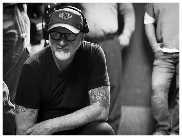
Everyone talks about Moore the voice, the hat, the relentless pestering of CEOs. But Michael McDonough was the eye behind the lens actually making it work. Shooting for Moore isn’t like shooting a narrative feature; you aren’t setting up lights for three hours. It’s about adaptability and having the reflexes to catch a moment of pure absurdity before it’s gone.
McDonough’s job wasn’t to create hyper-stylized tableaux. It was about being responsive and, honestly, quite practical. He had to capture Moore’s interactions as they unfolded, prioritizing stable framing even when things got chaotic. It’s a mix of photojournalistic instinct and a filmmaker’s eye for story. The visual punch of the film comes from that “fly on the wall” energy, even if the audience doesn’t realize how hard that is to execute in the heat of a moment.
Inspiration Behind the Cinematography
The visual philosophy here is basically Moore’s personality caught on film. He’s described the movie as “scathing, incendiary, and provocative,” so the camera doesn’t exactly tiptoe. The inspiration isn’t “art” in the traditional sense; it’s about direct engagement and exposing inconvenient truths.
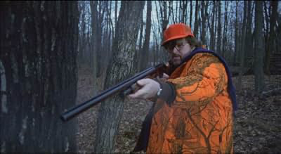
Moore’s “always questioning” ethos translates into an unflinching, observational camera. There’s a total rejection of the glossy, packaged news look. I’ve heard people call this film an antidote to the “callousness” of the 24-hour news cycle. While a movie like Elephant went for a hyper-objective, immersive style, Bowling feels way more personal. The camera’s job is to anchor the “why” why is gun violence so high in America? Whether it’s the weirdness of a bank giving away free rifles or the Lockheed Martin plant in Littleton, the visuals provide irrefutable clarity.
Camera Movements
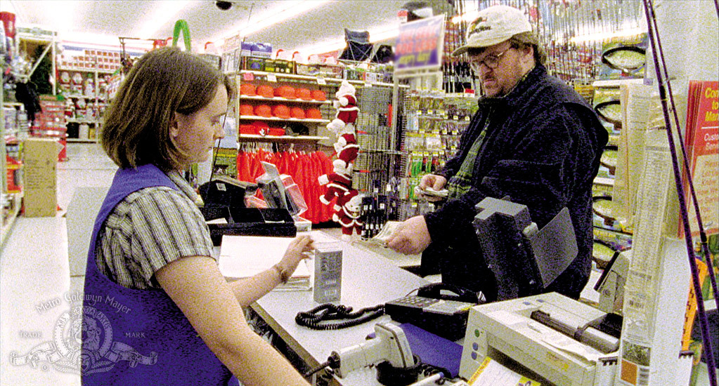
In a doc like this, flashy camera moves just get in the way. Instead, you get this blend of handheld intimacy and locked-down stability. The handheld stuff feels visceral you’re right there with Moore in those awkward conversations. Take the bank scene: the slight wobble as he holds that free gun conveys a sense of disbelief that a tripod just couldn’t capture. It feels real.
Then you’ve got the static interview shots where the camera just sits there, forcing you to sit with the subject’s words. I also noticed the pans are very deliberatelike showing the massive scale of the Lockheed Martin plant. It’s not just a “look at this” shot; it’s a visual argument about the military-industrial complex.
My favorite bit of “movement” is actually when nothing moves at all. When Moore challenges Charlton Heston and Heston eventually walks out, the camera stays steady. It doesn’t chase him like a tabloid crew. It just watches him retreat. That patient, observational stance carries way more weight than an aggressive zoom would have.
Compositional Choices

The framing in Bowling proves that simple compositions are often the most powerful. Moore puts himself in the frame as our proxy, usually at eye-level. These medium close-ups make the confrontations feel direct. When he’s interviewing someone, the framing is usually balanced, putting both Moore and the subject in the same tense visual space.
The wide shots of Littleton are what really get me. It looks like any other idyllic American suburb. That normalcy is the whole point it visually reinforces the idea that “this could happen anywhere.” It makes the tragedy feel much more jarring.
McDonough uses close-ups sparingly, which is smart. When he does zoom in like on a gun being handed over a bank counter it actually means something. He also likes to use depth, placing Moore in the foreground with something like a gun shop or a factory filling the background. It layers the information so that every pixel is working to support the central thesis.
Lighting Style
In my world, lighting is everything. But in Moore’s world, “available light” is king. You aren’t going to see intricate three-point setups here. It’s about letting the environment dictate the look, which actually makes the film feel more “honest” to the viewer.
For the interviews, they’re mostly using window light or whatever lamps were already in the room. It’s soft, naturalistic, and avoids that “over-produced” feel that makes people suspicious of documentaries. It feels like you’ve just stepped into someone’s office to listen in.
Of course, “available light” doesn’t mean “lazy.” It means knowing how to position the camera so the light actually works for you. The only time the lighting gets “designed” is in the animated segments or the satirical bits. For everything else, the rawness is the point. It prioritizes journalistic integrity over looking like a perfume commercial.
Lensing and Blocking
McDonough definitely took a pragmatic approach to lenses. You’re not seeing a bag of expensive primes; you’re seeing versatile zoom lenses. For a doc crew, a mid-range zoom is the workhorse. You can go from a wide environmental shot to a tight reaction shot in two seconds without breaking the flow or missing the action.
The wide lenses do the heavy lifting in places like Littleton, giving us the scale of the landscape. Then you have the “blocking.” In a normal movie, the director tells actors where to stand. Here, the camera is blocked around Moore. When he knocks on Heston’s door, the camera has to find the best angle on the fly.
The Heston interview is the best example of this. Moore sits in a way that’s respectful but firm. When Heston leaves, the blocking captures it as a physical rejection. The camera doesn’t get in his face; it just documents the exit. It feels like an authentic journey of inquiry rather than a staged production.
Color Grading Approach
This is where I get nerdy. Looking at Bowling today, I’m thinking about the film stocks of 2002. It was likely 16mm or 35mm, so the original look has that classic print-film feel: organic grain, distinct highlight roll-off, and colors that feel “baked in” by the chemistry of the film.
If I were grading this today at Color Culture, I wouldn’t try to make it look “modern.” I’d focus on keeping it grounded.
- Contrast: I’d want punchy blacks for depth, but I wouldn’t “crush” them. You want to see the detail in the shadows so it feels real, not stylized.
- Hue Separation: I’d clean up the colors just enough so the suburban greens and the interior yellows don’t get muddy. I’d probably keep the palette a bit muted oversaturated documentaries always feel a bit “fake” to me.
- Highlight Roll-off: This is the big one. Digital highlights can look cheap and “clipped.” I’d make sure those highlights transition smoothly to white, preserving that 16mm texture that gives the film its grit.
The goal isn’t to make it “pretty.” It’s to make it impactful.
Technical Aspects & Tools
In 2002, we were in that weird transition period between film and digital. While we don’t have the exact gear list, it’s a safe bet they used 16mm for the core footage. It’s light, portable, and has that beautiful grain that screams “documentary.” The dynamic range of film handles those tricky outdoor-to-indoor shots way better than early digital cameras did.
That said, Moore’s “guerilla” style probably required some early digital gear for the tighter spots maybe a Canon XL1 or something similar. Mixing those formats is a pain for a colorist, but it adds to the visual texture of the film.
Everything about the tech here was chosen for mobility and reliability. Small crews, fast setups, and the ability to keep rolling no matter what. That technical pragmatism is exactly why the film looks so immediate. It’s not about “cinematic magic”; it’s about being there when the truth happens.
- Also read: WILD STRAWBERRIES (1957) – CINEMATOGRAPHY ANALYSIS
- Also read: 8½ (1963) – CINEMATOGRAPHY ANALYSIS
Browse Our Cinematography Analysis Glossary
Explore directors, cinematographers, cameras, lenses, lighting styles, genres, and the visual techniques that shape iconic films.
Explore Glossary →