Let’s talk about a film that teaches a masterclass in visual storytelling without ever showing off: Martin Brest’s 1992 drama, Scent of a Woman.
Usually, the conversation starts and ends with Al Pacino’s performance. And rightfully so it’s iconic. But as a colorist and filmmaker, I’m watching the craft that supports that performance. I want to dissect the cinematography and the specific visual choices that ground this story. It’s not about flashy camera tricks; it’s about how light, composition, and movement build a world for two characters at completely different crossroads.
About the Cinematographer
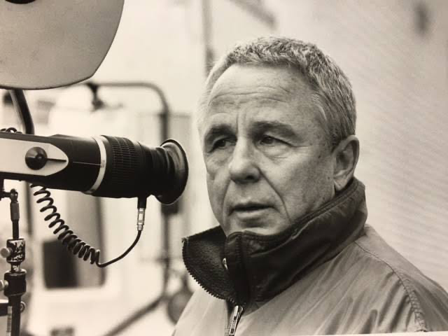
The visual architect behind Scent of a Woman was Donald E. Thorin. Thorin was an incredibly versatile DP who didn’t just stick to one genre. He shot the neon-soaked, moody visuals of Michael Mann’s Thief, the glossy romanticism of An Officer and a Gentleman, and the gritty action-comedy of Midnight Run (also with Martin Brest).
Thorin had a knack for adapting his style to the story rather than forcing a signature look onto every movie. In Scent of a Woman, he exercised restraint. He wasn’t trying to replicate the high-contrast grit of Thief; instead, he went for a classical, invisible approach. He creates a visual reality that supports the narrative weight without ever calling attention to itself. It’s the kind of cinematography that trusts the actors to do the heavy lifting.
Inspiration Behind the Cinematography
The core challenge here is obvious: Frank Slade is blind. As a cinematographer, how do you visualize a world for a protagonist who can’t see it?
Some DPs might have gone for literal POV shots or blurry effects, but Thorin avoided gimmicks. Instead, the visual approach is about the experience of blindness the isolation and the chaos. Frank is erratic and aggressive; Charlie is innocent and naive. The camera mimics that duality. For Frank, the frame focuses on what he senses—sounds, smells, the proximity of others. The camera effectively becomes Charlie’s eyes, guiding us (and Frank) through the turmoil.
The narrative arc moves from confinement to freedom. We start in the sterile, privileged world of the Baird School and move to the chaotic energy of New York City. The visuals reflect this shift perfectly, moving from rigid, claustrophobic framing to open, dynamic possibilities. It’s a transition from darkness to light, mirroring Frank’s internal journey.
Camera Movements
The camera work in this film is deliberate. In the opening act at Baird School, the camera is mostly static or uses very subtle, functional pans. It feels constrained. This grounds Charlie’s reality he’s trapped by his circumstances, and the camera keeps a respectful, almost detached distance.
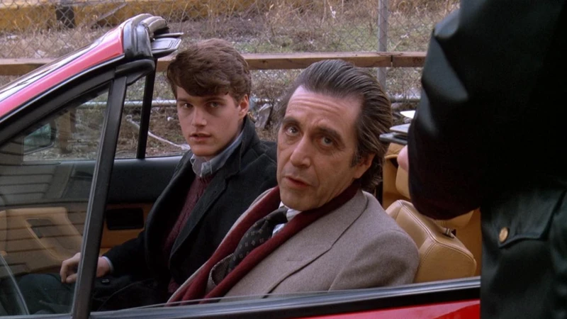
But once Frank Slade enters the picture and drags Charlie to New York, the visual language changes. The camera wakes up. When Frank is manic or aggressive, we get subtle push-ins or quicker rack focuses that match his unpredictability. Then you have the “good life” moments the tango, the Ferrari drive. Here, the camera finally breathes. It embraces fluid tracking shots and sweeping movements. The Ferrari scene is wild and chaotic, matching Frank’s reckless abandon. The camera isn’t just recording the action; it’s participating in the adrenaline.
It also tracks their relationship. Early on, wide shots emphasize the physical space between them—they are antagonists. As the bond forms, the camera physically moves closer, tightening the frame, forcing them into the same visual space.
Compositional Choices
Thorin’s framing tells the story without dialogue. He uses deep focus and specific placement to establish power dynamics.
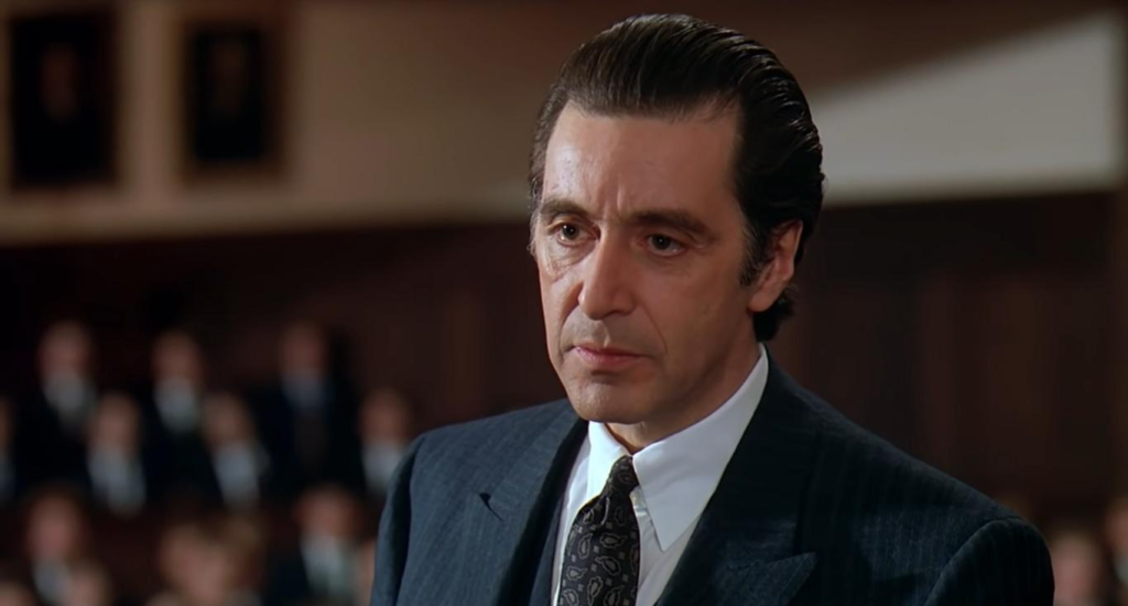
At the school, Charlie is often framed against heavy, imposing architecture. He looks small. He looks crushed by the weight of the institution. Contrast that with Frank. Even though he’s blind, the camera doesn’t hide him. It frames him in tight close-ups, emphasizing his face and his eyes. Pacino’s performance is intensely physical, and the composition gives him the space to dominate the frame.
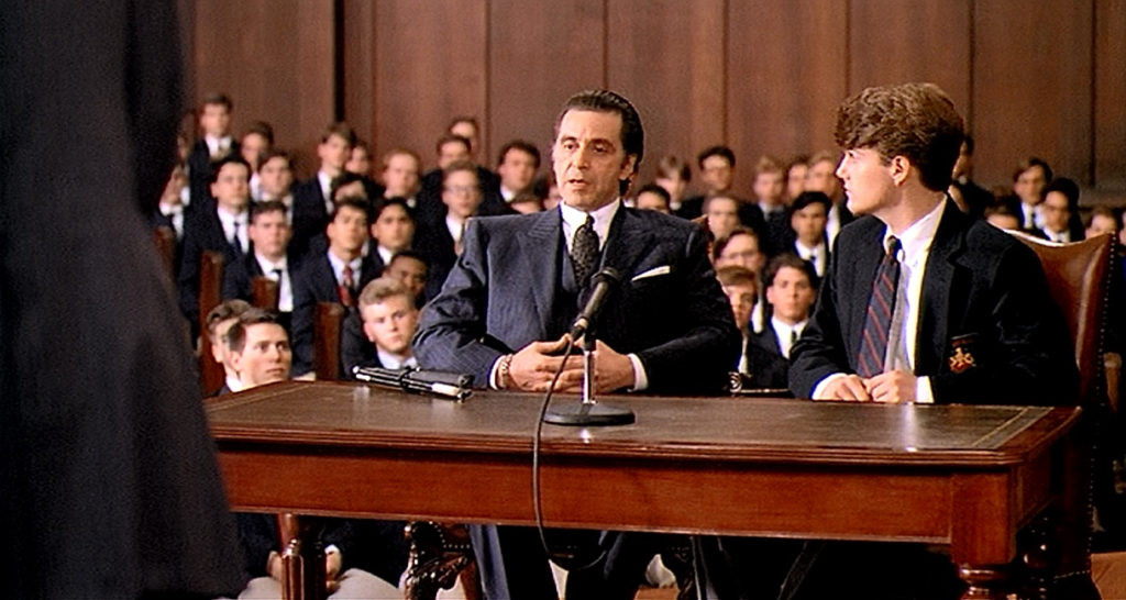
The most interesting evolution happens in the two-shots. Initially, Frank and Charlie are separated by negative space or physical barriers doorframes, furniture. But as Charlie begins to break through Frank’s defenses, the blocking shifts. We start seeing intimate over-the-shoulders and tighter two-shots where they physically overlap. By the time we get to the courtroom scene, Frank commands the center of the frame with Charlie right beside him. Visually, they have become a unit.
Lighting Style
The lighting is naturalistic, but don’t mistake “natural” for “accidental.” Thorin was a master of motivated source lighting.
In the early school scenes and Frank’s darker moments, the lighting is subdued. It feels cooler, a bit stark. The shadows on Frank’s face are deeper, reflecting his isolation and bitterness. It sets a cold, serious tone.
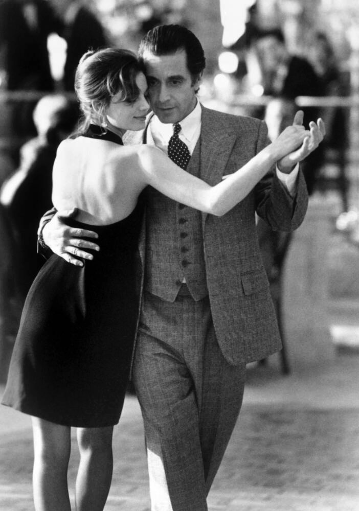
But New York brings warmth. The restaurants, the hotel, the tango hall these locations are lit with practicals that give off a warm, tungsten glow. The highlights are richer. Even in his blindness, Frank is chasing this “warmth” of life. The tango scene is a standout: atmospheric, soft top-light, romantic. It creates a heightened reality.
Crucially, Thorin handles the contrast so the film doesn’t turn into a Hallmark movie. Even in the warm scenes, he keeps enough shadow density to remind us of Frank’s volatility. The dinner scene with Frank’s brother is a great example the light is harsher, less flattering, exposing the raw history between the characters.
Lensing and Blocking
Thorin leaned heavily on medium to long lenses for the character work. This compresses the background, pulling the environment closer to the characters and creating an intimacy that wide angles just can’t achieve. Wide lenses are saved for establishing the scale of New York or the intimidating size of the school.
The blocking where the actors stand is meticulous. At the start, Frank and Charlie are almost always physically distant. Frank dominates the space, often pacing or sitting in a way that forces Charlie to the edge of the room. It’s an aggressive power play.
As the film progresses, the blocking forces them together. They share a car seat; they sit close in the plane; they walk arm-in-arm. The tango scene is the ultimate example of narrative blocking: Frank is hesitant, then guided into an embrace, physically relying on another person. By the end, in the courtroom, Frank stands to defend Charlie while Charlie sits, looking up at him. The physical positioning perfectly creates the father-son dynamic they’ve been lacking.
Color Grading Approach
This is my wheelhouse. Since this was 1992, we aren’t talking about digital color grading in DaVinci Resolve; we’re talking about photochemical color timing and the specific characteristics of film stock.
The image has that beautiful, organic texture you only get from 35mm. The approach is grounded realism, but the tonal shift is distinct. The Baird School scenes lean into cooler tones desaturated blues and cyans. It feels academic and cold.
New York is where the print really sings. Skin tones become denser and healthier. The saturation bumps up the red of the Ferrari, the golden practical lights in the hotel. It’s not over-stylized; it’s a subtle sculpt of the palette to mirror Frank’s zest for life returning. Because this is a film print, the highlight roll-off is smooth bright windows or lamps don’t clip harshly like digital; they bloom softly.
The contrast plays a huge role here. The earlier scenes have a harder contrast ratio, creating a sharper edge to Frank. As he softens, the contrast seems to open up slightly, allowing for more shadow detail and a gentler image. It’s a great example of how color timing (even the old-school chemical kind) dictates emotional response.
Technical Aspects & Tools
Scent of a Woman was shot on 35mm film, likely using Arriflex or Panavision cameras, which were the industry standard. Thorin would have paired these with spherical lenses probably Zeiss or Cooke primes to get that sharp but creamy look.
He likely used Kodak Vision stocks (pre-Vision 3). Probably a 500T (tungsten) for the interiors to handle the mixed lighting of New York locations, and a finer grain daylight stock for exteriors.
The key here is the latitude of film. Film handles overexposure beautifully. This allowed Thorin to shoot with natural window light or practical lamps without blowing out the image. The grain structure adds a texture that feels “real” in a way 4K digital sometimes lacks. Post-production was traditional lab timing, printer lights, chemical baths. No power windows, no tracking masks. They had to get the look right in camera and refine it globally in the lab. That constraint often leads to more disciplined, cohesive cinematography.
- Also read: THE INVISIBLE GUEST (2016) – CINEMATOGRAPHY ANALYSIS
- Also read: AKIRA (1988) – CINEMATOGRAPHY ANALYSIS
Browse Our Cinematography Analysis Glossary
Explore directors, cinematographers, cameras, lenses, lighting styles, genres, and the visual techniques that shape iconic films.
Explore Glossary →