Usually, when I analyze a film, I’m looking immediately at the grade or the lens choice. But with Roman Polanski’s 1968 classic Rosemary’s Baby, the cinematography does something insidious: it gaslights you alongside the protagonist. It isn’t just a scary movie; it is a study in paranoia, vulnerability, and control, all executed through a visual language that feels just as unsettling today as it did in the 60s.
Let’s break down how the cinematography builds this psychological trap.
About the Cinematographer
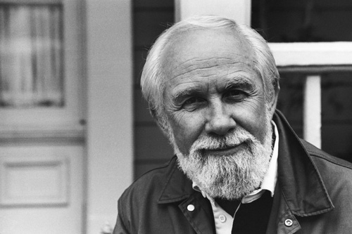
The man behind the look was William A. Fraker, ASC, a legend who knew exactly how to blend naturalism with an underlying sense of dread. Fraker didn’t just light a set; he created an atmosphere that felt lived-in yet slightly “off.” While he had a versatile career shooting distinct films like Bullitt and WarGames his work on Rosemary’s Baby is arguably his most psychological.
Fraker understood that horror isn’t always about darkness. Sometimes, it’s about being trapped in a beautiful, well-lit room. His collaboration with Polanski resulted in a visual style where the camera doesn’t just record the action; it acts as a conspirator, trapping Rosemary within the elegance of her own apartment.
Inspiration Behind the Cinematography
Polanski is notorious for his obsession with precision he wasn’t the type to “find it in the edit.” Every frame of this film feels predetermined. He took what was essentially B-movie source material a paperback thriller about Satanists and gave it A-list treatment.
The film grounds itself in the very real, very imposing Dakota building in New York (renamed “The Bramford”). The architecture does a lot of the heavy lifting here. The film taps into the specific anxieties of the late 1960s the decline of traditional morals and the isolation of city life. Fraker and Polanski used these themes to turn the apartment into a metaphor: as Rosemary’s individuality is stripped away by her neighbors and husband, the visual world around her tightens. It’s a masterclass in using physical space to represent mental collapse.
Camera Movements
If you’re looking for shaky handheld cam or chaotic whips, you won’t find them here. Rosemary’s Baby is defined by a “mannered” camera slow, deliberate dollies and smooth push-ins.
The movement is almost voyeuristic. There are moments where the camera drifts down a hallway or peers around a doorframe, partially obscured. This is a brilliant directorial choice: by blocking our view of a character or an object, Polanski forces us to lean in, making us complicit in the surveillance of Rosemary. When the camera pulls back, it emphasizes her isolation, making her look tiny against the heavy, dark furniture. The static shots are just as cruel, framing her in a way that suggests she is always being watched.
Compositional Choices
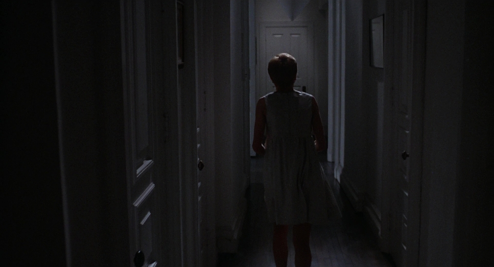
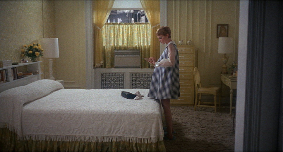
The framing consistently reinforces one idea: Rosemary is small, and the forces against her are massive. Mia Farrow gives an incredible physical performance, but it’s the composition that sells her vulnerability. Fraker often frames her deep in the background of cavernous rooms, or dwarfed by the high ceilings of the Dakota.
The use of negative space is suffocating. Even when she is in a “safe” space, the depth of field often keeps the background sharp, a constant reminder of the environment encroaching on her. There is a “babe in the woods” quality to the visuals we instinctively want to protect her because the frame makes her look so breakable. It’s a visual manipulation that aligns our empathy with her completely from the first act.
Lighting Style
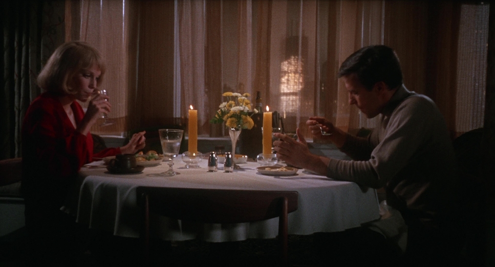
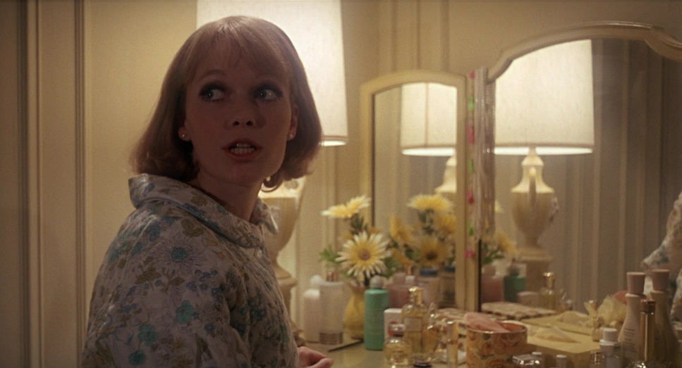
The lighting arc in this film is subtle but devastating. It begins with a warm, saturated glow practical lamps and soft window light that make the apartment feel like a sanctuary. It lulls you into a false sense of security.
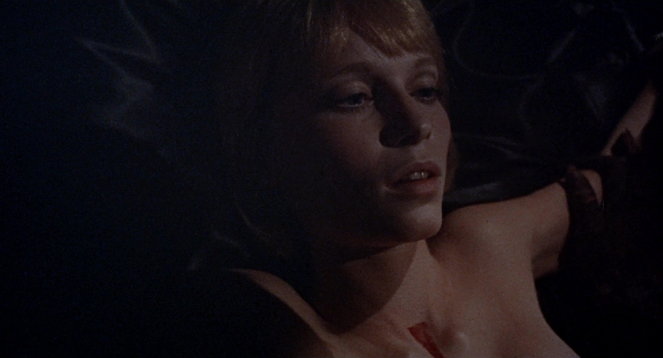
As the pregnancy (and the conspiracy) progresses, that warmth is slowly sucked out of the image. The contrast ratio increases; the shadows get deeper and harder. Fraker manages to make even daylight feel hostile. There is a specific harshness to the lighting on Farrow’s face in the later acts that highlights her pallor, emphasizing her physical deterioration.
Then there are the dream sequences, specifically the “boat” scene. Here, the lighting breaks reality entirely, shifting into a more expressionistic, stylized look that feels disjointed and jarring, perfectly mimicking the logic of a nightmare.
Lensing and Blocking
Technically, Fraker favored wider lenses for the interiors. Paradoxically, this makes the apartment feel huge while making Rosemary feel trapped within it. A wide lens expands the background, making the walls feel distant yet imposing.
The blocking where the actors stand is incredibly precise. Polanski famously clashed with actor John Cassavetes (who played Guy) because Cassavetes preferred improvisation, while Polanski wanted exact positioning. You can see why: the blocking creates power dynamics. Notice how the neighbors, Minnie and Roman, are constantly invading Rosemary’s personal space. They stand just a little too close. In later scenes, Rosemary is often physically cornered or boxed in by the other characters. It’s a visual representation of her loss of agency.
Color Grading Approach
Now, putting on my colorist hat, this is where the film becomes fascinating to analyze. Since this was 1968, there were no digital intermediates or power windows. The “grade” was achieved through production design, lighting ratios, and the photochemical timing at the lab.
When looking at high-quality transfers (like the Criterion release, likely restored/graded by Sheri Eisenberg), you are seeing the characteristics of vintage Eastman Kodak 35mm stock. The look is defined by a warm, thick density. The “toe” of the film curve (the shadow rollout) is lifted meaning the blacks aren’t crushed into a digital void; they are milky and retain detail, which adds to that organic, textured anxiety.
If I were recreating this look in DaVinci Resolve today, I wouldn’t just slap on a vintage LUT. I would focus on the highlight roll-off. The highlights in the film are creamy and soft, likely due to the halation of the film stock and the lenses used. The skin tones start vibrant and healthy but arguably shift toward sallow, desaturated hues as the film progresses a subtle change that could be achieved photochemically by manipulating the printer lights to pull out the warmth, leaving Rosemary looking cold and sickly without making the whole image look monochromatic.
Technical Aspects & Tools
Rosemary’s Baby
Technical Specifications| Genre | Drama, Horror, Occult, Psychological Horror, Mystery, Thriller |
|---|---|
| Director | Roman Polanski |
| Cinematographer | William A. Fraker |
| Production Designer | Richard Sylbert |
| Costume Designer | Anthea Sylbert |
| Editor | Sam O’Steen, Bob Wyman |
| Colorist | Sheri Eisenberg |
| Time Period | 1960s |
| Color | Warm, Saturated |
| Aspect Ratio | 1.85 – Spherical |
| Format | Film – 35mm |
| Lighting | Hard light, Top light |
| Lighting Type | Artificial light |
| Story Location | New York > New York City |
| Filming Location | Los Angeles > Paramount Studios |
| Camera | Mitchell BNC, Arriflex 35 IIC |
Filmmaking in the 60s was a heavy, physical process. They were likely hauling massive Mitchell BNC or Arriflex cameras, which makes the smoothness of the movement even more impressive.
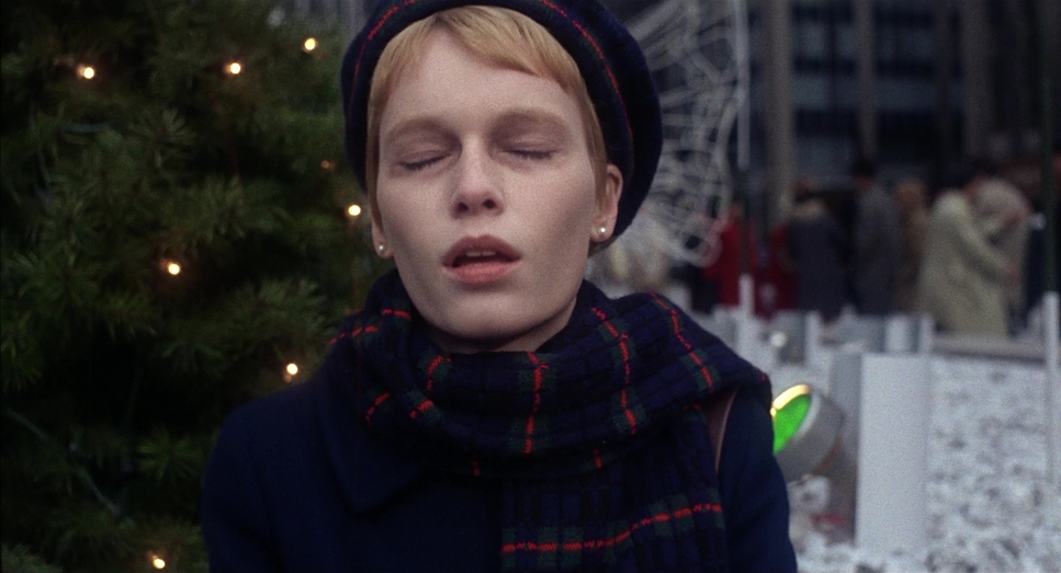
The film relies entirely on practical effects, and it ages better because of it. The chilling reveal of the baby’s eyes or rather, the lack of a reveal works because it forces your imagination to fill in the gaps. There is also the famous story of the scene where Rosemary walks into New York traffic. That wasn’t staged; Farrow actually walked into real traffic with a camera operator following her. It’s a level of guerrilla filmmaking that wouldn’t fly today, but it adds a layer of authentic, uncontrolled chaos to the scene.
- Also read: LION (2016) – CINEMATOGRAPHY ANALYSIS
- Also read: AMORES PERROS (2000) – CINEMATOGRAPHY ANALYSIS
Browse Our Cinematography Analysis Glossary
Explore directors, cinematographers, cameras, lenses, lighting styles, genres, and the visual techniques that shape iconic films.
Explore Glossary →