Amores Perros (2000) The name itself implies a specific texture gritty, vibrant, and undeniably aggressive. It’s a masterclass in how cinematography serves the gut-punch of the script. When I look at films that defined the turn of the millennium, Amores Perros stands out as a seminal work that revolutionized Latin American cinema. Its depiction of Mexico City a place of contradiction is unflinching. It’s a frenetic dance of “deseo y desastre,” painted with mixed lighting, wide-angle distortion, and a camera that refuses to look away.
About the Cinematographer

To understand the visual language here, we have to look at Rodrigo Prieto. This partnership laid the groundwork for much of Iñárritu’s career. Prieto is a cinematographer who understands that technical precision is useless without emotional resonance. For Amores Perros, he was tasked with translating a hyper-realistic, violent vision of Mexico City onto 35mm film. It wasn’t about beautification; it was about immersion. Prieto doesn’t just light a scene; he sculpts an atmosphere. Iñárritu intended to present “space and characters from a hyper-realistic perspective,” and Prieto used the camera to strip away the artifice, transforming conceptual ambition into tangible, gritty images.
Inspiration Behind the Cinematography
Iñárritu’s Mexico is a place of inherent violence mental and physical. The city is a character itself, permeating every frame. The director aimed to “never caricature,” choosing instead to highlight “the pervasive presence of violence” as a defining characteristic of contemporary life. This philosophy drives Prieto’s cinematography.
When aiming for hyper-realism in a narrative about the “underbelly of the nation,” the visual strategy must reflect that rawness. It’s not about polished imagery; it’s about capturing the frantic energy and desperation. The camera work and lighting conspire to put us inside that world, often uncomfortably close. In a story where “violence is about to be overcome by his character’s animalistic nature,” Prieto’s visual cues emphasize the primal struggle. The film creates a sense of varying emotional suffocation that clings to every character, regardless of social standing.
Camera Movements
From the opening car chase, the camera asserts a restless presence. We are thrown into a “cámara temblorosa y dinámica” (shaky and dynamic camera) with tight shots. This handheld quality isn’t a mistake; it’s a deliberate choice to place the audience inside the chaos rather than observing it.
This nervous energy permeates the film, especially during moments of high tension. It creates a feeling that “at any minute, something crazy can happen.” When Ramiro’s temper flares, the camera mirrors his internal turmoil. Unlike the invisible movement of classical cinema, this is an urgent, breathless presence. It grounds the film in a documentary-like authenticity. The operator isn’t just following action; they are reacting to it, embracing the imperfections of human movement to heighten the claustrophobia of the characters’ realities.
Compositional Choices

Prieto’s composition masterfully manipulates space to reflect internal realities. He uses wide angles to create separation, while extreme close-ups force an uncomfortable emotional connection. This push and pull defines the film’s rhythm.
Consider the framing of the homes: Octavio’s crowded house, Valeria’s apartment, and El Chivo’s warehouse. Each is shot with wide lenses, yet they all feel suffocating. In Octavio’s cramped quarters, Iñárritu frames scenes with establishing shots that highlight the “disjointed, disconnected” nature of the family. The wide angle doesn’t offer freedom; it highlights the emotional chasm, distorting the foreground to create “physical barriers between human communication.”
For Valeria, the wide angles initially show luxury, but post-accident, her apartment becomes a “claustrophobic cage.” The high-angle wide shot of her lying impotent on the bed emphasizes her sudden vulnerability. This distortion of filmic space is a recurring motif: everyone walks toward “death and danger,” trapped in environments that feel both expansive and confining.
Lighting Style
The lighting avoids overt glamour, favoring motivated realism and high contrast. Prieto uses light to underscore psychology, often utilizing top-down artificial sources mixed with practicals.
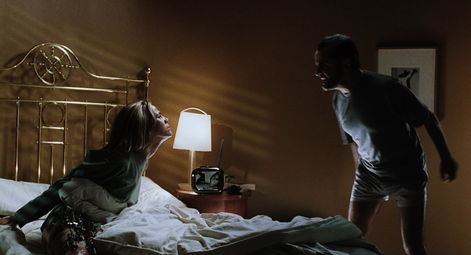
A poignant example is the contrast between Octavio and Ramiro. Ramiro, the abusive brother, is often bathed in an “iluminación roja” (red lighting) or warm sodium tones, highlighting his volatile, “iracundo” character. It’s a visual warning of his instability. In contrast, Octavio is often rendered in cooler, “iluminación media celeste” (cyan/blue) tones, hinting at his melancholic hope.
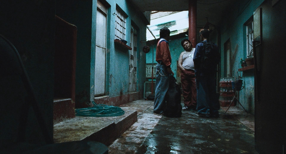
The overall scheme leans heavily into available light, creating deep shadows. As a colorist, I appreciate the work involved in maintaining detail in those shadows while allowing practicals to bloom naturally. The result is a dynamic range that feels “dark and desperate” without losing visual information. The blacks are rich, and the mid-tones carry a subtle gradient that prevents the image from feeling flat.
Lensing and Blocking

The visual identity of Amores Perros relies on short focal lengths specifically Zeiss Ultra Primes and Super Speeds. This wasn’t just a stylistic preference; it was a mechanism to link the three narratives. The repetition of wide-angle distortion connects the characters, asserting that despite their disparate lives, they share the same dangerous urban fabric.
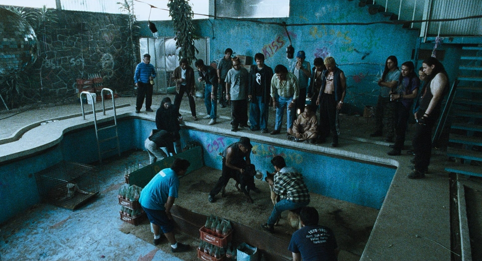
The wide lenses give a grotesque aesthetic to scenes like El Chivo’s planning meeting. The distortion bends perception, reflecting moral ambiguity. In Octavio’s house, the lens actively works against convention; it expands the space but paradoxically heightens the claustrophobia. Objects loom large in the foreground, separating characters who share the same frame.
Blocking works in tandem with these lenses. Characters are often positioned with significant negative space or crammed together, their isolation underscored by the lens choice. This allows multiple planes of action to coexist—Ramiro pacing while his mother watches from deep background physically manifesting emotional distance without needing a cut.
Color Grading Approach
As a colorist, this is where I really sink my teeth into the film’s texture. Shot in the year 2000, this was the era of photochemical “timing,” likely involving a bleach-bypass simulation or silver retention process to get that high-contrast, desaturated grit.
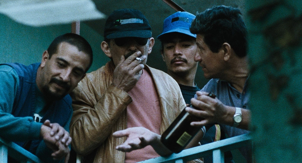
The look is defined by density. The blacks are crushed, but the highlights are allowed to breathe, characteristic of the Kodak Vision stocks used. This creates a crude, obscure atmosphere. Hue separation is subtle but impactful: the warm, aggressive tones for the dogfighting and Ramiro’s world contrast sharply with the cyan and blue tones of Octavio’s cooler moments. These aren’t oversaturated digital colors; they are dense, chemical colors.
The grading maintains nuanced skin tones despite the muted palette, ensuring the characters remain human amidst the grime. There is often a slight green or yellow tint in the mid-tones, enhancing the industrial, polluted feel of the city. It’s an honest, unvarnished image that prioritizes potent truth over polish.
Technical Aspects & Tools
Amores Perros: Technical Specs
| Genre | Drama, Thriller, Melodrama |
|---|---|
| Director | Alejandro González Iñárritu |
| Cinematographer | Rodrigo Prieto |
| Production Designer | Brigitte Broch |
| Costume Designer | Gabriela Diaque |
| Editor | Alejandro G. Iñárritu |
| Colorist | Juan Magaña |
| Time Period | 2000s |
| Color | Mixed, Saturated, Cyan, Blue |
| Aspect Ratio | 1.85 – Spherical |
| Format | Film – 35mm |
| Lighting | High contrast, Top light |
| Lighting Type | Artificial light, Practical light |
| Story Location | … Mexico > Mexico City |
| Filming Location | … Mexico > Mexico City |
| Camera | Moviecam SL |
| Lens | Zeiss Ultra Prime, Zeiss Super Speed, Angenieux – HR Zoom – 25-250mm |
| Film Stock / Resolution | 5246/7246 Vision 250D, 5279/7279 Vision 500T, 5289/7289 Vision 800T |
Technically, the film owes its distinct grit to the Moviecam SL, a lightweight 35mm camera that allowed Prieto the freedom for that “shaky, dynamic” handheld work. They paired this with Zeiss Ultra Primes and Zeiss Super Speeds, along with an Angenieux HR 25-250mm Zoom. This is a crucial distinction: they didn’t use vintage glass for softness; they used sharp, high-performance lenses and let the film stock do the heavy lifting for texture.
The production utilized a mix of Kodak Vision 250D (5246) for daylight, and Vision 500T (5279) and Vision 800T (5289) for interiors and night scenes. The choice of the 800T stock was essential for the night exteriors, allowing them to light with practicals and maintain that deep, noisy contrast without losing the image to the shadows. The 1.85:1 spherical aspect ratio kept the framing tight and focused, supporting the intimate, claustrophobic narrative.
- Also read: DOG DAY AFTERNOON (1975) – CINEMATOGRAPHY ANALYSIS
- Also read: THE WRESTLER (2008) – CINEMATOGRAPHY ANALYSIS
Browse Our Cinematography Analysis Glossary
Explore directors, cinematographers, cameras, lenses, lighting styles, genres, and the visual techniques that shape iconic films.
Explore Glossary →